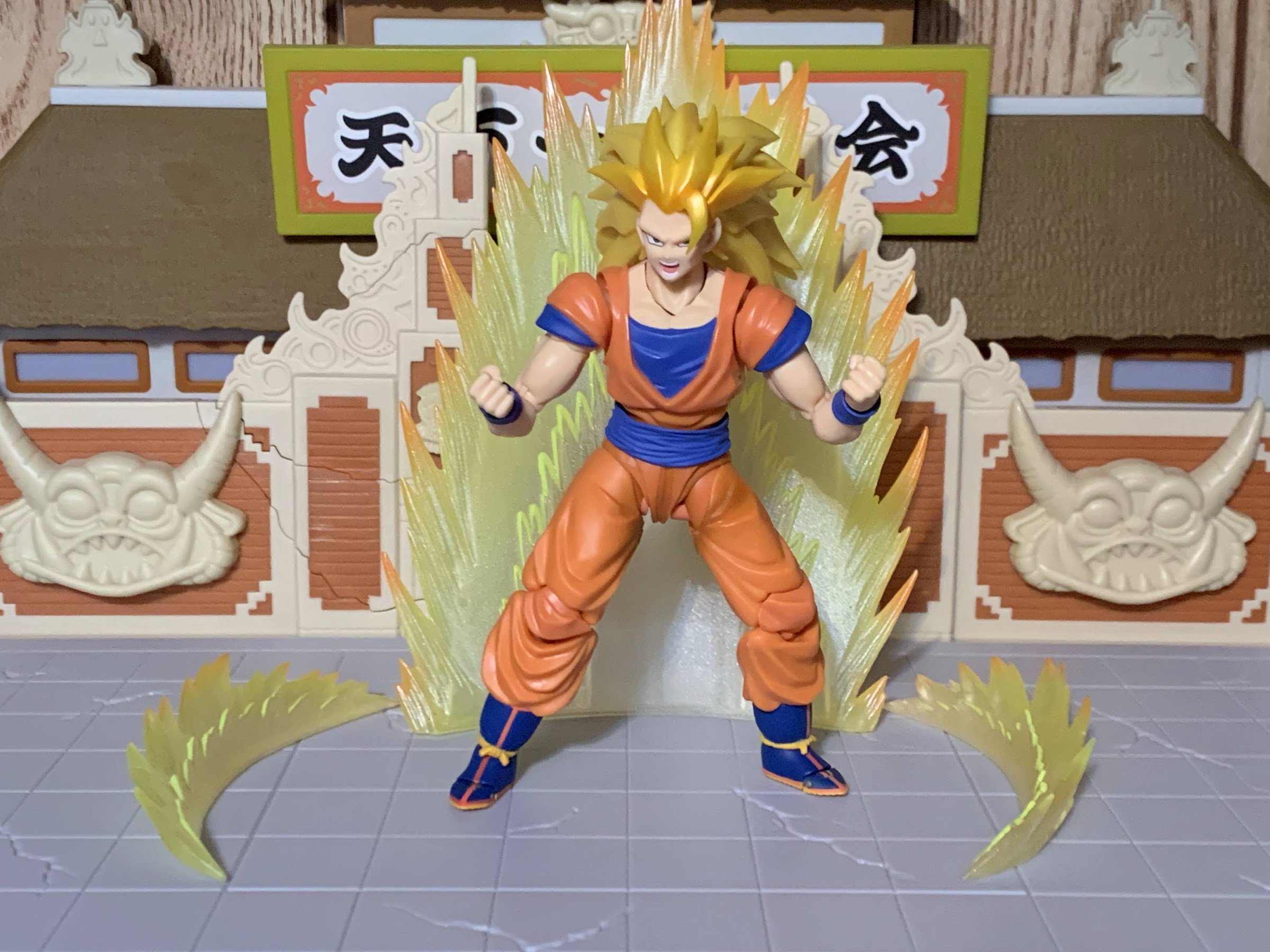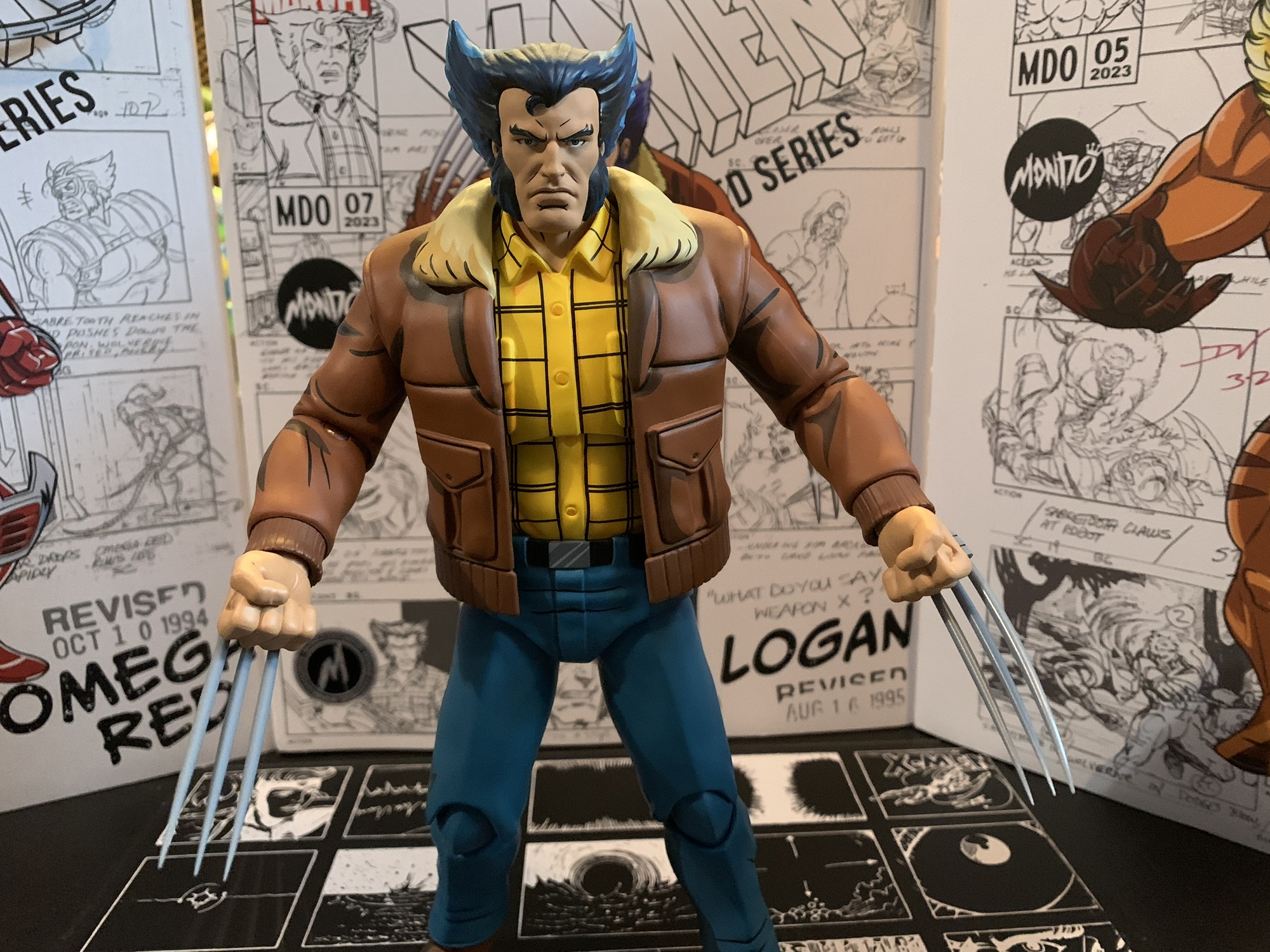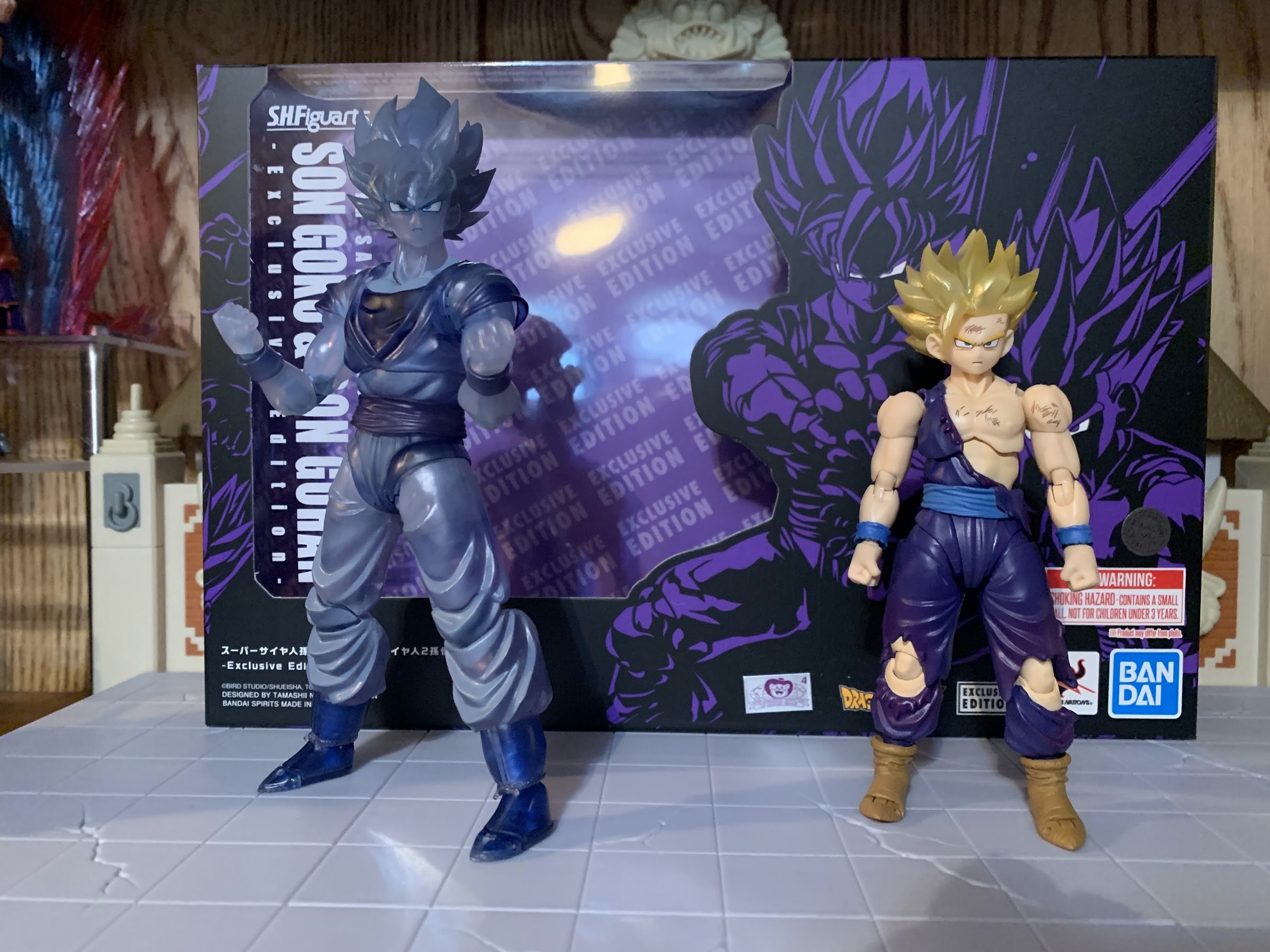
We are now past Valentine’s Day and I’m ready to close the book on San Diego Comic Con 2023. The last action figure exclusive to look at is the two-pack of Super Saiyan Goku and Super Saiyan 2 Gohan. Dragon Ball Z has been around for a long time and has given birth to many iconic images whether it’s Goku and Vegeta squaring off or Goku’s initial transformation into a Super Saiyan or any others. One of the top ones is definitely Gohan finishing off Cell with what has been dubbed the Father-Son Kamehameha. Gohan, bloodied and with his left arm just hanging limp at his side, summons the strength to muscle-up one last blast with his father urging him on from beyond the grave. Goku appears as a spirit behind him as if he’s providing his own blast alongside his son. Whether it’s to be taken literally or not has never been really clear to me, but it’s a dramatic moment and definitely a fan favorite.

For Comic Con 2023, Bandai released a two-pack that has shockingly never happened before. A battle damaged Super Saiyan 2 Gohan and a “ghost” Super Saiyan Goku so collectors can essentially reenact that moment as part of their collection. It comes in an oversized box with a black and purple deco and the photography on the box makes it obvious what moment this represents. The window only shows Gohan which almost makes Goku feel like it’s a surprise, or a glorified accessory. Both figures are re-releases of past ones. We’ve seen this base Goku body many times before across several iterations of the character. Gohan is also a re-release, though it’s an older figure and one I’ve never interacted with before. Initially, I was only going to get the event exclusive Raditz, but this release just looked too cool and it earned my $95.

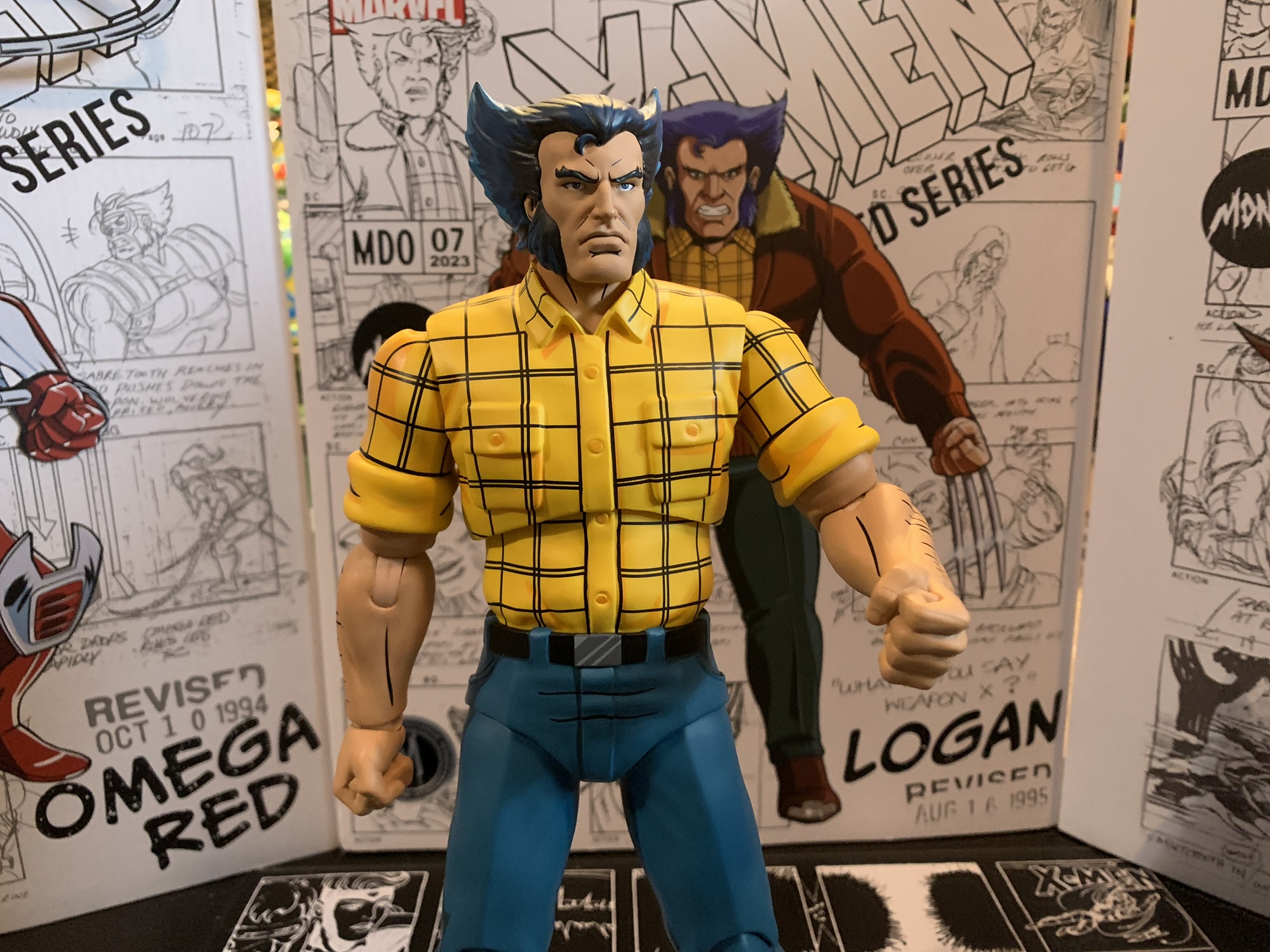
Let’s talk Gohan first since, as I mentioned earlier, Goku feels more like an accessory here even though he’s a full-fledged action figure. Gohan is, as the box states, in his Super Saiyan 2 form and his purple gi is all tattered and torn. There’s some battle damage painted onto his flesh in places, but no blood. He’s a young teen so he’s much smaller than his father and stands about 4.25″ to the top of his face. He follows some past event exclusives by featuring translucent, yellow, plastic for his hair which has been brushed over with a pearlescent, gold, paint. It’s a pretty heavy coat of paint so it’s actually hard to tell that there’s any translucency to the plastic, but it’s there and it looks pretty nice. I don’t know if I prefer it to painted, yellow, plastic, but it’s fine. The face printing looks sharp and is likely updated from the original release of the figure. Bandai did a good job matching colors the rest of the way, and it helps that the upper body is cast all in flesh-colored plastic. The only painted flesh are the exposed knees. The rest of the paint is fairly minimal. The gi is painted and there’s a darker purple for the inside portions of the torn parts. There’s a little shading around the knees, and then there’s the battle damage. It’s limited to the chest, face, and left arm and I’m surprised there aren’t any cross-hatches on his right arm, but it looks good and at least it isn’t overdone.


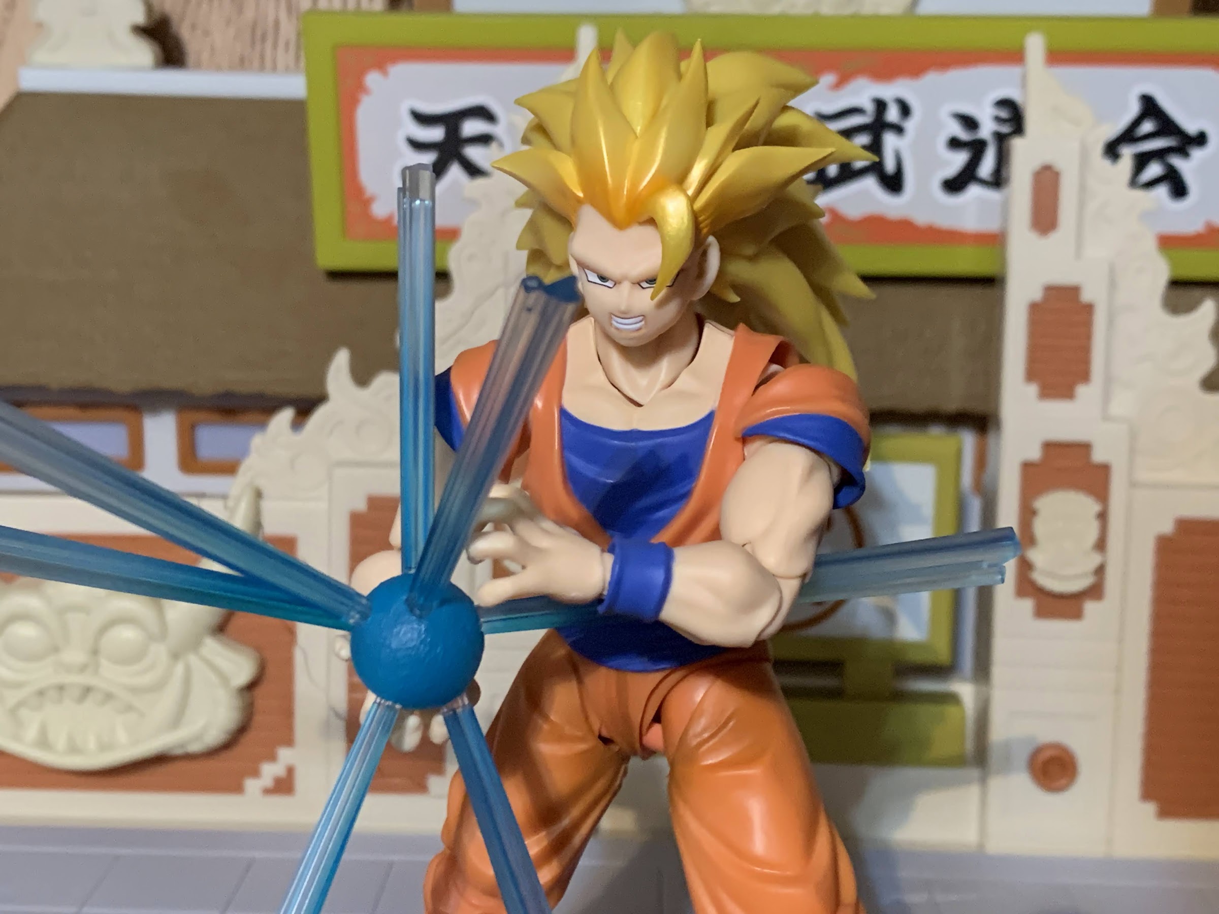
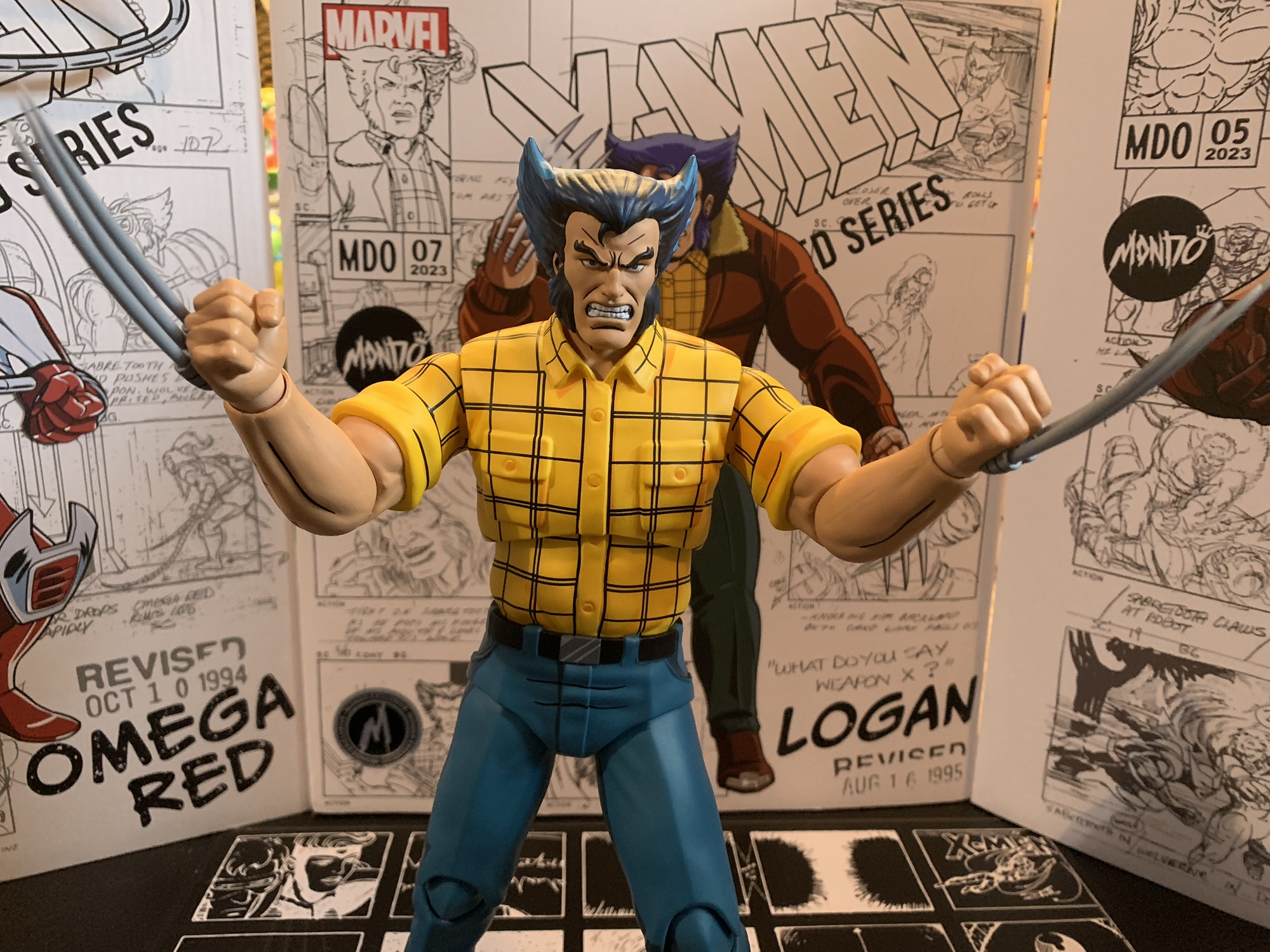
For optional parts, Gohan has four portraits: stoic, teeth gritting, yelling, and an even bigger yell. The two yelling are certainly pretty similar, but it’s hard to argue anything is missing. For hands, Gohan has a set of fists, open, relaxed, Kamehameha, and Kamehameha hands with pegs on them. And if you get those blast effect hands with pegs, that usually means you get some kind of blast effect and that is true of Gohan. He comes with the charging, Kamehameha, effect. It’s done in translucent, light, blue plastic and consists of a small sphere with slots in it to accommodate seven, acrylic, posts. It’s an effect we’ve seen a few times and it seems like it’s becoming a favorite of Bandai as I think I have four of them now. This one seems lighter in color from the one that came with Orange Piccolo and doesn’t feature any shading. It felt a little softer too and the posts are more finicky, but it’s still a useful accessory.


When I ordered this set I didn’t really think much about Gohan as a figure because, like I’m guessing most people, he only needs to hit one pose and that’s it. To my surprise though, this is a wonderfully engineered little figure. I’m finding myself really charmed by it and if I didn’t want him on my shelf in his iconic pose he’d make for a great desk figure to fiddle with. His head is on a hinged ball peg, which isn’t my favorite setup as you need to keep track of which way that hinge is going to make use of it. I didn’t mention it in the aesthetics, but I love that the faceplates do not include the sideburns so the fit is seamless. The heads get some tilt, rotation is fine, and there’s a joint at the base of the neck that lets him look up and down, though if you want him to look as far up as he can it will create a gap at the base of the neck. The shoulders are hinged ball pegs and the range is terrific. Gohan’s arms go up past horizontal. The ball peg in the shoulder allows for the arms to come forward and across the chest pretty far. It’s not a true butterfly joint, but since the figure’s chest is so small the clearance is fine. There isn’t much in the way of a floating piece or cap to hide the joint which might turn off some, but it doesn’t bother me at all.

In the arms, we get the usual biceps swivel and double-jointed elbows which go past 90 degrees. The hands are on hinged ball joints and they work fine. The diaphragm has what feels like a single ball joint that lets Gohan tilt a bit to each side. It only pivots rather than provides for rotation and there’s no forward and back. The waist has a ball joint which rotates and goes forward and back enough. The legs will kick forward past horizontal and kick back almost as far. They don’t go out to the side for full splits, but it’s better than 45 degrees. There is a thigh swivel in each leg and the knees will go a little past 90 degrees. The sculpted tatters interfere a bit. The ankles are the only articulation point I dislike. I think it’s just a ball peg, but Gohan has these sculpted boots that Bandai apparently didn’t want to break up so they’re one, solid, piece except for the toe hinge. They’ll go forward a bit on the ball joint, but not back very far. The ankle rocker is pretty poor, but the toe hinge is at least done well.

That’s Gohan, which means we’re only halfway through this one because we still have to talk about Goku. This Goku is essentially the Super Saiyan Full Power Goku, only now he’s sculpted in blue, translucent, plastic. There’s some darker blue paint for things like his boots and shirt and his face is printed on as well. Some parts of the body are more transparent than others as there’s some air-brushing over his pants. It’s a cool looking figure though and puts any Marvel Legends Iceman to shame. The only parts that aren’t translucent are joints like the knees and the inner part of the butterfly joints, but they don’t stand out in an ugly fashion. He looks great. It’s a figure I never felt like I needed and I still feel that way, but if you’re going to do it it’s hard to imagine it being done better than this.


Like Gohan, this is a figure that basically only needs to do one thing, but Bandai still outfit him like a full figure. Goku comes with three portraits: stoic, yelling, and teeth-gritting. The printing looks pretty good considering it’s on translucent plastic. If anything the white of the eyes are too opaque, but it’s good that they stand out. For hands, he has the usual Goku assortment: fists, Kamehameha, open, martial arts posed, and a set of Instant Transmission hands. All of the extras are probably good for those who want to have a little fun with their toy photography, but he only needs those Kamehameha hands for me. Articulation is the same as all of the other Goku figures. It’s fine, with some areas showing their age, but he can do what he needs to. The joints are all nice and firm, but not overly tight.

Like I said, this set just needs to be able to hit one pose and it does. It actually does it even better than I would have expected. This is a great release as an event exclusive. It’s a variant of two of the most popular characters in Dragon Ball Z and it’s centered on an iconic moment. It’s a wonder that Bandai hasn’t done more of this, but I wouldn’t be surprised if there’s more to come. There are plenty of other spots they could look to, and in a way they’ve already started by including certain extra parts and accessories with some figures. They orchestrated Vegeta defeating Android 19 by including a new portrait with 19 and the upcoming full power Frieza comes with a new face for Legendary Super Saiyan Goku. I’m curious to see how far they go with this and it’s a natural path considering they’ve released damn near every major character at this point. As for this release, it was an event exclusive that Premium Bandai put for preorder on its website. It’s been made and distributed, but they may unload extra stock on another retailer so keep your eyes opened if you missed out. I like it enough to recommend it even at a mark-up, but certainly don’t sleep on it because it’s only likely to go up.
We’ve got plenty more from the world of Dragon Ball to talk about:

S.H.Figuarts Dragon Ball Super: Super Hero Orange Piccolo
When Akira Toriyama set out to draft the plot for Dragon Ball Super: Super Hero his original goal for the film was to take a favorite character of his and give him an upgrade. That character was Piccolo who had basically been left behind by the likes of Goku and Vegeta way back at the…
Keep reading
S.H.Figuarts Dragon Ball Super: Super Hero Son Gohan Beast
Last summer, fans of Dragon Ball were treated to a new movie: Dragon Ball Super: Super Hero. The intended purpose of the movie seemed to be to take two somewhat forgotten characters in Piccolo and Gohan and give them a makeover. The manga and anime Dragon Ball Super has basically been a story about Goku…
Keep reading
S.H.Figuarts Dragon Ball Z Super Saiyan Trunks: Infinite Latent Super Power
In the waning days of Toys ‘R Us, I found myself at one of the nearby stores in need of something. What that something was, I don’t recall, but since everything was hitting clearance I had a look around the store. TRU had started carrying the Bandai/Tamashii Nations S.H.Figuarts line of action figures which, at…
Keep reading