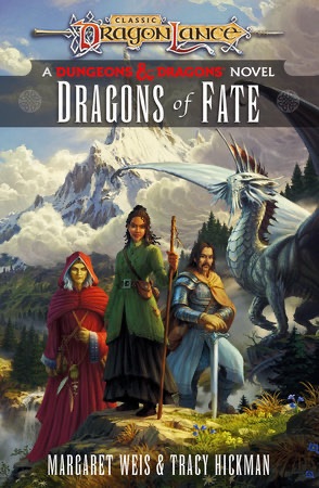
Batman: Caped Crusader

Batman: Caped Crusader (2024)

In the far off land of 2021 we received word that a new animated Batman series was in development and attached to it was none other than Bruce Timm. Timm was one of the main creative minds behind Batman: The Animated Series and the DC Animated Universe it spawned so this news was met quite enthusiastically. Then Warner stepped in and muddied things up. The series was originally pitched as an HBO Max/Cartoon Network joint affair, but corporate reshuffling nixed that idea. Still, Caped Crusader is actually here now in 2024 which some other projects can’t say the same. It was shopped around for much of 2022 eventually landing with Amazon. This past Friday, the entire first season was dropped all at once on the Prime service ensuring talk of it will likely be ancient history once this goes live, but we should talk about it, nonetheless.

Caped Crusader is said to have come about as a result of Timm not wanting to continue with the universe he helped create starting with Batman. That’s understandable since a lot of that cast has either retired or unfortunately passed on and trying to recreate the magic of that series seems like a fool’s game. Timm instead used the opportunity of a new animated Batman to do things he couldn’t do with the other shows. This was to be a younger Batman set in a distinctive noir setting, not some time-locked version of an otherwise contemporary Gotham. It would not be beholden to any past era of the character, but would also be free to draw from the classic comic run. It could be more mature with its action and plots since it wouldn’t be airing as part of a network television kid’s programming block.

One of the most dramatic redesigns is that of The Penguin, which I rather enjoyed.

Alongside Timm is a host of other executive producers: J.J. Abrams, Matt Reeves, Ed Brubaker, James Tucker, Daniel Pipski, Rachel Rusch Rich, and Sam Register. Brubaker was hired as the head writer and directors Christina Sotta, Matt Peters, and Christopher Berkeley split the 10 episode series (4, 3, 3 respectively). Abrams’ Bad Robot Productions would handle much of the animation with DC Studios and Warner Bros. Animation also credited. Amazon MGM Studios is also listed, though I don’t know if that’s more branding or if that studio did actual work on the show. Frederik Wiedmann was brought on as the composer for all ten episodes.

Wiedmann had some big shoes to fill taking over for Shirley Walker, but equally as large is the role of Batman himself. Kevin Conroy left one hell of a mark on the character, but he had essentially retired from the role when the show was announced and would sadly pass away before this show could be completed. Dawning the cape and cowl this time is Hamish Linklater. He is joined by Jason Watkins who serves as loyal butler Alfred Pennyworth. This is a story of a Batman just starting out. We can assume he has been at this whole crime fighting thing for a little while because he has the costume, the car, and the cave all in place. What he doesn’t have are connections just yet within Gotham’s police department and other legal institutions. Most of the citizens seem to regard him as a myth and over the course of this first season the Batman will become more established and will be known to people like Commissioner Gordon (Eric Morgan Stuart) and his daughter, Barbara Gordon (Krystal Joy Brown).

Two characters featured quite a bit in the first season are Barbara Gordon and Harvey Dent.

I will say upfront that I came away from the first season of Batman: Caped Crusader with mixed feelings on the show. The design is definitely one of the elements I took issue with the least. Batman resembles his original design of black and gray with those tall, wide-splayed, ears on the cowl. He does not have the purple gloves, which is probably a solid choice. Alfred has a younger, rounder, build while Jim Gordon seems noticeably younger than usual while Barbara is noticeably older. She’s a career woman who is a public defender in Gotham. I don’t know how that is supposed to work, her being a public defender for those whom her father essentially locked up, but I suppose it makes for good conflict in a TV show. I just know I wouldn’t want the police commissioner’s daughter representing me if I were to find myself in trouble with the law.

The desire for a noir atmosphere is captured in the setting quite well. Technology is of the 1940’s with old style vehicles, phones, and televisions. There isn’t much technology on display in the rogue’s gallery, possibly to keep the show firmly locked in its setting, though it does give way to more supernatural elements. Batman has always encountered such and the 90s show had villains like Clayface, the Man-Bat, and others, though I can’t recall him fighting an actual ghost at any point like he does here. There are still villains who are very much of the gangster type. The first we meet is The Penguin, who has been gender-swapped to a female crime boss voiced by Minnie Driver. The first screenshot I saw of this version of the character looked a bit silly, like it was just the classic Penguin in a wig and lipstick, but the character model is much better in the show. I actually liked this change and found that bird-influenced appearance suited a female quite well. Another villain, Clayface (Dan Donohue), was redesigned to more resemble a Dick Tracy villain while the eventual Two-Face (Diedrich Bader) appearance was surprisingly simple.

I was routinely disappointed in the lighting in the show.

I could take or leave certain character designs, but what I found myself most disappointed in consistently was the animation on display. Characters have very stiff, sometimes robotic, movements. Walking animations with a character in full frame are surprisingly ugly for a 2024 show. Did Warner really cut the budget on this once it was no longer going to appear on one of their platforms? The lighting also isn’t always up to task. The very first shot in the series is a classic police interrogation scene under a single light. It looks awful as there’s a real lack of shadows being cast by the light. It’s a huge downgrade as far as I’m concerned. There are a few shots where more effort was put into it, but also plenty where it doesn’t even feel like the episode is taking place at night. It was never going to come close to matching the efforts from the 90s, but compared to X-Men ’97 this one leaves a lot to be desired.

The voice cast is a mixture of recognizable names as well as talent that is new to me. Most of them are quite good in their role. The only one I was left disappointed by was, unfortunately, Linklater’s Batman. Like a great many to do it before him, Linklater plays Bruce Wayne and Batman differently. Bruce is more personable, more perky, while Batman is curt and speaks in a lower voice. There’s an art to voicing Batman and I think Linklater needs more time in the role to really get it. His Batman is stiff to the point of sounding robotic. It’s possible he was receiving direction to play a character still trying to figure out his tough guy persona. Linklater is a talented actor so I’m assuming he’ll grow into the role, but it’s a little disappointing since a perfectly good Batman, Diedrich Bader, is right here on the cast already.

I don’t mind some supernatural elements in my Batman stories, but this guy is a little too Scooby Doo for me.

The ten stories of the first season are mostly stand-alone, but with some connecting tissue between them. The final three episodes are more purposefully connected and I suppose it can be considered serialized, but you wouldn’t miss a whole lot by mixing up the first 7 episodes. One villain, Harley Quinn (Jamie Chung), is introduced as her therapist persona first before the villain shows up and that’s one of the few aspects of the early episodes that wouldn’t work out of order. Speaking of, Quinn appears here in an origin separate from The Joker which was a somewhat bold choice. She’s her own thing this time around and I thought the show did a solid job with her. The tone of these stories is also allowed to be more mature. We see lots of people get shot, though gratuitous violence isn’t present. Batman is also free to punch guys in the face and sometimes the show feels a little preoccupied in pointing this out. There’s alcohol and even some romance making the show feel like it’s something akin to a PG-13 rating.

Other episodes were just okay. Few felt like they had heavy stakes and I found it hard to establish an emotional connection to any of the villains of the day. The best Batman episodes found something interesting to say about their bad guys, but this show struggled there. There’s even a kid villain in one episode that I think the episode wants us to have a response to at the end, but it just didn’t do enough to earn it. It at least does a good job of getting us to hate its crooked cop characters, but I think it also mishandles the character of Harvey Dent. We all know what Dent’s fate is to be when he’s first introduced, but this is an unlikable Dent. He’s arrogant and far more consumed with making the jump from District Attorney to Mayor of Gotham than actually doing his job so when the thing we all know is coming does, there’s no emotion. Plus there’s no one close to him to be affected by his transformation that we can feel something for instead. The Bruce/Harvey friendship is shoehorned in too late to make much of an impact, but I will give the show credit for finding another angle to play that at least puts Batman and Alfred at odds with each other. That’s also probably the only real character development we get out of our lead. We spend a lot of time with Gotham’s finest, but not a whole lot of time with Bruce or Batman. The show needs to find a way to make its lead more interesting.

When the show really wants to look good, it can. It gives me hope that a second season will be stronger.

I went into Batman: Caped Crusader not expecting to find something on par with Batman: The Animated Series. That would be an unfair expectation. I did expect to find something good and the product I got was at least approaching that. Caped Crusader is not a bad television series, but is it exceptional? No, not really. It’s a pretty easily digestible 10 episode season that mostly just gets credit for existing. Most of its “bold” choices for the Batman universe are just doing gender and career swaps with its characters. A lot of the story beats felt too predictable, too ordinary. The best episodes of the season were the ones that felt like stories that hadn’t really been told before, but they were few. I don’t expect it to make much of a mark on pop culture and I don’t know if a second season is even a sure thing. The show definitely expects one and it does the predictable thing of teasing a major villain at the very end to try and drum up some excitement, but it all feels a bit played out. Amazon did order a second season back in 2023, but if the streaming numbers are bad then nothing is stopping them from going back on that and getting one of those highly coveted tax write-offs. If it does come back then I’ll probably watch it, and if it doesn’t I probably won’t even notice.

Here’s more Batman content if you’re in search of such:

Batman – The Adventures Continue #50: Batman

If you’re a repeat visitor here at The Nostalgia Spot, then you’ve probably noticed that around here there is a high opinion of the television show Batman – The Animated Series. I did a re-watch of the series that spanned more than two years and also checked out the various films based on the property.…

Keep reading

Batman: The Animated Series Wrap-Up

One-hundred and nine episodes plus three features leading to one-hundred and twelve blog entries have been devoted to the subject of Batman: The Animated Series. It started as a celebration of the show turning 25 and then as a curiosity piece. Since its premiere in 1992, the show had become much celebrated and praised all…

Keep reading


NECA Mirage TMNT – The First Turtles SDCC 2024 40th Anniversary Edition

Today belongs to the originals.

As the story goes, one night Kevin Eastman was drawing with his friend and partner-in-comics Peter Laird when the idea to doodle a ninja, anthropomorphized, turtle entered his brain. Laird was so amused by this drawing that he too drew his own take on it. What was done just to amuse each other eventually turned into something that would change both of their lives as well as the lives of many others.

Kevin Eastman was commissioned to do the packaging and it’s appropriately “special.”

In 1984, the first issue of Mirage Studios’ Teenage Mutant Ninja Turtles hit shelves and became an indie darling. That comic would go on to inspire a toyline, which beget a cartoon series, and a phenom was born. The Teenage Mutant Ninja Turtles, once thought of as a fad, are still relevant today now more than 40 years from their inauspicious beginnings. To celebrate the milestone, NECA partnered with co-creator Kevin Eastman to create an action figure two-pack of those inaugural turtles. Sculpted by Paul Harding with paint by Geoff Trapp and Mike Puzzo, the set was sold as a two-pack at San Diego Comic Con as well as a presale on NECA’s own website. The First Turtles are just the latest in what are sure to be more celebratory figures to come. It’s on the heels of Playmates’ own Original Sketch Turtles which can currently be found at Target and on Amazon. Those turtles were the more refined, second pass, versions of the characters which bare a strong resemblance to what would be featured in that first comic, where as these originals are quite crude by comparison.

The original Eastman pose, as best as I can recreate it here.

The set sold by NECA comes in a rather large box adorned with new artwork by Eastman. It also features a lenticular slipcover depicting the drawings changing from black and white to color. The rear of the slipcover is almost bare white as the idea here was for convention goers to be able to have Eastman sign or even doodle on the box for them. I suppose that is still possible for other convention appearances to come. The interior box is a fairly typical NECA window box that displays both figures and their accessories quite well. The only thing missing is the actual original drawings which I’m surprised by, but maybe there were legal reasons. This really is a pretty nice display item, but I’m no in-box collector so let’s rip into this one.

And the original Laird pose.

First of all, the figures here are presented fully painted in color that’s basically a match for what NECA did with the Jim Lawson turtles released in 2023. The original drawings were never colored by Eastman and Laird, but since Eastman worked closely with NECA on this release it can be assumed that this is how he and Peter likely would color them today. We also don’t really know how tall they envisioned these guys to be or if any consideration was really given. Eastman probably had input there, but I don’t know if Laird had any involvement (he’s essentially retired after having sold the property to Viacom over a decade ago). Based on interviews Trevor Zammit of NECA has given, it sounds like NECA had some freedom to figure out how to present these two. Eastman’s turtle, which was really more tortoise-like in some respects, was made bigger and chunkier while the more lithe version Laird came up with is shorter and thinner.

These pair pretty well with the Playmates Original Sketch Turtles, which were like the second version of the property.

We might as well discuss the Eastman turtle first since it was the one said to be created first. The figure stands roughly 5.75″ to the top of its head. He may not be the tallest figure in the line, but he’s definitely a big boy. This turtle is quite chunky and there’s a nice heft to the figure. The shell is quite large and another area where NECA had to exercise some creative freedom since the drawing depicted the character from the front. Now, these turtles are not intended to be any, one, turtle from what followed. This isn’t Michelangelo or Raphael, it’s just a ninja turtle. Still, he has some recognizable traits from the turtles that followed. He’s sporting the red bandana along with brown elbow and knee pads and wrist wraps. There is no belt, but there is a tail. The original turtle also did not hold any weapons, but did have nunchaku affixed to both forearms which this figure does as well. The weapons are fused together, but do have real chain links affixed to them. They tab into a slot on the inner wrist band and are quite easy to work with.

A little too Raph.

What really stands out about the first turtle is the portrait and proportions. The head is more egg-shaped with barely any sort of beak. The eyes also feature pupils and areas of green around the eyes are visible through the eyeholes on the bandana. The hands and feet are large and more closely match that of an actual turtle. The hands look more like flippers for swimming through the water while the feet are quite tortoise-like. He has five digits on each limb as opposed to the three and two that would follow. The paint job is truly exquisite as there is tons of black hatch lines all over. The articulation cuts are not very prominent making this figure look almost like a statue. While subjectively many may find this turtle to be crude and even a bit ugly, objectively the figure is nothing short of a work of art when compared with the original sketch.

A lot of Michelangelo can be found in these original designs.

The same is true of the Laird turtle. This one clocks in at around 5.375″ and is far less substantial in mass when compared to the Eastman turtle. Laird’s turtle is similar to Eastman’s in style, but different. There’s a mask in place, but on this turtle it extends over a pronounced beak essentially wrapping around where the nose would be. It does feature the nunchaku on the forearms, but there are no chain links present this time and the straps holding them on are the only other garments on the turtle. There are no pads or belts, and the hands and feet feature four digits instead of five. He still is more turtle-like than the finished design, but the leaner proportions make him a bit more convincing as a ninja, even if still comically implausible. The paint job here is just as good as it is on the Eastman turtle, and despite the smaller size, this figure still has substantial weight to it.

The Lawson turtles were like the advancement of the original Mirage style.

Where the two figures also differ concerns the articulation. The more slender Laird turtle was likely easier to work with and articulates slightly better than the Eastman variety, though neither turtle is intended to be placed in poses many would consider “dynamic.” Both feature neck and head articulation with basic arm articulation. There are no double joints on either figure and the range at the hinge joints is probably going to be less than 90 degrees for most. The bandana knot and tail swivel while the hips are ball sockets with thigh swivels engineered into them. Neither turtle is going to be able to hit a split or kick forward all that far. The Laird turtle gets to have hinges at the knees and ankles with an ankle rocker. The Eastman turtle, who has big stumps for legs, just has one set of hinges below the kneepads. There is basically no ankle to be found on this guy so that’s it.

And, of course, it was the ’87 version of the property that launched a phenomenon.

Safe to say, if it’s articulation that you prioritize in your action figures then these are not for you. I think for most, they’ll pose them like the original drawing and call it a day. And that’s definitely a viable display option, but it would mean ignoring all of the goodies in the box. NECA decided to load this pair up with all of the weapons you would expect and more. That means we get a set of katana, nunchaku, sai, and a bo staff. There’s also a nunchaku with a whirling effect that even spins and looks really nice. There’s a tonfa as well if you prefer more of a Last Ronin vibe. All of the weapons are fully painted and look great. There’s a slight crudeness baked into some of them as well such as a chip in the blades of the katana and the wraps of the bo being off-center. They also appear to be based off of the original sketch of the four that followed which, if so, is a logical choice.

The tonfa has to nod to this guy, right?

In order to properly wield such weapons each turtle comes with an alternate set of gripping hands. The standard hands are an open style and the gripping are just that. They feature horizontal hinges, unfortunately, but at least they work with the clip-on nunchaku just fine. Both turtle can adequately wield any of the included, though aside from those clip-on ‘chuks there’s no weapon storage to be found. NECA also decided to give each figure one optional portrait. The default ones from the drawings are what I would deem stoic, while the alternate ones are angrier and feature exposed teeth, something we would be most accustomed to seeing out of the TMNT. It’s an appropriate alternate, for sure.

A fun set that feels like a real piece of TMNT history. Track it down if that’s something that appeals to you.

NECA’s send-up to the origin of the Teenage Mutant Ninja Turtles is a worthy inclusion in the year-long 40th anniversary celebration. It’s cool to see both of the co-creator’s original vision celebrated here in action figure form. While they don’t exactly put the “action” in action figure, they make for a great display piece and it’s something that I think diehard TMNT collectors will want to add. Since this was a San Diego Comic Con exclusive, it’s now unfortunately sold out and only available on the after market. NECA sometimes sells remaining stock online and at future conventions, but the likely easiest path to owning this set for those that missed out is to keep an eye on retail. It’s expected that some stores are going to be home to an another version of this set where the figures will be painted in black and white, but with red bandanas and weapon handles. It looks like it’s going to contain everything from this set as well, though the slipcover will probably be dropped. The SDCC version was priced at $70 so expect something similar for the retail version. Listings for it have already been spotted at Walmart, but NECA’s own solicitation did not mention any store by name so I don’t think this will be exclusive to Walmart. Needless to say, I really dig this set for what it is and I think every TMNT collector should try to pick up the version they like best.

More from the world of Teenage Mutant Ninja Turtles:

Playmates TMNT Original Sketch Turtles

Last week we took a Turtle Tuesday off which feels like a rarity for this blog. And that’s because there seems to be new stuff featuring the Teenage Mutant Ninja Turtles branding coming out all of the time. And it’s only going to become more plentiful as the franchise celebrates its 40th anniversary this year.…

Keep reading

NECA Mirage Studios Teenage Mutant Ninja Turtles 4-Pack

When it comes to the popularity of Teenage Mutant Ninja Turtles a lot of the credit goes to Playmates Toys. Kevin Eastman and Peter Laird created the characters born out of a joke. Credit them for having the vision to think this joke had appeal beyond their small circle as they self-published Teenage Mutant Ninja…

Keep reading

Super7 TMNT Ultimates! Classic Rocker Leonardo

When I was a kid, I had parents with divergent musical tastes. Dad likes oldies from the 50s and 60s while mom was more into modern rock (then 80s). One area where their tastes overlapped was Bruce Springsteen. We had several of his records in my house and I distinctly remember that cover to Born…

Keep reading

MOTU Turtles of Grayskull Krang

Krang decided his body should be all naked and muscley too.

Two words that are much hated in the toy collecting community are “Store Exclusive.” Add a “Walmart” in front of that phrase and you get something akin to a worst nightmare. The world of “collectibles” has always relied on same degree of scarcity. The 90s saw a collector boom across various mediums which created a mindset in producers that scarcity was good. Scarcity is what the public wanted. Scarcity was fun! In reality, most collectors aren’t buying because they want to make an investment. Sure, some do, but most collect for the enjoyment of it. The idea of an exclusive is just a barrier of entry and it’s frustrating for those who just want to buy some toys.

If you want him to have normal proportions you will want to forego the Krang Kave.

With the rise of online sales and the decline of brick and mortar, stores are more desperate than ever to drive foot traffic. In the eyes of retailers, exclusives will bring in people that might not otherwise set foot in the store and the big toy producers like getting the big retailers to pay for exclusive merch. With Mattel and its Turtles of Grayskull subline of Masters of the Universe Origins, the company was able to strike a deal with both Target and Walmart. At Target, the deluxe figures that include a build-a-figure part have remained exclusive to that retailer. I have so far reviewed those two releases and I plan to review them all. I’ve been able to find them in-store with no issues, and failing that, online has worked fine. With Walmart, Mattel has released a different set of deluxe figures that seem to be a little more involved than what’s at Target, but doesn’t have a build-a-figure. And even calling them “more involved” might be a stretch so I don’t know where the extra money is going, but they’re $25 as well. Only with Walmart, tracking them down has been a problem, at least for me in the north east. Not only have I not seen a single store exclusive at various Walmart stores spread across Massachusetts, New Hampshire, and Maine, I haven’t seen a single Masters of the Universe figure at all! It’s like they don’t even carry the brand any longer.

He’s so widdle and cute!

What’s a guy to do when he can’t find something at retail? Regrettably, I turned to a third party seller. It’s great that Walmart can’t sell its own product on its website to people that want it, so they let others use their website to sell their wares at inflated prices – awesome! In this case, I purchased today’s figure from someone charging $41. Whoever this person is presumably paid $25 for this thing and then had to cover shipping and whatever fees Walmart charges those who sell through their website to sell me this thing. What did they actually make on it? Ten bucks? Eight bucks? I guess from Walmart’s perspective it’s a win-win. They sold this person a toy, then got to take a piece of the resale as well – it’s like selling it twice! If you ever wondered why Walmart essentially condones the practice of scalping on their own website, well now you know.

“Mondo bizarro!”

Unfortunately, I felt like I had to have this figure of Krang so hopefully it’s worth the extra fifteen bucks or so. Krang has always been an absurd character design. As Vernon put it, it’s a guy with his brain in his stomach. If you’re a toy designer at Mattel and you just received word that the company acquired the Teenage Mutant Ninja Turtles license to mash-up with Masters of the Universe then Krang had to be at the top of the list of characters that would be the most fun to design. And for Krang, they settled on a mash-up with Megator, a big, green, ogre of sorts. He’s packaged in a window box with new artwork all over that looks great. And this Krang certainly takes up a lot of real estate in that box.

The “deluxe” villains.

Krang, like Sla’ker, utilized the oversized Origins body to add some considerable size. To the top of his head, he’s around 6.875″ and to the top of the tuft of hair he’s 7.5″. That’s not where it ends though, because Krang needs to occupy the center of this body as God intended. Since this toyline is modular by nature, the way to accomplish this is simply to create a little Krang prison that fits in between the waist and abdomen. Once that is in place he balloons to about 7.75″ to the top of the head and 8.25″ to the top of the hair. He’s a big boy and he looks pretty good. The figure is primarily green with light red, almost pinkish, accents. The head is shaped like the classic, Playmates, android body only the antenna has been replaced by a topknot of hair and he has a helmet and protruding sharp teeth. The helmet is red with spikes on the side and a metallic plate on the front which covers the eyes and nose. The red slits of the eyes look like they’re set too high on the sculpt. The artwork on the box has them angled so it works better, but the figure didn’t carry that over.

“Use this stuff if you want to be a true master of the universe!”

For the body, Krang is wearing this breastplate with a skull on it held to the body by two, bronze, chains. These go over the shoulders and match the color of the cavity for Krang. Below that he has a black loincloth and belt, but the only part painted is some more bronze chains. Krang himself, the little brain with a face, is quite tiny. He’s almost cute. It’s a soft rubbery plastic with painted eyes and teeth and the portrait here is very close to the 1987 TV series interpretation of the character. He locks into place in the body and there’s a little grate that closes over him. The tentacles are designed to stick out and I think it’s quite entertaining to look at. If you’re particularly concerned with scale then it might annoy you that Krang is way smaller here than he’s been in the past. They could have made him bigger, but that would have required a larger compartment. One drawback to this design is that Krang’s body has very short arms since they’re designed to scale with the body without the middle insert. If it were any larger it would look really goofy.

It’s a Krang comparison. I forgot how big the NECA one is.
Real chains are pretty cool, but they need some help to pose well.

Krang does come with a pair of accessories to add some value here. Both come in the form of weapon add-ons. Krang can remove his hands and swap them with either an axe or a ball and chain. The axe can function has a handheld weapon too and it’s cast in a grayish plastic with some decent sculpt work. The ball and chain is done in the same bronze plastic as the chains on the body of the figure with a gray, spiked, ball at the end. Like Michelangelo’s nunchaku, the chains are all plastic, but are actual links. It’s pretty damn long and looks cool, though I’m always a little remiss that accessories like this don’t have a fixed chain for posing, but this line gets away with it by being an homage line to actual toys that are meant to be played with. It’s an odd space where it’s a collector line done as-if it were a line made for children. The articulation is also exactly the same as Sla’ker, right down to the poor ankle rocker. The peg hole in the foot isn’t done at enough of an angle for the ankle rocker to be useful.

“It would appear that we are evenly matched.”

Is Krang worthy of your $25? If you can find him at that price, then definitely. Is it worth north of $40? No, probably not, but that’s what a potential hole in the collection will do to a collector. That’s not the figure’s fault though, it’s on Walmart. For the line, this is one of the best figures so far. Maybe even the best. I like the design quite a bit, it’s fun to behold, and it works as a combination of two famous properties. If you’re into this line and come upon this figure in your travels then I highly recommend you pick it up.

It takes a lot of turtles to topple a Krang.

Check out more from Masters of The Universe – Turtles of Grayskull:

MOTU – Turtles of Grayskull Deluxe Sla’ker

It’s a Tuesday, and I have a new Turtles product to talk about, so let’s make it another Turtle Tuesday! And today brings us the second in the line of deluxe Masters of the Universe Origins – Turtles of Grayskull line exclusive to Target – Sla’ker: The evil cybernetic snapping turtle! This is Slash, the…

Keep reading

MOTU – Turtles of Grayskull Deluxe Mouse-Jaw

Nothing can be simple in this day and age of retail toy sales which is why the new mash-up of Masters of the Universe and Teenage Mutant Ninja Turtles toyline features ostensibly 3 SKUs: standard, deluxe, and deluxe with build-a-figure parts. The standard releases are, as you may have expected, released abroad and you can…

Keep reading

MOTU – Turtles of Grayskull Skeletor

When it’s come to the Turtles of Grayskull line by Mattel, I have mostly stayed in the Teenage Mutant Ninja Turtles side of the pool. I have all four turtle boys plus Sla’ker, who is more Slash than Faker if you ask me. The one exception has been Mouse-Jaw, but the classic Masters of the…

Keep reading

Marvel Legends Retro Card Scarlet Spider

Look whose come (wall) crawling back.

It was in this space last year that I shared my fondness for the Scarlet Spider costume when I reviewed the Medicom MAFEX Scarlet Spider action figure. I don’t buy much from Medicom because their figures are really expensive for what they are, but I sometimes break my own rule when I think they’ve made something I might not get elsewhere. Silly me, because Scarlet Spider would be featured in the Across the Spider-Verse movie that summer which meant, of course, that the character was on Hasbro’s radar. And it made further sense we’d see him once again in the Marvel Legends line since Hasbro seems to be updating all of their Spider-Men with pin-less limbs and toe hinges. When this particular Scarlet Spider went up for preorder, I put in an order because, what the hell? – I can use another one. Now that I have it, what do I think and how does it compare to its much more expensive counterpart?

If only they could literally fight it out.

Since I do have that MAFEX edition, I figured we could do this review a little differently. It’s going to be more like a comparison because that sounds fun to me. Besides, this Scarlet Spider from Hasbro is pretty much par for the course when it comes to a Marvel Legends Spider-Man. And from just a quick glance, it doesn’t look like a piece of crap next to the figure that’s roughly 4x more expensive. I mean, we are comparing a $100+ action figure to a $25 one in the same scale so, really, the more expensive one should be the better figure without question. Rather, we’re asking the question of does the gap in price correlate 1:1 with a gap in quality between the two? And do the more subjective elements of the figures play much of a role as well?

This Scarlet Spider is new, but not.

Before we can dive into it, we should at least do a quick rundown on this new version of Scarlet Spider from Hasbro. It’s on the newer Spider-Man body which most refer to as the Renew Your Vows body since that’s the two-pack it first debuted in. It’s not that different from the previous retro card body as demonstrated by my symbiote Spider-Man in the image above (left). The articulation is essentially the same, but the figure has new arms which are pin-less and the knees have been made pin-less as well. And it has the added toe hinge. It’s the same body as the animated symbiote Spider-Man (above, right) which I reviewed awhile back, only this one has the overlay for the sweatshirt. It’s fine, though not without flaws. This Spider-Man still sucks at doing splits and Hasbro is so bad at implementing double-ball pegs in the neck that they had to hollow out a cavity on the back of the neck to give the figure more range. It gives the head a floaty quality, at times, and for some reason the head is rather hollow. From most angles, it will be fine, but there are others where it looks downright goofy. And Scarlet Spider is a character that can get into some odd positions so it may be more of a problem here than it would be on another character.

I really hate this dumb neck cut-out.

All that aside, I like the look of this one. The red is rather saturated and pretty close to an actual scarlet. The hoodie has a nice look to it as it’s a dark blue with the big spider logo. The hood isn’t functional, but are you really going to display him with it on even if it were? I like the texture to the hoodie and and Hasbro at least painted the drawstrings white. The rest of the figure is mostly bare plastic. The eyes are painted on, but not all that well. There’s some paint on the ankle pouches and belt and it’s fine, nothing worthy of praise, but also not worthy of scorn. The web shooters are floating pieces and can come off if you so desire while the ankle pouches appear to be glued into place. I very much enjoy that he has the classic hoodie, but I wish the eye shape was more in-line with the character’s earliest appearances.

It’s a thwip-off!

The figure looks fine and I think the hoodie helps hide the small shoulders that plague a lot of Marvel Legends. It also helps to make the head look more appropriately sized. And it’s in the visual component where this figure will compare as well as it can to the MAFEX version. If we bring in that figure, it’s easy to see that the Legends figure is a bit bulkier. The hoodie is darker and has the bigger logo and the belt is more of a first appearance Scarlet Spider than the one Medicom went with. Both figures don’t “wow” in the paint department. While Medicom did apply some red shading to their figure, it’s barely noticeable. Their Scarlet Spider is also a brighter red and the soft goods hoodie is a lighter blue that even has a bit of a pearl finish. The smaller logo is not my preferred look as well, though Medicom did include my preferred eyes. The other heads included with that figure feature a more generic Spider-Man eye shape with one looking a little angry. They’re kind of worthless.

Thinking about how cool of a figure we’d have if I could combine the elements of both figures into one.

Am I giving Hasbro the nod in the looks department? Yes and no. I much prefer the art direction of the Hasbro figure. The bigger body, classic shirt and belt, but it does still have that not-so-great head. And I’m not just talking about the style of the portrait, but the lollipop effect it has going on. And while it has less articulation, the cuts present are more of an eyesore. The thigh twist looks awful if you use it and the same can be said of the waist twist and boot cuts. Meanwhile, the Medicom figure does a good job of hiding the joints even if there are a bunch of them. I guess that level of engineering is what we’re paying for?

MAFEX Scarlet Spider likes to show off all of his stuff.

That and the accessories! This aspect isn’t even a contest, because the Legends release blows. The only items included in the box are a set of fists, wall-crawling hands, and thwip hands. That’s it. No unmasked head, no webbing, no nothing. The Medicom release also lacks an unmasked portrait, but that’s pretty much the only thing it’s missing. You get all of the hands you could want: fists, thwip, grip, open, and even magnetic hands and feet to adhere the figure to a metal surface. There’s also a ton of web lines to mess around with and a stand. In fact, I’d say a hidden piece of value to these Medicom Spider-Man figures is that buying one can outfit about a half dozen so your Legends figures can partake in the webs. The only hindrance there is Hasbro almost never includes gripping hands with their Spider-Man action figures so you’re limited to the thwip effects or the ones that fit over a forearm.

My attempt at the card art pose with both figures. Hasbro left, Medicom right.

Articulation is an area where the Medicom figure should be better, but also one where the Hasbro release should at least be able to compete. And for the most part, it’s true. Basically, anything the Legends figure can do the Medicom figure can as well and probably better. The joints are just smoother, possess more range, and are just all around engineered better. However, there’s not much the Medicom can do that the Hasbro one can’t as well. About the only thing I feel like the Medicom figure clearly does better is crouch and get into a low crawl. Both figures feature some annoying drop-down hips that really don’t enhance the range of the legs all that much. Both can’t do forward splits either, though the MAFEX can do the splits out to the side where as the Legends figure needs to rotate its legs forward a bit on the ball joint. The butterfly on the MAFEX figure also works better and it’s aided by the soft goods hoodie. I will say, I was surprised at how little the plastic hoodie of the Legends figure got in the way. You can still engage the diaphragm joint pretty easily and there’s enough room to take advantage of the butterfly joint. It’s just a butterfly joint that doesn’t offer a whole lot to begin with.

And this just seemed like a fun swinging pose. With effort, the Legends figure can do some cool things, but it’s definitely way easier with the MAFEX release.

All right, so I think it’s pretty clear that the MAFEX Scarlet Spider does a lot more than the Legends one. We knew that though. What is less clear is if it’s superior by 75 bucks or so. And I think the answer there is “probably not.” Sort of like comparing a conventional sedan to a luxury model, yeah you’ll like the luxury model more, but you might prefer to keep the money it costs to upgrade over the standard model and spend it elsewhere. That’s just on a much bigger scale, but even here 75 bucks is nothing to sneeze at. That’s about what it costs to take my family of four out to eat at a decent restaurant, maybe before tip. It also can get someone three more Legends figures or maybe some third party web effects, stands, and some more stuff. I got the Medicom one first and I’m happy with it. I like the Legends release too, and I might even prefer the aesthetics of it over the Medicom one, but not enough to toss the MAFEX one on eBay or something. If I had neither and was thinking of getting just one, I’d probably be okay with the cheaper Marvel Legends release. There would be some temptation to go with the Cadillac, but pragmatism would probably win out.

If you only have the Legends figure, you’ll probably be all right. Though you may want to hunt down some webs.

That’s just me though. You may place more of a premium on articulation and “stuff” to the point where it’s much easier to just get the Medicom figure and be all set. I definitely didn’t need to get the Legends Scarlet Spider, but I justified it to myself because I’ll probably never buy another Scarlet Spider. Unless a really bad ass cel-shaded one surfaces from either company. Then we’ll be talking about this 90s relic for a third time.

“Why can’t we be friends…?”

We have more spider men to talk about if that’s your thing:

Medicom MAFEX Marvel No. 186 Scarlet Spider

When I was a kid, one of my favorite past times was drawing. Like most, I started really young with a box of crayons and coloring books. I’d eventually start keeping markers, colored pencils, and other instruments in a plastic McDonald’s case that came from a Happy Meal. It was blue and had a map…

Keep reading

Marvel Legends Spider-Man ’94 Spider-Man vs Carnage

Last year, Hasbro celebrated the 30th anniversary of X-Men, the animated series that premiered on Halloween 1992 and would become a ratings hit shortly thereafter for the Fox Kids Network. It was responsible for getting a lot of kids into the X-Men and Marvel comics in general and the first, prime, benefactor of that rise…

Keep reading

Marvel Legends Spider-Man (Animated)

It was in 2021 that Hasbro released a PulseCon exclusive Venom figure on a Spider-Man retro card. The retro card series is meant to stir-up nostalgia for all of the adults who were buying toys and watching cartoons in the 90s as the retro card is a facsimile of the old cards Toy Biz used…

Keep reading

Super7 TMNT Ultimates! Classic Rocker Leonardo

It’s a one-turtle show today.

When I was a kid, I had parents with divergent musical tastes. Dad likes oldies from the 50s and 60s while mom was more into modern rock (then 80s). One area where their tastes overlapped was Bruce Springsteen. We had several of his records in my house and I distinctly remember that cover to Born in the USA with the butt of The Boss on proud display clad in denim with a handkerchief sticking out of the pocket. And as a kid, I tended to like whatever my parents liked though I definitely preferred my mother’s taste more so than my father’s and I liked that record. Years later, when I first laid eyes on the Classic Rocker Leonardo action figure from Playmates Toys with its black vest, handkerchief clad head, and denim pants that cover of Born in the USA immediately came to mind.

My vintage figure needs a good cleaning.

Classic Rocker Leonardo was part of the Rock ‘N Rollin’ Turtles subline of figures released by Playmates in 1991. Whenever these variants came about I pretty much always got the Leonardo and seldom the rest because I couldn’t afford to be a completist. Leonardo was the most appealing from the set because he was my favorite turtle, but also because he most fit my image of a rock star. Torn jeans, black vest, and a guitar. It ended up being one of my favorites and it’s one of the few figures that managed to survive all these years and that I still possess. He did lose all of his accessories except the one that matters: his guitar.

I miss the pattern on the bandana and the rhinestone messaging.

Because of my fondness for this iteration of Leonardo, Classic Rocker Leo has been on my want list from Super7 pretty much right from the get-go. When Wave 7 was solicited with Punker Donatello in it I was tickled because it meant Leonardo was on the table. At the same time, I was confused and a little irritated since we all were expecting Undercover Donatello to complete that set. Wave 8 followed with Space Cadet Raph and then Wave 9 was revealed to contain Slam Dunkin’ Don – what?! Was Classic Rocker Leonardo no longer on the table? What was Super7 doing going from the disguise series, to the music one, and then to the sports themed wave?

What’s better than one guitar?

Turns out, my fears were unfounded and I didn’t have to wait much longer to see Classic Rocker Leo revealed as part of Wave10. Yes, ladies and gentlemen, we have arrived at the tenth wave (ignoring the fact that Wave 7 still hasn’t shipped) of Super7’s line of Teenage Mutant Ninja Turtles Ultimates! It’s pretty crazy and I’m guessing this line has exceeded Super7’s expectations to go this deep. It’s also arrived at a bit of a crossroads as Playmates has made it a lot harder for Super7 to simply reproduce their work. These Rock N’ Rollin’ Turtles apparently skated by because there’s promotional artwork from the 90s depicting them so these designs weren’t solely confined to the toys. Or maybe Playmates has no intention of re-releasing them so they didn’t make a fuss. I don’t know, I’m just glad it’s here as it’s the only figure in the tenth wave that is based on a vintage figure. The others – Ninja Newscaster April, Casey Jones (Mirage colors), and Karai are new to the line. April did have a similar figure in the old line, but the design of this one is almost completely different. This was also the wave that was supposed to include Rat King, but the design Super7 came up with was so different from the Playmates figure that the collectors basically revolted. It was pulled, replaced with Karai, and moved to the eleventh wave where it will have a more vintage toy-inspired design.

“Boooorn in the sewers, yeah!”

Whatever the politics are behind the scenes, I’m just happy that Leo is here. Classic Rocker Leonardo arrives in the standard Super7 box only now sans a slipcover. He stands around 5.5″ and is basically in-line with the other Leonardo figures from Super7. His design is almost an exact recreation of the Playmates figure and it’s definitely a lot easier to cite the differences than what’s the same. And those differences are limited to the red bandana on top of his head which no longer has any sort of pattern on it. I’m not sure why and I do miss it, but it isn’t something that truly bothers me. The “Turtle Rocks” on the t-shirt is in a different font and the colors have been inverted. The straps on his boots are no longer painted all silver but are black straps with silver studs and the message on the back of the vest has been altered. On the original, it read “Rock N’ Roll” and it was done in silver rhinestones. Now, it says “Rock N’ Out” in a blue font. I don’t mind the change in messaging, but I do kind of miss the tackiness of the rhinestones. His belt buckle has been changed from a peace sign to a shuriken and the harmonica in his vest pocket is now all silver rather brown and silver. It’s kind of odd that this detail seems more simply painted than the original, but it’s fine.

He still has his fretboard swords. Not sure how effective they would be as weapons, but okay.

The differences are few and largely inconsequential and are likely done just to give this figure a slightly different flair than the old, even if there’s no mistaking what’s going on here. And from a sculpt and paint perspective, it’s a pretty nice figure. There’s an ample amount of paint to bring the figure to life and it’s nice to see the rip on his left thigh finally painted when compared with the vintage release. The torso feels like it’s mostly a rubbery overlay, but it’s still painted like it’s hard plastic. The vest is part of the sculpt so you can’t take it off or even look under it at all. The green flesh has a nice matte look though I don’t think it’s painted. If you get in real close you’ll fine some uneven lines in the paint here and there, but it’s nothing that will show at a normal distance. The only paint issue I have is there is a small dot of blue at the top of the right eye. Since it’s blue on white, it stands out more than I like. Overall though I’m happy with the sculpt and paint and this is a nice update over the original.

“You mean they gave you real blades?!”

Where this figure differentiates itself from the vintage the most is with the accessories. The original figure came with a guitar, two guitar fret swords, and some plastic records. This new version has a lot of the same, but different. For hands, we get a set of fists and gripping hands. The gripping hands have vertical hinges for sword and “axe” wielding while the fists have the standard horizontal ones. He also has a right hand that’s pinching a blue guitar pick, a left hand where the fingers are positioned in such a way that it looks like he’s squeezing a fret board, and a pointing gesture left hand for when he needs to point out bootleggers in the crowd.

Feel the music, Leo.

Those guitar playing hands are here to handle Leonardo’s new, double, guitar. It still has a turtle shell pattern, but with silver pickups and white plating which makes it resemble a Fender Stratocaster. There’s a soft, rubbery, strap for it that’s done in blue with silver clasps. It slots onto it just as it would a real guitar and works pretty well. The two fret boards are actually removable and feature blue, katana-like, handles so this version of Classic Rocker Leo still has his unusual swords. The connection is fairly loose, but the frets won’t fall out or anything. I think it’s done this way so as not to disturb the paintjob, which is excellent. The detail work and paint on this accessory looks great. This is one of my all-time favorite accessories I think I’ve ever received with an action figure because it looks so convincing as just a miniature version of a real thing. Some may be disappointed in the change from a more traditional guitar to a double one, but the absurdity of the double guitar (in both real life and toy) works for this line and it’s an easy way to take the old figure and turn it up to 11.

Can’t forget about the pizza!

Also included with Leonardo is a microphone stand. It’s black and gray with a hinge for the mic and blue wrappings on the stand. It doesn’t telescope and the mic is non-removable, but I suppose a guitar player doesn’t need to hold his mic. It’s at the right height and it’s a nice touch if you want your Leo to be the lead singer of his group or prepared to sing backup. There’s also the requisite slice of pizza which appears to include clams this time and Leo gets a pair of round shades. They don’t fit all that well, but they’re slightly transparent and done well enough. They may make more sense to use with Leonardo’s alternate portrait, which is just a regular Leo head, but with his eyes closed like he’s really feeling a guitar solo. It’s a good idea for a second portrait, and if you don’t want him to have closed eyes then the sunglasses hide that detail well enough. Swapping hands with this figure is also pretty easy, but getting the default head off required some heat.

If you don’t want his eyes closed you could always hide them behind the shades.

All of that fun stuff would be no good if Leonardo couldn’t even be posed with his instrument properly, but fear not, this figure should deliver well enough on the articulation front. He’s pretty typical of the line with a double-ball joint at the head, hinged shoulder pegs, biceps swivels, single-jointed elbows, and wrist hinge and swivels. I do like that Super7 hid the biceps swivel behind the rolled up part of the t-shirt so it looks good. The head joint is the same as the other turtles, which is lacking. It’s seated way too deep in the head and since there’s no joint at the base of the neck the range is pretty limited. Nothing in the torso, and the hips are the old hinged peg setup, but this time at least they’re not loose. A thigh twist follows with single-jointed knees that also swivel, hinged ankles, and an ankle rocker. Range at the knee is less than 90 degrees which is, again, typical of a Super7 turtle. The ankles are the best part and at least the elbows can hit a 90 degree bend.

He can play and that’s probably good enough for most.

Leonardo is limited, though obviously more articulated than his vintage counterpart. The range in the arms is enough that he can mime playing his guitar. He can’t really get his pick all the way down to the bottom pickups, but you could still pose him with his right arm raised or something. He can stand on one leg to imitate Angus Young and he can do jump kicks or stomp around like the guys from Iron Maiden. He can’t really be posed on his knees unfortunately and it’s too bad they didn’t take advantage of all the clothing to sneak some articulation into the torso. With a soft enough overlay they could have snuck in an ab crunch or at least a twist. Even without that stuff, the figure should be up to the task of posing, your imagination will just be limited some by it.

Looks like we’ve got a new band leader!

Classic Rocker Leonardo is not the best figure Super7 has made, but it might be my favorite. I am obviously biased because I adored the original so I was going to like this so long as it wasn’t butchered (like Sewer Samurai Leo). The figure looks great, the accessories are a ton of fun, and the new additions to the package are worthy additions indeed. This is basically what I want Super7’s line for this brand to be and I’m glad we know that at least two of the remaining three turtles from this subline are on the way. The only one unconfirmed right now is Heavy Metal Raph, but if he’s not part of Wave 13 (Rappin’ Mike is in Wave 11 while Wave 12 is dedicated to the 2003 Turtles) I’ll personally be surprised (and irritated). The four don’t exactly combine to make a cohesive band, but it’s okay and maybe Super7 will do an original design of Casey the drummer or something. Classic Rocker Leonardo should be available now or very soon from your favorite retailer where he’ll set you back $55. It’s a steep price, it always is with Super7, but at least for me it’s definitely worth it.

“Can I play too? I brought a kazoo!”

Interested in more of Super7’s TMNT offerings?

Super7 TMNT Ultimates! Wingnut & Screwloose

Late in 2023, Super7 started shipping the ninth wave of its line of Teenage Mutant Ninja Turtles Ultimates! action figures. I bought none. It was a wave with no compelling characters for me as it contained Slam Dunkin’ Donatello, Scumbug, Wingnut & Screwloose, Zak the Neutrino, and a flocked Master Splinter variant. Scumbug had been…

Keep reading

Super7 TMNT Ultimates! Mutagen Ooze Leonardo (now with the rest!)

If you’re into collecting action figures then you’re likely familiar with the concept of a variant. Tooling action figures, the process of cutting steel into molds in which plastic is inserted to create the figure, is the most expensive part of creating an action figure. That’s why it’s in the manufacturer’s best interest to get…

Keep reading

Super7 TMNT Ultimates! Sewer Samurai Leonardo

Well, after looking at the Wave 6 Slash a couple of weeks ago we can now finally turn our attention to a Wave 5 release from Super7’s line of Teenage Mutant Ninja Turtles Ultimates! series of figures: Sewer Samurai Leonardo. The thing with TMNT is, you have the four good guys, a few core allies,…

Keep reading

Marvel Legends Iron Man Retro Card Series War Machine

War were declared.

Recently, we took a look at the Marvel Legends retro-carded Iron Man. In that review, I mentioned I was always more of a War Machine guy than an Iron Man one. As a kid, The Avengers and associated characters appeared outdated and were largely off my radar. Then War Machine was introduced and suddenly Iron Man seemed cool again. War Machine was the only figure from the 90s Iron Man toy line I would acquire. The snap-on armor of that line better suited War Machine, who was just Iron Man with a bunch of stuff affixed to him. And that stuff was mostly guns, very large guns.

Iron Man is undoubtedly the more famous of the two, but War Machine was always cooler.

War Machine feels like a post-Reagan era antihero. The name is almost grotesque for a superhero – war machine? He makes war? Does he seek it out? It’s quite silly, not that I paid it any mind as a kid because an armored guy with a bunch of guns is cool. And if you have spent any time looking at this blog then you know I’m still very much affected by things I thought were cool when I was a kid. As a result, when Hasbro released its retro-carded War Machine figure a little while back it got my attention. Not enough to get me to buy it right away (and I first encountered the figure at a comic store that wanted more than MSRP), but it was on my radar enough that I kept an eye on it. I was hoping to get it for a discount some day, but after getting Iron Man I felt like I needed this War Machine and had to settle for a discount of only a couple bucks.

Dude has guns everywhere.

War Machine comes on the same retro card as Iron Man, only the art has been swapped to change Iron Man to War Machine. This is consistent with how the Toy Biz line sold the character back in the day so I do like that Hasbro kept that tradition going, even if this is going in the trash eventually. Unlike Iron Man, this War Machine is much more closely aligned to his animated, season one, appearance of the Iron Man cartoon. He’s mostly a mix of white and black plastic with few painted details. The face is painted as are the lenses found on his head and mini gun as well as the center of the chest armor. The armor of the body is a bit more detailed than it was in the cartoon. To make it closer to 100% accurate, the panels that come across his traps should come to a point and the boots should end at the bottom of the knee pad. It’s pretty minor stuff, but the most “off” aspect are the eyes and mouth which should be red rather than black. Personally, I’m not bothered by that as I think the black looks better, but if you wanted a true representation of the character from Iron Man then it is inaccurate..

The effect parts that come with the retro card Apocalypse will fit this gun on the right forearm.

Ignoring the inaccuracy, I do like the look of this figure. It’s what drew me to it in the first place. The white and black complement each other so well and the mixture of finishes works really nice. The black parts have a satin, or matte, appearance while the white is glossy with a slight pearl quality to it. A matte finish would have probably looked nice too for the white (which is true of the face), but I like the juxtaposition. The paint on the mouth is a little messy, in particular the right side. The edge of the face is also imperfect. It’s not something to notice from the shelf, but it is apparent in-hand. As far as I can tell, nothing on this figure is reused from the Iron Man figure I looked at previously. The arms are pin-less, but the legs are not so I am assuming the legs are reused from a previous War Machine or Iron Man release for Legends. The presence of pins doesn’t bother me as they’re colored properly. The arms look fine as well as the joining elbow piece maintains the finish of the rest of the arms. There is some excess plastic on the right elbow that I’ll have to trim away. The sculpt of the character is a touch more slight than Iron Man, which is odd. I’m not really bothered by it when it comes to the upper body, but his thighs could use some beefing-up. Overall though, I find the color combo so appealing that I can overlook my otherwise minor criticisms.

He certainly does look like a machine of war.

War Machine is basically known for two things: looking like Iron Man and having big guns. This War Machine comes with two, shoulder-mounted, guns: a mini gun and a cluster rocket launcher. They snap onto pegs that are affixed to channels on the armor so they can slide back and forth and pivot. Both also come with effect parts. For the mini gun, it’s a fairly simple blast effect done on translucent orange plastic which pops on and off easily. The rocket blast effect is a bit more robust. Also done on translucent orange, it features three “trails” for three, orange, rockets to peg onto. The rockets are way too big to plausibly come out of the weapon, but I’m willing to bet that was true of the illustrated ones as well. There’s a bit of black spray at the base of the plume which is kind of odd, but doesn’t ruin the look. Aside from the guns and effects, the only other items in the box are two sets of hands: fists and open, repulsor, blasting hands. Like Iron Man, we don’t get any effects for the blasting hands and, oddly, they’re unarticulated. I’m a bit surprised we didn’t get an unmasked head, but I’d never use it so I can’t rightly complain. It’s more than we’re probably used to getting these days, so it’s fine.

The mini gun effect is simple, but effective.

The articulation for War Machine is fairly consistent with that of Iron Man. One change that is for the better is his head is on a double ball peg. It works great and the only limitation is the shape of the armor around the base of the neck prevents the figure from having much range looking up, but I’ll take it over the hinge which doesn’t work much better on Iron Man. The shoulder hinges are not impeded by the shoulder pads which move out of the way just fine and we get the standard biceps swivel, double-jointed elbows, and hinged peg for the hands (fists only). Even with the large forearm gauntlets, the elbow still bends past 90 degrees. There is a small canon on the right forearm that unfortunately does not swivel or anything so you have to use the bicep swivel to aim it. A forearm swivel would have been nice to accommodate such.

The missile blast is a bit more elaborate.

The torso features an ab crunch that’s just okay. It has better range going forward, which is preferred to having it going back, but more range would have been nice. There is a waist twist and it’s fine while the hips are affixed via ball sockets. They don’t quite go out to the side for splits, but they kick forward plenty far. There’s almost no range going back while the thigh twist and double-jointed knees work as well as expected. The ankle hinges go back all the way, but not forward very far due to the cut of the boot and the ankle rocker is fine. The articulation in general moves well with the appropriate tolerance. The knees are a touch gummy though and I don’t care for that. It’s fairly standard stuff though and the only aspect of the articulation that bums me out is the lack of forearm articulation for that gun.

Yeah, it’s pretty cool.

If you’re into Marvel Legends then you’ll probably like this War Machine. It looks quite a bit like the character from the cartoon and also works well enough as a comic book version. He has the weaponry one would expect and even some effect parts to go with them. He’s missing effect parts for his hand blasters and the gun on the forearm. And like Iron Man, a flight stand would have been really nice. We got all of that, or nearly all of that, with the Toy Biz Marvel Legends version of the character so it’s a bummer to remind one’s self of that fact. I’m sure it’s also disappointing to some to not have a James Rhodes head as well. Aside from that, the only other negative here is that this figure won’t work for your Marvel vs Capcom display. That’s through no fault of the figure though as the MvC War Machine was just a palette swap of Iron Man when Capcom found out late in the game that Iron Man was off limits for contractual reasons. If you really need that version of War Machine, Hasbro did release such a figure a little while ago so it’s out there. I’m just not interested in it.

90’s characters – assemble!

If you like this War Machine then here are some other figure reviews that will likely be of interest:

Jada Toys Mega Man

We just had 11 consecutive weeks of action figure reviews on Super7’s line of figures based on The Simpsons. Things were getting pretty negative in that sphere as that line went out with a whimper. I don’t like reviewing bad figures and it’s mostly because everything I review here I buy for my own collection.…

Keep reading

Marvel Legends X-Men Retro Card Series Apocalypse

It is Halloween and that means it’s time for costumes, candy, and spooky fun. It’s also Halloween 2022, a pretty important date if you grew up loving those mutants who ran around in colorful spandex fighting for a better tomorrow. That’s because 30 years ago on this very night, the animated series X-Men premiered on…

Keep reading

Marvel Legends Retro Iron Man and Plasma Canon

90’s nostalgia has taken me on a ride of late. I could blame X-Men ’97, but it could just be me getting older and having more fondness for the decades that have come and gone. It’s not a bad thing, but it can be bad for the wallet. Lately, I started looking at my somewhat…

Keep reading

Star Wars – The Acolyte

The Acolyte (2024, Disney)

It’s fine.

Looking to read some more Star Wars reviews?

Star Wars: The Vintage Collection Boba Fett (Vintage Comic Art)

I’ve been collecting action figures in some capacity for my whole life, and it occurred to me now that I’ve never owned the Fett man. That’s Boba Fett, who is one of the most iconic characters from Star Wars and also pretty noteworthy in the world of action figures. I am not the place for…

Keep reading

Star Wars The Black Series Mandalorian Warrior (Holiday Edition)

We’re getting to Christmas coverage at The Nostalgia Spot one day early this year with this look at one of the latest in the Holiday Collection from Hasbro’s Star Wars line of action figures referred to as The Black Series. I have previously looked at a figure from the very popular streaming show The Mandalorian…

Keep reading

Star Wars: The Vintage Collection Dark Trooper

I’m back with another Star Wars action figure review! Actually, I don’t do these very often. This is only the third such review out of me because I usually don’t collect Star Wars. Sure, I think the franchise is fine and I did collect figures as a kid, but it’s not something I’m drawn to…

Keep reading

Super7 TMNT Ultimates! Wingnut & Screwloose

The crime fighting duo you were expecting?

Late in 2023, Super7 started shipping the ninth wave of its line of Teenage Mutant Ninja Turtles Ultimates! action figures. I bought none. It was a wave with no compelling characters for me as it contained Slam Dunkin’ Donatello, Scumbug, Wingnut & Screwloose, Zak the Neutrino, and a flocked Master Splinter variant. Scumbug had been on my list of wants from the line, but when NECA released their version of the character in its TMNT Animated line it scratched that itch since the character model was practically a 1:1 recreation of the vintage action figure. Wingnut was tempting, but Super7 wanted $75 for the figure and that was too rich for my blood. The rest I had little to no interest in. The Slam Dunkin’ Donatello even irritated me by simply existing since it was Super7 starting yet another variant line of turtles without finishing any of the ones they had already started to begin with (the disguise turtles and the music ones). Eventually, I would happen upon these figures in my travels at local comic book stores and I was really impressed with Wingnut, in particular, just not enough to meet the asking price of Super7 (or the comic book store markup on top of that) so I played the waiting game. I was okay if I never got the figure, and if it ever did get marked down then I’d be happy to pounce. That day finally came via Amazon, and while their discounted price only amounted to around 12 dollars, it was enough for me.

I no longer have the vintage version of this duo so this comparison with NECA will have to do.

The ninth wave of TMNT Ultimates! is the last to make use of the traditional slipcover style packaging, if that matters to you. Wingnut gets the green slipcover with his own, custom, manhole decal on the front and the figure is presented in a window box behind it. Thankfully, I’m an opener because my Screwloose was not secured in the plastic bubble and flopping around inside. If you only remember Wingnut from the cartoon, then you’re probably surprised to see he gets the green “Good Guy” slipcover instead of the villainous purple one. According to the lore of the original Playmates figure, Wingnut is indeed a good guy alien who has a vendetta against Krang. The character is best known as a member of Archie’s Mighty Mutanimals comic book series where Wingnut is a hero. He actually first debuted in Ralston-Purina cereal comics where he was indeed a villain and not aligned with Screwloose. His creation is credited to Ryan Brown and in basically every iteration of the character he’s a Batman parody of some kind and the design that would become the Playmates toy very much drives that point home.

Wingnut is pretty big, but in more a chunky sense like the previously released Muckman.

I don’t think anyone outside of Super7 or Viacom knows what the true constraints of this line are, but it’s nice to see that Wingnut is, more or less, a recreation of the vintage toy. Super7 has acknowledged that Playmates has expressed frustrations with the company essentially copying their figures for their Ultimates! line and Viacom has acquiesced to those concerns. As best as we know, Super7 can no longer recreate those old toys if that’s the only way they’ve existed. That’s basically a mandate from Viacom, legally it would appear Playmates doesn’t have a ton of standing, as we saw when the fans roundly rejected the Super7 Rat King concept solicited for Wave 10. Super7 was able to leverage those complaints with Viacom to get permission to more closely design their version of the character to match the vintage toy. And with the music turtles, it would seem those designs were used for some stickers and other ephemera back in the day and that’s enough to give Super7 access to those. With Wingnut, I’m not sure where this design comes from. He looked quite different in both Archie and the Ralston-Purina comic, but given he was a somewhat popular action figure it wouldn’t shock me if he showed up elsewhere. Maybe the cartoon featuring a near spot-on likeness to the figure is enough even if the toon is NECA’s domain.

When the wings don’t work you make them work.

Whatever the reason, I’m happy to see this approach to Wingnut taken by Super7. I think fans want to see a lot of those Playmates features incorporated into the same characters released in this line, just bigger, more detailed, and more painted. Like most of the old toys, I no longer have my original Wingnut. I suppose I could have purchased the somewhat recent reissue, but those can’t be trusted as Playmates often omits accessories and skimps on paint. From what I remember, this figure embodies a lot of the same features. He has his tongue sticking out, the belly of the shirt is ripped open, his tiny wings are incorporated into the mechanical features, and he has a gaudy, bat-head, belt buckle. The costume is clearly inspired by the classic Batman costume with a gray body suit and blue cowl, gloves, and boots. He’s only different in that he has some armored bits on his shoulders, biceps, and thighs. His fingers and toes are also exposed and then, of course, there’s the wings.

“You better have a good lawyer.”

The base figure isn’t changed much from the Playmates release save for the addition of the cape. That was basically the one missing ingredient from the Batman parody, but perhaps no one felt the cape was necessary back then because he had actual wings. Super7 included a blue cape with “W” logo buckles that connects to the shoulder pads. It’s tattered and torn to match with the aesthetic of the figure as a whole and it is a really nice addition. It provides for display options as you can include it with or without the wings and really lean hard into the Batman parody. There’s also a secondary portrait that’s also more Batman inspired as it features a closed mouth and whited-out eyes rimmed with black paint. It’s a good look for the character and it’s reminiscent of the actual turtle releases in this line which featured vintage-inspired heads as well as new interpretations that work just as well. Options are certainly nice to have, especially at this price point.

Wingnut will look pretty big mixed in with the turtles.

Super7 charges a premium for this figure likely because of its size and paint. In terms of height, Wingnut is around 7″ to the top of his head and around 7.75″ to the tips of his ears. He’s one of those characters that’s always hunched over though so he’s taller than the figure stands. He’s also long-limbed and the wings add considerable depth and width to the display giving him a rather imposing presence on the shelf even beside other larger figures. He’s most similar to Muckman as they both have poor posture, but also feature a ton of paint. There’s a nice Kevlar-like texture to a lot of the armored portions of the costume and all of the straps and panels are well painted. The facial details are also clean and there’s a nice gloss applied to the exposed gums and tongue of the default portrait. The tiny, atrophied, wings are painted brown with a black wash over them to distinguish them from the metallic, armored, portions. The “W” logo in the chest is a painted feature too where as the vintage figure came with stickers. The only disappointing aspect of the paint concerns the belt. Super7 has a bad habit of only partially painting certain features of its toys. Some of the gear that’s part of the belt’s sculpt (dynamite, walkie-talkie, flashlight) have been painted and painted very well and look great. Other items, basically most of the stuff on the rear of the belt, were left bare plastic. They come so close to giving us what we want, but then step back from the edge.

Those details at least aren’t enough to ruin what is otherwise a terrific displaying action figure. And it’s certainly true that Super7 leans more into that display than it does articulation. Wingnut is pretty basic for a modern action figure in that regard and his somewhat unusual shape won’t lend itself well to posing. We do get a ball-jointed neck with a double-ball peg for the heads. This lets him swing his head left and right pretty well with some up and down and then the head joint provides for even more range. I don’t think it works as well as it does with Muckman, the ball joint is situated a little too deep in the neck and is prone to popping off, but it’s solid. The shoulder hinges provide surprisingly good range given the shoulder pads and the single-jointed elbows will provide swivel and a 90 degree bend. There is a ball joint at the waist which allows for a little tilt in all directions and plenty of swivel, but it’s in the legs where sacrifices are made. The Super7 standard hinged-peg hips go out to the side plenty far, but are very limited going forward and back. Because his neutral pose features bended knees, there’s little play there as well. Basically, he can crouch or go into a deeper crouch. The ankles hinge forward, but going back they’ll bump up against the dewclaws. The ankle rocker works fine as do the thigh and knee swivels but this is a figure that’s designed to basically have its legs in only one pose only allowing for minor adjustments. He also has a tail which is on a ball peg that mostly rotates. The wings are on hinged pegs so they move up and down as well as in and out some. The cape is also wired and can be posed fairly well.

Does a winged guy really need a grappling hook?

I don’t think anyone will be surprised by the articulation of Wingnut. He’s not exactly a joy to pose, but it’s also not hard to find a pose that looks good. The various spikes and such can make it a painful exercise though and there is a fiddly nature to the figure. The wings pop off rather easily and can become cumbersome when trying to find a good pose. The inner wing on my figure’s right wing is also prone to popping off the peg it’s on which is really annoying. You can essentially remove the armored parts of the wings if you want to as it’s just that peg and a plastic clasp that holds them on. I’ll never do that though so I’m tempted to glue the inner wing to the armor instead. The cape also pops off way too easily as it just pegs through some clasps on the armor. It’s not a tight fit at all and the cape basically just rests in those ports. The head also comes off too easily when trying to pose it. At the same time, at least nothing is getting stressed and looks like it will break. Most of the joints are tight without being overly so. The only exception are those damn Super7 hips. I wouldn’t call Wingnut loose there, but he’s looser than I’d like. He stands fine though and I credit that to his massive feet.

He’s got a few toys and can store most of them on his person too.

Where this figure improves upon Muckman (and is perhaps where it tries to justify its value) is with its accessories. I already mentioned the two portraits, the optional wings and cape, but he also has weapons and some additional hands. For said hands we get a set of fists, open hands, a trigger finger right hand, and a pointing/gripping left hand. The two gripping hands feature vertical wrist hinges which is certainly appreciated. The trigger right hand works well with Wingnut’s gas gun. If you’re going to be a Batman knock-off, then you need a means of firing a grappling hook (even if you’re a character with wings). The gun itself looks like a stylized revolver with a W logo on one side and a bat head over the muzzle. Wingnut holds it well, or it can be pegged onto one of his wings. There’s an included grappling hook which slots into the muzzle, but no included rope or blast effect to capture it in a mid-firing pose. It’s done up all in a nice, metallic, silver. Wingnut also has his own “Batarang” which looks like an actual bat. As a kid, I never knew if this was supposed to be a metallic weapon or just a dead bat he throws at people. Super7 chromed it up so it’s clearly a weapon as opposed to something morbid. The pointing or trigger hand work okay to hold this one or you can wedge it between the fingers of the open hands. Sadly, there’s no way to peg it to the wings or utility belt. I guess you could stuff it in-between the belt and figure, but it’s pretty big and looks a bit silly.

Also included are more vintage-inspired accessories. There are four grenades that are all silver like the other weapons. Wingnut can palm them or store them on either his belt or wings. The canisters feature peg holes and there’s one peg on each wing. He also has two open loops on his belt for storage. I’m left wishing he just had four loops, but it’s all right. Lastly, he has his trusty radar dish. Does his own inner radar not work very well? It’s silver and looks almost like a repurposed colander. There is a bit of red paint on the tip. It has a long post, or handle, which Wingnut can’t hold very well. Both wings feature shallow holes though and they can accommodate this dish to a point. It will stay, but the slightest breeze will knock it out. I wish they gave us one wing hole that just went all the way through for a more secure attachment as it certainly feels like this is an item meant to go on his wings.

And who could forget dear mosquito boy?

Of course, we can’t end this review without talking about the other figure in the box – Wingnut’s trusty sidekick Screwloose! I think Wingnut was the first figure in the original line that I got that came with a little buddy character. Lots of figures would follow with the little guys always being a slug figure that was one color. Now, through the magic of Super7, we get to see Screwloose all painted up. Which is to say he looks a lot like his cartoon version, only with one obvious distinction. First of all, Screwloose stands a shade under 4″ and like his vintage counterpart he’s molded in yellow. His tank top has been painted orange and his pants green while his shoes are black. It’s, more or less, a Robin color scheme which is driven home by the inclusion of a black domino mask. I wish I had my old figure as I can’t remember if that had a sculpted mask or not on it. I want to say it did and it was something I noticed after I had owned the figure a long time making it a sort of “Eureka!” moment where it finally clicked that he was a Robin parody. The painted details are done well, including the eyes, teeth, and tongue. I think the exposed limbs could have used a wash or something to liven them up, but he looks fine.

Where Screwloose isn’t much of an improvement over the old one is with the articulation. He has some, so by default it’s better, but I think Super7 could have done a little better considering this guy is presumably part of the reason why this figure costs 20 dollars more than most. The head is likely on a big, ball, socket, but it can only rotate a little. Each of the four arms are on hinged pegs which move okay while the tail just swivels. The wings, done with transparent plastic, attach to ball sockets and really only swivel. Try to move them out from the body any and they’re likely to just pop off. There’s no articulation in the body of the figure itself, including the legs. His legs are preposed like the vintage figure and he can at least stand fine, but that’s it. He can’t do any flying poses and since the wrists aren’t articulated you can’t swap hands. This is annoying because his lower, right, arm is in a pointing gesture and I’d love to move that hand to the upper arm. I suppose I could try to pull the arms out at the shoulder socket, but I also don’t want to break it. As an accessory, Screwloose is fine. As a figure, he’s rather poor. If he could at least get into a flying pose I’d have been more than content.

This franchise loves Batman parodies.

In terms of visual quality, Wingnut and Screwloose are among Super7’s best. The paint is exceptional and they nailed the look of both characters. There’s a lot of the vintage toy here and a lot of it has been improved upon through both the sculpt and paint. There’s also a little new and what’s been added is just as good and gives the figure multiple display options. Really, the only true downside with this figure is the price. Asking $75 is just too much, especially with the hit or miss approach Super7 has had of late across its lines. Super7’s business model is heavily dependent on preorders, but they haven’t earned that level of trust to commit to pay sight unseen. If money isn’t a deterrent, then I think you’ll like this figure. There’s very little not to like. If the price is a turn-off, then maybe do what I did and wait for a sale. This wave is already seeing some discounting (especially Scumbug who was down in the 30’s off an inflated MSRP of $65) so keep your eyes peeled. I think if you can get this down closer to the standard price of the line then it’s definitely worth it. I feel fine paying around $62 for it and I’m happy to have it as I liked the vintage toy. Hopefully Super7 is able to continue making vintage-inspired figures because it would be a shame if this guy represents an end of an era for the line.

If you want to check out more Ultimates! or TMNT stuff there’s certainly plenty of that around here:

Super7 TMNT Ultimates! Muckman & Joe Eyeball

Gross. That’s the word I hear all of the time associated with the vintage Playmates Teenage Mutant Ninja Turtles line of action figures. Back then, articulation was kept pretty simple and this allowed studios like Varner to go nuts with sculpting. They could include all kinds of details in their figures. Sure, much of it…

Keep reading

NECA TMNT Cartoon Wingnut & Screwloose

For most fans of the Teenage Mutant Ninja Turtles from the 1980s, you reside in two camps when it comes to how certain characters are remembered: either from the cartoon/comics, or from the Playmates toy line. For Wingnut and Screwloose, I suspect most associate them with the action figure, but there are those who think…

Keep reading

Super7 TMNT Ultimates! Slash

It’s been over 9 months since I last reviewed a figure from Super7’s line of Teenage Mutant Ninja Turtles action figures. That figure was Muckman, and I actually waited on that one a little while because I ordered through Big Bad Toy Store and wanted my pile of loot to fill up a bit. Had…

Keep reading

Marvel Legends Retro Iron Man and Plasma Canon

The 90s are here to punch you in the face.

90’s nostalgia has taken me on a ride of late. I could blame X-Men ’97, but it could just be me getting older and having more fondness for the decades that have come and gone. It’s not a bad thing, but it can be bad for the wallet. Lately, I started looking at my somewhat tidy Marvel shelf and the figures from X-Men and Spider-Man which all refer back to their 90s animated counterparts and I felt like I had a hole. And that hole’s name is Iron Man.

This portrait is the only aspect of the figure that is dedicated to recreating the 90s animated series look.

X-Men was my jam when it aired on Fox Kids and Spider-Man was firmly situated in second place. On another channel though was Iron Man. It never sunk its claws into me like the other two shows, but I watched a fair amount of it. I can’t recall a single plot and only remember characters, but I liked it enough to find the accompanying toy line enticing. I never did go deep on it though. While the show was called Iron Man, my favorite character was War Machine. War Machine felt like a more 90s appropriate Iron Man. The name is inelegant and a bit stupid, but kids loved an armored dude covered in guns. I allowed myself to get his action figure and it would be the only figure I would get from that toy line. And he was cool, I just never felt like I needed any other characters.

Well, okay, mullet Tony is also pretty much lifted from the cartoon as well.

Despite that, I do love me some 90s Iron Man. The aesthetic, that is. The modular suit works for me even if it’s kind of stupid. He definitely does not look like a guy in an iron suit. He looks like any other superhero, but with some iron plating in places. No matter, I like what I like and what I like is this look for Iron Man. I did get the Toy Biz Marvel Legends version that came in a two-pack with The Mandarin and it was probably one of my last Toy Biz Legends. I’ve resisted the urge where modern figures are concerned, but obviously I decided to give in.

This guy is definitely more at home in a Marvel vs Capcom display.

In 2022 Hasbro released a retro Iron Man that’s at least an approximation of the animated series look. It’s at least the closest version they’ve felt inclined to release, though it’s mostly a repaint of a more comic accurate modular Iron Man. It’s also less an animated Iron Man and more a Marvel Super Heroes or Marvel vs Capcom 2 version of the character and if that wasn’t obvious by looking at the figure the big gun certainly drives the point home. Like X-Men and Spider-Man, Hasbro has found success releasing Iron Man figures on retro cards that harken back to the 90s. This guy is released on such a card, but also in an oversized box similar to the Pulse Con animated Venom from a few years ago. Only in this case, the box just repeats the art of the retro card with a fake window rather than go with original artwork. Inside the box is the figure on said retro cardback as well as another box for his big, freakin’, gun.

One thing I don’t like about the sculpt is this red hinge.

This Iron Man stands a tick over 6.5″ to the top of his dome. He’s a very glossy yellow and red with almost every part of the figure being colored plastic. It’s an aesthetic that I think works for both the animated series and the video game sprites this deco is based off of. As far as animated Iron Man goes, there’s actually not much to tie it back to that source aside from the default head. It has the full yellow facemask with some yellow piping on top that is consistent for the look of the show’s first season. It’s also really large which is a Marvel Legends trend that has cropped up over the past few years. Comic book characters, if anything, tend to have smaller heads than a real person would since it helps make their usually impressive physiques look even more so. Hasbro apparently sees things differently and whatever they use for their proportions likely wouldn’t agree with an actual Marvel artist.

He has hands for the repulsor blasts, but no blast effects for them.

Aside from that head though, most of this figure matches up with the video game Iron Man. The knock-off Superman logo on the chest is from the game and that’s the clearest tie there. The shoulders should be bigger and scalloped really for both, but the smooth appearance of the figure is certainly closer to that of the video game. The only aspect of the figure that doesn’t really tie back to anything is the angled cut of the “pants.” Some of the artwork from the cutscenes in Marvel Super Heroes makes it look like that angle may be present. Some of those scenes also include the yellow piping on the head so consistency isn’t really its strong point. All that is to say that if you want a true, animated, Iron Man then this is suboptimal. In that, it’s similar to a lot of the animated figures Hasbro has released over the years as rarely are they 100% accurate to the source. If this guy is going on your Marvel vs Capcom shelf though, then it’s pretty damn close if you’re looking to match his first appearance in that franchise. He’s definitely not as beefy as that character sprite. This is very much a Marvel Legends Iron Man with a video game deco and accessories.

It’s light on the Capcom, and that’s the wrong War Machine, but it’s a decent start to an MvC display.

And if you’re screaming at me “Wait! What about the head?” then don’t worry, I’m getting to it. Hasbro included a second head that omits the yellow piping and features a faceshield that matches the shape of the one featured in the game. It basically ends just below the mouth so Iron Man as a red chin. It’s a repaint of the head from the original release of this body and it looks fine. Actually, it looks better than the new head as it doesn’t seem to be as out of scale. Pop this on your figure and you get the true Marvel vs Capcom 2 Iron Man. It’s also the same style of helmet the character wore during his appearance on the Spider-Man cartoon, though the rest of the body was pretty different. We also get a Tony Stark head featuring his mullet hairdo from the cartoon. It’s…fine? He looks like Charles Bronson to me and it too is oversized, but if mullet Tony is your jam then here you go.

Did I mention this figure comes with a very big gun?

The other accessories in the box are hands and effect parts. For hands, we get fists, open, and gripping. The open hands feature pegholes for blast effects, but none are included. They at least painted the rim of the ports yellow so it looks okay. On the gripping hands, the blast holes are filled and painted over. Even though Iron Man doesn’t have blast effects for his traditional, blasting, pose he does have some effect parts. The first is a burst effect that plugs into his chest opening. In the video game he can fire a beam from this spot so I guess this is like a charging effect before that beam emits. The other effect part is for his fist to plug into for his victory pose from Marvel vs Capcom 2. It’s molded for his right fist, but you can squeeze the left one in there if you prefer. Both effects are molded in blue, translucent, plastic with white shading. The burst effect looks pretty nice, while the victory pose effect has the white applied too heavily. It looks more like a sea creature or something and some of the “spikes” are bent and warped.

Iron Man: “To me, proton canon!”

Now, that obviously isn’t everything included with this guy. Oh no, we still need to talk about that gigantic gun of his. The box labels it a “plasma cannon,” but all who have played the video games from where this came know it as the proton canon. It’s Iron Man’s big attack as this giant gun comes out of no where and sends a massive beam across the screen. Hasbro definitely wanted to get the size of this thing right as it’s about 6.5″ long making it roughly the same size as Iron Man himself. It’s around 3″ wide from the widest parts. Since no 6.5″ action figure would stand a chance at holding this thing, Hasbro included a 3″ clear, plastic, stand for it to plug into so that Iron Man can basically fake holding it on his shoulder.

Mega Man: “Oh no! After he hits me with that there won’t be anything left for Dr. Light to repair!”

The canon itself is mostly gray plastic, but with darker gray paint applied in parts. There’s a hit of metallic pink on the front and a few places where red is applied for lights or buttons. The one thing not painted that should have been is the targeting reticle that Iron Man looks through. There’s a sculpted bull’s eye on it, but it’s unpainted. It’s probably mostly a hollow piece, but there is some heft to it. The stand plugs in without effort and works as intended. It’s not particularly challenging getting Iron Man into the proper position to look like he’s firing the weapon and the gripping hands are able to grasp it securely.

Mega Man: “Heh, heh…”

Hasbro also included yet another effect part in the form of a blast effect for this gun. If you’ve played the games this thing comes from, then you know it unleashes a devastating beam effect not unlike something one would see out of an anime character. The blast effect Hasbro included is…less than adequate. They included a blue version of the same effect they included for the retro card Apcalypse’s gun. You know, that gun that’s probably a fifth of the size as this one? This dinky little blue thing looks ridiculous when plugged into the center of the gun. There are peg holes all around the center and if this thing was meant to go in one of them (and there were more of the effects) it might look passable, but as-is it looks stupid. And what sucks is the diameter of the peg on the effect means it’s too big to be used with Iron Man’s hands and feet. I wouldn’t have expected Hasbro to include a gigantic beam here, but how about a charging effect? Or just a half sphere or something? I can’t see anyone displaying this canon with this blast effect. You know that popular Bart Simpson meme with the “At Least You Tried” cake? I’m not even willing to give Hasbro that much credit here.

Iron Man: “Sigh….damnit…”

We should probably talk about the articulation on the actual figure before we wrap this one up. Iron Man articulates like most Marvel Legends figures save for the lack of a butterfly joint. The arms and legs are pinless and the torso uses the old style of ab crunch that’s just a big hinge. I do like that the yellow panels on the sides of his thighs come over the thigh cut so the whole piece rotates with the joint when usually Hasbro would just cut right through it. The waist twist is just a standard twist so it gets ugly real fast when you rotate more than one click. Which is a bit of an issue all around with this guy. Very little would be described as smooth as the shoulders, elbows, knees, ab crunch, and waist almost feel ratcheted. The shoulders especially feel like they’re fighting back when moved which is a touch unsettling. I also don’t like how Hasbro did the shoulders as the red caps are cut into for the shoulder hinge. It looks fine on top as the hinge is red, but that also means the underside is red so anytime his arms are lifted it looks goofy. They could have simply pegged the red parts in to avoid this. I’d consider a big red hinge in the armpit uglier than yellow and red pegs in the arms and legs, but I guess Hasbro disagrees.

Animated friends unite to take on evil!

Retro Iron Man is a flawed Marvel Legends release as most are, but not one that is critically flawed or anything. I think most Legends collectors will likely be satisfied with this take on Iron Man. I personally wish the shoulders were done differently and that the heads were more proportional. I also would have scrapped the fist accessory for some repulsor blast effects, or better yet, a better effect for the proton canon. The effect included for that is laughably bad to the point where it would have almost been better to not include one at all. Yeah, we would have complained about the lack of one and would have been justified in doing so, but that would somehow feel less insulting.

He’s not without his flaws, but I’ll allow him to end this with a victory pose.

If you are a fan of the 2D fighting games from the 90s and want an Iron Man for such a display, this gets the job done. I don’t know if there are any third party beam effects that would pair well with this one, but I’m almost tempted to try and tack-on the fist effect to the end. Even a piece of paper with the beam printed on it would look better than the included one if positioned right. The only other drawback to this release is the price tag of $40. A repainted Iron Man with a big gun warrants a $15 mark-up over the standard Marvel Legends figure? Eh, that’s a hard sell, which is why it took me so long to take the plunge (thank you Amazon gift card) as I don’t know if it’s really worth it. If it had a worthwhile blast effect then sure, but you’re going to need to dedicate additional blast effects you may have laying around or dedicate time and/or money into coming up with something better to really make this guy be all that he can be and that sucks. If you do want him though, Amazon still has this one for MSRP. Maybe the patient will score it on clearance at some point too.

For someone who isn’t a Marvel Legends collector, I sure have reviewed quite a few at this point:

Marvel Legends X-Men Retro Card Series Apocalypse

It is Halloween and that means it’s time for costumes, candy, and spooky fun. It’s also Halloween 2022, a pretty important date if you grew up loving those mutants who ran around in colorful spandex fighting for a better tomorrow. That’s because 30 years ago on this very night, the animated series X-Men premiered on…

Keep reading

Marvel Legends Spider-Man ’94 Spider-Man vs Carnage

Last year, Hasbro celebrated the 30th anniversary of X-Men, the animated series that premiered on Halloween 1992 and would become a ratings hit shortly thereafter for the Fox Kids Network. It was responsible for getting a lot of kids into the X-Men and Marvel comics in general and the first, prime, benefactor of that rise…

Keep reading

S.H.Figuarts Dragon Ball Z Vegeta 24,000 Power Level

Way over 9,000

When a toy line is as long in the tooth as Bandai’s S.H.Figuarts Dragon Ball Z line, producers tend to start looking in all of the various crevices of the property for new material. We recently looked at a figure that did just that in Mecha Frieza, a version of the chief villain of the series that appears briefly in the series and gets summarily dispatched with relative ease. Today’s figure appeared in more episodes of the show, but is still a fairly nuanced look at a popular character.

Assemble The Vegeta Squad!

Depending on who you ask, Vegeta is either the most popular character from Dragon Ball Z or just one of them. Everyone likes the bad boy and Vegeta fits the bill as he started off as a brutal antagonist of Goku before becoming more like a rival with a conscience. When Vegeta first showed up, he was a little guy with outrageous hair and big shoulder pads. He also sported a tail and what was basically a skirt of armor. Following his defeat by the Earthlings, Vegeta winds up on Planet Namek in search of the Dragon Balls so he can have his wish for eternal life granted. And when he showed up on that planet, he was basically in the same attire as he featured on Earth minus the tail and also minus the skirt. And that’s what we have here in Vegeta 24,000 Power Level, the latest delivery from Premium Bandai.

He’s a little guy.

First of all, before we get into the figure do we really think this Vegeta needed to be a Premium Bandai release? Vegeta is immensely popular and this version has never seen release before. The Scouter Vegeta is old at this point and it’s the most similar to this release. I think this should have been a general release. There’s enough new stuff here that I get why it wasn’t one of the $35 Target releases, but if the recent Super Saiyan Gohan (Cell Saga) can be a general release then surely this could have been as well. It being released as part of the web store means it was $65 and required a shipping charge of $10.

I’m not sure how I feel about the off-white armor, but at least the hands will match to past releases.

That out of the way, let’s talk about the figure. This Vegeta is mostly new and it takes some old problems and attempts to rectify them. In some ways, Bandai and Tamashii Nations are successful, but in others not so much. Let’s start with the good and it’s that this Vegeta is short. To the top of the exposed flesh of his famous widow’s peak, Vegeta is just a tick over 5″. To the tip of the hair he’s more like 6.25″, but either way it’s shorter than Goku and noticeably so and that’s the way I like my Vegeta. When he became a good guy he basically had height creep as the show and manga went on. He never got as tall as Goku, but he definitely got much closer. And since he is shorter in stature it means he’s mostly new parts. The engineering is the same, but the muscle definition when compared to the Super Saiyan Vegeta release is a touch softer which is a nice detail. It’s very true to the look of the series at this point as this is before the characters became more defined and Toriyama incorporated more straight lines into his art.

You may opt to use this hand with other Vegeta figures.

And speaking of, the thing that will likely stand out most are the included portraits. Bandai took care to make sure Vegeta’s facial features reflect the artwork of this era, something I don’t think the old Scouter Vegeta attempted. It’s ultimately a subtle thing, but likely anyone who has spent a lot of time with DBZ can spot a face from this era vs a later one. The lines around the eyes are rounded off and the chin is less angular. He has more pronounced cheeks and overall the faces look terrific. The rest of the body is true to the show with the broad chest, yellow shoulder pads, and all-white boots. As is often the case with this line, paint is minimal. The white portions are more off-white and it almost looks like there’s a wash, but I don’t see any difference between the exterior whites and the interior so I’m guessing there’s nothing here. The yellow paint for the armor looks fine and the faces look great, but more shading would have helped.

“How is his power level so high?!”

One thing that has plagued characters from this era of the show when making the move to plastic has been these damn shoulder pads. Bandai’s solution over the years has been to make them hinged which allows access to the full range of shoulder articulation, but the trade-off is the shoulder pads look bad when the arms aren’t in a neutral spot. For this figure, Bandai opted to ditch the center hinge and instead use a hinge and peg system located at the base of the rear of the shoulder pad. This allows the shoulder pad to rotate back in addition to hinge up. It’s better, I suppose, but still not ideal and the most annoying aspect of the figure is that the shoulder pads just won’t sit flush against the chest no matter what position the arms are in. It’s worse on the figure’s right side, but it drives me nuts. I don’t like the old hinges, but they at least didn’t have this problem. Really, we should have multiple shoulder pads that peg in so we have a neutral one and one for when the arms are raised. They did this with Jeice of the Ginyu Force, but I don’t know why they’ve never done it again.

“This time, Kakarot, I shall be the victor!”

The accessory loadout with this Vegeta isn’t great, but it’s not terrible either. We get four different portraits: neutral, smirk, teeth-showing, and really angry. The really angry expression is nicely stretched and looks really expressive. It’s very much of the era. For hands, we get fists, clenching, splayed open, and chop with the thumb in front, otherwise known as Big Bang Attack posed hands. Even though this era of the character didn’t feature that move, he still held his hand up in such a pose to fire energy blasts. And since the Super Saiyan Vegeta and Super Saiyan Blue Vegeta lacked this hand, it’s nice to get it here and the whites match well enough. We also get a scouter and a left ear for when he’s not wearing the scouter. It looks great, though going without means there will be a seem in front of the ear. It doesn’t really bother me, but I also plan to always go with the scouter anyway.

With the arms sitting high, you will need to rotate the shoulder pads back which also exposes gaps between the shoulders and body.

Lastly, we get a new crossed-arms piece. Previous figures have had this feature and it’s always been done as one piece that connects at the bicep swivel. With this figure, Bandai made the piece the entire arms so they plug into the shoulder, ball, joint. It’s a little harder to work with, and there’s a floating shoulder cap that might go flying when you first pull the arm out, but it does work. The left arm and right arm also separate where the blue sleeve meets the glove of the left arm. This makes it a lot easier to focus on getting the shoulders in place before moving onto adjustment. At first, I couldn’t get the arms to fit on the figure in a way that would allow the shoulder pads to sit in a neutral pose. Even the image on the back of the box couldn’t pull it off and the shoulder pads are up. After more fiddling, I did get it to work better. If you want the arms towards the bottom of the chest, it’s do-able. If you want them higher, you’ll have to rotate the shoulder pads back or up. Either way, while I don’t know if I’m sold on this piece attaching at the shoulder vs the bicep, I do like how it’s two pieces instead of one and it works well enough. Much better than the same for Raditz, anyway.

Pulled back for a more “shelf look,” which honestly doesn’t look terrible.

Articulation for this release is both familiar and yet not. Some of it is pretty good, and some not so good. We already talked about the shoulder pads so we’ll start at the head where Bandai is, once again, using a hinged ball peg. It’s not great, especially if you lose track of what direction the hinge is facing. It’s also tight, which means the much looser lower neck joint will do the heavy lifting when moving the head. The problem there is that the piece sits really high and gets very gappy. It’s ugly, and I can’t think of a figure in this line with a neck joint this unpleasant. The shoulders are on ball pegs with a hinge in the shoulder itself so you get a butterfly joint, but it doesn’t work that great. You basically pull the arm out first to bring it around the front, but the chest is so broad that it would need to move out much farther. Biceps swivel, double-jointed elbows, and wrist ball-hinges are all fine.

The torso features a joint in the diaphragm that feels like a single ball peg. It does very little. The upper torso will rotate and shift side to side, but it gets almost nothing forward and back. The waist joint is just a ball and socket that only swivels so you don’t get to leverage the joint for more forward and back. The legs kick forward and back nicely, but splits aren’t possible as the legs only go out to the side about 45 degrees. The thigh twist is fine and the double-jointed knees as well. The ankles are back to the old ball pegs which are very limited in all facets aside from rotation. There is a toe hinge, but it doesn’t have much range.

With the arms lower, the shoulder pads won’t need to be rotated back, but damn those persistent gaps!

For an S.H.Figuarts release, the articulation is pretty mediocre. We’re used to that when it comes to figures with this style of armor, but there’s no excuse for the lower half being as poor as it is. I’m surprised they didn’t go with a hinged peg in the diaphragm to get more crunch as his articulation there is worse than older figures in armor. This type of thing should be getting better, not worse.

When it comes to this edition of Vegeta, I’m a bit torn. Visually, it works for me as a representation of the character. The shoulder pads drive me nuts and the neck is pretty ugly, though I can at least pose around that to some degree. And the new crossed-arms piece works well enough. As for the rest, the articulation is lackluster and the paint is minimal. We get a nice array of faces and hands, but no effect part. He breaks one shoulder pad pretty quickly in the show so why not a swap-able piece for that? It also would have been nice if they made this figure convertible to a Saiyan Saga one with an included skirt and tail, but oh well. With a little more love, this could have been exceptional, but instead it’s merely passable.

We have plenty more Saiyans to look at:

S.H.Figuarts Nappa – Event Exclusive Color Edition

When it comes to my S.H.Figuarts collection, I’ve been able to largely keep to just Dragon Ball. And by Dragon Ball, I mean the original anime and manga that centered on a young boy named Goku. Even though that’s my favorite edition of the venerable series, it doesn’t mean my favorite is the one shared…

Keep reading

S.H.Figuarts Dragon Ball Z Event Exclusive Raditz and Son Gohan

I’ve been getting a little taste of July of late in the dead of winter as not one, not two, but three action figure exclusives from San Diego Comic Con have arrived at my door. That’s because the nature of the exclusive has changed over the years. Why make a limited number of something and…

Keep reading

Super Saiyan God Super Saiyan Vegeta – S.H.Figuarts 15th Anniversary Ver.

To celebrate the 15th anniversary of the Bandai/Tamashii Nations action figure line, S.H.Figuarts, Bandai turned to the fans. There was a large roster of releases eligible for re-release to mark the occasion, and anyone who wanted to could cast a vote for their five favorites. The winner was, not surprisingly, Vegeta. And in particular, it…

Keep reading