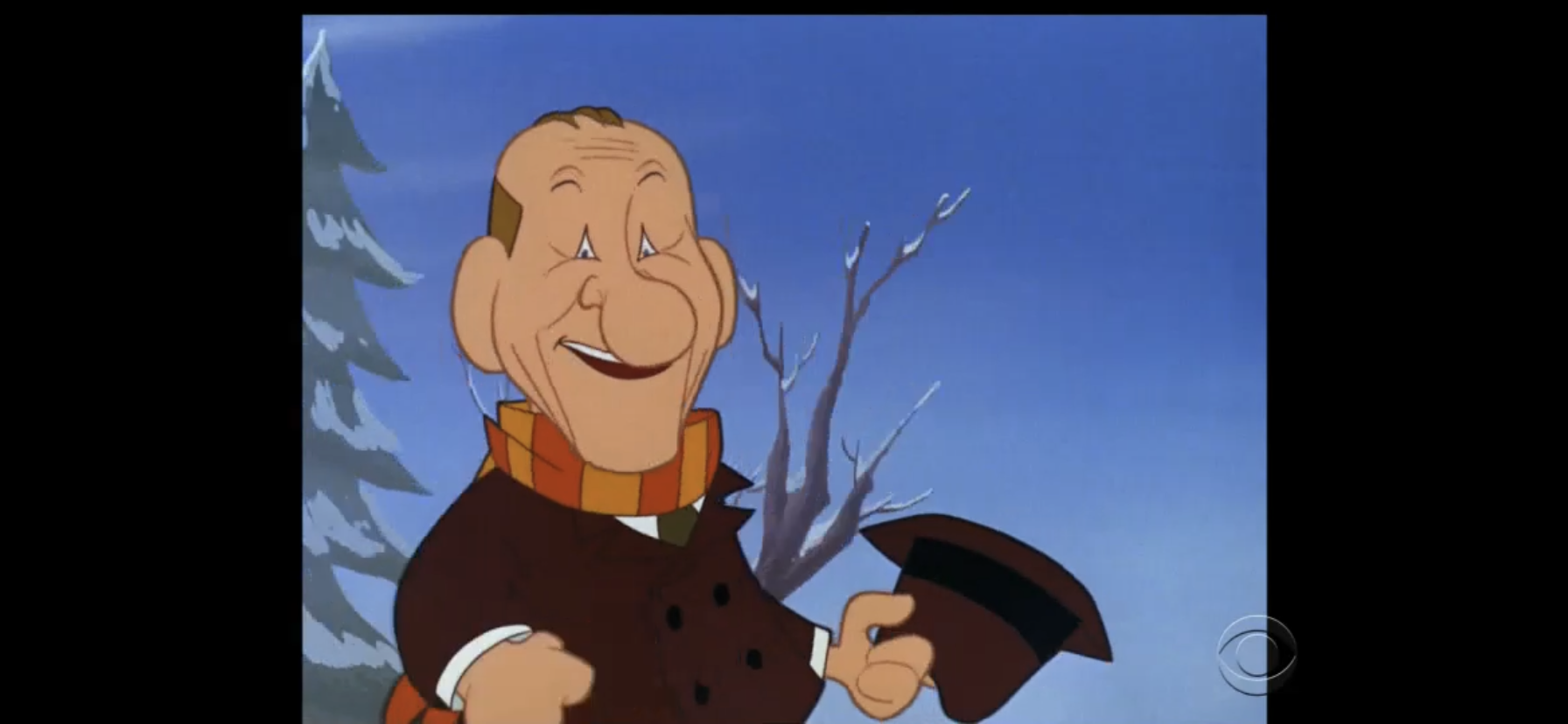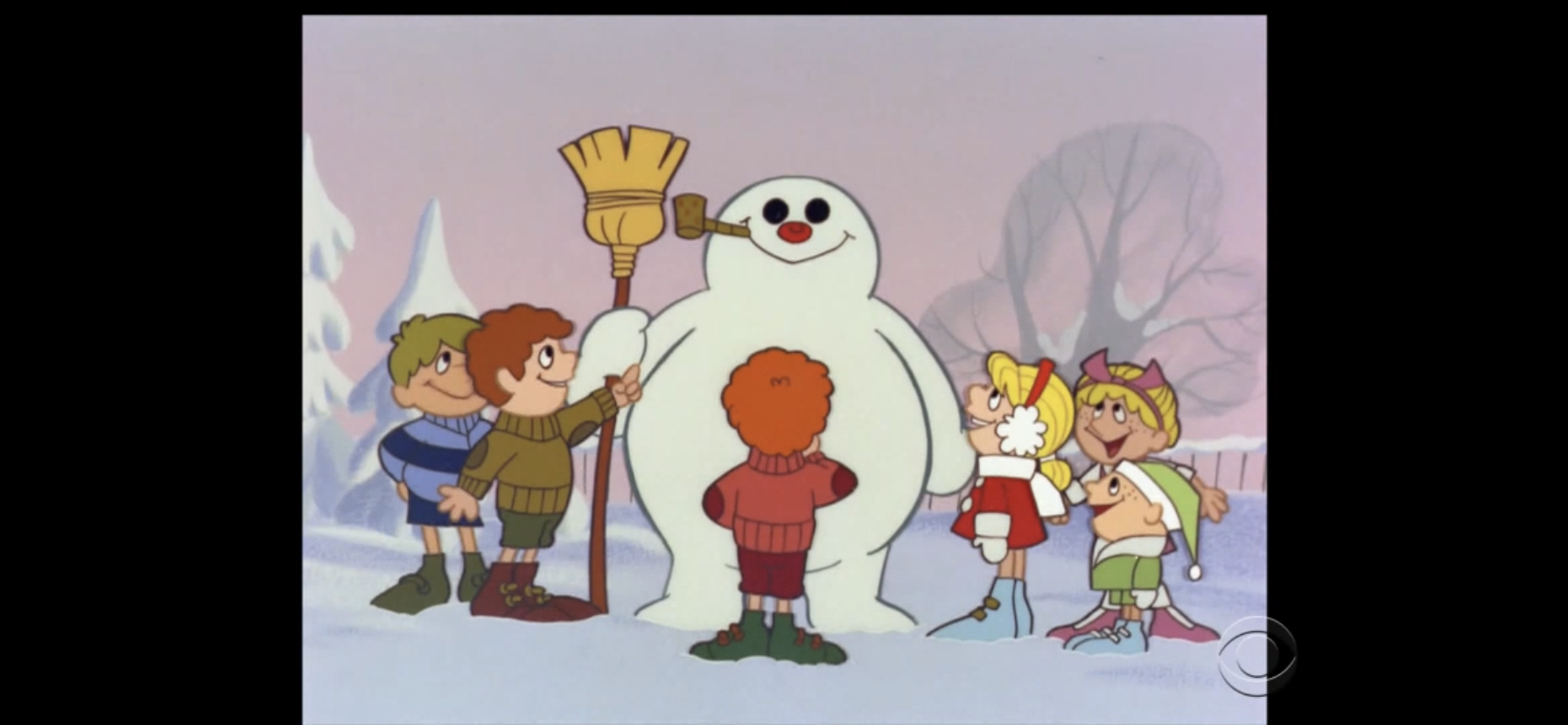
Last year, we took a trip to the Mushroom Kingdom (kind of) and watched the Super Mario Bros. save Christmas from the evil King Koopa. Since Koopa failed, it would make sense for him to attempt the same trick at a later date, especially since he would go on to become “King Dad” and Christmas presumably got a lot more expensive around Koopa Castle (or should it be Kastle?). Well, he apparently did not agree as he’s left Christmas alone ever since, but Cave Christmas? Now that, is apparently appealing!
In the early 90s, if anything was popular either in toy aisles or on gaming consoles it had a cartoon, and Mario was at the forefront of that. He first had The Super Mario Bros. Super Show followed by The Adventures of Super Mario Bros. 3, and concluding with the Super Mario World cartoon. Other popular Nintendo, or Nintendo-adjacent, properties had to settle for a cameo on Captain N The Game Master, but Mario was able to front his own toon. None of these cartoons were any good, and as the franchise marched forward it feels like the budget set by DiC just got smaller and smaller. The live action segments hosted by Danny Wells and Lou Albano were dropped, and the voices of the Mario brothers were replaced with Tony Rosato and Walker Boone, respectively. John Stocker, who saw his character Toad written out for Super Mario World, got to keep working by voicing new addition Oogtar while Tracy Moore (who came onboard for the Super Mario 3 show) and Harvey Atkin (the only one to voice the same character from start to finish) continued to voice Princess Toadstool and King Koopa, respectively.
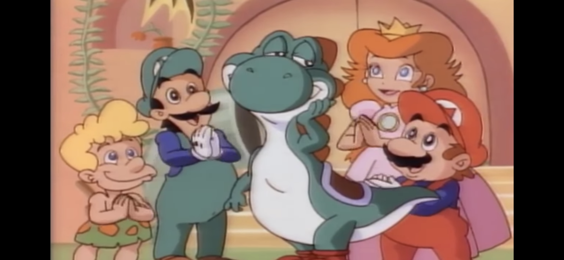
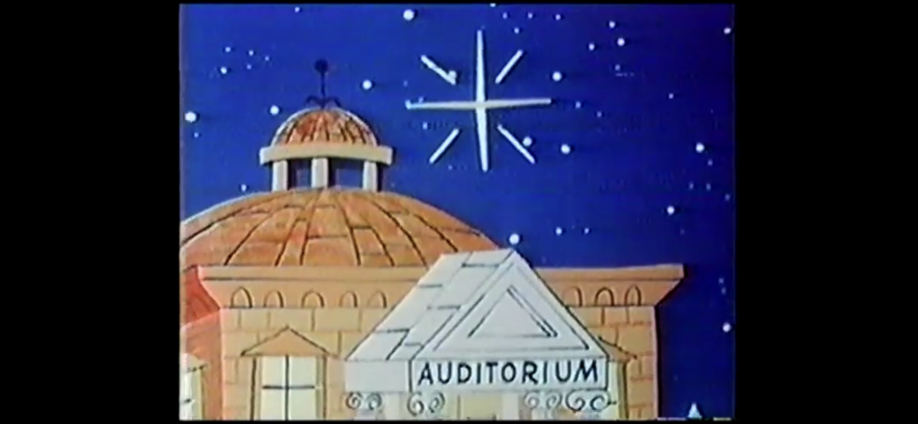
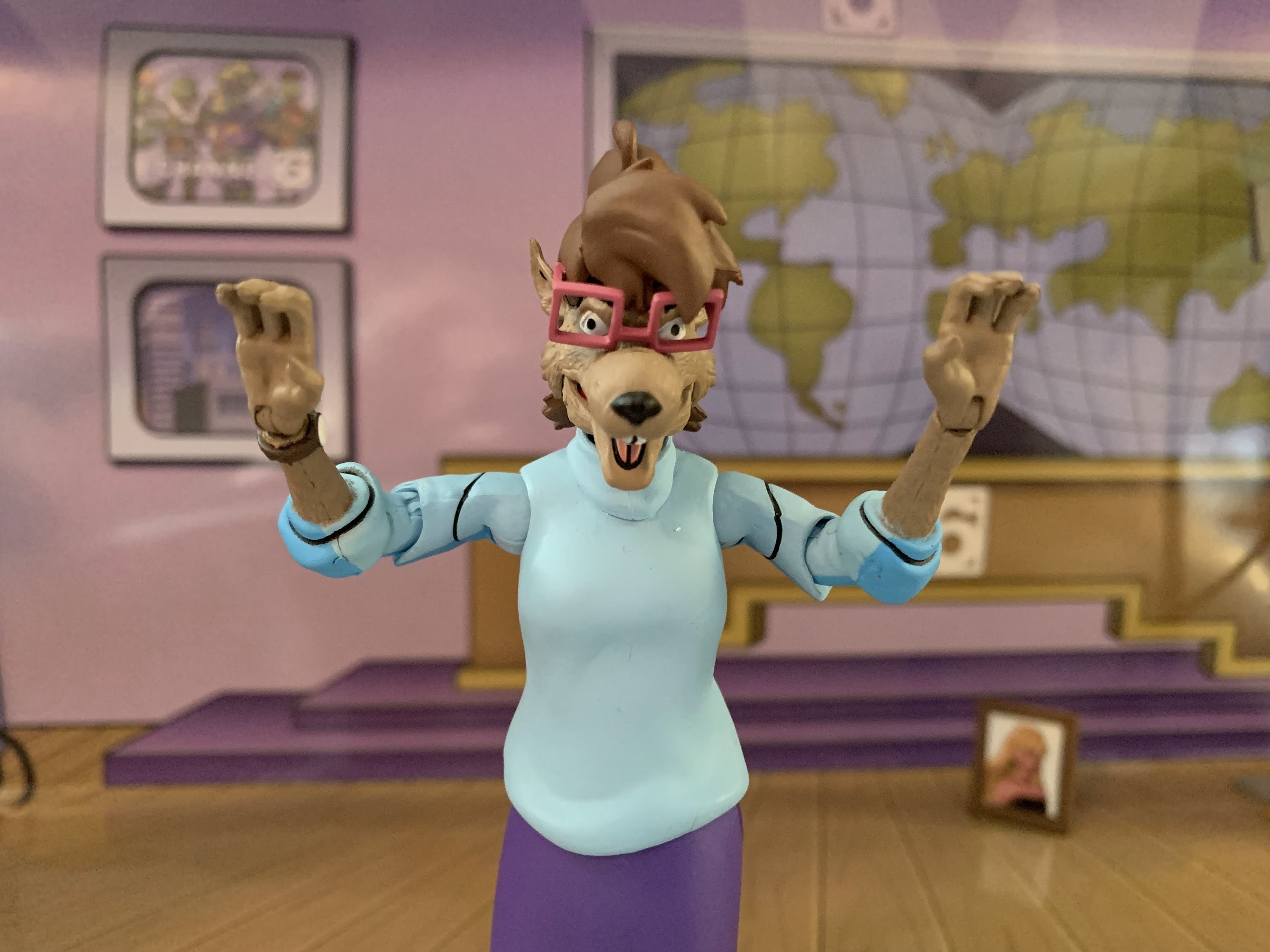
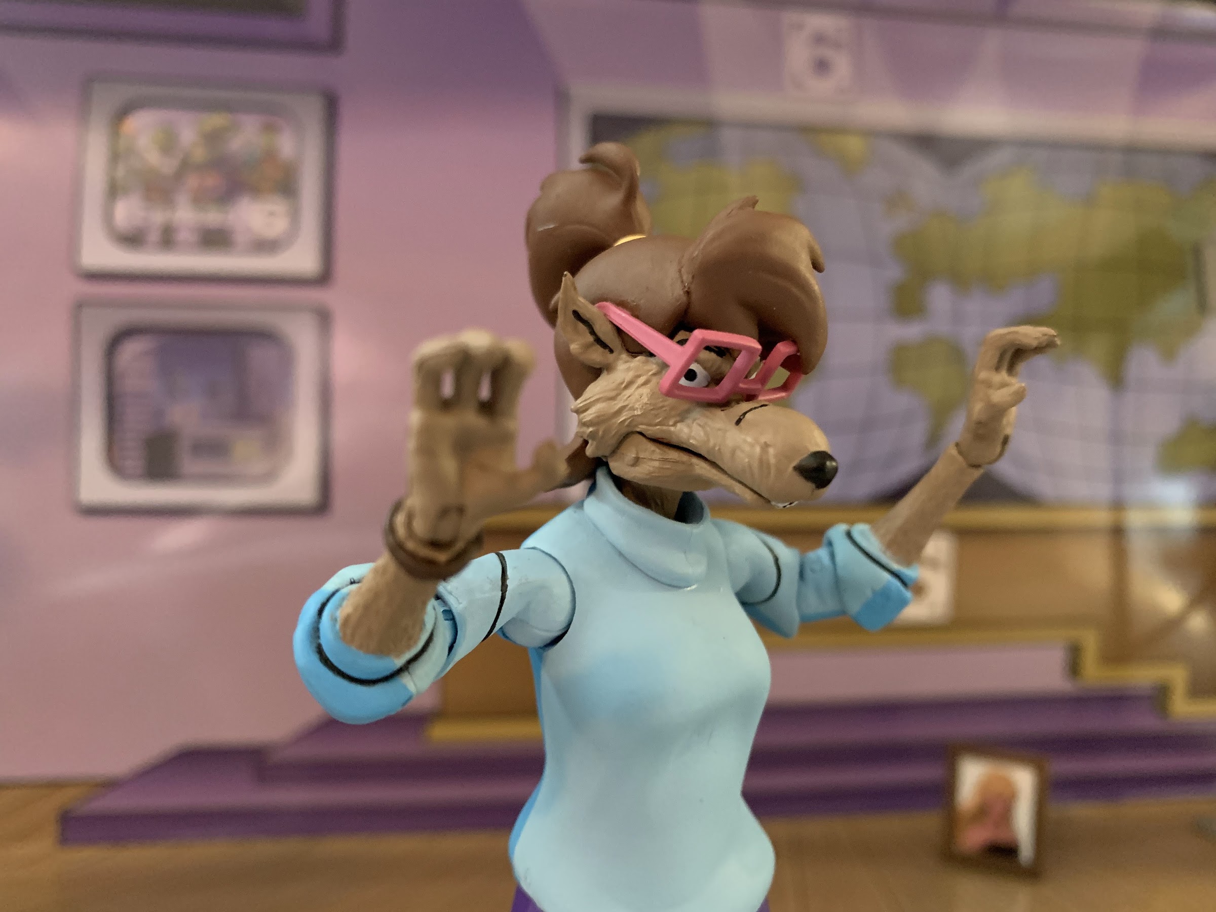
Super Mario World, like the video game it’s based on, is set in the fictitious Dinosaur World. Mario and his friends are vacationing there, only to find King Koopa and his many Koopa kids have followed them. They make friends with the cave people, and Princess Toadstool more or less throws her weight around as royalty to take over, and take-in a young dinosaur named Yoshi (Andrew Sabiston). Each cartoon is little more than 10 minutes in length and DiC wisely dropped the use of song parodies so the syndicated cut and retail releases were able to retain the original music this time around. The show was bundled with Captain N to air as a block and both shows mainly exist to sell video games. There’s not much to the plot of each episode, characters experience little or no growth, and most episodes can be drilled down to a simple formula. Only 13 episodes were produced airing from September 1991 into December of that year. The show didn’t seem to find much success following its initial run as the episode count was likely too small to interest most cable networks. It did receive a DVD release from Shout Factory, and the show today is mostly remembered as being pretty bad with certain aspects of it being enjoyed mostly from an ironic perspective as the character of Yoshi is both annoying and ridiculous, which I guess makes him a tad charming?
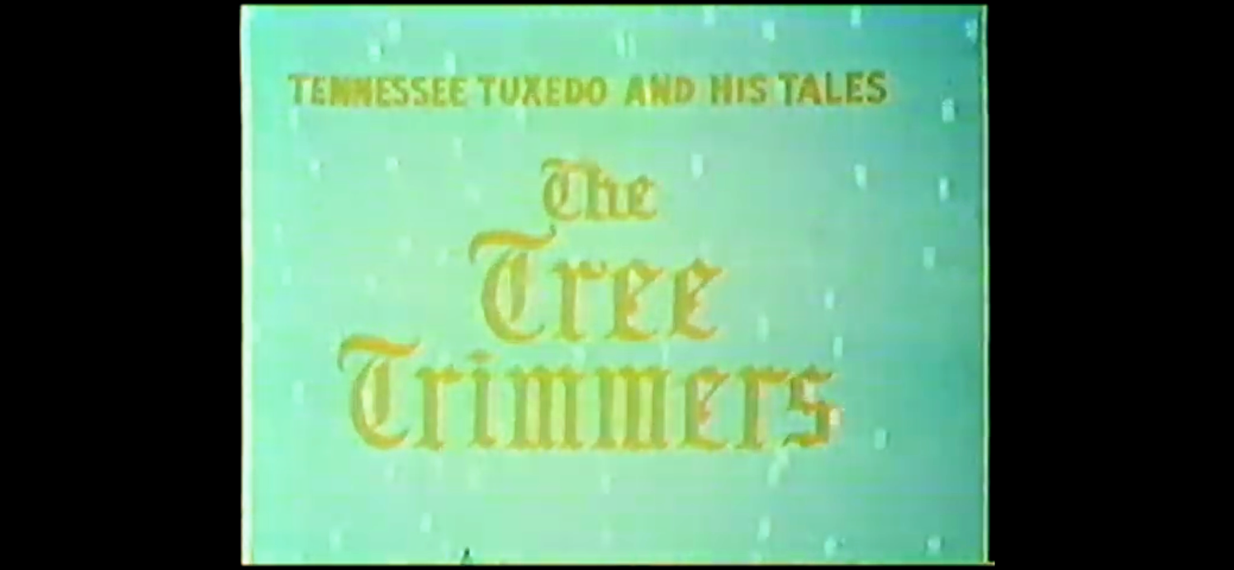
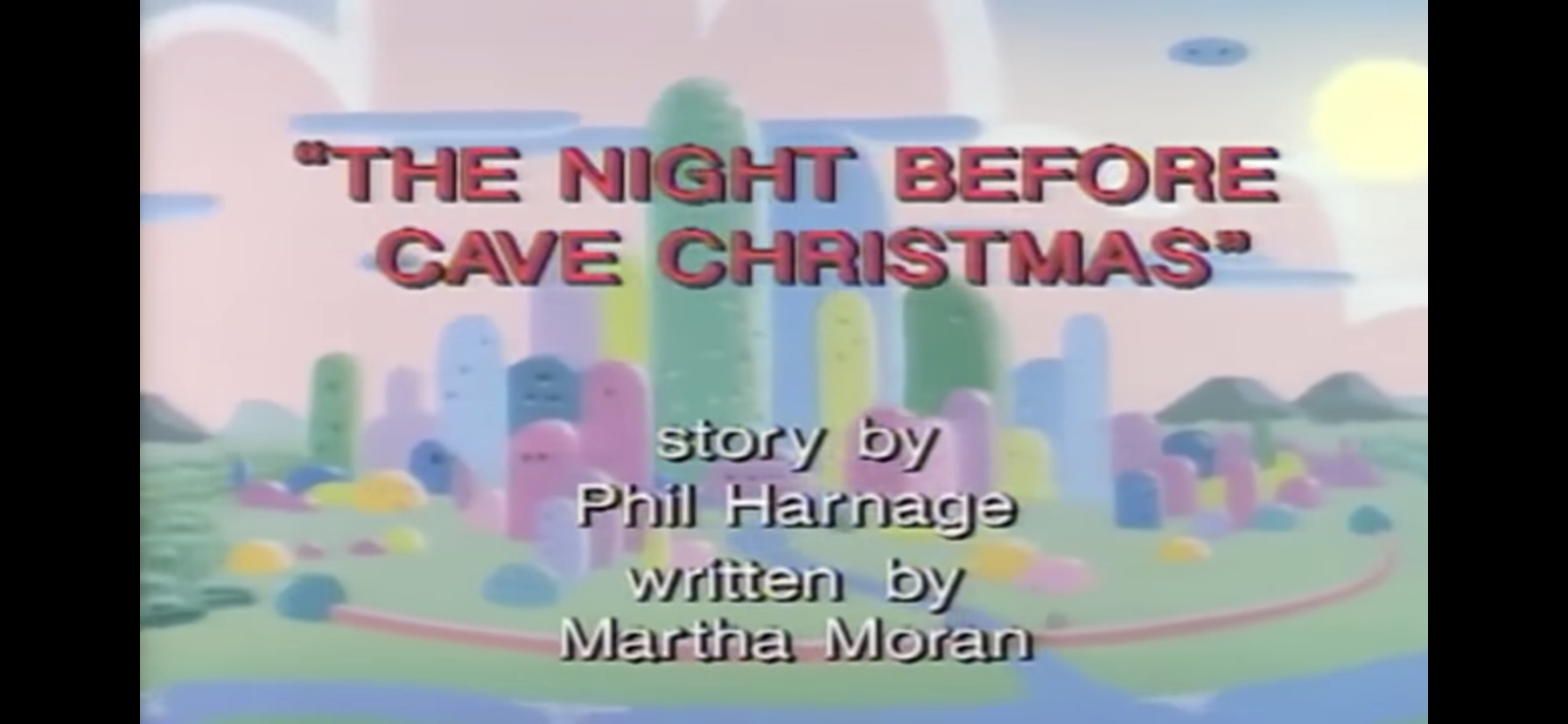
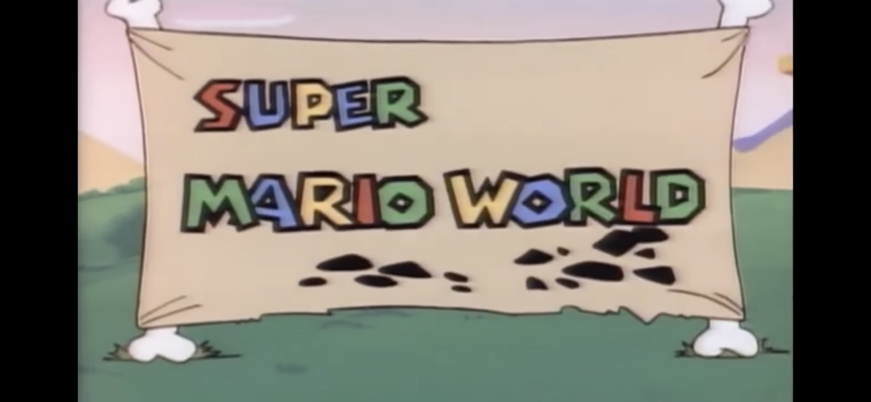
The fifth episode for the show is titled “The Night Before Cave Christmas.” It aired before Halloween, but since Cave Christmas is a made-up holiday by Mario I guess it didn’t need to air during the Christmas season? As mentioned before, this is the second, and final, Christmas episode from the Mario universe of cartoons as DiC declined to do one in The Adventures of Super Mario Bros. 3. I’d say it’s a shame we didn’t end up with 3 Christmas cartoons, but considering the first one was pretty terrible, and this one might actually be worse, I guess it’s no real loss.
The cartoon begins with a brand new theme song. The previous cartoon cheeped out by forgoing a traditional theme for just narration over some video game inspired music, a severe downgrade following the greatness that is “The Plumber’s Rap.” This new theme is a bit of an ear worm, despite not being great. It’s full of tribal drums and has a Caribbean feel to it, though I’m skeptical DiC paid for an authentic singer and probably just had some white dude fake an accent. Mark Mothersbaugh is credited as composing the theme, but I don’t know who actually sang on it. The lyrics are a bit lacking as the song closes by rhyming the word blast with…blast! I’m getting flashbacks to the “Wrap Rap” from last year!
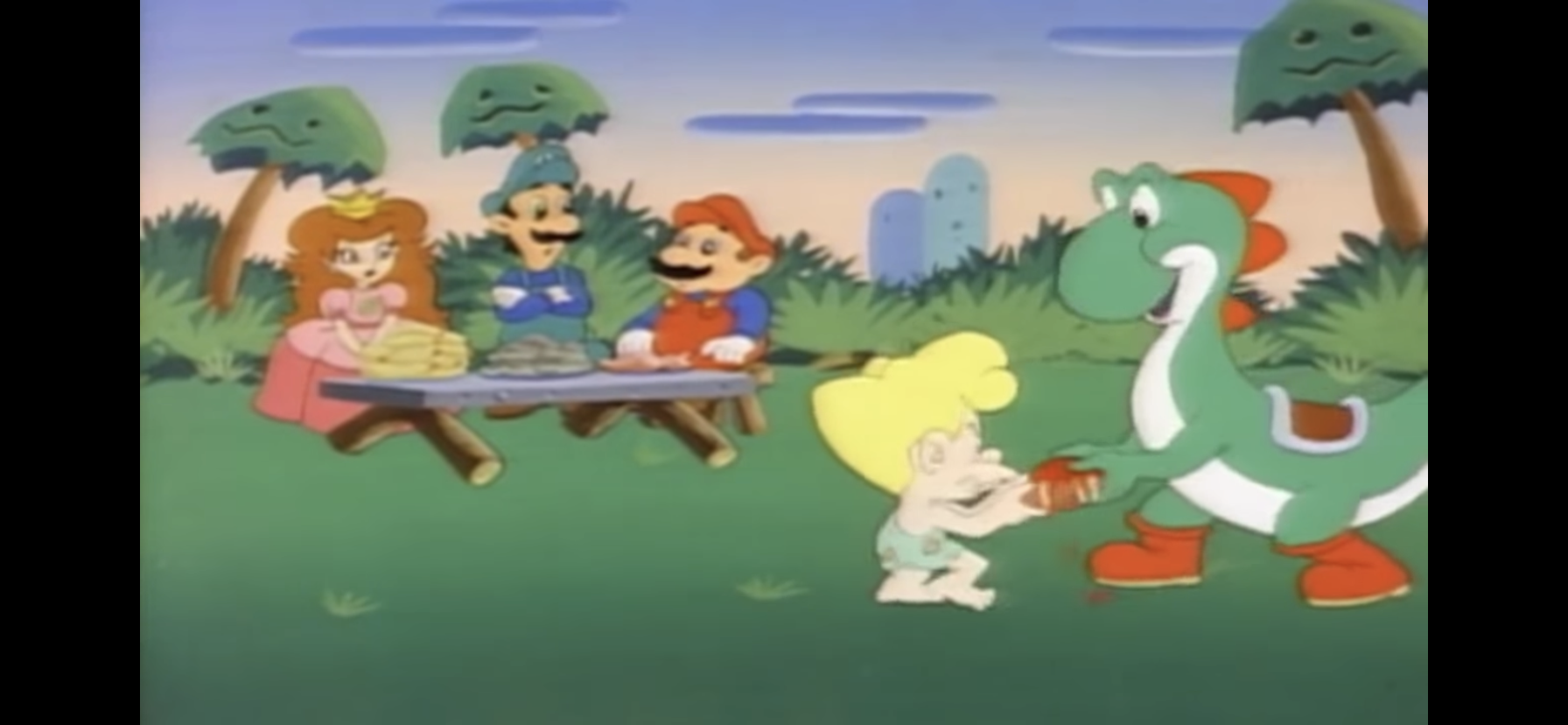
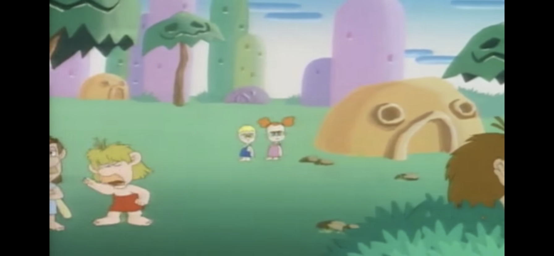
When the cartoon begins, we find Yoshi and Oogtar fighting over some barbecued mammoth ribs, which are pretty small for mammoth ribs (maybe they picked off an infant). Mario starts complaining to Luigi and the Princess about how Oogtar is a pain in the ass who spends all day getting into fights with Yoshi. Luigi points out it’s not just Oogtar, as we pan to see other cave people fighting with each other. One poorly animated boy and girl pair are just hitting each other like Itchy and Scratchy, minus the mallets. Mario then hatches up an idea based on the notion that people start acting really nice to each other around the holidays. Luigi asks if he means Christmas, because it’s currently the middle of August so that doesn’t make much sense. Mario basically responds by reminding him that cave people are stupid and will believe anything they tell them. This cartoon really shines a light on what’s awful about colonialism.
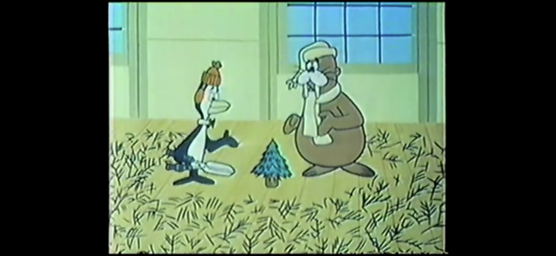
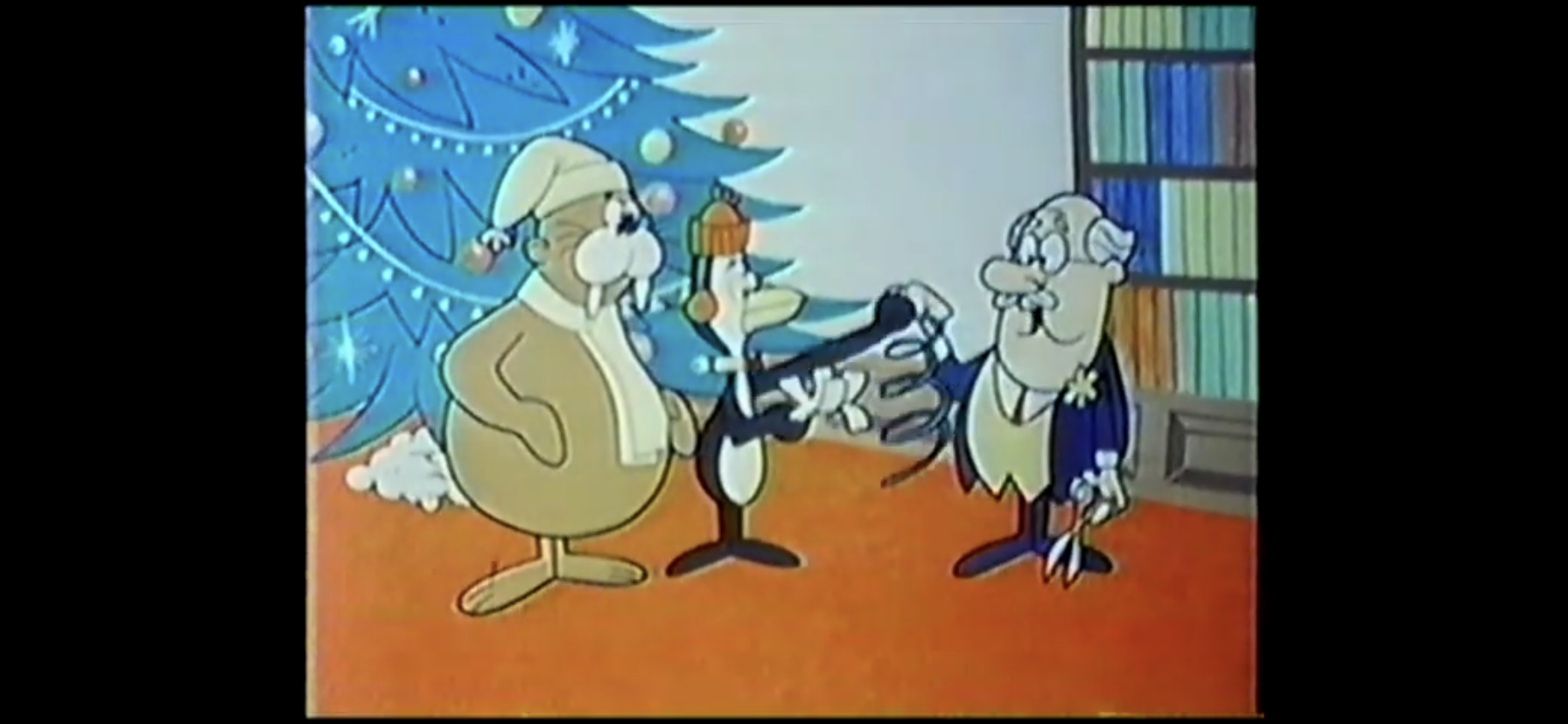
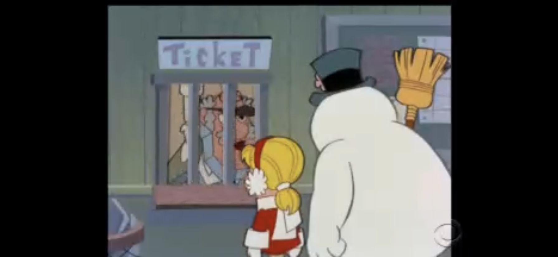
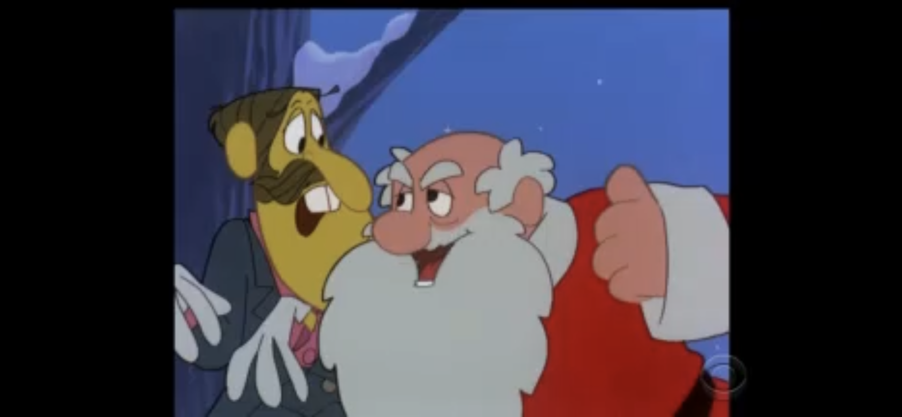
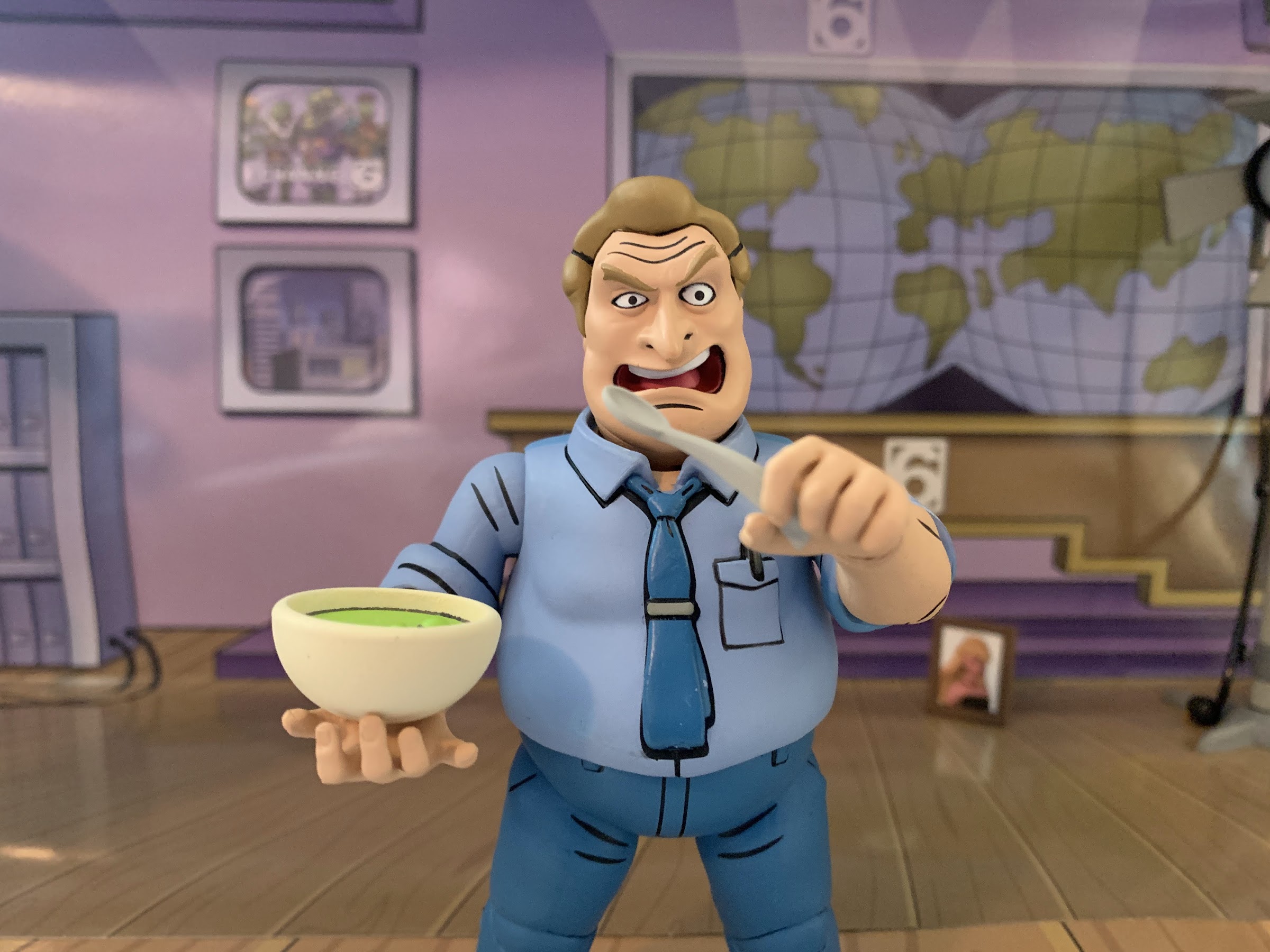
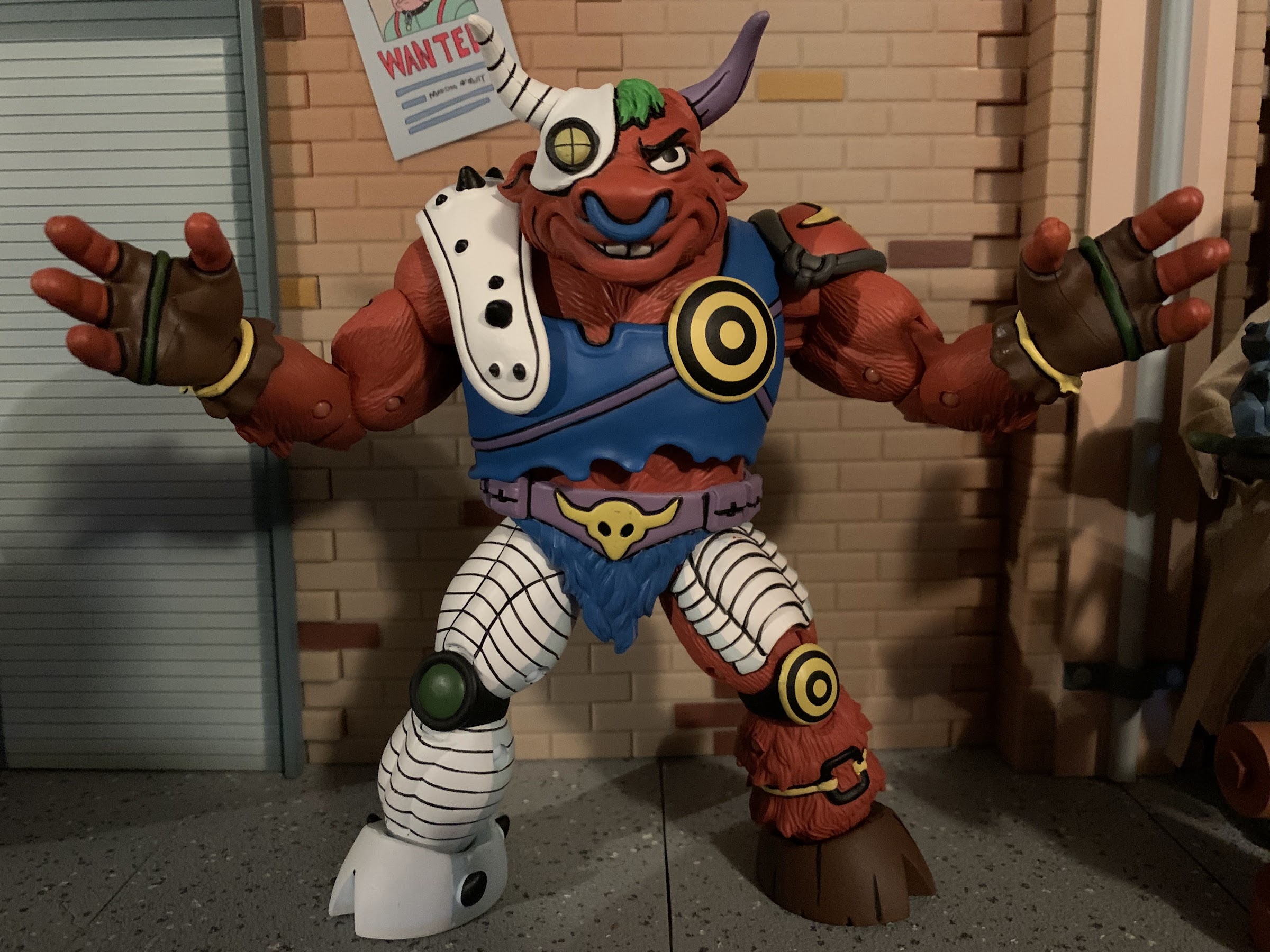
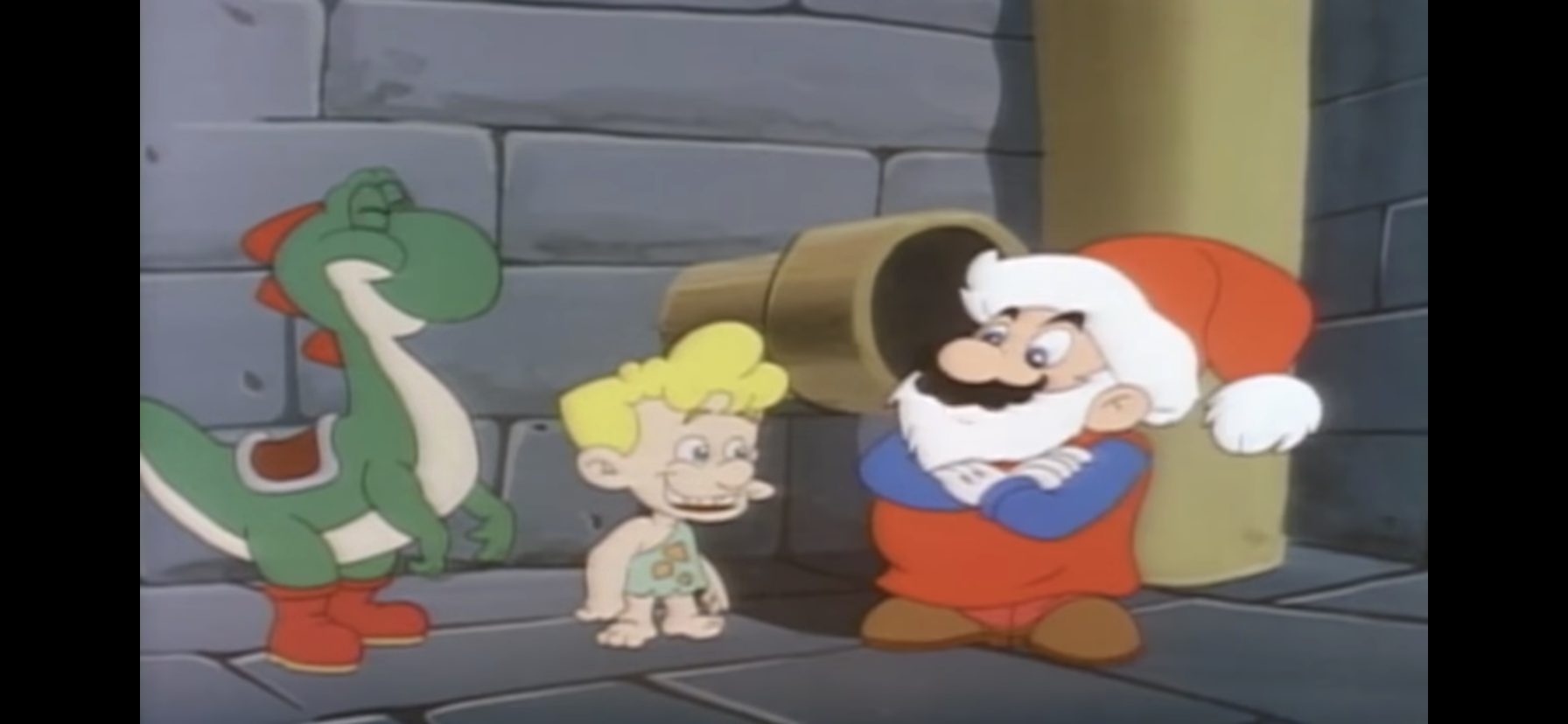
Mario then goes over to the squabbling Yoshi and Oogtar and starts telling them about Christmas. Mostly, he wants to convey the message that good boys and girls are rewarded with treats and presents, and Oogtar immediately becomes nervous because he knows he’s a little piece of shit. Mario christens it Cave Christmas and hangs a big wreath on one of the stone huts and announces, “Merry Cave Christmas!” to all of the onlookers. Nearby, Koopa pops his head out of what I guess is a trash can fashioned out of a stump. Referring to Mario as a “pipe-squeezer” (which got a chuckle out of me), he questions the plumber’s sanity by noting it’s the hottest day of the year before closing the lid and returning to his hiding spot.
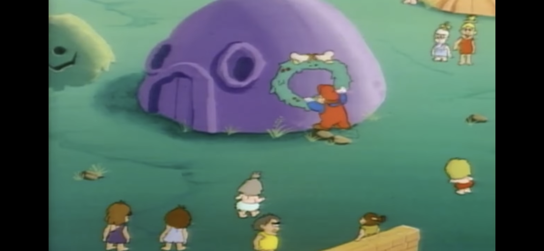
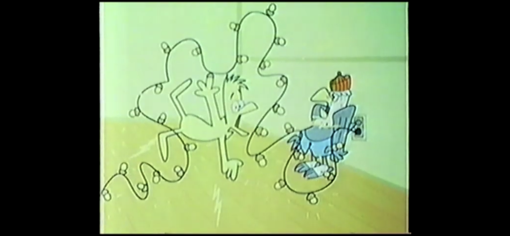
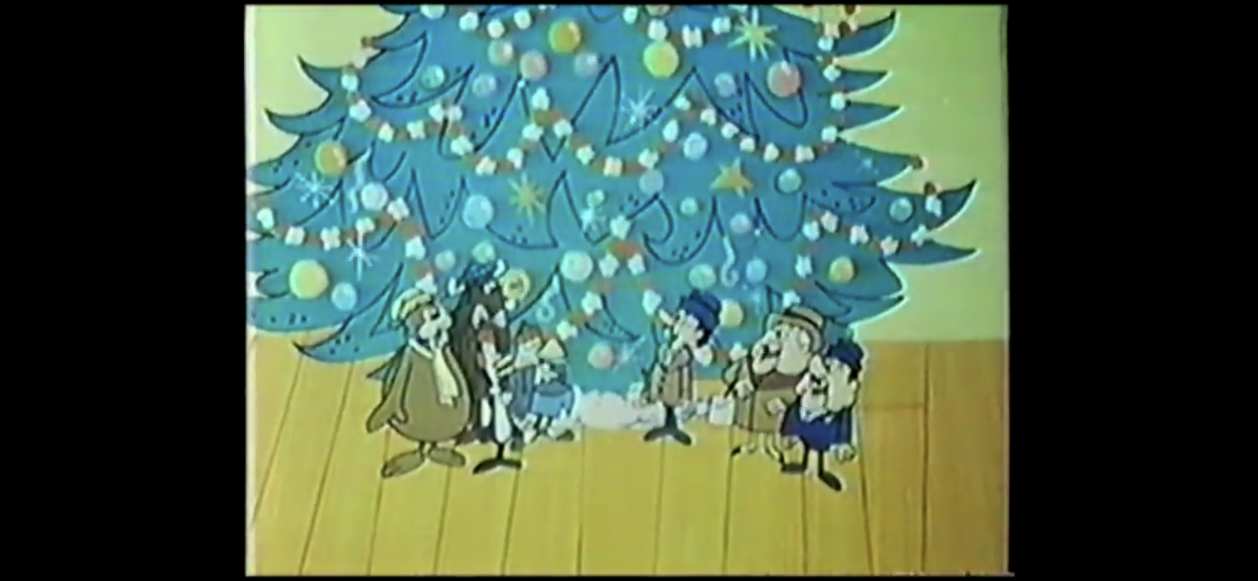
The gang then sets to making the place look like Christmas. Mario and an unnamed cave person cut down a tree, while Oogtar and Yoshi help the Princess collect nuts from nearby trees. Koopa and his son Bully (Dan Hennessey) watch and Bully informs his dad he wants a Christmas tree too. We then go back to town where Princess Toadstool is trying to hang candy canes on a tree (that has a creepy face), but Yoshi keeps eating them as she hangs them. She reminds him about how he needs to be good if he wants presents from Santa, and the dinosaur promptly regurgitates the candy canes back onto the tree. It’s not made to look as gross as it could have. Bully and King Koopa pop out of the garbage stump and Bully takes note of the Princess’s description of Santa and calls the guy a wimp. His dad agrees, but then the garbage dinosaur shows up and tosses the whole stump (which seems very inefficient) into a stone dumpster strapped on his back.
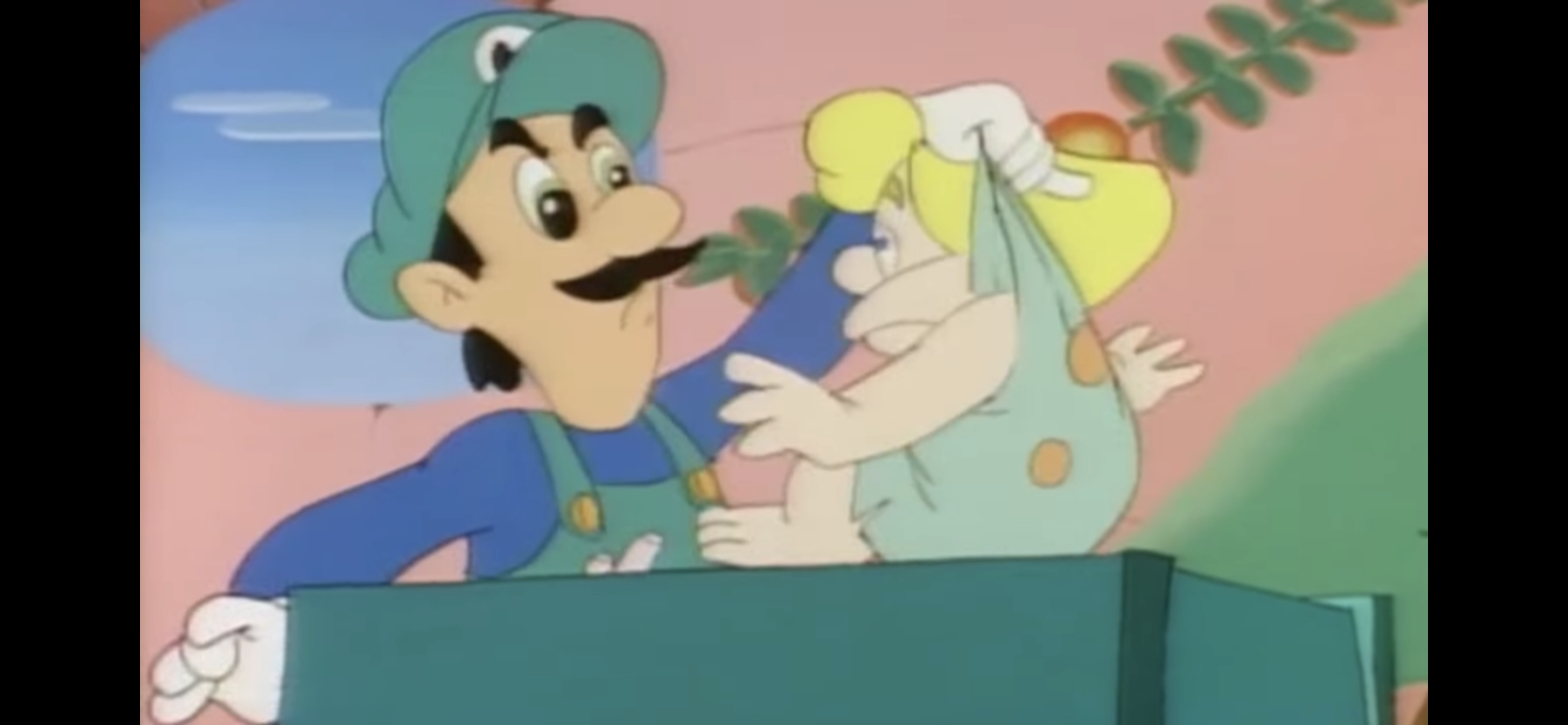
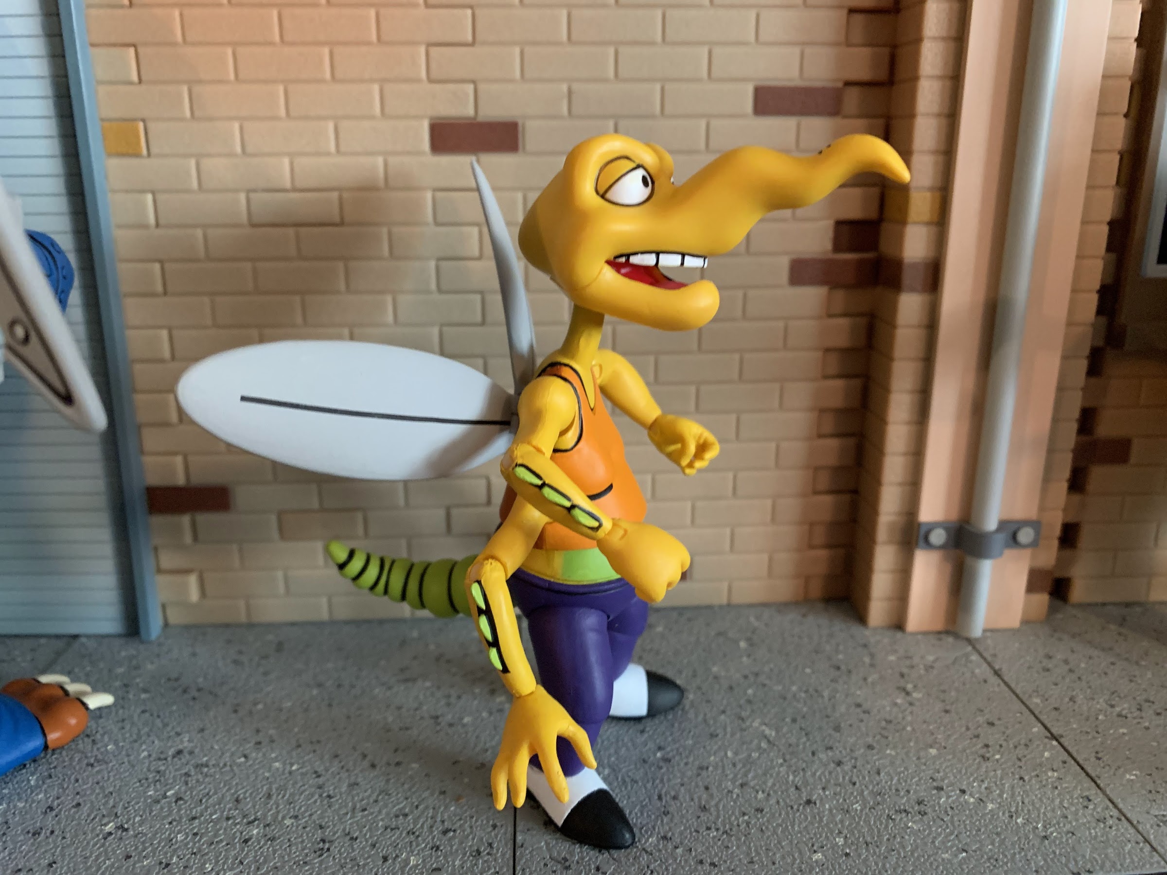
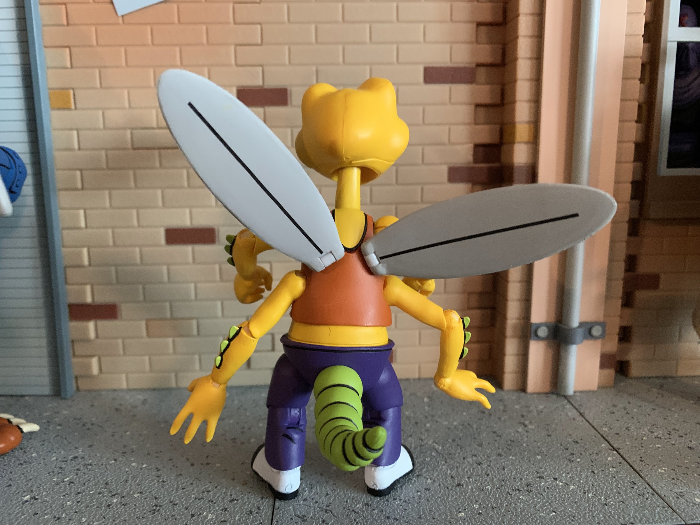
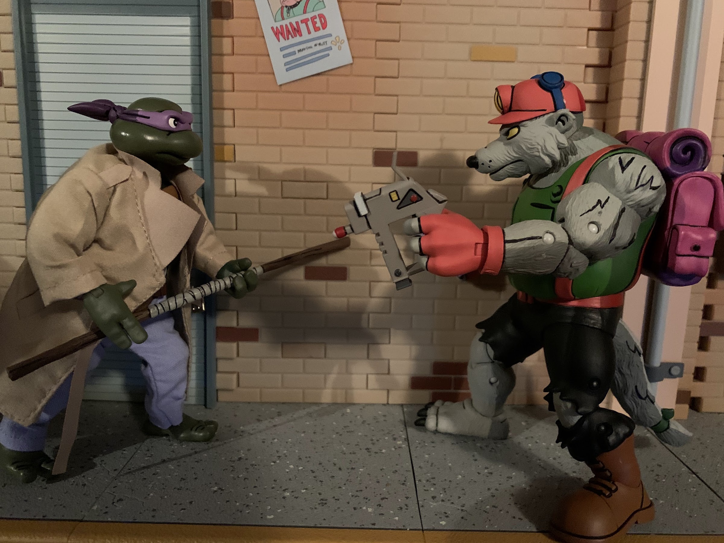
Since there is a severe lack of toy stores in a prehistoric setting, the Marios have to make the toys for Cave Christmas. In a dome, they’re hard at work building shadow boxes and jack-in-the-boxes. Luigi’s emblem on his hat is miss-colored, a frequent occurrence in this show. Oogtar has snuck in though and is trying to get a peek at the presents. Luigi catches him hiding in a jack-in-the-box. He bolts and attempts to hide in a box of dolls, but Luigi picks him up by his shirt and tosses him out the door.
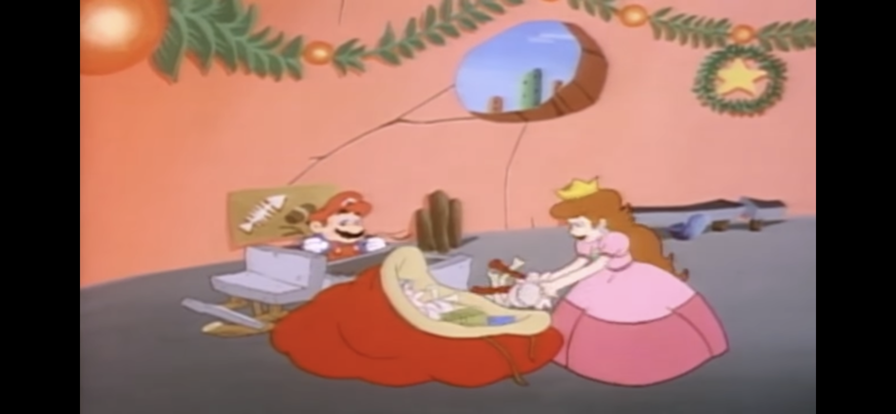
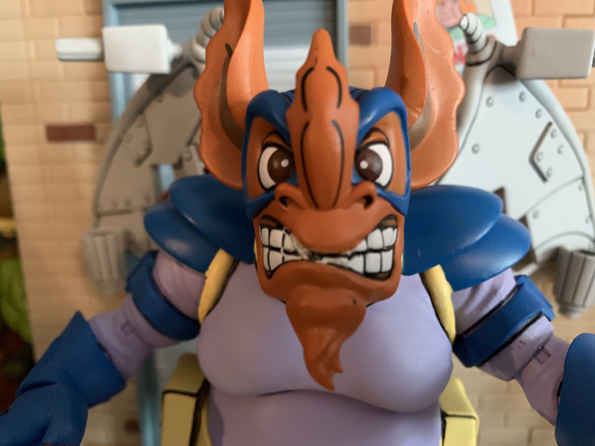
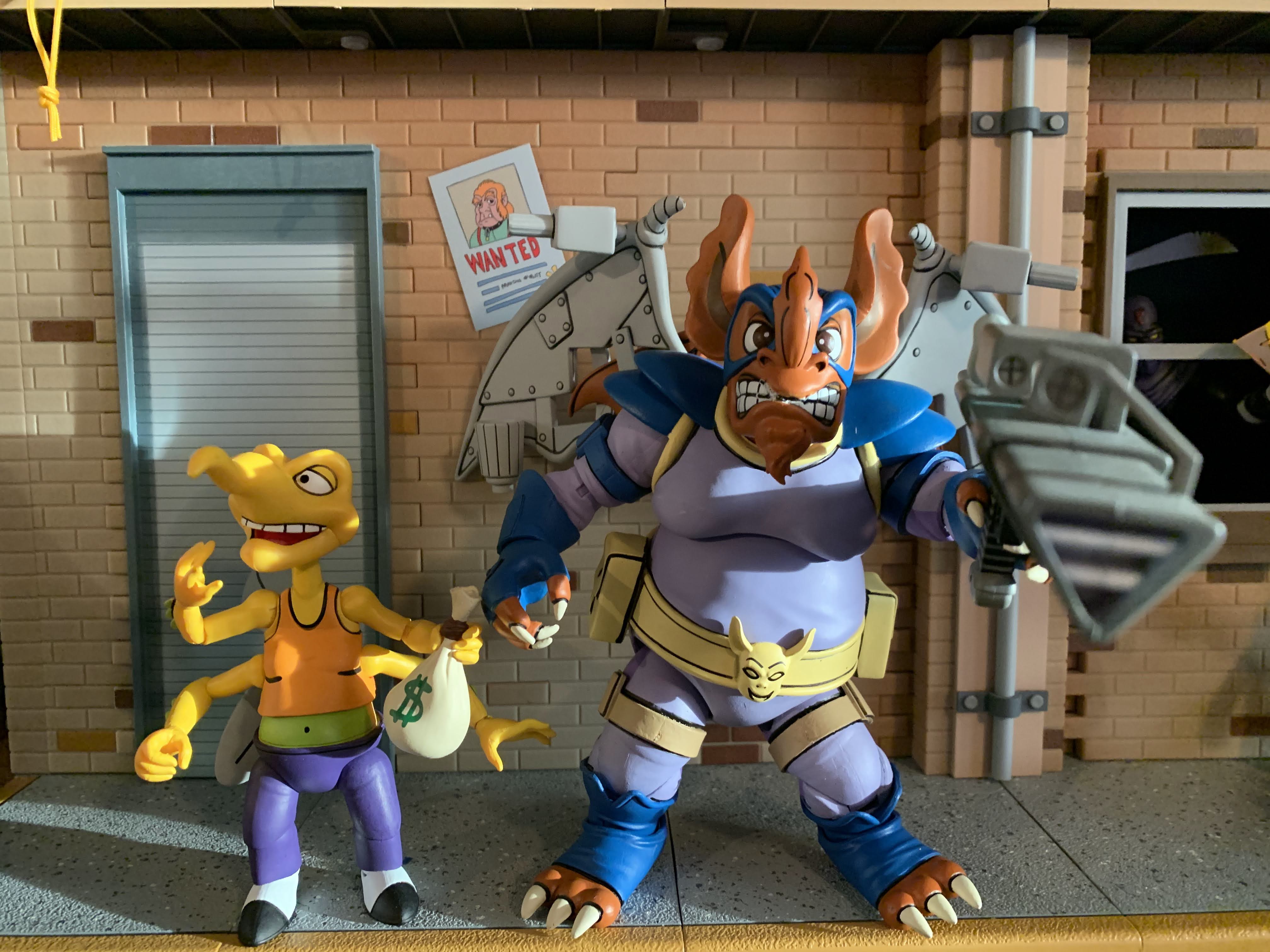
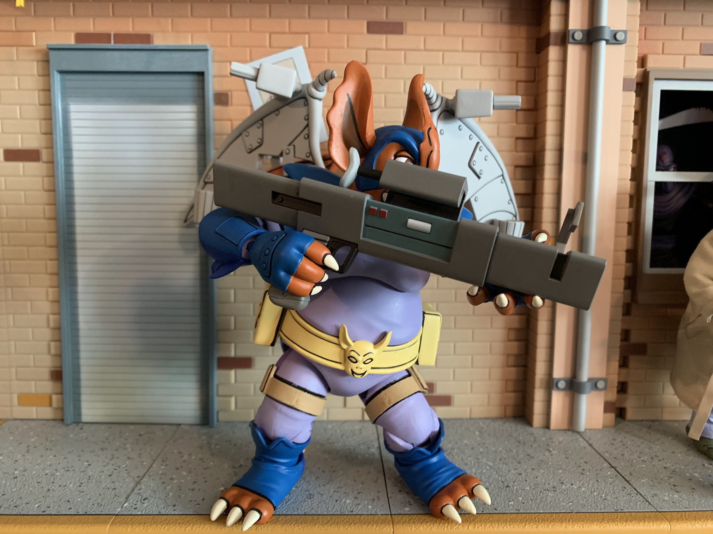
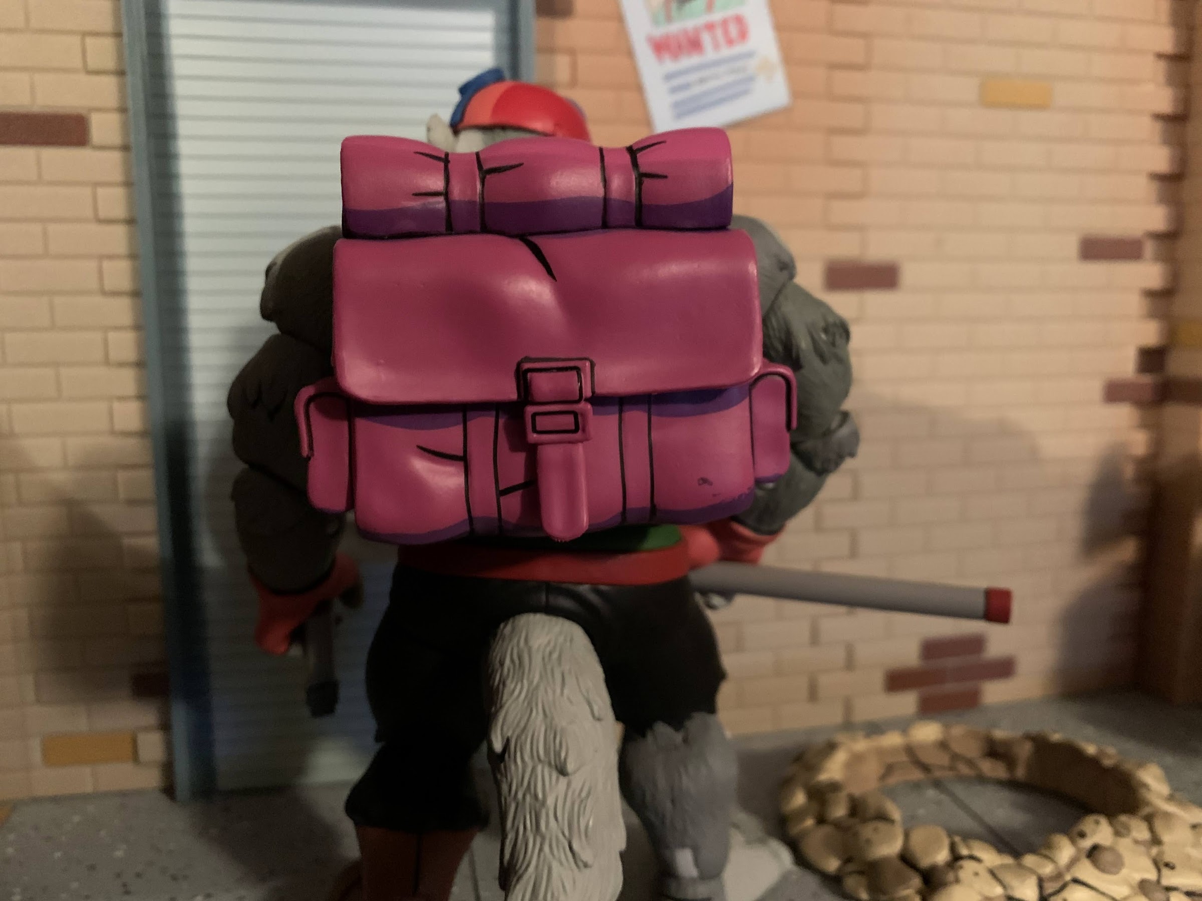
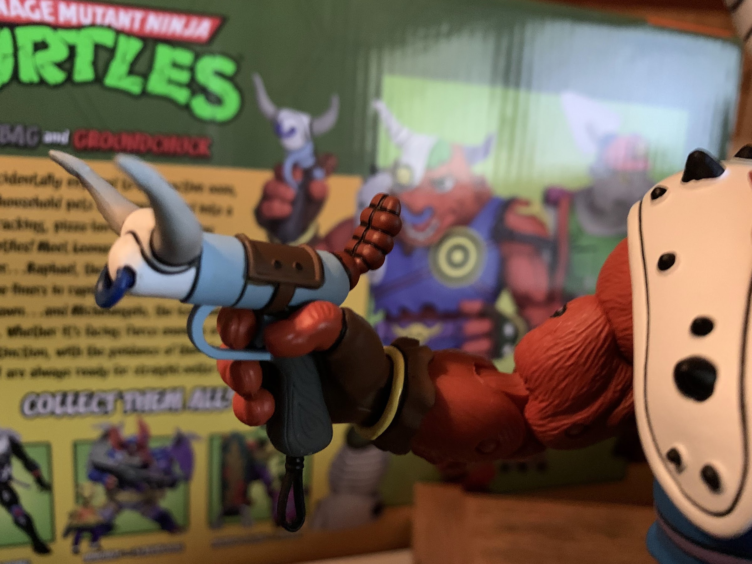
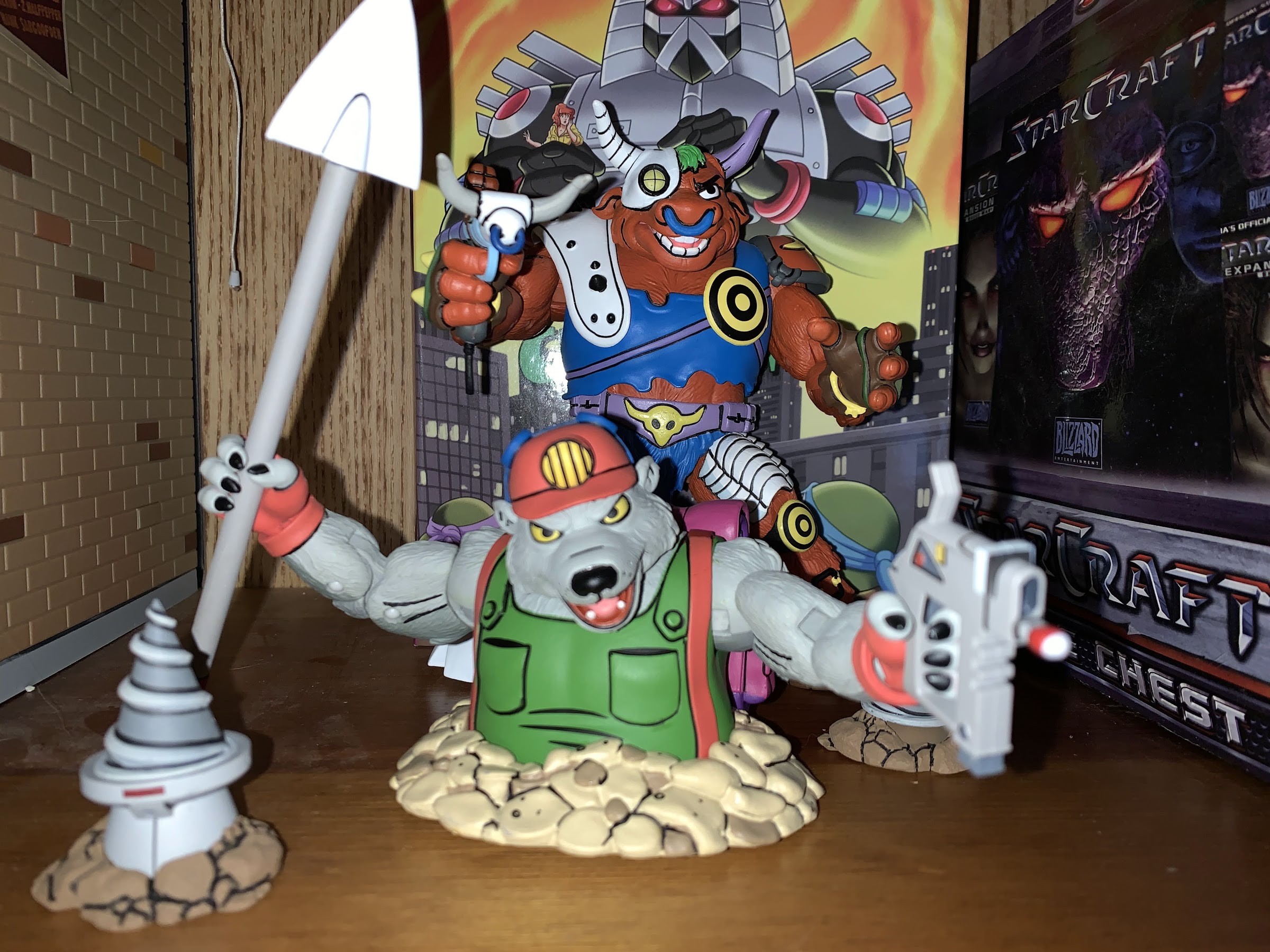
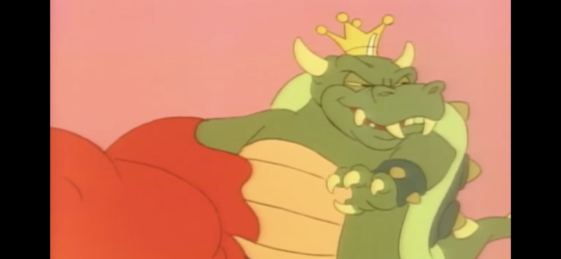
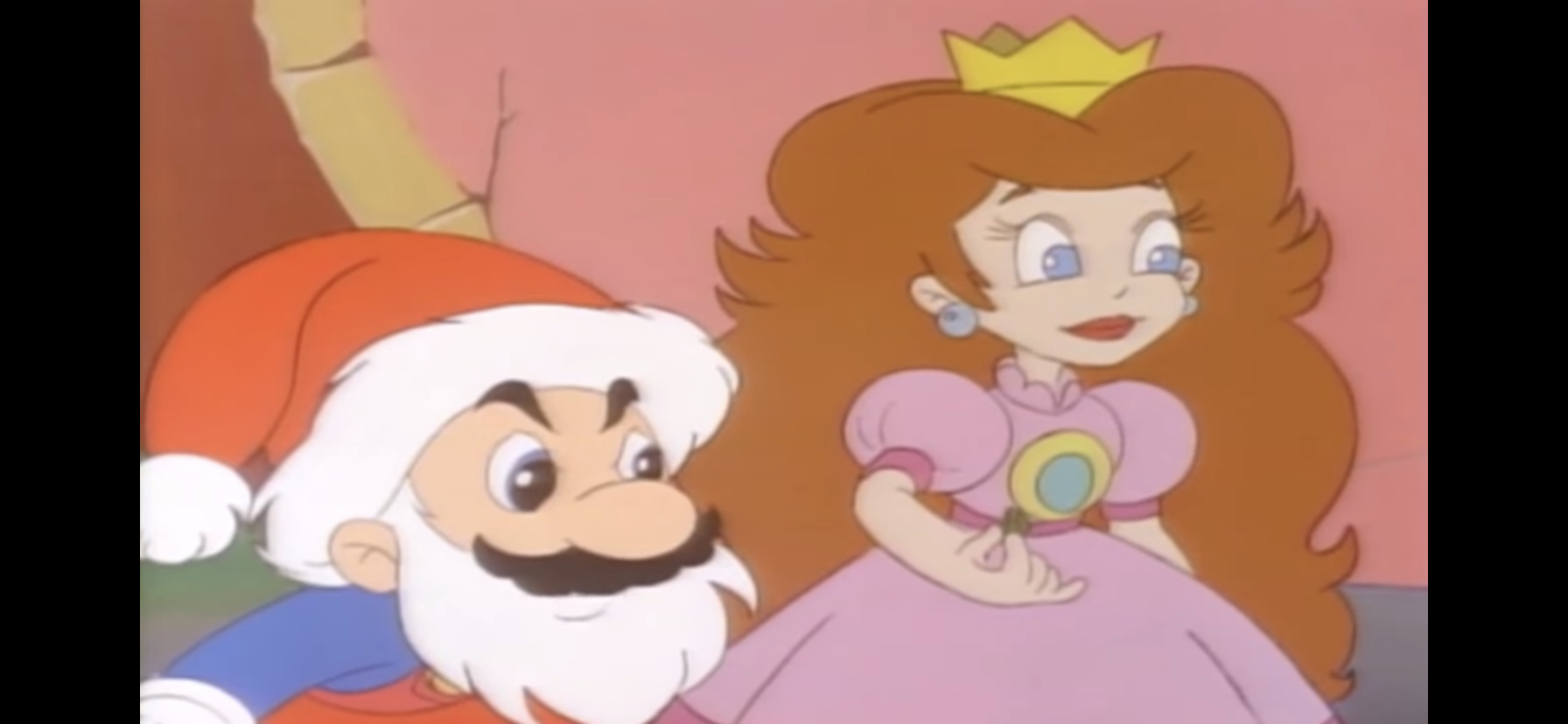
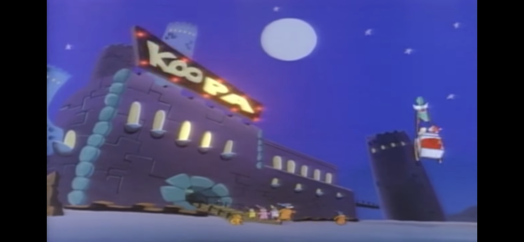
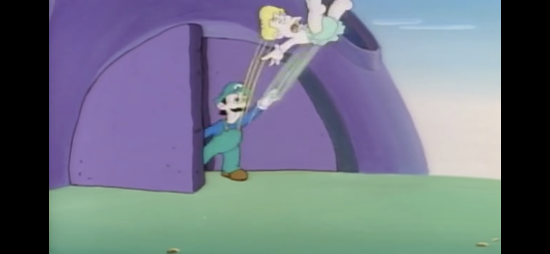
The Princess is then shown piling gifts into Santa’s sack while Mario appears to be constructing the sleigh out of stone and wood. Good luck getting that thing to fly! The Princess remarks how she can’t wait to see all of the kids react to the presents on Cave Christmas morning (she makes sure to include the Cave distinction), but lurking just outside the window is King Koopa once again. He laughs to himself and remarks that the Princess won’t get to see any of that because he plans on stealing the toys so his kids can have a jolly Koopa Christmas (Kristmas?). Considering he is mean and green, I suppose it makes sense for Koops to play the Grinch in our story.
The next day, Mario and Luigi are seen shoving their stone sleigh out the door. Mario expresses joy that its Cave Christmas Eve and prods Luigi by remarking it’s just like being back home, Luigi isn’t buying it though. As they head back inside their makeshift toy factory, Oogtar slips in and heads over to the sack of toys. With an evil look on his face, he lets the audience know he intends to cherry-pick the best toy out of the sack early leaving the crummy stuff for the goody-two-shoes. When he hears someone coming back in, he panics and dives into the sack of toys to hide. He seemed to think it was one of the Mario brothers that were coming, but it’s actually Koopa! Because DiC thinks its audience is stupid, Koopa has to explain out loud that he’s stealing the toys for Koopa Christmas and casually strolls out with the sack of toys and Oogtar inside.
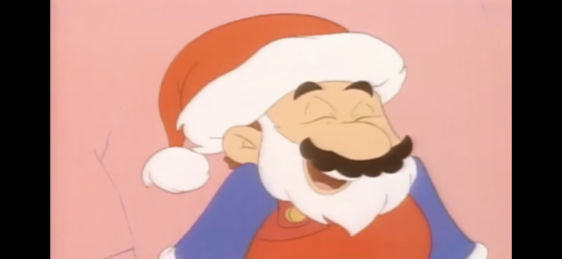
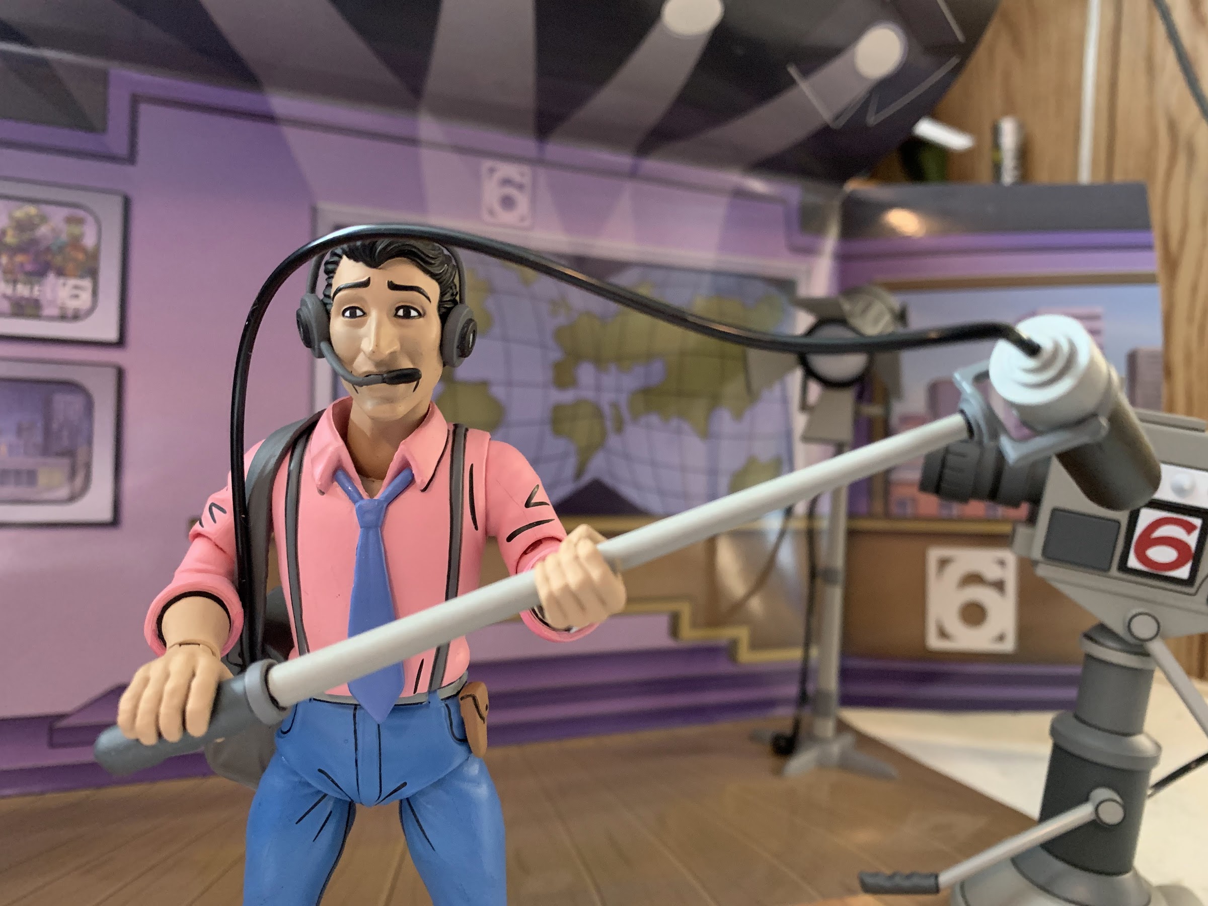
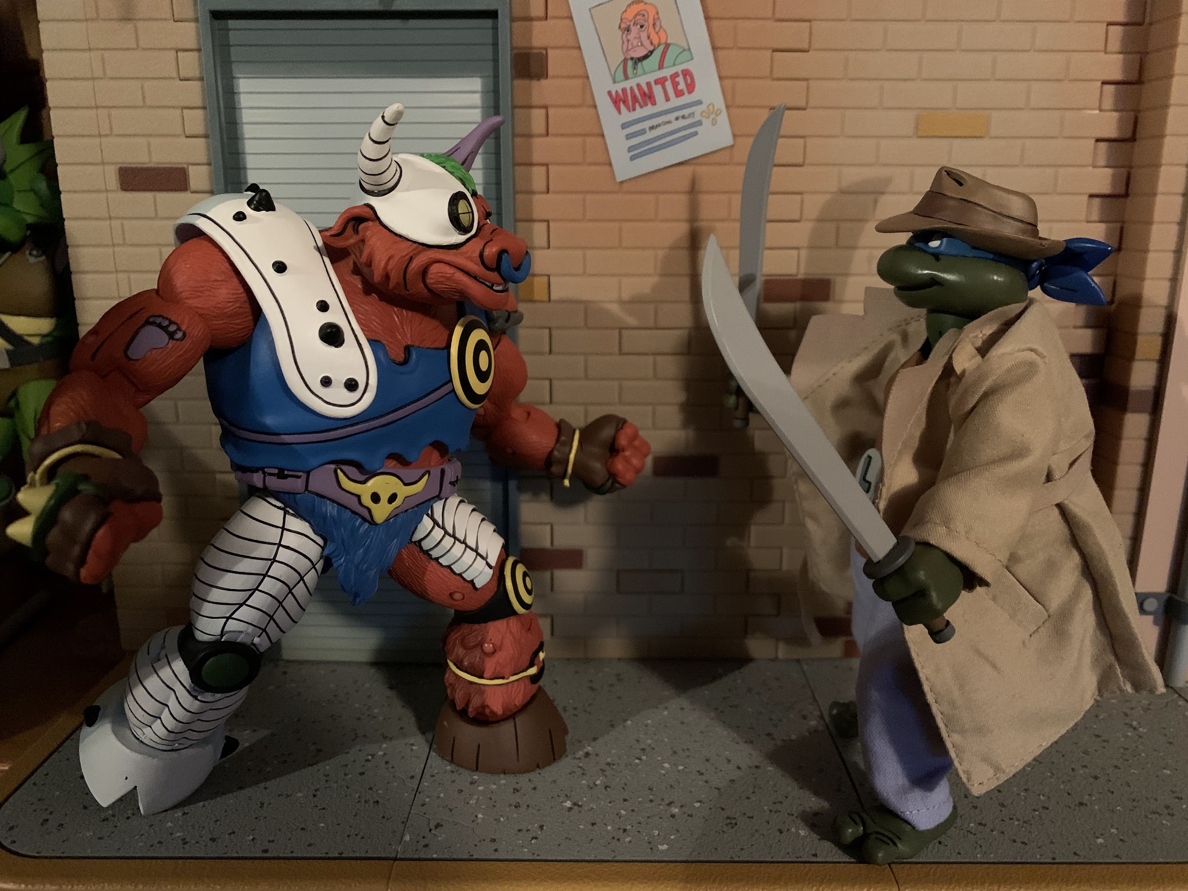
Mario, who this whole time was just standing mere feet away from the cave-napping, is trying on his Santa costume (What? Did you think he’d actually let Luigi play Santa?!) which consists of a hat, white beard (his black moustache is still visible) and a red toga-like garment worn by the cave people which is worn over his red overalls and looks stupid. When he asks how he looks, Luigi tells him he wouldn’t get away with wearing that in Brooklyn. Mario gives a knowing chuckle and I have no idea how I’m supposed to interpret this joke. This is from the early 90s, so it reads like a homophobic joke. Would they attempt such in a kid’s show? Koopa did refer to Mario as a pipe-squeezer earlier…
Mario then notices the toys are gone! They run over to the empty place where the massive sack once sat aghast that someone would steal toys on their fake holiday. The Princess announces she knows who is responsible, which is cute of her since we all know who did it. She picks up a scale from the ground and says it belongs to Koopa, and I say, it doesn’t matter. Koopa and his kids are the only bad guys in this entire world! Santa Mario remarks this is somehow worse than what Koopa usually does (I don’t remember enough of this show to know if that tracks or not, but it sure feels like hyperbole) and vows to get them back!

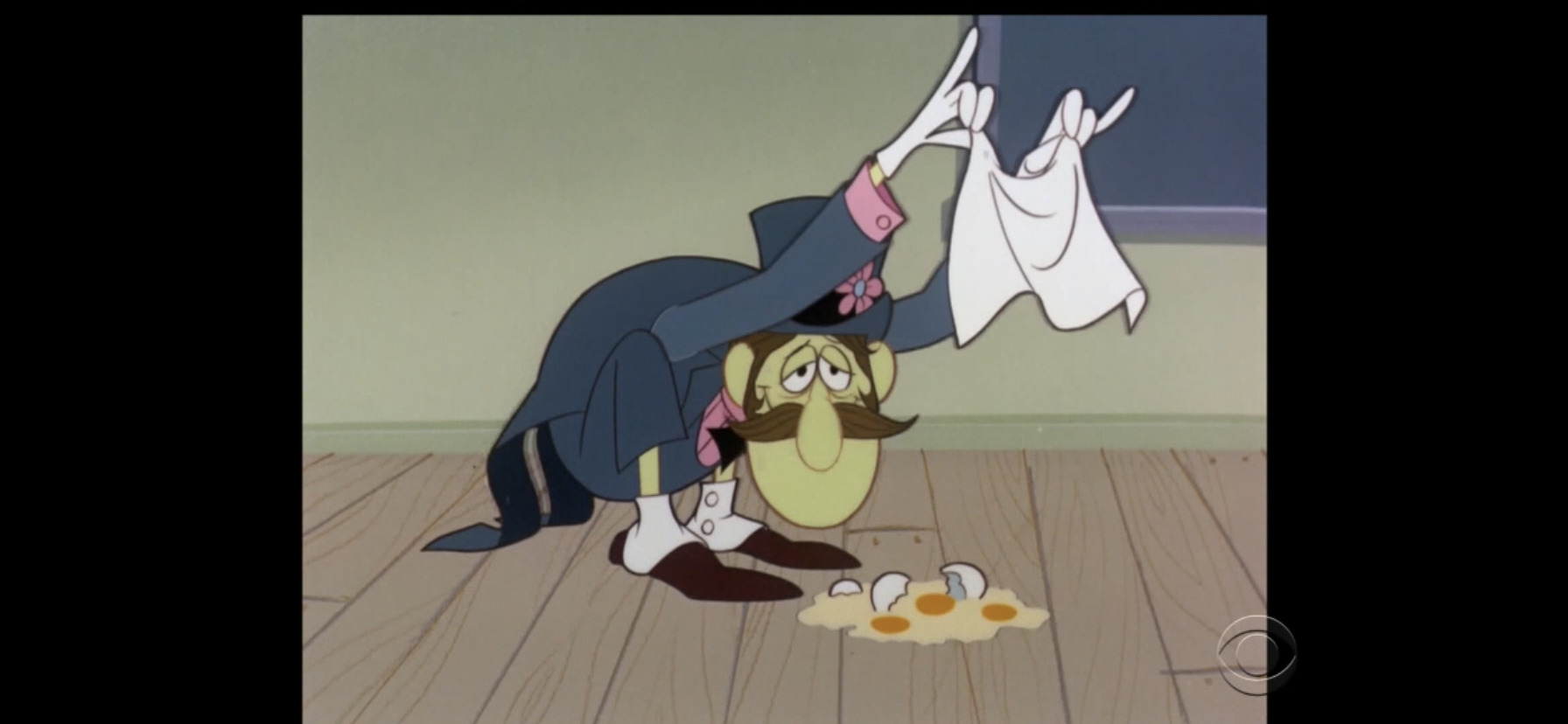
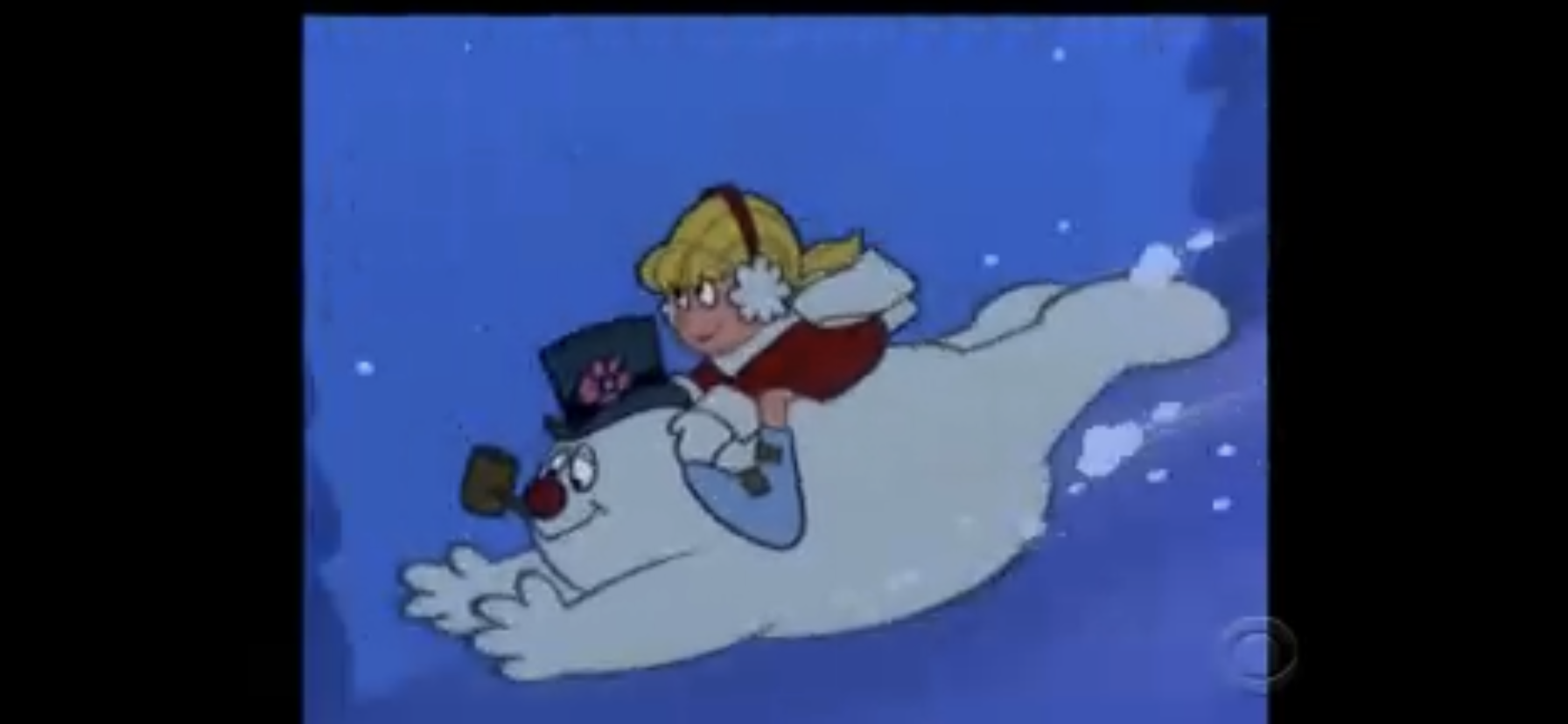
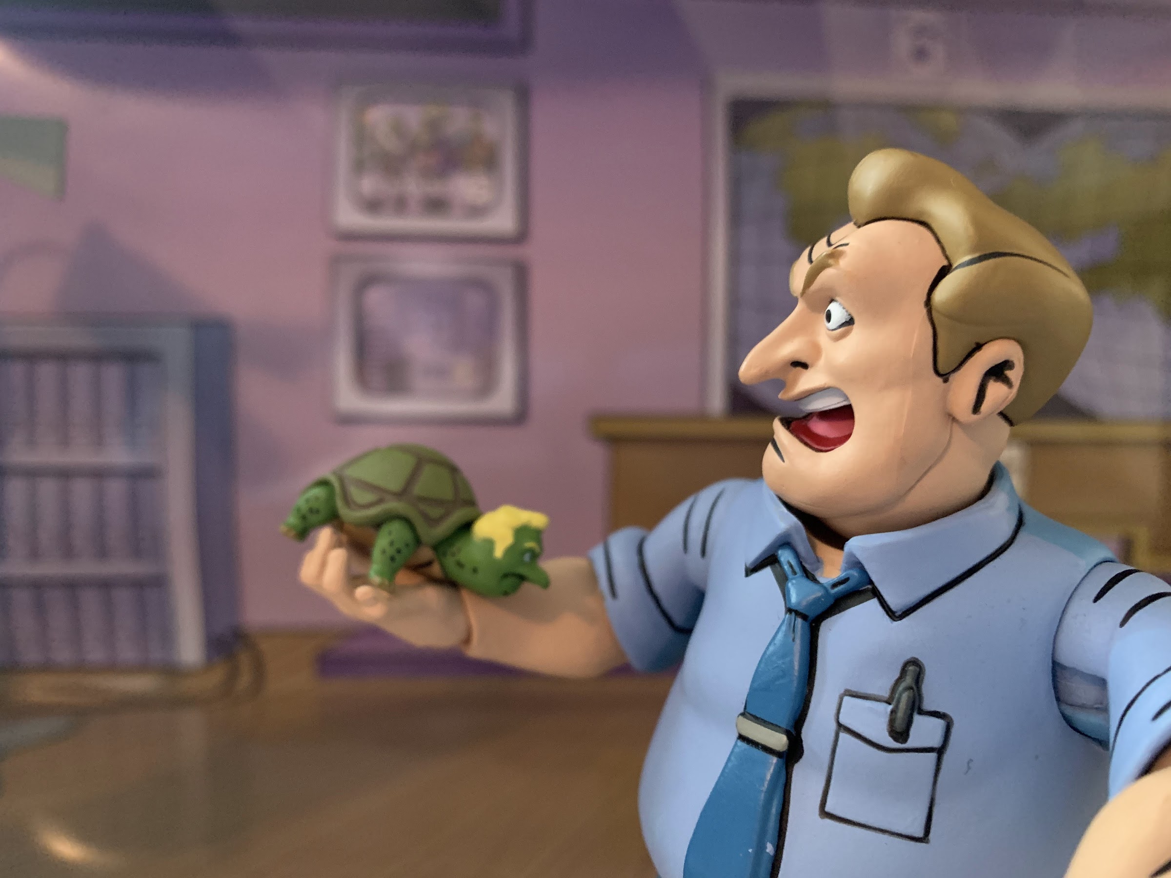
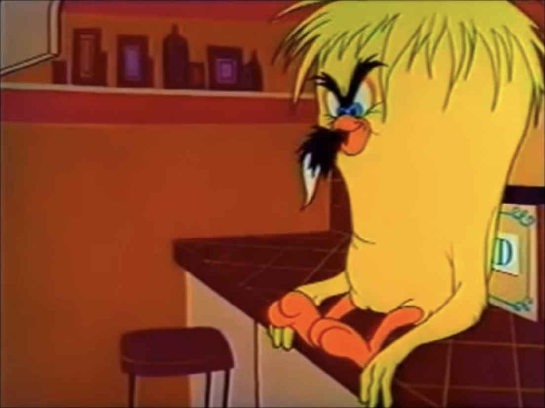
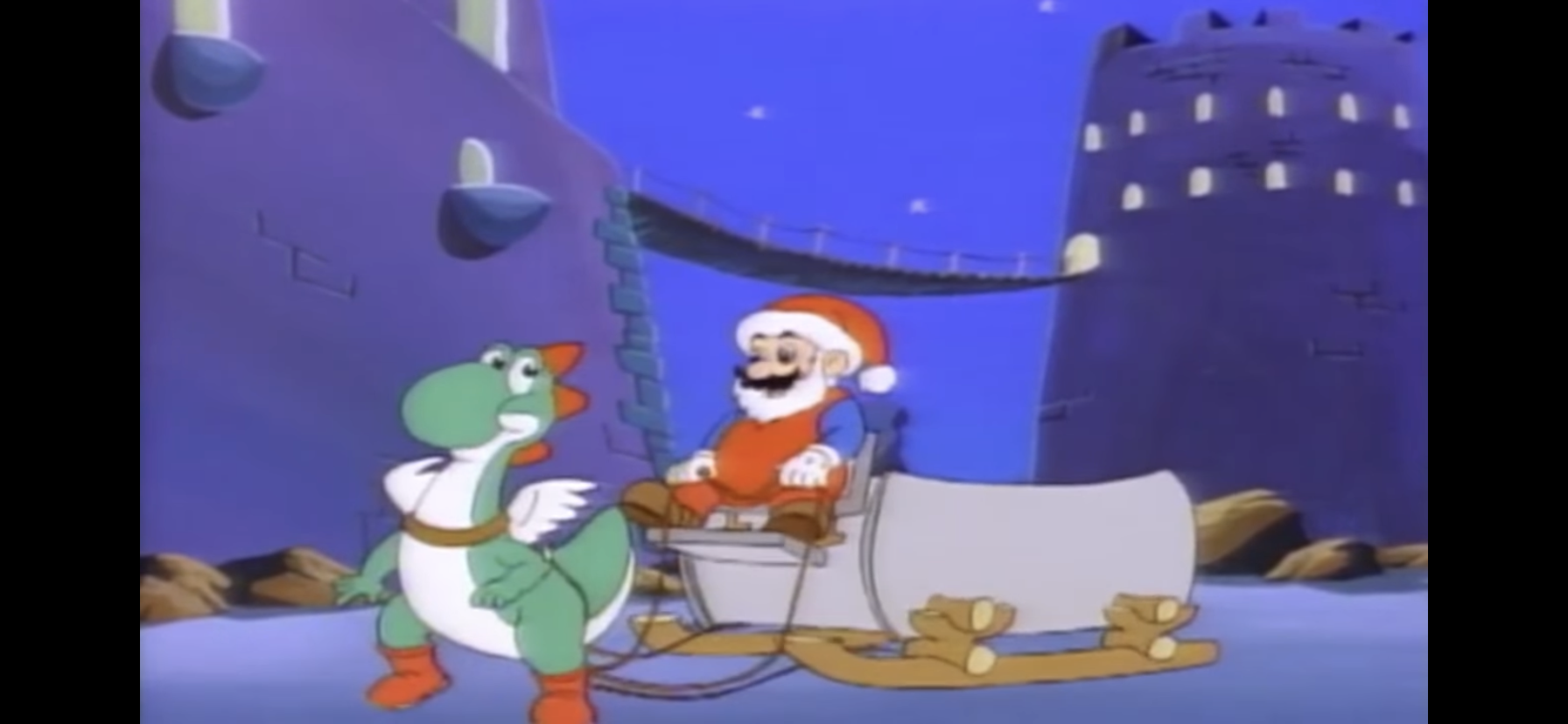
Mario takes off in his one-dinosaur sleigh as poor Yoshi has to pull that stone monstrosity through the air with his wings power-up. They do find time to pass in front of the moon. Meanwhile, Koopa empties the sack of toys back at his “neon” castle and finds Oogtar inside. Oogtar, apparently lacking any sense of danger, is still preoccupied with getting all of the toys and gets into an argument over it with Koopa who intends to give them to his kids. Oogtar grabs one gift and Koops swats him across the room, rather gently unfortunately. Oogtar rips it open, only to find a ba-bomb inside it which he promptly tosses back to Koopa. He shouts he’s glad Koopa isn’t his dad with a gift like that, but aren’t these all gifts Mario and the gang wrapped? Were they trying to murder Oogtar?!
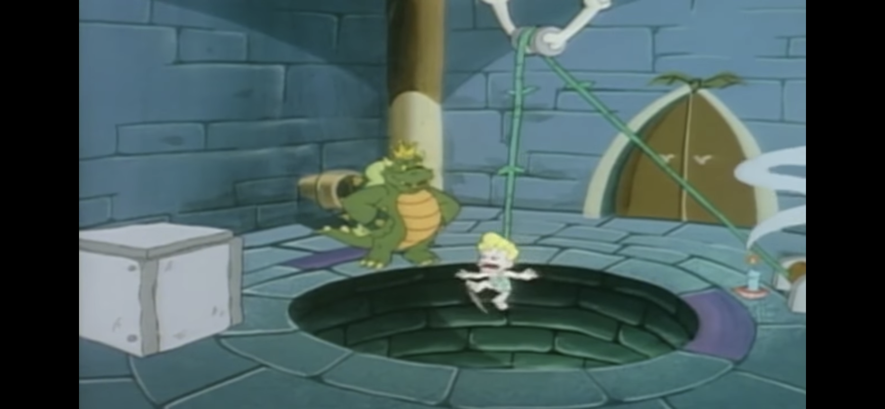
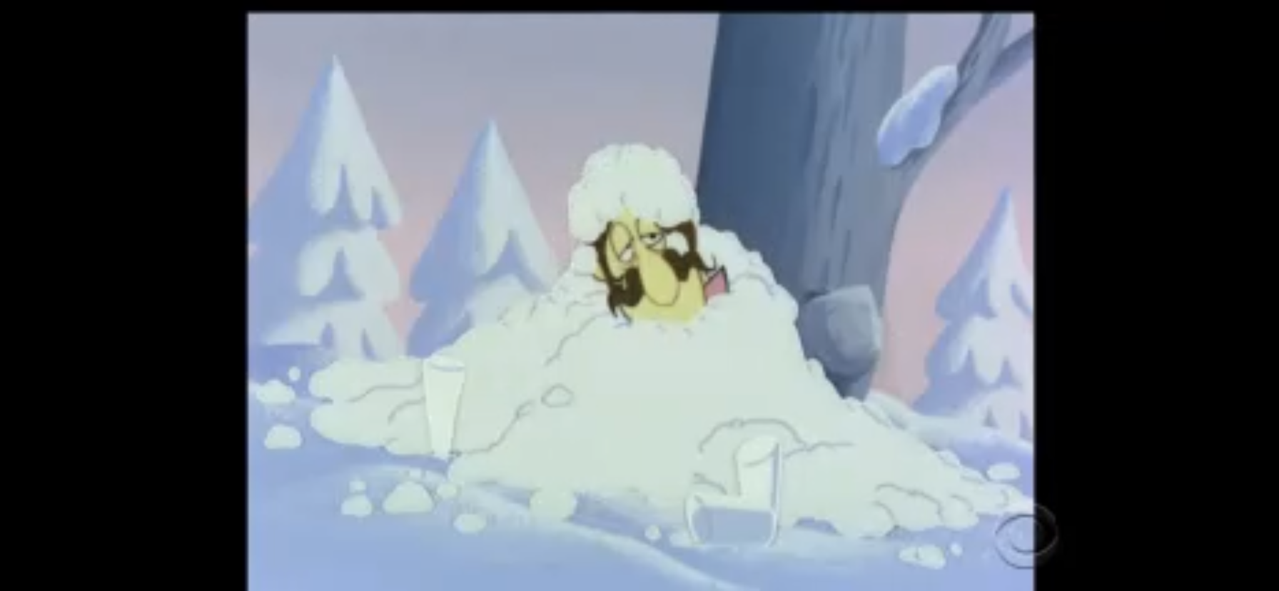
The bomb predictably explodes in Koopa’s face, even though he tried telling it that it’s not supposed to blow until Christmas. Oogtar tries to book it, but Koopa grabs him. He’s got something special planned for Oogtar as he strings him up with a pulley system. The rope is a vine and Oogtar finds himself dangling over a pit in which a hungry dinosaur waits at the bottom. Koopa places a lit candle under the vine and leaves Oogtar to his certain death rather than stay and watch. I’d think he’d want to see the little twerp get it, but I guess he has other plans. As he departs, he chides Oogtar by reminding him that his name spelled backwards is “Rat Goo,” an actual worthwhile zinger for this show! I like this Koopa fellow.
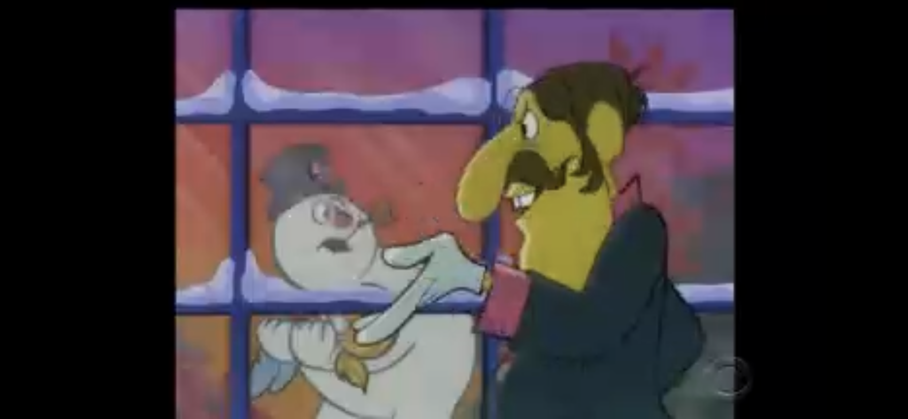
Santa Mario and Yoshi arrive and hear the screams of that little baby, Oogtar, coming from the castle. Mario runs over with his toolbox and spies Oogtar through a barred window. Seeing Oogtar in danger, he then runs to a different window for some reason and pulls out some little dinosaur from his toolbox that he uses to bend the bars. Yoshi, who seemingly lost his wings despite not taking any damage, is then advised to help Santa squeeze through the opening he just created, but he’s still too wide. We get a predictable diet joke out of Yoshi, and Mario informs him that a diet is not in the cards and that he needs to push harder! As Yoshi backs up to get a running star, he sees a terribly off-model Boo ghost and panics, crashing into Mario sending both tumbling into the castle where a horde of mecha-koopas descend upon them.

We then go into the chase segment. I think every cartoon in this show features one where the characters go running through the castle, avoiding enemies, all while a song plays in the background. The song is almost unintelligible. It sounds like the Koopa Kids making up a Christmas song. There’s something about a sleigh in there and I can’t make much out. It’s not good. Mario rides Yoshi through part of the castle avoiding catastrophe until they have a trio of the football guys from the video game chasing them down. Mario is able to conveniently find a super feather in a block and becomes caped Santa! He grabs Yoshi and the two fly through a pipe that leads them to Oogtar.
Oogtar, unfortunately, is still dangling over the hungry dinosaur infested pit. The vine breaks and Oogtar heads for doom, but Mario grabs the end of the vine. As Oogtar rises out of the pit, Mario goes in! Narrowly avoiding the chomping jaws of the dinosaur lurking within, Mario is able to fly out of the pit, catch Oogtar, and safely land outside the pit while the poor, endangered, creature in the pit is left hungry. Mario does a “ta-da” pose and a puff of smoke seemingly indicates his cape power wearing off, but when the smoke dissipates the cape is still there. Only when Mario starts laying into Oogtar is his cape finally removed from his model. Oogtar tries to weasel out of the discussion, but Mario points out that he’s already gone through all of Santa’s presents. Oogtar finally cops to being a little shit and Yoshi calls him bad (his eyes are all over the place in this segment too and it’s really distracting). Oogtar then promises to be a good little cave kid for the rest of his life, but Mario notes he’s got his fingers crossed behind his back. Oogtar, astonished, asks Santa how he knew and Mario gives a chuckle that he was once a little “bambino” too. Cave Christmas magic!
Mario then comes running out of the castle with the sack of toys, which looks much smaller than before. They’re apparently just going to “yadda yadda” over how he managed to sneak into the throne room and grab them. With Oogtar in the sleigh and Yoshi hitched up, Mario tells him to take off, but there’s one problem – Yoshi doesn’t have any wings! Mario retreats to a nearby castle wall and just starts punching blocks until some wings pop out – the solution was so easy why bother even creating the problem in the first place? With the wings in place on Yoshi, they can finally leave, and just in time too as the threats of Bully Koopa start echoing from inside the castle. The whole Koopa clan races out as Santa’s sleigh lifts off.
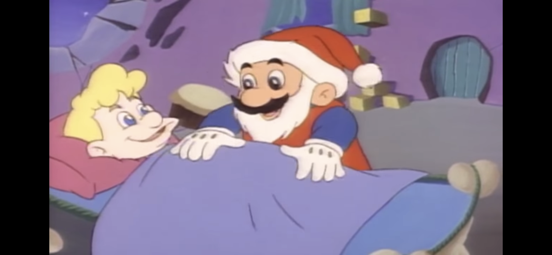
Back at Dome City, Santa Mario tucks Oogtar into bed. Before he can leave, Oogtar grabs Santa’s shirt so he can tell him that he’s been a bad kid and doesn’t deserve any presents. Being saved from the dinosaur is present enough (I bet the town wishes they could trade the presents they’re about to get in exchange for feeding Oogtar to that dino), but if Santa wants to leave Oogtar something it would make him happy. Mario remarks this isn’t like Oogtar, implying this one bit of manipulation on Oogtar’s part erases how terrible he is. Mario, predictably, leaves Oogtar a present before he and Yoshi fly off into the night.
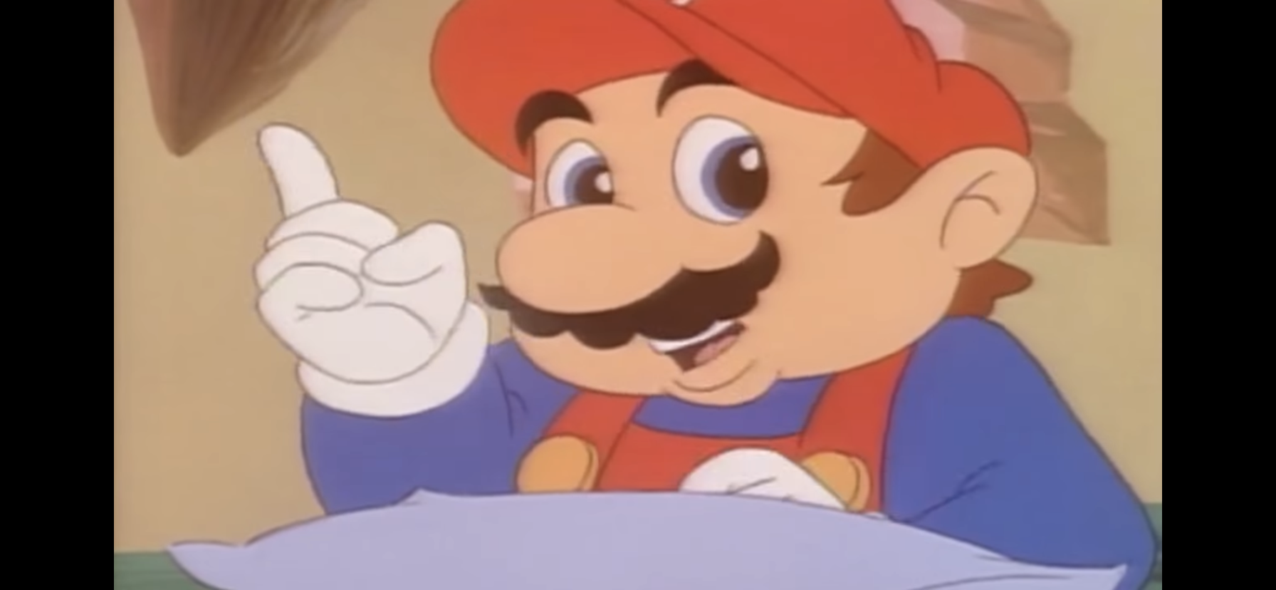
The next morning, Mario is snoring away in his very uncomfortable looking vine bed still in all of his clothes. As he sleeps, Oogtar slips in with a wrapped gift as he notes Santa didn’t leave Mario anything. He places the gift by Mario’s bed as the plumber wakes up. Oogtar wishes “Mario dude” a merry Cave Christmas. The episode ends with Mario breaking the fourth wall to ask the audience, “Wouldn’t it be nice if every day were Christmas?”
And that is the rare holiday of Cave Christmas. It’s just like regular Christmas, only Santa is a plumber and his stone sleigh is pulled by a winged dinosaur. Also, the toys look pretty lousy. And it’s set in August. I don’t think I thought much of this episode (or this show) as a kid and have almost no memory of this, specific, episode. As an adult, it’s hard for me to ignore the inherent colonialism in the Mario brothers setting up shop in a remote location among the natives and basically brainwashing them in a bid to control them. It’s actually pretty shitty. It’s made worse by the fact that they’re also spreading a religious holiday to these people, though the religious aspect of Christmas is not touched upon at all, for the better.
Even if I accept that I’m reading way too much into this extended video game commercial, there’s no polishing this turd of a Christmas special. Oogtar is unlikable and pretty damn annoying. I really don’t want to see him learn a lesson or have a merry Christmas in the end, I just want him to go away. He also didn’t really learn anything as I get the impression he just goes back to being a shit the next day once Cave Christmas is concluded. He tried to lie to Santa! Beyond that, the episode is poorly scripted, plotted, and paced and almost demeaning to its audience. The good guys have to be stupid in order to not see a giant turtle monster skulking about town stealing their stuff, and they make sure to tell the audience everything that’s happening because no one apparently trusted the kids to understand this stuff. The only positive I can give this thing is Harvey Atkin is still dynamite as Koopa and he even made me chuckle on two occasions.
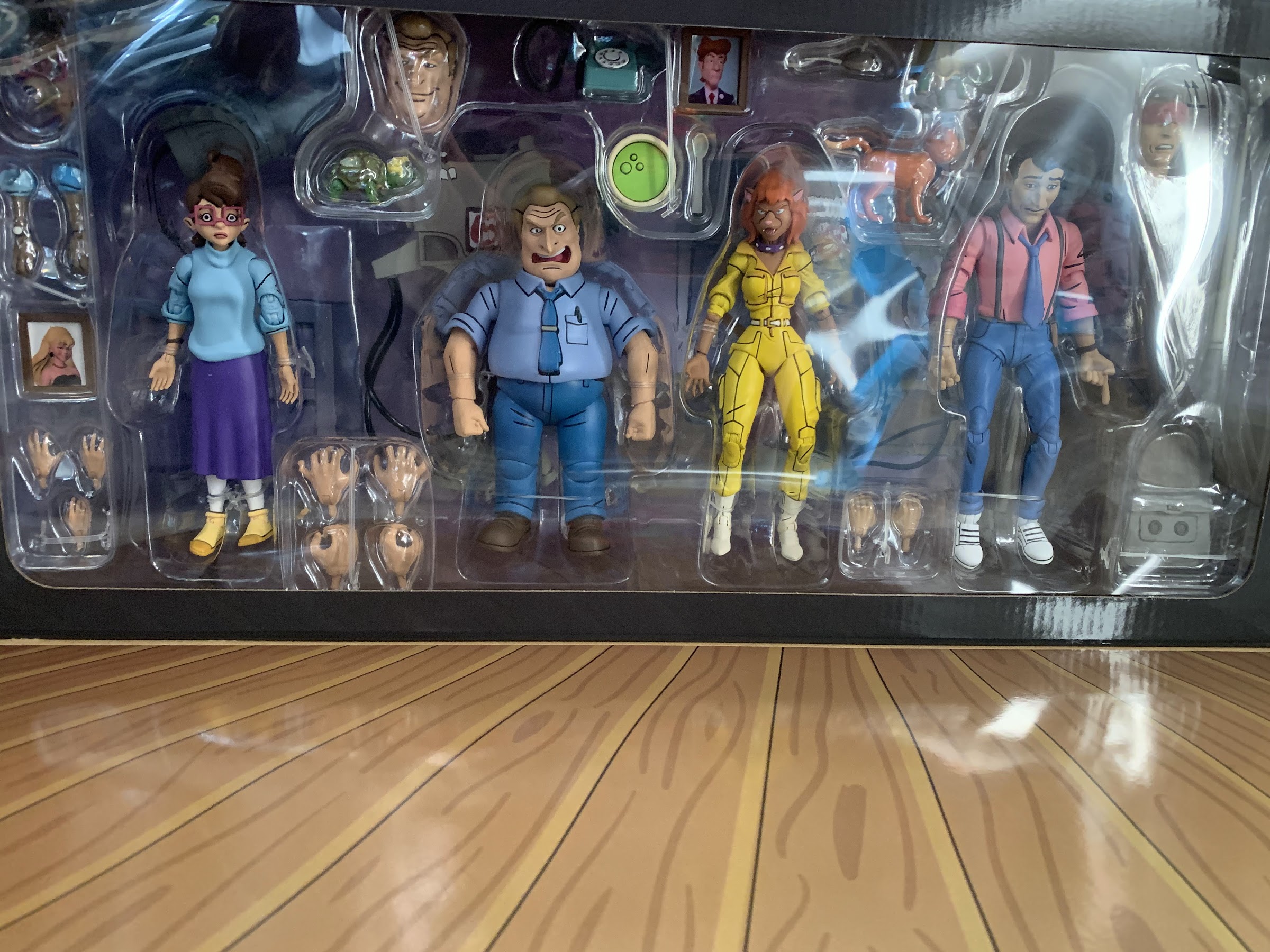
If you absolutely must journey to Dinosaur World this Christmas then you’ll be pleased to know that all 13 episodes of Super Mario World are available on DVD. And since the show is bad, you can probably find it for very cheap as nostalgia seekers probably impulse bought it when it was new and then were eager to get rid of it. Nintendo also hates these old cartoons and basically just wants nothing to do with them so no one is actively enforcing the copywrite presently and you can find this one streaming online for free. With seemingly every IP under the sun getting locked into exclusive deals with some official streaming service, this one might actually remain free for awhile since Nintendo doesn’t appear interested in even shopping this stuff around. I’m actually a little surprised they aren’t throwing their weight around to wipe this thing from existence, but I guess their inattention to the show is everyone’s gain. Or loss.
Can’t wait until tomorrow for more Christmas? Check out what we had to say on this day last year and beyond:

Dec. 3 – The Simpsons – “The Way of the Dog”
It’s not often I get to look at a Christmas special from the same year I’m doing The Christmas Spot, but it also helps when that Christmas special premieres in May of the same of year. May?! Yeah, it’s weird, but for the 31st season finale of The Simpsons the show rolled out a Christmas…
Keep reading
Dec. 3 – Mega Babies – “A Mega Christmas”
Considering how gross a lot of cartoons had become in the 90s, it should come as no surprise that the decade concluded with Mega Babies, a cartoon about literal snot-nosed, super-powered, babies featuring diapers overflowing with excrement in the opening title. Mega Babies was a short-lived production from the Tremblay brothers, Christian and Yvon, who…
Keep reading
Dec. 3 – X-Men: Evolution – “On Angel’s Wings”
Long after the X-Men animated series that originated on Fox Kids had ended, along with basically every other Marvel cartoon at that network, X-Men: Evolution showed up on Kids WB. It’s kind of odd considering WB owned DC and yet they went in on X-Men, but X-Men were still popular and were gearing up for…
Keep reading