The first episode of X-Men ’97 left me grinning from ear to ear and eager to see what would happen next. I’m happy to say, the show’s second episode left me feeling very much the same. “Mutant Liberation Begins” starts off right where the previous episode ended. Magneto, has revealed that it was the wishes of Charles Xavier that all of his assets be turned over to his longtime friend and often adversary. Magneto now leads the X-Men, and everyone is worried about where his loyalties truly lay.
The episode begins with a familiar refrain: Previously, on X-Men. Before, it was usually delivered by Norm Spencer, the voice of Cyclops. For the second episode it’s delivered by Matthew Waterson, the voice of Magneto. The opening credits are also updated to feature Magneto first reflecting his new status (and new, big M costume) as headmaster of the institute. This was a plot foretold by the official trailer for the show so it comes as no surprise. It’s also a plot from the comics as is another plot from this episode: the trial of Magneto. In addition to his new presence, there are also new shots included in the intro that mostly replace the classic shots we’re used to seeing. These new ones are recreations of scenes from the original series so it would appear that the opening title will be a little different for every episode which is kind of fun.

This episode has to confront the issue of how the X-Men will exist with Magneto in charge and how humanity will respond. Magneto is essentially branded a terrorist by most of the world governments, which is why his reveal as being affiliated with the X-Men leads to a confrontation with Valerie Cooper and the federal government. Perhaps to the surprise of everyone present, Magneto surrenders as he views this as the clearest path to gaining the trust of the team. He does make it clear that he does not share Xavier’s world view that peace between mutants and humans can be achieved, but for the sake of his departed friend, it would appear that he’s at least going to try while also doing things his way.

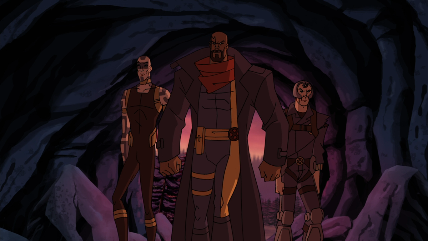
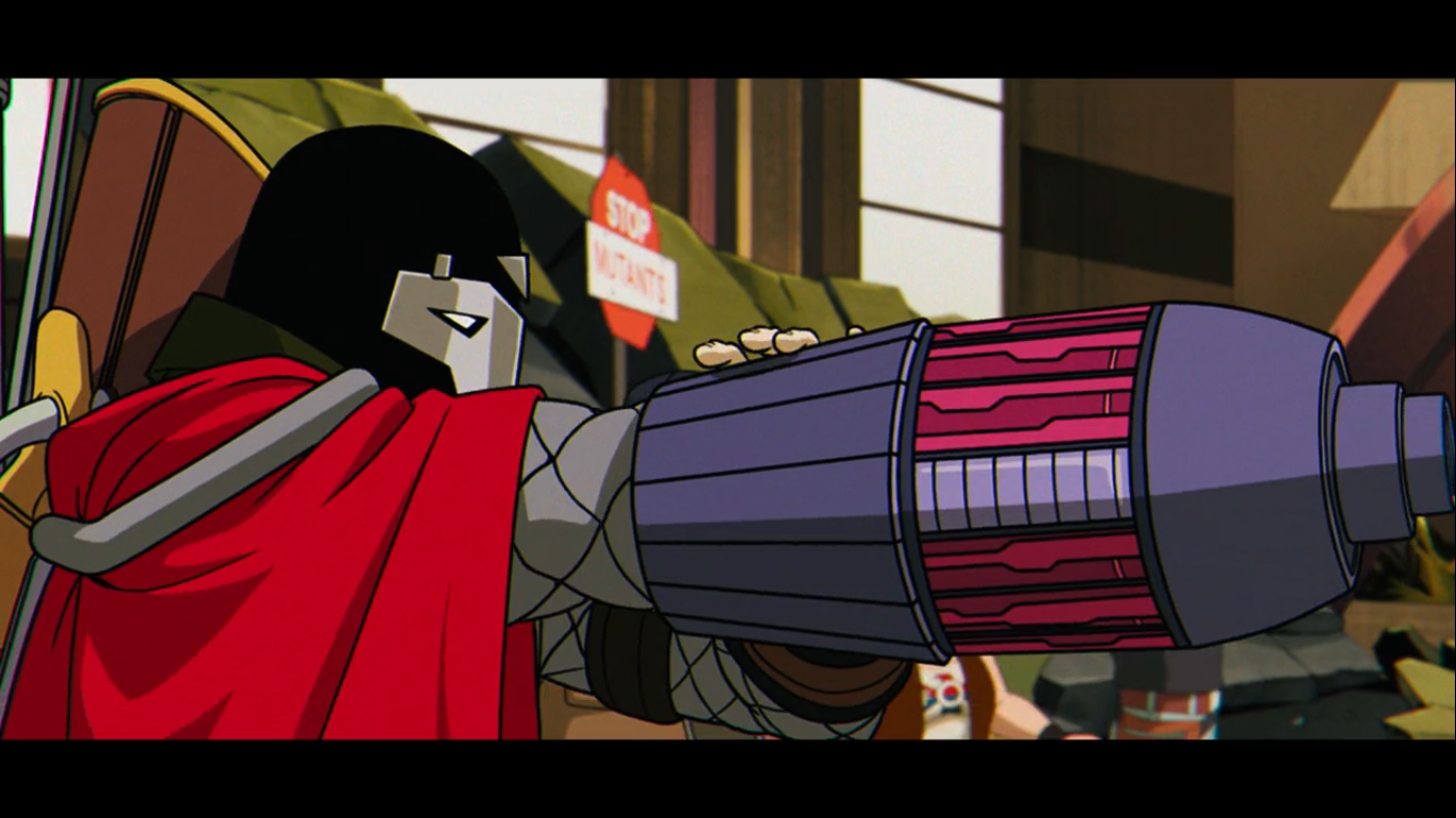
Much of the episode takes place before a United Nations council set to judge Magneto. It also introduces a new villain: X-Cutioner. Pronounced by the character as “Executioner,” the character is voiced by Lawrence Bayne who is known to fans of the original X-Men cartoon as the voice of Cable. Cable will appear at some point in this show, but with a different voice actor. That choice was justified by series creator Beau DeMayo as being a necessity so that they could cast Cable as someone who sounds closer to Cyclops, something the original series likely didn’t take into consideration. Even with that, I was disappointed at the news as Bayne’s Cable was one of my favorite performances in the old show. He’s fine as X-Cutioner who is an enemy allied with the Friends of Humanity packing some serious fire power, but I’m sure I’ll miss him as Cable whenever that character debuts.
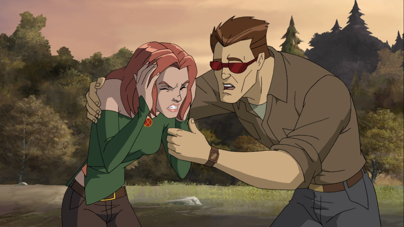
The episode does include a B plot which would be unusual for the original show, but may be a sign of things to come. It’s also a humor-based B plot which would also be unusual and concerns Wolverine and Jean. Everyone except them has gone to the UN to watch Magneto’s trial unfold, so naturally this is the time when Jean goes into labor. It’s up to Wolverine to get her to a hospital and he seems far more unnerved doing that than facing down Apocalypse. It’s not something that chews up a ton of screen time and it was kind of nice to see the show willing to embrace a bit more humor. It also leads to some important character moments like what happens when an extremely powerful mutant shows up in labor at a hospital? And how does Wolverine feel about the woman he loves having a baby with another man? It gives us a great moment between Wolverine and Morph too that elaborates on their friendship, something we were told was a thing in the original series, but really didn’t get to see much of.

And speaking of everyone’s favorite love triangle from the original show, we’re apparently about to be served up another. When the writers were handed the keys to the mutant kingdom with that first show, it was a group unfamiliar with the X-Men that had existed in print for decades prior. As a result, they seemed to view the show as a new beginning. Some of that would be retconned in later series when it was acknowledged that the team had existed for awhile prior to the events of the show and more of that is being addressed here with Rogue and Magneto. It would appear their prior relationship before Rogue joined the team is now canon and it’s likely going to lead to some uncomfortable moments between they and Gambit. It just wouldn’t be X-Men without a little soap opera drama. I will say, one of my few criticisms of this episode takes place during these Rogue and Magneto scenes, but not because of the character development, but because of Rogue’s forced dialogue. It would seem writer Beau DeMayo could not get her line about looking as nervous as a long-tailed cat in a room full of rocking chairs out his head because Rogue has a lot of cat puns in this one scene. And they’re not very good. Perhaps the show can add an actual southern, female, writer to the staff just for Rogue lines going forward.

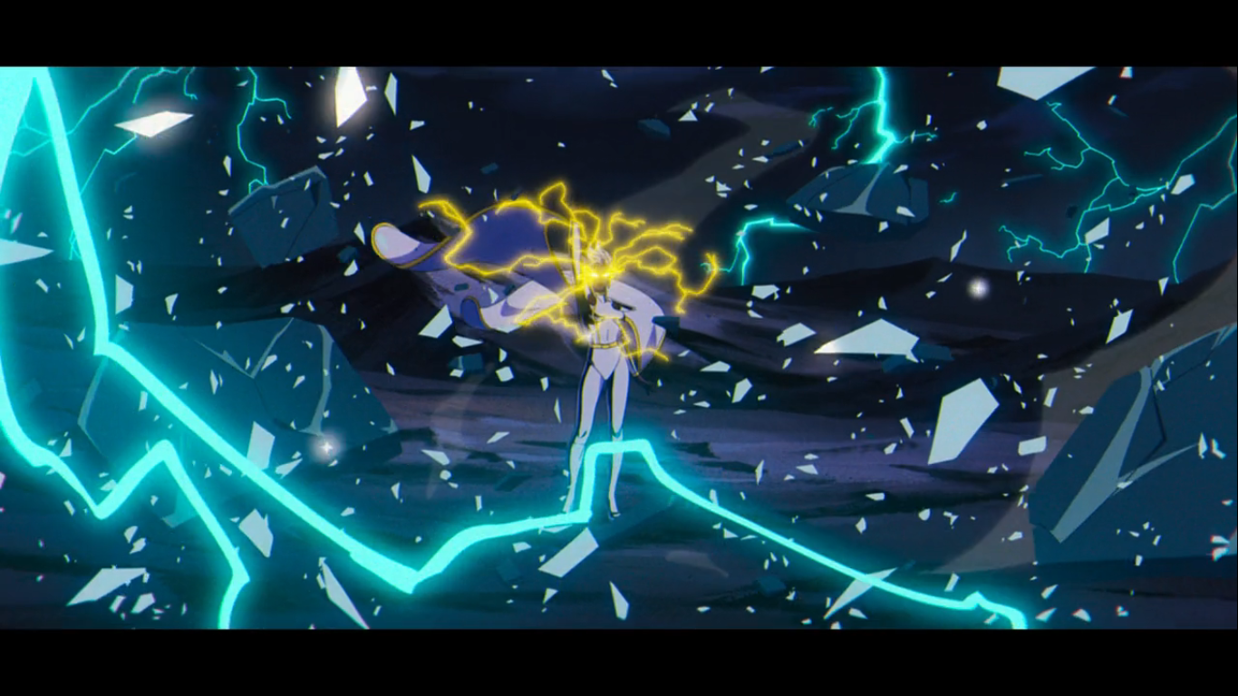
For a show that stylizes itself as a superhero action drama, an episode about dry court proceedings would have been dreadfully boring. That’s why “Mutant Liberation Begins” includes more wonderful action set pieces and also contains some pretty earth-shattering shakeups to the team. Like the first episode, this is still a show building towards bigger plots and laying the groundwork for how the series will go. It’s at times uncomfortable, but also exciting and I definitely want to see more. The episode also ends on another shocking reveal. Fans of the comics likely have ideas on where this development will lead, but I also wouldn’t expect a 1:1 recreation of any comic book plots. There will likely be some wrinkles thrown in and a change or two or three. As far as plots that could have been sourced from the books, I think it’s one of the top ones and it’s a plot that I’m glad the original series saved for this show because the more lax standards and practices should allow X-Men ’97 to do it justice.

Episode two of X-Men ’97 is more of the same, which is great. It’s going to be a long wait each week if all of the episodes are structured like the first two. Never mind the wait we’ll be in for when the season ends. I plan to review every episode of this inaugural season, though I don’t know how quickly I’ll be able to post reviews. It could be a Friday thing each week if I can find the time, or maybe it makes more sense to have a Mutant Monday on this blog? I guess we’ll see, but I’m definitely looking forward to taking this journey with all of my fellow X-Men fans around the globe.
Check out the other X-Men coverage we have here:

X-Men ’97 – “To Me, My X-Men”
It used to be that when a show got cancelled that was it. It simply ceased to exist as a new product. If there were enough episodes it could last in syndication on both broadcast and cable for a good while, but rarely was it accessible to the point where a fan could have the…
Keep reading
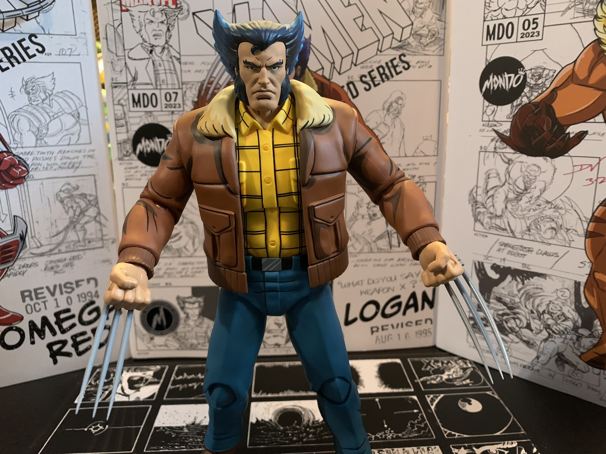
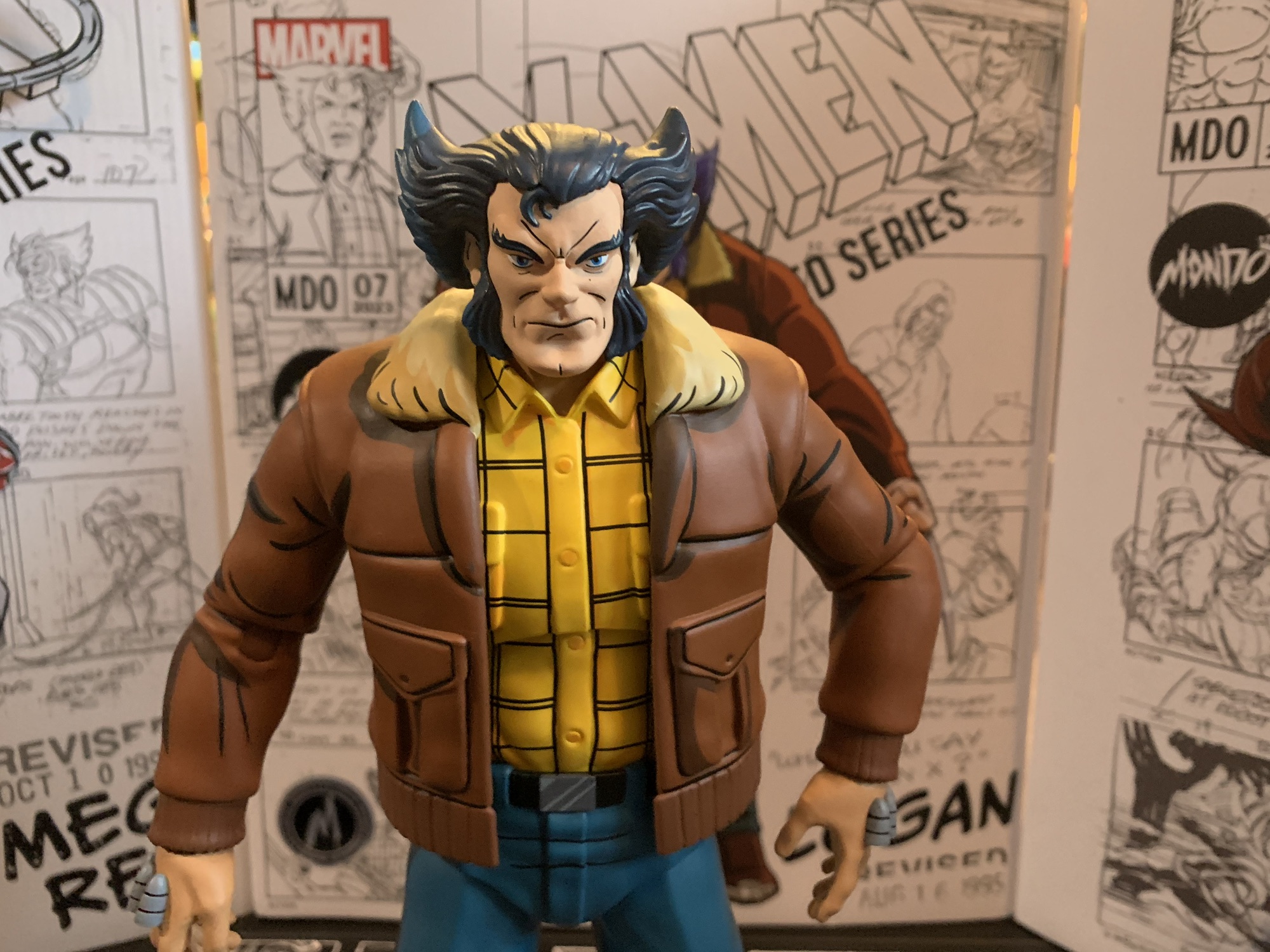
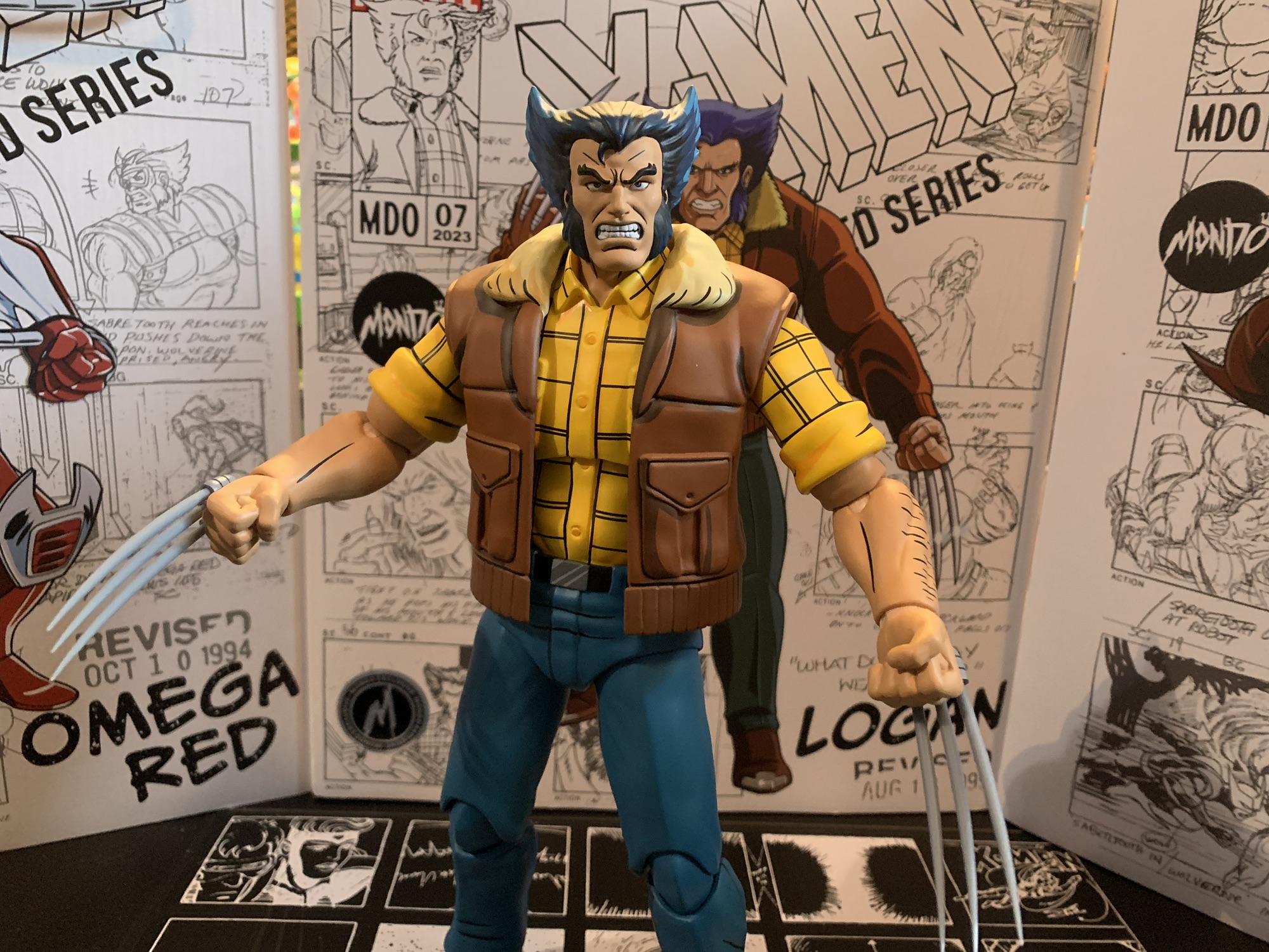
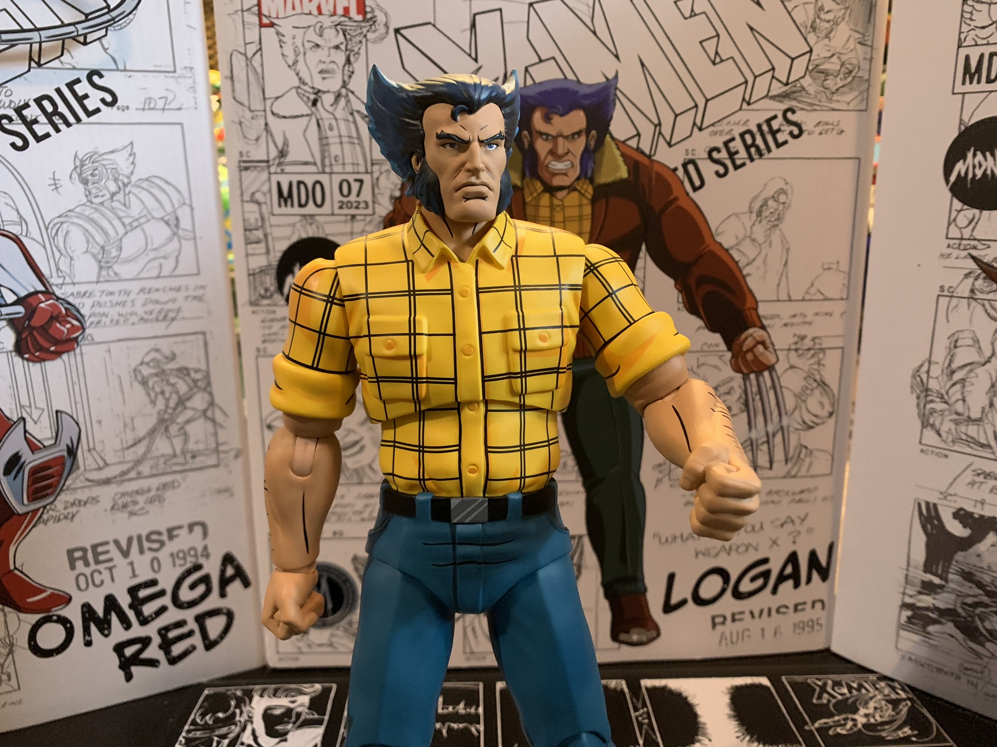
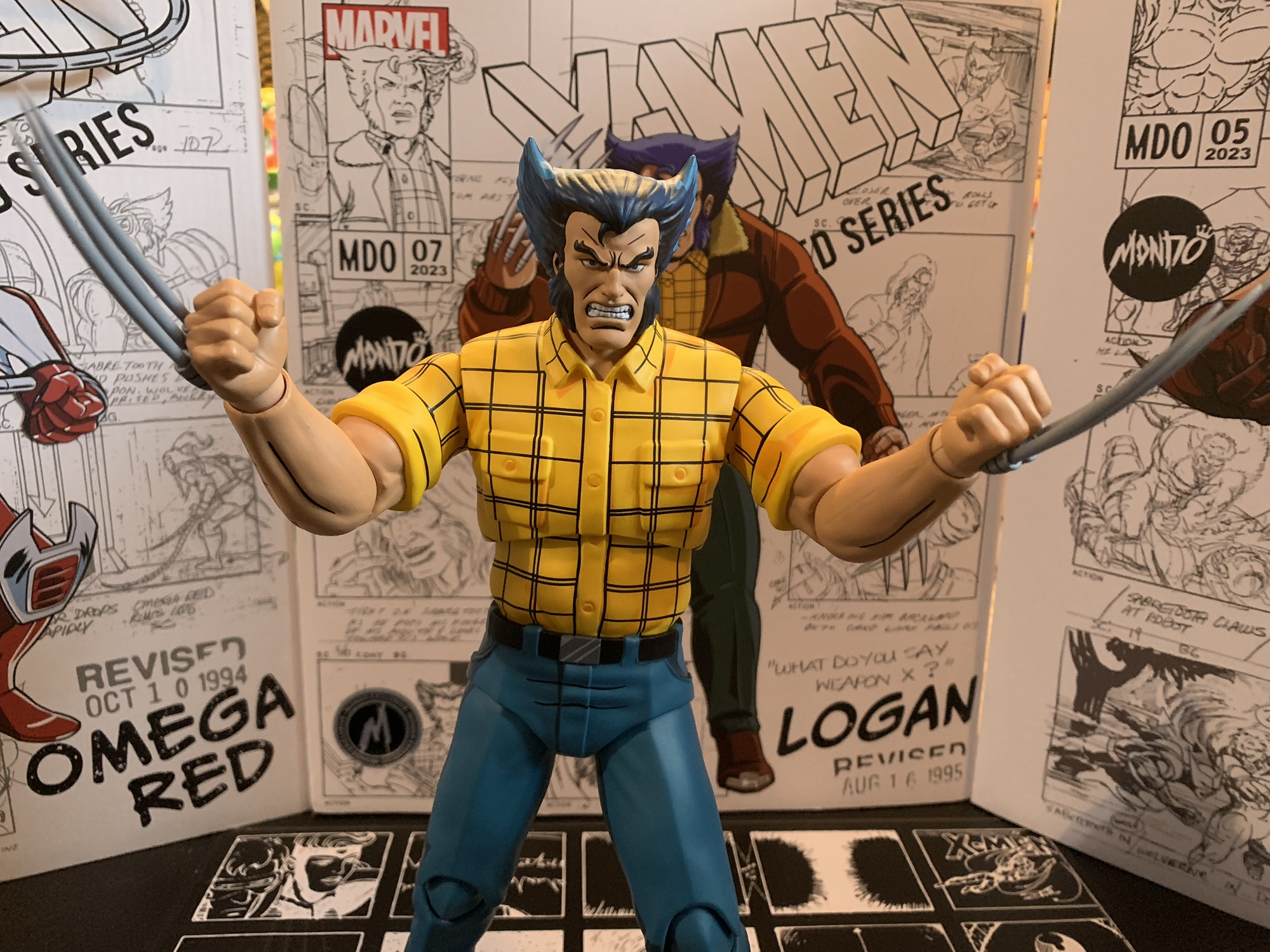
Marvel Legends X-Men ’97 Jean Grey
If you are reading this the day it goes live then Happy X-Men ’97 Day! Today is the day the long-awaited sequel series to X-Men debuts on Disney+. Rather than fast-track a review of the first two episodes to this blog, I decided instead to do what I most often do: review an action figure!…
Keep reading
Wolverine and the X-Men
It might seem amusing to folks younger than me who grew up on Marvel’s Avengers, but back in the first decade of the new millennium there wasn’t a hotter team of superheroes than the X-Men. The X-Men had been around since the 60s, but really took off as a comic book property in the 80s.…
Keep reading