Not every Looney Tunes or Merrie Melodies star had to be inherently funny. Sure, most of them were and that’s often what many cartoon enthusiasts will point to the Warner catalog of cartoons as having over Disney, but it wasn’t some hard and fast rule. That’s why when a guy by the name of Chuck Jones was getting into directing cartoon shorts he envisioned creating a star out of a character that was cute first, funny second. It was Jones along with Disney import Charles Thorson that created Sniffles, a little mouse character designed to make audiences go “aww!” The little guy was distinct from a more famous mouse, but was very much in-line with other Disney mice as Thorson basically ripped himself off when designing Sniffles as he looks an awful lot like the mice from The Country Cousin.
Sniffles debuted in the 1939 short Naughty but Mice and would go on to star in 12 additional short films, all but one released under the Merrie Melodies umbrella. He was an unassuming character that often stumbled into, and out of, danger in his cartoons or he just went on a little adventure with low stakes. Eventually, Jones seemed to become disinterested in “cute” and moved towards comedy. Towards the end of his run, Sniffles underwent a change in personality in which he became a chatterbox who often annoyed other characters with his incessant questions and explanations. It’s that version of the character some may remember since that was the persona he possessed for a brief cameo in the movie Space Jam.
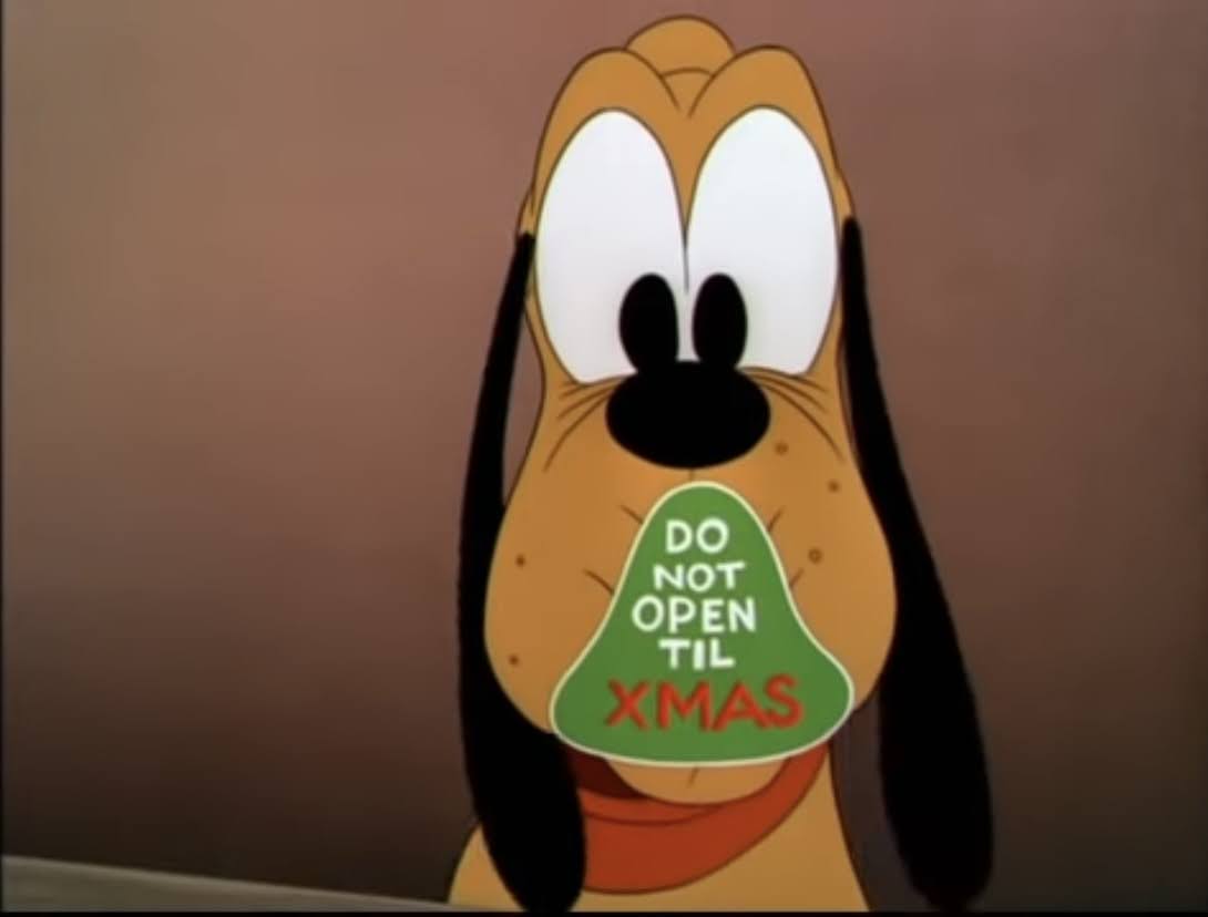
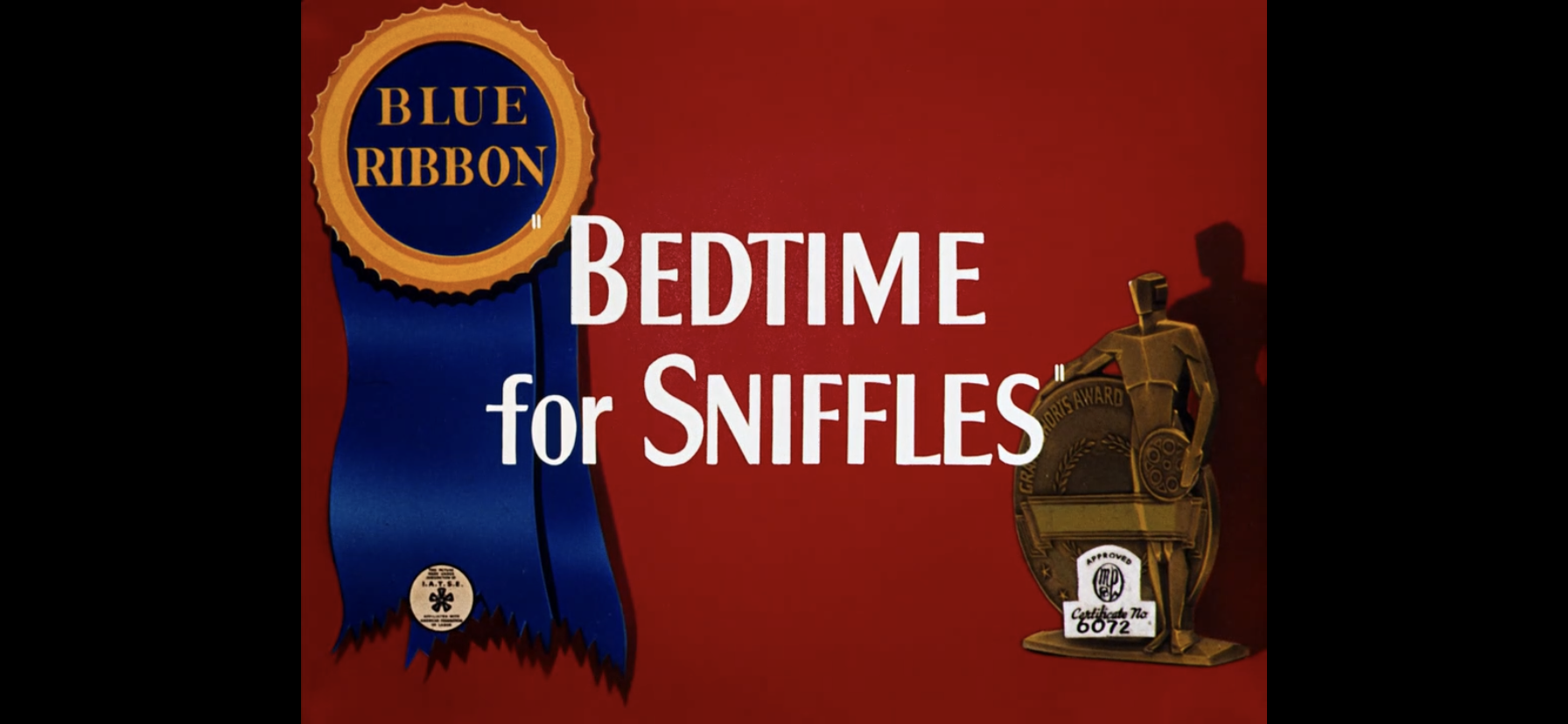
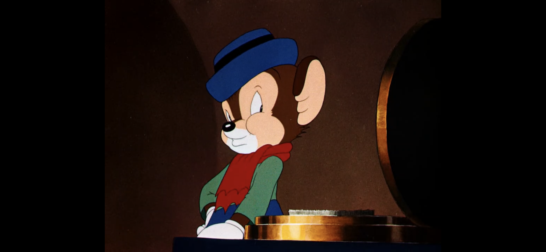
In 1940, Sniffles was still very much in his cute phase and he was handpicked to star in a Christmas short that year. Bedtime for Sniffles is a simple little cartoon about trying to stay up late on Christmas Eve to catch Santa Claus in the act. Sniffles seems a bit like a child, but he’s actually an adult mouse who lives alone. This short relies on his cuteness and the capabilities of Jones to put the viewer in Sniffles’ shoes. It’s definitely short on laughs, but it’s also not going for them.
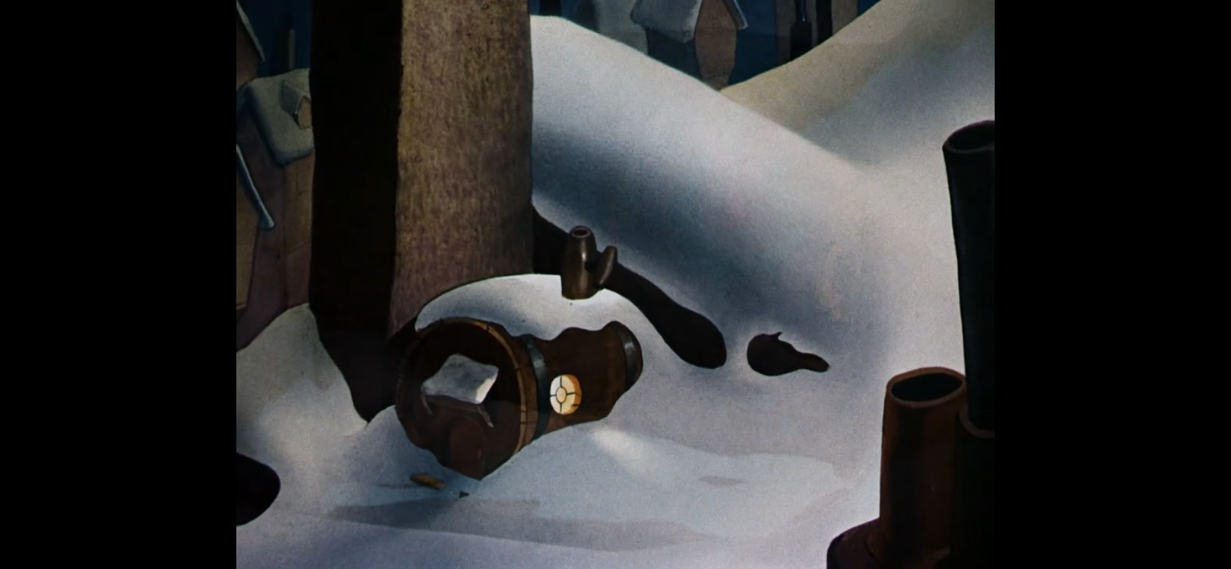
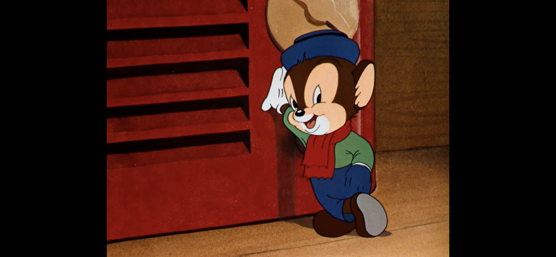
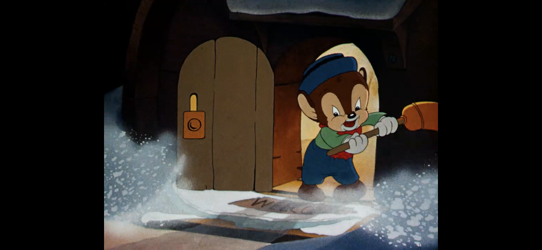
The cartoon begins with “Joy to the World” being sung. It’s implied the song is coming from carolers as we see a snowy cityscape illustrated in just a still. As the camera pans the animation comes in and the song fades and is replaced by Sniffles (Margaret Hill-Talbot, probably, as it’s uncredited) singing “Jingle Bells.” The camera pans to a rooftop and a little, wooden, barrel on its side with warm light escaping from it. A door has been fashioned out of the bottom of the barrel and it’s adorned with a Christmas wreath. Sniffles pops out to brush snow away from his welcome mat before heading back inside.
Once in the cozy confines of his little home, Sniffles takes note of the time. It’s Christmas Eve, and Santa is due to arrive in about an hour and a half. He decides if he’s going to stay awake for Santa he’ll need to brew some coffee. He heads over to a large container of Haxwell Mouse (this sort of pun-based humor is basically it for comedy in this one) and fills up a little coffee percolator positioned over a lighter. Most of the home of Sniffles is cleverly designed with every day items repurposed into something a mouse could use, but the coffee percolator just looks like a mini coffee percolator.
Sniffles continues to sing “Jingle Bells” to himself as he waits for his coffee to brew. He heads over to a radio, which is massive in his house, and turns it on. He appears to be dozing off as his voice kind of trails a bit, but then some classical music comes on the radio and he decides to dance with himself. He waltzes over to a makeup compact setup like a dresser on top of some matchstick boxes and looks himself over in the mirror. He then starts talking to himself and even flirting with himself (poor guy must be pretty lonely) before going into a shadow boxing routine. A sleepy song (“Sleep Baby Sleep”) comes on the radio and seems to instantly tire him out as he turns towards the mirror and starts to nod off. His head comes to rest on a little brush as he drifts into sleep.
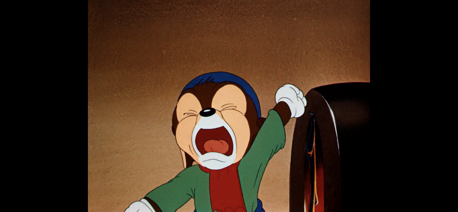
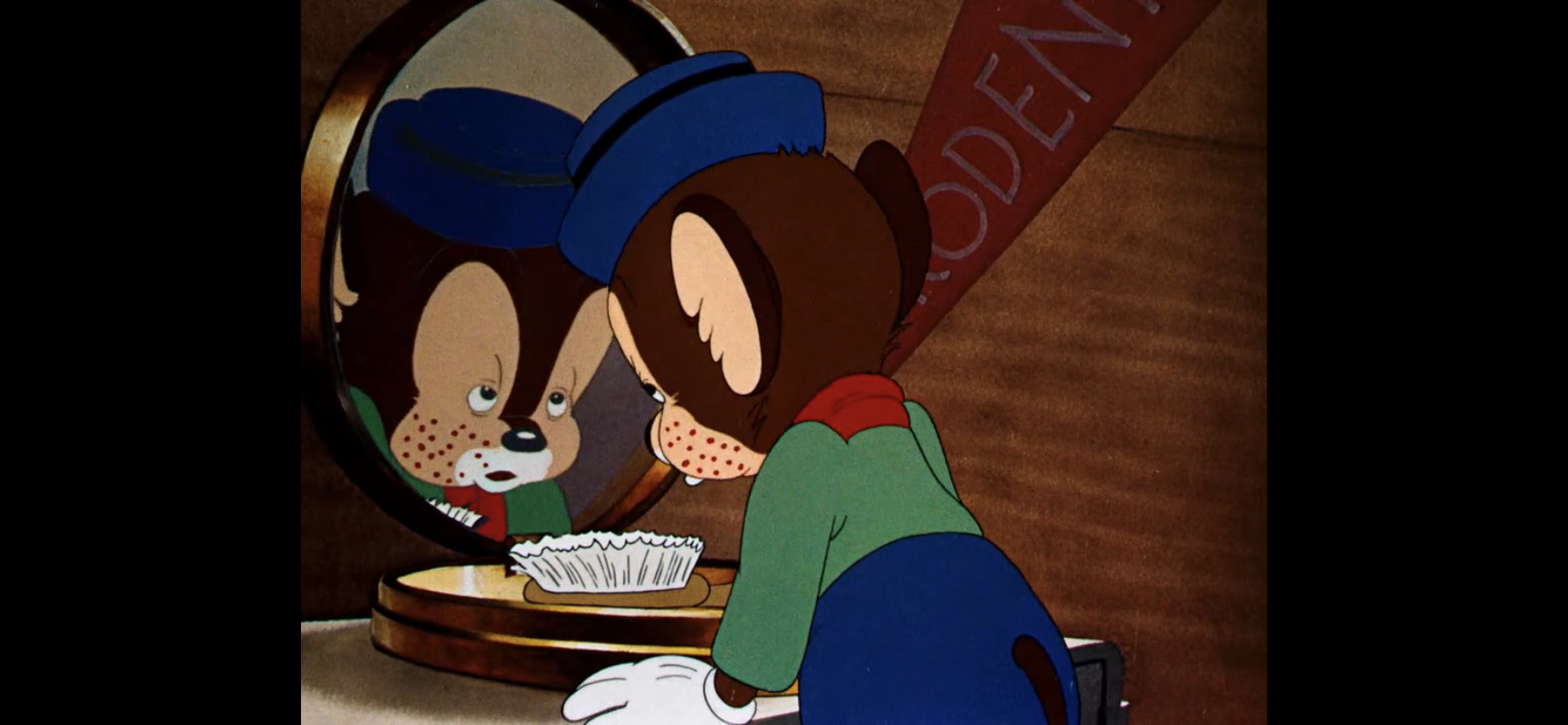
The sleepy song ends and a lively rendition of “Jingle Bells” comes on to rouse Sniffles from his brief slumber. As he pops his head up, the brush has left a bunch of dot marks on his cheek. He exclaims “Measles!” at the sight, and it sure must have sucked to not have a vaccine for them back in the day! As he rubs his face, he soon figures out the culprit and smiles to himself. He then saunters over to the radio and slumps against it. He’s in bad shape now as sleep is making a hard play for him. The animation takes over as we close in on the face of Sniffles as his eyes grow heavy and his posture slumps, only for him to snap himself back awake with a big smile. He can’t convince himself he’s wide awake though as his face quickly starts to sag once more.
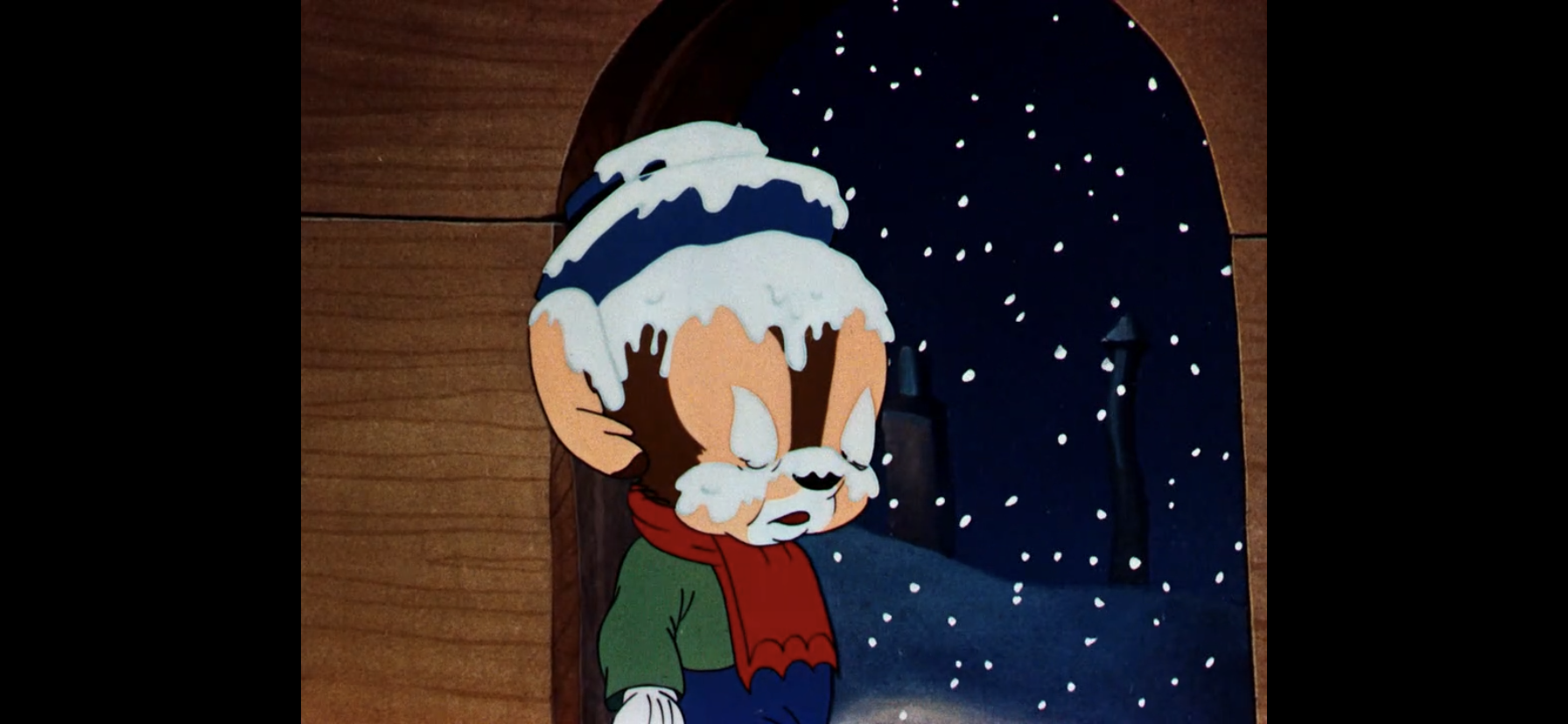
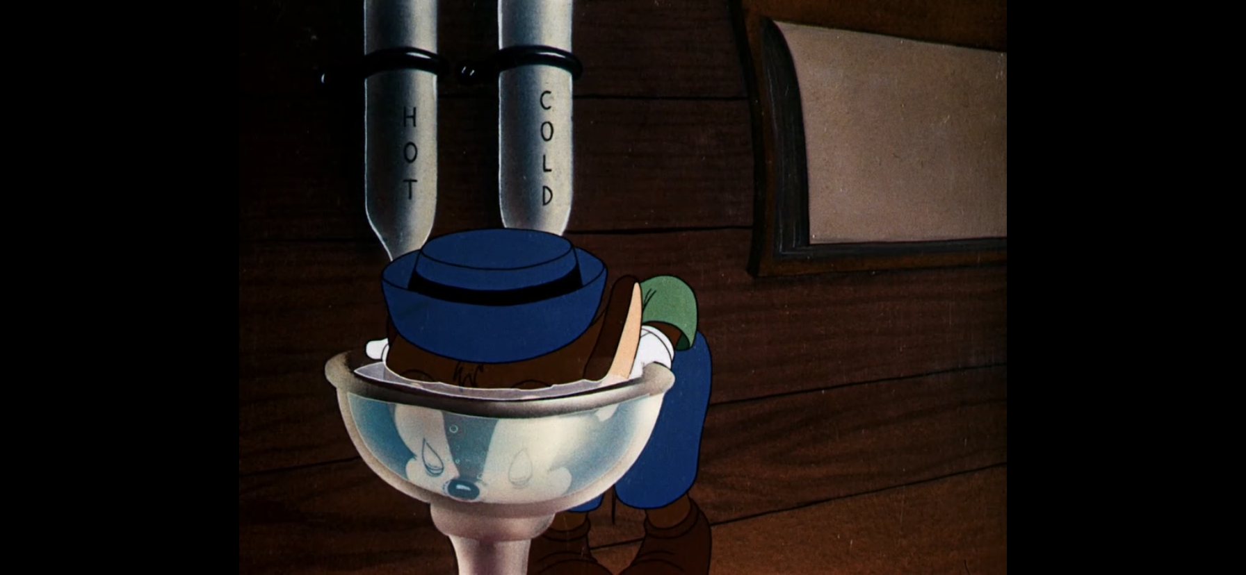
Sniffles stumbles over to his makeshift sink, two eyedroppers over some cup-like structure. He washes his face to try to and wake himself up and reaches for a box of cigarette paper on the wall to use as a towel. He discards it in an empty walnut shell he uses as a trash receptacle then walks over to his door to get a blast of cold air and probably search the sky for Santa. As he mumbles to himself about the need to stay awake, his posture slumps and he leans against the frame of the door for support. By now, I’m already thinking about that open flame under the coffee percolator and wondering what that will mean for Sniffles should he fall asleep, thankfully the thing whistles like a tea kettle though and Sniffles wakes up. He turns to the camera and his face is covered in white snow and he looks like…well, I could make a filthy joke right now, but this is a Sniffles cartoon!
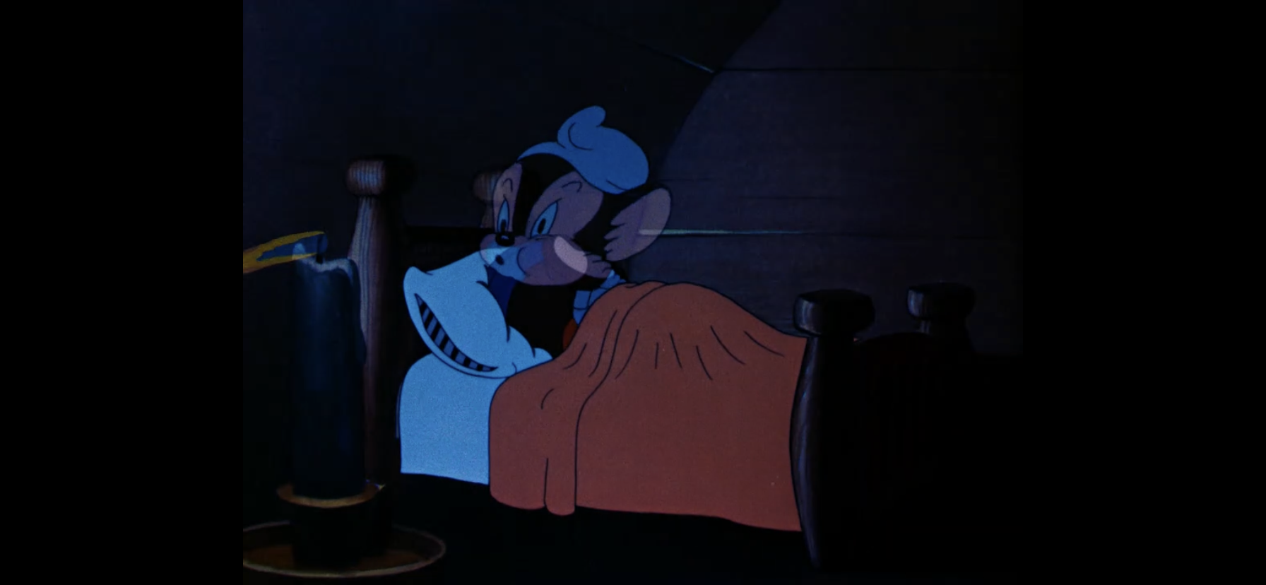
Sniffles heads over to retrieve his coffee with a little bit of pep in his step. He tries to convince himself a thimble of coffee is just what he needs and he sits in a chair to nurse it. We pan over to the radio and a chime comes on to indicate this is the end of the broadcast day. It’s now 11:30, and the departing DJ doesn’t even wish the listeners a “Merry Christmas,” which just seems wrong. The camera then pans back over to Sniffles. The coffee is all over the floor in a puddle, he’s slumped forward in his chair barely clinging to the thimble he used as a mug, as he barely clings to semi-consciousness. Sniffles then lifts his head and turns to a magazine to keep him awake. It’s titled Good Mousekeeping, and he immediately spies another visual pun encouraging him to go sleep, this one a cartoon of a yawning baby carrying a tire with the caption “Time to Re-tire.” He then looks up from his magazine and spies his bed. It looks so inviting, but he turns his head with a frown to avoid it. Only his eyes then rest on his mirror, and the bed is reflected in it. He turns again, but now he can see the shadow of the bed on the wall!

Sniffles then returns to his sink and plunges his head into the bowl of water. He can see through the side of the sink his bed once again, only now it’s inhabited by Sniffles! Now, my head cannon is Sniffles drowned himself in the sink, and the rest of the cartoon is his ghost trying to call out to his body. Sniffles lifts his head out of the sink, and the Sniffles in the bed is semi-transparent, like a ghost! It sits up and beckons for him to come to bed. Sniffles is resistant at first, but soon he starts to head that way. He starts with a couple steps, then floats across the floor as the ghost Sniffles gets out of the way allowing for tangible Sniffles to get into bed. The ghost pulls the covers over him and climbs in beside him, their bodies merging. The ghost then pops back up to blow out the candle because this mouse seems determined to start a major fire. Good thing he has ghosts looking out for him.
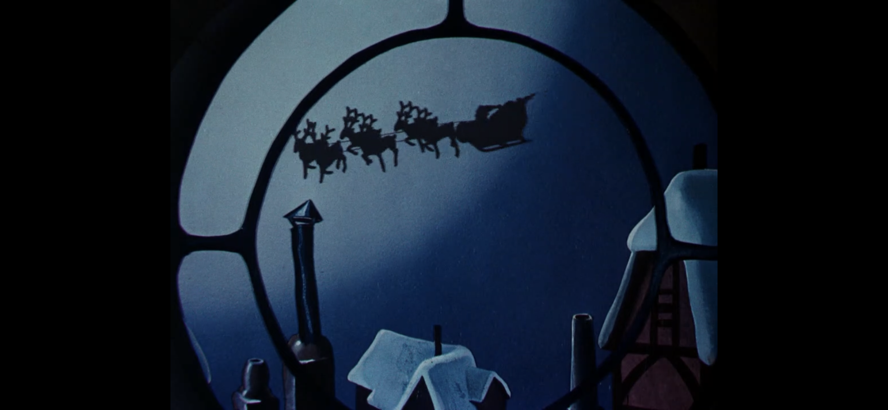
We then pan over to a window as “Joy to the World” returns. The sound of sleigh bells soon fill the air and we see the silhouette of Santa pass by a chunk of the moon. He has six reindeer, because eight are just too hard to draw, and the short comes to an end before he can pay old Sniffles a visit. Or pull his corpse from the sink.
And that’s all folks! A simple, little, situational Christmas cartoon starring a cute little mouse. Sniffles doesn’t really get to do or say enough in this one to become annoying, and while this cartoon is short on laughs, it’s pretty involving from an animation point of view. Jones and his staff do a terrific job of just animating the slowly deteriorating condition of Sniffles. I liked how he battled his fatigue, and I especially thought introducing the bed as an antagonist was a nice touch towards the end. The way the character frowns as he spins away from even looking at his bed is done well, though the ghost Sniffles was a little weird. I do wish we saw a little more of Santa, but I guess it would have been a challenge to try and draw a human character interacting with this miniature world crafted by the short. Even just a little gift dropping onto Sniffles’ welcome mat would have been appreciated though.
Bedtime for Sniffles, being a cartoon that stars one of the lesser Warner stars, is pretty easy to come by today. I believe it’s officially streaming on HBO Max and it’s been included on various VHS, DVD, and even Blu Ray releases over the years, most notably the Chuck Jones focused Looney Tunes Mouse Chronicles: The Chuck Jones Collection. And if you don’t think it’s worth paying for, you can find it easily enough online streaming for free in various places, though I do recommend that Blu Ray if you’re still into physical media (like I am). This is a solid, low energy, Christmas short you could sandwich in between something like Gift Wrapped and The Night Before Christmas. It’s probably no one’s favorite Christmas short, but it’s a hard one to truly dislike.
Can’t wait until tomorrow for more Christmas? Check out what we had to say on this day last year and beyond:

Dec. 7 – SuperTed Meets Father Christmas
When it comes to British imports and the subject of bears is brought up, most probably immediately think of Paddington or Winnie the Pooh. Few probably recall SuperTed, the Welsh teddy bear brought to life by a spotted alien and given super powers by Mother Nature. SuperTed is similar to Mighty Mouse in that he…
Keep reading
Dec. 7 – Bob’s Burgers – “Father of the Bob”
Bob’s Burgers has somewhat quietly become the best animated show on the Fox Network. Better than the modern version of The Simpsons, and better than Family Guy. It might be the ugliest of the three, but it more than makes up for that with its characters and plots. Bob’s Burgers looks like just another…
Keep reading
Dec. 7 – Dexter’s Laboratory – “Dexter vs Santa’s Claws”
After yesterday’s entry ran 3,000 words, it seems like a nice time to slip in one of the shorter specials we’ll be looking at this year. This one comes from the Cartoon Network original Dexter’s Laboratory. Created by Genndy Tartakovsky, Dexter’s Laboratory was one of the inaugural series to be spun-off from the Cartoon Cartoon/What…
Keep reading