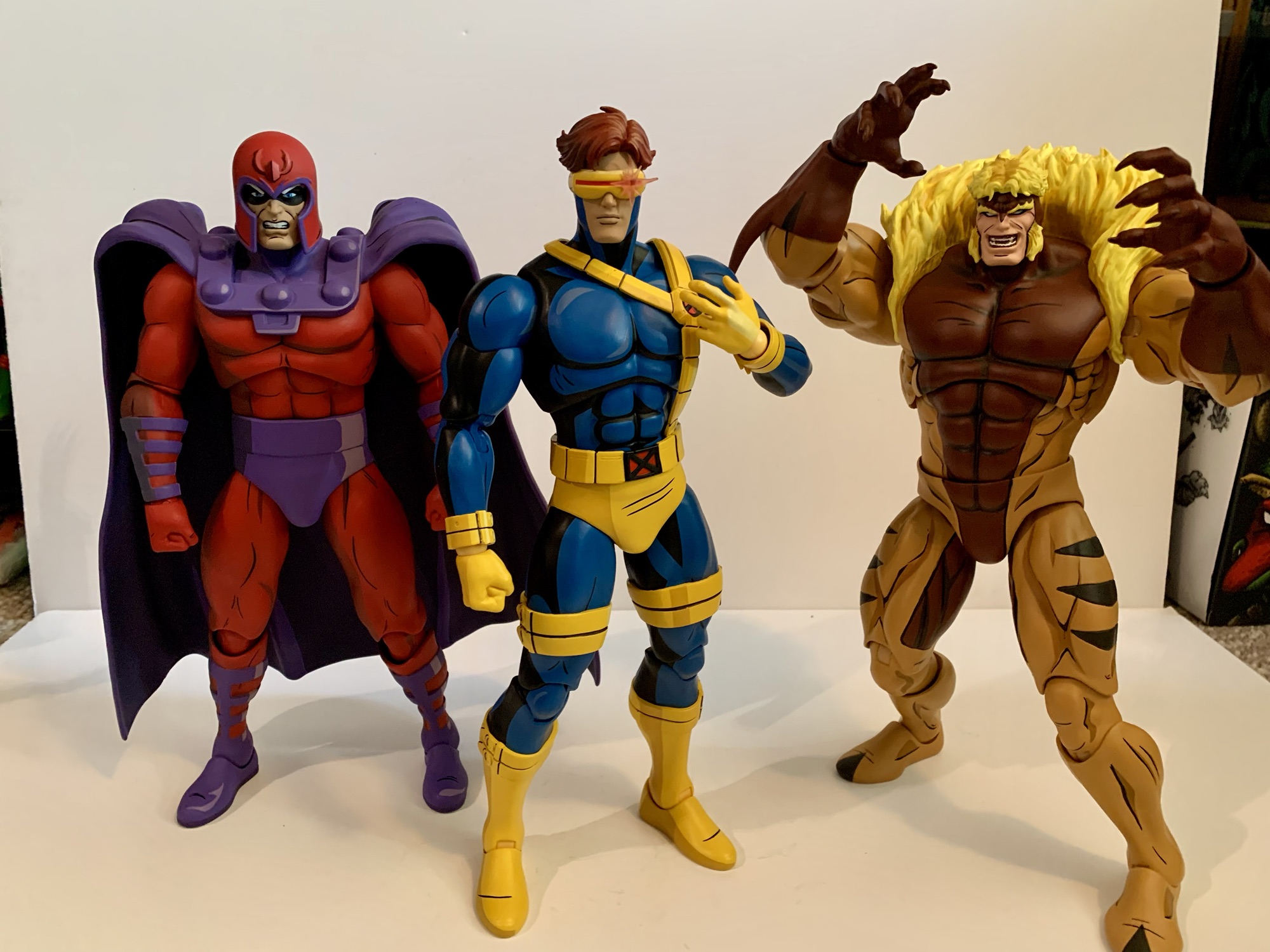
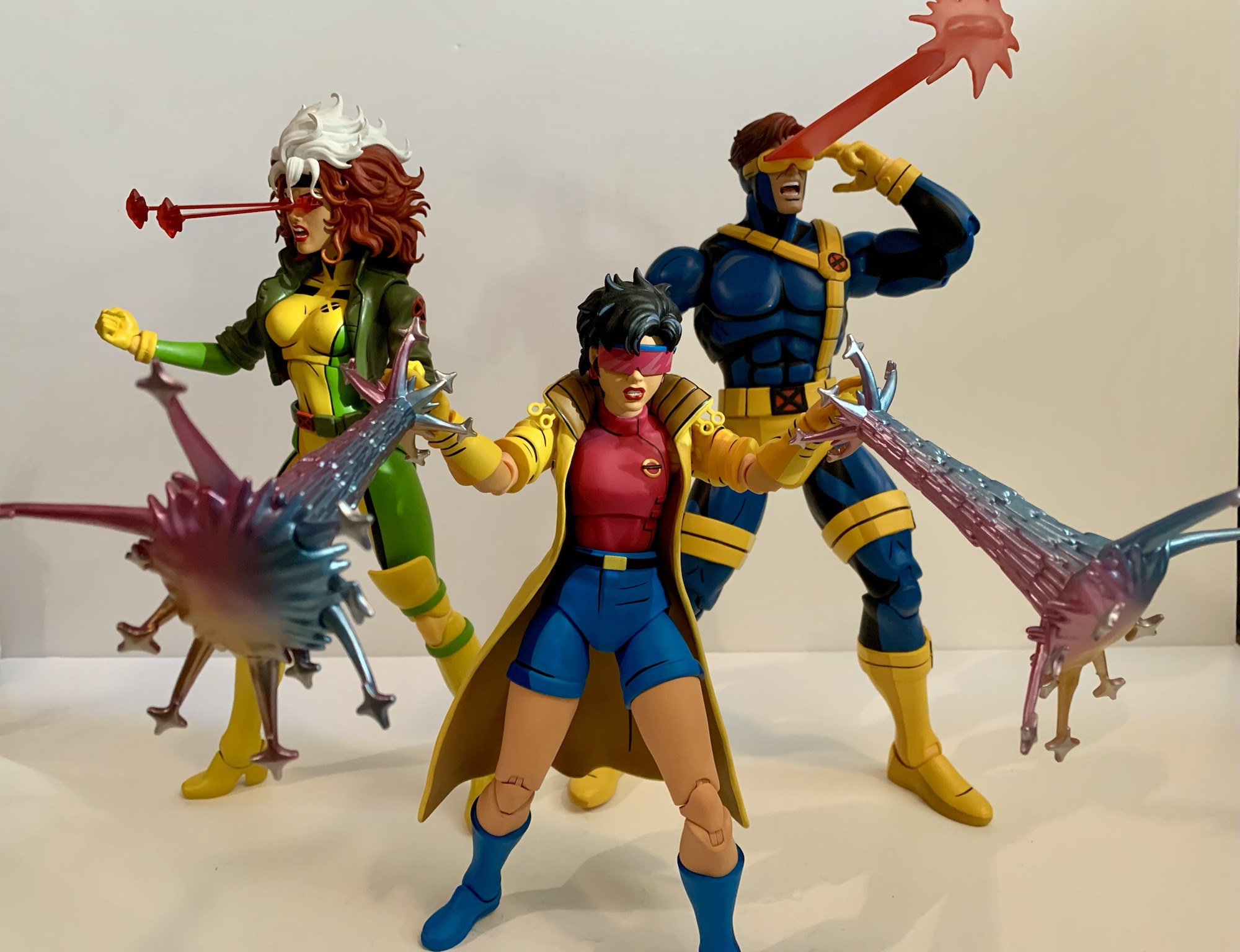
After putting a real hurting on my wallet in 2023, Mondo decided to take it easy in 2024 with its line of sixth scale action figures based on the animated series X-Men which ran from 1992-1997 on Fox Kids. Two figures ended up getting released this year, Rogue and now the leader of the X-Men Cyclops. With Cyclops though we get a slight change because easily the biggest thing to happen to the X-Men in 2024 was the release of X-Men ’97. Well, some would argue for a movie staring a foul-mouthed merc and an old man as being the biggest business in the X world, but I’m going with the Disney+ series. Since the show turned out to be quite the hit, and because it’s a continuation of the original X-Men series, Mondo decided its figures could use a little rebranding which is why Cyclops is the first release to be billed as hailing from the new show. What does this mean for the figure itself? Not a whole lot.

Cyclops still comes in the same style of window box with artwork from storyboard artist Dan Veesenmeyer. The difference between his release and the others is that the character model definitely resembles the look from X-Men ’97 and not the original show. That’s not a huge change as the costume is the same, but Cyclops has a slightly slimmer profile and the detail work is a dead ringer for the same in the new show. For the figure, there’s really no change and Mondo via its YouTube channel has basically admitted that the figures are going to hew closer to the original series. It’s just now they will be able to toss-in items and accessories pulled directly from the new show where it makes sense.

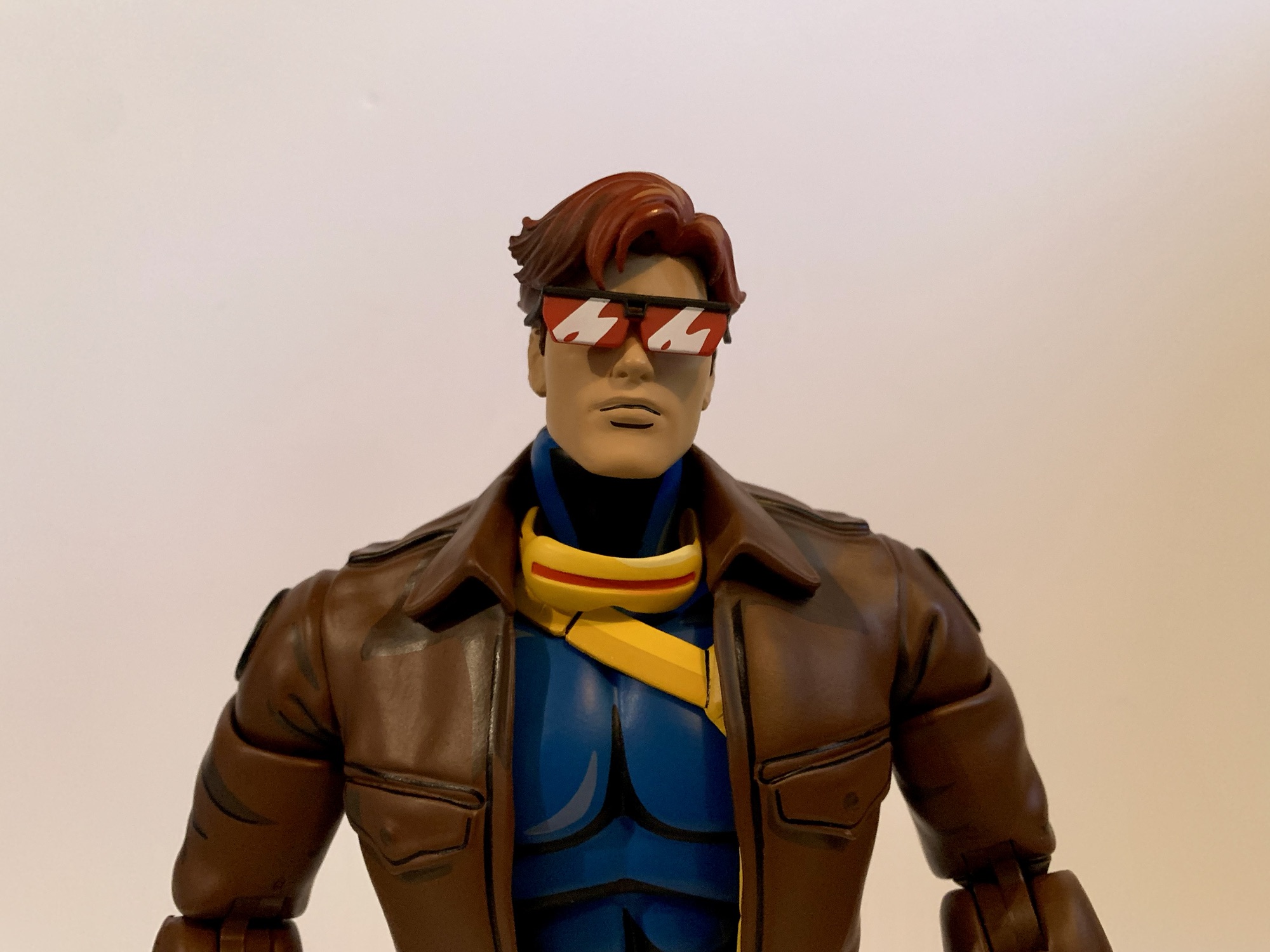
And we pretty much know this to be true because concept art for Cyclops was shown well before X-Men ’97 debuted. Here we have another sculpt by the awesome Alex Brewer with paint by Tomasz Rozejowski that really harkens back to 1992 and that original Fox series. Cyclops stands a full 12″ and is clad in his yellow and blue Jim Lee outfit which he wore almost exclusively in that show. Like prior figures in this line, there were two editions of Cyclops made available and I opted for the limited version which came with extra stuff which we’ll get to.

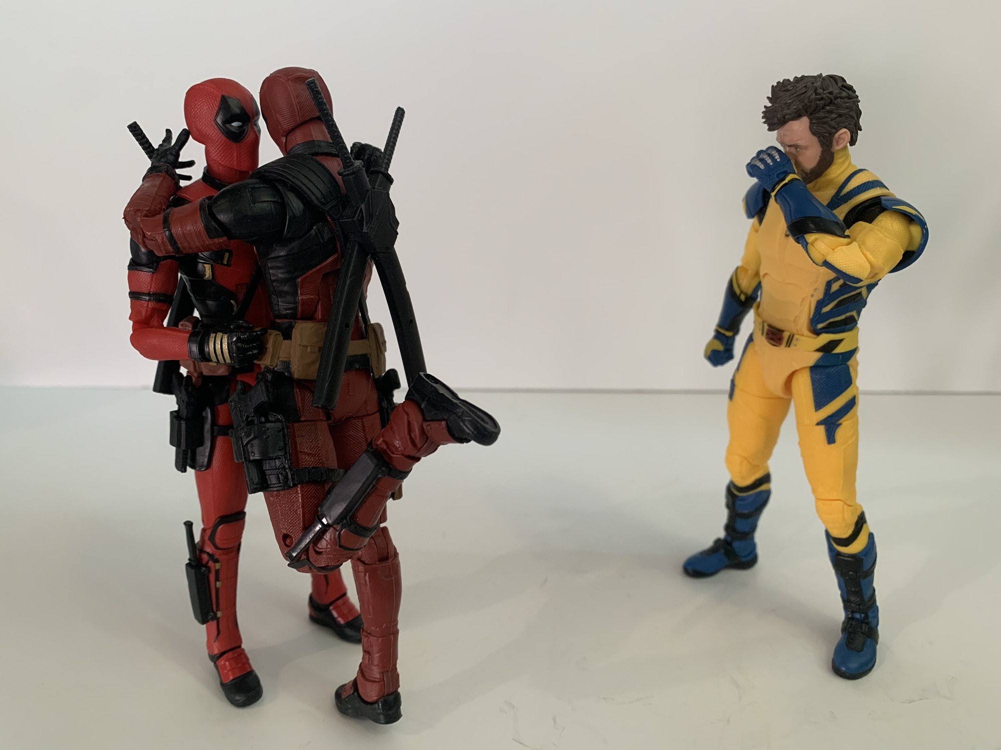
The sculpt for Cyclops may not be complex, but it gets the job done. He’s well-muscled and proportioned with a portrait that evokes the original series. The details one would expect are in place like the segmented straps on the belt or the pouches and straps. There’s even a little extra detail where the chest strap attaches to the lower belt that I don’t remember seeing in the show. The hair and the visor are all appropriate and the placement of the thigh straps appears spot-on as well (they’re also floating and slightly annoying as a result). That doesn’t mean there isn’t room for some nitpicks. Cyclops was nicknamed Slim early on, but by the 90s he was a pretty massive dude. This figure depicts him as a big guy, but maybe not quite as big as he could be. The legs look fine and so do the arms, but the chest and abdomen strike me as a bit undersized. It’s almost like Mondo aimed to fit this Cyclops figure in-between the 92 and 97 version. It could also be for a different reason which ties into the extra stuff. This version of Cyclops has removable arms and an optional flight jacket part like the Logan figure. If he were any bigger he might look huge with the jacket. If so, I disagree with the approach as the jacketed look should be a secondary concern, but the feature also seems to play a role with his shoulders being set apart from the body. These are all things mostly noticeable when the figure is just standing straight up and down, pose him and it’s less an issue, but it’s an expensive figure so we have to nitpick where it’s warranted.
What really offers no room for disappointment is the paint. Mondo just slays when it comes to that part of the presentation and Cyclops is no different. The base blue is the perfect royal blue and the lighter blue used to shade it and the blacks all make him pop. The yellow is the right shade with just a hint of red of in it to lessen that lemony look the Hasbro figure of the same has. The different shades of gold used to apply the cel-shading for the yellow looks great and everything is rich and full. There’s an impressive lack of paint slop and issues as well. With such an ambitious paint job some of that is expected, but I’m finding it hard to notice with this one. There’s a visible brush stroke on the chest strap, but apart from that I’m at a loss. This is some really impressive execution so Mondo better hang onto whatever factory put this one together.

Cyclops comes with new branding, but he also comes with new articulation. Mondo tends to keep things basic with its figures as they prioritize aesthetics over function. And at this scale, I think that’s the right approach. However, there’s no denying that certain characters need to be able to hit certain poses and for Cyclops it’s being able to place a hand on the side of his visor to activate his optic blasts (even though we also see him do so without pressing a button in the show, but lets just go with it). In order to achieve that function, Mondo opted to incorporate double-jointed elbows into this one. And they work great, no problem hitting that pose and he can pretty much put his hand to his X communicator on his chest as well. And the aesthetics trade-off is nil, as far as I’m concerned. We’re all toy collectors and we’re used to double-jointed elbows. They look fine, better than the swivel joint used on Wolverine and Sabretooth that has some miscolored plastic, so I hope they do this more going forward.

Aside from that, the articulation is pretty much the same as other figures. The head is on a double-ball peg and the range is pretty nice. It is a little more gappy than past figures, but I’m guessing they prioritized plus range at the head given his unique skillset. The shoulders are the usual ball-hinges with a bicep swivel past that. Wrists are ball-hinged and they can be tight, but I didn’t experience any issues. The torso is where things get less impressive. Cyclops has the usual ball-jointed diaphragm and waist, but he also has that unique belt that goes around his chest. It’s connected to the belt at his waist so it’s going to get in the way. It has some play and will float when you manipulate the chest, but the range is okay, at best. Hips are ball-sockets with thigh swivels built in, but the rubber trunks will hinder the figure’s ability to kick forward and back. I can get him into one knee poses, but it’s awkward and one must be mindful of paint rub. Knees are double-jointed and the ankles hinge forward and back with an ankle rocker. The ankles are pretty tight, but I didn’t need to heat them up to get them working. Shoulders are really tight too, but again, no heat needed as I just went easy.


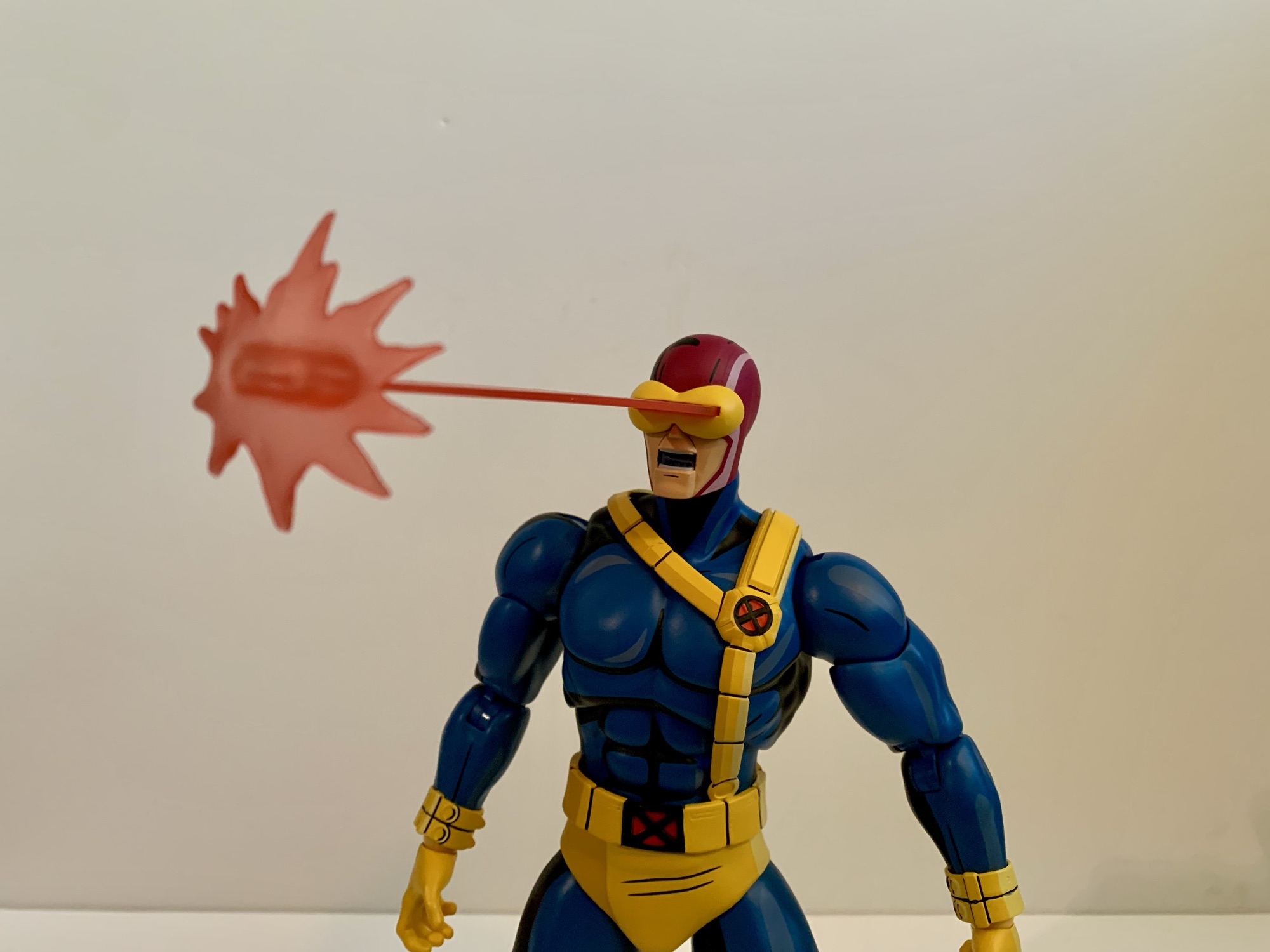
Cyclops has a ton of extra stuff to go through so let’s not waste any time. We’ll do the standard version accessories first which include a stoic head and a yelling head. Both feature interchangeable visors and come with a standard one by default. Getting the visors off and on is pretty painless, and both heads can use all of the visors. The extras are a visor with a lens flare and one with a slot in it for blast effects. And for blast effects we get two by default. The first is a pretty standard Cyclops blast. It’s 4″ long or so with a splash effect at the end. The easiest way to put it on is to slot it through the visor first, then plug it into the head. It can only go in one way so if it doesn’t fit just spin it around. The other blast effect is an arc with four short blasts. It strikes me as a very Marvel vs Capcom effect and it looks pretty cool. Both are done on translucent red plastic which feels appropriate for a Cyclops effect. They’re rigid so hopefully none arrived warp. I love the look of the blast, and the lens flare part is also pretty cool, so settling on a display is actually quite challenging with this guy. You’ll want to swap some stuff from time to time.
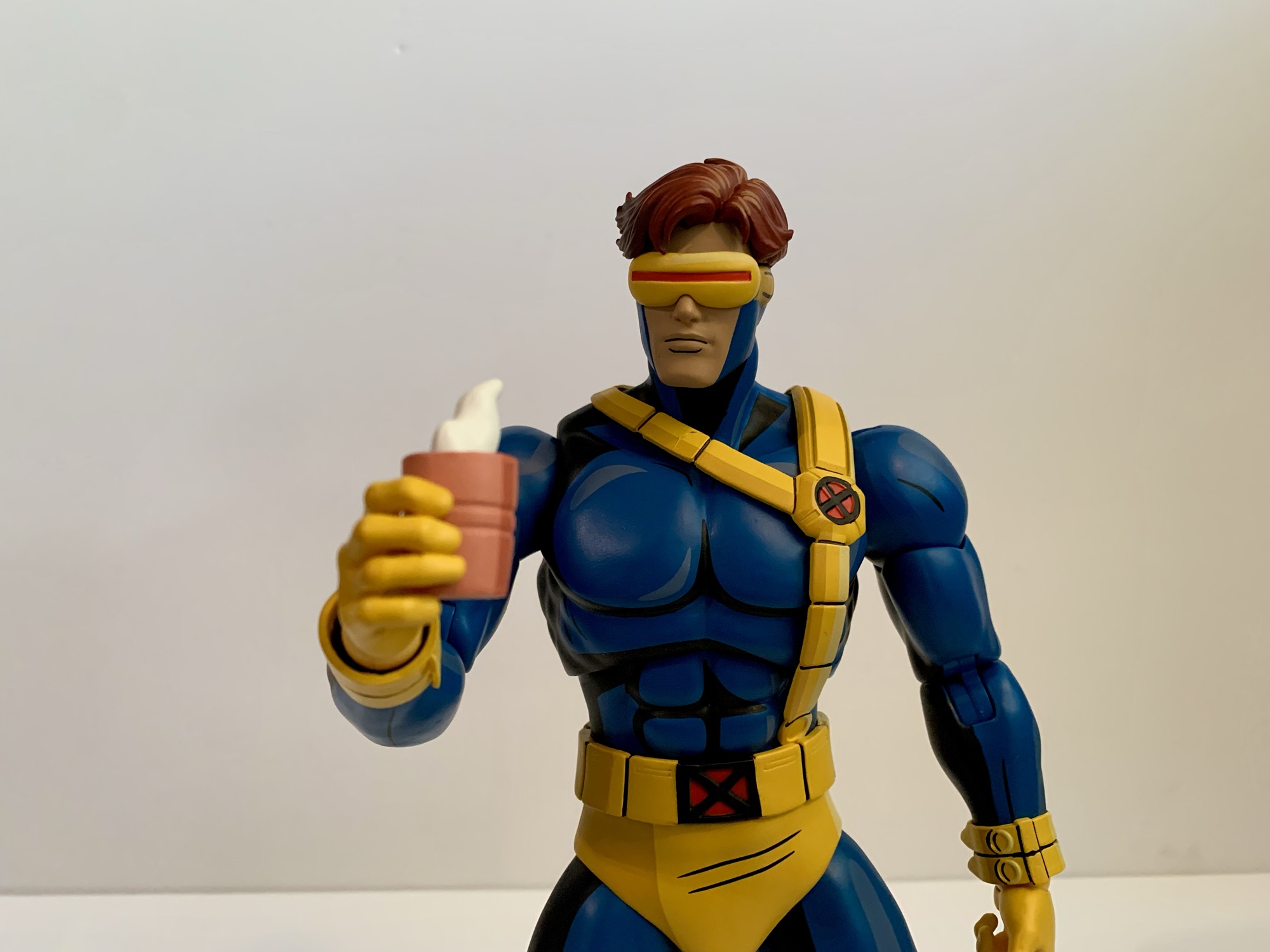
Cyclops also has an assortment of hands to make use of. By default, he comes with a set of fists which are always useful. In addition to that he has two clenching hands, two “finger bang” hands, a set of two-finger hands for his optic blasts, and a single right gripping hand. The gripping hand is for his cup of coffee which is included. This was seen a few times in the first season, most memorably for me in “Deadly Reunions,” and it’s a pink cup with sculpted steam wafting off of it. Even though Mondo included a gripping hand for it, I find the clenching hands work just as well to hold it. Swapping heads and visors is painless with this guy, but the hands are tough. The pegs going into the arms are ribbed when they probably don’t really need to be. The ball hinge also plugs into the hand and each hand is on its own, which is how Mondo always does it. Initially, I felt like the fists were more likely to come off at the hand and not where they’re supposed to in the forearm, so I heated the forearms of my figure with warm water. It’s made easier by the fact that the arms are designed to pop off. I was then able to get the hands out, but it was dicey. I’m reluctant to really jam any of the hands into his forearms as a result, though I haven’t had the same level of difficulty with the other hands.

That’s all the stuff that comes with the standard, $220, version. The $240 limited edition has a few more things including the aforementioned jacket. Swapping the arms isn’t too bad and the jacket arms come with bare fists. The fists are actually the exact same as the standard fists just painted flesh colored. They are removable, though I haven’t bothered since they’re in there pretty good. He sometimes wore gloves with the jacket in the show so the other hands work with this look as well. The arms are also double-jointed at the elbows just like the standard ones so there’s no loss of articulation in swapping them. I think he looks great with the jacket and it’s a tough call on how to display him. Right now, I’ve gone without, but I’ll be changing it from time to time for sure. Oh, and I had to try because this look is so close to Morph, but the Morph heads don’t fit. The opening is way too small, which is probably good so that I’m not tempted to attempt a very expensive custom.


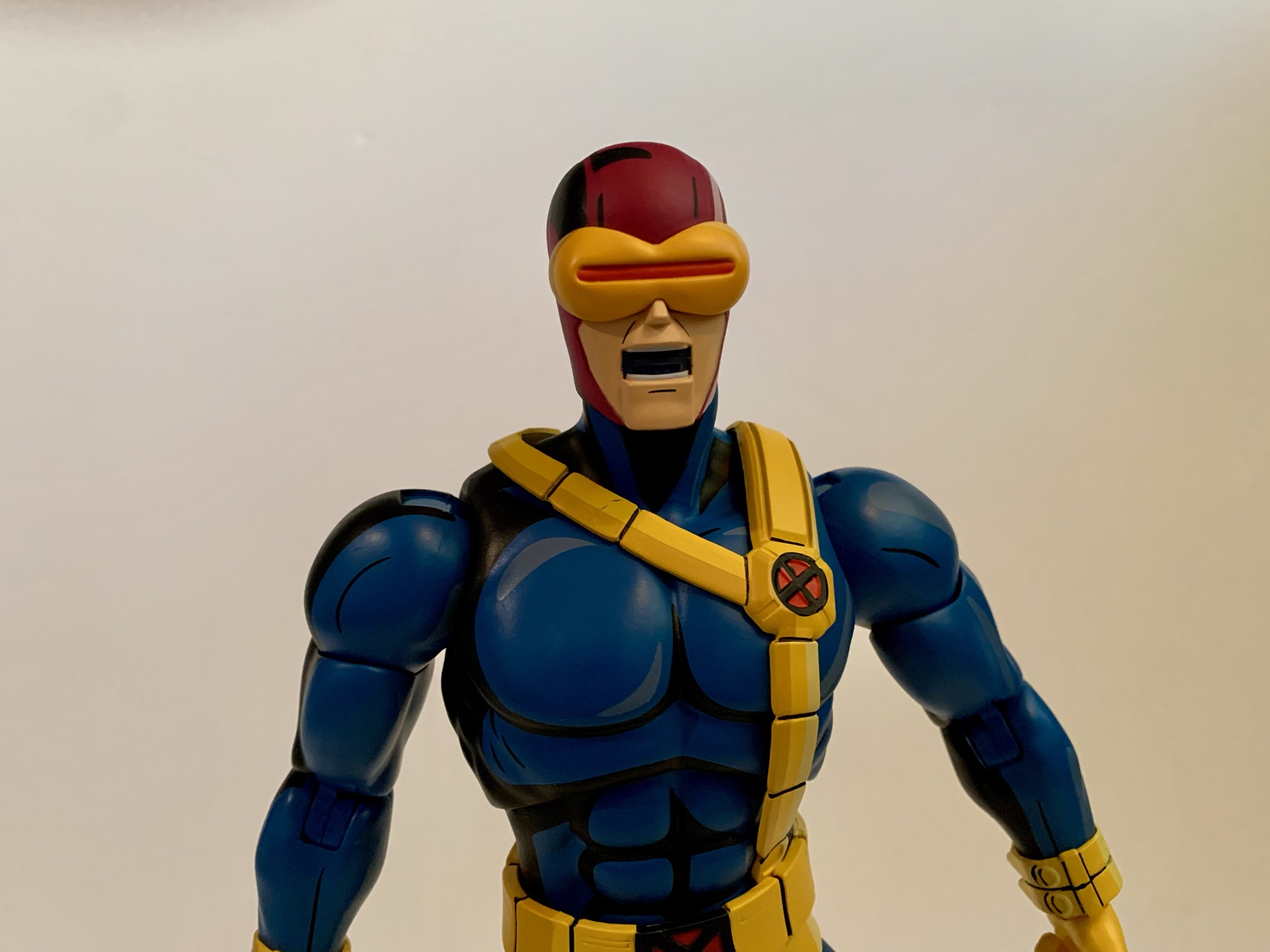
Cyclops would wear the jacket in the field plenty, but sometimes also to look more casual. To that end he has an uncowled head. It looks great and his eyes are painted red, which makes sense. Maybe some would have preferred brown eyes for the few times he was depowered in the show, but many won’t display him like that because he also has his shades. They’re black with the red lenses that have some white shading on them which looks nice. They’re a little brittle feeling, but have held up fine so far. They slot into his temples and look great when in place. He also has yet another visor that’s been removed so he can either hold it or stick it around his neck or something. It’s a nice touch. I will say, this head is the most X-Men ’97 looking part of the package, which could be intentional. This version also comes with another effect part that is one, massive, blast that’s almost 8″ long. It has a large splash effect at the end and it looks cool, but it’s heavy. There’s some drooping with this one so I’m reluctant to leave it in place for long stretches of time. It probably works best in tandem with an enemy getting blasted so there’s some added support for it.
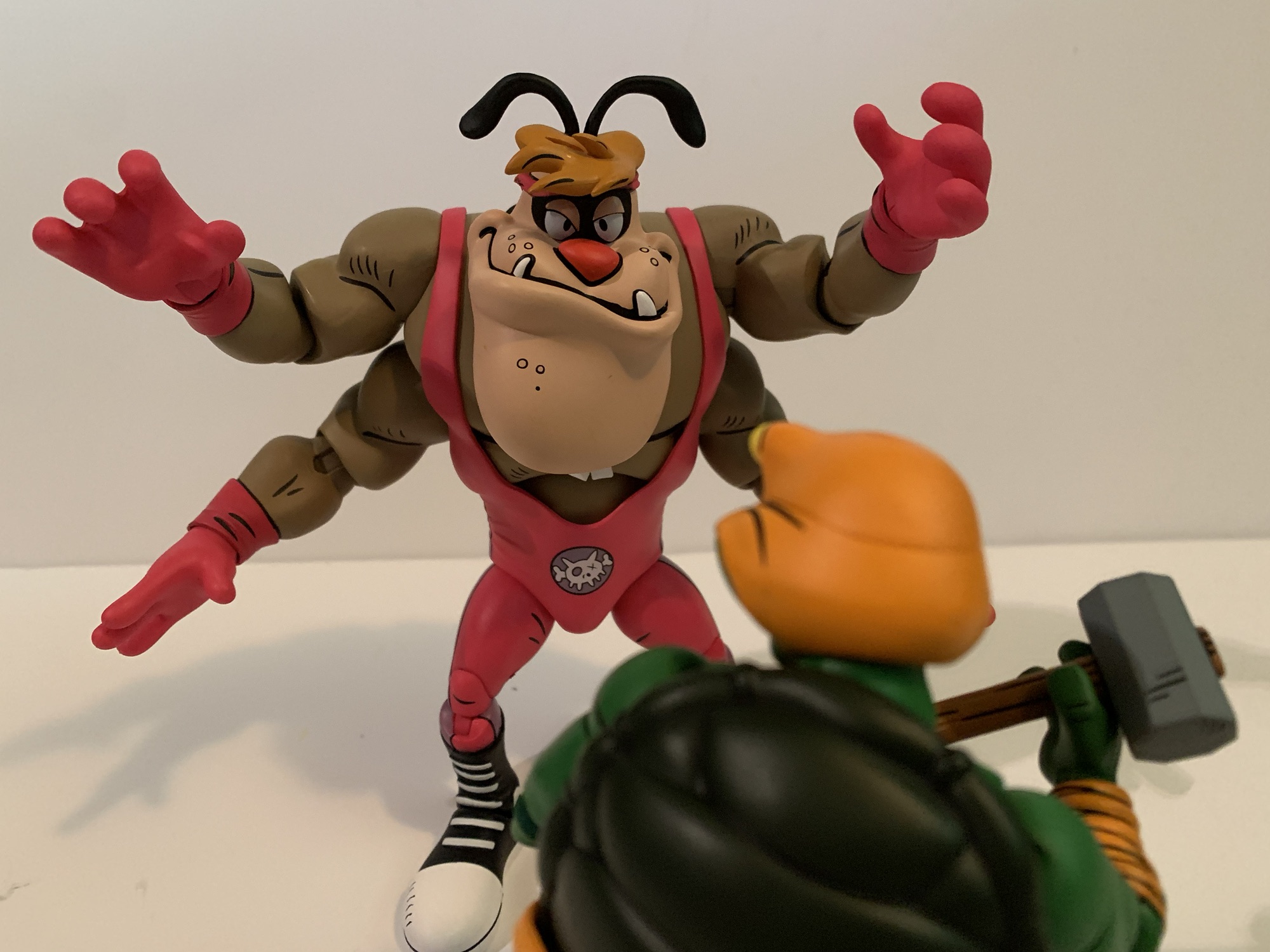
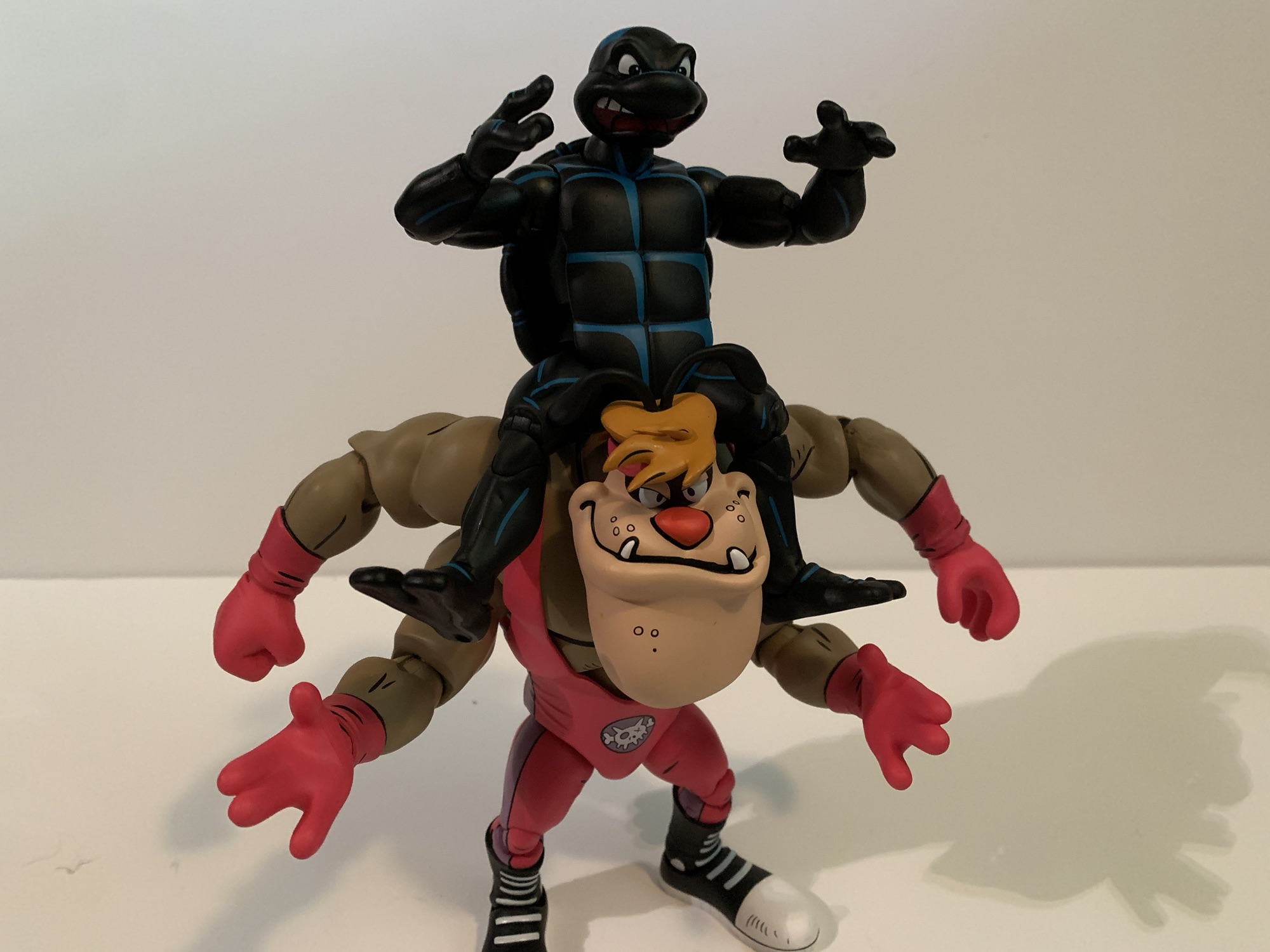
Oh, but we’re not done! Mondo likes to toss in a goofy accessory with all of these special editions. We had the elf Jubilee portrait, Gambit as Mystique, and the Morph heads. With Cyclops, it’s a Sentinel head styled to resemble Cyclops. This is taken from the episode “Till Death Do Us Part – Part One” where Wolverine is battling Cyclops robots in the Danger Room. It looks the part and is pretty ridiculous when placed on the head of the figure, but it’s there if you want it. And Mondo went the extra mile and also included a swappable visor piece so he too can make use of the blast effects. It’s a little tighter a fit than the other visor, but it works. I’ll never use it, but it’s funny. Maybe it can be used as a head of a fallen Sentinel with Wolverine or something? Lastly, there’s also the usual Mondo stand. I don’t use them so I didn’t even take it out of the plastic. I wish they’d put an X emblem on it like the Logan one, but it’s fine.

Ultimately, this is another home run by Mondo. Cyclops is a much needed addition to the roster of characters and he turned out pretty great. Did I have issues? Yeah, because nothing is perfect. I’d have liked to see a little more beef in the torso, but that is basically the end of my complaints. I do think the hands could have been made to swap easier and the hands are a longstanding issue with the line (though it’s been better, Magneto was rough). I get why things are tight though because these are big, solid, figures and loose joints would kill them. This figure poses reasonably well and the swappable effect parts and heads are all a ton of fun. This is probably the figure that is the most fun to pick a display, though Gambit and Jubilee are pretty great at that too.
Cyclops is definitely the last figure from this line to see release in 2024, but on-deck is another Wolverine. Alex Brewer has sculpted all of the figures in the line since the original Wolverine so Mondo wanted to get his take on the character and the looks we’ve had are promising. There’s also a retro Cyclops coming based on his look in the season finale of X-Men ’97. I have not gone for the variants in this line and I didn’t go in for that one either. We should also start seeing the first figures from the Spider-Man ’94 line very soon. I don’t plan on going all-in with that one, but expect at least a couple reviews of that line. Beyond that, we don’t know what’s next, but it sure seems like this line is going strong. If I had to guess, I’d say Storm will follow Wolverine, but I hope we get all of the core cast from the ’92 series. Even though it gets harder and harder to find room each time one arrives.
If you liked this review, then check out more from Mondo’s X-Men line:

Mondo X-Men TAS 1/6 Scale Rogue – Limited Edition
The conclusion of X-Men ’97’s first season has left behind a void. For 9 consecutive Wednesdays, we had something awesome to get up for. Now the long wait for a second season has begun, but here to help fill the void while we wait is Mondo. Mondo has been dishing out some very impressive sixth…
Keep reading
Mondo X-Men TAS 1/6 Scale SDCC Exclusive Logan
Mondo has been absolutely killing it with its sixth scale line of action figures based on the now classic animated series X-Men. The company also really ramped up production in 2023 on the line by soliciting five new figures during the year. At over 200 bucks a pop, it was quite the hit to the…
Keep reading
Mondo X-Men TAS 1/6 Scale Gambit
It is my belief that when it comes to X-Men, the animated series which debuted in 1992, the breakout star of the show was Gambit. Wolverine was the closest thing we had to a household name going into the show and was the de-facto pick for favorite character of many. And while the whole roster…
Keep reading