In 2001, Rugrats had the honor of being the first Nicktoon to make it 10 years. The path to that honor was not a smooth one as the show had effectively been cancelled in 1993 with the third season. That appeared to not be performance related, but more strategic on the part of Nickelodeon as the Nicktoons brand was a constantly changing block of cartoons. It was only when the network realized that reruns of Rugrats were not only their highest rated program, but one of the highest rated cable programs in general did it finally decide that maybe keeping the show in production was a good idea. The show would end up lasting for 9 seasons with the final, new, episode airing in 2004. A new series has since been launched that returned some of the original cast and it would appear that Rugrats is not going anywhere anytime soon.
For that tenth anniversary episode the show aired the two-part special “All Growed Up.” The episode was a flash-forward and fans of the show got to see what the babies would be like as pre-teens. It’s one of the last Rugrats episodes I can remember watching. I did not come back to the show when it resumed in 1995 and I didn’t see any of the movies it spawned, but I was curious enough about “All Growed Up” to give it a look. I really don’t remember anything about the episode, but I do recall my number one takeaway from it was that this special was destined to become a series of its own. And it did! The special was a massive success scoring a 7.2 rating when it originally aired making it the number one cable show that week. It’s estimated that 70% of children in the show’s target demographic tuned in and those were numbers that Nickelodeon could not ignore. They almost immediately ordered 35 episodes of the show and on April 12, 2003 All Grown Up! debuted.

All Grown Up! returned basically all of the cast members who were still alive from the original show. At that point, Nancy Cartwright had replaced Christine Cavanaugh as the voice of Chuckie while David Doyle, voice of Grandpa Lou, had passed away in 1997. The show would run for five seasons totaling 55 episodes and aired its final episode on August 17, 2008. The show’s third season (which was part of that initial 35 episode order so we’re talking broadcast seasons) premiered on December 7, 2004 with the Christmas episode “The Finster Who Stole Christmas.” Rugrats had become known for its holiday specials as it was one of the few to dedicate full episodes to Jewish holidays. It was also no stranger to Christian holidays like Christmas thanks to the main character’s family being a mixed household. It’s easy to look back on that decision as one of genius since it creates easy opportunities for holiday episodes, but back in the 90s Jewish holidays were not thought of as marketable. Rugrats blew that preconception to dust as its Passover and Chanukah specials did big ratings proving that audiences just like to see their favorite characters celebrating their chosen holidays.

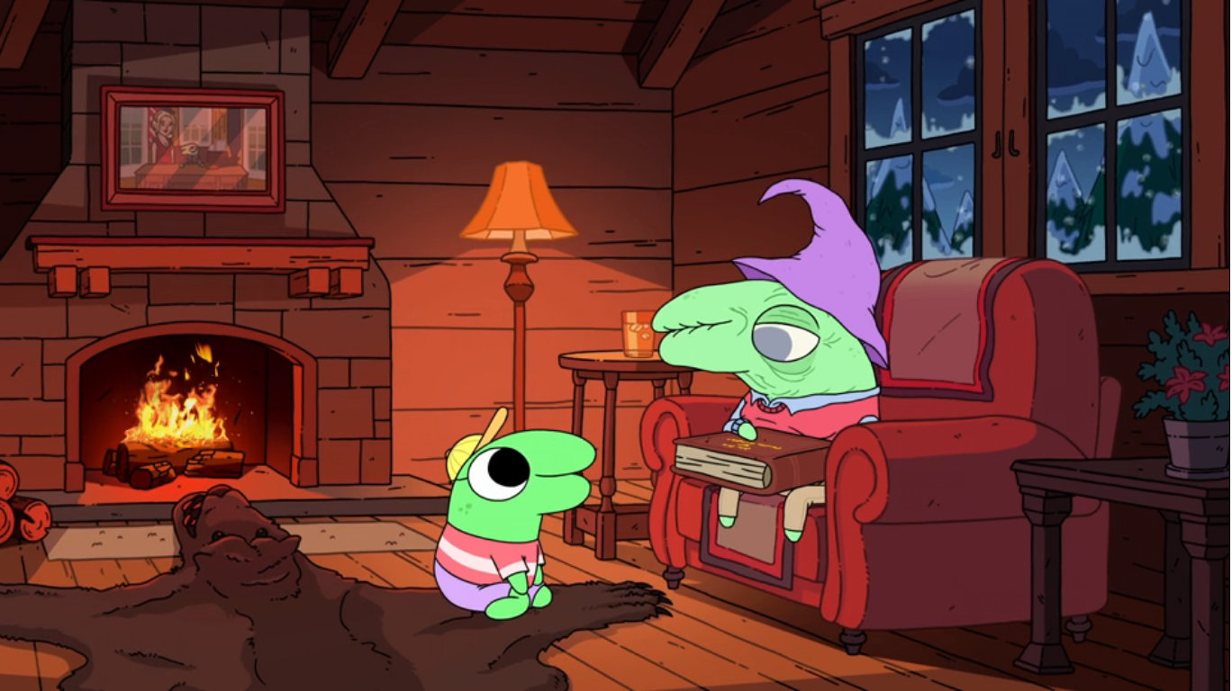
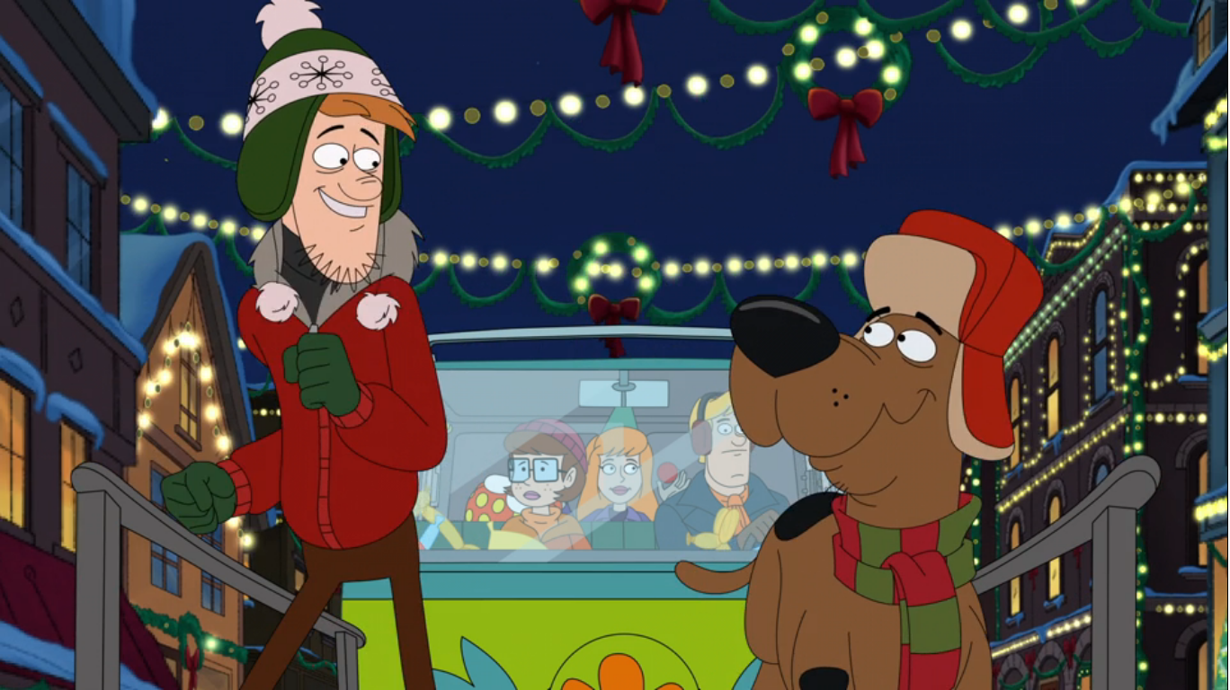
The show begins with this very generic alternative rock song performed by Cree Summer on vocals. I don’t particularly care for it and I miss the more whimsical charm of the original series’ intro. When it’s done, we find ourselves at a school. It’s pretty well decorated for Christmas and the bell has rung to release a horde of preteens upon the world. Dill Pickles (Tara Strong) is walking with his brother Tommy (E.G. Daily) and explaining to him how he believes that Christmas gets all of the best songs as he compares it to Chanukah. Tommy tries to offer up “The Dreidel Song” as a counterpoint, but seems to concede that yes, it’s not a particularly good song. They’re walking along with Chuckie (Cartwright), Susie (Cree Summer), and the twins Phil and Lil (Kath Soucie). Phil informs the group that his mom just burnt a whole bunch of angel cookies so they’re up for grabs. It would seem this is the show’s way of retaining how Phil, the baby, was always interested in eating gross items. This leads to a brief discussion about how the gang plans to spend the holidays with Susie mentioning she landed a big role in her church’s choir. All of the kids are really supportive of her and let her know they’ll be sure to attend her performance which is really sweet. One kid is conspicuously quiet though and that’s Chuckie.

As the gang heads home, Chuckie lags in the back with his head down. Dill starts explaining to his brother how he has plans to create the world’s best Chanukah song and wants his brother’s help. Tommy thinks this is actually a pretty good idea considering the dearth of quality Chanukah songs. Dill is pretty sure of himself pointing out how he believes he’s an excellent singer in the shower and he makes up songs in there every day! Susie then recaps everyone’s holiday plans for us and in the process informs the audience that Anjelica is away on a ski trip, and then turns to Chuckie to ask what he’s got going on for the holidays. Chuckie just sighs and says, “Oh, the usual – high expectations met by crushing disappointment.”

We cut to what I assume is Chuckie’s bedroom. He and Tommy are watching a video on the television that’s apparently Chuckie’s Christmas gift to his dad: 20 years of Christmas home movies compiled on one DVD. We get to see glimpses of the many Finster Christmases and they’re all pretty terrible. There’s often a tree falling over, Chuckie crying (the tape begins before Chuckie is born, hence why it can total more years than Chuckie’s been alive), and Chuckie’s dad running out of frame due to some catastrophe. Chuckie is longing for a nice Christmas, one that’s more celebratory, but concedes that his dad’s mantra is “Christmas starts with family and ends with family.” He’s not really into the flashy stuff. When Tommy points out how the tree in every scene on the tape is pretty sickly looking it gives Chuckie an idea. If he can get a nice tree this year then that will be the way to setting the proper mood for his holiday.
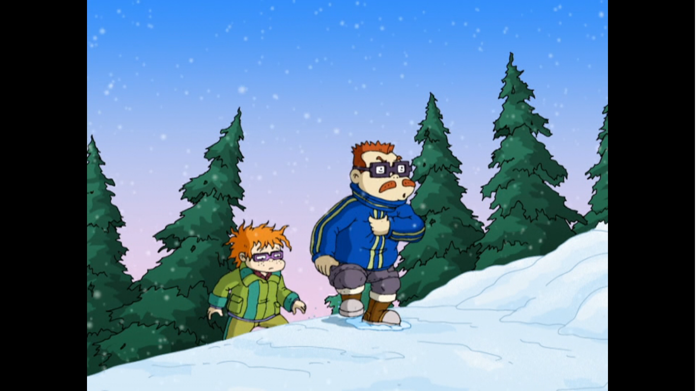
The scene transitions to one of Chas (Michael Bell) leading his son Chuckie through the snow apparently in search of a tree. When the camera zooms out we see they’re actually just at a tree lot and the snow is being created by a snow machine. They’re still dressed rather warmly, but I do think this show is meant to take place somewhere in the southwest where there probably isn’t typically snow and frigid weather. The tree lot attendant shows Chas a nice looking tree that he seems to be in awe of. And that’s the problem. Chas Finster is a simple man and doesn’t like flashy items. He’s also probably very pragmatic when it comes to expenses, but Chuckie tries to tell him that buying a big tree is sort of like buying in bulk which is something his dad is prone to do. Chas reminds him that he only buys corn dogs and eyedrops in bulk, which apparently explains the added girth Chas possesses when compared to his character in Rugrats.

Chas then comes across the perfect tree! It’s actually in the kindling section and the tree attendant is surprised that anyone would show interest in what are essentially needle-less sticks. He also positions himself in front of the kindling sign to conceal it from Chas’s view so that he can extract a little more money out of him since he’s committed the cardinal sin as a consumer in letting a salesman know that he’s very interested. The person not interested is Chuckie. When Chas asks for a price, he’s given 20 bucks though a small amount of snow falls on the tree and snaps the top off so the salesman immediately changes the price to 15. Chuckie can only hang his head in embarrassment when his dad tells him they’ll come back tomorrow for by then it will likely only be ten!

We next find Chuckie sullenly walking up a sloping sidewalk kicking a pinecone in frustration. He kicks it a bit too hard and it manages to knock someone’s Santa Claus decoration from their roof. Chuckie runs over to pick Mr. Claus up, but when he does he notices a Christmas tree bound with twine left leaning on someone’s garbage bin. Chuckie runs over in disbelief that someone would be throwing out a perfectly good tree, but gives it no further thought since fortune has apparently smiled upon him this day. As he drags the tree out of sight, some guy emerges from the house with a puzzled look on his face as he calls to his offscreen wife asking where’s the tree?

Chuckie struggles to get the tree home, but he manages to pull it off with only a minor concussion. He then has his dad cover his eyes so he can lead him into the living room to see what he brought home. When Chas opens his eyes his reaction is actually rather positive. I guess it’s pretty much in-line with how he responded to the resplendent tree at the lot, which is also why he shifts gears pretty quickly and remarks it’s not really a Finster tree. Chuckie points out that’s because it’s green, but then hangs his head once more and tells his dad they can get rid of it if he doesn’t like it. Chas immediately starts reassuring his son that it’s fine and he likes the tree. He gives him a concerned smile while Chuckie returns a more genuine one of his own as his Christmas wish is coming together nicely.

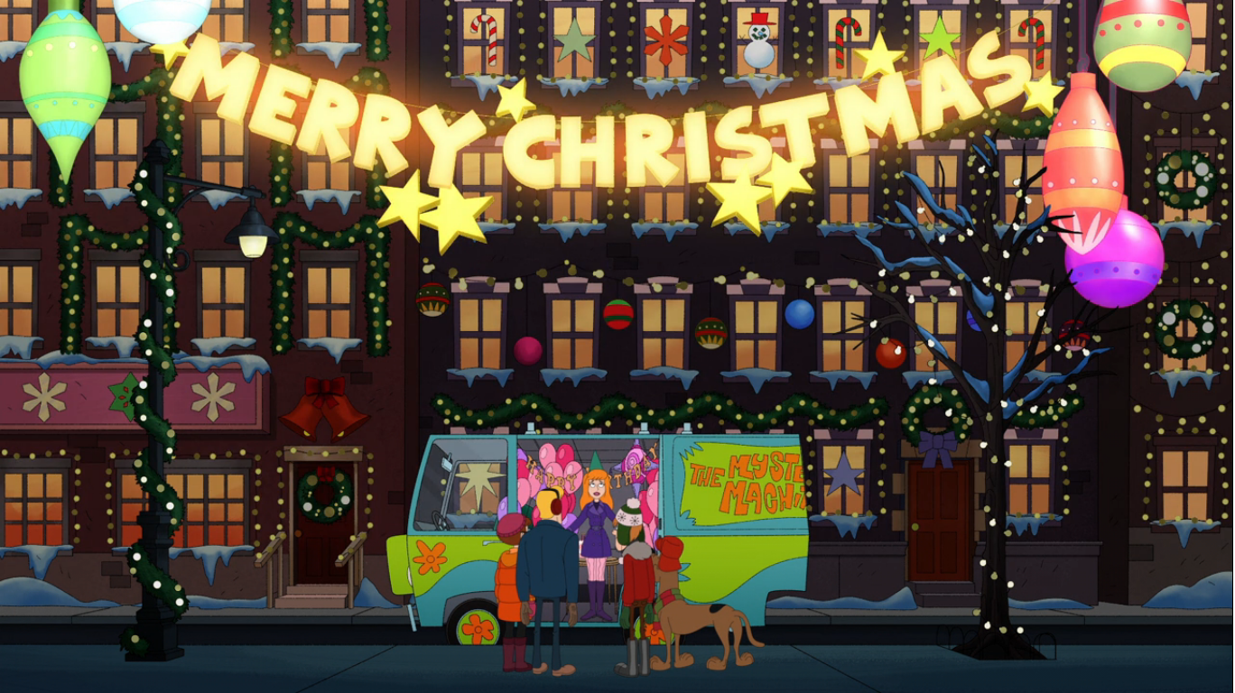
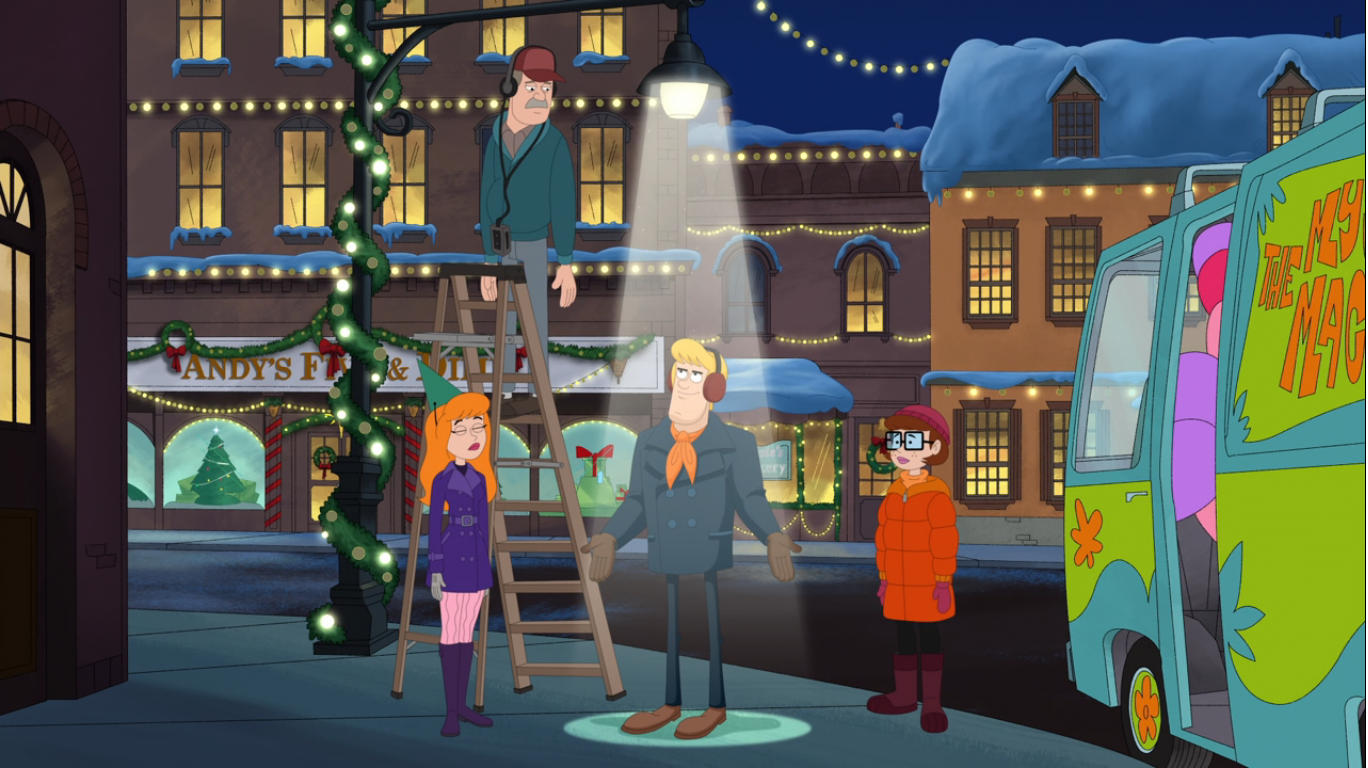
Our next scene takes place at the Java Lava Cyber Cafe. When did we stop calling cafes with internet access “Cyber” cafes and just went back to calling them cafes since they basically all have wi-fi now? A mall Santa comes walking out somewhat nervously ready to sip his hot coffee while inside Phil appears to be decorating. Dill and Tommy are rocking out on some keyboard while Chuckie and Susie just hang out eating popcorn. My guess is, since Phil and Lil’s mother Betty was always big into coffee in the original show, this is her place of business and the kids help out. It’s also probably a frequent hang out spot for them in the show (I’ve never watched a single episode until now).

Dill and Tommy’s song sounds pretty terrible and the two seem to know it as Tommy proposes they take a break. Dill seems less aware, but is in agreement on account that he’s creatively spent. Betty (Soucie) and Lil come walking in with trays of holiday themed beverages. They sound pretty awful with names like honey baked java, yam latte, and figgy pudding macchiato. Everyone is reluctant to partake, all except Chuckie who downs a cup of one of the likely terrible concoctions. Lil points out that it’s not like Chuckie to be the brave one, but he’s rather content at the moment and chalks it up to an abundance of holiday spirit. Phil sees this as an opening to bring up that someone in the neighborhood recently had their Christmas tree stolen. Chuckie does a spit-take when he hears about it while everyone has some rather choice words to share about the thief. Chuckie, growing visibly sick at the realization he likely stole someone’s tree, runs off to the bathroom clutching his stomach. Betty just assumes it’s related to her drinks, “Looks like that’s a big ‘No’ on the fig latte,” is the punch line used to go out on.

After the break, we find Chuckie outside hyperventilating into a paper bag while Tommy exclaims “You stole a Christmas tree!” Chuckie apparently used the act break to explain partly what happened, though we get to hear him tell Tommy he thought they were throwing it away. He’s quite worried about getting run out of town while Tommy tries to calm him down. Since it was a simple misunderstanding, Tommy sees no reason why Chuckie can’t just tell his dad what happened and return the tree. Chuckie perks up at the idea, and this seems like a pretty simple solution to the episode’s plot. Now what are we going to do for the remaining 15 minutes or so?

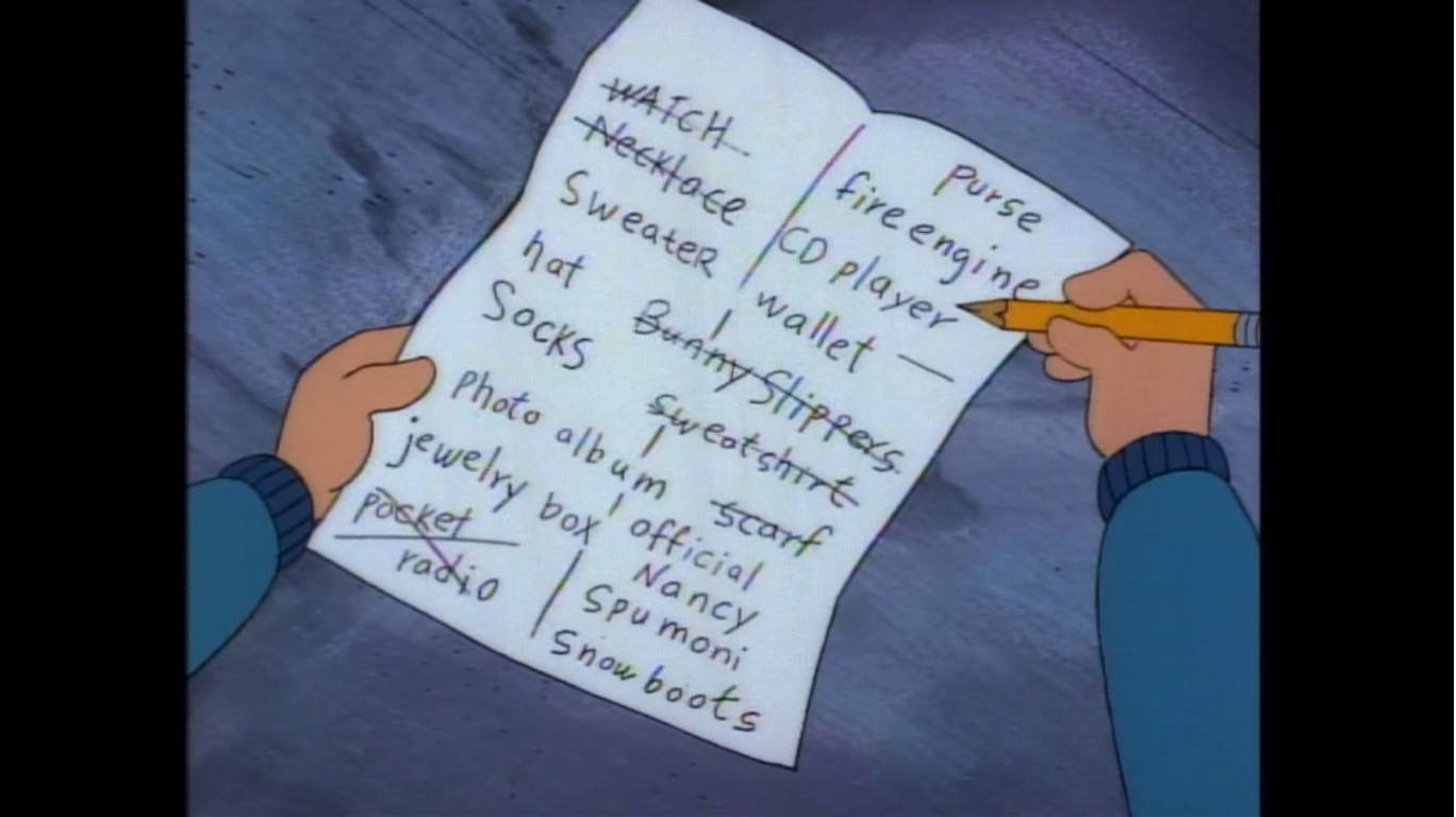
Tommy and Chuckie return to Chuckie’s house where the two are happy to find the tree just standing there undecorated. This seems to affirm in Chuckie’s mind that his dad didn’t even like the tree anyway, which is an assumption that’s about to be shattered. I knew we couldn’t just wrap this thing up so neatly! Chas comes waltzing into the house with his arms full of Christmas ornaments. Chuckie is surprised to see his dad bought new ones, and then Betty enters in behind him to inform him he bought more than just that. Apparently, Chuckie’s tree really pointed out to his dad how shoddy their Christmases were and the old guy has gone Christmas crazy! He’s even got gingerbread cooking in the oven so he can construct an entire gingerbread village right down to the emergency call boxes. Chuckie had initially told his dad he needed to tell him something before he saw all of this Christmas stuff, but now he has literal Christmas stars in his eyes and can’t bring himself to tell him the truth. Instead, he just says he wishes his step mother and step sister could be here, but Chas tells him not to worry as they should be boarding their plane home right about now. Earlier, we learned the two were in Japan and coming home on Christmas Eve so we’re basically right up against the holiday at this point. We then get a quick check on the two as Kira (Julia Kato) and Kimi (Dionne Quan) are being informed by a ticket agent that they’ve been bumped from their flight home. Looks like we’re going to need to order a Christmas miracle.

Chuckie and Tommy are outside the Finster home where Chuckie confesses to a somewhat disinterested Tommy that he just couldn’t bring himself to tell his dad what happened. Chuckie sort of rambles on while Tommy can’t get over how good the gingerbread is that Chuckie’s dad made. Chuckie then gets the idea that to solve his problem he just needs to buy a new tree for the family he stole from. Tommy points out how expensive that tree was, but Chuckie brushes aside his concern as he’s been schooled in the Finster art of tree shopping! We cut to the tree lot where only one, scraggly, tree remains and the attendant wants 50 bucks for it. Chuckie literally drops to his knees begging for a better deal, but he’s just met with a “Supply and demand” explanation. We then cut to Tommy and Chuckie carrying the tree with Tommy pointing out how Chuckie had saved all year for that money. Chuckie must have given in, but he’s at least comforted by the fact that he still has a little over 3 bucks left. He pauses to scratch his nose and in doing so lets go of the tree. Tommy does as well, for some reason, and it flops into the street and is predictably run over by a passing truck leaving it in shambles. Chuckie sadly picks up what’s left of it which at least kind of resembles a Christmas tree, albeit at only 9 inches tall. Tommy tries to cheer him up by saying maybe it will look nice with some tinsel or something, but there’s no fixing this mess.

A close-up of Betty installing a security camera takes us back into the Java Lava. Susie is working the register while Dill is apparently still working on that song. He asks her what rhymes with dreidel, but Susie just tells him nothing does (how about ladle?) and supposes that’s why there’s so few Chanukah songs. Tommy and Chuckie come walking in and Lil immediately notes that Chuckie has a case of the holiday blues. Betty then draws attention to her new surveillance system and blames the tree thief for the holiday blues going around. Susie reassures everyone not to worry about that and when Chuckie asks why she theorizes that “the big man upstairs” will take notice. I wasn’t sure if she meant Santa or God, but then suggests a smiting shall be upon them which answers that. This freaks Chuckie out and as Betty turns on her camera she tells Chuckie to “Say cheese,” but finds the kid has run off. You would think they would start to piece some things together at this point.

Chuckie heads home only to find his dad rehearsing Christmas carols with a group of authentic looking carolers. Chuckie is bewildered at this continued outpouring of Christmas spirit from his father and is further surprised when he finds out they’re rehearsing for the Christmas party Chas intends to host. He even declares that from now on the name Finster will be associated with Christmas fun! This turn is so intense on the part of Chas that I’m starting to think this is all a dream, but I don’t think so. Chuckie declines the invitation to join in on the fun and tells his dad he’s off to bed instead. Chas doesn’t pick up on any distress in his son, and in his defense I’m guessing Chuckie is frequently mopey, and instead just has everyone whisper their song instead.
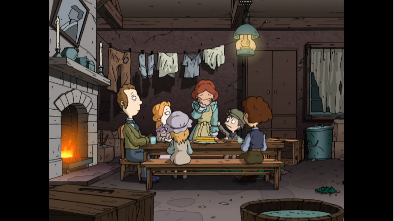
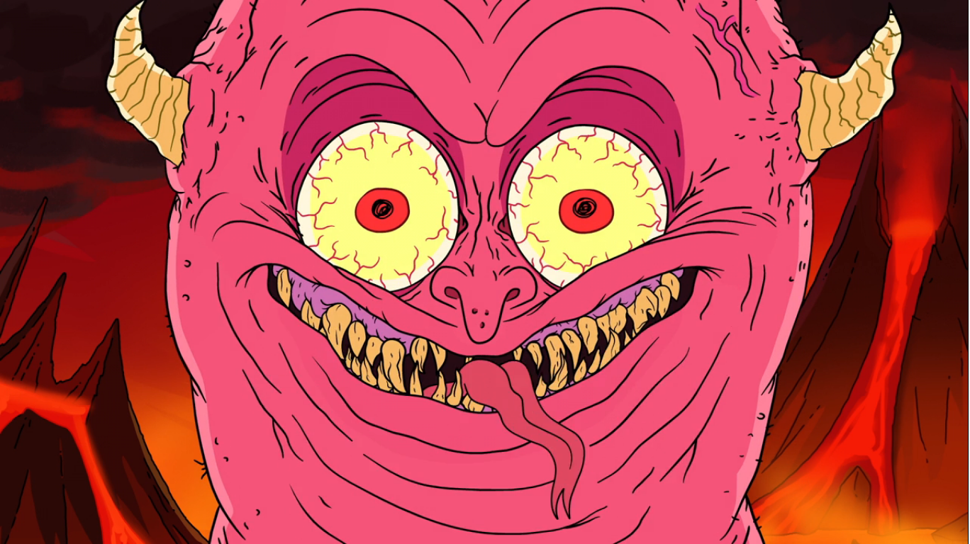
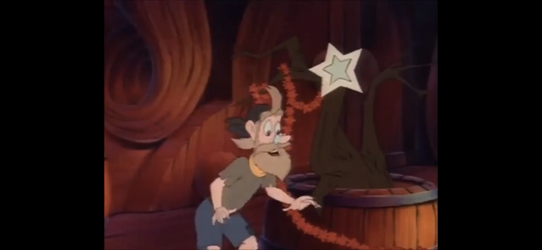
With Chuckie in bed, it is time for a dream sequence. Chuckie dreams himself outside the home of the family he stole from while the sound of sobbing can be heard coming from inside. He peers through the window and finds a rather Dickensian looking family seated at the table. They appear to be very poor as a young boy consoles his sobbing mother. The daughter curses the one who stole from them while the father instructs her to essentially turn the other cheek. As they prepare to say grace, Chuckie runs off into the woods where he encounters a new creature: the Christmas tree! It speaks to him, and when Chuckie questions who he is, the tree responds rhetorically and turns into a burning bush. Chuckie wakes up with a startle in his bed repeating to himself that he’s going to be smited, wicked smited. I find it weird that he sleeps with his glasses on.

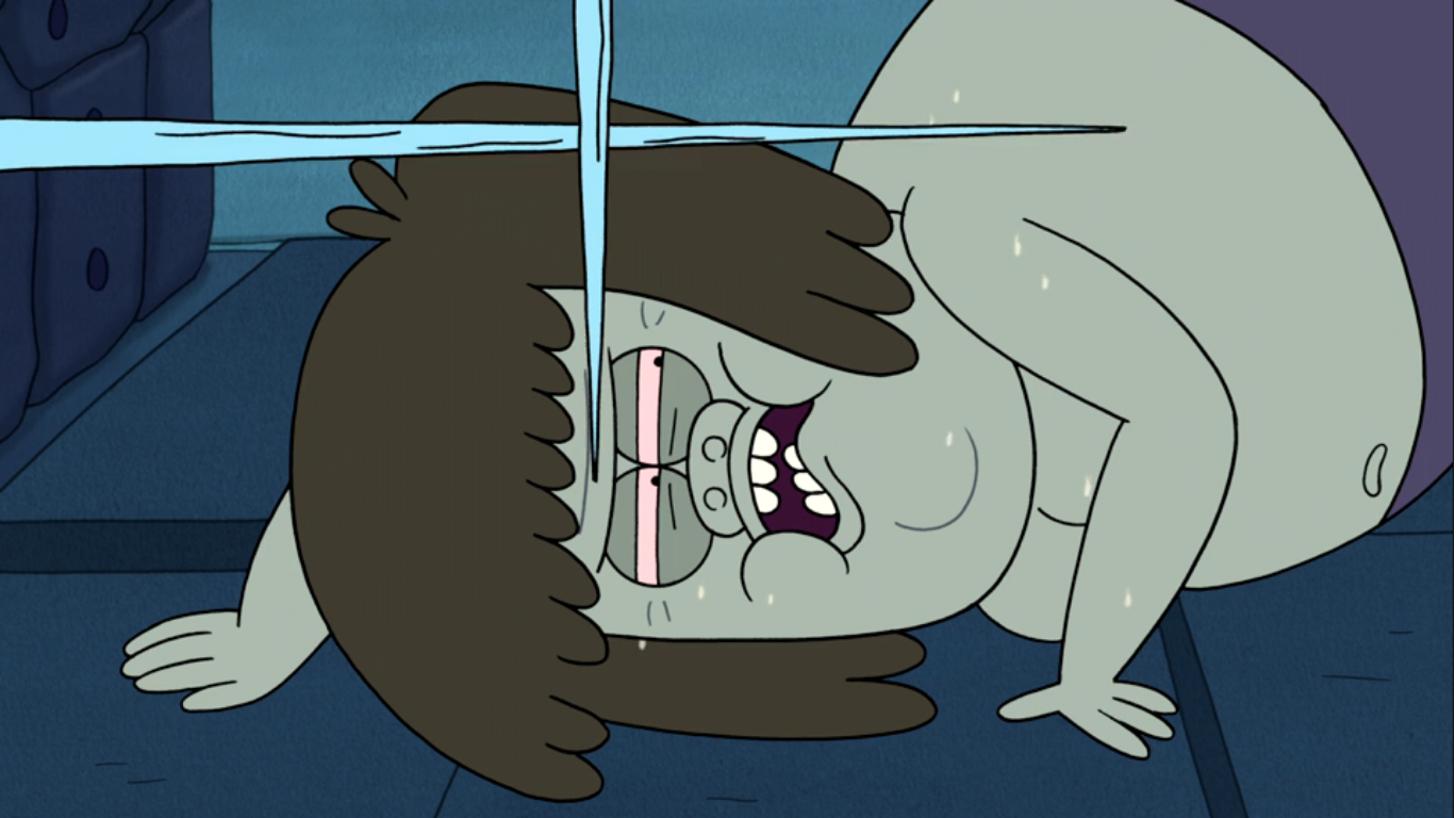
Time to check in with Kimi and Kira who are now in Hawaii. Kira is on the phone with Chas while an airline employee claims to have good news for them. She thinks it’s about their luggage, which has gone missing, but he just wants to offer some macadamia nuts to them. Kira is trying to keep it together, but Kimi attempts to leap across the counter and grab the guy. Kira informs her daughter that he’s probably doing everything he can to locate their luggage, but rather than confirm that assumption the man just keeps waving the little bag of nuts in her face. She sighs and accepts the meager offering. I suspect she’s going to explode next time we check-in on these two.

Chuckie, Phil, and Lil are next seen strolling through the mall. It must be Christmas Eve at this point and they’re basically exactly where I wouldn’t want to be. Tommy and Dill are there too and Dill is still trying to come up with a song. Tommy points out they only have two days until Christmas, so I guess my assumption was off. As was Chuckie’s earlier explanation that his mother and sister were coming home on Christmas Eve, unless they were planning on all of these travel nightmares they’re going through.

It’s at this point that everyone has basically taken notice of Chuckie’s mood, and it becomes harder to ignore when he stops dead in his tracks to basically curse out a display Christmas tree. It’s located where the mall Santa has taken his perch and Chuckie confronts him to share his opinion that the holiday has turned into a sham. He points out a tacky holiday advertisement to support his claim, but the Santa doesn’t really seem to care. Tommy tries to pull his friend away and Chuckie agrees to back down, but not without one of Santa’s freebie candy canes! He lunges for it and at this point a bunch of helpers emerge to the sound of alarms to pry the Finster away.

Tommy and the others lead Chuckie to a bench. He apparently got to keep the candy cane and I would say he’s rather fortunate to not be tossed out of the mall at this point. I’m betting that sly Tommy was able to talk him out of any further punishment. Lil asks Chuckie what’s gotten into him and then confesses that it’s kind of attractive. I’m guessing that normally such a declaration from Lil, or any girl, would knock Chuckie off of his feet, but he’s too far down in the dumps now. No longer able to take it, he tells the rest of his friends that he’s the sicko who stole the tree! Tommy quickly jumps to the defense of his bestie telling the others it was an honest mistake. Chuckie insists he’s in real trouble with the man upstairs, but Lil assures him that God won’t smite him. I thought they were purposely avoiding the mention of God until Lil jumped in there. Chuckie disagrees pointing out that he even has elves on his case now. He suspects a smiting is in order and tells his friends they should keep their distance. Right on cue, sparks start raining down on Chuckie, but it’s from someone welding a banister above them (pretty odd to do while the mall is open). Chuckie is beyond consoling and begins to leave and then has to move faster when more sparks start showering him.
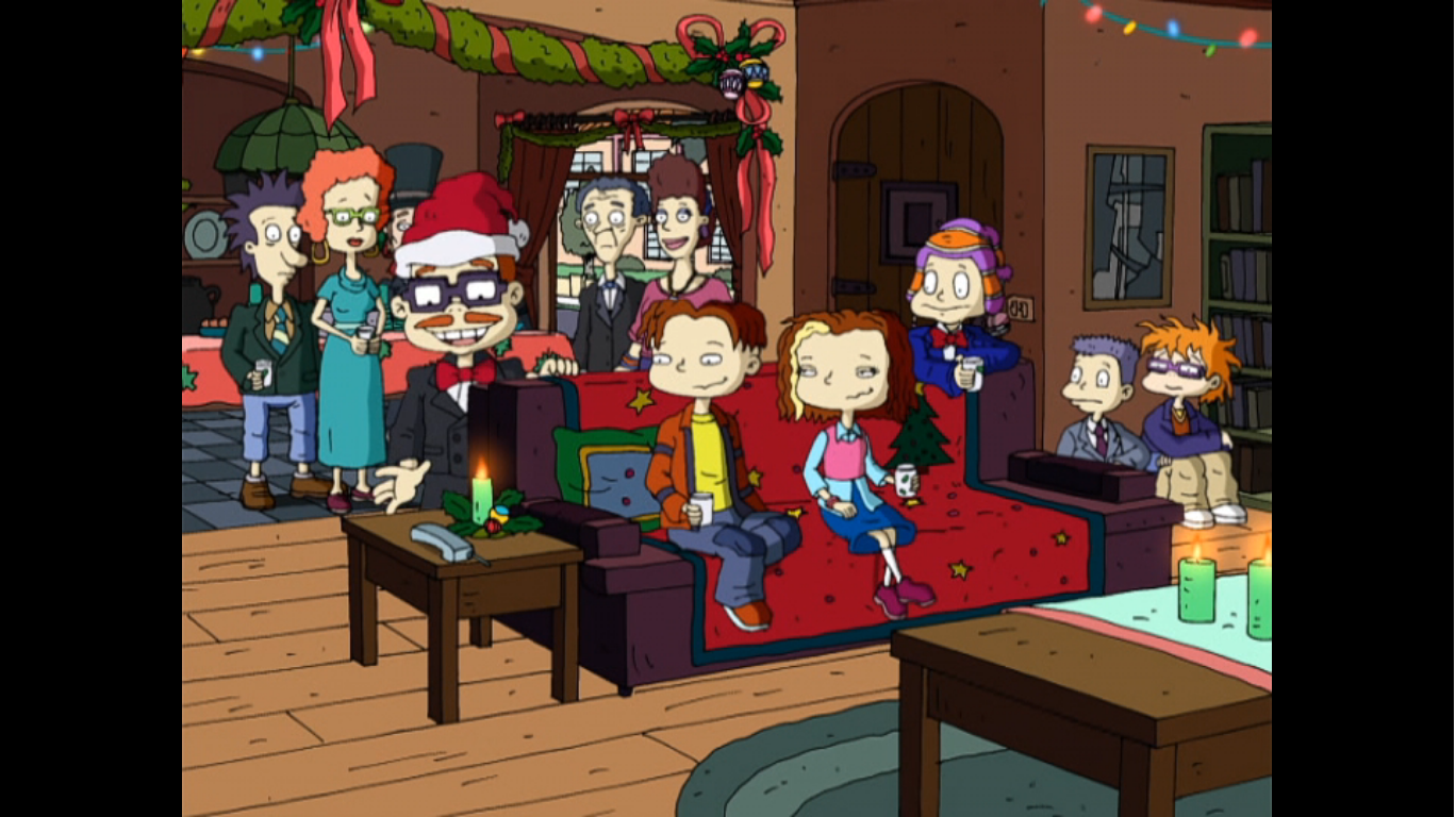
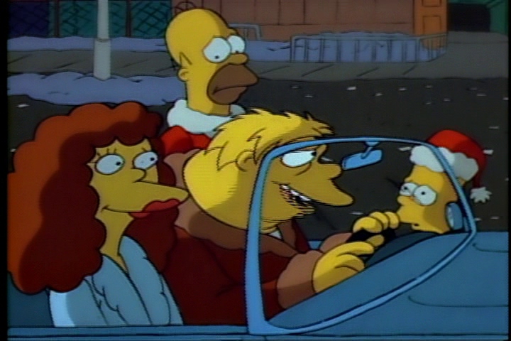
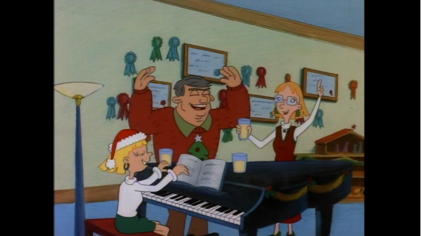
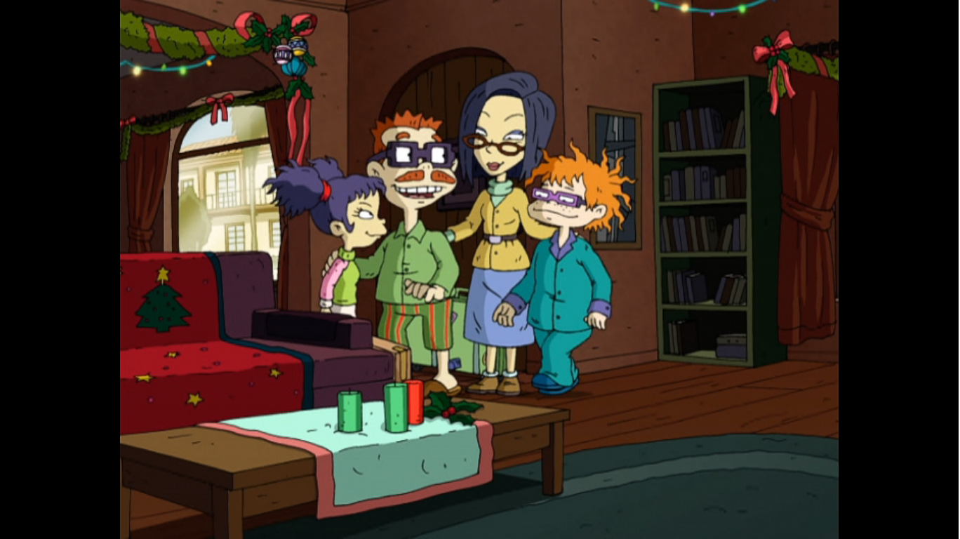
It’s party time at the Finster residence! Not only are those carolers present, but Chas hired a full, live-action, nativity scene as well. He really has gone all out. We also get to see all of the adults we’ve been denied up until now. Howard, Phil and Lil’s dad, is looking rather feeble while Didi and Stu have aged more gracefully. The entire Pickels clan decided to wear formal attire, but Chas is doing the same so maybe that was encouraged? One person not in a suit is Chuckie and Tommy finds him sulking in a corner thoroughly miserable. He points out that this is the Christmas he’s always wanted and he couldn’t be more unhappy. The phone rings and it’s Kira and Chas has the Christmas wind knocked out of him when he finds out the two are stuck in Mexico. Chuckie blames himself and feels he’s essentially cursed his family’s Christmas by stealing that tree. Tommy points out that he could potentially fix this since he’s the one who stole it. When Chuckie asks how Tommy replies, “By stealing it.”
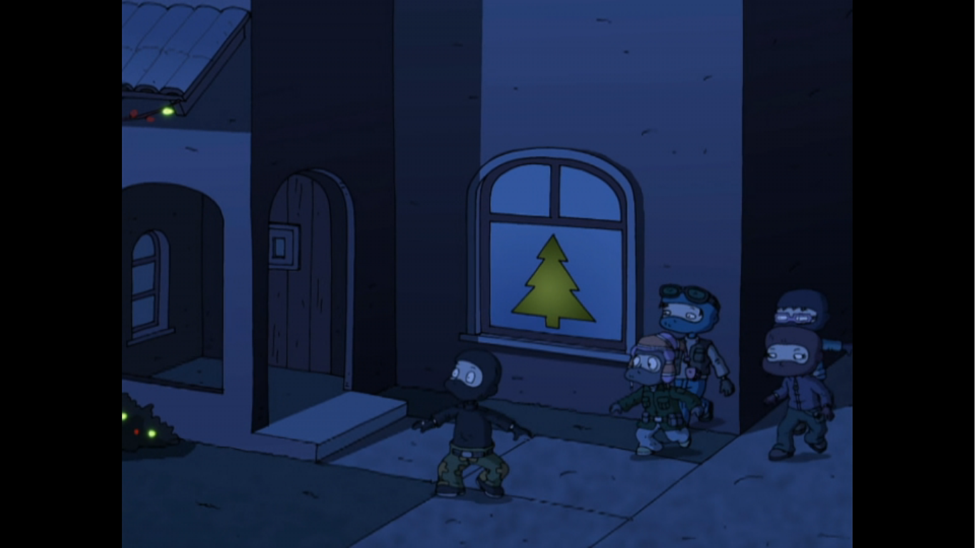
We then find the crew dressed like ninjas and lurking outside the Finster house later that night. Stealing a Christmas tree is clearly a five kid job. They come to the window where Tommy whips out old reliable – his screwdriver, and uses it to break into the house. Chuckie points out that they can go through the door, but the others seem really invested in this ninja stuff. At least Tommy is, and as he makes various hand gestures to the others they just return them with confused looks. He then just tells them to get the tree. They try to shove it out the window, ornaments and all, but it’s a tight fit prompting Chuckie to remind them that the door is still an option.

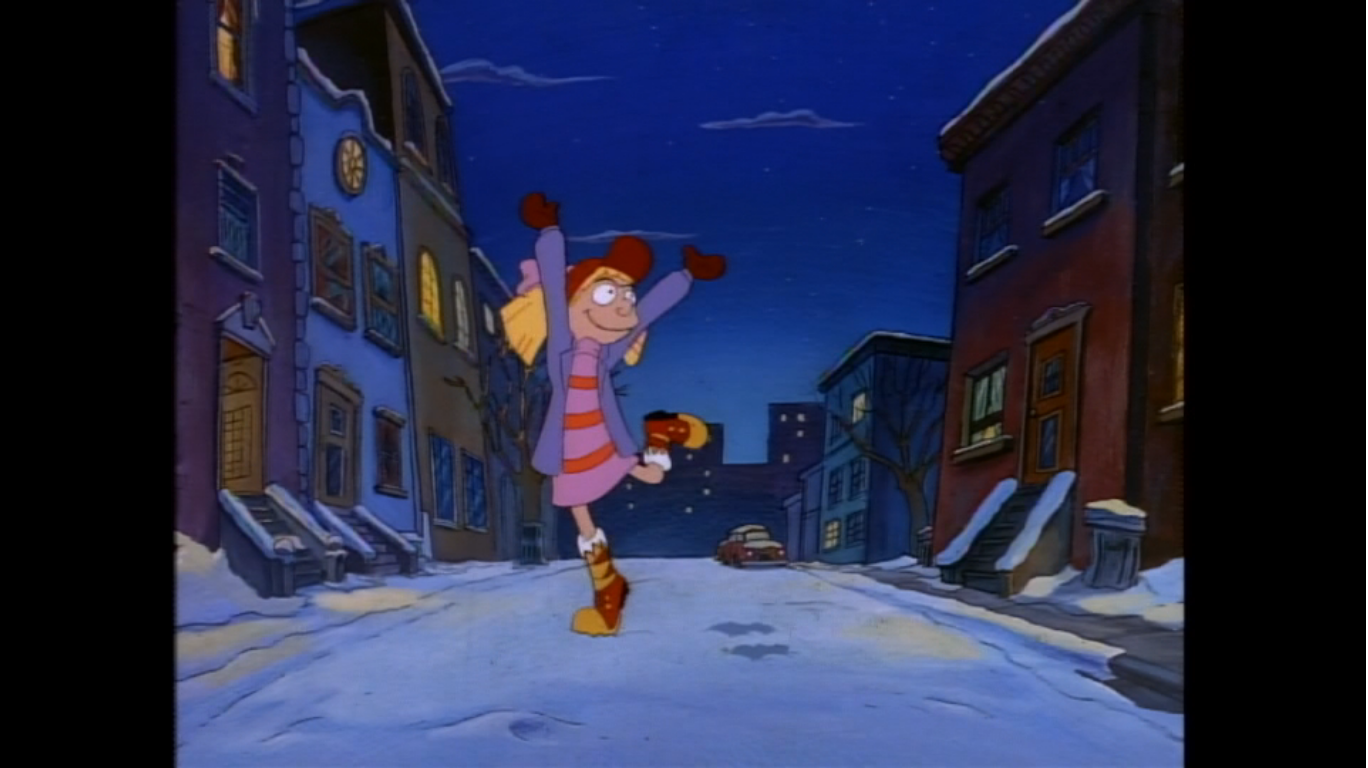
In Mexico, we find Kira and Kimi on the streets. The good news is they appear to have all of their luggage, the bad news is they’re going to miss Christmas. Kira seems a little frazzled as well with the mariachi playing in her ear and street vendors repeatedly trying to sell her items. Kimi tells her mom she’s proud of her, and when Kira asks why, it’s because she’s managed to keep her cool throughout all of this. That means she’s about to lose it and does when some rando tries to swipe the cab she hailed. She grabs the man by the collar and throws him to the ground while recounting her misadventures up until now in case we needed a quick recap.

With that out of the way, we can return to the tree plot. The kids place the tree on the stoop of its rightful home and ring the bell. Then, for some reason, they stand around a moment until a light comes on inside and at that point they finally run. We cut to the next morning and Chas is discovering the missing tree. He apologizes to Chuckie, but the son is happy to just curse those tree thieves that have been making the rounds. As Chuckie dramatically cries out “Why?” Chas concludes that he should have listened to Betty’s warning and given Chuckie “that dog early.” Chuckie then excitedly asks if he’s getting a dog, but Chas just says “No.” He then wonders why someone would steal a Christmas tree, but leave behind “a Kid-Vid X-Game?” In this universe Kid-Vid must have broken free from the Burger King Kid’s Club. Chuckie then repeats the previous gag by asking if he’s getting such a game and Chas deadpans, “No,” once more. Does he know what really happened and is just torturing his son at this point?
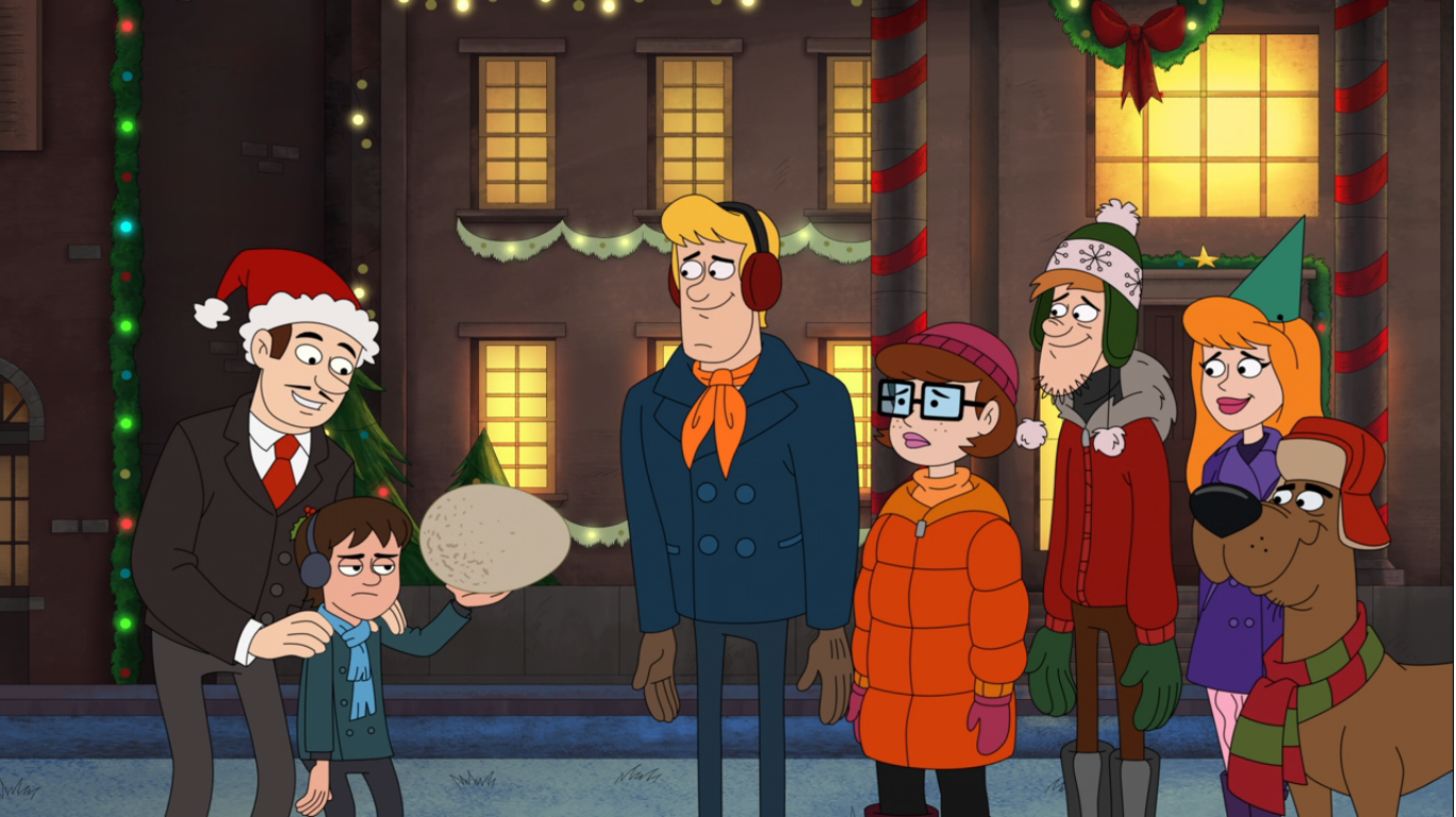
Chas concludes that Christmas is ruined and draws his son in close and is puzzled at the presence of pine needles in Chuckie’s hair. That’s it, Chuckie is done keeping things from his dad and confesses to stealing the tree not once, not twice, but three times! He then concedes that he’s confused about how many times he stole it (I think it was just twice, Chuckie) and Chas just calmly tells him to explain what happened. And he…doesn’t? He just tells his dad that he wanted a big Christmas like everyone else and that’s it. Before Chas can ask a presumed follow-up question, the door opens and Kira and Kimi come waltzing in. The family embraces and Chas gets to give his son a lesson by showing him they don’t have nothing and repeats the mantra about family and Christmas. Kira is pretty amazed to see how festive the house is, but then asks about the lack of a tree. Chuckie suggests he tell them about that over breakfast. Kira then pulls out a bonsai tree and declares that anything is better than one of Chas’s trees and hands him what I assume is a little gift she brought back from Japan. They place it in the spot vacated by the Christmas tree and the sound of Susie singing “The First Noel” fills our ears.

As Susie sings we get to see the camera pan over the town and its festive decorations. I thought we were going to check-in on the other families, but no, instead we are taken to the church as the sun goes down. Inside, Susie is singing and all of her friends and their families are gathered just as they promised. When Susie finishes her song she announces that their Jewish friends have something to share as well. This is Tommy and Dill’s cue to launch into this Chanukah song they’ve been working on. It’s an ode to latkes, and most of the audience seems amused by it. Didi, surprisingly, does not. I also notice a lack of Grandpa Lou in attendance which had me running to a wiki to see if he was dead. He’s not supposed to be so I guess he’s just asleep in front of the TV.

That’s it though as the episode ends with a pan up and out of the church as the audience applauds the silly song about latkes. That wasn’t bad and I was surprised at how effortlessly these characters just sort of slip into teenagers. I thought they might have felt forced into these somewhat new personas, but it all felt natural. The episode also didn’t feel like it had to get everyone into it. The cast is rather large now and likely a tad cumbersome, but I was surprised we didn’t get a quick cut to see what Anjelica was doing. Only Betty and Chas of the adult characters had any lines, not that we needed to hear from anyone else, but I was still surprised. Usually these holiday episodes feel the need to get everyone involved, but not All Grown Up!
The only plot in this one that mattered was Chuckie’s. The bit with his step mother and sister only existed to make Chuckie feel bad and that God was out to get him for stealing a Christmas tree. Even so, it was a rather low stakes plot considering it was a misunderstanding. A rational person would have righted the wrong fairly quickly, but that wouldn’t be very dramatic. We had to wait until the last minute for everything to be set right, though Chuckie really didn’t have any comeuppance. I guess his torture was all the comeuppance he needed. The subplot about the song was unnecessary, though I liked that the episode did end at the church since it was mentioned by Susie early on and I like that her friends are all supportive of her. It’s also somewhat quaint to see a church-going community on television in 2004. The Simpsons has been doing it for awhile, but even with that show it feels like a throwback to a bygone era.

And speaking of, the “villain” of the episode being God was pretty interesting. Well, I suppose technically the villain was Chuckie, but he feared God’s retribution and the almighty was even named. That’s definitely rare for a kid’s show, but it did make sense here considering we’re dealing with tweens. It would have felt really silly for Chuckie to fear getting coal in his stocking or something. If the show were Not Quite Grown Up and the kids were in elementary school then sure. They don’t outright say anything about Santa not being real, but it’s implied with Chuckie asking his dad what he got him for Christmas. I suppose Chuckie could have feared the police or another threat instead, but God works.
As for the production, this is still very much a Klasky-Csupo show. Character models are still pretty weird and almost purposefully ugly. The aged-up babies actually all look a lot less monstrous now, maybe it’s simply the hair? If it weren’t for the purple hair, Tommy would look fairly normal. Chuckie looks about the same, while I really dug Lil’s updated design. She has some flair, Phil as well, and I don’t know that I would have predicted that out of the twins. There’s a lot of wardrobe changes too for an animated show and I certainly appreciated the variety. The show is almost mean to the adults though. They all look like they aged 20 years, not 10 or whatever it’s supposed to be. Poor Howard looked the worst, but at least he’s still with Betty. I thought she would have left him for another woman by now. Mark Mothersbaugh is still the composer for the show, but his score is not really evocative at all of the one in place for Rugrats. I’m guessing that was tailor-made for a show about babies and this one needs to be about tweens, but in doing so it lost a lot of personality. Nothing about it stood out to me. At least the character voices all sound great. I’m not sure if they had to modulate Daily and Strong in post at all, but I was impressed with how low they were able to go with their voices. Soucie’s Phil and Lil were left mostly unchanged and same for Summer’s Susie. I actually don’t have much exposure to Cartwright’s Chuckie, but I think it’s basically the same between the two shows with maybe just a bit more confidence in the delivery since he’s no longer a baby stumbling over words.

I don’t know that I’ll ever get around to it, but I am curious about the rest of the show. I also wonder if Nickelodeon will ever bring these characters back as high school aged kids. The original audience of the show is approaching 40 at this point, so maybe that ship has sailed. Do those kids want to see them as adults? I was only a casual Rugrats viewer back in the day and I can safely say the idea of adult Rugrats doesn’t interest me. Maybe as a special, but what would I want from it? Can Rugrats be cynical or will everyone be leading happy, healthy, adult lives? I don’t know, but considering these characters are babies once again in the new show, that seems like something pretty far off.
If you want to spend Christmas in agony with Chuckie, All Grown Up! can be found streaming on Paramount+. There, this episode is listed as the seventh in the third season for some reason, but it’s there for you if you wish to view it. I doubt that Nick will air it, but I suppose you never know. You might as well pair it with the other Rugrats holiday specials, they’re all pretty good (the secret best one is actually the Mother’s Day episode), and you’re likely to have a good time whether you’re a kid, adult, or just a kid at heart.
Can’t wait until tomorrow for more Christmas? Check out what we had to say on this day last year and beyond:

Dec. 14 – Rugrats – “The Santa Experience”
Yesterday, we took a look at the 1992 Christmas special from the third Nickelodeon Nicktoon The Ren & Stimpy Show. Today, we’re basically working backwards and talking about the second Nicktoon to premiere: Rugrats. The Ren & Stimpy Show is probably the most celebrated of the original Nicktoons when it comes to animation circles, but…
Keep reading
Dec. 14 – Gifts from the Air
For today’s subject, we’re going all the way back to 1937 to talk about the Columbia Pictures Gifts from the Air. This particular cartoon comes from an era dominated by Disney, Warner Bros, and MGM with a tip of the cap to Noveltoons. The Color Rhapsody Theatrical Cartoon Series is not particularly well-remembered outside of…
Keep reading
Dec. 14 – Aqua Teen Hunger Force – “A PE Christmas”
It was a couple of years ago we looked at the first Aqua Teen Hunger Force Christmas episode because it contained Danzig. I was basically required to talk about it! This year we’re coming back to it, and wouldn’t you know, there is a musical component to this one as well. If you’re unfamiliar with…
Keep reading