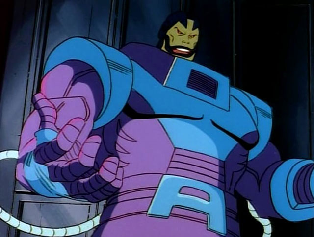
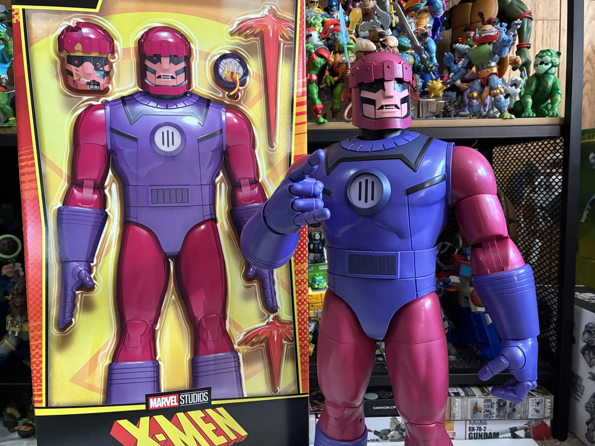
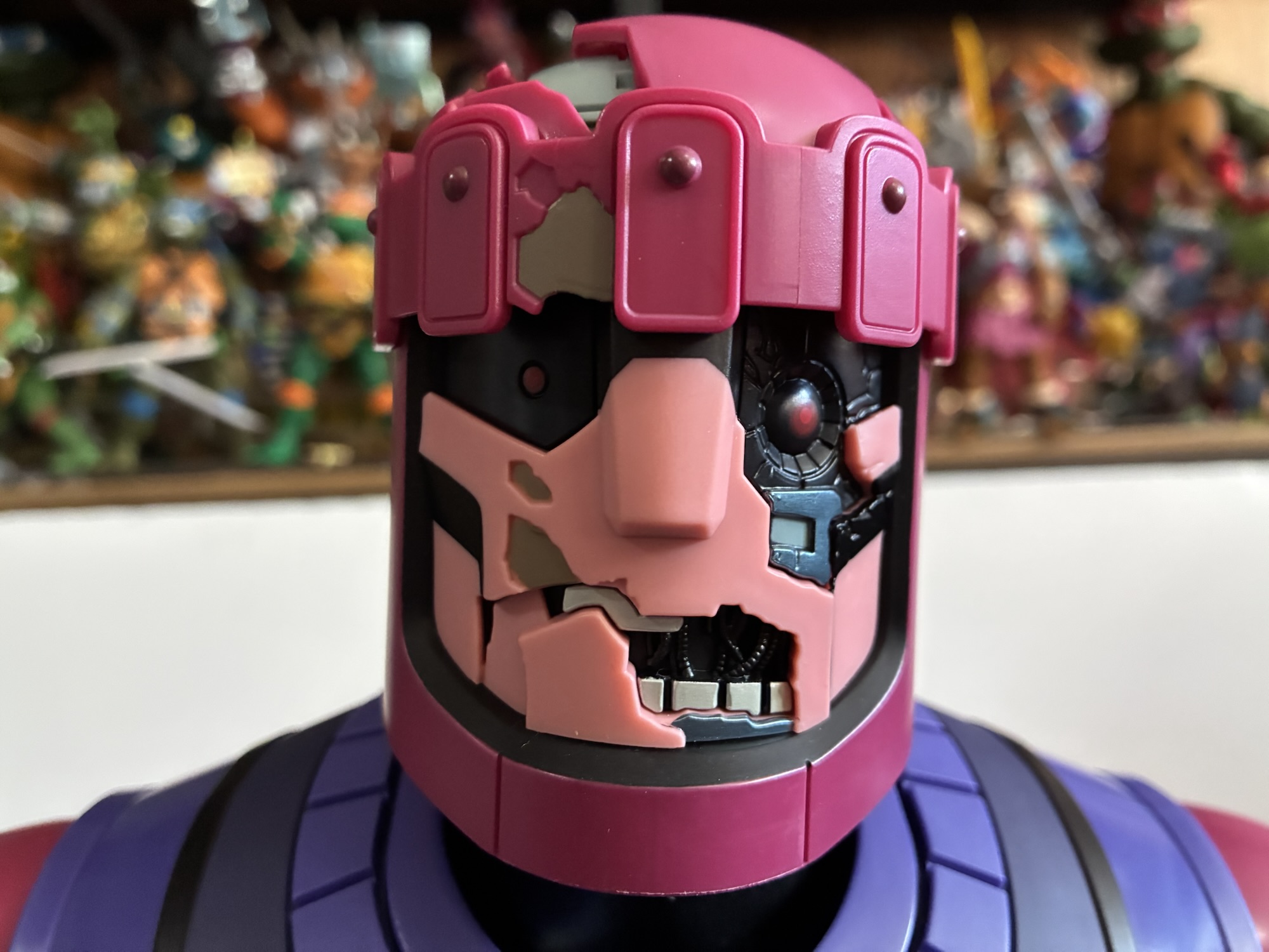
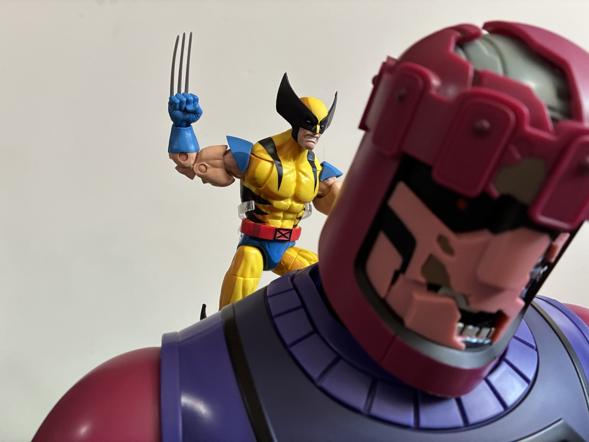
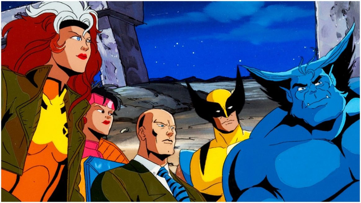
When the topic of X-Men villains is broached the first name that comes to mind is Magneto. And rightly so, he was on the cover of the very first issue getting pelted by a snowball from Iceman (and Marvel wonders why the kids of the day thought the X-Men looked lame). When the X-Men were first brought to television in pilot form, it was Magneto that was chosen to lead the antagonistic group the Brotherhood of Evil Mutants removing all subtlety from the character and firmly placing him in the role of villain. That show never made it any further and when Marvel got yet another chance to bring the X-Men to animation it was, once again, Magneto placed as the big, bad, guy right there in the opening title directly opposing Xavier’s X-Men. He didn’t actually debut in the series until the third episode where he had a brief skirmish with just three members of the team before returning in the following episode for a slightly more combative showing that ultimately ended in defeat.
And then that was it. Magneto was never the central villain again past the fourth episode. He briefly teamed-up with Apocalypse for the “Beyond Good and Evil” arc, but otherwise he was more like a hostile ally which is why the first villain I think of when someone mentions X-Men – The Animated Series my mind goes to Mister Sinister.
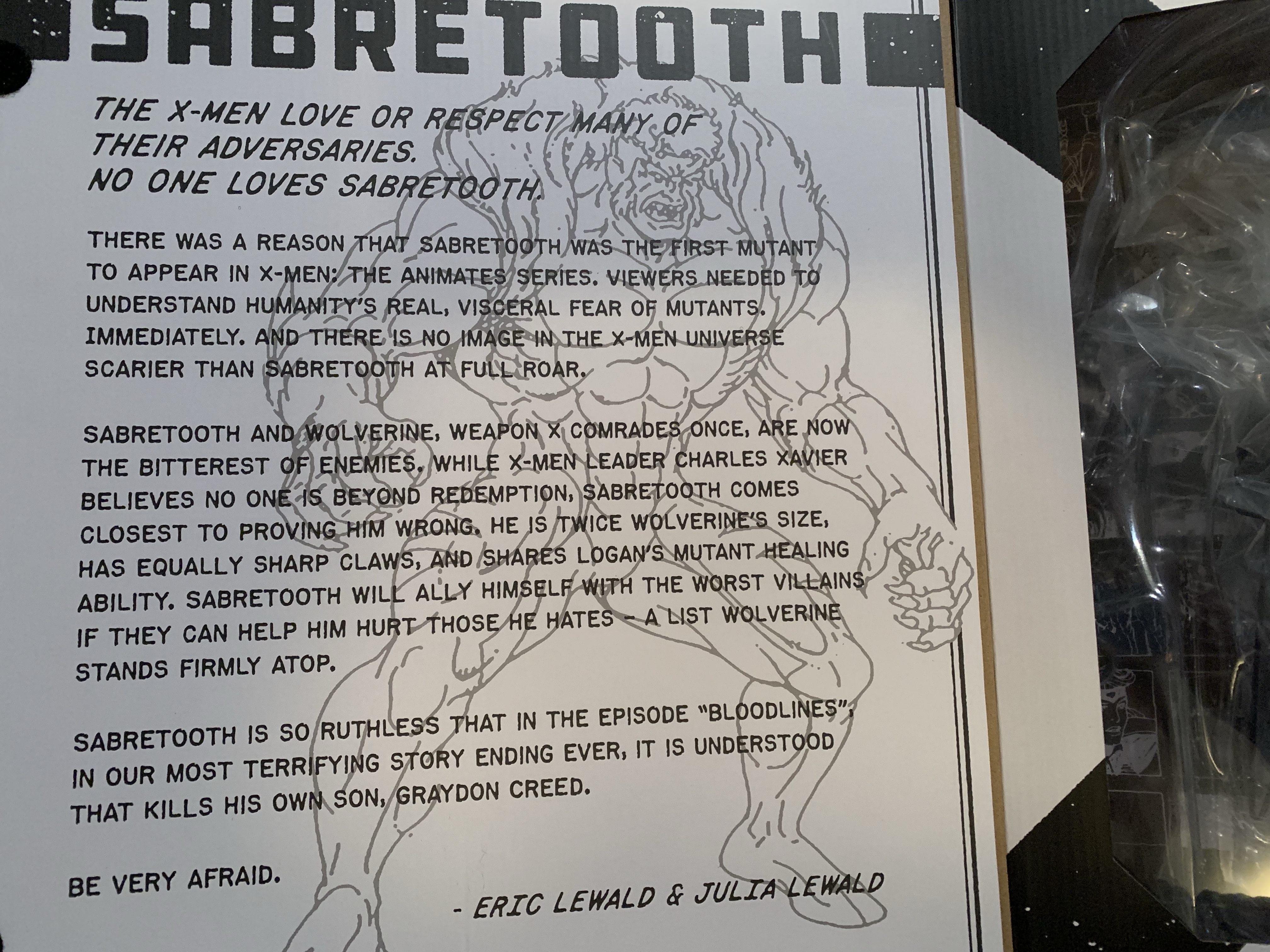
Mister Sinister was still a relatively new face when the cartoon series began having first been mentioned in 1986, but holding his full debut until 1987. He was the antagonizing force over the show’s second season either directly opposing the X-Men or lurking behind the scenes setting plots in motion. Apart from a brief truce with the X-Man Beast during the Phalanx confrontation, he remained a villain throughout because that’s really all you can be with a name like Mister Sinister. The scientist Nathaniel Essex was obsessed with human mutation, but his experiments were so controversial he was forced to do them in secret and on himself and his wife. This basically turned him into a mutant with somewhat undefined abilities. His body can restore itself almost instantaneously and he can produce energy blasts. He may even have some telepathic abilities as well as telekinetic ones, or maybe all of that was just for show in the cartoon. He is often allied with Apocalypse and one has to wonder if a thousand years from now his powers might evolve to more match that of the original mutant.
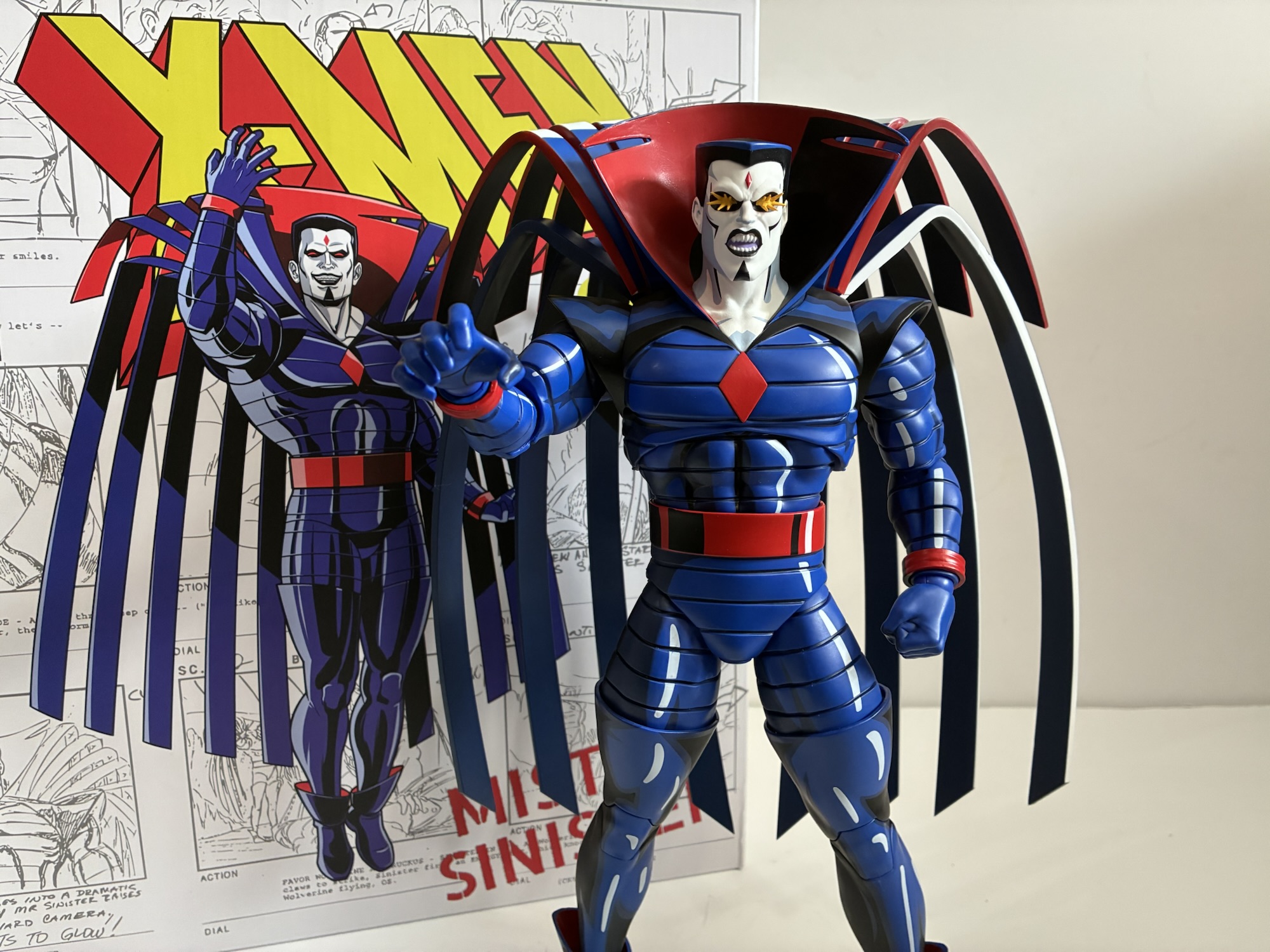
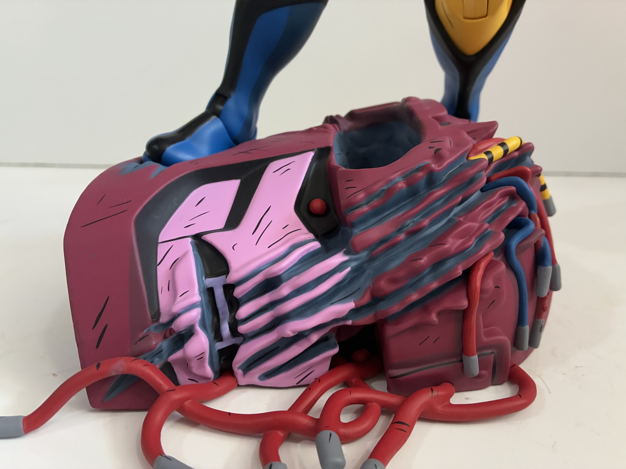
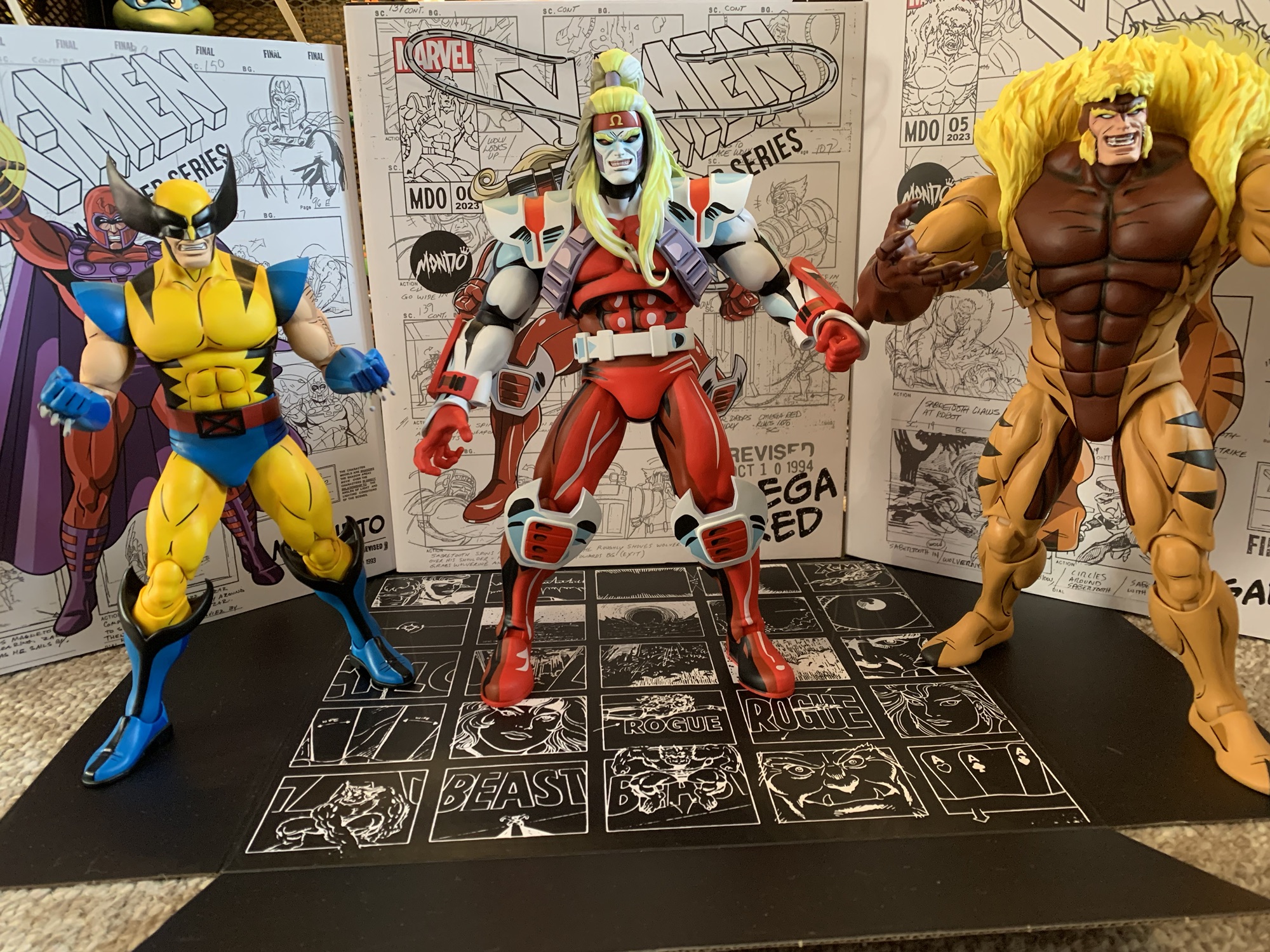
Because of his lofty standing in the show, Mister Sinister was a must have for Mondo’s action figure line based on X-Men and X-Men ’97. The character does always pose some difficulties in bringing him to life due to his unusual appearance. His costume and portrait is pretty straight-forward, but it’s that cape that can give animators and sculptors fits. It basically consists of three, main, parts: collar, upper portion, and lower portion. The upper portion rises from Sinister’s body and then takes an acute angle towards the ground. The section below that is wider and basically does the same thing giving his cape a tiered appearance. To further complicate it, it isn’t just one or two pieces of material, but it’s broken out into strips. I have no idea what the material is intended to be, it could be leather, it could even be a thin metal, but it moves around like a cape. For the show, the animators basically just kept Sinister as stationary as possible. He wasn’t allowed to turn or do much in frame to reduce the need to animate that cape. Sometimes, they would drape part of it over his forearm which is about as fancy as they ever got. In toy form, the original Legends one had rubber strips of plastic affixed to his collar and didn’t really attempt that big “hump” the upper piece creates. When Hasbro attempted the character it did the cape in the proper shape, but also tried to keep it as few pieces as possible by essentially fusing the strips together in a manner that made it look like the cape was just bunched together. That approach worked fine for a 1:12 scale figure, but for a 1:6 scale figure there’s a greater challenge. You can’t hide things at such a large scale and the need for realism becomes more important. Mondo had to come up with a way to both have Sinister’s cape retain its shape while also not being brittle. Now that he’s here, how did they do?
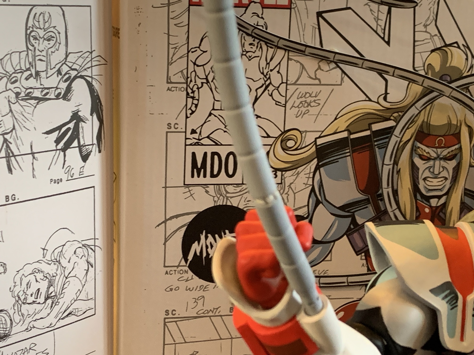
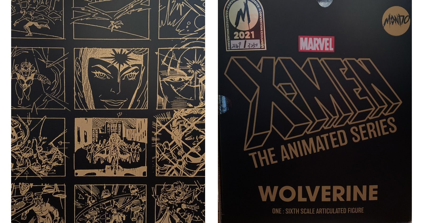
Before we get into it, I want to mention that this another figure distributed in a box with new artwork by series storyboard artist Dan Veesenmeyer. It’s also adorned with production artwork from the original series depicting Sinister which I think is from the episode “Till Death do us Part – Part 2.” Sinister foregoes the usual frontal flap and instead has his bio on the rear of the box. It’s again by the Lewalds, Eric and Julia, who worked on the writing staff of the original series. I’m curious if this is the plan going forward which is honestly fine by me. There isn’t much use for a window box on something most people buy online, and even less so for a Mondo figure as they always wrap their figures in plastic bags and tissue paper to protect the paint. It is one of the deeper boxes in the series so far as Sinister needs quite a bit of room. Once again, this is a sculpt by Alex Brewer with paint by Mike Pflaumer. Hector Arce is credited with art direction and Jordan Christianson packaging.
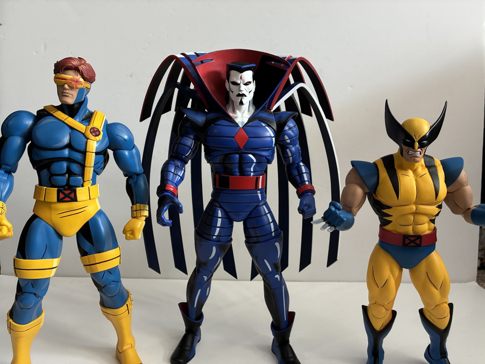
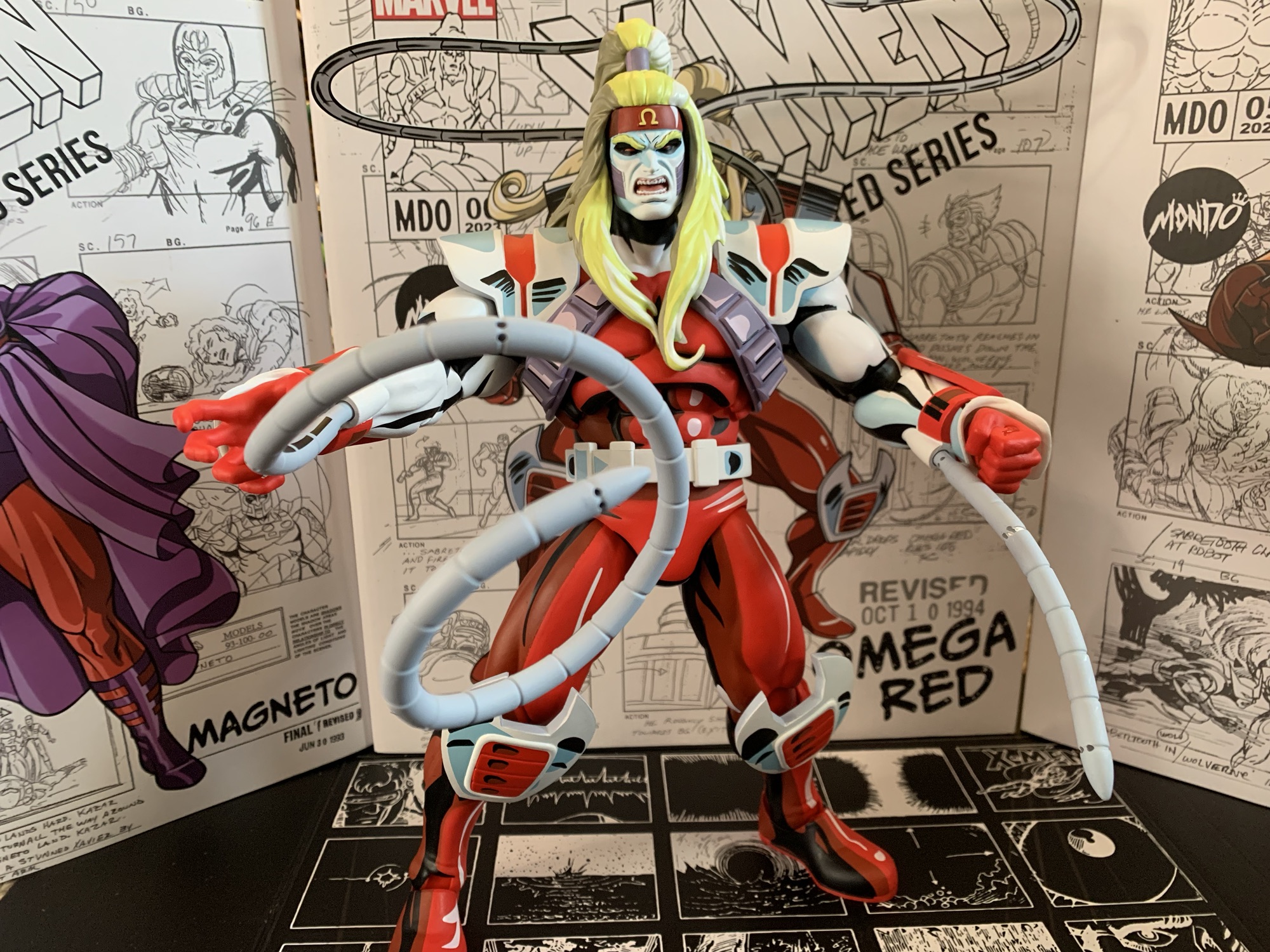
Sinister to the top of his head is a little over 12″ putting more or less eye to eye with the likes of Cyclops, Gambit, and Magneto. His collar takes him higher, but more so is the depth needed because of that bizarre cape. Mondo elected to do Sinister’s cape with a hard plastic – I’m assuming ABS. It’s basically four pieces: you have two upper pieces each consisting of four strips and two lower pieces each consisting of another four strips. The pieces for each side, one upper and one lower, are glued together where the cape slots into the body of the figure so you effectively have two pieces to slot into the figure. They do not go in easy. The right side is more stubborn than the left on my figure and the challenge here is that this type of plastic has little to no give. It’s thick, probably a quarter of an inch, so you probably have to give it way more force than is reasonable to actually break it, but it’s hard to find a safe way to apply the pressure needed to fit it in there. I don’t think heating the actual cape will help as this type of plastic usually doesn’t work like that, but heating the openings on the back of the figure is an option. I tried lowering the upper body into some hot water, but I don’t think I got it quite hot enough. It still helped, but there’s a little notch on the side of the cape that I think should be flush with the figure’s back and it’s not quite there. And yes, that is the sort of thing that will annoy me as I do my best to ignore it. I feel like the top of the cape relative to the top of the collar looks about right though so I’m trying not to let it bother me. If this were a cheaper figure I’d consider cutting some plastic away on the entry points to get a smoother fit. Or, I’d attempt to file off the little lip they put on the cape itself.
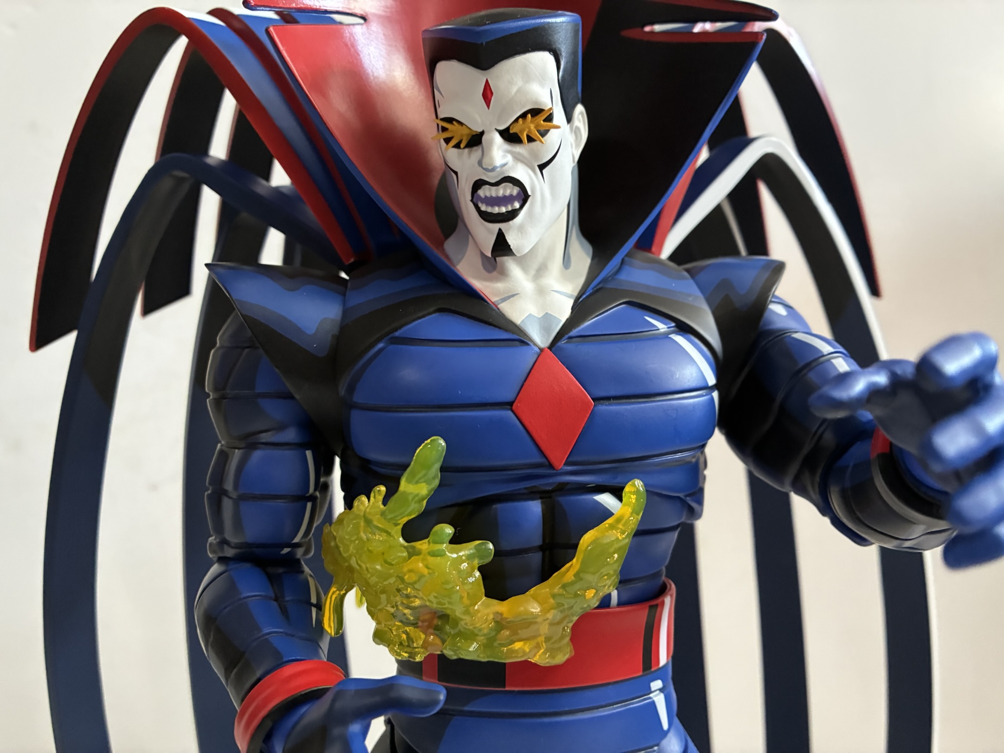
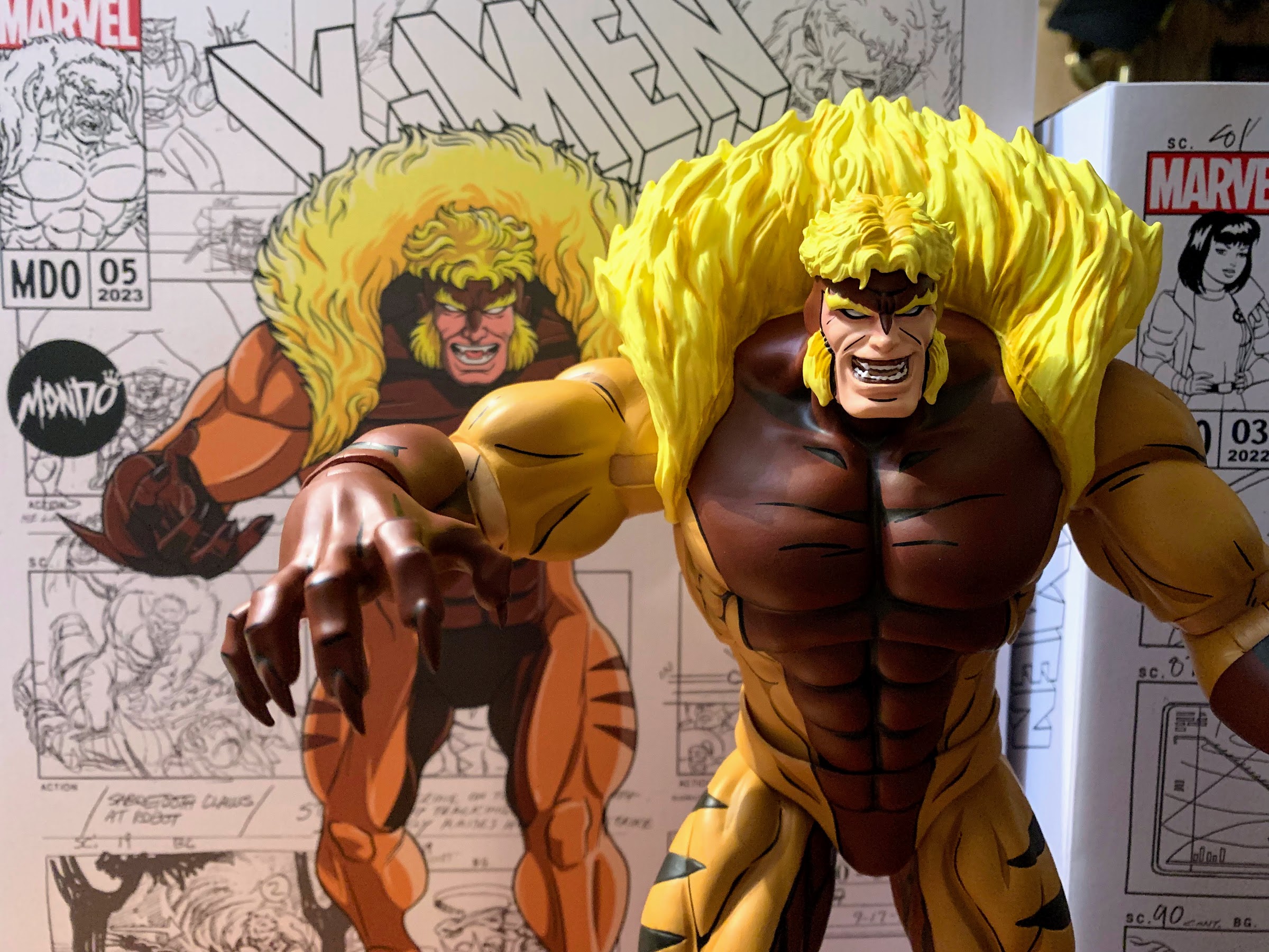
Aggravations aside, the cape does look good and it’s pretty accurate to the show. The figure’s right side has red and dark blue highlights on the side while the figure’s left has white which follows the shading in the show. This material will also never warp, though shelf dives could be quite destructive so definitely do be careful with how you ultimately pose this guy. As for the rest of the figure, he looks pretty damn great. The sculpt is basically dead-on with a nice shape to the torso. He is mostly a dark blue with a lot of black shading and some white highlights. The horizontal stripes are sculpted in which is accurate to the show as his costume almost looks like metal banding around his body. The collar is wonderfully excessive and the design of the shoulder pads and how they connect with the chest was realized well.
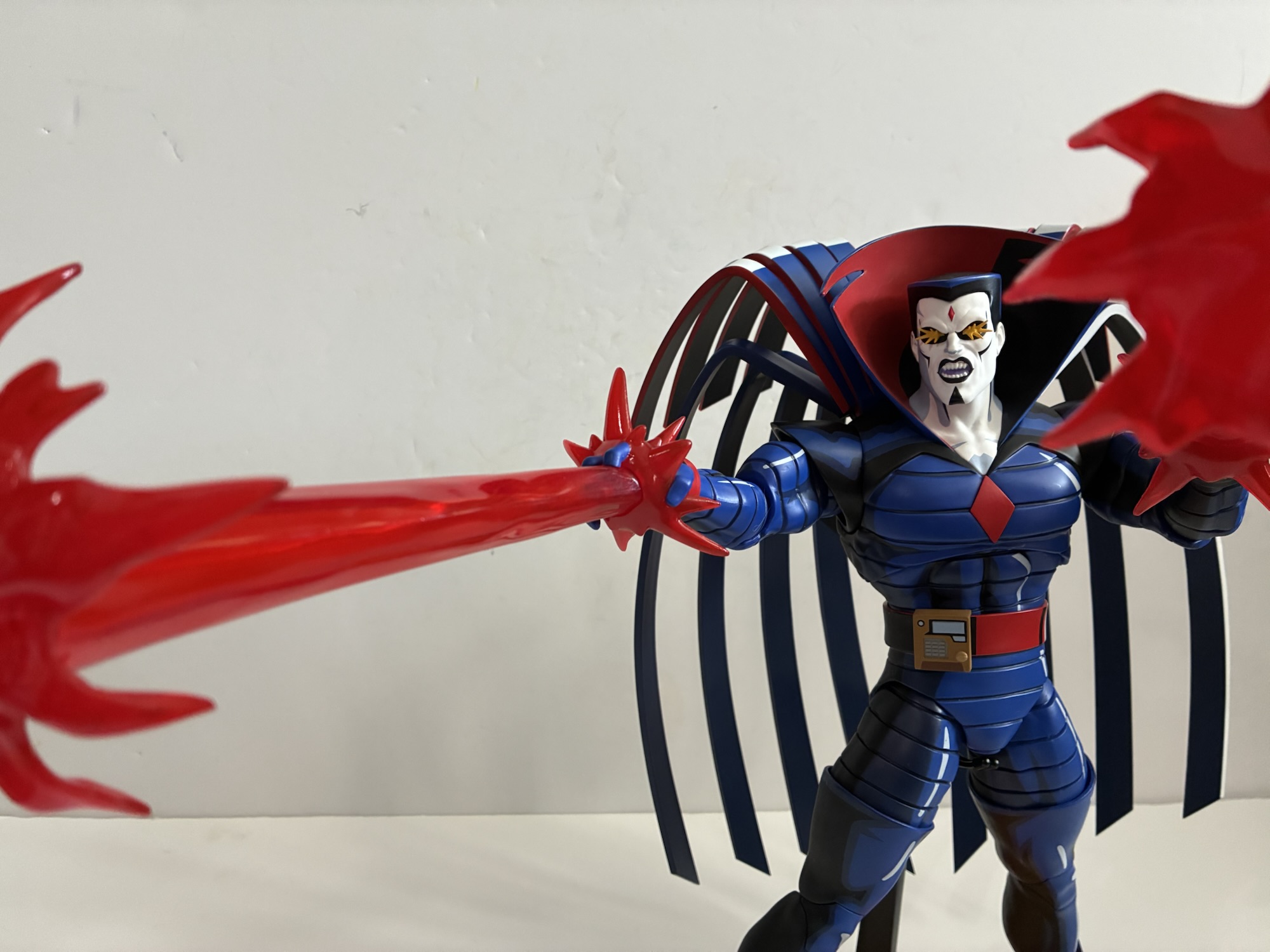
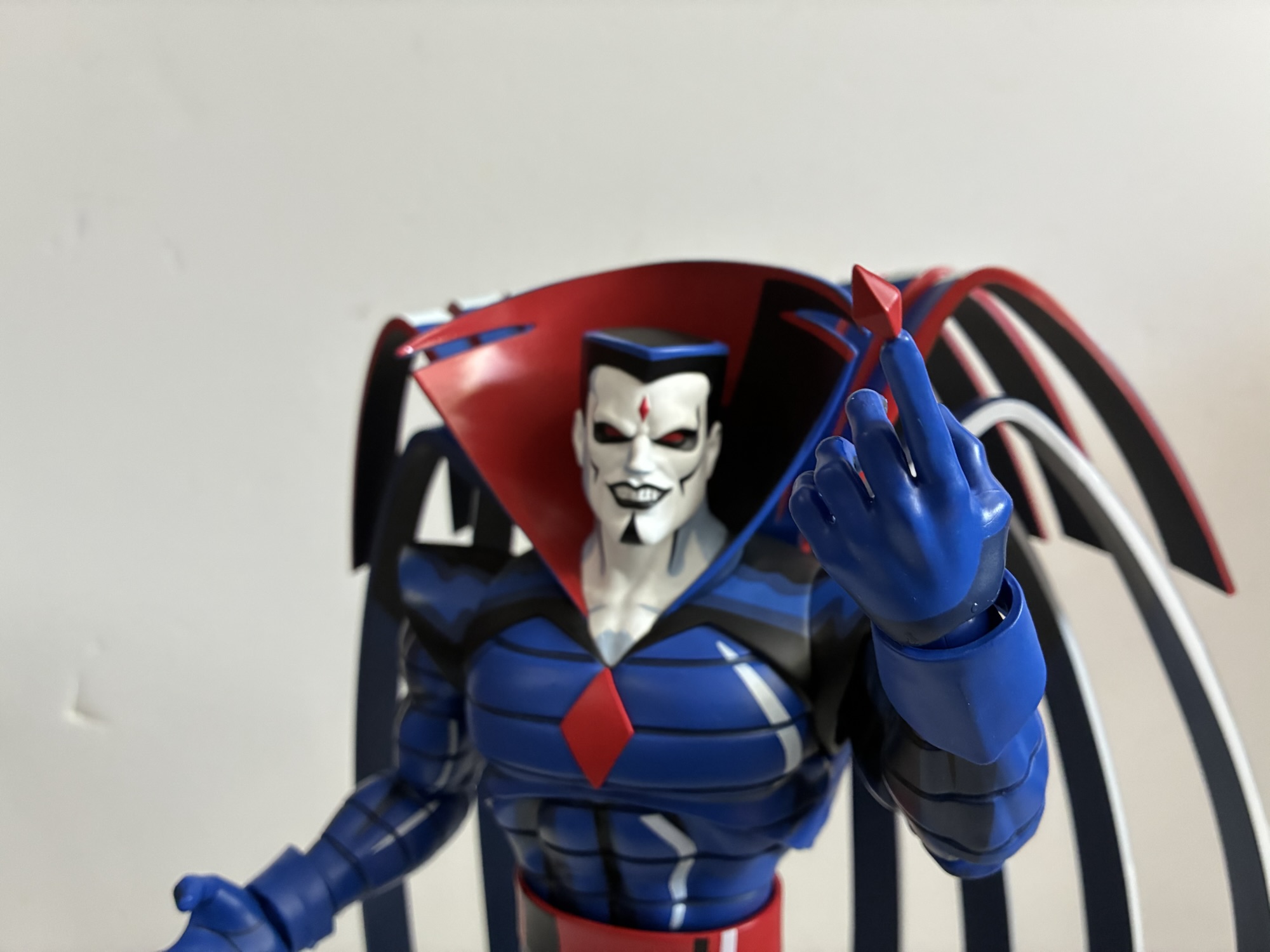
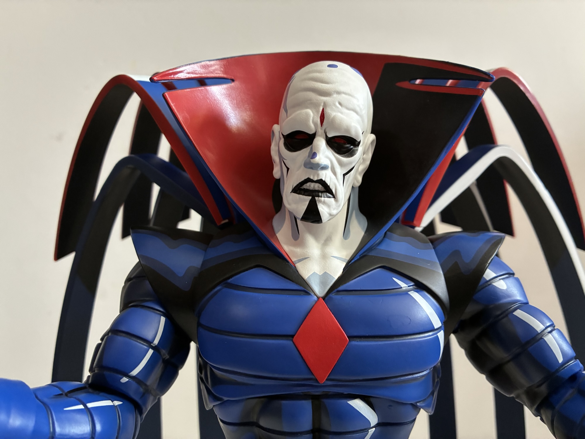
Sinister’s bone white visage is also done well with black lines accentuating his cheekbones which was always prominent in the show. There’s a blue-gray used to shade his face and his very square haircut is mostly black with blue highlights. His default portrait is a rather…sinister grin with his pointy teeth prominently displayed. This is one area where some fans may quibble with the look of the character. When I look at this portrait I very much see the X-Men ’97 version of the character. The differences between the two are very subtle and come down to the style of the show. Sinister’s mouth is just a little wider in that show, a little more cartoon-like. And that’s fine given that the box says X-Men ’97, but I don’t see a true original series portrait in the box. His other portraits include a scowl that’s basically a neutral portrait for him and it’s very ’97-like in appearance. He also has a portrait of his withered, old, look from the finale of the first season of X-Men ’97. The only other portrait is the one that I think looks the most like it’s from the original series. It’s a yelling head where his eyes are aglow with yellow energy. The energy is part of the sculpt and painted yellow, it’s not a translucent piece glued into the eye sockets like Rogue’s optic blast portrait. The yelling mouth, which has no hint of a smile, is like an equalizer in bringing the two designs together. Plus, I think this look is from an episode in the original series. It’s just a shame that it’s such a specific expression, though it is one I like and am happy to have. Personally, I have no use for that withered portrait and I wish instead we got a specific original series portrait that looks like the character turn-around art on the rear of the box.
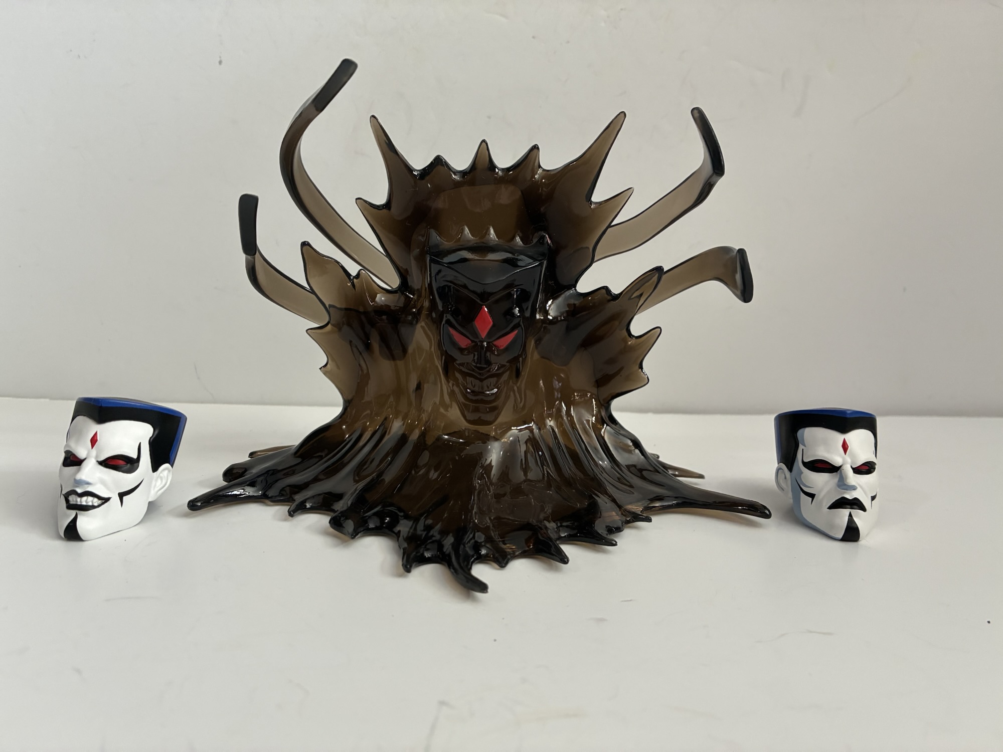
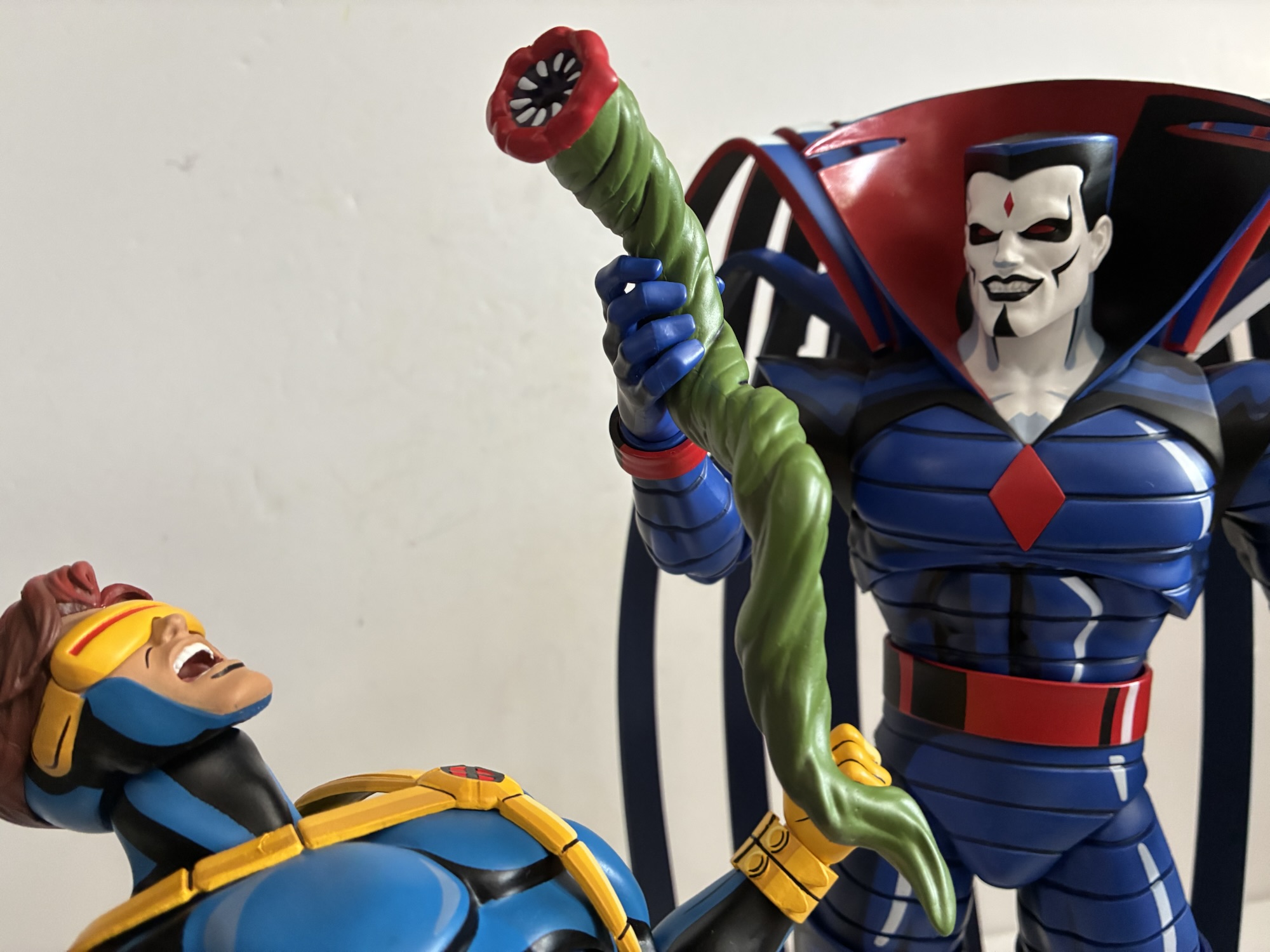
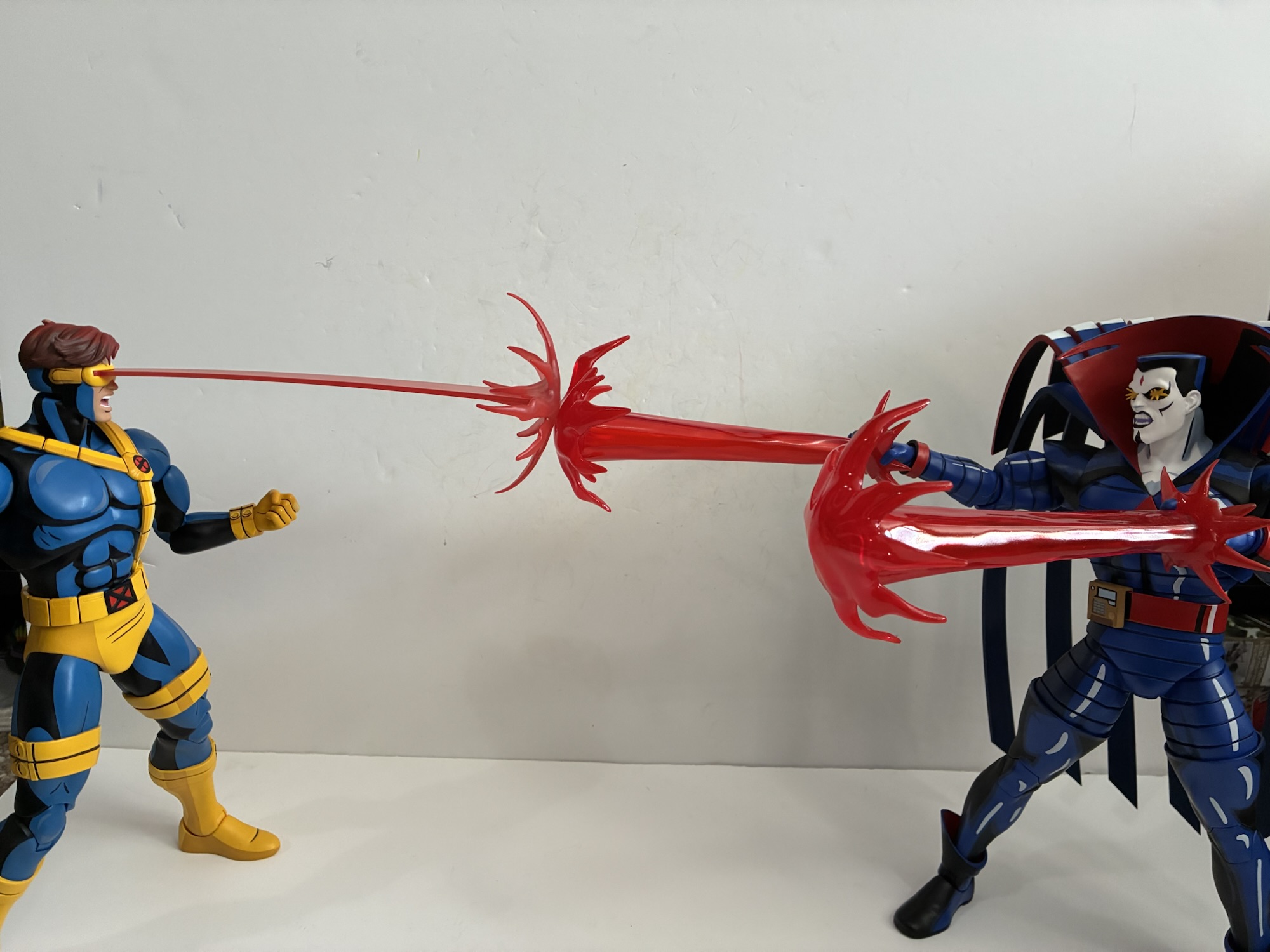
Those are the portraits, and per usual we also get a bunch of hands. By default, Sinister has some style-posed open hands. They look like he’s reaching for something or maybe getting ready to blast some foolish X-Man. He also has a set of fists and clenching/gripping hands. There’s an extra left hand that’s pointing with a red diamond at the tip of the index finger which is from X-Men ’97. The most eye-catching hands are his blasting hands which he comes with two of. They have the blast effects glued onto them which adds some noticeable heft, but so far my figure has been able to support them just fine. The blasts are done in red, translucent, plastic which looks very similar to the blasts that came with Cyclops. I kind of wish they went with yellow or mixed some yellow into it to differentiate them more from Cyclops since they famously had a collision of blasts to close out season two of the original show. When Sinister came back in later seasons he had red blasts so the figure isn’t inaccurate, I just would have gone with something else. He also has optional cuffs for his wrists. By default, he has red bands around his wrists which is how he was depicted in the original series. The cuffs were added for X-Men ’97 which is what he had in the comics as well so if that’s your preference Mondo gave you the option. His other accessories include a translucent, yellow-green, clip-on part for his abdomen to depict his battle damage after getting blasted by Cyclops. There’s his control device that can clip onto his belt which he used to control Morph. And then there’s his gross tentacle thing with red lips. In one of the more bizarre scenes in the original series, Sinister makes one of these things just kind of grow out of the ground which he then uses on Cyclops and it spits out some amber-colored jelly bean. For an X-Men ’97 specific accessory, there’s also the shadow Sinister from the final episode which is done on smokey, translucent, black plastic with the red details of Sinister’s face painted onto it. It’s neat, but way smaller than it was in the show. This is more like a little buddy accessory like Nightcrawler’s Bamf doll. Everything is sculpted well and painted perfectly. Lastly, there’s the traditional Mondo stand with X logo on the base. Even though Sinister isn’t the sort of character who would necessarily need it, I do wish we got the new flight stand that came with Nightcrawler as that one just feels more sturdy and this is one figure I want to feel like is secure on my shelf.
That’s a ton of stuff and I honestly kept forgetting about things here and there and would go back to the pile to remind myself of what else came with this guy. For articulation, there’s much less to talk about. Sinister is a step back for this line as Mondo has gone back to single-jointed elbows with no bicep swivel. I guess the thinking was that Sinister didn’t need more? I’d disagree, but it does help to give him a cleaner look. He does have double-jointed knees, but even with those thigh high boots he wears (they’re more like double boots as he has cuffs at the ankles too, but no one ever said this design wasn’t “out there”) Mondo opted not to put in a thigh swivel. His thighs do rotate a little on the ball-joint at the hips, but it’s not much. The diaphragm joint does nothing while the waist is a little loose, but does rotate fine with a little tilt. The elbows are quite tight and come close to a 90 degree bend while the double-ball peg at the head works mostly as intended. The collar will limit his ability to look up and there’s paint rub to be mindful of, but it’s probably enough. The cape does have some play in the slots on his back so you can kind of adjust the angle of it if it suits your pose.
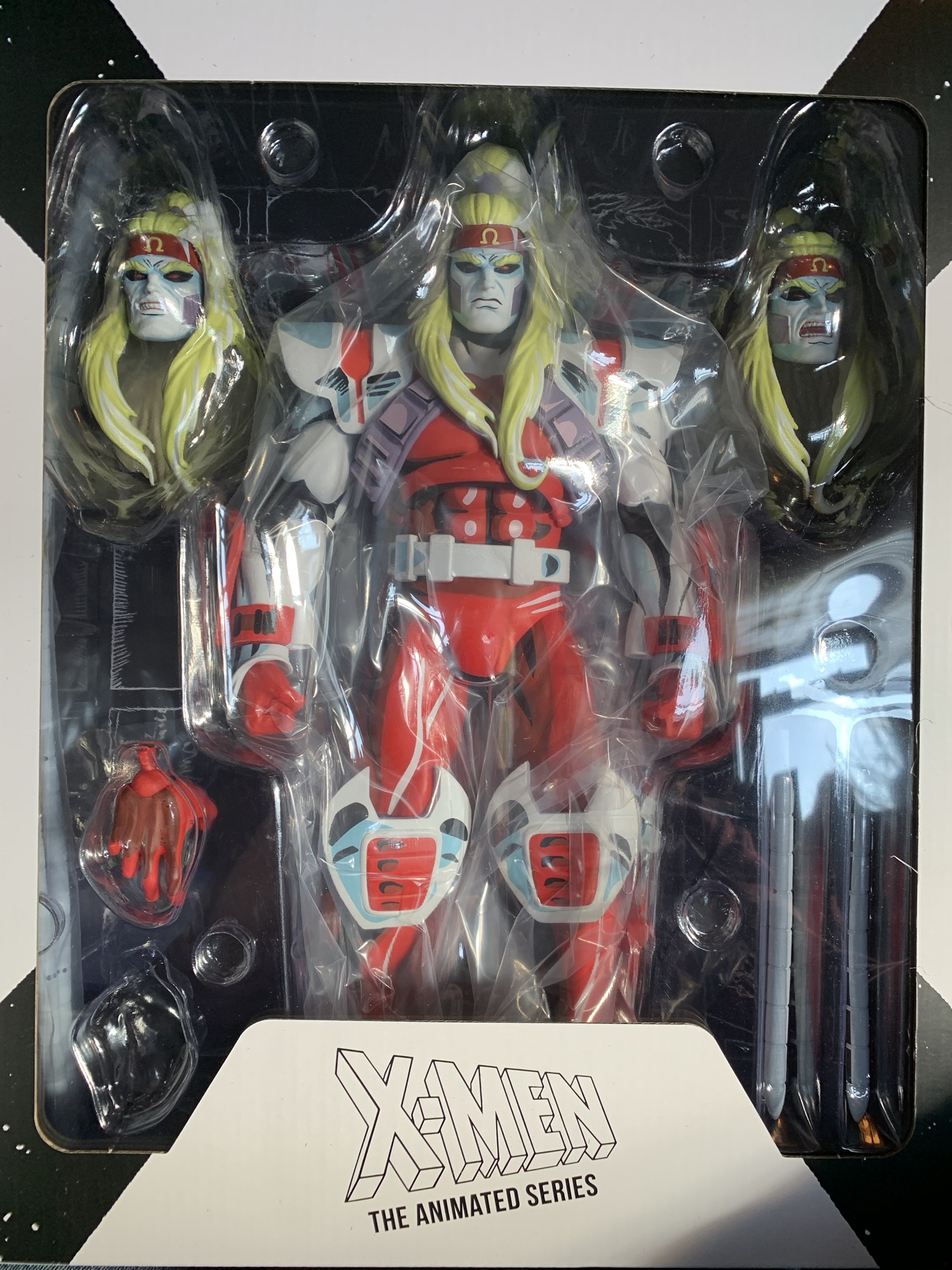
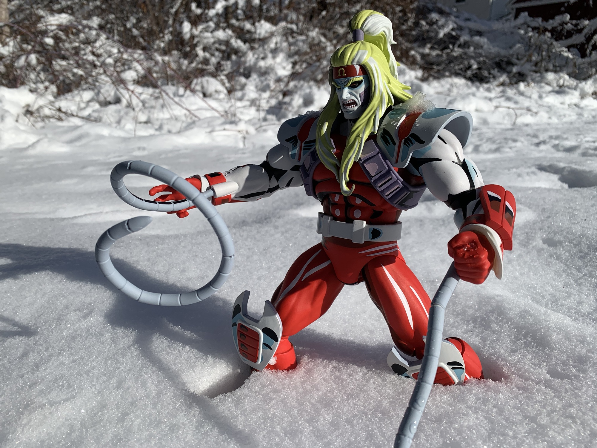
Like his onscreen counterpart, this Mister Sinister figure is largely a statue. He can raise his arms and take advantage of those blast effects, but he’s not going to do anything remotely exotic or dynamic. The only figure in the line more limited than him is Omega Red, who between the bulk and the costume really can’t do much of anything. That likely comes as no surprise for those who collect this line as the articulation and ability to pose the figures is a distant second to the aesthetics, and like basically all of the other figures in this line, Mister Sinister looks great. He’s a wild design and that cape is a pain in the ass, but Mondo’s solution for it is one that preserves the look of the character from the show.
Mister Sinister is advertised as a limited edition by Mondo that’s been restricted to 1,250 units. It has apparently not been a big seller because even though this went up for preorder last summer it has yet to sell out. Some of that is likely due to the price tag of $265, and that’s before tariffs, shipping, and any applicable sales tax. He is, without a doubt, the worst value in the line so far and I guess that cape is the driving force of the price. Not only is it a unique piece of engineering, it necessitates a deeper box and a bigger box means more space is taken up and more room in a shipping container is needed and so on. There’s also a lot of stuff in here fans might feel like they don’t need. The weird Sinister wave, the withered head, maybe even the tentacle thing – all things fans might be able to do without in exchange for a cheaper price tag. Given that this one hasn’t sold out, I wouldn’t necessarily count on there being a standard version of this character. Especially when one considers that the non-exclusive versions are usually only around 15 dollars cheaper. If Mondo can’t sell 1,250 Sinister action figures at $265, how many do they really think they can sell at $250? All that is to say, if you’re like me and feel that Mister Sinister is a necessity for an animated X-Men display then you probably should just bite the bullet and grab this version. The figure looks amazing and absolutely brings up the quality of the display. It does lead me to wonder what villains could possible be next after Sinister? Apocalypse? Juggernaut? They’ll both be huge and a lot more expensive. Mystique seems likely, or maybe they’ll go X-Men ’97 specific with a Goblin Queen? More importantly, where am I going to put all of these figures?!
If you want to read my thoughts on other X-Men offerings from Mondo then check these out:

Mondo X-Men ’97 1/6 Scale Nightcrawler
Yes, I’m afraid this is another toy review that needs to begin with a word about tariffs. It was the talk of 2025 in the toy collecting community because it caused considerable delays, disruptions, and worst of all, increased prices across the board. One line impacted by the introduction of these new costs more than…

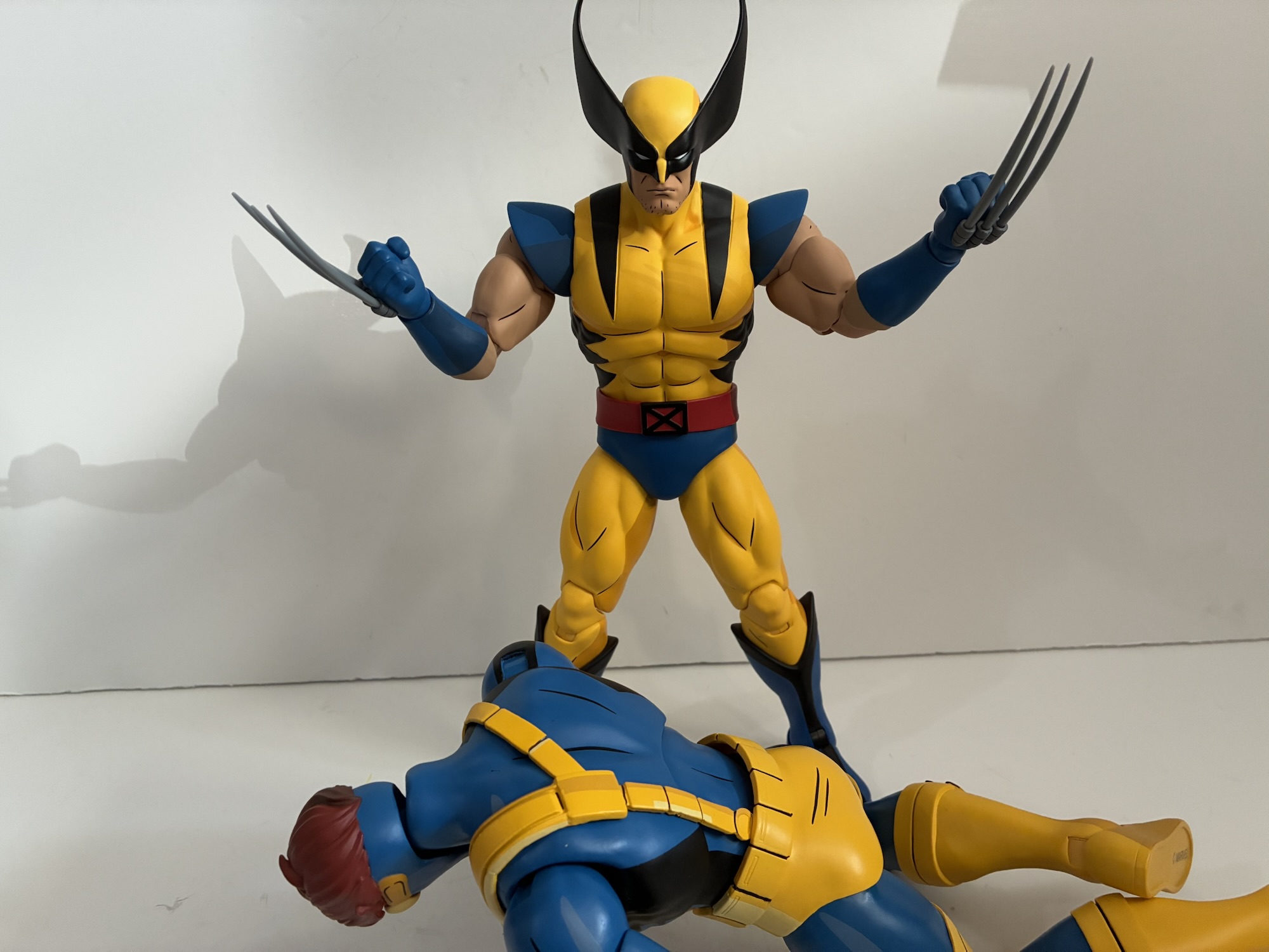
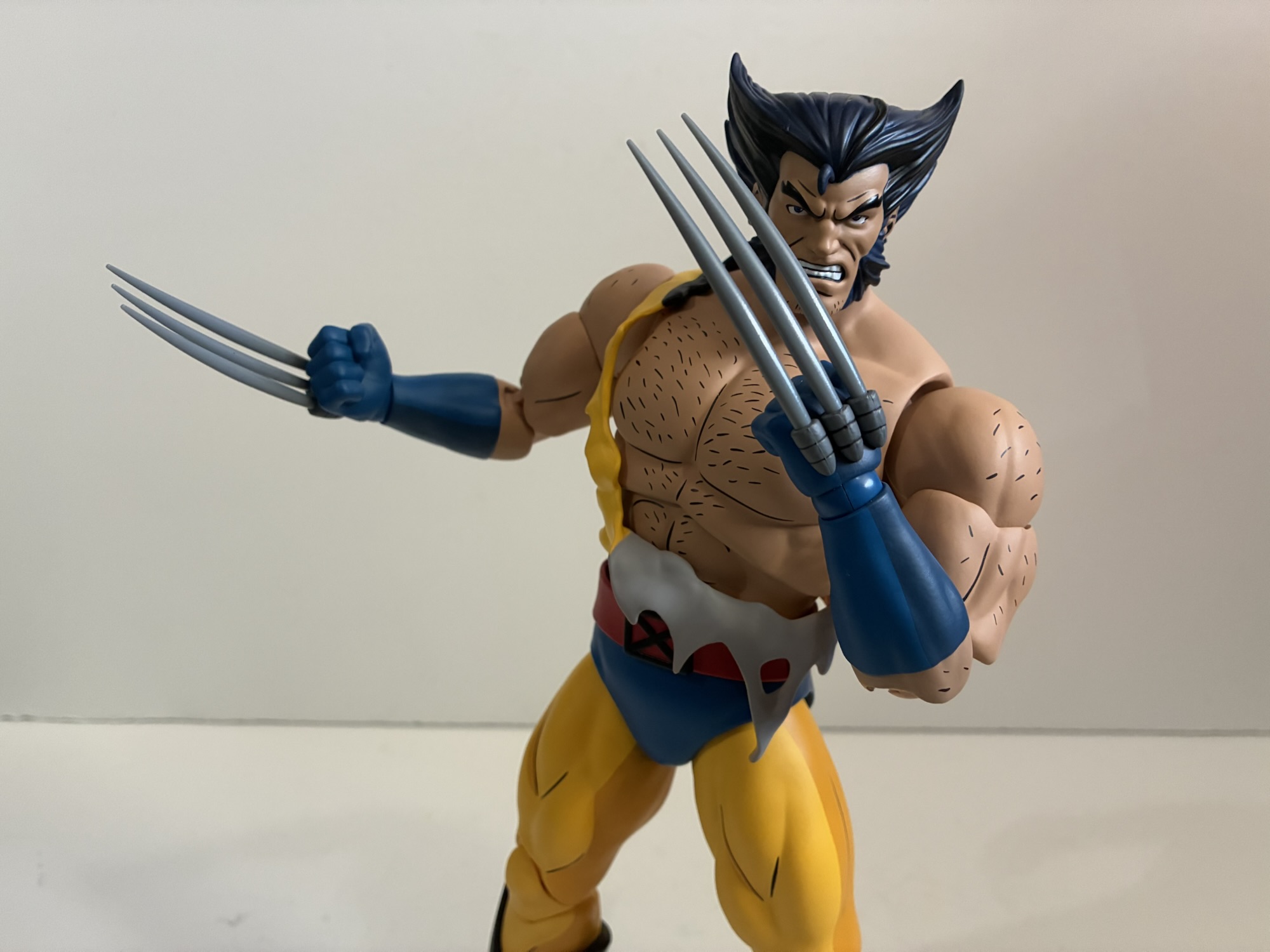
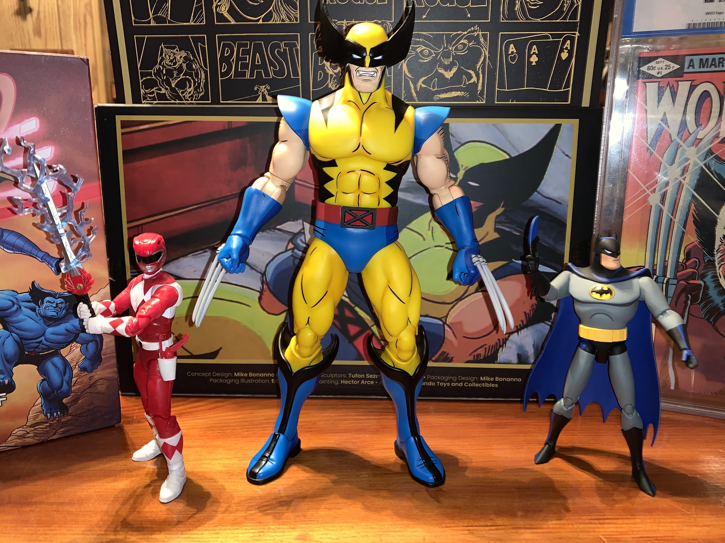
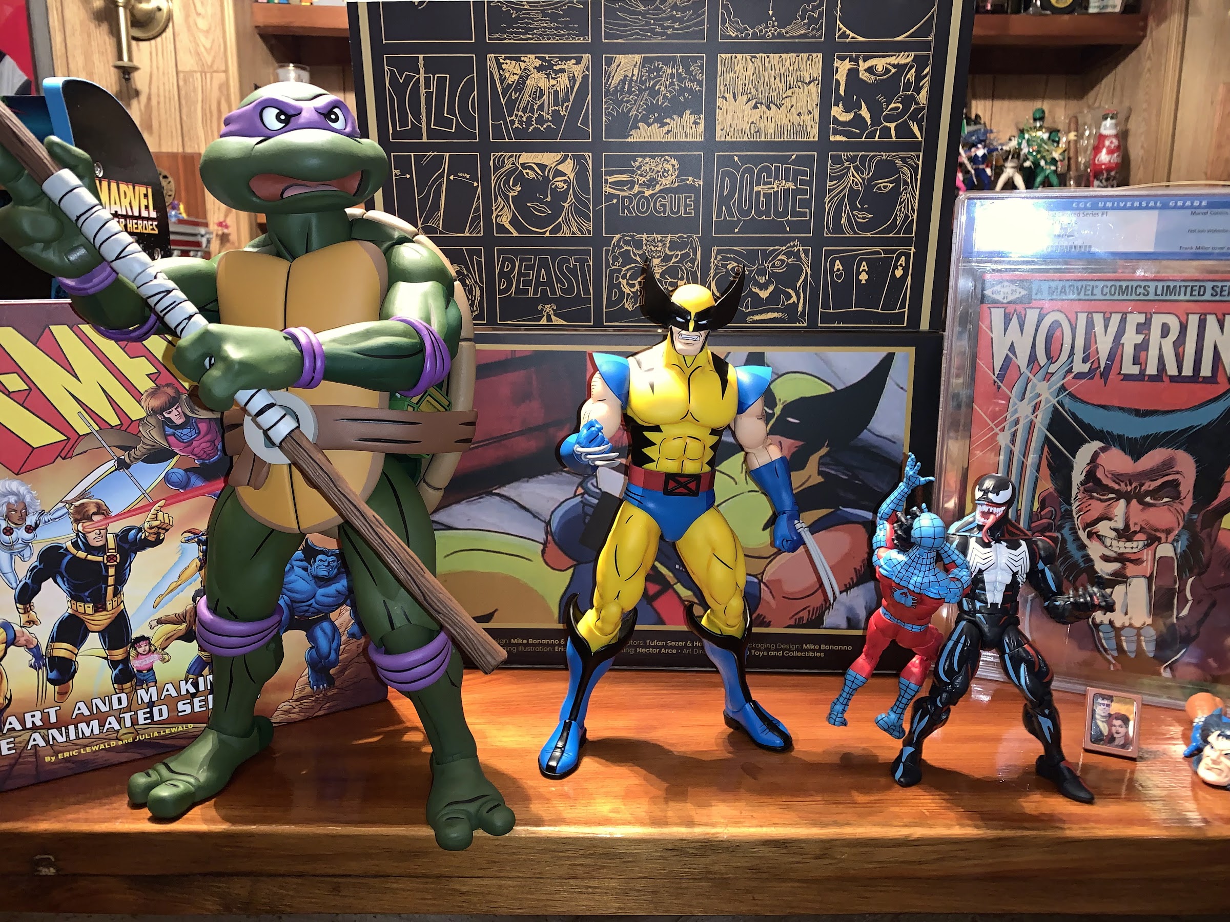
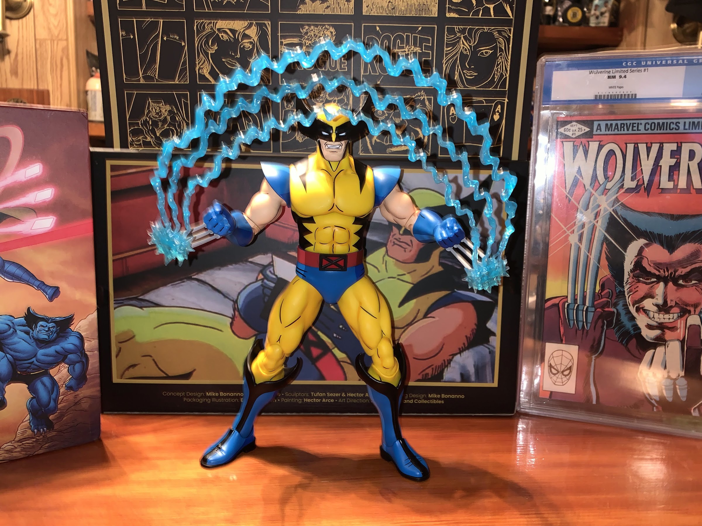
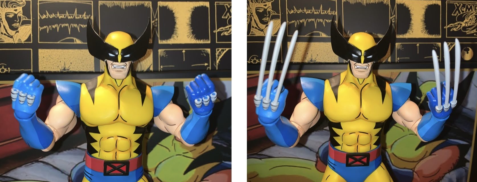
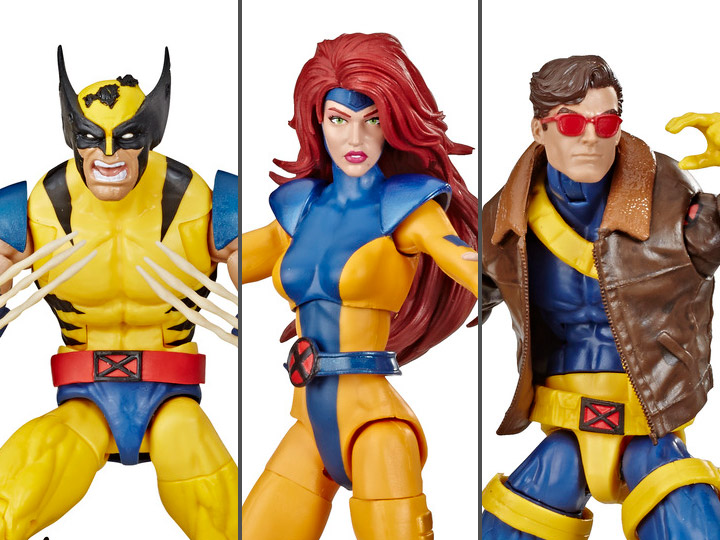
Mondo 1/6 X-Men ’97 Wolverine – Limited Edition
Back in 2021, Mondo unveiled for San Diego Comic Con a sixth scale Wolverine action figure based on the X-Men animated series from the 90s. It was a presale to coincide with the 30th anniversary of the show’s premiere and product went out in 2022 closer to that actual anniversary. At the time, Mondo wasn’t…

Mondo X-Men ’97 1/6 Scale Cyclops – Limited Edition
After putting a real hurting on my wallet in 2023, Mondo decided to take it easy in 2024 with its line of sixth scale action figures based on the animated series X-Men which ran from 1992-1997 on Fox Kids. Two figures ended up getting released this year, Rogue and now the leader of the X-Men…


![X-Men (FOX) [1992-1997]Shown from left: Wolverine, Morph, Beast](https://thenostalgiaspot.com/wp-content/uploads/2018/09/xmen_01_-_embed_2017.jpg)