If you’re reading this the day it went up then you should know April 25, 2025 as Skeleta day! This is the day that Ghost unleashed its latest album upon the masses and there’s a lot of hype surrounding this one. It’s arguably the band’s first release since it saw its popularity explode in recent years. Ghost is a hard band to wrap one’s head around. It’s this satanic, doomy, metal act that has also successfully blended pop elements with its music to create something that’s certainly catchy and unique, but also not typically what one would consider mainstream. For me personally, I’ve gone from seeing Ghost as the oddball band filling the opening slot on a show, to an Iron Maiden support act, to headlining its own tour in small arenas, to selling out large arenas and now playing in some of the largest venues we have. And fronting the band for much of this era has been Papa Emeritus IV.
A gathering of Papas (left to right): Papa I, Papa IV, Papa III
Papa IV took over for Papa III and is the son of Papa Nihil who fronted the band back in the 70s when only three songs were produced: Kiss the Go-Goat, Mary on a Cross, and The Future is a Foreign Land. Like his predecessors, Papa IV tends to take the stage in a somewhat flamboyant suit his face a mask of black and white, but when the situation calls for it he’s known for dawning wings or his full vestments as the leader of the clergy. Super7 has produced figures of the three Papas to come before him (they have not done Papa Nihil) so it was hardly a surprise when this figure went up for preorder last year. I have all of the predecessors, but I only reviewed the first one as they’re fairly similar. This one is perhaps the most different one yet though so I figured, why not? Plus it’s certainly topical.
Papa III: “He keeps asking to be let out of the box? Says he’s sick of smelling his own flatulence.” Papa IV: “Why would I want to smell that? Leave him in the box.”
Papa IV comes in the standard Ultimates! box, though now without a slipcover (because those surely add considerable cost…). He’s clad in his black suit and shiny blue coat. The figure is, as expected, a mixture of old and new parts. This costume required a bit more new this time around due to the cuffs on the sleeves a different style shirt, and the pattern on the pants. I’m guessing that Super7 got to reuse the lower torso, upper arms, calves, hands, and feet. If you’re worried about Super7’s bottom line then maybe it will comfort you to know they saved a little with some repeat accessories.
Papa IV is probably the most flamboyant frontman for Ghost yet.
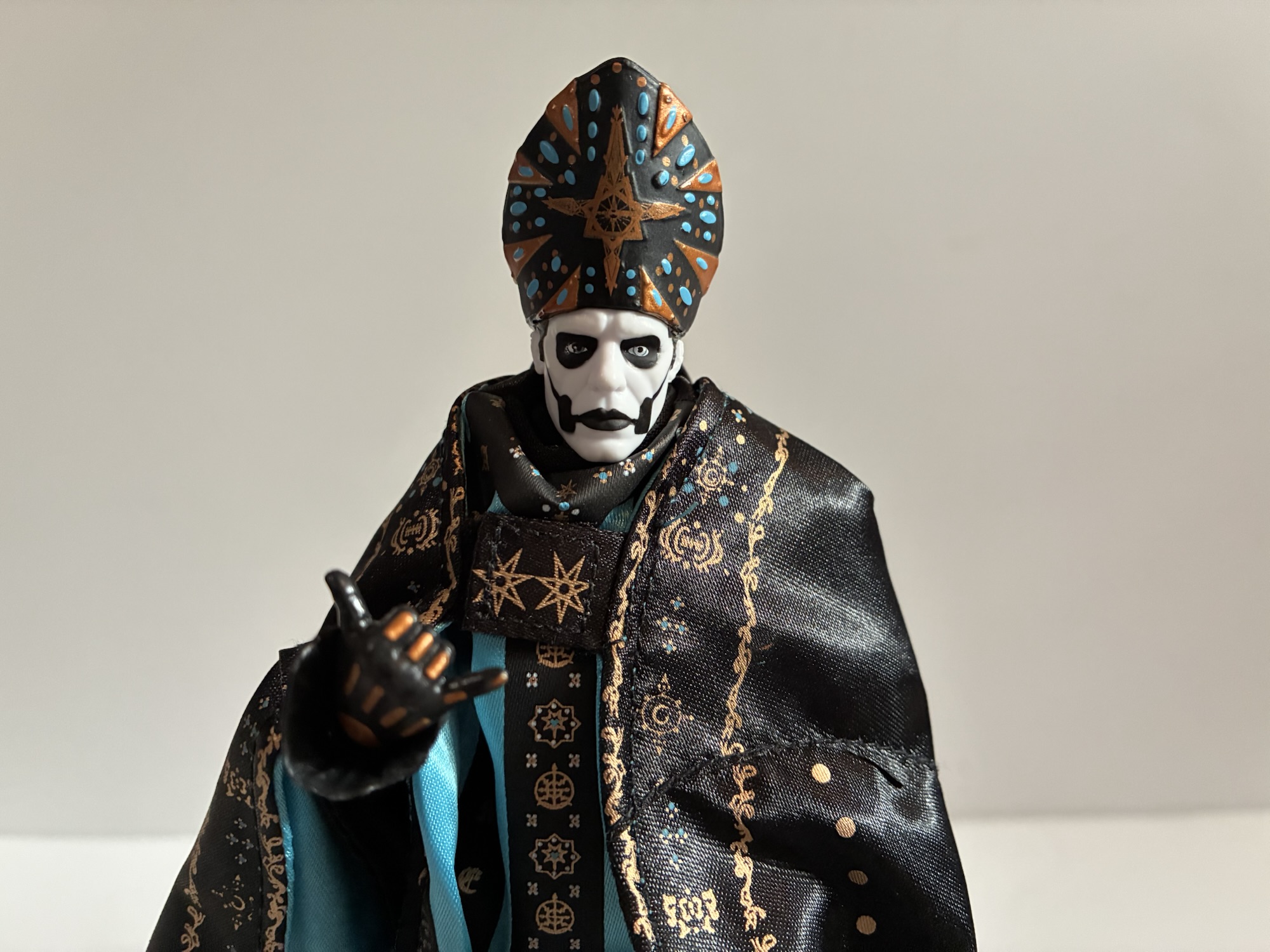
The most obvious new piece of sculpt work is the head. This Papa has slicked back gray hair and his own distinct pattern of black and white on his face. Super7’s attempt to capture the likeness is satisfactory. I don’t think they nailed it as well as they did with Papa III, but it looks okay. I think it’s just a little narrow in the face and the hair isn’t particularly convincing. The forehead on mine is also a little scratched and I don’t know if that’s intentional or not. I don’t know why it would be. I should also mention he stands at roughly 6.75″ putting him in-line with the other Papa figures.
“Ugh, we cool? Hang loose?”
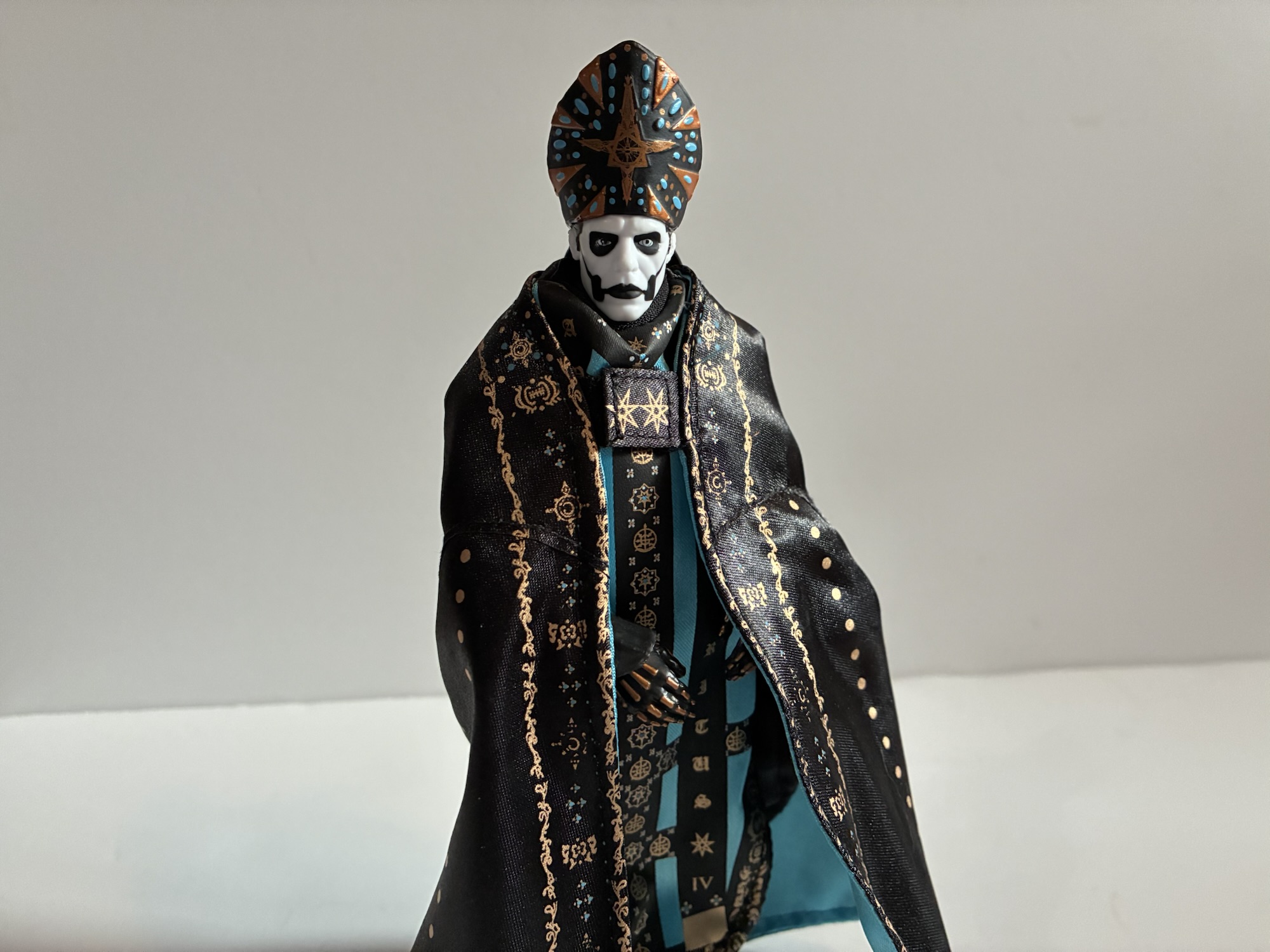
If you want this figure to looks its best, you will want to take advantage of the optional vestments. For this iteration, Super7 did it in two layers. There’s basically a poncho that goes over the head (or neck, since you’ll have to take the head off) and then a cape that goes around that and it’s fixed with a Velcro clasp. It’s very colorful, and the portrait that goes with this look is a little cleaner looking and seems to work better for me with the pope hat. Unfortunately, this two garment approach makes the look more cumbersome. The material bunches up around the neck making Papa look like he’s wearing a scarf. It’s also quite restricting when it comes to the arms. Both garments are wired so you can do some posing, even if they just typically hang there when he wears this outfit. Also, take care when swapping heads. On mine, the neck piece has a tendency to want to pop off with the head which can be quite annoying.
What we were sold……and what we got.
Papa IV comes with a bunch of hands. He has five sets total plus an extra right hand in a “Hang Loose” gesture. The other sets are basically for his different costumes. For the standard look, we have black hands which come with sets of gripping, open, and fists. The other hands are black with bronze bones painted over the digits. For those, we get a set of gripping hands and relaxed hands plus the lone hang loose hand. The only other accessories are the microphone and stand which has come with all of the Papa Ultimates! releases.
There’s just too much material here.
Articulation for this figure is the same as the rest as well. Double-ball at the head, single ball at the neck, single hinged elbows and knees, standard shoulders and wrists with an ab crunch. The ankles hinge and rock. It’s all decent, but unspectacular. He can hit basic poses, and with all of the vestments on he can basically do nothing but stand there, but the more nuanced mannerisms you may be accustomed to seeing from the stage are a bit out of reach.
Papa: “What’s this?! I want ghouls, not reptiles!” Don: “Hey man, you can get the shell out!”Gasp!Papa: “Now, where are my ghouls?”
And that’s Papa IV. A figure I want to like a lot, but it just has too many problems holding it back. The soft goods not fitting very well is a real bummer because, off of the figure, they look really nice. I was pleased to see the two piece approach. If you compare it to the render Super7 used to sell the figure it’s almost laughable, if not down right deceitful. The base figure underneath is at least decent. Not great, but it’s unmistakably Papa Emeritus IV. It would have been interesting if they could have done the cuffs on the sleeves with soft goods, though I doubt they could have gotten them to hang realistically. That’s the issue with soft goods at this scale – they lack the weight needed to look like the real deal.
This is likely how you’ll want to display this Papa.
Nonetheless, I’m guessing this isn’t the last we’ll see of this mold. Papa Emeritus IV wore these vestments mostly just in music videos. On tour, he wore something different. There’s also his previous look as Cardinal Copia which Super7 passed over. This could be easily repurposed into a figure of the cardinal, either as an Ultimate or maybe a Deluxe release (which Papa II has been re-released as and is the version I have). If that does happen I can’t say I’d be interested in buying this one again. Now, if they do a Papa V Perpetua (spoiler: he went up for preorder today) then that will get my attention as I like the new look. Hopefully Super7 can do it justice because this one is pretty lacking.
I may have only reviewed one figure from the band Ghost, but I do have other ghostly reviews you can check out:
I feel like I have a pretty interesting relationship with the band Ghost. They came to my attention in 2010 with their album Opus Eponymous and came at the recommendation of one of my friends. It wasn’t so much a recommendation based on quality, but more of a “You have to hear this,” because it…
For past few years Four Horsemen have been bringing us surprise Christmas figures each holiday season. The first was Krampus and the second Father Christmas. Last year, Four Horsemen surprised us with the Ghost of Jacob Marley. A ghost character, especially one in 19th century clothing, can make for a fun design and figure, but…
I have long maintained that the best episode of the now classic Batman: The Animated Series is the Mr. Freeze story, “Heart of Ice.” It is not, however, my favorite episode of the show as that honor belongs to “Beware the Gray Ghost.” That episode introduced the character Gray Ghost, a superhero from television who…
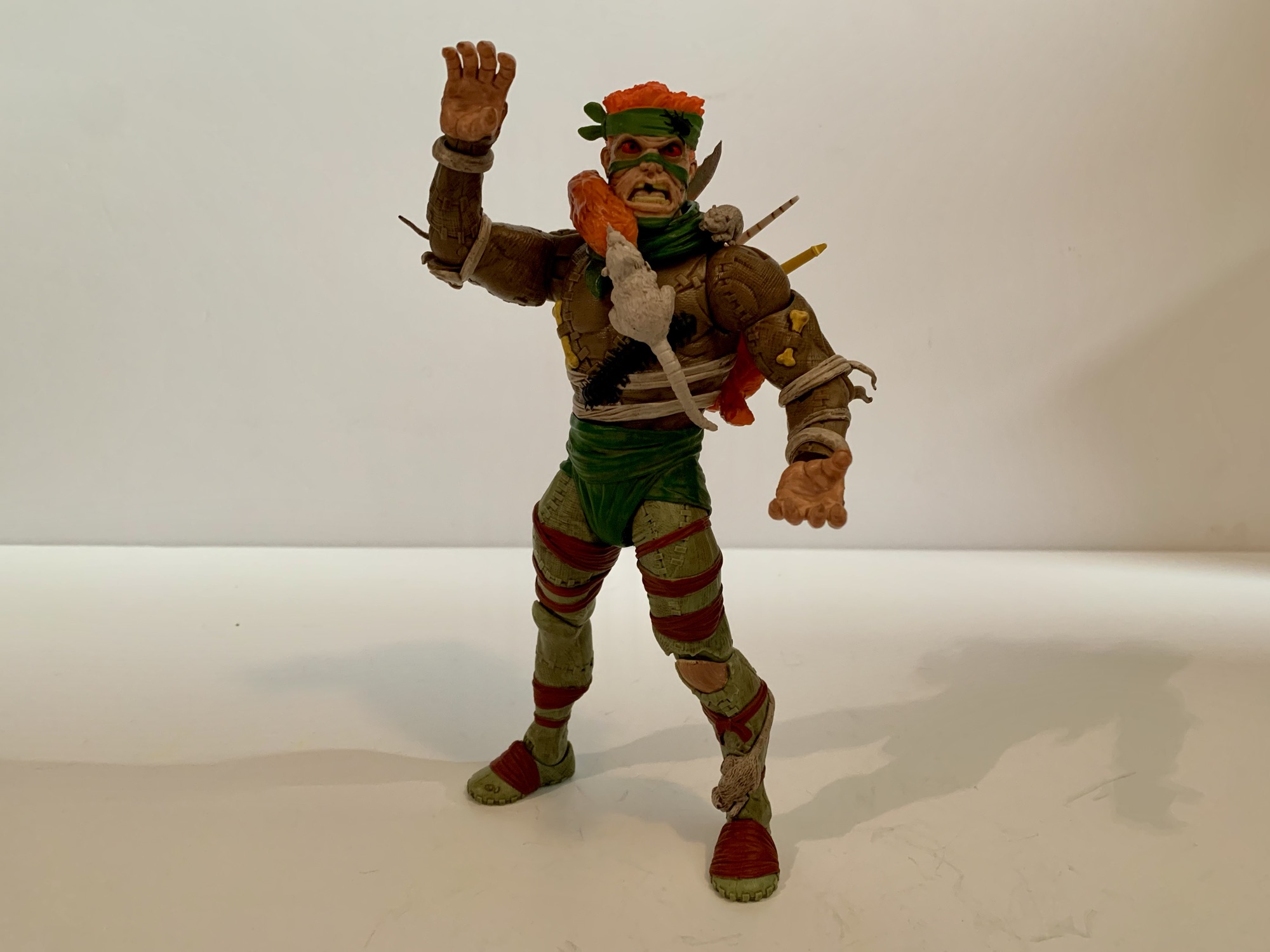
When Super7 unveiled their tenth wave of Ultimates! action figures for Teenage Mutant Ninja Turtles they learned an important lesson: don’t mess with the classics. For years, Super7’s line of figures has essentially focused on remaking the vintage figures first released by Playmates Toys in a new scale with updated articulation, sculpting, and paint. Fans have come to expect that when a new figure is revealed in the line, it’s going to harken back to those old figures. When Super7 messed with expectations and revealed a Rat King that did not much resemble that old toy, the Internet revolted! After what must have been a sizable amount of backlash, Super7 relented. They pulled their new Rat King, which fans dubbed Hot Rat King because of his lovely cheekbones and smile, and replaced him with Karai, a character never released in the vintage line who was essentially immune to backlash. Rat King was retooled to better fit that vintage aesthetic and moved to wave 11 where he has now seen release.
Internet rage accomplished something by making sure this figure never came to be.
In truth, the original take on Rat King Super7 first sent out there wasn’t exactly the company trying to do something different. Rather, it was forced upon them. Ever since this line gained steam it has been at odds with what Playmates is doing. That company still holds the master toy license for TMNT and because of that has a lot of influence with Viacom, who owns TMNT. Even though Viacom owns all of the designs, the company is sensitive to the relationship it has with Playmates and is at least willing to hear them out when it comes to what Super7 is doing. They got Super7 to ditch the weapon sprues that used to come with all of their figures and has also been able to extract some meaningful change. Playmates is protective of what it sees as being unique to the figures it still controls, and since they started re-releasing much of these old toys (including Rat King), they actually do have a leg to stand on. Super7 hasn’t come out and said just what orders they’re receiving from Viacom, but it sure seems like if a look only existed in the toyline then it’s no longer fair game. Since that Playmates Rat King is pretty unique, Super7 must have felt like they couldn’t really do it justice so instead they based their version of the character off of his appearance in the video game Shredder’s Revenge. He had a bit of anime styling, a pipe, but was still recognizable as the character from the cartoon. Fans, apparently, just weren’t interested.
No stupid, sexy, Rat Kings here.
To their credit, Viacom listened to both the fans and Super7 and allowed the company to do a more faithful recreation of Rat King from his Playmates days. And by faithful I mean they pretty much let Super7 just redo that old figure. When I heard he was getting a redo, I just figured it would mean a new head or two that better reflected that ugly, old, design. I was not expecting to get a figure that had all of the little sculpted oddities of that old one. The new Rat King is barely different from what Playmates did. He has the same face, same rats, same odd yellow bones, and giant centipede all sculpted into the body. The only real differences that I can easily spot are that Super7 did not include the pair of black bugs on the figure’s lower half (though they did retain the one on the headwrap) and they adjusted the placement of the rat who was on the original figure’s left foot. There, the change wasn’t to appease anybody, it was just to move the rat up so it wouldn’t interfere with the ankle joint.
The Super7 Rat King takes the title of tallest Rat King at 7.75″
Aside from those minor changes, this really is the upscaled and modernized version of the Playmates figure most fans wanted. Rat King is still an ugly dude with red eyes, missing teeth, missing patches of hair, and this weird, patchwork, suit of unknown origin. The centipede on the chest is now painted black, but the rest is basically the same. The rats are still essentially one color and the stitches in the suit are unpainted. The texture of the shirt has also been changed. On the original it’s dimpled, but here there’s just a lot of linework giving it a rough appearance. I always assumed it was fashioned out of many, many, rat pelts or perhaps the pelts of those who threaten the rats. Either way, it probably smells horrible. The figure is pretty well painted as there are numerous wraps of green, white, and brown on the figure and everything is covered in a dark wash to really give Rat King a grimy appearance. This is a dude who lives in a sewer surrounded by rats and he very much looks the part. This is a figure I can almost smell.
Unfortunately, I don’t have a Super7 Splinter to pose him with.
This is a figure who is impressively ugly. That’s a compliment to whoever sculpted Rat King. His face is covered in scars like maybe he was a burn victim and every bit of this thing is textured. His clawed hands can be painful to work with because they’re so pointy as is the hair in some places. It’s a figure that takes me back as I used to love looking over those Playmates figures to see what I could find hidden in the sculpt. I know we started this thing off by pointing out how Super7 got into trouble by deviating too much from the old toy, but I almost wish they sculpted more weird stuff into the figure to give us some more stuff to look for. The only other criticism I could levy at the sculpt is I wish the chest was just a little broader. He’s got these big arms, but comparatively small chest. At least it’s not really noticeable when he’s wearing all of his stuff.
Rear of the cat bandolier when wearing conventionally.It’s a little less cumbersome to wear the cat backwards.
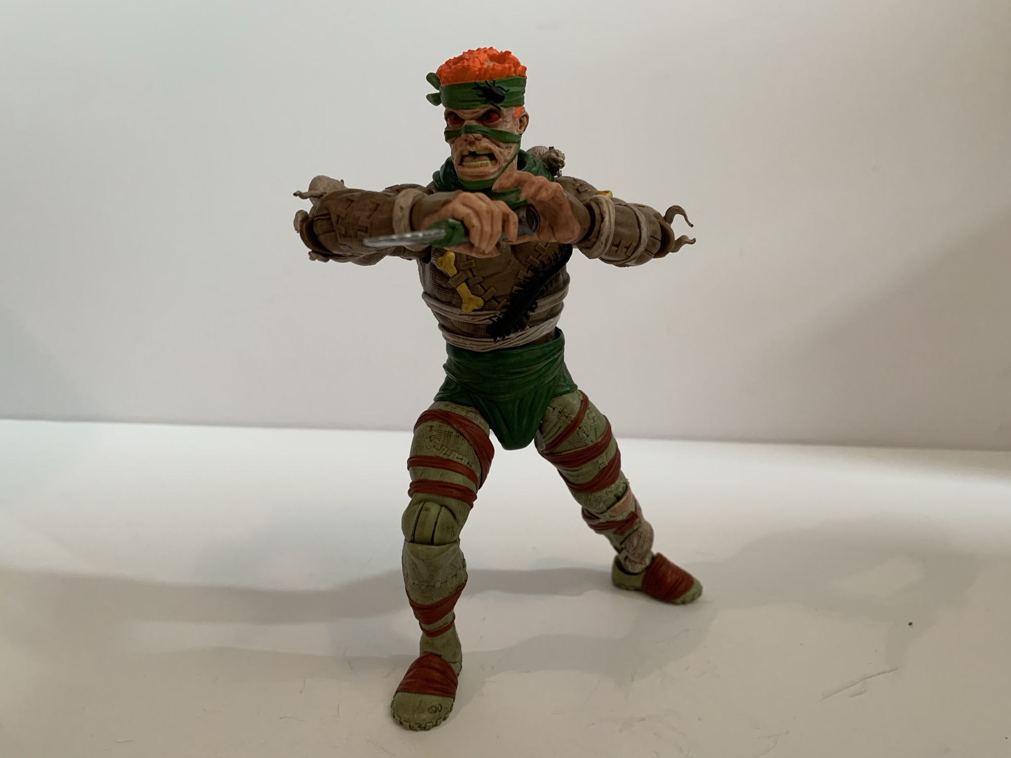
The original solicitation was pretty light on accessories limiting Rat King to a single instrument, some rats, and extra heads and hands. This one really outfits the Rat King with weapons some of which call back to the vintage figure. It would seem that was the line Super7 was given by Viacom: you can recreate the old figure, but you need to do something new for accessories. The most memorable accessory from that vintage figure is the dead cat belt. Rather, it’s actually a snake that serves as the belt, but it had a dead cat draped over the front like a loincloth. It was cartoony which is how Playmates was able to get away with packaging a dead cat with its figure, and I’m sure Super7 felt like they had to pay tribute to that very odd attire. And they did, only it’s no longer a belt but a bandolier. The snake is gone and it’s just a dead cat that fits over the should and there’s a rat biting its tail to complete the circuit. It’s all orange with a black wash and the teeth and X eyes are painted. It’s a good way to meet the fans and Playmates halfway. I’m pretty sure it’s intended to go over the chest of Rat King, but you can also drape it over him reverse which looks just as good if not better since the cat is pretty cumbersome. Especially if one makes use of the weapon storage built in.
This is a Rat King who likes to get stabby.
In what is likely a reference to the toon version of Rat King, the bandolier has what appears to be the remnants of soda scans built into the front. These act as holsters for Rat King’s three, primary, accessories. The first is a crudely fashions knife. It’s a serrated blade jammed into a piece of pipe and then bound with the same green material Rat King uses to fashion that attractive diaper he features. The blade looks dented and dulled and you know anyone who gets stabbed by this thing better be up to date on their tetanus shot. The middle holster is for Rat King’s scepter. Not much of that old figure really played into the fact that this guy thought of himself as a king so this accessory is a pretty thoughtful one. It’s just a seated rat and the handle of the scepter is his tail. He has a gold crown atop his head and it leads me to wonder who the real king of rats is: the Rat King, or this little guy. The third holster is for his pipe. It’s usually referred to as a flute and it’s something that appeared in the cartoon, though it resembles a clarinet more than anything. It’s all yellow with a green wrap on it and it’s basically the only remnant of the Shredder’s Revenge version of the figure that was scrapped.
“Me know not how play ‘dis ding.
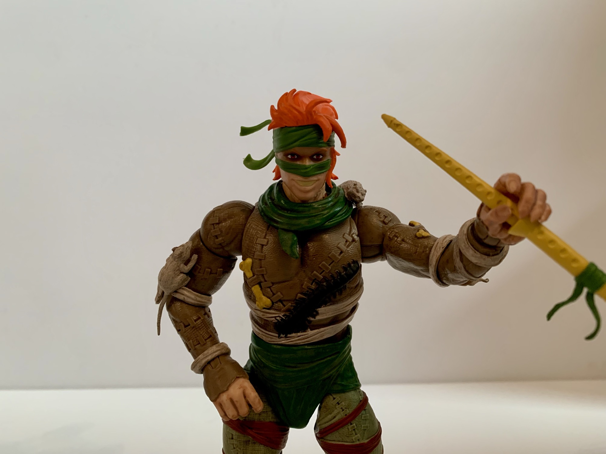
In order for Rat King to utilize his toys, he’s going to need some hands. And for Rat King we get a set of fists, open, gripping, and a set of pipe playing hands. These hands are kind of pinched in the middle like he’s making a “Too Sweet” gesture as made famous by the nWo in WCW in the mid 90s. The instrument can slot into these hands just fine, but the articulation makes holding it in a convincing manner a tad cumbersome. He also doesn’t really have a portrait intended for playing this thing. For heads, we get the vintage inspired head as well as an alternate expression where he’s yelling. For the third head we get the Hot Rat King. For the few who were looking forward to that figure, Super7 included one of the heads. It’s the smiling portrait and the sculpt certainly presents a far more attractive version of the character. It’s not painted as well as the other heads though as it looks like they didn’t paint the skin tone on and instead hit it with a wash. He’s got a bit of a jaundiced look going on as a result when I would have preferred a warmer complexion, not that I plan to use this head (sorry, Hot Rat King). The final accessory is a little bit of a callback to the original figure. That one came with a rat grappling hook and this Rat King has his own version of the same. The old one was comprised of two rats while this is just a single rat with a really long tail and some mighty incisors to serve as the hook. It’s all sculpted plastic so it can’t really do much and I don’t see a storage spot for it on the bandolier, which is a bummer. I suppose you could loop it basically anywhere, it’s just a tad tricky figuring out how to make it look like it’s hanging naturally.
This Rat King was made for shampoo commercials.The instrument is more this guy’s style than the other guy.
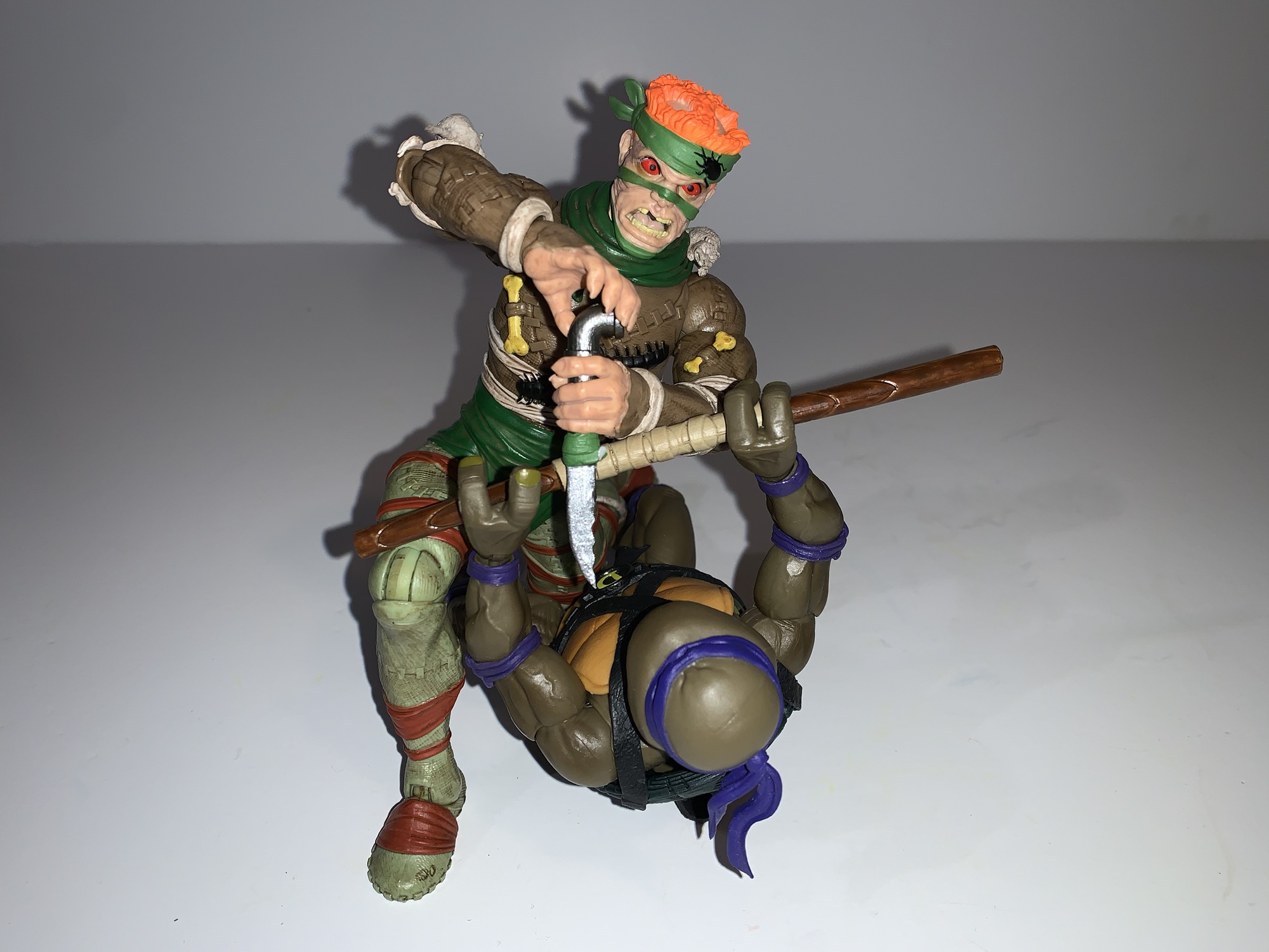
That’s all the stuff that comes in the box, but one pressing question remains: can he articulate worth shit? Articulation is not this line’s strong suit as I would describe it as an aesthetics forward line. And Super7 has some antiquated views on what articulation is needed and what isn’t. In the case of Rat King, the articulation is about what is expected of this line. It’s mostly basic stuff: double ball-jointed head, shoulder-hinged arms, bicep swivel, single-jointed elbows, swivel and hinge wrists, ball-jointed waist, pin and hinge hips with a thigh swivel, single-hinged knees, and ankles that hinge and feature an ankle rocker. All of the wrist hinges are horizontal which is disappointing as even the pipe hands would be better with vertical hinges. The waist joint, despite being a ball-joint, is basically a swivel only point as there’s no real forward and back motion. The right shoulder on my release is very tight at the hinge. Rotation is fine, but that hinge sucks to move every time. It looks a little funky, like it was miscut at the factory, so maybe that’s only a problem with my figure. The left wrist is also a little tight in that it’s hard to get the hands to seat all the way into the joint. There’s a slight gap which honestly isn’t the worst thing in the world as it comes out easy enough. Rat King also has floating wrist straps that can slide over the joints, if need be.
“Your place or mine?”
By far, the best thing about the articulation with Rat King is that there’s no looseness. My wave 11 Rapper Mike was pretty floppy in the hips, but Rat King does not suffer from the same fate. The range there is also pretty nice as he can kick forward about 90 degrees and perform some splits out to the side. The knees and elbows won’t give you 90 though, but that’s become expected of this line. I’m just happy that the exposed knee on the figure’s left leg is not broken up by the articulation so it looks fine even when bent because they painted the exposed part. The previously released Triceraton unfortunately can’t say the same thing. I do wish there was a joint in the abdomen, but then they would have had to move the centipede (so what?) and it’s a shame he can’t convincingly play his pipe, but since that thing is really here for Hot Rat King then I guess who cares?
“The sewers belong to me now, reptile!”
Rat King is not a perfect action figure, but he is a damn good one. For a Super7 Ultimates! release, the usual caveats apply where articulation is concerned, but aside from that there’s little to complain about and plenty to praise. The sculpt is what most TMNT fans want – a highly detailed throwback to the vintage Playmates figure with lots of paint. I love the gross factor added by the wash and the new open mouth portrait especially looks terrific. The accessories are appropriately themed for Rat King and I enjoy the new take on the cat belt and its available weapon storage. The only thing missing that somewhat surprises me are some stand-alone rats, but considering he has three on his person plus three more across the accessories then I guess we’re doing fine when it comes to meeting the rat quota. Mostly, Rat King is exactly what fans of this line want. He’s well-executed and is a figure that earns its $55 asking price. There are no wait for a discount encouragements here this time. If you’re a fan of Rat King and that old Playmates release then I think you’ll enjoy this one. And if you’re one of the few bummed out that Hot Rat King was scrapped, at least you get a head with this package. Hot Rat King may be gone, but he hasn’t been forgotten.
The King of Rats is well-represented in action figure form:
Rats! Is what Charlie Brown would say at the sight of today’s subject, the almighty king of the rats himself, the Rat King. Rat King has always been a favorite of mine when it comes to Teenage Mutant Ninja Turtles villains. Like a great many, I was introduced to the character via the cartoon series…
When I last reviewed a NECA Teenage Mutant Ninja Turtles two-pack it was the Splinter vs Baxter Stockman set and I referred to it as potentially the last essential set for some. The key word there being “some” as I am not “some” and didn’t consider myself “some” when I wrote that, for there are…
Robotic Bebop might be the reason, or one of the reasons, why wave 7 of Super7’s line of Teenage Mutant Ninja Turtles Ultimates! figures was so delayed. If you recall, this was put up for order back in the winter of 2022. Robotic Rocksteady, who we reviewed here back in November of 2023, was supposed…
“The name’s Michelangelo and I’m here to say, I like pizza in a radical way!”
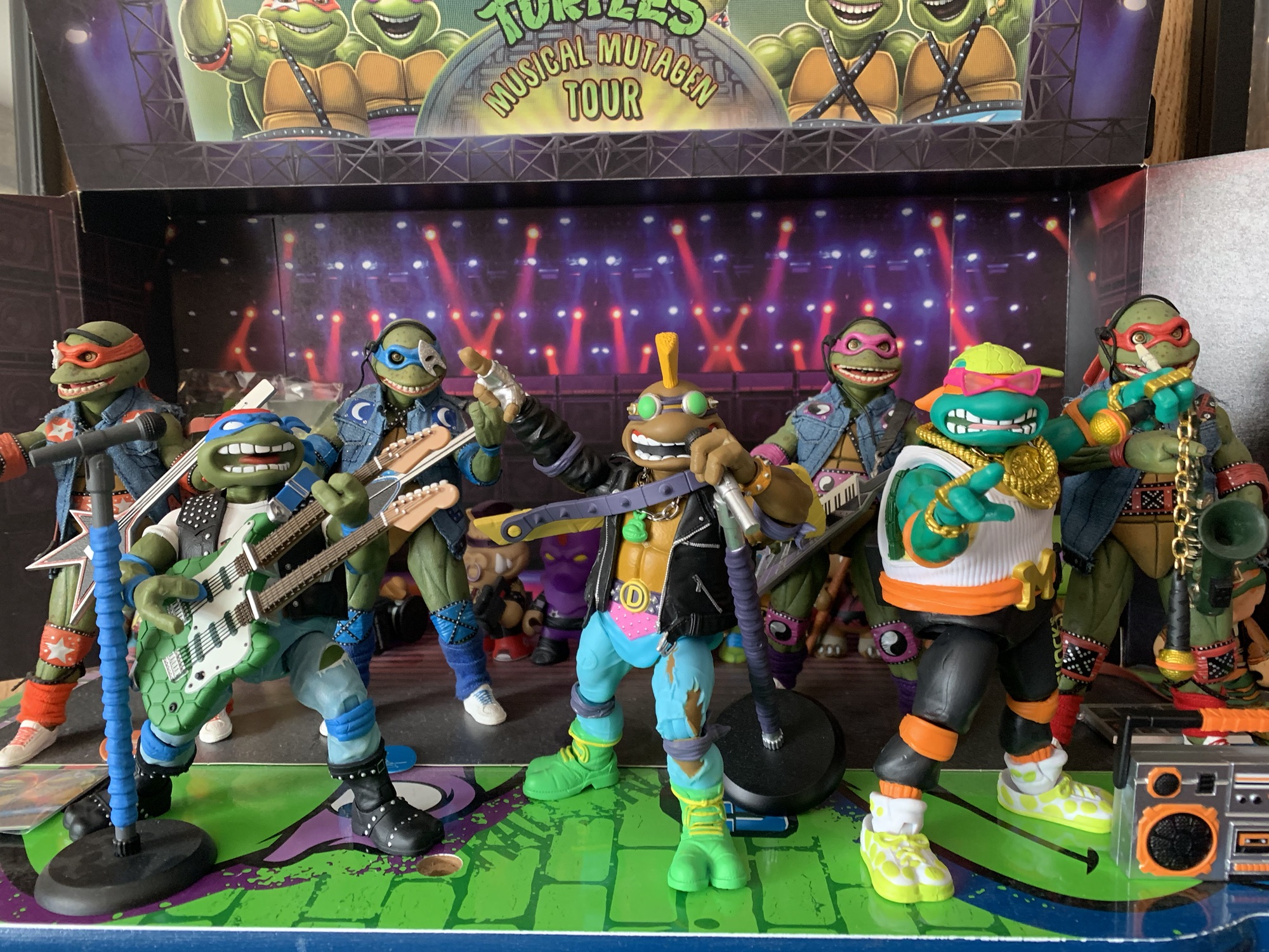
Is Super7 going to finish a set of variant Teenage Mutant Ninja Turtles?! Maybe, as we’re now three-fourths of the way through the rock n’ roll turtles as released by Playmates. Punker Don, Classic Rock Leo, and now Rapper Mike make 3 with only Heavy Metal Raph remaining. As of this writing, Raph hasn’t been shown or even really teased. I only bring it up because Super7 has given us 3 of the 4 disguise turtles – Sewer Samurai Leonardo, Sewer Surfer Mike, and Raph the Space Cadet with Undercover Don left out in the cold. Seemingly in lieu of that figure, we received Slam Dunkin’ Don as part of the ninth wave with no indication that more sports turtles are on the way. I guess what I am saying is don’t expect anything or purchase any of these figures with the expectation that you’ll eventually get a complete set.
A lot of the sculpted elements of the old figure have been turned into accessories, but not these speakers on the back.
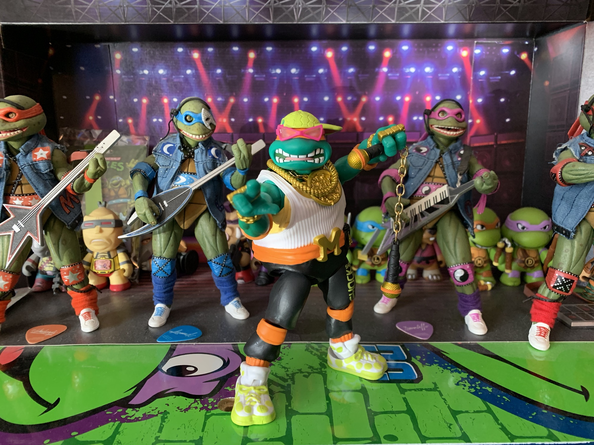
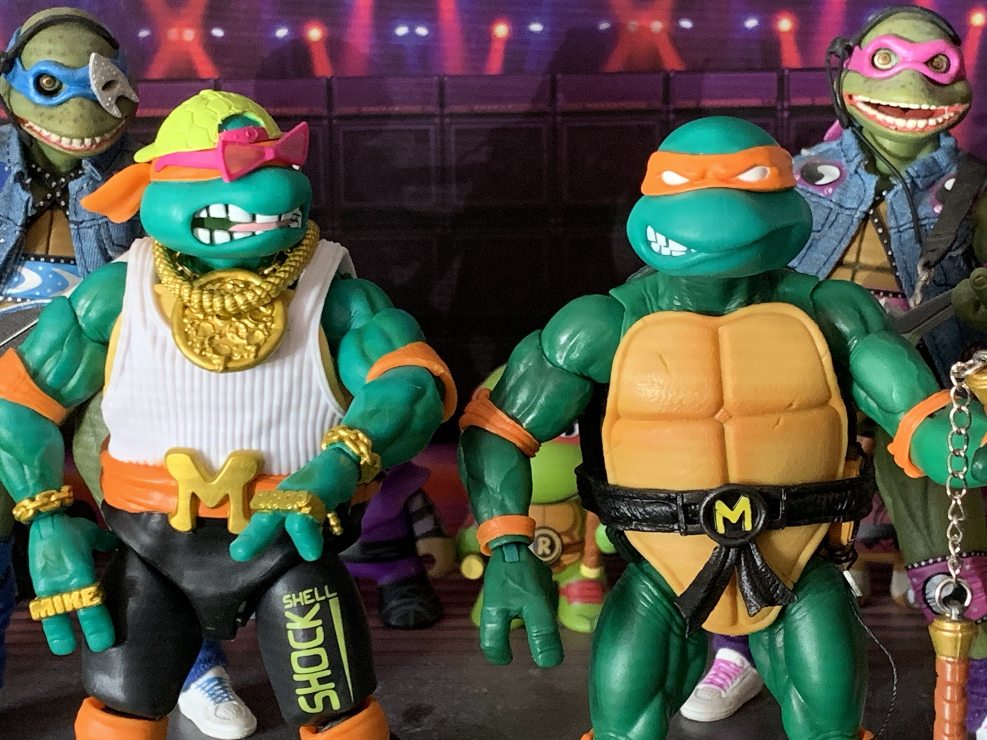
Rapper Mike was previously released as Rappin’ Mike in the Playmates line. Unlike Punker Don, I have no issues with pairing Michelangelo up with hip hop. It makes sense for him, the party dude, though he could be melded with other genres without much issue. He was also a figure I had as a kid, but since I wasn’t much of a hip hop fan, he wasn’t among my favorites so he’s been lost to time. And personally, I really like the other three figures from this set so I’m mostly getting Michelangelo here for the sake of completion. That doesn’t mean he can’t be a good figure though, and like the prior two in this set, he’s a pretty faithful recreation of the Playmates figure. The head, creative, person on the line at Super7, Kyle Wlodyga, sat down for a pretty expansive talk with Nick of the Robo Don’t Know YouTube channel and discussed some of the design choices with this figure. He sometimes has to dance around issues where it’s obvious Playmates is exerting some influence over Viacom when it comes to approving Super7 releases, but I didn’t pick up on any of that with this figure. It sounds like most of the changes were made voluntarily.
He may be an MC, but he still needs some ‘chuks!
And there aren’t many changes. Mike still has his white tank and green hat with what I guess are intended to be MC Hammer style parachute pants. He still has the usual arm bands and knee pads to go along with a big, toothy, grin. The biggest changes may just be taking what was previously a sculpted element and turning it into an accessory with the giant clock necklace and pink sunglasses. One highlighted change by Kyle was the choice to change the message on his brass knuckles from Mike Raps to Mike (sic) Drop. The old figure also had a chunky turntable on the front of his belt which has been removed. The belt is a little different, since it’s now more visible, and the shoes have a slightly different deco. The sculpt of the shoes is largely the same, but before they were all green and now they’re painted green and white. When I look at this one I do find him a little less interesting than Don and Leo, but is that just my bias against the genre showing through? I do think Super7 should stay close to the Playmates designs because I think that’s what their customer wants more than anything. Maybe a big, soft goods, coat that rips off the old Starter jackets would have made for a fun addition? I do wish the design was a little louder, but that’s partly the fault of the original figure.
This paint hit under the arm is an odd choice that I can only assume was either an error or a budget one.
Paint across the board with Mikey is a step up from Punker Don. The shoes, especially, look clean and the linework on the face is pretty nice, all things considered. The printing on his pants now reads “Shell Shock” and it’s styled reasonably well. The two speakers on the rear of his belt are fully painted as are the audio cables attached to them. The painted elements and different materials give the figure a nice finish, though it clashes slightly with the soft, orange, plastic used for the elbow and kneepads. They just come off a little cheap in comparison. There’s also a paint error where the under arms are painted this sort of cream color which matches the visible portion of plastron. On all other turtles, this part of the shell is green so it’s pretty odd looking. I went back to where I bought the figure, Big Bad Toy Store, to check the glamour shots to see what it was colored then, but they removed those images. Super7 still has them up, but they’re inconclusive. There’s also a minor defect with my figure where the portion of the overlay that’s supposed to connect at the crotch is disconnected. I’m guessing it was supposed to be glued. It’s an easy fix, but it might be something that impacts other figures or just mine.
These two ends tab together, but not securely since the plastic is soft. I’m guessing there was supposed to be a hit of glue applied.
Articulation for Mikey is pretty standard for a Super7 turtle: double-ball head, hinged balls at the shoulder, single hinge and pin at the elbow, swivel and hinge at the wrist, waist twist, ball-hinged hips, pin and hinge knees, ankle hinges and rockers. Punker Don was a floppy mess while Classic Rock Leo was damn near perfect. Mike slots somewhere in between. He’s not as floppy in the hips as Donnie, but he’s also not as tight and smooth as Leonardo. It’s frustrating that Super7 still struggles with this joint in what is now the 11th wave of the line, but it is what it is. Maybe we’ll finally see a big change with the 2003 turtles due up next? Some of the other joints are pretty tight too and in particular the left knee of my figure. It will need heat to function. Mikey does have one extra articulation feature and it resides under his hat. The old figure wore his hat backwards, but this one spins so you can have him wear it however you wish. It’s a good idea and a fun addition. It does mean that the hat doesn’t work with the other portrait, but that doesn’t strike me as a big deal.
Evil doers beware, getting punched by Rapper Mike is going to both hurt and leave behind a pun.
The accessory load-out here is pretty solid, but also mostly unique when compared with the vintage figure. The optional sunglasses and necklace are here to mostly complete the old look. The sunglasses are like other glasses accessories in this line in that they don’t plug in or anything, but they’ll stay in place on your shelf well enough and better than the sunglasses for Sewer Surfer Mike. The big necklace is gold and contains a new pattern on it. Instead of a clock, it’s like a bronzed pizza which I guess is fine. I prefer the clock, but maybe they feared a lawsuit from Flava Flav? There’s also a second gold chain provided. It’s a bit cumbersome to feature both at the same time so you may prefer to prioritize one over the other, but as you can see from my pictures it is possible to get both on. The optional hands are all unique to this figure since they need to feature the brass knuckles. They include fists, gripping, open, and what I guess are meant to be turntable hands that could also serve as a pointing gesture.
I think this is how I’ll be displaying this accessory.I don’t think he’d an effective DJ with his hands smacking that handle bar.You can kind of fake it.This look makes me think of the kid from E.T.
The old figure came with this turntable on a strap that Mike wore around his neck and the device was held out in front like an actual table. Super7 opted to alter this one so that it’s now a turntable and boom box all in one. On one side, you have the boom box which looks pretty nice and it’s painted well. There’s an articulated handle on the top and Mikey can carry it or put it up on his shoulder reasonably well. The reverse side is where the turntable is found and it looks fine, but is harder to pose the figure with. It lacks a strap to have it draped on the figure like the old one and since it isn’t an actual table it can’t be setup in front of the figure. Super7 really should have included an optional stand. Just a cheap piece of folding plastic or just optional legs that could be plugged in. This limitation means it’s likely to remain a boom box for me, but you can kind of get it in place if you slot the handle over the hands. It just won’t look like a practical way to manipulate a turntable. And in order to sing along, Mikey has some nunchaku where each handle has been replaced with a microphone. This is a recreation of a vintage accessory and it’s a welcomed inclusion. The real chain is almost a gold color which adds a nice splash of color on the shelf.
This extra head could have been so cool.
The last accessories are an alternate portrait and some headphones. Since the alternate portrait lacks the hat, the turtle shell themed headphones fit better on this head than they do the default one. This extra head though was of real interest to me going back to the solicitation. When it’s come to Michelangelo figures from Super7, I haven’t been too impressed with their portraits. The alternate head on the original is just odd looking and the Sewer Surfer portraits are large and cartoony. Even so, I’ve been using one of those heads for my Wave 3 Michelangelo, but this new one looked like a real upgrade. Unfortunately, it wasn’t meant to be. Like the other variants, the proportions aren’t a match for the original turtle figures Super7 made. The heads are slightly larger and if you can manage to get this onto your figure (it was tight, though getting the old head off was really the hard part) it may look too much like a bobblehead for your taste. Worse though is the color difference. Rapper Mike has a skin tone that’s close to a green-blue where as the original figure is what Crayola probably described as a forest green. It’s not going to look very good as a result and combine that with the oversized nature compared with the other brothers and it’s an all around failure of something that could have been awesome. It’s just a shame because I really like the look of the sculpt. It fits in very well aesthetically with the alternate portraits of the other guys, but Super7 went and Super7’d it up.
I probably won’t be sticking with this display.
Rapper Mike is largely more of the same, which is both good and bad. I think the sculpt turned out pretty well and Super7 did a good job of keeping what made the original fun while also adding a few new elements. The paint is an improvement over Punker Don and the accessories are fine, it’s just that it has too much of that Super7 feel to it. And if you have handled many of their figures, you might know what I’m talking about. Despite looking pretty good, and costing quite a lot relatively speaking, the feel in-hand just isn’t there. Mikey feels clunky and some of that is definitely owed to the floppy hips. As I said above, they’re not as bad as Donnie’s, but that doesn’t make them good. They don’t feel nice when moved almost like the figure doesn’t want you to mess with it. The stubborn knees, subpar range at the elbows, and little imperfections just add up.
It’s going to be a long while before this band is complete.
In the end, Rapper Mike is another figure from Super7 that struggles to really earn its $55 price tag. From the shelf, I’m generally happy with what is here, but there are enough faults and the in-hand experience is lacking enough that I don’t feel great about it. I absolutely love the vintage set of four so I’m attached from the onset when it comes to the Super7 versions. I just remain disappointed that Classic Rock Leo, the first in the set released, wasn’t a sign of things to come. If you love those old figures and are happy with Leo and especially Don, then you might as well go ahead and add Rapper Mike to the band. If Punker Don was a bad experience that you aren’t sure if you want to repeat, then approach with caution. For the other fence sitters, the usual Super7 caveat largely applies here where you may feel a lot better about your purchasing decision if you can score it on discount somewhere down the road. And with 2003 turtles on-deck for the next two waves from Super7, don’t expect a confirmation on Heavy Metal Raph anytime soon. We won’t see him until 2026 at the earliest, and maybe even longer since Super7 has cut way back on their preorders. We know 2003 is Wave 13 because they showed off a teaser back at San Diego, but it has not gone up for preorder yet with Wave 12 due in June right now. If they’re waiting for that wave to deliver before solicitation, then we won’t even see Wave 14 solicited until 2026 and that, ultimately, kind of sucks.
Check out these other rock n’ roll turtles from Super7 and some more Mikey:
When I was a kid, I had parents with divergent musical tastes. Dad likes oldies from the 50s and 60s while mom was more into modern rock (then 80s). One area where their tastes overlapped was Bruce Springsteen. We had several of his records in my house and I distinctly remember that cover to Born…
It’s been awhile since we last took a look at a figure from a wave of Super7 Teenage Mutant Ninja Turtles Ultimates! It was back in July 2024 that I gave a rather glowing review of the first of a presumed four turtle figures based on the old Playmates Rock n’ Roll Turtles – Classic…
We are back with one more look at Wave 6 of Super7’s Teenage Mutant Ninja Turtles line of Ultimates! action figures: Sewer Surfer Mike. This, like every figure in the line so far, is a recreation of a Playmates Toys figure from the vintage line of TMNT action figures, and in this case it’s of…
Robotic Bebop might be the reason, or one of the reasons, why wave 7 of Super7’s line of Teenage Mutant Ninja Turtles Ultimates! figures was so delayed. If you recall, this was put up for order back in the winter of 2022. Robotic Rocksteady, who we reviewed here back in November of 2023, was supposed to complete the pairing when he was released. That figure retailed for $65. Bebop, on the other hand, was $55. Did maybe a pricing error on Super7’s end contribute to the delay? Perhaps. I have no real knowledge of anything, but if the figure priced out higher than expected after solicitation it may have given the company pause. They may have tried to find a different factory to take the job, though with one figure in the wave being a complete re-release of Metalhead it would have meant the tools needed for at least that one were probably with a factory already. And this was a wave that also included Guerilla Gorilla, a massive ape priced at $75, and the almost equally beefy Triceraton who was also $55.
He’s pretty big, though regular Bebop is actually a tad taller if you can get him to stand up straight.
Whatever the reason (his heart or his shoes), Robotic Bebop and others were late to the party, but they’re here now. I’ve been looking forward to this one and my anticipation for it went up after getting Rocksteady since he ended up being one of my favorites in the line. If you like those big, chunky, figures, then this one is for you. And like many figures in this line, Bebop is a recreation of an old Playmates design which either loosely inspired the toon version of the same, or was loosely based on it. The main difference with Super7’s interpretation (other than the obvious increase in mass) is the lack of a vac-metal coating and an adjustment to the silhouette. Bebop is even chunkier than his Playmates equivalent. His head is a little smaller relative to his body with the shoulders and chest being inflated. It’s a good update and he strikes a mighty nice profile on your shelf.
Finally, the duo is here!
Bebop, because this wave was supposed to come out so long ago, comes in the standard Ultimates! box with slipcover. Starting with Wave 10, the slipcover is a thing of the past. He stands at approximately 8.25″ to the top of his head and you can add another quarter of an inch to reach the top of his mohawk. He’s not massively tall for the line, but the heft with this one is apparent when picking up the box. The sculpt on Bebop is very detailed. There’s grooves and textures galore with this guy and a few wires down by the calf. He still has the radio controls on his belt, or what look to be radio controls, like the old figure and there are some buttons and dials sculpted onto his chest. The finish on the body is more of a gun metal with Bebop as opposed to a bare steel with Rocksteady. I didn’t notice this difference between the two until Bebop was released, but it’s there in the promo pics. I don’t mind and I like that Super7 differentiated the two. I’m not sure I even have a preference as I like this darker color which adds a menacing vibe to the character, while the shinier approach looks pretty rad with Rocksteady. The mohawk is done with translucent, orange, plastic so he has some light piping just like Rocksteady. It’s not as obvious since the mohawk isn’t going to let in the same amount of light as Rocksteady’s dome, but if the light catches it just right it does indeed work.
Since I don’t have the Playmates ones here’s the Super7 bots with the NECA version from the cartoon.
Paint on Bebop is minimal, but present. There’s some black around the collar and on the sides of the legs which looks neat. The other most present color is blue which is used in a few places, mostly on the chest and the glasses. There’s some on the arms as well and even a little on the back of the shin which didn’t need to be there, but I like it. Of course, it’s not all perfect. The yellow on the chest for the buttons and switches isn’t applied in the most consistent fashion. There’s also a blob of black right at the thigh cut on my figure’s left leg. The green for the shell shoulder pads is a very matte green and it kind of clashes for me. I’m left wondering if the figure would have looked better with a metallic green? The main body has a nice finish though and I can’t tell if it’s painted or not. I’m pretty sure it is since there’s some scuffing on the inner, left, bicep of my figure. The mere fact that I have to question it is a good thing. He looks great and if this was the level of quality we got out of Super7 consistently with this line no one would be complaining. Well, someone would because there’s always someone unhappy, but this guy wouldn’t be.
If you think he needs a shield he’s got it.
I’m going to jump into articulation now because there is an aspect of it that goes hand-in-hand with the presentation. In general, this figure doesn’t articulate incredibly well which I think anyone could guess just by looking at it. This is an aesthetics forward release, not articulation. And it’s actually the perfect type of character for Super7 to attempt since they don’t prioritize articulation in general. You still have the double ball jointed head which gets great range, ball-hinge shoulders with the shoulder pads on hinges to move them out of the way, bicep swivels, single elbows that bend 90 degrees and swivel, swivel and hinge wrists. There is a diaphragm joint, hinged-ball hips, thigh swivels, single-hinges at the knees that swivel, and ankles that hinge and swivel. Range at almost evey joint is compromised to some degree by the sculpt. The abdomen isn’t going to twist all the way because of the boxy design nor does it crunch forward very much. The big, flat, feet only swivel so they lack a true ankle rocker which is a bummer. What’s a little irksome though is that the biceps swivels, especially, aren’t sculpted in such a way that they move freely. You’re probably going to scuff up the shoulder if you twist them a whole bunch. There’s some scuffing on the neck of my figure as well, though I think that was the result of the factory process. The diaphragm and thigh swivels could easily cause scuffing too so be careful. Otherwise, joints are nice and tight with no floppiness which is key for such a heavy figure.
“The filthy reptiles blew off my arm!”
Bebop’s sculpt is going to provide for ample shelf presence and it moves just enough to add to it. The accessories are also going to help in that department. Bebop has a few hand options at his disposal including fists, gripping, and open hands. The gripping hands are very thick and very stiff which is important to note because you will want to heat them up for some of these accessories. The hand you don’t have to heat is the open hand, which has a curl to the fingers. This one works well with the included shield which is the exact same trash-can lid inspired shield that came with Robotic Rocksteady only now it’s cast in blue translucent plastic. It and the two flame effects which plug into Bebops shoulder canons are the only reused parts from Rocksteady (or Rocksteady reused them from Bebop?), which is impressive.
Say cheese?The flame effect for the shoulder canons work in the gun too.“I want to be a..a..dentist!”So this happened during my picture taking which kind of sucks.
For handheld weapons, Bebop comes with a big knife and a gun. There’s not much to say about the knife. The blade is pretty wicked looking and it’s basically the same color as Bebop’s body. It’s handle is painted green and, if you’re careful, you can probably get this into one of the gripping hands without too much fuss. The gun, on the other hand, will need some heat unless you don’t care about taking off paint. The gun looks like a combination of an uzi and a camcorder. It’s more a shiny silver color with a green handle and some blue paint applied to the two viewfinders on the back as well as a little on the side.
“I’m tired of these jokes about my giant hand. The first such incident occurred back in…
Both the knife and the gun are remakes of vintage accessories and so is the next one. Bebop has some interchangeable right hands that double as weapons. There’s this big, blue, connection on the right arm that pops off and can be replaced with this big, robot, hand. For when Bebop needs to smack someone around, he has this thing which looks pretty cool. There’s no articulation at the wrist, but it does swivel where it connects to the arm. I kind of wish the fingers were articulated, but it’s cool and fun and it came with the old toy so it’s good to have. If you prefer something that’s a callback to the original Bebop, there’s also a drill bit. It plugs into the blue adapter in place of a hand and it’s a big, silvery, drill. Bebop is often associated with such since he came with a drill in his original appearance, so as an extra it makes sense. He also has another optional attachment which is a battle damaged limb. I like this one a lot and it plugs into the same spot as the blue adapter. The wires and rods coming out look twisted and crushed which makes me think of Terminator 2 after the T-800 gets its arm stuck in a compacter. What’s not here is the second blue adapter that was featured in the solicitation images. That one had a scope sculpted onto it and was seen paired with the drill bit perhaps as a way to recreate Bebop’s drill gun in a new way? It was cut though, but Super7 never sent out new solicitation images which is kind of shitty. It’s not a big deal that the item was cut, but tell your customers, Super7.
Original promo with the cut blue piece.Good luck, Donnie. You’re gonna need it.
Robotic Bebop is not a perfect release, but what action figure is? For $55, the sculpt, paint, and accessory load-out is pretty damn good. He moves as much as he needs to and this is a figure that will improve anyone’s Teenage Mutant Ninja Turtles display. This is one of Super7’s bests and so was their first take on Bebop. Maybe they just have a really solid rapport with the character? I don’t know, but I do think their best figures are the bigger ones. They play well with Super7’s approach to articulation and their strength as an action figure producer is their sculpts and big figures really showcase that. I was okay with Robotic Rocksteady at $65 so naturally I think this figure at $55 is a great deal. This is one you don’t have to wait for a sale on. The only thing holding it back is that it’s a bit of an obscure version of a popular character. Not everyone wants a robot version of Bebop, but for those who do, this figure should make them quite happy. For now, this concludes my look at Wave 7 of Super7’s Ultimates! TMNT. I had Triceraton on preorder, but that figure has some problems which caused me to drop my preorder. I may revisit that decision if he hits clearance. As for Guerilla Gorilla, I have no attachment to either he nor Sargent Bananas so that was an easy pass considering the price and shelf space required and I have zero interest in the Metalhead repaint. I’m onto Wave 11 which has actually already started shipping so it shouldn’t be too long before we have more Super7 TMNT to talk about.
We have a whole lot more Bebop if you’re interested:
Last week, it was Space Cadet Raphael’s turn to be put through the ringer by me. Super7 didn’t really impress with that offering, but I did tease at the end of that lukewarm review that a more positive one was on the horizon. This is that more positive review. Robotic Rocksteady is the latest villain…
This is a big figure. That’s the take-away and the thing any reviewer has to mention when reviewing Super7’s take on the classic warthog from Playmates. Back in ’88, Bebop was bigger than the turtles, but he was also really hunched over to the point where it was like his neck was coming out of…
2021 introduced a lot of good things for collectors of NECA’s Teenage Mutant Ninja Turtles line of action figures based on the classic cartoon. The toy maker still kept the line a Target exclusive when it came to brick and mortar, but it also started selling a lot of it online to coincide with each…
The punk rock turtle is here to rock your shell off!
It’s been awhile since we last took a look at a figure from a wave of Super7 Teenage Mutant Ninja Turtles Ultimates! It was back in July 2024 that I gave a rather glowing review of the first of a presumed four turtle figures based on the old Playmates Rock n’ Roll Turtles – Classic Rocker Leonardo. Leo had the distinction of being the first released from that set, but the first solicited was Super7’s take on Punk Rock Donatello, or Punker Don. I ordered this figure way back in March of 2022. He is part of Wave 7 of this line. Leo is part of Wave 10. What the hell happened?! I don’t know. Super7 never provided any real updates or reason for why this wave lagged so far behind the rest. There were some big figures in the wave, there could have been issues with licensing, or maybe it was funding? I don’t know. Brian Flynn of Super7 mentioned that they probably undercharged for one of the figures in the wave (which we’ll talk about in due time) so maybe they more aggressively factory-shopped to get the best rate they could which maybe pushed them to the back of the line? I don’t know, but Wave 7 is here and has been out for a little while now (we’re still clearing out a backlog here) so hopefully the extra time in the oven did some good.
Donnie is still trying to figure out how this whole punk thing works.
Punker Don has always been an amusing release to me. Each turtle needed to be matched with a genre of music for this set. Leo as a fan of classic rock? I suppose that makes sense since he’s always been displayed as the closest to his father, Splinter, and classic rock is essentially “dad rock.” Raph a fan of the loud, aggressive, and abrasive heavy metal? Sure, makes perfect sense. Mikey as a hip hop artist needs no explanation, but what does Donnie listen to when he’s working in the lab? Punk rock? It doesn’t really jive for me. Donatello would probably be into prog rock. I see him being way into Rush or King Crimson. The problem there is prog rock isn’t as popular a visual as punk rock. Not even close. I’m not sure any genre of rock is more visually interesting than punk with the crazy hairstyles, spiked jackets, torn pants, and smashed up instruments. It works too well as a toy, so someone had to be the designated punker and it fell to Donnie.
I guess it being poorly painted makes it punk rock?
That’s not the only reason why this design is so amusing to me though. The other is the chosen instrument: the keytar. I don’t really know if the keytar truly belongs to any genre of music, but I know it does not belong to punk. I get it. Leo and Raph both came with guitars and while they could have given Don a bass, a bass guitar isn’t exactly visually distinct from a guitar. Especially since the guitars included with the others aren’t accurate to the actual instrument when it comes to string count. I wish he came with a drum kit, but maybe Playmates saw that as too expensive back in the day? And sticking a lone drum around his neck like the Little Drummer Boy would have looked just as ridiculous as a punker with a keytar.
He even comes with a record like the old one.
All that being said, this is a fun release. It was back then anyway, and it should be now. This Donatello is a pretty faithful recreation of the vintage figure with some minor differences. I don’t have the old one for an easy comparison, but we do have the good old internet where such pictures exist. The main differences here are that some sculpted details on the old figure are now off on their own. The necklace is the most obvious as here it’s an actual necklace on a real chain. There was also a sculpted chain on the left arm of the old figure and that has been turned into an accessory. He still has his big mohawk and classic turtle grimace. The color of said mohawk seems a little more yellow this time around as opposed to orange, but it’s a subtle change and probably not even an intentional one.
And he’s turned his bo staff into a flute/recorder/clarinet/whatever.
Mostly, this is just a new version of an old toy. The details have been upped and the paint hits increased. The leather jacker looks especially good with a nice finish. The part of it on the torso is a soft overlay and even the parts of the shell showing through on the back are part of it. It blends well with the harder plastic arms where the sleeves are sculpted and the trim work with the silver paint is very crisp and clean. The “NO” button on the lapel is painted now which was probably a reference to the War on Drugs which was quite popular back in the day. The knee and elbow pads are sculpted to look like they’ve been tied on and they’re separate, soft, pieces. The belt is part of the sculpt and only what’s visible is what’s sculpted, which is fine. The underside of his boots are sculpted like LL Bean boots and it’s quite sharp.
I like how they sculpted the shell as part of this jacket overlay.
Not everything is great though. The jacket is well painted, but the paint hits elsewhere aren’t so clean. The pink portion of his pants is a little thin so you get a sense of the blue poking through. The green boots with yellow laces are also really sloppy. There’s little specks of yellow throughout the pants that seem to have transferred from there and the laces themselves look pretty bad. The left boot, especially, is really poorly done on my figure. The ripped portions of the pants are painted all right, not perfect, but mostly I don’t like the finish on the pants. I can’t tell what these are supposed to be. They don’t look like denim so I guess they’re spandex or something. They’re just bare plastic and look really cheap. The T patch on the right thigh has also been left unpainted, like it was on the old figure, which is a shame though with how bad the detail work turned out on the laces maybe that’s a good thing? These pants needed a wash or something though because they look really out of place compared with the rest of the figure.
The yellow for his laces got everywhere. Also, I need to dust under the musical tour turtles.
What bothers me more with this release is the articulation and an old enemy has resurfaced. These figures are never great when it comes to articulation, but at this point we should be able to expect the same level of quality on the turtle figures especially since they’re all basically the same from an engineering point of view. I was really happy with Classic Rocker Leo, but the same is not true for Punker Don. The articulation points are all the same: double ball head, ball-hinge shoulders and hips, single jointed elbows and knees, and so on. What suck is the range in the arms seems less than what we had with Leo. He’s a little harder to pose with his keytar than Leo was with his guitar. The right elbow, especially, doesn’t bend well and it’s frustrating. What’s worse though are these dreaded Super7 hips. Yup, they’re floppy again. There are slip points on both sides where the legs just won’t stay. Now, I have been able to get him to stand without falling over, so it’s not as bad as perhaps it could be, but it’s still unacceptable. I was hoping Classic Rocker Leo was a sign of things to come, but Punker Don didn’t get the memo. Get your shit together, Super7.
Donnie has a couple of new heads this time around.
The good thing about this figure being from way back in Wave 7 is that it still has the old Super7 amount of accessories. There’s not a whole lot missing from this package. We even get the rare triple portrait approach. There’s the default head, and then there’s another mohawk head with an open mouth and goggles sculpted on. It looks pretty fun, though the paint between the eyes is a little iffy. The third head contains a totally different hairstyle with big, purple, spikes and a tongue hanging out the side. He’s biting down on his tongue which feels very “vintage” and the hair is certainly very punk rock. The paint is a little sloppy in that it doesn’t go all the way to the roots. Still, I like it and I might even like it more than the classic interpretation.
When you only have three digits on your hand, a pointing gesture also doubles as a middle finger.
We get the customary allotment of hands as well. There’s a set of fists, gripping hands, pointing hands, and a set of keytar hands which is basically a C-grip left hand and an almost open right hand. All of the hands have horizontal hinges which is less an issue for Donatello being a bo staff handler. And he does have a bo staff. It’s basically Donnie’s bo repurposed as a recorder or clarinet. It has little holes or buttons and an end with a mouthpiece on it which is clever. The old figure may have referred to it as a flute, but that is not a flute mouthpiece. He also has a record with a purple center label, a direct callback to the vintage toy. It’s really thick and not convincing, but it’s fine. There’s also a tuning fork, a new accessory, which I guess is a decent way to reference Donnie’s more nerdy tendencies, though is really out of place for a punk rock guy. There’s also the chain I mentioned earlier. Previously part of the sculpt, it’s now just an accessory. It sits very loose in Donatello’s hands and feels a bit pointless. I wish they had rigged up a way to make it function like a wallet chain or attach to the figure in some way, but oh well.
This Punker Don figure may not be as good as the Classic Rocker Leo, but they still look pretty cool together.
Donatello also has a repeat accessory – his mic and mic stand. It’s the same as the one included with Leonardo just with a new deco. I liked it with Leo, and I like it here. Lastly, we have the most important accessory for any punk rocker: his keytar. Like the vintage figure, it’s sculpted in yellow. Unlike the vintage figure, the keys are painted. Unfortunately, that’s all that’s painted. This thing is really well-sculpted as it looks like it’s held together by tape. Leonardo’s double guitar received a fantastic sculpt and paint job, but this looks like shit. The sculpt is great, but the lack of paint is so cheap and I feel bad for whoever sculpted this because Super7 did them dirty. Someone needs to tell Super7 that no one cares about the extra stuff like the chain or tuning fork if the keytar, the featured accessory, is going to look like crap. In their defense, this is how it looked in the solicitation so it’s not like they did some bait and switch, but it looks bad and I’m calling them out on it. It looks so poor beside Leonardo’s guitar that I’m thinking of just returning it to its box and making Donnie the vocalist of this fake turtle band.
There is a lot about Punker Don that disappoints me, there is also a lot that I like. This is basically a mid tier Super7 release in that the sculpt is there, most of the paint is acceptable, but there’s enough eyesores and poor articulation to dampen the enthusiasm in the end. It’s just a shame because Classic Rocker Leo turned out so well and gave me hope for this one. Maybe Super7 had finally ironed out all of the kinks after ten waves of Ultimates! and this was the level of quality we could expect going forward. Sadly, that’s not the case here. It’s not a bad figure and I mostly am happy with what is on my shelf, but it could and should be better. This one will also set you back $55. Is it worth it? That’s hard to say. If you’re on the fence then you can probably safely wait for a discount to come at some point. Since this is Wave 7 there’s really no danger of the ordered amount being impacted by the massive discounts we saw on Super7 products in the past year. There should be plenty to go around. If you’re like me and love these silly rock n’ roll variants and can’t wait any longer then you may have a touch of buyer’s remorse, but hopefully it fades with time.
There are plenty more reviews of Super7’s TMNT offerings, both good and bad:
When I was a kid, I had parents with divergent musical tastes. Dad likes oldies from the 50s and 60s while mom was more into modern rock (then 80s). One area where their tastes overlapped was Bruce Springsteen. We had several of his records in my house and I distinctly remember that cover to Born…
Late in 2023, Super7 started shipping the ninth wave of its line of Teenage Mutant Ninja Turtles Ultimates! action figures. I bought none. It was a wave with no compelling characters for me as it contained Slam Dunkin’ Donatello, Scumbug, Wingnut & Screwloose, Zak the Neutrino, and a flocked Master Splinter variant. Scumbug had been…
It feels like it’s been awhile since we had a proper Turtle Tuesday around here, but today that streak ends. It also feels like a long time since we had a new wave TMNT Ultimates! from Super7 to talk about – and that’s because it has! Not including the glow-in-the-dark variant of Leonardo I looked…
It just wouldn’t be Halloween without The Simpsons.
Happy Halloween fellow toy enthusiasts and fans of The Simpsons! Every year since 1990, there has been a Halloween edition of The Simpsons. The annual anthology style episode called Treehouse of Horror is basically appointment viewing each and every year. Sometimes it arrives before Halloween, sometimes on Halloween, and often times after Halloween (as it’s doing this year for some unknown reason). It would be nice if there could be some consistency when it comes to that aspect of the annual show, but at least with Halloween occurring on a Thursday this year it’s not a long wait until Sunday.
Here at The Nostalgia Spot, much time was spent on Simpsons action figures in 2024, and in particular, those from Super7. The company announced it had the license a few years ago to produce action figures based on the show, but it took a long time to get things moving along. As a result, Disney may or may not have grown impatient or they just didn’t like the returns they were getting from Super7 because the company yanked the license (along with all other Disney licenses) away and gave it to Jakks Pacific. That lead to three waves of Ultimates! figures getting released in a short window earlier this year with varying degrees of quality (most not great). I enjoyed some of those figures, but I also did not enjoy some and I was pretty harsh at times. This isn’t an apology though, the figures are what they are, and the criticism was warranted. When I finished that though I opined on if I should make a post about some Super7 figures based on The Simpsons that I did enjoy. Namely, the ReAction brand.
The ReAction figures are a little bigger than the new Jakks 2.5″ (Bart on skateboard) line, but a lot smaller than the Jakks 5″ line (far right).
Super7’s ReAction brand is its retro-style action figure. Loosely based on what Kenner started in the late 70s with Star Wars, these are approximately 3.75″ figures with five points of articulation: head, shoulders, hips. All of those points are simple swivels and Super7 has used this format for basically a whole bunch of licenses over the years. Personally, I don’t have any nostalgia for the original Star Wars line from Kenner so I typically am not interested in these intentionally ugly, limited articulation offerings from Super7. It also doesn’t help that they’re usually around 20 bucks (ouch). However, for some properties Super7 alters its approach slightly to basically sculpt and paint the figures to match the source material and that’s what it did with The Simpsons.
Each wave of Simpsons Treehouse of Horror ReAction consists of four figures.
Super7 did four waves of Simpsons ReAction. One was based on the movie within the show, McBane, while another was a series of Troy McClure two-packs (and they were great). The other two were devoted to Treehouse of Horror. Wave one consisted of Reaper Homer, Skeleton Marge, Inside Out Bart, and Kang as Bob Dole. The articulation across the board is terrible, but the sculpts are pretty nice and these figures are fully painted. What really helps sell them is the yellow paint for the skin, something the much larger and more expensive Ultimates! figures skimped on at times. The Marge sculpt, in particular, is very nice as she has a skeleton body with her normal head (in a horrified expression). Inside her rib cage is a trapped Snowball II and even the little kitty appears to be fully painted. She’s a bit tough to stand because the hips are a touch loose and her hair makes her top heavy, but overall she’s rather nice looking.
Finally! I have Bob Dole’s boneless face in plastic!
Homer also looks great. This take on the “Reaper Madness” segment where Homer became the Grim Reaper captures the likeness well. He has one skeletal arm and one normal one. Plus, he has two accessories: his scythe which he can hold okay with his left hand, and the scroll ordering him to kill Marge which he can hold with his right. He’s even more limited articulation wise, but these things are basically just little statues. Kang-Dole is depicted from the moment in the segment where Homer yanks the Bob Dole mask off of his head exposing the top of his eyeball. The Bob Dole mask is an accessory and it’s kind of creepy. The details on the figure are nice though and it’s certainly a memorable segment from the show. Inside Out Bart is perhaps the least interesting of the bunch. Even though the concept should lend itself well to figure form, there’s less paint since they were able to just mold him in pink and just paint a few veins here and there. His expression is also odd, but he has his cane and top hat and looks fine. It’s just the limited posing (even for this form as his legs do very little) of this form factor that lets the figure down since this character only exists for a dancing segment and he definitely can’t be posed in any dancing maneuvers.
Not the most creative character selection, Super7.
Wave two was surprisingly more of the same for Super7. It once again features a version of Homer, Marge, and Bart and then throws in a side character, which in this case is Groundskeeper Willie. Marge comes in her witch attire from “Easy-Bake Coven.” She has a laughing expression and comes with her broom. She, of course, can’t really ride the broom and even though she’s wearing a long skirt Super7 still gave her hip articulation by splitting the sculpt. I hate when they do that and it’s one reason why I’ve never been tempted by their Misfits ReAction figures. They left the robed Homer alone, but not Marge. It just looks stupid, and the limited articulation doesn’t add much. Still, she’s a good representation of this Marge, even if a little less exciting than the skeleton one.
Both Homers look pretty great.
Homer is in his Snake form from the segment “Hell Toupee.” That means he looks like regular Homer, only he has a gray shirt and hair. Somewhat to my surprise, Disney let Super7 sculpt his pack of cigarettes under his right sleeve. It’s a small detail, but they’re so averse to smoking in anything that I’m surprised they didn’t insist on removing it. He also comes with a corkscrew with Moe’s heart stuck on the end. It’s pretty gruesome for such a small item, but I appreciate his right hand being sculpted in such a way that he holds it properly. The Bart in this wave is technically not Bart, but Hugo from the segment “The Thing and I.” His shirt is a little darker than usual and his clothes are tattered. The remnants of his shackles are still on his ankles and he comes with a glass of milk and plate of fish heads. His grip on the glass is pretty loose and can get annoying as dropping that tiny accessory can lead to a long search for it. The plate of fish heads also just kind of rests on his right hand and can be precarious since it throws off his balance. Basically, once you get him right, don’t touch him! The sculpt looks nice though and he’s well painted, though the tattered bits of the hem of his shirt could have been done better. It’s basically seamless with his body so it looks odd upon close inspection.
Willie, with his Jakks counterpart.
The last figure in the wave is Groundskeeper Willie in his Freddy Krueger attire from “Nightmare on Evergreen Terrace.” He is perhaps the most preposed of the line (Hugo is as well) as his knees are bent and his arms are situated in such a fashion that he can hold his included rake with two hands. It basically just means he has one pose so the articulation on this guy is almost pointless. He looks great though and I’m definitely not upset about his inclusion or anything. I do think this line is open to criticism when it comes to character selection. We get two each of Bart, Marge, and Homer, but no Lisa? After the Ultimates! completely shut out her, Marge, and every female in Springfield it was disappointing to see the ReAction figures almost do the same. We could have easily received a witch Lisa instead of Marge, or maybe sorcerer Lisa, Einstein Lisa, snail Lisa, or a multitude of others. Hawk Lisa with a shrew Maggie (or whatever she was supposed to be in “The Island of Dr. Hibbert”) could have been a way to get both of the Simpson daughters into the line.
I love what Super7 gave us, but could we have sacrificed a Marge for a Lisa? I get that Homer and Bart are the most popular, but we needed a Lisa!
All other criticisms of character selection mostly stem from the line only lasting two waves. It’s a shame, because Treehouse of Horror is ripe for more figures. I might have preferred a fly Bart or werewolf Bart to the inside out one, but it’s not like Inside Out Bart is a bad pull or anything. Plus it comes from one of the best editions of Treehouse of Horror. With this line, Super7 had a great process. The sculpts were on model, they didn’t sacrifice on paint, and even the scale looks pretty good. I was certainly looking forward to more and it’s a shame this is it. If you want to collect what’s present here, you definitely won’t want to wait. Most places are sold out with figures only available on the aftermarket where folks are looking to get more for them now that the line is cancelled and no more are coming. At 20 bucks a piece, they were already too expensive for what they are. I could forgive it because at least they looked nice (and I got some of these on sale too), but at any more than that it becomes a really hard to sell. You have to be a hardcore fan of The Simpsons and Treehouse of Horror in particular to spend more than that, and if you are such a fan there’s a good chance you already have them. Happy Halloween!
For more Simpsons figures, and even some Treehouse ones, look no further:
We are onto the third wave of Ultimates! from Super7 based on The Simpsons. Like past waves, plenty of questions abound when it comes to Super7’s character selection and they’re not unfounded. Perhaps the two most questionable inclusions in this third wave are the subject of today’s post: Kang and Kodos. These are two separate…
Last week, we concluded our look at the third wave of Super7’s line of figures based on The Simpsons and now we embark on the fourth and final wave. That’s right, Disney pulled the rug out from under Super7 and handed The Simpsons license over to Jakks. Their products will start rolling out this fall.…
I think it was early this year that we found out Super7’s line of ReAction and Ultimates! action figures based on The Simpsons was ending after just a couple of years. That meant Super7 was done after four waves of Ultimates! and four waves of ReAction figures. We had seen figures for a possible fifth…
When I was a kid, I had parents with divergent musical tastes. Dad likes oldies from the 50s and 60s while mom was more into modern rock (then 80s). One area where their tastes overlapped was Bruce Springsteen. We had several of his records in my house and I distinctly remember that cover to Born in the USA with the butt of The Boss on proud display clad in denim with a handkerchief sticking out of the pocket. And as a kid, I tended to like whatever my parents liked though I definitely preferred my mother’s taste more so than my father’s and I liked that record. Years later, when I first laid eyes on the Classic Rocker Leonardo action figure from Playmates Toys with its black vest, handkerchief clad head, and denim pants that cover of Born in the USA immediately came to mind.
My vintage figure needs a good cleaning.
Classic Rocker Leonardo was part of the Rock ‘N Rollin’ Turtles subline of figures released by Playmates in 1991. Whenever these variants came about I pretty much always got the Leonardo and seldom the rest because I couldn’t afford to be a completist. Leonardo was the most appealing from the set because he was my favorite turtle, but also because he most fit my image of a rock star. Torn jeans, black vest, and a guitar. It ended up being one of my favorites and it’s one of the few figures that managed to survive all these years and that I still possess. He did lose all of his accessories except the one that matters: his guitar.
I miss the pattern on the bandana and the rhinestone messaging.
Because of my fondness for this iteration of Leonardo, Classic Rocker Leo has been on my want list from Super7 pretty much right from the get-go. When Wave 7 was solicited with Punker Donatello in it I was tickled because it meant Leonardo was on the table. At the same time, I was confused and a little irritated since we all were expecting Undercover Donatello to complete that set. Wave 8 followed with Space Cadet Raph and then Wave 9 was revealed to contain Slam Dunkin’ Don – what?! Was Classic Rocker Leonardo no longer on the table? What was Super7 doing going from the disguise series, to the music one, and then to the sports themed wave?
What’s better than one guitar?
Turns out, my fears were unfounded and I didn’t have to wait much longer to see Classic Rocker Leo revealed as part of Wave10. Yes, ladies and gentlemen, we have arrived at the tenth wave (ignoring the fact that Wave 7 still hasn’t shipped) of Super7’s line of Teenage Mutant Ninja Turtles Ultimates! It’s pretty crazy and I’m guessing this line has exceeded Super7’s expectations to go this deep. It’s also arrived at a bit of a crossroads as Playmates has made it a lot harder for Super7 to simply reproduce their work. These Rock N’ Rollin’ Turtles apparently skated by because there’s promotional artwork from the 90s depicting them so these designs weren’t solely confined to the toys. Or maybe Playmates has no intention of re-releasing them so they didn’t make a fuss. I don’t know, I’m just glad it’s here as it’s the only figure in the tenth wave that is based on a vintage figure. The others – Ninja Newscaster April, Casey Jones (Mirage colors), and Karai are new to the line. April did have a similar figure in the old line, but the design of this one is almost completely different. This was also the wave that was supposed to include Rat King, but the design Super7 came up with was so different from the Playmates figure that the collectors basically revolted. It was pulled, replaced with Karai, and moved to the eleventh wave where it will have a more vintage toy-inspired design.
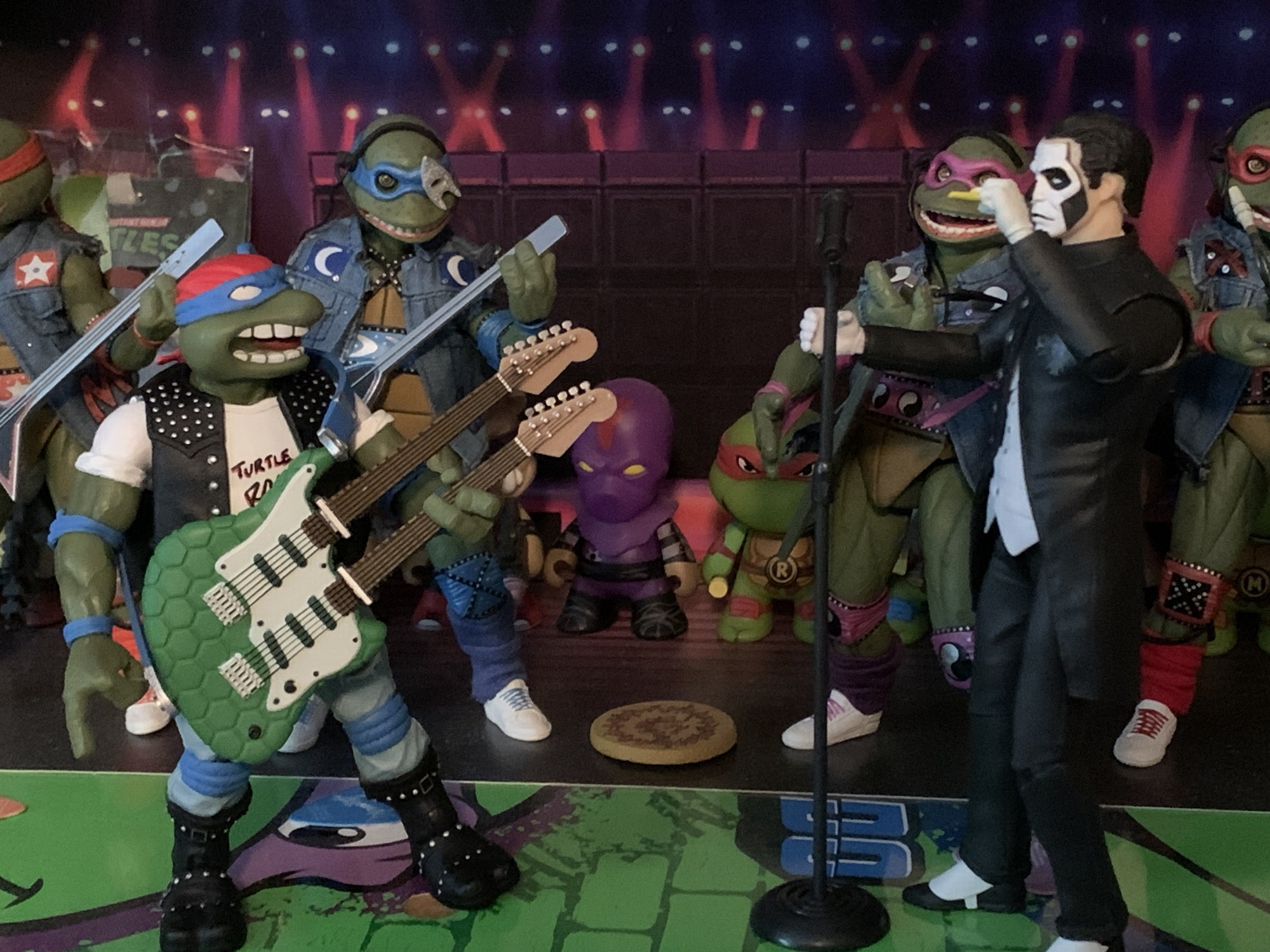
“Boooorn in the sewers, yeah!”
Whatever the politics are behind the scenes, I’m just happy that Leo is here. Classic Rocker Leonardo arrives in the standard Super7 box only now sans a slipcover. He stands around 5.5″ and is basically in-line with the other Leonardo figures from Super7. His design is almost an exact recreation of the Playmates figure and it’s definitely a lot easier to cite the differences than what’s the same. And those differences are limited to the red bandana on top of his head which no longer has any sort of pattern on it. I’m not sure why and I do miss it, but it isn’t something that truly bothers me. The “Turtle Rocks” on the t-shirt is in a different font and the colors have been inverted. The straps on his boots are no longer painted all silver but are black straps with silver studs and the message on the back of the vest has been altered. On the original, it read “Rock N’ Roll” and it was done in silver rhinestones. Now, it says “Rock N’ Out” in a blue font. I don’t mind the change in messaging, but I do kind of miss the tackiness of the rhinestones. His belt buckle has been changed from a peace sign to a shuriken and the harmonica in his vest pocket is now all silver rather brown and silver. It’s kind of odd that this detail seems more simply painted than the original, but it’s fine.
He still has his fretboard swords. Not sure how effective they would be as weapons, but okay.
The differences are few and largely inconsequential and are likely done just to give this figure a slightly different flair than the old, even if there’s no mistaking what’s going on here. And from a sculpt and paint perspective, it’s a pretty nice figure. There’s an ample amount of paint to bring the figure to life and it’s nice to see the rip on his left thigh finally painted when compared with the vintage release. The torso feels like it’s mostly a rubbery overlay, but it’s still painted like it’s hard plastic. The vest is part of the sculpt so you can’t take it off or even look under it at all. The green flesh has a nice matte look though I don’t think it’s painted. If you get in real close you’ll fine some uneven lines in the paint here and there, but it’s nothing that will show at a normal distance. The only paint issue I have is there is a small dot of blue at the top of the right eye. Since it’s blue on white, it stands out more than I like. Overall though I’m happy with the sculpt and paint and this is a nice update over the original.
“You mean they gave you real blades?!”
Where this figure differentiates itself from the vintage the most is with the accessories. The original figure came with a guitar, two guitar fret swords, and some plastic records. This new version has a lot of the same, but different. For hands, we get a set of fists and gripping hands. The gripping hands have vertical hinges for sword and “axe” wielding while the fists have the standard horizontal ones. He also has a right hand that’s pinching a blue guitar pick, a left hand where the fingers are positioned in such a way that it looks like he’s squeezing a fret board, and a pointing gesture left hand for when he needs to point out bootleggers in the crowd.
Feel the music, Leo.
Those guitar playing hands are here to handle Leonardo’s new, double, guitar. It still has a turtle shell pattern, but with silver pickups and white plating which makes it resemble a Fender Stratocaster. There’s a soft, rubbery, strap for it that’s done in blue with silver clasps. It slots onto it just as it would a real guitar and works pretty well. The two fret boards are actually removable and feature blue, katana-like, handles so this version of Classic Rocker Leo still has his unusual swords. The connection is fairly loose, but the frets won’t fall out or anything. I think it’s done this way so as not to disturb the paintjob, which is excellent. The detail work and paint on this accessory looks great. This is one of my all-time favorite accessories I think I’ve ever received with an action figure because it looks so convincing as just a miniature version of a real thing. Some may be disappointed in the change from a more traditional guitar to a double one, but the absurdity of the double guitar (in both real life and toy) works for this line and it’s an easy way to take the old figure and turn it up to 11.
Can’t forget about the pizza!
Also included with Leonardo is a microphone stand. It’s black and gray with a hinge for the mic and blue wrappings on the stand. It doesn’t telescope and the mic is non-removable, but I suppose a guitar player doesn’t need to hold his mic. It’s at the right height and it’s a nice touch if you want your Leo to be the lead singer of his group or prepared to sing backup. There’s also the requisite slice of pizza which appears to include clams this time and Leo gets a pair of round shades. They don’t fit all that well, but they’re slightly transparent and done well enough. They may make more sense to use with Leonardo’s alternate portrait, which is just a regular Leo head, but with his eyes closed like he’s really feeling a guitar solo. It’s a good idea for a second portrait, and if you don’t want him to have closed eyes then the sunglasses hide that detail well enough. Swapping hands with this figure is also pretty easy, but getting the default head off required some heat.
If you don’t want his eyes closed you could always hide them behind the shades.
All of that fun stuff would be no good if Leonardo couldn’t even be posed with his instrument properly, but fear not, this figure should deliver well enough on the articulation front. He’s pretty typical of the line with a double-ball joint at the head, hinged shoulder pegs, biceps swivels, single-jointed elbows, and wrist hinge and swivels. I do like that Super7 hid the biceps swivel behind the rolled up part of the t-shirt so it looks good. The head joint is the same as the other turtles, which is lacking. It’s seated way too deep in the head and since there’s no joint at the base of the neck the range is pretty limited. Nothing in the torso, and the hips are the old hinged peg setup, but this time at least they’re not loose. A thigh twist follows with single-jointed knees that also swivel, hinged ankles, and an ankle rocker. Range at the knee is less than 90 degrees which is, again, typical of a Super7 turtle. The ankles are the best part and at least the elbows can hit a 90 degree bend.
He can play and that’s probably good enough for most.
Leonardo is limited, though obviously more articulated than his vintage counterpart. The range in the arms is enough that he can mime playing his guitar. He can’t really get his pick all the way down to the bottom pickups, but you could still pose him with his right arm raised or something. He can stand on one leg to imitate Angus Young and he can do jump kicks or stomp around like the guys from Iron Maiden. He can’t really be posed on his knees unfortunately and it’s too bad they didn’t take advantage of all the clothing to sneak some articulation into the torso. With a soft enough overlay they could have snuck in an ab crunch or at least a twist. Even without that stuff, the figure should be up to the task of posing, your imagination will just be limited some by it.
Looks like we’ve got a new band leader!
Classic Rocker Leonardo is not the best figure Super7 has made, but it might be my favorite. I am obviously biased because I adored the original so I was going to like this so long as it wasn’t butchered (like Sewer Samurai Leo). The figure looks great, the accessories are a ton of fun, and the new additions to the package are worthy additions indeed. This is basically what I want Super7’s line for this brand to be and I’m glad we know that at least two of the remaining three turtles from this subline are on the way. The only one unconfirmed right now is Heavy Metal Raph, but if he’s not part of Wave 13 (Rappin’ Mike is in Wave 11 while Wave 12 is dedicated to the 2003 Turtles) I’ll personally be surprised (and irritated). The four don’t exactly combine to make a cohesive band, but it’s okay and maybe Super7 will do an original design of Casey the drummer or something. Classic Rocker Leonardo should be available now or very soon from your favorite retailer where he’ll set you back $55. It’s a steep price, it always is with Super7, but at least for me it’s definitely worth it.
Late in 2023, Super7 started shipping the ninth wave of its line of Teenage Mutant Ninja Turtles Ultimates! action figures. I bought none. It was a wave with no compelling characters for me as it contained Slam Dunkin’ Donatello, Scumbug, Wingnut & Screwloose, Zak the Neutrino, and a flocked Master Splinter variant. Scumbug had been…
If you’re into collecting action figures then you’re likely familiar with the concept of a variant. Tooling action figures, the process of cutting steel into molds in which plastic is inserted to create the figure, is the most expensive part of creating an action figure. That’s why it’s in the manufacturer’s best interest to get…
Well, after looking at the Wave 6 Slash a couple of weeks ago we can now finally turn our attention to a Wave 5 release from Super7’s line of Teenage Mutant Ninja Turtles Ultimates! series of figures: Sewer Samurai Leonardo. The thing with TMNT is, you have the four good guys, a few core allies,…
Late in 2023, Super7 started shipping the ninth wave of its line of Teenage Mutant Ninja Turtles Ultimates! action figures. I bought none. It was a wave with no compelling characters for me as it contained Slam Dunkin’ Donatello, Scumbug, Wingnut & Screwloose, Zak the Neutrino, and a flocked Master Splinter variant. Scumbug had been on my list of wants from the line, but when NECA released their version of the character in its TMNT Animated line it scratched that itch since the character model was practically a 1:1 recreation of the vintage action figure. Wingnut was tempting, but Super7 wanted $75 for the figure and that was too rich for my blood. The rest I had little to no interest in. The Slam Dunkin’ Donatello even irritated me by simply existing since it was Super7 starting yet another variant line of turtles without finishing any of the ones they had already started to begin with (the disguise turtles and the music ones). Eventually, I would happen upon these figures in my travels at local comic book stores and I was really impressed with Wingnut, in particular, just not enough to meet the asking price of Super7 (or the comic book store markup on top of that) so I played the waiting game. I was okay if I never got the figure, and if it ever did get marked down then I’d be happy to pounce. That day finally came via Amazon, and while their discounted price only amounted to around 12 dollars, it was enough for me.
I no longer have the vintage version of this duo so this comparison with NECA will have to do.
The ninth wave of TMNT Ultimates! is the last to make use of the traditional slipcover style packaging, if that matters to you. Wingnut gets the green slipcover with his own, custom, manhole decal on the front and the figure is presented in a window box behind it. Thankfully, I’m an opener because my Screwloose was not secured in the plastic bubble and flopping around inside. If you only remember Wingnut from the cartoon, then you’re probably surprised to see he gets the green “Good Guy” slipcover instead of the villainous purple one. According to the lore of the original Playmates figure, Wingnut is indeed a good guy alien who has a vendetta against Krang. The character is best known as a member of Archie’s Mighty Mutanimals comic book series where Wingnut is a hero. He actually first debuted in Ralston-Purina cereal comics where he was indeed a villain and not aligned with Screwloose. His creation is credited to Ryan Brown and in basically every iteration of the character he’s a Batman parody of some kind and the design that would become the Playmates toy very much drives that point home.
Wingnut is pretty big, but in more a chunky sense like the previously released Muckman.
I don’t think anyone outside of Super7 or Viacom knows what the true constraints of this line are, but it’s nice to see that Wingnut is, more or less, a recreation of the vintage toy. Super7 has acknowledged that Playmates has expressed frustrations with the company essentially copying their figures for their Ultimates! line and Viacom has acquiesced to those concerns. As best as we know, Super7 can no longer recreate those old toys if that’s the only way they’ve existed. That’s basically a mandate from Viacom, legally it would appear Playmates doesn’t have a ton of standing, as we saw when the fans roundly rejected the Super7 Rat King concept solicited for Wave 10. Super7 was able to leverage those complaints with Viacom to get permission to more closely design their version of the character to match the vintage toy. And with the music turtles, it would seem those designs were used for some stickers and other ephemera back in the day and that’s enough to give Super7 access to those. With Wingnut, I’m not sure where this design comes from. He looked quite different in both Archie and the Ralston-Purina comic, but given he was a somewhat popular action figure it wouldn’t shock me if he showed up elsewhere. Maybe the cartoon featuring a near spot-on likeness to the figure is enough even if the toon is NECA’s domain.
When the wings don’t work you make them work.
Whatever the reason, I’m happy to see this approach to Wingnut taken by Super7. I think fans want to see a lot of those Playmates features incorporated into the same characters released in this line, just bigger, more detailed, and more painted. Like most of the old toys, I no longer have my original Wingnut. I suppose I could have purchased the somewhat recent reissue, but those can’t be trusted as Playmates often omits accessories and skimps on paint. From what I remember, this figure embodies a lot of the same features. He has his tongue sticking out, the belly of the shirt is ripped open, his tiny wings are incorporated into the mechanical features, and he has a gaudy, bat-head, belt buckle. The costume is clearly inspired by the classic Batman costume with a gray body suit and blue cowl, gloves, and boots. He’s only different in that he has some armored bits on his shoulders, biceps, and thighs. His fingers and toes are also exposed and then, of course, there’s the wings.
“You better have a good lawyer.”
The base figure isn’t changed much from the Playmates release save for the addition of the cape. That was basically the one missing ingredient from the Batman parody, but perhaps no one felt the cape was necessary back then because he had actual wings. Super7 included a blue cape with “W” logo buckles that connects to the shoulder pads. It’s tattered and torn to match with the aesthetic of the figure as a whole and it is a really nice addition. It provides for display options as you can include it with or without the wings and really lean hard into the Batman parody. There’s also a secondary portrait that’s also more Batman inspired as it features a closed mouth and whited-out eyes rimmed with black paint. It’s a good look for the character and it’s reminiscent of the actual turtle releases in this line which featured vintage-inspired heads as well as new interpretations that work just as well. Options are certainly nice to have, especially at this price point.
Wingnut will look pretty big mixed in with the turtles.
Super7 charges a premium for this figure likely because of its size and paint. In terms of height, Wingnut is around 7″ to the top of his head and around 7.75″ to the tips of his ears. He’s one of those characters that’s always hunched over though so he’s taller than the figure stands. He’s also long-limbed and the wings add considerable depth and width to the display giving him a rather imposing presence on the shelf even beside other larger figures. He’s most similar to Muckman as they both have poor posture, but also feature a ton of paint. There’s a nice Kevlar-like texture to a lot of the armored portions of the costume and all of the straps and panels are well painted. The facial details are also clean and there’s a nice gloss applied to the exposed gums and tongue of the default portrait. The tiny, atrophied, wings are painted brown with a black wash over them to distinguish them from the metallic, armored, portions. The “W” logo in the chest is a painted feature too where as the vintage figure came with stickers. The only disappointing aspect of the paint concerns the belt. Super7 has a bad habit of only partially painting certain features of its toys. Some of the gear that’s part of the belt’s sculpt (dynamite, walkie-talkie, flashlight) have been painted and painted very well and look great. Other items, basically most of the stuff on the rear of the belt, were left bare plastic. They come so close to giving us what we want, but then step back from the edge.
Those details at least aren’t enough to ruin what is otherwise a terrific displaying action figure. And it’s certainly true that Super7 leans more into that display than it does articulation. Wingnut is pretty basic for a modern action figure in that regard and his somewhat unusual shape won’t lend itself well to posing. We do get a ball-jointed neck with a double-ball peg for the heads. This lets him swing his head left and right pretty well with some up and down and then the head joint provides for even more range. I don’t think it works as well as it does with Muckman, the ball joint is situated a little too deep in the neck and is prone to popping off, but it’s solid. The shoulder hinges provide surprisingly good range given the shoulder pads and the single-jointed elbows will provide swivel and a 90 degree bend. There is a ball joint at the waist which allows for a little tilt in all directions and plenty of swivel, but it’s in the legs where sacrifices are made. The Super7 standard hinged-peg hips go out to the side plenty far, but are very limited going forward and back. Because his neutral pose features bended knees, there’s little play there as well. Basically, he can crouch or go into a deeper crouch. The ankles hinge forward, but going back they’ll bump up against the dewclaws. The ankle rocker works fine as do the thigh and knee swivels but this is a figure that’s designed to basically have its legs in only one pose only allowing for minor adjustments. He also has a tail which is on a ball peg that mostly rotates. The wings are on hinged pegs so they move up and down as well as in and out some. The cape is also wired and can be posed fairly well.
Does a winged guy really need a grappling hook?
I don’t think anyone will be surprised by the articulation of Wingnut. He’s not exactly a joy to pose, but it’s also not hard to find a pose that looks good. The various spikes and such can make it a painful exercise though and there is a fiddly nature to the figure. The wings pop off rather easily and can become cumbersome when trying to find a good pose. The inner wing on my figure’s right wing is also prone to popping off the peg it’s on which is really annoying. You can essentially remove the armored parts of the wings if you want to as it’s just that peg and a plastic clasp that holds them on. I’ll never do that though so I’m tempted to glue the inner wing to the armor instead. The cape also pops off way too easily as it just pegs through some clasps on the armor. It’s not a tight fit at all and the cape basically just rests in those ports. The head also comes off too easily when trying to pose it. At the same time, at least nothing is getting stressed and looks like it will break. Most of the joints are tight without being overly so. The only exception are those damn Super7 hips. I wouldn’t call Wingnut loose there, but he’s looser than I’d like. He stands fine though and I credit that to his massive feet.
He’s got a few toys and can store most of them on his person too.
Where this figure improves upon Muckman (and is perhaps where it tries to justify its value) is with its accessories. I already mentioned the two portraits, the optional wings and cape, but he also has weapons and some additional hands. For said hands we get a set of fists, open hands, a trigger finger right hand, and a pointing/gripping left hand. The two gripping hands feature vertical wrist hinges which is certainly appreciated. The trigger right hand works well with Wingnut’s gas gun. If you’re going to be a Batman knock-off, then you need a means of firing a grappling hook (even if you’re a character with wings). The gun itself looks like a stylized revolver with a W logo on one side and a bat head over the muzzle. Wingnut holds it well, or it can be pegged onto one of his wings. There’s an included grappling hook which slots into the muzzle, but no included rope or blast effect to capture it in a mid-firing pose. It’s done up all in a nice, metallic, silver. Wingnut also has his own “Batarang” which looks like an actual bat. As a kid, I never knew if this was supposed to be a metallic weapon or just a dead bat he throws at people. Super7 chromed it up so it’s clearly a weapon as opposed to something morbid. The pointing or trigger hand work okay to hold this one or you can wedge it between the fingers of the open hands. Sadly, there’s no way to peg it to the wings or utility belt. I guess you could stuff it in-between the belt and figure, but it’s pretty big and looks a bit silly.
Also included are more vintage-inspired accessories. There are four grenades that are all silver like the other weapons. Wingnut can palm them or store them on either his belt or wings. The canisters feature peg holes and there’s one peg on each wing. He also has two open loops on his belt for storage. I’m left wishing he just had four loops, but it’s all right. Lastly, he has his trusty radar dish. Does his own inner radar not work very well? It’s silver and looks almost like a repurposed colander. There is a bit of red paint on the tip. It has a long post, or handle, which Wingnut can’t hold very well. Both wings feature shallow holes though and they can accommodate this dish to a point. It will stay, but the slightest breeze will knock it out. I wish they gave us one wing hole that just went all the way through for a more secure attachment as it certainly feels like this is an item meant to go on his wings.
And who could forget dear mosquito boy?
Of course, we can’t end this review without talking about the other figure in the box – Wingnut’s trusty sidekick Screwloose! I think Wingnut was the first figure in the original line that I got that came with a little buddy character. Lots of figures would follow with the little guys always being a slug figure that was one color. Now, through the magic of Super7, we get to see Screwloose all painted up. Which is to say he looks a lot like his cartoon version, only with one obvious distinction. First of all, Screwloose stands a shade under 4″ and like his vintage counterpart he’s molded in yellow. His tank top has been painted orange and his pants green while his shoes are black. It’s, more or less, a Robin color scheme which is driven home by the inclusion of a black domino mask. I wish I had my old figure as I can’t remember if that had a sculpted mask or not on it. I want to say it did and it was something I noticed after I had owned the figure a long time making it a sort of “Eureka!” moment where it finally clicked that he was a Robin parody. The painted details are done well, including the eyes, teeth, and tongue. I think the exposed limbs could have used a wash or something to liven them up, but he looks fine.
Where Screwloose isn’t much of an improvement over the old one is with the articulation. He has some, so by default it’s better, but I think Super7 could have done a little better considering this guy is presumably part of the reason why this figure costs 20 dollars more than most. The head is likely on a big, ball, socket, but it can only rotate a little. Each of the four arms are on hinged pegs which move okay while the tail just swivels. The wings, done with transparent plastic, attach to ball sockets and really only swivel. Try to move them out from the body any and they’re likely to just pop off. There’s no articulation in the body of the figure itself, including the legs. His legs are preposed like the vintage figure and he can at least stand fine, but that’s it. He can’t do any flying poses and since the wrists aren’t articulated you can’t swap hands. This is annoying because his lower, right, arm is in a pointing gesture and I’d love to move that hand to the upper arm. I suppose I could try to pull the arms out at the shoulder socket, but I also don’t want to break it. As an accessory, Screwloose is fine. As a figure, he’s rather poor. If he could at least get into a flying pose I’d have been more than content.
This franchise loves Batman parodies.
In terms of visual quality, Wingnut and Screwloose are among Super7’s best. The paint is exceptional and they nailed the look of both characters. There’s a lot of the vintage toy here and a lot of it has been improved upon through both the sculpt and paint. There’s also a little new and what’s been added is just as good and gives the figure multiple display options. Really, the only true downside with this figure is the price. Asking $75 is just too much, especially with the hit or miss approach Super7 has had of late across its lines. Super7’s business model is heavily dependent on preorders, but they haven’t earned that level of trust to commit to pay sight unseen. If money isn’t a deterrent, then I think you’ll like this figure. There’s very little not to like. If the price is a turn-off, then maybe do what I did and wait for a sale. This wave is already seeing some discounting (especially Scumbug who was down in the 30’s off an inflated MSRP of $65) so keep your eyes peeled. I think if you can get this down closer to the standard price of the line then it’s definitely worth it. I feel fine paying around $62 for it and I’m happy to have it as I liked the vintage toy. Hopefully Super7 is able to continue making vintage-inspired figures because it would be a shame if this guy represents an end of an era for the line.
If you want to check out more Ultimates! or TMNT stuff there’s certainly plenty of that around here:
Gross. That’s the word I hear all of the time associated with the vintage Playmates Teenage Mutant Ninja Turtles line of action figures. Back then, articulation was kept pretty simple and this allowed studios like Varner to go nuts with sculpting. They could include all kinds of details in their figures. Sure, much of it…
For most fans of the Teenage Mutant Ninja Turtles from the 1980s, you reside in two camps when it comes to how certain characters are remembered: either from the cartoon/comics, or from the Playmates toy line. For Wingnut and Screwloose, I suspect most associate them with the action figure, but there are those who think…
It’s been over 9 months since I last reviewed a figure from Super7’s line of Teenage Mutant Ninja Turtles action figures. That figure was Muckman, and I actually waited on that one a little while because I ordered through Big Bad Toy Store and wanted my pile of loot to fill up a bit. Had…
Well, we’ve done it. We’ve reached the last figure in Super7’s line of Ultimates! action figures based on The Simpsons. Did we save the best for last? No, not really, but I am happy to say today’s figure is definitely not the worst. And this fourth and final wave has featured multiple contenders for worst in the line. I don’t wish to beat a dead horse, but for whatever reason this fourth wave was pretty terrible. Even the figures that look fine, like last week’s Drederick Tatum, suffer from inexcusable levels of quality control. How hard is it to make sure an arm or a leg fits properly? I don’t know. A lot of toy companies seem to have no issues with such things, but Super7 has certainly made it look challenging with this line.
A much wider Homer than we’re used to.
King-Size Homer comes from the episode of the same name from the show’s seventh season. It is our second Homer Simpson in this short-lived line of action figures which normally wouldn’t seem like something that stood out, but here it does considering we never got a Marge or a Lisa in the line. The company that made it a point to include a female character in each wave of its Mighty Morphin Power Rangers line didn’t seem to find any value in doing the Simpson women before double-dipping on Homer. Cool. At least this Homer is a little more of a popular variant than wave one’s Deep Space Homer. Not that Homer going to space wasn’t a memorable episode, it’s just that there are a lot of Homer variants I would have gone with over that one. I still would have chosen several over this version as well, but I concede that of all the various Homer Simpson looks he’s had in the show, this is among the most memorable. And it’s way better than Dancing Homer or Homer the Vigilante, though it’s no Mr. Plow.
Oh look, he’s monologuing again.
King-Size Homer comes in the standard box with no slipcover, as has been true of every figure in this wave. If you’re unfamiliar with the episode, this gargantuan Homer is the result of him trying to gain a bunch of weight to be declared medically obese and thus eligible to work from home. As evidenced by his appearance here, Homer was pretty successful in packing on the pounds (thank you Play-Doh doughnut) and achieved his dream. Homer stands at right around the 7″ mark which is more or less in-line with the wave one figure, only now he possesses far more girth. He’s in his floral moo-moo and comes packaged with his “fat guy hat” and has an optional soft goods cape. Since this Homer is far bigger than the last, everything here is new sculpt and it looks pretty good. Homer has his much girthier neck and even his hands have been enlarged to match the show.
This sort of thing drives me nuts.
As for the paint, well it’s again another mixed bag. Unlike that first wave Homer, this one is done in yellow plastic and not painted over. There is a matte coat to cut down on the shininess of the plastic, but he has a cheaper look than that first Homer as a result, but it also puts him in-line with Devil Flanders, Burns, and Ralph. The strands of hair atop his head are done with soft plastic and with Homer it works far better than it does with Ralph. Unfortunately, he’s packaged wearing his hat and the default head on my figure has some warped hair as a result. It also has a blob of white paint on the back of the head too. The garment he’s wearing looks okay and the flowers are painted cleanly, but they did a thing that really annoys me. Since Homer has a cut for articulation in the torso, some of the floral pattern gets broken up and if you line-up one flower it doesn’t line up all of them. The cape looks nice at least and it’s well-tailored. It might be a tad on the small side, but it’s not as if it gets lost when he’s wearing it. It just slips over the head and it completes the look. The paint on the shoes and eyes is hit or miss. Some portraits look good, while others have a sloppy edge to the eyes. My Homer’s right shoe has a chunk of white missing around the sole.
Reaching broom included.
For accessories, Homer comes with various items from the episode that should look pretty familiar. For heads, we get one with a slight smile, a side-eyed angry expression, and one where he’s making his “Ooo” mouth. It’s basically the same expression that Deep Space Homer came with, which is one I like, but it feels a little redundant. For hands, Homer has fists and that’s really the only “set” he has as the rest are specialized hands. He has a gripping left hand which seems intended to work with his ice cream cone (Ooo, raspberry). The cone looks fine and comes close to matching Ralph’s alternate head which I suppose is nice for symmetry. There’s a different-shaped gripping right hand and that’s intended to work with Homer’s “reaching broom.” In the episode, Homer sits on the couch watching TV and utilizes the broom to just whack the keyboard of his work computer so it seems like he’s doing something. The broom-head has sculpted indentations for his fingers and thumb to slot into and he gets a pretty good grip on it. Sadly, his articulation is lacking so he can’t really use it as intended, but we’ll get to that. There’s also an open left hand and that one works well with the famous drinking bird. This is the bird Homer got from his brother Herb in the season three episode “Brother Can You Spare Two Dimes” and it’s a novelty toy. It returns as Homer’s assistant in the episode. The bird is articulated so you can simulate the pendulum effect it’s supposed to have. The sculpt and paint are fine, and this is an accessory Homer had to come with. Lastly, Homer has a pointing right hand and his medal which he is awarded at the end of the episode for using his ass to prevent the release of deadly, poison, gas.
At least they got this guy in.
It’s a solid spread of accessories and I think Super7 keyed in on the right objects from the episode to give Homer. They could have given him a computer, but as we saw with Ralph, without something to put the PC on it serves little purpose. I would have preferred an expression that could work with the ice cream cone, but I suspect that didn’t happen because he can’t reach his face. There is absolutely one thing missing though and it’s Homer’s sign from the episode that reads “Give Me Ride or Everybody Dies.” Really, that scene should have been priority for Super7. Cut the pointing hand and replace it with a hitchhiker’s thumb. Cut either alternate portrait and give us exasperated Homer with his hair limp. When you’re going to do these episode specific action figures you really need to hit on the episode’s best jokes and Super7 certainly whiffed on that one.
They’ve been staring at this bird for hours.
As for the articulation I’ve been teasing, what is there really to say? It’s terrible. Just look at this guy. It was going to be bad and it is as expected. He is basically a statue with arms that swivel. The head is the only aspect of the figure that has moderate range, because the rest does not. The elbows are poor, the diaphragm twist adds little, and the garment renders the leg articulation absolutely useless. They could have done absolutely nothing with his legs and the figure probably would not have suffered for it. I’m not going to kill Super7 for the articulation here because there isn’t much that can be done with a comically obese Homer Simpson. Maybe if they had done all of the clothes with soft goods it would have allowed for the legs to have some utility, but to do what, really? I guess it would be cool if he could sit down, but the line didn’t last long enough for Super7 to deliver a couch. The only thing that sucks is the lack of a vertical wrist hinge so he could properly wield his reaching broom. The cape at least has a wire, so you can add some dramatic flair to your Homer, but this is a figure that is just going to stand there.
You’re probably not getting that cone much closer to his face.
King-Size Homer isn’t exactly a homerun Homer, but he’s a cromulent one. The look, aside from my nitpick with the floral pattern, is on-model and while I bemoan the lack of yellow paint at least the finish is a matte one. The accessories are also pretty solid and the figure looks good with or without the costume accessories in the form of the hat and cape. I’d be a lot higher on the figure if Super7 had nailed the “Give Me Ride or Everybody Dies” scene and if this figure carried the standard MSRP of $55. It does not and instead will set you back $65. I guess because there is a minor uptick in plastic versus some of the other figures? Hell if I know why it’s more money since one would assume Homer is going to sell the best out of all of the figures in the wave. I can kind of see charging more for an obscure character like Drederick Tatum, but a popular version of Homer? The pricing is absurd, but is functionally moot since this line is dead. This figure is all but guaranteed to hit the clearance rack before long so you need only wait it out if you want a better deal.
The only award this line will ever receive.
And that’s a wrap on Super7’s journey with The Simpsons. It got off to an odd start given the confusing character selection and long wait for wave one. Plus the thing with Moe’s apron wasn’t great, but remedied in a fairly painless fashion. I felt the quality of the first two waves was pretty damn good though and the figures were about as good as I think could be expected of Super7. The issues with those figures were just the choice of characters and I suppose disagreements over accessories. Starting with the third wave though, the quality took a hit in particular with Burns and Ralph and this fourth wave was practically a disaster. King-Size Homer is the only figure in the wave without blatantly obvious quality control issues. I suppose the only good thing for Super7 is that waves 2, 3, and 4 basically all arrived at the same time so the line didn’t experience a gradual decline, it just went off a cliff.
“Way to lower the quality of the line, Flanders!”
It leaves me wondering what will be the legacy of Super7’s take on The Simpsons? I’m guessing it will be viewed as a failure considering a great many fans were unhappy about the character selection and we know the intent was to pivot away from this approach with the canceled fifth wave. It should have a “missed opportunity” vibe, but did we really miss out on much? If the fourth wave is any indication then no, because it can be assumed the fifth would have sucked just as hard. The majority of this line was just flat-out not worth the money and yet the price kept going up while the figures were getting worse. That’s a pretty bad combination. The figures also lack an attention to detail that would have made it feel like truly hardcore Simpsons fans were in charge at Super7. Lacking that charm, there’s no pull. I don’t see these figures appreciating in value and becoming something fans who missed out on chase down ten years from now. Maybe they will the ReAction figures which were actually pretty well done. Perhaps I should make a post on them because they were certainly more deserving of your money than the Ultimates! line and they actually form a cohesive display, premature death and all. In the end, The Simpsons and Super7 is just a thing that happened. If the line has any sort of lasting ramifications it may be something we look back on as the beginning of the end for Super7’s Ultimates! because the company’s reputation certainly didn’t get better by producing this line.
Here it is, for better or worse, the entire assortment of Simpsons Ultimates! by Super7.
We have looked at 15 figures from Super7’s line of Ultimates! action figures based on The Simpsons and we’re about to look at the 16th. What I’m wondering at this stage is do I need to keep talking about the baffling character selection? Yes, yes I do. Drederick Tatum is today’s figure, the show’s Mike…
Last week, we started on our journey through the fourth and final wave of Ultimates! from Super7 based on The Simpsons. It did not start well. Devil Flanders represented a new low point for the line and maybe for Super7 as a whole. I know I certainly do not own a worse Super7 figure than…
Last week, we concluded our look at the third wave of Super7’s line of figures based on The Simpsons and now we embark on the fourth and final wave. That’s right, Disney pulled the rug out from under Super7 and handed The Simpsons license over to Jakks. Their products will start rolling out this fall.…
We have looked at 15 figures from Super7’s line of Ultimates! action figures based on The Simpsons and we’re about to look at the 16th. What I’m wondering at this stage is do I need to keep talking about the baffling character selection? Yes, yes I do. Drederick Tatum is today’s figure, the show’s Mike Tyson parody, and he’s about as warranted as last week’s figure, Radioactive Man. I don’t know that any, named, character on The Simpsons who has spoken lines could be called a deep cut or anything, but there’s tons of minor characters in the show who show up for a joke here and there and then fade away. Sometimes for years at a time. Tatum isn’t unique in that sense, and yeah, those minor characters are certainly part of the charm of The Simpsons, but I don’t think I’m alone in saying that fans would prefer dozens of characters ahead of Drederick Tatum. Characters like Principal Skinner, Edna Krabapple, or how about freakin’ Marge Simpson?!
“I do not appreciate the way you are looking at me, Homer.”
We all know the case against Drederick Tatum, but what’s the argument for the character getting immortalized in plastic? I don’t think he had a figure in the Playmates line back in the day so that’s one. That line actually was super expansive and probably should have done a Tatum, but maybe they were afraid of a lawsuit? He is a minority character in a line that’s been all yellow dudes and the occasional alien, dog, or robot. And he has a pretty unique build in the show relative to the existing characters so it’s a different sort of figure.
“D’oh!”
The existence of this figure is probably pleasing to some. I know at least one person who is a Mike Tyson fan that is getting just this figure from the line. And that’s good for him since this figure won’t pair with anything else in the line. I don’t think it changes the fact that it’s still a bizarre choice in a line rife with them. Perhaps more concerning though would be is the figure any good? I have not had a very good time with the fourth wave of this line. It’s featured sloppy paint, a low accessory count, and limbs that just fall off. The bad news is those were the “cheap” figures of the wave at $55. The last two figures come with an inflated MSRP of $65 and that includes Mr. Tatum. What about this figure warranted the extra ten bucks? I have no idea. Maybe Super7 expected lower orders for this character and thus decided to tack on an extra Hamilton. Sure, he’s bigger than Flanders and Radioactive Man, but not to the degree one would think warranted more money. There’s not a ton of paint here and the accessory count is just okay. Basically every figure in this line has been all unique tooling and most have featured soft goods. What separates him from Krusty or Duffman? Again, I have no idea.
Duffman seems to be the figure most similar to Tatum.
This figure has to impress a bit more as a result of that price, and at least at first glance, it’s off to a solid start. Tatum stands around 7.5″ to the top of his head. This sets him a little taller than he probably should be if we’re going off of his appearance in “The Homer They Fall” as he was really no taller than Homer there. He’s a chunky figure with a good feel in-hand as there’s some heft to him, not the overly hollow, plastic, feel some of the other figures possess. He has a very neutral expression, but that’s suitable for the character. The paint on the face is okay. The top of the eyebrows aren’t painted and if you get in close the black lines around his stubble aren’t perfect. The eyes look nice and it’s amusing how this character has such small eyes compared with the usual Simpsons design.
“Don’t make me hurt you, Duffman.”
The body of the figure requires far less detail. He’s a boxer so he’s just a guy in trunks and boots. The body is molded in brown plastic and has a nice, matte, finish. The forearms appear to be molded in white plastic and painted brown, but they match the rest of the arms perfectly. Why? Because Super7 painted brown over brown! They had started to do that with the second wave in places, but abandoned the practice with the third wave. It looks so much better and it’s basically what NECA does with all of its toon figures. The trunks are just plastic though, as are the boots. They’re a really dark, almost black, navy and the exposed portions of the legs are painted brown and look fine.
This right shoulder just has no room to really move properly and leads to scuffing.
The paint is not perfect, but few figures can claim to have a perfect paint app. The brown paint doesn’t quite reach the white cuffs where the boxing gloves begin and there is some chipping around the elbow of the right arm of my figure which leaves behind white marks. What is more the fault of the figure and Super7 is how tight the shoulders are. Clearly, they’re not used to painting this much of their figures because the shoulders were close to stuck out of the box. The left arm was easier to free than the right and it’s fine, but the right arm is all chewed up on the underside of the shoulder joint. That sucks, and the elbows are also very hard to work with and I think it’s a combination of paint and how far recessed the hinge is in the arm. I basically have to take the hands off to work the elbows otherwise they’ll just pop off. They, and the heads, come off easily. Maybe too easily for the hands, but they’re not falling out so I’m not bothered by that. I am, once again, bothered by the hips though. Just like Radioactive Man, the right leg loves to come off when posing the figure. The left is a little better, but I even had that pop off on me when I was setting up for pictures.
Good luck getting him into any sort of “boxing” pose.
The rest of the articulation is pretty mediocre. The shoulders suck and so do the elbows. He has a diaphragm joint that pivots and can go back a bit, but not much forward. The waist twist doesn’t want to work on mine. It moves, but snaps right back into a neutral position so I think plastic is bending as opposed to rotating. The hips have good range, but the knees do not. Ankles are fine, but this is a design with stubby legs and small feet relative to the body so posing options are going to be pretty limited. He can’t really get into a “ready” position for a boxing match, but he can sort of deliver a punch at least. He, like most of the figures in this line, is best equipped to just stand on your shelf in a fairly neutral pose. And as a blunt, understated, sort of tough guy in the show, that’s at least a look that works better with Tatum than others.
Not enough is made of his nickname in the show.
Tatum does have some accessories to speak of, most notably the soft goods “Mr. Armageddon” robe. It’s very well done and looks nice. There’s no wire this time, but this isn’t the sort of garment calling for one. It looks so good though that I doubt many will display the figure with it off. For alternate heads we have a teeth gritting expression which is meaner than the normal one and an eyes closed one with a smile. They’re painted well enough, though I can’t see myself ever using the smiling portrait. Since Tatum wears boxing gloves, there isn’t much need for alternate hands, but we do get one extra set. They’re open hands with peg holes in them and they’re to be used with his championship belt. The belt is really thick and done on a rubbery plastic. It has pegs on the reverse side so he can hold the belt over his head. It does not fit around his waist nor does it look good draped over a shoulder because it’s just too thick to hang naturally. Completing the look is a white, preposed, towel to be draped over Tatum’s shoulders and it looks good whether he’s robed or not. The last accessory is his “butt-ugly shoe” which is from the episode “Large Marge.” Tatum was paid to endorse them, but wasn’t up to the task. Or just too honest for his own good.
“Please purchase this shoddy action figure butt-ugly shoe which I have been paid millions of dollars to endorse.”
Drederick Tatum is another somewhat subpar release for this line. He looks better than some of the other figures in the line, but the quality control isn’t up to par. Especially for the money Super7 is charging. It’s still hard to shake the feeling that the company blew off a lot of the review process in order to get these out faster (it was rumored that Super7’s slow release pace was a problem for Disney) because it’s very basic, tolerance, checks that these figures are failing at. The hips are still an issue and so are the shoulders. They both required more fine-tuning, which is indicative of a rush job since that fine-tuning may have been scrapped. Super7’s Brian Flynn acknowledged the issues with Devil Flanders, but said nothing of the rest of the wave other than to sell it as “So good,” like it’s a tragedy the line is ending. And to be clear, Devil Flanders is the lone figure I think was absolutely not fit for release in its present state. The rest are more flawed than outright disasters.
The champion of Wave 4?
Even with its problems, the Drederick Tatum figure is the best of The Simpsons Ultimates! Wave Four. That’s an admittedly low bar since one figure wasn’t fit for release while the other had plenty of issues on its own. The real question is does this figure do anything to warrant the price tag? No, not really. I mean, if you want a figure of Drederick Tatum this at least looks good. It’s going to satisfy that need, it’s just overpriced at $65. It’s possible not a ton of these figures were produced so waiting for a discount might come back to haunt the person who needs this figure to complete their collection, but I still have a hard time seeing this guy sell out at the current price. If you’re asking me it’s probably worth the gamble, but perhaps be ready to pounce if it drops below 40 bucks. Next week, we’ll see if this line’s final figure can redeem this awful wave or if the line is fated to end like Homer’s attempt at jumping the gorge.
Want to see more from Super7’s take on The Simpsons (you masochist):
Last week, we started on our journey through the fourth and final wave of Ultimates! from Super7 based on The Simpsons. It did not start well. Devil Flanders represented a new low point for the line and maybe for Super7 as a whole. I know I certainly do not own a worse Super7 figure than…
Last week, we concluded our look at the third wave of Super7’s line of figures based on The Simpsons and now we embark on the fourth and final wave. That’s right, Disney pulled the rug out from under Super7 and handed The Simpsons license over to Jakks. Their products will start rolling out this fall.…
We wrap-up our look at Wave 3 of Super7’s Ultimates! line of action figures based on The Simpsons today with the main villain of the series: Charles Montgomery Burns. Mr. Burns has been around since the beginning and, like Ralph, is a worthy inclusion in the line at this stage and it’s only odd that…