We continue to bang out action figure reviews here in 2023 just in case there’s one that needs to sneak onto a year-end best of 2023 list. Is today’s figure such a contender? Probably not, but that doesn’t mean it isn’t worth talking about. Super7 has managed to crank out three waves of Mighty Morphin Power Rangers Ultimates! in 2023 after a lengthy delay to get the line off the ground. The reception has been so-so. There have been figures I thought turned out rather well, and others I wasn’t too thrilled with. Not all have been reviewed in this space, but basically I’ve been disappointed in the actual Power Rangers while the zords have pleased me quite a bit. That’s why my lone purchase from Wave 3 is the Megazord, or Dino Megazord if you want it narrowed down a bit more.

When Mighty Morphin Power Rangers premiered in 1993, the Megazord was their ultimate weapon. At least for a little while. Then the Dragonzord came along which meant the Megazord could level-up to the Mega Dragonzord. Then they added Titanus and suddenly the Ultrazord was a thing. And on the toy front, the Megazord was every bit as cool in plastic as it was on the screen. The Bandai Megazord was such an awesome toy that I wanted it badly, only I never got it so I had to purchase it as an adult to make it up to the kid in me. The toy is a blast because it’s five in one. Five robot dinosaurs (okay, well, three robot dinosaurs and two mammals) which can combine into a massive robot. In order to pull that off, the final product had to sacrifice some of the aesthetics when compared with the character on television. This may come as a shock, but the costumed person punching and kicking as the Megazord was not, in fact, made-up of five robots and had the proportions of a normal human. The toy basically couldn’t duplicate that look while maintaining the play functionality, but I don’t recall anyone who had it caring at the time.

When Super7 got the license from Hasbro to do Power Rangers it can be assumed it was like the Transformers license which meant no transforming and no combining. No problem. Doing just straight toys of something like the Tyrannosaurus zord or Megazord without having to incorporate that function means they can focus on screen accuracy. Now, if I were still a kid I’d think a Megazord that can’t break down into five robots sounds useless, but as an adult collector? I’m intrigued.

Super7’s version of the Megazord comes in the usual Ultimates! packaging. We’ve moved on from the brown shipper, but we’re still getting the slipcover for now. The box may surprise since it’s not nearly as large as the T-Rex or Dragonzord, but that’s because the Megazord doesn’t feature a giant tail. Don’t be fooled though as this is still a big, chunky, action figure that has substantial weight for something in this scale. The window box display is as nice as ever, though Super7 must have been concerned about paint rub as the figure is basically surrounded (not wrapped) in plastic in the tray which does downgrade the presentation for in-box collectors. Not that Super7 should care. The packaging is meant to get the product to your hands in pristine condition. Anything else is just gravy.
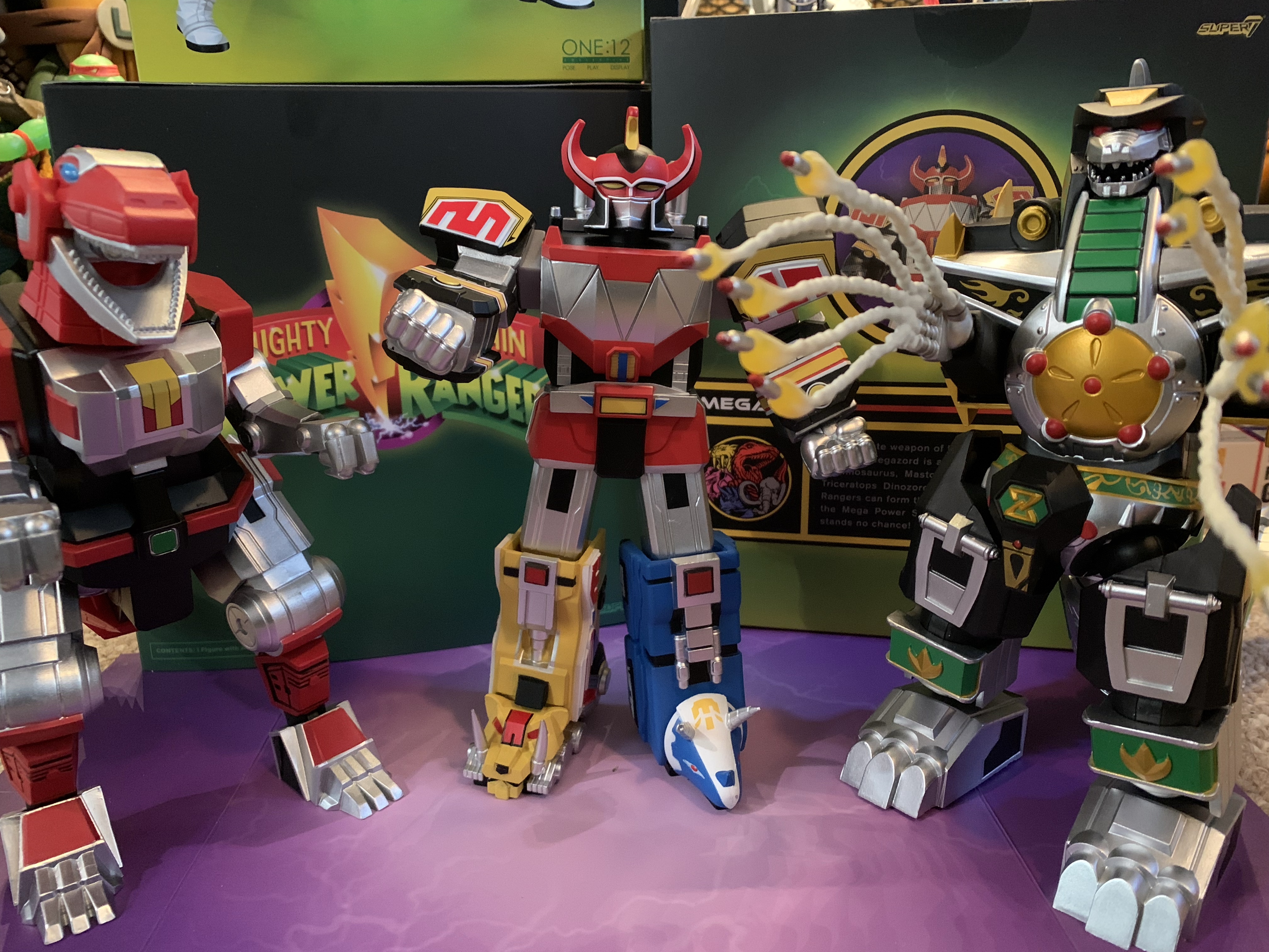
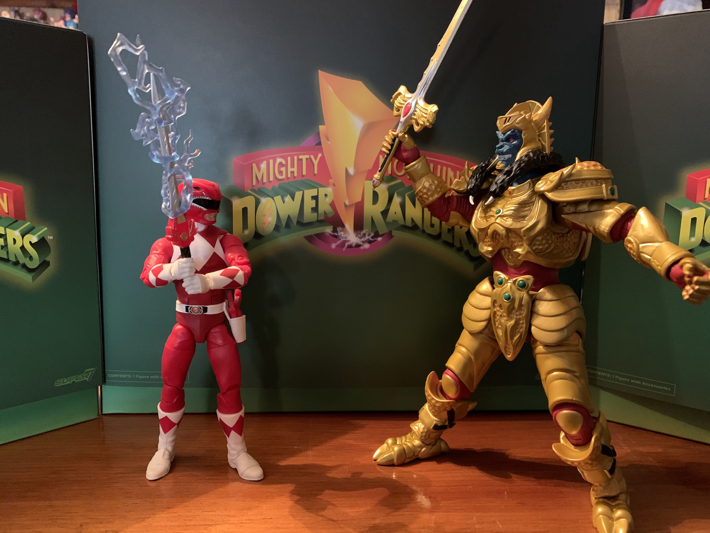
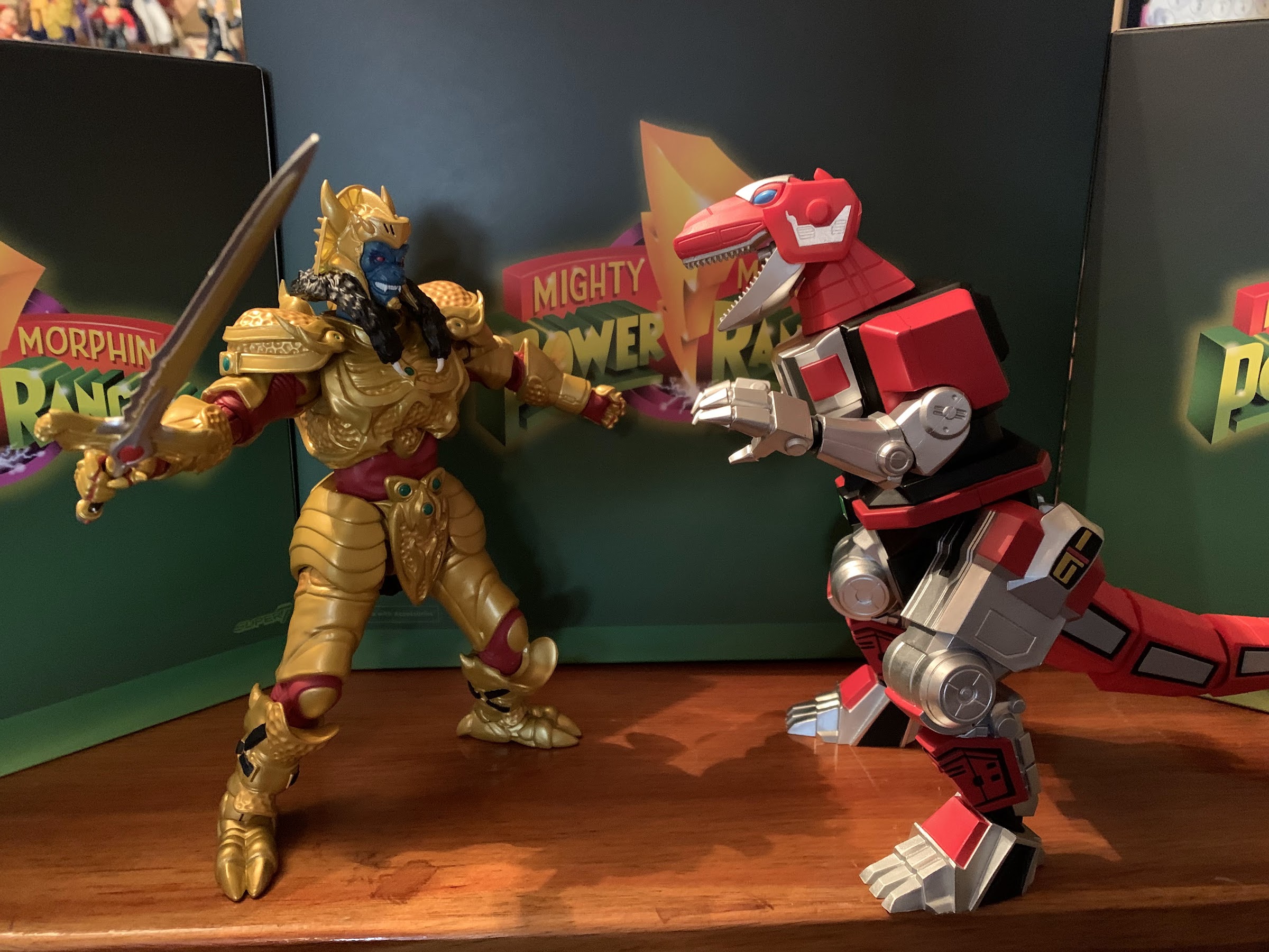
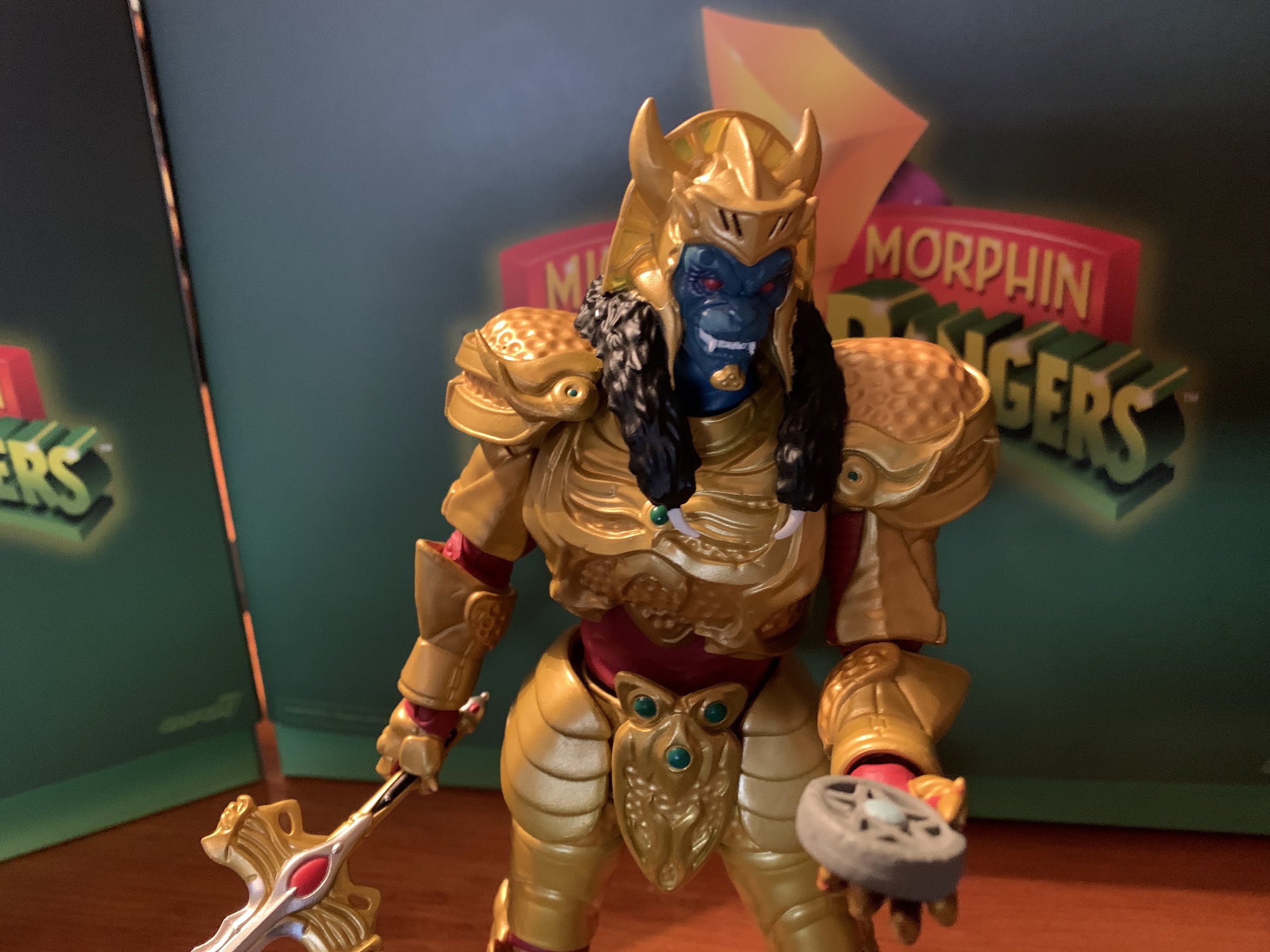
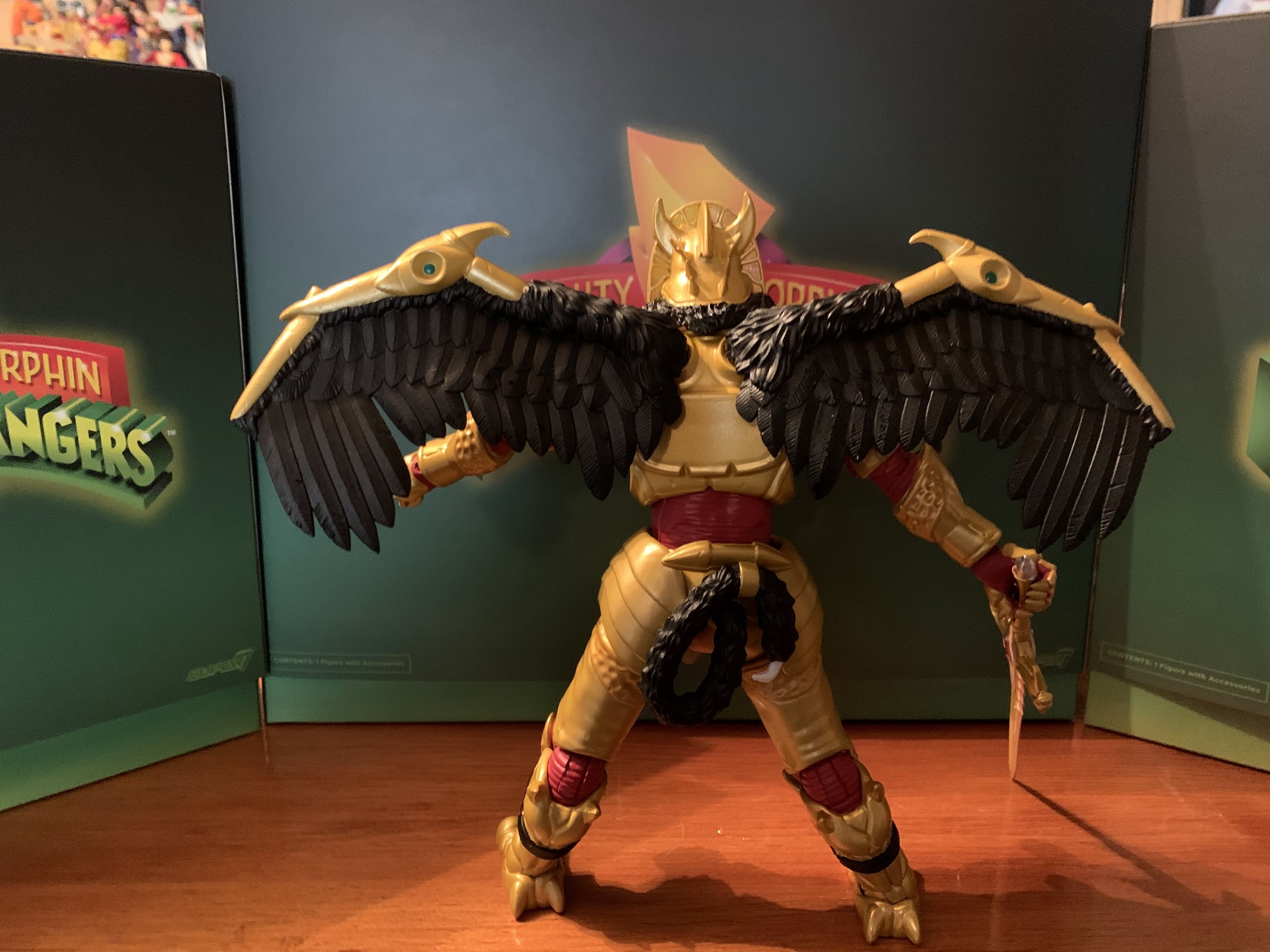
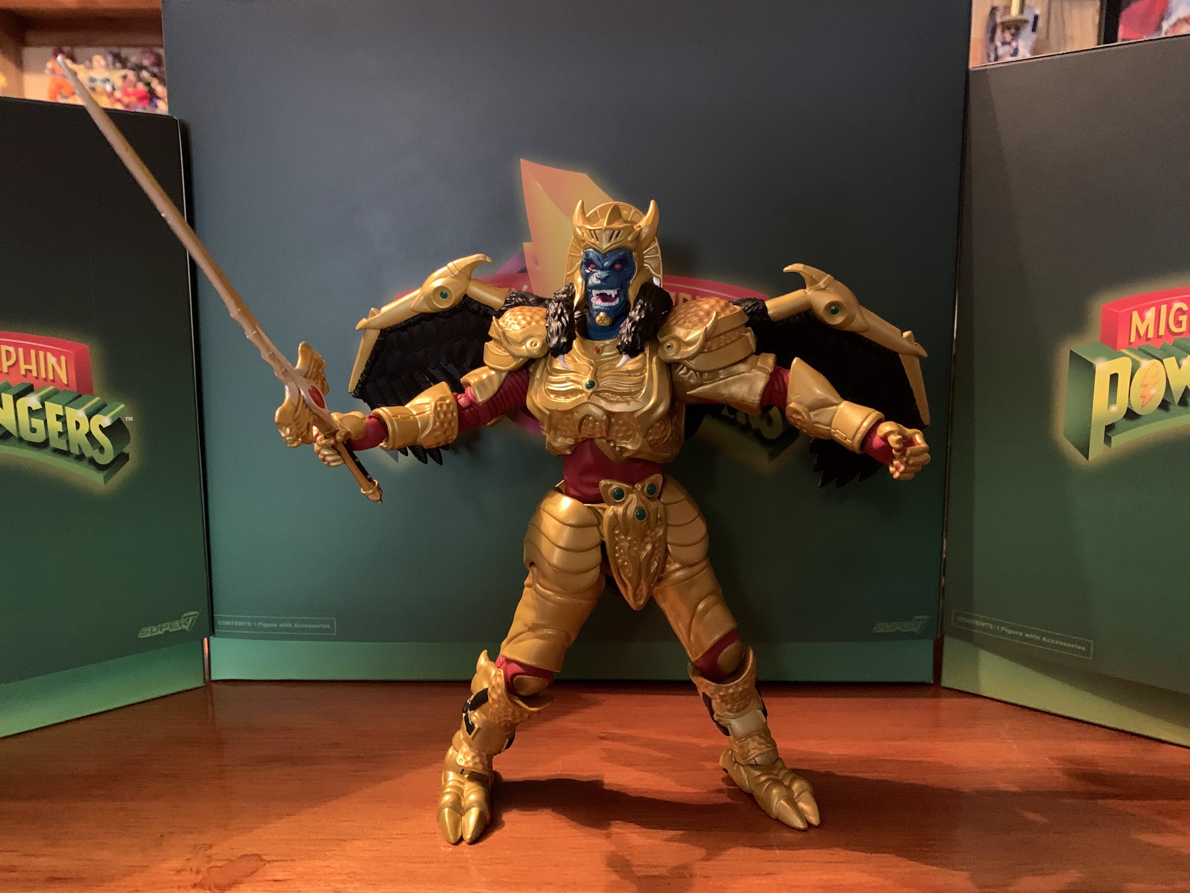
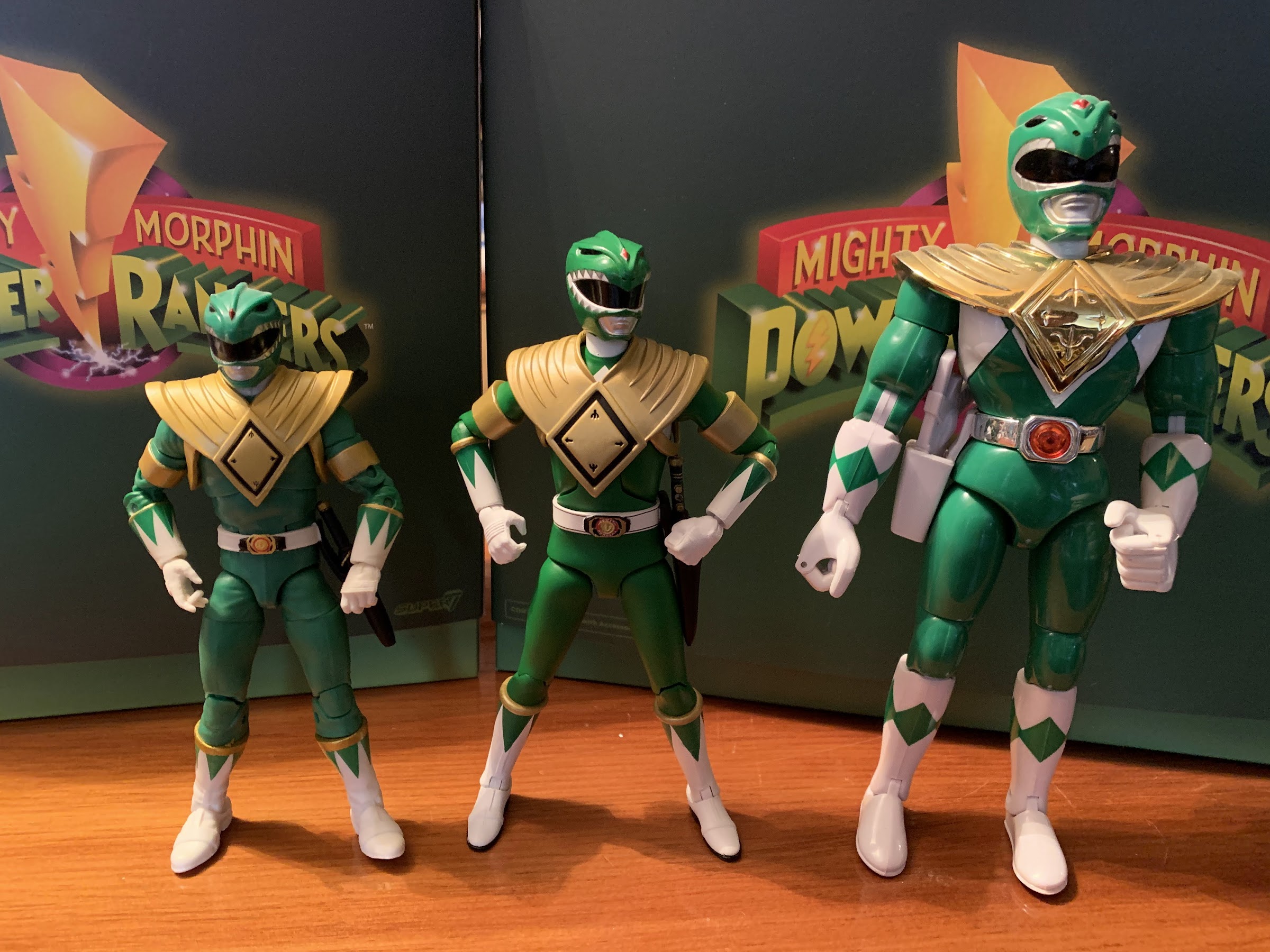
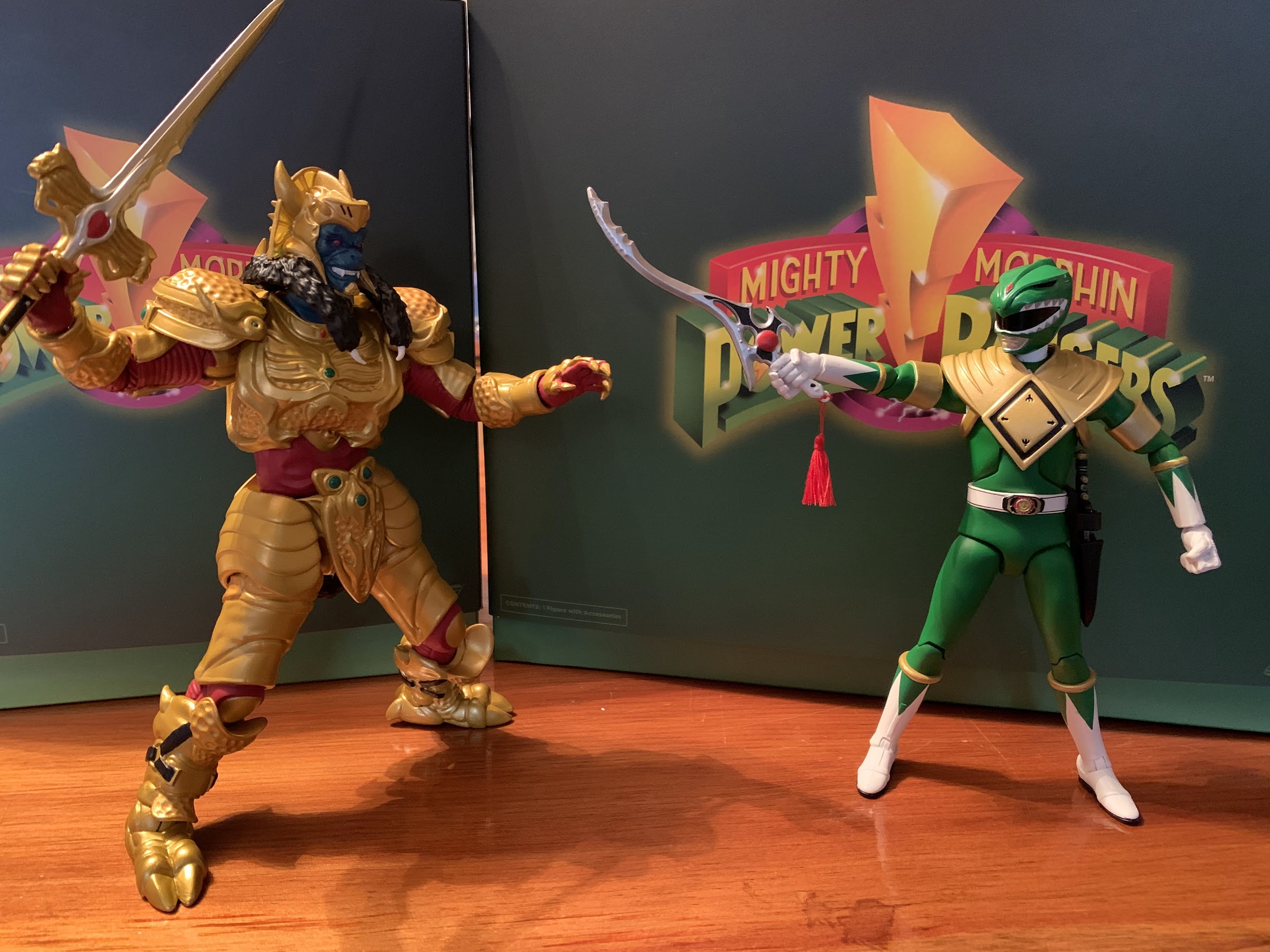
Out of the box, Megazord stands about 8.625″ to the tip of the “fin” on its head. This line is a 1:10 scale line, but that obviously does not apply to the zords. Instead, this figure is meant to just scale with the other zords and the monsters and pass the eyeball test in doing so. I will say, he looks mostly okay beside the Dragonzord. Maybe a little undersized, but certainly good enough. It looks ridiculous beside the T-Rex though which is too big. Considering it’s technically impossible for these two robots to appear side-by-side, it’s not a big deal, but if you remind yourself that the T-Rex is technically the torso of the Megazord then it becomes laughable. It looks pretty good opposite Goldar, better than the other zords if you ask me, and it’s probably more important for this particular figure to scale with the monsters than the others so I like that.

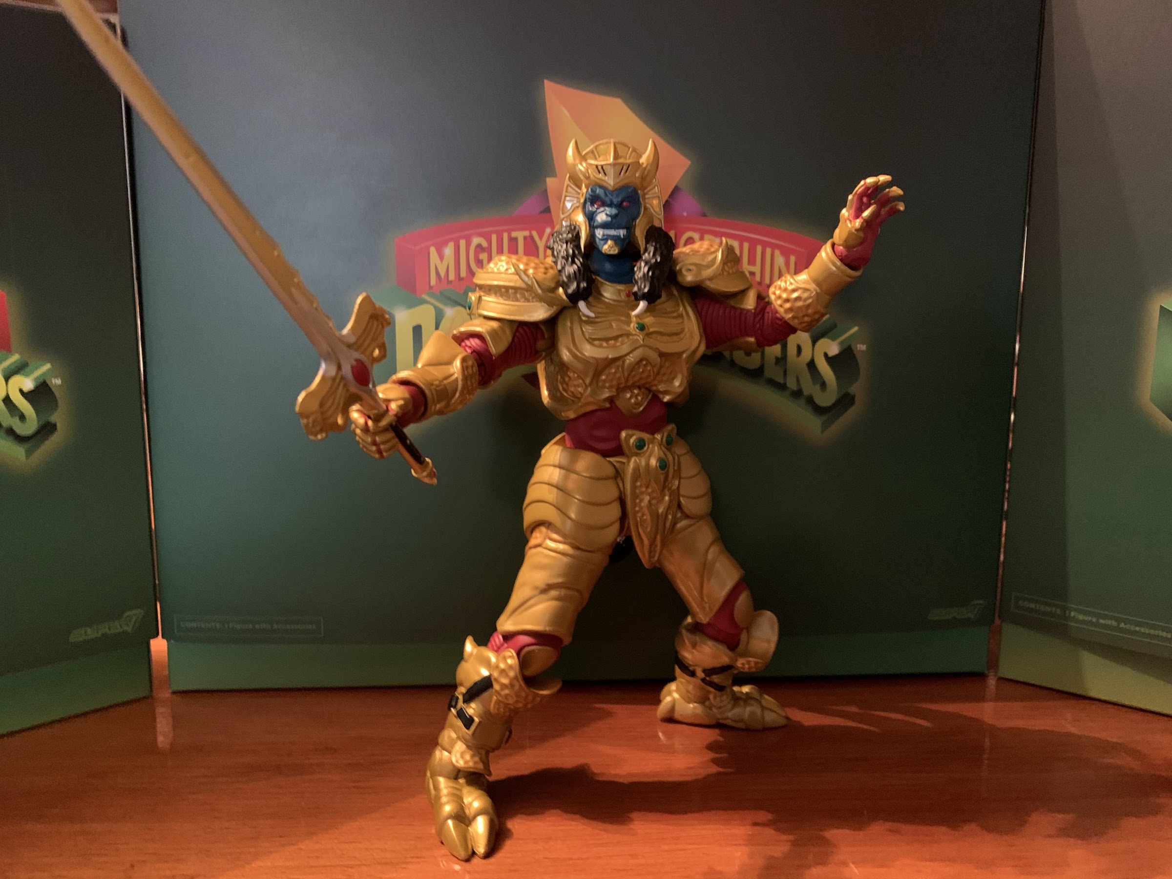
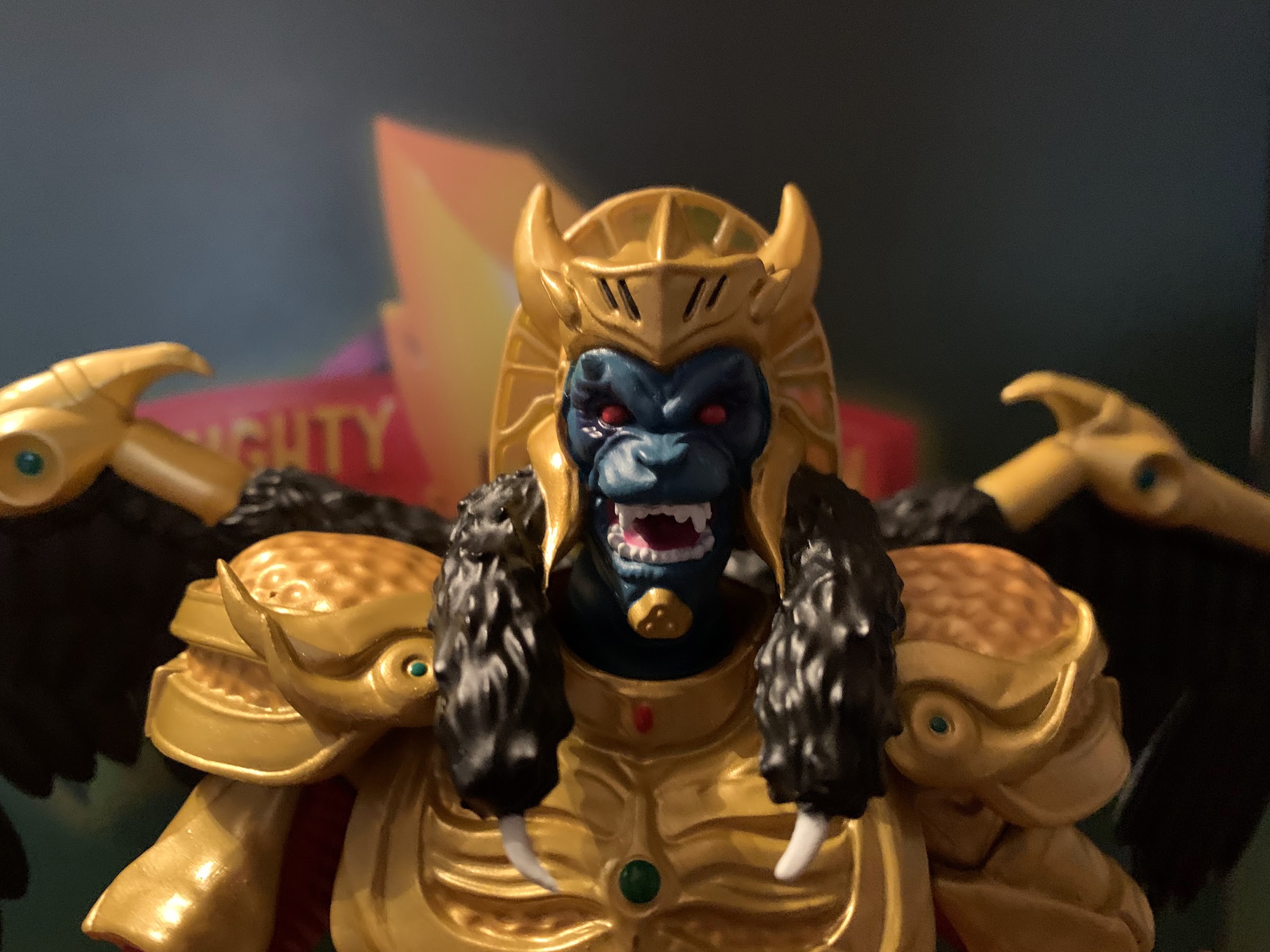
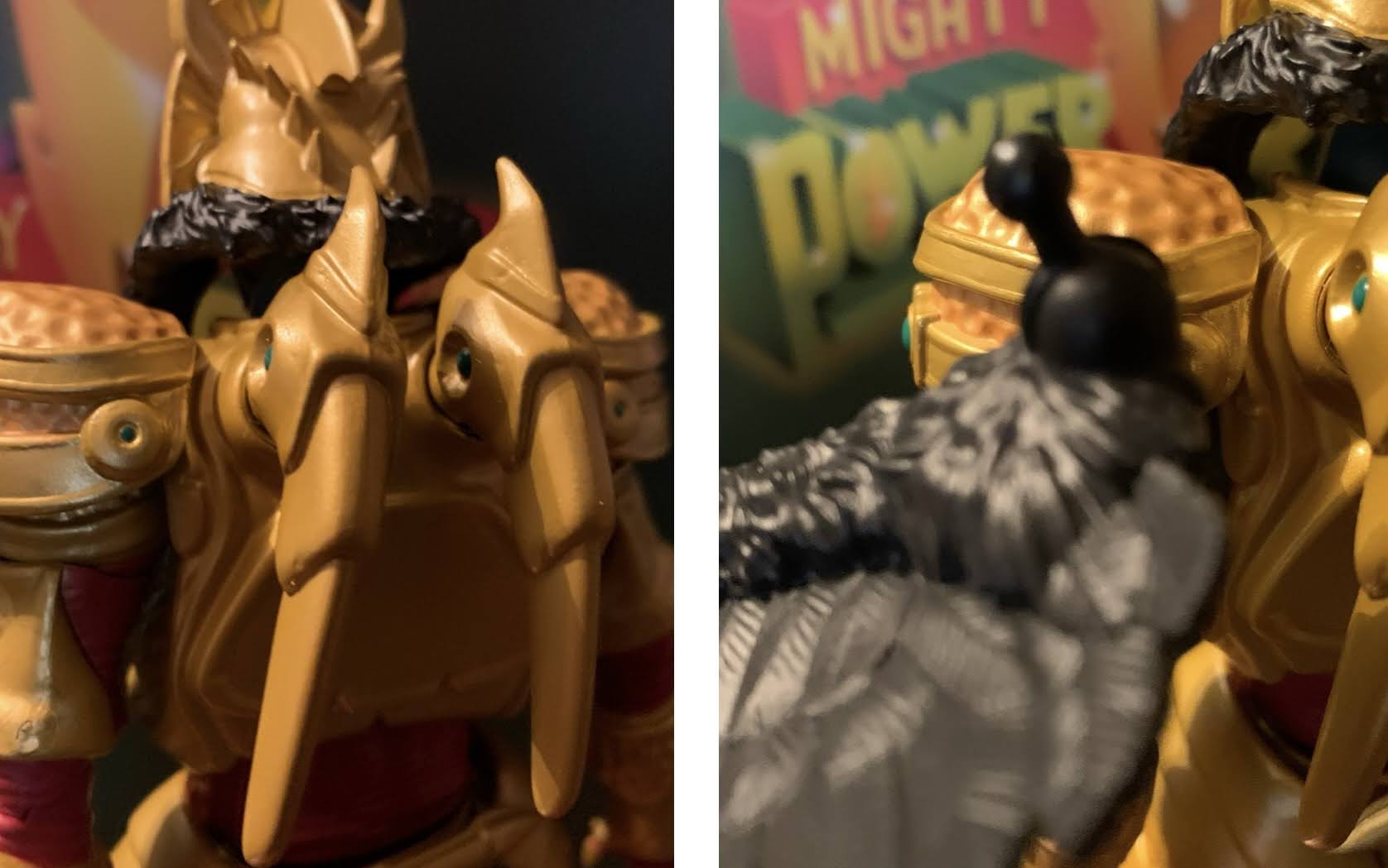
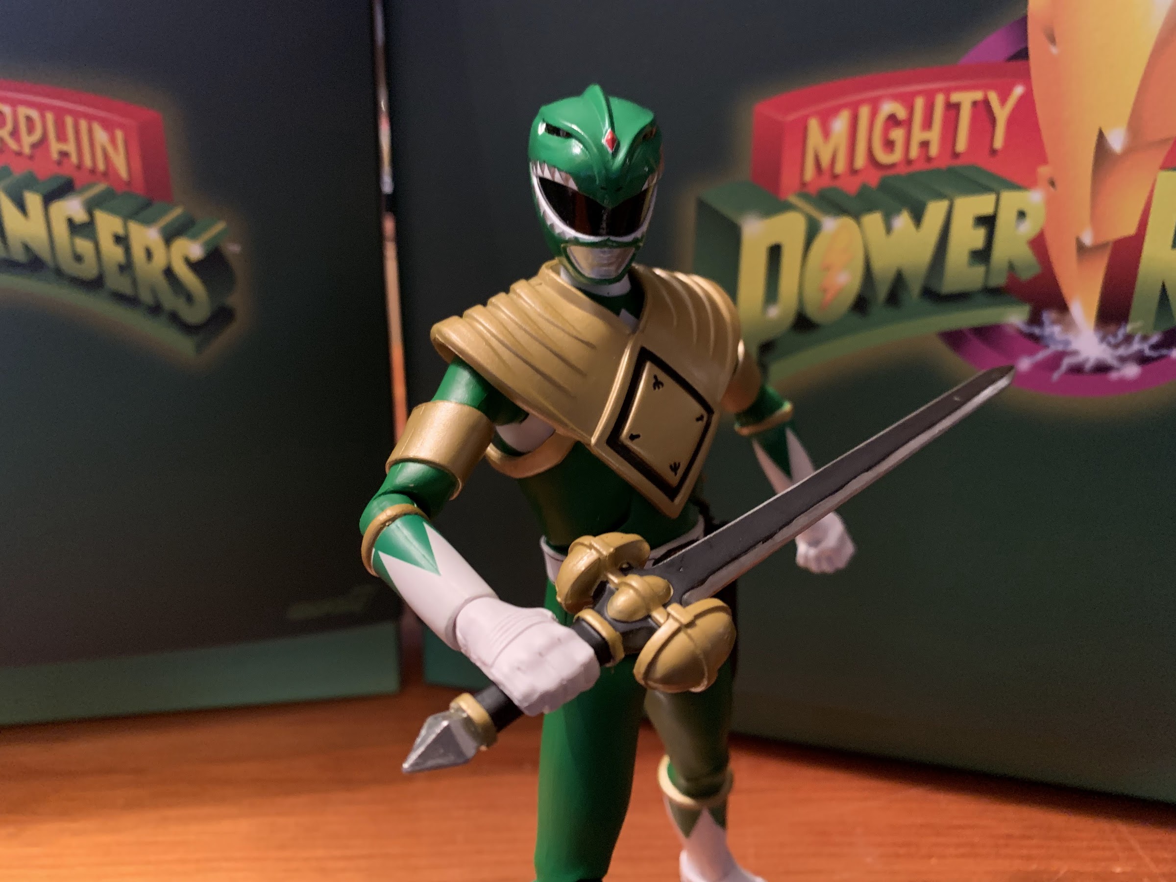
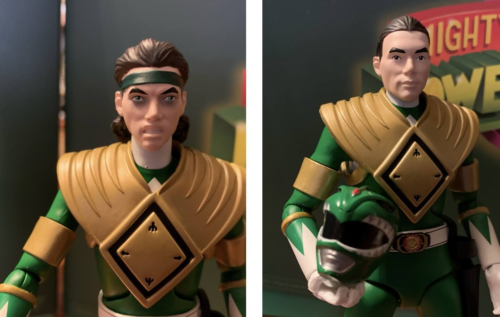
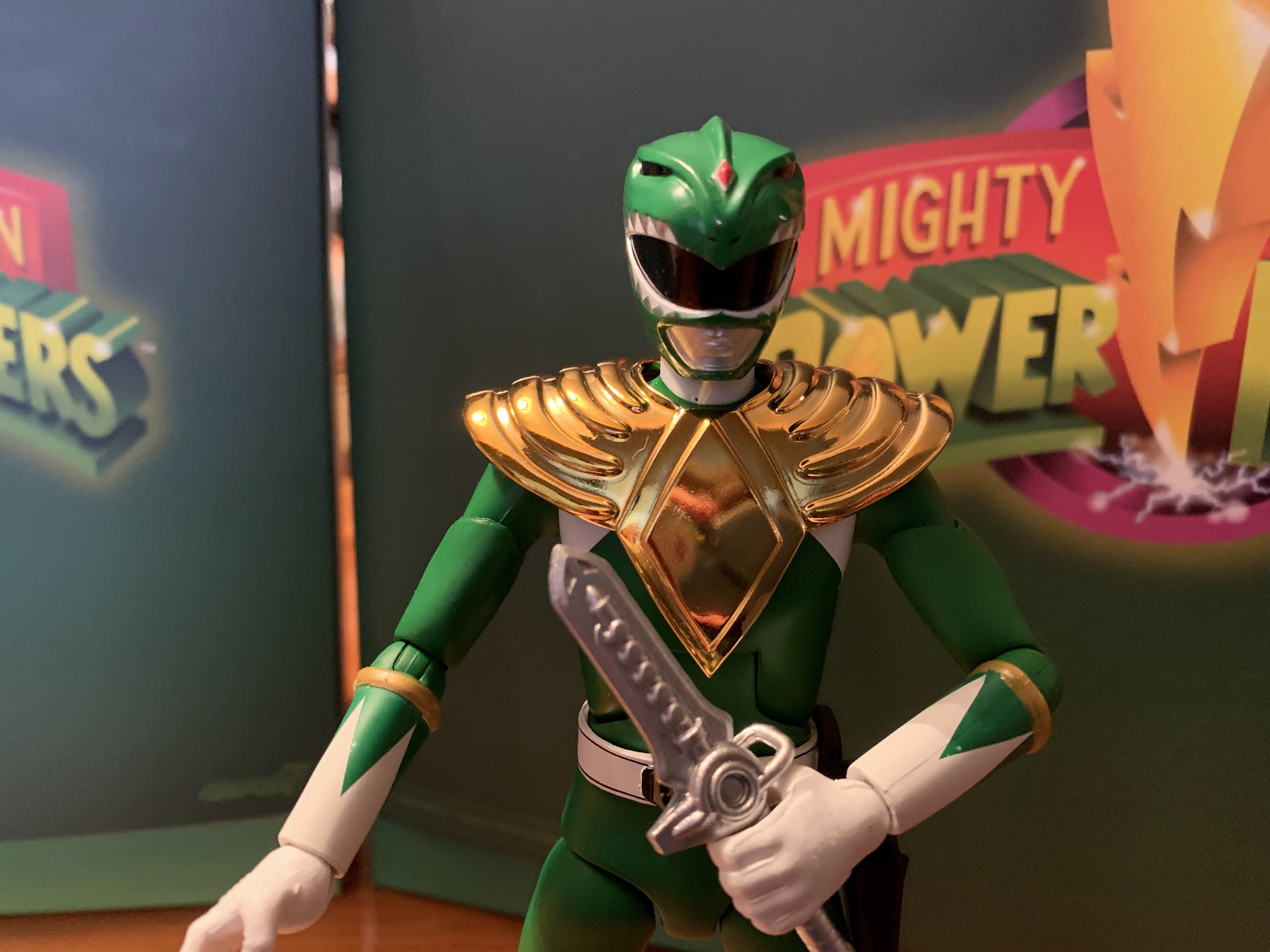
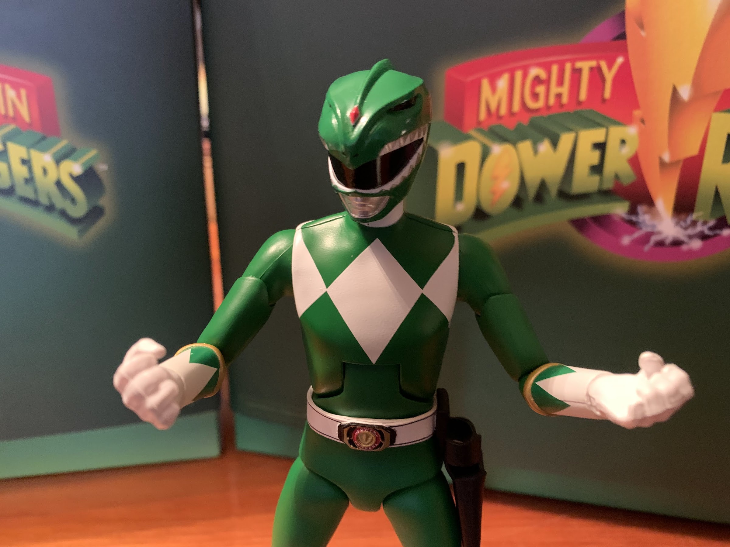
As for the figure itself, it looks pretty damn good. The head and shoulders are properly sized and the proportions look much better than the other combining figures out there. Even better though, is that seemingly every inch of this thing is painted. I believe the black portions are where the bare plastic is, but even they look like they at least have a matte coat on them. The silvers are nice and shiny and I think they nailed the shade of red this character possesses. The face, in particular, is really well done and pretty clean. Closer inspection of the figure in other places will uncover some blemishes and subpar linework. The nose of the sabertoothed tiger has a blemish and there’s a silver spec on the snout of the triceratops foot. The white on that same foot is a bit thin and I could say the same for some of the yellow. These blemishes are mostly invisible from the shelf and the only one that bothers me is the tiger foot. The hands are the same shade of silver as the other silver parts of the figure and I think they were darker on the show, but that could have been due to ware and tare on the suit itself. Otherwise, this somewhat garish mix of colors looks as good here as it did on TV and it’s nice to see this amount of paint on what is a fairly expensive collectible. The figure also has a nice weight and feels sturdy, just the like the zords that came before it.

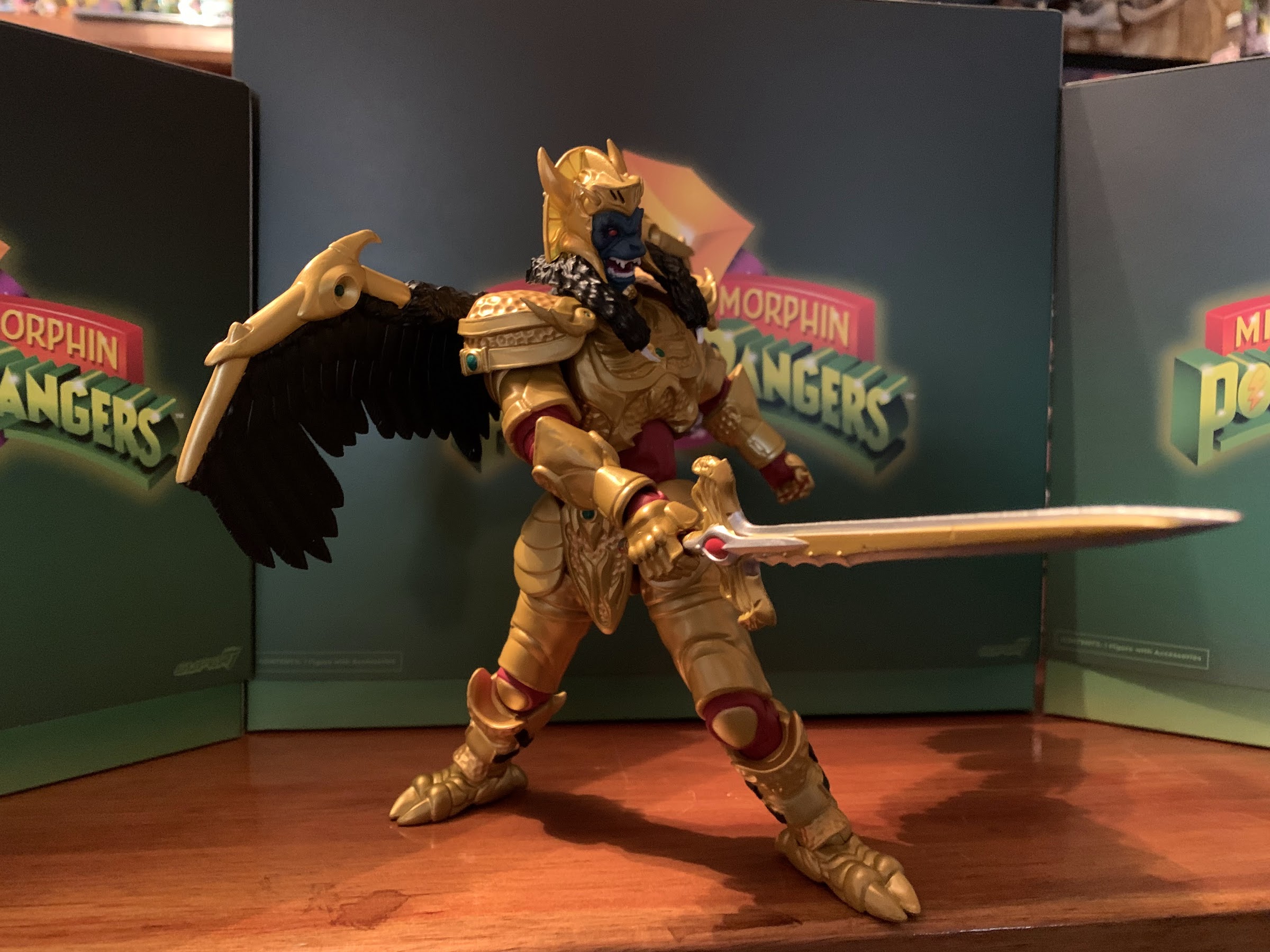
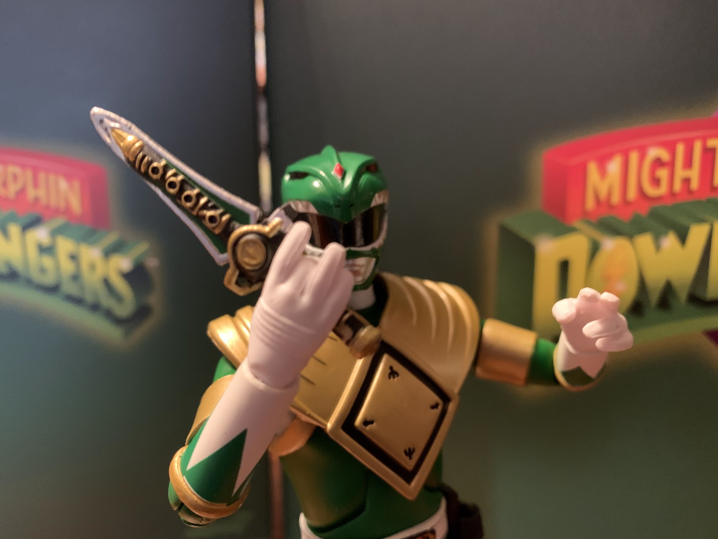
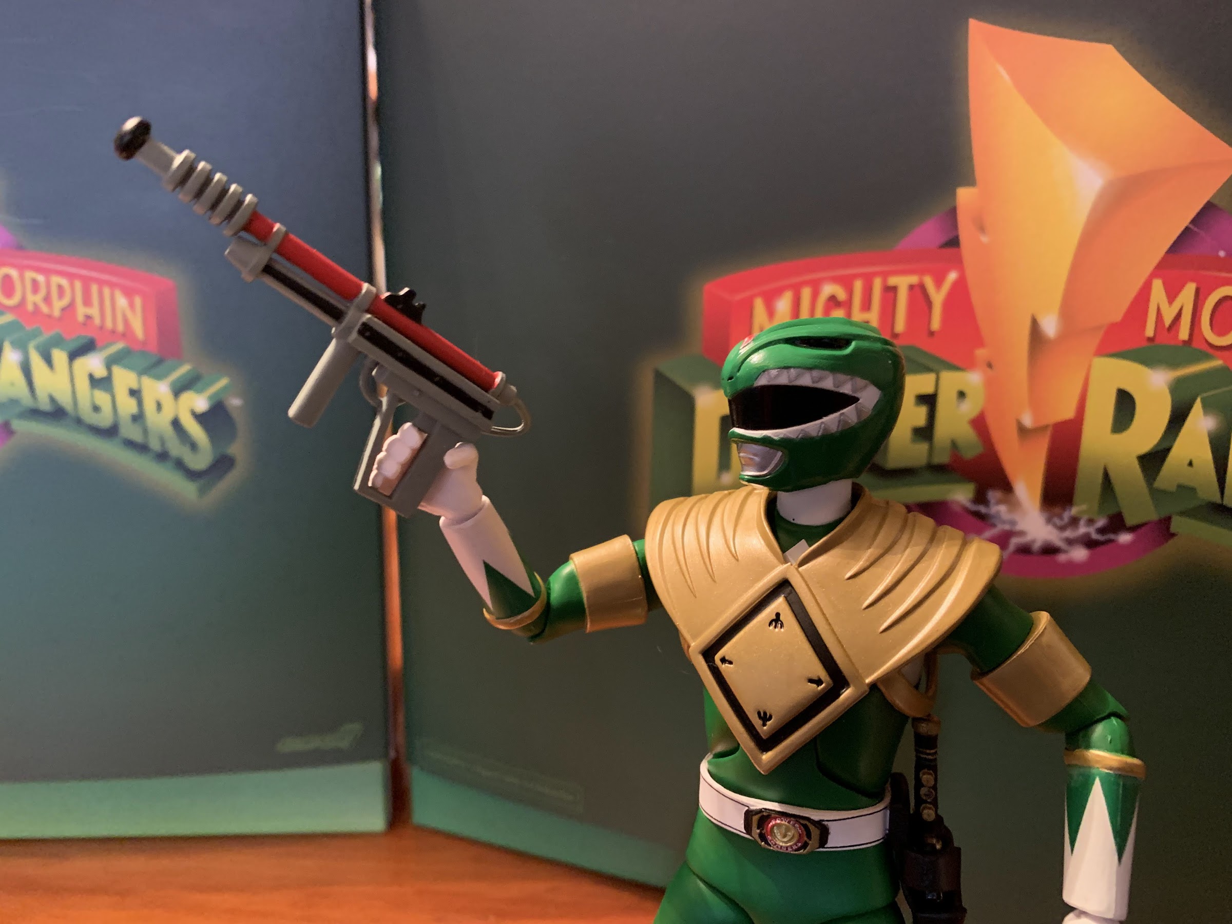
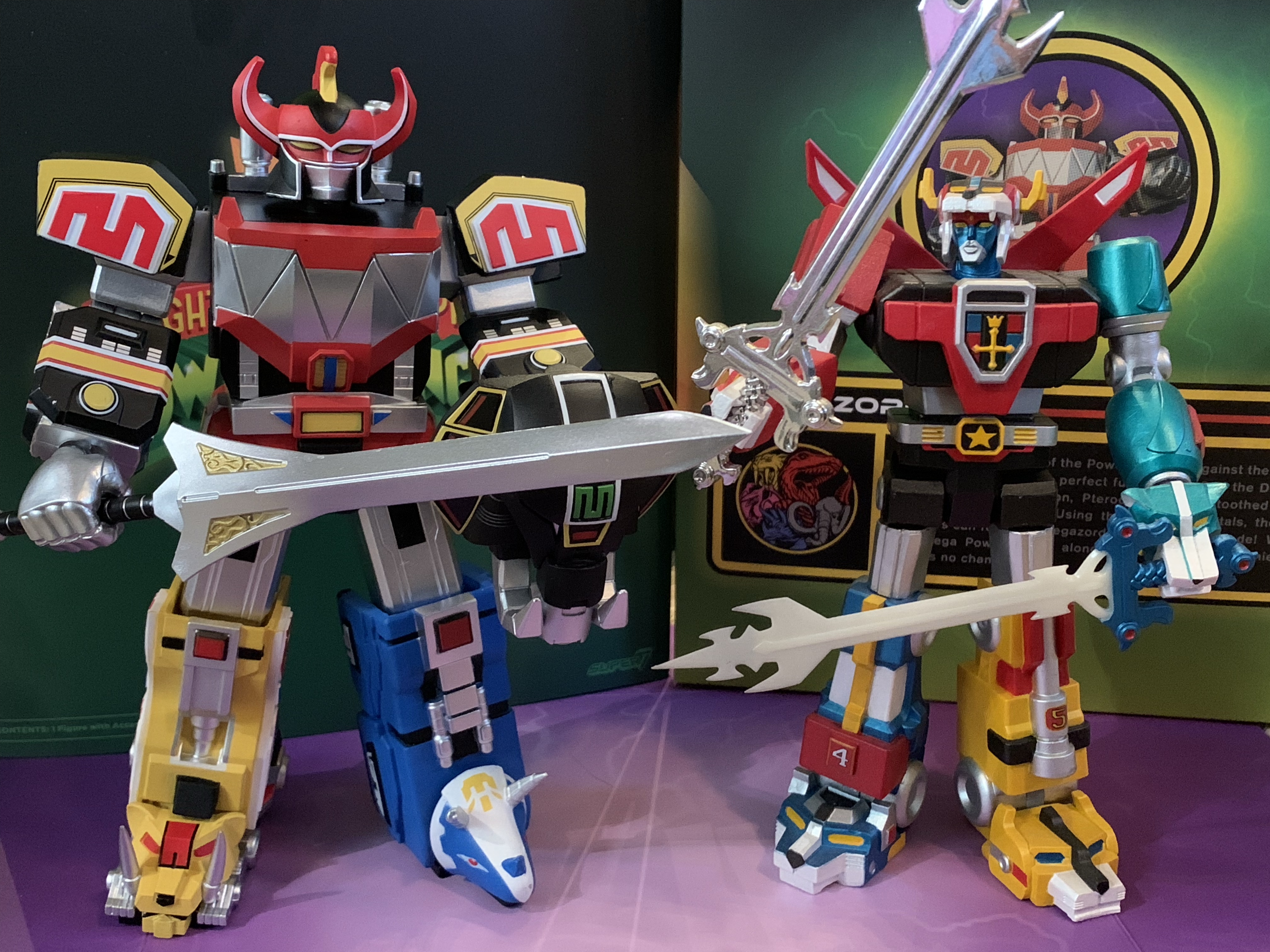
It’s important that this figure nail the presentation because it doesn’t have much else to rely on. The accessories are very light with this one as we get just one extra set of hands: fists and gripping. They look fine, but I would have liked some style-posed hands as well. For those gripping hands we get the power sword and mastodon shield. The sword looks great. It’s painted silver and has some nice etching near the hilt that’s painted a soft gold. The handle is painted as well, though if I was going to criticize one aspect of the item it’s that it’s too big. Super7 has a tendency to go bigger with weapons (just check out their Conan) and that apparently happened here as the sword on TV wasn’t quite so large. The mastodon shield also looks great and the paint on it is very crisp. I wasn’t sure if I’d even display my figure with it since it showed up in the show rarely, but I love the finish on it so it’s likely going to make the cut. The trunk is short and curled in though so it can’t be pointed at an enemy like it’s about to unleash a cloud of freezing air, not that it would have an effect piece for such. That’s the easiest room for criticism as a laser effect for the sword would have been neat or some crackling lightning, but this is basically it.

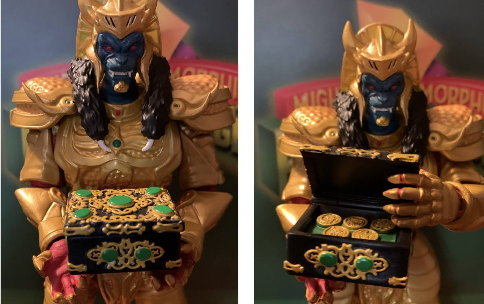
There are a couple of other accessories in the box, but they’re not really for the Megazord to use. Call them indirect accessories, if you will. There are two, miniature, Power Rangers in a summoning pose: Pink and Yellow. They’re the exact same sculpt which means the Yellow Ranger has a skirt piece which is inaccurate to the show, but I don’t know if that’s something that will bother people or not. They look okay, and if you’re keeping track that means we have two Red Rangers, Green, Pink, and Yellow. What’s missing is Blue and Black. Since the Megazord is the combined robots of all five of the original Power Rangers, why not just include Black and Blue in this box and get it over with? I’m not sure what else would make sense for them to be packed in with. The Mega Dragonzord? I’m not sure how much enthusiasm is out there for that one. Lastly, we get a power coin. One one side is the Megazord logo which features the portraits of the five robots that make it and on the reverse is the Zyuranger logo, one of the few remnants in the show of its Japanese origin. It’s the same high quality coin as the prior two and it’s fine. If it’s here at the expense of more accessories for the Megazord itself then I’d consider it unwanted.

You likely need only take one look at this thing to figure out it doesn’t articulate particularly well. This is a boxy design and it’s not like the actor on the show was capable of much when in costume and this figure is pretty much the same. The head is on a ball-joint, probably a single, so it rotates and gets some tilt. The figure can look up a little and down some as well, though when looking down it’s just staring at the top of its own torso. The shoulders are ball hinged and rotation is fine, but you probably get about 70 degrees worth of range going out to the side. If they had put the shoulder pads on pegs so they could move out of the way it would have minimized this. There is a single hinge at the elbow that pegs into the upper arm which is essentially your bicep swivel. The hinge on the elbow offers less range than that of the shoulder and we’re pretty much in Optimus Prime territory here. The design of the character presents a challenge, but they could have done this better to get at least 90 degrees of bend here. Even the Hasbro combining Megazord can do better. The wrists swivel and the fists have a horizontal hinge while the gripping hands have a vertical hinge. They’re recessed pretty far in the forearm so range is mediocre, but you can pull them out slightly to get better range.

There is a waist twist on this guy, but it’s damn near useless because of the shape of the crotch area. Even though Super7 did that crotch with a soft, rubbery, material, there really isn’t enough flex to turn the waist and you do have to be mindful of paint rub. The hips appear to be the standard hinged ball pegs, and something that may annoy some, is they can’t be straight up and down due to how bulky the shins are. This appeared to even be an issue with the actual suit so I can’t fault Super7 too much for not being able to do better. The oversized diaper piece severely restricts what these hips can do. Rotation is fine, but going out to the side is minimal and the figure doesn’t have much range kicking forward and back. I would say it actually has no range going back, and going forward is basically one “click.” There is a single hinged knee below that which pegs into the thigh so there is some pivot, but not much due to the shape. The hinge is super tight and my left leg doesn’t seem to want to move much while the right will bend just a little. It’s more or less useless as there isn’t much clearance. The ankles are likely supposed to hinge and rock, but they do next to nothing. They basically wiggle just enough to let you know there’s a joint there and if there is a hinge it’s totally blocked by the sculpt.

The Megazord was never going to be a figure that’s super-articulated, but even with low expectations it still manages to disappoint. From the waist down, it’s practically a statue. The thigh swivel is okay, but everything else is borderline useless, especially the ankles. Super7 really should have borrowed a page from Bandai and used plastic “scales” that peg into the figure instead of the diaper. That would allow for plenty of range at the hips and it would still look fine if done properly. At the knees, they really should have just added a centimeter or less for clearance for those knees. Instead, they seem far more concerned with hiding the knee joint, but this thing is an action figure. If people don’t want to see the joints, they can go for the vinyl version or something. The joints are at least fairly tight. There’s some wiggle at the calves, but that’s it. The left arm at the shoulder could be just a touch tighter as sometimes the arm will droop when holding the mastodon shield, but it usually stays put for me when I set it. I guess time will tell if it gets worse or not.
Super7’s take on the Megazord is about as good as the two previously released zord figures. To no one’s surprise, they went heavy into the aesthetic and trying to match this to the show as much as possible and the results are pretty damn good. There were some things to nitpick, but overall they delivered on that end. Where they could have done better is in the accessory department and definitely with the articulation. I’ve said it before, but I feel like when Super7’s designers run into an obstacle with the articulation they don’t put any effort into actually coming up with a solution and instead give us a joint that doesn’t work. It makes me wonder if they even want to be in this business or if they’d be much happier just doing ReAction and the vinyl stuff. The only other real negative here is that this figure comes in at the inflated sticker price of $65. At $55, I felt the T-Rex and Dragonzord were a good enough value given the size, weight, and paint apps. At $65 here, I’m really not seeing where that extra ten bucks went. I’m not unhappy with my purchase, but in general, at this price point I think I need to see a bit more value in the box or I should at least be getting something that earns the term “action” figure better than this one. This figure is also likely to end up on clearance at some point, as that has been the trend, making it a hard sell at its current price.
If you’ve been buying the zords up until now then I suspect you’ll get this one since it probably is the most popular of the three. And it certainly is the most popular of all of the Megazords that followed. It will be interesting to see if there is an appetite for more. Collectors and fans already rejected Super7’s attempt at the White Tigerzord which came in at $65 and was probably more sparse than this release since it didn’t feature a shield of any kind. Super7 had to cancel it due to lack of interest. Do fans want a Mega Dragonzord? Maybe they want the Thunder Megazord? Or Dragonzord Battle Mode? If Super7 can’t get them onboard with the zord of the most popular Power Ranger then it’s hard to say what they will buy. For me, I probably don’t need any other zords so this may very well be my final word on Super7’s Mighty Morphin Power Rangers line. And if it is, I would say it filled a niche for me and did a good enough job at it. Others may disagree.
If you’re interested in what I had to say about some of these other Super7 Power Rangers releases, then check these out:

Super7 Mighty Morphin Power Rangers Ultimate Tyrannosaurus Dinozord
Today we are wrapping up our look at Wave 1 of Super7’s Mighty Morphin Power Rangers Ultimates! action figures with the lone zord of the wave: the Tyrannosaurus Dinozord. The T-Rex zord was the vehicle of the Red Power Ranger and main body of the Megazord. It was basically the only one of the original…
Keep reading
Super7 Mighty Morphin Power Rangers Ultimate Goldar
Last week, when we took a look at the first Power Ranger in Super7’s line of Ultimates! action figures based on Mighty Morphin Power Rangers I expressed some surprise that Hasbro would license out this brand since it competes with their own Lighting Collection. I do feel like the actual Rangers are pretty safe. People…
Keep reading
Super7 Mighty Morphin Power Rangers Ultimate Dragonzord
After a long delay, wave one of Super7’s Mighty Morphin Power Rangers line arrived earlier this year. And after a delay of basically just as long, wave two is now upon us. For the first wave, we took a look at three figures: Green Ranger, Goldar, and the Tyrannosaurus zord. For wave two, it’s just…
Keep reading