A figure some never expected to appear in Marvel Legends is the Spider-Man ally/foe Cardiac. For whatever reason, he was apparently off-limits at Hasbro. There could be a number of reasons for that, but whatever was in the way is obviously no longer an issue because Cardiac has now taken his rightful place in plastic. Had we never received a Cardiac action figure would that have been a great tragedy? No, but fans of the character certainly would have been disappointed. I’m personally not one. I barely remember the guy, but when I saw the reveal I thought the figure looked interesting. And then when I saw him hanging out on some pegs at my local store I said “What the heck?”
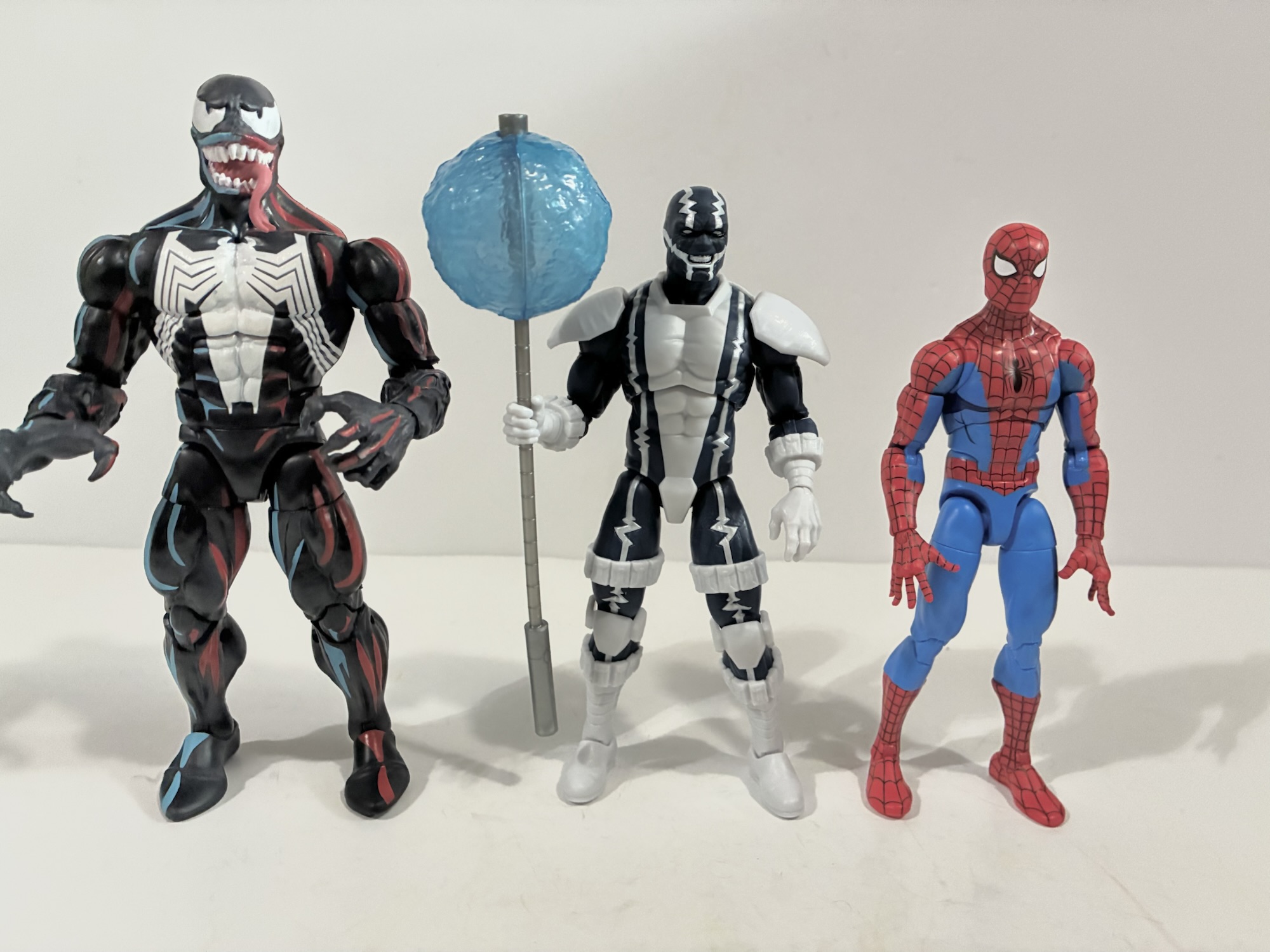
Cardiac is about average height for a superhero character.
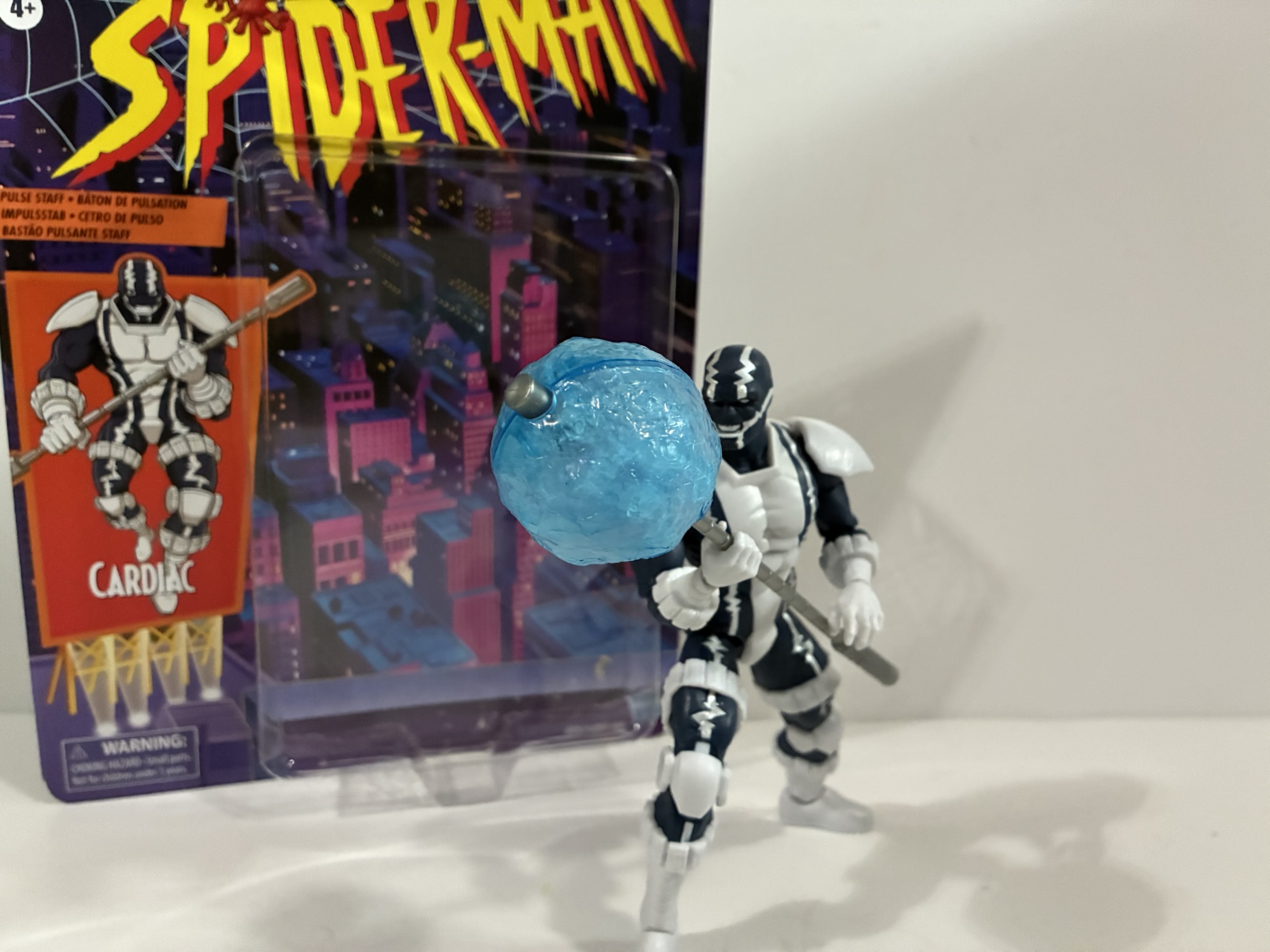
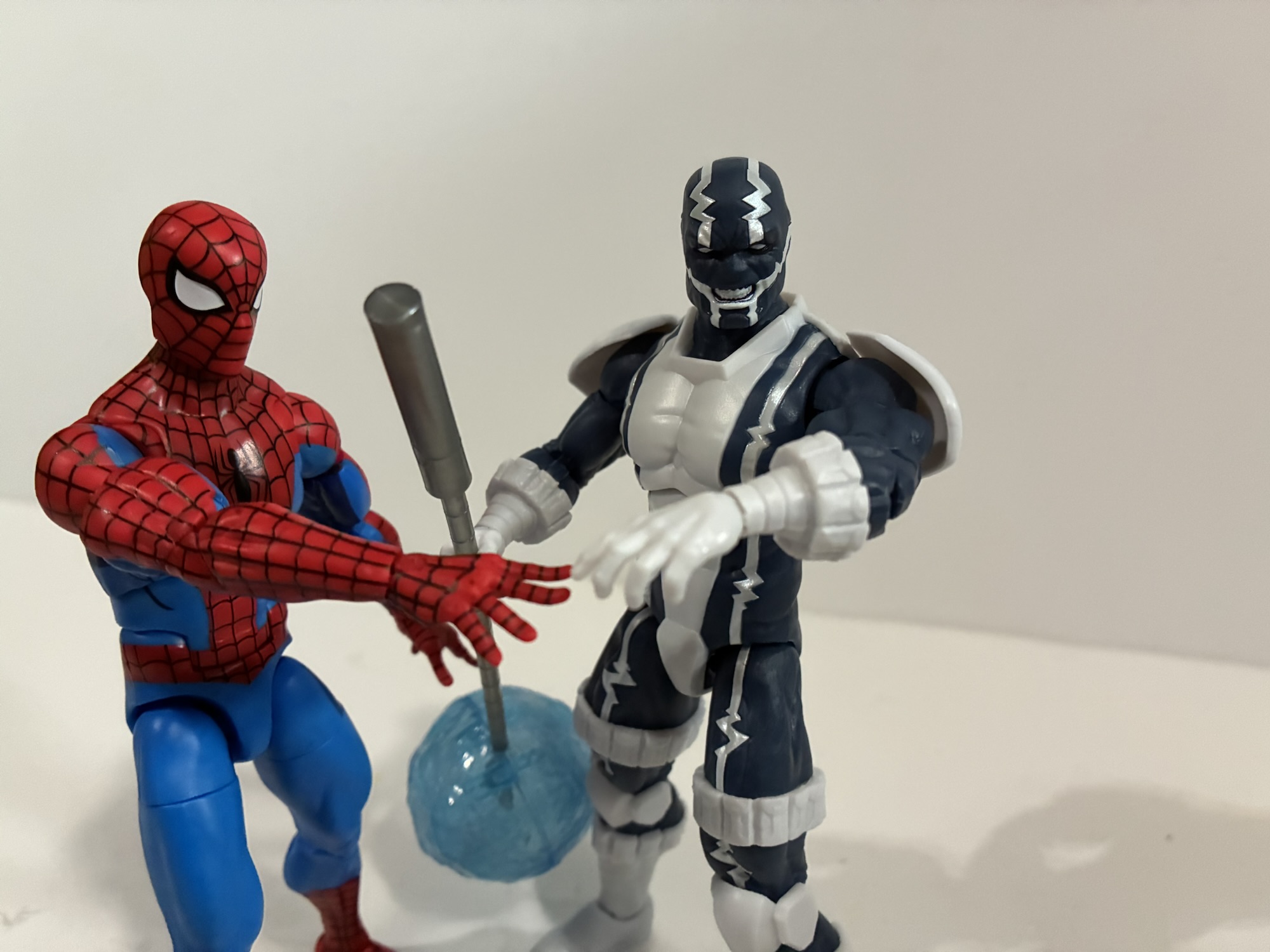
Cardiac is basically a vigilante, like many heroes. He’s a cardiologist (get it?) who is basically angry at the insurance and pharmaceuticals industry for the unjust death of his brother and, man, that’s a guy who feels made for this moment in time. He’s basically a guy in a cool suit with a “pulse staff” that can shock dudes. He’s in a skin-tight, navy suit that’s adorned with an EKG down each side which is sculpted into the figure and painted silver. The rest of the figure is white plastic including his shoulder pads, knee pads, boots and gloves. And since Cardiac made his debut in 1990 he is adorned with pouches! They’re at the cuffs of both his gloves and boots and he also has them going around his thighs. It was just in the water at the time. What got me with this figure is I love the clean look of the white juxtaposed with the dark blue. The silver paint work adds a little something extra as well and it’s pretty clean. And I read a lot of 90s comics so I do have nostalgia for this type of look. It’s silly, in retrospect, but strangely effective.
“I find your lack of nose…comforting.”
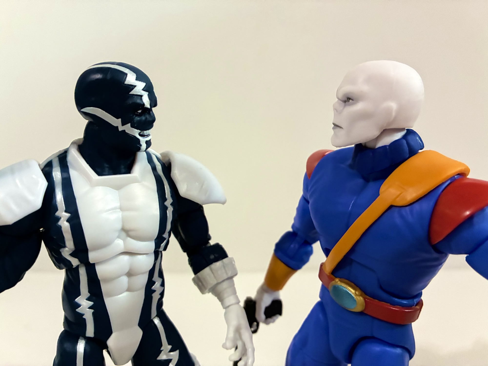
That’s not to say everything is perfect. The paint isn’t perfect, but it’s surprisingly close. I wasn’t sure in the box what was going on with the torso, but it looks like the white is white plastic inserted into the blue torso. That helps to keep things clean and it also ensures that all of the blues match as well as the whites. There’s a little shading in the face around the eyes and in the creases of the brow which looks really good. I like the expression, a teeth-gritting one, though the paint is a little messier at the base of the mouth. Not distractingly so, but it looks off up close. One thing fans of the character have pointed out as being suboptimal is the nose. Cardiac was almost always drawn with basically a flat face and no nose. My guess is the sculptor here wanted to add a little realism so there’s a bump for a nose under the mask. It’s one of those inconsistencies with Legends that drives me crazy – are we matching the source art or going with this house style of realistic interpretations of comic book characters? Hasbro used to almost always go for the realistic interpretation, but over the past couple of years have started doing more source art looks. It seems almost universal that fans wanted a source accurate Cardiac, especially because this is likely the only one we’ll ever get. Not being a fan, it doesn’t bother me, but what does are the wrists. They’re puny and it’s weird looking. I’m not really sure what happened there (I have since seen images of people online putting the power effect over his wrists instead of the staff so maybe that’s a reason, though you could just use the wider opening on a thicker wrist), but his forearms look like they belong on a different body.
“Whoa! Don’t get that cotton candy on the threads, buddy!”
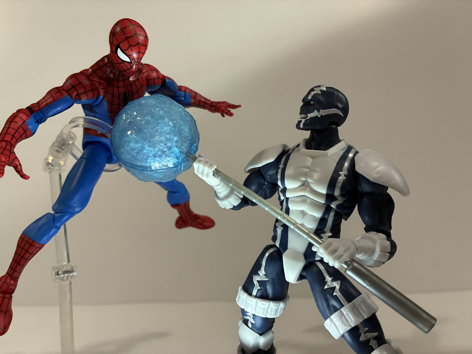
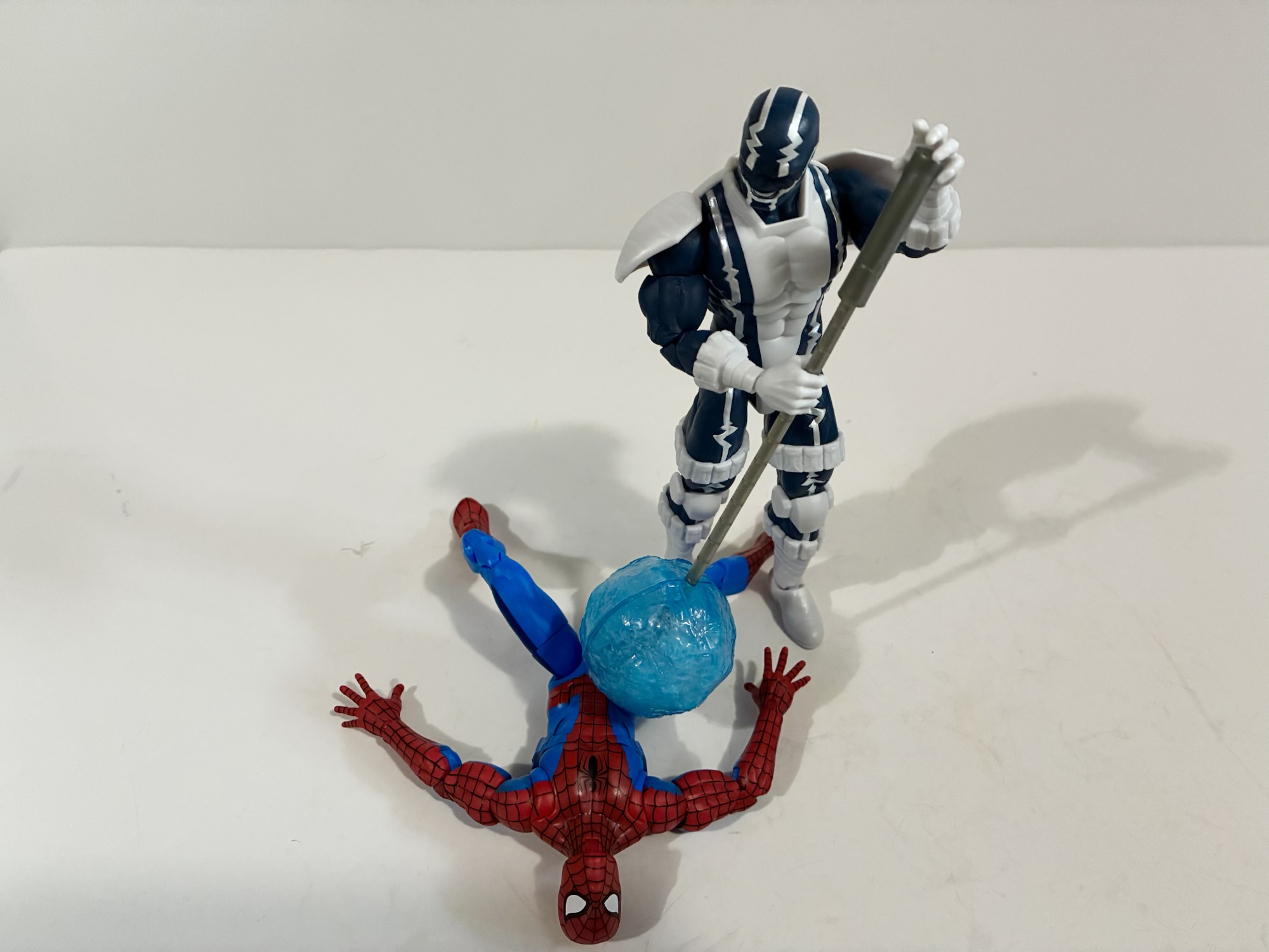
That’s a somewhat subjective critique, though a justifiable one if you’re someone who just wants their figures to look like the source. My only complaint concerns the articulation. Before we get to that, the accessory load-out for Cardiac is a set of gripping hands, a right fist, and a left relaxed hand. He also has his staff which has a blue effect orb that clips around one end. I think it probably looks as good as it could, it’s a translucent blue with some frosting inside the globe, but it does kind of look like cotton candy. Or blown glass. The actual staff is just gray plastic, but it’s new tooling and looks how it’s supposed to. The articulation though has one major flaw.
Those wrists are a bit dainty.
For the most part, Cardiac articulates like most Legends figures. He does have the double ball peg head and it’s one of their bad ones. The lower ball is seated too low in the neck so the range is poor looking up and down. He has standard arm articulation and the shoulder pads are looped through the shoulder pegs so they rotate with the arm. They may be the reason for it, but the arms won’t go all the way out to the side for a classic “T” pose. The bicep swivel, double-elbows, and wrists are all fine. The gripping hands have the preferred vertical hinge while the other two have a horizontal one. There is a diaphragm joint that works very well. The hips can nearly hit splits out to the side and kick forward 90 degrees. The thigh swivel is hidden by the thigh pouches, the knees are double-jointed, and the ankles hinge and rock. All work pretty well, so what’s the problem? The waist! There’s no waist articulation at all. No swivel, no ball, nothing. I saw some speculation it was because Hasbro didn’t want to break up the EKG lines, but they were fine breaking them up for the diaphragm joint so that doesn’t make sense. And it’s really missed. This is all new tooling so why not go nuts and give him a ball-jointed waist? What a bummer.
“Stay out of my way, web-head!”
Does that ruin the figure? No, but it keeps people from feeling like Hasbro nailed Cardiac. I didn’t review it, but a lot of people felt like they did just that with their ROM the Space Knight from last year. That’s a similar case where it’s a long requested character who is unlikely to ever receive another figure. With characters like that, you hope that Hasbro puts out something that is unlikely to be topped in their line. They went through the trouble of tooling a unique body, they just stopped too short. I don’t know what that joint would have cost, but I don’t think much. Ignoring that, this is a fun looking character design that will add a little something to your shelf. That’s why I got it and I didn’t even wait for a sale. I don’t know if I could have, but I’m okay with it since there isn’t another figure in the wave I have any interest in. I’m guessing if you are a Cardiac fan and were dying to add him to your collection then you’ve already got this in your hands. And I sincerely hope you’re satisfied with it, because it seems unlikely we’ll ever get another.
If you enjoyed reading about Cardiac here’s a few more from the world of Spider-Man:
In some ways, Secret Wars was bad for comics. Commercially, the 80’s event was hugely successful for Marvel even though it seems to have just a lukewarm reception by fans in some circles. It helped to establish the belief that events sell and Marvel seemed hellbent on taking that approach in 90s. One of Spider-Man’s…
We’re going to be doing a lot of 2025 catch-up here as Christmas always slows things down. Toy producers also like to push product for the holidays so I seem to always end up with a backlog at the end of the year. Especially when stores are doing generous sales and convincing me to buy…
I had a bit of an impulse buy a few weeks back with the Marvel Legends Spider-Man Unlimited action figure from the show of the same name. What I didn’t mention was that he was not alone for hanging on the pegs that day with him was The Chameleon. Like Spider-Man Unlimited, The Chameleon is…
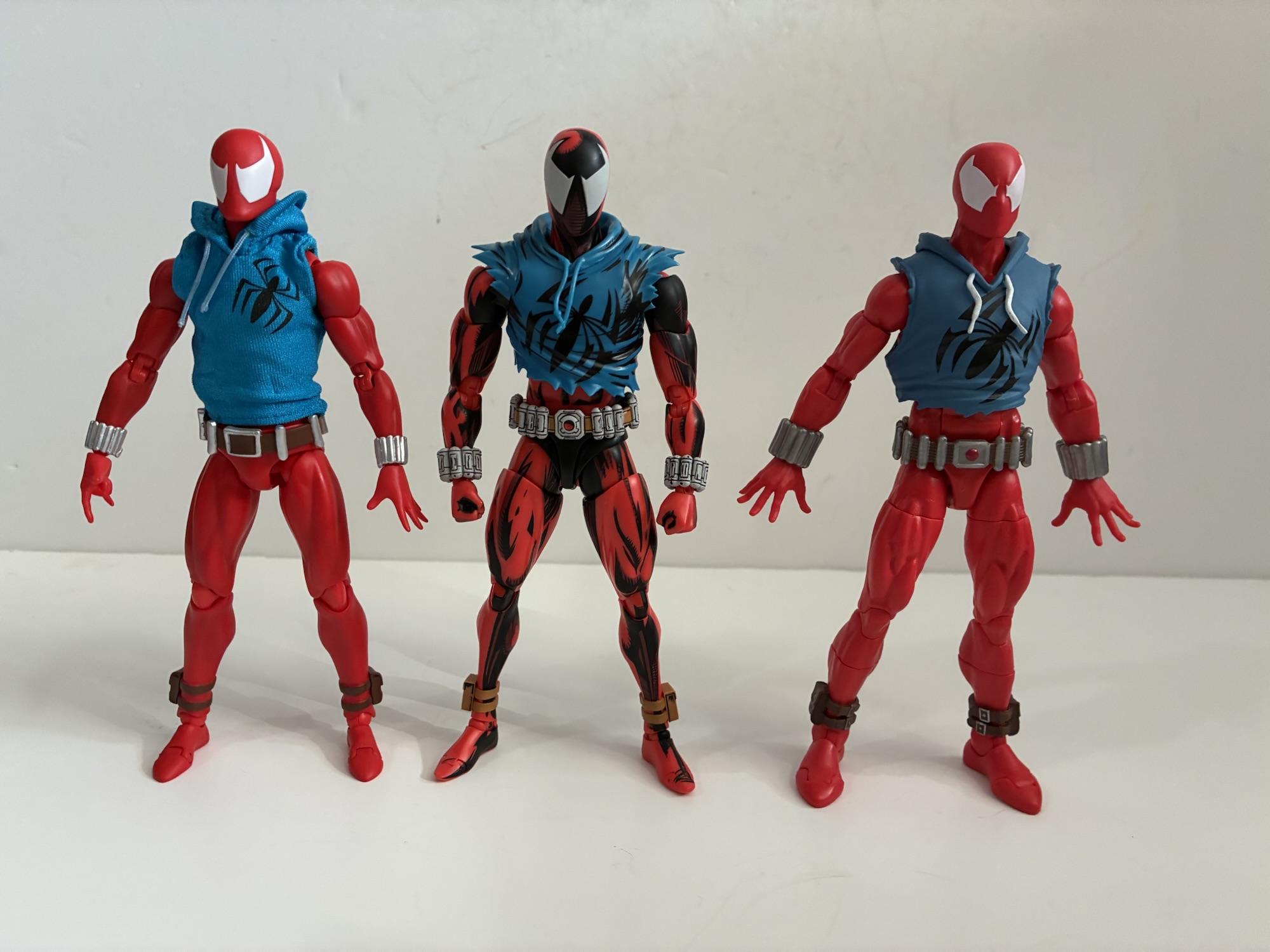
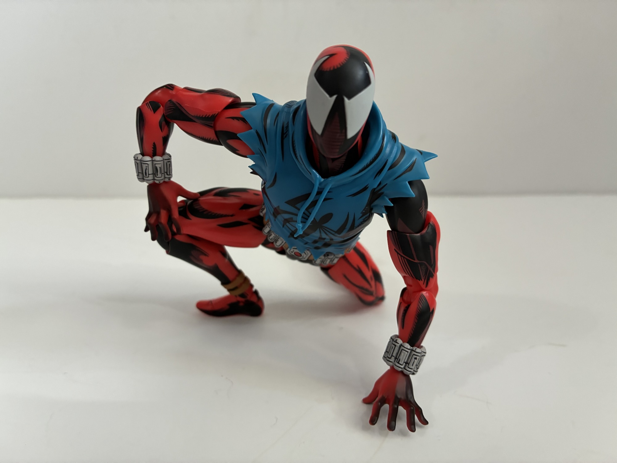
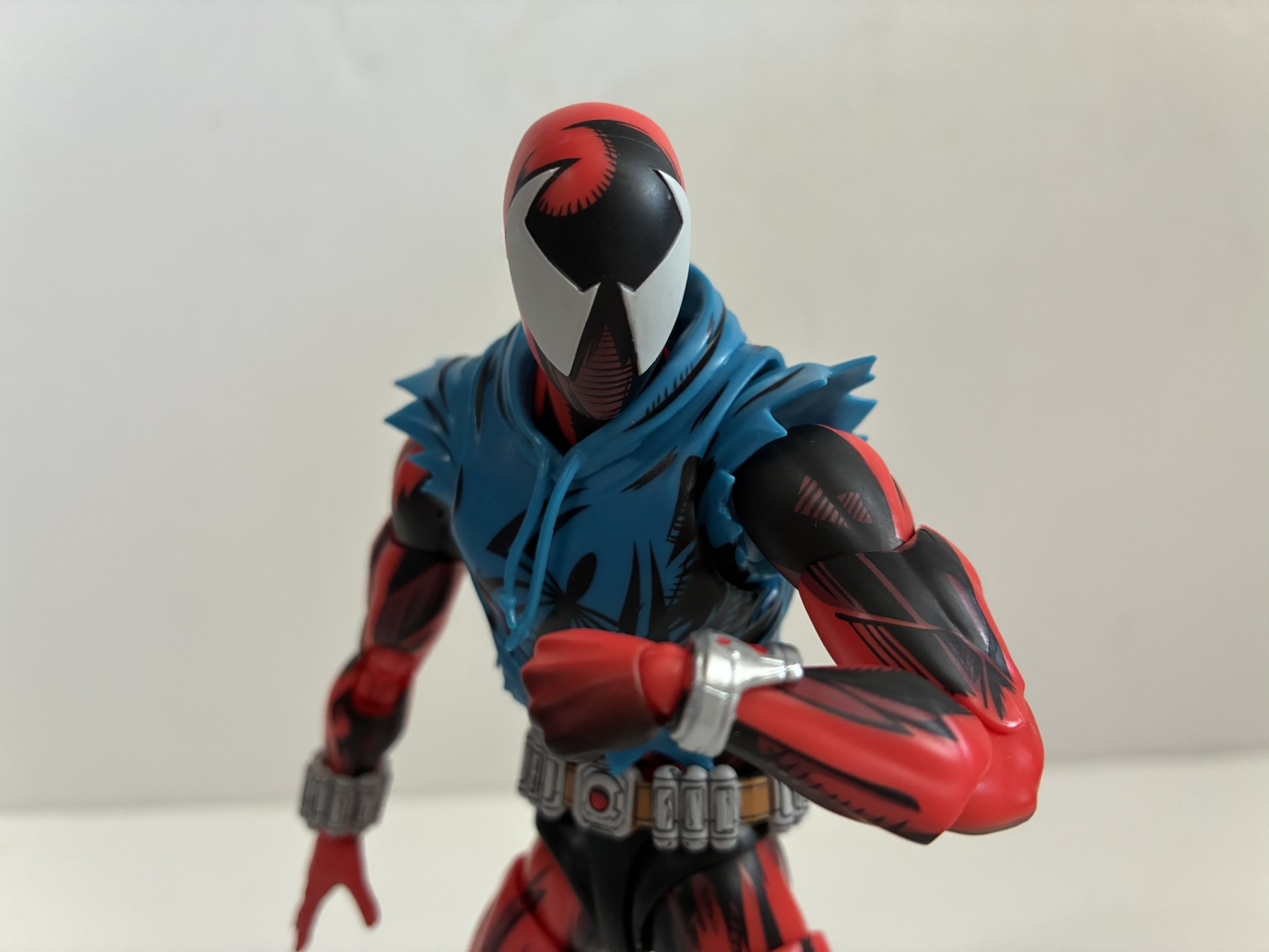
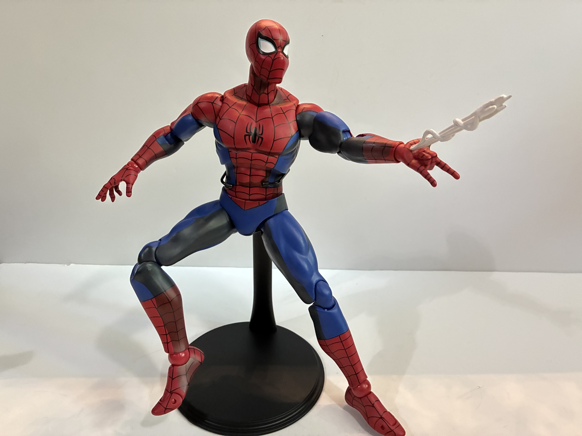
In the two reviews I did of Scarlet Spider action figures I shared the origins of my love for the character’s design. To make it short, I found the appearance of him on a cover of a Spider-Man comic intriguing, but more is as a young artist I much preferred to doodle him in my notebook than Spider-Man himself. And that’s due to the lack of those tedious web lines the traditional Spidey costume contains. And even so, there’s something about the simplified look of the red body suit with a ratty, blue, hoodie over it that works. The shape of the eyes worked for me and the exposed web shooters also looked kind of cool, but what really sold it are the artists (Tom Lyle is the one who is credited as designing the character) who drew and colored this look because that heavy, black, shading just made him seem so much more intense and mysterious.
I like all three of these figures, but this new one from Bandai does make the other two look quite dull by comparison.
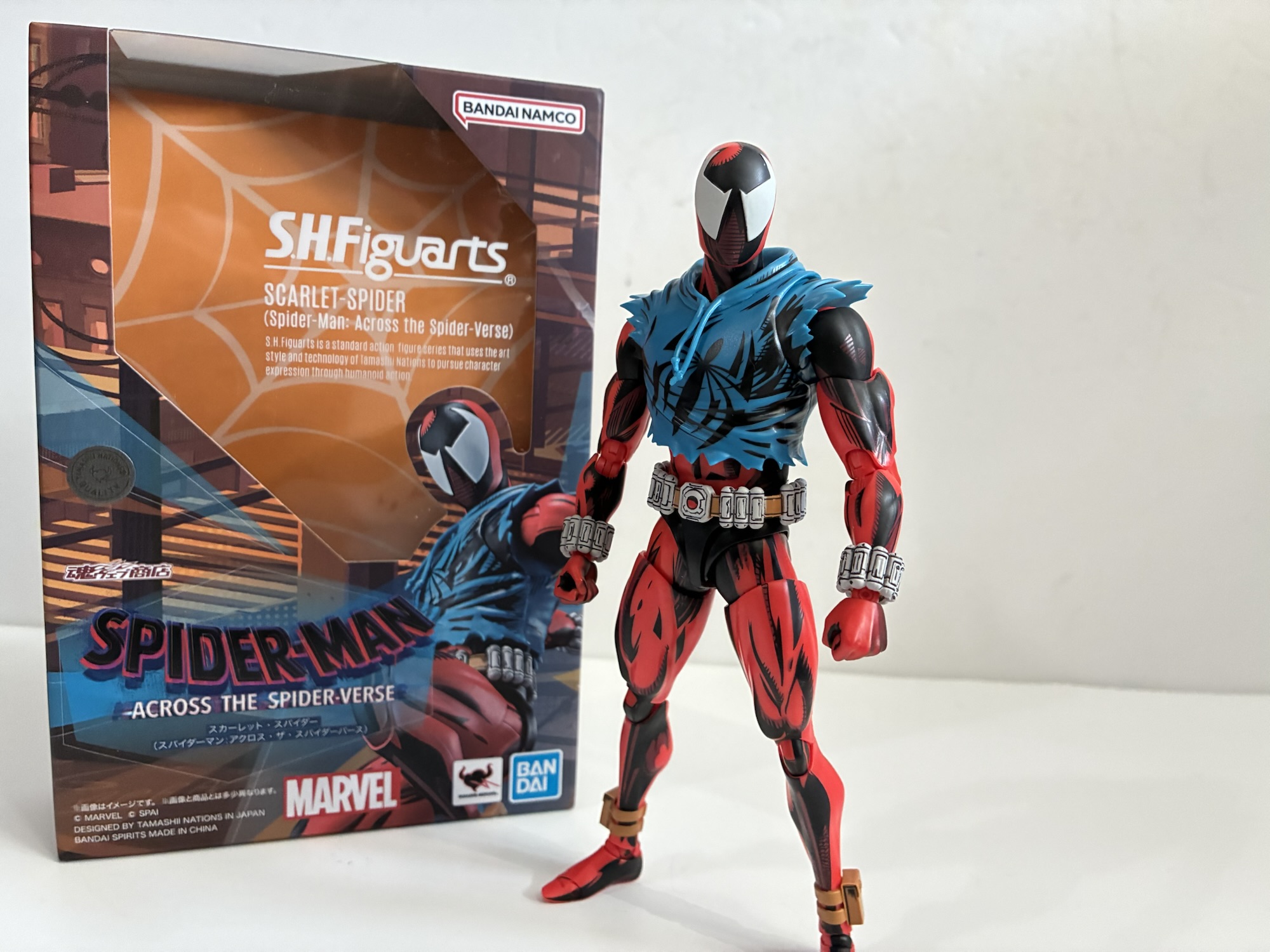
When Scarlet Spider showed up in the movie Across the Spider-Verse I immediately wanted a figure of that look. The art designer (Kris Anka is credited as the character designer) for that film clearly knew what made the costume pop as he was depicted with heavy comic shading in every scene he appeared in. Hasbro, unfortunately, declined to include him in their companion action figure line, but they did release the character on a retro card later. Medicom did one and then even did a shaded one last year as a convention exclusive, but the shading was basically just a little black on his face. It wasn’t what we saw on film or in the comics, but here comes Bandai! Bandai has released a few figures in its S.H.Figuarts line based on the movie, but for some reason I never considered them a possibility for this look. They’re usually not really into painting their figures while Medicom has actually done comic shaded figures of Spider-Man in the past. When they showed this one off though I knew I had to have it. I even preordered it via Hobby-Genki, an import operation in Japan, rather than wait for one of the US stores to get the figure in. And, of course, because of those wonderful tariffs it ended up costing me about the same so while I didn’t save any real money, I did get the figure a little quicker.
I do like these wall crawling hands.
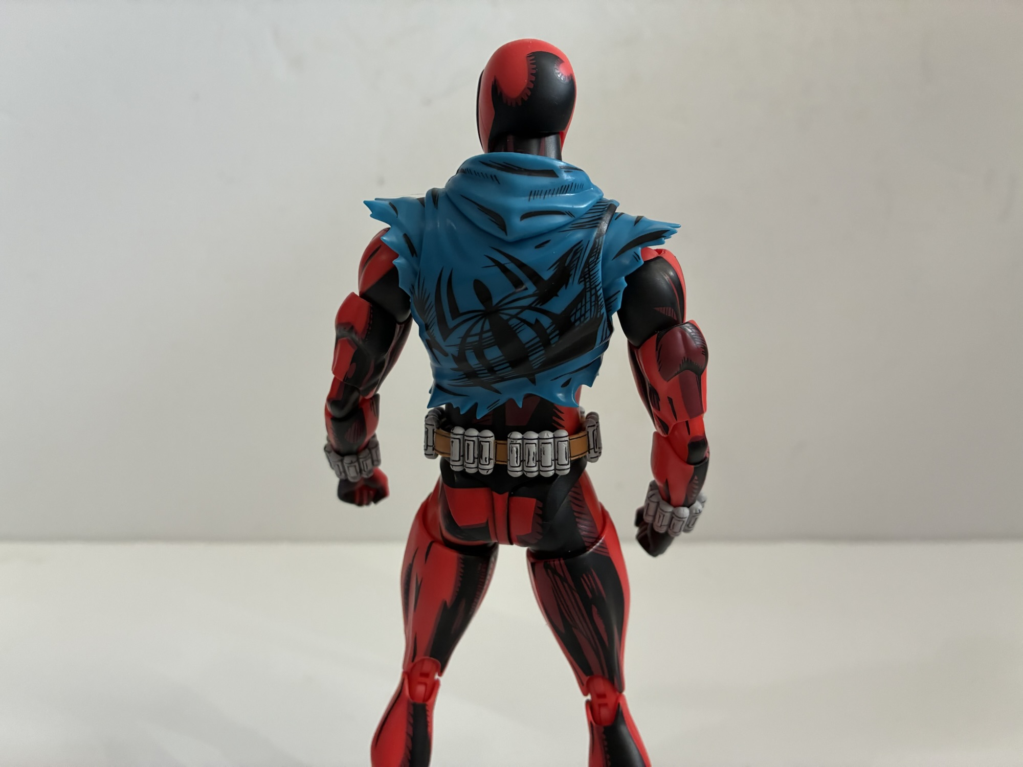
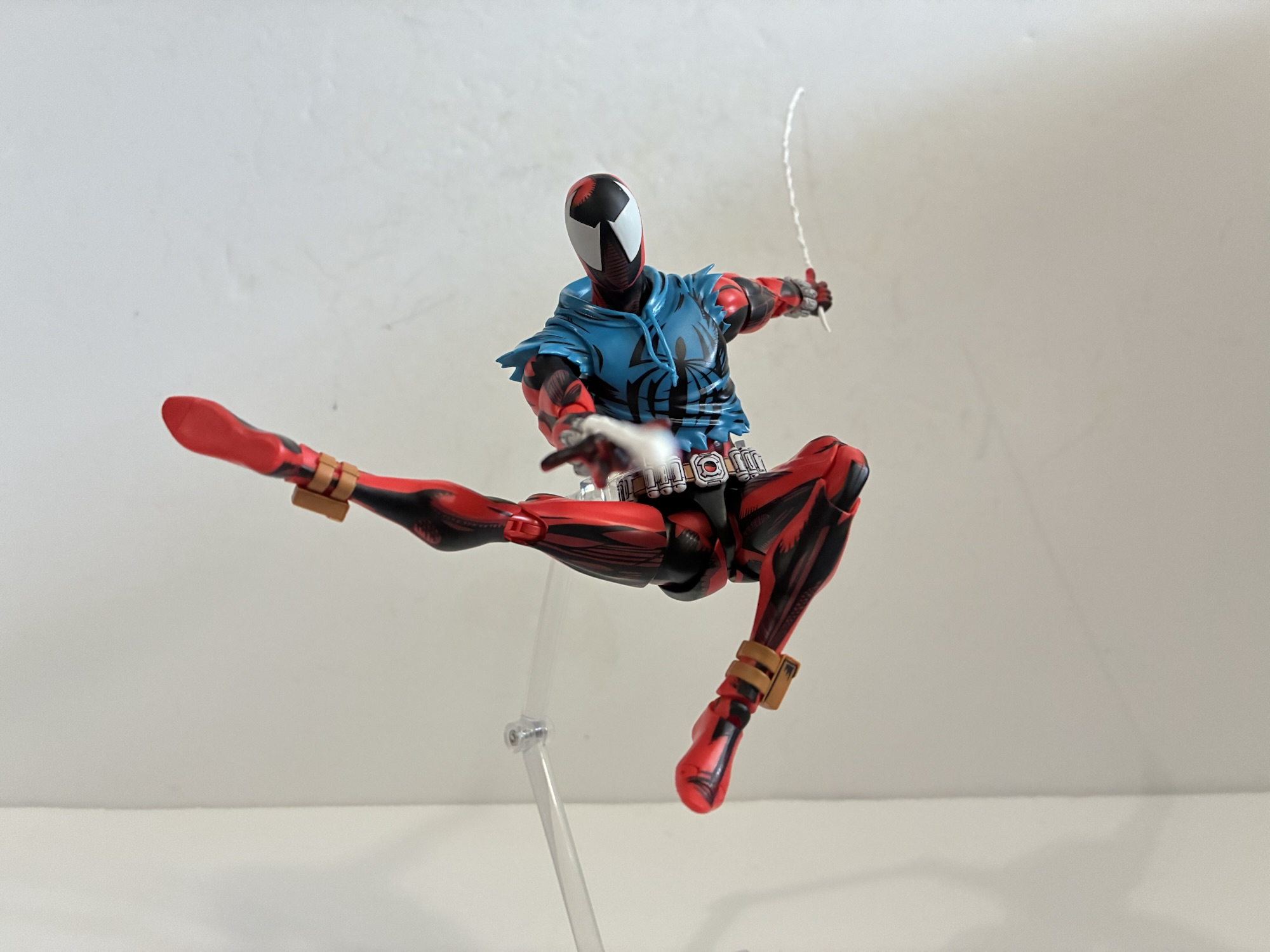
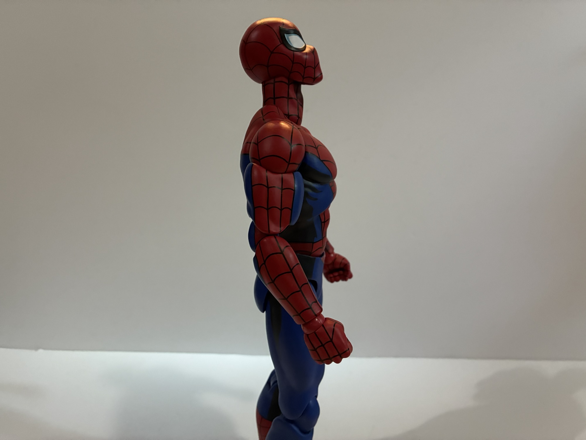
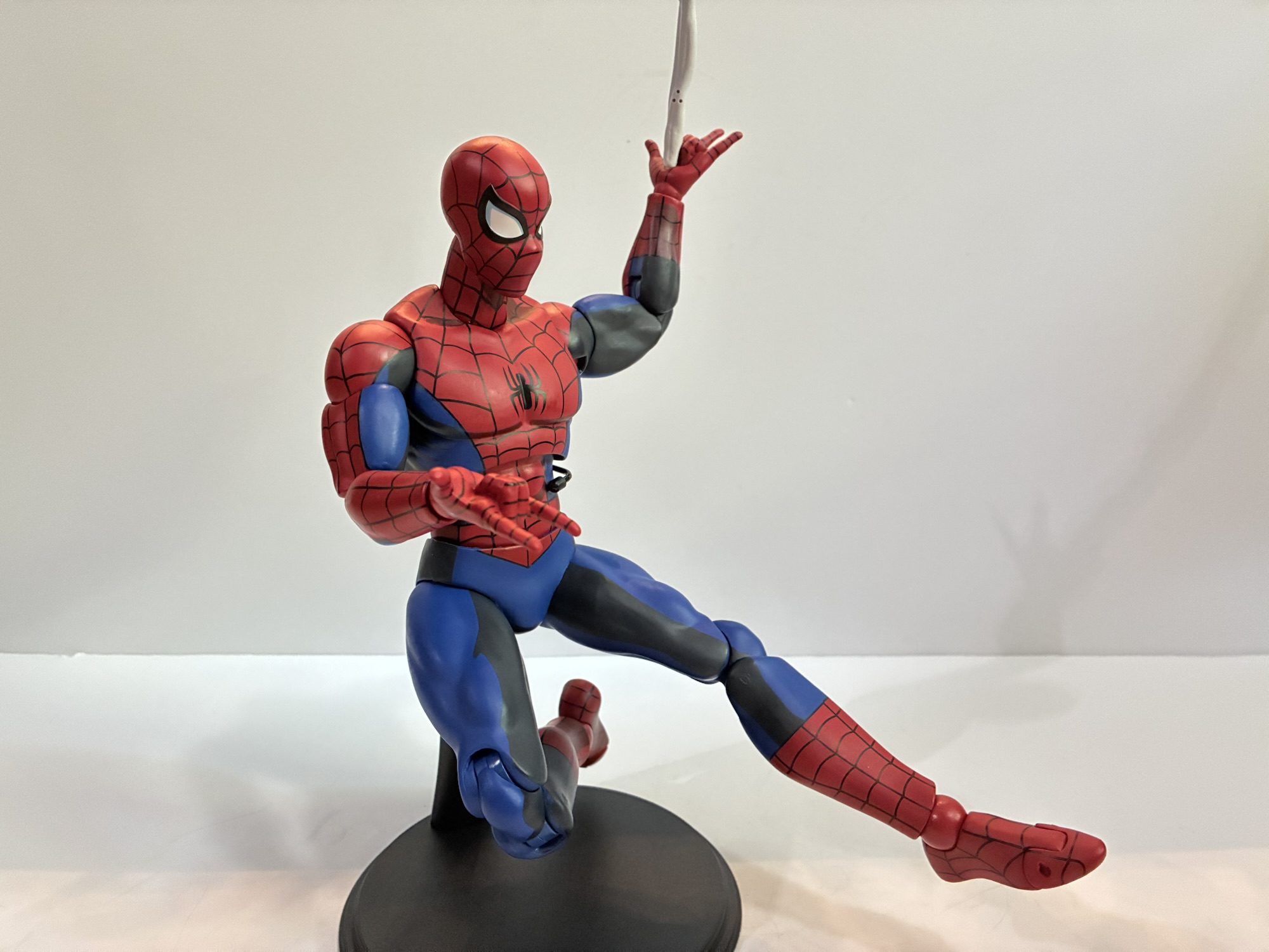
Ben Reilly comes in the standard SHF box. There’s some artwork on it that is vaguely similar to the style of the film and it’s adorned with photos of the figure in action. To my surprise, there is an included set of basic instructions for the figure as opposed to having them printed on the inner box flap like most of the recent Dragon Ball releases. Scarlet Spider (which has a hyphen in the name on the box which I’ve never seen before with this character) stands at about 6.5″ so he is right there with the Legends figure so if you think that one is appropriately sized for your Marvel collection then this one should be too. I like that figure, but placing it beside this new one really makes it look inferior. It’s just bare plastic while this figure from Bandai is covered with black shading and it looks fantastic. They didn’t hold back and there’s a liberal amount of the black on every part of the figure. The web shooters and cartridges on his belt have some nice linework on them as well and there’s even a little shading on those goofy ankle pouches. I really like how the mask turned out and it helps the white eyes to really pop. The blue of the hoodie is a touch darker than the Legends figure and the same is true for the red making it look a lot closer to an actual scarlet shade of red. There’s tons of shading on the rear of the figure as well so there was no skimping at any point.
Even the rear of the figure has as much as detail as the front.
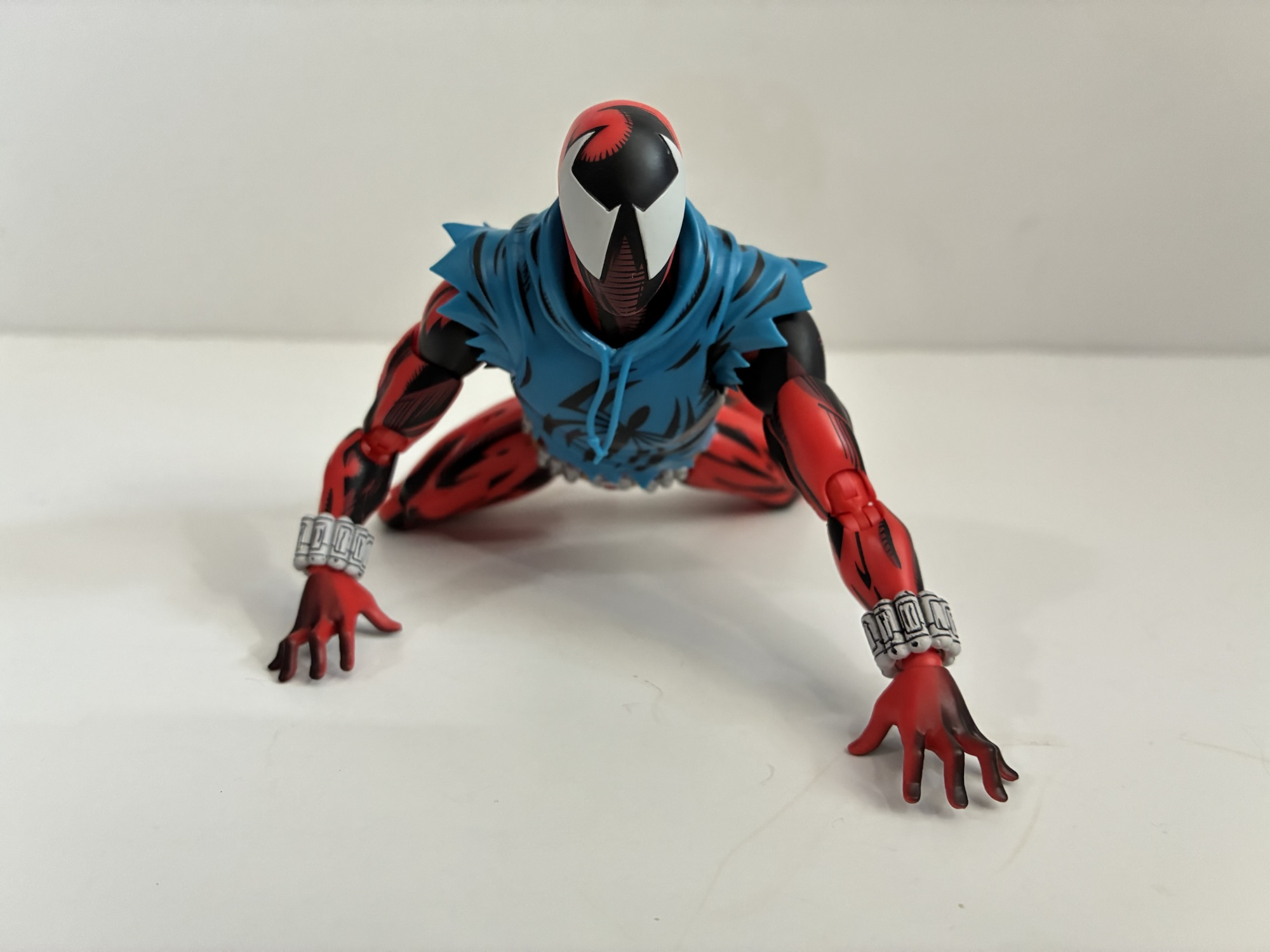
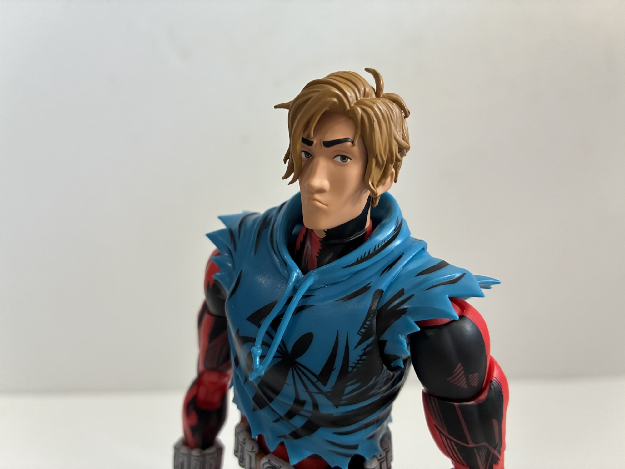
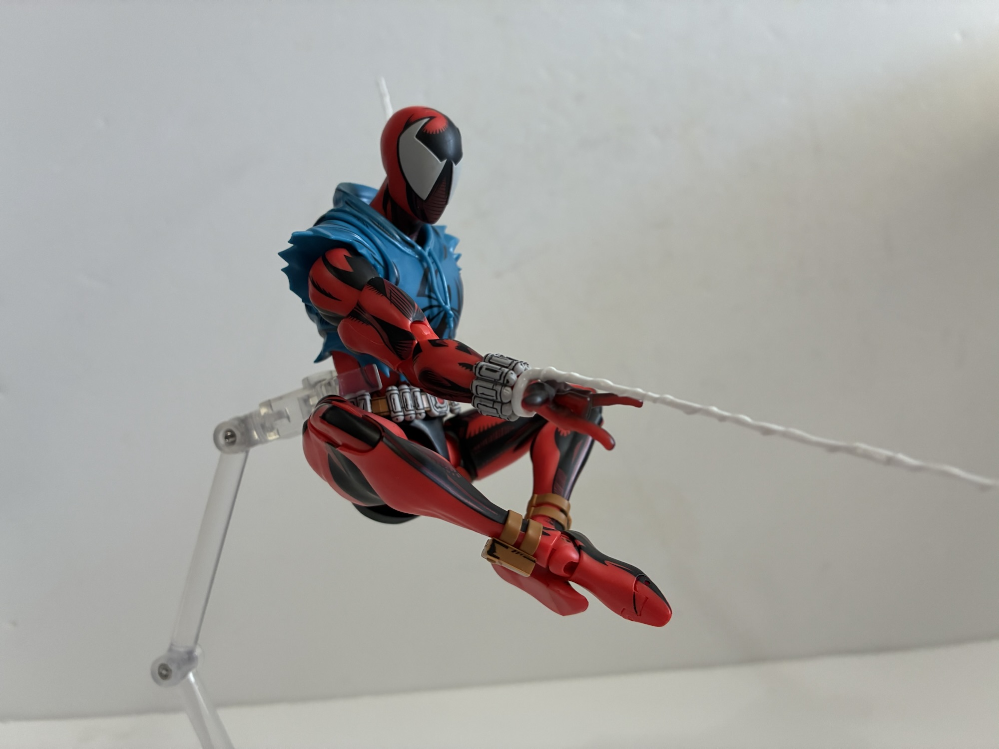
This figure is stunning and I don’t think there’s a thing about the presentation here that I’d change. It’s going to run into some issues where the linework won’t stay in-line when you move limbs, but because there’s so much it’s not as noticeable as it could be. The hoodie is non-functioning, if that matters to you, so he can’t pull it up over his head. It’s also hard plastic so those who prefer soft goods might be turned off a little, but I don’t think you could do shading like this with soft goods. Bandai did load him up with some accessories, though not as many as the Medicom release. For hands, we get fists, gripping, gripping with a thumb out, wall-crawling, web-shooting, and open hands. The wall-crawling hands have a more pronounced arch to the fingers which I like when compared with other versions of the same. There are two web lines – one with a ring at the base to mimic a web-shooting pose and one long one for swinging. There’s an unmasked portrait which also has a neck piece as part of it and Ben looks like his douchey self from the film. It’s great, but I’ll never use it after taking some pictures. What’s missing is a flight stand. An expensive Spider-Man figure should always come with one, but Bandai almost never includes them with their offerings unless absolutely necessary.
Two accessories that turned out well that I’ll likely never use: the unmasked portrait and the time bracelet.
Where this figure does stumble is in the action department. Like any Tamashii Nations release, there’s a bunch of joints on this guy, but unfortunately they don’t seem to work very well. The rundown is pretty typical: head, neck, shoulders, butterfly, bicep, double elbows, wrist, diaphragm, waist, hips, thighs, double knees, ankles and toes. What works well is the head and neck which has plenty of range and personality and I have no issues with the arms or knees. The butterfly joint is restricted and doesn’t go forward or back all that much. It’s better than nothing, but the sleeve piece of the hoodie prevents the figure from reaching over its head in a swinging pose. The ankle rocker is pretty limited too and quite steep. What sucks though is the torso and, to a lesser extent, the hips. Scarlet Spider can do the forward to back splits, but out to the side is pretty limited. The torso though feels almost static. I can’t get the joint under the hoodie to do anything. It wiggles so I’m pretty sure it’s there, but it’s useless. The waist also just seems to pivot and rock a bit. What I can’t get it to do is actually rotate and that’s just bizarre. It might just be seized, or something with the shape of the cut is causing it to bind. It’s quite unfortunate.
If you have a stand handy he can get into some decent web-swinging poses, but the lack of rotation in the torso is frustrating.
The end result is that this is a Spider-Man figure that’s not very good at doing Spider-Man type poses. He can do some, but basic wall-crawling is pretty much out. He can only do a basic crouch and he’ll need some kind of support to actually hold the pose on your shelf. It’s a bummer, and honestly quite surprising as most SHF releases I have articulate pretty well, even some of the odder designs. And this is, ultimately, a guy in a skin-tight suit with just a hoodie to get in the way. It should be very easy to articulate, but they completely dropped the ball.
At least the shading is so good that he doesn’t really have to do much to look cool.
Does that make this release a bad one? Yes and no. If you want and expect articulation better than your $25 Marvel Legends figure then this will let you down. This is a downgrade in articulation from the Legends figure and especially the MAFEX one. It’s honestly more on par with the Mondo sixth scale Spider-Man than those figures. Maybe even worse because of that waist. I’ll do some checking around and see if anyone else has the same issue with the waist as I do and if I can at least get that to rotate I think I’ll be a lot more satisfied, but it will still be lackluster. If you don’t need this figure to pose as well as a Legends figure, then you’ll likely be a lot happier. I do think this is one of the best looking figures in my collection. It’s a Mondo type of presentation on a 1:12 scale figure. It looks spectacular, and that’s what I wanted. It’s a damn good thing that it looks great in a standard, hero pose lessening the desire to do something more exotic. It still shouldn’t be that way, but presentation matters a lot too. And that’s what it comes down to. If you are as in love with the appearance of this one then you’ll probably be happy. If not, then you should probably pass because this figure isn’t cheap. It’s actual price tag from an import shop is around $80, but after shipping and duties it will end up around the $110 Big Bad Toy Store is charging. If you shop around you may find a better deal, but either way this is a pricey figure. If I wasn’t such a fan of this particular look I would likely chosen to admire it form afar, but even with the articulation limitations, it’s my favorite Scarlet Spider in my collection.
If you’re curious what I thought of those other Scarlet Spider figures and even that Mondo one I mentioned then look no further:
It was in this space last year that I shared my fondness for the Scarlet Spider costume when I reviewed the Medicom MAFEX Scarlet Spider action figure. I don’t buy much from Medicom because their figures are really expensive for what they are, but I sometimes break my own rule when I think they’ve made…
When I was a kid, one of my favorite past times was drawing. Like most, I started really young with a box of crayons and coloring books. I’d eventually start keeping markers, colored pencils, and other instruments in a plastic McDonald’s case that came from a Happy Meal. It was blue and had a map…
It took a long time for Mondo’s Spider-Man to get to me. At first, I wasn’t sure if I was going to even buy it. I passed on the Mondo offering in 2024, debated the symbiote costume variant, but ultimately passed on that as well. The X-Men line from Mondo is my true love and…
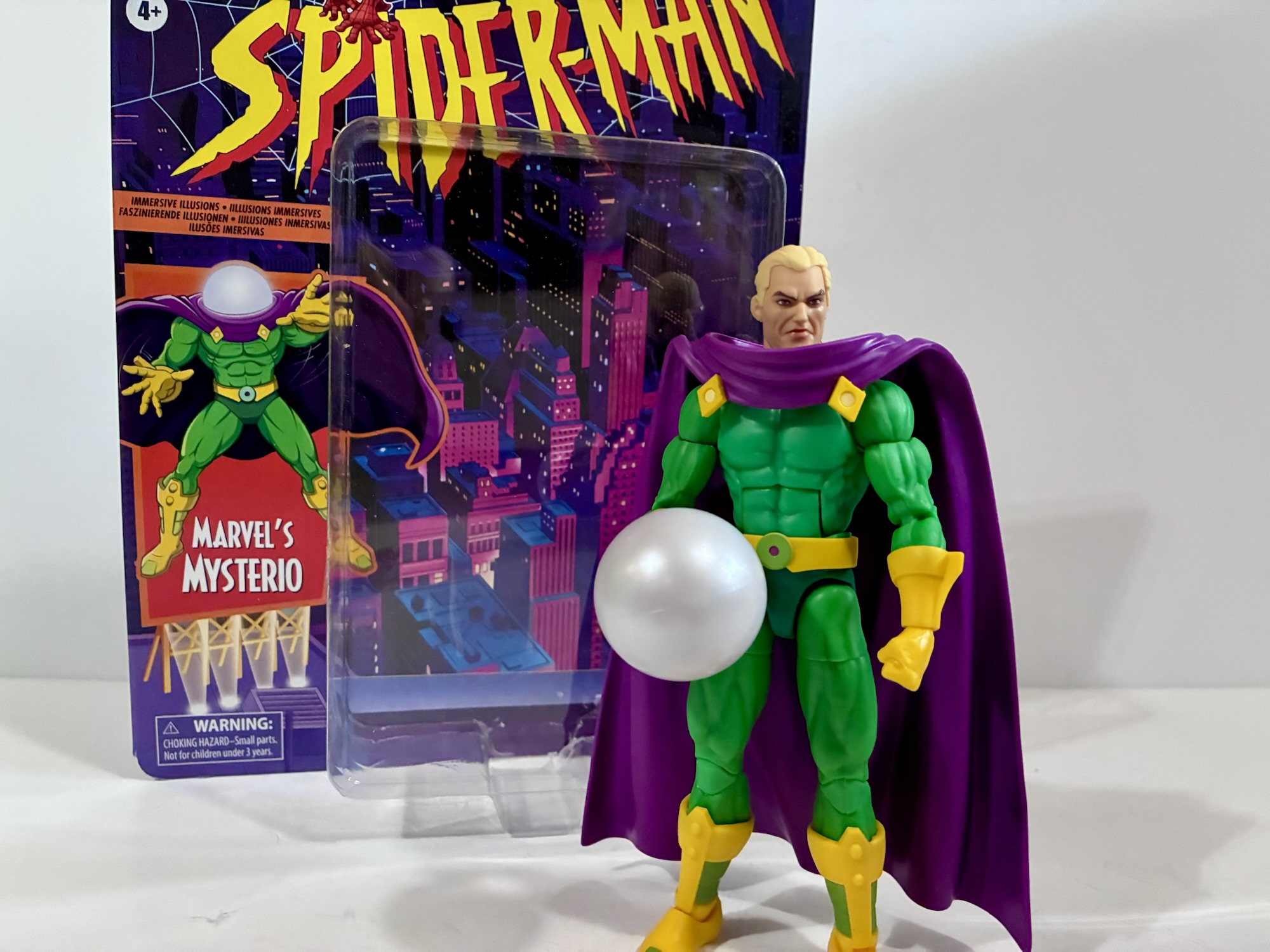
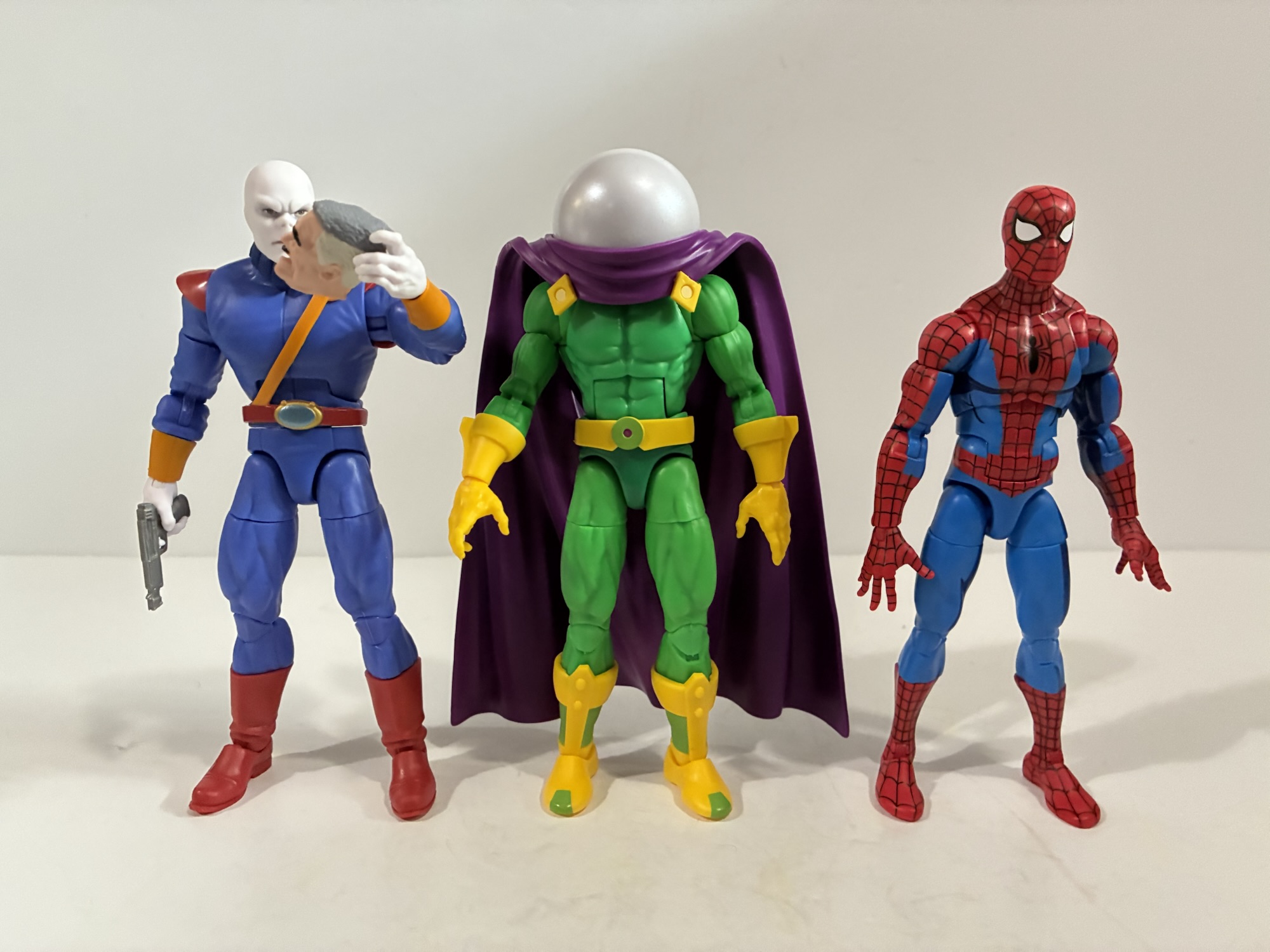
We’re continuing our look at 2025 figures with one that should have arrived in plenty of time to squeeze it in. Walmart has been doing a Collector Con annually for a few years and you just never know if you’re actually going to receive the figure you preorder. So it was with the Spider-Man retro card Mysterio which kept getting pushed back on me. I’ve done this dance before and what typically happens is Walmart just pushes the release back until it eventually cancels it. Rather than wait for that, I was able to find this guy on the pegs at a local store, albeit one out of my way. Others weren’t so lucky. I’m also going to make an effort starting with this review to attempt to be more brief when it’s warranted and a Marvel Legends figure certainly fits that criteria.
I always was a fan of Mysterio’s look, though less so the actual character.
This Mysterio is based on his appearance in the animated series Spider-Man which debuted in 1994. This basically means he’s just the same villain we’re used to, but with a simpler costume and one that also happens to be a very bright green. Since the comic version usually has a quilted pattern to the costume, this figure actually utilizes very little from past releases. It may actually just be limited to the accessories. That doesn’t mean this guy is entirely all new. The body is essentially a base body. I’m not sure if it is indeed the Vulcan body, but it’s basically the same body as the Secret Wars Iceman we looked at not too long ago and the hole in the middle of his back would seem to be a giveaway there. The gloves and boots are unique as are the belt, cape, and the domed helmet. The figure is primarily colored plastic with paint reserved for the belt and the green areas on his boots. There is a pearl finish to the dome which looks nice and helps keep the opacity up so one cannot see what lurks beneath.
These effect parts are pretty fun.
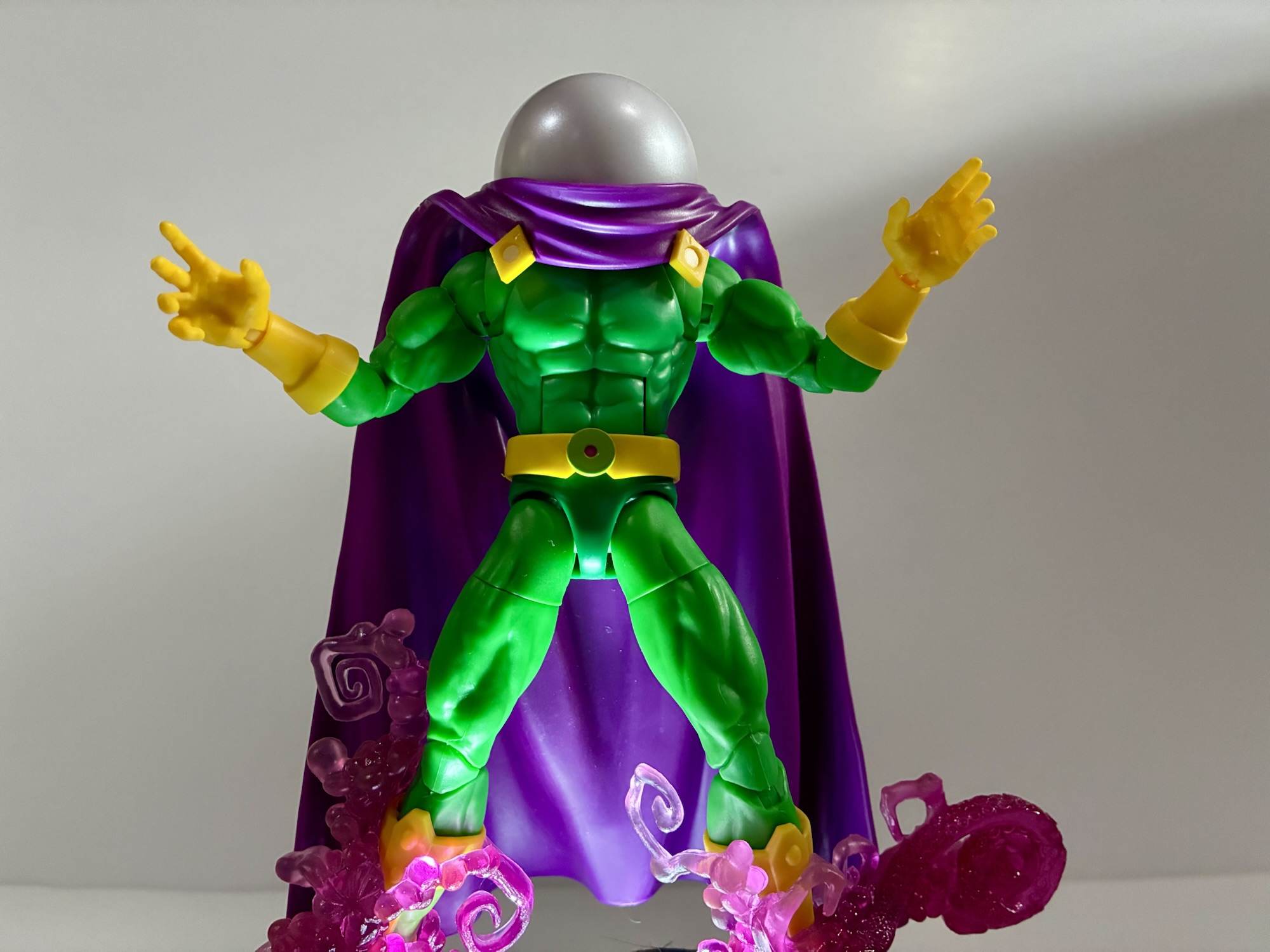
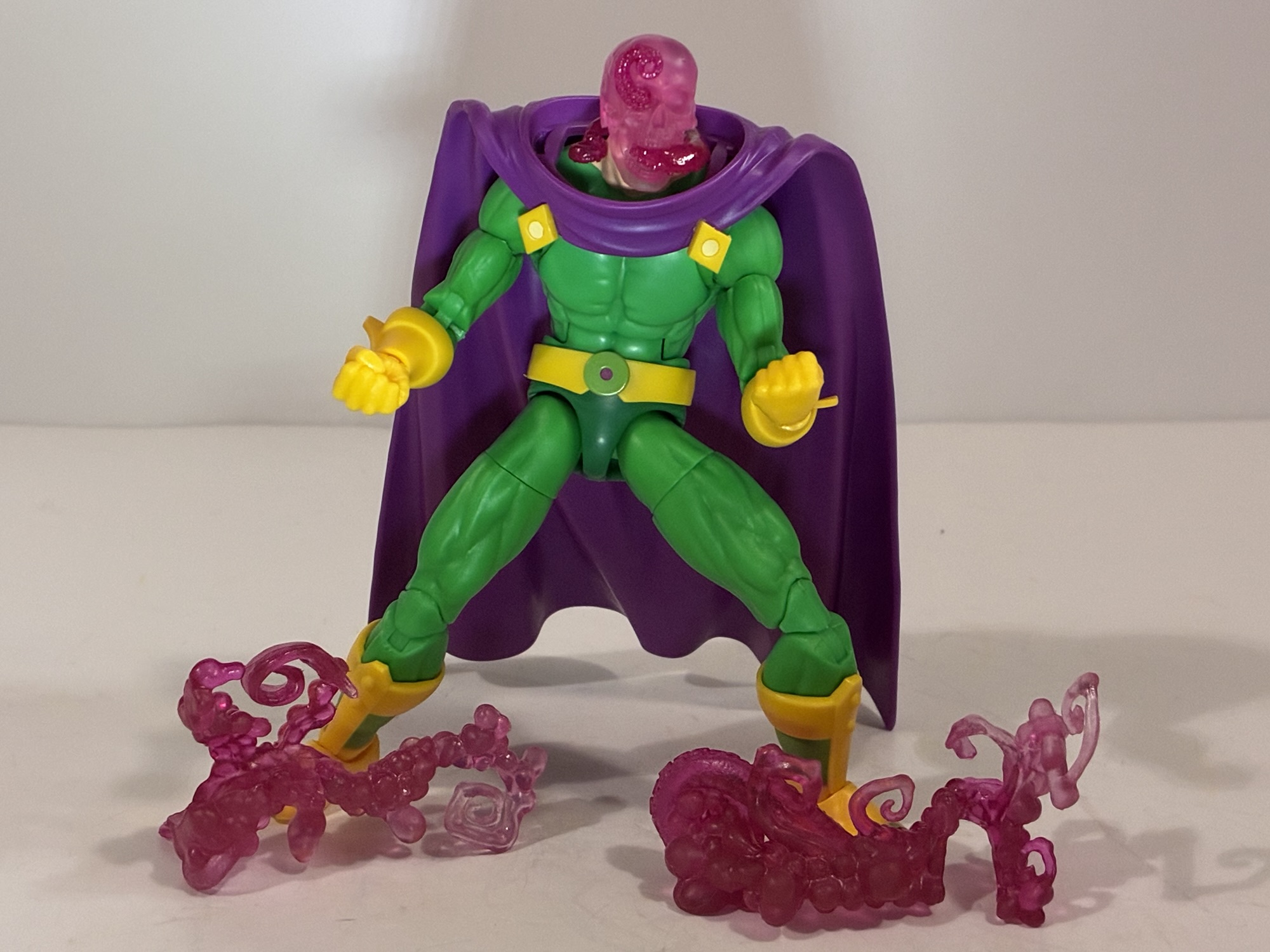
The figure is about as basic as it comes for a Legends release, but it has some quirks about it. Namely the cape which is designed to sit high to give it that billowing effect. To achieve this, it actually pegs into the back, but while there are two, yellow, clasps on the front they don’t actually do anything. It sits a little high as a result from the front. The dome also doesn’t actually connect to the figure. It connects to the cape which is a little strange, but it does work for the most part. He does have two optional heads, including an unmasked Quentin Beck head that’s all new. It’s a terrific likeness to the cartoon, and if you really want to you can try to cram it under that dome or just go without. The dome does detach from the cape, it’s a little tight, but I don’t think it will break.
Well, that’s kind of horrifying.
The other accessories in the box are repeats from a past release. There are two sets of hands: fists and open. He also has some effect parts done with translucent, red/pink plastic. Two of them are these smoky, tentacle parts that can clip onto his ankles and the third part is a skull with tentacles worming through it. They’re not from the show or anything, but they look pretty cool so I’m happy to have them. The articulation is typical, Vulcan body Legends. You have a ball-hinge head, shoulders, butterfly, bicep, wrist, ab crunch, waist twist, hips, thigh cuts, double knees, ankle hinge and rocker. I’m surprised he doesn’t have a boot cut. They wiggle a little, but it must be keyed in such a way that it prevents rotation, which is weird. He’ll do what you probably need of him, though the cape is cumbersome.
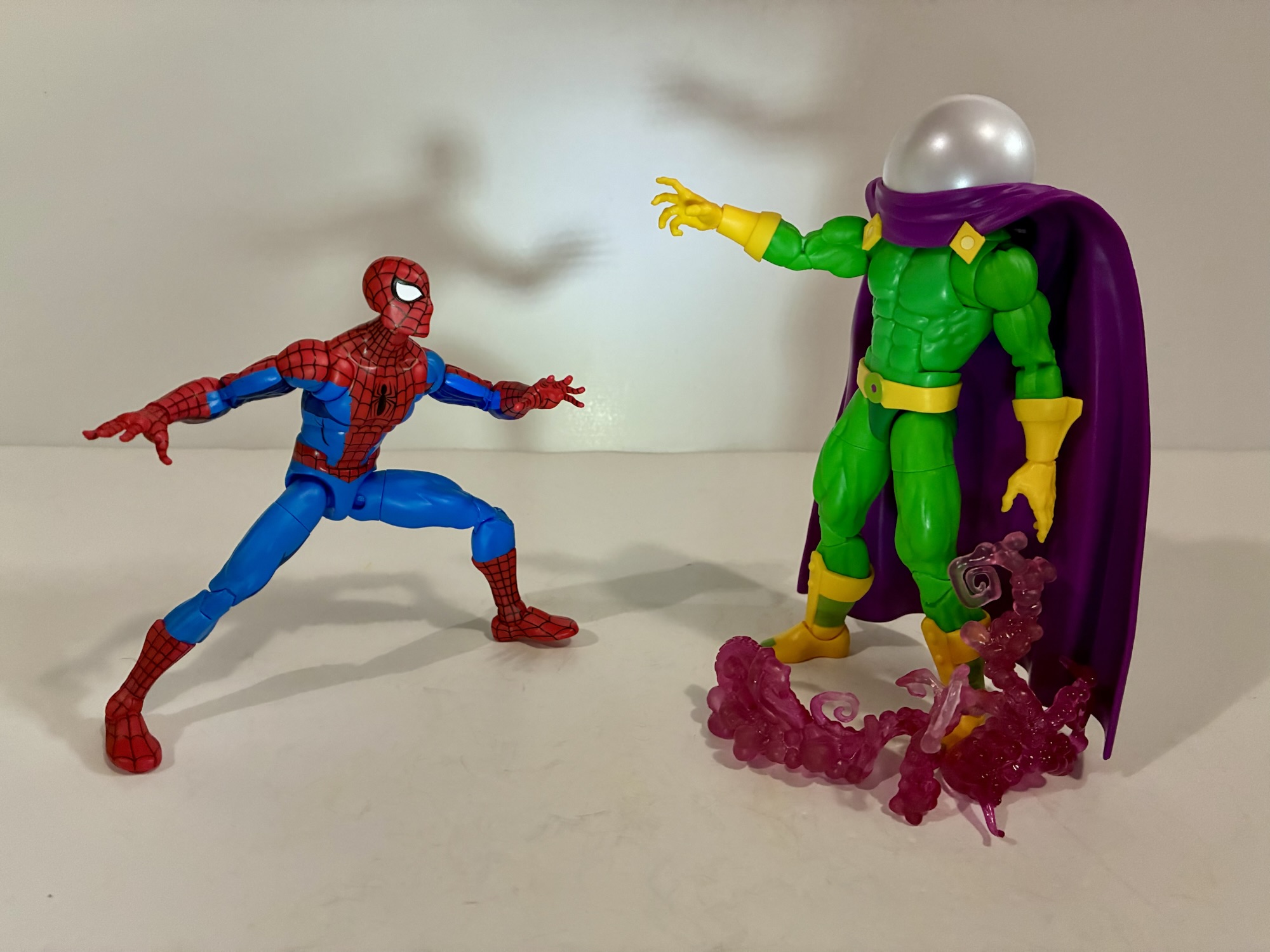
“Face my illusions, Spider-Man!”
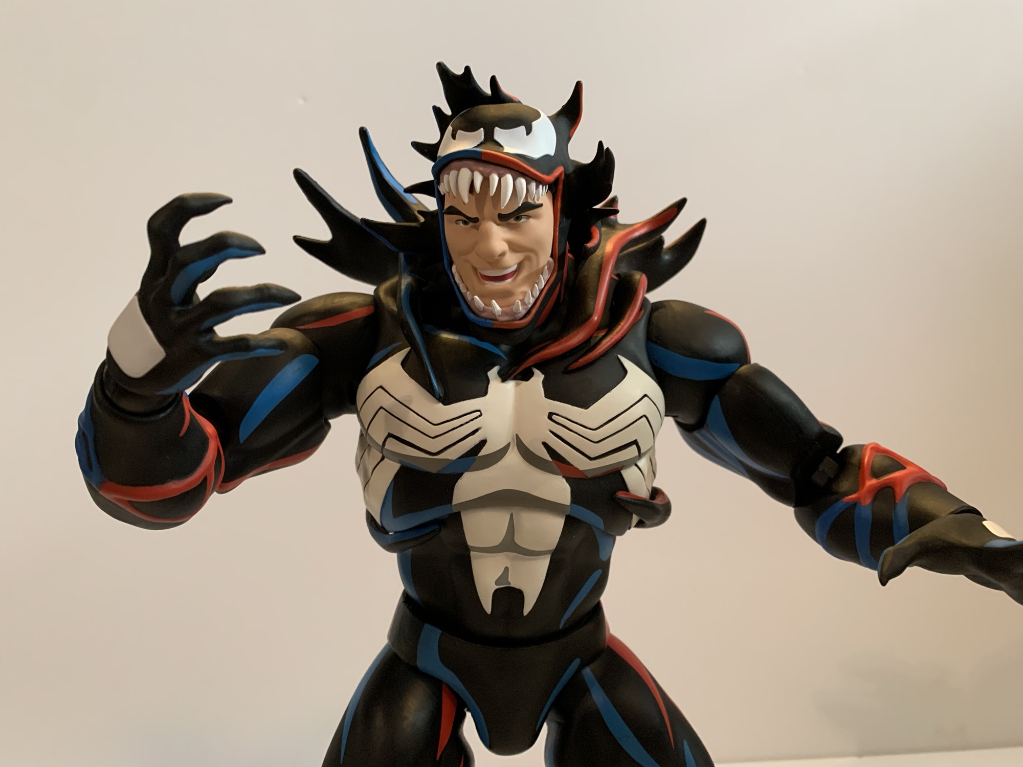
The one and only reason to get this Mysterio is if you like the look of the character from the old cartoon. And it mostly accomplishes what it set out to do. It is missing the seem line on the torso that’s even present on the card art, but I’m not surprised Hasbro didn’t go back and sculpt that in. I wish the cape sat a little lower, but at least it provides clearance at the shoulders. The different portions of the body do suffer that discoloration we see with many Legends where one area doesn’t match another. In this case, the torso is a little lighter than the arms. It’s not as noticeable as it is with other figures, but it is there. He’s also a pain in the ass to get, but that’s a Walmart problem and not the figure’s fault. Hasbro does have a track record of re-releasing these kinds of figures if the demand is there so if you can’t find one maybe he’ll come back in a year or two. Then again, they still haven’t released the Walmart exclusive Venom figures or the Spider-Man ’94 so I guess you shouldn’t hold your breath.
If you’re interested in this Mysterio then you may like some of these as well:
As a kid in the 90s, there was a social pressure to not choose the obvious when discussing favorite parts of a fandom. It’s basically a method of gatekeeping, a really silly, annoying, habit that’s not exclusive to children. If you enter into a certain band’s fandom there are some who will claim you’re a…
I had a bit of an impulse buy a few weeks back with the Marvel Legends Spider-Man Unlimited action figure from the show of the same name. What I didn’t mention was that he was not alone for hanging on the pegs that day with him was The Chameleon. Like Spider-Man Unlimited, The Chameleon is…
When the decision was made to end the animated series Spider-Man, it didn’t mark the end of the webbed one’s adventures on the small screen. Momentum was building towards a Spider-Man movie which would eventually arrive in 2002 so it made sense to keep old webhead in the public spotlight. Apparently, it would have been…
Today’s portion of the countdown is a little like yesterday’s. We have a few adult cartoons mixed in with mostly kid’s stuff. I liked the flow of yesterday’s list so I’m going to stick with that and front-load today’s list with the few adult cartoons I want to talk about before moving onto the general audience television specials. And if you’re curious, my arbitrary ranking for all of these pretty much coincides with that approach. I haven’t been including my scores for each special because they’re purely subjective and not part of my original review/write-up. They’re simply the product of my gut reaction to looking at the list of all of the specials I’ve covered and only used to help get me started when it came to organizing this thing. If you’re curious though, everything here has the purely arbitrary score of 6.5-6.75 on a 10 point scale. We’re firmly past mediocre and bad and into the “fine” portion. I know everyone’s reaction to 10 point scale scoring is either different or everyone thinks anything under 8 is bad, but for me it’s something like this:
0-1 – Abysmal
2-3 – Bad
3-5 – Time Waster
5-6 – Mediocre
6-7 – Fine
7-8 – Good
8-9 – Very Good
9-9.9 – Excellent
10 – Near Perfect
My approach may not be a 10 on my own scale, but it worked to get things in order and then I moved stuff around as I saw fit. In general, I don’t like numerical scales for deciding if something is simply good or not which is why I don’t use them. That’s just a little peek behind the curtain though, now let’s talk Christmas!
The Christmas Peter was visited by the ghost of Patrick Swayze.
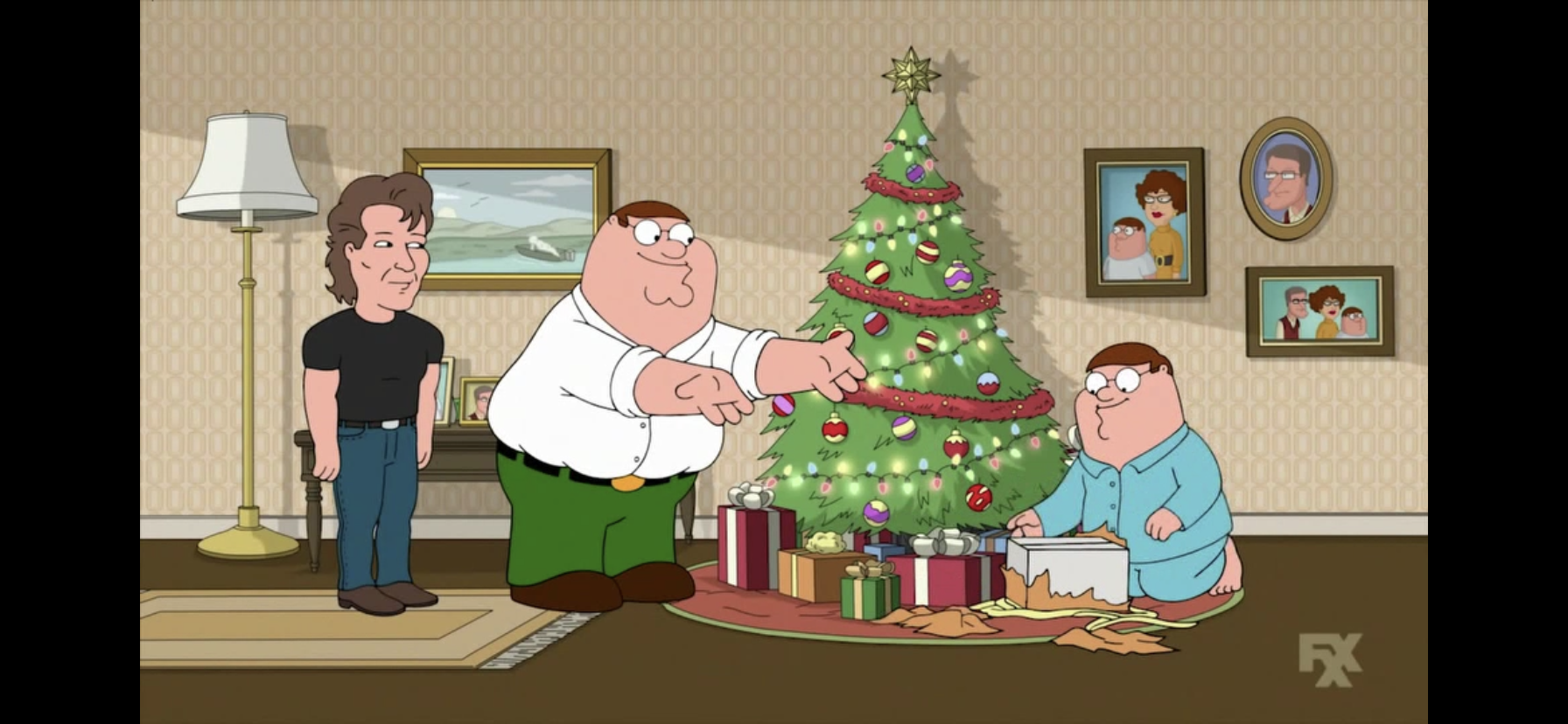
Family Guy has probably never been celebrated for its creativity, even among its fans. It’s more about subversion and shock so when I found out the show did a parody of A Christmas Carol in 2017 I can’t say I was very surprised. The twist, if you want to call it one, is that instead of someone Peter actually knows serving as the ghosts of Christmas it’s Patrick Swayze (voiced by his brother Don) in the role of all 3. He takes Peter on a trip through time to examine how selfish he is and also to revisit the show’s Patrick Swayze jokes, of which there may be more than you think. It’s a bit self-indulgent and likely only works if you’re a long time fan of the show and enjoy callbacks. I think Family Guy relies on such tactics far too much and they rarely work on me. The jokes are mostly predictable and the episode ends exactly how you would it expect it to, but it’s also Family Guy where there’s a joke every 10 seconds so you’re almost guaranteed to laugh at something. How often is what will determine your overall enjoyment of it.
That doesn’t seem like the best way to win over a kid, Santa.
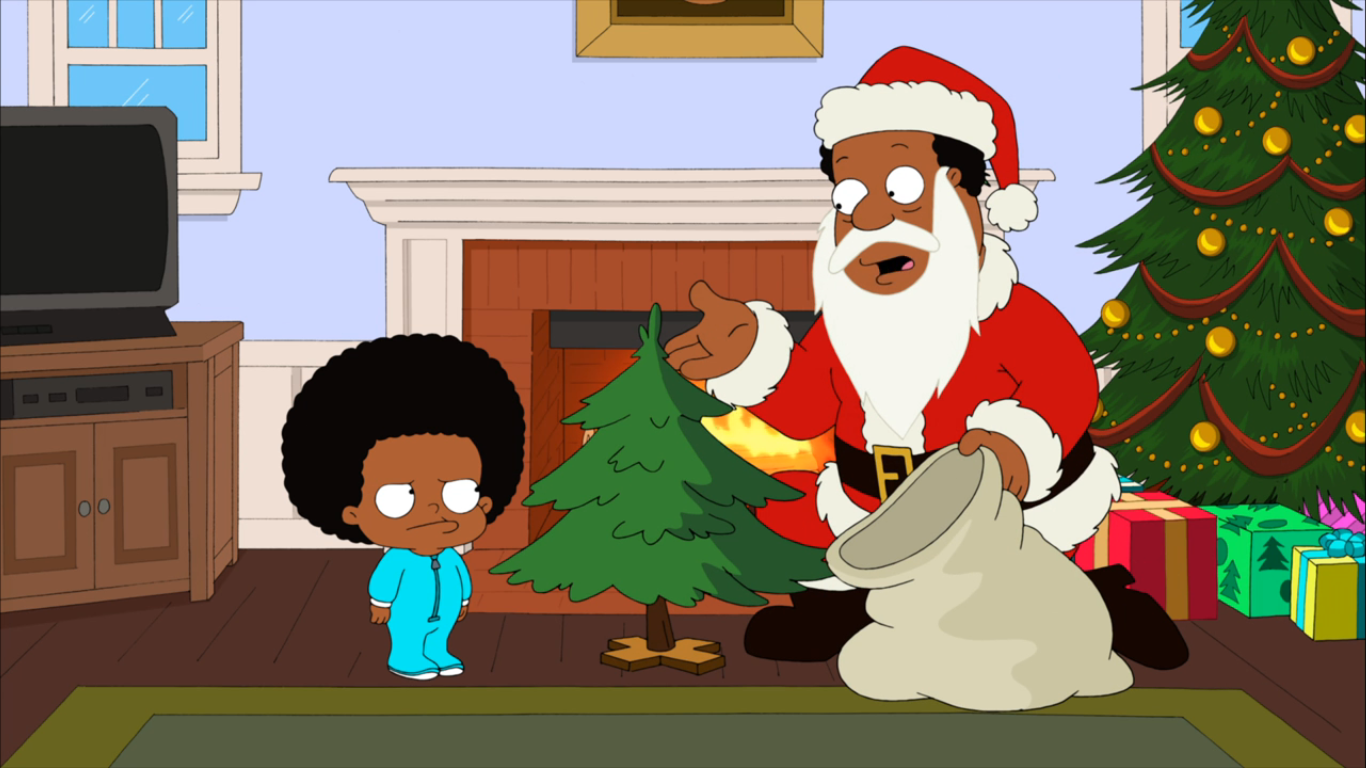
Yes, I’m ranking the Family Guy spin-off ahead of not one, but two Family Guy Christmas episodes. Considering this one is only one spot ahead, I wouldn’t read too much into it. I’m giving it the nod because it doesn’t rely on the A Christmas Carol trope and because the next entry on the list is going to be…well, you’ll see in a moment. The Cleveland Show was not something that worked for me. I didn’t stick with it for very long before dropping off which I suppose is unfair since many shows don’t truly find their footing until the second season or so, but also no show just deserves your attention until it gets good. My issue with it was it was just way too similar to Family Guy to the point where it felt redundant. The Cleveland character seemed to have to become mean like Peter and the family dynamics felt all too familiar. Nevertheless, the first Christmas episode is all right. Cleveland’s stepson Rallo hates him, but worships his biological father who’s a total deadbeat. Cleveland loses it while playing Santa and informs Rallo that his real dad is a piece of shit which sends the kid spiraling out of control. In the end, his real dad shows up for Christmas and invents a new lie for why he never has time for his kids: he’s the real Santa Claus! It was a clever way to return the show to the status quo, which most of these sitcoms aim to do. It’s just along the way there were many dud jokes of questionable taste, but some not so bad ones. If you’re a Family Guy fan who has exhausted that show’s Christmas offerings then you could do worse than turning to Cleveland.
Yup, a trio of Seth MacFarlane cartoons are leading off this section of the countdown. I honestly can’t really separate these three in terms of quality, they’re all very similar flavors. It’s like choosing between 7Up and Sprite. This one gets the nod over the other two because it actually has a little heart. This episode takes place in the brief period of time when Brian, the dog, is dead and replaced by a new dog named Vinny. Stewie ends up going on a time travel adventure to prevent Brian’s death, but the lead-up to that moment is pretty clever and doesn’t really occupy the whole episode. Instead, we have a Peter and Carter B-plot for that which includes bukkake jokes which I suppose is pretty unique for a Christmas plot. Nevertheless, this is Family Guy so the sweetness has to be undercut at every opportunity which lessens the payoff and makes the preceding 20 minutes feel like it may not have been worth it in the end. I did enjoy the resolution enough to slide it past the other two, but I don’t blame others if they find the other episodes funnier.
If I liked this series more I’d be calling for a Christmas Duckula action figure to be made.
Count Duckula is basically the unofficial first Nicktoon. It’s the first cartoon Nickelodeon produced for its network, though by the time the network got to the actual Nicktoons the process was changed up and they had a firmer grip on the legal component. Duckula is a spin-off of Danger Mouse and a superior one at that. I never cared for Danger Mouse, but Duckula was okay. I think I like the idea and character design more than the execution. This Christmas episode of the show is a bit odd as about half of it is devoted to Duckula reading an in-universe comic book and we get to see the story unfold on screen. It has basically nothing to do with Christmas. The plot of this one is that Duckula is your typical selfish protagonist eager for Christmas, though he’s more general kid selfish and not over-the-top Scrooge selfish. Santa is delivering presents, but gets lost in the maze that is Castle Duckula while the local vampire hunter is basically in the same predicament while trying to deliver a trap. It’s a very low stakes episode and no one learns anything in the end. Santa does escape while the vampire hunter’s Christmas trap literally blows up in his face. It has a bit of a British feel to the humor so if that’s your thing you may enjoy this one more. I enjoy it mostly for the animation and character designs as you don’t find too many of these spooky Christmas specials. It’s way better than Little Dracula.
Most people are probably familiar with the Disney feature Lilo & Stitch, especially now that it’s been given the live-action treatment. Fewer are probably aware of the animated series Lilo & Stitch and even fewer there are familiar with the anime, simply titled Stitch! This one was mostly for Japanese audiences, but it did receive an English dub and I do believe it aired on the Disney Channel at some point, but it has yet to make the leap to Disney+. There is no Lilo to be found in this one so maybe Disney thinks it wouldn’t play well with American audiences. It is animated just fine and supremely cute. The plot is pretty safe as well and similar to the other animated series as Hamsterviel is the main antagonist. He dresses up as Santa and lures in children with mind control cookies which Stitch easily counters with cookies made by Jumba. It’s just to kill time as the last act is reserved for Stitch helping Santa Claus out by playing him. It mostly just leads to a fun character design of Stitch as Santa and we get the customary sweet ending. It’s cuteness for the sake of cuteness. If you love Stitch then you’ll probably enjoy it.
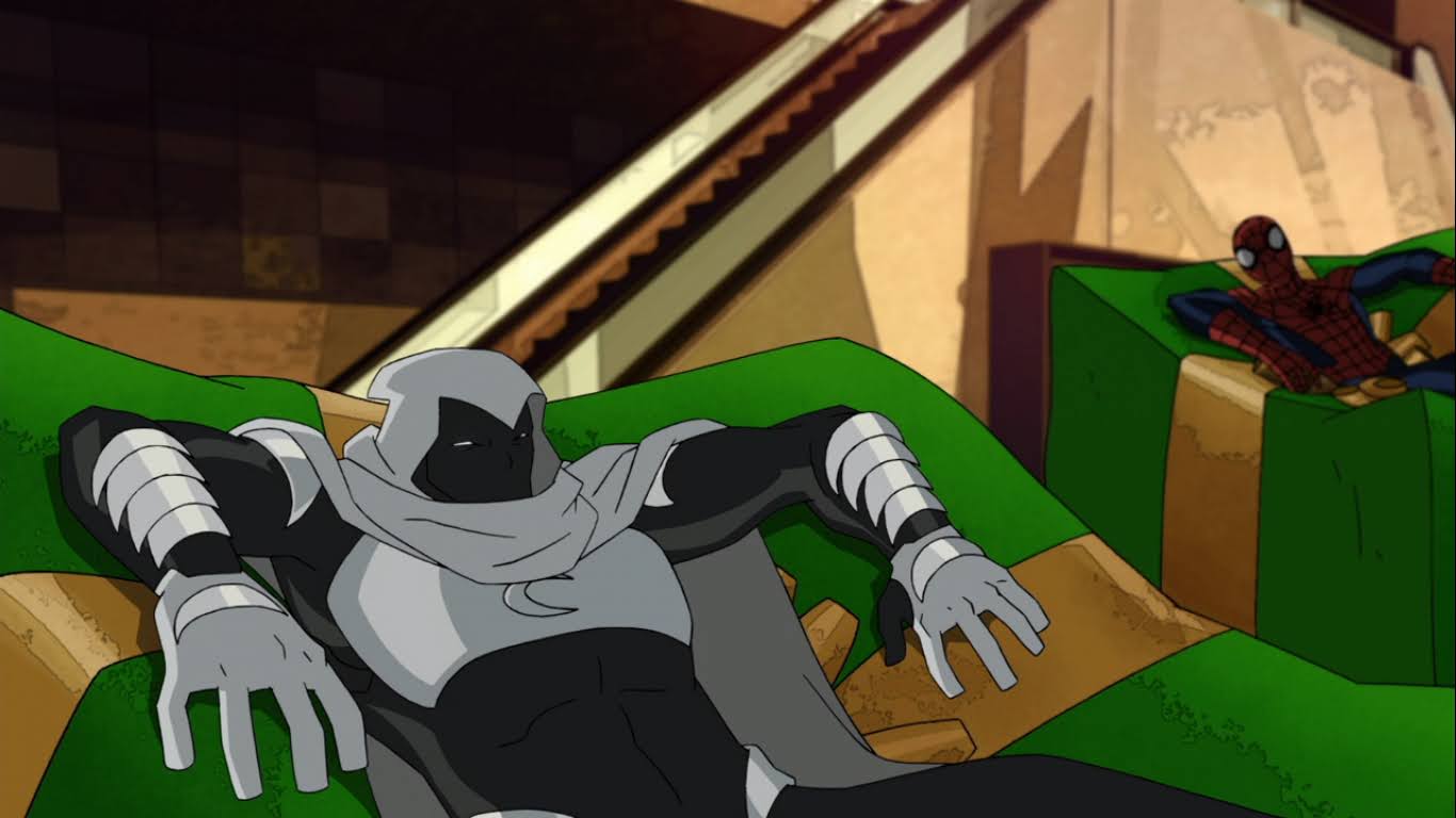
Not to be confused with the comic of the same name, Ultimate Spider-Man is another perfectly cromulent Disney Channel vehicle for the webslinger. In this holiday episode, Spider-Man has to house sit for Doctor Strange and things get out of hand when Moon Knight crashes the party. The enigmatic hero mistakes Spidey for a villain and the two soon find themselves teaming up to stop the spawn of Mysterio who uses her mind-altering powers to conjure up a violent Christmas. If you ever wanted to see Spider-Man and Moon Knight battle against Christmas themed rogues then this is the special for you. The Spider-Man here is likable and full of his usual quips and it amounts to a mostly satisfying experience. It even manages to sneak in a little Christmas feels in the end with a redemption arc of sorts for Mysterio. Humanizing villains in superhero cartoons is always a pretty solid path to a successful Christmas episode.
Okay, here we have yet another adaptation of A Christmas Carol. As far as adaptations go, this one isn’t any better or worse than the usual lot. And the show it hails from is merely decent. I rank it this high though because Captain Hook is played by one Tim Curry and he’s fantastic. I absolutely adored this take on the pirate brought to life by Curry and some of that praise should definitely go towards the writing staff who do a tremendous job with Hook’s dialogue. He’s cultured, articulate, but also vicious, mean, and vile. It may be another version of A Christmas Carol, but in this one the protagonist (who is actually the antagonist) learns almost no lesson. He emerges from his visit with the ghosts of Christmas just as mean and vicious as before. If anything, he’s even more committed to his life of villainy! That’s a Captain Hook I can get behind. We just talked about a villain receiving redemption in the Spider-Man show and that’s all well and good, but sometimes villains need to just be that and no redemption is necessary or even wanted.
Sometimes a Christmas special just hits right for me when, objectively speaking, it probably shouldn’t. That’s why I do this though because I like the corny aspect of Christmas specials. I like the feel good moments. If a special can penetrate my wall of cynicism then it usually wins me over. That was the case with ‘Tis the Season to be Smurfy. Where the other Smurfs special almost completely failed, this one succeeds. It’s somewhat a retelling of The Elves and the Shoemaker substituting in the Smurfs in place of elves, but it goes about things differently. It’s very much a “Christmas Magic” plot where we need a character, a woman named Elise, to have plot sickness and the only cure is Christmas. Sassy and Grandpa Smurf find out about the poor woman and take it upon themselves when no other Smurf will. A thief sees the error of his ways, some rich guy learns to not be a dick, and everyone has a merry Christmas in the end. Along the way you get the usual Smurfs antics with Brainy, Hefty, and all of your favorites. If you have no affection for this sort of thing then scroll on by. If you’re in the mood for a surprisingly well-animated Christmas special with a feel good ending then go for it.
One of the most surprising experiences for me in doing this countdown was this episode of RoboCop: Alpha Commando. Prior to discovering it, I had no idea this show even existed. It came out at a pretty odd time for a new RoboCop cartoon and that it seemed to be a continuation of the short-lived 80s cartoon was even more surprising. And it’s not bad! It does some silly, late 90s, “extreme” stuff like giving RoboCop Roller Blades, but the animation is competent. The voice performances are fine, but what surprised me the most was the humor. The villain, appropriately named Tannenbaum, has some pretty suggestive language in this one that kept making me laugh. Was some of it only funny because it was so unexpected? Probably, and it’s not the sort of humor that could sustain an entire series, but for someone like me just dropping in for Christmas then ducking out it connected. There’s also just enough cynicism and sarcasm owing back to the film to make this not feel too foreign as a RoboCop property. It doesn’t have much Christmas sentimentality, but that’s definitely not something I’d expect from a RoboCop cartoon.
It’s Christmas Eve and the dog is about to die – sounds like a great setup!
Like The Smurfs, this one just happened to hit me in the right way on the right day. I can still remember watching this one in my bedroom on my little 13″ tube TV. It almost certainly would have been airing on Cartoon Network and I was somewhere in my teens when this one did something I wasn’t expecting it to: it made me cry. I can’t recall if I was feeling especially susceptible at the moment, but Christmas has a way of doing that. At the time, it was a rarity, but now it’s almost a guarantee with anything uplifting. And what got me here was the damn dog. They kill Astro! It’s Christmas, so it all works out in the end, but that got to me. And as the title implies this is yet another adaptation of A Christmas Carol. This time, it’s George Jetson’s boss, Mr. Spacely, in the role of the Scrooge figure and the special plays it straight. Jetson gets a raise and Astro is saved, though I don’t think anything changes from a continuity aspect. I don’t think there are many more episodes to follow anyway. Plus, Spacely’s motivation to save Astro is because the Jetsons sued him following the dog’s death since it was caused by a toy made by Spacely’s company which bankrupts him. In other words, he’s just out to save himself and his money. In the grand scheme of things, A Christmas Carol adaptations are boring and overdone, but in the case of The Jetsons this is one of the more successful ones.
Can’t wait until tomorrow for more Christmas? Check out what we had to say on this day last year and beyond:
It was a week ago that we took a look at the Seth MacFarlane produced American Dad! and I remarked it had been a minute since we did an American Dad! Christmas episode. Well, it’s been even longer for the MacFarlane original, Family Guy, the show that was famously unloved, cancelled, and then brought back…
Today, we return to my best Christmas specials of all-time list with television’s first family: The Simpsons. The Simpsons are the brainchild of series creator Matt Groening who allegedly came up with the idea as a spur of the moment one when he needed something to pitch to the Fox Network. He essentially based The…
Alvin and the Chipmunks is one of the oldest, family-owned, pieces of intellectual property left in the world. And it might not be for much longer as the franchise is reportedly up-for-sale and has been since last year, but as-of this writing nothing has been agreed upon. The Chipmunks date back to the 1958 novelty…
Hi kids, it’s Spider-Man! He has a cold and a bad back so he won’t be saying anything or doing anything.
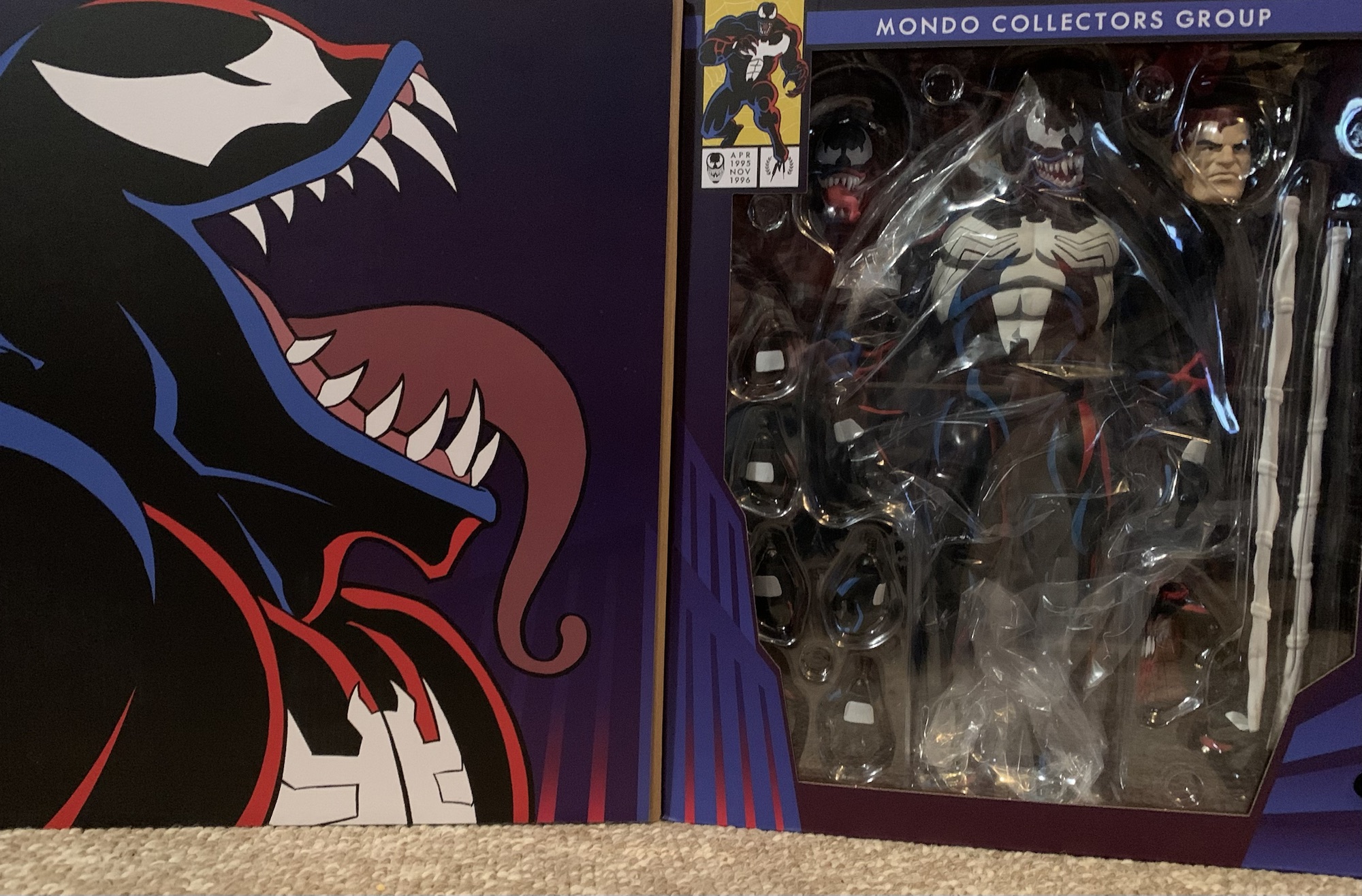
It took a long time for Mondo’s Spider-Man to get to me. At first, I wasn’t sure if I was going to even buy it. I passed on the Mondo offering in 2024, debated the symbiote costume variant, but ultimately passed on that as well. The X-Men line from Mondo is my true love and I just don’t have room on my shelf for another line of sixth scale action figures. I did get Venom because I love the character, and when Entertainment Earth had a big anniversary sale I decided to take the plunge on Spider-Man. That was in October of 2024 and at the time the figure was expected to ship in January. Then all of the tariff nonsense struck. The figure kept getting pushed out and eventually EE even had to up the price on me because of said tariffs all but wiping away the discount I was originally expecting. As the months went along I started to debate just cancelling it all together. I loved my Venom figure and I didn’t need a Spider-Man to enjoy it any more than I already did. When I received a notification that the figure was, at long last, in-stock I figured “Well, it’s happening.” Then nothing. Then my order was flipped to backorder. I emailed EE which didn’t offer much other than to say they didn’t get enough to fulfill all of their preorders. At that point, I figured I should just drop it and move on, but before I could my order was changed to “processing.” Now I have a Spider-Man from Mondo and I kind of wish I didn’t let my indecision get the best of me.
Spider-Man comes in a large window box with artwork by Nick Bradshaw and Peter Santa-Maria adorning it. It has an almost dark-deco vibe to the skyline which is evocative of the show’s CG cities when Spidey was seen web-swinging around New York. The figure itself is a sculpt by the renowned Alex Brewer with paint by Mark Bristow. The packaging concept is credited to Jordan Christianson and art direction to Hector Arce.
The ’94 version of Spider-Man could probably be taller, but I like the difference between he and Venom.
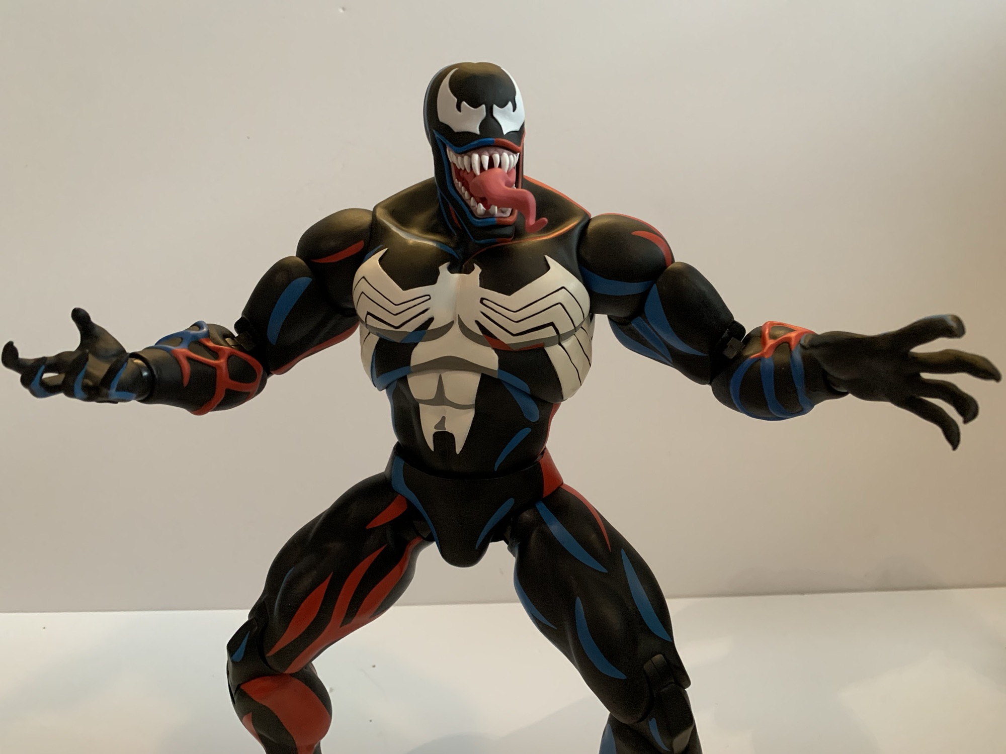
Spider-Man stands at about 11.75″ to the top of his head. I’m a little surprised they didn’t make him the full 12″, but I also don’t mind him being that much shorter than Venom. I tried to find some turn-around art from the show’s production for comparison, but the Internet has let me down. I can only compare him to still frames from the show and I have to say I feel like the silhouette is a touch off. Spider-Man in the 1994 cartoon is a pretty big Spider-Man. Pretty much all of the super hero shows back then had one style for all of the male characters. Flash Thompson would pick on Peter Parker for being a nerd, even though Pete was built like a linebacker. Here, the neck is a little slender and sits inside the silhouette of the head, which isn’t really how he was drawn. The shape of the head is also a little narrow which just draws even more attention to it. It was a Saban production and those were notoriously cheap for the time so there’s a lot of inconsistency from episode to episode, scene to scene, and shot to shot. Did Spider-Man look close to this in some shots? Probably, and there’s going to be some subjectivity on the part of the sculptor. For me personally I would have liked a slightly more beefy Spider-Man since that’s what stands out to me about the ’94 design.
Apart from that, the actual design and paint applications for this figure are fantastic. The eyes have that very ’94 shape to them and there’s a lot of empty space around the spider on the chest, as was true of the show. The linework is very clean and the cel-shaded paint job pops as one would expect. It was important to nail the shade of blue and red to make this feel like it’s from the show and Mondo did an excellent job there. There is some light scuffing on the left thigh of my figure which is odd because that area was wrapped in cellophane when packaged. Maybe it was wrapped too soon after painting or it just got too hot during transit? Despite that, the paint is easily the best aspect of the figure and really the entire Mondo sixth scale line and Spidey doesn’t lower the bar at all.
He’s a handsome fella.The mask looks more like a helmet when held this way.
Spider-Man has a host of accessories, though this particular edition has fewer than the limited run solicited by Mondo initially. For an alternate head we just have the unmasked version of Pete. It looks exactly like the character from the show and the paint job is terrific. He does have a bit of a smile to his face which does present an issue for a different accessory, but not one that actually came with this figure so I guess we can’t really ding it for that. There’s also a mask accessory. It’s shaped like Pete should be able to hold it and have it hang from a gripping hand, but I couldn’t get it to work. I thought it might be intended for Venom, but then I remembered Venom came with his own Spider-Man mask accessory and that one is glued into his gripping hand. Maybe other villains will be able to make use of this one down the road?
Go web!Long web.
For hands, Spider-Man comes equipped with a set of gripping hands. What he’s supposed to grip, I don’t know. He also has a set of relaxed hands, fists, and thwip hands. Peter also has his trusty camera which is molded to a web splat like it’s stuck to a wall. It does make it hard for him to hold, but I suppose one could stick it to a wall in their display with some tack or even via a finish nail or clear pushpin. Peter also has two thwip hands with short bursts of webbing coming out of them. The hands do not feature any articulation and are on straight pegs, which is fine for what they’re meant to do. There’s also another set with the long web lines attached just like we saw with Venom. There is a bendy wire in these webs, but I’m not really sure what purpose it would serve since the web lines are non-removable. For the ends of the webs, there are two conical attachments that serve as generic ends to the webs. There are also two web splats if you want the webs to be striking a surface or other figure. And lastly we have the typical Mondo display stand which is of limited utility. I don’t ever use these things, but I actually probably will with this figure. For that reason, it’s a shame it’s a plain black stand without any artwork on the base. It’s also the basic doll style stand and not the more dynamic one they have coming with Nightcrawler. I appreciate Mondo finally addressing the quality of their stands, but if you were going to do a better one wouldn’t Spider-Man be a character deserving of such?
It’s even a challenge to do convincing web firing poses.
That is all well and good, but where this figure has really come up short for me is with the articulation. Mondo’s figures are not super-articulated. They’re fairly basic as this is an aesthetics forward line, first and foremost. I’ve always felt it suits the X-Men line very well as the show that is based on featured pretty stiff, limited, animation. Those characters didn’t do a whole lot. Spider-Man wasn’t much better, but it still featured a character who spends most of his time crouching on landings, crawling on walls, and swinging through the city. Mondo correctly recognized that there was a need for more points of articulation with Spider-Man than they might normally do, but unfortunately the execution is lacking.
This is pretty much the extent of his range in the torso.
Spider-Man has a standard double-ball peg head which all Mondo figures seem to have. Unfortunately, Mondo really buried the lower ball joint in the neck which limits Spidey’s ability to look up. This can sometimes be corrected with a lower neck joint and Mondo opted to do just that. Unfortunately, the ball joint at the base of the neck might as well not be there. It’s way too snug and offers nothing when it comes to articulation. The shoulders are the standard hinged ball peg and there’s no butterfly joint. I’m okay with the absence of a butterfly joint at this scale and with this character design, but what I’m not okay with is how tight the right shoulder on my figure is. I could not get this thing to move much at all out of the box and I’m surprised it didn’t snap at the bicep. Even after heating and lubricating the joint, it still barely functions so it’s not a case of needing to just crack some paint that worked it’s way in there. There are bicep swivels, double-jointed elbows, and ball-hinge wrists and they work fine.
If you want your Spidey to crouch, good luck. Here he’s being supported by the stand.
Where things start to take a turn for the worse is with the torso. Mondo typically goes with a ball joint in the diaphragm and one at the waist and that’s what they did here. This combination is ideal for waist articulation even in a character like Spider-Man who is expected to crouch a lot. Unfortunately, Mondo screwed it up. The diaphragm joint does almost nothing. It doesn’t really rotate nor does it really go forward, back, or tilt. It’s just way too snug on the abdomen. As for the waist, it barely moves as well. Even rotating it doesn’t work all that well as the joint feels like it’s fighting me. Did the factory not lubricate any of these joints during the assembly process? It doesn’t feel, or sound, like it and I have noticed zero lubrication residue anywhere apart from what I added. I get it that Mondo would not want articulation that leads to large gaps in the figure or that might cause too much paint rub. They went too far though and basically made the pieces so snug and tight that the articulation is functionally useless.
This is probably the extent of his swinging ability.
At the hips, it only gets mildly better. We have ball-socket hips with built-in thigh swivels. The left hip is okay while the right hip is stubborn. It sometimes snaps back into position when I try to move it. I have popped it off and applied some lubricating oil which has improved it some. It still doesn’t mean Spider-Man can do splits or kick a full 90 degrees. If you try to kick forward, the figure wants to go off to the side. You can rotate at the hip to basically get into a split, but the way the cel-shading is done makes it look kind of dumb as the darker shaded portion of the legs will be forward-facing. The knees are standard double-jointed knees and at the ankles Mondo decided to go with hinged ball pegs like they do at the wrist. This means you can swivel and move those feet all around as much as you want, but it’s not a strong joint which is why I recommend using that display stand with this one. He’s just not going to stand very well. There’s also a toe hinge that’s kind of ugly. It works, but there isn’t enough stability in the figure to utilize the joint without a display stand.
I was not expecting Marvel Legends levels of articulation from this figure, but I was hoping for more. He’s really stuck in vanilla poses which is not befitting a Spider-Man. If the joints just worked he’d be fine. Then you could hunch him forward or having kind of twisting in a swing pose. I was hoping for a basic crouch, not a super low one, but you’re not getting that either. He can kind of do a basic swing pose, but it’s a bummer that he doesn’t have a web line to just grab onto. If they could pop out of the web shooting hands that would have solved that. I’m just really disappointed in what this figure is capable of and it left me feeling that Spider-Man is a poor fit for what Mondo wants to do.
At least this was a pleasant surprise.
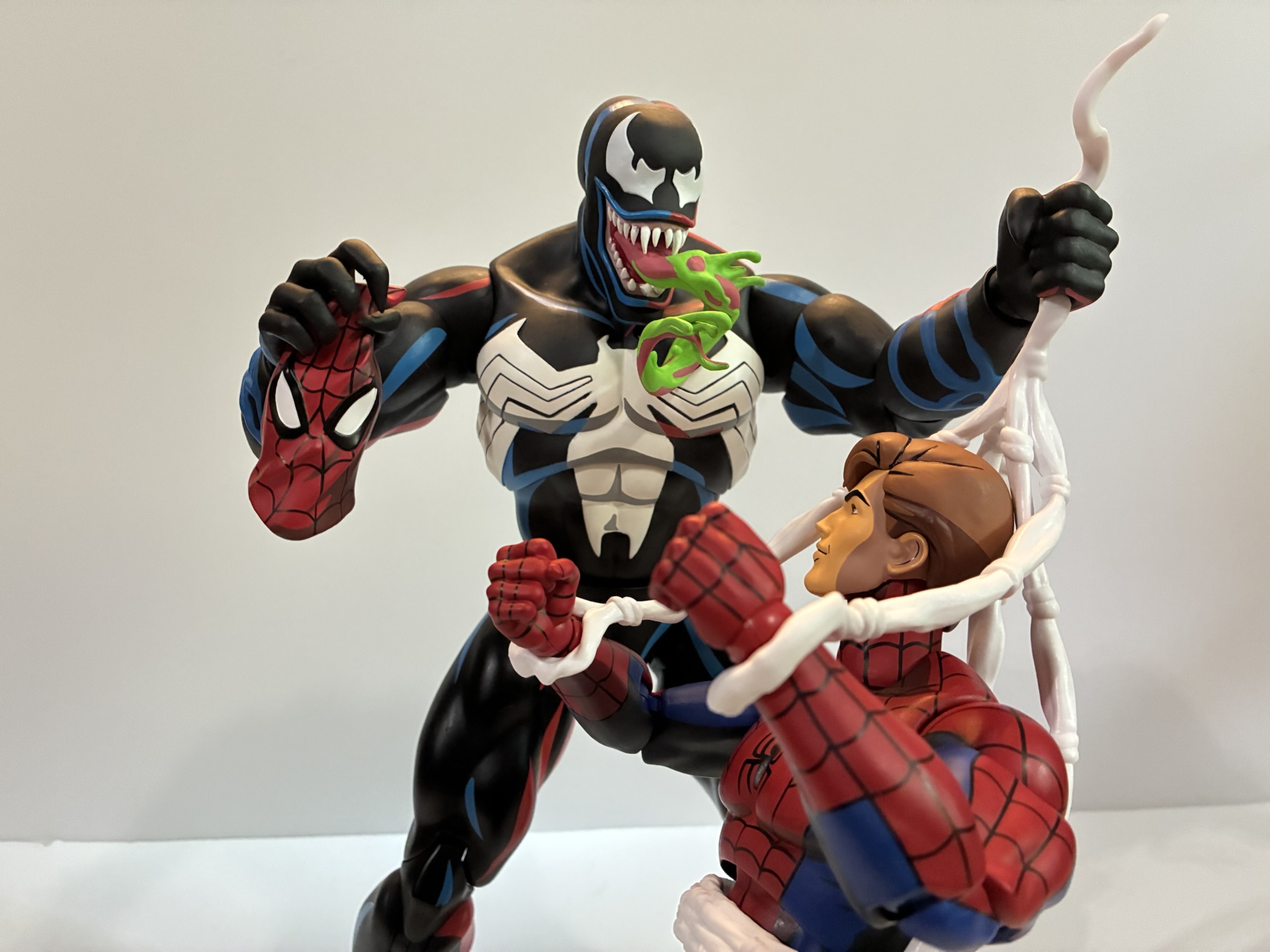
There is one other thing to talk about and it’s Venom’s web swing. If you have the Mondo Venom, he comes with a left hand accessory that’s a web swing/harness for Spider-Man. It’s based on a scene straight out of the episode “Venom” where Venom webs up Spider-Man and takes his mask off. He dangles him off a rooftop threatening to expose his secret identity to the world. The accessory is basically a belt and two loops for each hand. I was able to slide it onto my Spider-Man figure starting at his feet. It wasn’t easy and his right leg popped off in the process, but it is doable. The two strands for his hands are simple enough to attach and I plugged the Venom hand portion into my figure to test it out. To my surprise, the thing actually works! I first just had him on a surface and Venom was able to remain standing while holding Peter, but Peter’s feet were on the same surface. I moved the pair to a shelf where I was able to dangle Peter off the edge like in the show. Venom was up to the task and the two remained without issue. I don’t know if I actually have the guts to leave them there permanently like that, but I was sorely tempted. I didn’t think it had a chance of working this well, but credit to Venom’s tight joints and hefty weight. The only disappointment is Peter’s stupid, smiling, face. He really needs an angry expression or a scared one to sell this display. The black costume version of the figure comes with an angry unmasked head which probably would work better for this specific display, but that was a limited edition and has long since been sold out.
The harness accessory working so well was certainly a pleasant surprise, but it doesn’t redeem this figure of Spider-Man for me. This is the first Mondo figure that I regret buying. He looks good enough in a neutral pose, but Spider-Man is not a character for a neutral pose. It’s frustrating to know that Mondo recognized that and incorporated more points of articulation into the figure to address the issue, but nothing they added really worked. Ball-jointed torsos aren’t that complicated even at this scale and if the worry was the figure would topple over well then why hinged ball-joints at the ankles? It’s unfortunate and this is a figure I can’t recommend especially at the price it commands. If you think he looks good and don’t mind that he won’t be doing much of anything on your shelf then have at it. I personally expected more from Mondo and Spider-Man.
If you liked this review then here’s some other related entries you might like:
Mondo has had success with its sixth scale line of action figures based on X-Men and X-Men ’97 so it’s no surprise that the company has decided to dip its toe into another 90s animated Marvel series in Spider-Man. And when it comes to Spider-Man, I’m not sure what to call it. I always referred…
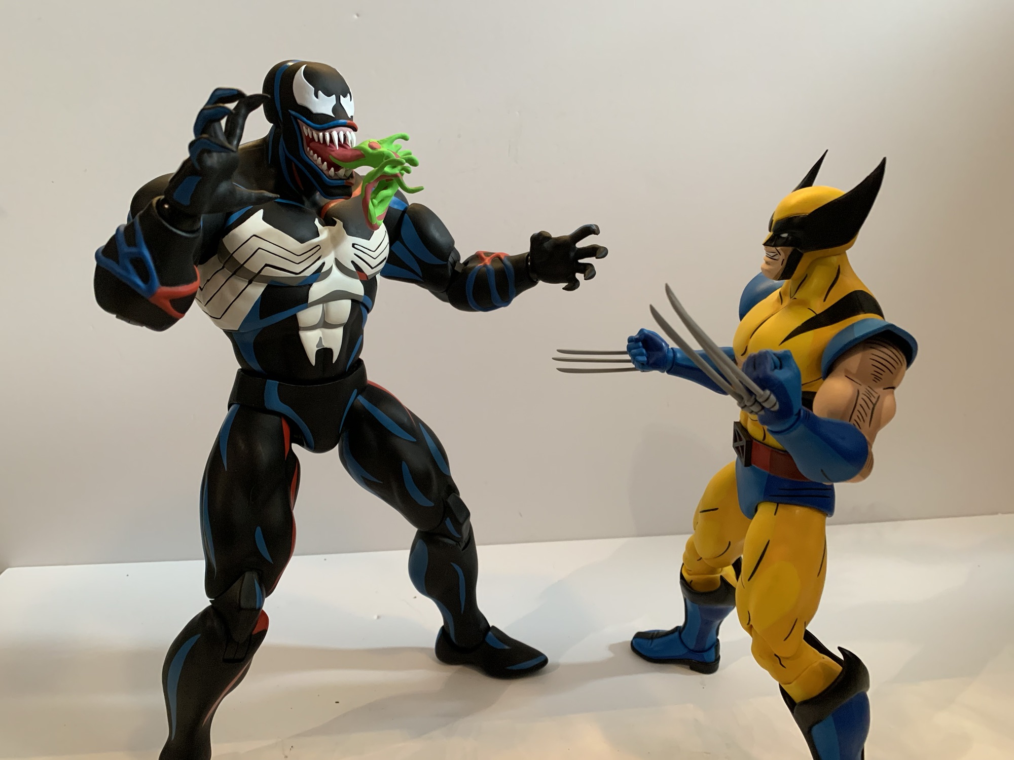
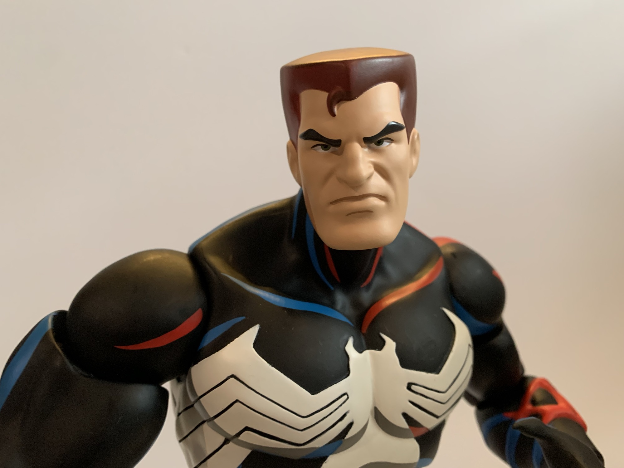
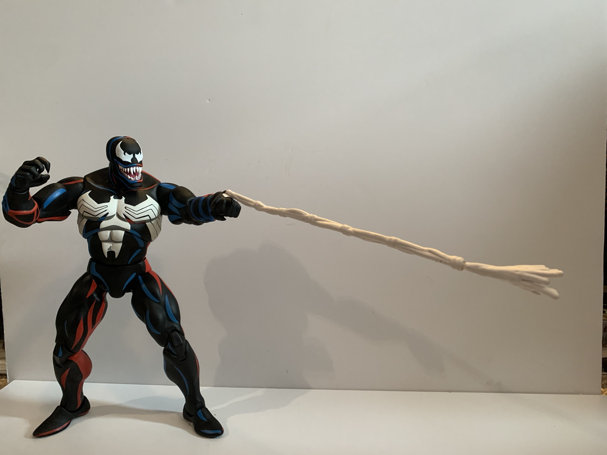
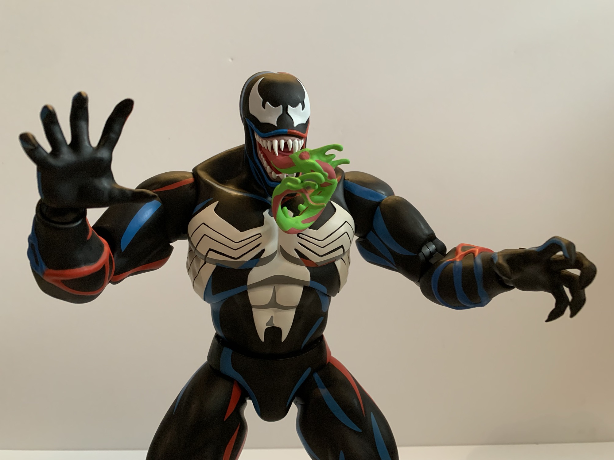
It was in 2021 that Hasbro released a PulseCon exclusive Venom figure on a Spider-Man retro card. The retro card series is meant to stir-up nostalgia for all of the adults who were buying toys and watching cartoons in the 90s as the retro card is a facsimile of the old cards Toy Biz used…
Last year, Hasbro celebrated the 30th anniversary of X-Men, the animated series that premiered on Halloween 1992 and would become a ratings hit shortly thereafter for the Fox Kids Network. It was responsible for getting a lot of kids into the X-Men and Marvel comics in general and the first, prime, benefactor of that rise…
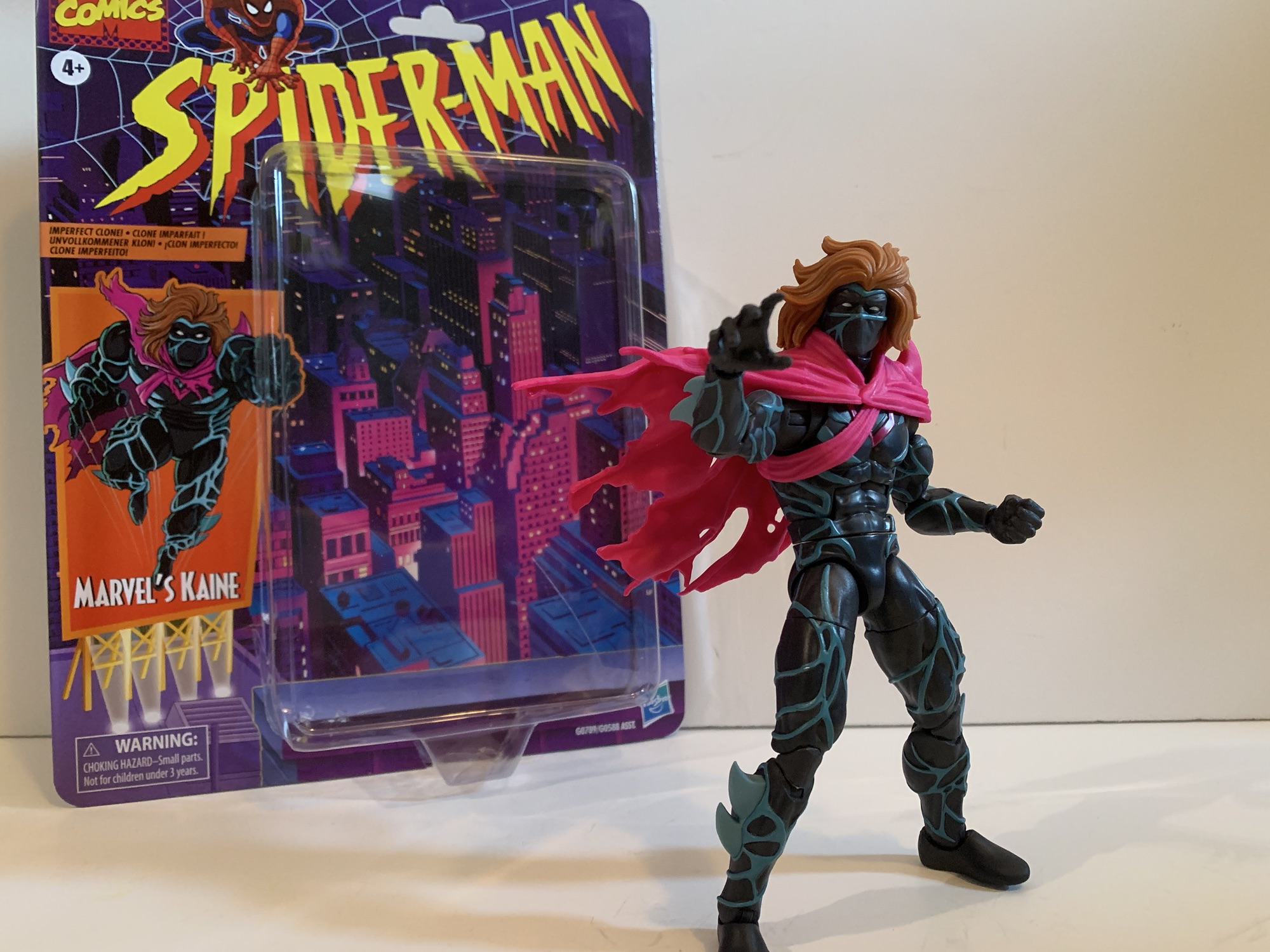
In some ways, Secret Wars was bad for comics. Commercially, the 80’s event was hugely successful for Marvel even though it seems to have just a lukewarm reception by fans in some circles. It helped to establish the belief that events sell and Marvel seemed hellbent on taking that approach in 90s. One of Spider-Man’s big plotlines was Maximum Carnage. It was a multi-issue arc with a bunch of heroes and villains teaming up to form super teams, and like Secret Wars, it didn’t seem like fans thought much of the finished product, but it sure seemed to sell well. And if it had not we wouldn’t have the extremely derivative Maximum Clonage (sic) to follow. Also referred to as The Clone Saga, Peter Parker was suddenly confronted with multiple versions of himself thanks to The Jackal and no one knew who the real Peter was. It’s the storyline that brought us the Scarlet Spider and it’s also the storyline that gave us Kaine.
“Don’t look at me!”
Kaine was yet another clone of Peter. He was the like the goth Peter before Sam Raimi came up with the idea for Spider-Man 3. Clad all in black with this weird, blue, membrane running throughout and a tattered cape, he caused some trouble for both Spider-Man and Scarlet Spider before eventually being outed as yet another clone. Kaine was actually the point where I fell off the story as a kid. It just got way too soap opera-like for my taste and I got enough of that at home from a mother who would monopolize the television on Saturday to watch all of the episodes of All My Children she had recorded during the week.
That’s more sculpt and paint than we’re used to with Hasbro.
Kaine may have been a lame addition to the story, but if I’m being honest, he did look kind of cool. When Hasbro unveiled a Kaine figure last year, I took one look at it and said to myself, “Why not?” As a Marvel Legends figure, it looked interesting and the crazy pricing we’re seeing from the world of action figures makes these $25 ones feel more susceptible to impulse buying now. Kaine comes in the retro Spider-Man packaging which makes sense given his era. He never did get a single card release in that line, so I guess this is like making up for lost time. There was a Maximum Clonage box set that contained a Kaine figure that was probably exclusive to some store. It was a classic Toy Biz repaint and I think they used an Archangel body for the base and just slapped a cape on it. Maybe if he had made the jump to the actual show he would have been given a more prominent release, but honestly it’s all Kaine really deserved.
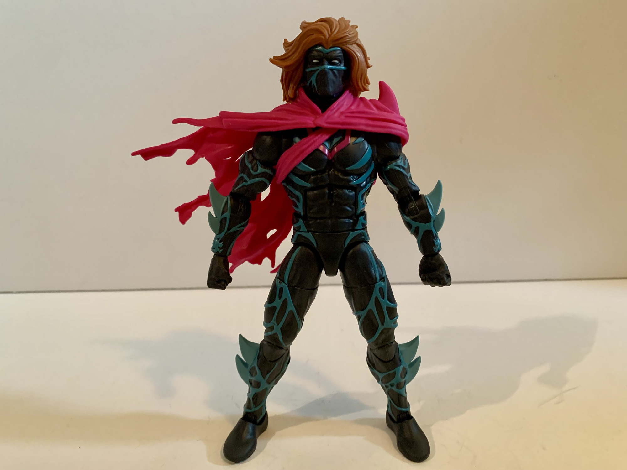
The cape looks nice and dramatic, but it will get in the way.
Hasbro apparently felt like he deserved better, because this Kaine figure goes harder than I would have predicted. This figure is basically all new sculpt. The blue veins are all sculpted and painted as are the fins, or blades, on his forearms and shins. Even the crotch piece has sculpted veins. The hair, head, and cape are all new as well and the only reuse this figure can take advantage of rests with the hands and feet, which I’m sure are recycled from tons of figures. This does come at a cost for the consumer as Kaine only comes with one set of alternate hands, but that’s how it goes. He has fists and open, style posed, hands. The cape is sort of an accessory because you can remove it, but the straps for it on the torso are much harder to get off so it’s really not designed to be removed, but you may want to and we’ll get to why in a bit.
Krillin: “I don’t think even the Dragon Balls could get us a mane like that!”
What I find really striking about this figure is that wonderful head of hair. Kaine looks like he walked out of a shampoo commercial or something. Fabio would be jealous as his hair never looked this good while hawking imitation butter. It, as well as the cape, are just one shade though. There’s no paint added which is a bit of a bummer as I think a wash would really help liven this figure up and also reduce that plastic look. I find this figure looks a lot better on my desk when the lighting is getting dim because it takes away that plastic sheen. Still, by the standards of the line, Kaine is an impressive looking figure and if you’re a customizer of some talent you can probably get this to look even better with minimal effort.
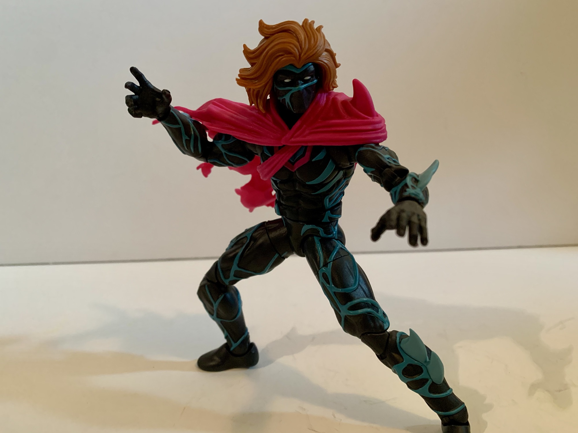
The articulation is basic by Legends standards. He should be able to pose well enough, even with the cape.
Since this is an all new body you may wonder if it has some articulation surprises. And the answer there would be, “Not really.” They had to make new molds to produce this figure, but I bet they just took an existing digital sculpt and then added the details to it before cutting steel. As a result, Kaine feels like a lot of Marvel Legends. He has the hinged ball neck, ball hinged shoulders, butterfly joints, bicep, double-elbows, swivel and hinge wrists, ab crunch, waist twist, ball hips, thigh cuts, double knees, and ankles that hinge and rock. Range at these joints is also all typical Marvel Legends stuff. He can almost do splits, kick forward 90 degrees, and the ab crunch works well enough. Where this figure is limited is the head and that left shoulder. The combination of the big hair and the plastic cape really lockdown the head. He can turn to the side a bit, look down, and barely look up. The left shoulder is also restricted by that cape, but really only in a sense that it can’t rotate all the way around. It does a decent enough job of getting out of the way with most movement and once you’ve settled on a position you can just reposition the cape. It’s not nearly as bad as it looks like it would be, though I’m sure there will be people getting custom soft goods capes for this guy.
Which one is the real Peter Parker?!
How do we feel about having a Marvel Legends Kaine? Fine. He’s a solid entrant for the line and it feels like real effort was put into making an accurate representation of the character in plastic form. Now I understand there’s some debate over just what color the blue vein things should be. He often was drawn to have gray instead of blue. Not being a massive fan of the character, I don’t care. I like the light blue on black so I’m happy. I’m not happy about the lack of accessories, but I expect that of Legends now. I have a weird soft spot for the trash of the 90s, so that’s primarily why I have Kaine. He’ll go with my Scarlet Spider and look like his goth cousin and that’s cool. And if you too think he looks cool then by all means drop $25 and grab him. I don’t know if he’ll be anyone’s favorite release in the line come the end of the year, but he certainly won’t be the worst.
We have more Spider-Man and Maximum Clonage stuff here if that’s your thing:
It was in this space last year that I shared my fondness for the Scarlet Spider costume when I reviewed the Medicom MAFEX Scarlet Spider action figure. I don’t buy much from Medicom because their figures are really expensive for what they are, but I sometimes break my own rule when I think they’ve made…
Last year, Hasbro celebrated the 30th anniversary of X-Men, the animated series that premiered on Halloween 1992 and would become a ratings hit shortly thereafter for the Fox Kids Network. It was responsible for getting a lot of kids into the X-Men and Marvel comics in general and the first, prime, benefactor of that rise…
When I was a kid, one of my favorite past times was drawing. Like most, I started really young with a box of crayons and coloring books. I’d eventually start keeping markers, colored pencils, and other instruments in a plastic McDonald’s case that came from a Happy Meal. It was blue and had a map…
The villain who can be anyone he chooses to be and this is what he chose.
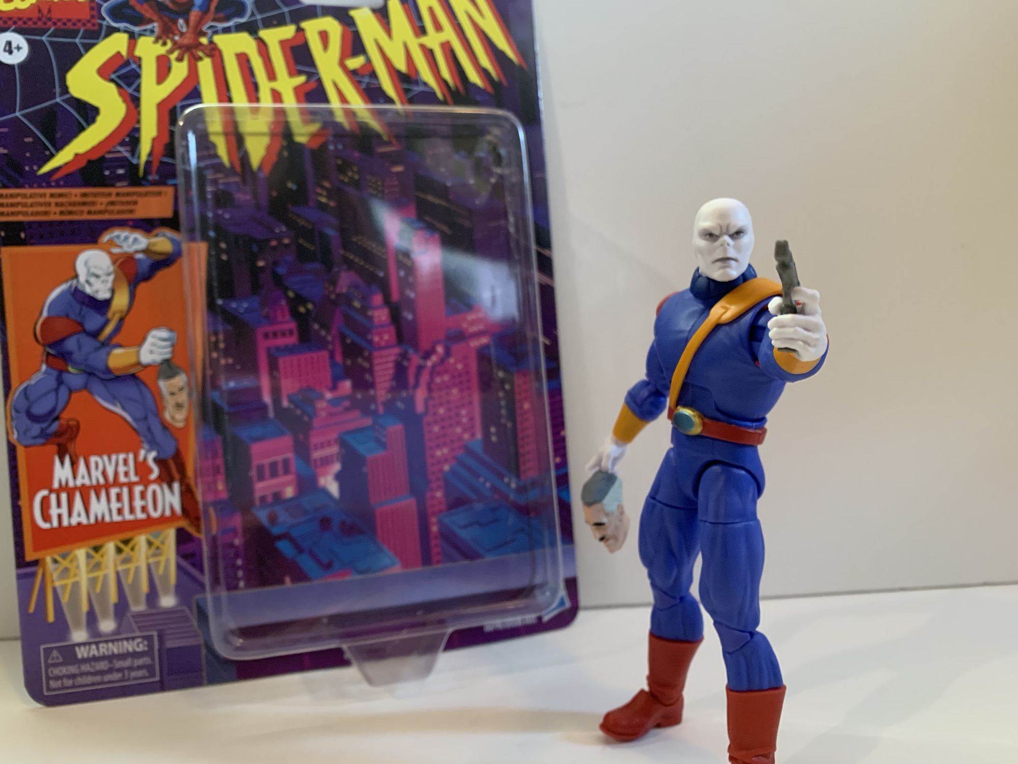
I had a bit of an impulse buy a few weeks back with the Marvel Legends Spider-Man Unlimited action figure from the show of the same name. What I didn’t mention was that he was not alone for hanging on the pegs that day with him was The Chameleon. Like Spider-Man Unlimited, The Chameleon is based on his appearance in a Fox Kids animated series, it’s just that this one is based on the more popular, more celebrated, Spider-Man which debuted in 1994. I can’t say that I was ever particularly fond of The Chameleon. He literally doesn’t talk so he doesn’t have much personality in the show. He’s just a shape-shifter in a purple outfit who received a featured slot in his own episode before becoming more of an ensemble type of villain. And for a villain that isn’t going to banter with Spider-Man, he’s probably best suited for that type of role.
Chameleon with animated Venom and the Walmart exclusive animated Spider-Man.
I have not been collecting figures based on Spider-Man like I did X-Men. That largely had to due with Hasbro’s release model. I would have loved to have added Doc Ock to my display, but I had zero interest in paying for a cruddy looking Aunt May figure just to get him. The two-pack approach really killed my enthusiasm for that line. I was never going to be as into it was I was X-Men, but I definitely would have bought more if I could have just picked up the characters I actually wanted. Chameleon was at least released as a retro card all by himself. He’s in his animated duds and mostly looks the part. My affection for the show, and boredom at not having bought anything recently at the time (damn, that changed fast) is what motivated me to pick up this release. Was that a smart move? Ehh…
And now with the rest of the animated figures I own.
Chameleon stands at approximately 6.5″ making him look a great deal larger than the animated Spider-Man released on a retro card. That’s more of a problem with that Spider-Man than Chameleon, but he does seem really big. Everyone was kind of big in that show, ordinary people on the streets seemed to all be jacked, so I guess it’s not that big of a deal, but I did expect him to be all together smaller. I have no idea how much of this figure is reused, but I’d wager it’s some and maybe that’s how he ended up tall and pretty thickly built. Even though he’s from the cartoon there’s no cel-shading or anything like that on him. He’s played straight up. The head is really well done with a lot of deep grooves in his lethal expression. There’s a little bit of what looks to be an almost silver paint around the eyes and in the creases of his brow. That combined with the really well applied eyes gives him an eerie look. Almost lifelike. It’s striking and it really gives Chameleon the appearance of a cold-blooded killer.
This belt is a pain in the ass to get straight.
The rest of the body is essentially bare plastic. I don’t think there’s another hit of paint on this guy. The only painted part is the belt. Since it has a shoulder strap, Hasbro did it all in one piece. It’s an orange plastic which matches the cuffs on his sleeves. The actual belt portion is painted red and the device on his belt buckle is painted gold and green. It’s somewhat soft, but the choice to make it all one piece means you’ll likely have to mess with it to get it on straight. The harness is pretty tight with no real room for play so it tends to want to pull up on the belt. It’s really challenging to get that belt buckle centered, if not impossible, so it may drive some folks a little nuts if they hate stuff like that. I wish they had just done it in two pieces similar to what they did with the strap on Cyclops. His shoulder pads are also a softer plastic that are keyed into the shoulder joint. I’m guessing the peg for the arm goes through a loop to sort of hold it in place. It moves with the arm, but getting them to mirror each other is a chore. The shoulder pad on the right shoulder of mine is seated nicely into the body while the left one is not so more of it is visible. In trying to jam it back in I actually damaged it slightly with my thumbnail so I guess I should learn to live with it.
At least he has fists?
Chameleon has the usual accessories for a Legends release which is to say he doesn’t come with much. Though, he does come with more than usual. Out of the package, he’s equipped with two trigger finger hands and he also has a set of fists he can turn to. For those trigger hands we get a pair of guns: a pistol and a much larger gun. They’re both a dull silver and they are the exact same two guns that came with the VHS Mystique. And if you’re buying more of this wave, they’re the exact same two guns that come with Agent Venom. I think the pistol also came with movie Deadpool so Hasbro has certainly got a bunch of mileage out of these two. Lastly, we also get a “mask” of one J. Jonah Jameson. It’s designed to resemble a rubber mask that’s been pulled off of someone’s head and is just hanging from something – like a hand. It’s both creepy and kind of funny looking. I like it, but I hate that they sculpted finger holes for it in the back. If you want Chameleon to hold his arm out and have the mask just hang from his fingers it will look stupid. If he holds it as his side it looks passable, but a little odd. I wish they had just sculpted it with the mask coming to a point in the center of the head like it’s going through his fist. Hell, since it’s an all new sculpt, just make it an extra hand like Mondo did for the Venom hand holding Spider-Man’s mask or the Spider-Man hand holding the mask of the Green Goblin. That would have been the way to go.
He also has a bigger gun.
You can probably take one look at this figure and conclude that it’s not going to articulate all that well, and you would be right. The head is on the old ball-hinge, but the oversized collar renders the hinge nearly useless. He can basically just turn his head to the side. Arms feature the usual hinged ball at the shoulder, bicep swivel, double-jointed elbow, swivel and hinge at the wrist. The trigger hands have the superior vertical hinge while the fists go with an appropriate horizontal one. The torso feature an ab crunch that has crappy range going forward, decent range going back. There’s a waist twist, ball-socket hips that can almost hit splits out to the side, kick forward a decent, and a thigh twist in each leg. The double-jointed knees are tight, but otherwise fine. There is a boot swivel that’s pretty ugly, but there if you want it, and the ankles hinge forward and back and there is an ankle rocker. Range at the ankle is mediocre. This figure is pin-less so that’s nice, but it also means that knees and elbows are a slightly lighter shade of purple than the rest of the body so you’re swapping one eyesore for another. I will say, on this figure the miscolored parts aren’t as bad as I’ve seen it on some others.
Sure to be everyone’s favorite accessory is this JJ mask. It doesn’t make sense for this version of Chameleon, but who cares?
Chameleon is pretty mediocre when it comes to articulation. He’s going to just stand there on your shelf. I don’t know why they’d go with the ball-hinged neck given the big collar. The collar is a floating piece so I guess if you want Chameleon to have more range looking up and down you could remove it, but I’d have preferred a double-ball peg so he could have more tilt for nuance posing. I don’t need him to look up at the sky or down at his toes. No butterfly joint when he comes with guns is a bit of a bummer, but I do like the unbroken appearance of the chest. He’s actually pretty broad-chested compared with a lot of Legends and the proportions are pretty damn good. Chameleon is an example for how a character doesn’t need a complicated design to look good in plastic if you just get the proportions right.
Standing tall. Standing proud.
And that’s what it all comes down to for me with Chameleon. Yeah, he doesn’t impress with the articulation and there are some design flaws that bug me, but he looks like the character from the show. He’s a big dude and he’s sculpted as such. The matte finish across the board just makes him look nice and they really nailed the face. He comes with an extra set of hands, two guns, and the mask accessory which is practically a motherload for a Marvel Legends figure being sold at the standard price. For that reason, I can’t really be down on this guy. He’s fine. If you like Chameleon as he appeared in the Spider-Man cartoon from the 90s then I think you’ll be happy with this one. He’s not going to be one you fiddle with much, but when you look to your shelf and see him standing there staring a hole through your soul you’ll probably think “Man, Hasbro kind of nailed that one.”
We have plenty more action figure reviews from the Spider-Man cartoon of the 90s:
Last year, Hasbro celebrated the 30th anniversary of X-Men, the animated series that premiered on Halloween 1992 and would become a ratings hit shortly thereafter for the Fox Kids Network. It was responsible for getting a lot of kids into the X-Men and Marvel comics in general and the first, prime, benefactor of that rise…
When I was a kid, my dad took me to some local convention or trade show. I have no idea why because my dad wasn’t the type who would go to such an event. He liked car shows, but from what I can remember this was more of a hobby show. It was early in…
It was in 2021 that Hasbro released a PulseCon exclusive Venom figure on a Spider-Man retro card. The retro card series is meant to stir-up nostalgia for all of the adults who were buying toys and watching cartoons in the 90s as the retro card is a facsimile of the old cards Toy Biz used…
There’s got to be at least one person who has been waiting for this day.
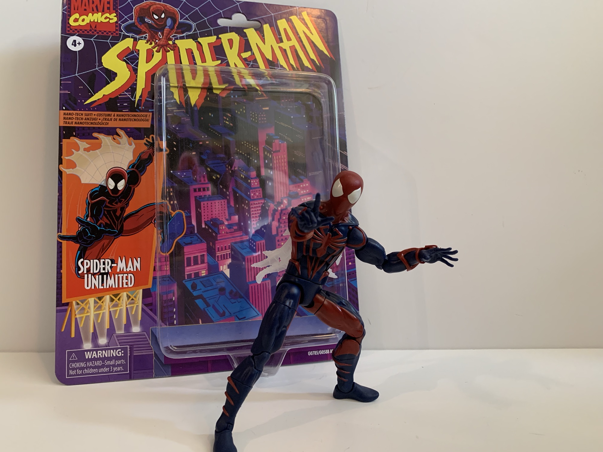
When the decision was made to end the animated series Spider-Man, it didn’t mark the end of the webbed one’s adventures on the small screen. Momentum was building towards a Spider-Man movie which would eventually arrive in 2002 so it made sense to keep old webhead in the public spotlight. Apparently, it would have been too costly to just renew Spider-Man and see if Peter Parker ever did find Mary Jane (we had to wait until 2024 to find out), so Saban Entertainment set out to do something new. Various ideas were kicked around including going back to the beginning, but with Sony working on an origin story for the big screen Marvel squashed that. Ideas for Spider-Man 2099 were considered as well as some sort of alternate universe story with two Peters that Marvel also nixed (perhaps PTSD related following Maximum Clonage). What Saban and Marvel eventually settled on was Spider-Man Unlimited, a show cancelled after three episodes aired that has largely been forgotten. Until now!
It is an interesting look for Mr. Parker, I just wish Hasbro went all out with the shading for the figure.
Spider-Man Unlimited is back in action figure form. Hasbro has done almost every other incarnation of Spider-Man at this point so why not? He did have a cameo appearance in Across the Spider-Verse, just like basically every Spider-Man, and since the look from the show was pretty unique I suppose it makes sense to give it a go in plastic. If anything from the show is remembered fondly these days, it probably is the suit which is sort of a mix of Scarlet Spider and Spider-Man 2099. It’s still red and blue, but there are no weblines and the whole thing is heavily shaded. He also has the web cape of Spider-Man 2099. It’s not the sort of look that can be easily adapted from an existing figure so the fact that Hasbro was willing to invest in new tooling for this is actually a surprise. And there’s really no way to do the figure without also using a fair amount of paint when compared with a basic Marvel Legends release. It will be interesting to see how this thing sells and if Hasbro’s investment paid off.
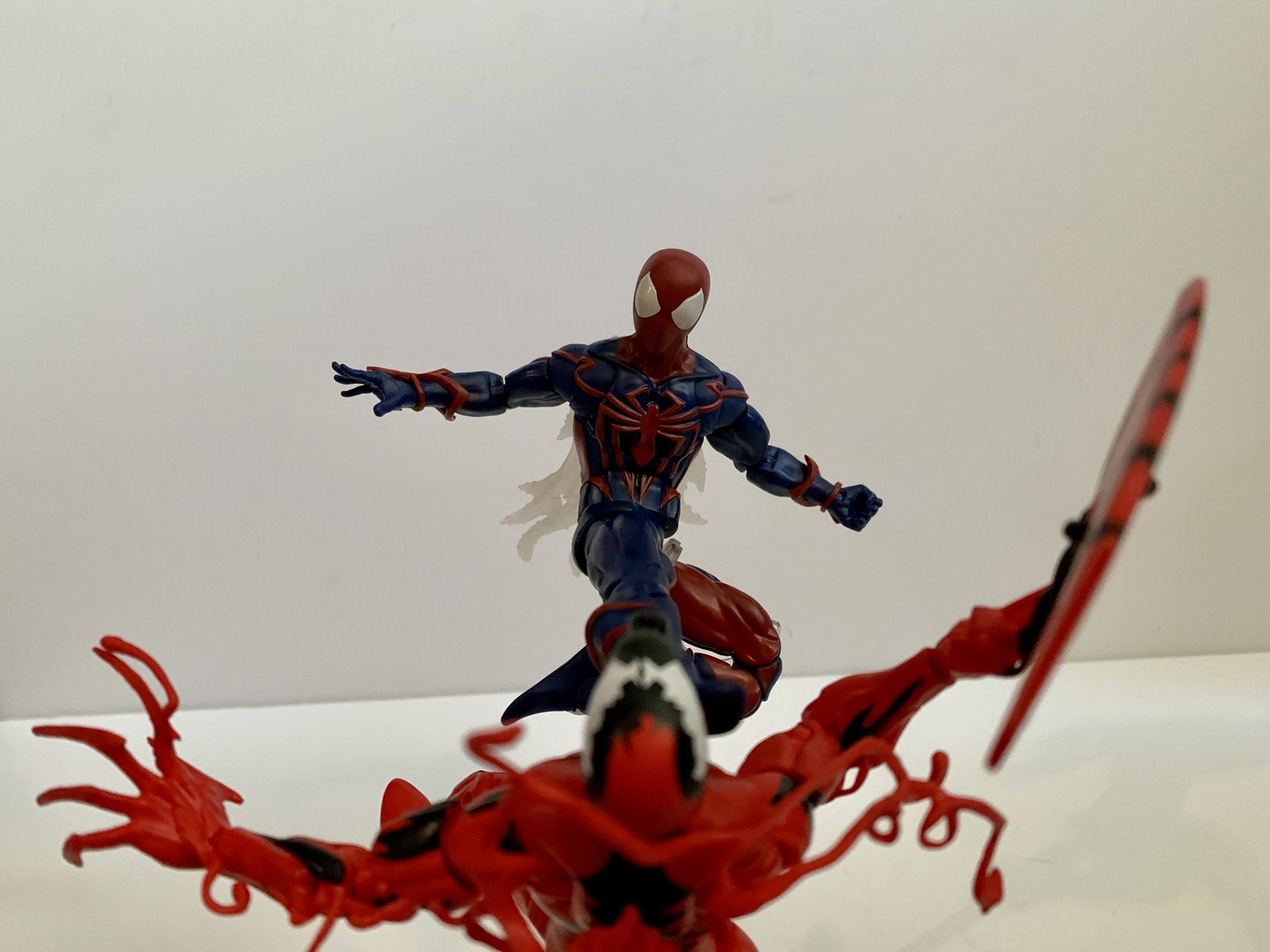
I’m guessing we’ll never get Venom and Carnage from this show so this will have to do.
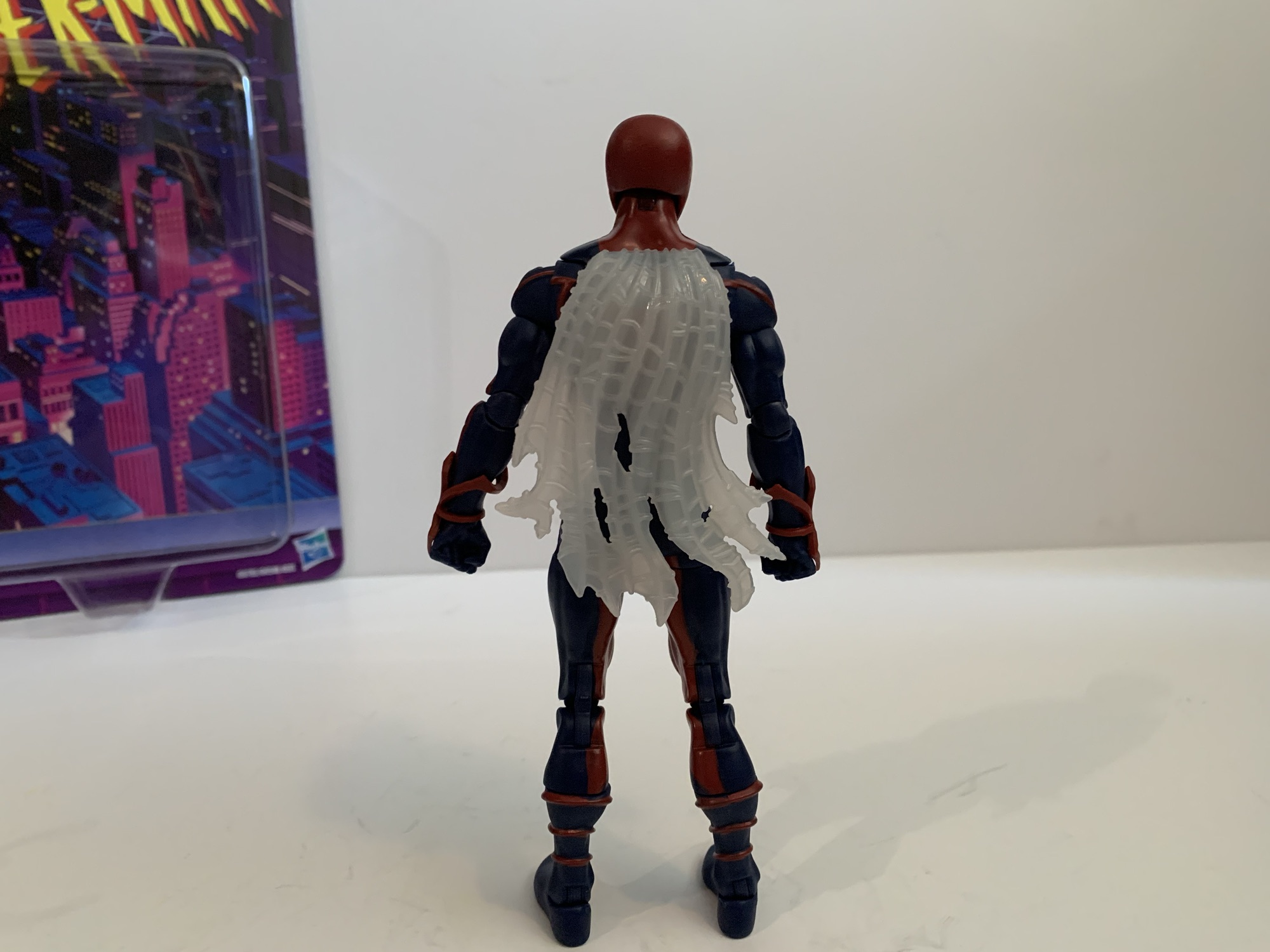
Spider-Man Unlimited is a bit of a throwback to a couple years ago when it comes to Spider-Man figures. I should point out that this suit was designed by Shannon Denton and Roy Burdine so if you like the look then thank them. The figure is mostly new tools because the spider logo on the chest is raised as are the legs running from them. Where they are not raised is on the arms and the red, spider, web-shooters are a separate piece. The calves have molded fins on them while the thighs and feet do not. In other words, the torso and shins are definitely new sculpt while the arms and thighs could have been sourced from another figure. The hands are conventional Spider-Man hands while the head is similar to past Spider-Man molds, but it looks too round to be from one of the symbiote costume figures and I want to say it’s all new. The web cape I’m not sure of as I don’t have any of the 2099 figures. It’s hard plastic and semi-transparent that’s slightly preposed.
It’s really not a bad sculpt.How do we feel about web capes? Personally, I could do without.This one can be touch to get into classic Spider-Man poses.Just like I don’t expect to see Venom and Carnage from the show, I’m guessing no Green Goblin will show up to help Spidey.
Most of this figure has been molded in blue plastic. All of the red you see on the figure is painted except for the web shooters and head. And on the head, the eyes are painted and not all that well. There’s some bleed around them and it’s noticeable even from a distance. The paint on the torso though is pretty clean and impressively so. The only ugly spot is the seem between the back and front of the figure where blue shows throw. Paint on the legs is mostly fine. The red is not particularly opaque on the knee pieces, probably because that piece is a hard plastic and it just doesn’t adhere as nice. To my surprise though, the head doesn’t really clash with the painted neck so that’s a plus.
I need to do a second coat and touch-up the edges, but I like the added shading on the face. Can I keep myself from shading the rest?
What does stand out aesthetically here is the lack of shading. It’s not really Hasbro’s approach to do heavy shading on their figures, but it feels like a pretty big component for the look of this version of Spider-Man. Rather than shade it, the blue and red just seem all together darker than they probably should be. It is really apparent though since the image on the box is similar to the look from the show. In my opinion, the shading makes the suit look more interesting than it is, but to properly shade this it would need most of the blue to be covered in black. What’s easier is the face, which was always shaded on the front and basically outlined in red. I think a solid compromise would have been for Hasbro to include that shading, but they opted not to. I decided to try it myself, despite not really being a customizer and, personally, I think the shading adds something. I could easily see myself getting carried away and going over portions of the body too, but I feel like I’d be better served to just stop at the head.
A flight stand can really aid in posing this one given its limitations.
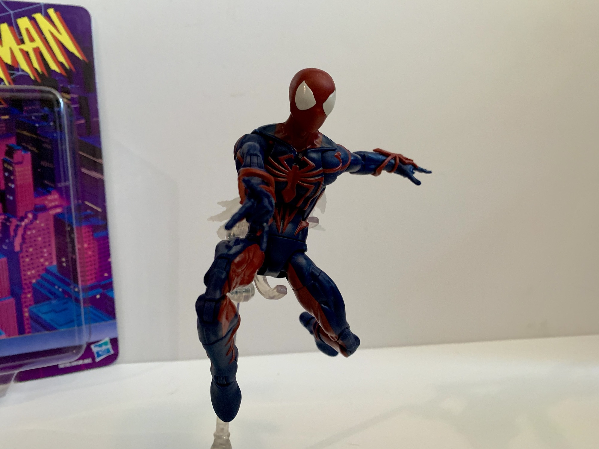
Accessories for Spider-Man Unlimited are what you would expect: fists, wall-crawling hands, and thwip hands. That’s all. No Peter portrait or web accessories. The articulation is where the figure feels a little dated. Most new Spider-Man figures have settled on a scheme that includes a ball-jointed diaphragm that Spider-Man Unlimited omits. He just has an ab crunch and a waist twist which really limits the “spider” posing. The other aspects are mostly conventional: ball-hinge head, ball-hinge shoulders, butterfly joint, bicep swivel, double-jointed elbows, wrist swivel and hinge, waist twist, ball socket hips, thigh cut, double-jointed knees, shin swivel, ankle hinge, ankle rocker. Range at the butterfly joint is a plus, while range at the hips is just okay. The waist twist, thigh cut, and shin cuts all are useful, but also all break-up the sculpt quite a bit so your mileage may vary when it comes to how useful they are. The ab crunch, being the only joint in the torso, at least works well enough, but I’m surprised they would go through the trouble of sculpting a new torso without implementing what passes for modern articulation. I don’t love what Hasbro does with its Spider-Man figures, I think they should do a ball joint in the diaphragm and waist, but it would be better than what we have here.
Even in bad TV shows, Spidey can still kick some ass.
Spider-Man Unlimited is a figure I never thought we’d get, but now that he’s here, I find myself surprised I own him. I have a bit of a fondness for odd looks sported by famous characters, especially when it’s tied to some forgotten media like Spider-Man Unlimited. I also kind of bought it because I kept striking out when heading to stores in search of other figures, and then when I saw this, it was like a bit of retail therapy to just buy it. It wasn’t anything I was planning on getting, but now that I have it what do I think? It’s okay. The figure looks fine, and I guess when you’re talking about a costume like this that’s what is most important. The articulation isn’t very good compared to the other Spider-Man figures Hasbro has done recently which aren’t exactly amazing either. And the usual complaints about a lack of accessories applies here too. I will forever remain puzzled how Hasbro was able to condition Marvel collectors to accept Spider-Man figures without web effects. If this costume is one you actually have fond memories of or just think is cool, you shouldn’t have much trouble locating this figure at retail be it online or in-store. I’ve seen it a few times now and more seem to be shipping out every day. It will set you back $25 should you decide to take the plunge with no one’s favorite Spider-Man.
Postscript: So I got kind of bored with this one just hanging out on my shelf. It’s not a bad figure, but the Spider-Man Unlimited TV show was so heavily stylized that it just really wasn’t doing it for me. I saw some customs online that looked really good, so I decided to take a stab at re-painting this one. I went with the outline approach and mostly copied the process of this custom on the channel Ken I Make It. Some others I saw put the blue on the inside of the sculpt to highlight the muscles, which looks pretty cool, but isn’t really in-line with the show. I liked the clean look with the spider logo outlined in black and decided to stick with this approach. Maybe I’ll get bored again some day and decide to do it differently, but I’m pretty content with the end result.
For someone who doesn’t really collect Marvel Legends, I sure have managed to look at quite a few Spider-Man figures:
Last year, Hasbro celebrated the 30th anniversary of X-Men, the animated series that premiered on Halloween 1992 and would become a ratings hit shortly thereafter for the Fox Kids Network. It was responsible for getting a lot of kids into the X-Men and Marvel comics in general and the first, prime, benefactor of that rise…
It was in this space last year that I shared my fondness for the Scarlet Spider costume when I reviewed the Medicom MAFEX Scarlet Spider action figure. I don’t buy much from Medicom because their figures are really expensive for what they are, but I sometimes break my own rule when I think they’ve made…
Well, this is a figure that I never planned on reviewing. It’s a bit old at this point, but we’re looking at yet another Spider-Man retro card release from Hasbro and this time it’s Cyborg Spider-Man. Now, I remember seeing this quite some time ago at Target and thinking it looked fine, but I’m not…
Mondo has had success with its sixth scale line of action figures based on X-Men and X-Men ’97 so it’s no surprise that the company has decided to dip its toe into another 90s animated Marvel series in Spider-Man. And when it comes to Spider-Man, I’m not sure what to call it. I always referred to the X-Men cartoon as simply X-Men, though in the ensuing decades there’s been an attempt to retcon it as X-Men: The Animated Series since that’s what happened with Batman. Only, Batman had “The Animated Series” tacked onto it from the very beginning even if it wasn’t technically the show’s name. With Spider-Man, I guess I always called it just Spider-Man, but over the years I’ve come to think of it as Spider-Man ’94. I don’t know why I feel the need to differentiate it in such a fashion, but I do sometimes refer to X-Men as X-Men ’92.
Whatever you want to call it, Spider-Man was a pretty entertaining show for an early teens kid in the 90s. I was introduced to the character of Spider-Man via public service announcements and that really cool CGi Spider-Man that dropped in as part of the Marvel logo at the end of Muppet Babies. I did catch a few stray episodes of Spider-Man and His Amazing Friends, but for the most part I didn’t know a ton about Spider-Man going into the premiere of the ’94 cartoon. I knew the basics, had a few comics, read the back of many trading cards, but a lot of Spidey knowledge would come from the show. And I liked Spider-Man well enough going into the whole thing, but the character I really liked and wanted to see on television was Venom.
As is typical of Mondo, the packaging is pretty nice.
I’ve explained my love of Venom in other posts on the subject, but he was one of the big characters of the 90s. Sure, he debuted in the 80s, but I feel like he took off in the 90s leading to his solo outing in Lethal Protector. When the Toy Biz Marvel Super Heroes line emerged, I didn’t buy Spider-Man, I got Venom! When the video game Maximum Carnage hit, I played that thing and kept saying “Where’s Venom?” until finally getting to the stage where he was playable. He was just cool. This big, brutish, version of Spider-Man with a great concept for his costume and artists that took advantage of it. When the show hit, he was saved for last in the opening title for a reason and I would tune into that show week in and week out waiting for the big guy to finally show up. And when that episode finally hit and the alien slime dripped down onto Eddie Brock I could have jumped out of my skin with excitement. Unfortunately, that would be just one of three episodes that featured the character, but it was still cool to finally see him in animation.
That’s definitely Venom from the old Spider-Man cartoon.
I liked the show Spider-Man well enough, but it wasn’t as high on my list as X-Men. As a result, I don’t know how deep I’m going to go on a line of sixth scale toys that retail for over $200 a piece and require a lot of shelf space to display properly. However, when Mondo announced they were doing Spider-Man I knew I was at least in for Venom. Which doesn’t make the most sense, if I’m being honest. Venom, as a character created for animation, has a weaker design compared to his comic book counterpart. He couldn’t have the many rows of teeth, the giant tongue, complicated eyes, and so forth because it would be a nightmare to animate. He also couldn’t be shaded like he was in the books where most artists would start with a blue base and then layer on the blacks. He kept his basic shape, but the eyes and mouth were simplified. The show added its own touch by cutting out slits on the tops of the white eyes which give him the illusion of slit-like pupils as if owing to a snake. The tongue was there, but not monstrous and usually absent the green slime. Standing out most though was this blue outline the character would have on one side, plus a red one on the other. It’s not uncommon to see blue used to shade black in both comics and animation, but the red was certainly an interesting choice. It’s certainly a unique look for Venom, even if it isn’t my favorite, but there’s charm and certainly a great deal of nostalgia baked into this look.
Venom is pretty damn large even when compared with the biggest characters from the X-Men line.
Mondo’s Venom comes in a massive window box that is structurally the same as what we see from the X-Men line. Conceptually, it’s relying on new artwork and for this release that artwork is done by Kris Anka with Jordan Christianson receiving credit for the package design. There’s a big web on the front with Venom in the middle with a black, blue, and red Spider-Man logo across the top. There’s a Velcro flap with a side portrait of Venom on the inside. The window for viewing the figure has a comic book-like character portrait in the top left corner that also includes the dates April 1995 through November 1996 with both endpoints marking Venom’s debut and final appearance in the show.
Sorry Wolverine, since we don’t have a Spidey you’ll have to do.
Packaging is fun and all, but the real treat is what’s inside. Venom is a big, hulking, brute of an action figure. Mondo lists him as 13″ and my tape measure has him at just a tick over 13.25″. He’s big and right up there with Sabretooth and Omega Red from the X-Men line. This is another sculpt by Alex Brewer and on paint for Venom is Mara Ancheta and, let me tell you, these two did a bang-up job. That should come as no surprise to anyone familiar with what Mondo has been doing at this scale, but Venom looks like a maquette from the show. He is as faithful to the screen as you’re going to find. His upper body is massive with huge shoulders and bulging biceps. It tapers well at the abdomen and he has these tree trunk legs that just really add to the bulk on display.
I can hear Hank Azaria’s voice in my head.
All of the show specific details are captured beautifully in this figure. The portrait is perfect. He has this slight indent on the center of his head which he was often drawn with. It was like the meeting point between the blue and the red outline and it gave him a bit of a “butthead” look in some stills. Here it’s subtle so we don’t have a butthead Venom, but we have an accurate one. The eyes are perfect and he has those unique Spider-Man ’94 eye slits plus the blue and red lips around his lizard-like maw. The default head has an open mouth and the teeth are painted exceptionally well. On the chest and back is the classic white spider logo and the black lines in the legs are slightly sculpted in. The forearms feature those veins that kind of looked like webbing to me as a kid and they’re colored in blue and red as they were in his second appearance. The white patches are also present, a detail Mondo certainly wouldn’t overlook. And the paint is just fantastic. Crisp, clean, and in the right amount. Venom isn’t the sort of character that’s going to pop like a Cyclops or even a Spider-Man, but he has what he needs. There’s tons of blue and red highlights on the muscles and the logic on play is well applied as the figure creates an illusion of a light source. There’s also a hit of gray in the spider logo under the pectorals and in the abs which looks great and adds definition. If you inspect the figure in great depth you might find a white spot here and there or a softer edge to some of the paint, but in terms of paint slop it’s pretty much pristine.
Venom triumphant!
Now, where these Mondo figures usually don’t shine is with the articulation, and despite Venom doing some thing different, he’s still largely the same. All of the points of articulation you could want are here, they just don’t have the range to create a variety of poses. There’s the usual double-ball peg head, the ball-hinged shoulders, ball-jointed wrist, ball-jointed diaphragm, ball-jointed waist, ball-socket hips, thigh twists, double-jointed knees, ankle hinges, and ankle rockers. The sort of new, or less often seen, are the bicep swivels with double-jointed elbows. I think Mondo is going to be doing this more and more going forward as we did see it with Cyclops and it’s a change I like. In terms of what works and what doesn’t, it’s largely a case of tightness. The shoulders are very tight. Hitting a T pose might be impossible for this guy and just basic rotation is tough. You also have to be mindful of the arm rubbing on the pecs as you don’t want to mess up the paint. The elbows will bend a little past 90 degrees, but he’s so bulky that going any further really isn’t going to do much. The diaphragm joint feels very limited. I’m getting not much forward and back, rotation is oaky, but again it’s a painted surface and I don’t want to mess anything up. The waist is really hard to get much use out of and I can’t get the ankle hinges to budge. The rockers work so standing him has been easy, but this isn’t a Venom for deep crouches or those real spider-like poses.
Venom has these itty bitty webs.
There’s no sugar-coating it, articulation is a shortcoming with this figure and with this line. It’s just a question of as a consumer are you willing to accept that as a trade-off for the aesthetic? And aiding that aesthetic is the boatload of accessories Mondo included with this one. I have the limited version, which has some extra stuff that I’ll be sure to call attention to. As far as what’s included with all, we have a bunch of hands. By default, Venom comes equipped with open hands but he has sets of fists, gripping, and clawing hands that swap in and out pretty easily. He also has an extra right hand which is gripping a Spider-Man mask from the scene in his debut episode where he tries to expose Spider-Man to the general public. The mask is sculpted and fully painted and looks cool. It’s also kind of amusing to me because Mondo’s Spider-Man figure (I initially passed on that one, but then ordered it via a third party through a sale and I’m still waiting on it) came with a hand holding the mask of Green Goblin. Is that going to be a thing for this line where every character comes with a hand holding the mask of another character?
He also has some big web lines with different attachments for the end. This attachment is basically the traditional web line.
Naturally, Venom also has some effect parts. And namely, effect hands. He has two fists that are angled with long strands of web shooting out. The web lines are close to 9.5″ in length and are made of soft plastic or rubber with a wire running through it. I’m not sure how useful the wire will be, but I suppose it’s better than not having it. The line ends with a plug hole and you can insert one of two splatter ends or one of two included web ends. I like them, but the connection on my figure’s left hand is pretty weak. Weak enough that I think it might fall off soon which is something to be mindful of. The web line on the right hand seems secure. And if these web lines just seem like too much, there’s also a set of hands with short, 2.5″, web lines shooting out. These do not have a wire, because it’s not needed, but they certainly require less shelf space if you want Venom shooting webs on your shelf.
And if you prefer, we have a splat effect too.
Venom has always been an expressive character so he needs multiple portraits. And for the standard edition you get three. The default one features an open mouth and Venom’s typical sinister grin. The alt head has that tongue you all want snaking out. As it was in the cartoon, the tongue is pink and there isn’t any slime on it as was common in the comic books. Often in the show the tongue would end as if there was slime on it, but it was just colored pink. I always wondered if that was by design or if they just didn’t paint on the slime. Either way, this head doesn’t reflect that which is honestly probably for the best because it was pretty weird looking. Lastly, we have the unmasked Eddie Brock portrait. There’s not much to say about it other than the likeness is spot on. He has somewhat of an agitated expression when I think most may have preferred a sinister grin, but it’s fine. Paint across all of the heads is pretty damn immaculate. I don’t use that word often to describe the paint job on toys because there’s usually something wrong on everything, however minor. With these it’s pretty damn hard to find anything though.
I think of this as the Lethal Protector head.
And now for the extra stuff. If you get the limited version, you get two extra portraits. The first is another tongue head with a more dramatic tongue covered in green slime. This feels like more of a comic head even though the actual head and face of the character is still undoubtedly Venom from the cartoon. I think of this head as the idealized version of the character, what we would have wanted to see all things being equal from the show, but animation budgets prevented it. It’s awesome though and I am guessing this will be the favorite of many. The other head is an Eddie Brock portrait in mid-transformation. The Venom “mask” is closing its mouth over Brock’s face as it would do in the show and it looks amazing. I can’t believe how well they managed to get the paint on this thing and it’s this Brock face that has that sinister grin I was looking for. To go with this is a big piece of Venom goo that clips around the waist of the figure to make it look like alien slime is shooting off his back. It plays up that mid-transformation thing, even though the figure is basically already in Venom form, but it’s neat. It’s soft plastic so it doesn’t feel like something that will scuff the figure or anything.
Poor Venom has no Spider-Man for his swing. Maybe one day…
The last accessory is what I affectionately refer to as Venom’s web sex swing. It’s from the debut episode of the character where he webs up Spider-Man in this web contraption, pulls off his mask, and dangles him over the edge of a building where the onlookers at street level try to get a picture or video of Spider-Man unmasked. It’s basically five parts: you have a Venom left hand which is how it attaches to Venom. Then you have the five web lines, two of which end in loops to go over the Spider-Man figure’s wrists and the other two weblines end on what’s basically a web belt. The plastic is fairly soft and pliable and, according to Mondo, this belt part is supposed to slide over Spider-Man’s legs and come to rest around his waist. I don’t have that figure, but I have my doubts that this thing will be easy to get onto Spider-Man. When/if I get Spider-Man maybe I’ll update this with a picture of it in action, or confirmation that I just couldn’t do it. There are promo shots of it, but who knows how Mondo pulled them off. I suppose you could separate the figure at the diaphragm, but I don’t blame anyone for not wanting to pull apart a 200 dollar action figure. I know I wouldn’t.
What a portrait!
Mondo’s take on Venom is pretty damn rad. If you don’t care for his animated look then that’s understandable, but if you’ve ever wanted a representation of Venom from the Spider-Man cartoon on your shelf then this is the one to get. Yes, it’s very expensive and I was even a little annoyed at the price this one came in at, but it’s Venom and I had to have it. The articulation won’t blow anyone away, but the presence this one has is pretty damn incredible. He has all he needs and the execution of the sculpt and the paint is as close to flawless as I think I’ve ever seen with an action figure in any scale. Yeah it costs a lot, but you’re getting a damn good product. If you want the limited edition, unfortunately it’s sold out and you’re going to have to try your luck on the aftermarket. My preferred head is in the limited version, but I don’t know that I’d pay more than the ten bucks Mondo charged for the extra stuff. The standard version should still be available in various places, just not through Mondo directly. If this looks like something you want in your collection, I think the expense is worth it. Just know what you’re getting: a big, kick ass looking Venom from the 90s Spider-Man cartoon.
We’ve got plenty more Venom and more from Mondo for you to check out:
On Tuesday, I posted a review for the NECA TMNT Adventures Cryin’ Houn’ action figure, a figure that debuted during this year’s edition of Walmart Collector Con. Today, we’re looking at a true exclusive from that event. Cryin’ Houn’, and a lot of other figures released that day, were basically a first to market agreement…
When I was a kid, my dad took me to some local convention or trade show. I have no idea why because my dad wasn’t the type who would go to such an event. He liked car shows, but from what I can remember this was more of a hobby show. It was early in…
After putting a real hurting on my wallet in 2023, Mondo decided to take it easy in 2024 with its line of sixth scale action figures based on the animated series X-Men which ran from 1992-1997 on Fox Kids. Two figures ended up getting released this year, Rogue and now the leader of the X-Men…
On Tuesday, I posted a review for the NECA TMNT Adventures Cryin’ Houn’ action figure, a figure that debuted during this year’s edition of Walmart Collector Con. Today, we’re looking at a true exclusive from that event. Cryin’ Houn’, and a lot of other figures released that day, were basically a first to market agreement that are now available from other places. This figure, Marvel’s Venom, was only available through Walmart and that’s usually a bad thing. The retro carded animated Spider-Man released in 2022 was a Walmart exclusive and a brutal one at that. A lot of people I know had their orders cancelled and the figure was notoriously difficult to track down in-store. Worse, it was Spider-Man! A central figure to Hasbro’s line of figures based on the 1994 animated series and it was only available through Walmart. It was as much a boneheaded move by Hasbro as it was Walmart, but no matter how you sliced it, the consumer experience was less than optimal.
“Look ma, I can lick the back of my head!”
This Venom? No freakin’ problem. Did Walmart finally learn its lesson and up their order totals for their Marvel Legends exclusives? Perhaps, because a brand new Venom on a retro card is probably a pretty in-demand release. Venom has been popular seemingly from the get-go when he was introduced during Todd MacFarlane’s run on The Amazing Spider-Man. The previous retro card edition of the character was released as a Pulse Con exclusive and was a take on Venom from the ’94 cartoon. This one is a more evergreen interpretation and while it does share a lot of parts with that figure, there is some new stuff to talk about with this one. Now, I am normally not a huge Marvel Legends collector, but as I detailed in my review for that previous retro card Venom, I’ve always liked the character. I was a bit iffy on this one though when it was announced, but the whole Walmart exclusive aspect kind of forced my hand. In a bid to avoid later regret, I decided to grab one and I have some thoughts.
Since I only have one other Hasbro Venom, we have to compare then.
As stated, this version of Venom does come on a retro card. There’s an illustration of Venom on the front that is different from the previous version. It doesn’t jump out as an era specific take on the character and almost looks like an alternate take on how Venom could have looked in that ’94 cartoon. That makes sense since that’s exactly what this retro card is looking to invoke memories of. That edition of Venom was a bit weird as it featured blue and red shading and a “butt” head. There’s some charm there now in looking back, but had Venom looked like he does on this retro card then I think that would have been an improvement.
Despite their differences, they still love each other. Maybe a little too much.
Nonetheless, this Venom is more of a comic take on the character. Or more appropriately, a Legends take on the character as Legends often seeks to add a touch of realism to the characters. Venom stands right around 7.25″ to the top of his head giving him a decent amount of size which is appropriate for most takes on Venom. If you have that animated Venom figure, then you’ll be familiar with the arms and legs utilized for this figure. What’s new is the torso and heads, though I believe one of the heads is from a different Venom release. This does mean that we got rid of those obnoxious holes in the traps of the character that were a holdover from that mold’s prior use with Omega Red, and it also mean we have some new articulation to talk about.
Their favorite past time? Ganging up on Spider-Man.
What’s not really different though is the approach. Venom is basically just all black plastic with little paint. The paint is reserved for the spider logo that wraps around the body, the white patches on the hands, and the details on the face like the eyes and teeth. The body has different finishes too which is odd. There are spots where the plastic is fairly matte in appearance, but other spots are glossy. Were they trying to create hot spots on the sculpt to accentuate the slimy aspect of the character? Probably not. If so, it’s a foolish approach because it’s very inconsistent. The figure is a chunky one relative to other Legends releases, though the plastic feels like it’s of a lower quality. There’s a rubbery aspect to it, especially in the legs, and the joints have a gummy feel as a result. The white spider logo was sticky out of the box. A lot of the tack has been remedied by simply leaving the figure out for over a week now, though some spots (like under the arms) remain sticky to the touch.
This time, the spider logo continues onto the butterfly joint.
The paint is minimal, but also not as cleanly applied as it could be. There’s a blemish on the right pectoral of my figure and the edges are pretty fuzzy on the rear of the figure. Since the figure is black plastic, the white is also not opaque enough to hide that. Especially in the creases of the muscles where too much of the black shines through. Unlike the prior retro card Venom, for this one Hasbro decided to paint the spider leg onto the butterfly joint in the shoulder blades rather than squish the spider to fit inside them. It’s fine, though if you’re viewing the figure from behind it means you will have to line-up the logo to keep it from looking stupid. The paint on the faces is also kind of messy around the teeth. The alt head on mine also has a black speck in the middle of the right eye which kind of drives me nuts. The left eye is also a little sloppy around the edges.
For those curious, the animated Venom lacked the white patches on the hands and this is how a hand swap would look. I still think the patches are the wrong shape, but better than nothing.
The paint isn’t great, but the overall sculpt will probably please most. He’s very muscled and has some huge traps to speak of. The chest is pretty solid and the torso tapers in a bit towards the abs. The shoulders are still too small for my liking and they sit lower than I’d like as well. Oddly, I feel like some poses draw more attention to that when usually it’s the straight up and down poses where that is most evident. The proportioning is solid, though his hands are huge. They’re the exact same hands as the previous Venom I looked at so it’s not new, but he’ll look goofy in a neutral pose with open hands. Venom is routinely drawn with exaggerated hands so it’s not a bad thing, just something to be mindful of when posing. It’s not a perfect sculpt, but as a generic Venom body it’s likely to please most who collect the line.
This new head is a decent enough take on the MacFarlane design, one of my preferred looks for Venom.
In true Marvel Legends fashion, Venom doesn’t come with a whole lot. The figure is at least not a more premium priced figure so I guess we can excuse the lack of accessories. This figure comes with four hands: fists, and open hands. The two open hands are not mirrored as the left is more of a clawing hand. There are also two portraits. The default one, which I think is an old sculpt, has narrow, jagged, eyes with an open mouth. Emerging from that mouth is a giant tongue that curls back towards the body. The style of the head reminds me of the look Venom had during the Separation Anxiety storyline which was illustrated by Ron Randall, but I don’t know if that’s what the sculptor was going for. The alternate head is a closed mouth with eyes that are more like slanted half circles. It looks like it’s inspired by the debut panel for Venom drawn by Todd MacFarlane in Amazing Spider-Man #300. The two open hands even play into that image. Todd’s take on Venom was more squat than this figure and really bulky, but in the world of Marvel Legends, this is probably as close to a MacFarlane Venom as we’re likely to get.
The neck articulation on this guy is terrible. Left is an example of how far up the figure can look.
A lot of the articulation on this figure is familiar, but there is some differences to speak of. It starts with the head which features a double-ball peg instead of the old neck hinge. I am on record as not liking the hinge because it looks stupid when pushed all the way up or down leading to broken neck syndrome. The double-ball peg often sacrifices some of the range looking up, but adds for more nuance posing – tilt, if you will. This double-ball peg, on the other hand, is terrible. The bottom ball is way too deep in the neck. Worse, the neck on this bulky body is pitched forward at a slight angle and the end result is that this Venom has zero range looking up. He can look down, rotate, and has some tilt, but it’s bizarre to see nothing looking up. And this is the part of the sculpt that’s new so I don’t know why they didn’t just do it better. It’s really not that hard. Having the lower ball peg sit higher would help, though really the figure probably needs another joint at the base of the neck. We’ve seen Hasbro carve out a slot in the back of the neck on their Spider-Man figures which helps a little, though looks awful and is also unnecessary if you just make it better. Some people think it’s a safety issue, but these figures already come with small hands and such that are more of a safety issue so I don’t buy it. I think they just don’t spend that much time on this sort of thing.
Despite the head, this figure will pose okay.
The other new joint with this figure is a diaphragm joint. Venom is more like the newer Spider-Man figures in that he has a ball joint in the chest and a hinge in the abs. The new joint allows for the figure to rotate pretty well, though if you go too far it will start to look weird. There’s a little bit of tilt and a little forward and back. It’s an improvement, but would pair better with a ball joint at the waist instead of the big hinge. The hinge here isn’t of much use. Sure, the figure can bend forward far enough and back, but with the limited range at the neck it’s mostly useful in allowing Venom to look at his toes. You won’t be able to do deep crouches or anything because of that neck. There is also a butterfly joint which works just as well as the old figure, and the arms and legs are the same. Venom can’t do splits, but he kicks forward okay. He is a little top heavy, and some of the gumminess of the legs is a contributor to making him harder to stand than expected.
This Venom will pose okay for a Legends release. He’s actually better than the animated Venom because of the change to the torso. The head is almost unchanged as even though that figure featured the disc joint it still had pitiful range looking up because of the angled neck so those missing the hinged neck should probably banish it from their mind. This figure would probably have worse articulation with that setup because we’d lose the tilt aspect. Aside from that, the hips are still suboptimal. It’s not hard to give figures the ability to do splits, but Hasbro has problems with it for some reason.
He sure is a happy looking fella.
Is this the best Venom Hasbro has done? I don’t know. I’m not really qualified to do that since I own so few. I can say I hate the “monster” Venom aesthetic they did a few years ago and the three-pack Venom doesn’t look as good as this one, to me. Nor do I care about vampire Venoms or the movie one, so given all of that, then yes, I would say this is probably the best. That’s just me from a distance. It’s not the perfect Venom and it even has some pretty glaring issues that I think will bother even some of the more forgiving Legends collectors. Most will probably deem it good enough, and I do genuinely like the MacFarlane-esq head-sculpt. I just wish the figure went all the way in making it resemble the MacFarlane character design. And I really wish it didn’t have this gummy feel to it. It’s not a nice figure to handle.
If you’re a Legends collector who wants a different Venom, this might do it for you. There has been quite a few Venom figures of late so there probably isn’t anything new on the horizon (save for another movie version) to wait for. It’s priced like a standard Legends release so if you’re happy with the typical value of the line then this should do it for you. It has been popping in and out of stock at Walmart ever since it started shipping, so if you have yet to get it then you may want to keep an eye on it. I don’t think it’s expected to appear on store shelves so trying to track it down in-store will likely lead to frustration. If Walmart has sold out of its allotment though, then you’ll have to go third party where it will hopefully not be too expensive. Until Hasbro produces an obviously superior Venom, this one is likely only going to get more expensive due to the exclusive nature of it. Good luck!
If you want to read more about some of the figures I referenced here, then check out the below:
When I was a kid, my dad took me to some local convention or trade show. I have no idea why because my dad wasn’t the type who would go to such an event. He liked car shows, but from what I can remember this was more of a hobby show. It was early in…
It was in 2021 that Hasbro released a PulseCon exclusive Venom figure on a Spider-Man retro card. The retro card series is meant to stir-up nostalgia for all of the adults who were buying toys and watching cartoons in the 90s as the retro card is a facsimile of the old cards Toy Biz used…
It was in this space last year that I shared my fondness for the Scarlet Spider costume when I reviewed the Medicom MAFEX Scarlet Spider action figure. I don’t buy much from Medicom because their figures are really expensive for what they are, but I sometimes break my own rule when I think they’ve made…