Last week’s episode of X-Men ’97 saw the show take a breather with a fairly low stakes plot involving Jubilee and Roberto getting sucked into a video game. The last 7 or 8 minutes of the episode concluded with a more serious tone as Storm and Forge found themselves at odds in the wildlands of Texas. It ended with a shocking visual and if you wanted immediate closure on that thread you’re going to be left wanting by this week’s episode, “Remember It.” I don’t think that will bother many because “Remember It” is the most impactful episode of the season so far and has a lot of people already declaring it the best episode yet.
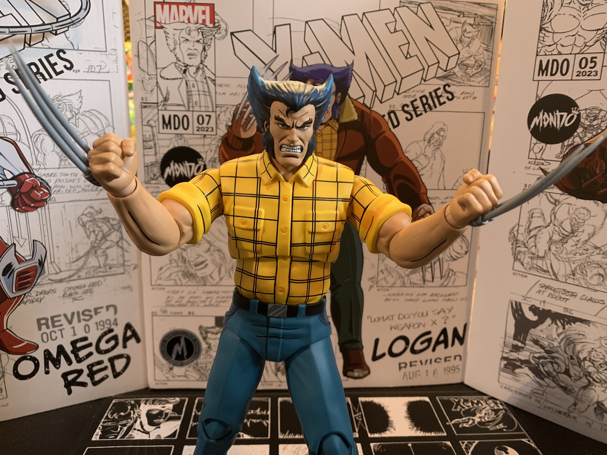
The phrase “Remember It” is a callback to a particularly bad ass line delivered by not one, but two, characters from the original series. Interestingly, those two characters now have a real world link as the former voice actor of Gambit, Chris Potter, is now the voice of Cable who makes his X-Men ’97 debut this week, albeit in a brief manner.
It’s a bit hard to tell, but I think this week’s “Previously,” is delivered by AJ LoCascio, otherwise known as the current voice of Gambit. The opening title features a lot of clips that we’ve seen before as someone really wants the Dark Phoenix plot to be at the forefront it would seem. Newly added is a recreation of Cable’s encounter with Apocalypse from the “Beyond Good and Evil” arc and it’s nice to see that Apocalypse still has his unique to the show color combo of blue and purple.

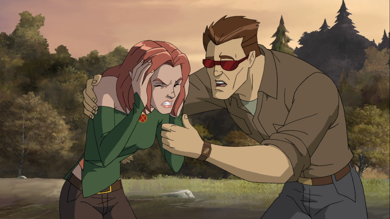
“Remember It” features an A and a B plot in a more traditional manner as the episode isn’t split like last week’s. At the mansion, reporter Trish Tilby (Donna Jay Fulks) is on-hand to interview the X-Men for television to give them a chance to humanize themselves in front of the world. At least, she’s interviewing the few willing to go on camera which seems to be limited to Beast, Cyclops, and Jubilee. Elsewhere, Jean is still trying to sort out her memories while Wolverine is ducking the cameras and checking up on her. Magneto, Gambit, and Rogue are enroute to Genosha as they’ve been invited by the new council there for unknown reasons.
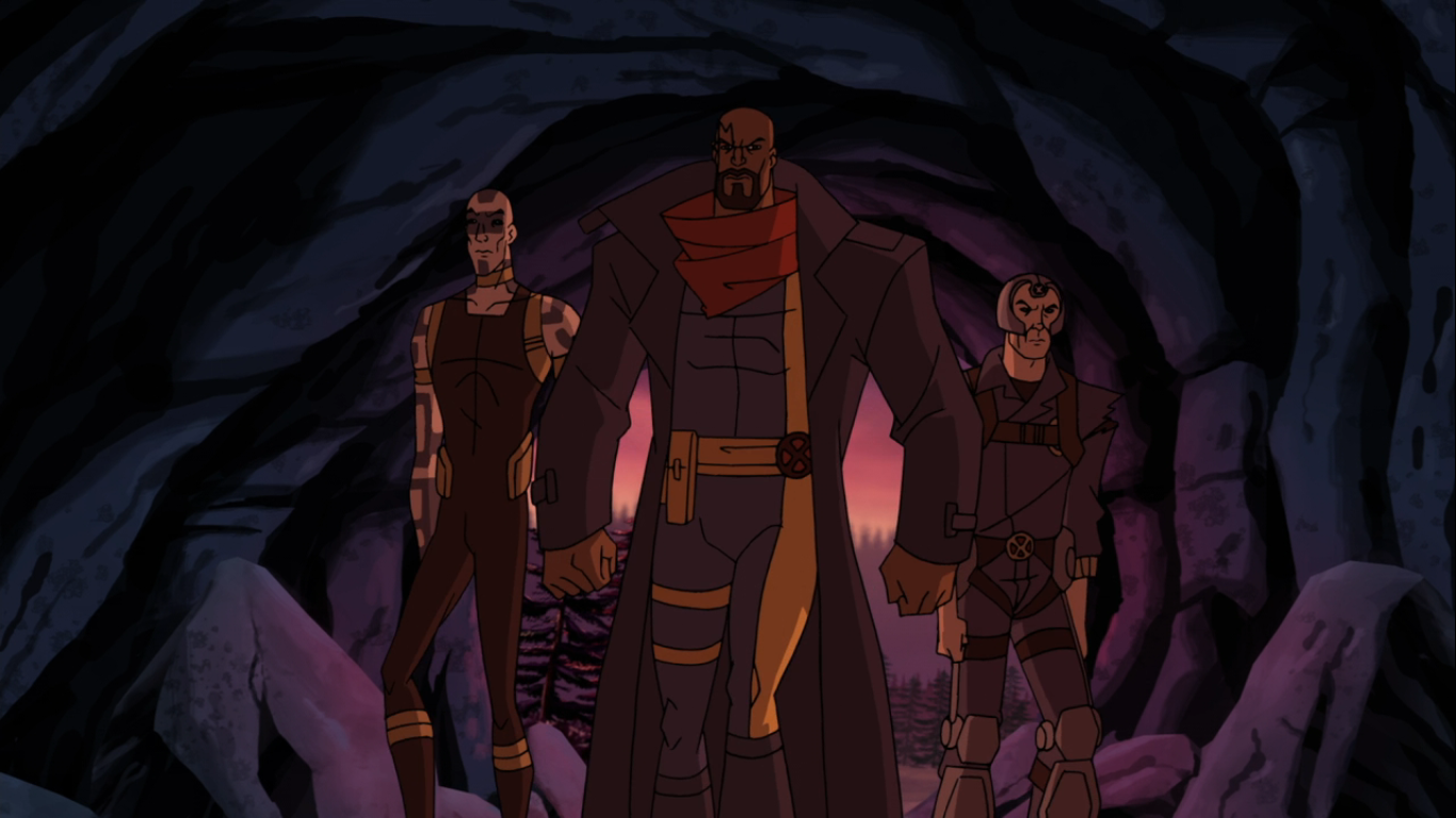
That trio will land to discover that Genosha is a pretty happening place. Mutants parade out in the open in a Mardi Gras like atmosphere of music and dance. Gambit takes notice of the incredibly high prices at street vendors and seems to be the only one who thinks maybe not everything is as it seems. Magneto is expected to meet with the council of Genosha while Rogue and Gambit get to do some sightseeing with an old friend. Returning from X-Men is voice actor Adrian Hough reprising his role as Nightcrawler. The fuzzy, blue, elf is a much happier and high spirited character now that he’s in a place that accepts him. He’s eager to reconnect with Rogue and Gambit and happy to be their escort on this day. Also in attendance on Genosha is Madelyn Pryor, aka the clone of Jean. She has accepted a position on the council and is Magneto’s introduction to the rest.

And that council is comprised of a lot of old faces, some more welcomed than others: Sebastian Shaw (Todd Haberkorn), Emma Frost (Martha Marion), Moira McTaggert (Marion), Callisto (Courtenay Taylor), and Banshee (David Errigo Jr.). Valerie Cooper is also present, but not a part of the council, and if she was she would object to what Magneto has been summoned here for. They wish to make him chancellor of Genosha by reason that since Xavier entrusted him with the X-Men, they can entrust him with Genosha. Magneto requires little convincing, but has one requirement for accepting the position: that Rogue be his queen.

This puts the love triangle at the forefront that’s been percolating a bit since the second episode between Rogue, Gambit, and Magneto. If you have been waiting for some resolution there, as well as more info on just what happened between Rogue and Magneto before the events of the original series, your questions will at last be answered. At the mansion, we will similarly see Cyclops and Jean start to address their own issues as a couple, as well as the fact that Cyclops had to bid his newborn son farewell. It gets heavy at times and certainly adds to the soap opera nature of the show (Nightcrawler even has a quip about that), but it’s what we’re here for.
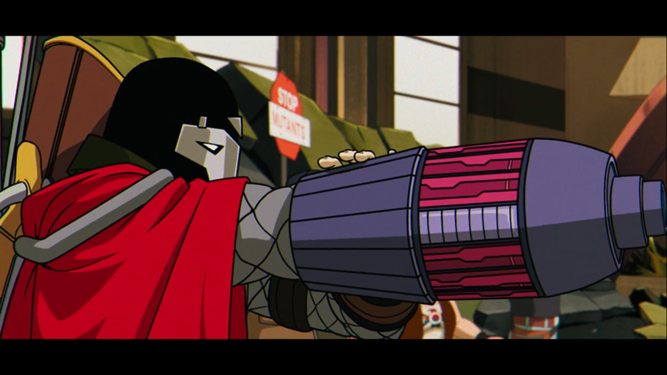
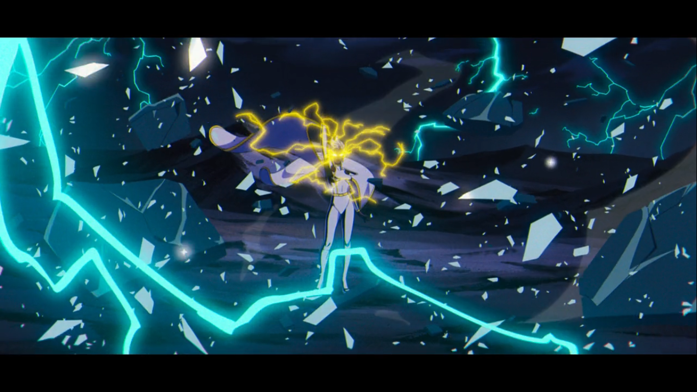
There’s a lot of good character detail in those moments, but what everyone is going to talk about where it concerns “Remember It” is really just the last seven minutes or so. I do not want to spoil anything, but there is an attack on Genosha and it leads to a spectacular action sequence. X-Men ’97 has firmly established that it knows how to stage flashy and creative action pieces with its cast. If you’re someone who has been waiting for Gambit to do something in this show, you’ll enjoy this section as he gets to go into full bad ass mode in a way that we’ve never seen. The original show had far more restraint when it came to the powers of basically everyone on the X-Men, but X-Men ’97 is breaking those chains. And it’s not just action on display as there are some very emotional moments captured in the chaos and you may need to keep some tissues handy for this one.

“Remember It” is a spectacle and an episode that is getting a lot of just praise. It’s a pivotal episode as well, and once you’ve watched it I would advise you to check out the Twitter handle of series creator Beau DeMayo as he has shared a lot of thoughts on this one. It’s an episode that will stay with you, especially those who grew up on the original series, and it’s one I needed to let gestate a little longer than the last few before sharing my thoughts. There is an undeniable heaviness to the episode, though there are some light elements and fun portions. Genosha is a setting designed for cameos and there’s plenty of that to be found. There’s even a really well choreographed dance scene too, but virtually all of that is overshadowed by the final act. This is one we’ll be talking about for a long time and is a prime example of why the weekly release schedule is so much more rewarding than the drop even if the wait for next week is going to be excruciating.
Previously…on X-Men ’97:

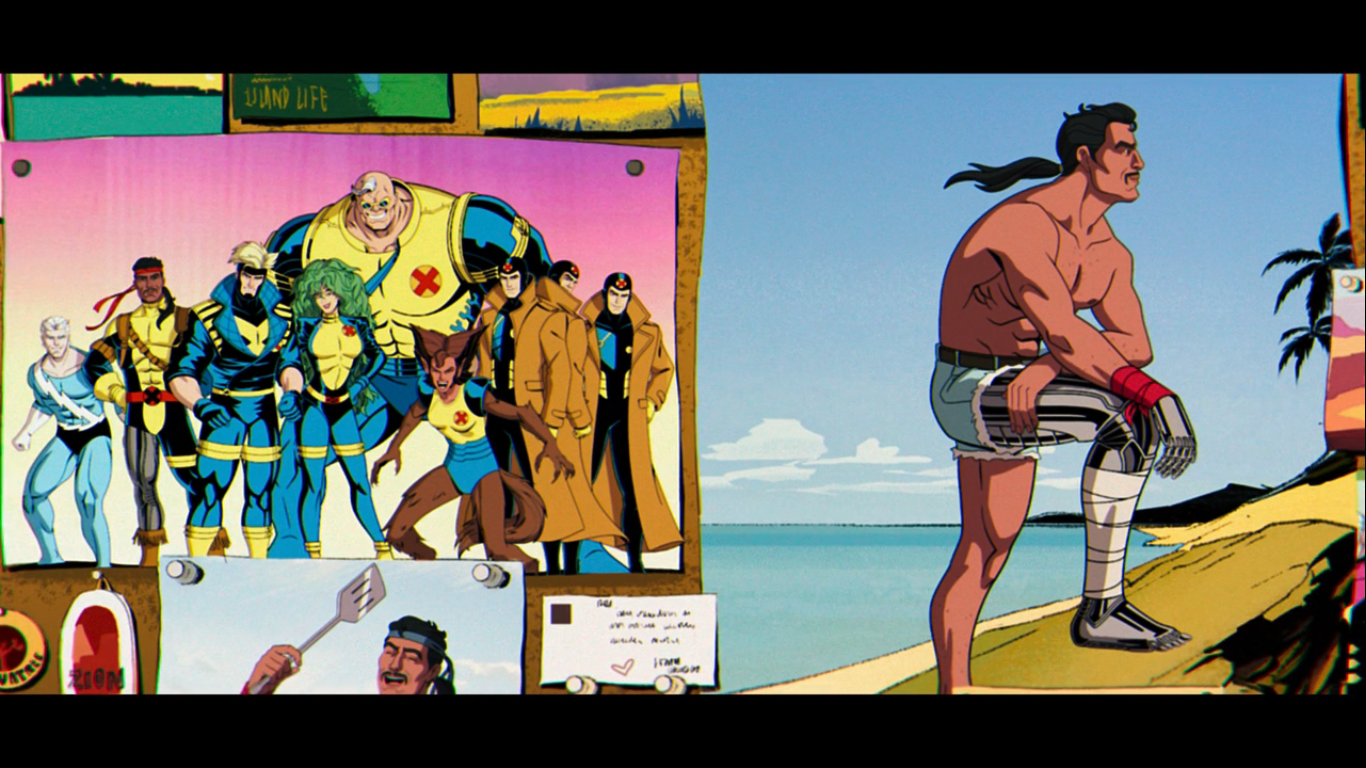
X-Men ’97 – “Motendo/Lifedeath Part 1”
X-Men ’97 continues on into it’s fourth episode with a bit of a change-up. The first three episodes were rather weighty dealing with the fallout of Xavier’s death, Storm losing her powers, and the whole clone situation of the third episode. And that third episode did reveal a few cracks in the foundation of the…
Keep reading
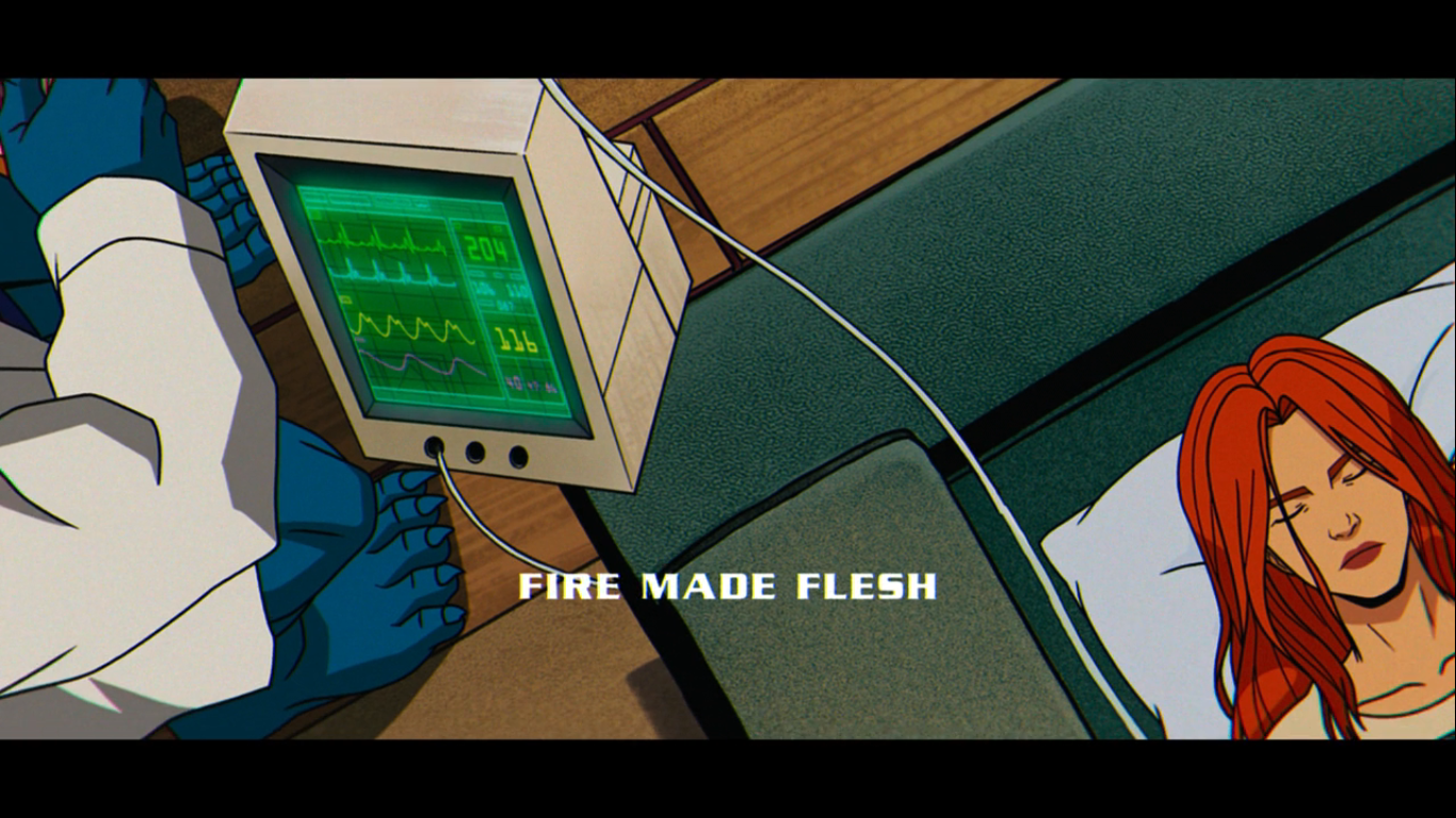
X-Men ’97 – “Fire Made Flesh”
Well, that was a long wait! After the two episode premiere of X-Men ’97 on March 20th I was ready for that third episode. The week long wait felt both excruciating and exhilarating. It’s been a long time since we’ve had an X-Men show to get excited about, or really an X-Men anything, and it’s…
Keep reading
X-Men ’97 – “Mutant Liberation Begins”
The first episode of X-Men ’97 left me grinning from ear to ear and eager to see what would happen next. I’m happy to say, the show’s second episode left me feeling very much the same. “Mutant Liberation Begins” starts off right where the previous episode ended. Magneto, has revealed that it was the wishes…
Keep reading