Final Fantasy VII Rebirth

My video game reviews are rarely timely. I just don’t have the available free time to plow through a video game like I once did, especially not a lengthy role-playing game. Nonetheless, the subject of a Final Fantasy VII remake has been a big one to me and I would be remiss if I didn’t collect my thoughts on the subject here in this space. It was nearly a year ago that I did just that with part one of a projected three-part project that is the Final Fantasy VII remake. That first part basically covered the Midgar portion of the story from the original game taking what was probably an eight hour experience and turning it into a 60 hour one. The second part of that journey arrived the same day as my review of the first and I think most had an idea of where it would leave off relative to the main story, and most were right. It has taken me the better part of eight months to work my way through this second chapter, titled Final Fantasy VII Rebirth, and I have some thoughts to share.

As is probably the case with every article, blog, etc. on the subject, spoilers are ahead for those who did not experience the original Final Fantasy VII or Final Fantasy VII Remake. I’ll not spoil this game outright, at least not without warning, so if you’re looking for a delayed opinion on a game you’re considering for yourself then you’re safe for now. The game picks up right where Remake left off and our heroes are fleeing Midgar and planning their next move following the destruction that took place and their encounter with the big baddie of the game: Sephiroth. Remake ended on a controversial note. Basically, it was revealed that what we’re playing is a remake in a meta sense, but only Sephiroth is aware. Final Fantasy VII happened. Sephiroth lost and the planet was spared. Now, he gets to try again by toying with the whispers of fate, as it were. In a way, it’s not important to the player if this is a redo or all happening for the first time, except for the fact that it was revealed at the end of Remake that Zack (Caleb Pierce) is alive. If you’ve played the original, or the prequel game Crisis Core, then you know Zack should be very much dead. He died saving Cloud and that inspired Cloud to basically become Zack, in a sense. With him alive it’s confirmation that Sephiroth (Tyler Hoechlin) has indeed altered history and anything can happen from here.

This guy showing up at the end of Remake certainly raised a few eyebrows.

That little detail may have caused a few fans to raise their pitchforks at the game’s conclusion, but if you thought this meant that the experience going forward would be vastly different then put those pitchforks away. Oh, there are indeed some changes, but the events of Rebirth largely follow in the footsteps of the original game. With just a whole lot more. How does one take a 40 hour experience and stretch it across three modern games? Why, with padding of course! Final Fantasy VII Rebirth is a long game and it took me just shy of 130 hours to roll credits on it. I did not do everything in this game either. I started off trying to keep up with every nook and cranny offered up by the experience, but at some point I decided if I ever wanted to beat this thing that I needed to play in a more focused manner. You see, this game has a mini game for seemingly everything. They add considerable padding to the experience especially if you want to get the top score and receive the best reward. The game is also structured in that there are a series of areas you visit which are fairly vast on their own. Each one comes with a bunch of tedium to extend them: encounter every enemy, find a bunch of special areas, tame a chocobo, beat a unique boss, etc. There is a flow to it, so it’s not a truly tedious experience, but there will be times when the game just plain doesn’t respect your time.

If you felt Remake needed more chocobos then you’ll be happy with Rebirth.

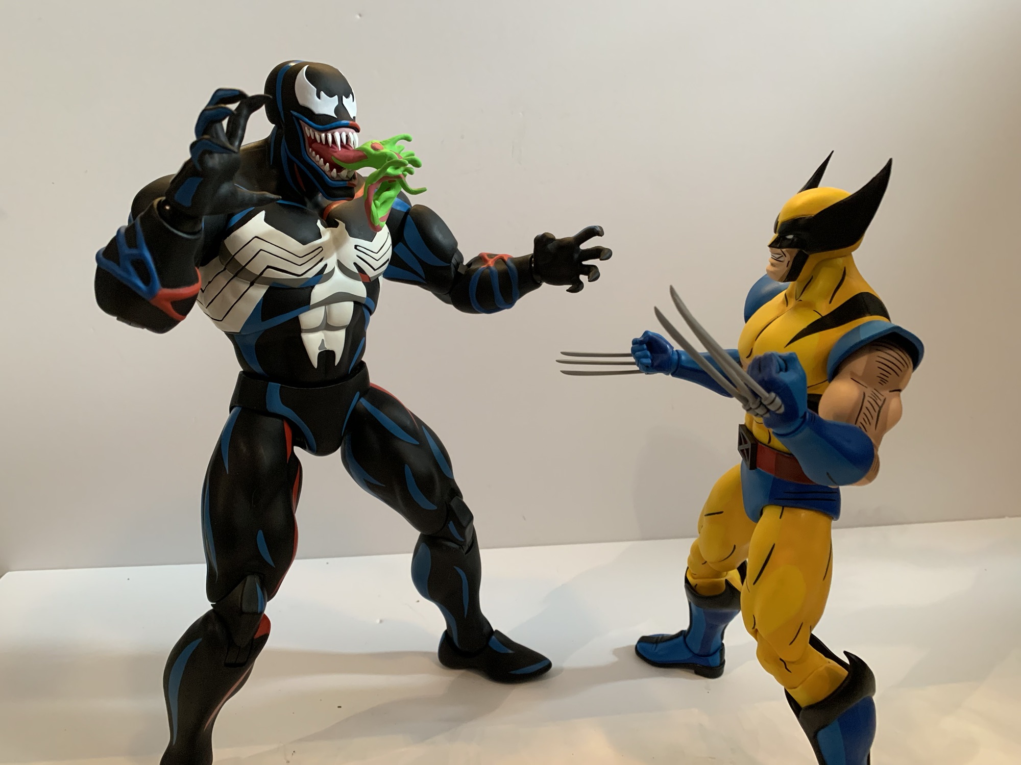
A game that is going to require such an investment of time better be fun to play. If you enjoyed the combat system in Remake, then you’ll be happy with Rebirth. Your characters all basically start over though. Same with your materia, the equip-able orbs that allow your characters to access spells and special abilities. Nothing is carried over from the prior game even though these are supposed to be all combined. The combat is still an action game. You can pause (technically, slow down time to a near pause) combat to issue commands to your characters, but there’s no turn-based option available. Combat is basically still mostly mashing the attack button, accumulating ATB bars, and then using them to unleash special moves and spells. Your party will grow quite a bit larger this time around with the additions of Red XIII (Max Mittelman), Yuffie (Suzie Yeung), and Cait Sith (Paul Tinto), but you can only take three into battle at any given time. There’s no swapping in reserves, though there is a reserve action available when things gets dire.

There are new faces in Rebirth, but like Red XIII in Remake, some are more like teases of things to come.

Every character plays a little different to make them unique. Our returning fighters in Cloud (Cody Christian), Aerith (Briana White), Tifa (Britt Baron), and Barret (John Eric Bentley) still control the same. Yuffie, who was part of the Intergrade DLC for Remake, is a hybrid melee/ranged attacker who relies on speed and is largely unchanged from that game. Red XIII was introduced in Remake, but not playable. In this one, he’s an attack/support character and his special ability is tied to his Vengeance gauge. It builds up during combat and at any point Red XIII can go into a Vengeance mode which makes him stronger, faster, and opens up new moves. Cait Sith is more of a wild card character with moves tied to chance. Cait is the small, anthropomorphic, cat and he rides an oversized moogle. The moogle can be called upon and used to dish out damage and most of Cait Sith’s abilities are tied into it.

The weapon system this time around has been altered. Rather than each weapon needing to level up via a grid type system, each character just has their own progression board of sorts to unlock abilities through. The weapons now just have a special ability and equipping the weapon and using that ability a set amount of times allows the character to learn it permanently. Weapons also have their own materia slots and their own pool of equip-able abilities. This does mean that the evergreen nature of the weapons in the last game is sort of lost. You’re far more likely to just run with the latest and greatest weapon acquired unless said weapon specializes in magic when you want the character to focus on melee attacks. The board each character has will modify base stats and also allow for the learning of magic abilities that do not require MP. It’s a unique grid for each character, so it’s not like Final Fantasy X‘s sphere grid where everyone is on the same thing, but a different starting area.

Synergy skills allow characters to team-up to unleash potent attacks in battle.

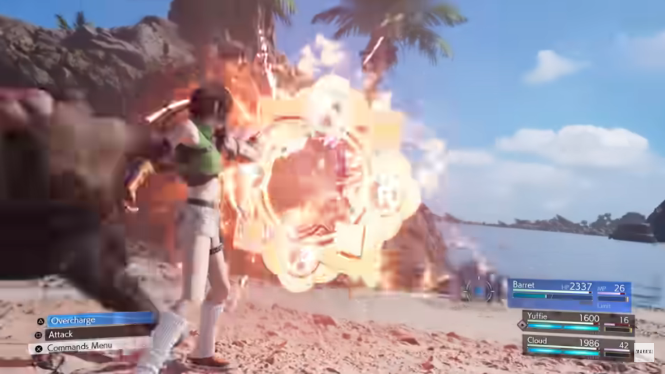
A key component of these new grids (which the game refers to as folios) is the ability to unlock Synergy skills. Synergy skills are basically team-up moves and they have to be unlocked. When a character uses an ability in battle, they fill a separate ATB bar. Once two characters have filled the required amount of ATB bars for their move, they can then use it. These moves often do a tremendous amount of damage, but also have other special functions. Many are focused on dealing extra damage to foes that have already been staggered. The Refocus ability, which grants an extra ATB gauge in battle, is also now tied to Synergy skills. Others speed up the limit gauge or leave the characters in a state where they have unlimited MP for a short while. They’re pretty useful and when it comes to harder boss fights they can be the key to turning the tide in one’s favor so it pays to make sure your favorite characters to play as have learned a Synergy skill or two.

The Gold Saucer now feels more like the experience it was supposed to be in the original game.

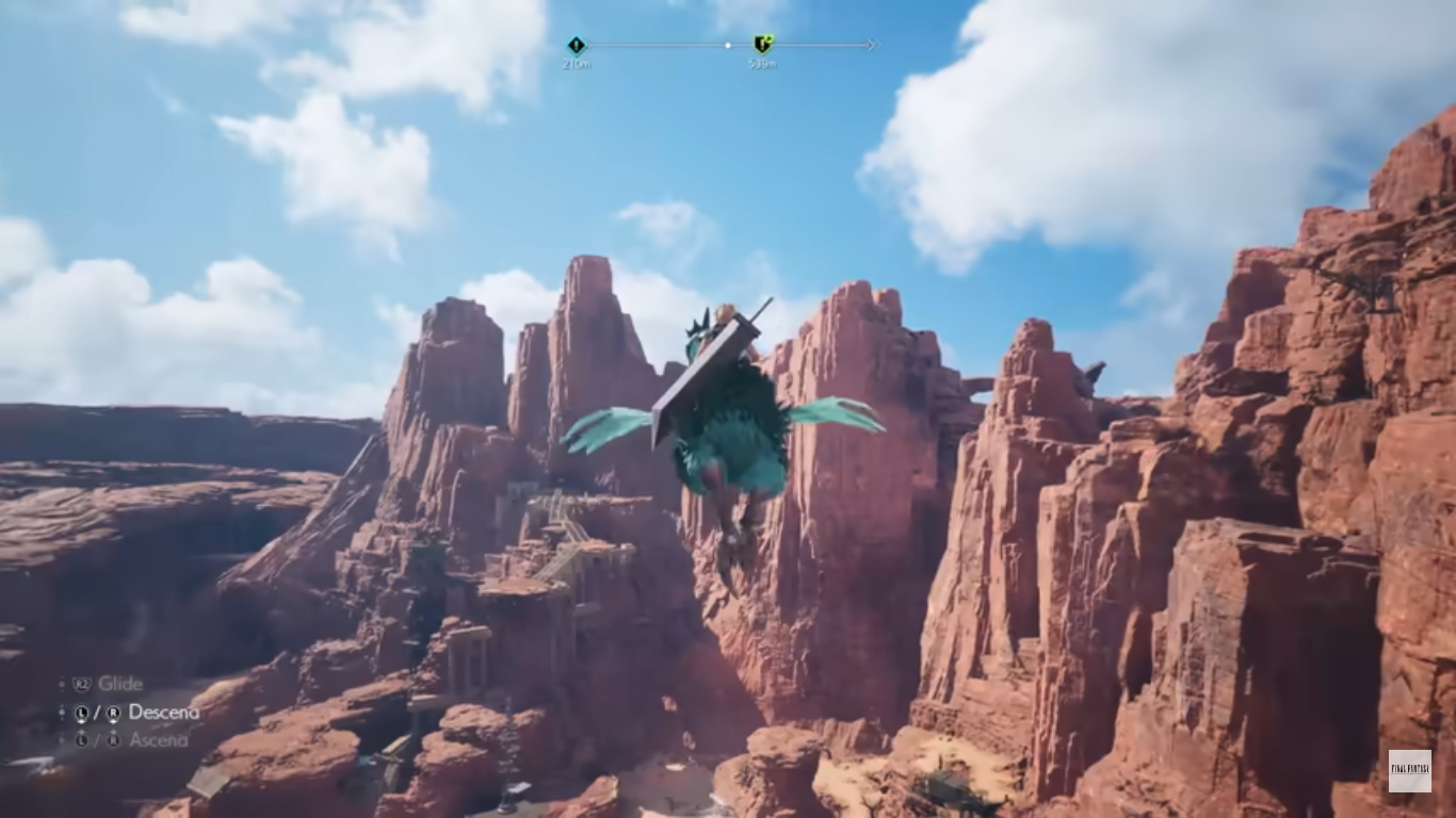
The presentation for Rebirth is, as you would have probably expected, quite lovely. There’s a variety of environments on display and characters animate and emote exceptionally well. The soundtrack is as good as ever making liberal use of the original game with some new twists thrown in. Voice acting is also very good and at no point will you feel like Square Enix cheaped out anywhere. About the only thing that can feel limiting is when reaching the edge of a map and encountering the ever annoying message that you cannot pass further. The locations though are technically connected so you could basically walk the entire map which I would not recommend. At some point water travel will become a possibility making it even more obvious that this is all one big area.

As most probably imagined, there are more summons to go around in this one.

There is a lot to do and a lot to see in Rebirth. I have no idea how fast this game could be completed if one ignored a lot of that extra stuff, or how much harder it would be. I played on normal and encountered plenty of challenging fights. Some of the hardest will be the summons. In order to acquire a summoned creature, you have to first beat them. You do so via Chadley, who returns from the first game, and his combat simulator. There are special shrines scattered about a region that if encountered can weaken the summoned creature, but most will still put up a good fight. Once acquired, they can only be used when the summon gauge pops up in battle, which does seem to happen far more often this time around than in Remake. Once summoned, they hang around, deal some damage, and have their own abilities that anyone in the party can tap into. Once their time is up, or the summoner is defeated, they unleash their ultimate attack and vanish. There isn’t a whole lot of strategic value to them, they almost feel like window dressing and something the game has to have since it was a part of the original. It’s still fun seeing them for the first time, at least.

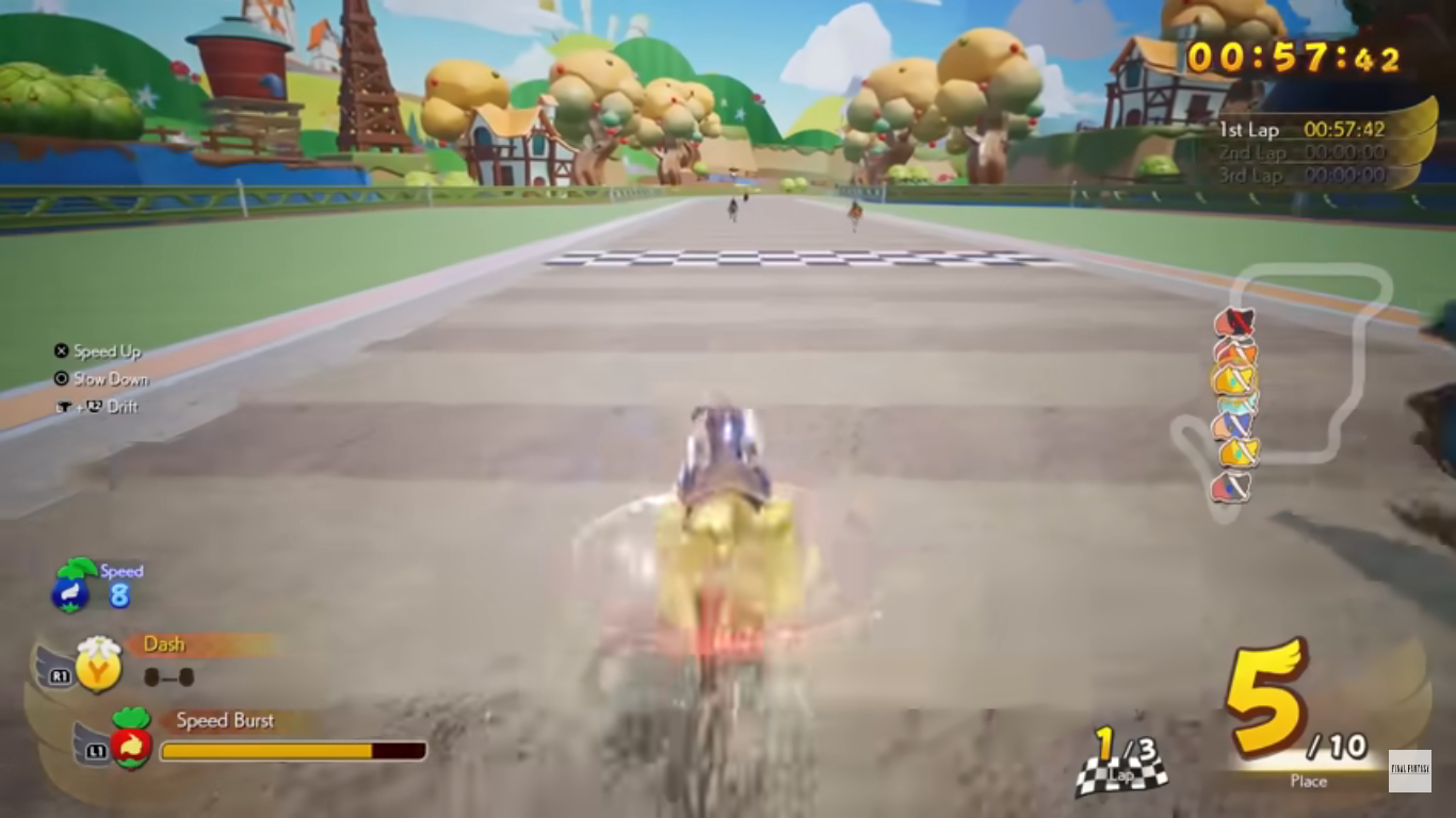
The other distractions all vary in quality. Some I enjoyed, some I couldn’t wait to be done with. Chocobo racing is back only now it’s more like Mario Kart. It’s also not entirely optional, but also not super difficult. There were times I was pretty annoyed though, but those instances may have been in the optional races. There’s also a card game that Cloud can partake in called Queen’s Blood. It takes a little getting used to, but the game does a solid job of bringing the player along as more complicated cards are introduced. I did manage to complete that entire side quest without too much trouble. It’s probably the best of the many mini games which largely do not impress, but also don’t really annoy. The only one I truly detested was the piano playing mini game. I just can’t get accustomed to it and never even managed a B playing a part. I got the impression even back in the demo that it was going to be way too time consuming to get good at so I didn’t bother. Thankfully, there are no moments in the game where you’re required to play piano and actually play it well. There are some moments where you do have to play and it’s a bit awkward, but we can’t all be winners.

It’s back!

Final Fantasy VII Rebirth is basically more of the same when compared with Remake, just a whole lot more. It’s probably way longer than it should be and I can think of plenty of ways it could have been cut down. Anytime I was forced to watch Cloud crawl through something or walk slower I couldn’t help but think this could be going a lot faster. Why do I need to control an airplane that isn’t even being piloted by one of my characters to get to a new area when it could just be captured with a quick cut scene? A lot of side quests are fetch quests that don’t add anything to the narrative, and I really hated that a series of items you collect all throughout the game just leads to an optional, high level, area I have no desire to see through. There’s a crafting element included, but it adds very little to the experience other than an excuse to just put a bunch of collectible crap on every map. The game is, for me, undoubtedly a more complete experience than Remake, but at almost every step of the way there’s this feeling that the designers are just trying to stretch this experience out to the game’s detriment.

The game is so similar to Remake that any issues one had with that game will carryover to this one. I still don’t love the combat system. I don’t hate it, but I still feel like this game is stuck between a subpar action game and a JRPG. It’s not going to satisfy action game fans or JRPG fans entirely, instead it tries to meet them all halfway. It would have been so easy to make it an optional turn-based game, but Square Enix refused. And yeah, you can pause and issue commands or switch to another character on the fly, but the game is still bad at letting you truly dictate to your party members what you want them to do. There was one optional fight where I had to take out a certain enemy first. The problem was, the other enemies in the fight were all weaker. The challenge is basically you have to fight against the game because you can’t reliably get your party members to focus on the target and the target alone. I had to redo it several times because someone would end up taking out one of those lesser enemies first resulting in a failure. Even doing the fight solo was a pain as it’s very easy to accidentally switch targets and the auto-targeting sucks.

And now we do have to talk about it. The big thing. Spoilers ahead!

Do you feel that pit in your stomach upon seeing this? If you do, it’s a totally normal reaction.

As all likely guessed, this game ends with the City of the Ancients and Sephiroth’s attack. The death of Aerith is quite possibly the most famous death in the history of video games. I am struggling to even come up with anything close to it. This game totally blows it by doing what it spends too much of the game doing: it drags it out. The impact of the moment is completely lost because of how drawn out the process is. It also intentionally muddles things too by turning to something I think many are sick of: the Multiverse.

Yes, we’re going full multiverse in this one. It’s basically hinted at throughout the game as there are short sequences where we’ll check in on Zack who is watching over both Aerith and Cloud. Aerith is in some sort of coma, while Cloud has apparently succumbed to mako poisoning. Biggs is also alive, and the game waits until the end to reveal what’s going on which is essentially that Sephiroth is trying to unite a whole bunch of multiverses. I suppose it’s not the game’s fault that Marvel has gone headlong into this type of story-telling over the past few years, but it’s a trope that I’m personally so sick of. It’s not adding to the experience of Final Fantasy VII and just feels like change for the sake of change. I still expect the events of the final game to play out largely as expected, only instead there will probably be some additional final encounter with Sephiroth. Maybe it will bring in other Final Fantasy universes and Sephiroth will team-up with Kefka while Cloud and Squall race to find Tidus for one massive, shark-jumping, finale! I doubt that, and I hope we’re not heading for something that ridiculous, but I’ve gone from slightly intrigued by the possibilities presented at the end of Remake to downright soured.

There will be more battles with Sephiroth to come, but what shape will they take?

The remake of Final Fantasy VII was never going to be easy. Redoing the game with prettier graphics might have satisfied many, but also would have felt pointless. The game does at least benefit from having the player spend more time with these characters. They’re far more fleshed out, their personalities more apparent, and I genuinely enjoy spending time with them. I am invested in their journey, even if aspects of it frustrate me. Aerith was done dirty. Not because she was killed off, but because it wasn’t allowed to resonate like it should have. Perhaps the fallout in whatever comes next (I’m guessing it will be called Reunion) will find a way to rectify that. And at least they didn’t chicken out, which I was a little afraid would happen and this new timeline would lead to one where Aerith doesn’t die. Not because I want her dead or anything, far from it as she’s a delightful character, but because her death should hurt and it shouldn’t be something we can ignore.

All this is to say that I have complicated feelings on this game. I did with Remake, and I still do with Rebirth. Chances are, I’ll feel the same way when all is said and done. Can I recommend it? Yeah, sure, if you have 100 hours to spend on a game. If you don’t then I totally understand. I find the task a daunting one and I’m nearing a point in my life where I don’t really want a game to last that long. As a fan of the original Final Fantasy VII, it is nice to see these characters from a different angle and experience them in a new way. I can’t compare the two games because they’re such different experiences, but the best thing I can say about Rebirth is that I don’t regret the 130 hours I’ve spent with it. I just don’t really want to spend any more time with it.

Check out some of my other Final Fantasy thoughts below:

Final Fantasy VII Remake – Intergrade

It took a long time for it to be realized, and a long time for me to play it. It’s debatable which Final Fantasy title is best and nostalgia will always play a big role. For many, Final Fantasy VII was the first Final Fantasy game they played. Previously, only three titles had made it…

Keep reading

Final Fantasy X HD Remaster

Over the years I’ve talked a lot about Final Fantasy but I’ve never posted a game review for any of the numeric titles in the long-running series. Well that ends today as I post my thoughts on the somewhat recently released Final Fantasy X HD Remaster. One opinion I have stated on more than one…

Keep reading

Final Fantasy VII – To Remake, or Not to Remake?

In the gaming community, a popular topic of conversation seems to always stem around remakes.  They’re fairly popular and have become more so due in large part to the rising price of game development and the profitable business known as nostalgia.  Games cost a ton of money these days to develop, and with little change…

Keep reading

Super7 TMNT Ultimates! Rapper Mike

“The name’s Michelangelo and I’m here to say, I like pizza in a radical way!”

Is Super7 going to finish a set of variant Teenage Mutant Ninja Turtles?! Maybe, as we’re now three-fourths of the way through the rock n’ roll turtles as released by Playmates. Punker Don, Classic Rock Leo, and now Rapper Mike make 3 with only Heavy Metal Raph remaining. As of this writing, Raph hasn’t been shown or even really teased. I only bring it up because Super7 has given us 3 of the 4 disguise turtles – Sewer Samurai Leonardo, Sewer Surfer Mike, and Raph the Space Cadet with Undercover Don left out in the cold. Seemingly in lieu of that figure, we received Slam Dunkin’ Don as part of the ninth wave with no indication that more sports turtles are on the way. I guess what I am saying is don’t expect anything or purchase any of these figures with the expectation that you’ll eventually get a complete set.

A lot of the sculpted elements of the old figure have been turned into accessories, but not these speakers on the back.

Rapper Mike was previously released as Rappin’ Mike in the Playmates line. Unlike Punker Don, I have no issues with pairing Michelangelo up with hip hop. It makes sense for him, the party dude, though he could be melded with other genres without much issue. He was also a figure I had as a kid, but since I wasn’t much of a hip hop fan, he wasn’t among my favorites so he’s been lost to time. And personally, I really like the other three figures from this set so I’m mostly getting Michelangelo here for the sake of completion. That doesn’t mean he can’t be a good figure though, and like the prior two in this set, he’s a pretty faithful recreation of the Playmates figure. The head, creative, person on the line at Super7, Kyle Wlodyga, sat down for a pretty expansive talk with Nick of the Robo Don’t Know YouTube channel and discussed some of the design choices with this figure. He sometimes has to dance around issues where it’s obvious Playmates is exerting some influence over Viacom when it comes to approving Super7 releases, but I didn’t pick up on any of that with this figure. It sounds like most of the changes were made voluntarily.

He may be an MC, but he still needs some ‘chuks!

And there aren’t many changes. Mike still has his white tank and green hat with what I guess are intended to be MC Hammer style parachute pants. He still has the usual arm bands and knee pads to go along with a big, toothy, grin. The biggest changes may just be taking what was previously a sculpted element and turning it into an accessory with the giant clock necklace and pink sunglasses. One highlighted change by Kyle was the choice to change the message on his brass knuckles from Mike Raps to Mike (sic) Drop. The old figure also had a chunky turntable on the front of his belt which has been removed. The belt is a little different, since it’s now more visible, and the shoes have a slightly different deco. The sculpt of the shoes is largely the same, but before they were all green and now they’re painted green and white. When I look at this one I do find him a little less interesting than Don and Leo, but is that just my bias against the genre showing through? I do think Super7 should stay close to the Playmates designs because I think that’s what their customer wants more than anything. Maybe a big, soft goods, coat that rips off the old Starter jackets would have made for a fun addition? I do wish the design was a little louder, but that’s partly the fault of the original figure.

This paint hit under the arm is an odd choice that I can only assume was either an error or a budget one.

Paint across the board with Mikey is a step up from Punker Don. The shoes, especially, look clean and the linework on the face is pretty nice, all things considered. The printing on his pants now reads “Shell Shock” and it’s styled reasonably well. The two speakers on the rear of his belt are fully painted as are the audio cables attached to them. The painted elements and different materials give the figure a nice finish, though it clashes slightly with the soft, orange, plastic used for the elbow and kneepads. They just come off a little cheap in comparison. There’s also a paint error where the under arms are painted this sort of cream color which matches the visible portion of plastron. On all other turtles, this part of the shell is green so it’s pretty odd looking. I went back to where I bought the figure, Big Bad Toy Store, to check the glamour shots to see what it was colored then, but they removed those images. Super7 still has them up, but they’re inconclusive. There’s also a minor defect with my figure where the portion of the overlay that’s supposed to connect at the crotch is disconnected. I’m guessing it was supposed to be glued. It’s an easy fix, but it might be something that impacts other figures or just mine.

These two ends tab together, but not securely since the plastic is soft. I’m guessing there was supposed to be a hit of glue applied.

Articulation for Mikey is pretty standard for a Super7 turtle: double-ball head, hinged balls at the shoulder, single hinge and pin at the elbow, swivel and hinge at the wrist, waist twist, ball-hinged hips, pin and hinge knees, ankle hinges and rockers. Punker Don was a floppy mess while Classic Rock Leo was damn near perfect. Mike slots somewhere in between. He’s not as floppy in the hips as Donnie, but he’s also not as tight and smooth as Leonardo. It’s frustrating that Super7 still struggles with this joint in what is now the 11th wave of the line, but it is what it is. Maybe we’ll finally see a big change with the 2003 turtles due up next? Some of the other joints are pretty tight too and in particular the left knee of my figure. It will need heat to function. Mikey does have one extra articulation feature and it resides under his hat. The old figure wore his hat backwards, but this one spins so you can have him wear it however you wish. It’s a good idea and a fun addition. It does mean that the hat doesn’t work with the other portrait, but that doesn’t strike me as a big deal.

Evil doers beware, getting punched by Rapper Mike is going to both hurt and leave behind a pun.

The accessory load-out here is pretty solid, but also mostly unique when compared with the vintage figure. The optional sunglasses and necklace are here to mostly complete the old look. The sunglasses are like other glasses accessories in this line in that they don’t plug in or anything, but they’ll stay in place on your shelf well enough and better than the sunglasses for Sewer Surfer Mike. The big necklace is gold and contains a new pattern on it. Instead of a clock, it’s like a bronzed pizza which I guess is fine. I prefer the clock, but maybe they feared a lawsuit from Flava Flav? There’s also a second gold chain provided. It’s a bit cumbersome to feature both at the same time so you may prefer to prioritize one over the other, but as you can see from my pictures it is possible to get both on. The optional hands are all unique to this figure since they need to feature the brass knuckles. They include fists, gripping, open, and what I guess are meant to be turntable hands that could also serve as a pointing gesture.

The old figure came with this turntable on a strap that Mike wore around his neck and the device was held out in front like an actual table. Super7 opted to alter this one so that it’s now a turntable and boom box all in one. On one side, you have the boom box which looks pretty nice and it’s painted well. There’s an articulated handle on the top and Mikey can carry it or put it up on his shoulder reasonably well. The reverse side is where the turntable is found and it looks fine, but is harder to pose the figure with. It lacks a strap to have it draped on the figure like the old one and since it isn’t an actual table it can’t be setup in front of the figure. Super7 really should have included an optional stand. Just a cheap piece of folding plastic or just optional legs that could be plugged in. This limitation means it’s likely to remain a boom box for me, but you can kind of get it in place if you slot the handle over the hands. It just won’t look like a practical way to manipulate a turntable. And in order to sing along, Mikey has some nunchaku where each handle has been replaced with a microphone. This is a recreation of a vintage accessory and it’s a welcomed inclusion. The real chain is almost a gold color which adds a nice splash of color on the shelf.

This extra head could have been so cool.

The last accessories are an alternate portrait and some headphones. Since the alternate portrait lacks the hat, the turtle shell themed headphones fit better on this head than they do the default one. This extra head though was of real interest to me going back to the solicitation. When it’s come to Michelangelo figures from Super7, I haven’t been too impressed with their portraits. The alternate head on the original is just odd looking and the Sewer Surfer portraits are large and cartoony. Even so, I’ve been using one of those heads for my Wave 3 Michelangelo, but this new one looked like a real upgrade. Unfortunately, it wasn’t meant to be. Like the other variants, the proportions aren’t a match for the original turtle figures Super7 made. The heads are slightly larger and if you can manage to get this onto your figure (it was tight, though getting the old head off was really the hard part) it may look too much like a bobblehead for your taste. Worse though is the color difference. Rapper Mike has a skin tone that’s close to a green-blue where as the original figure is what Crayola probably described as a forest green. It’s not going to look very good as a result and combine that with the oversized nature compared with the other brothers and it’s an all around failure of something that could have been awesome. It’s just a shame because I really like the look of the sculpt. It fits in very well aesthetically with the alternate portraits of the other guys, but Super7 went and Super7’d it up.

I probably won’t be sticking with this display.

Rapper Mike is largely more of the same, which is both good and bad. I think the sculpt turned out pretty well and Super7 did a good job of keeping what made the original fun while also adding a few new elements. The paint is an improvement over Punker Don and the accessories are fine, it’s just that it has too much of that Super7 feel to it. And if you have handled many of their figures, you might know what I’m talking about. Despite looking pretty good, and costing quite a lot relatively speaking, the feel in-hand just isn’t there. Mikey feels clunky and some of that is definitely owed to the floppy hips. As I said above, they’re not as bad as Donnie’s, but that doesn’t make them good. They don’t feel nice when moved almost like the figure doesn’t want you to mess with it. The stubborn knees, subpar range at the elbows, and little imperfections just add up.

It’s going to be a long while before this band is complete.

In the end, Rapper Mike is another figure from Super7 that struggles to really earn its $55 price tag. From the shelf, I’m generally happy with what is here, but there are enough faults and the in-hand experience is lacking enough that I don’t feel great about it. I absolutely love the vintage set of four so I’m attached from the onset when it comes to the Super7 versions. I just remain disappointed that Classic Rock Leo, the first in the set released, wasn’t a sign of things to come. If you love those old figures and are happy with Leo and especially Don, then you might as well go ahead and add Rapper Mike to the band. If Punker Don was a bad experience that you aren’t sure if you want to repeat, then approach with caution. For the other fence sitters, the usual Super7 caveat largely applies here where you may feel a lot better about your purchasing decision if you can score it on discount somewhere down the road. And with 2003 turtles on-deck for the next two waves from Super7, don’t expect a confirmation on Heavy Metal Raph anytime soon. We won’t see him until 2026 at the earliest, and maybe even longer since Super7 has cut way back on their preorders. We know 2003 is Wave 13 because they showed off a teaser back at San Diego, but it has not gone up for preorder yet with Wave 12 due in June right now. If they’re waiting for that wave to deliver before solicitation, then we won’t even see Wave 14 solicited until 2026 and that, ultimately, kind of sucks.

Check out these other rock n’ roll turtles from Super7 and some more Mikey:

Super7 TMNT Ultimates! Classic Rocker Leonardo

When I was a kid, I had parents with divergent musical tastes. Dad likes oldies from the 50s and 60s while mom was more into modern rock (then 80s). One area where their tastes overlapped was Bruce Springsteen. We had several of his records in my house and I distinctly remember that cover to Born…

Super7 TMNT Ultimates! Punker Don

It’s been awhile since we last took a look at a figure from a wave of Super7 Teenage Mutant Ninja Turtles Ultimates! It was back in July 2024 that I gave a rather glowing review of the first of a presumed four turtle figures based on the old Playmates Rock n’ Roll Turtles – Classic…

Super7 TMNT Ultimates! Sewer Surfer Mike

We are back with one more look at Wave 6 of Super7’s Teenage Mutant Ninja Turtles line of Ultimates! action figures: Sewer Surfer Mike. This, like every figure in the line so far, is a recreation of a Playmates Toys figure from the vintage line of TMNT action figures, and in this case it’s of…


Marvel Legends Spider-Man Unlimited

There’s got to be at least one person who has been waiting for this day.

When the decision was made to end the animated series Spider-Man, it didn’t mark the end of the webbed one’s adventures on the small screen. Momentum was building towards a Spider-Man movie which would eventually arrive in 2002 so it made sense to keep old webhead in the public spotlight. Apparently, it would have been too costly to just renew Spider-Man and see if Peter Parker ever did find Mary Jane (we had to wait until 2024 to find out), so Saban Entertainment set out to do something new. Various ideas were kicked around including going back to the beginning, but with Sony working on an origin story for the big screen Marvel squashed that. Ideas for Spider-Man 2099 were considered as well as some sort of alternate universe story with two Peters that Marvel also nixed (perhaps PTSD related following Maximum Clonage). What Saban and Marvel eventually settled on was Spider-Man Unlimited, a show cancelled after three episodes aired that has largely been forgotten. Until now!

It is an interesting look for Mr. Parker, I just wish Hasbro went all out with the shading for the figure.

Spider-Man Unlimited is back in action figure form. Hasbro has done almost every other incarnation of Spider-Man at this point so why not? He did have a cameo appearance in Across the Spider-Verse, just like basically every Spider-Man, and since the look from the show was pretty unique I suppose it makes sense to give it a go in plastic. If anything from the show is remembered fondly these days, it probably is the suit which is sort of a mix of Scarlet Spider and Spider-Man 2099. It’s still red and blue, but there are no weblines and the whole thing is heavily shaded. He also has the web cape of Spider-Man 2099. It’s not the sort of look that can be easily adapted from an existing figure so the fact that Hasbro was willing to invest in new tooling for this is actually a surprise. And there’s really no way to do the figure without also using a fair amount of paint when compared with a basic Marvel Legends release. It will be interesting to see how this thing sells and if Hasbro’s investment paid off.

I’m guessing we’ll never get Venom and Carnage from this show so this will have to do.

Spider-Man Unlimited is a bit of a throwback to a couple years ago when it comes to Spider-Man figures. I should point out that this suit was designed by Shannon Denton and Roy Burdine so if you like the look then thank them. The figure is mostly new tools because the spider logo on the chest is raised as are the legs running from them. Where they are not raised is on the arms and the red, spider, web-shooters are a separate piece. The calves have molded fins on them while the thighs and feet do not. In other words, the torso and shins are definitely new sculpt while the arms and thighs could have been sourced from another figure. The hands are conventional Spider-Man hands while the head is similar to past Spider-Man molds, but it looks too round to be from one of the symbiote costume figures and I want to say it’s all new. The web cape I’m not sure of as I don’t have any of the 2099 figures. It’s hard plastic and semi-transparent that’s slightly preposed.

Most of this figure has been molded in blue plastic. All of the red you see on the figure is painted except for the web shooters and head. And on the head, the eyes are painted and not all that well. There’s some bleed around them and it’s noticeable even from a distance. The paint on the torso though is pretty clean and impressively so. The only ugly spot is the seem between the back and front of the figure where blue shows throw. Paint on the legs is mostly fine. The red is not particularly opaque on the knee pieces, probably because that piece is a hard plastic and it just doesn’t adhere as nice. To my surprise though, the head doesn’t really clash with the painted neck so that’s a plus.

I need to do a second coat and touch-up the edges, but I like the added shading on the face. Can I keep myself from shading the rest?

What does stand out aesthetically here is the lack of shading. It’s not really Hasbro’s approach to do heavy shading on their figures, but it feels like a pretty big component for the look of this version of Spider-Man. Rather than shade it, the blue and red just seem all together darker than they probably should be. It is really apparent though since the image on the box is similar to the look from the show. In my opinion, the shading makes the suit look more interesting than it is, but to properly shade this it would need most of the blue to be covered in black. What’s easier is the face, which was always shaded on the front and basically outlined in red. I think a solid compromise would have been for Hasbro to include that shading, but they opted not to. I decided to try it myself, despite not really being a customizer and, personally, I think the shading adds something. I could easily see myself getting carried away and going over portions of the body too, but I feel like I’d be better served to just stop at the head.

A flight stand can really aid in posing this one given its limitations.

Accessories for Spider-Man Unlimited are what you would expect: fists, wall-crawling hands, and thwip hands. That’s all. No Peter portrait or web accessories. The articulation is where the figure feels a little dated. Most new Spider-Man figures have settled on a scheme that includes a ball-jointed diaphragm that Spider-Man Unlimited omits. He just has an ab crunch and a waist twist which really limits the “spider” posing. The other aspects are mostly conventional: ball-hinge head, ball-hinge shoulders, butterfly joint, bicep swivel, double-jointed elbows, wrist swivel and hinge, waist twist, ball socket hips, thigh cut, double-jointed knees, shin swivel, ankle hinge, ankle rocker. Range at the butterfly joint is a plus, while range at the hips is just okay. The waist twist, thigh cut, and shin cuts all are useful, but also all break-up the sculpt quite a bit so your mileage may vary when it comes to how useful they are. The ab crunch, being the only joint in the torso, at least works well enough, but I’m surprised they would go through the trouble of sculpting a new torso without implementing what passes for modern articulation. I don’t love what Hasbro does with its Spider-Man figures, I think they should do a ball joint in the diaphragm and waist, but it would be better than what we have here.

Even in bad TV shows, Spidey can still kick some ass.

Spider-Man Unlimited is a figure I never thought we’d get, but now that he’s here, I find myself surprised I own him. I have a bit of a fondness for odd looks sported by famous characters, especially when it’s tied to some forgotten media like Spider-Man Unlimited. I also kind of bought it because I kept striking out when heading to stores in search of other figures, and then when I saw this, it was like a bit of retail therapy to just buy it. It wasn’t anything I was planning on getting, but now that I have it what do I think? It’s okay. The figure looks fine, and I guess when you’re talking about a costume like this that’s what is most important. The articulation isn’t very good compared to the other Spider-Man figures Hasbro has done recently which aren’t exactly amazing either. And the usual complaints about a lack of accessories applies here too. I will forever remain puzzled how Hasbro was able to condition Marvel collectors to accept Spider-Man figures without web effects. If this costume is one you actually have fond memories of or just think is cool, you shouldn’t have much trouble locating this figure at retail be it online or in-store. I’ve seen it a few times now and more seem to be shipping out every day. It will set you back $25 should you decide to take the plunge with no one’s favorite Spider-Man.

Postscript: So I got kind of bored with this one just hanging out on my shelf. It’s not a bad figure, but the Spider-Man Unlimited TV show was so heavily stylized that it just really wasn’t doing it for me. I saw some customs online that looked really good, so I decided to take a stab at re-painting this one. I went with the outline approach and mostly copied the process of this custom on the channel Ken I Make It. Some others I saw put the blue on the inside of the sculpt to highlight the muscles, which looks pretty cool, but isn’t really in-line with the show. I liked the clean look with the spider logo outlined in black and decided to stick with this approach. Maybe I’ll get bored again some day and decide to do it differently, but I’m pretty content with the end result.

For someone who doesn’t really collect Marvel Legends, I sure have managed to look at quite a few Spider-Man figures:

Marvel Legends Spider-Man ’94 Spider-Man vs Carnage

Last year, Hasbro celebrated the 30th anniversary of X-Men, the animated series that premiered on Halloween 1992 and would become a ratings hit shortly thereafter for the Fox Kids Network. It was responsible for getting a lot of kids into the X-Men and Marvel comics in general and the first, prime, benefactor of that rise…

Keep reading

Marvel Legends Retro Card Scarlet Spider

It was in this space last year that I shared my fondness for the Scarlet Spider costume when I reviewed the Medicom MAFEX Scarlet Spider action figure. I don’t buy much from Medicom because their figures are really expensive for what they are, but I sometimes break my own rule when I think they’ve made…

Keep reading

Marvel Legends Retro Card Cyborg Spider-Man

Well, this is a figure that I never planned on reviewing. It’s a bit old at this point, but we’re looking at yet another Spider-Man retro card release from Hasbro and this time it’s Cyborg Spider-Man. Now, I remember seeing this quite some time ago at Target and thinking it looked fine, but I’m not…

Keep reading

JoyToy TMNT Rocksteady and Beebop

The henchmen have arrived!

No, that is not a typo you see in the title of this entry. This is a review of the JoyToy versions of classic Teenage Mutant Ninja Turtles henchmen Beebop and Rocksteady. I don’t know why it says Beebop on the box, but this is a Chinese company and English is probably not the primary language of many involved in this project. Viacom, as licensor, must not be a huge stickler for packaging on product made for an overseas market. Maybe Bebop is always spelled as Beebop in China? I don’t know, but for the rest of this entry he will be referred to as Bebop as I’m not relearning a spelling I’ve known for over 35 years.

They may be small by conventional standards, but Bebop and Rocksteady should look big beside the other figures in this line.

JoyToy’s take on TMNT in its 1:18 scale has been delightful to experience. I’ve taken a look at the turtles and Shredder so far so you must have suspected that I was going in for Bebop and Rocksteady. The henchmen crafted for the ’87 cartoon series have wormed their way into the hearts of turtle fans over the decades. They had to fight and claw to get out of that cartoon as TMNT co-creators Kevin Eastman and Peter Laird were dead set on keeping them out of the movies. When the turtles rebooted in 2003, the idea of including the pair wasn’t even really considered. They did get to shine a bit in the 2012 series with an all new take on the pair, and they also showed up in that Michael Bay movie I pretend doesn’t exist. They’ve probably shown up elsewhere and it’s escaping my mind at the moment, but the point of this preamble is that the two are most associated with the ’87 series and its toy line. This JoyToy line having a more mature take on the property is a bit of an odd fit for Bebop and Rocksteady. It doesn’t feel like they belong here, but I’m glad JoyToy disagreed.

Bigger isn’t always better.

The JoyToy approach for Bebop and Rocksteady is a little like Super7’s. They seem to think these guys should be big and intimidating. They’re not just some comic relief, but actual physical forces the heroes need to deal with. Both stand around the 4.625″ mark to the top of the head and both get close to a full 5″ when factoring in Rocksteady’s head gear and Bebop’s mohawk. This makes the pair a little taller than both Shredder and the turtles, but more than height is the added chunk both possess. These are beefy figures as everything about them is more substantial: biceps, hands, feet, heads, etc. Just sizing them up, it looks like four turtles would be needed to take down these two. The attire both possess are very much in-line with the ’88 Playmates figures and the ’87 cartoon looks. Rocksteady more than Bebop leans into the toon as he has cargo pants and a yellow tank. Bebop has his patchwork pants, left knee brace, red vest, and a lot of the little details you probably remember from the old toy. The logo on the back of his vest has been tweaked. It’s still a weird looking skull, but has been updated with paint and a message that reads Turtle Hunter.

There’s a nice blend of toon and old toy with these guys.

The differences between the designs and old looks are pretty minimal. Most of which can be summed up as the characters looking a tad more realistic. Rocksteady has what looks to be an actual snapping turtle shell on his belt while Bebop’s shoulder pads are relatively unchanged. He does get some sweet mutton chops though and they’re purple to match his mohawk and rat tail. The blue glasses are pegged into the head and can be flipped up to expose some blank, white, eyes which look pretty menacing. Rocksteady’s pants are also an olive drab as opposed to brown and he has some off-white kneepads. Both characters make liberal use of colored plastics, but there’s also a heavy wash applied which helps to add some grime. It feels like if the ’88 toy line were restarted today with a collector focus that the characters would look something like this as there’s really no trace of the dimwitted duo from the toon.

No paint in the mouth is a bit of a bummer.

What surprised me about this pair is that there’s very little parts reuse between the two. I think it’s basically just the hands and maybe the forearms. The rest is all unique, but the proprtions and construction is close enough that the articulation is basically the same. We have heads on a double-ball peg which has decent range. Bebop’s rat tail being curled up helps to allow his head to look up as far as the joint will go. Rocksteady has his helmet glued to his head and it also has goggles that can be lowered over his eyes which is a nice touch. Both feature a hinged jaw and one of the few eyesores about these two is that the inner portion of the mouth was left unpainted. Shoulders are hinged balls with single-jointed elbows that peg into the bicep to allow for rotation. Unlike Shredder, these two go with the double-ball peg setup for the wrists and the range is pretty good. They work better here than they did with the turtles.

Rocksteady’s rear knife is finally removable and Bebop’s logo (?) has been expanded upon.

In the torso, we have a double-ball setup in the diaphragm. This allows for some forward and back and rotation. Bebop, because of his vest, is a little trickier to bend back, but the jacket is soft so it’s possible to get something there. His joint is prone to popping apart, but since it’s a ball joint the figure goes back together with relative ease. The waist is another ball joint and between the two both characters get some solid crunch forward. Hips are ball sockets and both characters can nearly perform splits going out to the side, but kicking forward is still mediocre. Bebop can kick forward a little better than Rocksteady, but it needs improvement. There’s a thigh twist and double-jointed knees which work just fine. Ankles feature the usual hinge and rocker and these two also have an added toe hinge. It’s not a great toe hinge, but if you don’t like it then you don’t have to use it. It’s a pretty solid assortment of range for these bulky boys and I don’t think the limitations will be a problem for most.

Rocksteady has stuff, but not as much as Bebop.

In terms of accessories, one of these guys got a little more love than the other. Let’s start with Rocksteady. He comes with two sets of hands: gripping and trigger finger. He has one of each on by default and swapping hands is actually pretty easy. The opening for the ball peg looks small, but the hands are soft enough that getting them on is easy enough, just watch for the bracelets flying off. He does have some accessories on him in the form of a grenade and bundle of dynamite. They’re pegged onto his belts and can be removed, if you so desire. Otherwise, the accessories in the box include his rifle, sewer lid shield, and his big knife. All of these are from the vintage Playmates release just spruced up with better paint. It’s a real nice brushed, gun, metal, finish. The knife slots into the back of Rocksteady’s chest strap like it did on the old cartoon (and was almost never removed). Rocksteady also comes with a boom box as JoyToy really wanted to embrace the musical component to their names. This boom box is also a rocket launcher in disguise. There’s a fold-out handle on the bottom and the side panel pops off to reveal an opening. There’s a missile included which fits in here, though it doesn’t click in or anything. If you push it in too far it practically disappears. Still, it’s a fun addition and I like the creativity.

Bebop has a lot to be excited about.

As for Bebop, I think someone over at JoyToy really likes the big guy because he comes with a bunch of stuff. Some expected, and some that came out of left field. We’ll start with the hands. Bebop has gripping hands, trigger hands, a devil’s horns left hand, a very specific gestured right hand that we’ll get to, and fists that each sport some spiked, brass, knuckles. That’s pretty rad as normally I’m not that into fists for my action figures, especially ones that have other accessories, but put some brass knucks on them and it’s a lot cooler. Like Rocksteady, the hands are pretty soft and come off and go on pretty easily. He does have a bracelet on each hand so, as was the case with Rocksteady, try not to send them flying.

The brass knucks are a nice touch.

As for weapons, well Bebop has some stuff you probably expected. He has his drill gun, which basically looks like a conventional electric drill. I only call it a drill gun because this thing did shoot lasers in the cartoon. It looks great and follows the same style as the weapons with Rocksteady. He also has a machinegun which is very similar to an early gun he used in the cartoon. It’s also basically the same gun that came with the Playmates Triceraton as well as the NECA Triceraton so if you want a more conventional looking gun this is the one for you. He also has his trash can lid shield, which…looks like a trash can lid. The only weapon he doesn’t carry over from his Playmates days is his knife. Instead, Bebop gets a lead pipe to crack some shells with. It’s fine and it’s sculpted to look a little beat up which is a nice touch.

Bebop has been held down too long, it’s time he realizes his dream.

The accessory that stands out though is the double guitar. Technically, it’s a double bass as it only has four strings on each instrument. It’s this black, stylized, guitar with flames painted onto the upper body. It has a real Guitar Hero vibe to it, though it very much is sculpted to look like a real instrument and it’s pretty damn cool. I’m real impressed with the sculpt and paint on this thing as it’s pretty damn small compared with the Super7 Classic Rocker Leo. The strap for the guitar is also lined with bullets so it doubles as a bandolier. It can’t connect to itself though so in order for Bebop to brandish it as a bandolier he has to wear the guitar. That other gesture hand appears to be a picking hand, though he doesn’t have a pick. I guess if this is a bass then that makes sense since many bass players just use their fingers. The trigger hand seems to work the best as a way to grab the neck, but it would have been cool if he received a dedicated fretting hand. As far as I can tell, there’s no hidden weapon here like there is with Rocksteady’s boom box. This is just a double bass guitar for rockin’ out and apparently that’s something Bebop likes to do.

“Donnie, you sure about this guy?” “Hey, we needed a bass player and I got us a bass player.”

Both figures also come with a disc stand and a portion of a base. The disc stand looks like a manhole cover and if you’re looking for a little added stability it will probably get the job done. The base is the same piece that came with Shredder. It’s that white stone with a portion of a manhole cover in the middle. This piece is also included with the Foot Soldiers so if you have one of them plus Shredder then you’ll be able to assemble it. I passed on the Feet so I just have the three. I did preorder April so if she comes with one I’ll be able to assemble a full base, but I don’t remember which piece she comes with.

Unlike their toon counterparts, these two seem like they may be up to the task of taking on the turtles.

Both figures come with what you need and a lot of what you don’t so that’s pretty great. Rocksteady does come up short in the hand department and there may be some who wish Bebop had his knife, but I’m pretty content with what’s here. The only thing I really wish came with Rocksteady was a blast effect for that rocket launcher. That would have been cool and really added a little something extra to the package. Aside from that, it kind of sucks that the tongues aren’t painted on either figure, but I’m struggling to find real faults here. These two figures are great and if you’re into what JoyToy is doing then you’re going to enjoy these figures. They’re a little tricky to track down because you have to import them, but it’s not too hard and each one is going to run you around 40 bucks. I got mine from Cool Toys Club and have no complaints about my experience. There is at least one seller on Amazon that has these going in and out stock and I know some people got them from LT Cave. If they sold out just keep checking because JoyToy may produce more. I’m not all-in on this line, but I am excited for more because this is a toy line I never knew I wanted, but is one I’m really enjoying.

We have more from JoyToy below as well as plenty of Bebop and Rocksteady reviews:

JoyToy TMNT Shredder

Every hero needs a villain, and for the Teenage Mutant Ninja Turtles that number one villain is The Shredder. Setup as a foil in his original appearance, Shredder really became the main guy when the cartoon series was put into development. That show needed a villain who was always around and Shredder was the best…

Keep reading

JoyToy Teenage Mutant Ninja Turtles

It’s been said before and it will be said again: everyone is making Ninja Turtles. It feels like the list of companies not making Teenage Mutant Ninja Turtles is smaller than the list of those who are. Viacom has not been shy about licensing the brand out to toy makers and it’s reaching a point…

Keep reading

NECA TMNT Toon Vacation Bebop and Vacation Rocksteady

Pack your bags and grab the sunscreen because today we’re heading to Florida! It’s vacation time folks, and even the bad guys deserve a little fun in the sun sometimes. Coming from NECA Toys we have another fun variant of the duo Bebop and Rocksteady. Always more comic relief than true threat, the boys come…

Keep reading

MOTU Turtles of Grayskull Two-Bopsteady and Metal-Boto

The end of the Target exclusives for the Turtles of Grayskull line?

Thanks to Christmas and my affinity for only posting Teenage Mutant Ninja Turtle posts on Tuesdays, we have quite the backlog of action figure reviews to get through and this should be the last of them. 2024 is going to be known for a lot of things, and one such thing for me was Mattel’s Turtles of Grayskull crossover series featuring familiar faces from Mattel’s own Masters of the Universe brand and TMNT. It was sold basically everywhere, but the two, main, big box retailers in the US each got their own exclusive figures. For Target, that took the form of a build-a-figure line of four releases that started late in 2023 with the Mouse-Jaw release. That means collectors have had to keep track of these build-a-figure pieces for about a year as the final of four “deluxe” releases hit stores in November of 2024 in the form of Two-Bopsteady.

“Aww boss, we don’t wanna share a body!”

Two-Bopsteady is perhaps the most interesting release of the four. It takes the famous henchmen of Bebop and Rocksteady and mashes them up with the MOTU villain Two Bad. Two Bad, if you’re not aware, is two characters merged into one so for this release Mattel opted to merge Bebop and Rocksteady into one two-headed monstrosity. I love the concept and I’m left wishing this was something the old cartoon had done because there is a lot of comedic potential. And as a toy, it’s an interesting concept to get a two-headed figure and especially so in a toyline intended to be modular. Can they do it right without breaking the format?

Just one big knife? I guess we’re not going with a “Two” gimmick.

The answer to that is yes and no. The torso obviously needed to be unique to accommodate two heads which meant it has to also be wider than typical. It also seems flatter and it is a bit odd looking. The two heads, Bebop on the right and Rocksteady on the left, also seem undersized compared to the other characters in the line which was obviously needed to fit both in place. I also don’t know much about Two Bad, but I do know that the blue one on the right has the fins on his head which have been given to Rocksteady who is on the left of this release. I can see why they wouldn’t want to mess with Bebop’s mohawk, but why not reorder them then? It’s not an issue for me, but MOTU purists might find it annoying.

The flair is just a recolor of the same accessory that came with Krang. A bit weird this non-mechanical character has to remove a hand to use it.

Aside from the odd proportions though, I really like the look of this figure. Most of the figures in this line utilize a lot of colored plastic and this figure isn’t particularly different from that perspective. There is more paint though and the plastic in use has a real matte appearance. The shades are fairly earthy in tone and it all blends together in a very pleasing way. The gray on the torso is painted and it matches the gray plastic of the left arm very convincingly. The vest and harness is an overlay and there’s “metallic” overlays on the legs which have a slight blue hue to them. The paint on the two heads are pretty clean, there’s a tiny bit of purple slop on Bebop’s glasses while the big turtle shoulder pad looks pretty nice. The only really plasticky looking bits are the feet. The torso is a little odd and the figure is sort of bow-legged, but the different shades just work really well for me so I find myself just really liking the look here.

Do these guys strike fear into the hearts of turtles?

Articulation for this figure is exactly like the rest so I won’t go into detail. The ankle rockers work well and I point that out because it’s been the most inconsistent aspect of this line. His feet are tiny though so standing this one can be a bother. Accessories are limited to two, a big, yellow, knife and a ball on chain. The knife is a solid callback to both Playmates figures, more Rocksteady than Bebop due to its design. It’s fine, though I don’t like the use of bright, yellow, plastic here. It looks really cheap which clashes with the look of the figure. Maybe a bronze would have worked better? Or just copy the steel color of the armor. The ball and chain accessory is exactly like the one included with Krang, but it has a blueish chain and a yellow spiked, ball. It plugs into the wrist and it’s a bizarre choice. I think Two Bad comes with a gun so why not get representation for that aspect of the mash-up via the same? I don’t even know if a flail makes sense for Two Bad.

It took about a year, but Metal-Boto is now complete.

Since this figure comes with the final parts needed to build Metal-Boto, we should probably discuss him. He is a mashup of Metalhead and Roboto which makes sense. Despite that, I don’t think this figure shares many parts with Roboto aside from some of the accessories. I also don’t know if it’s all new sculpting, but it’s pretty intricate and detailed. This looks like a MOTU Origins Metalhead to me, and the only real Roboto aspect to it is the red mouthguard. Well, that and the hidden surprise in the chest. This figure has an action feature as the head connects to the torso via a different connection. It reduces the modular functionality, but when you turn the waist it makes the red piece flap up and down. And if you remove the green chest cover it reveals some transparent plastic with plastic gears behind them which also move with the head. It’s the same feature Roboto has and I actually didn’t even know it was there until I put everything together.

The shell can come off, but also be used to store his various attachments.

Metal-Boto is constructed like the other turtles in that he has a removable shell that can double as a shield. His shell also has plug holes for his accessories. On his arms, he has plugs for these extra attachments done in blue plastic. There’s a grabber and an axe head as well as a gun arm and drill bit. He also has an extra forearm which has a bit more of a turtle look to it. To use them in place of his hands you need to first insert an adapter. One came with Mouse-Jaw and one here so there’s one for each arm. They work fine, but they also add length to the arms so they look a little goofy. Especially if you want to use that alternate hand, Why they didn’t make that plug into the wrists I don’t know. I like the look of it, but it looks so stupid on the figure.

Pop the chest piece off to reveal his inner workings.

Aside from that, I do like the look of this one. As I said, it’s very Metalhead even down to the T logo on his belt. There’s a slight luster to the silver parts and the gold accents are well-painted. The green feet clash, but that’s true of the old Metalhead design. He has red trunks, but they don’t look out of place and I rather like the introduction of the soft, green, chest plate. It’s no gold vac-metal, but it has a nice finish. His articulation is basically the same as the rest save for the fact that his head only swivels. He’s a nice looking figure. I can see how this one may have been more expensive to produce than some of the others so it makes sense that it was the build-a-figure. Even so, he basically costs 20 bucks if you figure that extra five for these deluxe offerings fund this guy. Though in reality, you have to spend 100 bucks across four releases to get him. At least he might be the best figure in the line so that certainly helps. I just wish he had storage for all of his accessories. Basically, the adapters don’t slot anywhere so you have to keep track of either them or the default hands if you’re using some of the weapons.

These two figures basically put a bow on this line for me. Mattel is rolling out more including another set of turtles, a mutated Shredder, and more, but I think I’m content. I do like some of the new designs more than what I have, but not enough to double dip. I do wish I liked one of the He-Man figures because it feels weird to have a MOTU x TMNT display with no He-Man, but I’m not going to buy one for the sake of it (I already did that with the Shredder figure I’m still just lukewarm on). And my shelf is really full anyway. Fitting these two in there is hard enough. As a line though, it’s fun. It’s not amazing, but it’s also limited by the form of the Origins subline which wants to keep a lot of that 80s aesthetic with better functionality. It is a fun combo though as you have the dominant action figure line of the early 80s mixing with the one that took over at the end of the decade. It’s just surprising it took this long. If you’re still looking for this release, it seems to be in stock at Target still and may even be heading for a post holiday sale price. The other releases in this deluxe line may be harder to find at this point since Target put them on sale to make room for the next one. Good luck!

The true fifth turtle (take that, Zach!).

If you missed the other deluxe offerings in this line and are curious if you’re missing out, see below:

MOTU – Turtles of Grayskull Deluxe Mouse-Jaw

Nothing can be simple in this day and age of retail toy sales which is why the new mash-up of Masters of the Universe and Teenage Mutant Ninja Turtles toyline features ostensibly 3 SKUs: standard, deluxe, and deluxe with build-a-figure parts. The standard releases are, as you may have expected, released abroad and you can…

Keep reading

MOTU – Turtles of Grayskull Deluxe Sla’ker

It’s a Tuesday, and I have a new Turtles product to talk about, so let’s make it another Turtle Tuesday! And today brings us the second in the line of deluxe Masters of the Universe Origins – Turtles of Grayskull line exclusive to Target – Sla’ker: The evil cybernetic snapping turtle! This is Slash, the…

Keep reading

MOTU Turtles of Grayskull Splinter-Skull

A couple week back I bemoaned the Walmart exclusive Krang from Mattel’s Masters of the Universe Origins – Turtles of Grayskull line for being particularly troublesome to track down. I couldn’t even find one in store or online to purchase at MSRP and had to buy it from a third party – on Walmart’s website…

Keep reading

Mondo Spider-Man ’94 1/6 Scale Venom – Limited Edition

Mondo is heading down the Spider-Man rabbit hole.

Mondo has had success with its sixth scale line of action figures based on X-Men and X-Men ’97 so it’s no surprise that the company has decided to dip its toe into another 90s animated Marvel series in Spider-Man. And when it comes to Spider-Man, I’m not sure what to call it. I always referred to the X-Men cartoon as simply X-Men, though in the ensuing decades there’s been an attempt to retcon it as X-Men: The Animated Series since that’s what happened with Batman. Only, Batman had “The Animated Series” tacked onto it from the very beginning even if it wasn’t technically the show’s name. With Spider-Man, I guess I always called it just Spider-Man, but over the years I’ve come to think of it as Spider-Man ’94. I don’t know why I feel the need to differentiate it in such a fashion, but I do sometimes refer to X-Men as X-Men ’92.

Whatever you want to call it, Spider-Man was a pretty entertaining show for an early teens kid in the 90s. I was introduced to the character of Spider-Man via public service announcements and that really cool CGi Spider-Man that dropped in as part of the Marvel logo at the end of Muppet Babies. I did catch a few stray episodes of Spider-Man and His Amazing Friends, but for the most part I didn’t know a ton about Spider-Man going into the premiere of the ’94 cartoon. I knew the basics, had a few comics, read the back of many trading cards, but a lot of Spidey knowledge would come from the show. And I liked Spider-Man well enough going into the whole thing, but the character I really liked and wanted to see on television was Venom.

As is typical of Mondo, the packaging is pretty nice.

I’ve explained my love of Venom in other posts on the subject, but he was one of the big characters of the 90s. Sure, he debuted in the 80s, but I feel like he took off in the 90s leading to his solo outing in Lethal Protector. When the Toy Biz Marvel Super Heroes line emerged, I didn’t buy Spider-Man, I got Venom! When the video game Maximum Carnage hit, I played that thing and kept saying “Where’s Venom?” until finally getting to the stage where he was playable. He was just cool. This big, brutish, version of Spider-Man with a great concept for his costume and artists that took advantage of it. When the show hit, he was saved for last in the opening title for a reason and I would tune into that show week in and week out waiting for the big guy to finally show up. And when that episode finally hit and the alien slime dripped down onto Eddie Brock I could have jumped out of my skin with excitement. Unfortunately, that would be just one of three episodes that featured the character, but it was still cool to finally see him in animation.

That’s definitely Venom from the old Spider-Man cartoon.

I liked the show Spider-Man well enough, but it wasn’t as high on my list as X-Men. As a result, I don’t know how deep I’m going to go on a line of sixth scale toys that retail for over $200 a piece and require a lot of shelf space to display properly. However, when Mondo announced they were doing Spider-Man I knew I was at least in for Venom. Which doesn’t make the most sense, if I’m being honest. Venom, as a character created for animation, has a weaker design compared to his comic book counterpart. He couldn’t have the many rows of teeth, the giant tongue, complicated eyes, and so forth because it would be a nightmare to animate. He also couldn’t be shaded like he was in the books where most artists would start with a blue base and then layer on the blacks. He kept his basic shape, but the eyes and mouth were simplified. The show added its own touch by cutting out slits on the tops of the white eyes which give him the illusion of slit-like pupils as if owing to a snake. The tongue was there, but not monstrous and usually absent the green slime. Standing out most though was this blue outline the character would have on one side, plus a red one on the other. It’s not uncommon to see blue used to shade black in both comics and animation, but the red was certainly an interesting choice. It’s certainly a unique look for Venom, even if it isn’t my favorite, but there’s charm and certainly a great deal of nostalgia baked into this look.

Venom is pretty damn large even when compared with the biggest characters from the X-Men line.

Mondo’s Venom comes in a massive window box that is structurally the same as what we see from the X-Men line. Conceptually, it’s relying on new artwork and for this release that artwork is done by Kris Anka with Jordan Christianson receiving credit for the package design. There’s a big web on the front with Venom in the middle with a black, blue, and red Spider-Man logo across the top. There’s a Velcro flap with a side portrait of Venom on the inside. The window for viewing the figure has a comic book-like character portrait in the top left corner that also includes the dates April 1995 through November 1996 with both endpoints marking Venom’s debut and final appearance in the show.

Sorry Wolverine, since we don’t have a Spidey you’ll have to do.

Packaging is fun and all, but the real treat is what’s inside. Venom is a big, hulking, brute of an action figure. Mondo lists him as 13″ and my tape measure has him at just a tick over 13.25″. He’s big and right up there with Sabretooth and Omega Red from the X-Men line. This is another sculpt by Alex Brewer and on paint for Venom is Mara Ancheta and, let me tell you, these two did a bang-up job. That should come as no surprise to anyone familiar with what Mondo has been doing at this scale, but Venom looks like a maquette from the show. He is as faithful to the screen as you’re going to find. His upper body is massive with huge shoulders and bulging biceps. It tapers well at the abdomen and he has these tree trunk legs that just really add to the bulk on display.

I can hear Hank Azaria’s voice in my head.

All of the show specific details are captured beautifully in this figure. The portrait is perfect. He has this slight indent on the center of his head which he was often drawn with. It was like the meeting point between the blue and the red outline and it gave him a bit of a “butthead” look in some stills. Here it’s subtle so we don’t have a butthead Venom, but we have an accurate one. The eyes are perfect and he has those unique Spider-Man ’94 eye slits plus the blue and red lips around his lizard-like maw. The default head has an open mouth and the teeth are painted exceptionally well. On the chest and back is the classic white spider logo and the black lines in the legs are slightly sculpted in. The forearms feature those veins that kind of looked like webbing to me as a kid and they’re colored in blue and red as they were in his second appearance. The white patches are also present, a detail Mondo certainly wouldn’t overlook. And the paint is just fantastic. Crisp, clean, and in the right amount. Venom isn’t the sort of character that’s going to pop like a Cyclops or even a Spider-Man, but he has what he needs. There’s tons of blue and red highlights on the muscles and the logic on play is well applied as the figure creates an illusion of a light source. There’s also a hit of gray in the spider logo under the pectorals and in the abs which looks great and adds definition. If you inspect the figure in great depth you might find a white spot here and there or a softer edge to some of the paint, but in terms of paint slop it’s pretty much pristine.

Venom triumphant!

Now, where these Mondo figures usually don’t shine is with the articulation, and despite Venom doing some thing different, he’s still largely the same. All of the points of articulation you could want are here, they just don’t have the range to create a variety of poses. There’s the usual double-ball peg head, the ball-hinged shoulders, ball-jointed wrist, ball-jointed diaphragm, ball-jointed waist, ball-socket hips, thigh twists, double-jointed knees, ankle hinges, and ankle rockers. The sort of new, or less often seen, are the bicep swivels with double-jointed elbows. I think Mondo is going to be doing this more and more going forward as we did see it with Cyclops and it’s a change I like. In terms of what works and what doesn’t, it’s largely a case of tightness. The shoulders are very tight. Hitting a T pose might be impossible for this guy and just basic rotation is tough. You also have to be mindful of the arm rubbing on the pecs as you don’t want to mess up the paint. The elbows will bend a little past 90 degrees, but he’s so bulky that going any further really isn’t going to do much. The diaphragm joint feels very limited. I’m getting not much forward and back, rotation is oaky, but again it’s a painted surface and I don’t want to mess anything up. The waist is really hard to get much use out of and I can’t get the ankle hinges to budge. The rockers work so standing him has been easy, but this isn’t a Venom for deep crouches or those real spider-like poses.

Venom has these itty bitty webs.

There’s no sugar-coating it, articulation is a shortcoming with this figure and with this line. It’s just a question of as a consumer are you willing to accept that as a trade-off for the aesthetic? And aiding that aesthetic is the boatload of accessories Mondo included with this one. I have the limited version, which has some extra stuff that I’ll be sure to call attention to. As far as what’s included with all, we have a bunch of hands. By default, Venom comes equipped with open hands but he has sets of fists, gripping, and clawing hands that swap in and out pretty easily. He also has an extra right hand which is gripping a Spider-Man mask from the scene in his debut episode where he tries to expose Spider-Man to the general public. The mask is sculpted and fully painted and looks cool. It’s also kind of amusing to me because Mondo’s Spider-Man figure (I initially passed on that one, but then ordered it via a third party through a sale and I’m still waiting on it) came with a hand holding the mask of Green Goblin. Is that going to be a thing for this line where every character comes with a hand holding the mask of another character?

He also has some big web lines with different attachments for the end. This attachment is basically the traditional web line.

Naturally, Venom also has some effect parts. And namely, effect hands. He has two fists that are angled with long strands of web shooting out. The web lines are close to 9.5″ in length and are made of soft plastic or rubber with a wire running through it. I’m not sure how useful the wire will be, but I suppose it’s better than not having it. The line ends with a plug hole and you can insert one of two splatter ends or one of two included web ends. I like them, but the connection on my figure’s left hand is pretty weak. Weak enough that I think it might fall off soon which is something to be mindful of. The web line on the right hand seems secure. And if these web lines just seem like too much, there’s also a set of hands with short, 2.5″, web lines shooting out. These do not have a wire, because it’s not needed, but they certainly require less shelf space if you want Venom shooting webs on your shelf.

And if you prefer, we have a splat effect too.

Venom has always been an expressive character so he needs multiple portraits. And for the standard edition you get three. The default one features an open mouth and Venom’s typical sinister grin. The alt head has that tongue you all want snaking out. As it was in the cartoon, the tongue is pink and there isn’t any slime on it as was common in the comic books. Often in the show the tongue would end as if there was slime on it, but it was just colored pink. I always wondered if that was by design or if they just didn’t paint on the slime. Either way, this head doesn’t reflect that which is honestly probably for the best because it was pretty weird looking. Lastly, we have the unmasked Eddie Brock portrait. There’s not much to say about it other than the likeness is spot on. He has somewhat of an agitated expression when I think most may have preferred a sinister grin, but it’s fine. Paint across all of the heads is pretty damn immaculate. I don’t use that word often to describe the paint job on toys because there’s usually something wrong on everything, however minor. With these it’s pretty damn hard to find anything though.

I think of this as the Lethal Protector head.

And now for the extra stuff. If you get the limited version, you get two extra portraits. The first is another tongue head with a more dramatic tongue covered in green slime. This feels like more of a comic head even though the actual head and face of the character is still undoubtedly Venom from the cartoon. I think of this head as the idealized version of the character, what we would have wanted to see all things being equal from the show, but animation budgets prevented it. It’s awesome though and I am guessing this will be the favorite of many. The other head is an Eddie Brock portrait in mid-transformation. The Venom “mask” is closing its mouth over Brock’s face as it would do in the show and it looks amazing. I can’t believe how well they managed to get the paint on this thing and it’s this Brock face that has that sinister grin I was looking for. To go with this is a big piece of Venom goo that clips around the waist of the figure to make it look like alien slime is shooting off his back. It plays up that mid-transformation thing, even though the figure is basically already in Venom form, but it’s neat. It’s soft plastic so it doesn’t feel like something that will scuff the figure or anything.

Poor Venom has no Spider-Man for his swing. Maybe one day…

The last accessory is what I affectionately refer to as Venom’s web sex swing. It’s from the debut episode of the character where he webs up Spider-Man in this web contraption, pulls off his mask, and dangles him over the edge of a building where the onlookers at street level try to get a picture or video of Spider-Man unmasked. It’s basically five parts: you have a Venom left hand which is how it attaches to Venom. Then you have the five web lines, two of which end in loops to go over the Spider-Man figure’s wrists and the other two weblines end on what’s basically a web belt. The plastic is fairly soft and pliable and, according to Mondo, this belt part is supposed to slide over Spider-Man’s legs and come to rest around his waist. I don’t have that figure, but I have my doubts that this thing will be easy to get onto Spider-Man. When/if I get Spider-Man maybe I’ll update this with a picture of it in action, or confirmation that I just couldn’t do it. There are promo shots of it, but who knows how Mondo pulled them off. I suppose you could separate the figure at the diaphragm, but I don’t blame anyone for not wanting to pull apart a 200 dollar action figure. I know I wouldn’t.

What a portrait!

Mondo’s take on Venom is pretty damn rad. If you don’t care for his animated look then that’s understandable, but if you’ve ever wanted a representation of Venom from the Spider-Man cartoon on your shelf then this is the one to get. Yes, it’s very expensive and I was even a little annoyed at the price this one came in at, but it’s Venom and I had to have it. The articulation won’t blow anyone away, but the presence this one has is pretty damn incredible. He has all he needs and the execution of the sculpt and the paint is as close to flawless as I think I’ve ever seen with an action figure in any scale. Yeah it costs a lot, but you’re getting a damn good product. If you want the limited edition, unfortunately it’s sold out and you’re going to have to try your luck on the aftermarket. My preferred head is in the limited version, but I don’t know that I’d pay more than the ten bucks Mondo charged for the extra stuff. The standard version should still be available in various places, just not through Mondo directly. If this looks like something you want in your collection, I think the expense is worth it. Just know what you’re getting: a big, kick ass looking Venom from the 90s Spider-Man cartoon.

We’ve got plenty more Venom and more from Mondo for you to check out:

Marvel Legends Walmart Exclusive Retro Card Venom

On Tuesday, I posted a review for the NECA TMNT Adventures Cryin’ Houn’ action figure, a figure that debuted during this year’s edition of Walmart Collector Con. Today, we’re looking at a true exclusive from that event. Cryin’ Houn’, and a lot of other figures released that day, were basically a first to market agreement…

Keep reading

Mondo X-Men ’97 1/6 Scale Cyclops – Limited Edition

After putting a real hurting on my wallet in 2023, Mondo decided to take it easy in 2024 with its line of sixth scale action figures based on the animated series X-Men which ran from 1992-1997 on Fox Kids. Two figures ended up getting released this year, Rogue and now the leader of the X-Men…

Keep reading

Super7 TMNT Ultimates! Robotic Bebop

Looks like Bebop got an upgrade.

Robotic Bebop might be the reason, or one of the reasons, why wave 7 of Super7’s line of Teenage Mutant Ninja Turtles Ultimates! figures was so delayed. If you recall, this was put up for order back in the winter of 2022. Robotic Rocksteady, who we reviewed here back in November of 2023, was supposed to complete the pairing when he was released. That figure retailed for $65. Bebop, on the other hand, was $55. Did maybe a pricing error on Super7’s end contribute to the delay? Perhaps. I have no real knowledge of anything, but if the figure priced out higher than expected after solicitation it may have given the company pause. They may have tried to find a different factory to take the job, though with one figure in the wave being a complete re-release of Metalhead it would have meant the tools needed for at least that one were probably with a factory already. And this was a wave that also included Guerilla Gorilla, a massive ape priced at $75, and the almost equally beefy Triceraton who was also $55.

He’s pretty big, though regular Bebop is actually a tad taller if you can get him to stand up straight.

Whatever the reason (his heart or his shoes), Robotic Bebop and others were late to the party, but they’re here now. I’ve been looking forward to this one and my anticipation for it went up after getting Rocksteady since he ended up being one of my favorites in the line. If you like those big, chunky, figures, then this one is for you. And like many figures in this line, Bebop is a recreation of an old Playmates design which either loosely inspired the toon version of the same, or was loosely based on it. The main difference with Super7’s interpretation (other than the obvious increase in mass) is the lack of a vac-metal coating and an adjustment to the silhouette. Bebop is even chunkier than his Playmates equivalent. His head is a little smaller relative to his body with the shoulders and chest being inflated. It’s a good update and he strikes a mighty nice profile on your shelf.

Finally, the duo is here!

Bebop, because this wave was supposed to come out so long ago, comes in the standard Ultimates! box with slipcover. Starting with Wave 10, the slipcover is a thing of the past. He stands at approximately 8.25″ to the top of his head and you can add another quarter of an inch to reach the top of his mohawk. He’s not massively tall for the line, but the heft with this one is apparent when picking up the box. The sculpt on Bebop is very detailed. There’s grooves and textures galore with this guy and a few wires down by the calf. He still has the radio controls on his belt, or what look to be radio controls, like the old figure and there are some buttons and dials sculpted onto his chest. The finish on the body is more of a gun metal with Bebop as opposed to a bare steel with Rocksteady. I didn’t notice this difference between the two until Bebop was released, but it’s there in the promo pics. I don’t mind and I like that Super7 differentiated the two. I’m not sure I even have a preference as I like this darker color which adds a menacing vibe to the character, while the shinier approach looks pretty rad with Rocksteady. The mohawk is done with translucent, orange, plastic so he has some light piping just like Rocksteady. It’s not as obvious since the mohawk isn’t going to let in the same amount of light as Rocksteady’s dome, but if the light catches it just right it does indeed work.

Since I don’t have the Playmates ones here’s the Super7 bots with the NECA version from the cartoon.

Paint on Bebop is minimal, but present. There’s some black around the collar and on the sides of the legs which looks neat. The other most present color is blue which is used in a few places, mostly on the chest and the glasses. There’s some on the arms as well and even a little on the back of the shin which didn’t need to be there, but I like it. Of course, it’s not all perfect. The yellow on the chest for the buttons and switches isn’t applied in the most consistent fashion. There’s also a blob of black right at the thigh cut on my figure’s left leg. The green for the shell shoulder pads is a very matte green and it kind of clashes for me. I’m left wondering if the figure would have looked better with a metallic green? The main body has a nice finish though and I can’t tell if it’s painted or not. I’m pretty sure it is since there’s some scuffing on the inner, left, bicep of my figure. The mere fact that I have to question it is a good thing. He looks great and if this was the level of quality we got out of Super7 consistently with this line no one would be complaining. Well, someone would because there’s always someone unhappy, but this guy wouldn’t be.

If you think he needs a shield he’s got it.

I’m going to jump into articulation now because there is an aspect of it that goes hand-in-hand with the presentation. In general, this figure doesn’t articulate incredibly well which I think anyone could guess just by looking at it. This is an aesthetics forward release, not articulation. And it’s actually the perfect type of character for Super7 to attempt since they don’t prioritize articulation in general. You still have the double ball jointed head which gets great range, ball-hinge shoulders with the shoulder pads on hinges to move them out of the way, bicep swivels, single elbows that bend 90 degrees and swivel, swivel and hinge wrists. There is a diaphragm joint, hinged-ball hips, thigh swivels, single-hinges at the knees that swivel, and ankles that hinge and swivel. Range at almost evey joint is compromised to some degree by the sculpt. The abdomen isn’t going to twist all the way because of the boxy design nor does it crunch forward very much. The big, flat, feet only swivel so they lack a true ankle rocker which is a bummer. What’s a little irksome though is that the biceps swivels, especially, aren’t sculpted in such a way that they move freely. You’re probably going to scuff up the shoulder if you twist them a whole bunch. There’s some scuffing on the neck of my figure as well, though I think that was the result of the factory process. The diaphragm and thigh swivels could easily cause scuffing too so be careful. Otherwise, joints are nice and tight with no floppiness which is key for such a heavy figure.

“The filthy reptiles blew off my arm!”

Bebop’s sculpt is going to provide for ample shelf presence and it moves just enough to add to it. The accessories are also going to help in that department. Bebop has a few hand options at his disposal including fists, gripping, and open hands. The gripping hands are very thick and very stiff which is important to note because you will want to heat them up for some of these accessories. The hand you don’t have to heat is the open hand, which has a curl to the fingers. This one works well with the included shield which is the exact same trash-can lid inspired shield that came with Robotic Rocksteady only now it’s cast in blue translucent plastic. It and the two flame effects which plug into Bebops shoulder canons are the only reused parts from Rocksteady (or Rocksteady reused them from Bebop?), which is impressive.

For handheld weapons, Bebop comes with a big knife and a gun. There’s not much to say about the knife. The blade is pretty wicked looking and it’s basically the same color as Bebop’s body. It’s handle is painted green and, if you’re careful, you can probably get this into one of the gripping hands without too much fuss. The gun, on the other hand, will need some heat unless you don’t care about taking off paint. The gun looks like a combination of an uzi and a camcorder. It’s more a shiny silver color with a green handle and some blue paint applied to the two viewfinders on the back as well as a little on the side.

“I’m tired of these jokes about my giant hand. The first such incident occurred back in…

Both the knife and the gun are remakes of vintage accessories and so is the next one. Bebop has some interchangeable right hands that double as weapons. There’s this big, blue, connection on the right arm that pops off and can be replaced with this big, robot, hand. For when Bebop needs to smack someone around, he has this thing which looks pretty cool. There’s no articulation at the wrist, but it does swivel where it connects to the arm. I kind of wish the fingers were articulated, but it’s cool and fun and it came with the old toy so it’s good to have. If you prefer something that’s a callback to the original Bebop, there’s also a drill bit. It plugs into the blue adapter in place of a hand and it’s a big, silvery, drill. Bebop is often associated with such since he came with a drill in his original appearance, so as an extra it makes sense. He also has another optional attachment which is a battle damaged limb. I like this one a lot and it plugs into the same spot as the blue adapter. The wires and rods coming out look twisted and crushed which makes me think of Terminator 2 after the T-800 gets its arm stuck in a compacter. What’s not here is the second blue adapter that was featured in the solicitation images. That one had a scope sculpted onto it and was seen paired with the drill bit perhaps as a way to recreate Bebop’s drill gun in a new way? It was cut though, but Super7 never sent out new solicitation images which is kind of shitty. It’s not a big deal that the item was cut, but tell your customers, Super7.

Robotic Bebop is not a perfect release, but what action figure is? For $55, the sculpt, paint, and accessory load-out is pretty damn good. He moves as much as he needs to and this is a figure that will improve anyone’s Teenage Mutant Ninja Turtles display. This is one of Super7’s bests and so was their first take on Bebop. Maybe they just have a really solid rapport with the character? I don’t know, but I do think their best figures are the bigger ones. They play well with Super7’s approach to articulation and their strength as an action figure producer is their sculpts and big figures really showcase that. I was okay with Robotic Rocksteady at $65 so naturally I think this figure at $55 is a great deal. This is one you don’t have to wait for a sale on. The only thing holding it back is that it’s a bit of an obscure version of a popular character. Not everyone wants a robot version of Bebop, but for those who do, this figure should make them quite happy. For now, this concludes my look at Wave 7 of Super7’s Ultimates! TMNT. I had Triceraton on preorder, but that figure has some problems which caused me to drop my preorder. I may revisit that decision if he hits clearance. As for Guerilla Gorilla, I have no attachment to either he nor Sargent Bananas so that was an easy pass considering the price and shelf space required and I have zero interest in the Metalhead repaint. I’m onto Wave 11 which has actually already started shipping so it shouldn’t be too long before we have more Super7 TMNT to talk about.

We have a whole lot more Bebop if you’re interested:

Super7 TMNT Ultimates! Robotic Rocksteady

Last week, it was Space Cadet Raphael’s turn to be put through the ringer by me. Super7 didn’t really impress with that offering, but I did tease at the end of that lukewarm review that a more positive one was on the horizon. This is that more positive review. Robotic Rocksteady is the latest villain…

Keep reading

Super7 TMNT Ultimates! Bebop

This is a big figure. That’s the take-away and the thing any reviewer has to mention when reviewing Super7’s take on the classic warthog from Playmates. Back in ’88, Bebop was bigger than the turtles, but he was also really hunched over to the point where it was like his neck was coming out of…

Keep reading

NECA TMNT Cartoon Super Bebop and Mighty Rocksteady

2021 introduced a lot of good things for collectors of NECA’s Teenage Mutant Ninja Turtles line of action figures based on the classic cartoon. The toy maker still kept the line a Target exclusive when it came to brick and mortar, but it also started selling a lot of it online to coincide with each…

Keep reading

Super7 TMNT Ultimates! Punker Don

The punk rock turtle is here to rock your shell off!

It’s been awhile since we last took a look at a figure from a wave of Super7 Teenage Mutant Ninja Turtles Ultimates! It was back in July 2024 that I gave a rather glowing review of the first of a presumed four turtle figures based on the old Playmates Rock n’ Roll Turtles – Classic Rocker Leonardo. Leo had the distinction of being the first released from that set, but the first solicited was Super7’s take on Punk Rock Donatello, or Punker Don. I ordered this figure way back in March of 2022. He is part of Wave 7 of this line. Leo is part of Wave 10. What the hell happened?! I don’t know. Super7 never provided any real updates or reason for why this wave lagged so far behind the rest. There were some big figures in the wave, there could have been issues with licensing, or maybe it was funding? I don’t know. Brian Flynn of Super7 mentioned that they probably undercharged for one of the figures in the wave (which we’ll talk about in due time) so maybe they more aggressively factory-shopped to get the best rate they could which maybe pushed them to the back of the line? I don’t know, but Wave 7 is here and has been out for a little while now (we’re still clearing out a backlog here) so hopefully the extra time in the oven did some good.

Donnie is still trying to figure out how this whole punk thing works.

Punker Don has always been an amusing release to me. Each turtle needed to be matched with a genre of music for this set. Leo as a fan of classic rock? I suppose that makes sense since he’s always been displayed as the closest to his father, Splinter, and classic rock is essentially “dad rock.” Raph a fan of the loud, aggressive, and abrasive heavy metal? Sure, makes perfect sense. Mikey as a hip hop artist needs no explanation, but what does Donnie listen to when he’s working in the lab? Punk rock? It doesn’t really jive for me. Donatello would probably be into prog rock. I see him being way into Rush or King Crimson. The problem there is prog rock isn’t as popular a visual as punk rock. Not even close. I’m not sure any genre of rock is more visually interesting than punk with the crazy hairstyles, spiked jackets, torn pants, and smashed up instruments. It works too well as a toy, so someone had to be the designated punker and it fell to Donnie.

I guess it being poorly painted makes it punk rock?

That’s not the only reason why this design is so amusing to me though. The other is the chosen instrument: the keytar. I don’t really know if the keytar truly belongs to any genre of music, but I know it does not belong to punk. I get it. Leo and Raph both came with guitars and while they could have given Don a bass, a bass guitar isn’t exactly visually distinct from a guitar. Especially since the guitars included with the others aren’t accurate to the actual instrument when it comes to string count. I wish he came with a drum kit, but maybe Playmates saw that as too expensive back in the day? And sticking a lone drum around his neck like the Little Drummer Boy would have looked just as ridiculous as a punker with a keytar.

He even comes with a record like the old one.

All that being said, this is a fun release. It was back then anyway, and it should be now. This Donatello is a pretty faithful recreation of the vintage figure with some minor differences. I don’t have the old one for an easy comparison, but we do have the good old internet where such pictures exist. The main differences here are that some sculpted details on the old figure are now off on their own. The necklace is the most obvious as here it’s an actual necklace on a real chain. There was also a sculpted chain on the left arm of the old figure and that has been turned into an accessory. He still has his big mohawk and classic turtle grimace. The color of said mohawk seems a little more yellow this time around as opposed to orange, but it’s a subtle change and probably not even an intentional one.

And he’s turned his bo staff into a flute/recorder/clarinet/whatever.

Mostly, this is just a new version of an old toy. The details have been upped and the paint hits increased. The leather jacker looks especially good with a nice finish. The part of it on the torso is a soft overlay and even the parts of the shell showing through on the back are part of it. It blends well with the harder plastic arms where the sleeves are sculpted and the trim work with the silver paint is very crisp and clean. The “NO” button on the lapel is painted now which was probably a reference to the War on Drugs which was quite popular back in the day. The knee and elbow pads are sculpted to look like they’ve been tied on and they’re separate, soft, pieces. The belt is part of the sculpt and only what’s visible is what’s sculpted, which is fine. The underside of his boots are sculpted like LL Bean boots and it’s quite sharp.

I like how they sculpted the shell as part of this jacket overlay.

Not everything is great though. The jacket is well painted, but the paint hits elsewhere aren’t so clean. The pink portion of his pants is a little thin so you get a sense of the blue poking through. The green boots with yellow laces are also really sloppy. There’s little specks of yellow throughout the pants that seem to have transferred from there and the laces themselves look pretty bad. The left boot, especially, is really poorly done on my figure. The ripped portions of the pants are painted all right, not perfect, but mostly I don’t like the finish on the pants. I can’t tell what these are supposed to be. They don’t look like denim so I guess they’re spandex or something. They’re just bare plastic and look really cheap. The T patch on the right thigh has also been left unpainted, like it was on the old figure, which is a shame though with how bad the detail work turned out on the laces maybe that’s a good thing? These pants needed a wash or something though because they look really out of place compared with the rest of the figure.

The yellow for his laces got everywhere. Also, I need to dust under the musical tour turtles.

What bothers me more with this release is the articulation and an old enemy has resurfaced. These figures are never great when it comes to articulation, but at this point we should be able to expect the same level of quality on the turtle figures especially since they’re all basically the same from an engineering point of view. I was really happy with Classic Rocker Leo, but the same is not true for Punker Don. The articulation points are all the same: double ball head, ball-hinge shoulders and hips, single jointed elbows and knees, and so on. What suck is the range in the arms seems less than what we had with Leo. He’s a little harder to pose with his keytar than Leo was with his guitar. The right elbow, especially, doesn’t bend well and it’s frustrating. What’s worse though are these dreaded Super7 hips. Yup, they’re floppy again. There are slip points on both sides where the legs just won’t stay. Now, I have been able to get him to stand without falling over, so it’s not as bad as perhaps it could be, but it’s still unacceptable. I was hoping Classic Rocker Leo was a sign of things to come, but Punker Don didn’t get the memo. Get your shit together, Super7.

Donnie has a couple of new heads this time around.

The good thing about this figure being from way back in Wave 7 is that it still has the old Super7 amount of accessories. There’s not a whole lot missing from this package. We even get the rare triple portrait approach. There’s the default head, and then there’s another mohawk head with an open mouth and goggles sculpted on. It looks pretty fun, though the paint between the eyes is a little iffy. The third head contains a totally different hairstyle with big, purple, spikes and a tongue hanging out the side. He’s biting down on his tongue which feels very “vintage” and the hair is certainly very punk rock. The paint is a little sloppy in that it doesn’t go all the way to the roots. Still, I like it and I might even like it more than the classic interpretation.

When you only have three digits on your hand, a pointing gesture also doubles as a middle finger.

We get the customary allotment of hands as well. There’s a set of fists, gripping hands, pointing hands, and a set of keytar hands which is basically a C-grip left hand and an almost open right hand. All of the hands have horizontal hinges which is less an issue for Donatello being a bo staff handler. And he does have a bo staff. It’s basically Donnie’s bo repurposed as a recorder or clarinet. It has little holes or buttons and an end with a mouthpiece on it which is clever. The old figure may have referred to it as a flute, but that is not a flute mouthpiece. He also has a record with a purple center label, a direct callback to the vintage toy. It’s really thick and not convincing, but it’s fine. There’s also a tuning fork, a new accessory, which I guess is a decent way to reference Donnie’s more nerdy tendencies, though is really out of place for a punk rock guy. There’s also the chain I mentioned earlier. Previously part of the sculpt, it’s now just an accessory. It sits very loose in Donatello’s hands and feels a bit pointless. I wish they had rigged up a way to make it function like a wallet chain or attach to the figure in some way, but oh well.

This Punker Don figure may not be as good as the Classic Rocker Leo, but they still look pretty cool together.

Donatello also has a repeat accessory – his mic and mic stand. It’s the same as the one included with Leonardo just with a new deco. I liked it with Leo, and I like it here. Lastly, we have the most important accessory for any punk rocker: his keytar. Like the vintage figure, it’s sculpted in yellow. Unlike the vintage figure, the keys are painted. Unfortunately, that’s all that’s painted. This thing is really well-sculpted as it looks like it’s held together by tape. Leonardo’s double guitar received a fantastic sculpt and paint job, but this looks like shit. The sculpt is great, but the lack of paint is so cheap and I feel bad for whoever sculpted this because Super7 did them dirty. Someone needs to tell Super7 that no one cares about the extra stuff like the chain or tuning fork if the keytar, the featured accessory, is going to look like crap. In their defense, this is how it looked in the solicitation so it’s not like they did some bait and switch, but it looks bad and I’m calling them out on it. It looks so poor beside Leonardo’s guitar that I’m thinking of just returning it to its box and making Donnie the vocalist of this fake turtle band.

There is a lot about Punker Don that disappoints me, there is also a lot that I like. This is basically a mid tier Super7 release in that the sculpt is there, most of the paint is acceptable, but there’s enough eyesores and poor articulation to dampen the enthusiasm in the end. It’s just a shame because Classic Rocker Leo turned out so well and gave me hope for this one. Maybe Super7 had finally ironed out all of the kinks after ten waves of Ultimates! and this was the level of quality we could expect going forward. Sadly, that’s not the case here. It’s not a bad figure and I mostly am happy with what is on my shelf, but it could and should be better. This one will also set you back $55. Is it worth it? That’s hard to say. If you’re on the fence then you can probably safely wait for a discount to come at some point. Since this is Wave 7 there’s really no danger of the ordered amount being impacted by the massive discounts we saw on Super7 products in the past year. There should be plenty to go around. If you’re like me and love these silly rock n’ roll variants and can’t wait any longer then you may have a touch of buyer’s remorse, but hopefully it fades with time.

There are plenty more reviews of Super7’s TMNT offerings, both good and bad:

Super7 TMNT Ultimates! Classic Rocker Leonardo

When I was a kid, I had parents with divergent musical tastes. Dad likes oldies from the 50s and 60s while mom was more into modern rock (then 80s). One area where their tastes overlapped was Bruce Springsteen. We had several of his records in my house and I distinctly remember that cover to Born…

Keep reading

Super7 TMNT Ultimates! Wingnut & Screwloose

Late in 2023, Super7 started shipping the ninth wave of its line of Teenage Mutant Ninja Turtles Ultimates! action figures. I bought none. It was a wave with no compelling characters for me as it contained Slam Dunkin’ Donatello, Scumbug, Wingnut & Screwloose, Zak the Neutrino, and a flocked Master Splinter variant. Scumbug had been…

Keep reading

Super7 TMNT Ultimates! Space Cadet Raphael

It feels like it’s been awhile since we had a proper Turtle Tuesday around here, but today that streak ends. It also feels like a long time since we had a new wave TMNT Ultimates! from Super7 to talk about – and that’s because it has! Not including the glow-in-the-dark variant of Leonardo I looked…

Keep reading

JoyToy TMNT Shredder

Enter the Shredder.

Every hero needs a villain, and for the Teenage Mutant Ninja Turtles that number one villain is The Shredder. Setup as a foil in his original appearance, Shredder really became the main guy when the cartoon series was put into development. That show needed a villain who was always around and Shredder was the best choice. Ever since, he’s basically remained in that role with few exceptions so whenever a new company steps in to put their stamp on the franchise they usually bring old Shred-head along with them.

He’s a little Shredder.

JoyToy’s 1:18 scale line of Teenage Mutant Ninja Turtles action figures got off to a strong start with the four turtle boys. Whenever I approach a new take on the property, I always like to start with the turtles and Shredder. If I really like what I’m seeing then I’ll start to fill in my collection. Shredder is the seventh character in this line to go up for order and my fifth addition. Though technically I committed to Bebop and Rocksteady first, but they haven’t shipped (I think I’m going to have to change vendors). I’m fine with that though as when I first saw JoyToy’s take on the turtles I really wanted to see their Shredder. And once he was unveiled it turns out he looks pretty familiar.

These turtles scale much bigger than typical turtles.

Shredder arrives in the same style of box as the turtles. His design is that of a heavily armored Shredder and, for me, it’s impossible not to get 2k3 vibes from this figure. He has huge shoulder pads, a slim face, and a sash fashioned with the red Shredder logo from that show. He’s basically all silver and black and his eyes are little white points in the blackness of his helm. The main difference between the two designs is the texture of the armor of this figure is a bit more realistic and also weathered, to a degree. And his eyes aren’t red. The number of blades on the shins and forearms is different and this Shredder has a fashionable, purple, cape and sash.

And if JoyToy is indeed going to copy that 2003 look of the villain then that’s a pretty good one to copy. I love Shredder in that show and I was really impressed with his portrayal back then so this is a great foundation for this figure. It’s a lot of colored plastic, but there’s a dark wash applied to grime the figure up a bit. There is some white on the sleeves which is oddly placed, but the metallic armor does a decent job of selling the illusion of metal. The one aspect of the presentation I’m a little down on is the height. At 4.25″ this Shredder isn’t much taller than the turtles who stood right around 4″. This puts Shredder at about 6.375′ if he were a real person. That’s well above average and seems about right for Shredder so I guess my issue is more with the height of the turtles, not Shredder.

Shredder comes with a bunch of stuff, some expected, some familiar, and plenty new. For hands, Shredder has gripping, tighter gripping, and bladed. The bladed hands are fists with his customary blades that are held affixed to a band that slide over his fingers. They look cool, but if you want to utilize his weapons then you’ll have to go with the gripping hands. And for weapons, Shredder has a katana, a short sword, and a pair of double-bladed weapons. The curved nature of the bladed portions makes me think of the weapon included with the Playmates turtles that resembled a hook of sorts, even though it’s a different shape this time around. Shredder does not have storage for those, or technically any weapons. He has a pair of scabbards on his belt, but they have dummy handles that plug into them. The scabbards are a bit warped from the package so maybe that’s why? I’m surprised they don’t just function as intended. There’s also a pair of throwing stars which work well with the tighter gripping hands and Shredder also comes with a disc stand with his own logo on it. Like the turtles, he has a quadrant of a larger display stand. This one is made of white “stone” with a center manhole so it’s different from what the turtles came with which is cool. I’ll need more figures if I want to make a whole base.

He has better range going out to the sides at the hips than the turtles, but kicking forward is still an issue.

Articulation for Shredder is similar to the turtles, but also different. The head feels like a double ball peg and the softness of the helm allows for a decent range of motion. The ball hinge shoulders work fine and the shoulder pads are soft and can be dealt with there. Peg and hinge elbows allow for swivel and 90 degrees of bend. Wrists are ball-hinges, rather than double-ball pegs, and they work as intended. The diaphragm features a ball joint with another at the waist. Between the two, Shredder gets good rotation and even decent forward and back “crunching” motion. It can get a little gappy, but it’s not too bad. Hips continue to be a problem for JoyToy though. Shredder can almost hit a split, so that is much improved over the turtles. He can kick back an okay amount, but kicking forward is dreadful. I don’t know what they’re doing to so severely limit the forward movement of the legs, but they need to correct that. There’s just not enough room between the top of the leg and the abdomen so if you push it beyond what it wants to do you’ll probably separate the figure at the waist. Since it’s a ball joint, this isn’t a scary thing, but it makes it easy to see what’s going on. There is a thigh swivel which does what thigh swivels do. Double-jointed knees go a little beyond 90 and the ankles work well with a hinge and rocker setup.

I really like this Shredder. It’s not perfect, but for a 1:18 Shredder it’s pretty much all we have in this scale. And that by no means is an indication that I’m settling here. This is a nice figure. The upper body poses really well and you should have no trouble finding some intimidating poses for this figure. And I think it’s a better overall figure than the turtles and I really like those figures. If you’re into this scale and took the plunge on those turtles, then you owe it to yourself to add this Shredder to your collection. He’s great and it makes me want to see more from this line. Maybe I should get the Foot Soldiers I passed on? Can I continue to hold out hope that BBTS will get Bebop and Rocksteady? I’d hate to miss out.

We’ve got more Shredders and more JoyToy Turtles for you to check out:

JoyToy Teenage Mutant Ninja Turtles

It’s been said before and it will be said again: everyone is making Ninja Turtles. It feels like the list of companies not making Teenage Mutant Ninja Turtles is smaller than the list of those who are. Viacom has not been shy about licensing the brand out to toy makers and it’s reaching a point…

Keep reading

NECA TMNT Mirage Studios Karai as The Shredder

Where do you take your heroic comic book franchise when you kill your main villain in the first issue? Well, you first undo that rash decision by bringing him back! Teenage Mutant Ninja Turtles co-creators Kevin Eastman and Peter Laird famously killed The Shredder in the first issue of their comic. They never intended to…

Keep reading

MOTU – Turtles of Grayskull Shredder

For today’s latest Turtle Tuesday action figure review, I think we can go a little light. That’s because I am looking at yet another action figure release from the Mattel Masters of the Universe Origins – Turtles of Grayskull crossover line between the heroes and villains of MOTU and those of Teenage Mutant Ninja Turtles.…

Keep reading

JoyToy Teenage Mutant Ninja Turtles

JoyToy is coming in hot at the end of the year with its take on TMNT.

It’s been said before and it will be said again: everyone is making Ninja Turtles. It feels like the list of companies not making Teenage Mutant Ninja Turtles is smaller than the list of those who are. Viacom has not been shy about licensing the brand out to toy makers and it’s reaching a point where there isn’t much for companies new to the brand to do. How does one stand out? There’s been different versions of the gang throughout the years, but even the hideous Christmas turtles received figures this year. We’ve got toys based on the old cartoon, the kind of old cartoon, the cartoon that feels new (but is actually a dozen years old), movies, old comics, new comics, toys of toys and did I mention the ugly Christmas turtles? Yeah, it’s crazy, and I guess we’re in the midst of a new golden age when it comes to TMNT action figures, but one aspect of the brand that has not been tackled much is a smaller scale. Specifically, 1:18.

These turtles are pretty little. Left is a Super7 Ultimates, right is a Playmates Raphael.

The 1:18 scale basically owes itself to Kenner and its original Star Wars line. Kenner wanted to be able to sell action figures of characters like Luke Skywalker and Han Solo, but also their spaceships. Prior to that, most figures were pretty damn big. Think classic G.I. Joe. If your figure is 8″ tall well then the spaceship he rides in is going to be both massive and expensive. When Kenner did its Star Wars line there really wasn’t a science to it they just arbitrarily settled on 3.75″ for the figures. It’s basically been retrofitted as 1:18 scale and after the success Kenner had Hasbro would follow suit with the original action figure, G.I. Joe. Over the years, scale has become more uniform. Or at least, close to it. Most figure lines (and collectors) seem to prefer 1:12 or six inch scale for their figures. Of course, there’s “import 1:12” and “Marvel Legends 1:12” so nothing is completely scientific. There’s also a tendency for taller characters to get shrunk a little and smaller ones made bigger to find a middle ground of sorts. Usually there’s an anchor character and others are supposed to scale off of that character. And often times we’re talking scale with characters that don’t physically exist and different artists draw them differently. It’s very much an inexact science.

And here is Leo with some other dainty figures (left to right): Vintage Collection Boba Fett, ReAction Michelangelo, Plunderling

With Teenage Mutant Ninja Turtles, the original Playmates line didn’t really have a scale. Characters were all pretty close in height and the taller guys would be sculpted all hunched over and such. Modern lines have adopted more of a scale with NECA hitting something close to 1:12 with its toon line and 1:10 with its movie figures. Super7 goes for 1:10, Mezco 1:12, and so on. No one is doing 1:18 though unless you count Super7’s ReAction figures, but they’re more like the old Kenner stuff in that there isn’t really a scale.

JoyToy took an interesting approach to the shells.

When I was a kid, I can remember my mom telling me that Burger King was going to have Ninja Turtles in its kid’s meals soon. I was excited because I liked Burger King and I loved TMNT. In my head, they were going to be mini figures similar what I already had, just on a smaller scale. In reality, they were badges and pretty lame. That idea of small TMNT figures never left my brain though and was something I wanted. I kind of liked neat, tidy, things. I didn’t really associate size with value unless we were talking about “deluxe” sized figures like the 12″ stuff. And as an adult, I collect mostly 1:12 and 1:10 rarely dipping into the larger or smaller scales, but that’s not because I dislike either. I think the 1:18 Star Wars figures are actually pretty cool, I’m just not that into Star Wars. When I saw a company was doing 1:18 turtles, I immediately took notice, even though I had never heard of the company before.

Everybody gets a skateboard, some pizza, and a Turtlecom.

And that company is JoyToy. They’re a Chinese toy producer that seems to be mostly known for Warhammer stuff. I took a look at some of the stuff they’ve done, thought it looked pretty cool, then searched for a place I could buy these things. I’m guessing that JoyToy only has a license to distribute these in Asia because a lot of the usual places aren’t carrying them. I ended up ordering from 5k Toys, a vendor I’ve heard a lot of good things about, but never used myself. The figures were around 30 bucks a piece so not cheap, but not as high as some other figure lines I buy. I had to wait a bit, but they arrived eventually right around Thanksgiving. It’s taken me while to get to talking about them because of Christmas and all, but now I’m ready to and I have a lot of good things to say.

These figures don’t really need it, but they do each come with a small logo stand.

The JoyToy turtles all come in their own window box with modern logos printed on. These are official products, just not made for distribution in the US. The turtles are almost comically small inside these boxes which are bigger than most S.H.Figuarts boxes I have, but they do offer a good look at the product inside. The turtles are all a unique design, but it’s a design that’s a bit familiar. They all feature the standard colored masks and pads, but they also have tape around the wrists and ankles which is similar to the 2012 Turtles. I get a DreamEx vibe from them, a company that made TMNT figures several years back, and also a bit of a Mortal Kombat one. It’s mixed with a touch of the 2003 turtles which I see in the faces. The whited-out eyes with smiles (for Mikey and Donnie, at least) are the biggest contributors to that impression.

JoyToy’s approach to the belts has stirred some controversy in the TMNT community.

Each turtle is the same shade of green which is a fairly dark, saturated, green. It’s very close to what I think of as the default Leonardo green in a lot of TMNT media. There’s liberal use of paint washes on them, but there is also a glossy quality to the green. It’s almost like they’re sculpted out of hard candy. It’s weird since typically one associates shiny figures with cheapness, but these don’t look cheap. The plastron has a more scalloped appearance than is typical and it’s partly due to the articulation cut. All of the turtles also have a chest strap. In an odd quirk, the belts do not continue onto the shell, but behind it. For weapon holsters, Leo and Donnie have sheaths bolted onto their shells. Raph has a spiked piece of steel while Mikey has a license plate, for some reason. He’s also the only one lacking weapon storage options, which is odd. There’s a chain on the license plate that you can finagle his weapons into, but it’s a curious choice to make.

These effect weapons are pretty rad. Raph’s is probably the worst of the four as there isn’t an obvious effect for a sai.

All of the figures seem to utilize the same body. The chest and heads are the only different parts as they all have a different chest strap. Leo’s is just a basic belt, Donnie’s has a pouch sculpted in, Raph has some kunai, and Mikey has what looks like an old iPod sculpted onto his. Portraits are obviously different which is often the case for TMNT. Leo has a scowl on his face with a slightly pointed beak. Donnie has a wry smile while Mikey is showing some teeth. Raph has the classic Turtle grimace with exposed teeth on each side of his mouth. With these heads, I’d say the beaks are slightly understated, but the overall shape is still pretty much traditional TMNT. The elbow and knee pads have more of a standard sports equipment look to them with some nice texture. They’re also floating and each turtle has a different piece of thigh armor. Leo has these studded thigh pads on both legs while the other turtles only have one. And they’re different for each with Donnie having more pouches, Raph more knives, and Mikey some spray paint canisters (non-removable). Donatello also gets a satchel that appears to be a med kit which he can remove if you like. I suppose the thigh parts are also removable, but you would have to pop the legs off in order to get at them.

Like the 2012 versions of the characters, Mikey gets the shortest bandana tails.

And then there’s the size. These turtle boys stand pretty much right at the 4″ mark. A four inche turtle in true 1:18 scale would come out to these being 6′ tall in “real life.” That’s big for a ninja turtle who typically are much closer to 5′, but this is also JoyToy doing their own thing. Proportionally speaking, they look like taller turtles. The torso is longer and more like a typical comic book super hero. It will be interesting to see how other characters in the line scale with them. I’d prefer Shredder, for example, be at least a little taller. I guess we’ll see. In terms of actual height, they’re not much smaller than vintage Playmates figures, but one look at the proportions tells you this is a totally different scale as they’re not nearly as chunky. And if you’re going to do TMNT in this scale I think it makes sense to go a little bigger. If these were much smaller they might not look or function as well as they do.

These guys pose pretty well with nice, tight, joints.

And function is certainly what JoyToy is going for. These maybe something closer to Kenner sized, but they’re far from Kenner articulated. Each turtle articulates about the same and they feature double-ball pegged heads, shoulder hinges, single elbows, double-ball peg wrists, ball-jointed diaphragm, ball-jointed waist, ball-socket hips with thigh swivel, double-jointed knees, and hinged ankles that also feature an ankle rocker. The biggest limitations are found at the elbows, hips, and knees. Elbows will only bend 90 degrees while the knees will get just better than 90 as the kneepads seem to impede the range. The hips are a bit puzzling. They only go out to about 45 degrees which is disappointing. The thigh armor gets in the way, but even on the legs without they still don’t go much farther. It seems the thigh swivel catches on the belt and they basically all have pouches on their belts which get in the way. They also can’t kick forward 90 degrees and it just seems like something is off with how the joint was engineered. It’s easily the weakest aspect for these guys. The added joints in the torso also aren’t going to really deliver a proper ab crunch, but they will allow for swivel and tilt points.

Each figures comes with a quadrant of the below manhole cover diorama which can be snapped together.

The accessory load-out for these guys is pretty similar from turtle to turtle. You’re going to get hands, weapons, effect weapons, a skateboard, and something unique. For hands, each turtle has gripping hands, fists, open hands, and tighter gripping hands. Getting them on and off was okay for 3 of my 4. Raph was the troublemaker and the double-ball peg for the wrist kept popping out of the arm on me, but a little dunk in hot water fixed that. Some hands also won’t go on nicely the first time and may also need a dip. Each turtle has a chunk of road with a piece of a manhole cover on it that can go together to form a little diorama. There’s a single foot peg on each piece too which is kind of cool. If that’s too cumbersome, there’s also an included disc stand with the TMNT logo on it. The skateboard is the same across all four, it’s just painted slightly different to match each turtle. There’s a foot peg and real wheels and it’s fine, if you want a skateboard. Each turtle comes with an open Turtle-Com. It’s painted pretty well and resembles the old cartoon, it’s just pretty big for a 1:18 scale version. It’s almost the size of their entire forearm, but I guess cell phones were pretty big in the 80s. Each turtle also has a pizza slice in some state of consumption. It too is pretty big so I guess these are those massive New York style slices. Paint isn’t great though as the yellow cheese has a green tint to it. I’m guessing it’s molded in green and painted over. I can’t see myself using them.

There’s a foot peg for each turtle on this thing once assembled plus plenty of room in the middle.

Each turtle comes with the weapon you would expect. And like the 2k3 series, they’re colored as well to match each turtle. Leo has his twin katana, Donnie his bo staff, Raph a pair of sai, and Mikey his nunchaku. The nunchaku are all plastic, no chains, and one is slightly open and the other features the handles closer together. Donatello also has the previously mentioned satchel and he also has a wrench, for some reason. It can fit onto a loop on the med kit, but it’s not that secure. Each turtle also has effect weapons and these are pretty cool. They’re done with translucent, blue, plastic. For Leo, it’s done like an afterimage effect with his swinging katana. They’re painted really well and the effect is awesome. Donatello has a spinning bo, though it doesn’t actually spin unless you spin his hand at the wrist. Mikey has two, whirling, nunchaku and they too don’t spin, but still look awesome. Raph has a thrusting effect that makes me think of video game moves or something. One of them has some yellow paint on the translucent section which sucks. I’ll have to see if it will rub off with a Magic Eraser. All of the effect weapons are self-contained, they’re not effects that clip onto the normal weapons, and they all look terrific. I honestly can’t see myself displaying these figures without them in most cases. Raph’s are the least dramatic, but still useful. I’m in love with the Leonardo sword effects. Other companies need to rip those off.

Of course, we can’t forget about the pizza. Raph’s kind of looks like an alien profile.

What I haven’t really mentioned is the feel these figures possess in-hand. Despite their small size, they’re sturdy. Joints are pretty smooth, but also tight. I’ve had Mikey in a running post on my desk for weeks where only one foot is on the surface and he hasn’t fallen over. He looks so awesome in this pose that I don’t even want to move him for pictures, but obviously I’ll have to. These are great desk buddies as they’re just fun to mess with. They come with useful hands and extra stuff, but I’ll be unlikely to swap out their gripping hands because I like my turtles with weapons in hand. The only negative is that the hips suck. If JoyToy could fix those then these would be even better. An extra portrait for each turtle would have been cool too, or the ability to swivel the bandana knots, but those are nitpicks. I’m pretty happy with the look of each turtle as-is.

Be sure to check back because we’re not done with JoyToy yet!

I think JoyToy is onto something here with TMNT in this scale. It’s too bad they’re a little harder to come by in the US, but not impossible. There are plenty of retailers selling them and with reasonable shipping to the US. Big Bad Toy Store did list the Bebop and Rocksteady from this line for a little while, but have since taken them down which makes me think they won’t be carrying any product from this line likely due to distribution issues. I reached out to them to see if the figures were still coming and they just said they were working out some details with the manufacturer and that they’d be back on the site soon. That was weeks ago so I’m guessing if I want that duo then I’ll have to go elsewhere. By the time this goes up I should have Shredder and hopefully that review isn’t too far away. These are great though. They aren’t perfect, but I quite like them and they’re among my favorite toys of 2024. If you like the look of these turtles and are interested in a smaller scale then I definitely recommend checking them out.

We have other TMNT reviews and even some 1:18 stuff if you haven’t had your fill yet:

NECA TMNT Dimension X-Mas Vacation

If you know anything about me then you probably know that I like collecting Teenage Mutant Ninja Turtles action figures and I like Christmas. Strangely, those two things have not come together all that often. Most of the television shows featuring the famed four opted not to feature the holiday in an episode. And without…

Keep reading

Star Wars: The Vintage Collection Boba Fett (Vintage Comic Art)

I’ve been collecting action figures in some capacity for my whole life, and it occurred to me now that I’ve never owned the Fett man. That’s Boba Fett, who is one of the most iconic characters from Star Wars and also pretty noteworthy in the world of action figures. I am not the place for…

Keep reading

NECA TMNT Toon Vacation Bebop and Vacation Rocksteady

Pack your bags and grab the sunscreen because today we’re heading to Florida! It’s vacation time folks, and even the bad guys deserve a little fun in the sun sometimes. Coming from NECA Toys we have another fun variant of the duo Bebop and Rocksteady. Always more comic relief than true threat, the boys come…

Keep reading