I can feel it, folks – we’re getting closer! Closer to the Christmas specials that are almost universally worth watching! That’s not to say the specials that have appeared in the countdown thus far are not worth it, they just might require more nuance. These are the specials that are watched year in and year out chiefly due to nostalgia. They’re the ones you grew up with that you just have to watch each year or the holiday just wouldn’t feel complete – even if they’re objectively bad. And I do think we’re beyond the objectively bad, well past that even, and just into the splitting hairs category. Yeah, you could watch the specials spotlighted today, but each moment spent with one of these could also probably be spent watching something superior. Take our first Christmas special of the day…
Some redesigns are fine, while some are just “meh.”
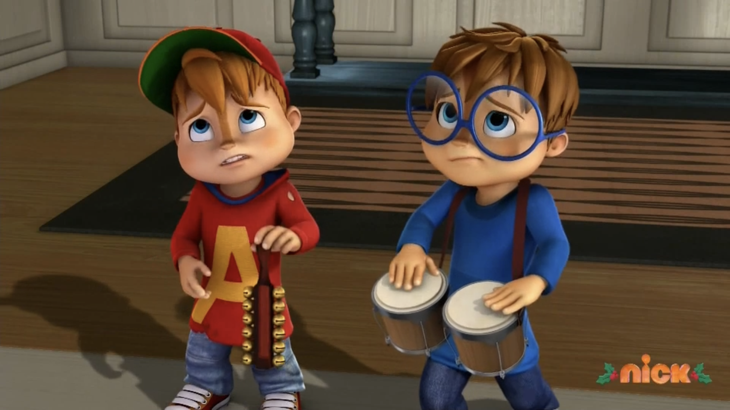
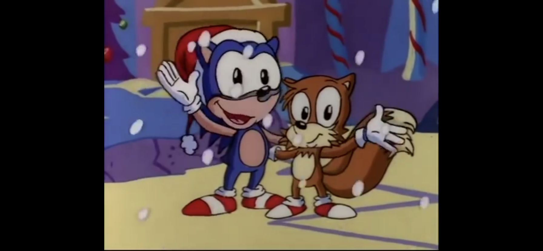
Alvin and his chipmunk brothers Simon and Theodore are no strangers to Christmas. They had a stand-alone TV special in 1981 as well as a Christmas episode during their run in the 1980’s in a show with a very similar name. This particular Christmas episode comes from the most recent iteration of the franchise which aired on Nickelodeon in 2020. If you’re familiar with the 80s cartoon, then this one should feel very similar. It just looks different. Alvin and his brothers, while still not the size of actual chipmunks, are a great deal smaller than they have traditionally been depicted in cartoons, but also their features otherwise are a bit deemphasized. They look more like kids with weird noses. And it’s a CG-rendered show that while not as ugly as some of the CG shows from the early 2010s, is still far less pleasant than the 80’s cartoon. In this holiday episode, Theodore is feeling unwanted at home, and when he gets mistaken for an elf and brought to the North Pole, he thinks no one back home actually wants him. And Alvin kind of gave him to the North Pole because in most versions of this franchise Alvin is a selfish dick, but he learns his lesson, Theodore makes it home for Christmas, and everything is fine. It’s just why would you spend your time with this one when you could be watching the far superior A Chipmunk Christmas? I don’t blame you though for preferring this to the It’s a Wonderful Life parody that showed up in the 80s series.
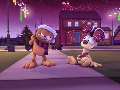
By sheer coincidence, we have another CG program from the 2010’s that aired on Nickelodeon starring a character who was pretty popular in the 1980s: Garfield. And like Alvin and the Chipmunks, Garfield has a much better Christmas special from the 80s you could be watching instead. Garfield and his pals made an okay jump to 3D. The models are a bit texture-less, but not unpleasant to look at. Frank Welker takes over for Lorenzo Music as the titular fat cat and does a solid job of capturing the same tone as Music. He’s low energy, almost bored, and rarely genuine. This episode, which is a tidy 12 minutes, features Garfield caroling because he sees it as a path to free food only no one he carols for seems to enjoy his antics. Meanwhile, Nermal and Odie are caroling together and dragging a wagon full of food behind them because they’re just so cute! There’s a few moments of genuine humor and since it’s so short it requires a much smaller sacrifice of time than most, but in the end it might still leave you wishing that you watched the more famous Christmas special featuring the orange cat.
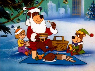
I can think of something very wrong with that title. Yogi Bear’s All-Star Comedy Christmas Caper is pretty light on comedy, as most Hanna-Barbera things are. What it is not short on are cameos. That’s the “All-Star” part as you’re going to see most of the classic Hanna-Barbera characters in this one, even Fred and Barney! That’s actually the only part that did get a little laugh out of me as Snagglepuss points out the absurdity of the situation. Anyway, this one is about a lonely, mistreated, girl mistaking Yogi for Santa and him being unable to come clean about it because he doesn’t want her to feel worse. They need to help her greedy, selfish, father see the error of his ways. It’s not very good, and if I’m being objective about it then I probably should have ranked this one lower, but I do have some nostalgia goggles for it. It did get a genuine reaction out of me when I was younger which is hard to let go of. And I am a sucker for big ensembles, just not enough for me to make it through Yogi’s First Christmas. That damn thing is an hour and a half and I refuse to ever watch it again.
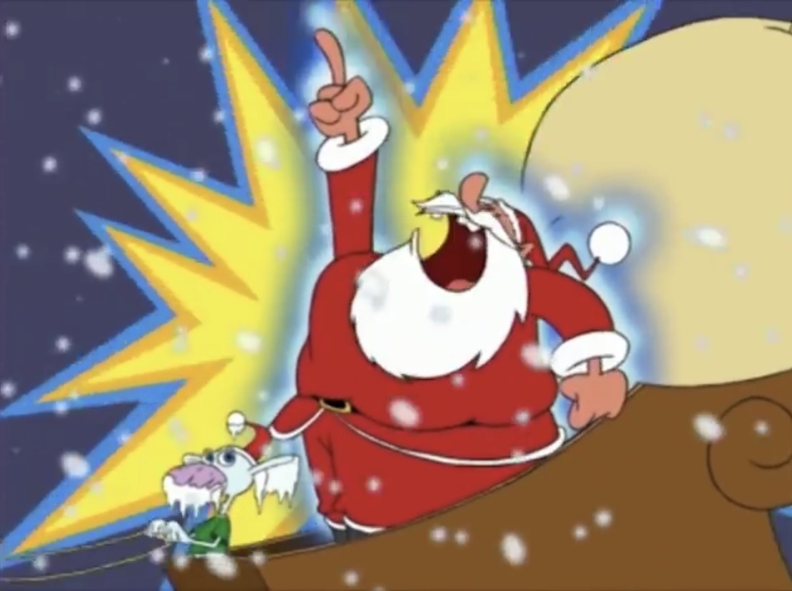
Space Goofs is a Fox Kids cartoon that started airing when I started tuning out on Saturday morning. Once X-Men and Spider-Man finished their respective runs I was all done. After watching this Christmas episode though, I do think I may have missed out. This is a bit of an ugly late 90s cartoon, the aesthetic for the era is not one that I look back on fondly, but it was pretty amusing. The premise of the show is a bunch of aliens are hiding out in a house and they’re oblivious to human culture, save for what they can get on their television. When Santa shows up on Christmas Eve, they think they’re being invaded. This Santa is incredibly stubborn though and insists on delivering presents so he keeps trying to sneak into the house which results in him getting caught by the various traps inside. He takes a beating, but he keeps on coming. It’s a bit like Smokey and the Bandit in that Santa keeps absorbing more and more punishment until he’s in a full body cast by the episode’s end. It’s an easy one to watch these days and if you like that 90s physical comedy that was present in many cartoons then you probably won’t need the benefit of nostalgia to find some enjoyment here.
If you didn’t like Bugs Bunny’s Looney Christmas Tales then it makes sense why you’d give New Looney Tunes and its Christmas episode a try. Unfortunately, it’s not that great. It’s not terrible, and I am ranking it ahead of that first one, but it doesn’t take advantage of the holiday very well. This one has two segments. In the first, Bugs is Christmas shopping and after a hot item, but so is Yosemite Sam. This means the two go to war in a Walmart-type store for the last item available. There are some decent gags, but nothing particularly memorable (except maybe Porky having to mop up spilled ham). The second segment features Bugs’ friend, Squeaks, misdelivering his letter to Santa to a guy called The Barbarian on account of the fact that he kind of resembles Santa Claus. Bugs has to get the letter back so he can get it to the real Santa, but Barbarian is apparently not interested in giving it back. It’s kind of stupid. Again, it’s just Bugs inflicting pain on his opponent (with some pain returned) through comedic means none of which is particularly memorable. You’re unlikely to hate it, but it’s not the sort of Christmas special you’ll be inclined to watch again. And there are better Looney Tunes specials to come.
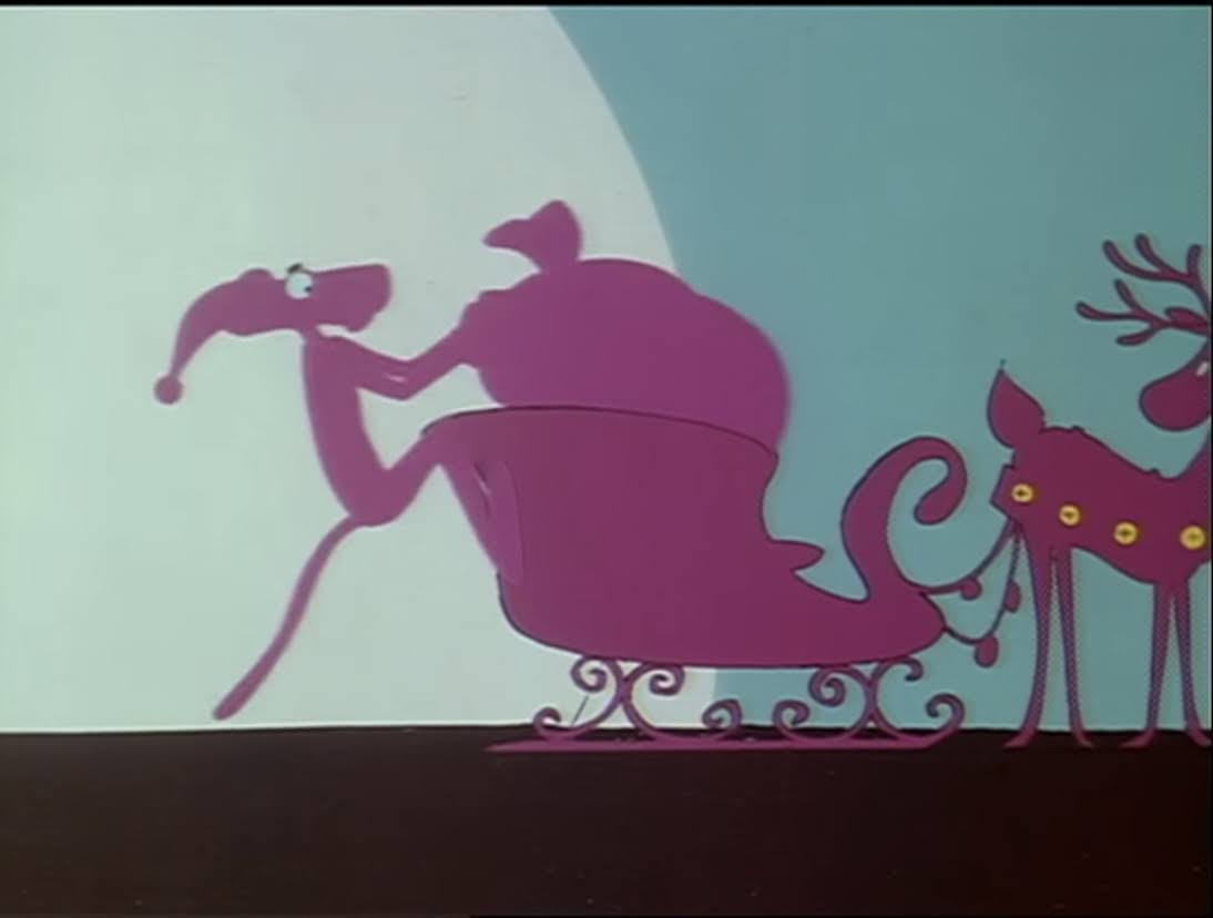
The Pink Panther is basically a silent cartoon star. The cartoons are not absent sound, but there’s no dialogue from anyone. The story is moved along through animation and the object is usually to convey pretty basic emotions that almost anyone can understand. Like most cartoon stars, The Pink Panther is accustomed to short subjects, but this television special had to fill a half hour and it really hurts the pacing. In this one, Pink Panther is basically homeless and just wants a hot meal. He goes through all kinds of hoops to land one which also lands him in trouble with numerous people along the way eventually leading to him getting arrested. It has funny moments, and there’s a nice ending to it as well, but it’s the sort of special that just wares me down. I don’t have any particular affection for the Pink Panther. I don’t think there’s anything especially sympathetic about him in any of his cartoons, but even so I get sick of him constantly losing throughout this one even knowing it’s going to work out in the end. Had this been a cartoon short, I think it would have worked better. It’s a bit too miserable in this form, but some may find that the constant misery leads to a better payoff I suppose.
Don’t be fooled by his cuteness, he just kicked the crap out of Santa.
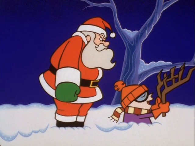
Here’s one for the British readers. SuperTed is a living teddy bear that’s also a superhero. I really liked this guy as a kid and had pretty much forgot all about him until I stumbled upon this Christmas episode a few years back. In this one, the villainous Texas Pete is out to steal Christmas and it’s up to SuperTed to stop him. The amusing wrinkle in this one is that SuperTed thinks he gets the drop on ole Pete only to find out it’s the real Santa Claus, err, Father Christmas. He actually beats him up pretty well too in what is an almost shockingly funny little bit. Outside of that, it’s a perfectly fine little Christmas episode that probably works better if you have some affection for the character.
I swear it’s just a coincidence that SuperTed is followed by Super Dave.
Comedian Bob Einstein’s Super Dave alter ego actually had his own cartoon series in the early 90s. It was short-lived, but it’s one of those things that impresses me to this day. Super Dave, if you’re unaware, was a daredevil. Since this was a bit by a comedian, he was a terrible daredevil. None of his stunts go right and he often winds up in extreme pain. It makes sense to turn that type of guy into a cartoon since you can really do some damage to a cartoon character and he’ll always come back ready for more! In this Christmas episode, Santa is kidnapped and Dave has to rescue him. Why does a daredevil have to be the one to rescue him? Who knows? It has its moments, but mostly it ends up getting ranked this high because I remain tickled that this is a thing that exists. I also appreciate that it really has no moral. Sometimes we don’t need a preachy ending, we just need an ending.
Eek is the good-natured cat that roamed the Fox Kids Saturday morning lineup in the early 90s. He is an eternal optimist which makes him a great fit for a Christmas special. He can also scream like a bastard and take some serious punishment which makes him an ideal cartoon character. In this Christmas episode, Eek comes across a gift for Little Joey and takes it upon himself to make sure it reaches him. Along his journey, he’s going to get the snot kicked out of him. He’s also going to help people along the way which just in turn leads to more misery, but the cat comes through in the end and delivers the present to Little Joey. Who turns out to be a rat or something. It’s entertaining, it’s just not one of the better looking shows from the era. And since it doesn’t really invoke the “feels,” it comes up just a tad limp for me in the end. If Eek was your guy, or cat, when you were a kid then you’ll probably derive far more enjoyment out of coming back to this one than I ever could. I also think his other Christmas special is just a little bit better.
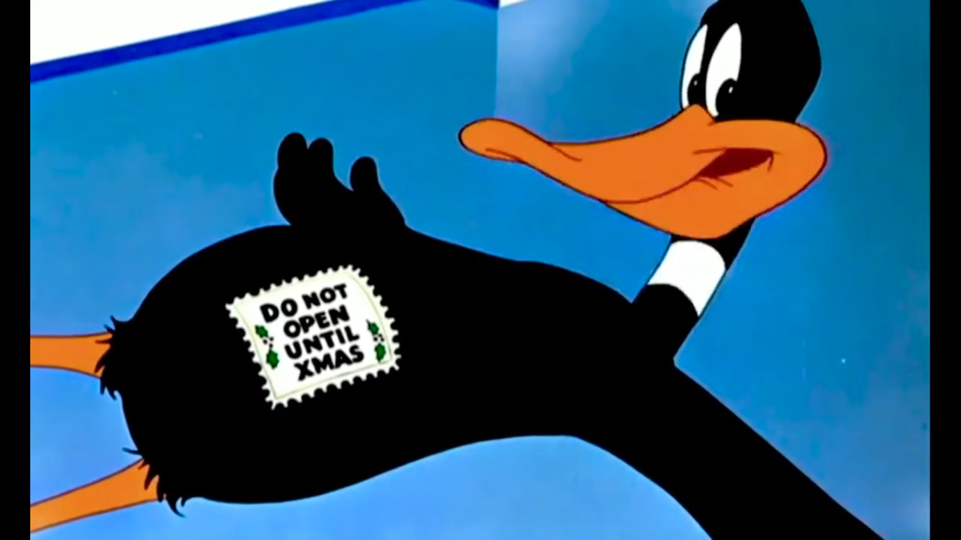
I apparently named this image “Dick Dexter.” I amuse myself sometimes.
Our final entrant for today is Dexter of Dexter’s Laboratory fame. He was one of the original Cartoon Cartoon stars for Cartoon Network and I have mostly positive memories of his show. In his Christmas segment, Dexter is confronted by his own ignorance for he gets into an argument with his sister about the existence of Santa Claus. Dee Dee insists that he’s real while Dexter insists that it’s merely their father in disguise. He seems to think his dad puts on an elaborate show to keep up the ruse indicating that while Dexter may be a boy genius, he’s also still a boy. Dexter then waits up all night and catches the real Santa in the act, only he still thinks it’s his dad and does horrible things to the big man in order to prove it. This just leads to injuries and destruction. Santa even loses his beard (coincidentally, the same thing happens to the Santa in Space Goofs)! Yeah, it’s kind of unsettling. What I love about this one is the continuity. This being a Hanna-Barbera Christmas episode that aired in 1998, it still made sure to have a Santa that looks exactly like the one from A Flintstone Christmas. That’s pretty neat, even if other versions of Santa have appeared over the years in other Hanna-Barbera productions. If you’re going to copy one though, that’s the one to copy. This Christmas episode is brief, but funny. A little dark, perhaps, but we need that from time to time out of our Christmas specials.
What’s not dark, is tomorrow’s Christmas special. Actually, it technically is dark, just not in tone or humor. You’ll see what I mean in short order, but tomorrow is a full write-up of a Christmas cartoon I never got around to. It’s one that has been on my “to do” list year after year and even pre-planned on at least one occasion, but I just never got around to it. That all changes tomorrow so come on back and see what ended up in slot number 147!
Can’t wait until tomorrow for more Christmas? Check out what we had to say on this day last year and beyond:
I told you we would probably take a look at the other Christmas episode from The Cuphead Show!, though maybe you expected a buffer. I considered it, but why not pair them up just like the creators and Netflix already did? This second Christmas episode comes right after the first. Titled “A Very Devil Christmas,”…
When two billion dollar organizations butt heads, it can be hard to know who to root for. Take Disney, somewhat of an “evil” overlord when it comes to content, which seemingly owns everything these days and likes to throw its weight around when it comes to copyright claims. And then there’s Fox, owned by the…
In 1964, Arthur Rankin and Jules Bass unleashed a Christmas Classic upon the world in the form of Rudolph the Red-Nosed Reindeer. The special basically put the company on the map and put it on the path to holiday domination for decades to come. Despite that, few of the specials that followed Rudolph truly hit…
We’re back to the ranking posts, and following yesterday’s solo entry, it means our numbers are no longer nice and clean. This is also our first day with 11 entries and we’ll have a few more just as part of my organization. We’ll also never have fewer than 10 on these. It’s math, baby!
Today we slide a bit further into the “Hmm…okay,” category. There’s still stuff here that I am unlikely to ever return to, but there’s also some stuff in here that I watch just about every year. Now, I hesitate to call those particular specials good, but they obviously do something right or appeal to a certain part of me and flawed Christmas specials can be watchable. The first one on our list though is a bit murky.
Courtesy of the “new” Woody Woodpecker show comes “A Very Woody Christmas.” I could make this short and say this series had another Christmas episode, but I never watched it. I had my fill here. It’s not terrible, it just didn’t really make me laugh. It’s three segments: two Woody cartoons sandwiched around a Chilly Willy. I’d say the Chilly Willy one is the best of the three, but I always liked the little penguin. The third one is also in the discussion as Woody tries to get himself off the Naughty List by doing something nice for his neighbor, but everything just goes wrong. The show premiered in 1999 and it looks okay by those standards. Woody’s redesign is slight and not unsightly and I did like Billy West in the role, I just wish the cartoon was funnier.
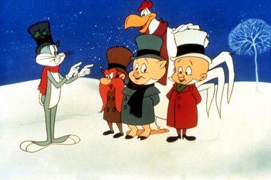
You could take a lot of what I just said about Woody and apply it here. One would think a Christmas special centered around Bugs Bunny would be pretty funny, but this is not. Perhaps one of the most disappointing Christmas specials I’ve ever seen, this comes post Looney Tunes shorts when the made-for-television animation was obvious and the voices started sounding a little different. It doesn’t look particularly good and too much time is wasted on a tired A Christmas Carol parody that does nothing clever. My affection for these characters has helped to prop it up all the way to this spot and the fact that my kids love Bugs Bunny has kept this in semi-rotation over the years, but this is the worst Looney Tunes Christmas anything on this list.
We go from the Looney Tunes Christmas special to the superhero who wants to be a Looney Tune. The Mask is not a show I’ve spent much time with outside of this episode and I’m not likely to. Even so, this wasn’t bad even though it’s another “Character takes over for Santa” plot. Rob Paulsen is a good Mask and there were at least a few spots that made me smile. It also has Tim Curry and he’s great. I did enjoy the look of this one as it’s much better than the other Jim Carrey movies turned cartoons in that respect. And with this one, I can watch it and think, “This isn’t bad, but it’s definitely not made for me.” And that’s because it’s made for kids and if I were a kid I’d probably think higher of this. And had I been a little kid when this was on, maybe my nostalgia for it would have pushed it higher? Or not as we’ll see in a few entries.
I avoided this one for years because of that title. “Dickens” implies only one thing when paired with Christmas and my appetite to watch unfamiliar A Christmas Carol takes is nonexistent. This one isn’t really what I thought the title implied. Instead, the Brown family (and Marty) travel back in time to find that A Christmas Carol is essentially a true story. They don’t really come to that conclusion, but that’s basically what it is. The Brown kids get mixed up with an Oliver Twist like kid and a Scrooge-type gets it in the end. It’s all right. A cromulent Christmas episode from a cromulent cartoon. There’s so little Back to the Future things outside the movies that there was a temptation to rank this one higher, but if I’m being honest with myself I’ll never watch it again.
Speaking of surprises, this one definitely surprised me. I knew the Berenstain Bears as a series of children’s books. I read and enjoyed them as a kid. I also vaguely recall an animated series. The only specific of the animated version I could recall was the opening title. An actual plot from an episode is just not something my brain can recall. I assumed this would be a preschool styled show and when I went to watch it for the countdown that year I thought there was a really strong chance I was wasting my time as I avoid preschool shows for this blog. There just isn’t much to talk about with them. I was wrong as this was really a straight-forward comedic show aimed at kids. It didn’t exactly win me over, but I was charmed by elements of it and came to enjoy the dumb father character. I think if this were in the 11 minute range it would have been stronger as I just got sick of it. The plot didn’t have enough meat on the bone to sustain the full run time, but it wasn’t bad. If my kids had been raised on this franchise then I would have been fine introducing this to them. Since they weren’t, I don’t have to.
The last of the Jim Carrey movies turned cartoons I covered was Dumb and Dumber. Coincidentally, it was also the last to be released and the same is true of the movie and cartoon. And it’s also the best of the three, which I’d say is also true of the movies which is quite the coincidence. As for series, that I can’t attest to as I haven’t seen enough of any of them, but for Christmas specials I’m taking “Santa Klutz” over the other two. Part of the reason for that is the run time – this one is short. I like short. It is ugly as sin and I don’t really like looking at it, but unlike the other two this one did have some genuine funny moments. It can be hard to write stupid characters, but this cartoon did a good job with that. There’s some misdirection to jokes and the plot setup is also a strength. Reflecting on it, I’m almost talking myself out of ranking it here and moving it up, but I’m not here to second guess myself.
A Cosmic Christmas is a special that’s more interesting than good. I say that as someone who didn’t grow up watching it so my nostalgia here is nil, but the main plot beats are pretty standard Christmas stuff. The animation is rough, but in an artistic and interesting way. Some characters have weird flow or large blocks of color. There’s lots of smoking which is unusual in this day and age and some odd effects with the aliens and their spacecraft. I was never bored watching it even if the story wasn’t exciting. I also enjoyed the Christmas message contained in this one which is largely to help the less fortunate – the sort of thing a lot of high profile church people lose sight of. RIP Nelvana.
Here’s the one I was mostly calling out in the intro paragraph as one I tend to watch every year. X-Men was my favorite show as a kid so nostalgia plays a big role. I was predisposed to liking any Christmas episode X-Men did. And this is a pretty bad Christmas episode, but it’s also intentionally bad. The writing staff was tasked with doing a Christmas episode so they tried to get every trope they could come up with into this one because, on the surface, Christmas with the X-Men is pretty absurd. It just wasn’t the type of show that was going to tackle the subject. The only problem here is the writers were almost too good at making a bad Christmas episode. There’s no sense of irony within the episode, you’re only in on the joke if you happened to read an interview concerning it.
I don’t have a ton of nostalgia for the Teddy Ruxpin cartoon, but I did love my Teddy Ruxpin doll and the book this episode was based on. I feel like I can almost recite that story from memory because Teddy and Grubby told it to me so much. It’s not a true Christmas special as it’s one of those other world stories where they have their own customs that just so happen to resemble Christmas an awful lot. The only thing missing is Santa Claus. Teddy and his pals deliver gifts to their friends while the villain, Tweeg, tries to ruin their time, but he’s an idiot with idiot followers. It’s a little too syrupy sweet at times, but I was entertained.
Mickey’s Once Upon a Christmas was so good that they had to come back for another one. Too bad that along the way someone decided that this should be animated in 3D as opposed to 2D and the classic Disney characters just weren’t ready for that. This thing is Ugly. Mickey looks weird, Goofy more so, and it’s an all together downgrade across the board. The duck nephews who are tasked with carrying one of the longer segments of this one look almost monstrous. It’s also a weird setup where we’re going with what is essentially a 90 minute block of programming broken up into 5 segments of varying lengths. It does improve the pacing when compared with Mickey’s Once Upon a Christmas, but the stories aren’t the best. The saving grace is the final segment where Pluto accidentally winds up at the North Pole and Mickey thinks he ran away because he got mad at him. It’s cute watching Pluto frolic with the other reindeer and it has a really sweet ending. It also helps that Pluto made the jump to 3D better than most of the cast. If you’re interested in this one, I recommend just fast forwarding to that part. The rest is filler.
Tex Avery’s contribution to Christmas is this short that’s also a sequel to the classic story The Three Little Pigs. Well, sort of. It doesn’t really matter, but we have two married pigs and their bratty son and old Mr. Big Bad is going to try and sneak into this home on Christmas. It turns out to be a bad idea as the little kid is a true screwball cartoon character with all the powers of the screwball. We get to watch this kid brutalize the wolf and get some laughs in the process. It’s light on your usual Christmas tropes, but there’s something there. What holds it back is just that, at this point in Avery’s career, there wasn’t a whole lot more he could do. It’s a lot of the same gags you’ve seen before and the attempts at making them bigger just lack imagination. I also don’t like the protagonist. I dislike his voice and most of his mannerisms so it ends up being one of those cartoons where you almost want to root for the bad guy. Eat the damn kid – he sucks!
Can’t wait until tomorrow for more Christmas? Check out what we had to say on this day last year and beyond:
What’s next for a video game that looks like a cartoon? Why, a cartoon! Novel concept, huh? Cuphead is a 2017 video game created by Jared and Chad Moldenhauer heavily inspired by animation from the 1930s. It’s basically a hand drawn video game and a fully playable one, at that. It made waves when it…
We touched on it a bit just a few days ago when we talked about The Justice League, and we’re going to do it again! What is “it?” Why, the launch of The WB, of course! The network fronted by Warner Bros. was a newcomer in the mid 90s and was here to challenge the…
Back in 1929 Walt Disney launched the Silly Symphonies series of cartoon shorts. Unlike the Mickey Mouse shorts that were growing popular at the time, Silly Symphonies did not center on just one character or even a group of characters, but rather were fairly self-contained. Some shorts that became popular, like The Three Little Pigs,…
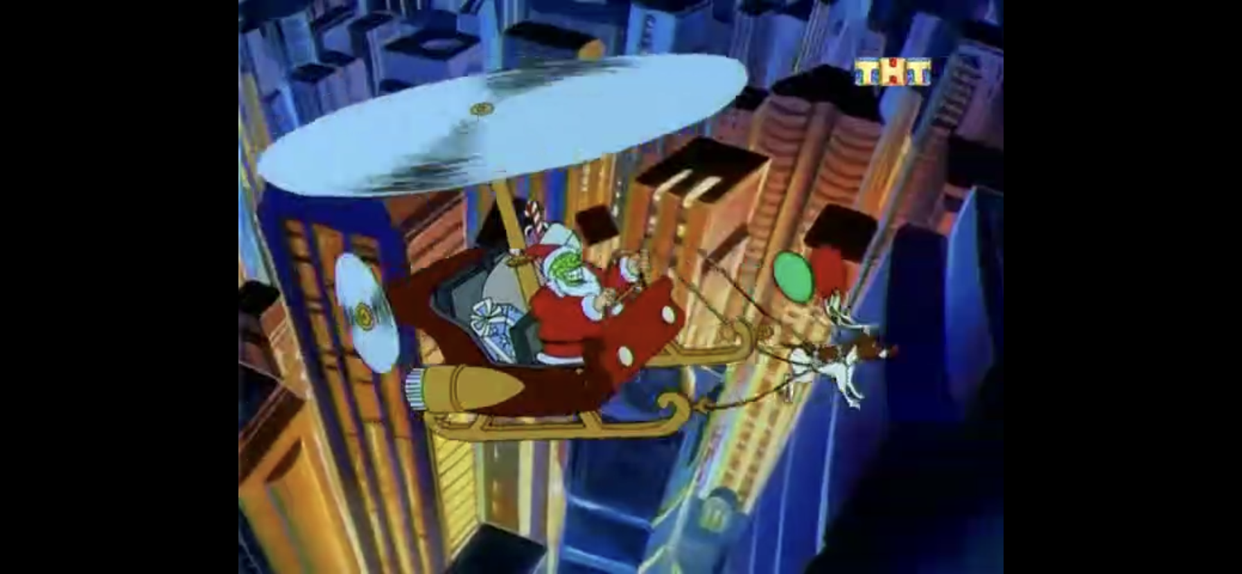
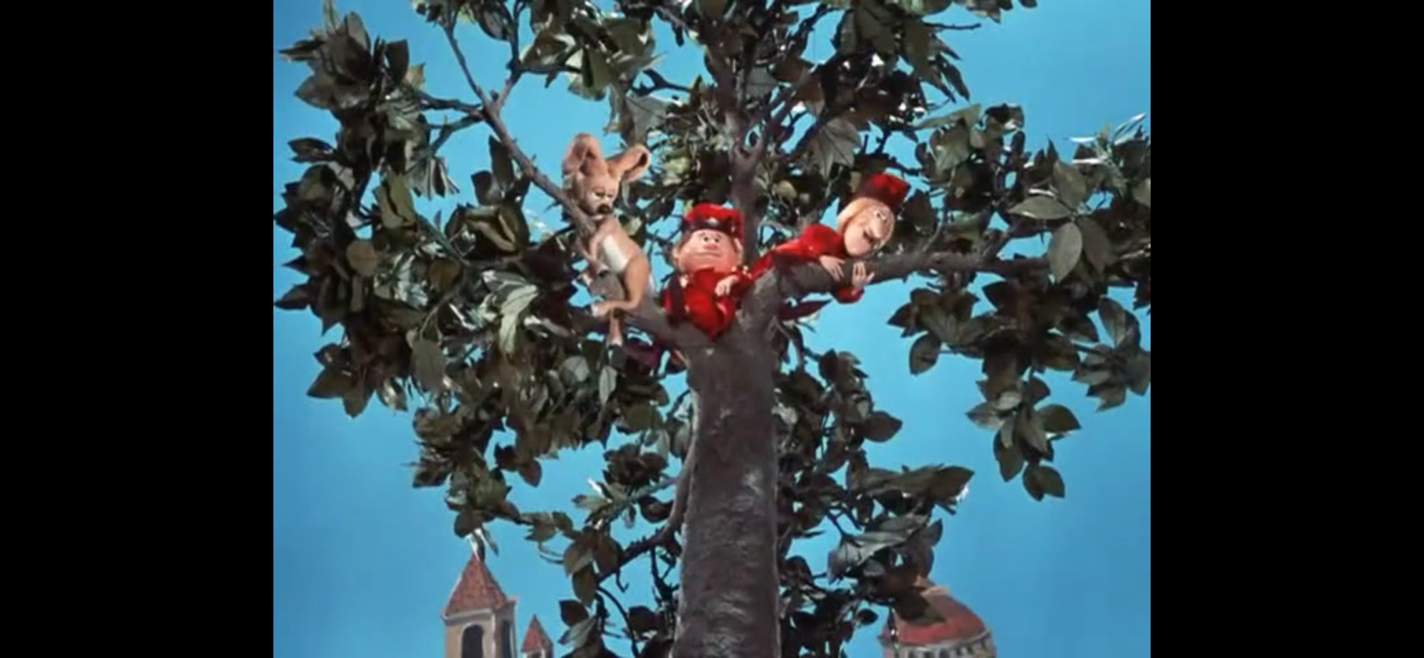
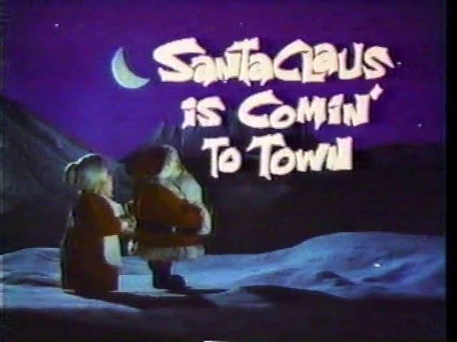
One Christmas special I seem to break with my peers on quite a bit is the Rankin/Bass television special The Year Without a Santa Claus. The special was originally aired on ABC in 1974 and is sort of a sequel to Santa Claus is Comin’ to Town. It’s one of the later arriving Christmas specials from the company and I’m guessing there was a feeling of diminishing returns at this point. As best as I can recall, The Year Without a Santa Claus never had a sustained run on broadcast television in the years to follow unlike its predecessor as well as other Rankin/Bass specials like Rudolph and Frosty. This one wasn’t on my radar as a kid and I’m not sure when I first saw it. I’m not even sure I ever sat through an entire viewing until now.
During the 90s, Christmas made the leap to cable. The Family Channel, which is now known as Freeform, was one of the networks that started making a habit of turning over much of its broadcast schedule to Christmas specials come December and The Year Without a Santa Claus was featured rather prominently. Is that the source of its enduring popularity? It could be, or like a lot of things with Christmas specials, it just happened to find its audience at the right place and right time. So many Christmas specials largely came and went and even though you may have folks who grew up during the same era, their idea of the best Christmas specials might differ quite a bit depending on what they were exposed to.
It’s not 1:1, but there’s some cohesion here with past Rankin/Bass specials.
I am not a huge fan of the Rankin/Bass stuff. I know, doing a Christmas blog and saying that sounds almost incompatible, but it’s really just nostalgia goggles that helps me even appreciate the few I do like. I tried to watch this one in the past mostly because people my age would cite it as one of their favorites, but it never took. In an effort to meet them halfway, I have decided that in order to feel like my Christmas rankings are complete I better give it another go. And I’ll say upfront, it’s not as bad as I remember. It’s still not all that good which is why we’re talking about it at this point in the countdown, but it at least has something to say even if I think it kind of chickens out in the end.
Mrs. Claus gets to assume more of a starring role this time, but maybe not as much as I would have gone with.
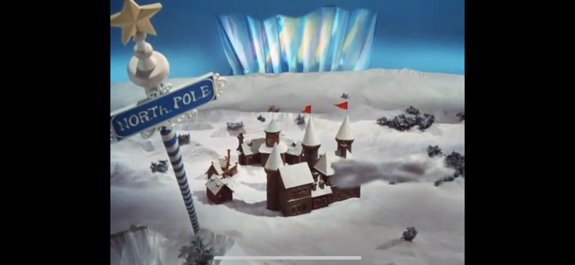
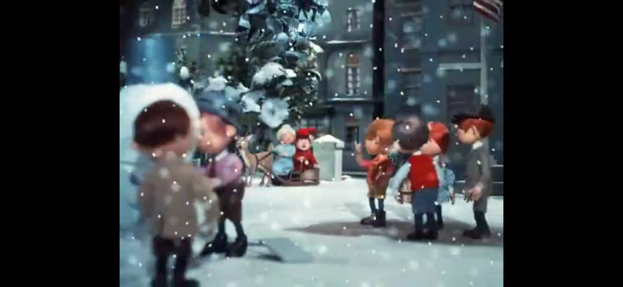
The Year Without a Santa Claus is a stop-motion holiday special and it follows with a similar story structure to other past Rankin/Bass specials. In the role of narrator, we have Mrs. Claus who is voiced by Shirley Booth. The stage queen would retire from acting after this role at the age of 74. That’s an old age to retire, but don’t feel too bad for her as she would live another 18 years. Unlike Sam Snowman and Special Delivery, Mrs. Claus is actually a key character for the plot as opposed to a passive observer or story-teller. She is reflecting on a Christmas from long ago, but it hardly matters for the story. And it’s another one that takes place at an almost impossible to nail down moment in time. It’s just sort of vaguely 1900s America.
Almost the exact same picture from Santa Claus is Comin’ to Town.
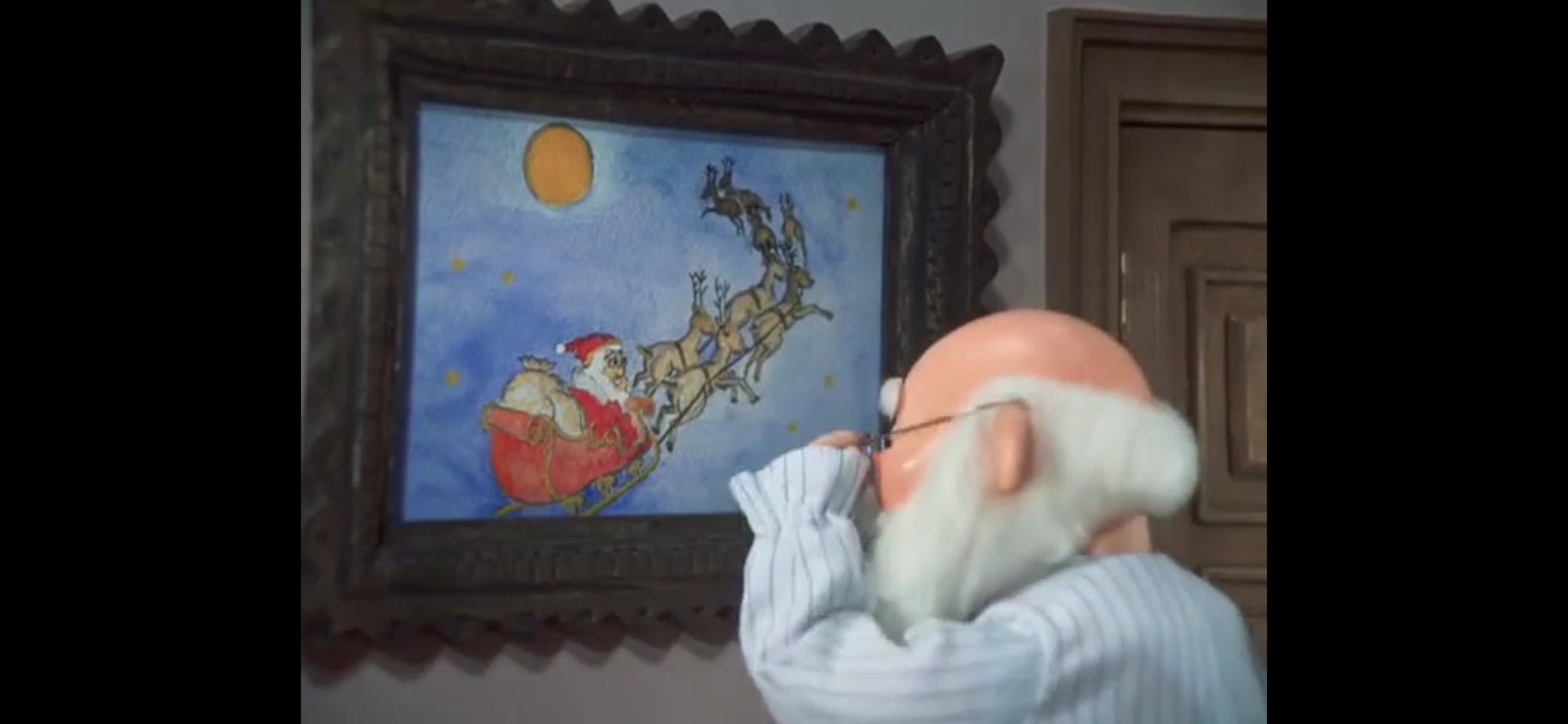
The special begins with Mrs. Claus setting the scene. She’s up at the North Pole doing North Pole stuff, but who is not is Santa Claus (Mickey Rooney). He’s not feeling so hot as we find him climbing into bed. It’s a single bed, and it appears to be the only one in the room so I guess Santa and the Mrs. keep things very old-fashioned. The castle and setting are not exact copies of the North Pole from Santa Claus is Comin’ to Town, but it is similar and I appreciate that attention to detail. Mrs. Claus goes back and forth between talking and narrating, sometimes even adding a “Said Santa Claus,” after he talks about his achy back and such. It’s annoying and unnecessary. Before Mrs. Claus gets Santa into bed, he walks about to a painting of himself driving the sleigh. It appears to be the same such painting from Santa Claus is Comin’ to Town. Once again, I appreciate the attention to detail.
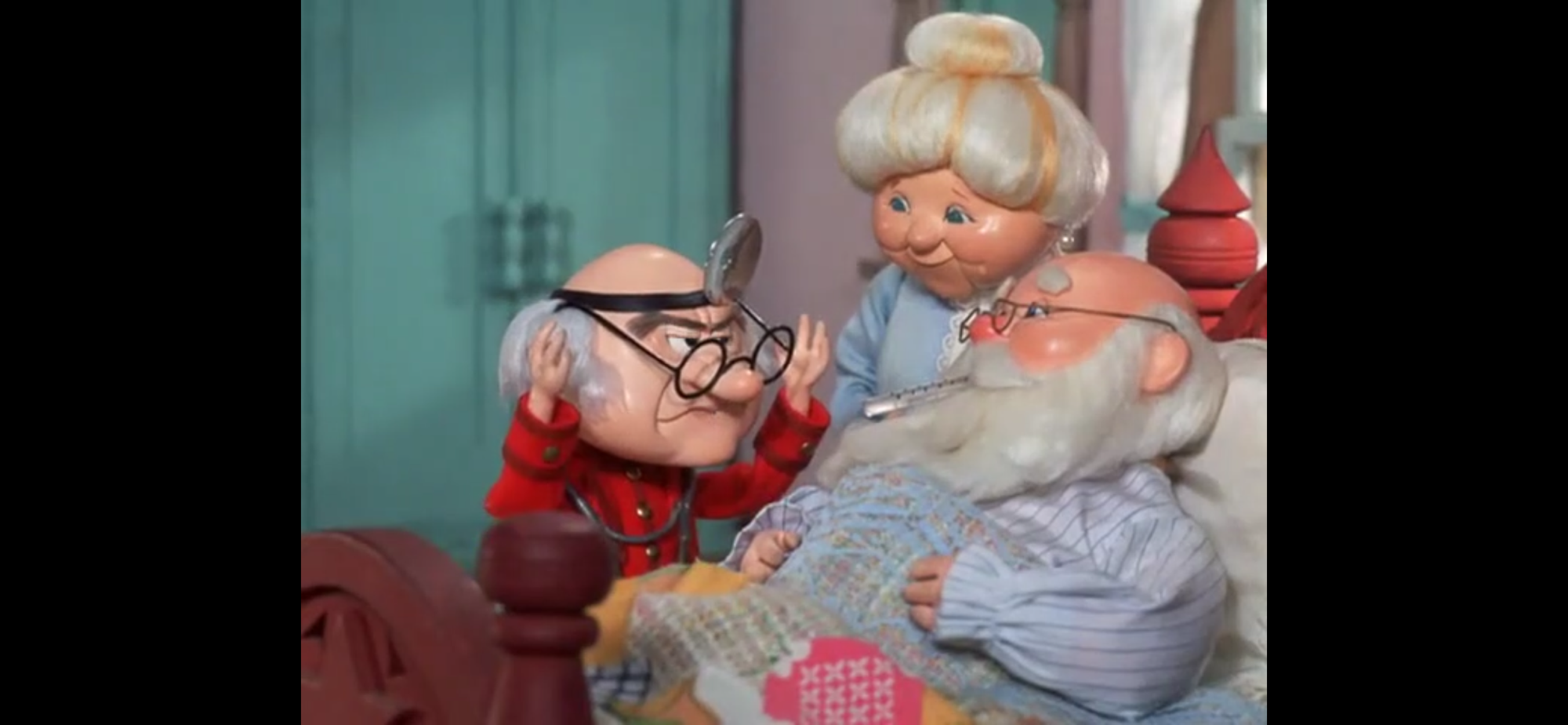
This doctor needs a new profession.
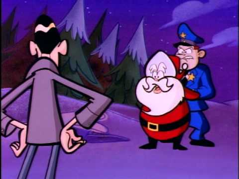
Santa gets in bed as Mrs. Claus welcomes a doctor in. The elf doctor (Bob McFadden) is a pretty grumpy sort. He also doesn’t look much like an elf. The doctor is not surprised he’s not feeling well and suggests he never got over that case of pneumonia he picked up riding in the sleigh. I was expecting some made-up, funny, ailment, not a real world one. This doctor is a real kill joy as he tells Santa no one cares about Christmas and no one cares about Santa. Geez. He best hope this doesn’t drive the old man to suicide. When the doctor leaves, Mrs. Claus discovers that Santa has taken his words to heart. Declaring no one cares and that he’s due for a holiday, Santa instructs his elves to inform the masses: Santa is taking the year off.
This elf is seeing pink elephants they’re so distraught!
Time for Mrs. Claus to sing the title song as the opening credits play. It’s not a terrible jingle, but there’s a reason why it hasn’t become a radio classic in the ensuing years. During the song we get some lines from Santa himself explaining his weariness and sightings from towns of people taking down Christmas. How depressing. When it concludes, we get a little more Santa informing the men that there will be no Christmas gallivanting this year. He instructs the stables to close down and the toy shop shuttered. During her explanation, Mrs. Claus refers to the workers as elves and gnomes which I find interesting. None really look much like elves. Sure, they dress in silly clothes with bells and such, but where’s the pointed ears? Where’s the continuity? You had two specials already that heavily featured elves and these guys don’t resemble them at all. At least the reindeer are more or less consistent with Santa Claus is Comin’ to Town.
Jingle (right), Jangle (right), and Vixen (sleeping, though you probably could have guessed that).
Mrs. Claus is going to take it upon herself to get Santa back into the Christmas spirit. And to do so, she’s going to call Santa’s number one elf, Jingle Bells (McFadden). He answers the phone as the number one elf and I don’t know if that’s confirmed elsewhere. He could just be really full of himself. With him is, get this, Jangle Bells (Bradley Bolke) who has a really of the era design to him with shaggy, blond, hair. I was expecting him to introduce himself as the number two elf, but he does not. Jingle doesn’t seem to think highly of him and boots him off the phone. He then just says “Yes, Mrs. Claus,” a whole bunch and we’re not privy to the other side of the conversation. When he hangs up the phone, Jangle asks “Who was that?” and Jingle responds in an exasperated manner, but maybe Jangle was just being polite and not listening in on the conversation?
Oh my!
We cut back to Mrs. Claus as the elves assumedly head her way. She’s admiring her reflection in a mirror while wearing Santa’s hat and remarking that she could pull off the look. This launches us into another original song, “I Could be Santa Claus.” It’s a song about how she thinks she could pull off the gig and she’s pretty convincing. Why not? This could almost be a female empowerment type of song if the special decided to run with it, but no. Jingle and Jangle arrive at the end and are surprised to find Mrs. Claus in Santa’s suit. It’s not played off salaciously or as if this is some major faux pas, which could have worked comedically. Instead it’s just general surprise, and then they move on. Apparently, just their look of surprise is enough to convince Mrs. Claus that she can’t be Santa and she takes the outfit off and declares they need to move onto Plan B. I guess her heart just wasn’t in it? Plan B is for the elves, and a diminutive little Vixen, to head south and find some Christmas spirit. Mrs. Claus is convinced that’s all it will take for Santa to feel motivated to resume his usual Christmas activities.
Santa isn’t even going to give his elves a chance to fail.
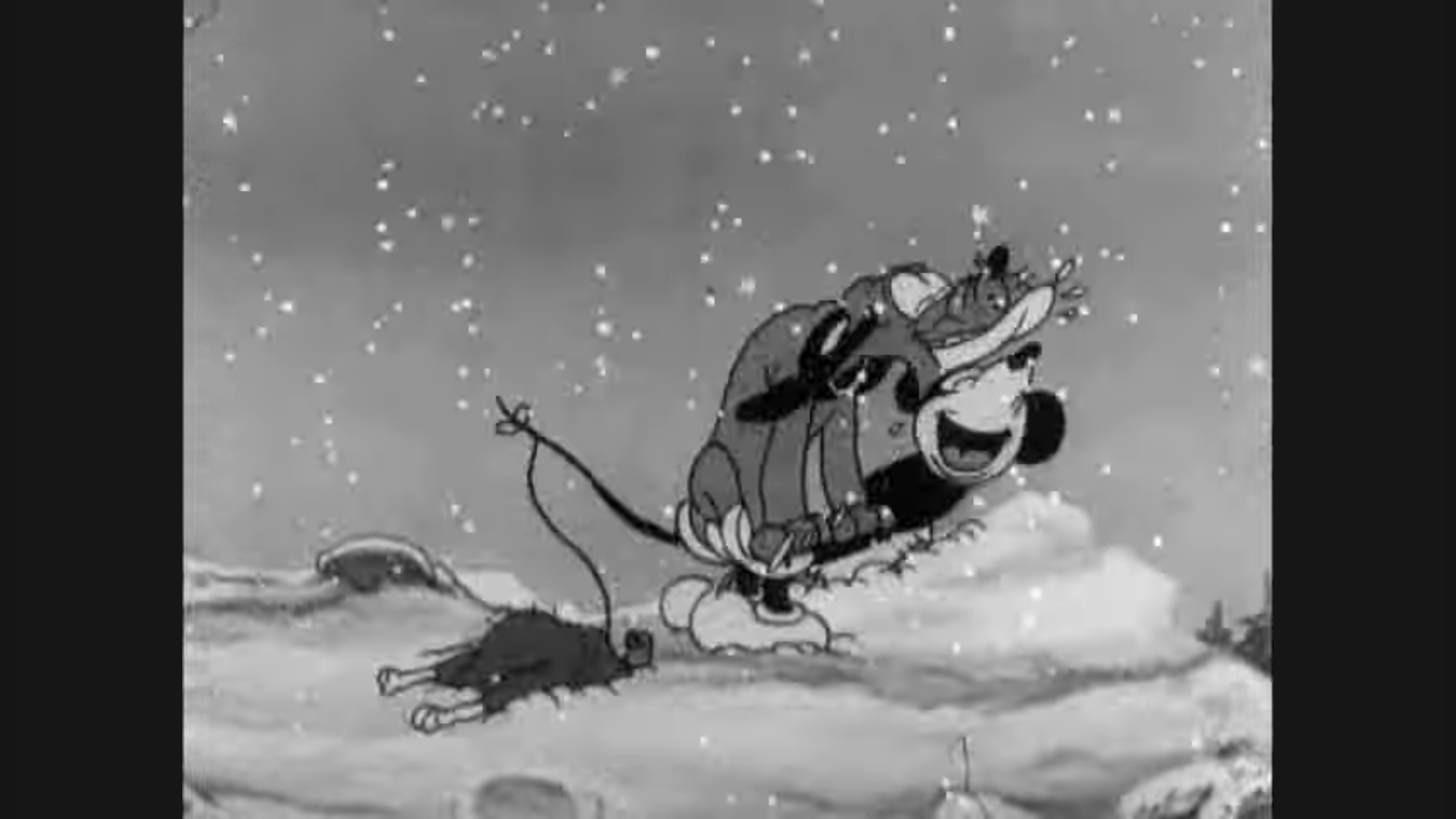
When the two leave, there’s a familiar music sting that’s pulled right from Santa Claus is Comin’ to Town. It sounds like it’s done on a xylophone. You’ll know it when you hear it, it’s apparently the reindeer take-off sting. Mrs. Claus heads back inside to do some ironing while Santa asks what’s going on. Apparently everyone hears that xylophone when reindeer fly? She tries to be evasive, but rather poorly. Santa gives her a chance to tell him if she thinks he’s making the wrong decision, but she declines to challenge her husband. He can tell she’s up to something and she comes clean about the mission Jingle and Jangle are on with Vixen, though she doesn’t tell the boss she put them up to it. Santa is concerned for their safety, especially Vixen since she’s just a baby (they really should have taken a bigger reindeer, or why not two?). I get the impression he doesn’t care what happens to the dumb elves. He also references the Miser Brothers and his doubt that the two can get past them. Santa has no other choice but to get out of bed, put on his Sunday best, and set off on Dasher to go after them.
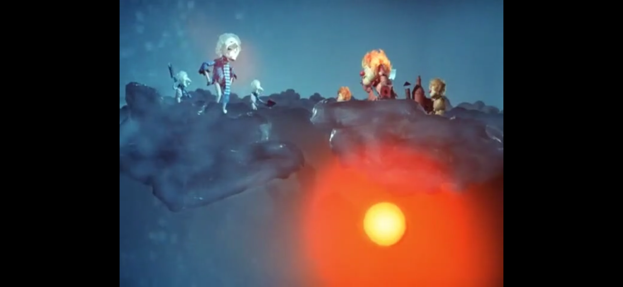
The real stars of this special, or so I’ve been told.
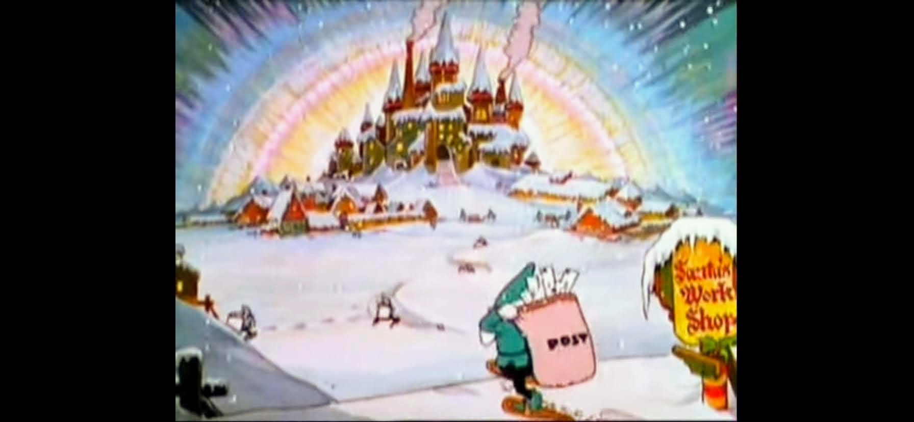
We then find the trio as they have to pass between the two warring step brothers: Heat Miser (George S. Irving) and Snow Miser (Dick Shawn). These guys, as best as I can tell, are a big part of why this special is beloved by some. Heat Miser is a round and brightly colored fellow with red-orange hair that resembles a flame. He’s like the Burgermeister, but colorful. Snow Miser looks like Dick Van Dyke with hair made of ice. The snow effect is just okay and looks more like aloe vera gel to me. They’re basically sitting on clouds and fighting over where it should be hot and where it should be cold in the world. The elves know they should avoid them, but are pretty damn terrible at piloting reindeer (Mrs. Claus, who has continued to narrate this adventure, puts the blame on the baby reindeer and I am not having any of that). They fly right in between the two and a burst of light from Heat Miser knocks them from their reindeer. So much for Plan B.
For some reason, everyone who isn’t a main character in this one is a total dick.
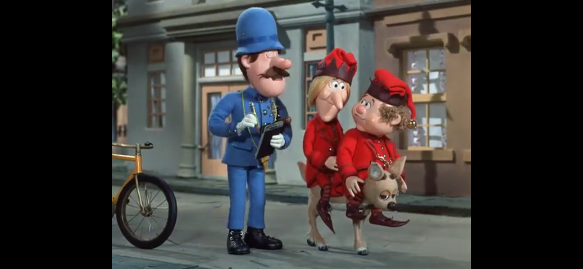
The special decides to just “yada yada” the whole falling from the reindeer thing as we next find the two back on Vixen flying through the sky. Seriously, do elves bounce or something? We were denied an incredible midair rescue by Vixen. The pair fly over a town and decide it’s as good as any to find some Christmas cheer. Southtown, USA is the chosen destination, but the elves are not accustomed to traveling these parts. They land in the street and are surprised to see them empty. A cop (Bolke) comes up on a bicycle and do you think he’s going to be helpful? No, of course not, he gives them a ticket for riding a “Vixen” the wrong way on a one way street. The stupid elves think the problem is people being unaccustomed to reindeer, so they put socks on her ears to try and pass her off as a dog. Sure. They then find a woman and approach her about Christmas. She’s horrified by their “dog,” which they have dubbed Rover, but the mere mention of a dog proves disastrous. The woman was holding her hands in one of those warmers that have a hole on each side, only it’s not one of those warmers. It was actually a cat this whole time who freaks out when Jangle tells Vixen to bark like a dog, which she does. The cat turns the tables though and chases Vixen, who is apparently afraid of cats as she bolts forcing the elves and woman to chase after her.
Up in a tree is a good place to be when you’re scared of the world.
We next find Santa who has also made his way to Southtown, USA. How did he know the elves would end up here? I guess we’ll just attribute it to Christmas magic. Or reindeer somehow leave their scent floating in the sky when they fly. Santa is talking to the same cop who gave the elves a ticket and he confirms he saw the pair earlier and seems delighted at the idea of a judge throwing the book at them. This guy sucks. Thankfully, Dasher was smart enough to hide in the bushes and doesn’t come out until the cop leaves. Santa expresses worry to the reindeer about the pair and assumes they must be scared to death. We then cut quickly to the trio high in a tree and Jangle remarks he’s scared to death. That Santa sure is perceptive, isn’t he? Jangle is ready to bail while Jingle is happy to blame everything on his elf partner. Jangle at least has the bright idea that if they want to find Christmas spirit they should look to the children. Jingle thinks that’s a great idea and they remove themselves from the tree.
Hello children, we would like to talk to you about Christmas.
The pair are shown approaching a school and they’ve removed their jackets because it’s quite hot. Vixen also isn’t doing too well. She’s not accustomed to heat so the two decide to just leave her in a shady spot in the town where cops hope you get incarcerated for riding an animal the wrong way on a one way street. This will go well, I’m sure. The elves then approach the kids who are just playing with balls. They recognize the two as Christmas elves right away and then also share they know that Santa is taking a holiday – it was in all the papers! Things get confusing when the kids then express no interest in Santa and remark how they’re too old to believe in him. But, he was just reported on in the paper? I am so confused. Do they think papers only print lies? This is the opposite of Yes, Virginia. The elves are soon equally confused when the kid points out that they have bigger problems. Naturally, it’s the dog catcher and he’s got Vixen. The elves can’t continue their conversation on the subject of Christmas as they now need to chase after the truck that’s making off their dog, I mean, reindeer.
Santa and the Thistlewhites.
The kid heads home and our narrator informs us he’s somehow pretty important. Outside his home, he runs into Santa Claus. That’s when he introduces himself as Ignatius “Iggy” Thistlewhite (Colin Duffy) and asks Santa for his name. He was apparently not prepared for someone to ask him his name. He’s also not great when put on the spot since the only thing he can come up with is Claus. Why not just go with Chris? Iggy shares that he saw a couple guys dressed like Christmas elves and Santa can only respond with a sneeze. This gets the attention of Iggy’s mom (Rhoda Mann) who insists on inviting him in to give him something for that cold. He accepts and inside we meet Mr. Thistlewhite (Ron Marshall) as well and everyone sits around the table and Santa asks more about what happened earlier. This ends up leading into a conversation about believing in Santa. When Iggy asks his dad if he believes, he responds in the affirmative. He then turns to Santa who also confirms he believes.
Iggy’s dad as a kid. This is a strange family.
Time for another song. This one is called “I Believe in Santa Claus” and it’s pretty self-explanatory. Santa kicks it off and then Iggy’s dad picks it up from there. It’s a bit odd as he starts singing about a time when he thought he grew out of believing and the camera zooms in on a picture of Mr. Thistlewhite as a kid with his parents. He looks like Iggy, but what’s really weird is his mom looks almost exactly like the current Mrs. Thistlewhite. Did this guy marry a woman because she reminds him of his mother? His first name must be Oedipus. We’re treated to a flashback, and this special does something I hate. The dad stopped believing in Santa until something happened. What do you think that was? Why, it was Santa himself! He woke the little bastard up to basically admonish him for not believing anymore. Now, imagine you’re a kid who is starting to doubt all of the Santa stuff and you’re watching this. Wouldn’t it just make you wonder why he doesn’t reveal himself to you like he did here? We’re creating some unreal expectations here, folks. More specials need to deprive the main characters of actually seeing Santa.
Aww, poor little reindeer.
Poor Mrs. Thistlewhite doesn’t get to sing her own section and the song ends with Iggy seemingly feeling bad for not believing. Well, that’s all it took to right this ship. With Iggy’s belief in Santa restored, the real thing can now ask some more about his friends. Apparently, Iggy had yet to get to the part about the dog catcher which immediately worries Santa. He’s also smart enough to figure out that the dog in question must be Vixen and we cut to poor, sick, Vixen in the pound looking mighty miserable. The attendant at least knows something isn’t right as we see him holding a thermometer and he looks a little concerned. The camera zooms in on Vixen, who sheds a few tears. Aww!
See what I mean? Guy married his mother.
Santa gets directions to the pound and heads off. He’s in such a rush that he summons Dasher and the two take off right in front of the Thistlewhites. They’re surprised, but not too surprised, and that clever Iggy figures out that Mr. Claus is really Santa Claus! He remarks to his dad that he wishes he could do something to help Santa and his elves and his dad tells him when he has a problem he should take it straight to the top like a true Karen. That means going to the mayor to inquire about getting the reindeer released. Mrs. Claus interrupts to inform us that Jingle and Jangle were told to do the same by the man at the pound and we’re soon introduced to the mayor of Southtown. This laughing, giggling, asshole of a mayor (Marshall) of course doesn’t believe their story. That’s not what makes him an asshole, it’s his reaction to the whole thing. Iggy is there to share what he saw, but the mayor is not buying it, but he’s willing to make a deal. He’ll believe their story if Santa makes it snow in Southtown. And not only that, he’ll free the reindeer from the pound and spread the word about Santa and all that. Jangle accepts, much to the chagrin of Jingle, and the trio take their leave.
Did the jerk-ass mayor really need his own song?
Song time! The mayor is apparently something of a believer since he runs out into the streets to sing his own song, “It’s Gonna Snow Right Here in Dixie.” Dixie, eh? As he prances about and sings his little song I’m now noticing that the population here is very white. There is not a single individual of color to be found anywhere in this town. A big part of the song is about how excited he is that it will be “all white overnight,” which is just moving us into uncomfortable territory. Let’s move on. The song sucks anyway.
It’s the Mrs. Claus-mobile.
Santa is able to get Vixen released. He apparently travels with cash. The little reindeer is so sick that Santa can’t waste any time looking for Jingle and Jangle and heads back to the North Pole with Vixen across his lap. This leaves Jingle and Jangle, along with Iggy, to sit and ponder how to free their reindeer and make it snow, even though part of that issue has been resolved with them not knowing. Now it’s Jingle’s turn to have a supposed great idea, which is just to call Mrs. Claus. I guess they dialed collect, but it works and that night Mrs. Claus arrives with a reindeer pulling a different sleigh than Santa’s typical one. The trio are waiting for her on a rooftop and she seems pretty happy to see them. She also has a plan – they’re going to go see Snow Miser! Iggy is apparently coming too.
I have questions.
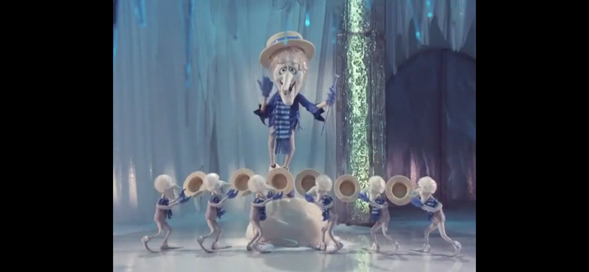
Time for the part that everyone seems to love best. We’re a half hour into this 50 minute special and we’re just now finally getting to the Snow Miser song. It has a thumping beat and this obnoxious horn section to announce the arrival of the character. He comes dancing in looking like a snow-themed Dapper Dan and he has a bunch of tiny versions of himself dancing around as well. How did those guys come into being? It is a fairly entertaining number, though I don’t think the lyrics matter much. It’s all about those comical sounding horns. When he’s done doing his thing, Snow Miser comes across as a pretty affable guy. He’s hospitable towards Mrs. Claus and crew, but when she requests he make it snow in Southtown he has to inform her the only way that can happen is if Heat Miser okays it.
Heat Miser doesn’t seem to be as into the song and dance thing as his brother.
You know what that means – off to see Heat Miser! The special cuts right to the chase and we join Heat Miser already into his own song. It’s the exact same song as Snow Miser, just with different lyrics to suit Heat Miser. He also has his own minions, but they don’t look like him. They look like little gremlins or monsters. Heat Miser also gets to show off his fire powers which exposes the limitations of stop-motion animation. Their solution for fire is just colored cotton. In the past they used foil or colored paper and I can see why they would feel that’s fine for standing flames, but not for Heat Miser’s fire breath. Heat Miser isn’t as helpful as his brother and demands something in return for letting it snow for one day in Southtown – The North Pole! Mrs. Claus calls Snow Miser on a video phone – pretty fancy for a cloud dweller. He has no interest in surrendering the North Pole to his brother, which comes as no surprise. Now it’s Mrs. Claus’s turn to behave like a Karen and go over the heads of the two squabbling siblings – to their mother!
So that’s Mother Nature…
Who do you suppose is the mother of these two boys? Iggy can’t even guess it so I guess he’s not too bright. If you guessed Mother Nature (Mann) then you are correct! Everyone acts scared and intimidated over going to see her, but when they do we find she’s just a pretty normal looking old woman. Only she has a bird’s nest in her hair. Honestly, pretty underwhelming character design. They couldn’t even make her a tree or something? She’s fine though, very accommodating, and immediately summons her boys to her side with a bolt of lightning. The two grumble, but Mother Nature informs them how this is going to all go down. Snow Miser is going to make it snow in Southtown for one day and Heat Miser can bring summer to the North Pole for one day as well. They try to protest a bit, but another bolt of lightning silences the pair and they do as their mother tells them.
Looks like Snow Miser was true to his word. And unlike Santa, Mrs. Claus doesn’t ditch kids on the roof.
Time to check in with Santa who has returned to the North Pole (it’s still frozen). He puts Vixen in his own bed and finds a note from his wife informing him that she went after Jingle and Jangle. Satisfied she can handle things, Santa settles himself into a rocking chair for a little rest. Down in Southtown, the snow is falling. The mayor is shown taking a phone call from his wife where his wife is instructing him to wear his goulashes, bundle up, and so forth and he’s doing the whole “What?!” schtick until he finally looks outside. We then jump back to the North Pole where Mrs. Claus and Jingle are rousing the old man from his slumber with a newspaper. The headline concerns the snow in Southtown and Jangle enters with more papers about a day off for Santa. He looks them over and informs his wife that she was right the whole time, but his conclusion is that the world is giving him a day off and he settles in for more nap time. Mrs. Claus can only shrug in the direction of the elves.
Aww, geez.
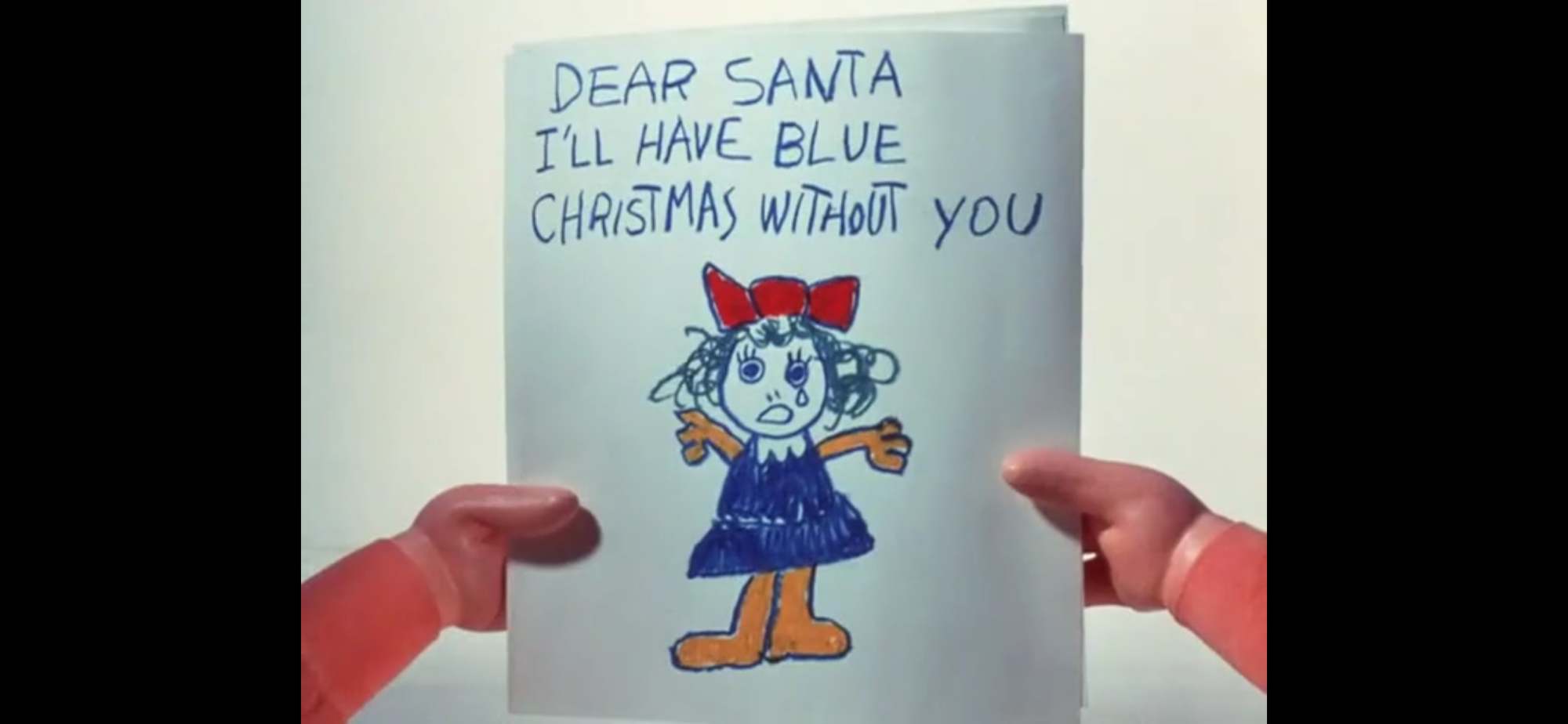
Mrs. Claus then returns to her narration duties to inform us that the children of the world became committed to giving Santa a day off. Now we get a multi-cultural group of children running over a map, writing letters, and wrapping gifts. They’re basically returning the favor and sending them to Santa and Mrs. Claus tells us they had more fun that December than any they could remember. Santa is then shown waking up and stumbling around. It’s like he’s having a senior moment as he just wanders the grounds grumbling taking note of the quiet workshop and sleeping reindeer. He pauses outside as a bird delivers a letter to him. He opens it up and it’s a picture of a sad, crying, girl with the message, “Dear Santa, I’ll have a blue Christmas without you.” I guess she wasn’t one of the kids having the most fun ever. This begins the song, “Blue Christmas.” Pretty surprising to see a licensed song enter at this stage of the production. I guess since this wasn’t adapted from someone else’s song they had room in the budget for a different one. The song is sung by a little girl (Christine Winter) and a children’s choir (The Wee Winter Singers) and it’s an even more somber version of the song compared with the Elvis version. It’s nice though. Most may like the Miser Brothers and their song, but I like this more. I will concede it’s weird the girl is clearly drawing a blue Christmas tree while singing about a green one, and the lyrics don’t work as well when they’re supposed to be about Santa and not a former lover. Especially sung by kids. Let’s not think about this anymore.
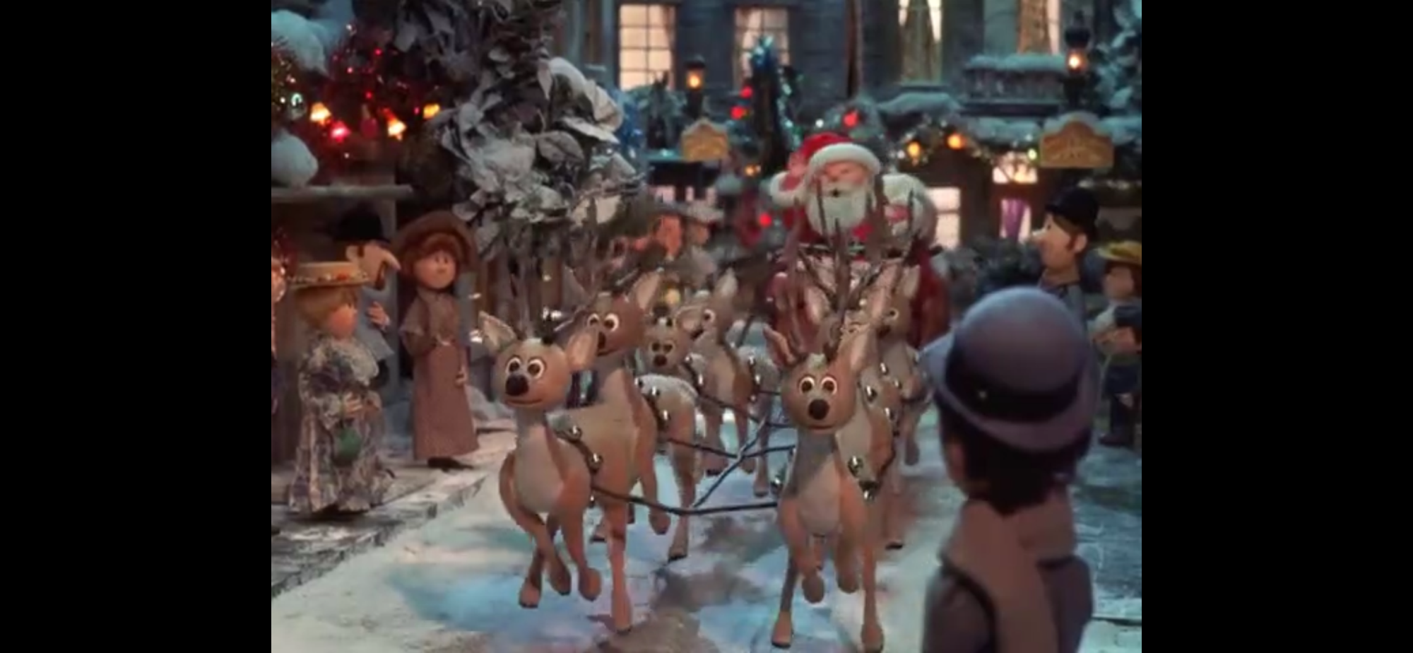
Tonight, we ride!
One letter is apparently all it took. If all of those kids were bullshitting everyone and really wanted Santa to come bring them toys, then they have this girl to thank. Santa, feeling especially vigorous all of a sudden, announces that Christmas is back on! Santa can’t take a day off on Christmas, he has stuff to do! Santa assembles the troops and starts barking orders and asserts that he’s feeling just fine. Set to the tune of “Sleigh Ride,” everyone gets back to work as Santa announces, “Tonight – we ride!” There’s almost a violence to how he says it, like they’re about to go crack some skulls. Might I suggest they start with that asshole mayor?
Looks like everything turned out fine in Southtown.
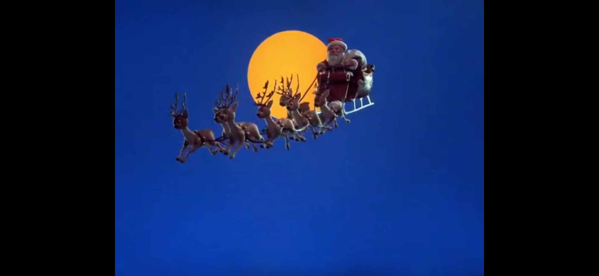
Santa flies off with a complete team of eight reindeer, including wee little Vixen. We get a partial moon shot as we head to Southtown, USA where the mayor has put up a sign designating it Santa Claus Lane. I bet you can guess the song chosen for this section. That makes two full songs they had to pay for. Santa reveals himself to the entire town as the sleigh touches down and slowly makes its way literally down Santa Claus Lane. Kids and adults are there to wave him along before he returns to the sky. Mrs. Claus gets the last word as she narrates over children, including Iggy, finding their gifts under the tree the next morning. She affirms you can always count on Santa Claus which takes us into a reprise of “The Year Without a Santa Claus.” Santa leaps from his bed and puts on his coat. He jumps into his sleigh and they take off into the night sky. As they fly towards the full moon, the special comes to an end. There will never be a year without a Santa Claus.
Everyone seems to like these guys, but they’re barely in it.
That wasn’t as bad as I remembered. I still think this is a pretty mid-level Christmas special. It’s just too uneven for me. The first chunk of the special almost feels unneeded. They could have easily just jumped to taking their concerns to Snow Miser to bring snow to a place in need of Christmas cheer, but it’s like we have to screw around for a half hour first because ABC wanted a full hour broadcast. I found it funny how Mrs. Claus narrates that Iggy is very important to the story, and then he proceeds to just be along for the ride. Yeah, he had to pass along the information about what happened to Vixen and the elves to Santa, but that’s it. Anyone could have done that. For as memorable as the Snow and Heat Miser are, they’re not in this one a whole lot. They did more recently get their own Christmas special, but I have never heard anyone recommend it nor do I have any interest in checking it out for myself.
Some of the effects could have used some refinement.
What I did like about this one is that the music by Maury Laws is very similar to the past Rankin/Bass specials. As I mentioned during the write-up, some music and sound effects are lifted straight from them while a lot of the instrumentals just call-back to them without exactly duplicating them. It helps to create this cohesive feel to everything. I’m surprised they didn’t drop a “Jessica” somewhere in reference to Mrs. Claus or make the elves resemble the old ones a bit more, but it still feels like a sequel or at least like this is the same Santa from before.
Mrs. Claus plays a big role in this one, but could it have been even bigger?
What bothers me most about this one is just the missed opportunity for a better story. I think I would have rather seen a Christmas where Mrs. Claus steps into the role of Santa. Maybe she would have found it’s really hard to do what he does and have some mishaps, but still get it right in the end. She so rarely steps into the spotlight, and even though the special didn’t take that path, this is still more Mrs. Claus exposure than we’re accustomed to. She did at least orchestrate the resolution to the story, even if it was just complaining to the manager. I also would have preferred an ending where Santa does just take a day off. The world lets him know how appreciative they are and he returns the following year with renewed vigor! Instead, there’s an outpouring of love and one kid is sad she’s not getting presents. Crisis averted, Santa is magically feeling better and Christmas is back on!
The general vibe is at least good. This little girl is adorable.
I guess what I’m saying is, there was a chance to subvert this one a bit, but Rankin/Bass decided to just pull a fake-out. The title is a lie as there never was a year without Santa. He just needed a little extra motivation one year. And we never did get to see Heat Miser bring warm weather to the North Pole. I kept waiting for the special to come back to that. I fully expected an ending with Santa and the Mrs. enjoying the sun at the beach for a day after the holidays. We were denied seeing Santa in a bathing suit. What a pity.
They squeeze in quite a few moon shots in this one. I went with my favorite of the bunch.
If you’re one of the people who does love this holiday special then you probably know where to find it. It still airs on cable each year and it’s sold on physical media and on streaming networks. If you’re opposed to paying, it’s also pretty easy to find online for free without having to go anywhere seedy. For me, I consider this one a little better than most of the other Rankin/Bass specials, but I also dislike most of them, which is why I rank it at #169 out of 209. Too low? Too high? Just right? If you have opinions to share, let me know in the comments. Hopefully, no one reading this will have a blue Christmas over it.
Can’t wait until tomorrow for more Christmas? Check out what we had to say on this day last year and beyond:
In 1985, a little film called Back to the Future debuted in theaters. Starring Michael J. Fox and Christopher Lloyd, the story about a modern day teenager going back in time 30 years to encounter his parents when they were teens was an instantly timeless tale. It spawned two sequels which were shot back-to-back and…
It’s the fifth of December so that means we are returning to one of the 25 Greatest Christmas Specials (as decided by me because it’s my blog) to take a deeper look than what was done some 8 years ago. When I re-evaluated my Top 25, one of the biggest fallers was A Flintstone Christmas.…
This year, I’m bringing back a feature from last year where I take another look at, what I consider to be, the greatest Christmas specials ever made. I explained my reasoning for doing this in prior posts, but in short, the first time I looked at some of these specials I did just a short…
We’re getting closer, ever closer to the Christmas specials that are most worth watching every year. That’s not necessarily a bad thing that we’re still kind of in the weeds considering today’s entry covers entries 180 through 171. It’s a reminder that there are a lot of Christmas specials out there. Yesterday’s entries on short subjects is so far the outlier in that some of them are worth watching just because they’re so brief. And there’s some historical value. Today’s entries are not so brief and not so old so they need to get by on entertainment value and nostalgia. And, for me anyway, there’s not a ton of nostalgia to be found in this cast of Christmas specials. Oh, there is some, including one that I pretty much watch every year because of how I know it, but there’s a lot of “filler” here as well. These are mostly from children’s entertainment and if there was a theme I suppose it would be Christmas episodes from cartoons that are not well-remembered. There are a few exceptions and as I look over my list and the days to come I can see some that I could have flip-flopped out of here. Though in the case of many, it’s more an issue of seeing a special yet to come that I really don’t think is all that good and wondering why it’s not here, but then I look at what we’re talking about today and it starts to make more sense. I could tinker with this list all month and never feel like it’s perfect so let’s just move on, shall we?
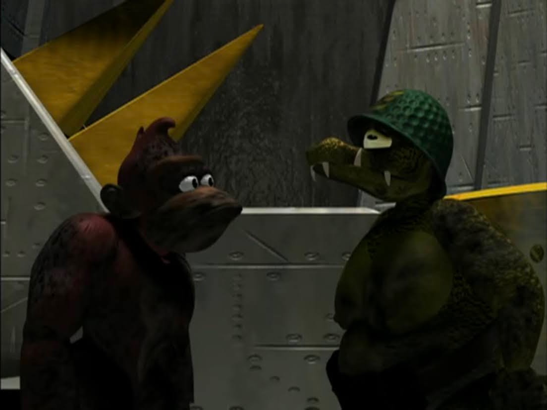
Donkey Kong managed to elevate himself above his more popular genre-mates Sonic and Mario, but let’s not pretend like his Christmas episode is all that great. For me, it’s most memorable for being the kind of show I had very low expectations for going in and it managed to exceed them. That doesn’t mean it rose to the level of something I’d consider good, but it’s not terrible. There’s some silliness to be found with the long lost brothers plot to the point where it kind of works. What does not and never will are the visuals. If this ranking was purely on visual quality, Donkey Kong might be in last place. It’s hideous. Those early 3D CG shows have not aged well.
This is a Christmas episode that was always going to have to really knock it out of the park to be placed higher in the rankings. That’s because it’s a Christmas in July episode and in it our monstrous protagonists find themselves trapped in the mall after hours. The Christmas element is purely visual as the mall is decorated for a big summer sale, but there’s a lot of actual Christmas episodes that don’t do much more than add a visual element as well. This one is also short since it was only one segment from a half hour television spot and judged strictly on the quality of the entertainment it’s probably better than where I have it. It’s just not very Christmassy. Plus, I’ve never liked the visual style of this show.
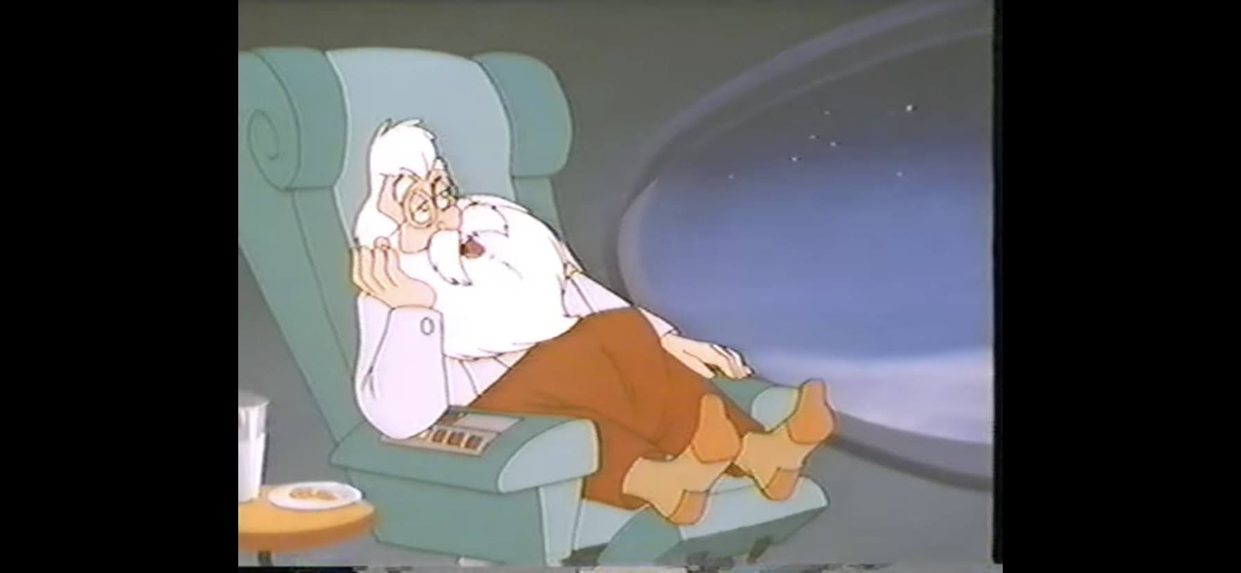
This is the one I teased as being a special I watch annually, even if I don’t really like it that much. It was featured on my beloved Christmas tape growing up so I saw it all of the time and I still see it quite often. As a kid, it was the spot on the tape where I was most likely to drop-off. Thankfully, it had Rudolph backing it up so that’s what usually got me through. Had it been last on the tape then I probably would have seen it far less. If you somehow have not seen this Rankin/Bass production, it’s the origin story for Santa Claus and Mickey Rooney’s debut as the character. The story is pretty silly with a local ruler outlawing toys, but the approach isn’t silly. There’s a lack of fun here and it’s just so long and plodding. None of the songs are particularly good either. Sure, “One Foot in Front of the Other” can get lodged in your head, but that doesn’t mean I want it there. For nostalgia’s sake, I’ll sit through this one at least once this month, but that’s all I’m giving it.
For a little while, there was an attempt at making the Flintstones into some sort of holiday tradition in the 90s. There was a A Flintstone Family Christmas and there was this, A Flintstones Christmas Carol. Now, I have some affection for The Flintstones. I never actively sought the show out, but if it was on I’d often watch it as a kid. I do like A Flintstone Christmas and the episode of the show “Christmas Flintstone” it was based on, but that’s sort of my limit. And when you take a dated franchise like The Flintstones and pair it up with one of the most overused Christmas tropes on record by adapting A Christmas Carol, well, you don’t really end up with anything remotely special. I’ll give it some credit in that the special tries to blend a meta component by having it be a production in-show, but Fred lets stardom get to his head to the point where he starts acting like Scrooge. It’s for serious fans of The Flintstones only, the rest need not apply.
There have been many attempts at melding Halloween with Christmas. The most famous is obviously The Nightmare Before Christmas and it’s also probably the most successful. On television in the 90s though, we had stuff like Little Dracula. It’s a cartoon where the cast is basically all monsters, but the approach to the macabre is so tepid that it tends to undermine any real spooky element it could have. In this one, the goal is to capture Santa Claus. I guess that’s what vampires do. It’s very by the numbers for such an unusual plot as we just get a lot of setup where the entertainment is supposed to be seeing how monsters decorate for the holiday, but nothing is particularly clever. The villain of the show, Garlic Man, wants to pose as Santa to enter the house or something, even though he knows they’re trying to capture the big man. And, of course, the real Santa shows up and we all learn something. Or not? It’s not very memorable.
Make way for Don Coyoooooote! Don Coyote hails from a mostly forgotten Hanna-Barbera cartoon and rightly so. The main character is incredibly annoying and he just bumbles his way through adventure after adventure in a model similar to Inspector Gadget, only Don Coyote didn’t have a niece and a really smart dog looking out for his well-being. The only saving grace for the show is that most of the other characters see Don Coyote for what he is: an idiot. The villagers in the town he tries to help in this one all think he sucks and it’s a bit humorous to see. It’s not a big Christmas vibes sort of episode either, it just takes place at Christmas and the bell referenced in the title has some meaning for the holiday. There is a light faith element to the plot, so if you like your Christmas to appeal more to that aspect of the holiday as opposed to Santa and Rudolph then maybe you can appreciate this on that level. Maybe. It’s still not very good.
Heathcliff may have originated close enough to Garfield that the two can be considered peers, but he’s mostly lived in the fat, orange, cat’s shadow in my lifetime. And that’s despite sounding like Bugs Bunny! Heathcliff did have a solid run on television in the 80s getting two similar, but separate, cartoons and around 100 episodes of entertainment. His grand finale is a Christmas episode in which his letter to Santa is returned so he and Spike (all dogs were required to be named Spike in cartoons) head to the north pole to investigate. There they encounter a jerk of an elf who is hell-bent on destroying Christmas, but as is often the case, things work out in the end and it turns out the elf isn’t such a bad guy after all. There aren’t any memorable gags to find and this one does something I hate. It has Santa literally tell the audience that a year of bad behavior can be redeemed at the last second to get on the Nice List. What a crock! I get needing to give kids something to reach for, but to come out and say it like that is just wrong.
Okay, I really didn’t know where to rank this one. Visually, it’s offensive to my eyes. It’s cheap and ugly. It’s also Ace Ventura who is a pretty annoying character. On the big screen, at least the physical acting of Jim Carrey can help make him tolerable, but as an ugly cartoon the charm is gone. This one does have a somewhat clever plot though and it feels pretty original. Since the character is a detective (which allows them to make liberal use of the term dick), there’s a mystery component and it’s not bad. Santa’s reindeer have gone missing, and Ace needs to get them back. It’s a good setup for a pet detective. It’s just…a lot. I can only handle so much of this character. I do think if you really like the character then you’ll like this a lot more than I do. It’s the sort of Christmas episode where I’m glad I did experience it, but once is enough.
The Nickelodeon Christmas special by Ralph Bakshi that doubled as a pilot for a show that never was, Christmas in Tattertown is quite possibly the most uneven special in this countdown. There are moments in this one that look terrific. There’s a throwback quality to the character designs and animation of the 1930s and it mostly works. There’s also moments where the quality dips and then there’s just the uneven performances. This is especially seen in the character Muffet, who is at times sympathetic and at times a horrible villain. She is a doll that doesn’t really want to be a girl’s doll and she’s frustrated that her life has seemingly been decided for her. She just decides to go full villain in response to that. The voice work is also so up and down that watching this is like experiencing whiplash. I wanted to like this because the premise is solid, but there are too many moments for me where I questioned if I actually hated it. It’s exhausting to watch, but it looks so interesting that I think it’s something everyone should see once. At least, everyone who has ever been enchanted by a cartoon.
Our last entry for today comes courtesy of that other children’s cable network, the Cartoon Network. I Am Weasel was a spin-off from Cow and Chicken which in turn was born out of the What a Cartoon workshop. I have no idea why I Am Weasel was chosen to be spun-off. I liked Cow and Chicken to a certain degree, but I did not care at all for I Am Weasel. It’s a setup where the weasel is basically an ideal character and does everything right and he’s juxtaposed with I.R. Baboon, a selfish, stupid, jealous character. He basically tries, and fails, to undermine the weasel and steal the spotlight for himself. In this Christmas edition, Baboon is surprised by his family when they show up for Christmas. He is ill-prepared, so he runs out to get a tree and all the trimmings, but leaves his family out in the cold. Weasel then comes by and notices the frozen solid group of baboons and invites them into his palatial estate. They become rather enamored with Weasel which just makes Baboon jealous when he finds out. He then tries to sabotage Christmas. It has a happy ending, and it’s actually a lot of plot for what is a short cartoon. It’s a solid setup and premise for the show, it’s problem is it’s just not very funny. Maybe I’ve aged out of this era of visually loud humor, but I didn’t really laugh. If you have fond memories of this or Cow and Chicken then maybe you’ll get more out of it.
And that does it for today’s entries. Tomorrow, we take a break from the countdown to spotlight a forgotten Christmas special. I think it’s a bit of a crowd favorite, but maybe the winds have changed for it over the years and I’m mistaken. Or it’s just become properly rated since we are talking about entry #169. What is it? Well, you’ll have to come back tomorrow and find out. Unless you’re not reading this on December 4, 2025. In that case, you can just click the little button for the next entry. I hope you were surprised!
Can’t wait until tomorrow for more Christmas? Check out what we had to say last year on this day and beyond:
Last year, I made an effort to get to a lot of the Nicktoons that I had yet to cover. My initial thinking when I started doing this Christmas blog was to try and avoid the specials that had been covered in depth many times over. Then I realized that, hey, if you want to…
Last year, we covered in depth the inaugural Christmas episodes of Rugrats and The Ren & Stimpy Show, two of the three original Nicktoons that premiered in 1991. Now, we’re going to look at the Christmas episode for the other original Nicktoon: Doug. Doug was created by Jim Jinkins and was one of the first…
Hugh Harman and Rudolf Ising were among the first stars of cartoon creation to burst onto the scene. Together, the duo would work for Disney, Warner, and MGM (among others) creating and overseeing some of animation’s most memorable characters from the golden age. After working with Leon Schlesinger’s studio to produce Looney Tunes shorts, the…
There’s going to be a lot of toys in these ones. And some are very familiar looking.
I mentioned yesterday that my rankings of Christmas specials are by quality and personal preference, but also by genre. When it makes sense, I’m trying to keep similar specials together when it comes to the general vibe and the vibe today is public domain shorts. The domain of the short used to be the movie theater and seemingly every major studio had a series of cartoon shorts. Some were bigger than others and a lot of the less popular ones have slipped into the public domain. Most of these shorts fall into that category, but not all. And most of these are going to have a very similar plot. A lot of these shorts liked bringing Christmas to poor kids. And almost all of them have something racist in them which is just incredible from a modern perspective. It got to the point over the years of doing this where it stopped being surprising. Even Mickey gets in on the action. It’s nuts. Anyway, let’s get to it.
Little Audrey and a diverse group of kids want to leave a surprise for Santa.
This is a Little Audrey cartoon who was a rip-off of Little Lulu and probably less successful. Maybe I’m being a little tough on this one by ranking it last because it does have a unique premise. Audrey and her friends decide Santa deserves some presents of his own on Christmas so they sneak into his sleigh and try to do something nice for him. It’s cute. I just don’t care at all about Little Audrey. The group of multi-cultural children that accompany her on this quest are also not the most sensitive depictions of such one is going to find. Usually, stuff like that is what helps get cartoons into the public domain because the companies that owned them originally don’t want to re-release them and if they’re not going to re-release them then they’re worthless.
He may not look like much, but this toy soldier is pretty special.
Here’s our first one where a poor kid gets a visit from Santa Claus. In this one, it’s a kid who lives alone in a shack with his cat. On the way back to his home, he finds a discarded toy soldier in the street and brings it home. When he goes to bed, the toy becomes sentient and uses the radio to call for Santa who shows up and does his thing. Most of the short is just toys doing stuff, the sort of thing we’re going to see a lot of. The kid eventually wakes up, is happy to have toys (and food) and that’s pretty much it. The short looks okay and it is in color. It’s also been re-released since my entry and there is a much better looking version out there now. It’s still a pretty boring short, but at least it will look nice.
Another one that would probably rank a little higher if I cared about the property. The Captain and the Kids is a series I don’t know much about, but it had a brief run of shorts and among them is a Christmas one. It’s basically a Captain character who takes care of some orphans and he’s harassed by the pirate John Silver and his crew. This one is interesting because the Captain is going to dress as Santa to surprise his boys, but John Silver and his crew get to him first. Silver takes the Santa suit for himself and they proceed to enter the dwelling and mess everything up. Because it’s Christmas, the bad guys feel terrible about what they did and eventually make it right. A large portion of the short is dedicated to a song that’s not very good performed by the pirates. It’s not terrible or anything, and the version I was able to find actually looked great, so there are worse ways to kill 8 minutes.
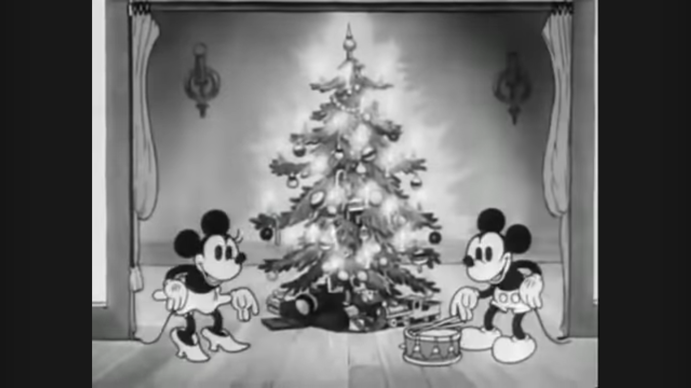
Mickey has had many goes at this whole Christmas thing.
Mickey Mouse’s first Christmas cartoon is among his worst. I rank this ahead of Mickey’s Christmas Chaos mostly out of respect, but that mediocre short might actually be more entertaining than this one. Mickey and Minnie wind up with some orphans in their care and try to give them a decent Christmas, but they’re also jerks. The little orphan cats just destroy the place and don’t seem to care that Mickey made the effort to give them a decent Christmas by playing Santa. There’s no real message here, no lesson to be learned, the kids just destroy everything until the short is over. It’s very bizarre in that aspect. It is in black and white, but the animation is pretty smooth, so it has that going for it.
This is an early Merrie Melodies short. It’s very similar to Gifts from the Air in that it’s another poor boy who seemingly lives alone. It begins almost exactly the same way with the poor kid walking through the snow on Christmas Eve getting progressively more upset over the sounds of other people enjoying Christmas. Only with this one, when the kid gets back to his shack he gets a visit from Santa before he goes to sleep! And not only is Santa there to bring Christmas cheer, he actually takes the kid back to the workshop and that’s where the toy antics come into play. It’s pretty crazy how similar the toy antics are from one short to another, and not just this and Gifts from the Air, but this and other shorts we’ll talk about shortly. This is another that ends abruptly, a fire breaks out and the kid is able to put it out and that’s it. Did he stay at the North Pole? Did he become the next Santa? Is he Santa’s slave? Is this where elves come from?! No one knows.
This one is a sequel to the Silly Symphony short Santa’s Workshop. If you like the part of that one where Santa just demoes the toys and laughs at them then this is for you. Santa delivers some toys to a house and we get to see him play with them. There’s even a Mickey Mouse cameo! Santa just laughs at everything and it gets real obnoxious. Eventually, he has to run and the kids come down and find their stuff. One cute kid gets a puppy. There’s a blackface gag, which is probably why it’s never been added to Disney+ to join its predecessor. It’s fine.
We have a lot of cartoons of kids finding toys under the tree, but not many of puppies finding toys under the tree. We do have this one from Hugh Harman and Rudolf Ising and it’s about what you would expect. Santa has made his delivery and the children are up in the middle of the night to check it out. Among them are two puppies who get into all kinds of mischief when it comes to the toys. In particular, there’s a toy tank that apparently has a personality all its own and it battles it out with the puppies. No puppy is seriously harmed, and they are cute. It does run a little long, which is an odd thing to critique a short for doing, but if you’re a dog person then you’ll probably enjoy this on some level.
This is one of the oldest Christmas specials in color out there. And it was also recently restored to look as best as it possibly can. And it is a good looking short. It’s a Fleischer Studios production and there’s some use of live-action references including a spectacular Christmas tree spot at the end, but the cartoon itself is pretty similar to everything else here. Grampy wants to bring Christmas to an orphanage, but since he can’t just will a bunch of toys into existence, he uses household objects to make toys and distribute them. The kids have a good time, and it’s a reasonably merry Christmas. Worth a watch to appreciate the impressive restoration, if anything.
Mickey is going to experience some hardships in this one, but it works out in the end.
Stop me if you’ve heard this one before, a character wants to bring Christmas to some poor kids and so they do. In this case, it’s Mickey Mouse who is very poor as well. He wants to help a family of cats (again), but in order to do so he needs money and the only thing of value he owns is his dog, Pluto. Some rich asshole’s kid wants Pluto so Mickey reluctantly sells him thinking Pluto will have a better life with the wealthy man than he would on the streets with him. He takes the money, buys a bunch of stuff, and makes a Christmas delivery to the kids. Unfortunately, that spoiled, rich, kid really sucks and is abusive towards Pluto who eventually gets away, but not before he makes off with a turkey. He finds Mickey all alone in the snow and there’s a happy reunion in the end. Thankfully. I get the idea of having a character sacrifice to make Christmas better for the less fortunate, but I don’t want to see them give their dog away! At least it all works out, and the animation is really nice. It was made in black and white, but there is a color version out there if you’re adverse to that.
The more popular Christmas themed Silly Symphony short. This one takes place at the titular workshop where we see toys being made, inspected, and tested. That’s it. I just rank it this high because I think it looks just lovely. There’s a whole bunch of gags similar to other ones we’ve already seen and it also had its own racist gag (which the Disney+ version omits), but at least it doesn’t have any orphans! Seriously, I’m getting a little sick of that trope. And seeing Santa prepare for Christmas is just more interesting to me than the process of infiltrating homes and the aftermath.
That concludes the public domain theatrical shorts category. Not all of those are in the public domain, but they all have a very similar feel to them, and as we saw, similar plots. There isn’t much separating the worst from the best in this case, I mostly ranked them on visual quality as that’s what appeals to me most. And not just how well it’s animated, but the emotive aspect of the characters since we get a lot of inanimate objects doing interesting things. They are all indeed short though and also pretty damn old. The historical aspect makes them worth watching, in my opinion. And they won’t take up much of your time. I bet they’re all on YouTube or Daily Motion too so they should be easy to find. It will give you something to do until tomorrow when we move onto the next group of 10. In looking ahead, there isn’t much of a theme in our next group other than it’s all stuff made for kids and almost all of it is comedic in nature. There might be one surprise in there, but we’re still firmly in the realm of mediocre and not quite to the point where we’re hitting on some essential viewing type stuff.
Can’t wait until tomorrow for more Christmas? Check out what we had to say on this day last year and beyond:
It feels like it has been a minute since we took a look at an American Dad! Christmas episode. The show can be counted on to produce such an episode almost annually and often times the Christmas episode is among the best of the season. 2024 is also the year we had to say goodbye…
Children’s cartoons often take to Christmas when the season rolls around. The holiday is usually ripe for parody or just direct adaptations so it’s easy for the writers to kind of phone it in. What’s not customary is for a cartoon series to feature two dedicated Christmas episodes in a single season! That’s what Animaniacs…
Last year for the Christmas Spot we took a look at the 1960’s TV series Popeye the Sailor and its Christmas episode “Spinach Greetings.” There are a lot of Popeye fans in the world and my assumption is that most would not put Popeye the Sailor above the theatrical shorts that helped catapult Popeye to…
Today, we move on with our Ultimate Christmas Special Rankings starting with number 199. As you can probably guess, we’re going to generally stick to 10 a day in order to have this neatly conclude on Christmas, but we’ll have a couple spots where we’ll have to do more. This isn’t one of those spots as you just get 10 today. Like yesterday, these specials are what I would consider to be genuinely bad, for the most part, but we’re working our way to the “meh” part of the rankings. We’re also going to kick things off with one I probably dislike more than most. There is a part of me that feels like I’m being unreasonable, but I pretty much loathe number 199.
Hah! It’s a snowman with a nut right where…his nuts…you know…
The Ice Age franchise had a nice run for itself, commercially speaking, during the 2000s. I can’t say I really loved any of it, but my memory of the movies I did see are that they were fine. Decent family entertainment that I never have to see again. For some reason, I hate this Christmas special. Maybe I was just in a bad mood when I went back to it last year for the countdown, but I just hate-watched the damn thing. Every plot point irritated me, it was so predictable, cliche, and talked down to the viewer. The attempts at humor were supremely irritating. I think this style of humor just didn’t age well. The competent CG doesn’t come close to rescuing it and I get no feels from it other than white, hot, rage. I honestly expect most people to see my take and not quite get it. Most probably see this as a pretty by the numbers, ho-hum, Christmas special. Let’s move on though as I’m already sick of talking about Ice Age.
Okay, this is a bad Christmas special. Very bad. It’s also entertainingly bad and it helps that I didn’t make my parents spend $30 on a VHS of this thing when I was a kid. It’s brief which helps. If this was your more typical hour long special then it would likely be intolerable. The only bummer for me with this one is that it’s the only Teenage Mutant Ninja Turtles Christmas special from this era. The ’87 cartoon had an episode where the turtles met the freakin’ Easter Bunny, but no Christmas episode. Instead we got this: repurposed live show costumes with unrecognizable voices and actors. It’s bad, and the budget must have been almost nothing. The songs suck in such a way that they’re funny, and the special is so well known now that we even got some NECA toys last year based on it. What a time to be alive.
He’s laughing, but there’s nothing funny about this one.
This one is barely a Christmas episode as it’s a made-up version of the holiday by Mario to supplicate some cave people he deems as lesser than him. Poor, misguided, cave, people, if only they had a holiday to believe in? Mario the missionary brings them Christmas and it just turns one cave person, Oogtar, into a spoiled brat. He almost ruins Fake Christmas, that little Ratgoo, but everything turns out fine in the end. It’s just phenomenally stupid and the Super Mario World cartoon was pretty terrible. There’s a reason why Nintendo wants nothing to do with it or its predecessors these days.
In this holiday special, the Smurfs are tasked with saving some kids from Satan. Yes, you read that correctly.
Oh boy, this one took a pretty surprising turn. The Smurfs holiday themed episodes manages to be both forgettable and also get mixed up in my brain. The other Smurfs holiday episode I covered is a better Christmas special, but so unmemorable. This one? This is the one where the Smurfs have to take down the god damn devil! What other conclusion is there to draw from the villain? Every other plot point here is pure corn, just garbage, Christmas, stuff. The Smurfs are a pretty terrible franchise that has somehow endured – I guess people really like little, blue, men?
Another video game mascot with a Christmas special, and it’s not much better. This is a cheaply thrown together episode of The Adventures of Sonic the Hedgehog, the wacky cartoon and not the more serious Saturday morning one. I hate the visual style and the plot is nonsense, plus an unspeaking Sally Acorn role? They did her wrong. It just manages to be memorable because of the wild turn at the end. Spoilers if you haven’t seen it, but Santa Claus retires! Yes, the big man hangs them up, but don’t worry as he has a successor ready: Sonic the Hedgehog. In the world of Sonic, he is now Santa Claus. It’s canon and I’ll hear no argument against it, I’m just patiently waiting for one of the video games to acknowledge this fact.
Pretty convenient all of these video game cartoons landed so close together, eh? It’s by design. This list has a subjective element to it where I did try to group things together to some degree. Especially when it comes to kids specials and the more subversive adult comedy ones. And spoiler alert, tomorrow very much has a theme to it. Anyway, this is another lousy Super Mario Bros. cartoon that takes place during Christmas and this one has a more conventional holiday plot. Koopa is out to take over Christmas and Mario and the gang have to save Santa. Toad learns a lesson and Luigi gets to help out. It’s all pretty conventional. There’s some awful animation and if you watch the full episode this is from you get some live-action stuff that has nothing to do with Christmas. Seriously, what a wasted opportunity. The only redeeming element to this one is basically the same as the Super Mario World cartoon: Koopa. I find him entertaining. Oh, and it’s also really short.
The Mighty Morphin Power Rangers had one Christmas episode and it came during the White Ranger era post the departure of the original red, yellow, and black rangers. In other words, it’s from an era of the show I didn’t watch as I fell off during the second season. I came back for the White Ranger mini series falling for the hype, but didn’t stick around. This one is pretty damn stupid. The Rangers have to go to the North Pole and stop the forces of Lord Zed who have taken it over. It’s an episode that was clearly conceived of on the US side because we don’t get a single shot of the Rangers in action. They stay in their teen persona so there’s very little action. Instead, there’s lots of bad acting that wouldn’t even be passable for a soap opera. The storyline back at Angel Grove with the sad kid or whatever? Terrible – no one cares. I wanted to see the Megazord slice and dice some massive reindeer monster or something and this did not deliver.
I have to admit, I don’t remember anything about this one. Or rather I didn’t until I went back to it before writing this. And yeah, it’s not very memorable. It’s from an era of cartoons on television where budgets were very small and the animation was very limited. This thing is capital U Ugly and I find nothing charming about the character designs. The audio quality is poor as well, though that may be a preservation problem and not something that was apparent at the start. It’s very similar in tone and quality to Tennessee Tuxedo, but shorter and therefore better. And for a character named Krazy Kat, she’s not very crazy. The craziest thing about her is her choice in grammar.
It’s big, beefy, dino-men in Santa hats – did you expect something else?
When it comes to cartoon dreck, there isn’t much lower than the direct-to-syndication cartoon that only exists to sell toys. And it gets even worse when that toyline is just a blatant rip-off of a more popular one. That’s Extreme Dinosaurs for you, which was an extension of Street Sharks. It’s terrible. It is the sort of cartoon where it can look okay in still shots because the character designs are big and colorful, but once things start moving around it turns to shit. I hate all of the attempts at “extreme” language or whatever and this is the sort of show that somehow makes dinosaurs seem lame. As for a Christmas special, it’s another let’s help Santa plot. Not a full-on The Santa Clause, but yeah, dinosaurs are going to help save Christmas.
Mickey does not subscribe to the whole “love thy neighbor” thing.
Around the turn of the millennium, Mickey Mouse tried to make it again in shorts and the results were mixed at best. Mickey’s Christmas Chaos is one of those shorts and it’s tonally kind of a mess. Mickey behaves more like a Warner Bros. character here as he goes to war with his neighbor Mortimer as each tries to one-up the other with their Christmas decorating. The animation is so flat that it limits the impact the gags can have. Plus, there’s really nothing new here. There are no pieces of physical comedy that feel original or offer a new twist on an old concept. I get trying to redefine Mickey or show a different side of him, but this isn’t it. Paul Rudish would figure it out much later. At least this one has a nice ending for best boy Pluto, and if you’re someone who disagrees and actually likes this one then good news! There are a pair of Christmas episodes from the House of Mouse series full of crap like this!
That’s all for now. Come back tomorrow as we move into the bland and the meh that also happen to be free and easy to view. We’re going into the public domain, folks!
Can’t wait until tomorrow for more Christmas? Check out what we had to say on this day last year and beyond:
Nothing puts one in the Christmas Spirit like carols about the refrigerator. Or so Dinosaurs would have you believe. Not that Christmas is actually mentioned at all in today’s special because it takes place in a setting on Earth millions of years before the Christ in Christmas was born. Back then, the sentient beings of…
In 1995, Warner Bros felt it was a big enough entity that it could launch its own broadcast television network. Dubbed The WB, it would try to compete with the big four of ABC, CBS, NBC, and Fox, but never really achieved that level of success which is why it no longer exists. The strategy…
In 1994, Nintendo and developer Rare Ltd. released unto the world Donkey Kong Country for the Super Nintendo. It was a pretty big deal because with Sony prepping its 32-bit PlayStation console for release, and Nintendo no where near ready to unveil the Nintendo 64, the company needed to eke out a few more years…
There are a number of Christmas specials out there that are basically known by all and I’ve written about most of them here. Some have been annual traditions especially when we had more of a monoculture in the US, but the slow death of cable television has made those annual traditions fade away. One holiday icon endures though (well, two counting Rudolph): Frosty the Snowman. The story of a snowman come to life based on a 1950 song premiered on CBS in 1969. There it aired every year until 2023 when CBS at long last let the rights expire. NBC was there to pick it up where it aired in 2024 and is set to air this year on December 4th continuing its run in prime time television for another year.
Specials like Frosty the Snowman were appointment viewing for me as a child even with my beloved Christmas Tape at hand. It was just a thing to get excited for on the road to Christmas and with how popular specials like it have been I’ve always been surprised at the lack of toys. These are Christmas specials, after all, a holiday synonymous with toys. Jada apparently felt the same for it unveiled its own take on Frosty as seen in that Rankin/Bass special which coincidentally arrives a year after Super7 did the same with its ReAction line. Unlike that toy, Jada went all out in making Frosty an actual, modern, action figure. Is this something that’s long overdue for the magical snowman or is there a reason why Frosty has never made the leap to plastic in such a way?
Frosty has some pretty rad packaging.
There may have been some trepidation about wading into the Frosty waters as Jada opted to partner this release with Big Bad Toy Store. It’s an exclusive there where it will set you back $50 and I wouldn’t expect a sale on it anytime soon. That’s a steep price for an action figure, especially one from Jada. I don’t know if they’ve ever done an action figure at this high a price point. I suppose the release is technically a two-pack as it does come with the rabbit, Hocus Pocus. Still, is that enough?
He seems to size pretty well with other 1:12 figures.
The packaging for Frosty is pretty damn fun. The window box is modeled after an old, 80s, television set which is probably similar to the actual set many people saw Frosty on for the first time. It has faux wood paneling and even the rear of the box resembles a CRT television. The bubble is shaped to have a curve in it as well and if you’re an in-box collector this will display pretty well like this. I, of course, am not so I broke into this thing and I do think it will go back together after the holidays just fine, should I choose to pack-up and store Frosty in such a manner.
Until we get a proper Santa, one of these will have to do.
Out of the package, Frosty stands at about 6.375″ to the top of his head. The default portrait has the hat affixed to it so that one will take the snowman over the 7″ mark. From a distance, he’s basically just a big hunk of white plastic, but upon closer examination it’s evident that Jada applied a pearlescent overcoat to the figure to give him a little shine. It’s about as close to approximating the look of snow when the sun hits it they could come up with and it does help to at least give him a little nicer finish, though there’s no hiding from the fact that this is just a big, white, toy. There is paint on the face for the eyes, button nose, and the inner mouth which they opted to paint blue. This had me running back to the special to see if that’s what Rankin/Bass did and, no, they did not. Frosty’s inner mouth was red so I’m not sure why blue was chosen, but it may have been an artistic choice to work off the white. I don’t hate it, it just stood out to me as an odd choice.
And I guess the Peanuts gang will have to stand-in for Karen and the others.
The likeness of the sculpt is decent. The face is pretty much spot-on, though there wasn’t a lot Jada had to get right there. Where I do think the figure comes up a little short is just in the overall shape of the snowman. His torso is very pear-shaped when the character in the show was more round. It’s possible they had to mess with the proportions a bit to better suit the articulation. The head also sits a touch high as it’s not sunk-in at all into the body. Was this done to better accommodate the articulation? It’s possible, but I don’t know if the trade-off was worth it. I feel similarly about the waist cut on Frosty. I appreciate the attempt, and maybe I’ll appreciate it more if we ever get a Karen for him to interact with, but I wouldn’t mind seeing how the figure looked without it. And if I’m going to nitpick further, the hat seems a touch too tall, but on the other hand, it’s not consistent in the special and there are shots where it’s more like it’s presented here and others where it’s more squat.
For some reason, Frosty has acquired a scarf over the years. Even the Super7 ReAction figure (right) came with one.
Frosty does come with a handful of accessories, most of which are basically essential to the look of Frosty. We have his corn cob pipe which plugs into his smile. It’s basically essential since without it he just has a hole in his face that looks kind of lame. It doesn’t bother me as I would never choose to display him with out, but if you want your Frosty to quit his bad habit you may be disappointed. He does have his broom stick which is well-painted and sculpted. It’s basically in solid colors which matches the animation fairly well. He also has some optional parts. For hands, Frosty has a set of relaxed hands, a wide-gripping left hand, a tight-gripping right hand, a pointing left hand, and a right fist for when someone disses his fly girl. There’s also an optional portrait of “dead” Frosty from before the magic hat is applied. It looks fine and has the same hole in the mouth for the pipe and I like having this one as a means of displaying the figure in the lead-up to December. Lastly, there’s a soft goods, red, scarf which is a thing that has sprung up over the years. I’m not sure the origin, but lots of Frosty merch over the years has placed a red scarf around his neck despite him never wearing one in the cartoon (in the sequel, he wears a striped scarf). Super7 did the same thing so I can only assume it’s just something that has been added into the licensing art over the years. It’s here if you want it, though I don’t think I’ll ever use it.
If you prefer your Frosty to be non-animated.
Of course, the other accessory in the box is Hocus Pocus. The little white rabbit stands at just a tick over 2″ and has a goofy looking smile fitting the character. His pupils are not aligned, presumably as intended, though I can’t recall him looking that way in the special (I’m not saying it didn’t happen, just that I can’t remember a specific moment for it). Like Frosty, he’s essentially a lump of white plastic with the only paint being reserved for his red nose, the pink of his eyes and inner ears, and the black of his pupils. He has his freckles sculpted in, but they get lost in the plastic since there’s no outline applied. His whiskers are represented with black wire and his arms are permanently sculpted into the torso. He does feature articulation at the base of his ears, head, waist, hips, and ankles, but it’s pretty limited. He has one accessory – the hat. Hocus is designed to separate at the head which reveals a super long double-ball peg that can plug into the hat. There’s some sculpted out area for his arms inside the hat to get a snug fit and it successfully recreates the look of Hocus from when he makes off with the hat and delivers it to the children. It’s a good idea and a fun way to display him if you’re opting to display Frosty with his “dead” portrait.
This is pretty much the extent of his posing.
Frosty’s articulation is also nothing to write home about. He has the same double-ball peg setup at the “neck,” and another one at the hat. This is where the figure is most expressive as he can rotate and tilt at both the head and hat which provides enough nuance to be fun. He has hinged shoulders, single-hinged elbows, and hinged wrists that rotate. Unlike NECA and their many TMNT figures, Frosty actually has the proper vertical hinge for his broom and any other weapon you feel he should have. That waist joint is a ball joint so Frosty can rotate and tilt, but don’t expect too much forward and back. The legs are connected via ball-sockets, but they’re functionally useless due to the shape of the character. He has no knees and instead some ankles that hinge and rock. If your dream is to recreate Frosty’s marching pose on your shelf then you may have to get a little creative. He also doesn’t have any peg holes on the bottoms of his feet so finding a stand to work with him might be a challenge.
They’re both pipe enthusiasts.
Frosty isn’t going to impress with his poses, but no one likely expected him to. What will sell this figure are the aesthetics and the power of nostalgia. Nostalgia for Christmas. Is that sort of thing worthy of your $50? It’s a legitimate question and one not easily answered. If I were to grade this release on the quality of the figure and the amount of stuff in the box then I’d have to say “No,” this isn’t a $50 release. I’d feel better about it if we got a more expressive Hocus or maybe some optional parts for Frosty to recreate the signature poses from the special. This Frosty can’t even belly-whop because the range at the head doesn’t allow for it. He basically needs a third head with the socket for the ball joint in the back. Perhaps a future Karen release could come with such a thing?
“You want a hit of this, snowman?” “Happy birthday!”
Despite my feelings on the value present, I am happy to have this. I have a huge soft spot for Christmas specials (obviously) and there’s no way I was passing on this. It’s still a better value than a Super7 Ultimates! release (and cheaper) and it looks good enough on my Christmas shelf. And I do selfishly want this release to be successful because I’d like to see more from Jada and Frosty the Snowman. I already name-dropped Karen, but throw-in Santa and Professor Hinkle and that will make me pretty happy. It would be fun if each came with a different Hocus since he had some different looks/poses in the special, and in the case of Karen, that belly-whopping head would be nice. If you’re interested in this release as strictly an action figure, then it probably won’t win you over. If you have a lot of affection for the old television special and won’t miss the $50 then I say go for it. There’s plenty of Christmas magic in this box to take away the sting of the price.
If you’re curious to read my thoughts on the original special or just have an interest in Christmas toys then check these out:
Welcome back, lovers of Christmas, to the 7th edition of The Christmas Spot! If you missed the introduction a few days ago, we’re doing things a little differently this year. Yes, you’re still getting a dedicated write-up each day through Christmas about a beloved or not-so-beloved holiday special, but this year we’re also going retro…
It was looking like we were in for a photo finish this year. Last year, toymaker Fresh Monkey Fiction partnered with online retailer Big Bad Toy Store to launch the Naughty or Nice collection. Structured similar to a Kickstarter campaign, FMF posted several action figures for preorder with a minimum order quantity needed for the…
Fresh Monkey Fiction is back with Naughty or Nice Wave Two and just in time for…(checks calendar)…Valentine’s Day? Okay, so things didn’t go quite as planned with this line. In 2021, Fresh Monkey Fiction partnered with Big Bad Toy Store for this line of action figures based primarily on Santa Claus. That preorder took about…
It has been said before and so it shall be said again, but Christmas is the holiday that is the most commercialized of all. A massive component of that commercialization has been The Christmas Special, that one-off theatrical short, television event, or just a Christmas-themed episode of a popular (or not so popular) show. These often take the form of animation, but are not limited to that. Certainly, there are many live-action sitcoms out there that have made Christmas the subject of an episode or two and there’s no shortage of movies centered on the holiday. It’s impossible to know at this point how many such specials exist. I’m sure folks have tried to catalog them all, but such a task seems futile at best.
Here at The Nostalgia Spot, every December has been turned over to the Christmas holiday. And for the last decade that has meant an advent calendar style rundown of many popular and not so popular Christmas specials. Last year, when the countdown concluded I revealed that I intended to retire The Christmas Spot as an advent calendar countdown and I’m sticking to that. It’s a lot and I feel like I’ve said almost all that I have to say on the subject of Christmas specials in this space, but not everything.
This year, we’re going to go back through them – yes, all of them! It’s time to take the specials that have been covered here and sort them out. The Christmas season is only so long and if you’re in what I consider a typical Christmas-celebrating household, the season begins on the Friday after Thanksgiving. This year, Thanksgiving fell on the 27th of November which is almost as late as it can fall in a calendar year. This is an especially short season – how can one possibly fit all of this essential Christmas viewing into such a short window of time?! And it’s already December 1st!
Fear not, for I am here to help guide you and your viewing schedule. Well, kind of. Since we’ll be unveiling this list in 10 special increments each day that means we won’t get to the good stuff for awhile. I guess this will be more helpful in the years that follow. It obviously can’t be all inclusive. I just said cataloging all Christmas specials would be a futile activity. However, there are a few that I’ve declined to report on in this space that feel like major omissions. When we get to them in the countdown, we’ll do an old school style write-up to make sure a wrong has been righted. I will almost surely miss someone’s favorite or one that simply stands out, but we can’t hit them all. I feel good about this body of work though and if I was only allowed to watch holiday specials from this list for the rest of my life I’d be okay with that.
Before we can get to the good stuff though, we have to talk about the bad stuff. Figuring out the best Christmas special of all-time is easy. It’s the Grinch (sorry, spoiler?), but what’s the worst Christmas special of all time? Now that’s a question with many answers. I’ve seen my share of crap throughout the years, and this dubious honor has more than one contender, but when the dust settled and I looked at my list there was really only one worthy of this title:
What a diaper-filled crap-fest! I wasn’t harsh enough in my rundown of this one back when it was covered. I think because it was so early in the season and I wasn’t feeling run down just yet. This show is brutally ugly, almost offensively so. I’ve seen and laughed at plenty of gross cartoons, but this is too much for me. It’s not particularly funny nor is it memorable. If I have to say one nice thing about it then it’s that it didn’t parody a popular Christmas special. That’s a low bar though and plenty of dreck at the end of this list can claim the same.
This redesign is worse than the one Toucan Sam got.
This special featuring semi-famous character George of the Jungle isn’t as offensively bad as some others, but I loathe its visual style. It has little to say or do to hold my attention and the art is just gross. It’s so cheap looking and comes from an era where everyone was cutting costs when it comes to animation. It’s basically Newgrounds quality and it makes me mad someone thought this was acceptable to put on television. Granted, I think it was on the equivalent of Canadian PBS, but the point stands. It has no reason to exist.
Just look at the dumb expression on the fox’s face. You just know this is going to be bad.
Chucklewood Critters represent something we’ll be seeing more of on this list. It’s a very bland, very boring, inoffensive sort of Christmas special. Well, inoffensive if you’re not offended by having your time wasted. There’s a bunch of stuff like this, but a lot of it is relegated to shorts where not much happens but at least it happens fast. And those shorts mostly look good since the shorts I’m thinking of were theatrical shorts. This is just an ugly, cheap, cloyingly sweet half hour of television. It probably won’t enrage you or anything, but it might put you to sleep. And these little bastards had a whole series of television specials! It’s crazy to think about and those poor children that were forced to watch them. I somehow dodged that bullet, but I took in this one in the interest of Christmas viewing as an adult. In that, I feel I was a worthy sacrifice.
It’s the terrifying story about the murder of a tree!
Speaking of sacrifice. Here we have the story of a tree that just wants to be given a purpose. And that purpose is to be cut down and put on display in front of the UN. Or White House, it depends on what version you saw. This is one of those specials that wants to put the Christ back in Christmas, or at least it appears to, but then it does this weird pivot to putting the Christopher back in Christmas. As in, Christopher Columbus. What an odd thing to insert into a Christmas special. And inappropriate. It’s a dumb special, but I place it slightly higher than something like Chucklewood Critters because it has moments where the animation looks nice. Basically, they blew the budget on the tree and some select sequences while side characters and backgrounds look like trash. I’m guessing there’s not a lot of websites out there that have dedicated as many words to Christopher the Christmas Tree as I have as this one is actually one of my most viewed Christmas entries. Weird, right? I guess it makes sense since there’s tons of places talking about Mickey, Frosty, Popeye, and so on, but what fool wants to waste their time on the tree that gave its life for Christmas? Me. I’m that fool, and because of my sacrifice you don’t have to be too.
And speaking of Popeye (we’re just mastering transitions today), here’s a terrible Christmas cartoon starring the famous sailor! I like Popeye, he’s the reason I ate my spinach as a kid even if I thought it was terrible. We’d get that frozen kind that smells like garbage after it’s cooked so you can’t blame me for not liking it. As an adult, fresh spinach all the way! Anyway, this cartoon sucks, but at least it’s mercifully short. It’s just a dumb Popeye saves Santa bit, but it’s so nonsensical and for some reason Santa flies around in an airplane shaped like a reindeer. It’s the most ludicrous visual I think I’ve seen in a Christmas special yet and that’s saying something because we already talked about Mega Babies. This series is from Popeye’s dark ages, best not to revisit them.
These 1960s cartoons tend to all have one thing in common: sucky animation. Tennessee Tuxedo is one the biggest offenders as characters barely move. Worse though, the whole thing feels incredibly lazy. Nothing happens! This is the Christmas special about nothing, they just have to decorate a stupid tree, but since they’re zoo animals they’re all dumb. We even have to pause so a character can teach us how to make the worst Christmas ornaments around. I don’t blame this thing being bad on whoever wrote it, they were probably charged with writing a whole series in a weekend or something. The only somewhat charming thing about this show is hearing Don Adams in the lead role. It’s just fun hearing the Get Smart/Inspector Gadget voice again.
Yeah, that’s more or less how I feel watching this one.
I tried to leave this one out of here until at least the next entry just because of the whole story surrounding it, but I just couldn’t do it. It sucks too much. This is another one of those inoffensive holiday specials that’s trying to launch a franchise, but it’s so inoffensive that it’s boring and no one cared about it. Really, like at all. This thing was lost media for a long time, but now it’s back. Sort of. I suspect it was really only back for that one magical moment in 2022 and now it’s rightfully forgotten again. The song might get stuck in your head though, so it has that going for it.
Okay, I have this thing way back in the rankings and yet I’m not sure if it’s far enough. That’s the thing with rankings, they’re pretty subjective unless there’s some sort of math behind it. And even then, you may just be using a subjective component to create an objective outcome. That’s probably way more thought already than Pillow People Save Christmas deserves. This thing is awful and it’s a garbage one-off special designed to sell dumb pillows. Watching it made me mad at my mom more than 30 years later for buying me one of those pillows. There is zero subtlety to this one as it’s just a big commercial complete with a tour of available products you can buy now. Well, now when it aired, today no one cares about Pillow People. If you still have a Pillow Person in your possession might I suggest burning it? It won’t take away the stink of this special, but it would make me feel a little better and it would probably do the same for you.
Pillow People is just plain bad, while Santabear commits a different sin: boredom. A lot of these backend specials are going to be placed here because they’re just so boring. The ones that are dull and combine it with bad music and visuals are the biggest offenders. Here we have Santabear, better known for his television spots in a Cinnamon Toast Crunch commercial. It probably would have been better if that’s all he was confined to because “high flying” this one is not. The cast is solid too, but everything is dialed down to a sleepy pace. I don’t want to hate you, Santabear, because you are cute, but I really hope to never watch your Christmas special again.
We end today’s entry with a cartoon that is not exactly sleepy and would prefer to announce its presence with a scream. Well, except for Santa who just kind of strolls in. This is a What a Cartoon original from Cartoon Network’s early days. An attempt to revive the duo of George and his gigantic son Junior. They’re a bit of a rip-off of the bears from the Warner Bros. shorts just minus the mama bear character. This one I actually liked as a kid, but now I can barely watch it. It’s so offensively ugly and the animation is so minimal. I can’t decide if that’s by design or by budget, but it’s bad. The gags are tired and lazy and about the only good thing I can say about it is that it’s brief. When I revisited this one way back in 2017 I wasn’t really expecting to like it, but I definitely didn’t think I’d hate it.
Well, that about covers the worst of the worst. Unfortunately, we still have some crap to get through before we can start talking about the actual good Christmas specials. At least now you know the ones to absolutely avoid. See you tomorrow!
Can’t wait until tomorrow for more Christmas? Check out what we had to say on this day last year and beyond:
It’s December 1st and you know what that means – time for Christmas specials! Not to “well, actually,” myself, but the Christmas special viewing season began before today in my house as it’s annually the day after Thanksgiving. What you may call Black Friday, I dub the start of the Christmas Special Season. And this…
We’re back with another year of The Christmas Spot! And to kick things off this year we’re taking a look at a bonafide Christmas Classic. Christmas Comes But Once A Year may not be the household name that Rudolph and Frosty are, but for Gen X and millennial kids it’s probably familiar because it was…
Welcome back to another year of The Christmas Spot! This year we’re kicking things off with a post I’ve been sitting on for a few years now. When I utter the title “The Christmas Tape,” I’m curious what comes to the minds of readers. It sounds both generic and specific and I suspect a few…
Today we finish our look at wave 3 of X-Men ’97 Marvel Legends action figures and I think I saved the best for last. Cable was one of the non-members of the X-Men to play a pretty substantial role in the original animated series. He showed up in multiple episodes in both the first and second season and was a key player in what was to be the show’s big finale, “Beyond Good and Evil.” It wasn’t a surprise to see him return in X-Men ’97 where he once again was a soldier displaced by time, only this time the show actually showed interest in explaining just who the heck this guy is.
They fed him well in the future.
In the episode “Time Fugitives – Part 2,” there’s basically a blink and you miss it moment where Jean Grey mentally probes the mind of Cable. We see images of Cyclops and Jean when she does, but the show doesn’t bother addressing that at any future moment leaving most of the characters in the dark, save for Jean, apparently. Obviously, if you’re a fan of the comics then you probably knew all that, but he must have been a pretty confusing character for those who were only exposed to the X-Men via the cartoon. In X-Men ’97, we finally find out that Cable is the son of Cyclops and Jean from the future. Only there’s a twist as Cable is actually the son of Cyclops and the clone of Jean, who decided to adopt the alias Madelyne Prior. Cable plays a large role in the back-half of the first season and appears to be set to play a big role in the upcoming season. Might we finally see him form X-Force? I kept waiting for him to do that in the old show so it would be long overdue if he does.
I suspect we’ll see something like this in season two. Only Apocalypse will be much taller.
This depiction of Cable is his traditional look. It mostly conforms to what we saw in the ’92 series as well as the first chunk of X-Men ’97. By the finale, Cable (like everyone else) gets a costume change meaning X-Men ’97 is perhaps the most action figure friendly show we’ve ever had. We’ve already seen one of those finale outfits via Jubilee in this wave while others have been reserved for some two-packs that I didn’t pick up. I’m most interested in figures that fit in with my ’92 display and this Cable accomplishes that.
Cable, like Morph, is an all new sculpt. Initially, I thought he might share some parts with the Bishop from the first wave, but if he does I can’t find them. He’s pretty tall as well standing a little over 7″ making him the tallest in the line thus far. His sculpt is pretty intricate with lots of straps, pouches, and other assorted details pulled from the show. He has that animated look to him via a lot of flat colors, but there’s also a slight touch of realism to the face like Hasbro knew comic collectors would want to add this Cable to their display. Cable has a pretty distinct face in the show and it’s not quite captured here. It’s almost like it’s halfway between the ’92 version of the character and the ’97 one.
This is the “little gun.”
As is the case with most of the wave, there isn’t a lot of paint to be found on Cable. It’s mostly reserved for his face which looks good. Hasbro elected not to go with a glowing eye which is fine. The X-emblem is painted onto the collar as well as the red lines on his suspenders (I guess that’s what they are). Perhaps the best paintwork and nicest little detail is the dark blue piping on his chest and abdomen. A lot of the other colored parts are just plastic. The green straps are bands of plastic and they even run under the chest which is an odd look. The arm band on his left arm is plastic as are the thigh straps. The dark gray on his shoulders pads is paint as are the yellow rectangles on the boots, but they’re not that clean. There’s no slop, but they don’t quite reach the edges of the piece. He looks pretty good, all things considered. Obviously, more paint is best, but this muted color palette works better in plastic than some of the brighter offerings. The only aspect of the presentation that bothers me is the left arm. For that, we get Hasbro’s swirly, twirly, silver plastic. It would look so much better if it had a painted finish and since it’s such a small area it’s disappointing that they didn’t go that extra mile, but not surprising.
And this is the Big Gun.
Cable further blows the budget by having some unique accessories as well. I could be wrong, but I don’t think even his hands are recycled, but I also don’t buy every Marvel Legend release that comes out. He has a trigger hand for each arm plus a right fist and a wide, gripping, left hand. That one is intended to support his big, freakin’, gun. It’s a big hunk of plastic with some nice, sculpted, detail and a little bit of red paint. He also has more of a sidearm which too has that futuristic look to it and a little bit of red paint detail. Both guns can utilize a blast effect and Hasbro so kindly provided two. They’re yellow with some red at the base giving it a nice transition. These are recycled from many releases, but they work just fine here and they’re nice to have.
It too has its own blast effect.
The one area that may leave collectors disappointed with this Cable is the articulation. Big guys don’t always articulate the best, but Hasbro made some curious choices here. He does have a double ball peg at the head and a single joint at the base of the neck. Maybe Hasbro is finally figuring these joints out because his range there is terrific. It goes south pretty fast from there though as the arms feature your basic, Marvel Legends, articulation with no butterfly joint. That’s not the problem though, what is are these shoulder pads. Hasbro made no effort to work them into the articulation. Like Emma Frost’s cape, you just have to deal with it. Only in this case, you can’t remove them if you so desire. Cable can raise his arms out to the side, but he can only raise them out front so far. The shoulder pads are a softer material, but not soft enough to just get out of the way. It makes it hard for Cable to hold either gun out straight. For the big one, he has to hold it across his chest while the smaller one is always going to be pointed out at an angle.
“The name’s Cable, Apocalypse, remember it!” “I shall not forget this IMPUDENCE!”
It’s a shame, because the rest of the articulation is solid. He has a ball-jointed diaphragm that provides some forward and back, tilt, and rotation. The straps don’t get in the way because they’re separate pieces between the chest and the abdomen. There is a waist twist and it’s basically hidden by the belt. The legs are pretty standard with the thigh swivels hidden behind the straps on his legs and the only other shortcoming really is the lack of a boot swivel. You don’t really need it, but since he has such big boots that are clearly a separate piece why not have it there anyway?
Is the poor articulation at the shoulders a deal-breaker? For me, no. I like the look of this Cable and it’s a character I’ve wanted to add to the collection for a long time so I’m mostly content. The sculpt and the accessories are great by Marvel Legends standards and I can finagle the figure into a pose that suits me. More than the shoulder range, I think I’m more disappointed by the lack of weapon storage.. All them pouches, but not a single holster for either gun. I know in the show he wore the big gun on his back most of the time, but I don’t know if he actually had a holster like Bishop or if it just attached via cartoon magic. I couldn’t spy one in any of the screenshots I looked at, but Hasbro could have at least given us a peg hole or something. At any rate, Cable is the standout of X-Men ’97 wave three. If you like the show and you’re collecting the figures, then you probably already have him. If you’re someone more into the comic-based figures then I’d still give this one a look. If Cable is missing from your display I think this one works just fine as more of a classic Cable, but that’s just me.
For more action figure reviews from X-Men ’97 look no further:
I knew who the X-Men were when the show premiered in 1992, but I didn’t know much about them. That show really was the proper introduction to the franchise for me and one thing I couldn’t wrap my head around as a kid was that these were heroes who didn’t really have a secret identity.…
I’m always going to have a soft spot for Morph. It was rare to see a character killed off in a children’s show, but that was the fate of old Morph who didn’t make it out of the show’s second episode. I wouldn’t call it traumatizing, but there was definitely a haunted quality to that…
If you have seen the first season of X-Men ’97 then you may be wondering why Emma Frost, aka the White Queen, is receiving an action figure in the show’s companion toy line. She didn’t play a big role in the show having a speaking role in just one episode and then what amounted to…
Last year concluded ten years of advent calendar style countdowns of classic and not-so-classic holiday specials. Twenty five posts on consecutive days for one person with a family and a full-time job is a pretty big time sink each year. It’s a year-round endeavor of hunting for specials never before seen or covered, viewing them, viewing them again, viewing them often a third or fourth time, then writing and capturing images for a blog post that routinely runs for thousands of words. I spend days on each post as a result and while I love Christmas, the sense of accomplishment I feel each year from doing The Christmas Spot dwindles. That’s why last year I decided I needed to make 2024 the last year. I knew I’d do something Christmas-related in 2025 and I figured I’d actually have several posts to make, but 25 posts in 25 days? No, those days are gone. Sort of.
Let’s not sugarcoat things: 2025 has sucked. It might be one of the worst years I’ve lived through and I’m not even factoring in things that have happened in my personal life. There’s a lot of unrest, social and economic. My favorite hobby, toy collecting, has been hit hard by tariffs and other sanctions delaying releases, cancelling some, and making the hobby a whole lot more expensive. The grocery bill reaches past $400 and things are unlikely to get better in the near term. In short, we need The Christmas Spot! We need a season where we can wrap ourselves in warm blankets and good feelings, even if we’re just lying to ourselves temporarily. Christmas itself brings along its own stresses, but let’s push past it, and here’s some free content to get you through the month of December.
Is The Christmas Spot back? Yes and no. Yes, there will be 25 posts in 25 days about Christmas specials. Actually, once you factor in the toy reviews there will be even more than 25 posts this holiday season. What there won’t be are 25 posts on 25 different Christmas specials like we’ve been doing for the past decade. Instead, I’m going to lay out all of the Christmas specials covered on this blog in order to figure out the proper viewing order. Or rather, the ones you should seek out year in and year out and the ones you probably don’t need to.
If you ever wondered how many Christmas specials have been covered here then I have an answer for you: 209. Now, if you run over to the index page and tally them all up you actually won’t find 209. That’s because five (well, technically four, but we’re doing one redo this year) haven’t been written yet! I always intended to rank the specials I’ve looked at, and while I’d love to say it’s all-encompassing the short order of it is that it’s almost impossible to view every Christmas special out there. I’ve covered most of the essentials and most of the well known, but I did feel like I had a few missing ones. Some I avoided because they’re very well known and I didn’t feel like I needed to add to it. Some I avoided because they’re an hour long and I hate doing specials longer than a half hour (it just gets tedious, even if I like it). And in the case of at least one of them, I just don’t particularly care for it, but it’s popular!
So here’s the deal: each day in December starting on December 1st, come here to see me rank each special ten at a time. Because we’re dealing with odd numbers, there will be some days when I rank more than ten, but no days where I do less. I will do a mini review of each special, tell you what I think, and move on. I also have five traditional write-ups planned which will go up in the order in which they appear. I’ll tell you right now that the first one is schedule to go up on December 5th. That special is the one I decided was fit for number one-hundred and sixty-nine. I did consider doing more since 209 is such a stupid number, but once I was past 200 it felt pointless to extend myself further.
That’s the deal though: one massive ranking spread out over twenty-five days. It’s not exactly a quick way to do things, but it’s certainly a far smaller workload than Decembers past. I have no idea what I’ll do in 2026, but for now we have plenty of Christmas content and a whole month ahead of us to fit as many holiday specials into that window as humanly possible. Happy viewing and merry Christmas!
Welcome back for another year of The Christmas Spot here at The Nostalgia Spot! 2024 has been another long year in some respects and I think we could all use a little Christmas right this very minute. Just like in years past, December 1st will mark the start of the advent calendar countdown to Christmas…
If you know anything about me then you probably know that I like collecting Teenage Mutant Ninja Turtles action figures and I like Christmas. Strangely, those two things have not come together all that often. Most of the television shows featuring the famed four opted not to feature the holiday in an episode. And without…
For past few years Four Horsemen have been bringing us surprise Christmas figures each holiday season. The first was Krampus and the second Father Christmas. Last year, Four Horsemen surprised us with the Ghost of Jacob Marley. A ghost character, especially one in 19th century clothing, can make for a fun design and figure, but…