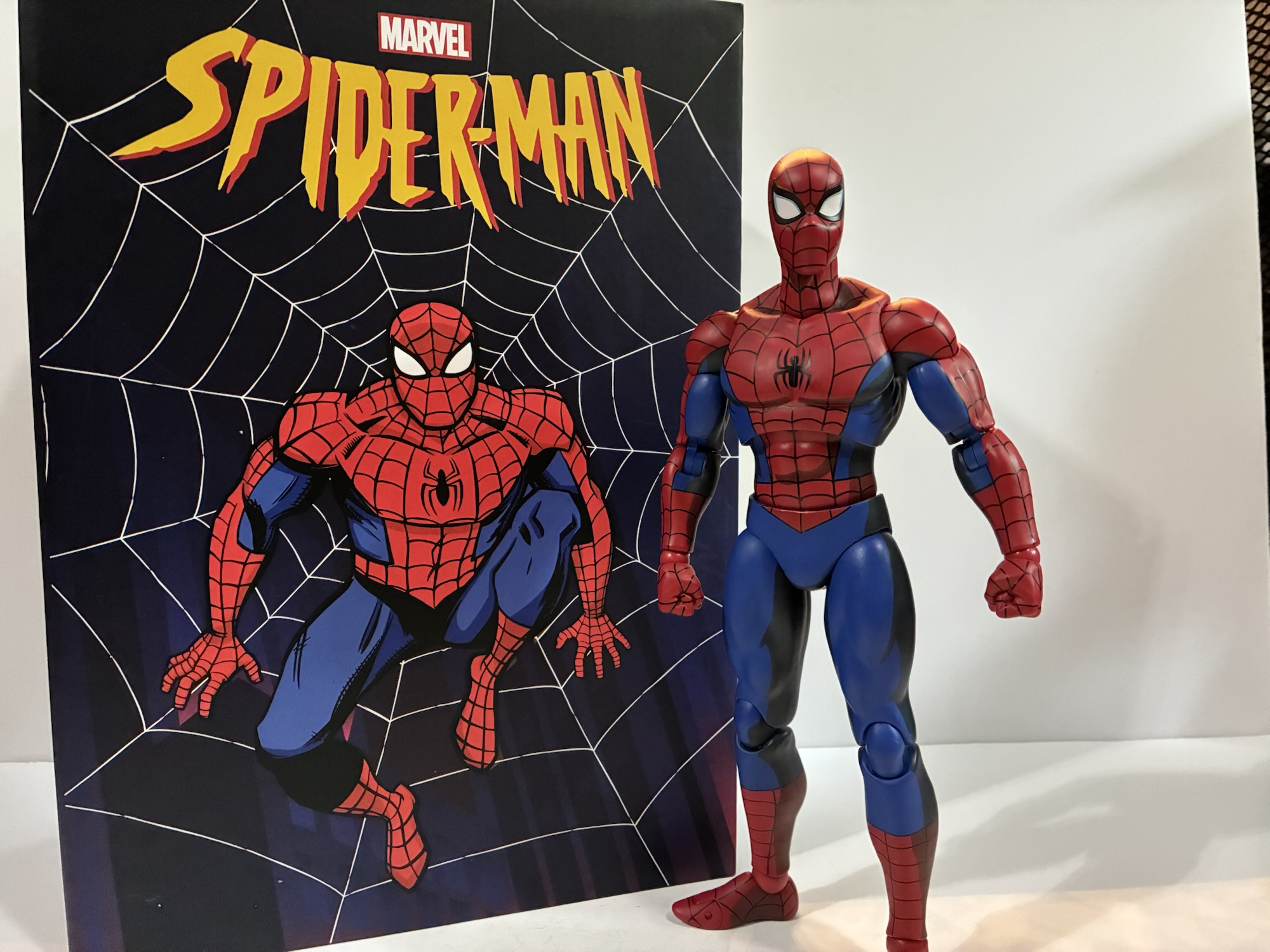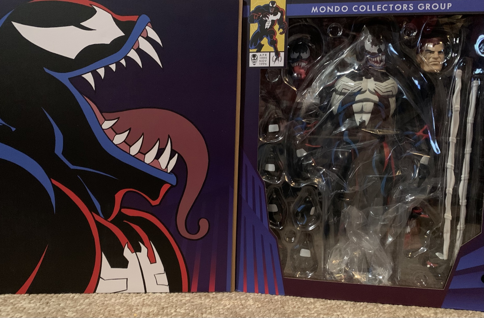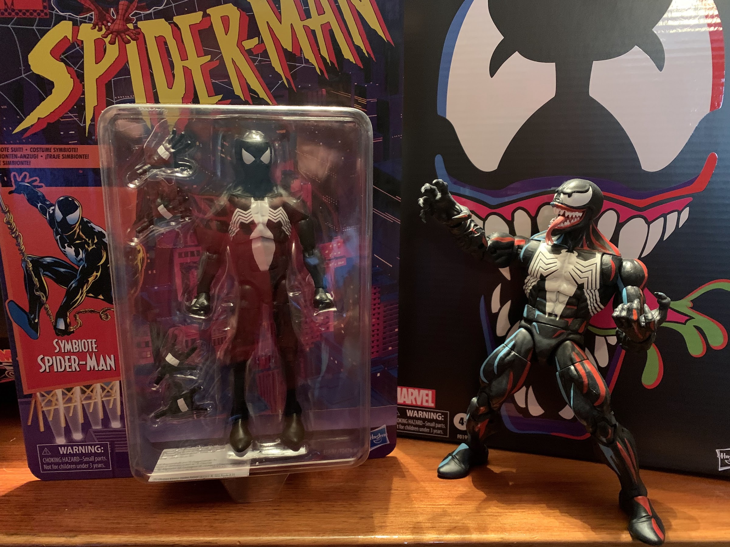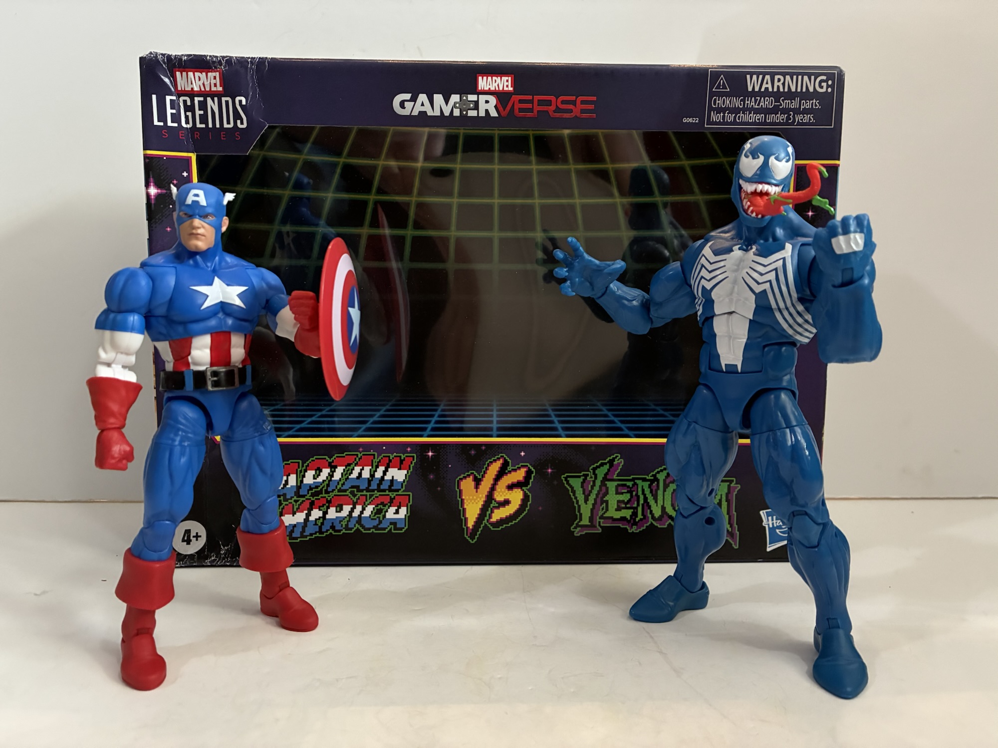
We’re going to be doing a lot of 2025 catch-up here as Christmas always slows things down. Toy producers also like to push product for the holidays so I seem to always end up with a backlog at the end of the year. Especially when stores are doing generous sales and convincing me to buy product I had already passed on. Stuff like today’s subject, the Marvel Legends Gamerverse two-pack of Captain America and Venom.
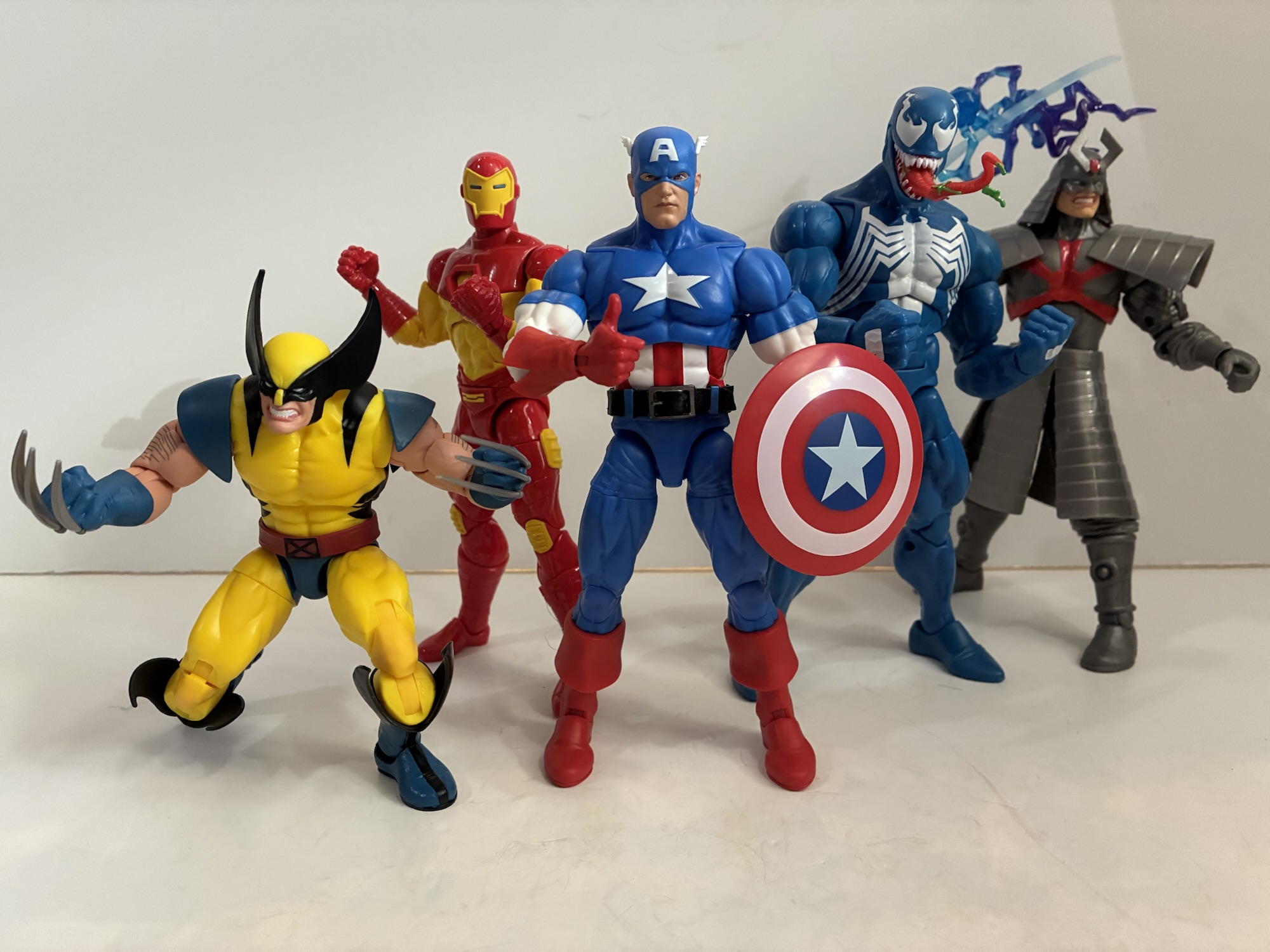
We’ve already looked at one release in this series which was the excellent Wolverine and the not so excellent Silver Samurai. The draw for me with that set was the all new Wolverine that quite resembles his sprite from the Marvel vs Capcom series of games. With this release, we get a very familiar Venom and a not so familiar Cap. I’m a Venom fan so I’m always a little tempted whenever a new one comes around and this being Hasbro’s first blue Venom did catch my eye, but I was willing to pass. As for Cap, I’ve never been a Captain America fan. He was one of the lame heroes of my youth and I only remember one kid who actually liked the character. On the other hand, I do like blue and when you have a hero with a lot of blue that gets my attention and this Cap very much got my attention. Not to the tune of $60 though, or whatever the MSRP was when this thing landed at retail. Then Target had some sale and I had reward money when this thing was in-stock at my local store making my price a whopping $16. For $8 a figure, basically 2005 Legends pricing, you’re damn right I was willing to take a look at this one.
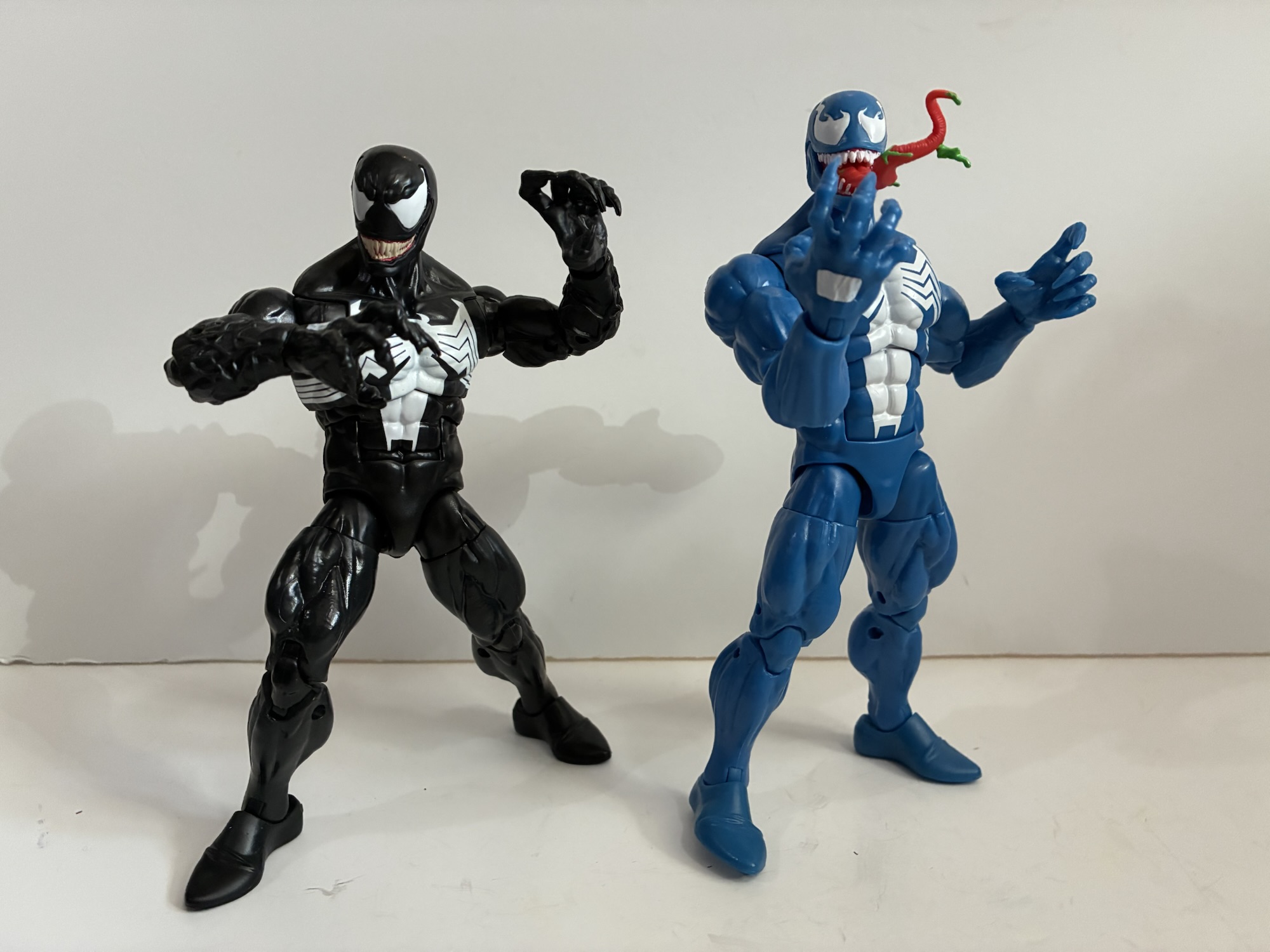
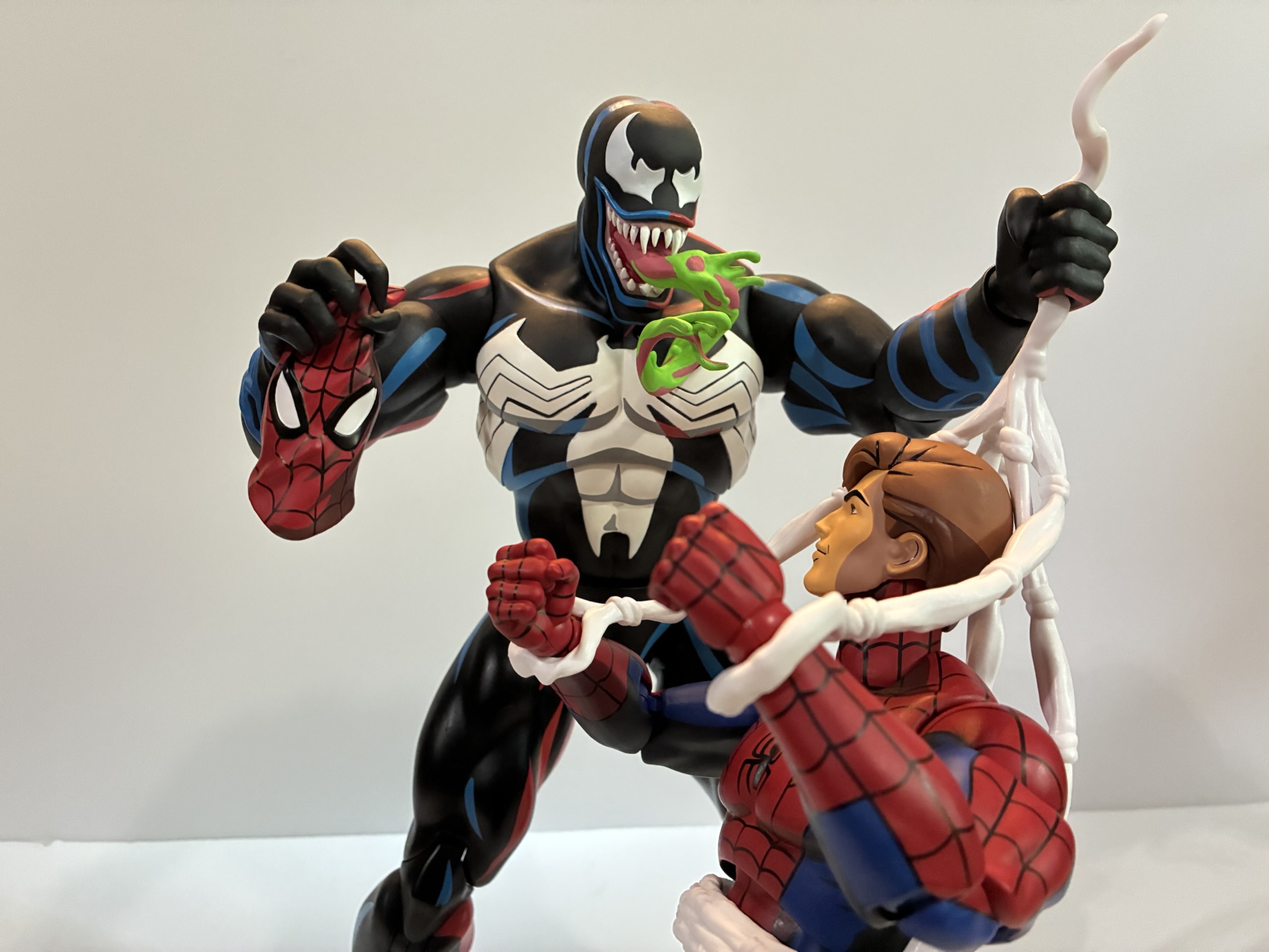
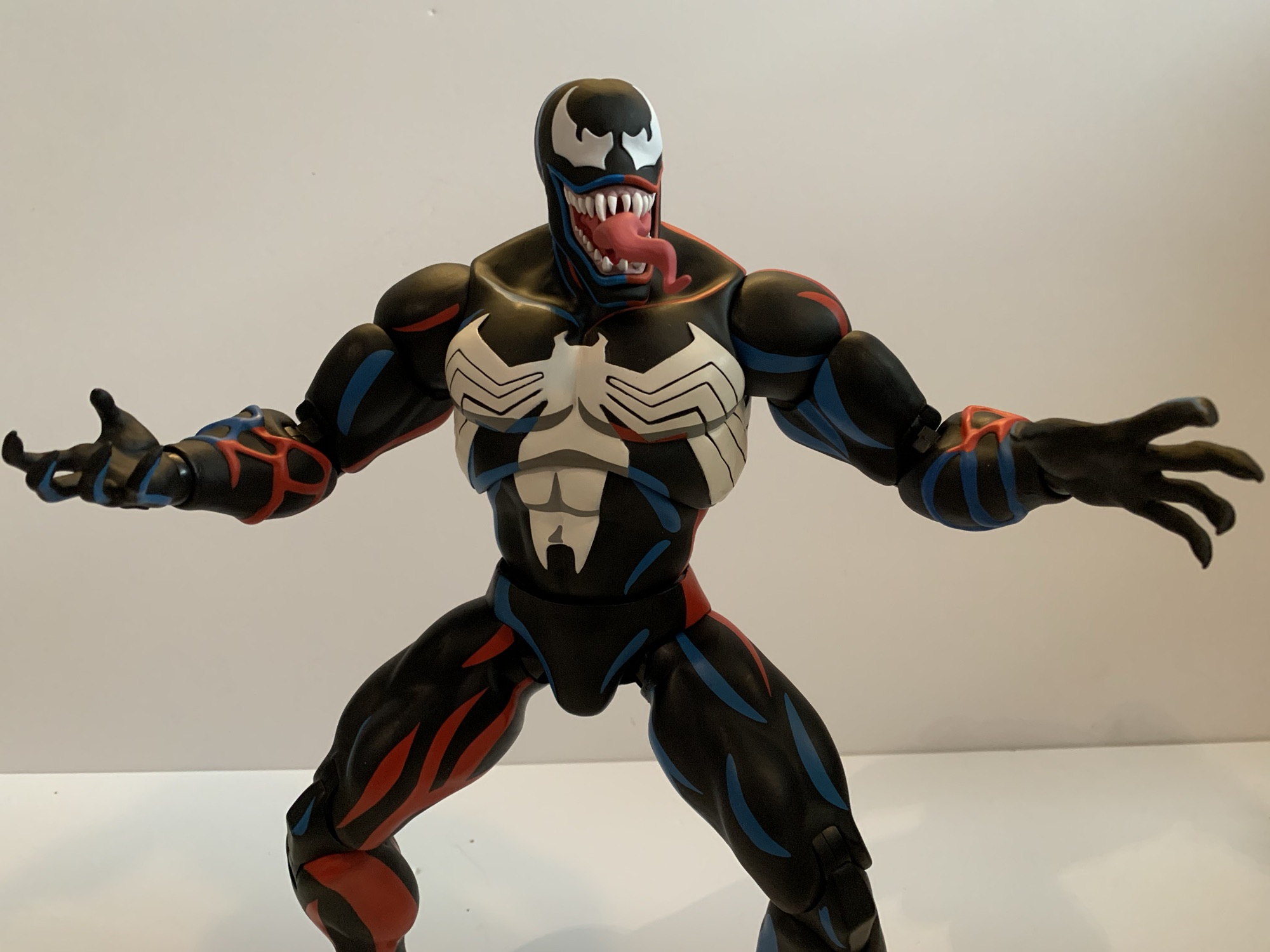
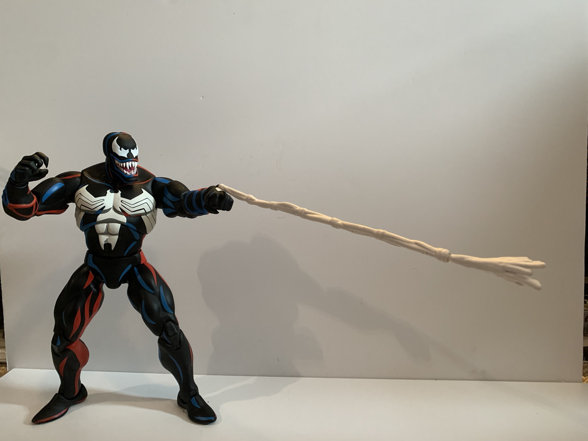
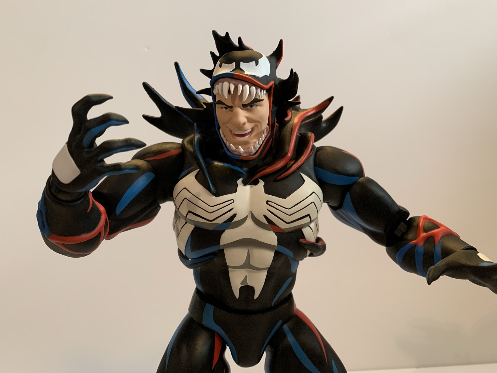
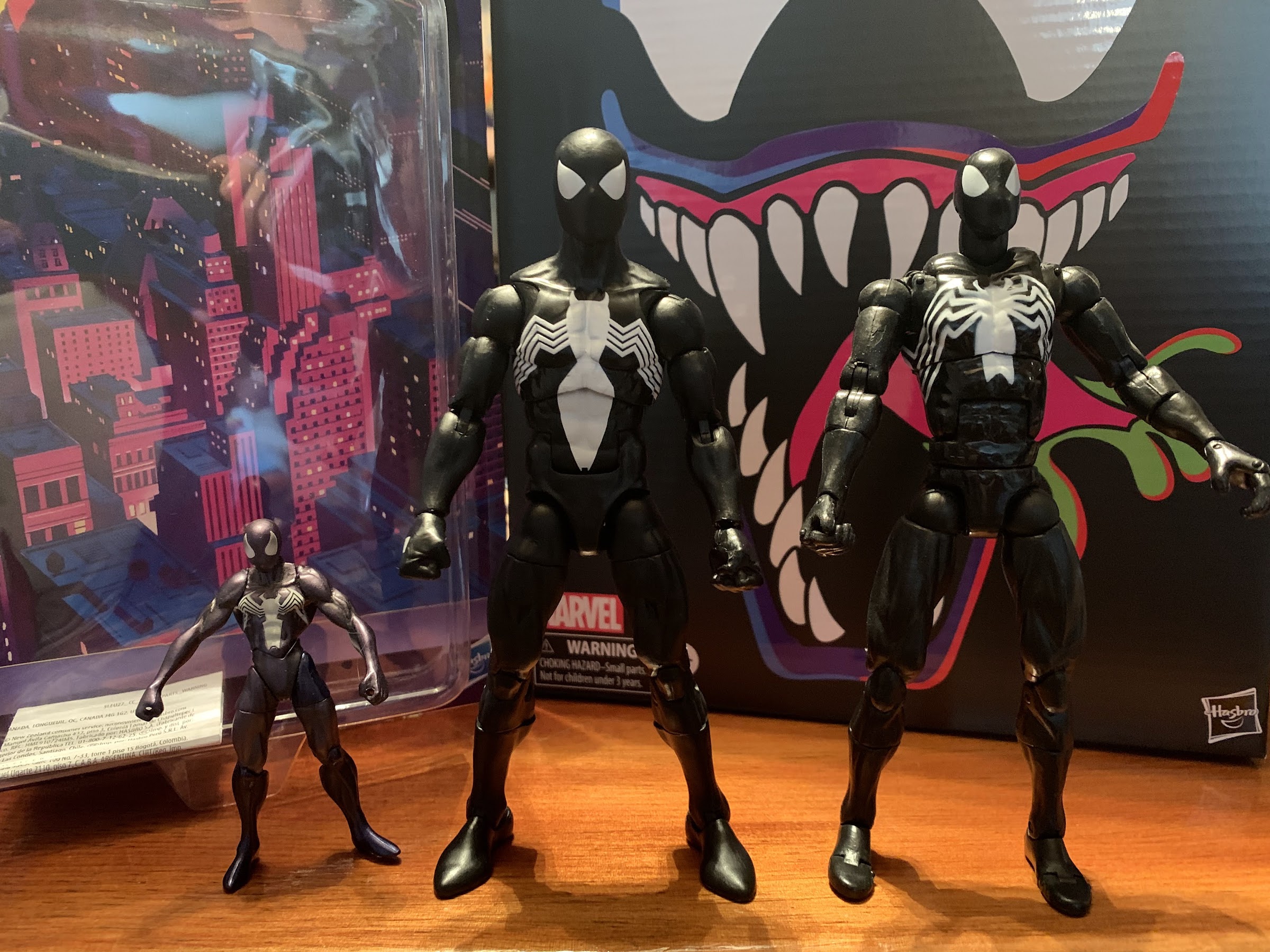
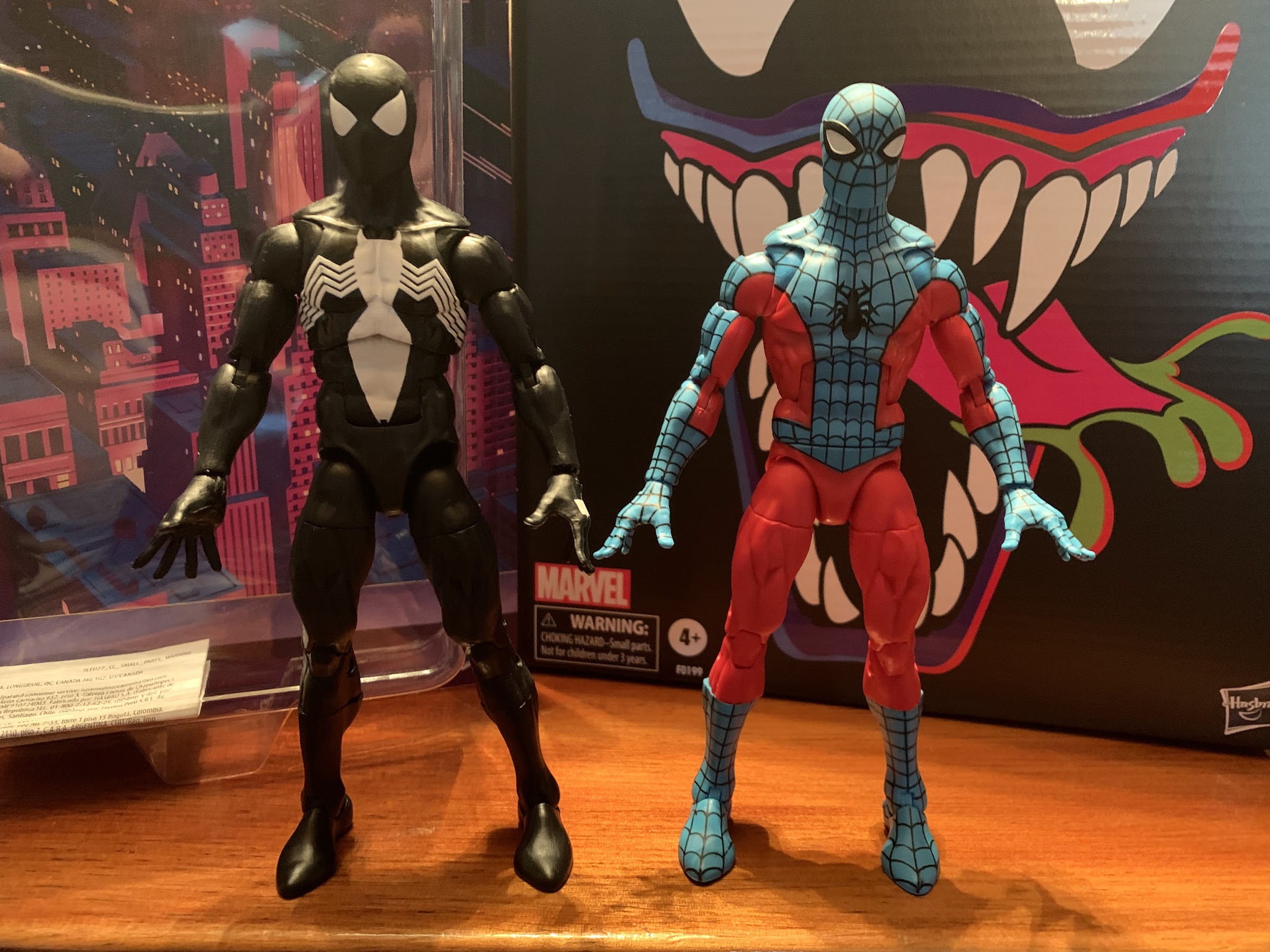
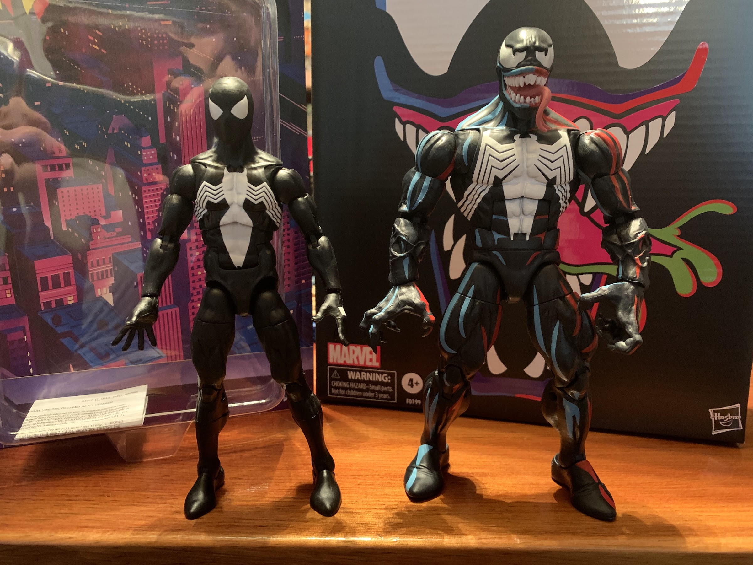
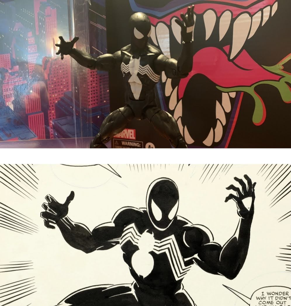
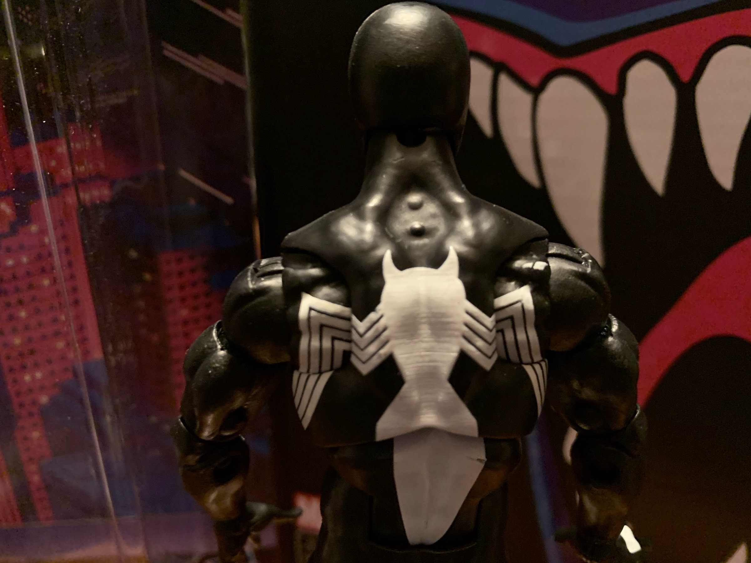
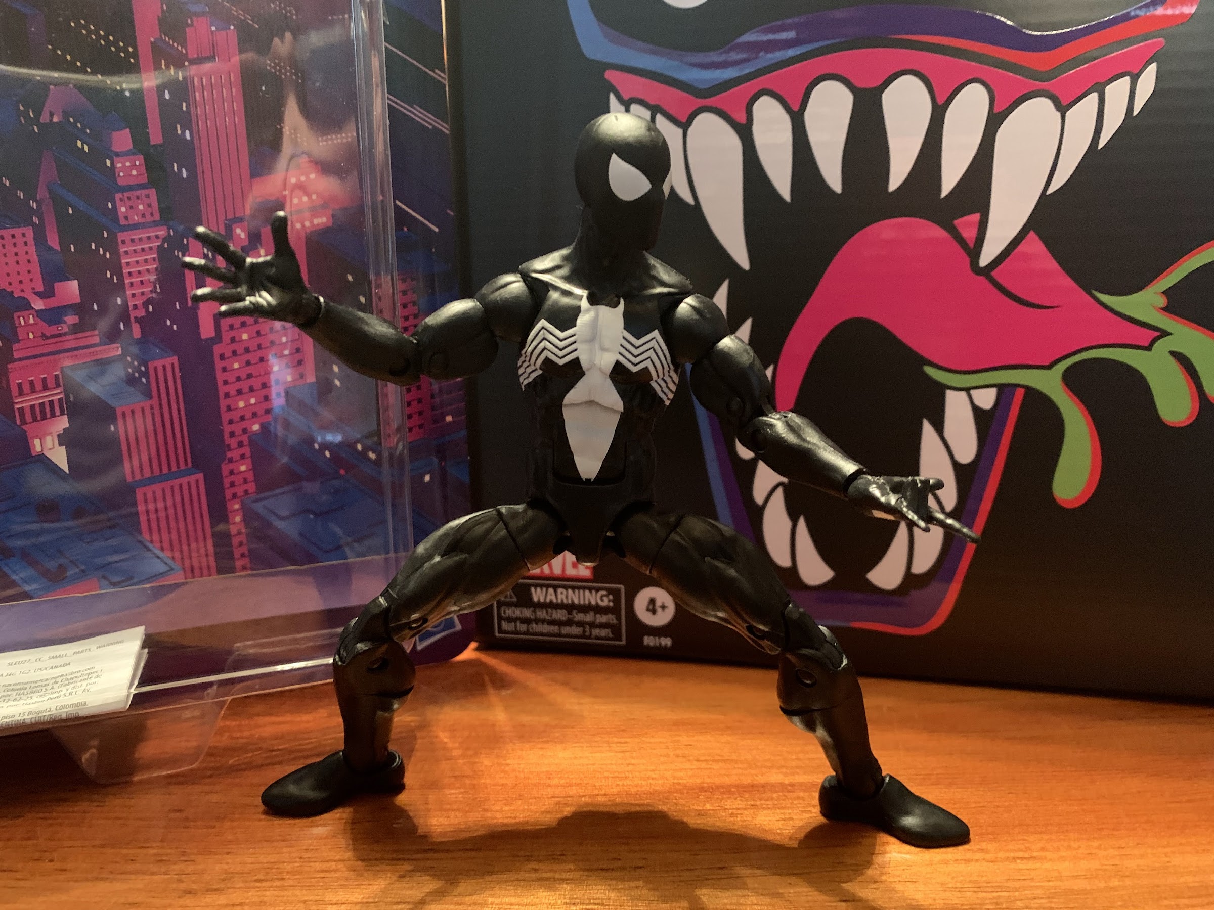
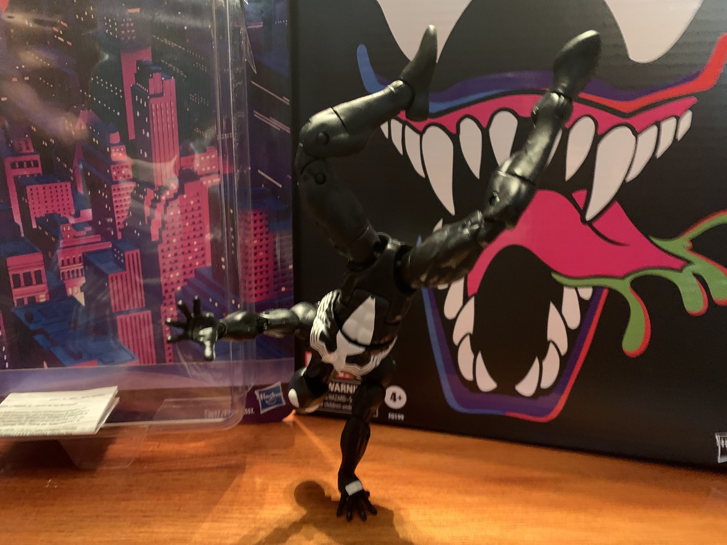
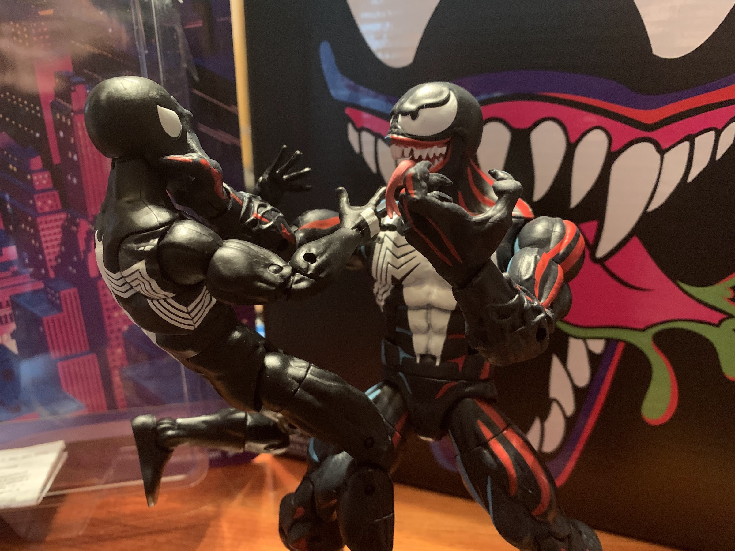
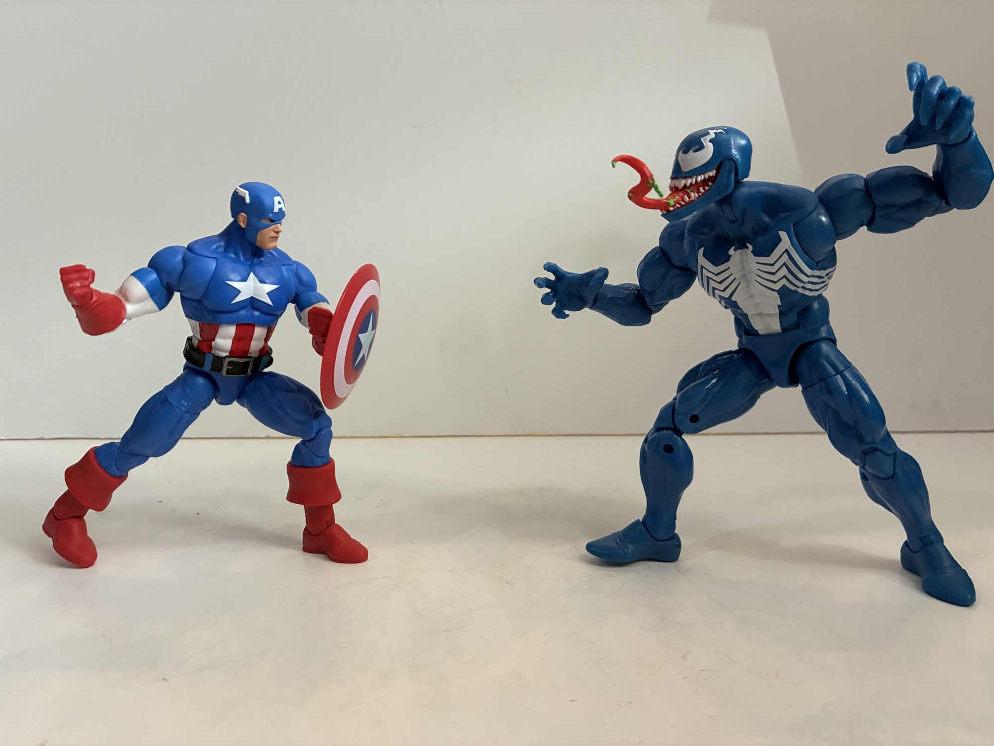
Let’s get Venom out of the way first since he very much resembles 2024’s Walmart exclusive retro-card Venom. At least, at first blush. The only parts this figure actually shares with that one (and other Venom figures) are the legs and hands. The torso and arms have actually been redone as this one goes with the old hinged-ball peg setup at the head. The musculature is slightly different, less vascular, and he has pin-less arms and no veins around the forearm. Like the animated Venom, the spider logo on the back has been squished to fit inside the butterfly joint which is fine while the logo on the front more comfortably fits inside the same joint. The shoulders are bigger which makes a big difference with the silhouette making this the best Venom body Hasbro has done. It’s just a shame they didn’t make the legs pin-less to match. The new torso does make this Venom slightly taller than the old one as he stands at about 7.125″ to the top of his “masked” head.
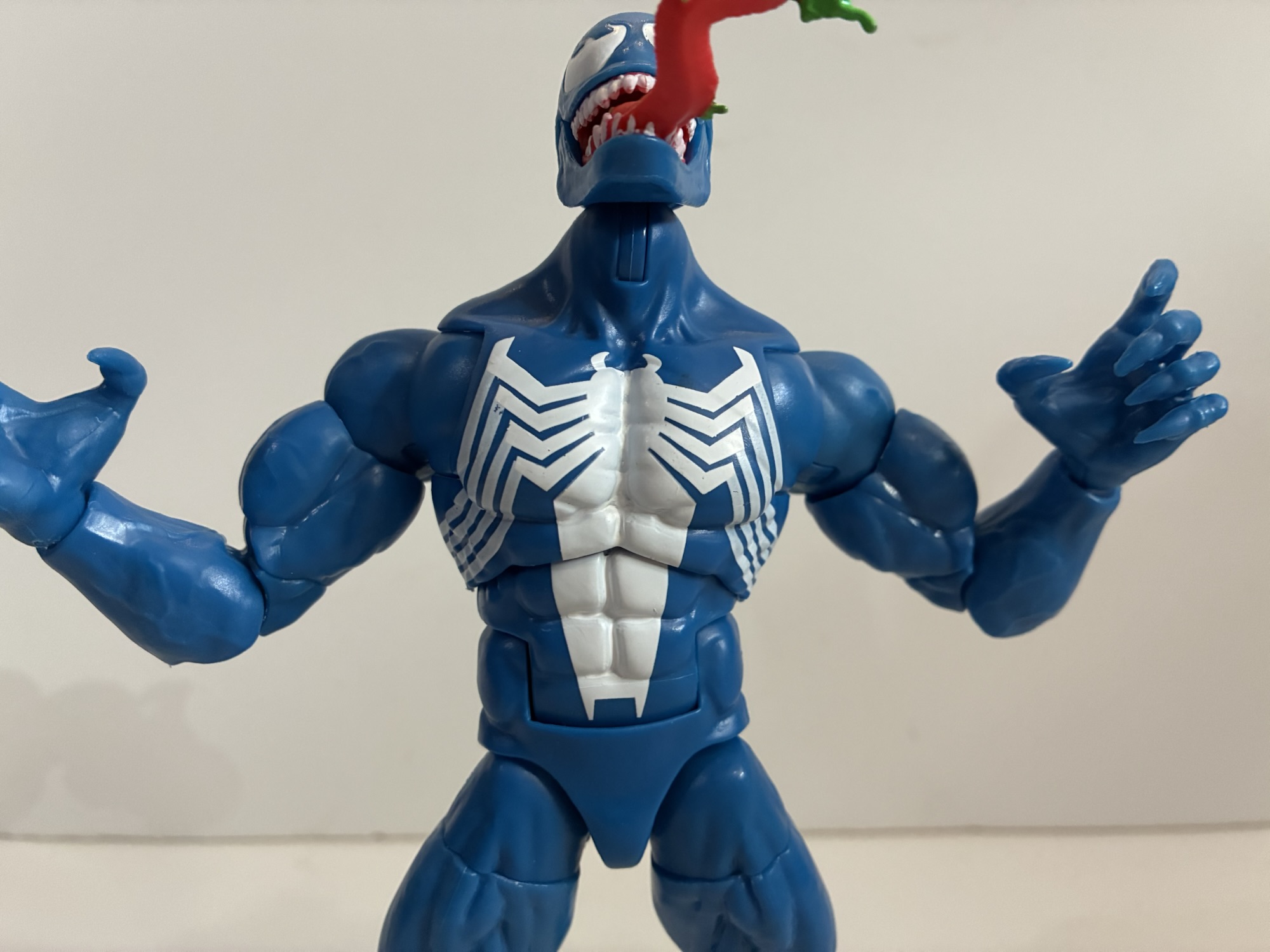
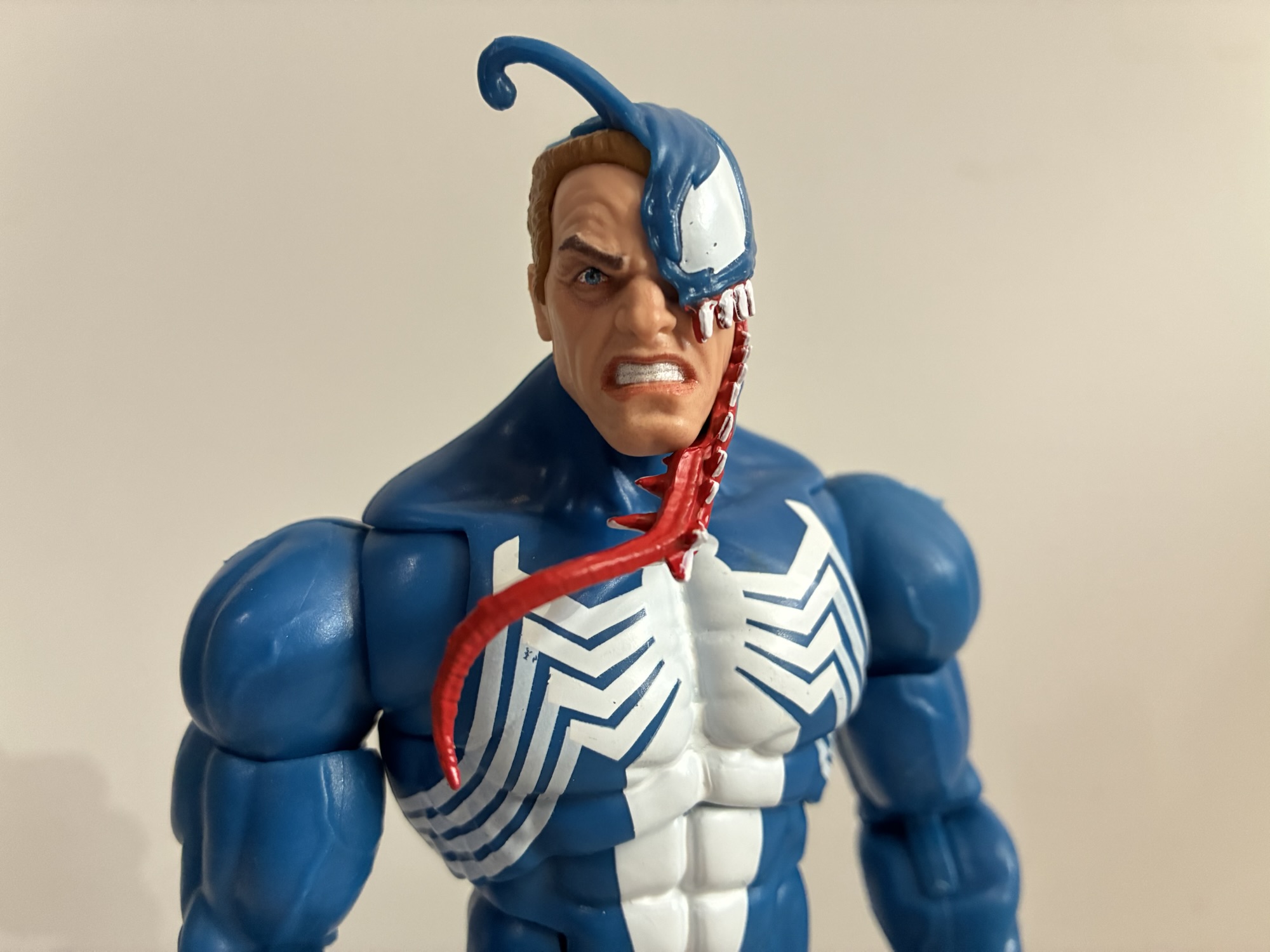
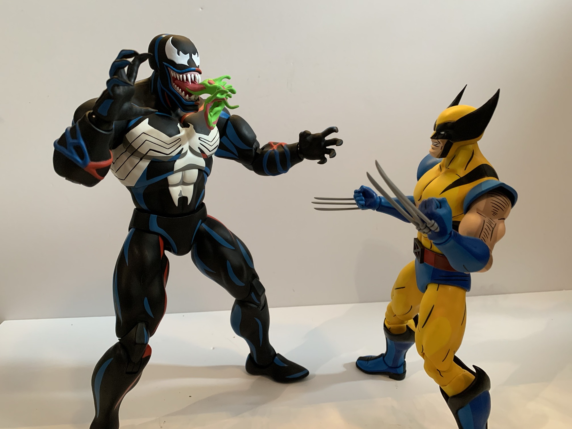
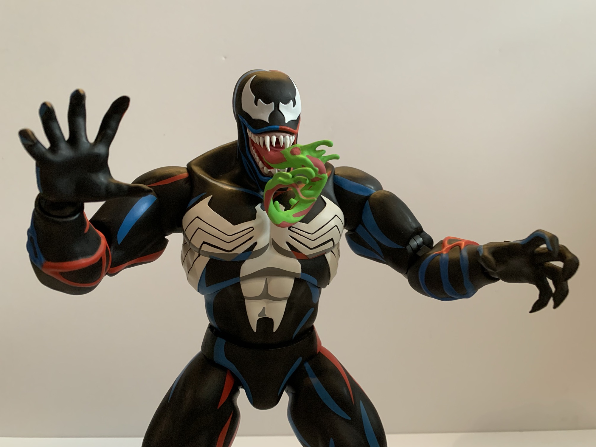
What obviously stands out most though is the color. This Venom is a light blue which is fairly similar to the in-game sprite. Venom, for a long time, was always colored blue in the comics and shaded with black as comic artists often do for characters that wear all black so I’ve always liked this blue look for him. My ideal would be a darker blue that’s shaded like the art of Mark Bagley, but this is still neat to see in figure form. The default head is the Eddie head in mid-transformation which I think originated in a 3-pack. The symbiote section is new sculpt to better match the look of this version and the overall look is actually pretty impressive. The alternate head is a Venom with his green-drool covered tongue protruding. The severe underbite and shape of the eyes is very much evocative of the game art, though thinner and more elongated than the actual sprite. The only negative with the presentation is the little used white paint. The opacity of the spider logo is fine in the middle, but the legs are too thin and a lot of blue pokes through. The paint for the eyes is hardly pristine and the white paint on the hands suffers from the same opacity issues, though not as severe as the spider legs. We might as well get the accessories out of the way now too as he only comes with two clawing hands and two fists.
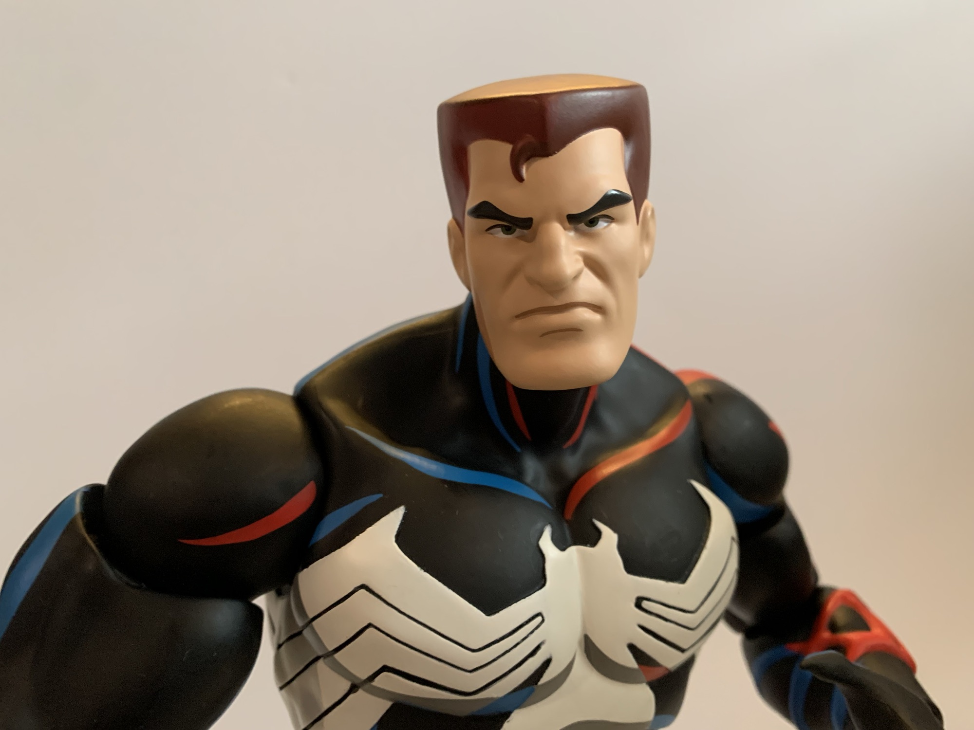
Even though I’ve always been a Venom fan, to my surprise it was Captain America that drew me to this set. Something about this shade of blue hooked me and the way it plays off of the red and white. It’s a clean version of Captain America’s suit as there are no sculpted textures for scale mail. It conforms to the video game look, but it also conjures up memories of his cartoon appearances for me. What also got me though is the sculpt. I don’t have any other Captain America figures, the last one I bought was the series 8 Ultimate Captain America back in 2004, so I can’t say for sure how much of this figure is reuse and how much is new. There have been quite a few Caps recently, the Secret Wars one and the 20th anniversary to name just two, and I assume some of these parts come from there. The torso must be new for it to not be textured and the proportions for it and the arms are terrific. This is what I want Legends to look like. The chest is broad and the shoulders large. There’s enough thickness front to back so he doesn’t have that pancake look. He has classic heroic proportions, something the ever popular Vulcan body lacks.

The paint and colors are mostly okay as well. I already said I love this blue and it’s largely colored plastic. There is a slight variation between the blue of the chest and the blue of the arms. In most lighting it’s barely noticeable, under brighter lights the arms are noticeably lighter which also includes the portion of the chest comprised by the butterfly joints. The paint on the face and head is pretty good as is the paint on the abdomen. The white star on the chest suffers some of the same issue as Venom with the opacity, but it’s not as severe an issue. The gloves and boots are molded in red and possess a nice, matte, finish. The only visual issue I have with the figure is that the wings on the sides of his head are not perfectly symmetrical. It’s minor, but also one of those things that once seen cannot be unseen.
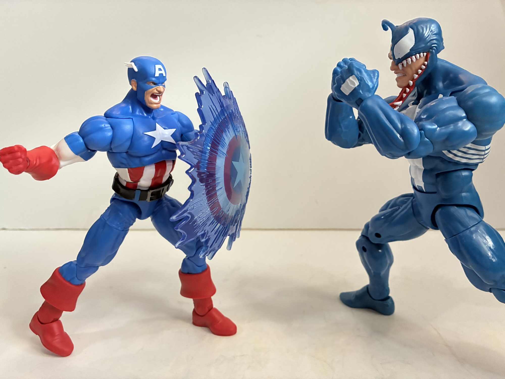

Cap does a little better than Venom in the accessory department. He has an alternate portrait with a yelling expression which is fine, though I’d have preferred something else. Maybe teeth gritting which I feel like shows up in the game more often or a smile as that would pair with his extra hands. By default, Cap has fists, but he can also switch to a thumbs up gesture. I want to say this is from his victory pose and it’s fine, but I don’t think we needed two. An open hand would have been nice to pair with his main accessory – his shield. What is Cap without his shield? This is a pretty standard one. I’ve seen some complaints that it’s too small and that may be so, but it doesn’t really bother me. It has the usual clip for the wrist that can toggle to a peg and plug into his back. Like the main figure, the opacity of the white is not the greatest and more in-line with what we saw on Venom, but the printing is at least clean. It also has an effect, a piece of translucent, blue, plastic that can clip over the shield. There are sculpted motion lines on the part for his shield rush attack and the center of it has less color than the edges. It actually looks really cool and is a perfect accessory for this set. It’s just a shame that Venom couldn’t get a game-specific accessory too.
The articulation for Venom is basically the exact same as the prior Venom I already looked at with the exception of the hinged head. This lets him get into a stance resembling his default one in the game. The ball joint in the torso seems to have a little more range as well, but everything else is the same. As for Cap, he’s a little less articulated owing to an inferior torso setup. He has the ball hinge head and his butterfly joints work pretty well. The pin-less, double-jointed elbows and knees work as expected though his bulky arms give him less than 90 degrees at the elbow. The thing I don’t like is the torso though which has a perfect design to include a ball joint in the midsection. Instead, he just has an ab crunch with a waist swivel. If this guy had the same setup as Gamerverse Wolverine it would have taken him to the next level and would probably be as good as any Captain America figure ever needed to be, but instead it’s got an easy to improve upon flaw for whenever Hasbro wants to give us a Maximum Captain America and charge $50 for the privilege of owning it.
As a $60 two-pack, this release is a bit of a hard sell. Do you really need a Venom in blue even if it is a minor improvement over the most recent release? Surely, if you prefer black this Venom body will see a re-release. Plus it still has that ab crunch which could be improved upon. The Cap is for those who don’t necessarily need or want the scale mail texture. The extra effect part for the shield is also nice, though very game-specific. If you don’t care about the video games it hails from, then you may not value it much. Now, if you are a big fan of the Capcom games then this set holds some added appeal. It’s a solid likeness found in the games and only Venom’s lack of a game-specific accessory hampers that. If you don’t have a past release of either character, it’s certainly more enticing, but still overpriced at $60. If you can get it for less then it quickly becomes a far better value. I got it down to a lowly $16, but it would have been worth it at far more. I would say $50 is the magic number and anything less is a good deal. I’m quite happy with it, even Venom, and I just love how they pop in my display. They’ve been my desk figures for weeks and they may remain there for a bit longer too. If this set appeals to you on a visual level then I think you’ll find plenty to enjoy.

For more from Marvel Legends and the MvC games check these out:

Marvel Legends Gamerverse Wolverine vs Silver Samurai
Video game inspired action figures are quite the hot ticket right now. I’m not entirely sure why that is, but maybe some of that is owed to Jada Toys and how well received their line of Ultra Street Fighter 2 action figures have been received. Hasbro, for their part, has had a “Gamerverse” subline of…
Keep reading
Marvel Legends Walmart Exclusive Retro Card Venom
On Tuesday, I posted a review for the NECA TMNT Adventures Cryin’ Houn’ action figure, a figure that debuted during this year’s edition of Walmart Collector Con. Today, we’re looking at a true exclusive from that event. Cryin’ Houn’, and a lot of other figures released that day, were basically a first to market agreement…
Keep reading
Storm Arena Street Fighter Alpha 3 Ken
One of my most anticipated releases of 2025 came out of no where. I was a kid during the early 90s and into video games so I know a thing or two about Street Fighter. Street Fighter II was everywhere and is pretty much the reason why the one-on-one fighting game became a huge genre…
Keep reading