Everyone can relax – Gambit has returned. Or arrived, since I’ve never reviewed a Gambit action figure in this space, but that’s because I haven’t bought a Gambit figure in about 20 years until now. When X-Men arrived on airwaves in the fall of 1992, hardly anyone on that team could be considered a true household name. Wolverine was certainly the closest. He was featured in a lot of Marvel related ads and had his own solo comic series as well. Other characters showed up as guests on Spider-Man and His Amazing Friends or in the pilot for the never was series, “Pryde of the X-Men” and the arcade game essentially based on it. My own familiarity with the team was mostly from the first run of ToyBiz action figures featuring Wolverine, Cyclops, Storm, Nightcrawler, Archangel, and Colossus.
Gambit was not featured in any of those things. For me as a kid in ’92, the first episode of the cartoon series was my introduction to the character and I don’t think I was a unique case. Gambit was the break-out star of the series, as far as I’m concerned. He was essentially designed to be cool. He’s probably over-designed, but somehow Marvel pulled it off. He looks ridiculous, and yet come 1993 that’s who I wanted to be for Halloween. I think it’s the trench coat that brings a lot of that “it” factor upfront and the way his face is framed with that unusual hood he wears and red eyes which adds a mysterious component. I remember thinking his gloves were cool, and for some reason exploding playing cards just struck me as bad ass. All of that allowed him to pull off the hot pink undershirt and that weird, blue, thing he wears around his neck area.

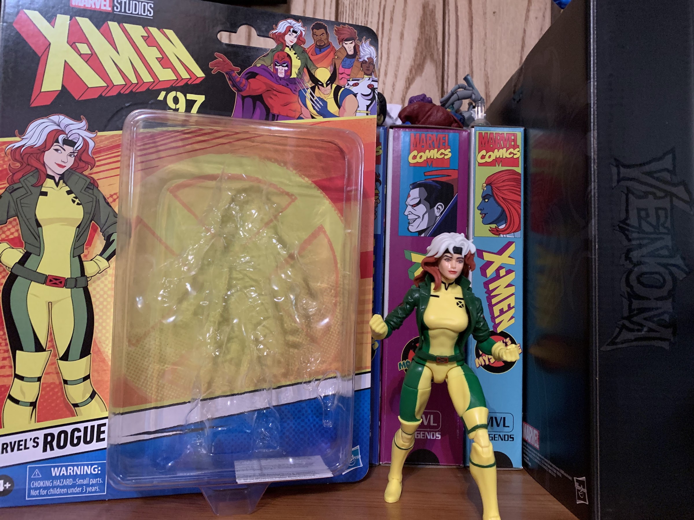
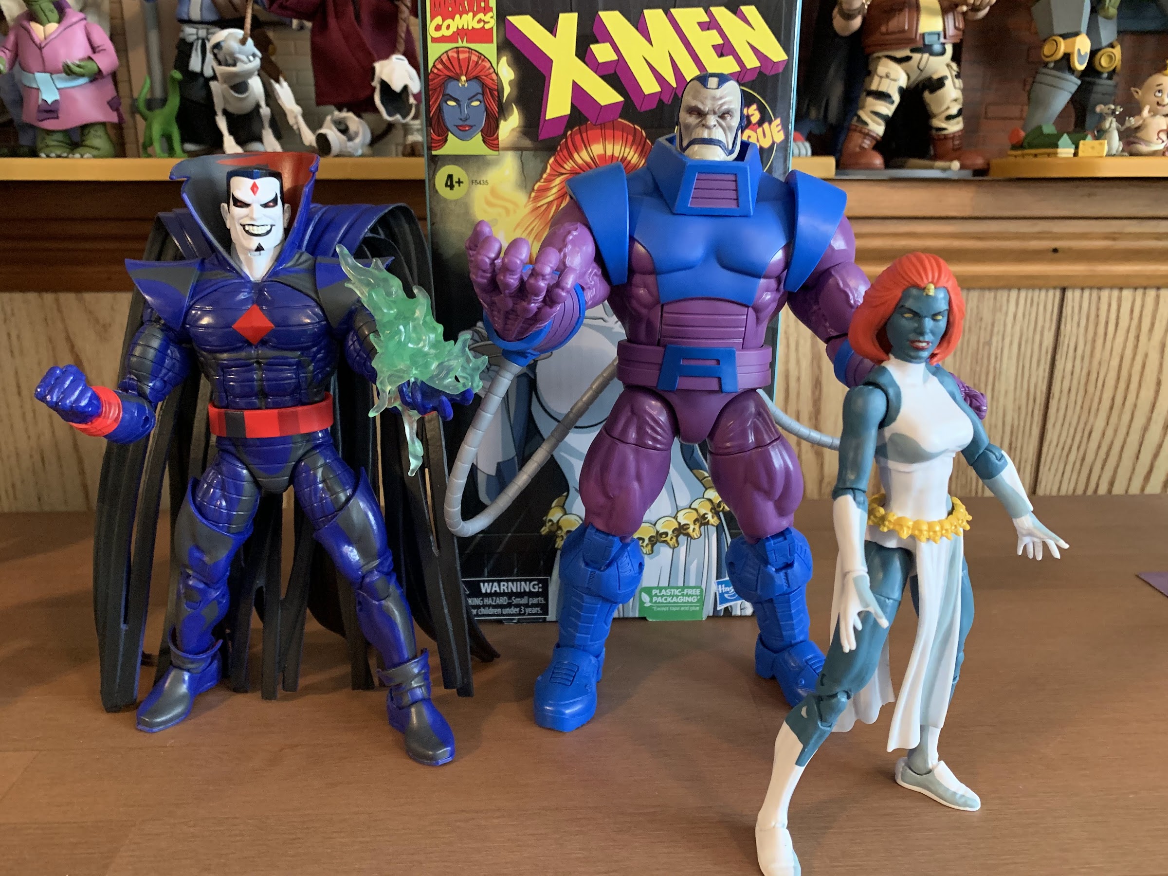
Following the debut of X-Men, most of my peers would cite either Wolverine or Gambit as their favorite character. That’s just how it was. ToyBiz hit stores with Series 2 of its X-Men line around the same time and Tiger Stripe Wolverine (or Wolverine II) and Gambit were the two hardest to find. Maybe the character’s popularity has faded over the years, but I was surprised that Gambit wasn’t featured in the VHS line of Marvel Legends based on the show. I think the real reason for his exclusion was due to the fact that Hasbro had somewhat recently released a Gambit figure in the same getup on a retro card exclusive to Target. I think it’s even still available. The same was true of Rogue and I think Hasbro made a business decision not to compete with itself for both figures, but if you’re going to have a line of X-Men figures based on the animated series you have to have Gambit.

Enter X-Men ’97 and its first wave continues to right the wrongs of the VHS line by including, among others, Gambit. This figure is basically a re-release of that Target exclusive with minimal changes that come down to a new head and new overcoat. I don’t have that Target figure, but as far as I know, everything else is the same including the accessories. The paint application is a little different to better reflect the new source material, but that’s it. Chances are, if you have that figure and you’re happy with it, you probably won’t need this one. I, on the other hand, just want an animated Gambit to put on my shelf with the rest of the animated X-Men so I grabbed this one along with Rogue and Magneto so lets see if that was a good decision or not.

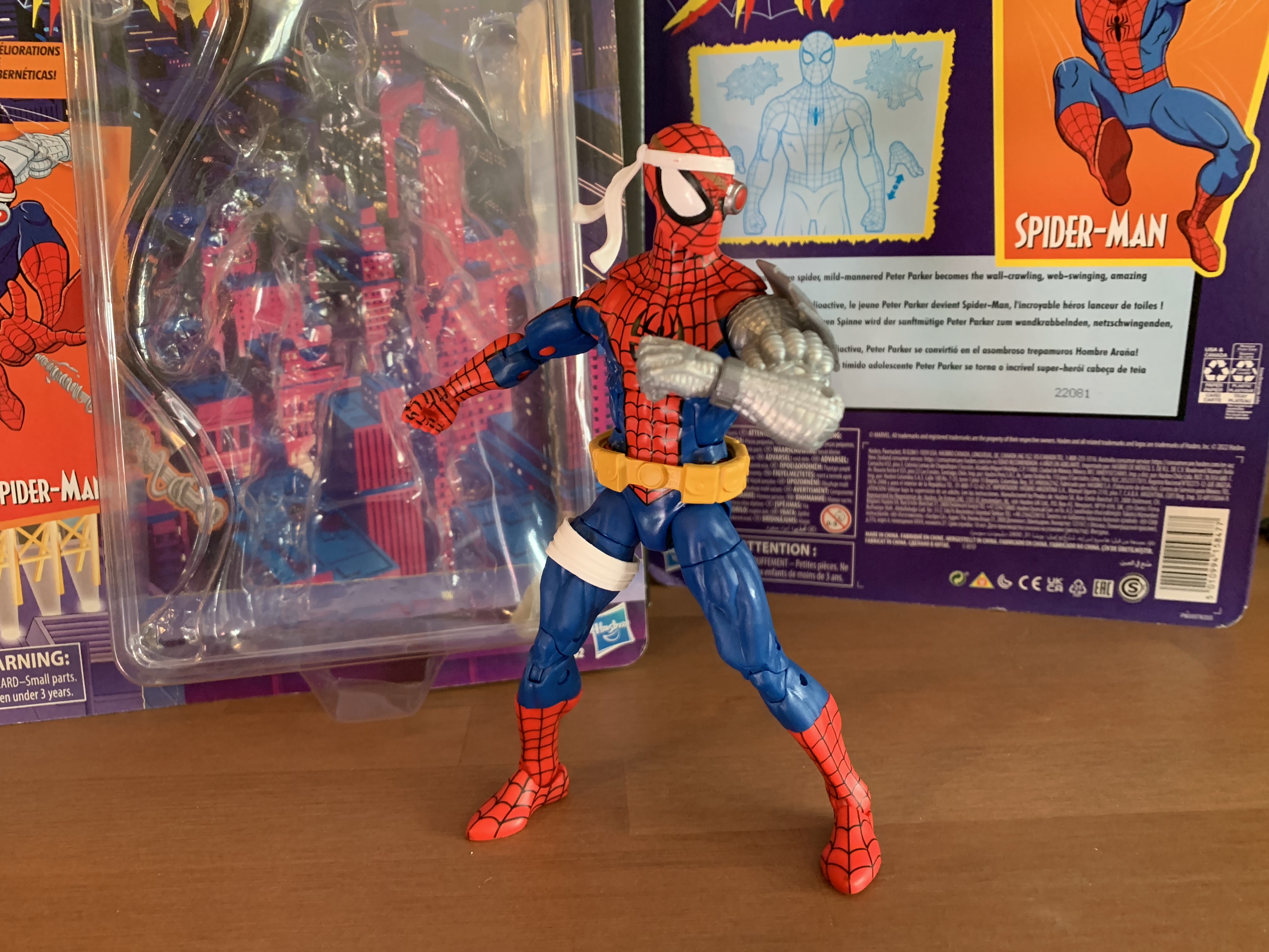
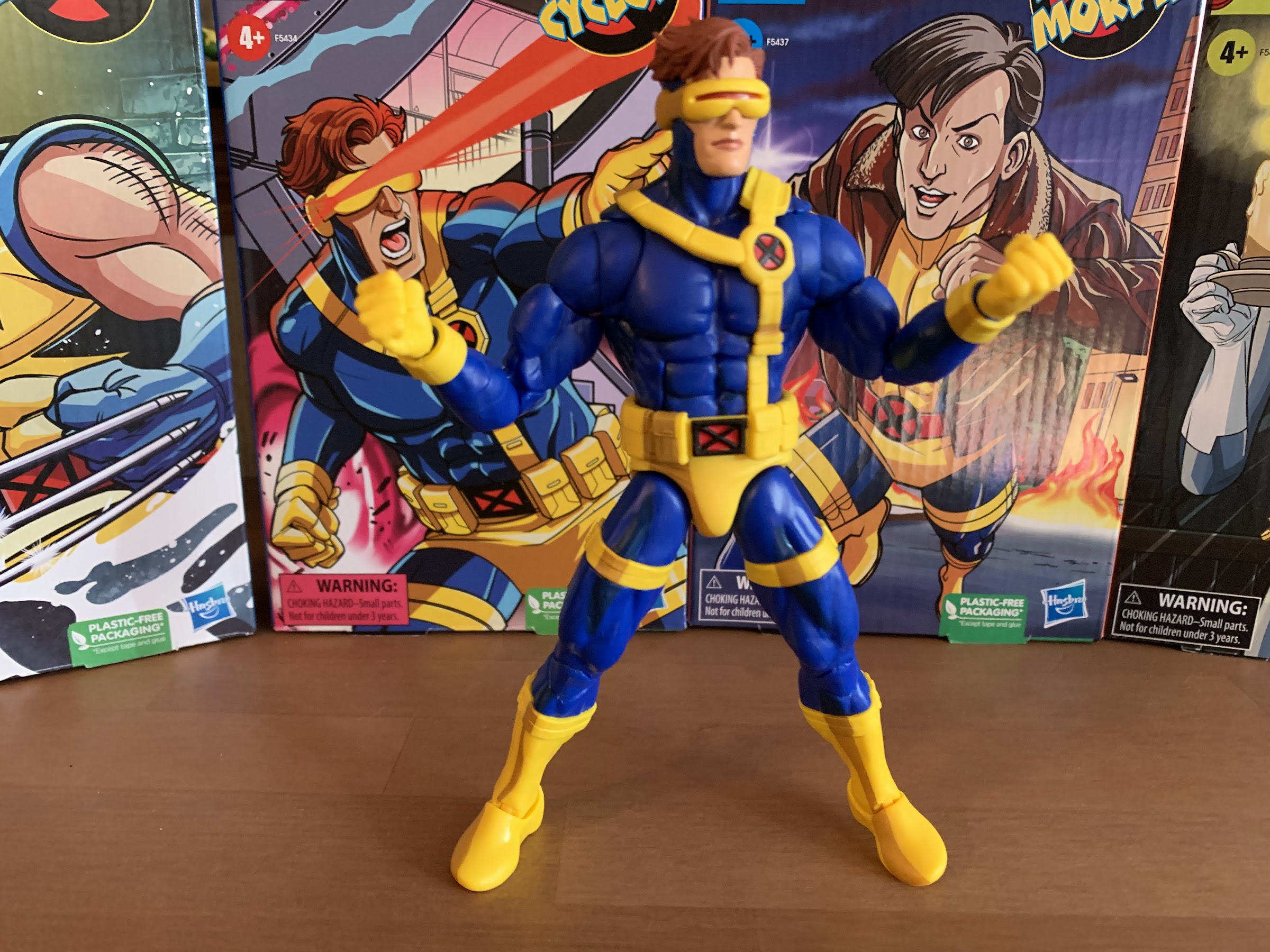
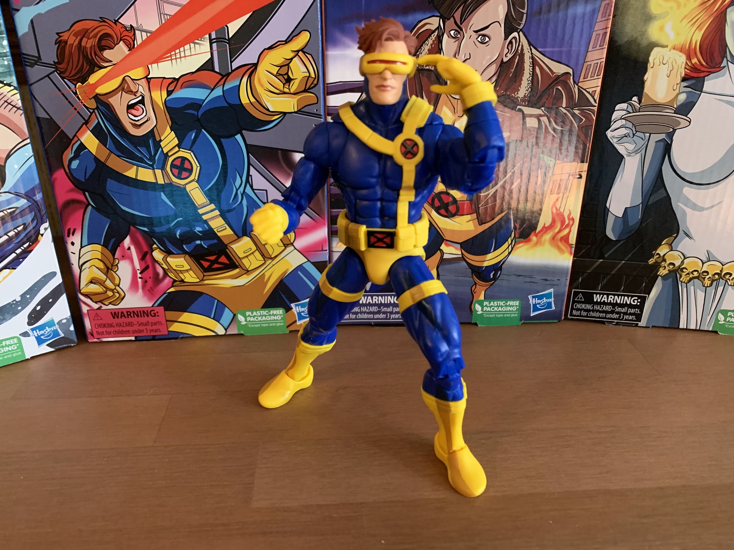
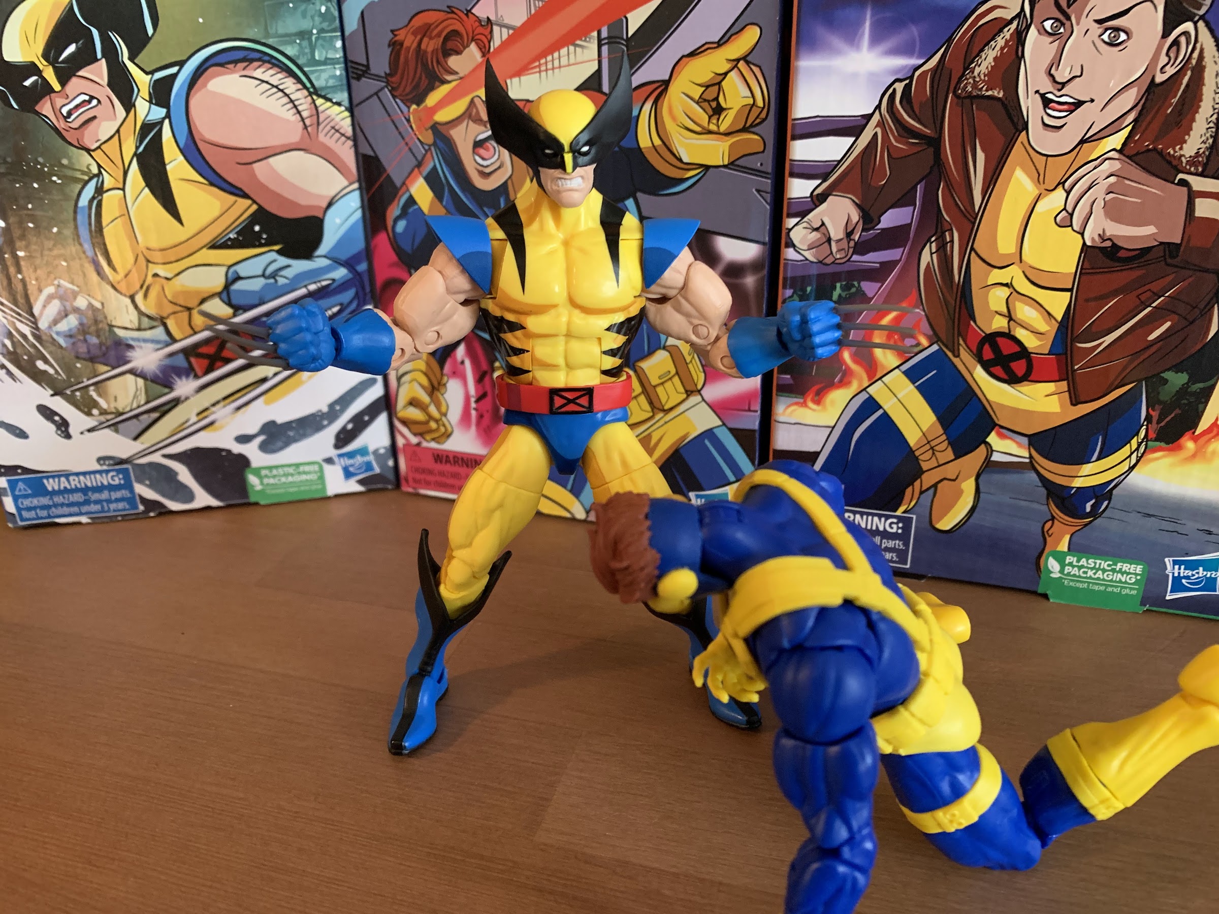
Gambit comes on the same card as the rest of the line with artwork from the show on the front. Out of the box, Gambit stands at approximately 6.25″ to the top of his head and 6.75″ to the top of his hair. Like the rest of this wave, the scale is suspect. Gambit is a bit too tall, but not egregiously so. The head sculpt will get the most attention here as it has a very animated look to it. It’s a very clean approach with few lines to make it easy to animate. I don’t hate it, but it doesn’t look like Gambit from the original series. It looks more like him than the Target figure, but that’s it. He looks reasonably enough like the art from the new show, so that’s fine. The paint is iffy though. The eyes are good and he doesn’t have lipstick, but the edge of the cowl isn’t clean. There’s a spec of flesh color on the right eyebrow of my figure and they added some stubble to his chin via paint. It’s on the character model, so I can’t kill it, but I wish it wasn’t there. The hair is huge and probably divisive. I don’t mind it though. Again, not at all accurate to the ’92 show, but looks fine for X-Men ’97 based on what I’ve seen. There’s no shading on it, but it’s probably fine for the source material.

And speaking of shading, you won’t find any on this figure. The coat is an overlay and it’s fine. It’s pretty stiff though and won’t pose at all, but it looks okay in a default pose. The sleeves are part of the sculpt and we’ve seen these before. The hands are unique to Gambit, at least the left hand with two finger gesture, so it’s odd to see fingernails sculpted onto the digits covered by the glove. They’re black, so the flesh part is painted which ironically covers up the fingernails to make them barely noticeable. Maybe this hand is reused for another figure? I don’t know, it seems odd to me. The torso is molded in pink and the blue portion appears to be molded in blue as well and keyed in. The very bottom of the shirt is painted pink and doesn’t match as a result. It’s pink over black plastic, which is an odd choice. I guess it’s because they wanted to do the legs in black so they could paint the pink thigh stripes, but it’s a lot easier to paint black over pink than the opposite. The pink stripes are also sloppy and the black shows through. The boots are just blue plastic and it shows.
It’s a very mixed bag on the presentation. Excepting the boots, the parts in molded plastic look fine, but the paint is bad. Gambit also has the same issue as Rogue in that the overlay coat isn’t snug enough at the shoulder. There’s plenty of pink showing between the sleeve and overlay when it didn’t need to be that way. It’s basically just another figure that is only concerned with the bullet points when it comes to the presentation, but the finer details are most certainly lacking.

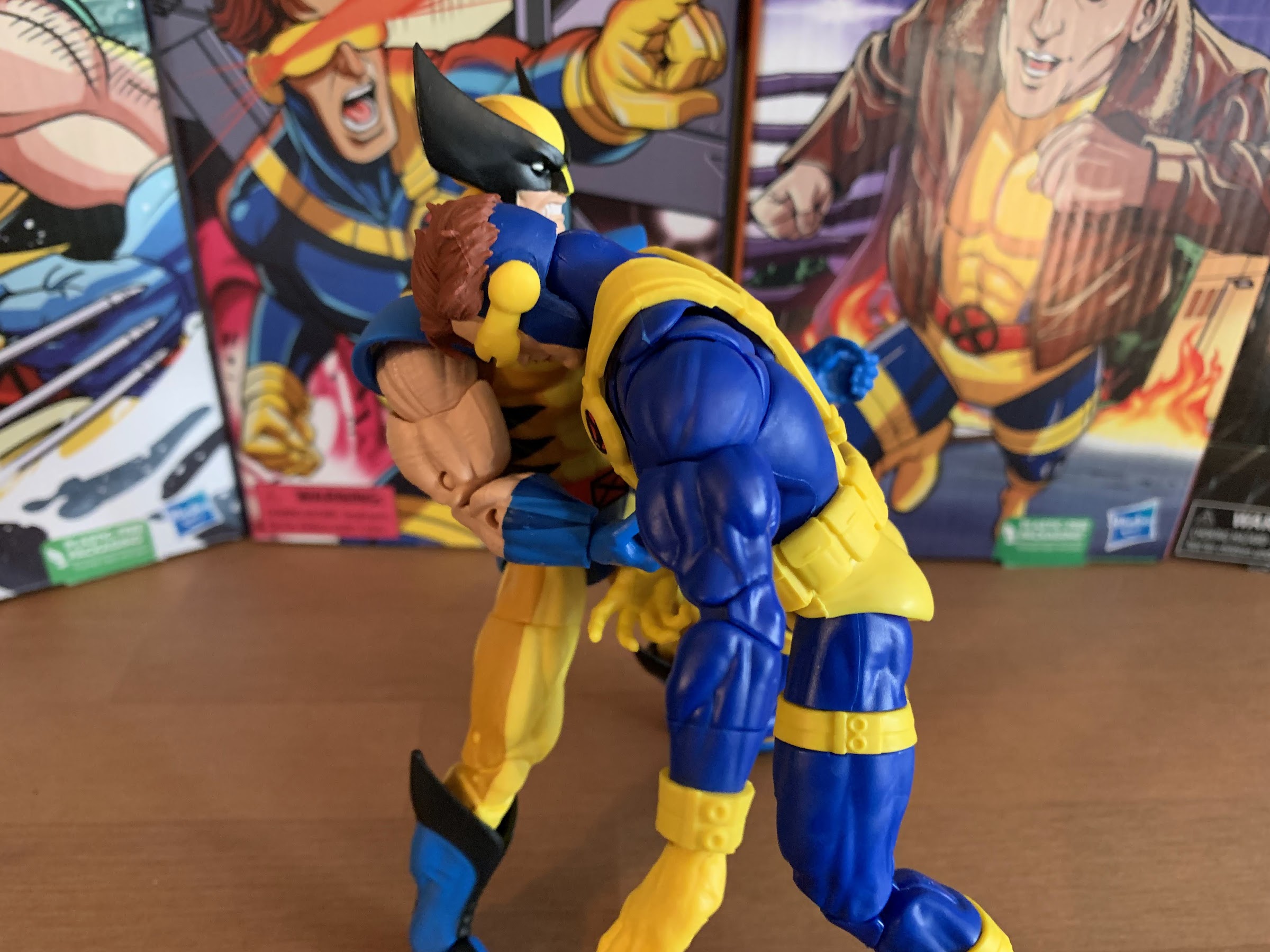
Gambit does get to have more accessories, at least, when compared with Rogue and Magneto who both just got a hand swap. That’s not to say Gambit is loaded, by any means. He has his staff which is molded in blue, and to my surprise, it appears to be a darker shade than the boots. It’s a staff, so it’s fine. What’s not is the gripping right hand which is too loose for it. Gambit can hold it if you’re patient and careful, but it’s not good enough. And if you wanted a two-handed pose you’ll have to search for a new left hand somewhere because Hasbro didn’t provide one. I mean, you can kind of use the default left hand, but it looks a bit silly. Instead, they provided an effect part hand. It’s molded in a transparent pink plastic or acrylic and has three cards extending from an open hand with a swoosh effect. It looks fine, there are fingernails on the hand again for some stupid reason, but the swoosh kills it for me. It makes no sense because it extends beyond the hand in both directions. The swoosh should end at the front of the hand and extend only one side, not past the hand on both. It makes it look like an energy wave is shooting out with cards too. At any rate, there’s also a single card effect to place between the two fingers of the default hand. I like this one much better and it’s good, but no second portrait? No second gripping hand? No gripping hand that actually works?!

The articulation is basically as expected with Gambit. The head is on the hinged ball peg that provides range up, down, and rotation, but zero tilt for more nuanced poses. The shoulders are hinged ball pegs that raise out to the side just past a horizontal position. The biceps swivel is fine and the single-hinged elbows give the figure better than 90 degrees at the elbow plus some swivel. The hands swivel and the gripping hand has a vertical hinge and the other a horizontal one. The torso has an ab crunch that goes forward pretty far, but the coat prevents much use going backwards. There is waist twist, but it’s pretty ugly because it just sits on a peg flush with the hips. The hips kick out to side about 45 degrees and kick forward all the way. There’s some range going back that’s stopped by the coat. There is a thigh cut for a swivel there and they put it in between two of the leg stripes so that’s a plus. The knees bend past 90 pretty far and there is a boot cut in the middle of the shin if you want it, but it’s ugly. The ankles hinge forward and back a solid amount and the ankle rocker is fine. My left ankle is pretty stuck at the hinge and I haven’t tried heating it up to free it.

Aside from the left ankle, the rest of the figure is fine as far as joint tolerances go. Like Rogue, the shoulders are a bit tight, but with Gambit I don’t feel any binding at the joint. This one seems less gummy than the other two figures so at least the feel is fine. This is just one of the few figures where I wish Hasbro had inserted a butterfly joint. It would serve him well with his staff and cards, plus the coat would hide it. Double ball joints at the head and waist would also have improved the figure. I don’t think the ab crunch offers much use and a ball joint there that gets some rotation would be better. It’s a very dated approach to articulation, but Gambit’s unique attire means unique tooling is needed and Hasbro doesn’t want to spend money it doesn’t think it has to.

The X-Men ’97 version of Gambit is essentially another compromised take on an animated character that will be acceptable for some and unacceptable for others. At $26, it’s too expensive for what’s in the box, but if you want an animated version of Gambit this is what you’re stuck with. And, for me, it’s mediocre, but passable. On the shelf with the rest of the crew, he looks okay. In hand and on its own, the figure isn’t much fun to mess with and a bit frustrating to pose the way I want to. Add the mediocre accessory load-out and frustrating gripping hand and it results in a below average action figure by today’s standards. Here I am essentially talking myself out of what little affection I have for this figure, but to summarize, if you (like me) just want a Gambit for your animated shelf it will probably get the job done. If you want something that’s an improvement over what Hasbro has already released, then you’re going to be let down. As seems to always be the case with Marvel Legends, you’re better off waiting for a sale.
Need to catch up on other X-Men animated Marvel Legends releases?

Marvel Legends X-Men ’97 Rogue
Previously, on X-Men reviews we looked at Magneto from the upcoming series X-Men ’97. The animated series may have been delayed into 2024, but the action figures from Hasbro are already here. And if you were collecting Hasbro’s line of figures based on the animated series from the 90s, this new line offers a chance…
Keep reading
Marvel Legends X-Men ’97 Magneto
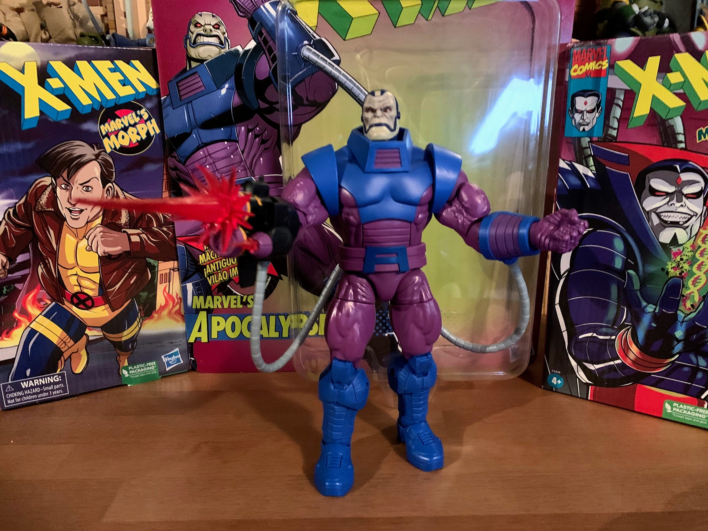
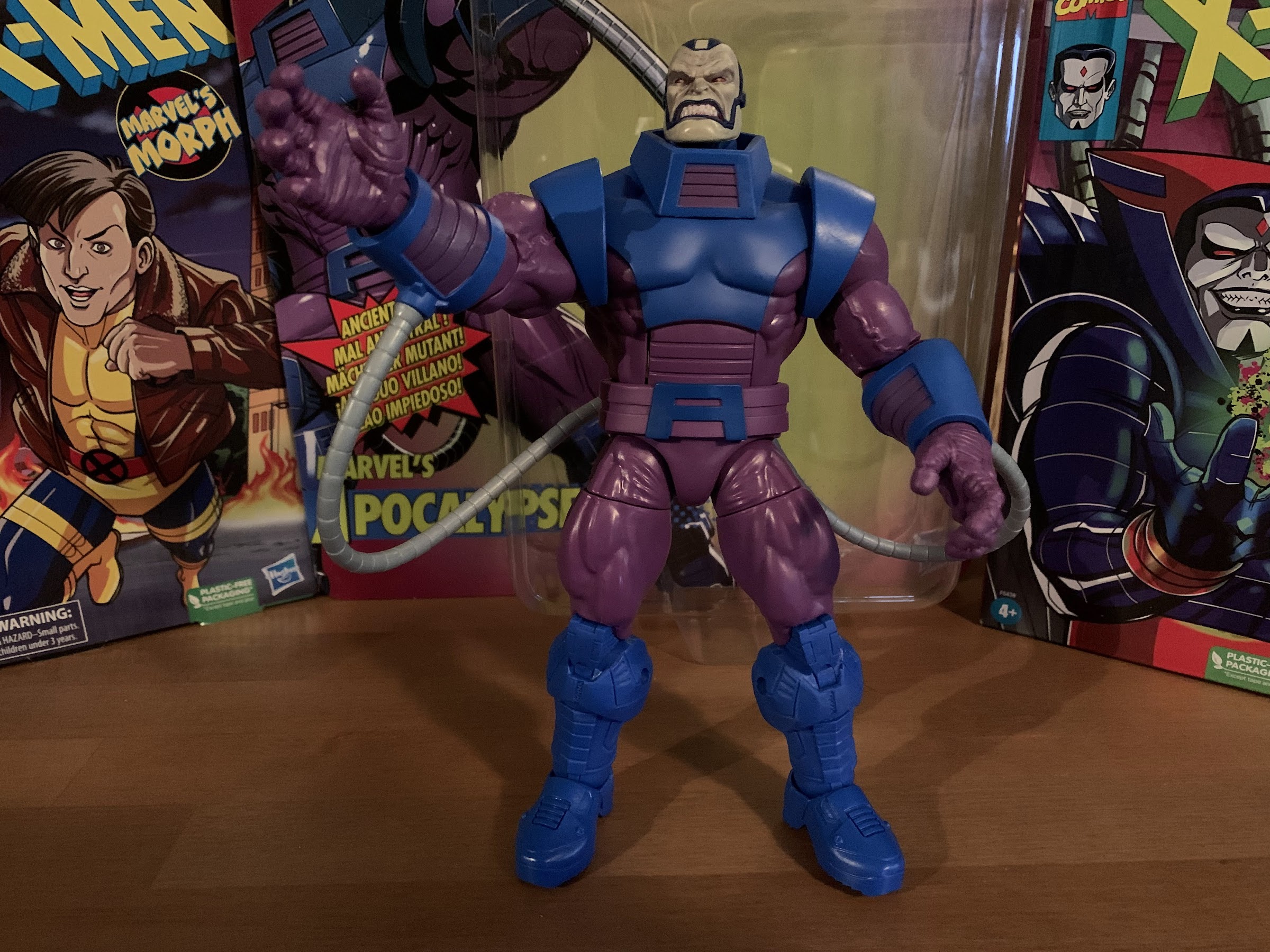
It was two years ago that Hasbro made the announcement that it was wading into the weeds of X-Men, the cartoon series that aired on the Fox Kids Network from 1992-1997. The line was released across eight installments in 2022 (plus a ninth if you include the obviously animated-inspired Apocalypse released on a retro card)…
Keep reading
Marvel Legends X-Men Animated Series Mr. Sinister
This week, the long wait for an in-person San Diego Comic Con comes to an end. For the first time since 2019, attendees, creators, and the like will be invited back into the city of San Diego for a celebration of all things comics, movies, and general “nerd” culture. One of the many panels this…
Keep reading