Tag Archives: hasbro

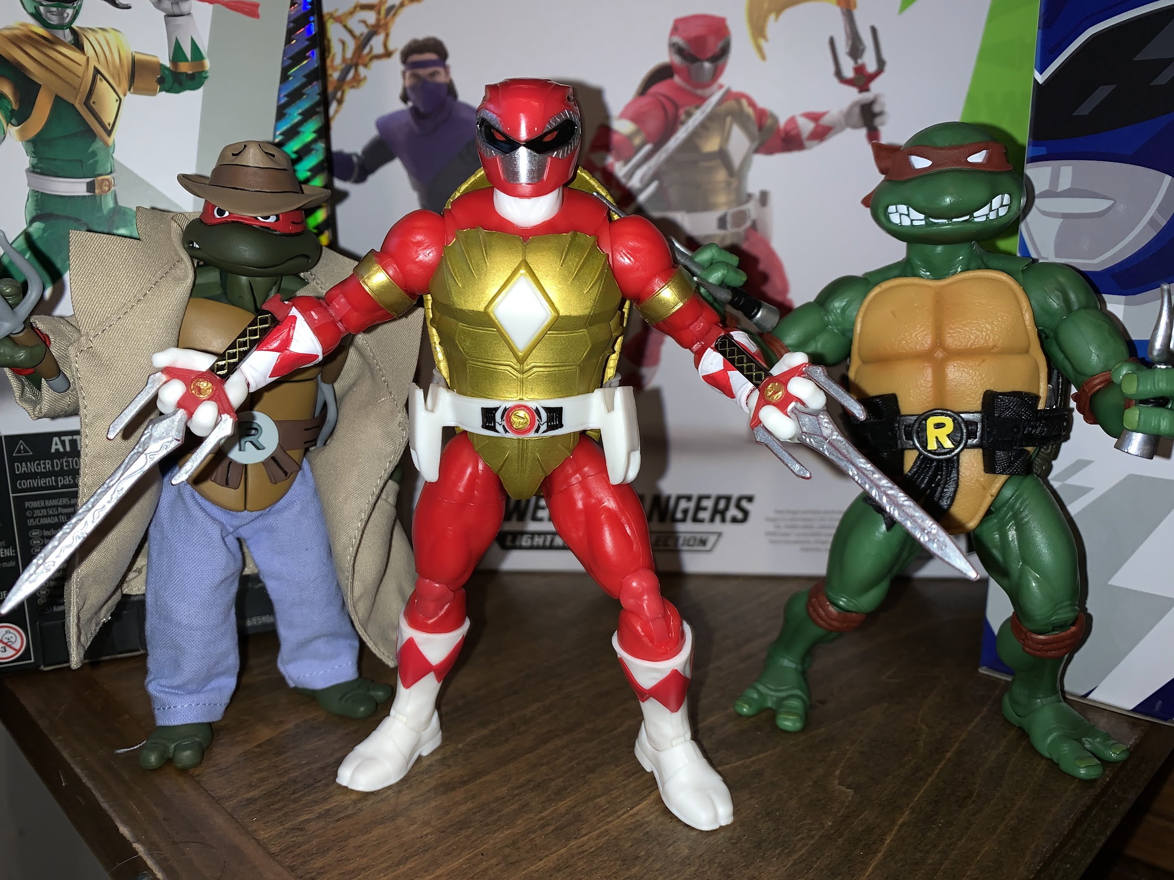
Hasbro Power Rangers x TMNT Donatello and Leonardo

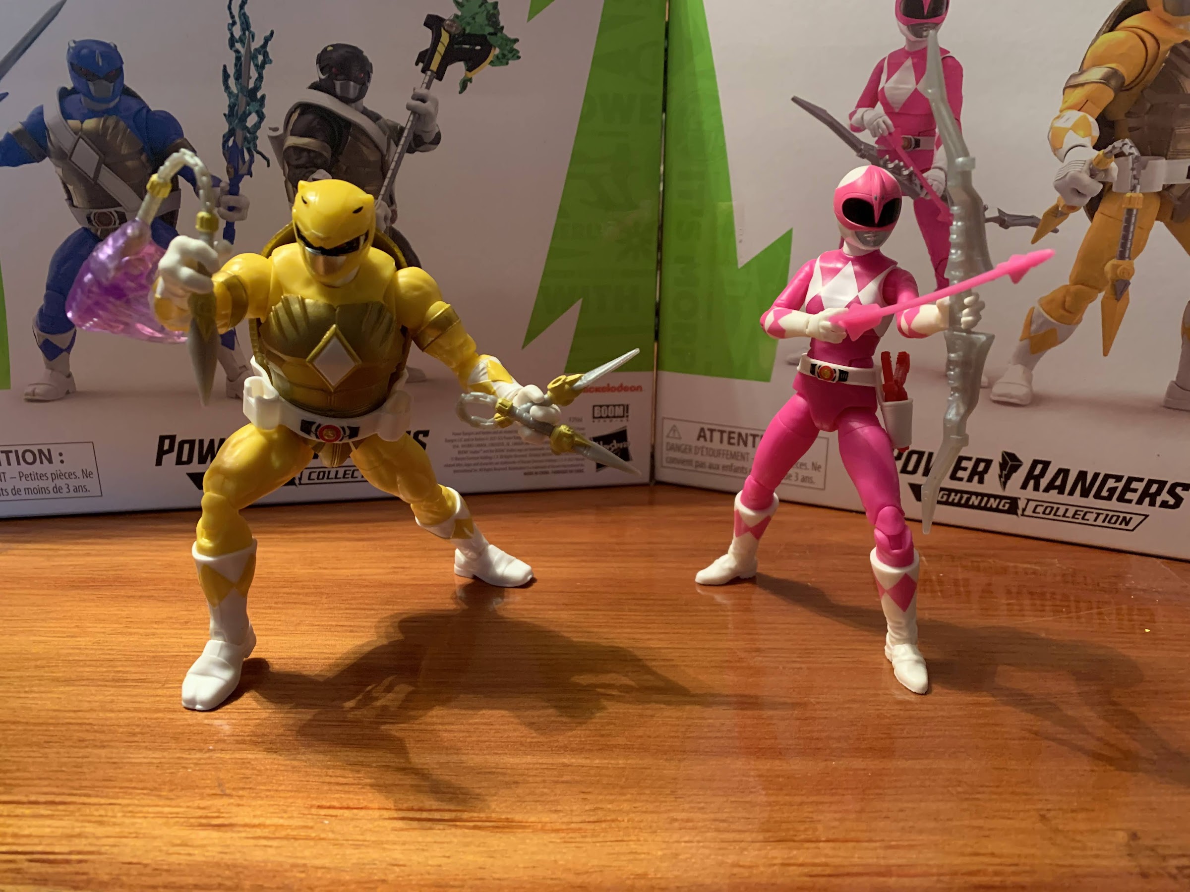
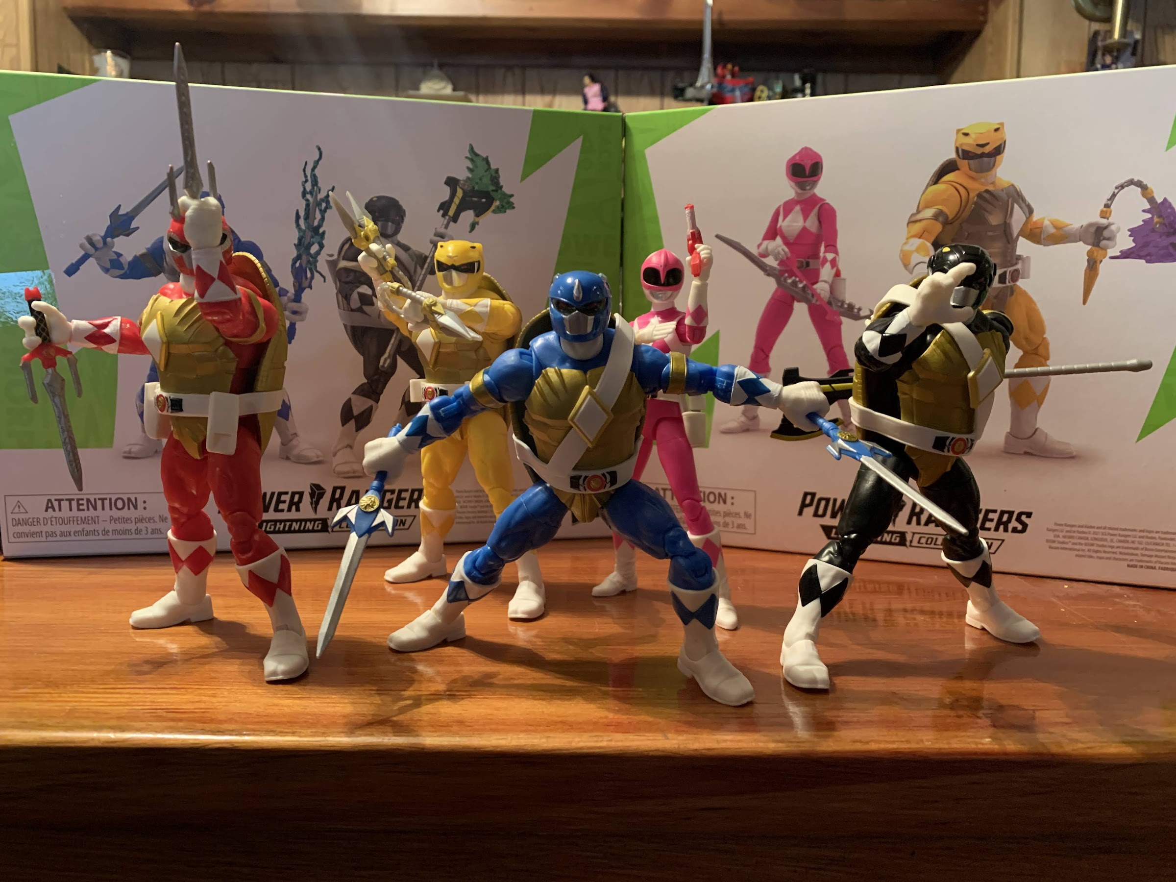
Donatello and Leonardo are here to join the team.

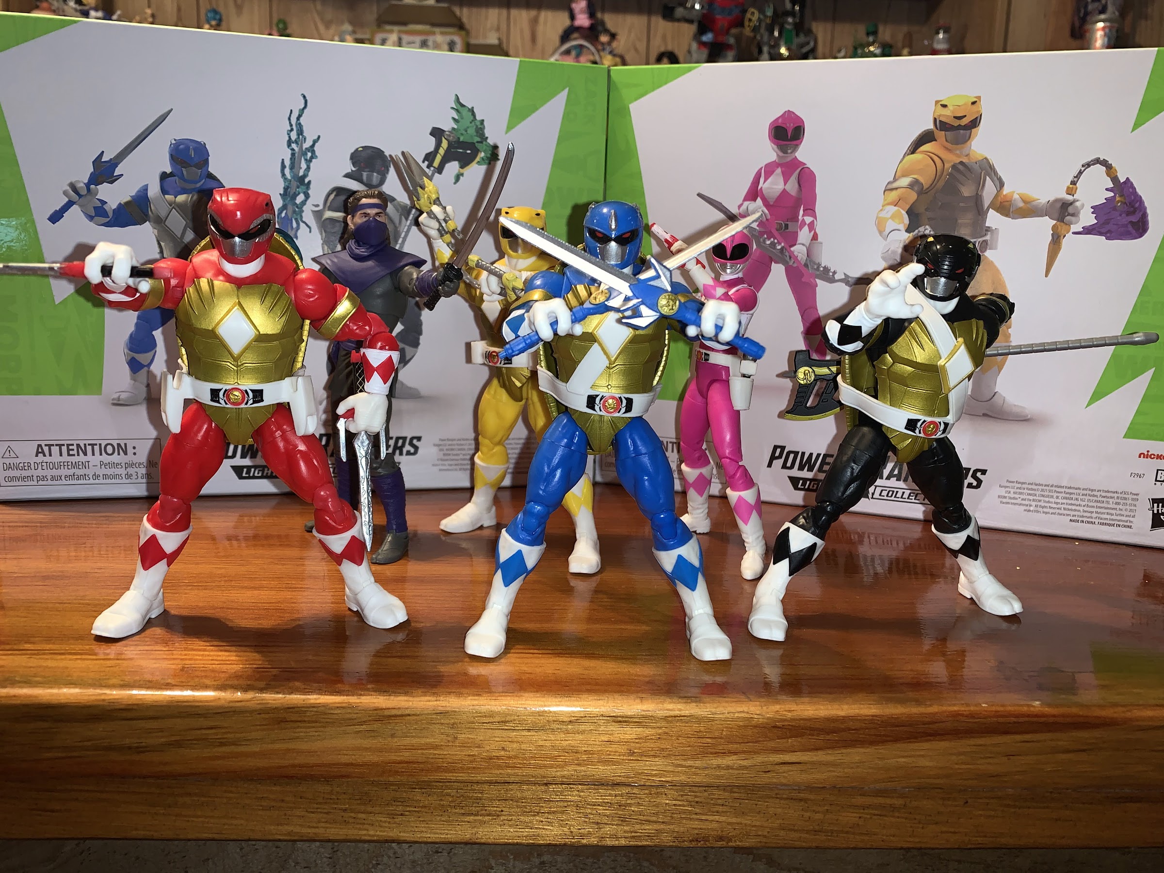
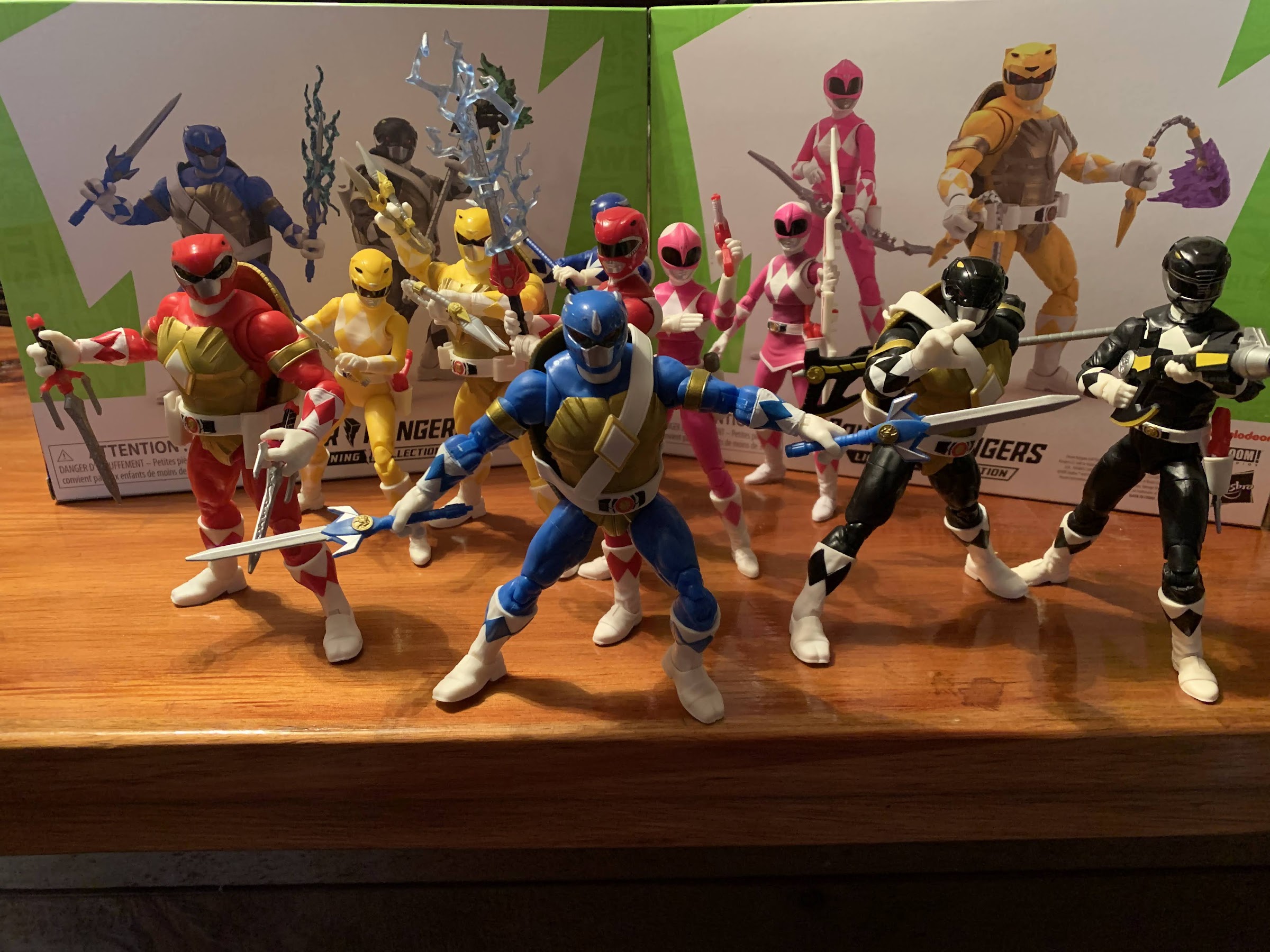
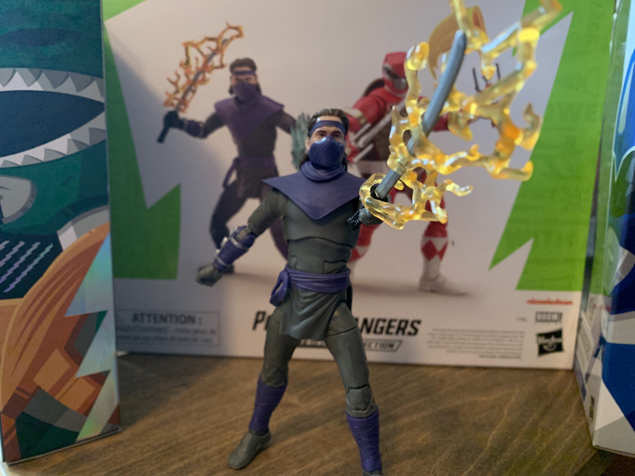
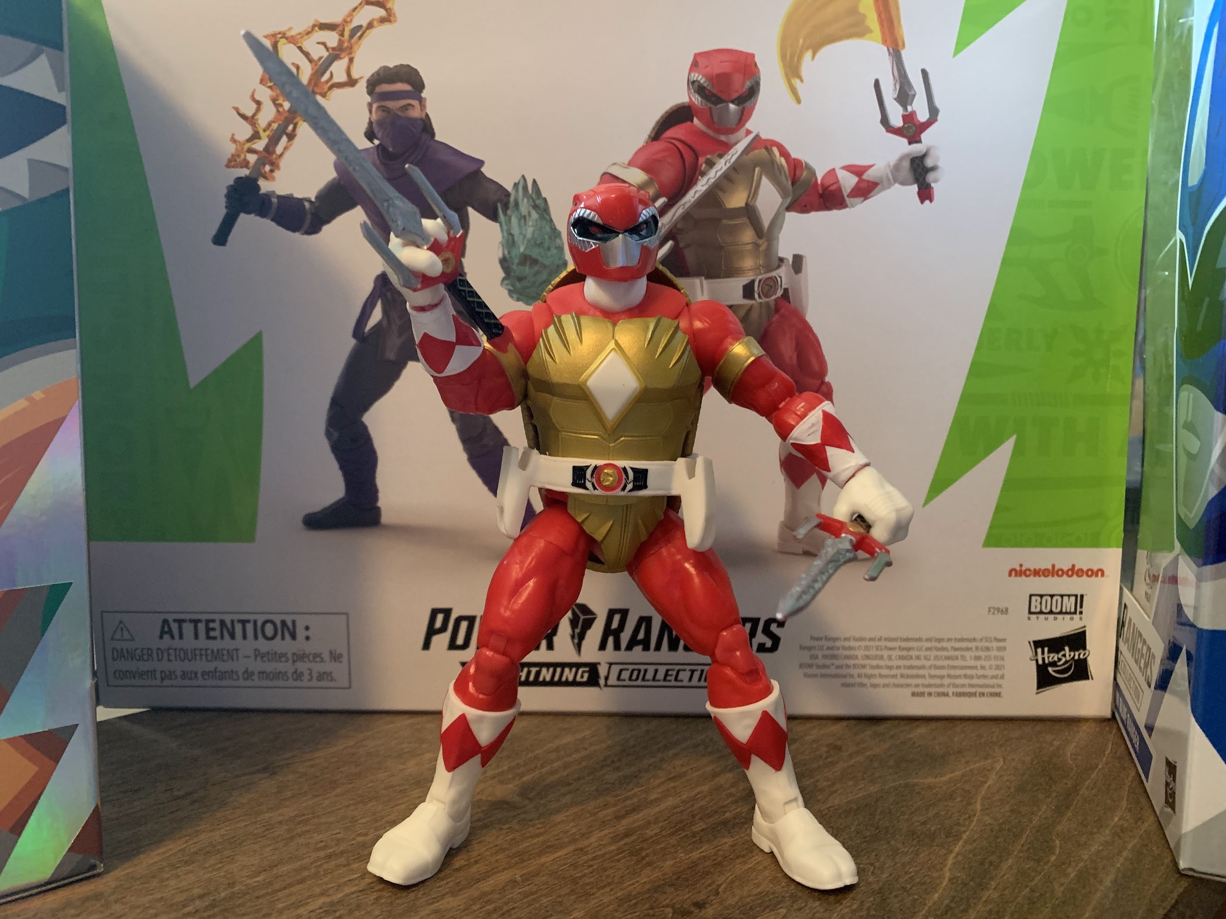
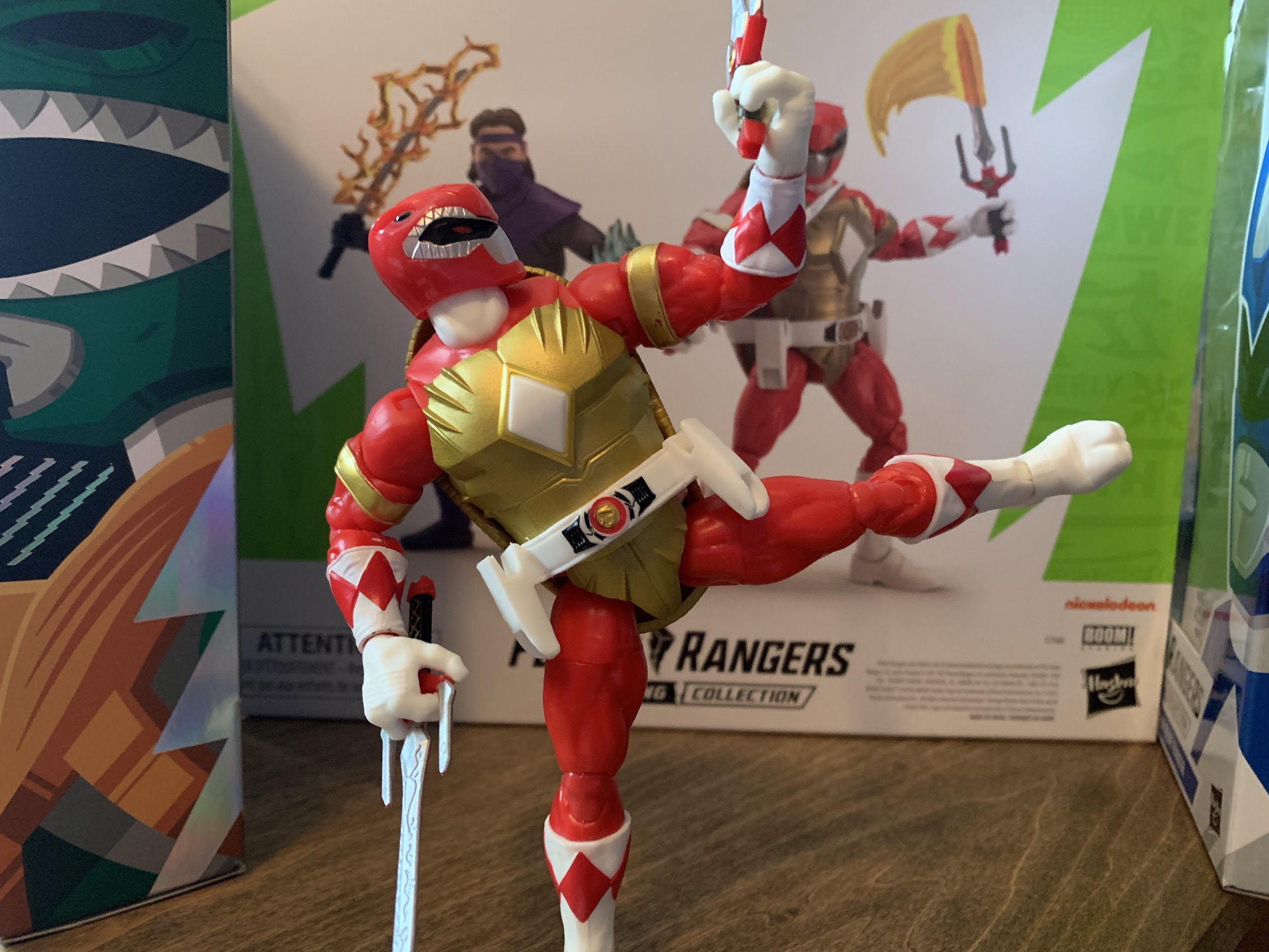
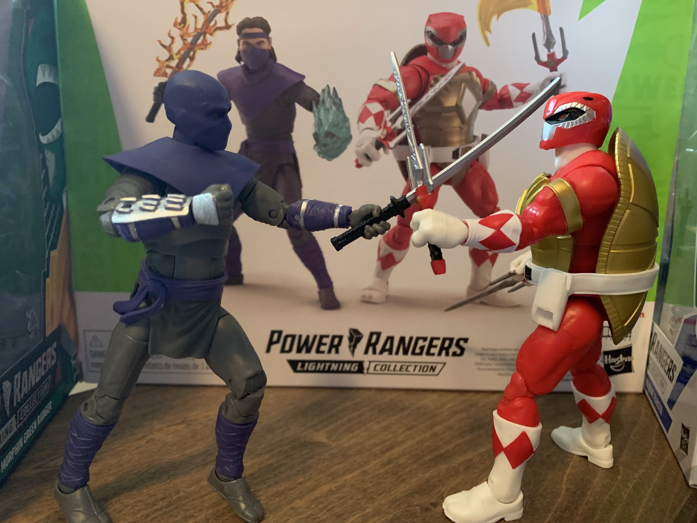
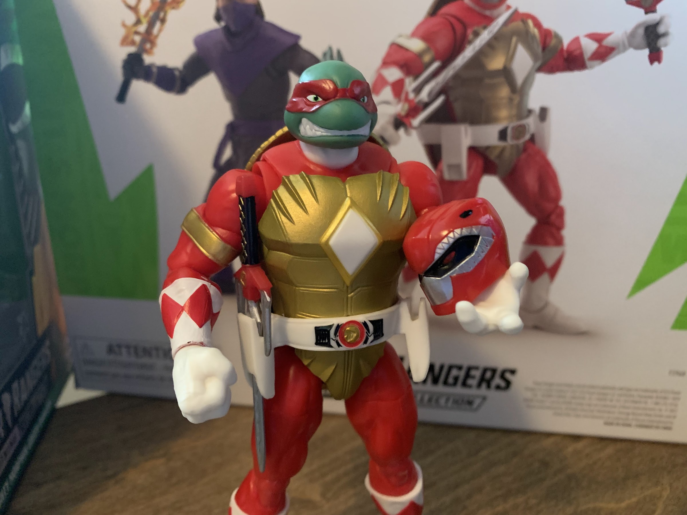
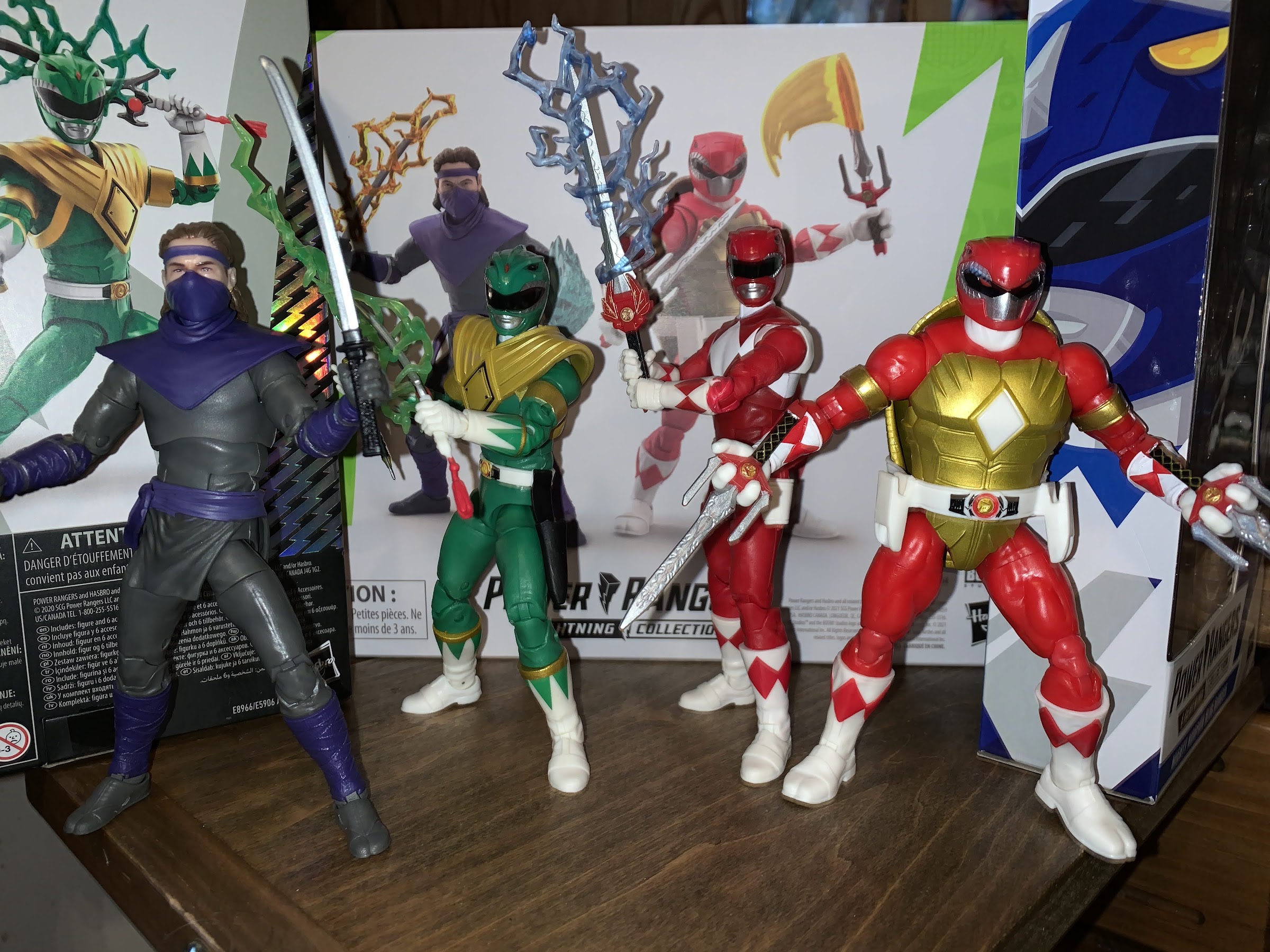
It’s been a minute, but we’re back with another two-pack from Hasbro’s Power Rangers x Teenage Mutant Ninja Turtles line of action figures. If you’re unfamiliar, this series is born from the Boom! comics crossover in which the Mighty Morphin Power Rangers meet the turtles and somehow their powers end up getting handed over to them. I haven’t read the story, so I don’t know why any of that took place, but it did lead to some cool character designs and that’s why we’re here.

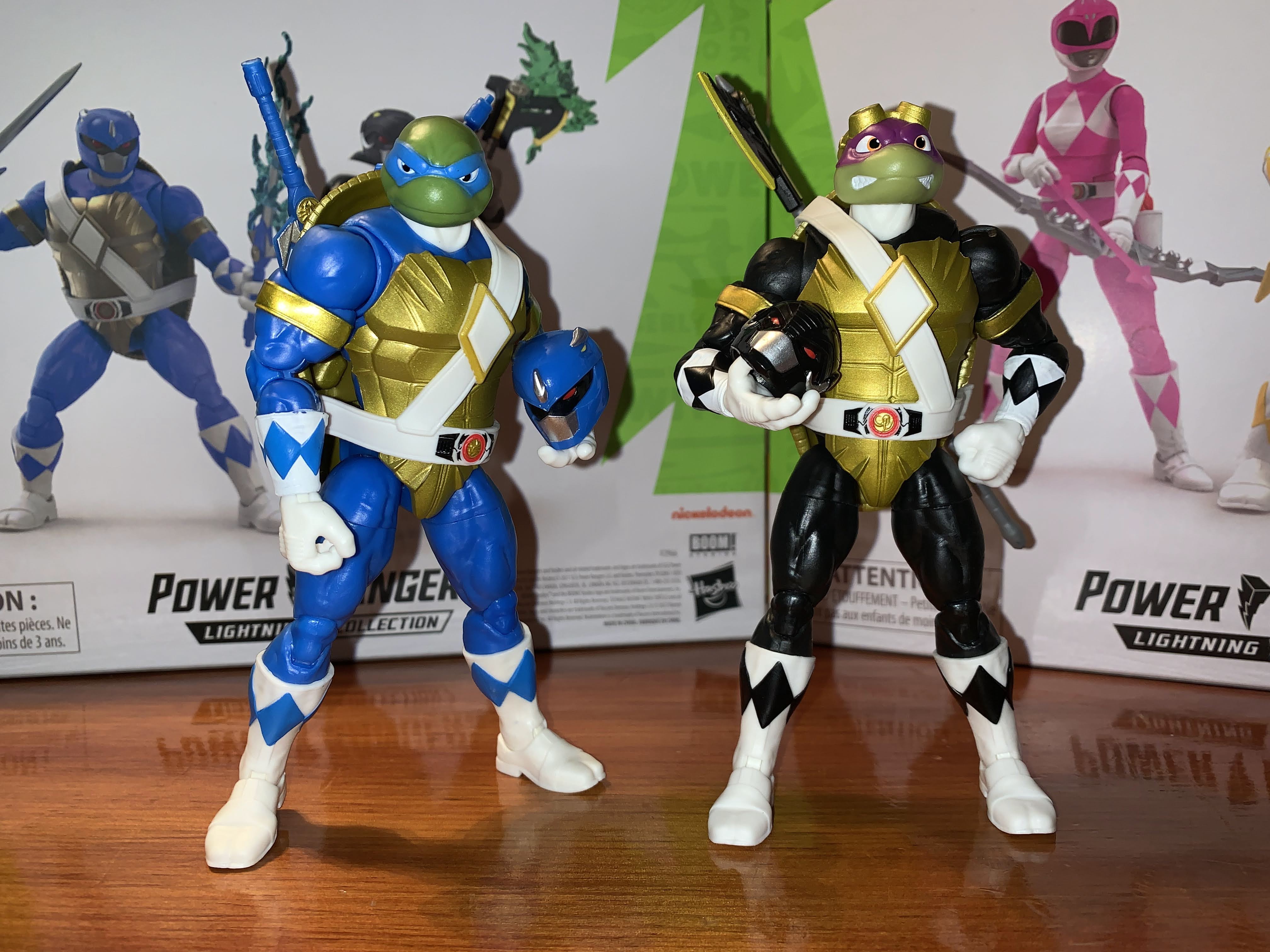
The first set I received was the Raphael and Tommy Oliver two-pack which was my introduction to this morphed turtle character sculpt. Because of that, this set is pretty damn familiar because, like many TMNT toy lines, the sculpt for each turtle is essentially the same. The only differences separating the turtles in this line are the unique, unmasked, head sculpts and the belts and weapons. And the other major difference is just the color scheme. With this set, Leonardo is logically the blue ranger, but since there is no purple ranger, Donatello had to take the black. It might have been kind of fun if the black ranger simply became the purple ranger in the hands of Donatello, but this is fine and I don’t fault Boom! for sticking with the traditional colors for MMPR.

It’s morphin’ time…dudes!

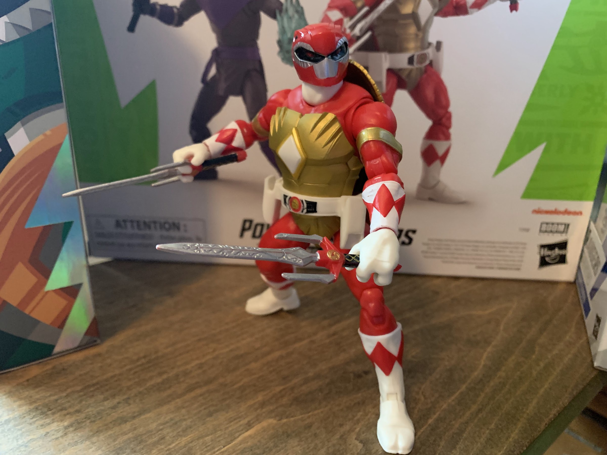
If you read my review of Raph and Tommy, then you know that I generally like this ranger turtle sculpt. It’s chunky and embodies enough of what makes the turtles unique while also mixing it with the classic MMPR look. For turtle fans, the biggest change from what we’re accustomed to is in the scale and proportions. These guys are big when the turtles are traditionally on the shorter side. They make Tommy look like a chump as they’re about the same height (six inches), but far more muscular. April, who is in the other two-pack I haven’t reviewed, is a little shorter than the turtles this time. The other big change is in the proportions as it relates to the head. The turtles usually have pretty big domes relative to their body, but here they’re much smaller and closer to more human proportions. It’s not something that I really notice with the masked heads, but swap to the unmasked ones and the contrast becomes obvious. Hasbro has to go off of the art, but I do think they could have gone a little bigger. Aside from that, the sculpt is fine and captures the fun mash-up this crossover embodies.

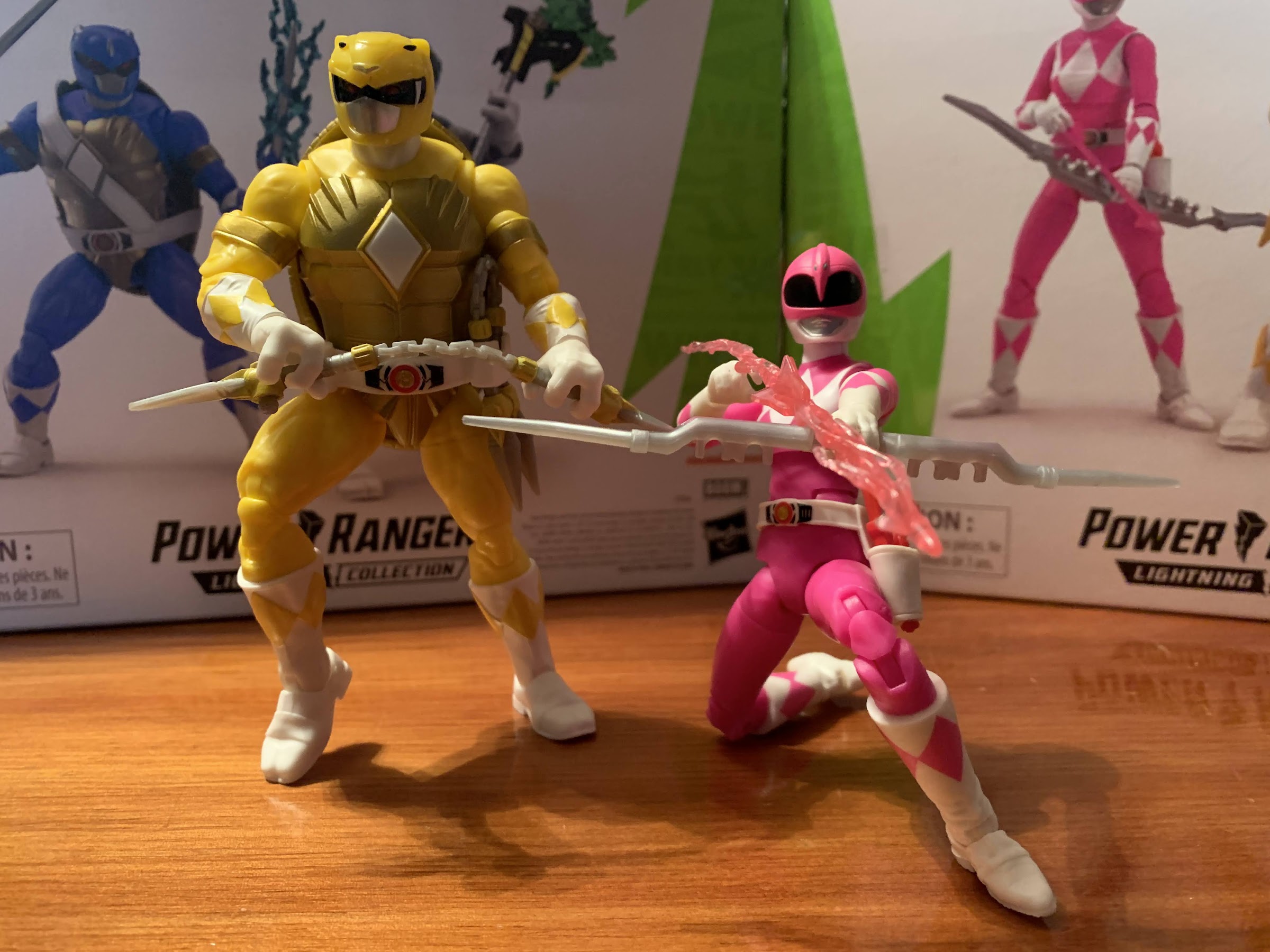
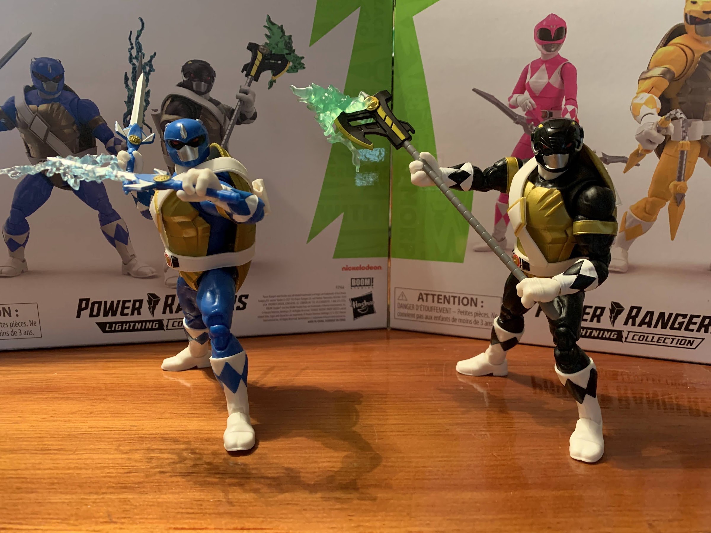
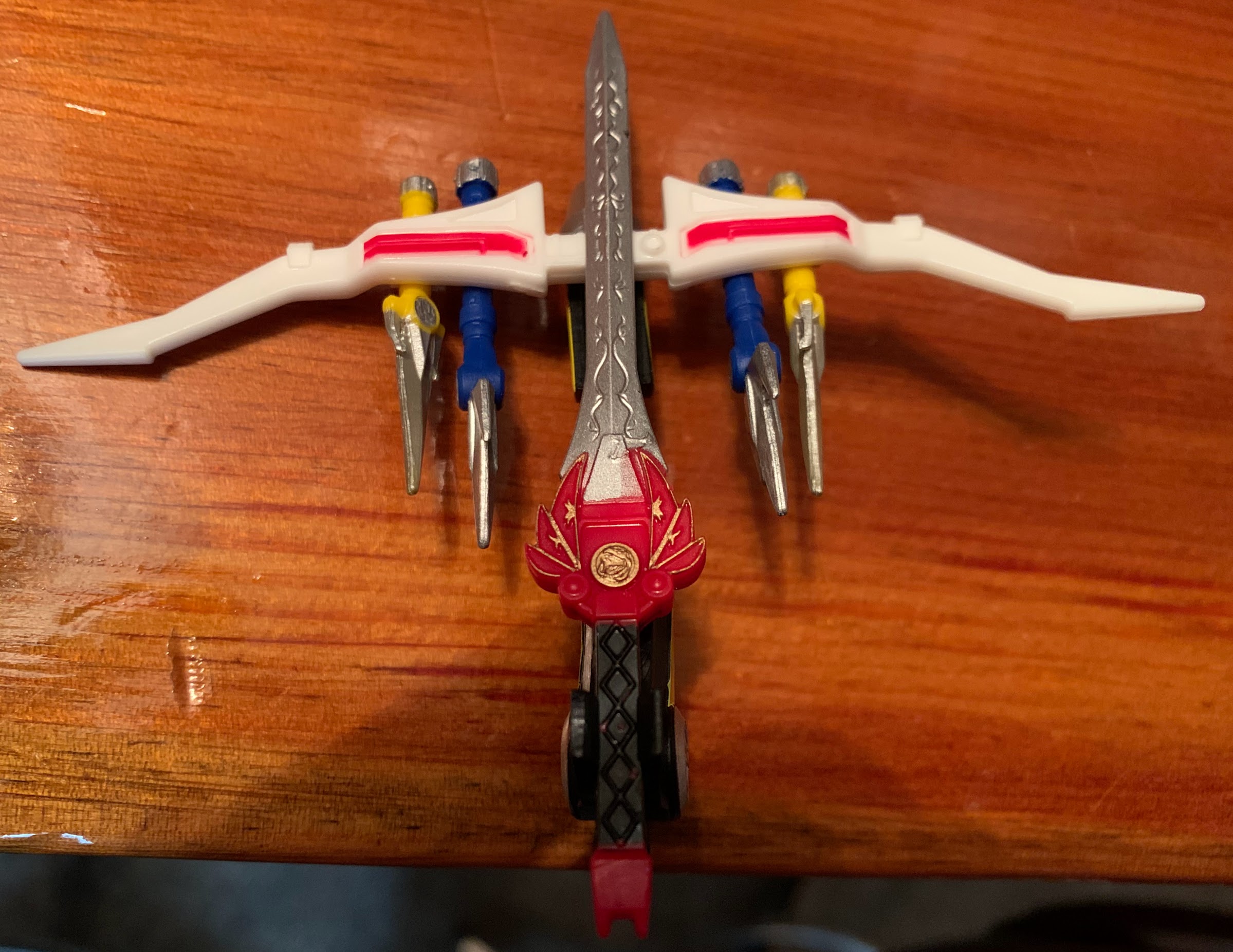
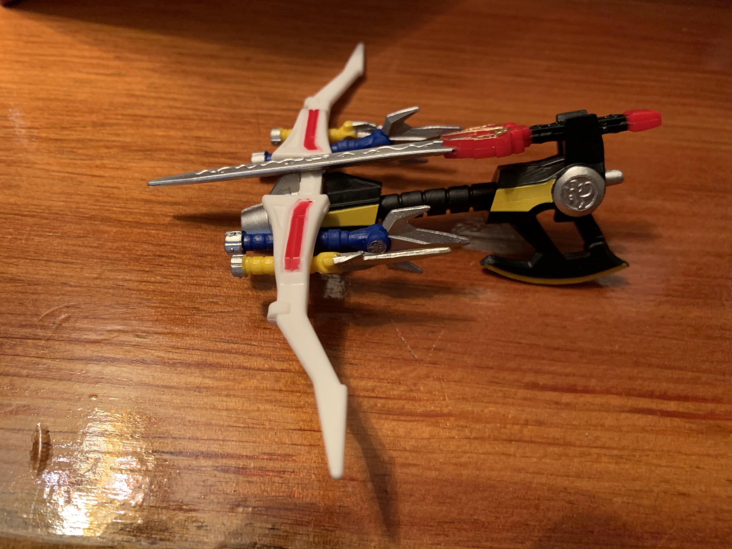
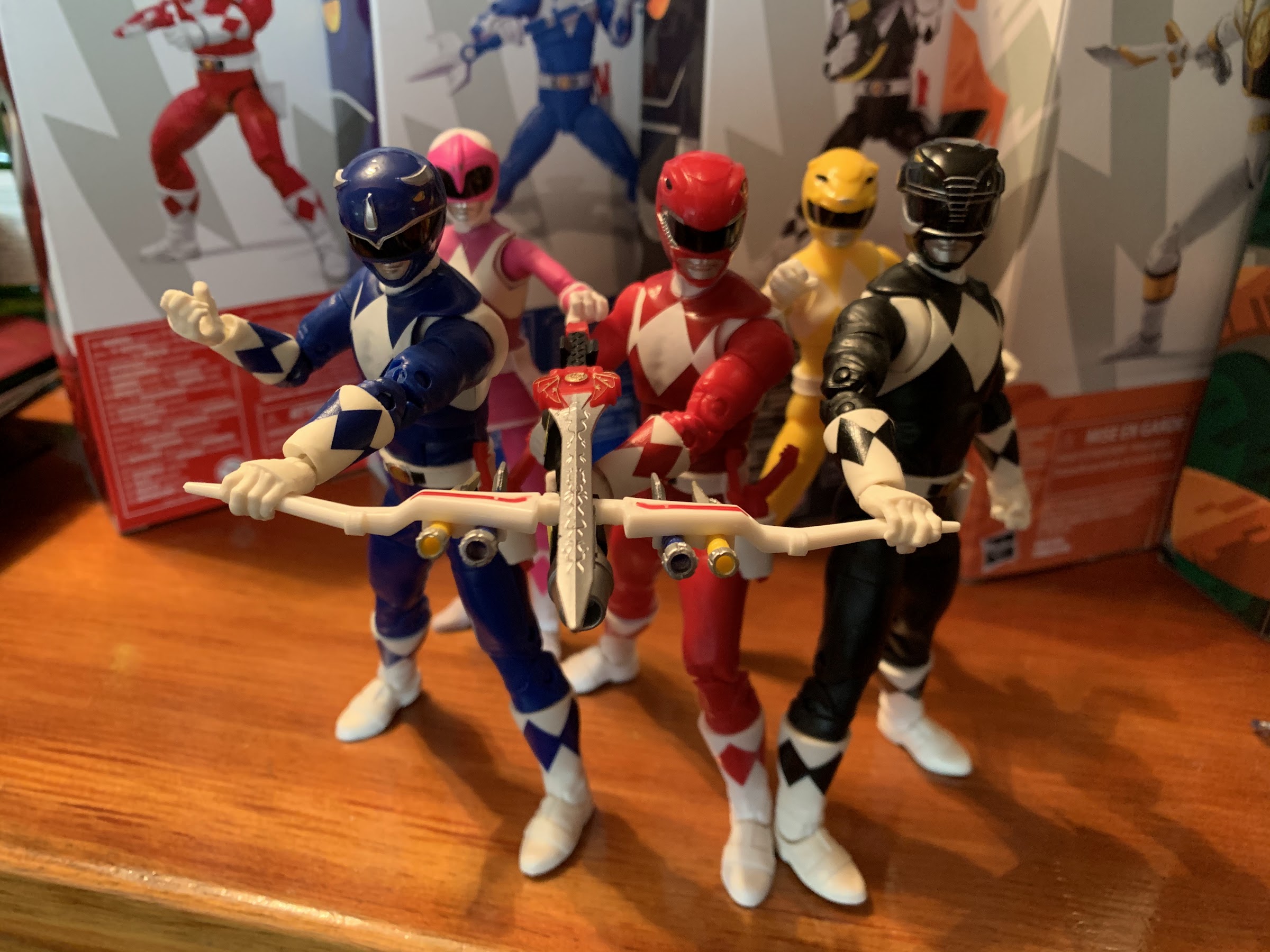
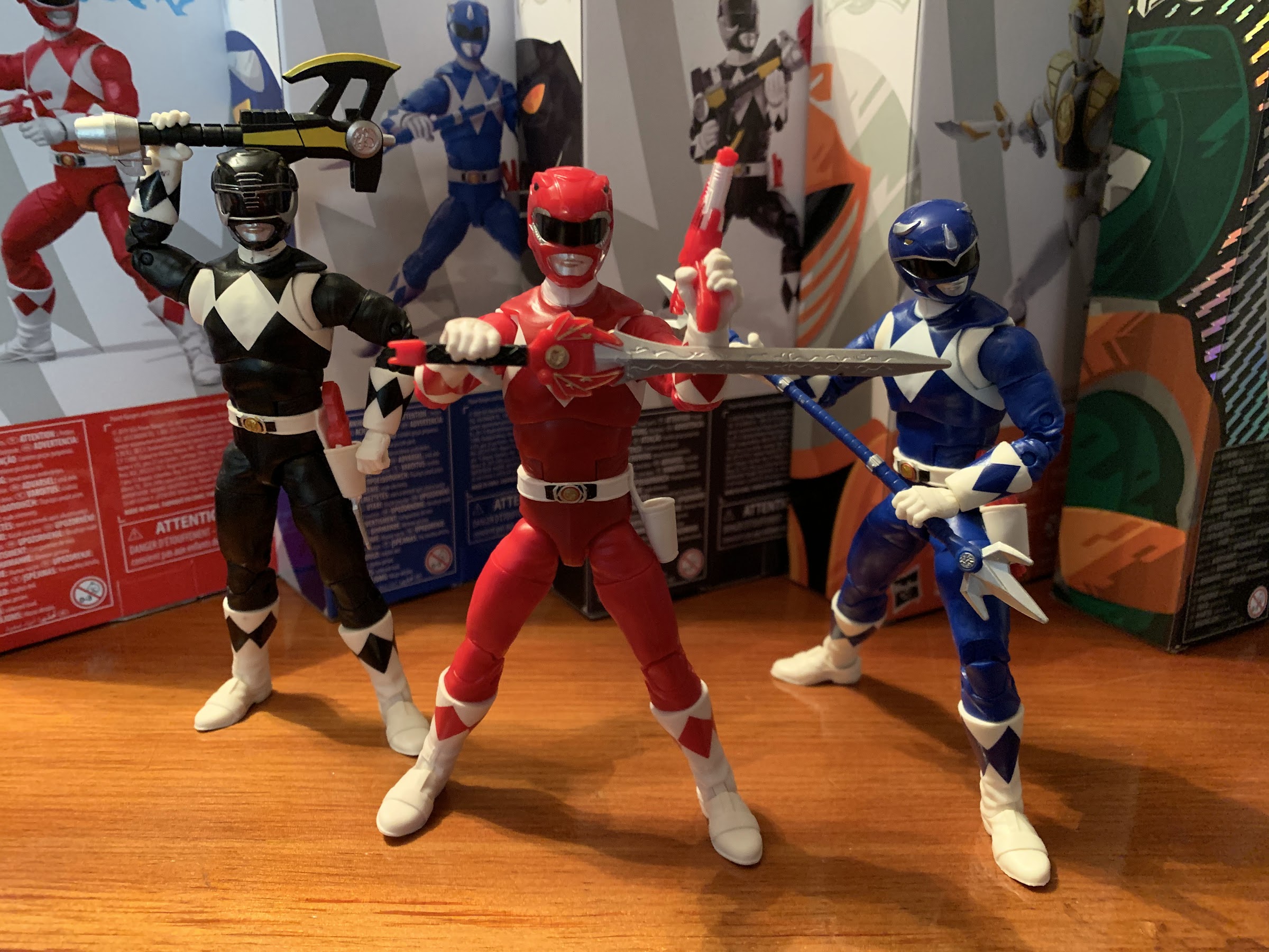
Both turtles get alternate methods of utilizing their weapons. For Leo, that means his swords combine, but for Donnie he just has a separate, standard, power axe.

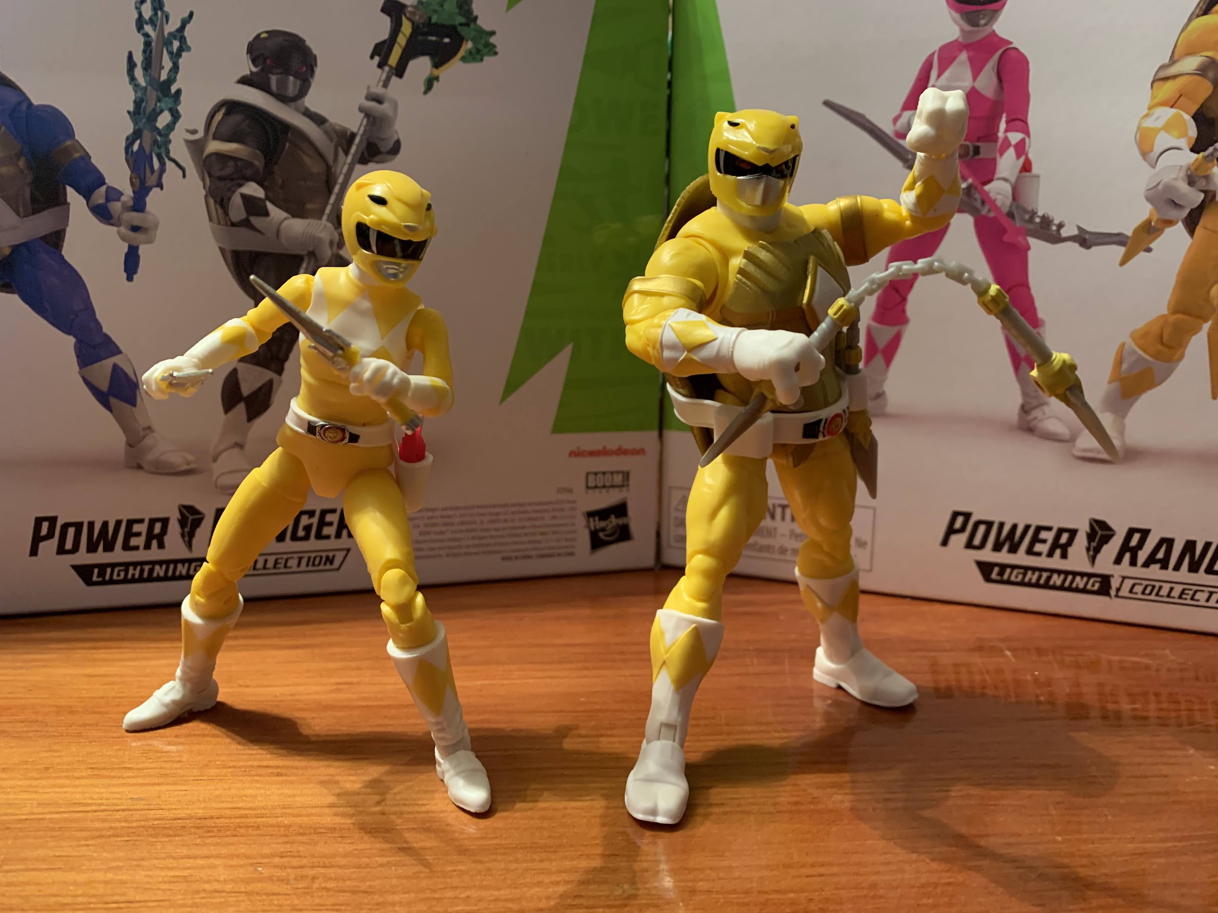
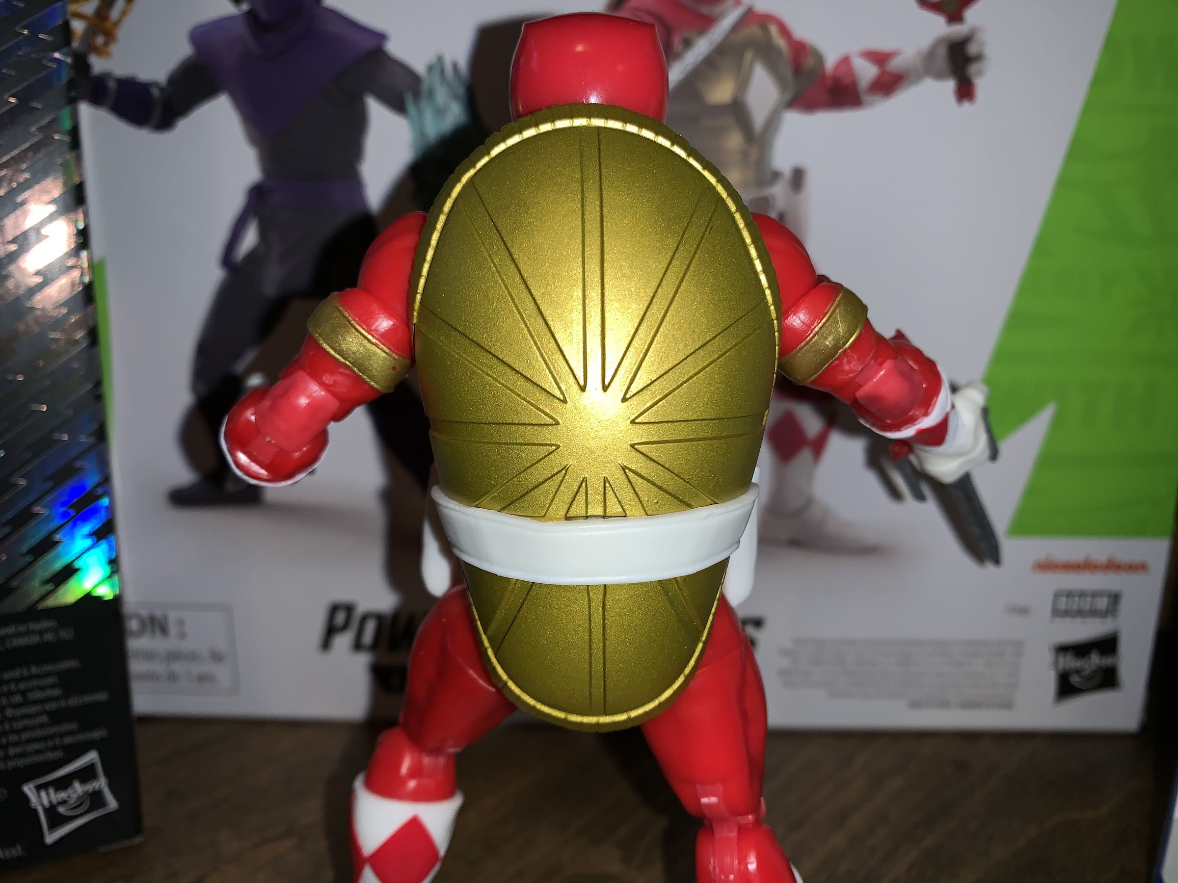
Leonardo and Donatello, as mentioned before, are the same as Raphael. The only difference is they feature the chest strap on their belt (just like the vintage toys) which contains the center diamond. On Raph, that diamond is glued into the chest, but on Leo and Don it just pegs in as part of the belt and can be pulled off. Leonardo’s belt crosses over his left shoulder while Donnie’s comes over his right. The insignia on the morpher is unique to each turtle: triceratops for Leo and mastodon for Don. The holster on the rear of the belt is also unique as it’s catered to the weapon of choice for each turtle. Donnie’s is interesting because we’re accustomed to companies making a tube on his back, but Hasbro chose to do the same, but with a slit through the side. Instead of jamming the staff portion of his weapon through one end and out the other, you can just push it in through the slit which is made of a soft plastic. It doesn’t look as neat, but it is easy and there would be less of a chance of paint rub with this design, though his weapon isn’t painted on the staff portion.

If you want, they can go mask-less, though I don’t know how many would want to do that.

The body of each turtle is essentially three colors: white, gold, and the primary color. Hasbro is able to engineer these guys in a way that allows them to use mostly colored, unpainted, plastic. The only paint appears to be the gold bands on the arms, the white on the forearms, and the diamonds on the gloves and boots. On Donatello, the white isn’t really opaque enough on the forearms so the black plastic shows through a bit. It contrasts with the white plastic hands which have a slight off-white hue. By contrast, the boots are quite clean, but that’s because Hasbro was able to do them in white plastic. Oddly, the knees and elbows are an ever so slightly different shade of black. Since they’re a joiner for the articulation it could be they’re a different type of plastic. It was more noticeable on Raph, but with Don it’s probably only apparent to me because I’m looking for it. On Leo, it’s slightly more uniform than Raph, with the exception of his left knee which looks darker than the rest. His forearms at least look a little better, but there’s more paint slop in general on him than Don as well as mold release imperfections on his limbs.

Weapon storage!

On the helmets, we have a little more going on. There we get some silver for the mouth guard and some of the features like the triceratops horns and mastodon tusks. Maybe it’s the shape of the turtle head, but Leo’s helmet comes across a little plain. He still has the black visor with red eyes inside as well as the yellow triceratops eyes on the side, but it feels like there could be a little more going on here. It could also be just the shiny, blue, plastic which gives off a cheap look. Donatello’s helmet is a bit better as the mastodon design has more linework. None of it is painted though so it’s not as striking as the black ranger figure from the Lightning Collection nor does it look like the art on the packaging. The silver paint on his mouth guard also isn’t as clean. Both come with an unmasked option which look okay. The design for these turtles is a bit more froggy than I personally like, and the heads look really small on the body. Leo gets a stoic expression while Don has a traditional turtle mouth and features goggles and a skull cap instead of the standard mask. I’ll probably never use these heads in my display, but I like that Hasbro gives collectors options.

There’s a very different approach to the shade of blue used when it comes to Leo vs Billy.

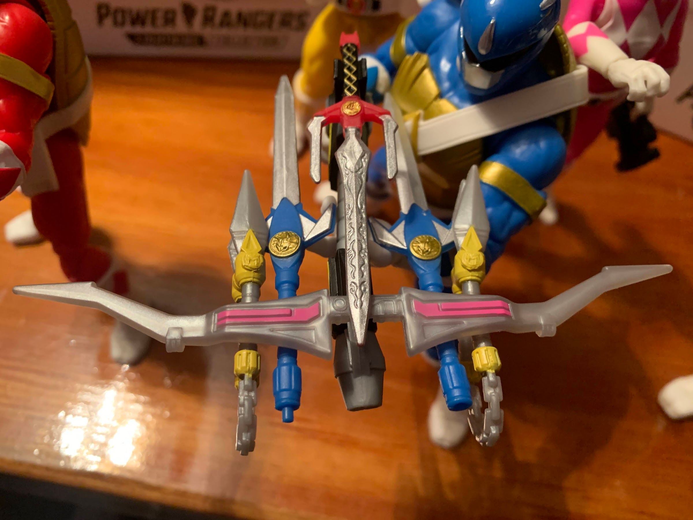
On the accessory front, we have weapons, effects, and hands. Like Raph, Leo and Don each come with a set of gripping hands, fists, and open hands. The gripping hands are the same from turtle to turtle so they have a vertical hinge and a wide gap between the fingers to accommodate Raph’s sai grip. That’s not really useful for the other turtles, and the grip isn’t perfect for Leo which is on the loose side. I love the vertical hinge, though I wish Hasbro had cut out a bit more room for it as there isn’t a ton of range there. For weapons, the blue ranger’s lance has been split into two, short, swords. They can connect like the lance to form basically a really dangerous looking weapon, but I suspect most will have Leo dual wield swords, per usual. Donatello gets two versions of the power axe. One is basically the standard axe, only the quality is less than what was released previously as it’s very soft and gummy and I had a hard time getting the “pump” action to work. Trying to move it just caused the entire barrel to bend, but some hot water freed it up, though it’s still not a smooth action. He also has a pole axe version which is what fits into his belt. It’s kind of neat, though the paint job on it isn’t terrific. The bulky turtle hands also don’t grip the standard axe very well in a firing pose. They also each get an effect part. Donatello has a green, flame, effect while Leonardo has a blue lightning effect that’s very similar to what the blue ranger came with. I don’t know if I’ll use either, but I’d rather have them than not. And there isn’t really anything missing, just shortcuts taken to keep costs down that harm the figures in a mild fashion. I’d rather have better gripping hands than what was packaged with Raph, but it’s more of a nitpick than a true criticism.

The power axe mold is unchanged from the black ranger release, just the paint and overall quality is different, which means the blast effect from the prior release works with this one as well.

The articulation for both turtles is the same as what we saw with Raph, which is mostly very good. The pin-less engineering on the double knees and elbows works very well as they look nice and the range is better than 90 degrees in both places. The range in the ankle pivots helps to make standing them fairly easy, though the shell does add weight to the rear of the figure making it a little tricky to do just a standard, vanilla, upright pose. They have articulation in the torso, but the shell limits it to basically just a waist twist. Hasbro did cut the bottom of the front of the shell in two to better facilitate this. The joints are all pretty tight, but not to the point where I needed to heat anything. The only joints that don’t really work are the butterfly joints in the shoulders. There’s just no clearance because of the shell on both sides, so I don’t know why it’s here. Even with that limitation, these are some of the most dynamic Teenage Mutant Ninja Turtles ever produced, probably surpassed only by the S.H.Figuarts versions. Obviously, the costume makes these almost a completely different animal in terms of aesthetics, but I can see why some people are interested in seeing what Hasbro would do with a proper line of TMNT figures.

For a ninja, balance is key.

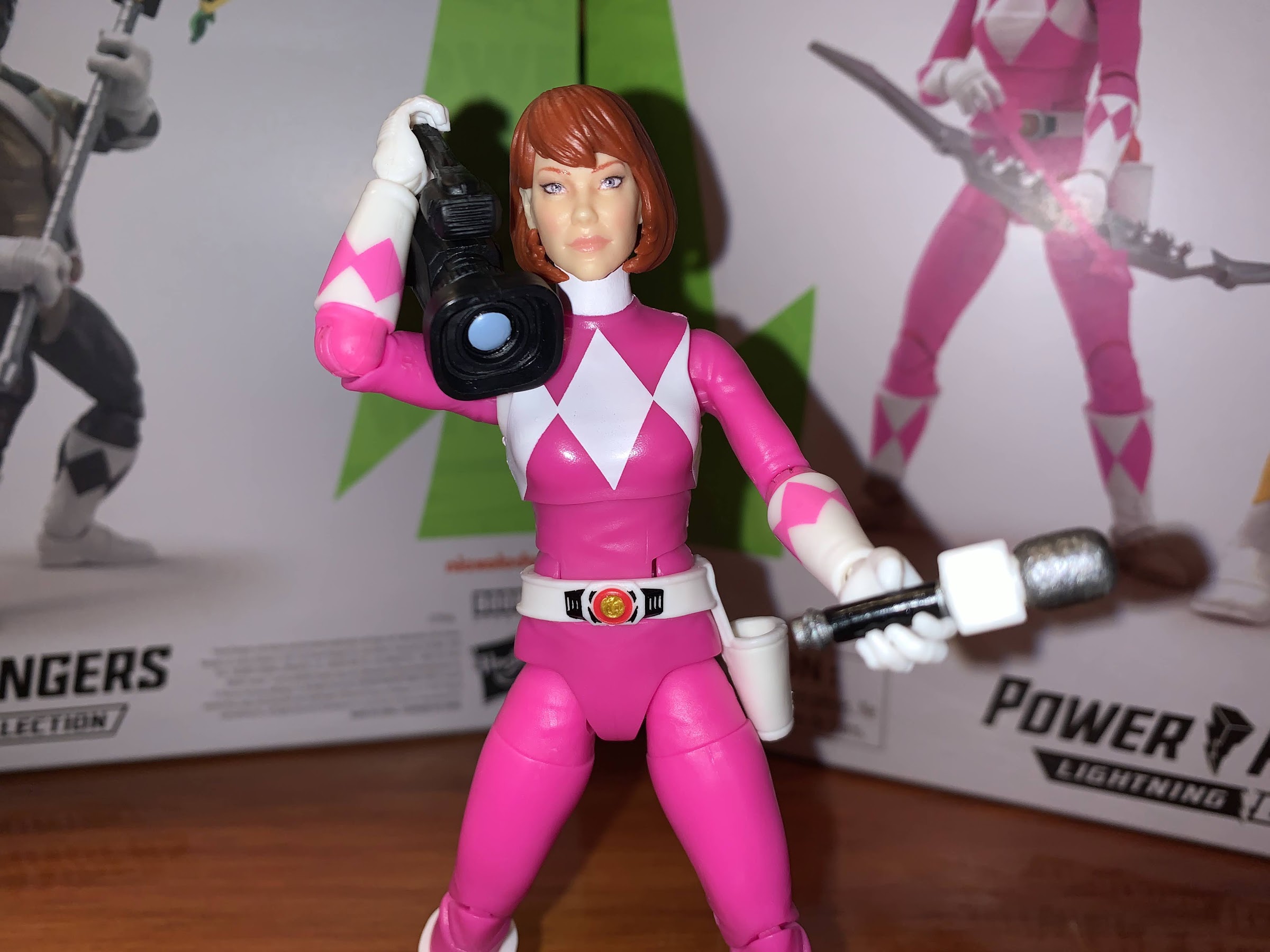
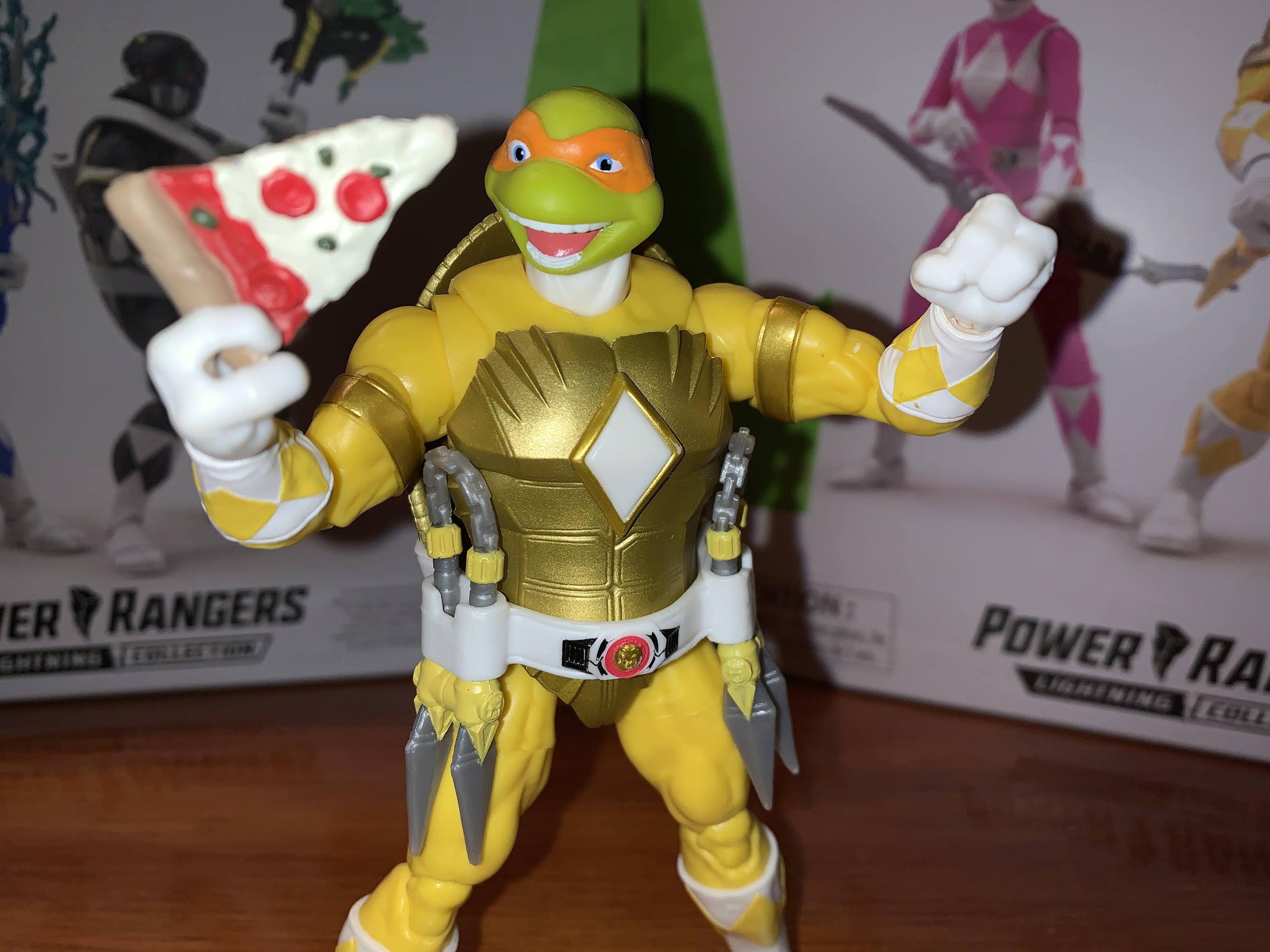
Reviewing this set is pretty easy after having reviewed the Raph and Tommy set. If you liked what you saw there, then you’ll be pleased with what’s present here. Hasbro does skimp on the paint, but the sculpts are interesting and the figures are pretty well engineered. It all comes down to style: do you like this mashup of Mighty Morphin Power Rangers with Teenage Mutant Ninja Turtles? If so, then you’ll enjoy what Hasbro has put together. I think these make for a fun display whether you’re more of a MMPR fan or a TMNT one, and if you happen to like both, well then this was practically made for you. And I do like how Leo and Don turned out especially. The black and gold color scheme just works, while I’ve always been partial to Leonardo. I like the lance/katana cross more than Raph’s sai/power sword combo (it helps that Leo’s weapons are painted better) and I definitely like the versatility of both weapons here. Even though this two-pack is essentially the same figure times two, I think I like it a little more than the Raph and Tommy set. Sorry Tommy, you’re just not nearly as interesting as a turtle in a Power Rangers costume. Check back next week when we take a look at the final two-pack in this series: Michelangelo and April O’Neil.

Come back next week and I’ll tell you all about how the weapons combine!

Hasbro Retro Card Symbiote Spider-Man

“Let him out! We hunger for brains!”

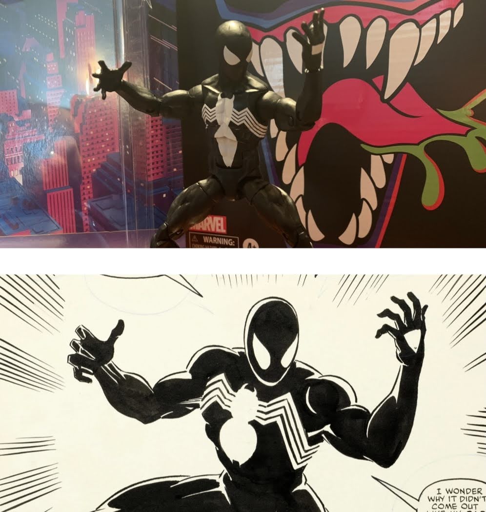
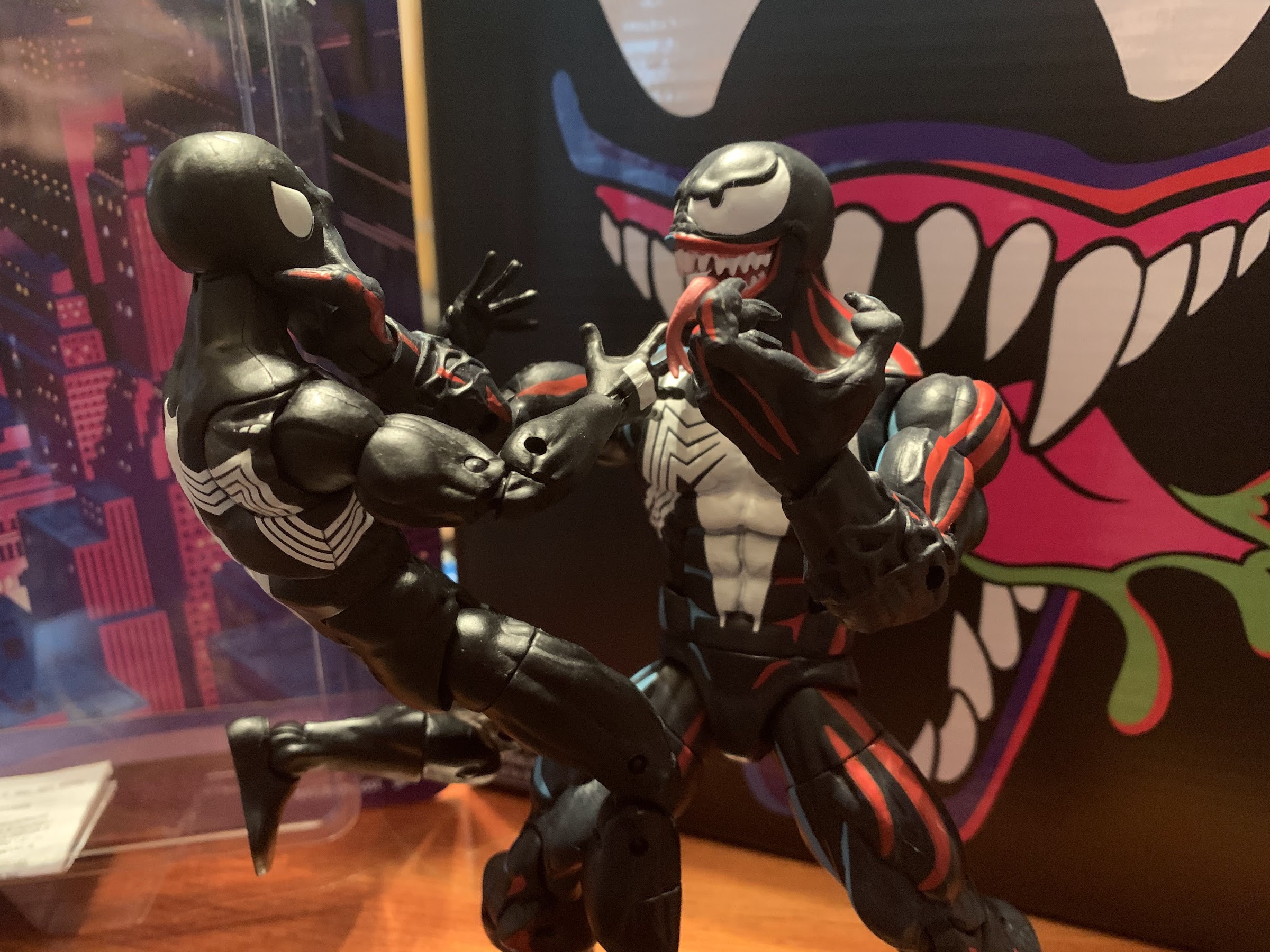
One of the most iconic costumes in the world of superheroes is definitely that of Spider-Man. I put that classic red and blue with webbed detailing right up there with Superman and Batman. I would argue that there’s no more iconic costume in the world of Marvel than Spidey’s, and the crazy thing with Spider-Man is he really has two now iconic costumes. The Black Costume, the Symbiote Costume, the Alien Costume – whatever you call it, is pretty popular on its own. I know I’ve encountered several fans who even prefer the black look to the classic one. I can’t go that far with it, but I do enjoy it, even if Venom has largely taken ownership of the look over the years.

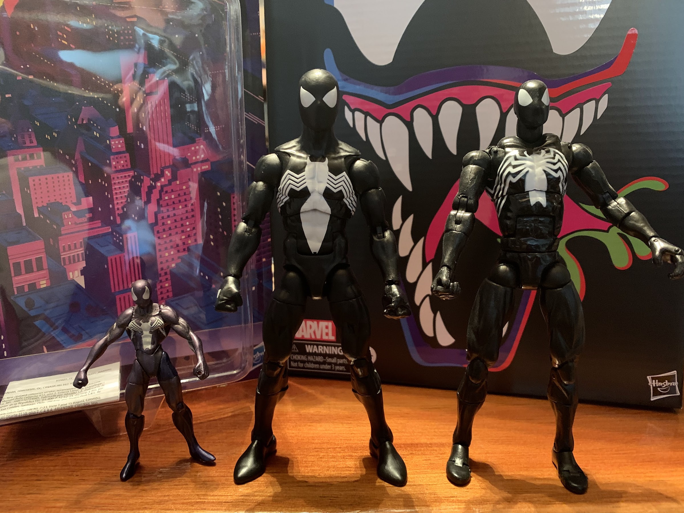
A small sampling of black costumed Spidey’s of the last 20 years or so: Kaiyodo Ultimate Spider-Man, Hasbro, Toy Biz Spider-Man Classics. The new one is an improvement in almost every way save for the “web holes” on the back of the Toy Biz Spider-Man’s hands.

The Symbiote costume has been popular. I can still remember when it first showed up in the ’94 Toy Biz line alongside the Venom II action figure. I wanted it, but because it was so popular, I had trouble tracking it down at the usual spots. I did have a local, dedicated, comic book store that had it along with Venom II. Unfortunately, they wanted 10 bucks for it which was double what Toys ‘R Us would charge me. I could only get one, so I got Venom. When I had replenished my funds, I could have gone back for it, but it was one of those figures saddled with a bad gimmick that made for an unattractive presentation. That was a thing we had to deal with back then. I didn’t mind a gimmick if it didn’t harm the sculpt, but ones that did were the bane of my existence as an action figure enthusiast in the mid-90s. I never ended up getting that figure, but I did get the 2022 edition so I feel like I’m making it up to my younger self.

This mold is an update over the prior one with the biggest addition being the diaphragm joint.

The retro card series from Hasbro is essentially just a subline of Marvel Legends. The packaging reflects the old Toy Biz line, right down to the artwork used for repeat characters. It does cause some confusion as collectors aren’t quite sure if this is an homage line or a line that’s supposed to reflect the animated series itself. I see this most with the recent Hobgoblin release, even though it looks nothing like the old cartoon. Homage line seems to be the right call. That Toy Biz line wasn’t a direct animated line either, though it was much closer to its source material than the X-Men line. What this line certainly isn’t though is a dedicated toon line like the upcoming X-Men one Hasbro is launching this year. These strike me as designs based on the comic with nostalgic packaging.

Together at last.

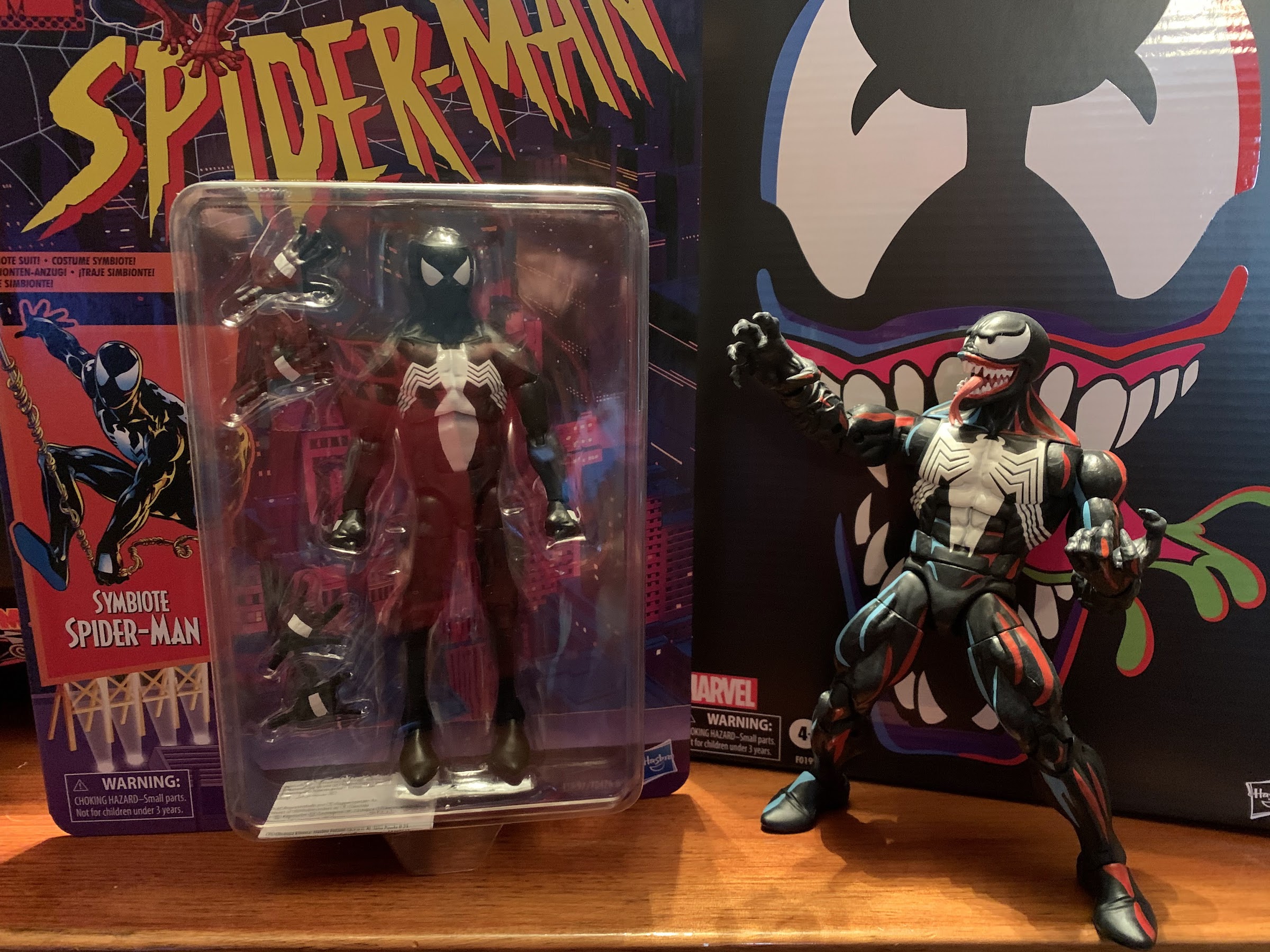
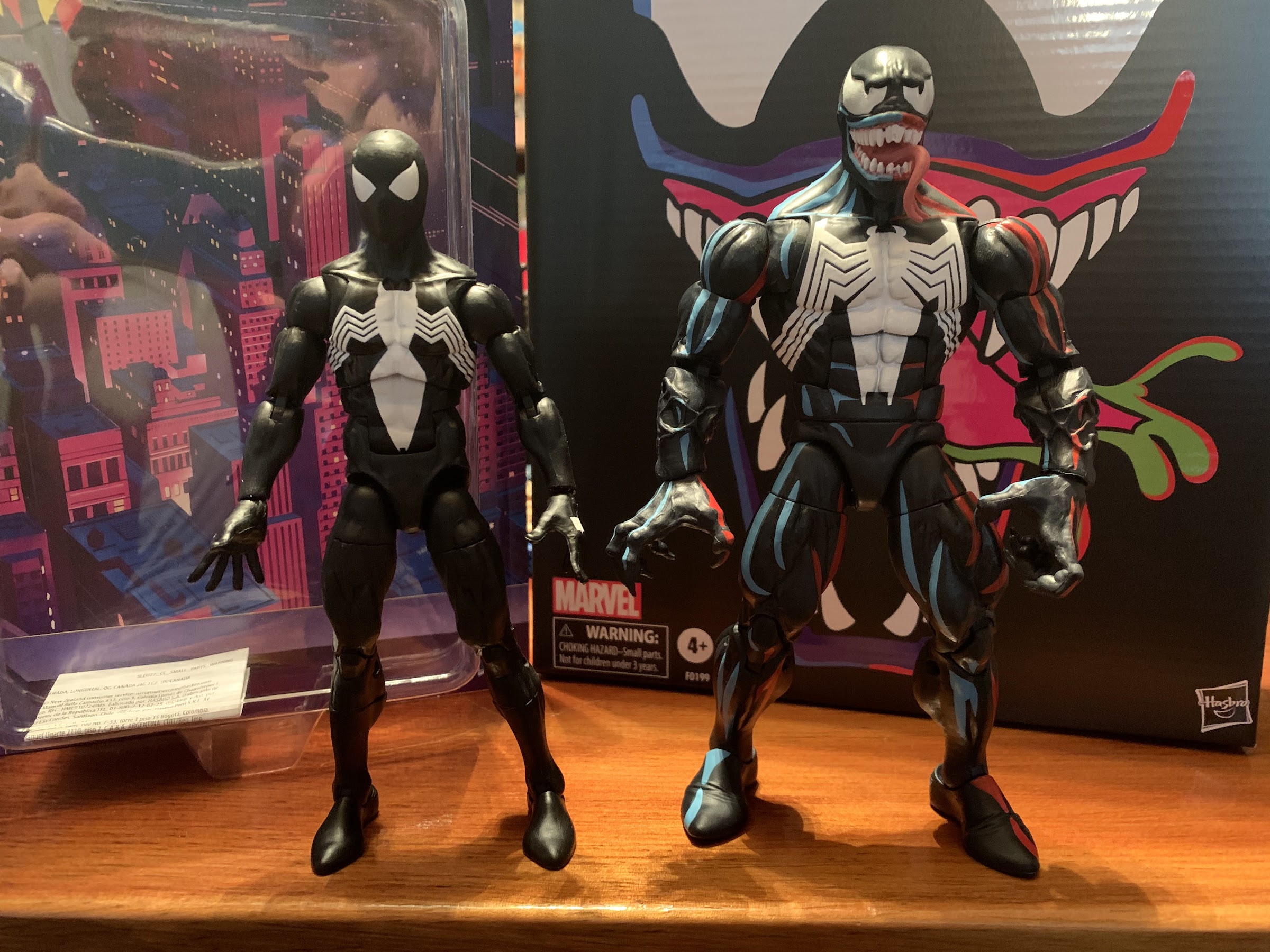
The exception, of course, is the animated Venom released last year. I have a lot of nostalgic attachment to Venom and the show, so I wanted to grab that release. When I did, I knew I wanted to at least pair him with a Spider-Man. As a bit of a fill-in, I grabbed Web-Man because I really liked the color palette. I also put in an order for this Symbiote Spider-Man when solicitations went up so the long goal was always to get this guy for my display and now he’s here.

The best I can do to visually illustrate my shoulder critique.

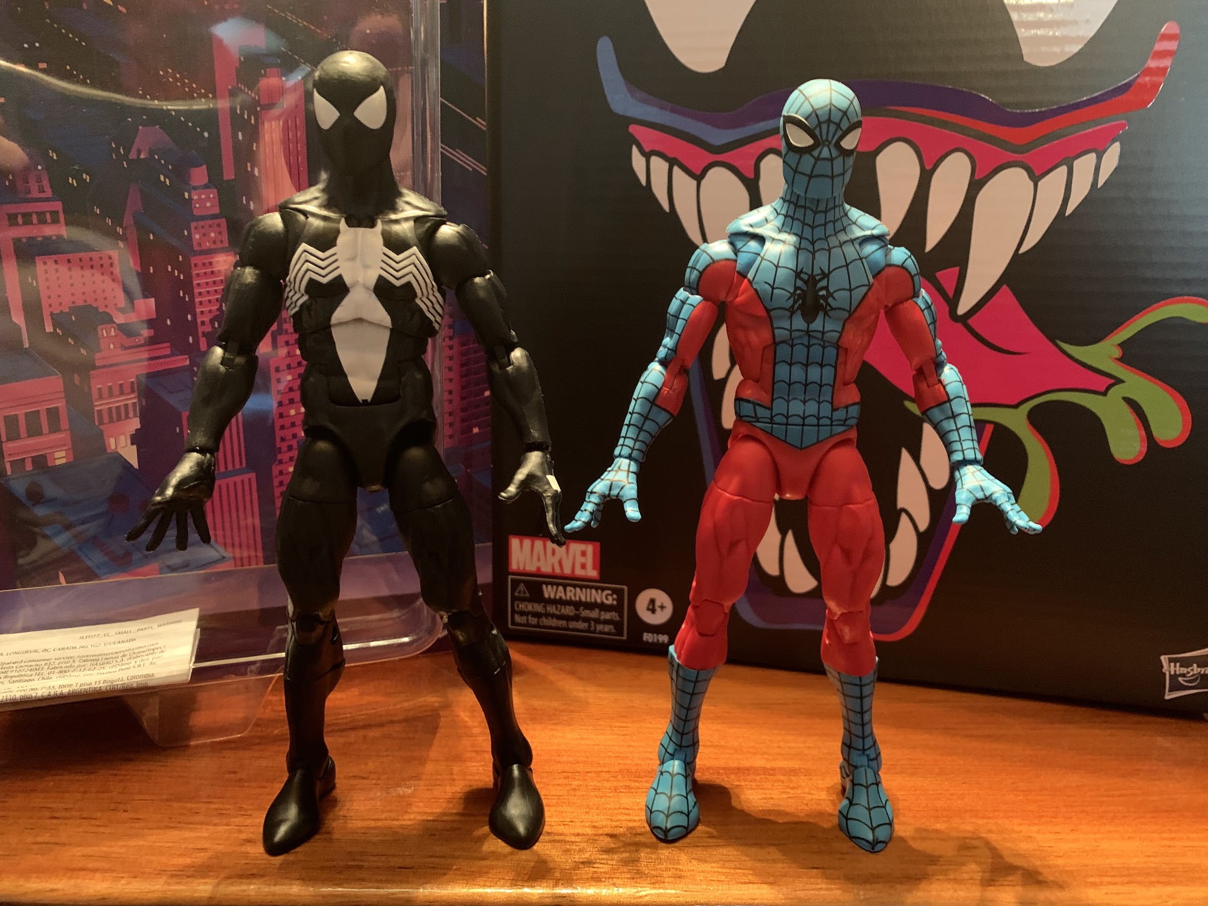
This Spider-Man is actually on a different body than Web-Man. I think Web-Man is on the “pizza body” and this version is on the updated body. They’re not vastly different, but there are some. This Spider-Man stands a tick shy of six and a half inches, which seems tall to me, but I’m not a regular collector of this line and can’t speak for how others feel. I don’t believe it’s a true 1/12 scale line. The overall look is pretty much what I envision Spider-Man to be. He’s well-muscled, but lean compared with the more bulky heroes out there. I really like the head shape which has a more pointed chin than Web-Man, and Hasbro did a solid job of minimizing the look of the articulation. It helps that this is a character in an all black suit so you don’t get unsightly issues like the color of the pins not matching the surrounding area. My one real critique of this body is a common one I have for Marvel Legends and it’s the shoulders. They just sit so low on the body. It’s not as noticeable as it is with Web-Man, but it’s something that needs to get better. They just really like this look of large traps sloping down into the shoulders when superheroes tend to have really big shoulders! These ones even sit entirely below the sculpted clavicle. It’s not super noticeable if you pose him well, but this design isn’t really helping out articulation (which we’ll get to) so I don’t understand why it persists.

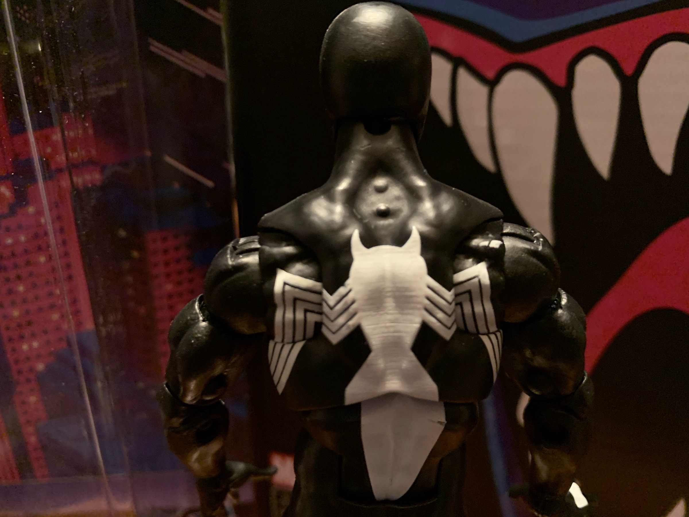
At least the paint slop is on the rear of the figure.

Being an all black figure means there’s little need for paint. Had this been a true toon line, or one aiming to even replicate comic shading, there would be a need for blue highlights, but that’s not Hasbro’s style. He’s all black save for the white portions. And when it comes to that, we have almost two figures. From the front, he looks pretty great. The eyes are well-defined and well-painted. I love the shape of them. The logo on the chest is quite clean as well, though the opacity of the paint is subpar. There’s too much black showing through giving it a grimy appearance. That’s true of the white panels on the hands as well. Here, we have a possible error too as there’s no “web hole” even though the packaging claims this is the symbiote suit. Longtime fans know that when Spider-Man ditched the alien, he still kept the black look as a traditional costume so in that sense the absence is not an error. It’s a nitpick, I know, but how hard would it have been to get that right? On the rear of the figure, the spider logo is more messy. There’s a scratch on mine in the lower torso and some excess white paint just behind the right shoulder. It’s on the rear of the figure so it’s not a huge deal, but it’s an error and one of those that you can’t even see when inspecting a figure in the card which is always frustrating.

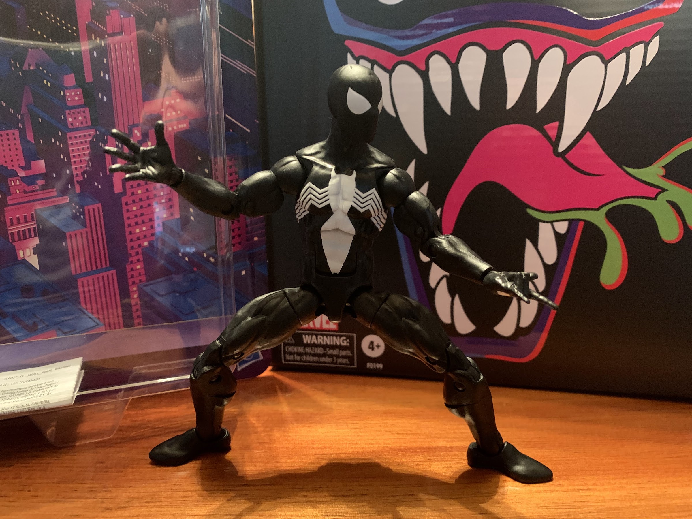
Spider pose!

Spider-Man is known for being rather nimble, so of course a Spider-Man action figure is packed with articulation. This dude has a lot, but it’s not all as functional as it probably could be. His head is on a ball-peg and that has plenty of range. The shoulders are ball-hinged and this is the area I alluded to earlier. He can’t raise his arms out to the side all of the way and getting him into a swinging pose is more challenging than expected, but do-able. He does have butterfly joints and they’re okay. Hasbro painted the spider logo all throughout the joint so you don’t get an ugly gap on the rear of the figure. The legs won’t be aligned, but there’s no real helping that. There’s a biceps swivel, double-jointed elbows, and the hands swivel and hinge. All of the hinges are horizontal. There’s a ball-joint in the diaphragm which lets the figure tilt n’ twist. The spider will obviously become miss-aligned when you do so, but again, there’s no helping that. There is a solid amount of clearance between the upper and lower torso so paint rub is minimal, but still something to watch out for. The joint also lets Spidey bend back a bit and crunch forward and when used in tandem with the ab crunch below you get quite a bit of range. There’s no waist twist, and the hips use a ball and hinge so you can drop the legs down. The drop-down function doesn’t really add anything as he can kick forward just as far either way. His butt cheeks prevent him from kicking back, but he can go out to the side almost to a full split. There are thigh cuts, double-jointed knees, a boot cut, and ankle hinges and rockers and all have plenty of range.

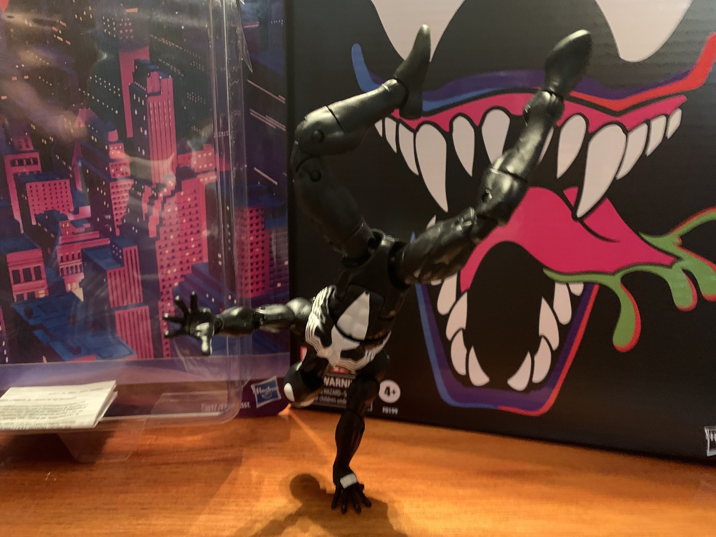
If you’re persistent, you can even get a one-handed pose. Note: the figure did fall over shortly after this picture was taken.

This figure articulates well enough. If I were allowed to design it, the only thing I’d change is those shoulders and the hips. Normal ball and socket hips would allow a thigh twist there so we could ditch the kind of ugly thigh cut. I just find that style of cut useless because it miss-aligns the muscle groups and just looks stupid. This guy though can get into most Spidey poses. The one that’s still out of reach is the classic three-pointed stance. To aid in his posing are some extra hands, which are the only accessories he comes with. He comes with fists hands and he can swap to open, “wall-crawling,” hands and web shooting “thwip” hands. The thwip hands don’t make any sense if this is the symbiote suit, but I think they’re still good to have. No gripping hands is kind of a letdown, but he also has nothing to grip. I would love web effects, and they’ve done them in the past, and that’s something sorely missing. This is also a $22 figure and accessories and paint are where Hasbro skimps with them. I’m not surprised, but I can still want more. And what really could some already tooled web effects actually add to the cost here? It’s probably less than a dollar, probably far less, but that’s what you get with Hasbro.

It would look better with some web effects…

And cost, or rather price, is really the main goal with this line. Hasbro wants to get you a good enough action figure at a low cost. This isn’t an import figure or a boutique thing, it’s a mass market retail release. As such, it’s pretty good! The figure does have that cheap feel when compared with a lot of other figures I own. The plastic can feel “gummy” at times and little in the articulation is smooth, but it’s also not loose or stuck so that’s a positive. And this is also a style of character that really fits what Hasbro wants to do: simple sculpt, simple paint, lots of articulation points. There’s a reason Hasbro keeps reusing this body, because it works. And for me, it gets the job done as now I have a Spider-Man to pair with my Venom. It would have been cool to get an animated deco, but this is fine. There are rumors that Hasbro intends to do an animated Spidey in his classic red and blue, and if so, I’ll probably take a look. Should they do that, I hope they at least update the arms to a pin-less system as I really hate how those look on the already released Spider-Man figures which end up with unsightly red dots on their underarm. I don’t know if it will be a deal breaker, but I guess I’ll know when I see it.

In this house, Venom always gets the upper hand.

Symbiote Spider-Man is currently being stocked by both Target and Walmart with other smaller shops still awaiting product. It’s a popular release, so it doesn’t hang around on pegs for very long. I actually got mine via Hasbro’s eBay page which doesn’t charge for shipping. If you’re still looking, maybe keep an eye on that and see if they do a restock. It’s popular for a reason so I would expect the figure to remain in production for at least a little while, but with all of the delays around the world, it could be awhile. Stay vigilant and good luck and if you have to go to the secondary market at least the prices don’t appear to be outrageous.


Hasbro Power Rangers x TMNT – Tommy and Raphael

Well here’s an interesting pairing.

When Mighty Morphin Power Rangers arrived on Fox Kids in 1993 it quickly became a ratings juggernaut. It was the hottest property around aimed at kids and seemingly everything got knocked down a peg as a result. By contrast, Teenage Mutant Ninja Turtles was embarking on its downturn. The third film wasn’t nearly as successful as the first two and the toyline was starting to show its age as it went into a lot of wacky offshoots. The Power Rangers formula became the new thing to imitate. Footage of martial arts shows from Japan edited into something American kids could identify with was both cheap and effective. And given that TMNT had already been successful in live-action before, it’s perhaps not surprising that Saban made one of the first attempts at reinvigorating the franchise with The Next Mutation.

The Next Mutation ended up being a flop. Either kids were sick of TMNT, disliked the cheap costumes, or failed to gravitate towards the new characters. No one can be certain, but during the show’s lone season it did cross over with Power Rangers. Of course, by then the Mighty Morphin era was over so kids who loved TMNT and then jumped to Mighty Morphin had little reason to enjoy the crossover. It wasn’t their preferred take on either franchise, and it seemingly failed to do much to boost either property.

Looks like we have ourselves a Foot Soldier, or do we?!

Eventually the turtles would come back to animation, and now more than 30 years removed form the cartoon’s debut it’s a supremely nostalgic, and profitable, property once again. Power Rangers, for its part, has never truly gone away though it has changed hands a few times. Now a Hasbro property, the Power Rangers can still be found on television and there’s always rumors of another movie. And in the pages of Boom! comics, the Mighty Morphin team can seemingly live forever! It was in those comics that the crossover fans wanted to happen finally did. The turtles, basically as seen in the pages of IDW, met-up with the Mighty Morphin Power Rangers. I don’t know why or what the big threat was that caused it to happen, but it did lead to some slick designs which are now being immortalized in toy form by Hasbro.

No way! It’s Tommy!

Hasbro has been around for ages, but it’s never been able to get its hands on Teenage Mutant Ninja Turtles. I’m not sure if the company has ever put forth a strong bid for the property when it has come up for sale. It seems most times this happens the franchise is in a dry spell which has probably made it easy for Playmates to retain ownership. That ownership has been tested over the years though as we’ve seen TMNT product from NECA, Super7, and even DC Collectibles. Now it’s Hasbro’s turn, but they’re giving us something pretty different.

Ninja Tommy!

Released as part of its Lightning Collection, the new Power Rangers x Teenage Mutant Ninja Turtles line is being released as three two-packs and a single carded figure. Each two-pack contains one or two of the turtles as they appear in the comics when morphed. Yes, the turtles become Power Rangers and the end result is pretty cool. Their limbs are pretty much the same as the regular rangers, just beefier, but they seem to all gain the Dragon Shield in the form of a gold shell. The front of which contains the signature white diamond, while the rear looks almost like a sunburst. The helmets are largely the same though, just form-fitted for a turtle head. They also gain red eye-slits in the visors for some reason.

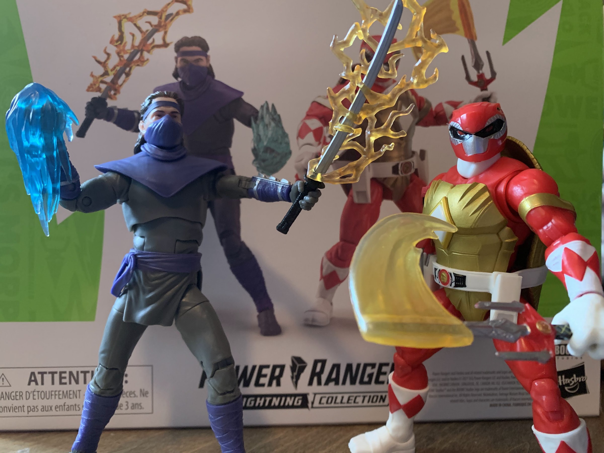
The first two-pack I was able to get my hands on is the Tommy Oliver as Foot Soldier with Raphael as the Red Ranger. When it came to crossing the two franchises, Boom! had to decide what was more important: color or weapon of choice. If going by weapon, Leonardo should have been the Red Ranger since both wield a sword and are the leader, but you can’t make Leonardo red. Instead, Raphael gets the nod here and his sai are just given a Power Sword makeover. As for Tommy, it’s my understanding he goes undercover as a Foot Soldier in the story, but the figure basically doubles as a generic Foot Soldier as well. It’s just a shame he’s sold in a two-pack since some collectors would likely buy multiples. Instead, it’s Shredder as the Green Ranger that gets the solo treatment.

Cool sword, bro.

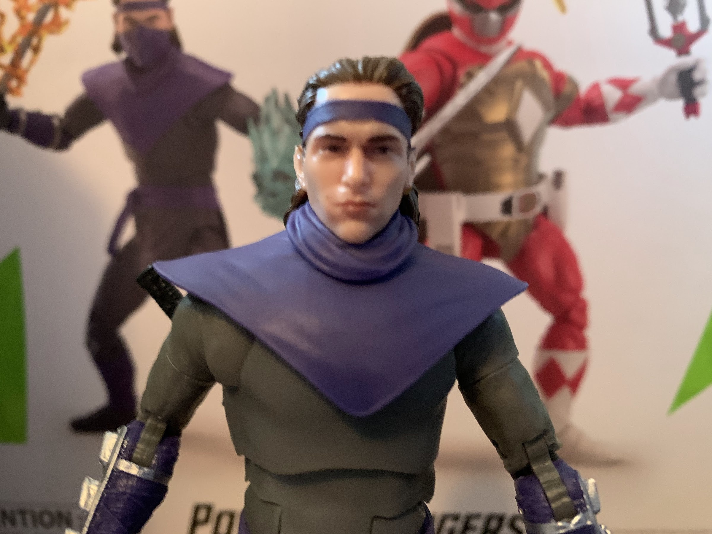
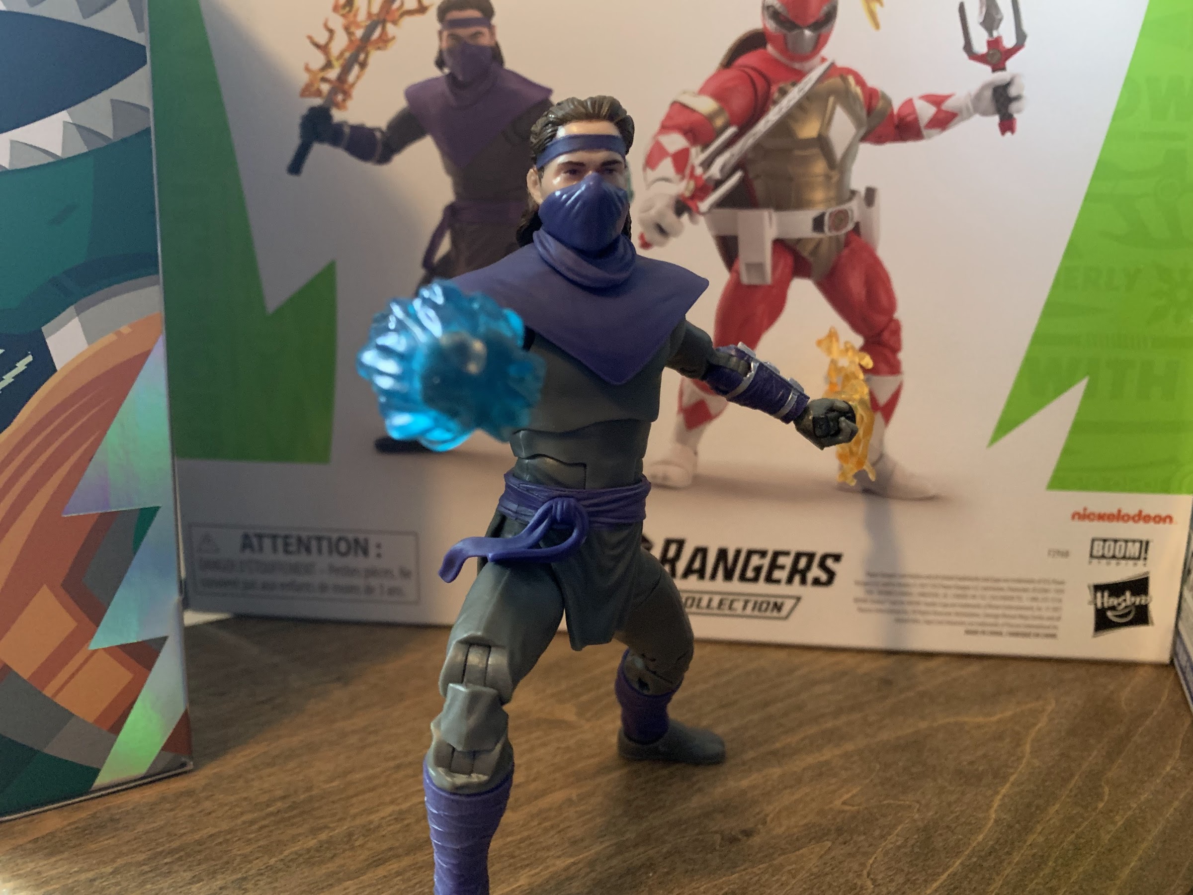
I think most are going to be interested in these sets for the turtles, but lets get Tommy out of the way. He’s basically a standard Lightning Collection release. I believe most of this body is reused from the Putty figure, but I don’t have that figure to say for certain. It’s fairly similar to the Ranger body from the Lightning Collection and contains all of the same articulation points. The Foot Soldier head is obviously new and contains some nice, subtle, details on it to show how the mask separates. I wish there was some dry brushing on it to bring it out, but Hasbro isn’t one for paint. Most of the figure is just cast in colored plastic: purple and gray, with some shiny, steel, bits on the forearms and rear of the hands. It’s a new look for the Foot Soldier, but it’s also pretty obviously a Foot Soldier to anyone familiar with TMNT. It’s solid, though a bit underwhelming. The alternate Tommy head appears to be the same one that came with the Green Ranger figure, but with the bandana tails coming straight off the back of the head and painted purple. There’s also very little paint on it so it doesn’t have the more matte appearance of the Green Ranger release.

The man…turtle of the hour.

Raphael, on the other hand, is basically all new. His body is of the pinless variety, so no pins in the elbows or the knees which is definitely welcomed. The red is basically all colored plastic so there aren’t any harsh variances like there were with the Jason figure I looked at. The joining pieces for the elbows and knees do appear to be a slightly paler red. I don’t really notice it on the knees, but I can see it on the elbows when inspecting the figure closely. It’s no where near as bad as it was with the Jason figure, but still a bummer. The ends of the gloves are painted white with the red diamonds which are pretty clean, but there is some chipped paint near the wrist on mine. The hands, which are cast in white plastic, are also a touch more off-white than the paint which is a little annoying. There’s also some chipped paint on the gold armbands. It’s pretty standard stuff for a Hasbro figure, but still worth pointing out.

A Power Ranger that actually looks intimidating.
The rear of the shell is pretty neat.

The sculpt on Raph is pretty cool though. He’s quite bulky and his limbs are longer than usual. He stands a full six inches putting him on par with Tommy so this is definitely a taller turtle than we’re used to seeing. The change in proportions does give him an undersized head as well. It doesn’t bother me with the helmeted look, but it stands out when swapped with the turtle head (which we’ll get to). I do like how the shell was designed, and since these proportions are more human, it probably shouldn’t come as a surprise that the rear of the shell is a bit more sleek than usual. The white belt is still a floating piece and it has the morpher on the front and a place to store his sai. He doesn’t have a power blaster, but I don’t know if they used them in the books.

Raph passes the old one foot test.

As for articulation, both figures are the same, but different. Tommy, as noted, is pretty basic Lightning Collection stuff. He’s got a ball peg in his neck that lets him look up, down, swivel, and tilt. The Tommy head has less range due to the hair, especially if you add in the cowl. The shoulders are ball-hinges with butterfly joints. They go back pretty far, but not forward much which is weird as one would prefer the range be reversed. The elbows are double-jointed and go past 90 degrees. There’s a biceps swivel and the wrists swivel and hinge. The hinges are vertical, which earns Hasbro a big thumb’s up! In the diaphragm is what’s probably a double ball peg. It doesn’t go back really at all, but it does allow the figure to crunch forward a bit, rotate, and tilt. Combine it with the ab crunch though, and you get a lot more forward and back. The legs are on ball pegs and allow the figure to almost do a full split. He can kick forward too, but not back because his buttcheeks get in the way. The thigh can swivel on that ball peg and also below it as there is a thigh cut. The knees are double-jointed and go past 90 there and there’s a boot cut and hinged ankles with good rockers.

Tommy can also serve as just a generic Foot Soldier for Raph to beat on.

As for Raph, he has all of the same including the vertical hinges on his gripping hands. The only differences are his butterfly joints are basically useless and he has a joint in the base of the neck so his up and down range at the head is quite good. He also has no diaphragm joint given that he’s a turtle and all. Hasbro did give him a waist cut which splits the shell in the front. It’s basically just what you see below the belt, and while it does look a little funky to have a turtle in a pose that results in his shell not lining up, it’s worth it to have that extra articulation. Likely owing to his more bulky design, Raph also doesn’t get much out of his double-jointed elbows. He can basically just do 90, and go no farther whether you’re bending with the top hinge or the bottom one. On the plus side, nothing was stuck on my figures and they seem to pose reasonably well. Raph is a bit harder to stand, likely because of the shell, but with a little patience I’ve been able to get him into some dynamic stances.

Yes, they do come with weapons.

On the accessory front, things were a bit surprising. The few Hasbro figures I buy seem to be of the bare bones variety, but maybe since half of this release is an in-house brand it helped to get more accessories into the box. For Tommy, we get the Foot head and the Tommy head. The Tommy head also has two extra pieces, a cowl to go around his neck and a facemask that can slide over his chin and mouth creating a cool look. He has gripping hands equipped in the box and a set of fists to swap to. He has a katana which can slot into his belt or be gripped in either hand. There’s also not one, but two, effects pieces. A translucent, blue, punch effect and a translucent, yellow, lightning effect for the sword. You could give the lightning effect to Raph too, if you prefer, though the blue punch is tough to get on Raph’s hands.

I suppose you could display him like this if you want to.

As for Raph, he has three sets of hands: gripping, fists, and open. The open hands are great for posing or for holding his helmet and I do wish Tommy had a set as well. The gripping hands have the correct hinges, as noted before, and are also just barely wide enough for Raph to grip his sai with the center blade through his fingers. If you’re worried about paint rub, warming Raph’s hand first makes it even easier to achieve such a pose. As for the sai, they’re pretty cool and look just like mini Power Swords, but with extra blades. They slot into his belt just fine and the sculpt and paint look pretty terrific. There’s a yellow slashing effect piece that can fit onto the center blade of one which looks decent. If you wish, you could give that to Tommy, but it looks a little silly on his much longer blade. Lastly, we have the unmasked head which features a battle ready expression from Raph. On its own, it looks fine, but on the figure it creates a real pinhead situation. It’s not as bad looking as the promo images made it seem, but I’m still never going to use it. I want to display these guys in morphed mode so even if I loved the alternate head I likely still would never use it.

Group shot! I used the flash to accentuate the contrast between Raph and Jason’s chosen shade of red.

Overall, this is a pretty solid two-pack. Admittedly, I don’t care that much about Tommy and if Hasbro had just paired the turtles up across two two-packs then I’d probably skip Tommy (and April, who comes with Michelangelo). Having him in hand though takes away some of that sting as he’s a solid release. It would have been awesome if he could have been given pin-less arms and legs, as the elbow joints are my lone sore spot with the figure, but it’s not a big deal to me. Raph is the real star though and I’m pretty happy with how he turned out, which is definitely a good thing since the other turtles figure to be the same figure just in different colors. Better yet, I got these guys from GameStop where they were on sale for $42, which is a very nice price in 2021 for an action figure two-pack. Now my real problem is figuring out where the hell I’m going to put these guys until the rest show up.

A little too Raph?

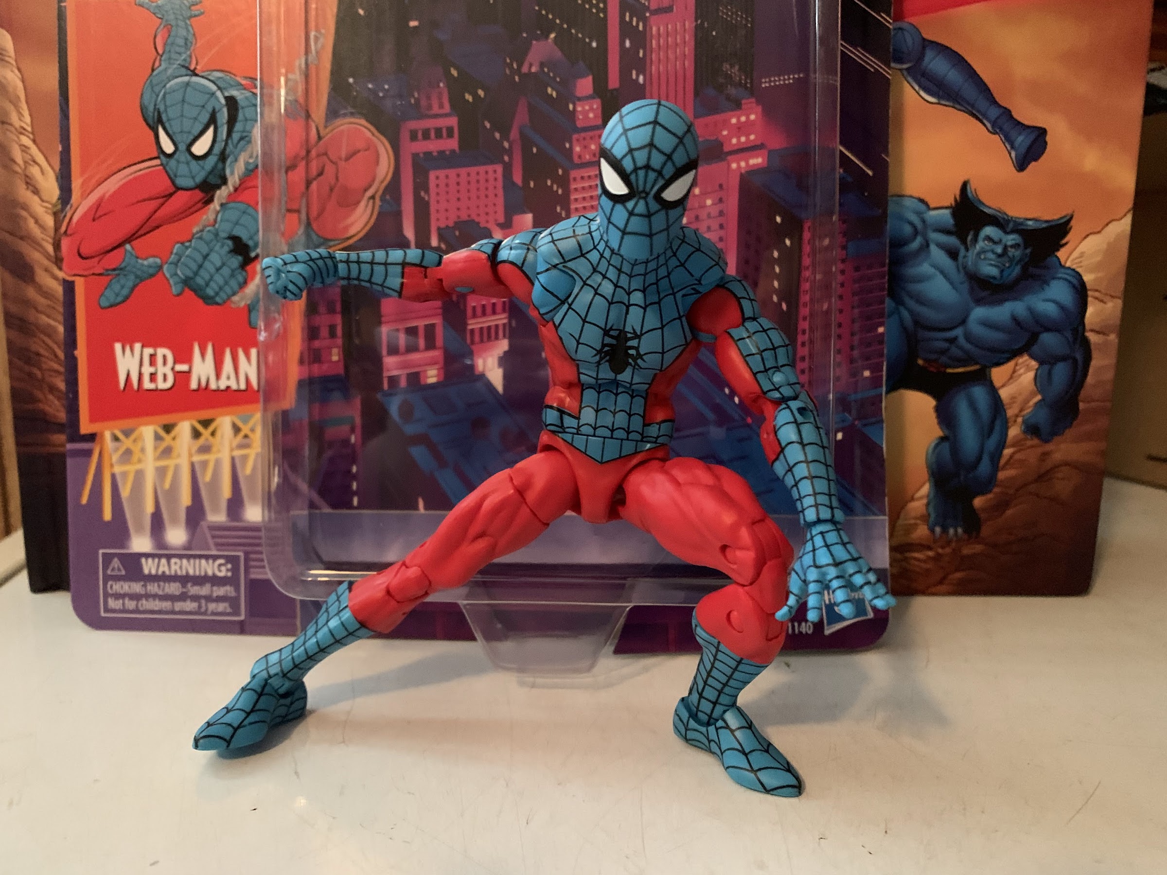
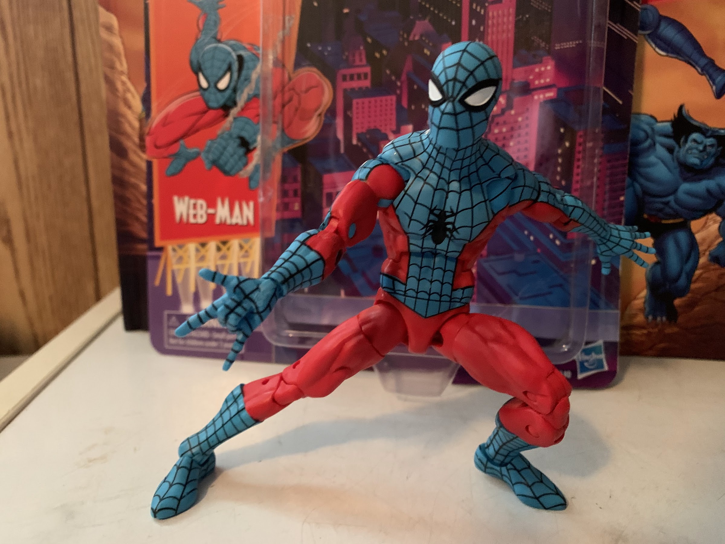
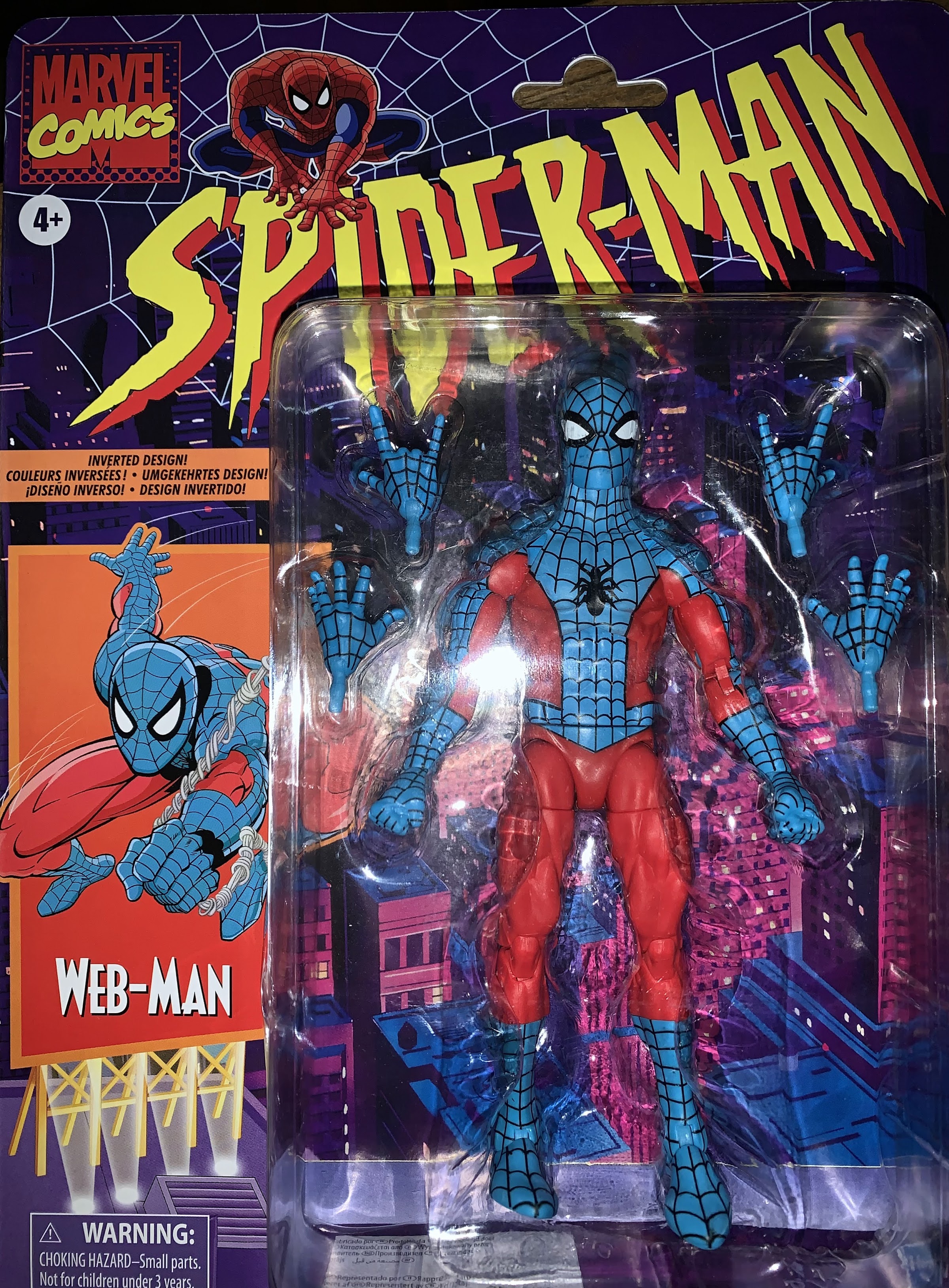
Marvel Legends Web-Man

Who the heck is this guy?!

No, this is not bootleg Spider-Man, this is Web-Man! Who is Web-Man? I actually had no idea until I just looked it up. It would seem Web-Man is a copy of Spider-Man created by Dr. Doom. Not only are his colors inverted from the real thing, but so is most everything else. And since Spidey is basically a genius, Web-Man is quite stupid. As far as I know, he appeared in just one issue in 1977 and has never been heard from again. Though this being a comic book character, it’s entirely possible I’m wrong about that last part as comics have been known to recycle characters here and there. Even obscure ones.

I’ve mentioned in posts before that I used to collect Marvel Legends. And alongside Legends, I also collected the offshoot Spider-Man and X-Men lines produced by Toy Biz and later Hasbro. I stopped though around 2007 and really haven’t looked back aside from a lone Deadpool acquisition last year. So why on Earth am I doing a Web-Man review? It’s kind of a funny thing. I’ve been aware of Hasbro’s retro card releases of the past year or so which seek to emulate the 1994 Toy Biz Spider-Man line. I loved that line as a kid and I had a bunch of those cards (and probably still do) and the figures that were once stuck to them. It definitely tickles my nostalgia bone to see these things in stores, though so far not enough to get me to bite. When it came to Web-Man though, I just loved the colors. He’s this light shade of blue juxtaposed with a very bright red. It’s not the true inverse of Spider-Man, who trends darker typically, but there is something so aesthetically pleasing to me about this color combo. I loved it the moment I saw it in product shots online, but not enough to buy it. That is, until, Amazon just happened to have the thing in stock and I grabbed one. I did want to add at least one Spider-Man to my collection because I snagged a Pulse exclusive Venom over the weekend (he has yet to ship), and now I have one. Sort of.

These cards are indeed glorious.

Being that I haven’t purchased a Spider-Man figure in quite some time, this figure is probably a bit more exciting for me than it is for longtime Legends collectors. I think the last Spider-Man I bought was Iron Spider-Man, which I think was released by Hasbro, but was one of the last figures Toy Biz was working on when it was dissolved. I’d dig it out if it was easily accessible (I might have even sold it) to compare, but other than that my last Spidey might have been the Marvel Legends Series 6 First Appearance Spider-Man. Either way, this is quite different. Now, my understanding is this Web-Man uses the same body as Hasbro’s Spider-Man 2099. I was actually a little surprised when I got him because I had just assumed this was a repaint of the classic Spider-Man released on the retro card. That one was pretty well-received, from what I understand, and ended up being hard to track down because everyone and their mother apparently wanted at least two: one to play and one to keep mint-on-card. The main difference between this body and that one is a diaphragm joint which takes the place of the waist twist on this one. There are pros and cons to each, one major pro of the other Spidey is that he can crouch down into a 3-point stance, but it’s more of an interesting observation for me than anything. I just assumed that all Spider-Men would be produced on that body going forward.

I love this blue, it’s just beautiful.

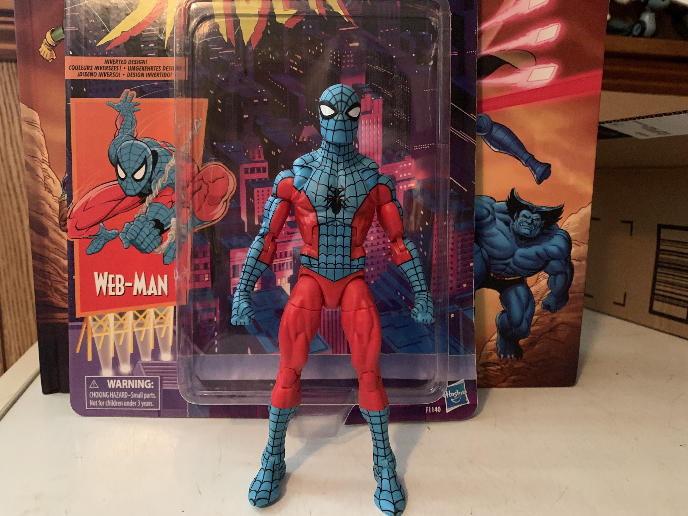
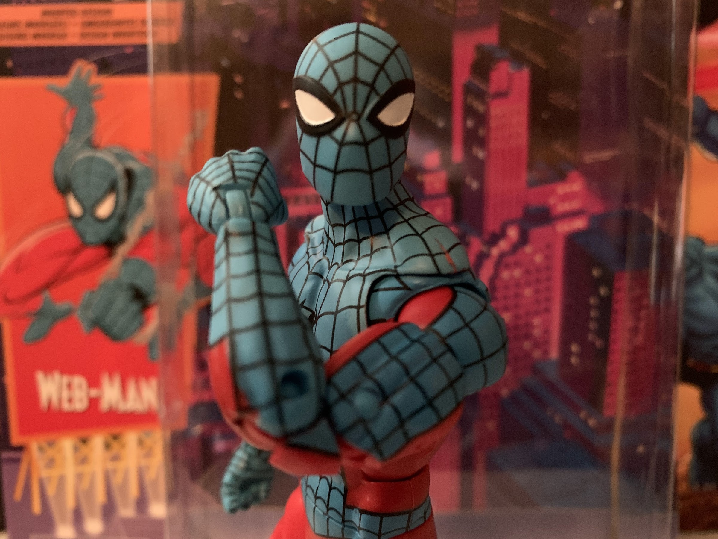
As mentioned before, this guy comes on a retro card back which looks lovely. He has a one sentence bio on the back with no cross-sell below. The card itself is thicker than the old ones and the blister is attached in a different way. It would have been awesome to see Hasbro invest in resealable blisters, but they also appear to be trying to phase plastic out of their packaging as much as possible (and that’s a good thing). Once extracted, Web-Man stands at about 6 1/4″ when placed on a flat surface. Immediately, my eyes are drawn to this guy. That blue is just beautiful and it contrasts so well against the bright red. The black web-lining is bold and striking and just serves as a reminder that this is one of the best designs of all-time. Superman, Batman, Captain America – all take a backseat to the classic Spider-Man design. I love the shape of the eyes which remind me of Ditko’s Spider-Man, but bigger. The webs on the mask form a little pentagon in-between the eyes and it’s so clean looking. The reference art I found on the guy doesn’t feature that detail, but I don’t care. I like the look of it. His head is a bit more square than most Spider-Man sculpts I’ve seen, but it’s not something I mind. The color matching between the blue, plastic, head and the blue paint on the torso is pretty well done. If anything, the head is just ever so slightly darker, but I don’t think most will notice it unless they’re putting this figure under intense scrutiny, which I am.

There’s a bit of ugly here, like that red line above the shoulder and a little missing blue near the front elbow pin.

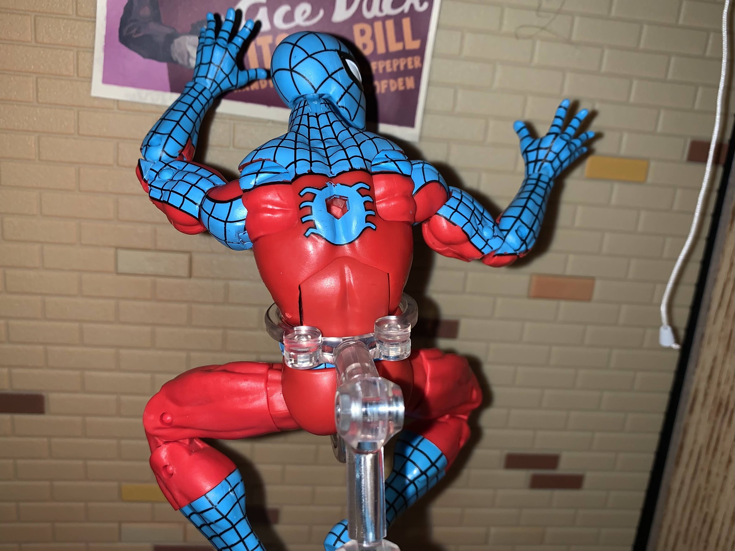
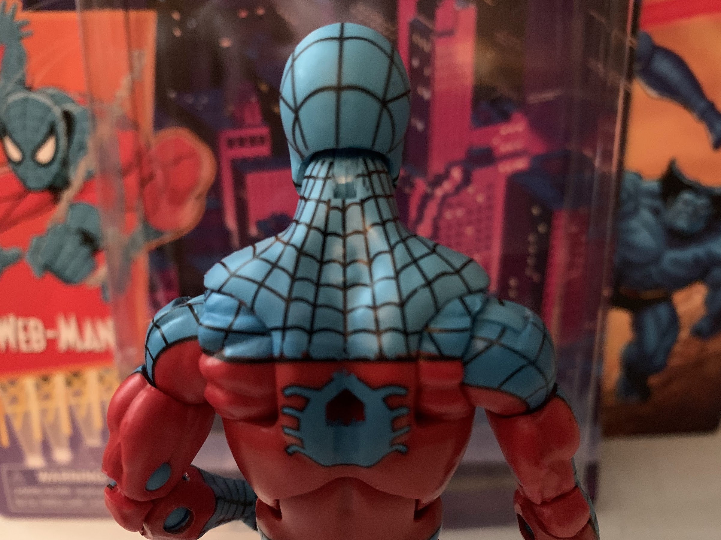
The torso is a little more of a mixed-bag, but certainly not a disaster. Web lines are hard, and with this figure I would say it passes the eye test when on a shelf. When right in front there are a few blemishes. The outer, black, line on the right hip is a little off on mine and there’s a little bit of blue paint over the center line right around the belly button. The right pectoral also has some blue slop and it’s probably the ugliest error on the front of the figure as the black webbing doesn’t extend to the outer line as a result. Up by his left trap is some missing paint resulting in a red line that’s distracting. It’s right on a seem where the plastic was fused together and if I was confident in my ability to match this paint I’d probably cover it. The back of the figure also features some messy spots along the edge, and he has an awful hole in his back. I don’t think Hasbro still uses those old peg stands, but I could be wrong. I’m guessing this hole was needed for Spider-Man 2099’s cape or something. It is an unfortunate eye sore though, as are the pins in his arms. If ever a character cried out for pin-less engineering in the arms, it’s Spider-Man, because you’re always going to run into this with his classic (and inverted) costume where you can only match the outer or inner color of the arm. Hasbro always opts to match the outer arm, which is the right move, but it means the inner arm has a circle of color that shouldn’t be there. In this case, it’s blue above and below the elbows. At least with the knees it’s not an issue. It would be nice if they just put a dab of paint there, but this is Hasbro and they’re quite focused on making low cost figures which is why their figures often are priced lower than everyone else.

I do wish he didn’t have a giant hole in his back.

Aside from the blemishes here and there, I do really like the look of this figure. This is a solid sculpt for a Spider-Man adjacent character. The only sculpting issue I have is that his shoulders are really small. Hasbro likes to almost recess them in the torso which just gives them an odd look. It’s really only noticeable in vanilla poses, but given this is a Spider-Man, you’re not likely to pose him in such a manner on your shelf. The musculature looks good otherwise as this is a lean dude and I like that he seems to have a unique spider logo on his chest. He’s just a very pleasing figure to look at, all in all.

I wish I could get that left hand on the ground, otherwise the articulation is pretty good.

Now when it comes a Spider-Man figure articulation is going to be super important. This figure may lack the updated configuration of the new Spider-Man body, but he’s no slouch in the articulation department. For starters, his head sits on a ball-hinge. This gives him very good up and down range, but little tilt. At the shoulders we have a butterfly joint that works very nicely. The inner pieces are painted though, so hopefully paint rub doesn’t become a major issue over time. For now, it seems okay. The shoulders are on standard ball-hinges and you do get that mismatch color issue here too as the hinge is blue plastic so he has a stripe of color in his armpit that shouldn’t be. Like the pins, this is just a trade-off on where to put the offending color and Hasbro did the best it could. And in this case, if they had tried painting over it the paint would likely just flake off rather quickly. The weird way they sculpt the shoulders does make it difficult to get his arms horizontal, but you can get close. There’s a biceps swivel past that and double-jointed elbows which bend past 90, but not much past. I was a little surprised with that part. At the wrists are swivels and hinges which might be a little gummy out of the box. At least mine were. In the torso we have an ab crunch and Web-Man can crunch forward pretty far and back a little bit, but without any ugly gapping issues. There’s a waist twist below that and the legs are on ball-pegs. He can kick forward rather well and almost do a split. There’s a thigh cut past there and double-jointed knees. We also get a boot cut and hinges at the ankles to go along with excellent pivot action.

Thwip!

Really, the only complaint I have with the articulation is the inability to get the figure into a classic, Spider-Man, three-point stance. Aside from that, he moves well and I didn’t have any stuck joints on my figure. Almost better, there are no loose joints either as everything is nice and tight. He’s a lot of fun to mess around with and probably would be even more fun with an action stand or some web effects. Sadly, he’s rather light on the accessory front, a common thing with Marvel Legends. He comes with fisted hands in the package that can be swapped with web-slinging hands or wall-crawling ones. They’re pretty standard Spider-Man hands, though he lacks gripping ones so even if you make your own web he won’t be able to grab them. It’s certainly decent, but does beg the question would collectors be happy to spend another buck or two to get more stuff? I’m used to buying NECA and Super7 figures which retail for a lot more than Legends so it’s probably no surprise where I come in on that question, but Hasbro exclusive collectors are definitely more price sensitive from what I’ve seen.

“I don’t think this is the New York I’m used to.”

Web-Man is what I wanted him to be. I saw a design that looked really pleasing to me and the finished product didn’t disappoint. Yes, I can pick over this thing and find little blemishes and imperfections here and there, but that’s true of pretty much any mass market retail action figure. Especially one with as demanding a paint job as Web-Man. It definitely would be preferable to find a vast assortment of these guys at retail rather purchase online sight unseen. That way you can hopefully find the one with the least amount of imperfections. This is admittedly an odd figure to have as the lone Spider-Man representation so to kind of make up for that I’ve pre-ordered the upcoming black costume Spidey. Even so, I love how this guy looks and it doesn’t bother me at all that I don’t have a traditional Spider-Man figure right now. Maybe when Hasbro eventually does a pinless one I’ll bite, but for now this is great. If you’re like me and you find yourself just drawn to this color scheme then this one’s for you.

“Easy there, big fella! You’re a little out of your league here.”

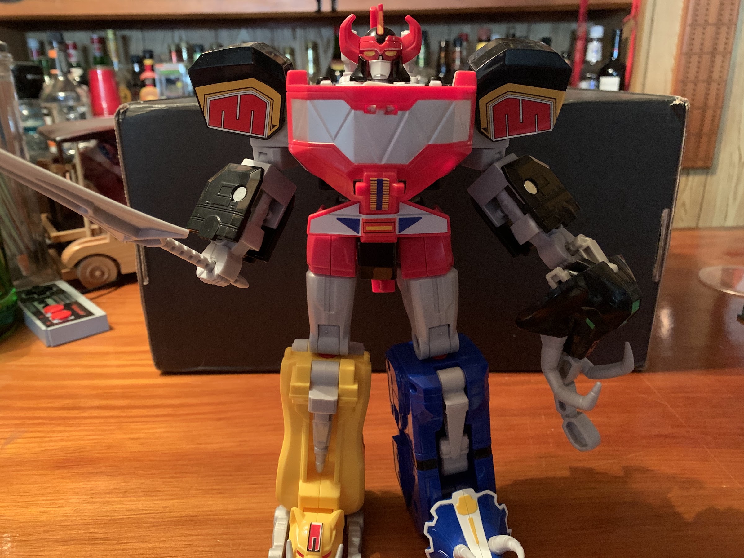
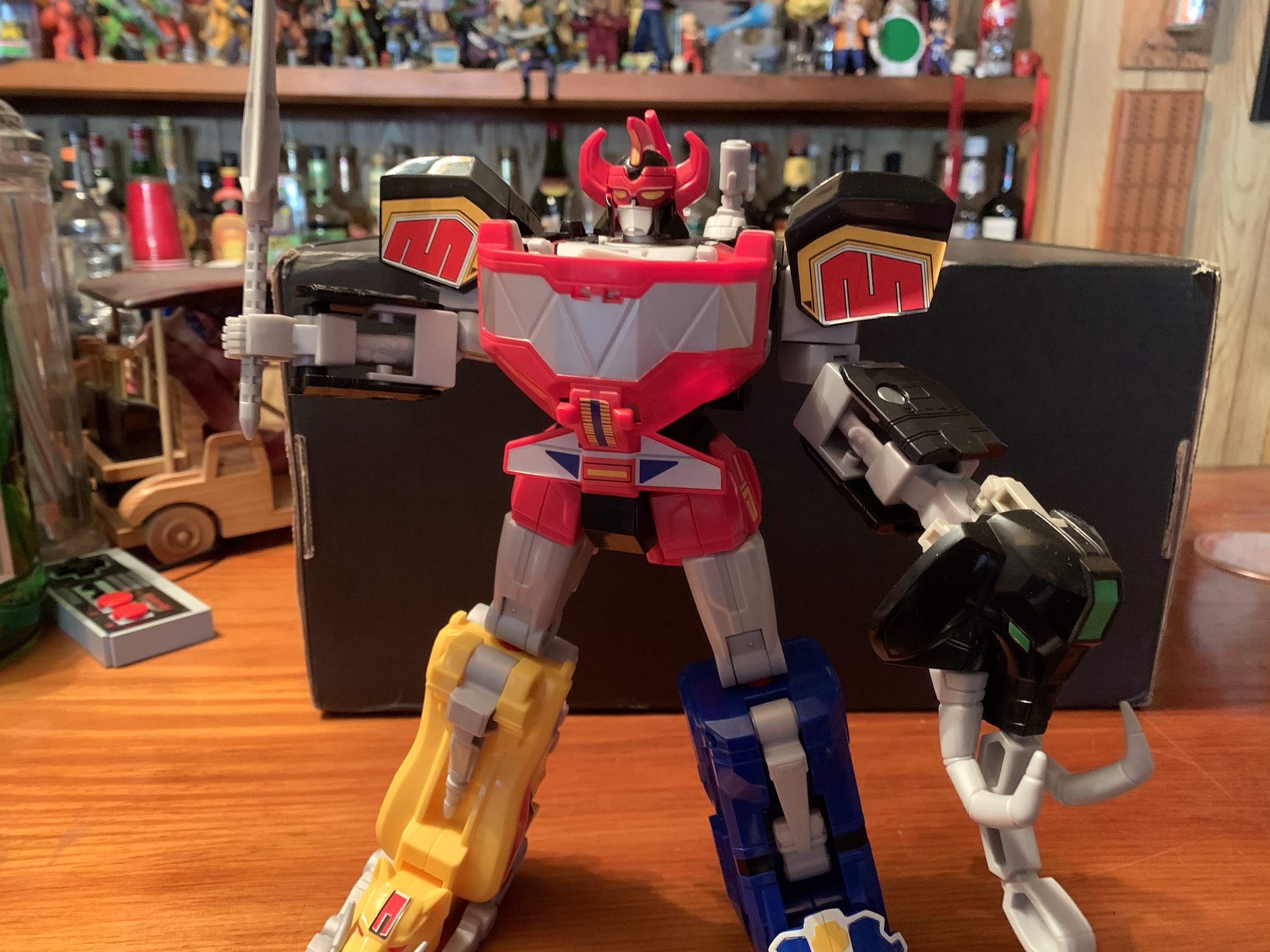
Hasbro MMPR Combining Dino Megazord

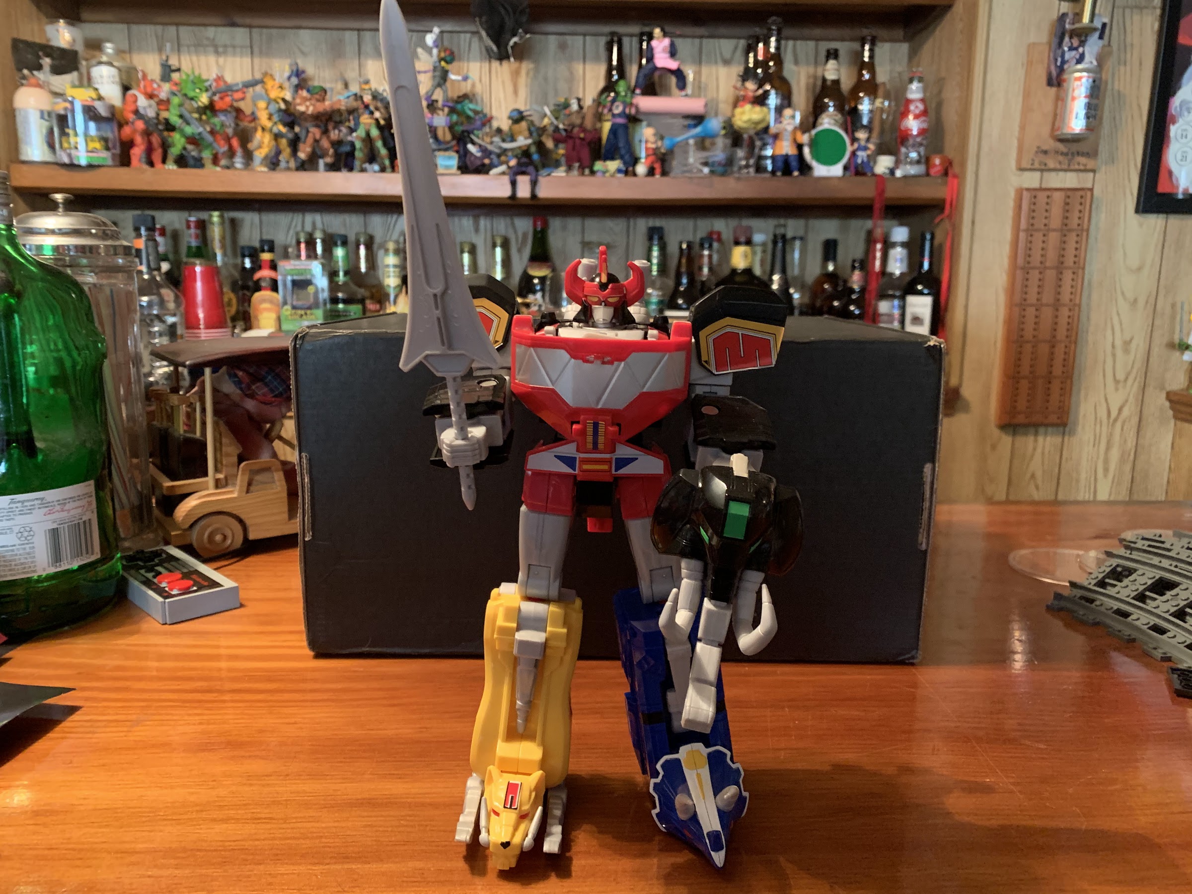
The only Megazord that matters.

I wasn’t going to do a post on this particular figure, but there probably is some curiosity about it and how it works with the Hasbro Power Rangers Lightning Collection, so here we are. Last year, I fulfilled an almost lifelong ambition and acquired a Bandai dino Megazord from 1993 based on its appearance in the Mighty Morphin Power Rangers television show. The toyline was white hot in the early 90s, and it was something I had to make due without as a kid (and for the record, I did just fine, so don’t weap for my childhood). It turns out, the kids of 2020 also enjoy Megazords from the 90s and my own children spent a fair amount of time playing with it, assembling it and disassembling it enough that I went to eBay and grabbed them some Power Rangers from the same era to play with. When Christmas came around, it made sense for my son to ask Santa for a Megazord he could call his own, and the big man delivered.

It was late last summer, or early fall, that Hasbro rolled out its own version of the classic Bandai toy. The zords were scattered across three blister pack releases that could be purchased at big box retailers and online at various toy and hobby websites. What was most attractive about the set was that it was really affordable. Each release retailed for $15 so kids, and collectors, could assemble a Megazord for a mere $45. I’m pretty sure it cost more in 1993 dollars to do the same. Of course, this meant the release was compromised compared with past iterations. The zords probably lost about 25-30% of their size and are primarily assembled with colored plastic with little or no paint. On the plus side, there were no stickers to place as the decals came on the toys, though they still appear to be as prone to peeling and such as stickers applied by the consumer.

The dino zords have never been particularly fearsome on their own.

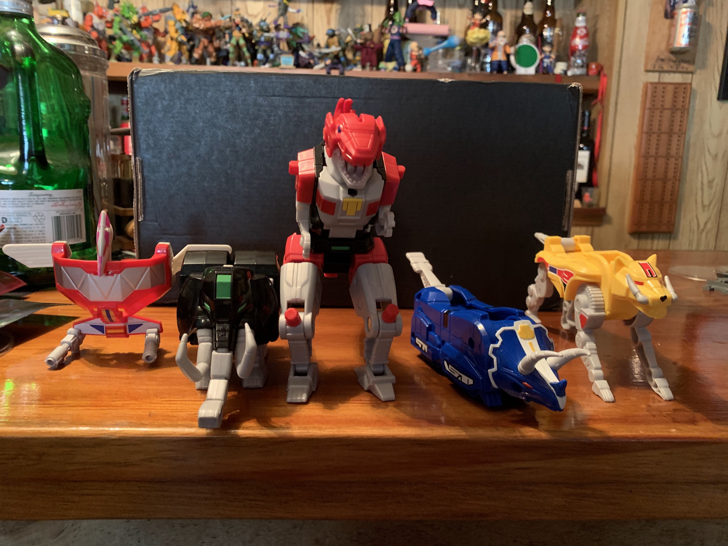
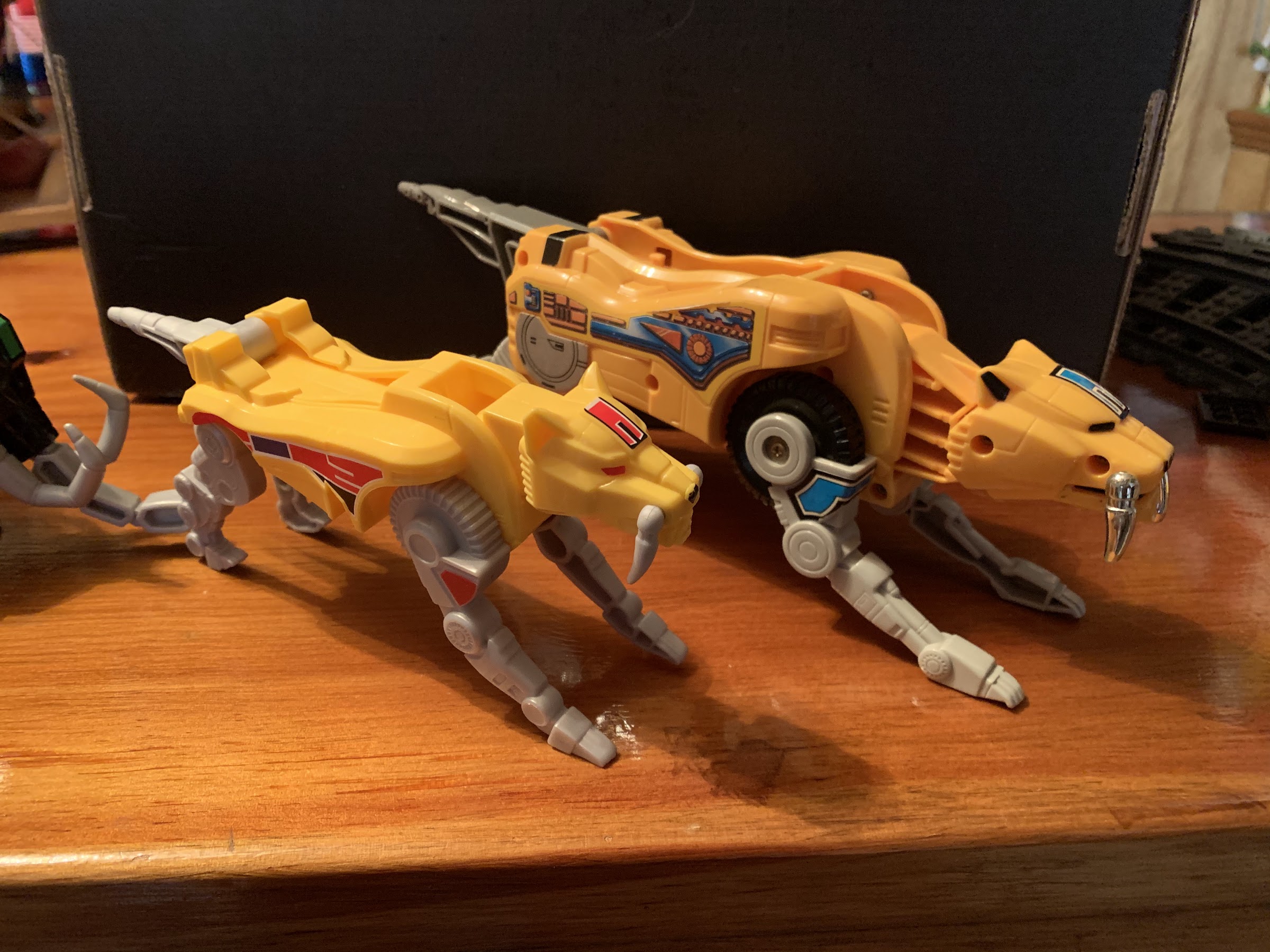
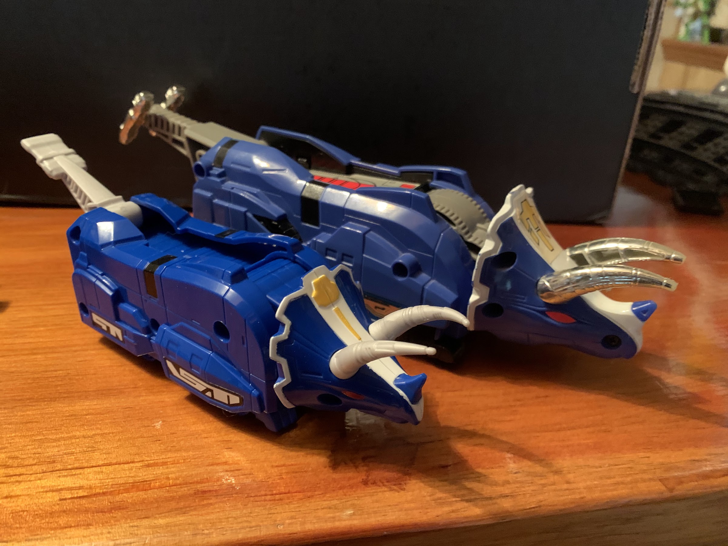
As mentioned already, Hasbro chose to distribute these dino zords across three releases. The mastodon and pterodactyl come bundled together as do the triceratops and saber-toothed tiger. The tyrannosaurus, being the largest of the five zords, comes solo, but Hasbro did toss in the power sword so it wouldn’t feel so lonely. I’m not sure why Hasbro opted to do things this way rather than simply sell it as one, complete, set. They probably could have even jacked the price up another five dollars and sold it at 50 bucks. It’s just unlikely anyone would want just one set and not all three, because lets face it, most kids don’t want to play with the individual zords. All this does is make it a little harder to find everything you need. Thankfully, the zords weren’t terribly difficult to track down, but I know in my frequent trips to Target I rarely saw all three sets readily available, it was usually just one or two

Dinosaurs! Assemble!

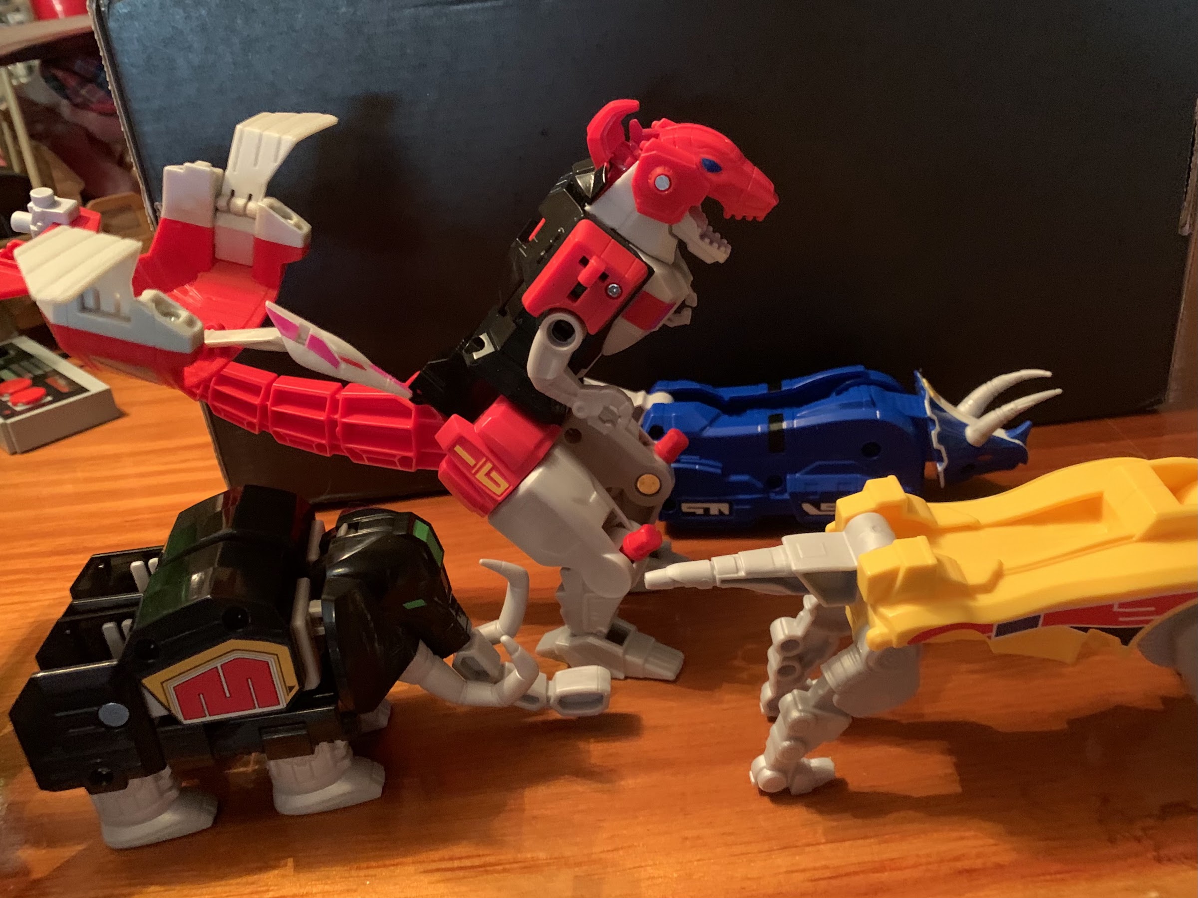
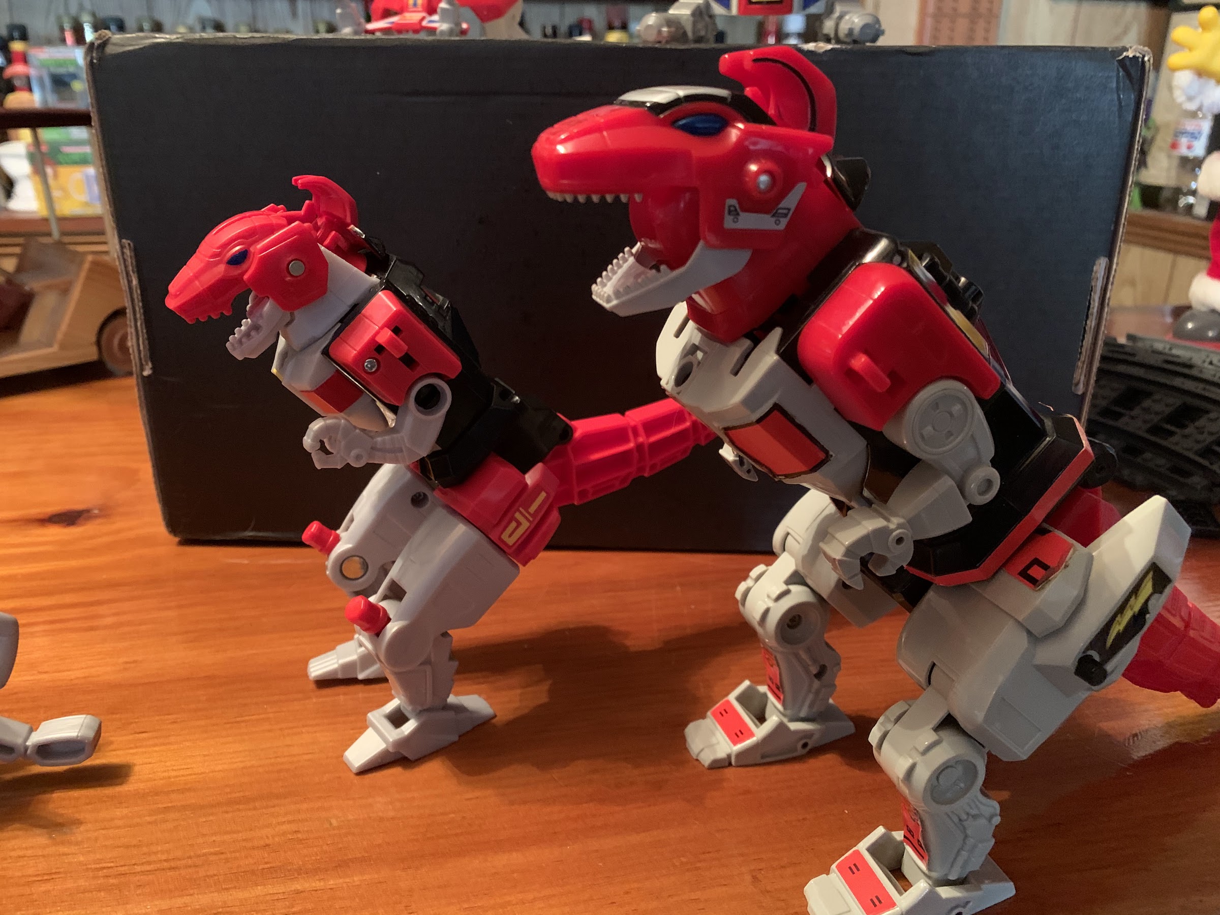
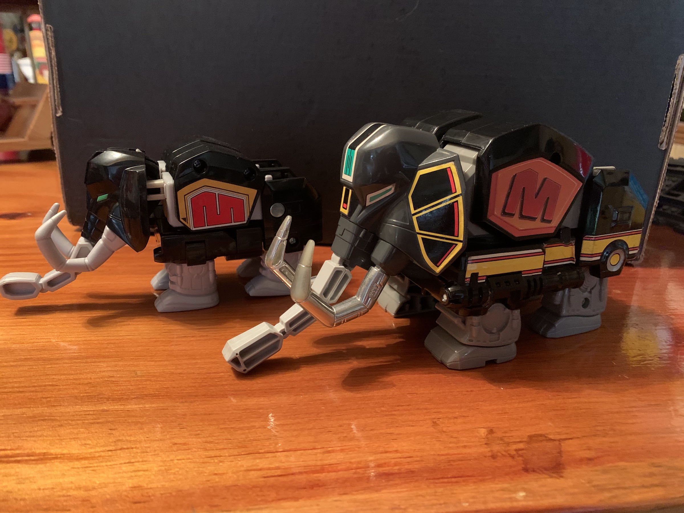
These toys aren’t technically in the Lightning Collection, but are in that lesser line Hasbro mostly markets to kids. All that means is that these aren’t technically being marketed to collectors, though I’d wager most of the people buying stuff based on the Mighty Morphin era are folks my age. The engineering on all of the zords is very similar to the Bandai originals as Hasbro has largely preserved the transformation as it appeared on television. The sheer amount of plastic utilized though has been significantly scaled back. It can be seen in the tail of the T-Rex zord which has a lot of chunks just cut out of it and the rear of the mastodon which is fairly open. It’s definitely not a set as attractive as the old ones, though there are areas where things have been improved slightly. The T-Rex, for instance, has its mouth canons sculpted in now and they look pretty nice. Some of the joints are also tighter, specifically the tails of the triceratops and saber-toothed tiger, though I’m also comparing a relatively new toy to one almost 30 years old. Given time, maybe they’ll be just as loose.

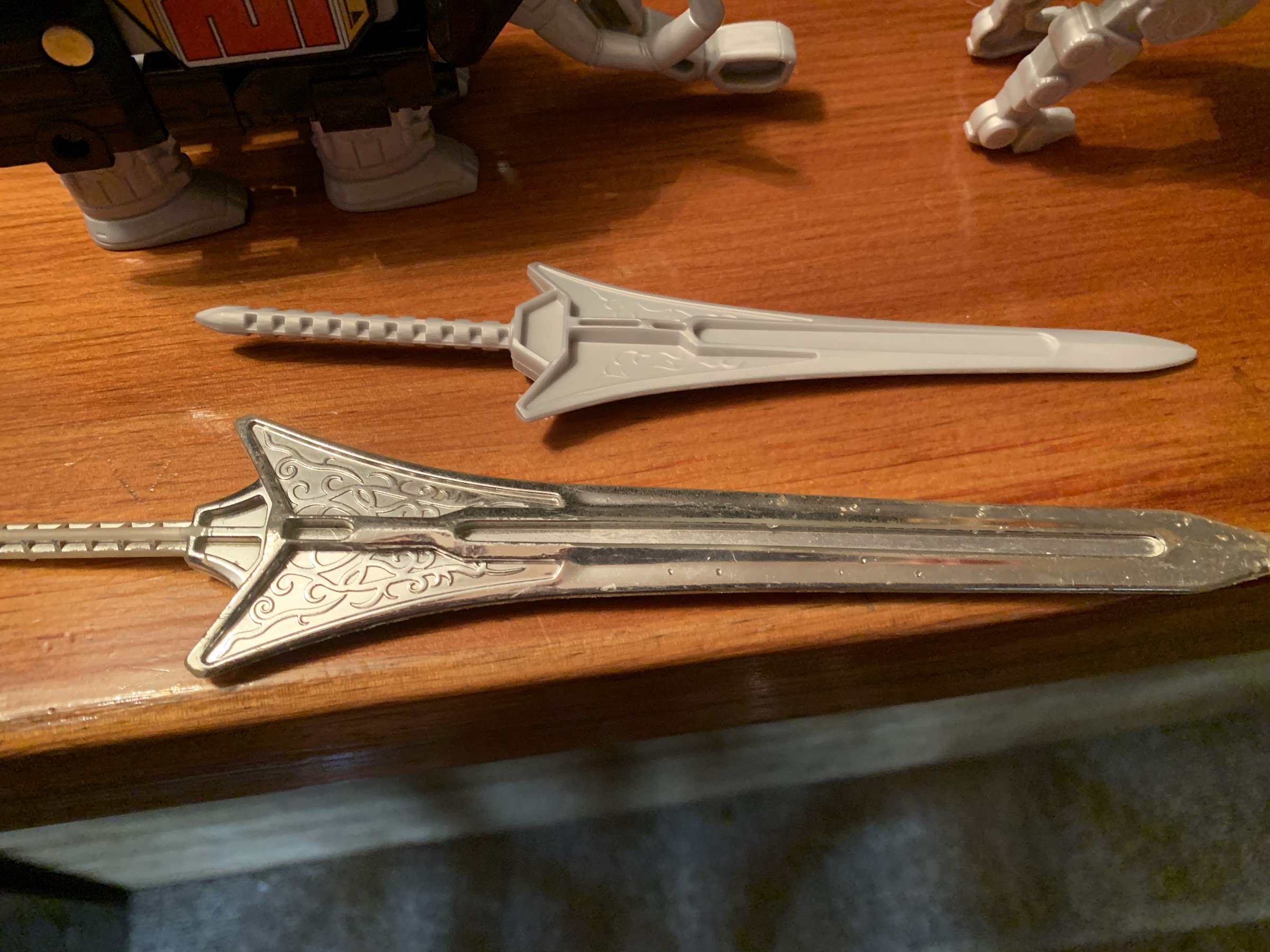
Top: new sword, Bottom: old sword. It’s not great.
Paint is apparently expensive.

Where this set comes up short though is just in the details. The wheels on the saber-toothed tiger, for example, aren’t painted black and are just sculpted gray like the rest of the legs. The canon at the tip of the triceratops tail doesn’t articulate so it looks pretty lame, plus it doesn’t have actual wheels to roll on. I also miss the chrome details some of the old figures had, though I mostly miss it on the Megazord’s power sword. It’s just unpainted plastic with some of the design sculpted on just one side of the blade. It’s very bland and is the aspect of this release I see the most complaints about. Hasbro also utilized a new peg system for the legs of the Megazord which works fine, but it also means the T-Rex now has red pegs jutting out from its knees. I also dislike the head of the T-Rex and how it snaps in place with the Megazord head contained underneath. It doesn’t seem to want to actually snap and it just feels very cheap. The “horns” on the Megazord itself can slide all the way to one side and just seems junky, even though it does, in the end, get the job done.

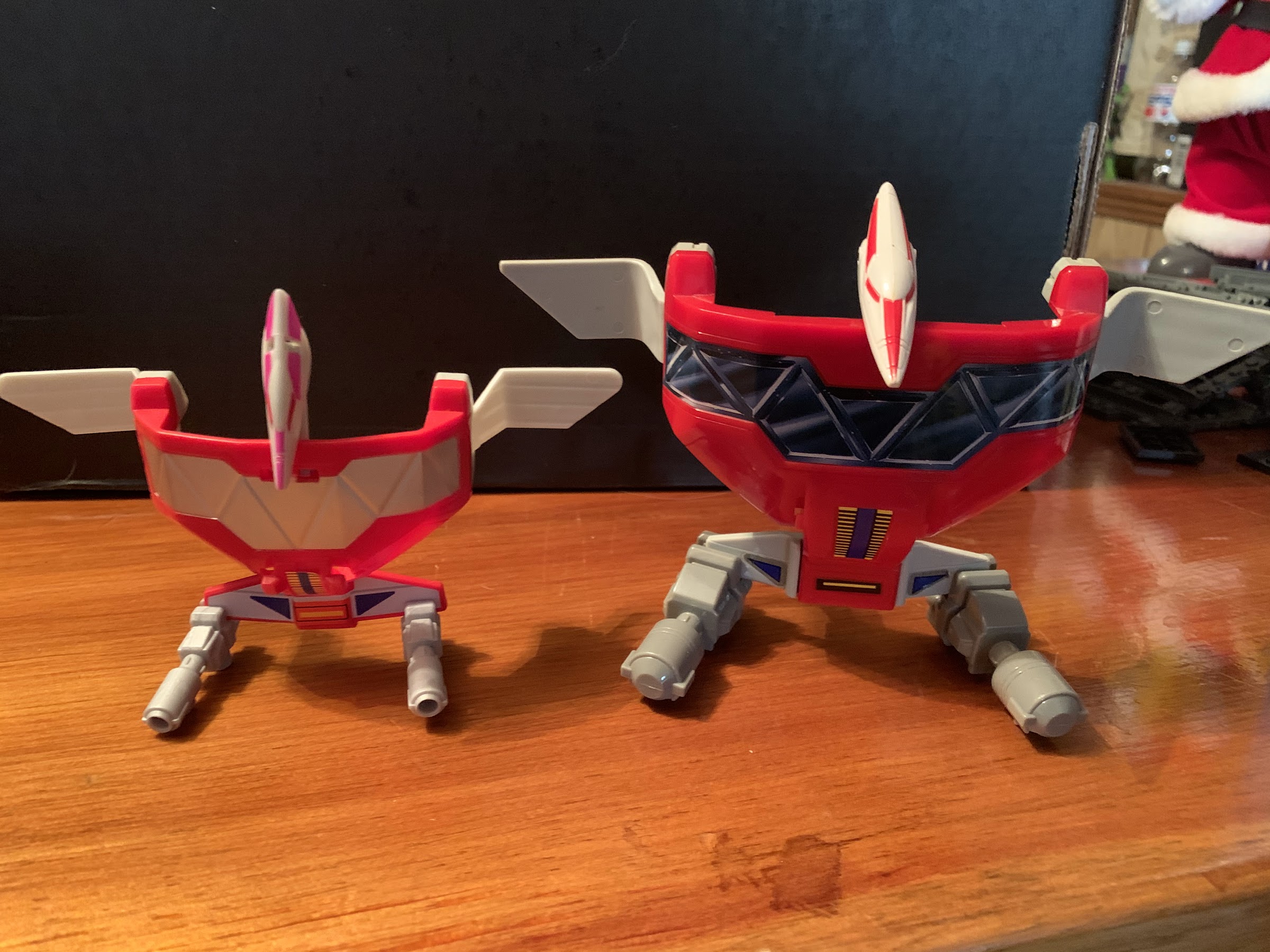
The new one can’t articulate its canon, but at least it can hold its tail up unlike gramps here.
The pterodactyl zord didn’t have to make too many compromises, though I’ve always really loved that old decal on the front of the original so that’s a bummer.

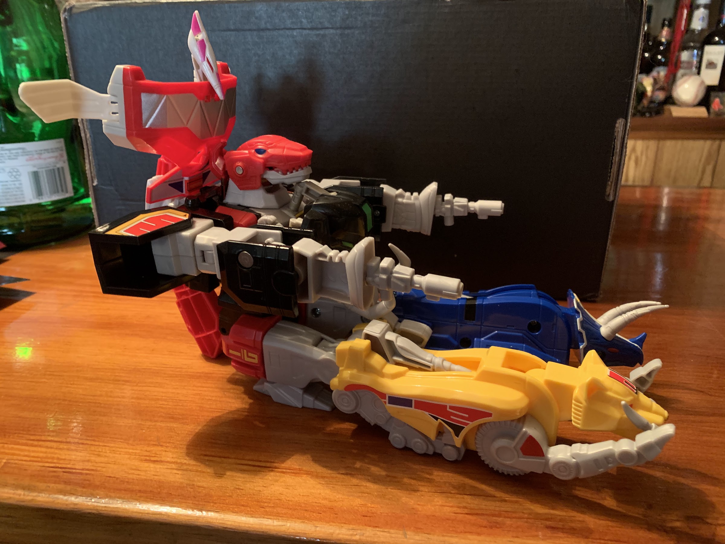
Playing with the zords on their own doesn’t seem like a great experience, based on how my kids interact with it. Thankfully, combining them is fairly easy even for a kid. The legs take a bit of effort to seat properly, and the pterodactyl can be a bit finicky, but it goes together largely in the same manner as before. I actually like how securely the mastodon clips on with this release, though I hate how easily the legs of the mastodon pop off. The tail of the T-Rex also no longer has a joint towards the end of it so it sticks up more pronounced than before and isn’t particularly pleasing to the eye, but it’s not a big deal. You can also still do tank mode, but it’s just as janky as before and more of a novelty than a fun way to play.

The tyrannosaurus continues to be the only zord that’s any fun solo, though those new, red, knee, pegs are an eyesore.
The mastodon turned out kind of junky on its own and it differs most from the original as the head is now all black, but at least it functions very well as the arms of the Megazord.

Once together, the Megazord does very much look the part. Once again, we’re missing some of the details of past releases, but it’s certainly far from an ugly thing. The face is where some extra paint would have really been welcomed as that vintage Bandai release just looks sharp. And, of course, the sword sucks, but I already mentioned that. What is better than before though is the articulation. The classic Megazord can’t do much of anything, but this one at least has some joints. The arms can rotate and raise out to the side a bit and the Megazord now has elbows! It can bend them about 90 degrees and also swivel too. At the legs, it can kick forward and back still, but it also can fan its legs out slightly for a wider, more natural, stance. The legs also swivel there as well. There are no knee hinges, unfortunately, but you can swivel the lower legs at the knee pegs. The only thing missing that really should be here is a head swivel. It just seems like that would have been a very easy and cheap thing to include that would have really added some personality to the poses available because even a kid wants to put this somewhere prominent in his or her room when it isn’t being played with.

Tank Mode is still a thing, if you care.
I had to pull back so damn far to get that whole sword into the shot.

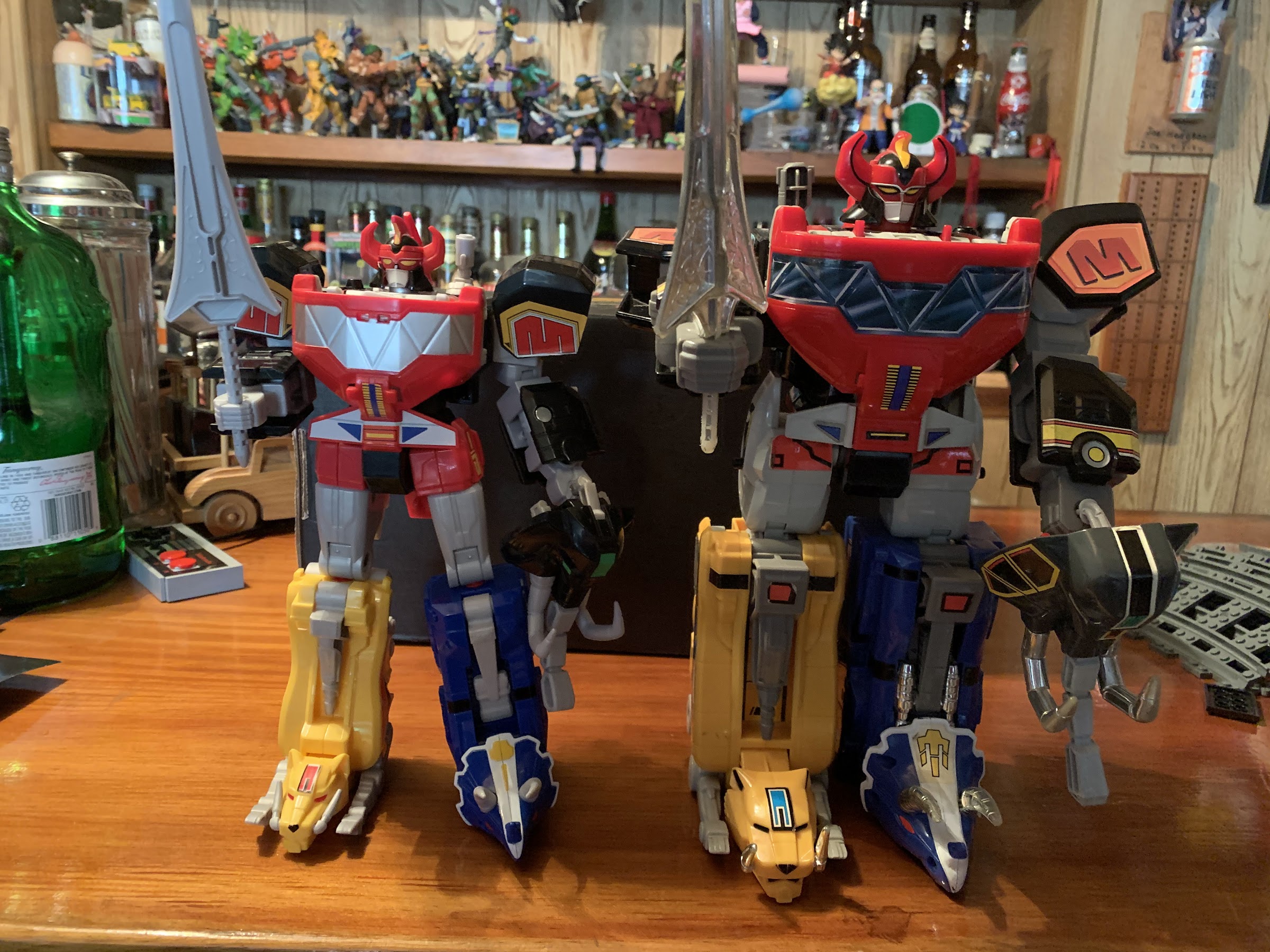
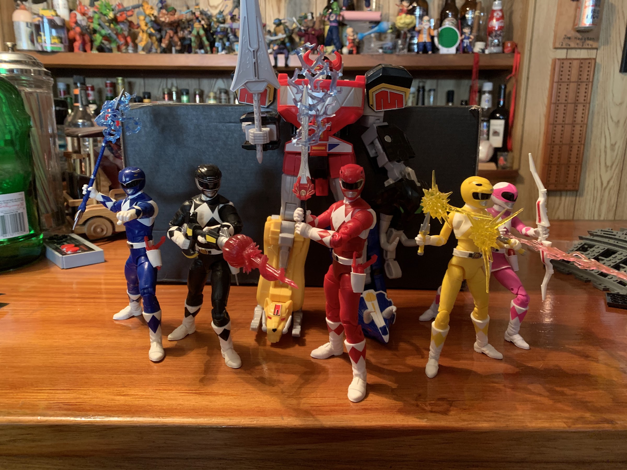
Obviously, this thing doesn’t scale at all with the figures in the Lightning Collection. Even the original doesn’t and in order to scale properly it would likely need to be six feet tall. It’s big enough at around 9″ tall though that I think it can be a reasonable centerpiece in your MMPR display. And if you’re ambitious, you could paint this thing up into something a bit more special. Hasbro sculpted most of the details one would expect, it just didn’t bother to paint them. As a toy, it seems pretty neat, to me. Admittedly though, my kids haven’t played with this much since Christmas and my daughter even told me she wants to play with my Megazord, not this one. Go figure. I think she just likes the sheer size of the original one, and as easy as it is to transform this one, it’s a bit easier for her to transform the original. Mostly I think it’s just a case of her being more familiar with that one and not wanting to take the time to get to know this new one.

The sculpt work is mostly there, it just needs a little love from a paint brush.
It’s a little smaller than the original, but also trimmer and less statue-esque.

If you’re a Lightning Collection fan that wants a Megazord, this is certainly an affordable option. It’s not a collector grade release though and that shows. Even with light play, some of the decals are already starting to peel on this one and that’s disappointing. It’s possible the same will happen for those who just set it on a shelf and forget it. The biggest thing this release has going for it is obviously the price and availability. A Bandai one from 93 will probably set you back a couple hundred dollars, while the Legacy Collection release is a bit cheaper, but also not as nice as the original and it suffers from a lot of the same shortcomings as this one. And then there’s the Soul of Chogokin Megazord which I think retailed for something like $350 and is no longer in production so it’s likely to cost even more than that now. This set is for kids and casual fans that need a Megazord, but don’t want to break the bank. I’ve seen this one getting dumped on a bit by collectors, but at $45, I think it’s pretty good. I definitely wouldn’t recommend displaying it in dino mode as the individual zords aren’t terrific looking, but who would do that anyway? As long as your expectations are reasonable, I think this will please most who buy it.
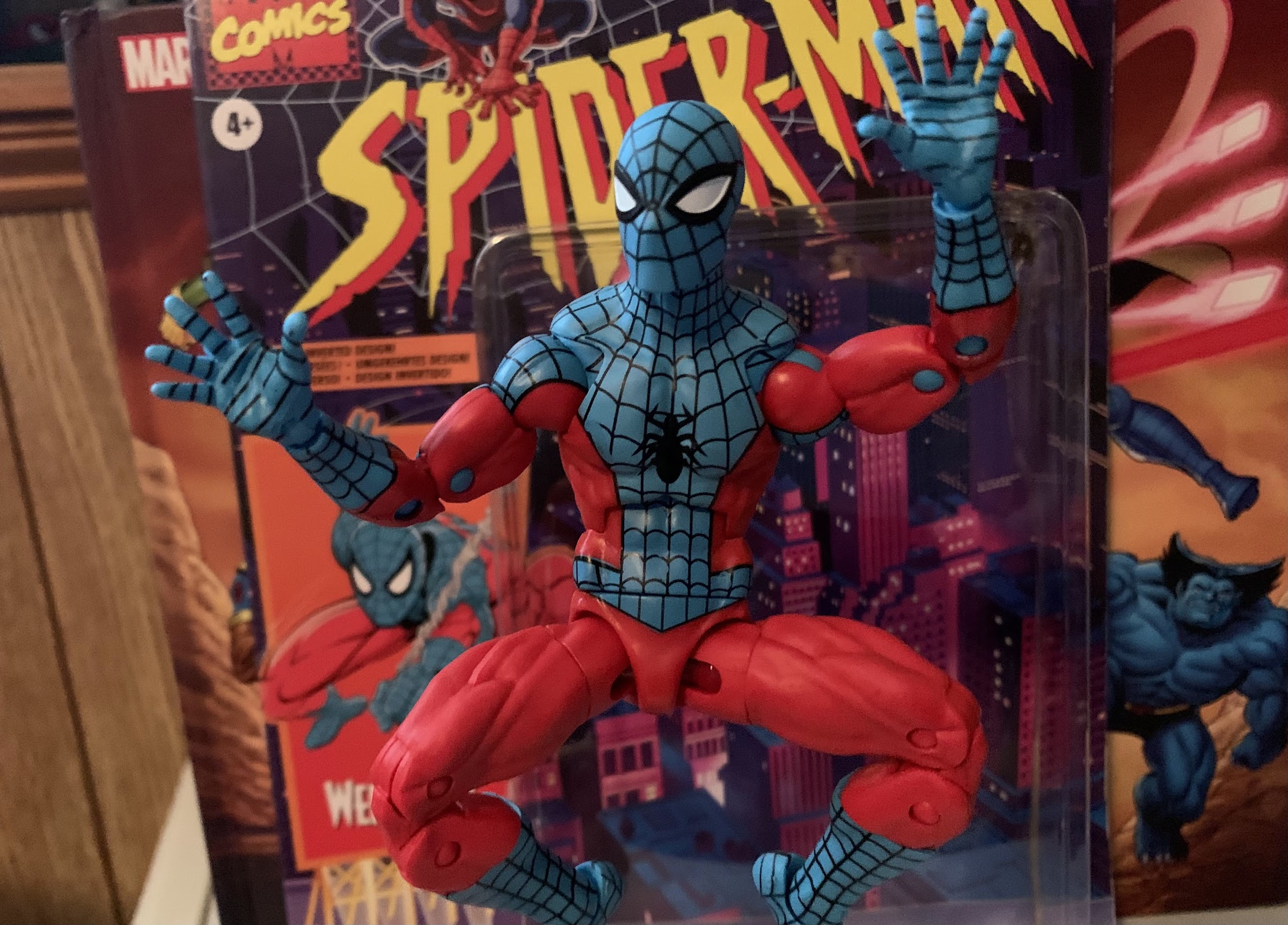
Definitely a more posable release.

If you are a collector looking to add a Megazord to your collection, you will soon have some more options. If you just want a posable Megazord, Super7 recently announced that it has gained the Power Rangers license. The company has already shown some vinyl, minimally, articulated Megazords, but it will be doing zords in its Ultimates! line and I can only assume a proper Megazord will arrive at some point. They’re doing the tyrannosaurs first though, and I don’t think they can do a combining Megazord so it figures to be a stand-alone zord. I could be wrong, but time will tell. Grabbing this Hasbro one at $45 doesn’t feel like a tremendous risk to me, but if you can wait, maybe hold out to see what’s coming.

Whether it’s a permanent part of your display or just a placeholder until something better comes along, the Hasbro Megazord is certainly an affordable option.

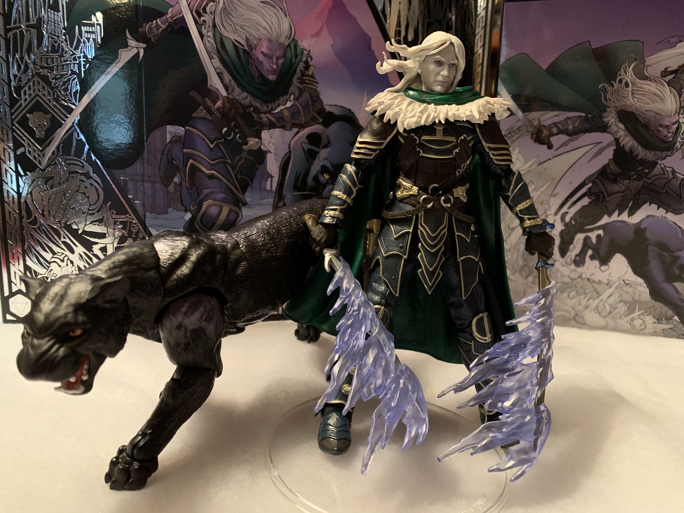
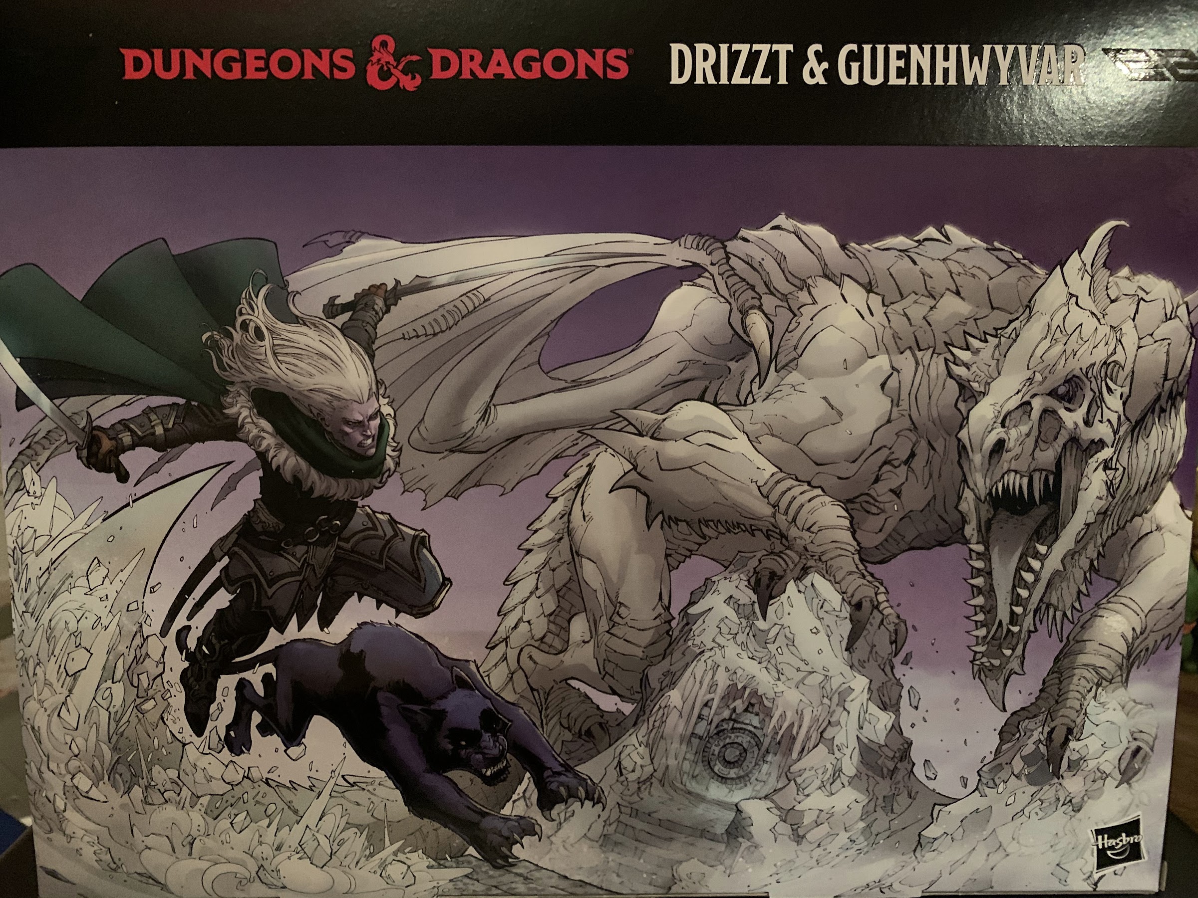
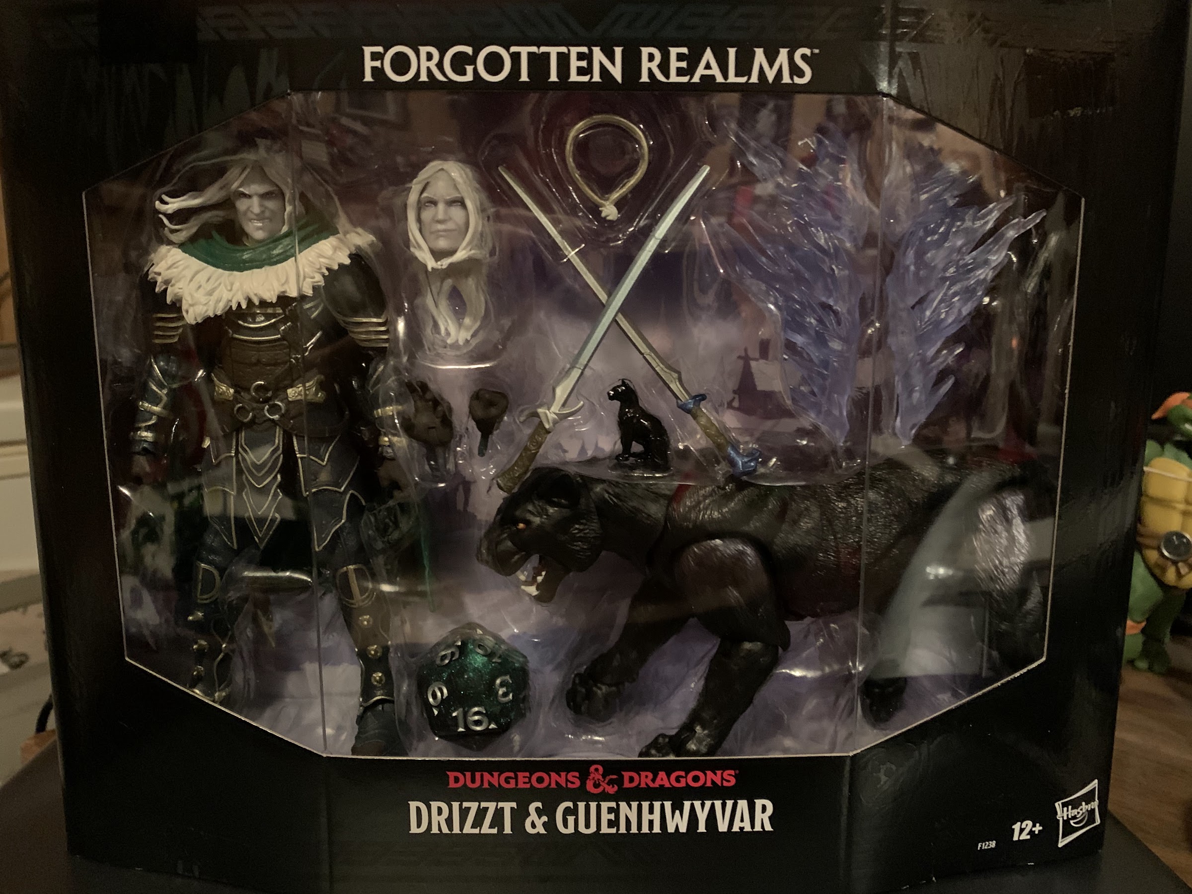
Hasbro Dungeons & Dragons Drizzt Do’Urden and Guenhwyvar

Just a man and his cat.

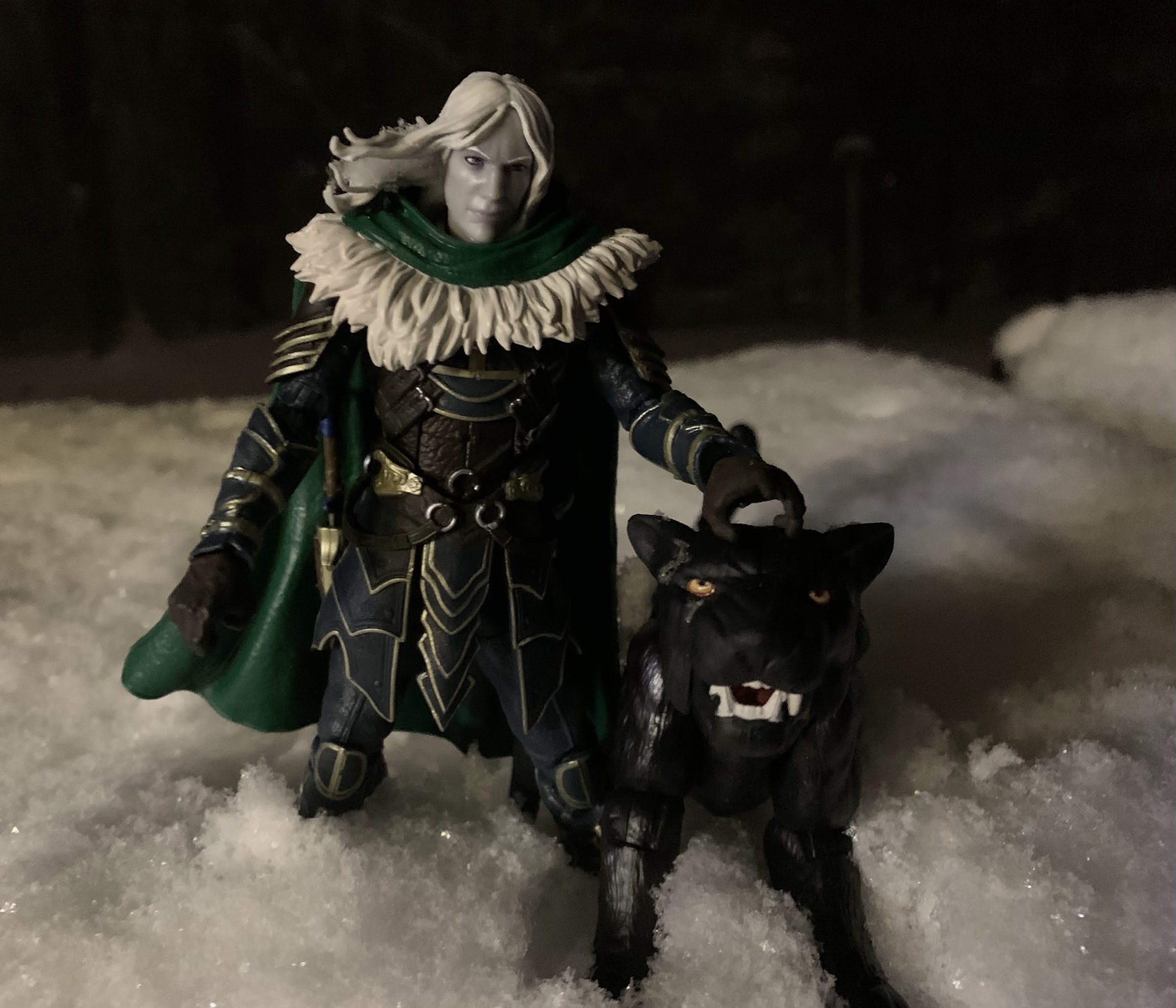
I was quite surprised when Hasbro unveiled a deluxe action figure set starring the Forgotten Realms hero, Drizzt Do’Urden. Drizzt was a character I was familiar with going back into my middle school days when I traded Star Wars novels for Dragonlance. Even though my nose was buried in stories about Raistlin Majere and Tanis Half-Elven, a lot of the other kids around me were reading the latest from R.A. Salvatore. Drizzt was an instant hit, a dark elf warrior exiled from his subterranean home turned good guy. He was armed with a pair of magic scimitars, had a magic panther as a sidekick, and was basically unbeatable in combat. When I had exhausted Dragonlance, a campaign setting for the game Dungeons & Dragons that saw its peak in the 80s, I finally checked out what was coming out of the Forgotten Realms setting and would eventually read several books starring the legendary drow.

That’s a fine looking piece of cardboard.

Hasbro has owned Dungeons & Dragons through subsidiary Wizards of the Coast for over two decades now, but few knew if the company really planned on doing action figures. Plenty of 80s kids have longed for stuff based on the old cartoon series, while folks like me who grew up with the novels published by TSR have wanted to see some of those characters captured in plastic. Drizzt kind of came out no where though and Hasbro elected to sell the set, which includes his panther, Guenhwyvar (who I am just going to call Guen from now on because that name is ridiculous), through its Pulse storefront. This generally means collectors could pre-order the figure and expect delivery months later. Hasbro was likely skittish about going straight to retail with the figure because it was an untested character at a premium price ($40), though there are plans to distribute it through other retailers in the future (I think).

I love the artwork on display here.

For me, I liked Drizzt well enough when I was reading the books decades ago. He’s cool, though his stories got very repetitive for me so I would never call him one of my favorite literary characters. I won’t deny though that he’s perfect for an action figure and his popularity makes him a great first choice for a figure. I saw it, and I thought it looked cool, and eventually placed a pre-order. My decision to buy this figure was one part enjoyment of the actual piece, and one part a desire to just support the brand in hopes of getting a Raistlin down the road. That property, Dragonlance, has some legal troubles though that will probably make it difficult for me to get what I want, but I can dream, can’t I?

There’s a lot of stuff in that box.

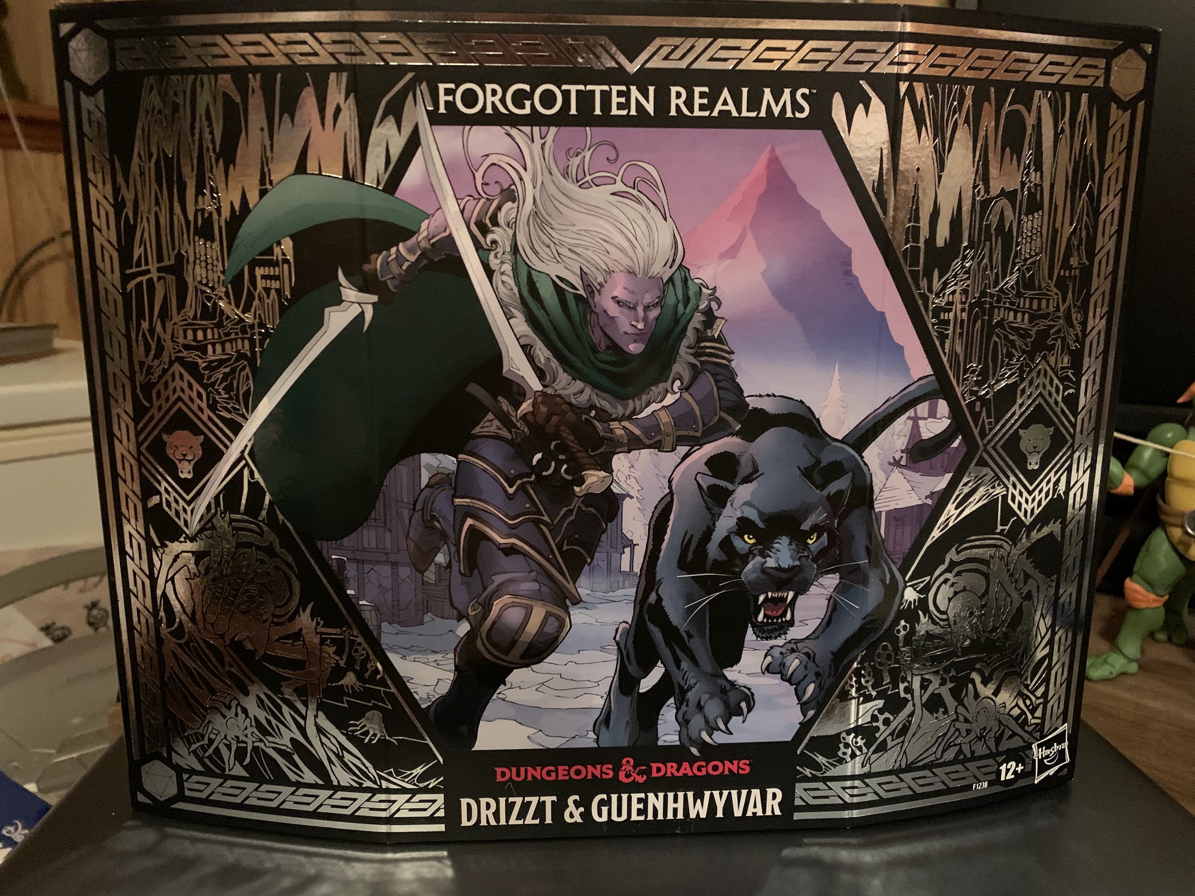
Drizzt arrived after a delay of about a month. All kinds of shipping problems in December threw things into disarray, but thankfully Drizzt wasn’t on that ship that lost a ton of cargo in a storm. The figure comes packaged in a very nice box with an unusual shape. The front is curved and embossed with a dynamic illustration of Drizzt and Guen. Sliding that off produces a window box with the figure itself and a nice, wintery, backdrop. It’s easy to reseal, which is always a plus with figures that come with a bunch of extra stuff, and would be attractive for mint-in-box collectors, though to display with or without the slipcover would be a tough call.

He’s free!
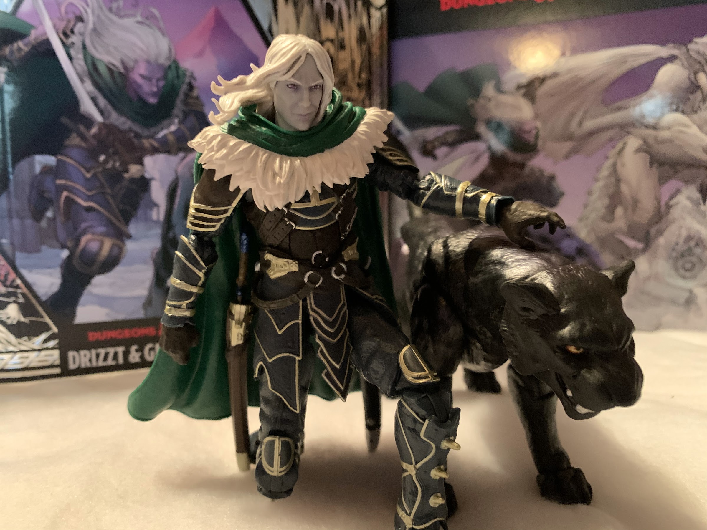
I think of his open hand as his kitty-patting hand.

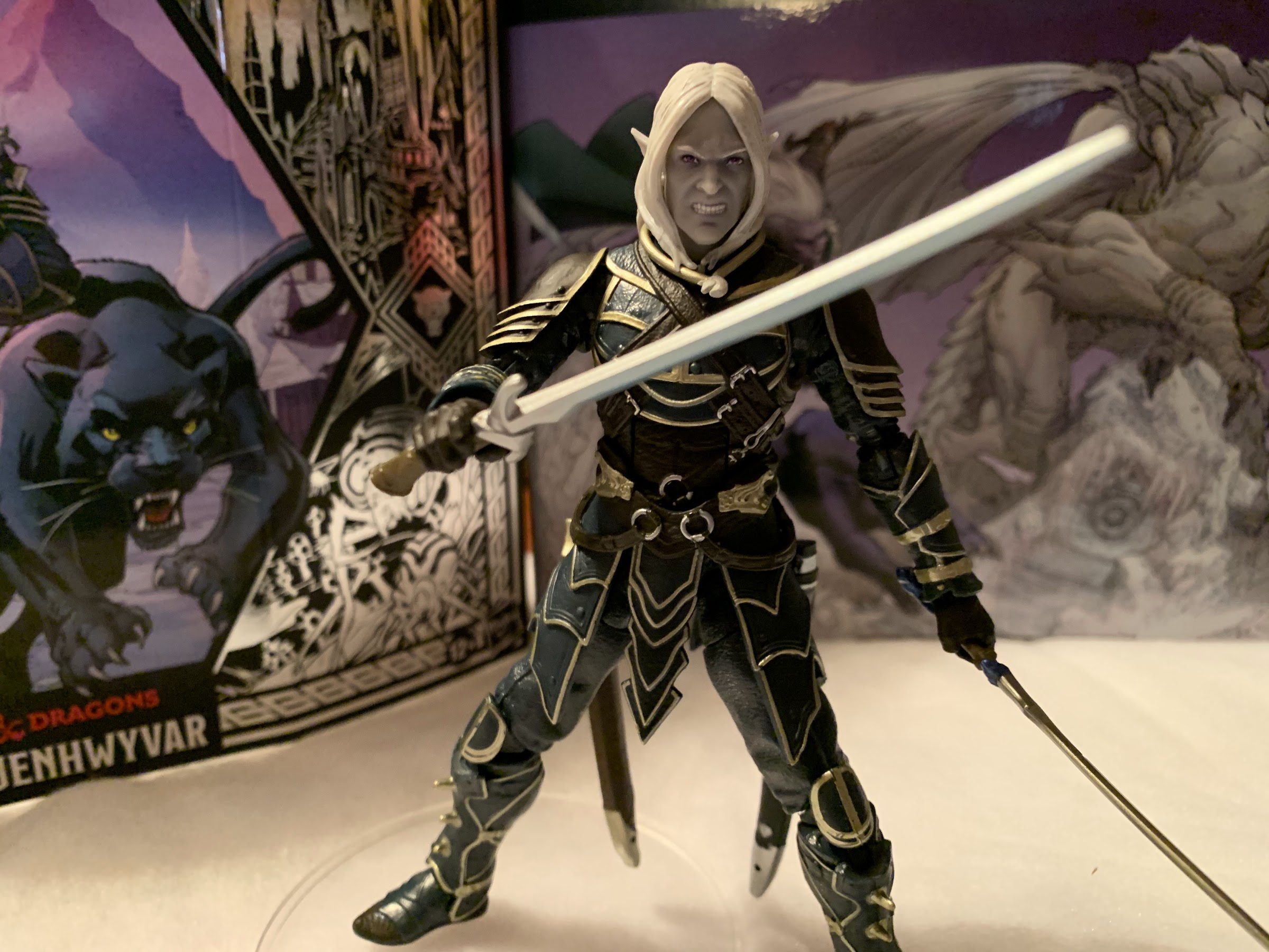
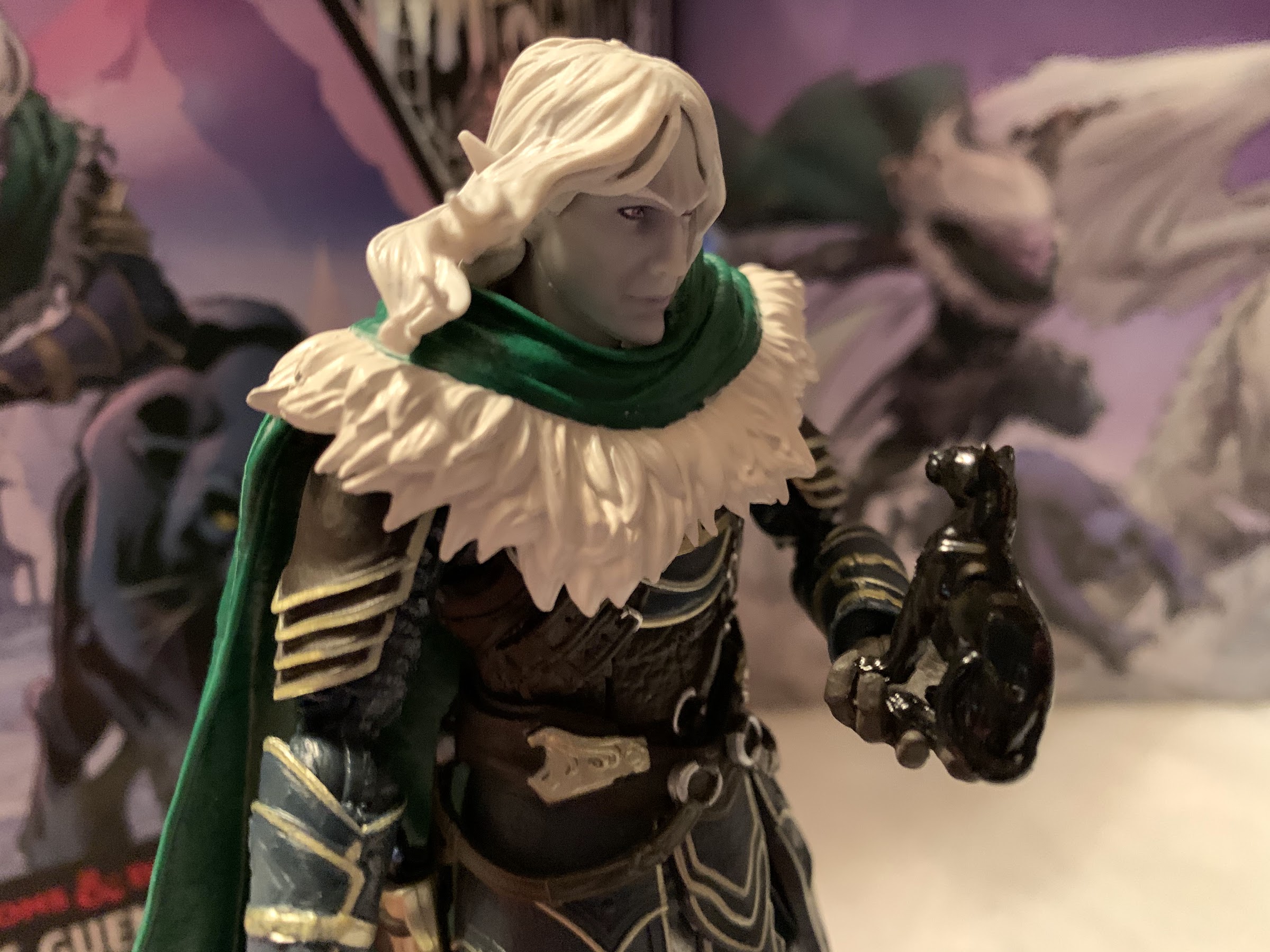
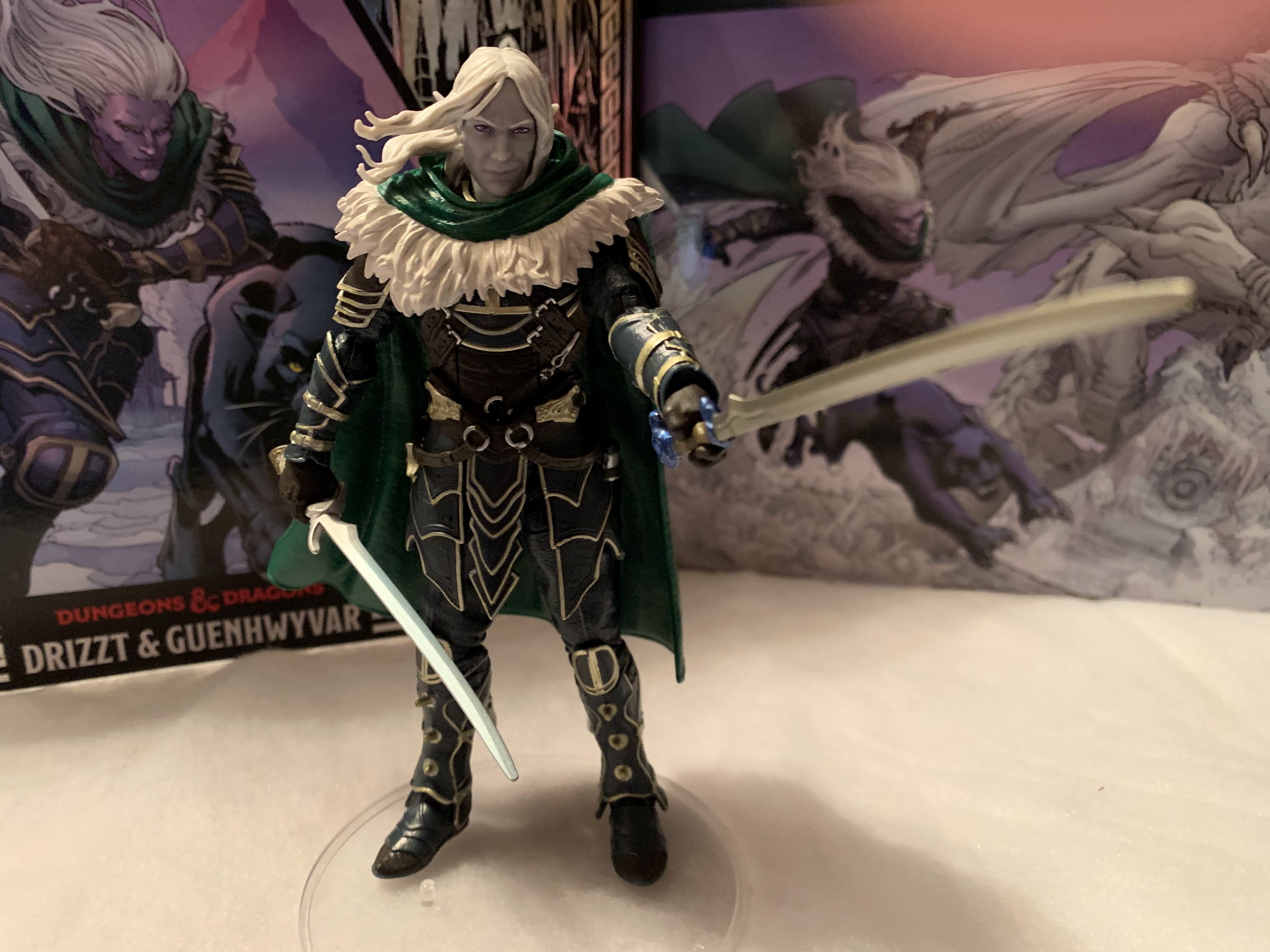
Drizzt is a little tricky to extricate from the plastic bubble inside as he has this big cloak that slips through the plastic, plus his scabbards go through it as well. Once removed he’s a pretty sturdy figure with a fair amount of heft to him due to that cloak. He stands right at six inches and seems like the kind of figure that could slip into other displays fairly easily. His armor is incredibly detailed with lots of little paint flourishes through out. My figure is pretty much devoid of any signs of paint slop or quality control issues of any kind. His joints were all free and easy out of the box and there are no defects I can spot. This is a very well made figure, though also still pretty familiar to anyone who collects stuff from Hasbro. I really like the gray-purple of his flesh and you can see the purple in his eyes. He has an angry facial expression with windswept hair perfect for a battle pose. He has a pair of gripping hands with vertical hinges (finally, Hasbro!) that have just enough of an opening in them that it’s fairly easy to slip one of his two swords into each hand. He looks great, and this is a later version of Drizzt as opposed to a first appearance. It reminds me of the look the character sported in the artwork for The Hunter’s Blades Trilogy. There’s a lot of black, green, and gold and the leather portions of his armor have a touch of blue. It’s textured really well too and looks like worn leather, though the armor is so pristine that it doesn’t look like something he’s ever actually battled in. The fur lining on the cloak is well done and there’s a hood sculpted into the back of it that’s been pushed back. This is just really nice and it’s good to see Hasbro sink a little more money into this release than it would a mass market figure for Walmart or Target. As they should, since they’re charging a premium for it.
If you really want to see what this figure can do you have to ditch the cloak.

If you’ve had a Hasbro figure recently, then you should know what to expect in terms of articulation. Drizzt’s head sits on a ball peg so he can look around, but his cloak plus his hair will severely limit that head articulation. Of course, you can remove the cloak and get better articulation, if you wish. The base of the neck is also on a ball peg which aids him in looking up and down when the cloak is not an issue. The shoulders are ball-hinges with a slight butterfly joint as well. The pauldrons on his shoulders can be manipulated a bit to get them out of the way when posing. He has swivels at the shoulders, double-jointed elbows, wrist swivels, and the previously mentioned vertical hinges. In the torso he foregoes a diaphragm joint in favor of an ab crunch. I am on record as not caring for ab crunches, but this one at least looks fine. He can also twist at the waist and swivel at the thigh, which are ball-hinged. He has double-jointed knees and can swivel at the foot. He also has hinges at the ankle and a generous rocker. It’s a solid assortment of articulation and Hasbro did a good job of working with the intricate armor on this figure to get as much articulation into it without disrupting that sculpt. The skirt pieces of the armor are very flexible so they only interfere a bit. I would have preferred a diaphragm joint in place of the ab crunch, but it’s fine.
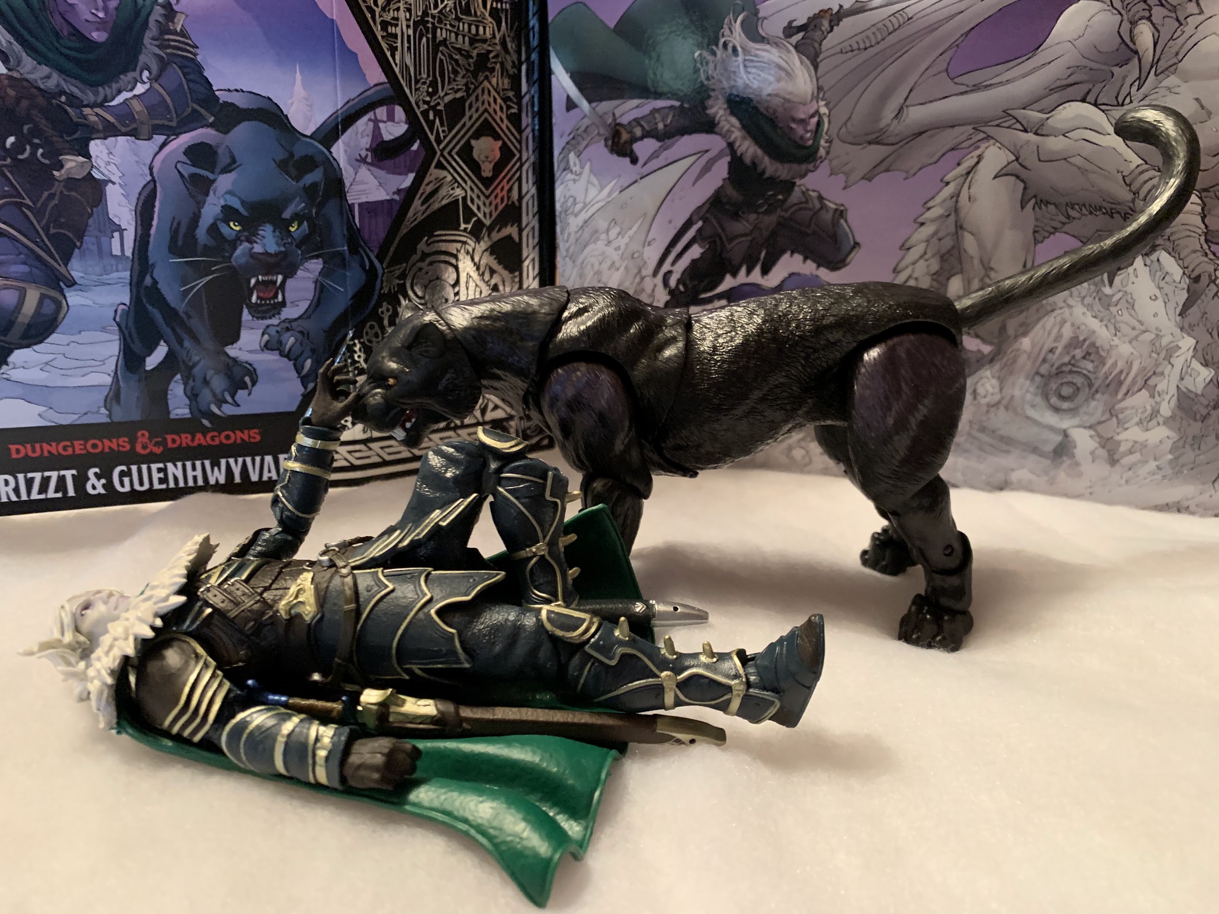
Kitty statue.
Extra stuff that will mostly entertain actual players of Dungeons & Dragons, something I haven’t done in over 20 years.

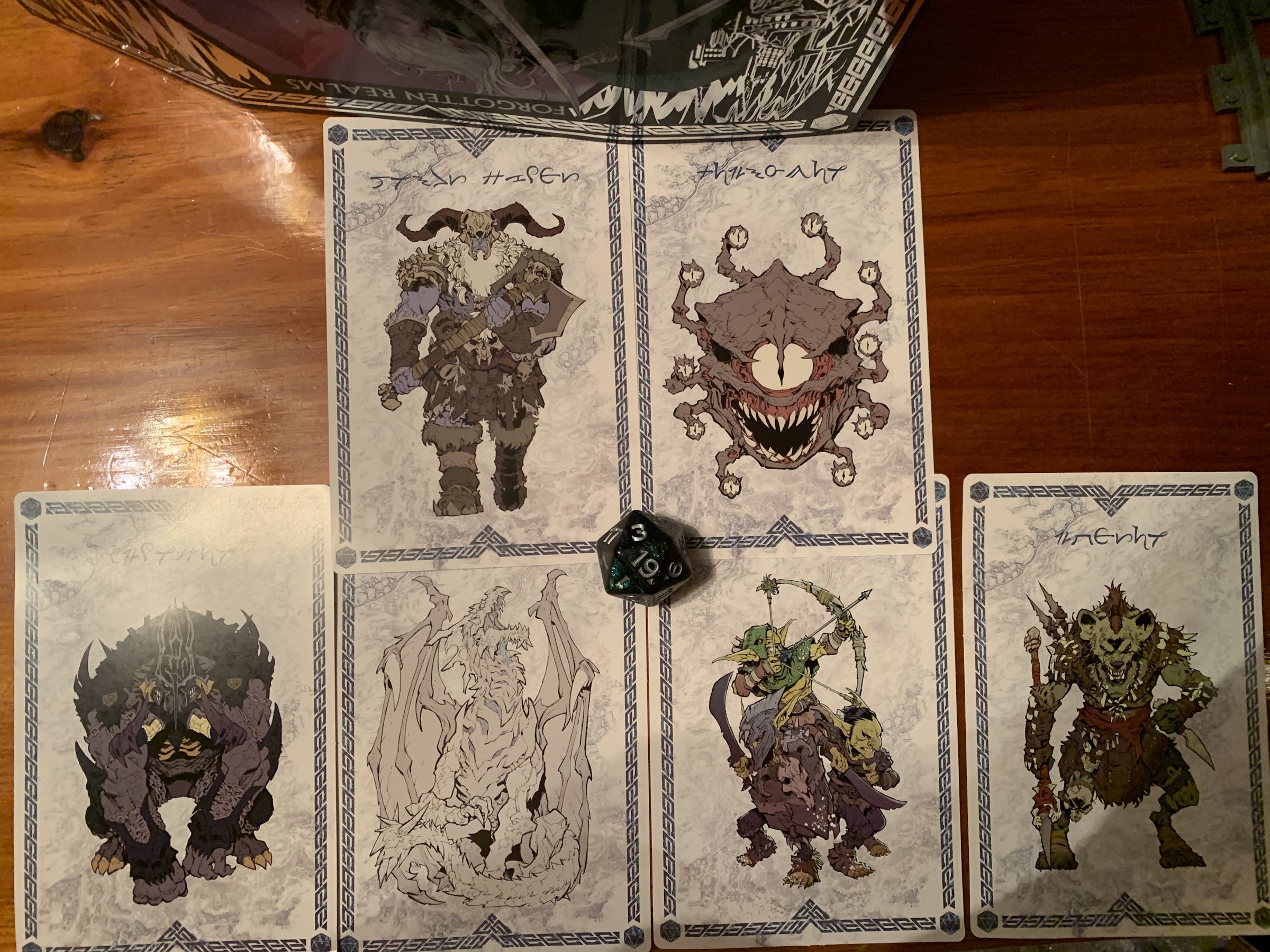
Drizzt comes packaged with quite the assortment of accessories and optional parts. He has two heads: an angry one and a smug one. I really like both, but I tend to prefer that cocky look to the yelling one. He also has two hairstyles which you can swap between the two heads. One is windswept and the other is static. I had a hard time getting the static hair to work in tandem with the cloak, but others may have better luck than me. The cloak can be removed by popping off the head, but be careful when doing do as sometimes his neck will release which is kind of a pain. Try to hold the neck in place as best you can. He also has an extra set of hands which include a fist and an open left hand. The fist is kind of useless and I would have preferred two style hands, but oh well. The open hand works with his little, black, kitty statue which is supposed to be Guen. That’s what the cat is when not in the material world. There’s also a D20 die done in a sparkly, black, green color that’s pretty neat for people who play D&D. Drizzt also has a necklace he can wear which features a little unicorn head. This is the symbol of the goddess he worships or identifies with. It fits over his head fine, but gets lost when the cloak is on too. It’s also too light to have a natural hang and I find I prefer the character without it, but it’s there if you like it. There are also monster cards hidden behind the cardboard insert in the box. I know some of them, like the beholder and ice dragon, but some I don’t know what they are. I wish they had a little bio or something on them instead of some fake language.

You probably don’t want to mess with this guy.
Let’s add a little magic to those blades!

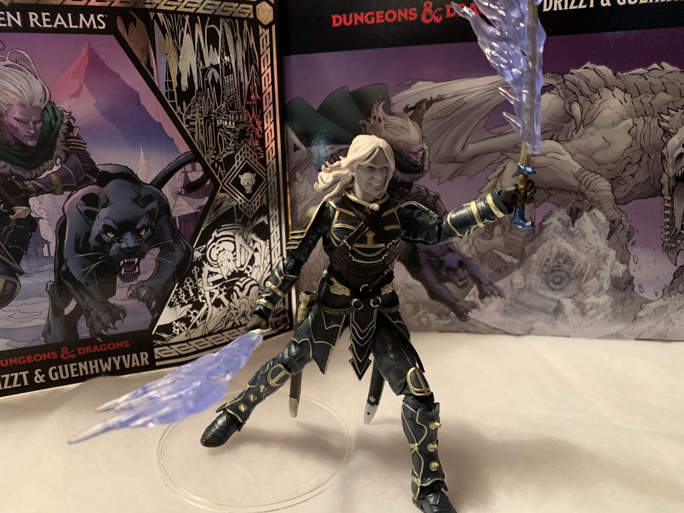
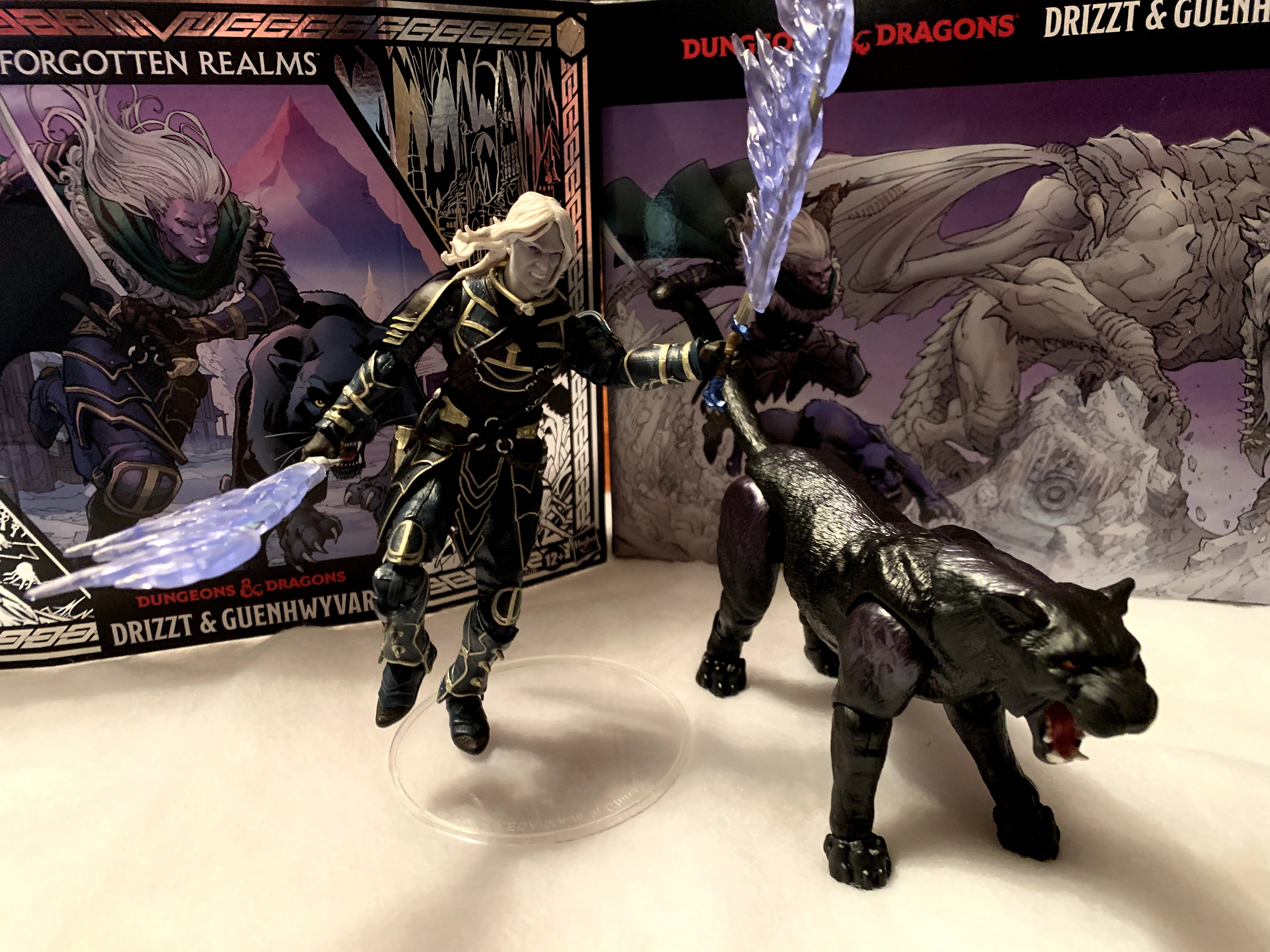
Of course, Drizzt also comes with his prized, twin, scimitars: Twinkle and Icingdeath. They’re well sculpted and painted and look terrific whether in-hand or sheathed. I find they don’t necessarily match up with the descriptions given for each in the books, but there have been prop Drizzt swords made over the years and these seem to match those. I think it’s Twinkle that has this neat metallic, blue, finish on the pommel that’s especially nice looking. The vertical hinges of his hands help in wielding them properly and Drizzt just looks cool with a blade in each hand. He also has two effects pieces for the blades that looks like ice magic, or something. They slide onto the blade and lend themselves well to dynamic poses. The only drawback is they add considerable heft to the swords. If there is one issue I have, it’s that Drizzt’s arms are a little loose for his swords. I still was able to get him into some interesting poses, but I’m concerned if I leave him on a shelf with these things on the blades his shoulders may weaken until he can’t keep his arm up. In particular, the left arm is the one I have the most concern with. I suspect this may vary from unit to unit.

Say, “ahhhh”

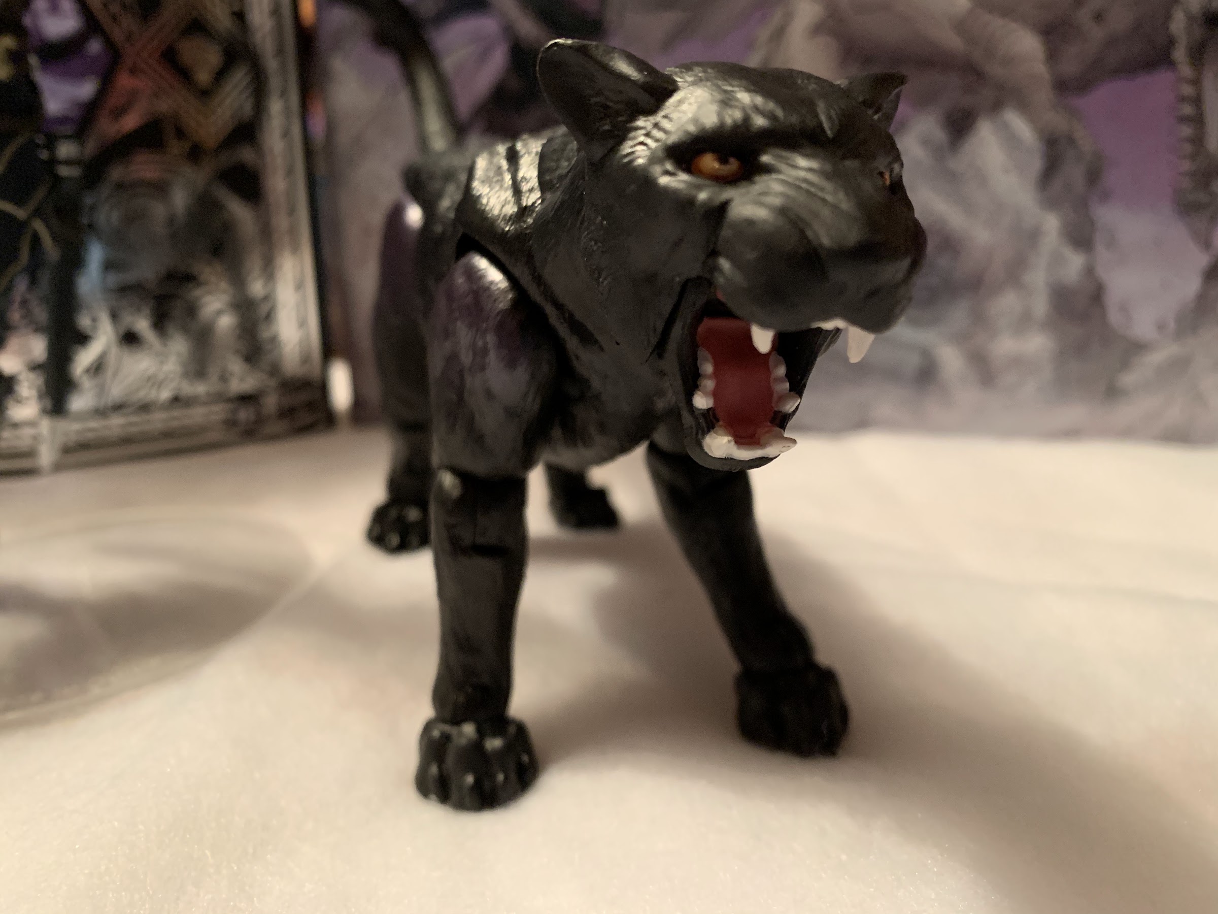
Lastly, Drizzt is accompanied by his good pal, Guenwhyvar. I don’t know why Salvatore settled on such an obnoxious spelling, but he has a tendency to do that with a lot of stuff in his novels. The panther is about six inches long and quite sleek with a lustrous black coat with maybe a hint of purple in some places. There’s a lot of points of articulation on this cat too. There’s a ball-joint in the torso that provides some ability to pivot, a ball-joint at the base of the neck, and a ball-joint at the base of the head with a hinged jaw. The legs appear to be ball-jointed at the base, but can’t do much other than move forward and back a little. The rear, right, leg is pretty tight on mine too. Each knee can swivel and bend and there’s another hinge past that and a third hinge at the foot. That’s on the hind legs, the front legs have one less hinge. The feet can also rock side to side. The tail pegs into a ball joint and kind of just hangs out. It’s a lot, but it’s not all functional. I can’t, for instance, get the kitty to sit in a convincing fashion. She can get into a pounce position, but for the most part I think people will just pose her in a fairly neutral position looking a bit menacing with that mouth open.

“Just five more minutes then I’ll feed you.”
As much as it pains my wallet to admit, he would look cool with an orc to slice and dice.

That’s a lot of stuff for one figure release, and I think this is a great value at $40. Of course, since it is a mail away situation you’ll have to pay shipping to acquire Drizzt so his real cost is more like $50, but it’s still pretty good considering a Lightning Collection Power Ranger is about $20 and of lower quality. For your money, you get a really nice looking and functional action figure plus a fully realized panther figure. That’s not to say it doesn’t have a few shortcomings. I wish the engineering on the panther was a bit better, and I find myself really surprised that Drizzt didn’t come with one more hairpiece that included his hood. Maybe they couldn’t figure out a way to get a hood to fit over the existing hood and didn’t want to turn that into a separate, floating, piece like they have done with the masks on some of the Marvel Legends. Otherwise though, there’s nothing really missing or that I wish the figure came with. I mentioned wanting a second open hand in place of the fist, but I don’t know if I can resist posing him with both blades drawn anyway.

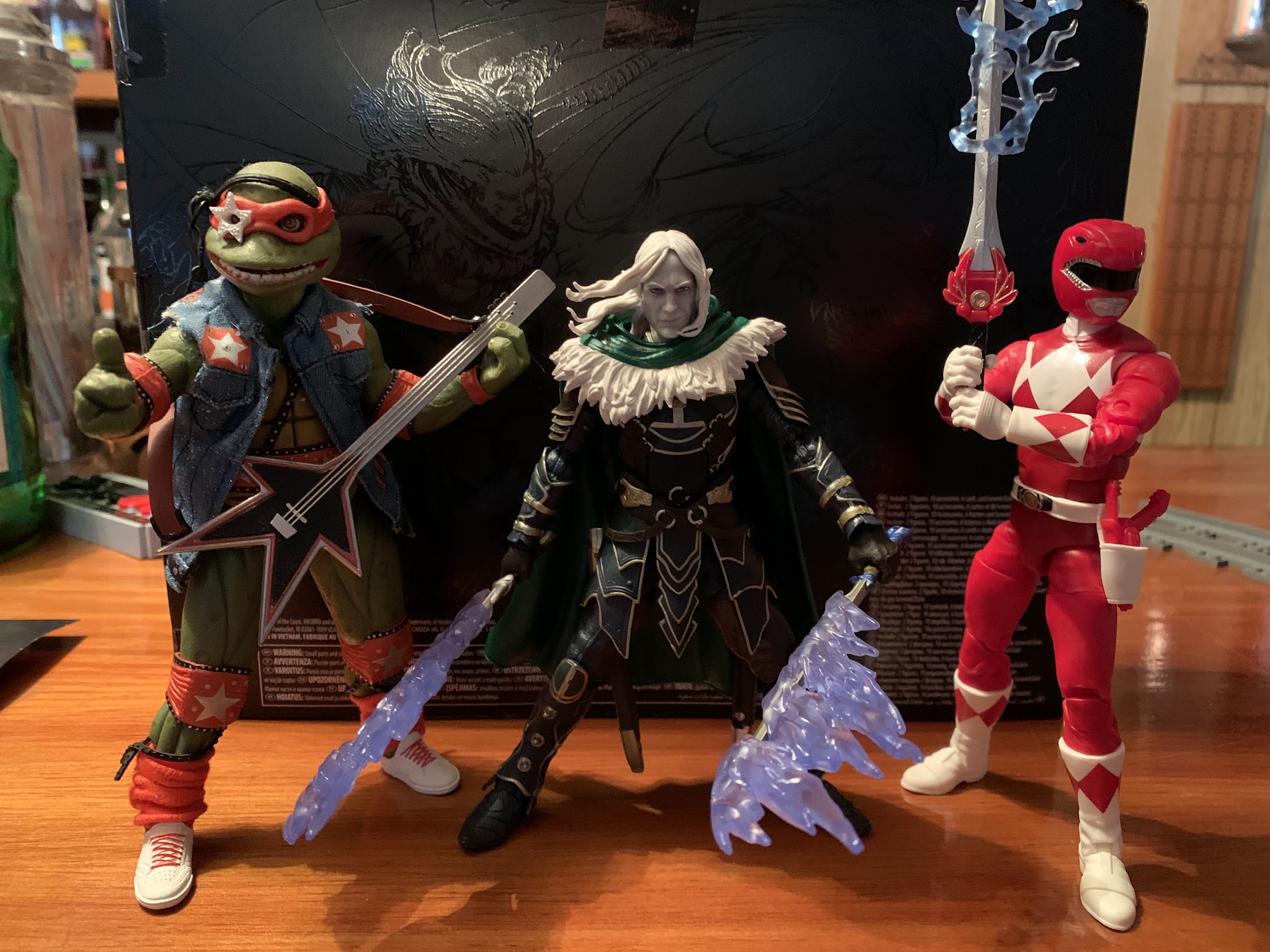
I figured I should probably toss-in a comparison shot with other lines since this is a new line for Hasbro.

If this is the start of Hasbro’s descent into the old TSR portfolio, then this a great way to kick off a line. I suspect Dungeons & Dragons will never be a huge part of the Hasbro figure lineup, but if they can get a couple figures out a year that would be better than what came before it. My hope is for them to head to Dragonlance, but I’d be pretty surprised if the company didn’t hang around Forgotten Realms for awhile and fill out Drizzt’s allies. They may also look to the iconic Monster Manual for some creature ideas in place of characters from the various novels. Unless this figure fails to sell, but I’m pretty optimistic that it will attract enough attention to warrant more figures. If you like what you see here and want Hasbro to do more, you can head over to their website now and order your own Drizzt. I think you’ll be pleased with what you receive.

It’s cold and lonely in the north: get a cat.

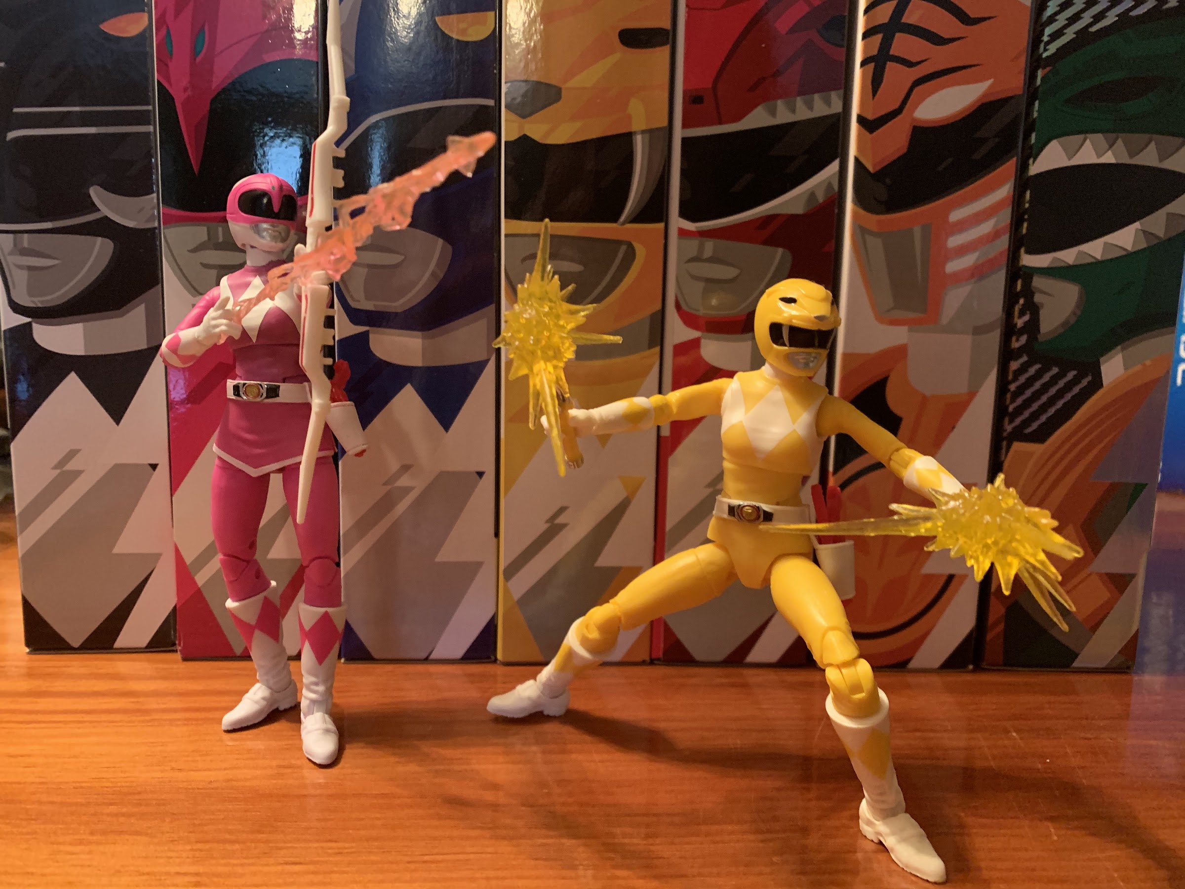
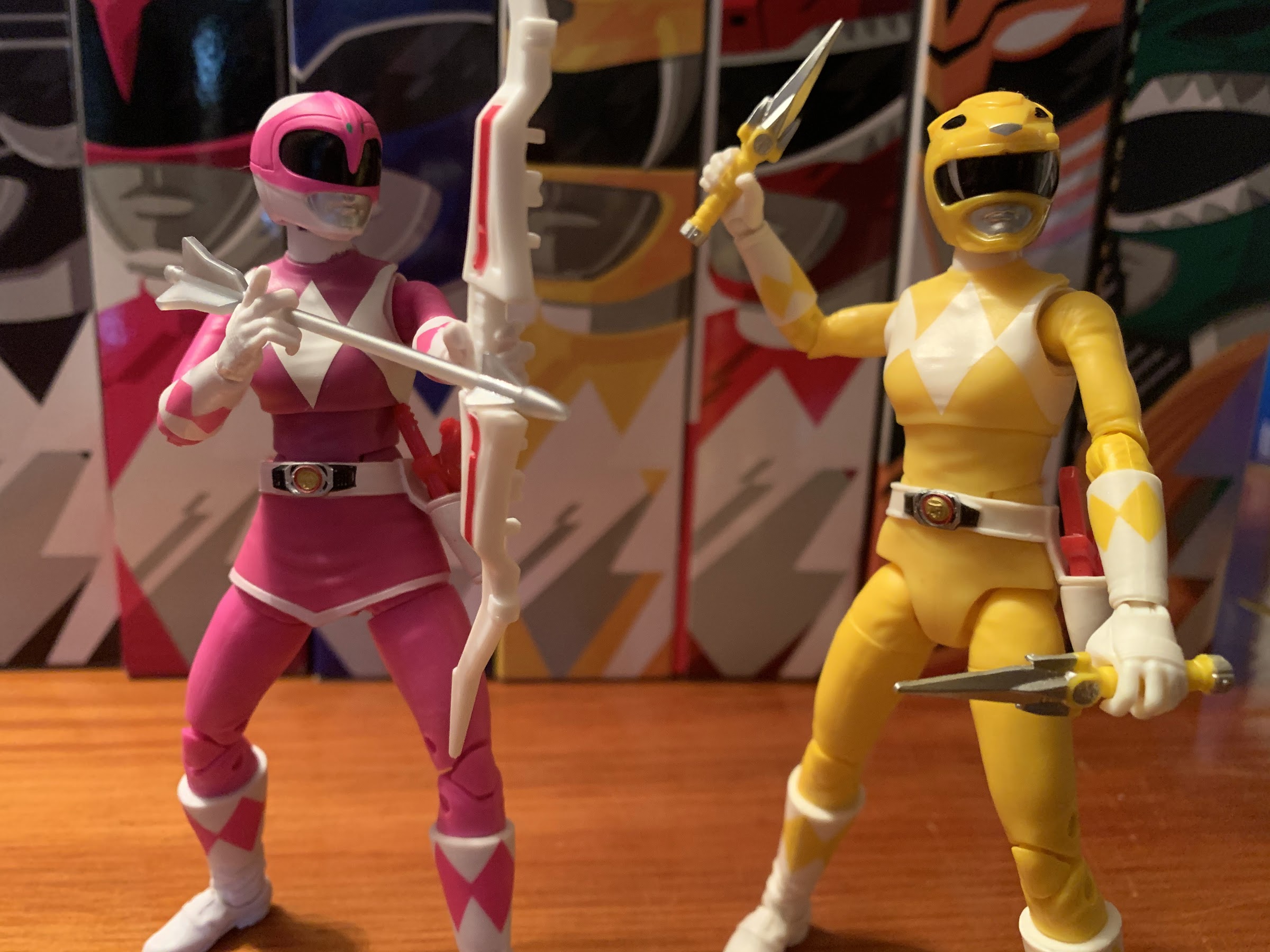
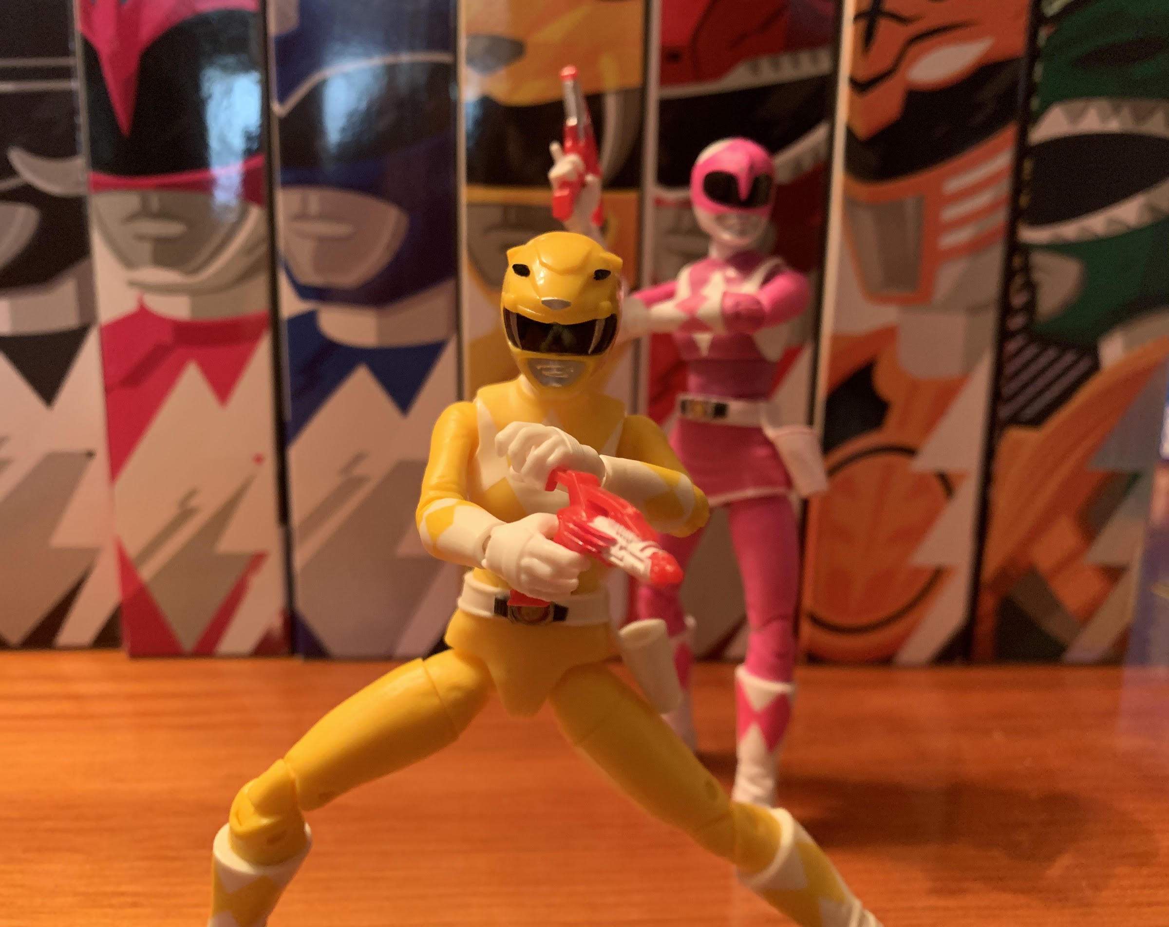
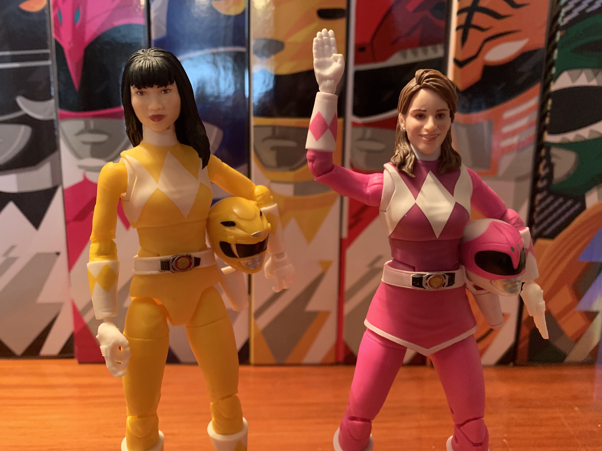
Hasbro Lightning Collection Mighty Morphin Yellow and Pink Rangers

Today we complete a team.

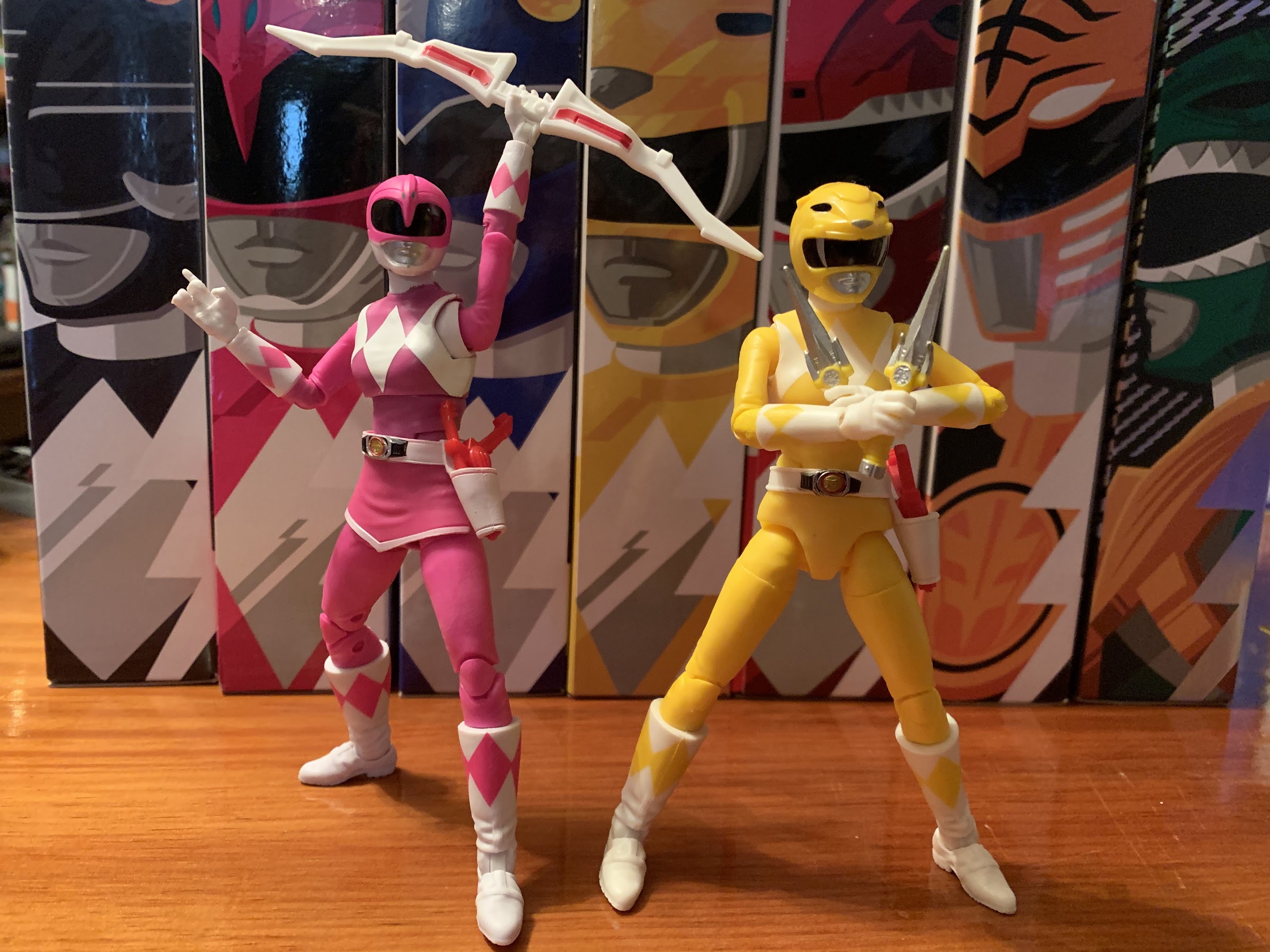
Last week we took a look at the male members of the Mighty Morphin Power Rangers from Hasbro’s Lightning Collection. Back when the show was red hot in the early 90s, all of the action figures of the Rangers were the same figure with a different head and decal on the chest. That isn’t going to work for a figure line aimed at both collectors and adolescents and Hasbro obviously knows that. That’s why they did a male body and a female body for the line and that’s why the women are getting their own write-up as today I’m looking at the Pink and Yellow Rangers from Hasbro’s Lightning Collection.

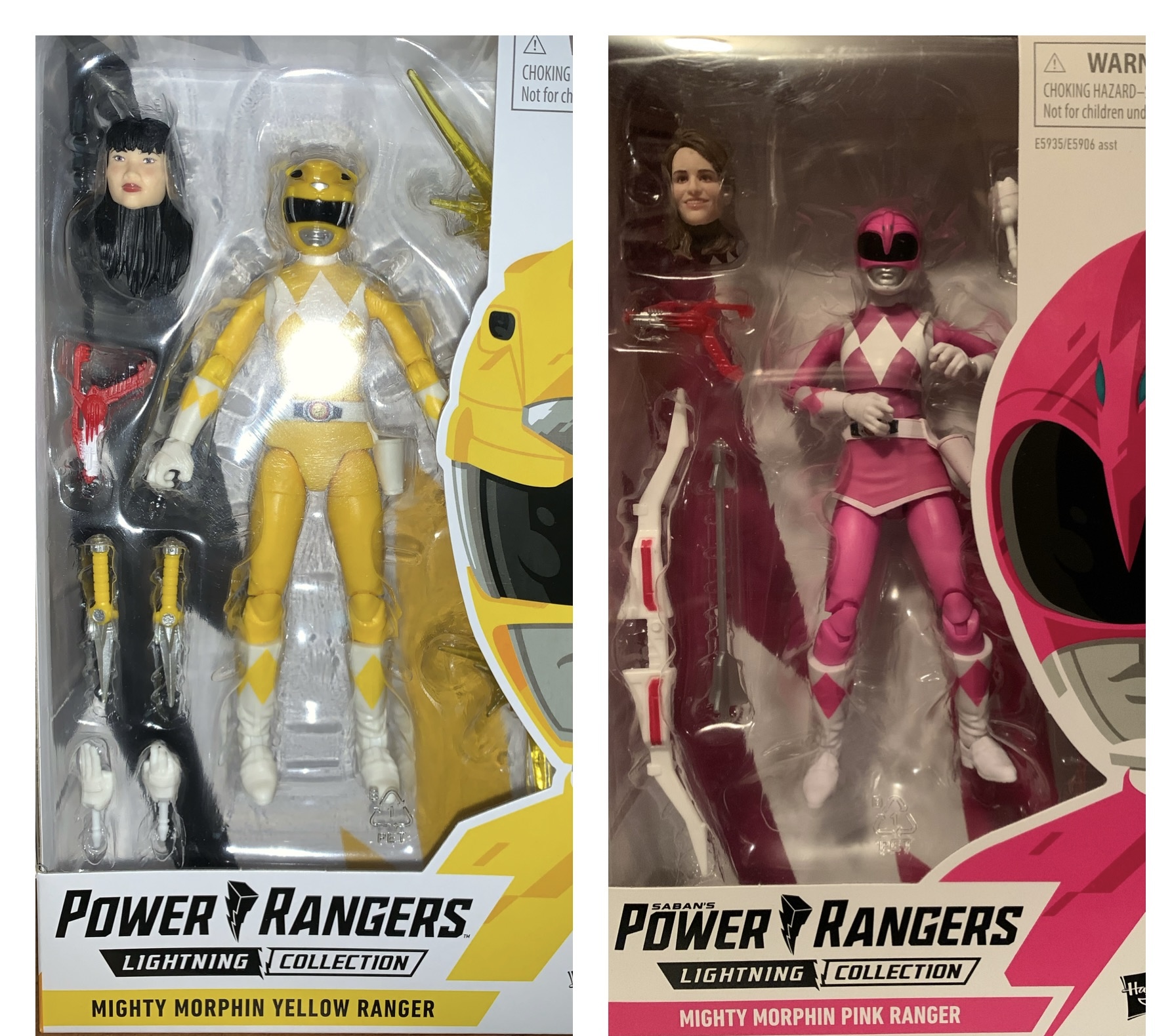
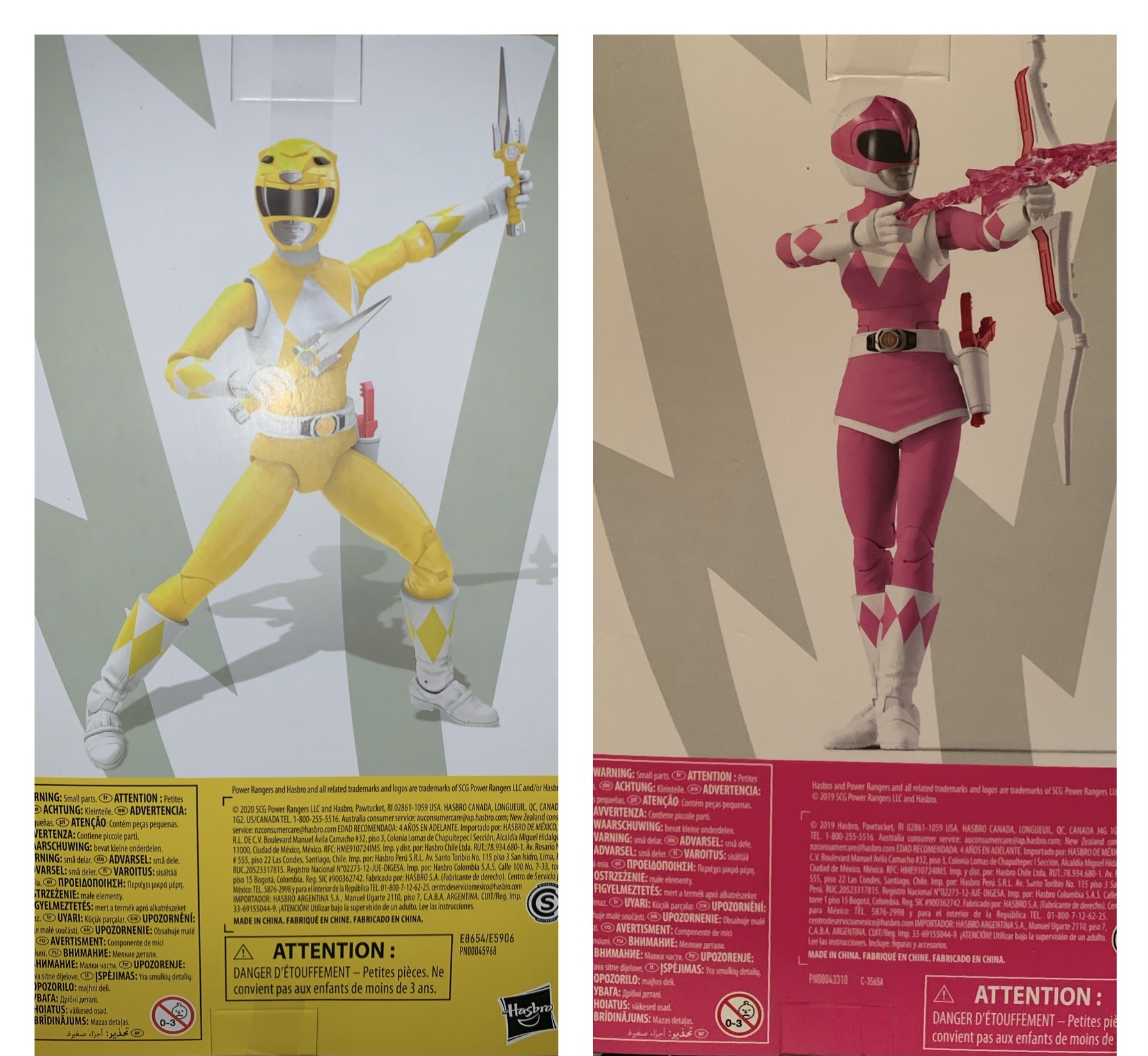
I am still a fan of the window box Hasbro uses for this line, but what’s with that awful posing on Kimberly?

The Yellow and Pink Rangers sharing a body sculpt makes sense, though it also kind of doesn’t. The Yellow Ranger was sort of infamous from this era because Saban chose to cast the late Thuy Trang as Trini Kwan to portray the teenager under the mask. Of course, she was never really under the mask as none of the American actors were since that was footage taken from Japan where the Yellow Ranger was portrayed by a male actor. There are some pretty humorous images online too that really drive that fact home. Technically speaking, the action figure of the Yellow Ranger should probably utilize the male body type, but since American audiences associate Trang with the role it would be kind of weird to have a very masculine Yellow Ranger on our shelf. This figure is already not screen accurate because of this choice, and yet, I think it’s the right move and it’s not something I’m bothered by and I can’t imagine anyone is.

I wish I could get my Pink Ranger into that straight a stance.

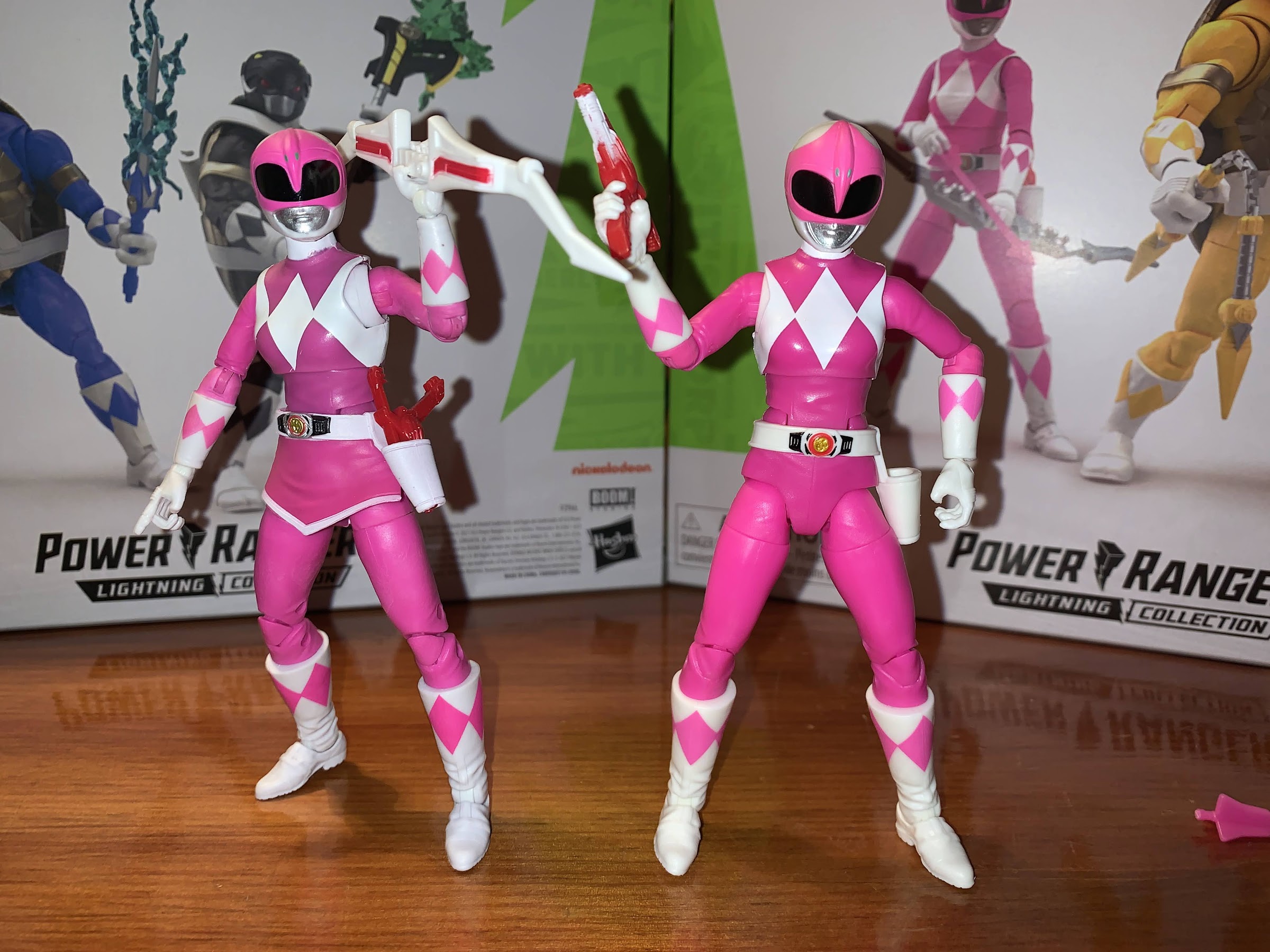
Trini and Kimberly use entirely new parts when compared with their male counterparts. Despite that though, they’re still engineered the same way so the figures feel pretty familiar. They’re just more slight than the men with thinner limbs and smaller hands and feet. They obviously have unique headsculpts and Kimberly differs from her teammate in that she has an extra piece of plastic for her skirt piece as she was the only female Ranger in the Japanese version. They stand at about five and three quarters inches, which is roughly half an inch shorter than the males. They look pretty good in relation to the male figures, though I think you could argue Hasbro went a little too far in slimming these two down. Their limbs probably don’t need to be quite this slight as these are pretty athletic women, and the thinness of the limbs apparently necessitated a compromise when it comes to the articulation. Their proportions also look less appropriate than the men. I can’t decide if it’s the torso that is too long, or the legs. Something just doesn’t look quite right to me and I notice it more with Kimberly than Trini.

These women are packing heat, albeit in an unconventional fashion.

Like the men, these figures mix colored plastic with painted plastic. And like the men, it’s a problem. With Trini, she mostly looks okay. The yellow is quite bright with her torso being ever so slightly darker than the limbs. I have to be looking for it. Kimberly is another story. Her torso is quite a bit darker than her limbs to the point of being near purple. The pink on her helmet appears to be a completely different shade of pink, as does the skirt. She’s a mess, and to make things worse my figure was quite bow-legged out of the box as she comes packaged in a rather awkward position. I had to heat her legs up to try and straighten them out and they’re definitely better now, but not good enough. Trini is a lot more interesting to position and move. Her paint is fine and she might be the cleanest one I’ve received. It also helps that yellow paint slop just isn’t going to be as obvious as a darker color, but it’s good.

The articulation here is not as good as it is with the male figures, but you can still have some fun.

The articulation with these figures is nearly the same as the male ones, but it also works a little differently due to the sculpt. We’ve got a ball-peg at the head, hinged shoulders, elbow swivel, single-jointed elbows, and swivel and hinged hands. Shockingly, Kimberly has a vertical hinge on her right hand for her bow. I don’t know what it is about a bow that made Hasbro decide she needed this hinge, and the others didn’t, but at least they got one hand right out of 14 in this line. Trini, sadly, still has horizontal hinges to deal with. The women having single-jointed elbows instead of double-jointed ones is something I can only assume was brought on by the thinness of the arms. Hasbro used a hinged, ball, peg system so that’s why they have a swivel at the elbow instead of a biceps swivel. It’s a bit more awkward looking, but the figures can still curl their arms past 90 degrees so it’s not a huge downgrade. The diaphragm cut is where things get a little worse. It’s still a ball-joint, but it’s far less effective. There’s a lot of gapping when the figure arches back and the range of motion in general is poor. I attribute this to the lower portion of the torso not sitting further inside the upper piece. The ab crunch is also still here, but even more useless than with the men. The belt floats and can be adjusted and for Kimberly it’s attached to the skirt. The hips flare out, since these are women, and reduces the range of motion there. The men couldn’t really do a split, and the women are even worse which is a shame as I feel Kimberly’s signature move was the jump-split-kick. There’s a thigh swivel and double-jointed knees to go along with a boot cut and ankle hinges with rockers. The ankles are still the star of the show. Overall, the articulation is okay, but definitely worse than the men. Kimberly’s skirt also further reduces her range down there and her bow legs make just standing straight like the phony product shot on her packaging impossible and far less elegant than it could be.

Kimberly does have a regular arrow, if you prefer it to the pink, zappy, one.

Trini comes packed with a pair of gripping hands for wielding her Power Daggers. The little sai-like knives look fine and she has no trouble holding them, she just misses the proper hinges for her hands. Kimberly has her Power Bow with a gripping left hand to hold it and the specialized right hand for knocking an arrow. She also has a silver arrow she can hold, but it doesn’t work particularly well or look all that good. She also has an energy arrow which is far more accurate to the show and easier to wield. And it also looks a hell of a lot better than the silver arrow. It’s a translucent pink with the form of an arrow at the front and looks quite good. Trini has two, yellow, translucent, sparks for her daggers that make me think of pom-poms. They’re fine and it adds a little flair to her posing.

A more traditional form of “heat.”

Like the men, both women come with a second set of hands and a Blade Blaster. For Trini, she has another gripping right hand that is meant to be used in tandem with the Blade Blaster. She also has a style pose left hand that’s similar to a karate chop. Kimberly comes with a left fist and a style pose right hand in the same shape as Trini’s chop hand. This is pretty smart on Hasbro’s part as it gives the women a set of stylized hands to share, should you want to. And I seem to recall at least the Pink Ranger using such poses in the show. Neither woman comes with the collapsed Blade Blaster or the knife version, which is a bummer because the blaster version doesn’t fit Kimberly’s holster as well as it does the other Rangers. Curiously, Kimberly’s blaster is painted differently from all of the other ones opting for a metallic silver instead of white. I think this actually looks better, but it drives me a bit crazy that hers is different for no apparent reason. She also doesn’t have a proper trigger hand and neither default hand works particularly well with the gun.

Tommy, your girlfriend – woof!

Of course, both have a second, unmasked, head. Thuy Trang’s likeness is okay. I at least know it’s her, but it’s not as good as Jason or either Tommy head that came with his figures. Kimberly looks awful though. It does not look anything like Amy Jo Johnson to me. The hair looks fine, so I guess she’s not as bad as Zach since both his hair and his face looked terrible, but it doesn’t really matter if she’s as bad as Zach since she’s still bad. It’s a good thing I don’t value these optional heads because I’d be livid if I did. Their long hair also makes articulation much trickier than before. Trini is okay, but Kimberly kind of locks in place once seated so she basically can’t move her head in this form, but you’re not going to use it so who cares?

The various power weapons join forces to vanquish evil! Yes, I had to look at a reference image to remember where everything goes.
In case you prefer something akin to a side view. The bow gets a little cockeyed doing this.

Since these are the last of the Mighty Morphin figures I will review, it feels like a good time to talk about how the weapons work. Just like in the show, the weapons can combine to form a clunky looking mega blaster of sorts. The axe is the base and the bow clips into the front of it while the sliding action on the axe serves to hold it in place. The daggers and Billy’s twin, mini, tridents peg into the underside of the bow while the sword slots on top of the axe and bow. It’s easy to assemble, though a little tricky to get one of the figures to actually hold it properly. I was able to finagle the pose from the show with Billy and Zach grabbing one end of the bow apiece and the women basically just placing their hands on Jason, so it’s doable. There’s no screen accurate blast effect packaged with anyone though, but that probably would have made it far more difficult to pose with added weight on the front. This gun has always looked kind of silly, but I love crap like this. I love that the weapons combined on the show and I would have been irritated if the toys could not do the same.

Megazord? We don’t need no stinkin’ Megazord!

The female portion of the Mighty Morphin Power Rangers brought with it a mixed bag. Generally speaking, this sculpt does not function as well as the male figure and that’s disappointing because there’s no reason why it shouldn’t work just as well. Despite that though, I’ve actually enjoyed posing the Yellow Ranger. Her weapons are simple, but not restrictive, so she has a lot of freedom. I’m also happy with her paint as she turned out about as well as the White and Green Rangers. The Pink Ranger though is another story. Her articulation is slightly worse, but what bugs me more are her warped legs and mismatched colors. She’s definitely the worst of the bunch and what’s working against her is I never liked her helmet in the show very much. She looks like an alien or something. She’s not a good figure which sucks because she’s been the hardest to get. I had to pay over retail for her because Hasbro stopped shipping her, possibly because there’s a new version out done in a metallic paint with a different actress likeness. I’m curious if that one is any better, though the metallic paint made it a non-starter for me as she wouldn’t fit in with the rest of my display. And if I didn’t need her to complete that display, I wouldn’t have her. She’s the worst figure I’ve purchased in a long while.

Group shot! Yeah, I know, the presence of the White and Green Ranger makes little sense, but I don’t care!

But you need the whole team! And that’s where Hasbro gets you. They know they don’t have to hit a home run with each figure in this line because collectors are going to buy them no matter what since they want a full team of Power Rangers. And now that I have a full team plus the Green and White Rangers, how do I feel? Pretty good. This is a case where the end result is better than the sum of its parts. I have issues with these figures, some more than others, but I’d rather have a full team than just a lone Green Ranger. And even though the scale is obviously way off, I do like having these guys with my vintage Bandai Megazord which displays better with this set than it did the vintage sets. I suppose that would mean it’s “Mission Accomplished” on Hasbro’s end, and that’s how it is with mass market action figures. At least now, after almost 30 years, I finally have a set of Power Rangers toys!


Hasbro Lightning Collection Mighty Morphin Red, Black, and Blue Rangers

It’s morphin time!

If it wasn’t obvious after my White Ranger review, I have decided I need to assemble a team of Power Rangers on my shelf. Specifically, the Mighty Morphin era. I’ve already posted my thoughts on both the Green and White Rangers, devoting a write-up to each figure, but for today I’m going to do some combining. And that’s because I am basically going to just talk about three different versions of the same figure. The base Power Ranger male figure is the same for each one, at least for the Mighty Morphin figures. I assume the other teams are similar, but I don’t know that for sure because I don’t have any of them, nor do I intend to get any of them. These three though are the same, and they’re basically the same as the Green and White Rangers too, though those two had a few unique pieces due to the slight differences in costumes. Now I don’t intend for that revelation to be a knock on this line, toy companies reuse parts all of the time and when the characters are pretty similar there’s no need to re-sculpt everything just for the sake of doing so. The actors in the show who portrayed the “teenagers” who become Power Rangers were fairly distinct in terms of body shape, but the costumed Rangers really were not.

I like what Hasbro has been doing with their packaging. Simple, but elegant, window boxes.

The good news is, I generally liked what Hasbro did for the other Rangers I reviewed. If I didn’t then I probably wouldn’t have bought more. The molds aren’t cartoonishly bulky like the old Bandai ones and was more reflective of how these characters actually look on screen. You can still nitpick them here and there, but for the most part they look like what I recall seeing on television back in 93. The articulation is solid, the paint has been okay for a mass market retail figure, and each figure has come mostly with enough stuff. This time though we’re going into original five territory. These characters were even more uniform with really the only difference being the head and unique weapon. All of them, in the show, were also armed with what was called a Blade Blaster which was a little laser pistol that could turn into a bulky knife. These three should be pretty similar with some room for there to be a clear “best” and “worst,” but my expectation is if one is good then all three should be pretty good. And, of course, if one is bad then they will all probably be bad.

Though I wish they used actual product shots on the rear as opposed to renders. Good luck getting the Black Ranger into that exact pose.

All three Rangers come in the same attractive window box with some unique artwork on the front and side and product shot on the back. The box is also color themed to that specific Ranger and these would probably look just fine to a mint-in-box collector, and for you openers the packaging is fairly durable and can be resealed with minimal effort. Each figure stands a tick over 6″; we’ll call it six and a quarter. And each one is some combination of colored plastic and painted plastic. Since these figures are essentially just two-toned, Hasbro tries to get away with using as little paint as possible and it creates problems. The Black Ranger is the best of the three as black is pretty opaque and plastic painted black and molded black are going to look the same. The molded white and the painted white which shows up at the butterfly joint is a little off, but for the most part he looks good. There’s paint inconsistencies here and there, and one glove has an ugly smudge of black on it, but it’s something you kind of have to deal with as far as this line is concerned. Strangely, he doesn’t have a red ring on his morpher, something all four have, so this is clearly an error on Hasbro’s part. The helmet is at least clean and looks pretty sharp. It was always one of my favorite helmets in the show with the mastodon tusks curling under the visor and it’s recreated here pretty well.

I’m going to be humming the theme song as I drop images into this thing.

Unfortunately, the Red and Blue Rangers are not as good. On these two, the colored plastic and painted plastic is noticeably different. The torso on the Red Ranger in particular is way darker than his limbs to a distracting level. It’s readily apparent in box, and still when removed. When he’s posed on a shelf with his limbs in a more dynamic pose the effect is minimized a bit, but not removed. The same is true of Billy, our Blue Ranger, but it’s not as severe. Instead, he gets to introduce a separate issue and it’s with the white paint on his torso. It’s not nearly opaque enough and the blue plastic shows through it. It’s bizarre for this figure to have this problem when the black figure is fine. These figures were not all released at the same time so it would appear the factory just had a bad run when it came time to manufacture the Blue Ranger because he feels like the clear dud of this trio. He also has the worst helmet of the three too as there’s a paint chip on the center horn and the shape just looks a little off to me. It’s very round. There are some sculpted lines on it, but the plastic is so dark and glossy that they don’t show well. I wish Hasbro had added some paint to bring them out more like they did with the Black Ranger who has some added silver paint. He’s not awful, but this figure is definitely helped by the fact that I’ve always enjoyed the aesthetics of the Blue Ranger, but someone who doesn’t like blue as much as I do would probably have a harsher take here. The Red Ranger also would benefit from some more paint on his helmet to bring out the design.

Hopefully you can tell how dark Jason’s torso is vs his limbs and how thin the white paint on Billy’s diamonds are.

The paint on these guys is definitely a mixed bag, but at least they’re all the same when it comes to articulation. To run it down again, these guys have a ball peg at the head that gives them an acceptable range of motion. Up and down articulation is limited, but it’s fine. We’ve got a ball hinge at the shoulder with a butterfly joint behind it. The combination of molded white and painted white plastic with this joint is a little unsightly, but the range created by the joint is, for the most part, worth it. I have a bit of a love-hate relationship with butterfly joints. There’s a biceps swivel, double-jointed elbow, and the hands rotate and have horizontal hinges, which are bad for these figures. There’s a ball-joint in the diaphragm that provides some tilt forward and back as well as side-to-side. There is an ab crunch that’s mostly useless, and no waist swivel. I wish Hasbro would ditch the ab crunch and just go with a waist swivel. The legs are ball pegs and can kick forward, but not back. They also can’t do a true split, which kind of sucks for acrobatic characters. There’s a thigh swivel, double-jointed knees, a boot cut, and ankle hinges with rockers. The ankles are terrific and will be your best friend when it comes to posing these boys. It’s fine articulation on the whole with obvious room for improvement. Unfortunately, any improvement to it though will be a benefit to other iterations of the Power Rangers as I suspect Hasbro is not going to re-sculpt the Mighty Morphin figures anytime soon. Maybe when they do guys like Rocky and Adam they’ll retool some things, but it’s not something I’d count on. It also should be noted some are more stiff than others, though I can say no joints are loose. My Red Ranger’s elbows were also curved slightly which made working them a bit difficult. I ran them under hot water to try to bend the bow out and was mostly successful. His shoulder hinges are real tight though and he’s a bit more awkward to work with as a result.

The weapons turned out pretty well, at least.
This is the only blast effect among the five Rangers so if you want the combined blaster to fire this is your only option.

The accessories present the most obvious opportunity for these figures to separate themselves from each other as each Ranger had their own unique weapon. For Jason the Red Ranger, it’s the Power Sword. Zach the Black Ranger has the Power Axe, and Billy has the Power Lance. Very creative names, I know. Jason’s sword is just that, a sword. It’s fine, but the lack of vertical hinged hands makes wielding it properly more difficult than it needs to be. Hasbro also painted the handle black, so now I have black smudges on the inside of the hands. Definitely just heat those hands to make them soft when inserting this thing unless you want your figure to have dirty hands too. Zach’s axe suffers from the same hinge fate when wielded as an axe, but it also functions as a gun which the wrist hinges don’t impact much. And it’s pretty cool! It even has a sliding action on it so he can pump it like a shotgun. It’s probably my favorite weapon so far. Billy’s lance is fine, though it’s a bit flimsy so it will often have a slight curve to it. It’s blue plastic, so there’s less fear of rub with this one as the only paint is reserved for the silver trident tips and some minor details. Hasbro packed in separate handheld daggers for Billy as his lance could break in half. This was mostly for when they combine their weapons (which is something the figures can do if you buy all five Rangers), but he can wield these like sais if you wanted. It’s probably the smarter play than just having the lance separate as they would have had to have a separate middle piece that did nothing in order for the lance to be long enough. These weapons are good though, so no real complaints there. Each one also comes with an effects piece for their respective weapon. Jason and Billy have a lighting effect that is blue for both of them. Zach has a blasting effect for when his weapon is used in gun form. It’s a translucent red with sparkles and works pretty well, though it kind of looks like a pumpkin. It does add a lot of weight to the front of the axe so posing him can get challenging when it’s inserted, but not impossible.

Ready for a shoot out.
Zach is the only one who got the memo it was actually a knife fight they were supposed to show up for.

For the blasters, Hasbro continues to confuse. Each Ranger comes with a Blade Blaster in blaster form. It would have been pretty awesome if they could have made a transforming blaster (since the transformation was very simple), but that might have resulted in too fragile a piece so instead there are just regular blasters. The paint on them isn’t great, but the sculpt work at least looks nice. Zach also comes with a Blade Blaster in blade form. This is cool since it was something each Ranger had, though as a weapon it looked really stupid even to an eight year old, but it was in the show so I want the toy to have it. The blade though is permanently extended so it has basically one function. This sucks because in the show the Rangers would holster these weapons in blade form, but with the blade retracted (it was essentially an ugly switchblade). That means each Ranger can’t holster this weapon in a screen-accurate manner. I’m tempted to just snip off the blade, but that won’t solve the issue of the Red and Blue Rangers only having the pistol version. The pistol fits in the holster, but again, it’s not screen accurate and it bothers me. You can brush this aside by saying “Well, this is a line meant to appeal to kids too,” but kids care about that stuff! I was arguably more obsessed with things being screen accurate as a kid than I am now. At the very least, each figure should have come with this bladed version in addition to the gun, but Hasbro got cheap on us. It’s like they put it in with the Black Ranger just to wave it in our face that they could have done this the whole time, but chose not to.

Spare heads, if you want them. Though I can’t imagine anyone wants that Zach.
Yeah, I’m not going to use these.

Lastly, each figure comes with some optional parts. All have two sets of hands: gripping and fists. I appreciate the extras, but fists aren’t very exciting as optional hands. I’d have preferred maybe some chop hands or more style pose hands since these characters did a lot of that in the show. The other optional part is the unmasked head that comes with each. This is a good thing if that’s something that interests you, though I personally won’t ever use them. The likeness for each is based on their original actor so we have Austin St. John as Jason, Walter Jones as Zach, and David Yost as Billy. Of the three, Jason looks the best. It more or less looks like St. John. Billy’s head is okay. It’s a bit goofy and glasses are always hard to get right, but it’s okay. Zach though looks terrible. I don’t know what Hasbro was trying to do with this one. He had dreadlocks in Season Two and I guess that’s what they were going for with this one, but his hair just looks terrible and the face looks nothing like Jones to me. It’s bad. It’s probably a bummer for diehard collectors of Power Rangers who want to assemble a team of every actor who played these characters, at least for a casual fan like me it’s just an ugly lump of plastic that will stay in the box.

All right, it’s face-off time!
“Don’t worry, Tommy! I’ll save you by smashing in your face with my Power Sword!”

This collection of Mighty Morphin Power Rangers is okay. I definitely do not like these figures as much as I did the White and Green Rangers, but I’m not feeling any buyer’s remorse or anything. They get the job done when put on a shelf, it’s when placed under greater scrutiny that some things start to fall apart. I think the Black Ranger is fine, ignoring his ugly unmasked head, and I’m mostly happy with how he turned out. The paint issues on the Red and Blue Rangers are my biggest complaints. I can handwave the inaccurate Blade Blaster and lack of vertical hinges for the hands, but the paint is a bummer because that affects the aesthetics of the figure just as much as the sculpt. The Red Ranger’s elbows, in particular, are ugly because they’re basically a candy apple red and the Blue Ranger has those poorly painted white diamonds on his chest. The thing I keep coming back to is that these are mass market retail figures priced at 20 bucks or less, in most cases. I shouldn’t even expect NECA quality with these things, let alone high end collectibles. Even with that caveat, I still think they’re a little disappointing because this is Hasbro and we know what Hasbro is capable of. Whether it’s Ghostbusters, GI Joe, or Marvel we’ve seen them do much better with paint and certainly matching colored plastic to painted plastic. I can’t recall ever having that be as big an issue with another line as it is here.

Hasbro is able to get a lot of important stuff right with these guys like the overall sculpt and articulation. They also realize that Billy should have a separate set of weapons for when his lance is separated. Then they go and mess up the paint and fail to include holstered Blade Blasters and just do some weird stuff that keeps these from being great. It’s frustrating.

Ultimately, you are free to like or dislike these figures. I suspect most will have mixed feelings, as I do, but I also bet there are some extreme reactions too. For me, I like the aesthetics of these sculpts more than I have any other Power Rangers products, so they work well enough. I always hated the over-muscled look of some of the Bandai figures because these guys aren’t Jim Lee drawings, they were just actors who were probably gymnasts first. If I thought Hasbro was going to do better I might have held off, but I don’t think that will happen unless they do some running changes when they get to the other actors, assuming they do. And if they do, I hope they just cast everything in colored plastic save for the hands and I suppose the boots. And they can also keep the white butterfly joint, I guess, though I think they can do better in color-matching that too. And if that happens, maybe I’ll sell these and upgrade (the Red and Blue, anyways), but maybe I won’t? These get the job done for me, I just think Hasbro can do better and I don’t blame Power Rangers fans if they want to hold Hasbro to a higher standard by ignoring these.


Hasbro Lightning Collection Mighty Morphin White Ranger

Looks like I bought another Power Ranger…

A couple of months ago, I purchased a Green Ranger from Hasbro’s Power Rangers Lightning Collection line of figures. The intent was to sort of replace my vintage Bandai Green Ranger following an unfortunate encounter with my children. I never intended to assemble a full team of Rangers on my shelf, but I am a fool. I was mostly impressed with that Green Ranger figure, and after weeks of seeing him all by himself on my shelf I found myself getting the urge to find him some company. Soon enough, I found myself scrambling to assemble the entire team of Mighty Morphin Power Rangers, the only incarnation of the show I watched as a kid. And while I enjoyed the show, I lusted after the toys which were supremely difficult to track down and I never had a full team. I had a head-flipping Green Ranger and my sister had the Pink Ranger and I honestly can’t remember if we got anymore. Now some 30 years later I have the means to assemble a team and Hasbro is willing to throw this line out there for folks like me with arrested development.

No one wants to be lonely.

That original team of Power Rangers consisted of the following colors: red, blue, black, yellow, and pink. The Green Ranger was added shortly after the show started as a villain, who would soon become an ally. You’re probably aware at this point about the show’s unusual development. It’s a Japanese show called Super Sentai and what Saban, the production company with distribution rights outside of Japan, did was cast American actors to play the alter egos of the Power Rangers. They’d shoot that stuff in the US, and then just splice in footage of the rangers in action from the Japanese program and overdub the voices. Since all of the Power Rangers wore helmets, it was easy to dub. The problem with this format is that once you run out of footage you’re kind of screwed, and that’s basically what happened with the Green Ranger. To fix this, they wrote him out of the show by having him lose his powers. They then brought back the character of Tommy Oliver (played by Jason David Frank) as a new Power Ranger: the White Ranger! Only this was even weirder as the White Ranger was from a different iteration of Super Sentai so he looked quite different from the others and often found himself taking on the minions of Lord Zed by himself. This was all stuff I was not aware of as a kid or even noticed, but as an adult it’s kind of fun to go back and watch this stuff with that knowledge.

This is the standard packaging release. There’s also the slightly more fancy “spectrum” packaging sold at Target, but the contents are the same.

In order to assemble a team of Power Rangers on my shelf, you could argue I don’t need both the White and Green Ranger. Well, the White Ranger was one of the easiest to find on store shelves and I do like his design and I’m profoundly weak, so here we are! This figure is quite similar to the Green Ranger as they basically all use the same body as the base of the figure. Hasbro then gives each character a unique headsculpt and weapon while also modifying the sculpt where necessary. For the White Ranger, that means sculpting new forearms and boots as his gloves and boots feature gold cuffs that require new sculpting. He also has gold armbands that are different enough from the Green Ranger that he needs some new tooling there as well. The black and gold vest he wears is a soft plastic addition that just fits over the main body of the figure. He also has a distinct belt and scabbard for his sword making him the figure with probably the most unique tooling in the line as far as the Mighty Morphin brand is concerned.

Ready to throw down.

From a purely aesthetic point of view, Hasbro absolutely nailed this one. Even more so than they did the Green Ranger, who I felt looked pretty damn good as well. For starters, the helmet looks great. There’s a lot of fine detail on it and it would not have surprised me to find paint slop in this area, but it’s all really clean. It’s striking, and I like how his head sits on the body in tandem with the vest, or shield, or whatever that thing is. With the Green Ranger, I felt his head sat a bit too low and his torso looked a little too long, but I think that was caused by the presence of his shield and the White Ranger’s vest mitigates those problems. The sculpting and detail on the vest looks terrific as does the belt and other gold accents on the costume. The hands and boots both feature the same sculpting as the Green Ranger as do the other parts of the body so he has some folds and creases which really bring out that authentic look. The only visual flaw with my figure is the presence of a smudge or scuff on the lower, right, side of his vest that’s barely visible because it’s all black. I did see several of these figures at the store and not all of them were as clean looking as this one, so definitely try to pick him up in person if you want this thing rather than order online. Overall though, I’m quite pleased with how he turned out.

Can he stand on one foot? Hell yeah he can!

While the White Ranger’s sculpt may differ a bit from his green predecessor, his articulation does not. This figure features the same articulation as that figure, but I won’t make you go back and read that review to get a rundown. His head is on a ball-joint and he can look up, down, rotate, and tilt a little. The shoulders are ball-hinged and also possess a butterfly joint which the vest works really well to conceal. There’s a biceps swivel above that gold armband and double-jointed elbows. The hands swivel and have horizontal hinges, which we’ll talk about in a minute. There’s a ball-joint inside the torso that provides great tilt and range of motion and there’s an ab crunch below it if you really want this guy to lurch forward. There’s no waist swivel, but that diaphragm joint works pretty well and I don’t really miss it. You have ball-hinges at the thigh with a thigh swivel just below on each leg. The knees are double-jointed and you get a boot cut as well above the gold cuff. The ankles are hinged and also have terrific “rocker” action as they pivot easily from side-to-side. Really, the only thing I miss is a set of vertical hinged hands, or even just one hand, for proper sword wielding. That’s a fault with the entire line though and not something unique to the White Ranger.

The problem with a talking sword is you never know how to hold it.

The White Ranger comes with a few accessories, but a little less than what the Green Ranger came with. He has his trusty sword at his side, Saba, the weird, talking, tiger thing. It’s his signature accessory and really the only one he actually needs, but it might bug some purists when they find out that Hasbro took some liberties with it. The shape of it looks fine and is largely as I remember, but rather than have a white, tiger, face on the hilt Hasbro chose to paint it all silver. It’s cast in white plastic so maybe someone felt it looked too boring being in white, but it doesn’t really bother me. Again, I’m not a Power Rangers super fan or anything, so others may be bothered by it. The stripes are painted black and are relatively clean. One side of his face is gold, while the other is left silver. I think both sides should be gold and, but I don’t believe this is an error on mine as a quick search of other reviews seems to produce the same thing. I think it would have looked cool if they added a little red to his eyes. I think they would glow in the show, or maybe I just wanted them to. Overall though, it looks okay and it fits in his scabbard if you’re a monster and actually want to pose this guy without the sword in his hand.

He also has this thing for the end of his sword. Is it an energy effect that didn’t exist in the show or just supposed to mimic light shining off his blade? I don’t know.

Aside from Saba, the White Ranger just comes with some additional hands, head, and an effects piece. Out of the box he comes with a right gripping hand and a left karate chop hand. In the box you will find a set of fists. It’s weird that he doesn’t have a left gripping hand, but I guess Tommy was a righty. Since he needs to be able to hold his sword, I doubt most will make use of that right fist, but it’s there if you want it. And it’s good that I’m lukewarm on it because the right hand snapped out of the hinge joint when I tried to remove it. The break was clean and I was actually able to get the hand back into the the joint, but it was a bummer. The second head is an unmasked one, as is the case with all of the figures in this line. It’s Tommy, but with a pony tail which is appropriate for this era. I believe this head was also released with the first Green Ranger Hasbro did, but was then replaced with a more appropriate head in the single release from late last year. The likeness on it is fine, but I’ll never use it once this review is done. I also had trouble getting the helmeted head off of the figure, and after what transpired with the hand, I just cut my losses and let it be. This line is technically for ages 4 and up, so it’s probably cool for kids to have the second head as they play, provided they can actually get the other one off. Lastly, White Ranger has this blue effects piece. It’s very spiky and the plastic is translucent and it has a little slit in it so you can stick it on the end of the sword. I guess it’s supposed to be a shimmering effect? I think that’s what they were going for, but it doesn’t quite work.
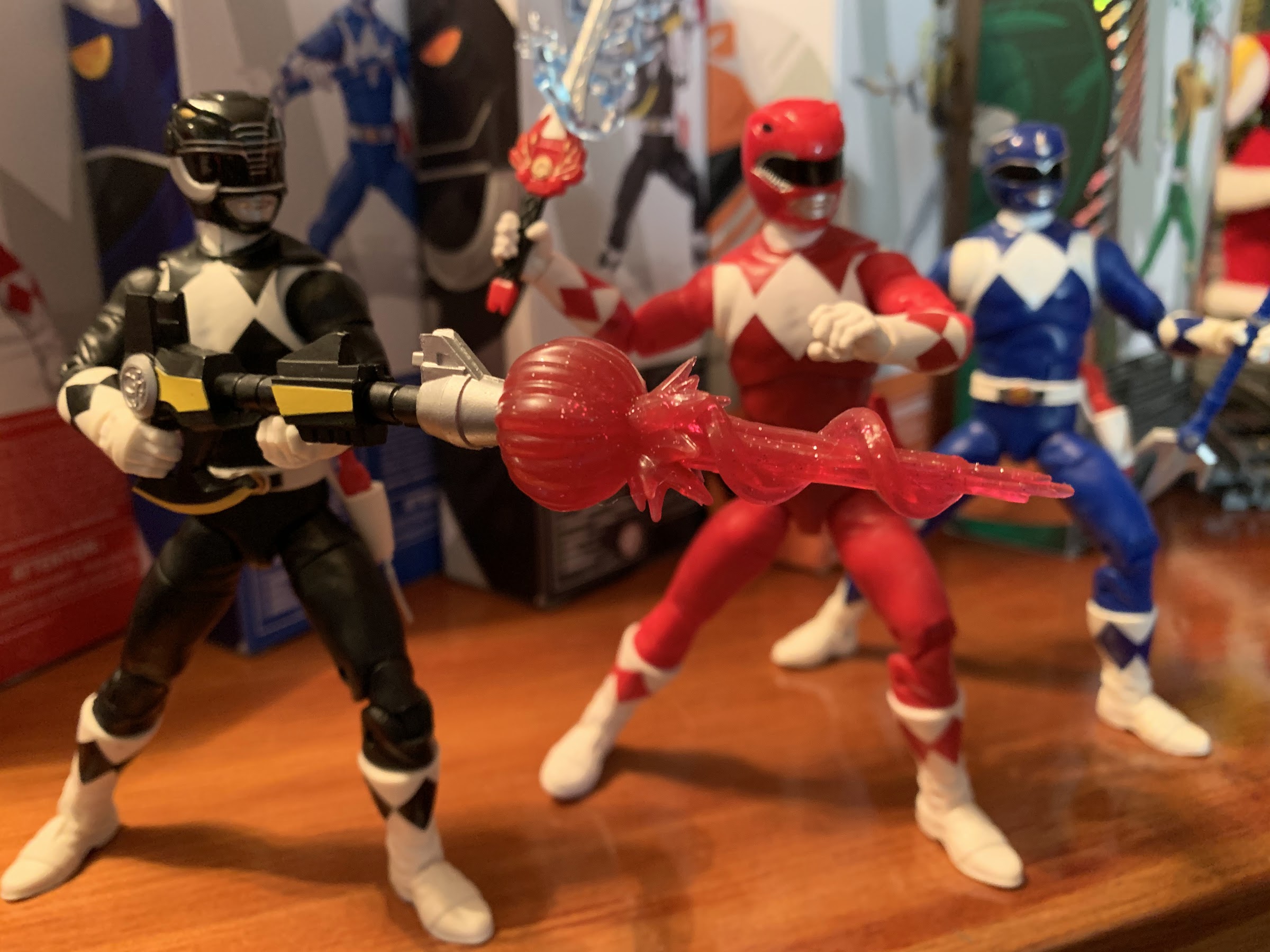
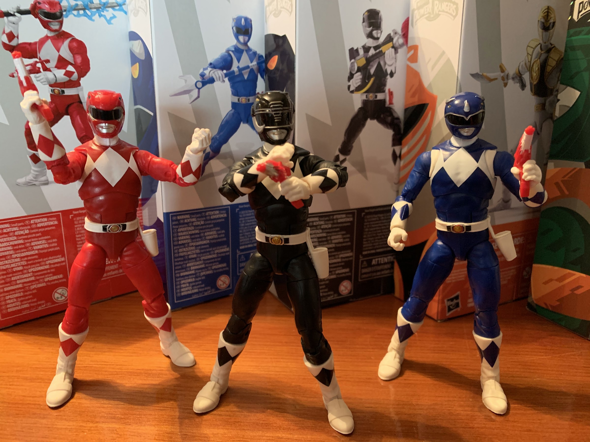
Everyone does the pose with the unmasked Ranger holding their helmeted head, but how many do the opposite? This is the content you come here for.

The White Ranger is a pretty fine release. It’s a twenty dollar figure that has mostly great paint, solid articulation, an attractive sculpt, and enough accessories to make him feel like a complete release. If I’m being objective, this is probably a better release than the Green Ranger I reviewed last year, but I’m partial to that character so I don’t know that I enjoy this one more than the other. Basically, I think Hasbro could have done a little better with the hands and effects piece, but otherwise this figure checks all the right boxes. My only real complaint is a lack of a vertically hinged sword hand. I think that’s a problem for the entire line though, so for whatever reason, Hasbro just doesn’t like vertically hinged hands. And then of course the quality control issue I had with the hand is not ideal. The pegs connecting the hands to the forearm are almost needlessly long and in this case the hinge gave out before the peg could be freed. It surprised me because this guy had been out of his box for nearly a week before I really messed with him so he had plenty of time to warm up. I’m tempted to return this one for another, but the hand went back on fine and the hinge is functional so I’ll probably just keep it considering the paint app was solid. This guy is not exclusive to any retailer though and should be pretty easy to get ahold of if you’re looking for him, so get get him if Power Rangers are your thing.


Star Wars: The Vintage Collection – Din Djarin (The Mandalorian) and The Child

The wholesome content you come here for.

Today we are celebrating ten years of The Nostalgia Spot! It’s not ten years to the day, the actual anniversary was about a week ago, but it’s close enough. In those 10 years, there have been 750 posts here on a variety of subjects, pretty much all of which could be labeled as nostalgic to someone my age. One such topic though has never been broached, and it’s Star Wars. I have nothing against Star Wars and actually consider myself a fan. The first Star Wars film I ever saw was The Empire Strikes Back when my dad was watching a television broadcast of it in the early 90s and beckoned me to watch it with him. I enjoyed it, even though I thought Darth Vader looked like a rip-off of The Shredder, and my dad made sure to rent The Return of the Jedi for me shortly after our viewing. I don’t think I’d see the original film for a year or so though, and that inaugural viewing was a broadcast television airing too.

I thought Star Wars was pretty great though, and while it never really threatened Teenage Mutant Ninja Turtles for number one in my heart, I would eventually become a bigger fan later in the 90s. The special edition of the trilogy was heavily marketed as was the novel Shadows of the Empire. Kenner re-launched its Star Wars action figure line and I dabbled in it. I had versions of all of the main cast, as well as a few vehicles, some Micro Machines, and other assorted toys. I got into the Expanded Universe and read quite a few books during that time and also played the video games. I even unironically enjoyed Masters of Teräs Käsi for the PlayStation and sunk several hours into it. And when the prequel trilogy was announced, I was pretty pumped and my family and I made sure to see The Phantom Menace as soon as we could.
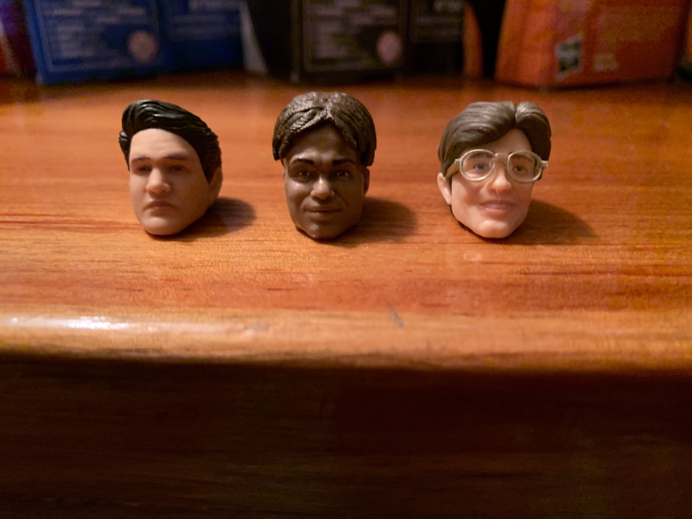
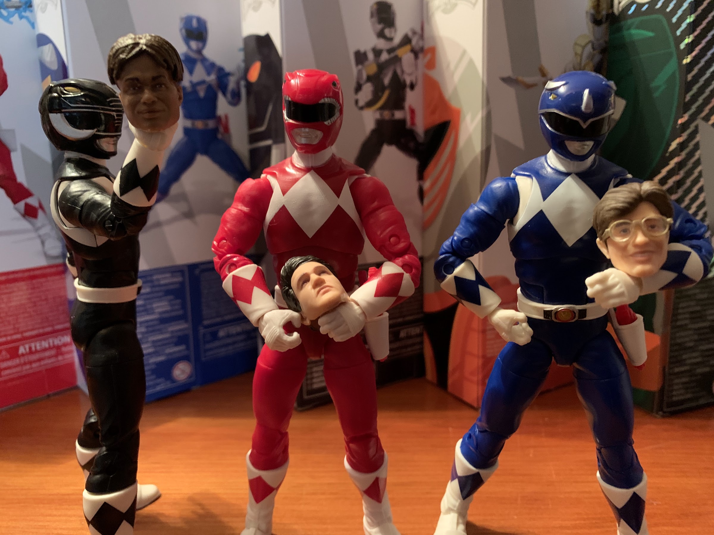
Hasbro knows nostalgia.

Ever since though, my fandom has certainly waned. The prequels turned out be rather poor, and when I moved on from toys I largely left Star Wars behind as well. I never stopped liking the original films, but the fandom certainly became exhausting and I’ve never been able to bring myself to care about the franchise in the way a self-described “fan boy” would. To me, it’s just a fun world and fun collection of movies. I have made no grand plans on how to introduce my own kids to it or anything, I’ll just show it to them when they finally show enough interest to care. And so far, they’re fine with not really interacting with it outside of the Disney Infinity game. On the subject of this blog though, I’ve just never felt like I had anything important to say about Star Wars that hasn’t been said somewhere else. It’s a huge topic with a lot of opinions and you can find Star Wars blogs and YouTube channels in astronomical numbers. Anything I post here would just wind up in an echo chamber. I haven’t been actively avoiding the subject, I just haven’t really found anything worthwhile to say on the subject.

If you don’t like the modern stuff, there’s a Luke to keep you happy.

In celebration of ten years blogging though, it felt fitting to finally tackle something related to Star Wars. And today, we’re looking at a toy! The Star Wars: Vintage Collection from Hasbro is a throwback line of action figures meant to remind collectors of the Kenner days. And since Hasbro owns Kenner now, they can even toss the logo right onto the package! The Kenner line was a 3.75″ scale line, though it might be more accurate to say that was really the height and not the scale as the characters did not scale well with each other. They were also articulated in a simple manner with just five points of articulation: head, shoulders, and legs. It was limited, but not in a manner that stood out for the era as a lot of lines offered little articulation. A Toy Biz X-Men figure, for example, often only had four more additional points of articulation at the elbows and knees. I think the line is actually more memorable for just having some amusing sculpts and oddball characters. The original Luke, based on his appearance in Star Wars, had a massive, barrel, chest on him that looked ridiculous. There were also numerous peg warmers of characters no one wanted as the line went on as long as it could often pulling background characters into the limelight. It was a flawed line of figures to be sure, but I had a lot of fun with it and even still have all of my figures to this day.

And with him, as always…

For The Vintage Collection, Hasbro wisely did not just emulate Kenner. These are not ReAction figures. This is a 3.75″ scale line of figures with modern articulation and a lot of the bells and whistles collectors today are used to. I do not collect anything Star Wars today, but it looks to me like this line works largely in tandem with Hasbro’s The Black Series, a 6″ scale line, with these figures just being scaled-down versions of figures from that line. I do not know if that’s true of every figure, but it certainly appears to be the case with Din Djarin, better known to most as The Mandalorian.

This is awesome.

The Mandalorian has been a big hit for Disney and its streaming service, Disney+, pretty much since day one. The second season just finished at the end of 2020 and a third season is expected later this year along with a spin-off series concerning Boba Fett. Like basically everyone with a Disney+ subscription, I have watched The Mandalorian and I’ve found it pretty damn enjoyable. It’s probably the best Stars Wars thing Disney has done and I think that’s due to it keeping things simple. Some of the episodes get a little too formulaic and feel like video game quests or missions, but for the most part the show is anchored by the relationship between its title character and The Child, a toddler of sorts who bares a strong resemblance to Yoda, hence why many just refer to him as Baby Yoda. The Child was given a name in Season Two, but I’ll refrain from including it here since it’s not printed on the package and because I don’t need to spoil it for anyone. This set features both characters and appears to be partly inspired by the final episode of the first season and is very similar to a set from The Black Series that also includes both. And because Hasbro needs to please all retailers, that Black Series set is exclusive to Target stores while this one comes from Walmart. I don’t know if any of these have actually made it to physical stores as it seems everyone who got one did so via Walmart’s online store where this set was made available as a pre-order (which Walmart cancelled many orders of). I did not get a preorder and was actually hooked-up by a fellow collector whom I met on Twitter via the #CollectorsHelpingCollectors group so a special shout-out and thanks go to Jay (@TMNT_MOTU_RGB)!

He’s got a spot for his rifle.

This set comes packaged on a retro-inspired blister card. The card itself is really attractive and features a shot from the series and a cross-sell on the rear. It looks so nice that I almost hate to open it as this is a classic blister and not something that can be resealed, but this wouldn’t be much of a review if I kept it mint-on-card. Once freed from his plastic confines, Mando stands almost right at that 3.75″ mark coming in a tick over. This makes sense as he appears to be a character of approximately average height for the setting. He’s in his beskar armor and he looks like he’s been in a fight as I think this is modeled on the Season One finale. There’s a nice graphite quality to the beskar with just a hint of a pearl finish on it. Black scuff marks and dirt smudges provide the distressed quality the figure is going for while the rest of the figure is mostly an earthy brown and gray-blue. He’s quite detailed for such a small figure and it’s incredibly rewarding to just sit an admire all of the little touches sculpted into the belt, armor, gloves, and boots. The amount of paint on him is rather impressive as there’s lots of little touches, especially on the belt or the shells strapped to his right calf. And it’s remarkably clean for the most part. The only areas I have some paint slop are the fingers and inside of the glove. The trigger finger of his right hand has some turquoise on it that I don’t think is supposed to be there, and it’s the only paint slop I’d consider an eyesore.

Or if you prefer, a jetpack!

Like the detail work on the sculpt, the articulation is rather impressive for such a small figure. His head is on a ball peg and has great range of motion. He can look up and down and tilt as well as rotate. The cape doesn’t really get in the way too, which is surprising. The shoulders are ball-hinged and he has single-jointed elbows with swivel right above the hinge. Even without a double joint at the elbow, he can still bend his arm a bit past 90 degrees. The wrists swivel and his left hand is a gripping hand while the right is in a trigger position. There’s a ball-joint in the torso with some nice range of motion that affords forward and back bends and plenty of twist and side-to-side action. The bandolier across his chest is loose enough that it doesn’t restrict the torso at all. His legs are on ball hinges which is certainly different. You can get him to kick forward and back as long as you line that hinge up the way you want it to go. This means he can swivel at the top of the thigh, plus he has a thigh cut just above his armor so you can finagle a kicking pose, for example, by spinning the top joint to orient the hinge properly and then twisting the thigh so his leg doesn’t look like it’s been contorted in an impossible fashion. I don’t know why they don’t just use a ball-joint, but this is okay. He has a single hinge in each knee and can swivel below the knee for an effective boot cut. The ankles are hinged and can rotate, but don’t appear to have an ankle rocker of any kind. And really, that’s probably the only thing I miss. An ankle rocker just adds stability for more spread out stances, but this guy stands pretty well and I am just impressed that Hasbro got as much articulation into this one as they did.

The best I could do with the rifle. Note how his jetpack can stand on its own though!
The ever important beskar.

Since this is Mando, he needs to come with some accessories. And obviously, important to him are his weapons and tools. He comes with a blaster holstered at his hip which fits snugly in there, but is also easy to remove. The sculpt on it is quite nice, but the paint is understandably simple. It’s just gray with a brown hilt, but there is a touch of pearl in the finish on the gun metal. He also has his rifle which he can either hold or have pegged into his back. The sculpt of the rifle is great and it’s painted or sculpted in that same graphite gray nearly matching his beskar armor. The stock of the rifle is more of a copper than brown and there’s some gold portions where the scope is fastened to the barrel. It looks rather nice, though there is a couple of spots of missing paint on the stock that I don’t believe I caused when trying to pose him with the rifle. His articulation means he can hold it in a ready position, but struggles to hold it in a firing position, but that’s common for six inch scale figures as well. He also comes with a container that probably has a special name, but I don’t know it. It opens at the front with a hinge and the top can also come off. It’s off-white with a little gray paint and looks like something from Star Wars. It’s mostly here to store his stash of beskar. He has a single brick he can hold in his left hand and a molded stack of bricks to put in this container. It might sound stupid, but even this little, plastic, brick is sculpted rather well as it even has the Galactic Empire insignia stamped into it. The finish is the same graphite color as his armor. He also comes with his jet pack, and it’s done in the same graphite color. I’m not sure if this is painted or just the plastic used, but it’s nice. It pegs into his back just fine too.

A canister, some space metal, and a kid.
“I love you, little buddy.”

Of course, there is one other accessory and it’s The Child, or Baby Yoda, whatever you refer to him as. He’s in scale with his much taller buddy meaning he stands at just three quarters of an inch. He is tiny, and yet somehow he’s just as cute as he is on television. The face is perfect and his eyes are a shiny black so they really capture the eyes of the actual character. There’s a little paint in his ears, but otherwise he’s kept pretty simple. His robe is two-toned and has some nice sculpted details in it. Best of all, he’s articulated which the Black Series two-pack can’t even boast. His head is on a ball-joint and it can rotate all around. He can look up and down slightly, but the way the robe is sculpted won’t allow much. That’s the only disappointment since he can’t really look up at Mando. The arms are ball-jointed too so he can raise his arms out to the side a bit and rotate forward and back. I don’t think his hands can move, but they look like they could be pegged in. Maybe they were strengthened with glue. He is beyond fantastic as far as I am concerned though. Somehow, Hasbro got more personality into this tiny chunk of plastic than some of the much larger versions of the character I’ve seen out there. The only downside is he lacks his little, floating, bubble (pram?) stroller of a device which would look nice beside Mando. He’s also so small that he basically can’t have his little steel shifter-top from the show.

What’s in the box?!
SHIT!

And one last thing! Mando also has an alternate head. If you prefer your Mandalorian unmasked you can pop the helmeted head off and replace it with this unmasked version. Once again, I am left floored by this figure as the likeness to actor Pedro Pascall on this tiny, piece of plastic is better than a lot of the larger scaled figures out there. It’s also a far better solution than the Black Series which made the helmet fit over the head thereby smooshing the nose of the actor and leading to a slightly imperfect fit. I can’t imagine ever displaying him with his unmasked head, but it’s nice to have the option. It’s also worth noting that this head features no battle damage as one may have expected given the rest of the figure. And I suppose now is as good a time as any to mention that his cape is removable. One you have popped off the head, simply slide it off, if you desire. It’s well positioned though so as not to interfere with the jetpack slot or the rifle slot so I doubt most will want to remove it. Plus, everyone looks cooler with cape!

He’s so small that it’s hard to get a camera to focus on his face.

If you can’t tell already, I am in love with this release. It’s the best Hasbro figure I’ve ever owned. It makes me want to check out more from the Vintage Collection, though presently I am not after any other characters. Instead, maybe I’ll just quietly hope my son or daughter falls in love with Star Wars and wants to start a collection of these or something. I definitely don’t feel the need to acquire other characters based on The Mandalorian, at least not the characters who originated in the show. I can think of one character from the Season Two finale that might tempt me, but otherwise I think I’m all set. We’ll see. Time has a tendency to make fools of us all. For now, I have this awesome set of figures that I’m really excited to find a home for in my house. I don’t know where they’ll be displayed, but it will be somewhere prominent, I suspect. This set is being sold by Walmart and is presently sold out, but considering how popular these characters are I expect a restock is underway. There may even be a reissue that omits the battle damage and is distributed to other retailers, so if you missed out don’t despair just yet. And if you’re not interested in The Child, there are single card editions of just The Mandalorian available. It also should go without saying though, if you’re a fan of the show or a Star Wars collector you absolutely do not want to miss this!

I feel like we should end this on a comparison shot, just in case I didn’t properly convey how small this figure is. Left to right: Lightning Collection Green Ranger, Mando, Funko Scrooge, NECA Leonardo