Tag Archives: 4kids

Super7 TMNT Ultimates! Teenage Mutant Ninja Turtles (2003)

Technically a blast from the past, but these designs still feel new to me.

Who isn’t making Teenage Mutant Ninja Turtles action figures these days? It’s becoming a far easier thing to keep track of than just who is making them. For years, it was the domain of Playmates Toys and only Playmates Toys. NECA tried to get in on that TMNT action in 2008 and it ended prematurely either due to poor sales or because Playmates killed it. That is no longer the case as I sit in my toy room and look around I see TMNT figures made by Joy Toy, Bandai, Hasbro, Mattel, and Super7 to go along with an expansive collection of TMNT by NECA Toys. That, however, doesn’t mean the Playmates influence is dead.

There’s definitely some interesting stuff going on here.

When Super7 secured a license to produce TMNT toys around 2019, the company decided the brand would be a perfect fit for its young Ultimates! line of figures. These approximately 1:10 scale figures were created with a goal of mixing modern production methods with an old school aesthetic. For TMNT, that manifested as basically an upscaled recreation of the vintage Playmates line with more articulation, more paint, and more accessories (and more money). If you thought it seemed weird that Super7 could basically just recreate the work of another company then apparently your intuition was right. This business model worked for a time, but Playmates reportedly wasn’t crazy about it and as the master license holder for TMNT they have quite a bit of sway. For whatever reason, that influence didn’t really begin to manifest until somewhat recently, but it’s prevented Super7 from following the blueprint it crafted at the onset which is how we ended up where we are today.

The 2003 version of TMNT had previously only been brought to plastic by Playmates (right).

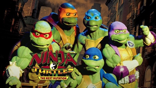
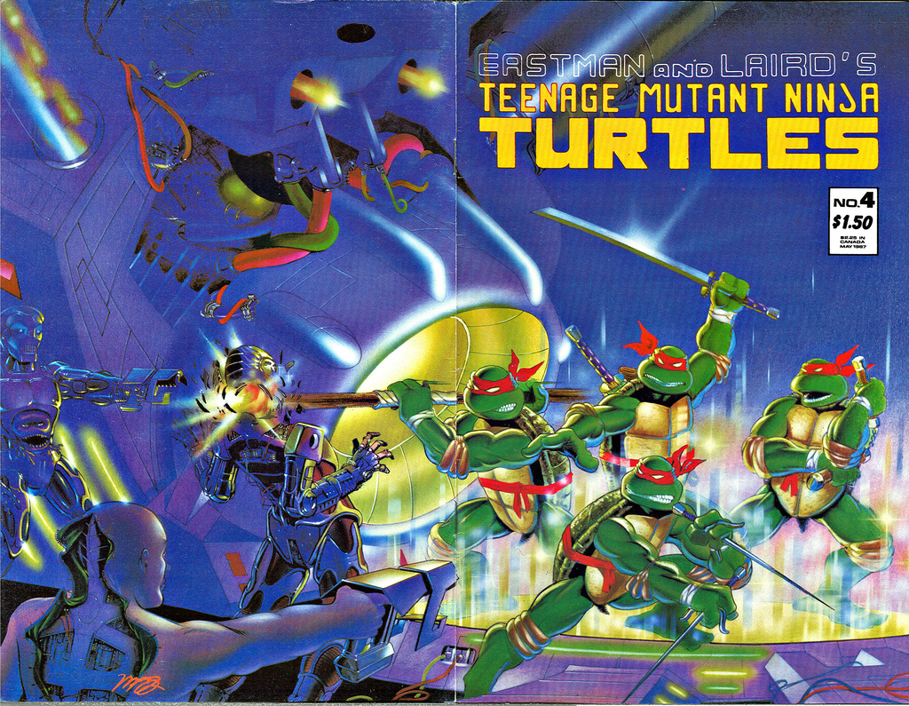
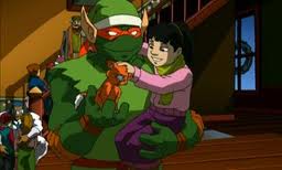
Perhaps Super7 saw just how many companies were getting in on the action where TMNT is concerned that they decided to be proactive. If the Playmates thing was going to create a significant barrier to creating more TMNT Ultimates!, then Super7 would need a new subject. In 2003, Teenage Mutant Ninja Turtles as a brand was on life support. The fad so many adults predicted would be over in a year or so had finally come to an end. Co-creator Kevin Eastman had moved on leaving Peter Laird to carry the torch. For Laird, this wasn’t necessarily a bad thing as it presented an opportunity to start over. He was able to find some willing partners in 4kids Entertainment and the Fox Kids Network to craft a new entry point for the franchise in the form of a new cartoon series. The show, simply titled Teenage Mutant Ninja Turtles, had the freedom to be a little edgier than the silly former cartoon. It stayed much closer in spirit to the original comics by Eastman and Laird while also doing its own thing. The art style was more mature and more evocative of modern comics and really the only obvious step back was the bland theme song.

New line means new packaging.

The 2003 version of the show was a success. Maybe not the success of the ’87 series, but successful enough to run for years and 155 episodes plus a TV movie. For fans who had enjoyed the original cartoon series, it represented one of that generation’s earliest forms of nostalgia while new kids were able to start from the beginning. The show is remembered fondly in the TMNT fanbase and it’s no surprise that a company like Super7 would want to make action figures based on it. It’s one of the few eras of the turtles to not get a modern action figure as really the only plastic representation out there is the original Playmates companion line. And with Super7 simply basing their figures on the animation, there is basically nothing Playmates can do about it other than keep them out of the toy aisle at Walmart. The fact that Super7 landed this “license” and not NECA came as a bit of a surprise, but apparently it was Viacom that proposed the idea to Super7. Maybe they were sick of managing the Playmates/Super7 relationship and wanted to give Super7 something else to do. Plus it probably came about as the show turned 20.

I think of these as the more heroic of the turtles.

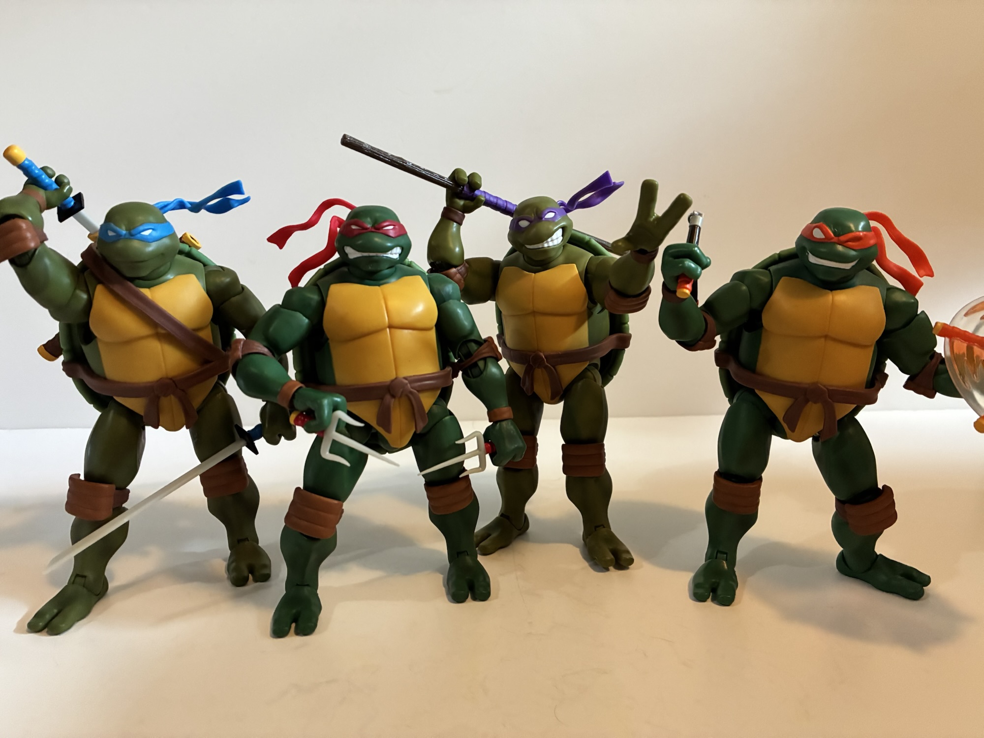
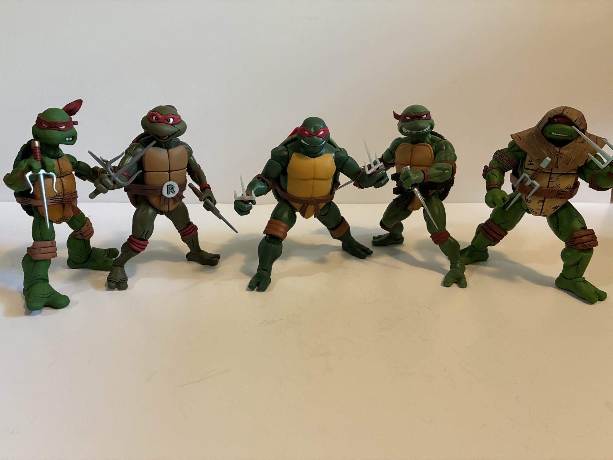
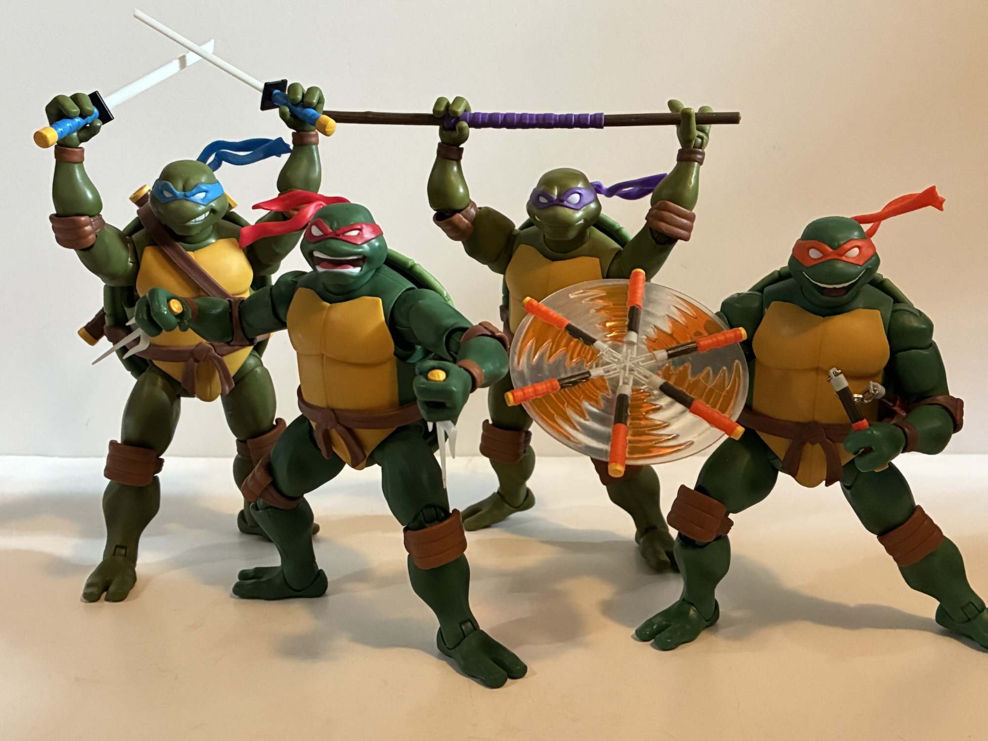
Super7’s inaugural wave of 2003 TMNT figures went up for preorder last spring and are just now making their way out to customers. The first wave is both a surprise and predictable as it contains the characters Leonardo, Donatello, Michelangelo, and Raphael. Yes, all four turtles are being offered right out of the gate as opposed to the one per wave approach Super7 initially took with the license. Perhaps with this aspect of the franchise being untested Super7 felt they needed to show fans that they would get all four turtles and have a complete set. They could have split them up, but maybe they feared customers would doubt their ability to deliver additional waves (and they’d be forgiven for such since Super7 has run into that problem a lot lately) and hold out until all four brothers were available. This approach undoubtedly worked to extract the maximum amount of interest they’re likely to see. Hopefully the drop-off for wave two (Splinter, Casey Jones, Shredder, and a Foot Ninja) wasn’t precipitous.

These new ones are just a touch smaller than the original turtles by Super7.

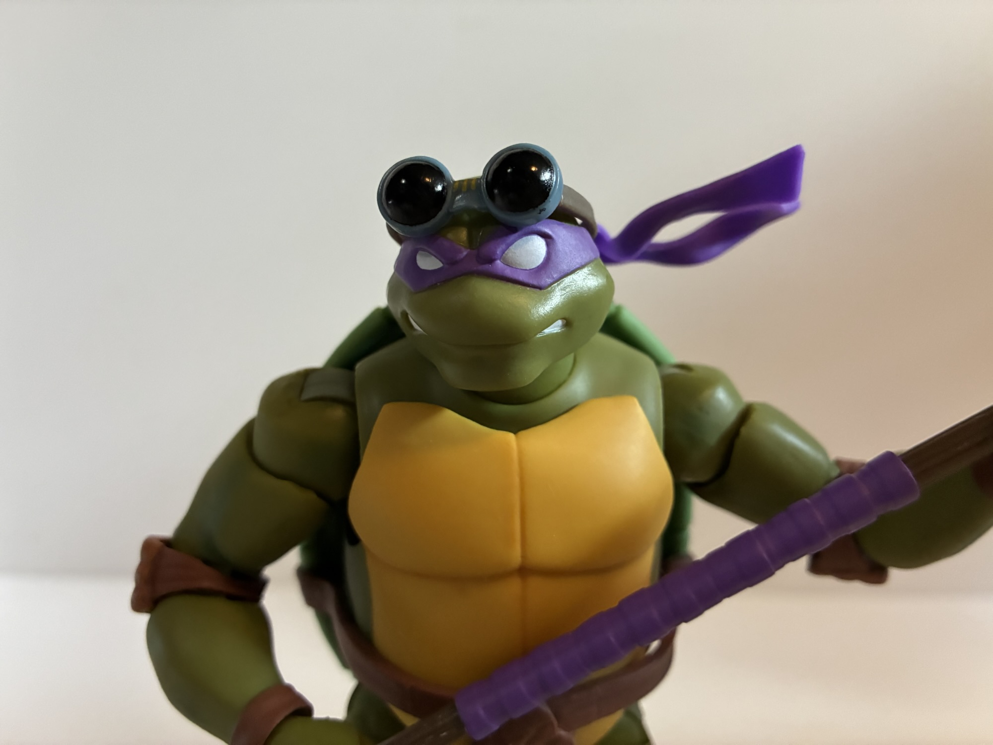
Lead designer at Super7 for the TMNT license is Kyle Wlodyga who explained in various interviews that these are the turtles he grew up with and thus some care has been taken to get these figures to match the visual style of the show. He gets into it in great detail in this interview posted by the show Turtle Tracks. And it appears that’s the approach as they look to be pretty screen accurate. This contrasts slightly with the companion art for the show and some of the more lavish sequences created for the show’s intro. In both, the turtles had a more traditional superhero shape to their body with a torso that tapers in towards the abdominal region and limbs that appear a bit longer than usual. The turtles of the show were more stocky, like most iterations of the characters, with rounded shells. They all have blank, white, eyes like the comics, but feature unique skin tones like the Playmates toys (though the colors aren’t the same) and their expected colored bandanas. The elbow and kneepads are brown like the turtles from the big screen, so we really do have a mix of influences coming together to create these new (old) look turtles.

The rear of each turtle features a hard, bulbous, green shell. It’s not super shiny, but it does cheapen the look.

Packaging for this wave is pretty typical of the Ultimates! brand with a big window box adorned with artwork of the characters and a bio on the back. The brown shipper also made its return to better protect the contents. It’s a bit evocative of the Playmates blister card, which may have been the one minor hurdle to getting these figures to market. The artwork across the front and back looks to be stock licensing art for the show. There’s also no longer any sort of bio on the back while the plastic for the window feels thinner than usual. The style for each box is the same from turtle to turtle while the insert is color-coded for each brother. If you’re an in-box collector then this is probably fine, though they still take up quite a bit of space. And if you’re an opener like me, these boxes aren’t so nice that you will feel compelled to keep them. Plus the blisters inside are so damn tight you’re likely to mangle them getting the figures and their accessories out.

As is commonplace these days, Michelangelo does have real chain link ‘chuks.

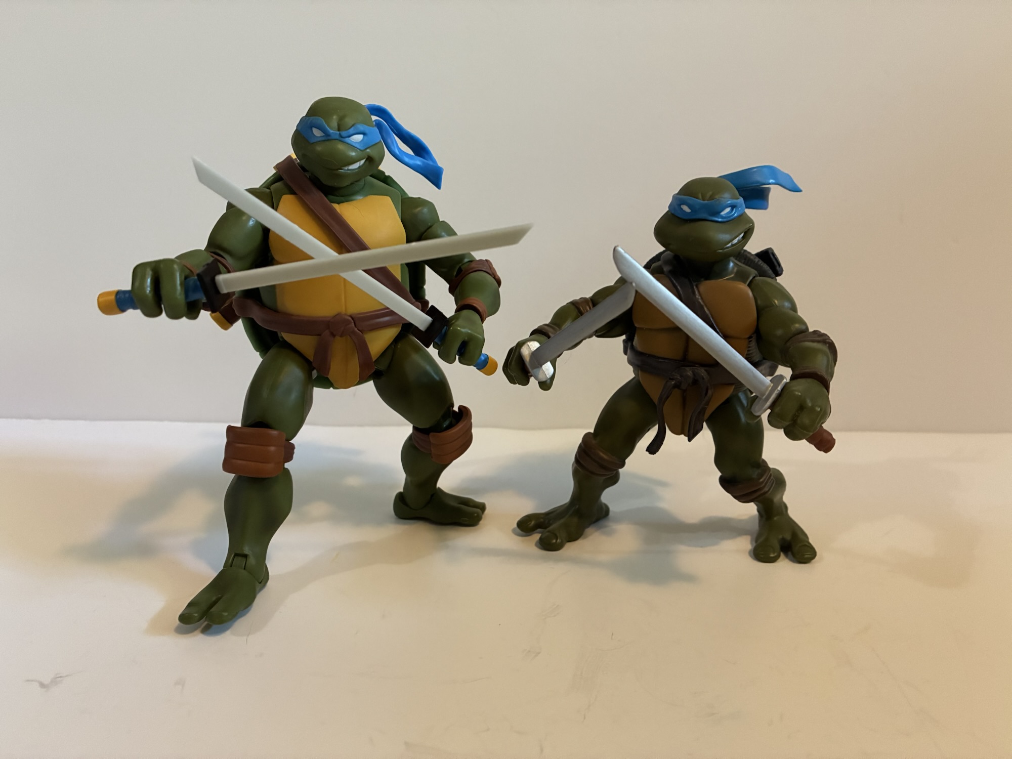
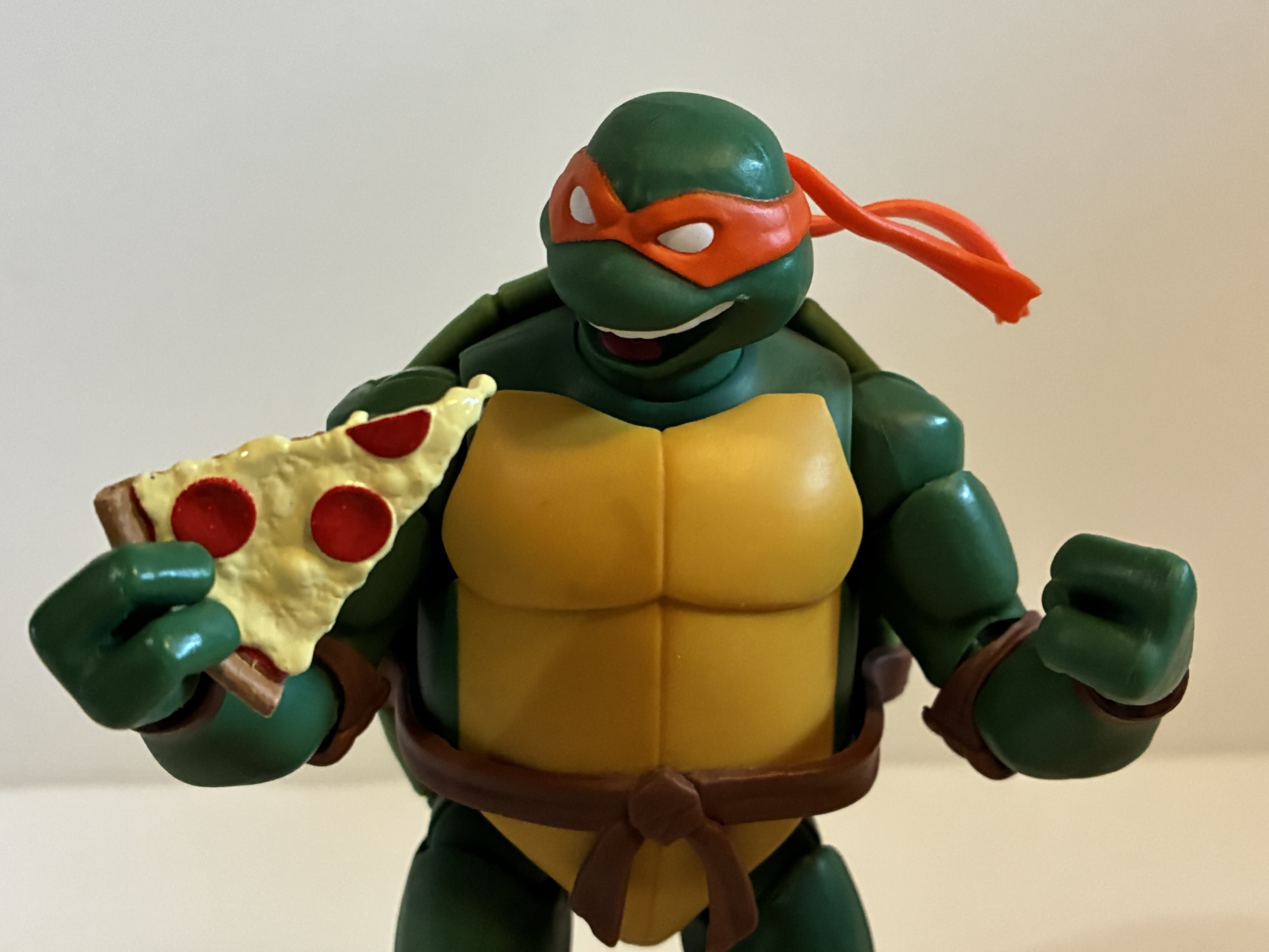
Once freed from their rather tight confines, the turtles will stand around 5.75″ on whatever surface you place them on. They’re actually a smidge shorter than the other Super7 turtles, but I have no idea how tall Super7 envisioned those characters to be. Super7 kind of did its own thing with that line. These new turtles do look a lot different though as they’re bulkier which makes them look stockier. They have smaller heads by comparison, but those older turtles have some pretty large domes. Aside from something very obvious that we’ll get to in a bit, the approach Super7 took is still pretty consistent. These new figures are mostly bare plastic with just a touch of shading applied to the green. It helps to cut down on that plastic sheen, but it also draws attention to the areas of the figures where no shading exists like the kneepads. The rear of the shell is the biggest offender as it’s just a light shade of green. It’s also very bulbous, but this is pretty screen accurate. It’s the most plastic looking of the figures and looks very cheap by comparison. It is on the rear of the figure, but these are premium collectibles and it’s definitely an eyesore. The figures at least appear to have a matte clear coat applied to the entirety of the figures. Strangely, it doesn’t come across as well in pictures. I tried going with a low light setup as harsh lighting can make them shine more than they will in natural light.

I don’t remember Donatello having a birth mark.

Even though paint is kept to a minimum, what little is there can still be messed up. My Donatello has a big, green, spot on the side of his face that I may reach out to Super7 about. That’s the worst looking part, but the paint around the bandanas on all of the heads leaves a little something to be desired. Michelangelo also has a speck of white on one of his cheeks. Normally, I’d get out the Magic Eraser to try to get rid of such, but I’m worried it will mess up the clear coat. Instead, I’ll either learn to live with the shortcomings or just go with the neatest head for each figure and call it a day.

Those who bought all four from Super7 got a bonus head pack on a blister card.

These versions of the turtles are quite chunky, more so than I remembered. It presents a tough order for a sculptor as there’s an inelegance to the silhouette that belies the fact that these characters are trained martial artists. It’s something that can thankfully be posed away, but just standing straight up and down they look awkward. The turtles do share the same body across all four figures with the only differences being the heads and belts. Leo has his scabbards and Donatello his loop for his bo staff while Raph and Mikey are just supposed to cram their weapons into the sides of their belts. These guys also dropped the belt buckles in favor of plain knots which makes it even easier on Super7 when it comes to molds.

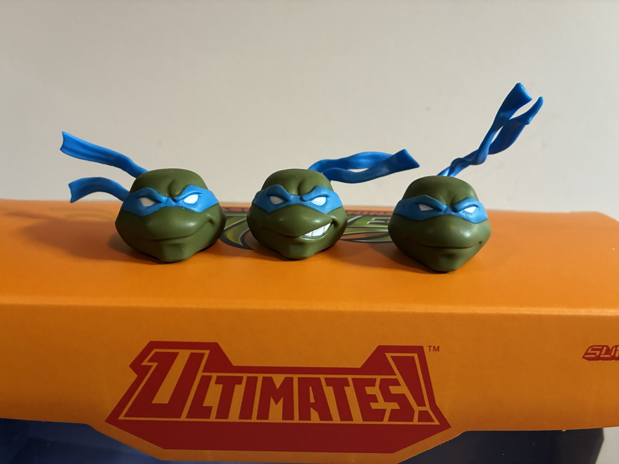
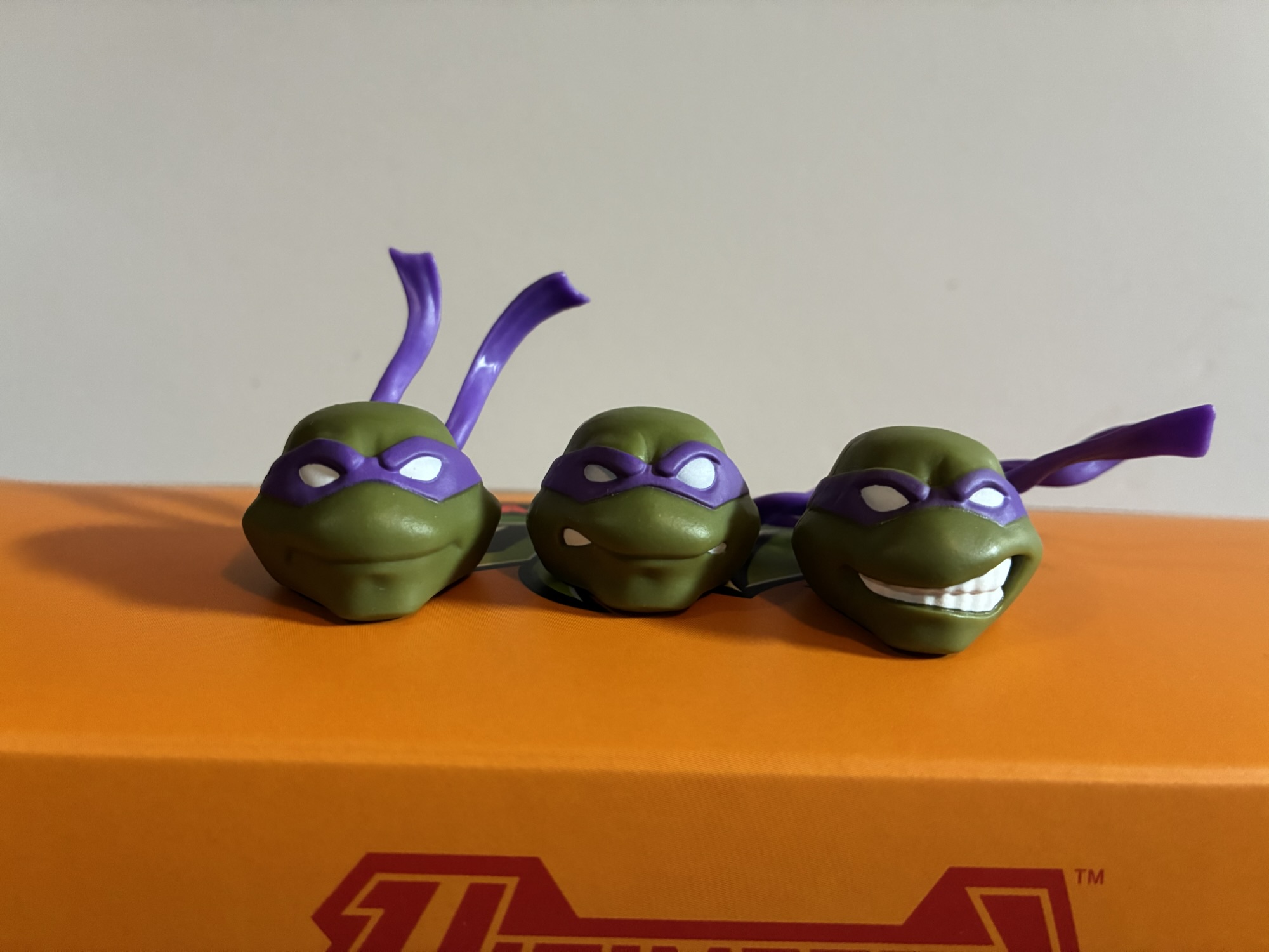
The default portraits across the four are pretty typical for the characters and each comes with a secondary option. Leonardo has a smirk and a teeth-baring smirk that reminds me of the Playmates figure. Donatello has an old school TMNT expression with his teeth showing on both sides of his beak as well as a smiling portrait. Michelangelo has a very similar smile to Donnie as well as an open mouthed smile embodying his party boy nature. Raph is the only one who doesn’t get to be happy as he has a pair of angry portraits. One features him baring his teeth while the other is a yell. That one is one of the best of the bunch as one eye is noticeably larger, and rounder, than the other which adds some more personality to the mix. And if you purchased direct from Super7, you got a bonus pack of heads with the following expressions: Leonardo (smile), Raphael ( full teeth gritting), Michelangelo (winking and smiling), and Donatello (a side smile taken from when he mugs for the camera in the show’s intro, also very similar to his Playmates counterpart). The extras are all fine in their own way, but there’s a severe lack of imagination on display. Why does Leonardo have 3 smiling portraits? Raph is all angry, which I guess is on brand, while Michelangelo is also nothing but happy. I would have liked a grim expression for Leo and a smile for Raph, even if it was more of a sinister one. Donatello is the only turtle who gets a wide range of emotions.

The Shell Cell is a downgrade from the Turtle Com.

For additional accessories the turtles share a lot of stuff plus feature their own weapons. For hands we have a set of fists, gripping, and open hands. Each turtle also has a Turtle Com or “Shell Cell.” It’s a bit of a throwaway accessory as the turtles can’t hold it convincingly. It’s in an open state too and it would have been more interesting to get an opened and a closed one. Donatello also comes with a set of goggles. They’re a little tricky to get on either head, but they also look a bit cheap so I’m not sure it’s worth it. This was kind of the start of Donatello always getting headgear of some kind which I’ve never been a fan of.

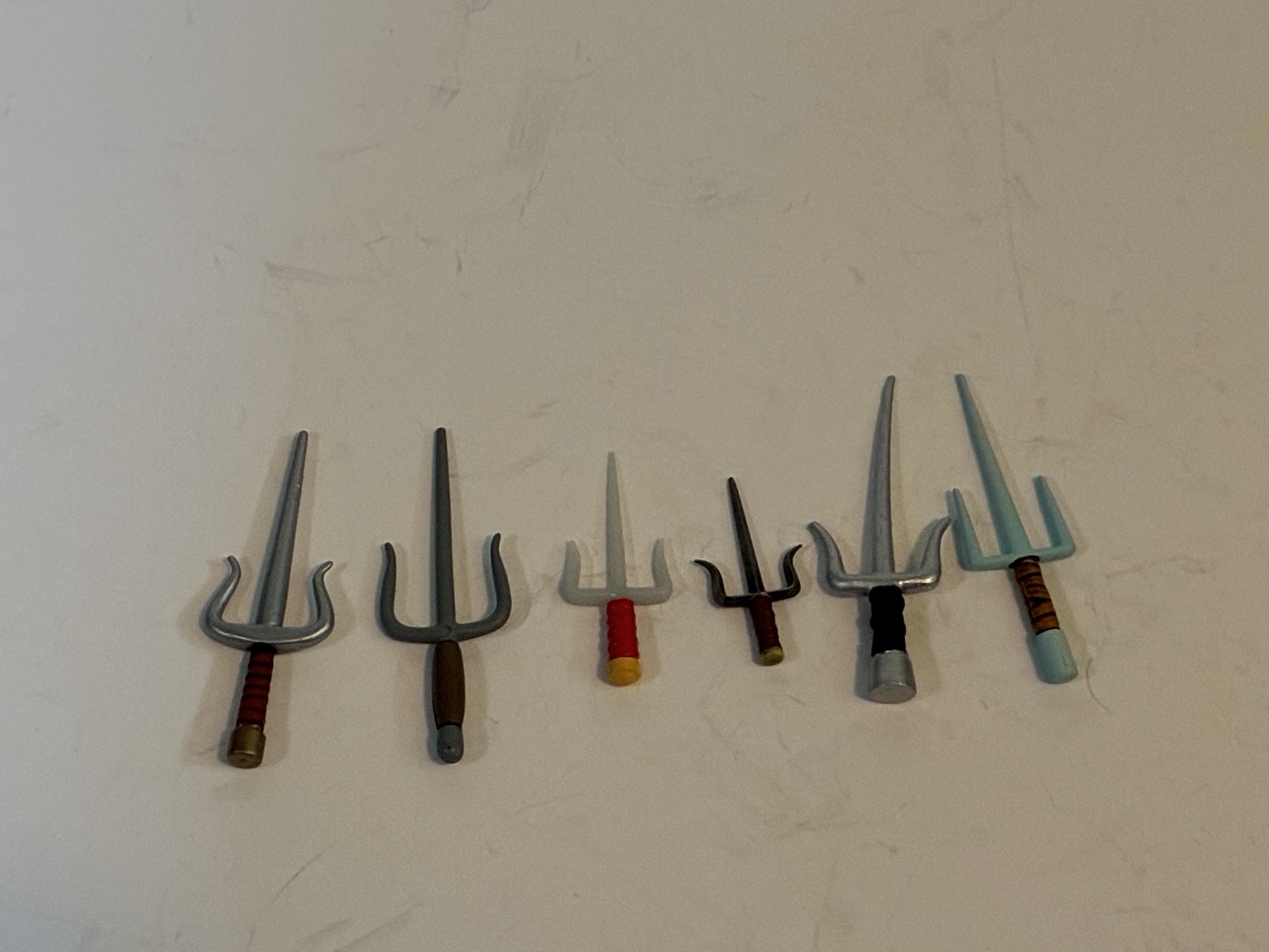
The rest of the accessories are the weapons and they’re what you would expect: swords for Leo, sai for Raph, a bo staff for Donnie, and nunchaku for Michelangelo. These versions of the turtles may have ditched the initialed belt buckles, but they did like color-coded weapons. This means colored wraps for Leo, Raph, and Mikey on the handles of their weapons while Donatello has purple tape in the middle of his bo. Unfortunately, this represents most of the paint on the weapons as the steel portions for Leo and Raph were left as bare plastic. The plastic is a very pale gray with the the sais almost looking slightly transparent and milky. As a result, their weapons look very cheap especially compared with past offerings from Super7. Raph’s sais are also puny and I can’t find any art, be it key art or from the show itself, backing this up. When stored his sai in his belt they tended to shrink, but in hand they look to be much bigger. Mikey does have real chain on his ‘chuks so they look fine while the brown plastic of Donnie’s staff looks more convincing. Michelangelo apparently was the favorite turtle at Super7 because he also gets effect parts. Like the NECA Michelangelo, you can detach one handle of his nunchaku from the chain and replace it with a whirling effect. He gets one for each weapon and it looks great, I just wish the other turtles received a similar effect part for their weapons like we saw with JoyToy.

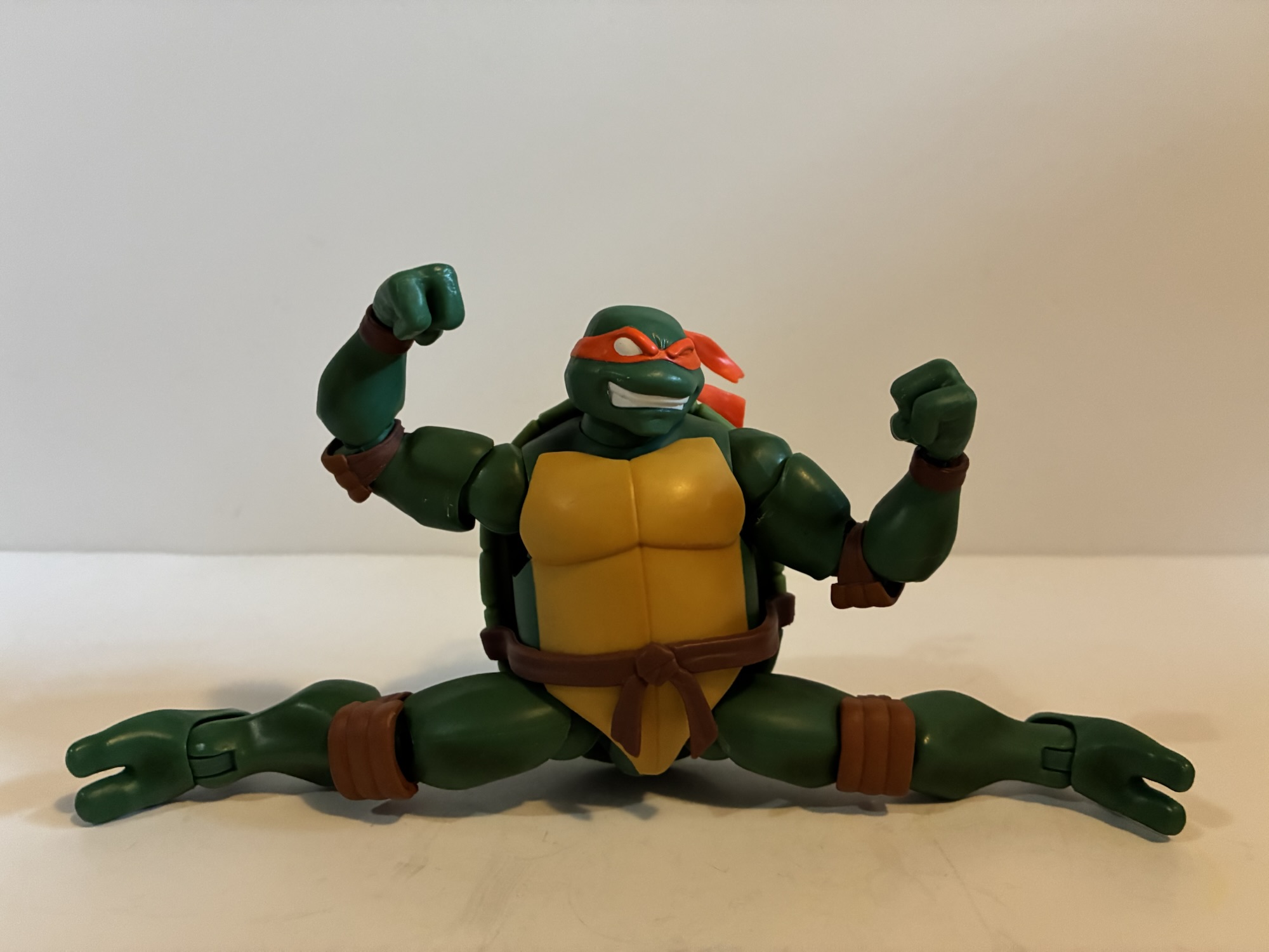
When these figures were announced last year the big talking point was double knees and elbows. For the first time in the line, Super7 decided to give the turtles double-joints at both spots. In the past, Super7 co-founder Brian Flynn has expressed a dislike for the aesthetic qualities of such joints. His background seems to largely be in soft vinyl figures and retro stuff so it’s not that surprising he’d feel that way. I think most modern collectors are fine with the trade-off and have always been since we’ve had double joints since the Toy Biz Marvel days. Super7 decided to change things up here, either because they felt the kids who grew up on this version of the turtles wouldn’t accept single joints, or because they caved to pressure that was both internal and external. Whatever the reason, the joints are here and they’re fine. Both are pin-less, but both also need to contend with what all turtle figures have to contend with and that’s the knee and elbow pads. To combat this, Super7 used a style of joint similar to what NECA used to use on some figures where you have a hinge ball above and below the joint. This creates two additional pivot points as well as the double-hinged bend. It works okay and certainly better than what we had. The aesthetics are a downgrade, but probably worth the trade-off to most.

Sais does matter.

Aside from that, most of the articulation should seem familiar. The head is on a double-ball peg and there’s also a ball joint at the base of the neck. These turtles have good range, but the shell prevents them from looking up effortlessly. The shoulders feature ball hinges and we have bicep swivels, the double elbows, and wrists that hinge and swivel. The gripping hands feature the proper hinge orientation for melee wielders while the elbows will bend past 90 degrees, but not far beyond that. There is a waist joint under the shell that mostly works as a pivot point than a full rotation. Hips are still ball-hinges, but the hinge seems much bigger and sturdier than typical Ultimates! figures. There’s a thigh swivel, double knees, and ankles that hinge and rock side to side. The knees bend past 90 degrees and the hip range out to the side allows for full splits. Kicking forward is a little limited since the shell forces the leg out to the side, but the range is there.

Perhaps most important to all who have interest in this line is that the joints are all nice and tight. That doesn’t mean it’s all sunshine and roses though. While I wouldn’t say any joints are too tight, there is an issue with binding and scraping. The hinges in both the shoulders and hips function like ratcheted joints. There’s no smoothness to them at all. Most of these figures are also composed of a very soft plastic, but at the joints we have hard plastic. This causes scraping, cutting, and scuffing even if you’re careful. You’re also bound to have a stuck joint or two across the four figures in either the elbows or knees. The rotation in these double knees can aid in posing, but also drive you nuts as they keep spinning out of position during handling and become misaligned for using the hinge. The design and approach isn’t terrible, and this is better than the often floppy hips we get from Super7, but it still needed another pass before going into production. It feels like Super7 just looks at a test shot once and thinks they don’t need to review anything again or something. Hinged shoulders and hips aren’t anything knee and lots of companies do them without issue, but Super7 would have you believe those toys are freakin’ miracles. Or they could just finally ditch the hinged hips and go with ball sockets. That would make me happy, though I’m sure there would be growing pains there as well.

Splits are also on the table.

Perhaps this is all coming to a head. I do not like to kick someone when they’re down, but things have not been great for Super7 of late. Some of their lines appear to be dead, licenses have been pulled, and a major release like the Cat’s Lair was plagued with quality control issues that Super7 had to rectify at some cost to the company. And now we have tariffs to deal with. This wave apparently arrived at port during that brief window when tariffs on products imported from China were at 140%. In response, Super7 laid off about half of its workforce including 75% of the designers they employed. Among them was Kyle Wlodyga who has been the head designer for Teenage Mutant Ninja Turtles and other licenses and was responsible for some really terrific stuff. I’ve always assumed TMNT was one of Super7’s best performing licenses so to see him laid off came as a shock. He also was vocally pushing for the company to tackle 2003 TMNT for awhile, but they didn’t do it until Viacom basically forced their hand. And what do you know, it was a big seller! At least, according to Super7. How shitty is that? The guy pushed for this, it finally happens, it’s a success, and he’s the one who gets shit-canned? Something smells there.

Thanks, Mikey – have a slice!

While I have sympathy for those at Super7 and I don’t want to see the company fold, as a reviewer, I’m not going to tell you to go out and buy an inferior product out of the kindness of your heart. I have to review these action figures as they are independent of the climate surrounding them and I’m forced to conclude that they’re just not worth the asking price. Super7 wants $55 each for these figures, perhaps more now that tariffs are involved, and they just don’t measure up to other figures in that price range. The appearance is too cheap in places and the articulation can literally damage your figures. They also don’t come with much and look especially light when compared with the other turtle figures Super7 has released over the years. If these were $35 then I could overlook most of that. The quality control would still be unacceptable to some degree, but also easier to swallow at that price.

These guys are a mixed bag, but if your standards are simply that you want something that looks like the show for your shelf then you’ll probably be content.

Objectively, I can say these figures aren’t worth the ask, but subjectively I can also say I don’t hate them. I don’t even dislike them. These are solid representations for an underserved era of Teenage Mutant Ninja Turtles. If you want a set of 2k3 turtles for your shelf you’ll probably be content with these once they’re in place. I do wonder how deep Super7 can go with this line. Personally, I’m in for Shredder out of wave two, but no one else. If Super7 wants to give me Christmas variants I’d be interested in that, but I don’t plan on going deep at all on 2k3. Unfortunately, it sounds like Super7 is. In another interview with Turtle Tracks posted at the same time, Wlodyga said the vintage-inspired stuff was “on pause.” Rarely does “on pause” ever mean anything good. That’s really frustrating as we’re still missing key figures in that line, most notably Undercover Don and Heavy Metal Raph, two figures keeping collectors from a complete set of Playmates remakes. Even if Viacom is really pushing for Super7 to move away from that stuff, the company should go to bat for its consumer and tell Viacom that people really want and expect those figures from them. They basically did it for Rat King, they can do it again. I’m so irritated by that decision that it makes me want to boycott the 2003 subline. I guess don’t expect a ton of Super7 stuff from me going forward.

We may be light on Super7 coverage from here on out, but there’s no shortage of historical coverage:

Super7 TMNT Ultimates! Rapper Mike

Is Super7 going to finish a set of variant Teenage Mutant Ninja Turtles?! Maybe, as we’re now three-fourths of the way through the rock n’ roll turtles as released by Playmates. Punker Don, Classic Rock Leo, and now Rapper Mike make 3 with only Heavy Metal Raph remaining. As of this writing, Raph hasn’t been…

Keep reading

Super7 TMNT Ultimates! Punker Don

It’s been awhile since we last took a look at a figure from a wave of Super7 Teenage Mutant Ninja Turtles Ultimates! It was back in July 2024 that I gave a rather glowing review of the first of a presumed four turtle figures based on the old Playmates Rock n’ Roll Turtles – Classic…

Keep reading

Super7 TMNT Ultimates! Classic Rocker Leonardo

When I was a kid, I had parents with divergent musical tastes. Dad likes oldies from the 50s and 60s while mom was more into modern rock (then 80s). One area where their tastes overlapped was Bruce Springsteen. We had several of his records in my house and I distinctly remember that cover to Born…

Keep reading

Ranking the Many Versions of The Teenage Mutant Ninja Turtles

Turtles in Time
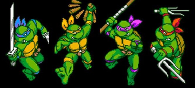
With Rise of the Teenage Mutant Ninja Turtles hitting the airwaves, it felt like a good time to sit down and take a look at the various incarnations of the Teenage Mutant Ninja Turtles. As you are likely aware, the TMNT got started back in 1984 when writer/artists Peter Laird and Kevin Eastman created their debut comic. Since then the four have become international superstars and seen their likeness adapted for television, film, a stage tour, and other comics over the years. Across these many mediums we’ve seen the four brothers sport many different looks, display different personality traits, while mostly adhering to the core of being mutated turtles that practice ninjitsu taught to them by their surrogate father – a rat named Splinter.

Whenever a new show based on an old property is unveiled, there’s almost always an immediate backlash by a certain portion of the fan base. It doesn’t even matter if the fanbase is inconsequential or even non-existent, as was seen recently with the She-Ra images unveiled, there will always be those who hate the new and prefer the old. And who am I to say they’re wrong? Hate it all you want, but you’ll always have what came before. I draw the line when folks say “they’re ruining my childhood” because that’s preposterous. Your childhood came and went, it’s history, there’s nothing to ruin. I’d encourage everyone to be open-minded and don’t be a slave to nostalgia because you’ll ultimately find more things in life to enjoy with such a mindset, but to each their own.

For this ranking, I am weighing the general design heavily above all others. This ranking is subjective and largely about how appealing I find the design of the four turtles to be. I am also giving a little added weight to the quality of the medium as well – does it hold up? Is it entertaining for children? All ages? And so on. I’m also just sticking to the comics, television, film, and stage show and not video games or toys. Most of the video games were based on one of those other things or strongly resemble another and the same is true for the toys. I don’t want things to get too unmanageable, so some of this may feel a little condensed, but you’ll see what I mean when we get to each one as I’ll note if there are any deviations. With that said, most of these all have some aesthetic charm to them, with only the very back-end of this ranking being particularly poor. Let’s get to it then, shall we?

TMNT_rock_band

What have we unleashed upon the world?

13. Coming Out of Their Shells Turtles

I ended up with 13 distinct flavors of Teenage Mutant Ninja Turtles, and by far the most dreadful would be the stage show Turtles from the Coming Out of Their Shells Tour. If you weren’t alive in 1990, basically the brand was on fire. No one could really explain it, and still can’t since the premise is so preposterous, but everyone was pretty sure it wouldn’t last much longer. Anyone with a financial interest in the TMNT was rushing product to shelves to capitalize as quickly as possible and someone thought a live show was a worthwhile endeavor. Utilizing two sets of costumes, the Turtles would appear on stage in some radical threads and would sing, dance, and mime fights with the bad guys from the cartoon. There were also backstage segments that were pre-taped featuring more conventional play style sequences for plot points. These costumes weren’t really meant to be seen up close since they were for the stage, and it shows. There’s no nuance to their mechanical mouths which just flap around. They have these crazy wide-eyed expressions and the added clothing items just look dorky, to put it simply. What was crazy though, is that these costumes weren’t confined to a live show. They had them appear on Oprah and in home videos so you could see just how terrible they looked. The home video and Christmas Special probably came out after the money had been made on the actual tour, but the Oprah thing still blows my mind.

Bay TMNT

These guys smell.

12. The Michael Bay Turtles (2014 Film)

I know I look like some old curmudgeon for sticking one of the most recent incarnations in the 12th spot, but I can’t help it – I really hate these guys. It wasn’t a surprise to see the newest films opt for CG over costumes, even if it was still disappointing, nor was it a surprise to see a new look for the gang green. However, could they have made these guys look any uglier? They’re a monstrous mess, just a pile of weapons, belts, and clothing. They embody the same personalities we’ve known for years and yet feel so lifeless. Even only four years after the first film, and a mere two after its sequel, these guys already feel forgotten and that doesn’t bother me one bit. I really have nothing nice to say about them. I guess Bebop and Rocksteady were cool?

tmnt03e

Talk about a downgrade.

11. All Effects Turtles (Teenage Mutant Ninja Turtles III)

The third film in four years for TMNT was the abysmal Teenage Mutant Ninja Turtles III. I liked it well enough as a kid I suppose, though it definitely was my least favorite of the trilogy. As an adult I find it mostly unwatchable. I suppose it can be laughed at in a manner befitting only bad movies, but my word do those costumes look awful. The first two films featured costumes designed by the Jim Henson Company and were remarkable for the time. For the third film, Golden Harvest and New Line Cinema contracted All Effects and the results were less than spectacular. The main bodies of each turtle looks fairly similar, but with less texture. They clearly looked like rubber suits. The heads though were awful. The dynamic expressions of the earlier costumes were gone replaced with something more static and soulless. I am not certain, but my guess is All Effects just went with one head design for its costumes as opposed to Henson’s multi-head approach. These ones are a bit more frog-like and just off-putting. Making these worse, the personalities of the Turtles were also less defined. Corey Feldman reprised his role as Donatello from the first film and apparently was considered the star as his character had way more lines. Everyone was kind of jokey and just along for the ride with only Mikey displaying much range. A very unsatisfying end to the trilogy. The feudal costumes at least looked kind of neat.

next mutation

They kind of look like they’re melting.

10. The Saban Turtles (The Next Mutation)

It feels like I’m picking on the live-action costumes in the early going, but I guess it’s to be expected with such outlandish characters that originated in print. And it also has to do with money. The third Turtles film was produced on the cheap, and the stage show certainly was as well relative to a film budget, and if you know much about TV cartoon development in the 90s then you know Saban is notorious for being cheap. Saban is most famous for bringing us Mighty Morphin Power Rangers which took film from the Japanese show Super Sentai and dubbed it for American audiences as something different. That’s about as cheap as it gets for show creation. It’s actually a surprise that the company even wanted to do a live-action series of TMNT in 1997 well after the franchise’s peak years. Titled Ninja Turtles:  The Next Mutation, it required all new costumes and sets and must have been rather expensive relative to other Saban entertainment. Even so, there was no way it was going to match the costumes from the film series, and while you could argue these are worse than what All Effects gave us, at least they tried to change things up. This show also famously added a fifth turtle, Venus de Milo, and it sort of followed the continuity of the other live-action heroes. It was pretty hokey and more than a bit cheesy, but I suppose it has its fans.

TMNT 2007

Passable, but also forgettable.

9. Imagi Turtles (TMNT 2007 film)

In what was a bit of a surprise, Warner Bros. tried bringing back the Turtles with a CG sequel to Teenage Mutant Ninja Turtles III 14 years after that film had been released. In truth, audiences didn’t need to know much about those previous movies to see this, just a general knowledge of who the Turtles were since a lot of time had passed in universe as well. The movie was okay, not bad but not exactly good either, and the CG was befitting that of a major studio. The characters mostly embodied the archetypes established in the first film, but the visual style was very different. The Turtles were more rounded with squished faces. Their skin was smooth and mostly free of any texture. They looked slippery and ever more frog-like than what we saw in the third film. It animated well, but the stills are some-what lackluster. It’s not the design I would have picked, but it was fine and not really noteworthy as this film is easily the most forgettable of the first four.

Rise TMNT

I don’t hate this.

8. The Flying Bark Turtles (Rise of the Teenage Mutant Ninja Turtles)

It seems premature to even include the newest version in these rankings, but here we are. I said a lot about them in my write-up for the first episode, but as designs go I don’t hate these. I appreciate the willingness of the producers and the animators at Flying Bark to try something pretty new. There are elements of the older designs in the new ones, but with this show the brothers are, for the first time, different subspecies of turtles. Even though I didn’t much care for the show, I can at least appreciate what it’s trying to do. And if we’re just going by looks, it’s definitely got more personality than what was ranked behind it.

4Kids TMNT

A lot more menacing than that old cartoon.

7. The 4Kids Turtles (2003 Cartoon)

We have arrived at what is perhaps our first controversial ranking. The 2003 series produced by 4Kids Entertainment is well-regarded. It came at a time when the kids who had grown up on the TMNT were willing to embrace something that had grown up with them while a new generation was also willing to dive into a show about mutated ninja turtles. The show was a back to basics, taking a lot of the material from the original Mirage Comics run and adapting it for television in a kid-friendly manner without pandering. The old chunky designs were replaced with sleek, muscular, frames and the skin tones of the old Playmates toy line was essentially made canon as each turtle was a slightly different shade of green. The personalities were a bit of an amalgamation of the old cartoon and comic, with Raph, Leo, and Donatello being pretty close to the source while Mikey was a bit more like the old cartoon character. Where this one sort of stumbles for me is with the decision to go with the blank eyed look from the comics and toys. It makes the characters look pretty cool in a still frame, but when they had to emote it looks awkward. A future series would integrate this better. Don’t mistake this ranking as an endorsement of the 87 cartoon over this one as I’d much prefer to watch this series over that one any day.

TMNT 1987

Regardless of your feelings on this show, you can’t deny this is still what most folks picture when you say Teenage Mutant Ninja Turtles.

6. The Fred Wolf Turtles (1987 Cartoon Series)

Here is where we get to the big one, the most recognizable brand of the Teenage Mutant Ninja Turtles and the one most responsible for the popularity of the franchise. These turtles actually had four some-what distinct looks, but we’ll get to that. In general though, the makers of the cartoon took the designs from Mirage and mostly added color and personality. The Mirage TMNT looked cool, but aside from Raph they didn’t offer much personality. They also looked the same and had those blank eyes which wouldn’t play well on television. To make up for that, the cartoon introduced the colored bandanas and pads unique to each turtle while also giving them actual eyes. Raph was toned down from a hot-tempered malcontent to a sarcastic prankster while Leo mostly retained his super serious persona. Donatello was made a genius, and Mikey a surfer dude. Oh, and they all loved pizza. Like, really loved pizza. It’s stuff you know all about now, and even though the cartoon basically existed to sell toys it at least looked pretty good. The first season, at least. In that one, the Turtles were a more muted shade of green with more musculature and a hint of a beak. Come the second season they were a bit brighter and more rounded. Weapons were de-emphasized and animators saw little need in actually showing their weapons holstered and so forth. By the final season though, they received a fairly radical redesign that introduced more blacks and a more angular shape. It was trying too hard to make the Turtles seem “dark” and “cool” and didn’t really play well. In Japan, a pair of OVAs were released that mostly featured the standard look of this serious, but gave the Turtles crazy transformation powers. You may remember seeing the toys for these on store shelves and wondered where they came from, well there’s your answer. I didn’t think either was really worth devoting a separate ranking to, but felt they were worth mentioning.

TMNT Archie

The storylines in the pages of Archie’s TMNT weren’t much better than the cartoon, but the artwork was a ton of fun.

5. The Archie Turtles (Archie Comics)

Alongside the original cartoon series was the Archie Comics series. This series basically captured the look and feel of the cartoon, but did at least experiment with making things a little more mature. I basically only decided to give the Archie Turtles their own entry because of what they did with Raph. Still keeping him mostly in-line with his cartoon counterpart, he was also made the loner or black sheep of the family and he wore all black for a while. It was confusing for me as a kid and I probably didn’t care for it, but now I look back and give Archie credit for not just adapting episodes of the cartoon into printed form.

Mirage TMNT

I’m guessing you’ve seen this image before, and probably not on the cover of a comic book.

4. Mirage Comics

All style, no substance. That’s pretty much the Mirage Turtles in a nut-shell, or should I say half-shell? While they did get better, initially the four characters were interchangeable. Chunky, but muscular, they were depicted in black and white and were only distinguishable by their weapons. Eventually, the personality of Raphael would be added and he was given a foil in Leonardo and a kindred spirit in Casey Jones. Leonardo would be made the stoic leader, while Donatello the introverted tech-nerd. Mikey never really morphed into the character we’ve seen elsewhere and he’s kind of hard to get a read on. Eastman and Laird’s artwork also improved along the way and their version of the Turtles from say issue 4 on is pretty damn good. Eventually, other artists were brought in to work on the books and you could do a separate listing on the various different takes they had on the characters, but for the purpose of this ranking I’m basically just going with the Eastman/Laird take. The peak of their art is probably best reflected, and most can recall it from the cover art to the first NES game. It confused the Hell out of me to see all four of the Turtles wearing red, but I sure thought it looked pretty bad ass.

Nick TMNT

The show that made April and Casey adolescents and made it work.

3. The Nick Turtles (2012 TV series)

It took some time, but the 2012 version of the characters seen in Teenage Mutant Ninja Turtles did eventually grow on me. As far as personality and so forth was concerned, I was pretty much hooked from the start. The same archetypes were followed that we’re used to, but they felt more malleable and sincere. Leonardo wasn’t just some goody-two-shoes, he often struggled with being a surrogate Splinter when out on the town. Raph was a bit of a hot-head, but he didn’t strike me as being confrontational just for the sake of it. Donatello was a brain, but an insecure one. Mikey was still juvenile and mostly care free, but without being too over-exposed. This show pretty much nailed it as far as that goes. From a looks perspective, they basically went with the first movie, but with colored masks. The Turtles also featured three toes for the first time, an odd choice, but largely inconsequential. They wore wraps on their feet too which was different, but it made sense (those other turtles must have had some serious blisters) and added a little personality. About the only thing I didn’t like was the sometimes boxy-looking anatomy. Their shoulder muscles looked practically square, but it became less noticeable the more I was exposed to it. I loved that each turtle had his own body type and you could tell them apart by that alone. I also liked the little touch of making their eyes go blank when in combat. Definitely a move that’s all style and has no practical explanation in-universe, but it’s a cartoon so who cares? Have fun with it! This television series should be the new measuring stick for any future incarnation of the TMNT. That doesn’t mean they all should take the same approach, but strive for the same level of quality.

IDW TMNT

Maybe the coolest looking version of the TMNT yet.

2. The IDW Turtles (IDW Comics)

Alongside the 2012 reboot came a reboot in printed form. Kevin Eastman returned to the franchise alongside IDW Comics and presented a new version of the TMNT. It basically takes the tone of the original Mirage Comics, while also adding in the more developed personalities that would follow. The artwork is largely great, and the Turtles are back to wearing all red (they would eventually gain some color). If you’re an adult fan still mad about the new cartoon, well just head to a comic shop and read this series. This is the version of the TMNT made for those who out-grew the franchise, and from that perspective it’s pretty good. The Turtles will never be high art, and there’s tons of fan-service plots in this series, but in general it’s what most TMNT fans over 30 probably want.

Henson TMNT

I love these guys.

1.The Henson Turtles (Teenage Mutant Ninja Turtles/Teenage Mutant Ninja Turtles II:  The Secret of the Ooze)

Could there be anything else? The 1990 movie is still the best adaption of any kind of the Teenage Mutant Ninja Turtles. Taking the Mirage look, adding in the colored masks from the cartoon, and also its own creative liberties resulted in a near perfect take on this green team. The four brothers all look different, all act different, and all go through their own ups and downs along the way. They have distinct personalities and challenges to face, and most of all the costumes created for these two movies are fantastic. I prefer the more realistic approach of the first film. That one was less intimidated by showing these characters for what they are, while the second one brightened things up and made them a little more appealing to look at from a practical sense. In other words, the Turtles of the first film looked like they lived in a sewer, while the ones in the second looked like they lived in an upscale apartment in Manhattan (which they did for a time). The first film is also very different in terms of style and tone, but the Jim Henson Company worked on both. The costumes received mostly minor tweaks between films, though Donatello looks almost completely different (he also had the biggest personality change as well, I guess because Feldman left the franchise). Both films entertained me a lot as a kid, but of the two, only the first one actually holds up. The second is basically a live-action version of the cartoon, though Raph still gets to inject a bit of conflict into the group dynamics. That first film is the best though. It hits the sweet spot between the gritty violence of the Mirage source material and the playful banter of the cartoon. It’s unlikely we’ll ever receive a better version of these characters, but maybe someone out there is just waiting to prove me wrong. I hope they’re successful.


Teenage Mutant Ninja Turtles (4Kids): The Christmas Aliens

images-166In 2003, Fox and 4Kids Entertainment launched a brand new Teenage Mutant Ninja Turtles cartoon series.  This series was the first re-launch for the TMNT after a long hiatus from both film and television and was an attempt at introducing the Turtles to a whole new generation.  One of the consultants for the show was TMNT co-creator Peter Laird and his Mirage Studios.  Something everyone seemed to be in agreement on was that this new show would borrow more heavily from the original comic book run of the Turtles while still keeping a general audience in mind.  This is, of course, in stark contrast to the original cartoon which all but abandoned the comics as both Laird and Kevin Eastman felt it was impossible to adapt that for a children’s show.  It would be easy to point to that decision as a mistake, but really that original show gave the world a whole separate take on the Turtles that proved endearing, if nothing else.

The 2003 series was more mature, but still pretty much directed at kids.  It took a lot from the old comics but also did its own thing.  Eventually, it would more or less go off on its own, especially once it hit the Fast Forward seasons towards the end of its run.  I can’t pretend to be an expert on the series as I really only watched the first season before eventually losing interest.  The show seemed to be fairly successful, though not a huge hit, with kids.  There was a new toy line and I’m sure the show’s success had some part in the decision to do the feature-length TMNT film.

The source material for this episode.

The source material for this episode.

Something unique to this series is that it contains what is, so far, the only animated Christmas special the Turtles have ever done.  It seems crazy to me that there was a never a Christmas episode during the original cartoon run, but I checked, and there isn’t!  The new series has also yet to do one, but it wouldn’t shock me to see one pop up eventually.  The only Christmas special featuring the TMNT so far is the live-action “We Wish You a Turtle Christmas” and if you’ve never seen it, DON’T WATCH IT!  The 4Kids series decided for its third season to adapt the Michelangelo (then Michaelangelo) Micro Series story for its first episode, “The Christmas Aliens.”  Having read that issue, I was interested in checking this episode out as that story is one of my favorites from the comics as it puts Michelangelo in the starring role as he attempts to make sure a donation of Christmas toys gets to a local orphanage.

Each episode of the series opens with a scene from later on in the episode, usually with a turtle or turtles in some kind of trouble.  This one opens with Michelangelo driving a truck as he’s being chased by some crooks before the opening credits hit.  The opening song for this show is one of its weak points.  I don’t care for the song on the new series, but it’s at least a throwback to the old series so I give it some points.  This one is just lazy.  When we get to the episode it shows Michelangelo strolling through the park on Christmas Eve.  The other guys are back at home in the sewer decorating for the evening’s festivities while Mike befriends some kids in the park and finds a stray kitten he dubs Klunk.  It doesn’t take long for Mikey to stumble upon a toy store that’s in the process of being robbed.  Apparently, this season’s hottest toy is a Christmas Alien doll (I believe in the comics it was intended to be a parody of the then mega-popular Cabbage Patch Kids) and it’s sold out everywhere.  A delivery truck loaded with them is the target of the thieves, but Mikey overhears the truck driver tell the crooks it’s intended for a local orphanage.  The crooks obviously don’t care as they make off with the truck and Mikey feels compelled to stop them.

That's one weird looking Santa.  I can't imagine he smells all that great as well.

That’s one weird looking Santa. I can’t imagine he smells all that great as well.

At the lair, various other characters start piling in.  I actually can’t name any of them since I didn’t watch the show regularly, except for Usagi Yojimbo who arrives with two other characters via some kind of portal.  All of the Turtles’ friends are here though to celebrate Christmas and some mischief is made.  Casey tries in vain to score a kiss under the mistletoe from April, while everyone tries their luck at beating the resident superhero in an arm-wrestling contest.  Everything has to be put on hold though as they all wait for Michelangelo to get home.

Meanwhile, Michelangelo has to contend with a bunch of crooks and even the police as he overtakes the delivery truck and heads for the orphanage.  The majority of the episode is a chase sequence, first with Mikey hanging onto the truck as he tries to take it over, then with more bad guys, and eventually the police.  The animation shows its limitations here as the truck looks extremely heavy.  It strikes parked cars and other moving vehicles and goes right through them without even the slightest wobble.  It’s an okay sequence, but not a very exciting one.  The Michelangelo character in this series is enjoyable though, and Klunk is supremely cute as he hides in Mike’s coat and pops his head out to take a look.

Michelangelo is eventually able to lose his pursuers and wind up back at the lair.  Everyone is ready to scold him for being late, but he of course explains himself and everyone heads to the orphanage.  The Turtles don elf costumes while Splinter goes as Santa and all the kids get their alien dolls.  We get a final lesson on giving, and everyone feels like a good person in the end.

Elf Mike and Klunk.

Elf Mike and Klunk.

As Christmas specials go, this is a solid entry.  It’s not too sentimental, there’s no silly drama, and everyone ends up with a good feeling when all is said and done.  There’s some light humor that is, while not inventive, at least amusing.  Michelangelo is a good choice for the lead role in this one as he’s always been the one that’s easiest to relate to.  His child-like state of mind doesn’t need to be exaggerated any further to make the story work.  In the comics, Klunk stayed around and would show up in future issues.  I don’t know if that was the case here or not but I never mind the addition of a kitten to story.  This episode was released on DVD as a Michelangelo’s Christmas Rescue and if you stumble upon it in your travels it wouldn’t be a horrible pick-up.  The running time is only around 22 minutes so definitely don’t pay too much should you come across it.  Since Nickelodeon launched the new series last year, episodes from this show are no longer on television so don’t expect to find it airing on any channels this season.  As always, there’s youtube if you really want to watch it.