Today should be a day of 90s cartoons because we’re taking it all the way to 64 – Nintendo 64! The Christmas gods do not agree for not only does today not include any 90s properties, but it doesn’t even include a Nintendo one. It does include a video game turned cartoon and there are some 90’s adjacent stuff, but that’s as far as it goes. It’s also a bit of a mix in terms of demographic. There’s stuff here that’s definitely intended for kids and some stuff that most certainly is not. In fact, I would say this may be the darkest installment yet of the countdown and the lead-off special is doing quite a bit of the heavy lifting there as it just may be the darkest Christmas special I’ve ever taken in.
73 – Moral Orel – The Best Christmas Ever
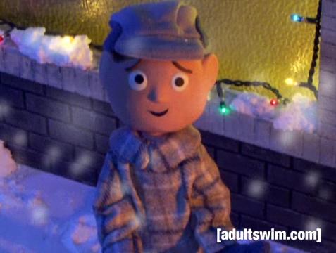
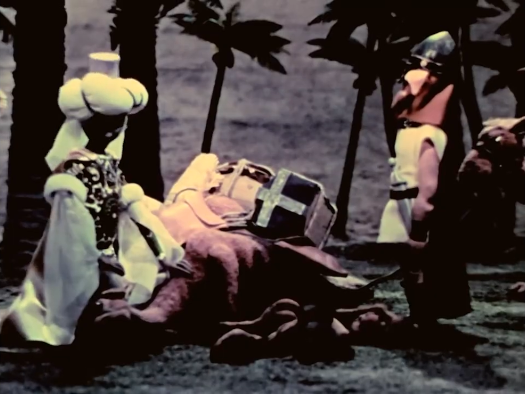
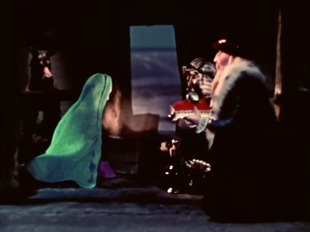
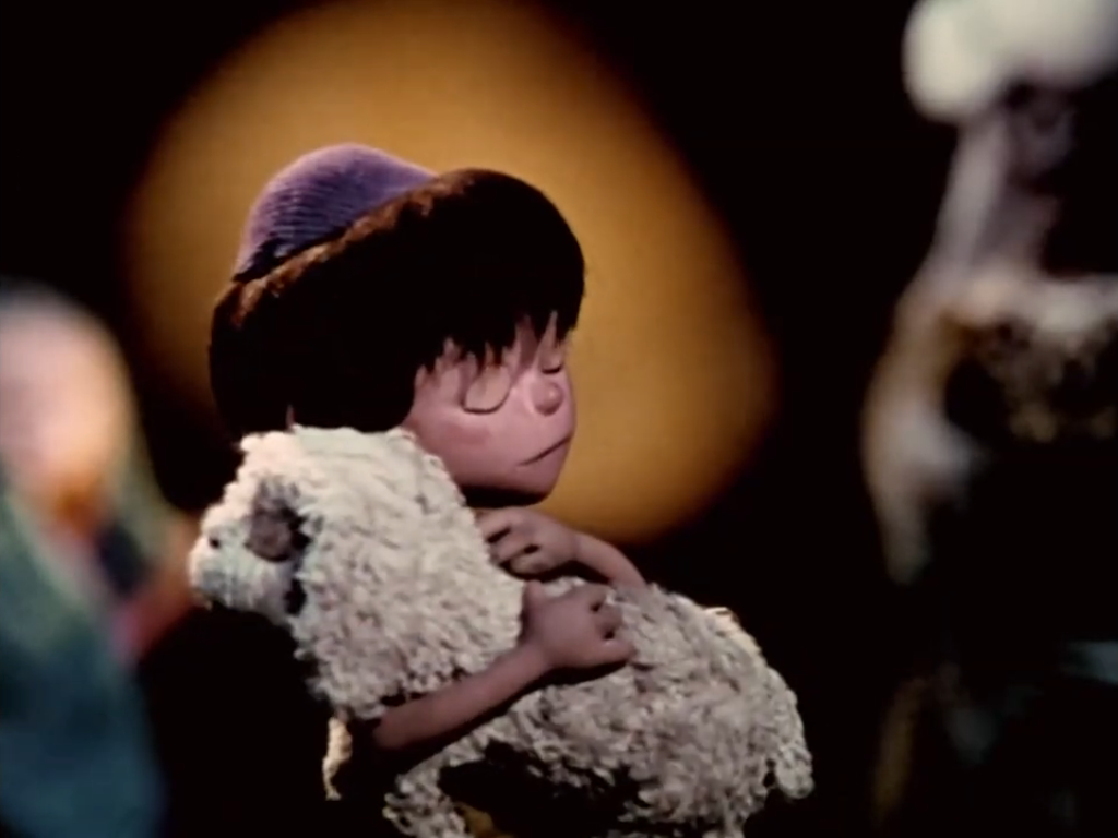
Moral Orel is a stop-motion animated show that aired on Adult Swim about a good-natured boy named Orel and his quest to live life in God’s image. It’s very much a subversive take on Davey and Goliath, just minus the talking dog. Orel, being a young kid, is completely oblivious to his surroundings in which all of the adults in his life are selfish and miserable and there basically isn’t one genuine person in his life. His father is an abusive alcoholic, his mother a bitter adulterer, and even his priest is a sexual deviant. “The Best Christmas Ever” was actually the show’s premiere, though it was never intended to be. If you caught it in the proper order, the episodes started off as a Davey and Goliath parody with Orel misunderstanding some church teaching and doing the wrong thing leading to a trip to his dad’s study to get taught a lesson. Physically. By the time the show reached this season finale, it just got depressing as his dad slipped further into the bottle and was forced to confront the fact that one of his children isn’t even his. And since Orel overhears the discussion between his parents, he gets the idea that his little brother was conceived immaculately and is actually the second coming of Jesus. In reality, the kid is terrible and his own parents regret not getting an abortion. It all ends with Orel and his brother smashing a nativity scene, because he thinks his Christ-brother is bringing about the Apocalypse, only for his mom to tell him that: He’s right that his dad isn’t his brother’s father, and they’re getting a divorce. Orel tracks his dad down at the local bar where his track coach is hitting on him and Orel comes to the conclusion that this is not the best Christmas ever. He notes there’s still two minutes left though and he has faith in the Lord to turn things around! And that’s how the episode ends which just feels even more bleak. This is definitely a very cynical look at the idyllic Protestant family and not the sort of special that’s for everyone. There’s a bit of an “edgelord” vibe to the humor, but the audacity of it all worked on me and it’s one of those specials I return to just to see if it’s as dark as I remember. And, yeah, it pretty much is. The only thing missing is a suicide joke.
72 – American Dad! – Season’s Beatings

This episode of American Dad! pairs rather well with Moral Orel as it’s another cynical take on Christmas with some sacrilegious displays of violence. It’s also far more lighter in tone due to the more slapstick nature of the show when compared with Moral Orel. In this one, Stan gets passed over as Jesus for his church’s play only for Roger to get the part. When Stan loses it and beats up Roger on camera over the alien’s disrespect towards his religion, he finds himself excommunicated from his church. Lucky for him though, his daughter and her husband just so happened to adopt the antichrist and if Stan can just kill his toddler grandson it will get him back into God’s good graces! It’s quite the farcical Christmas plot with numerous funny moments and some pretty strong animation from the show. It doesn’t advance the overarching Christmas plot the show has with the Smith family and Santa Claus, but it’s fun.
71 – Smiling Friends – Charlie Dies and Doesn’t Come Back

Smiling Friends is a much celebrated animated show in the circles I frequent mostly for its brand of humor and rough animation. It’s the latest in what appears to be cheaply produced animation for Adult Swim that turns into a hit. I confess it’s not as big of a hit with me as it is others. I don’t think it’s bad, but the show is just so damn ugly. I feel like I’ve hit my limit with ugly adult animation – why can’t we get stuff that looks nice? This is another Christmas episode from Adult Swim that’s not exactly packed with feels. Charlie dies while out looking for a Christmas tree with his friends and co-workers only to wander through Hell and find himself face-to-face with Satan. If he helps the guy out, he can go back, and since he’s one of the main characters I don’t think it’s a spoiler to acknowledge that the title of this one is a bald-faced lie. The humor is mostly dark, and even though I called this show ugly, there are some spots in Hell that are pretty inventive and surprised me. As I think about it, I probably should have switched this with Moral Orel, but it hardly matters when we’re talking two positions on a 200 episode countdown. This one fits in with a lot of the other subversive Adult Swim Christmas specials so if that’s something you like then you can easily make yourself a solid marathon of content.
70 – Teen Titans Go! – Second Christmas

Here’s one that’s a bit more lighthearted. Our second installment of Teen Titans Go! just confronts what we all hate about the holiday – it’s end. To stave off those post Christmas blues, the Titans invent Second Christmas complete with its own Second Santa and customs. It’s basically just good-natured fun, though at the expense of Starfire who is ignorant of Christmas, and no one really learns a lesson or anything. Instead, they all fall victim to a horrible accident when Starfire is denied a Second Christmas miracle and they get to spend much of the following year in a coma which is actually a happy ending because they get to basically skip right to Christmas again! Take that, Arbor Day!
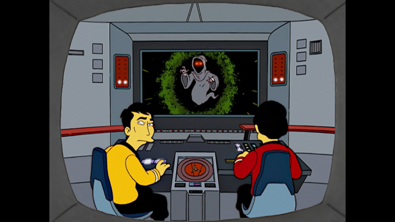
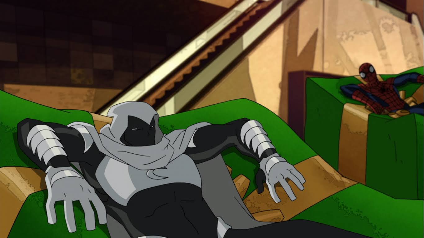
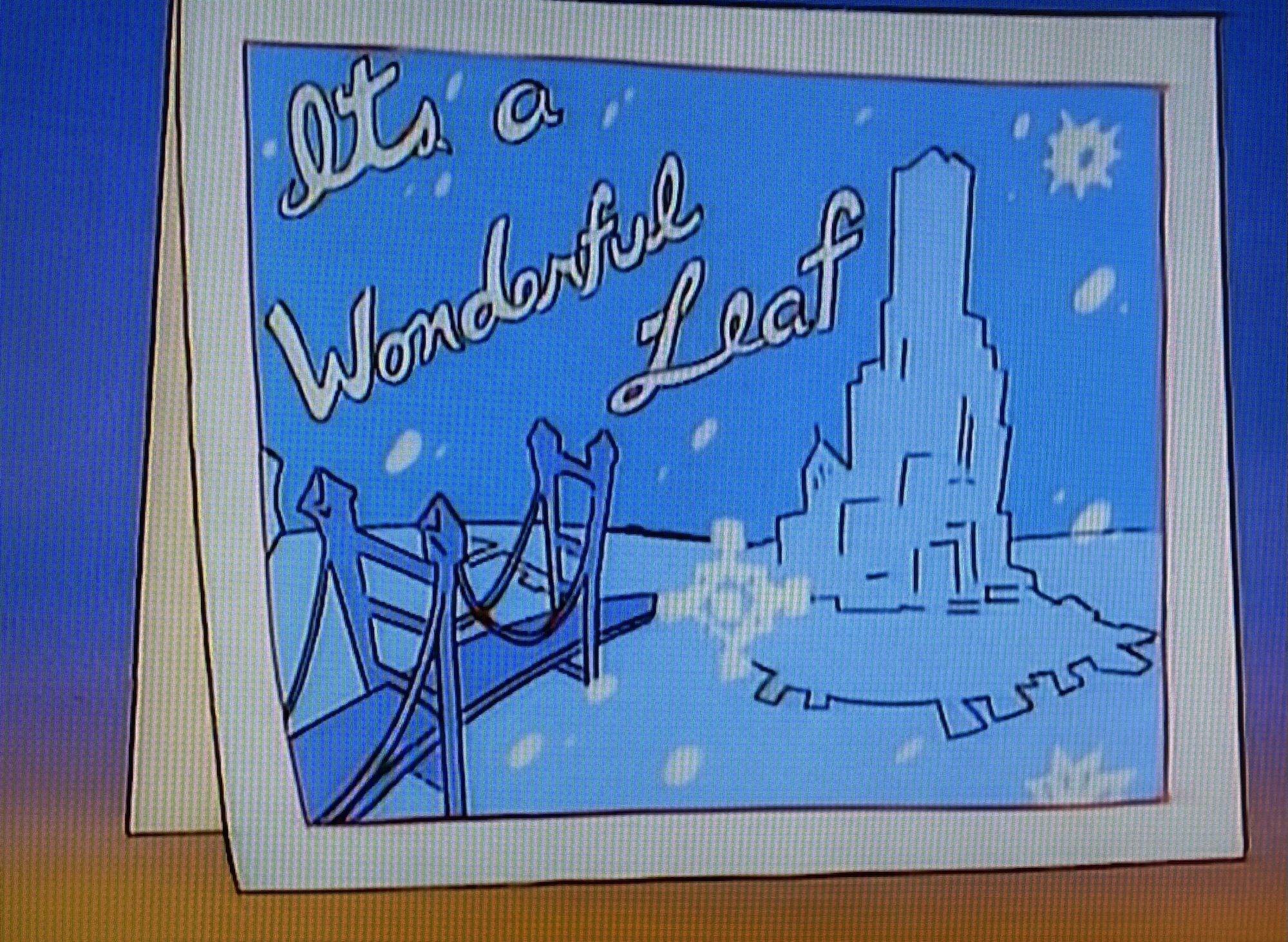
69 – Spectacular Spider-Man – Reinforcement

Spectacular Spider-Man was a short-lived animated series that really did an excellent job of condensing a lot of Spider-Man material into something new and fun. Unfortunately, the Marvel acquisition by Disney seemed to kill it as the House of Mouse wasn’t interested in boosting characters it didn’t have film rights to or that were animated on deals outside of their usual reach. Disney would make its own Spider-Man shows and none of them could hold a candle to Spectacular Spider-Man. In this one, Peter tries his luck at courting not one, not two, but three different women and kind of strikes out with all three (Pete, it’s never a good idea to let a woman feel like she’s not your first choice, pal). It ends up being the least of his worries as he’s soon set upon by the show’s version of the Sinister Six. It’s a lot for Peter to deal with, but he’s Spider-Man so you know he’ll figure it out. It’s basically an episode full of action and holiday puns from our hero and it’s pretty entertaining, just not really a self-contained Christmas special. You definitely won’t get as much out of it if you haven’t watched the episodes leading up to it, but even if you haven’t, it’s still the best Christmas episode any Spider-Man show has had up until now.
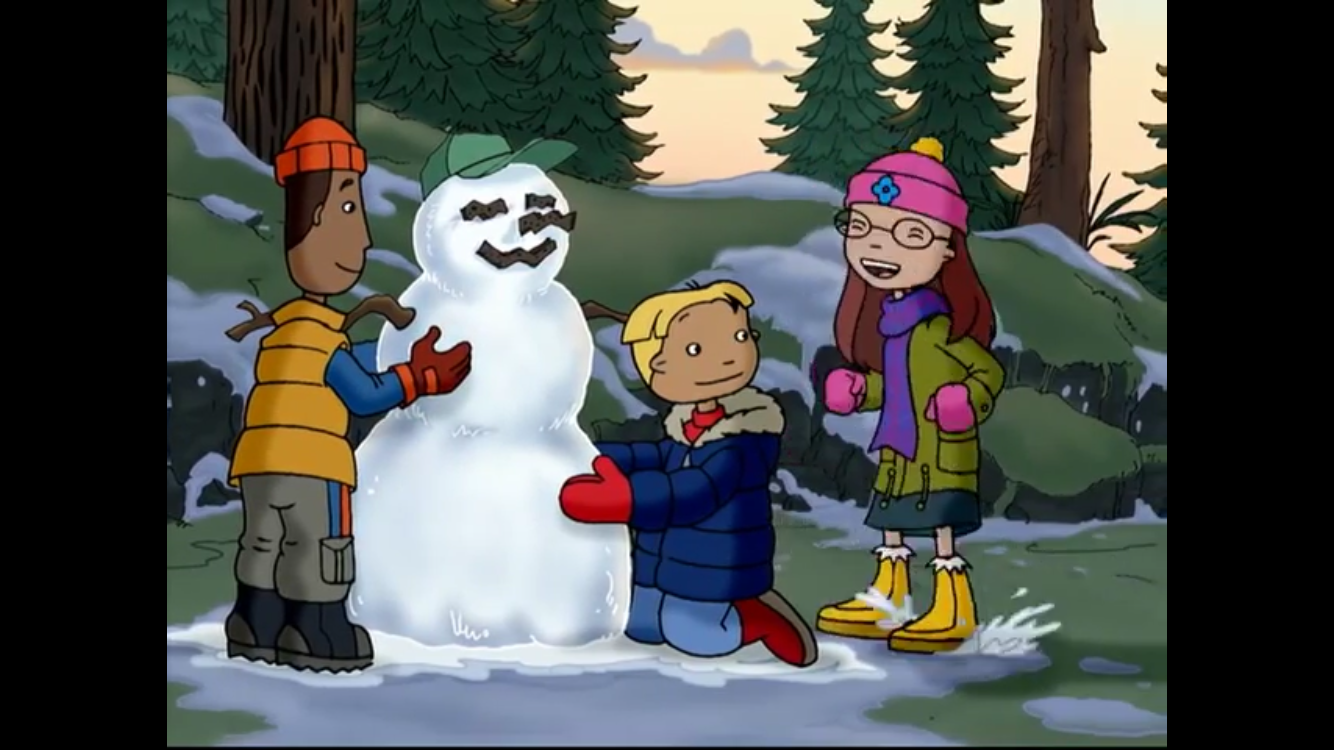
68 – All Grown Up! – The Finster Who Stole Christmas

This Rugrats spin-off arrived when I stopped caring about the franchise. I wish it had come earlier as I think I would have enjoyed it in those early teen years where I was still kind of watching Nickelodeon, but not sure if I should still be. The show surprised me in the little bit of time I spent on it as it took Rugrats, a show about babies going on wacky adventures, and made it a teen drama. I wasn’t sure that could work, but what do you know? It kind of does. And the result isn’t a show as reliant on Tommy. He almost feels like an afterthought, but this is a Chuckie centric episode as he mistakenly steals a Christmas tree and feels horrible about it. There are some inconsequential B-plots as well, but the meat and potatoes is Chuckie trying to do the right thing and finding it difficult. It mostly works out in the end and Chuckie gets to learn a lesson about the importance of family or something and it will leave you feeling pretty good about things. It’s sweet and I was charmed by the conflict between Chuckie and his dad. I considered ranking this one ahead of the Rugrats Christmas episode, but nostalgia kind of won out there.
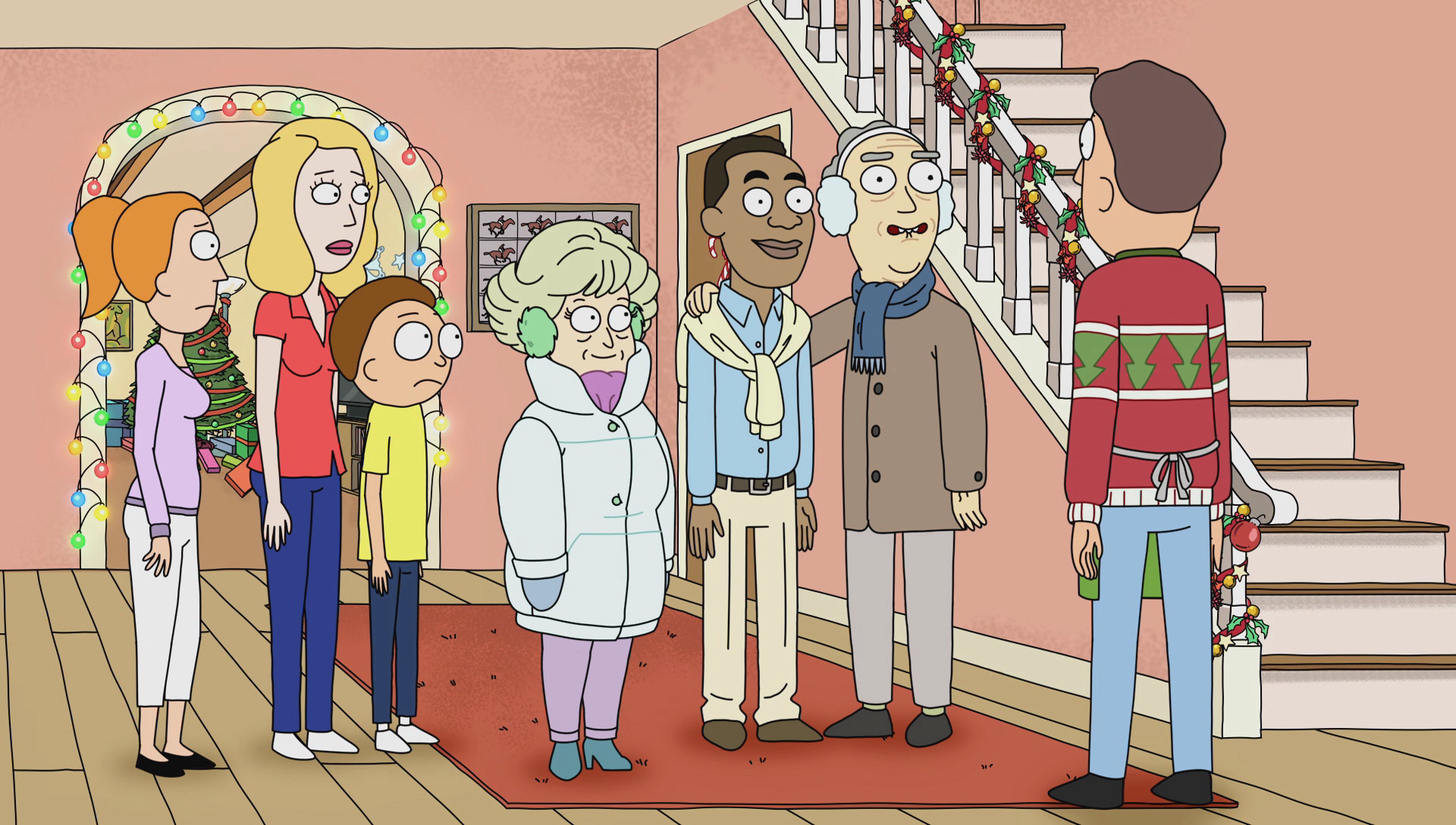
67 – X-Men Evolution – On Angel’s Wings

We already looked at the Christmas episode from the better, more popular X-Men animated series. Now, we’re looking at the better Christmas episode. That other X-Men special is a “so bad it’s good” kind of special while this one is mostly just plain good. It’s a more grounded episode even though it’s all about a guy with actual wings and dudes with laser eyes and such. It’s more teen drama with the orphaned Cyclops and Rogue being left behind by their peers at the X-Mansion for Christmas. While that does kind of suck, it forces them to bond a bit which is good for Rogue who has a crush on Summers that’s unlikely to go anywhere since he’s all about Jean. Since Wolverine was too old in this show to shoehorn into that love triangle I guess Rogue is a decent consolation. The two end up in the city investigating tales of an actual Angel, which is of course just another mutant. It turns into something of an arm’s race as Magneto wants to recruit him, but so do the X-Men, and the two battle over the reluctant mutant until finally he’s allowed to have a say of his own. It’s just a good-natured Christmas special with some nice action tossed in. It’s not as reliant as Spectacular Spider-Man on the audience being up to date on what is happening in the show and basically all you need to know is contained in this one. It also mostly avoids the slapstick elements of the show and plays it straight. There’s a nice little montage at the end showing how the others spend Christmas and there’s that nice touch of melancholy present in so many Christmas episodes and it’s just the right amount. If you thought the older X-Men Christmas episode was just too silly, this one will likely please you more.
66 – Futurama – A Tale of Two Santas
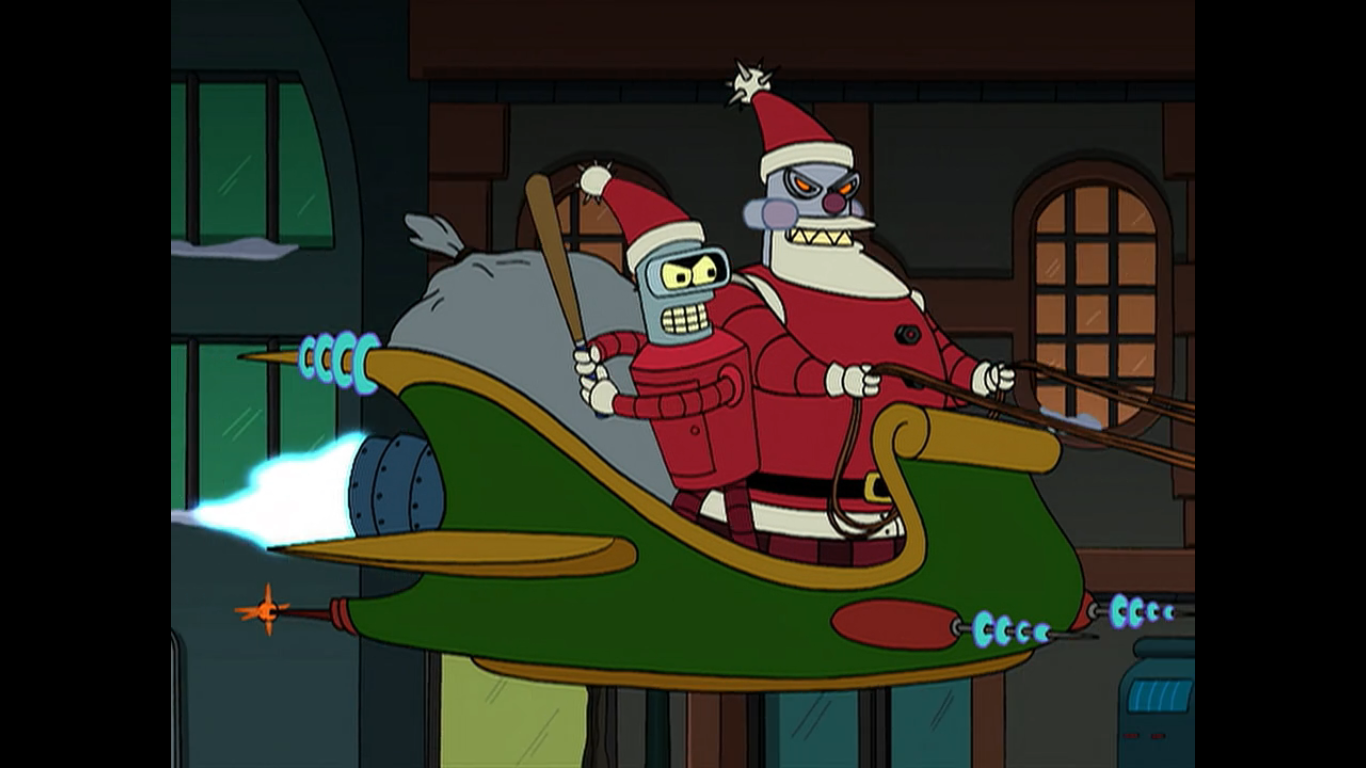
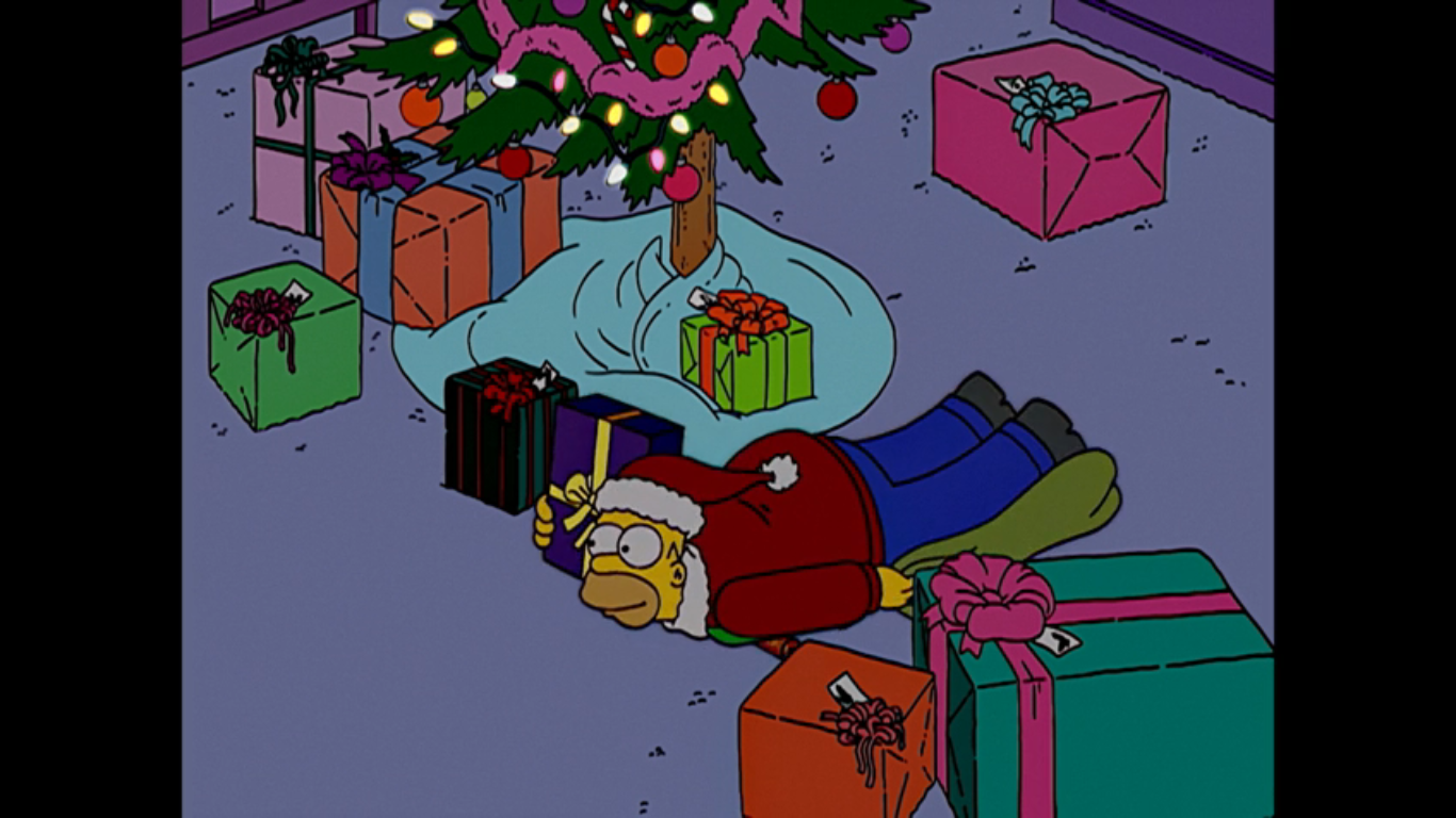
Enough of that sentimental bull crap, let’s cause some mayhem! Futurama is unique in that it turned Santa into a villain. Well, it was unique until American Dad! and Teen Titans Go! came along, but their murderous robot Santa is still his own brand. In the follow-up to the first Xmas special, the Planet Express crew is tasked with finally putting an end to Santa’s murderous rampage and they’re actually successful! A problem arises when they take it one step further and have Bender serve as a new Santa, one that will actually deliver presents to all the good girls and boys. After generations of growing up with an evil Santa, the people of Earth aren’t so willing to accept this reformed Santa and Bender is put through the ringer. He’s eventually jailed and sentenced to death for being Santa and the only way to save him is to free the real Robot Santa whom the crew trapped in the ice of Neptune. Do you believe in Xmas miracles? Well your faith is rewarded! Robot Santa is freed and saves Bender and the two are able to inflict carnage and mayhem on the world just as Jesus intended. Merry Xmas everyone!
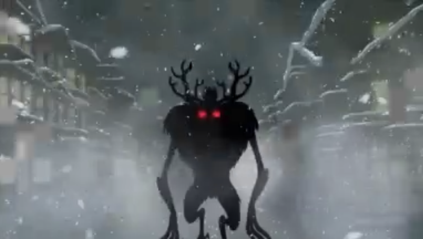
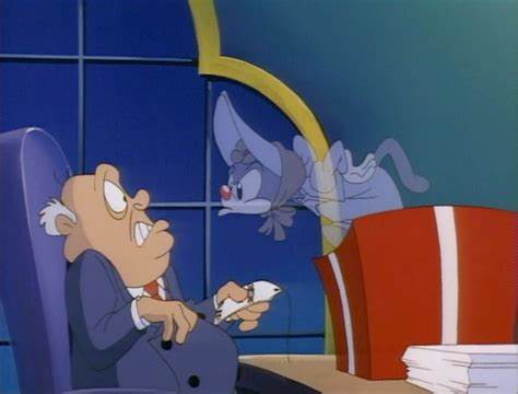
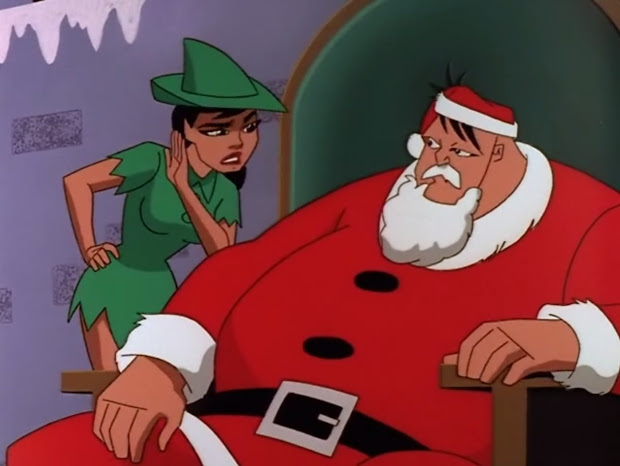
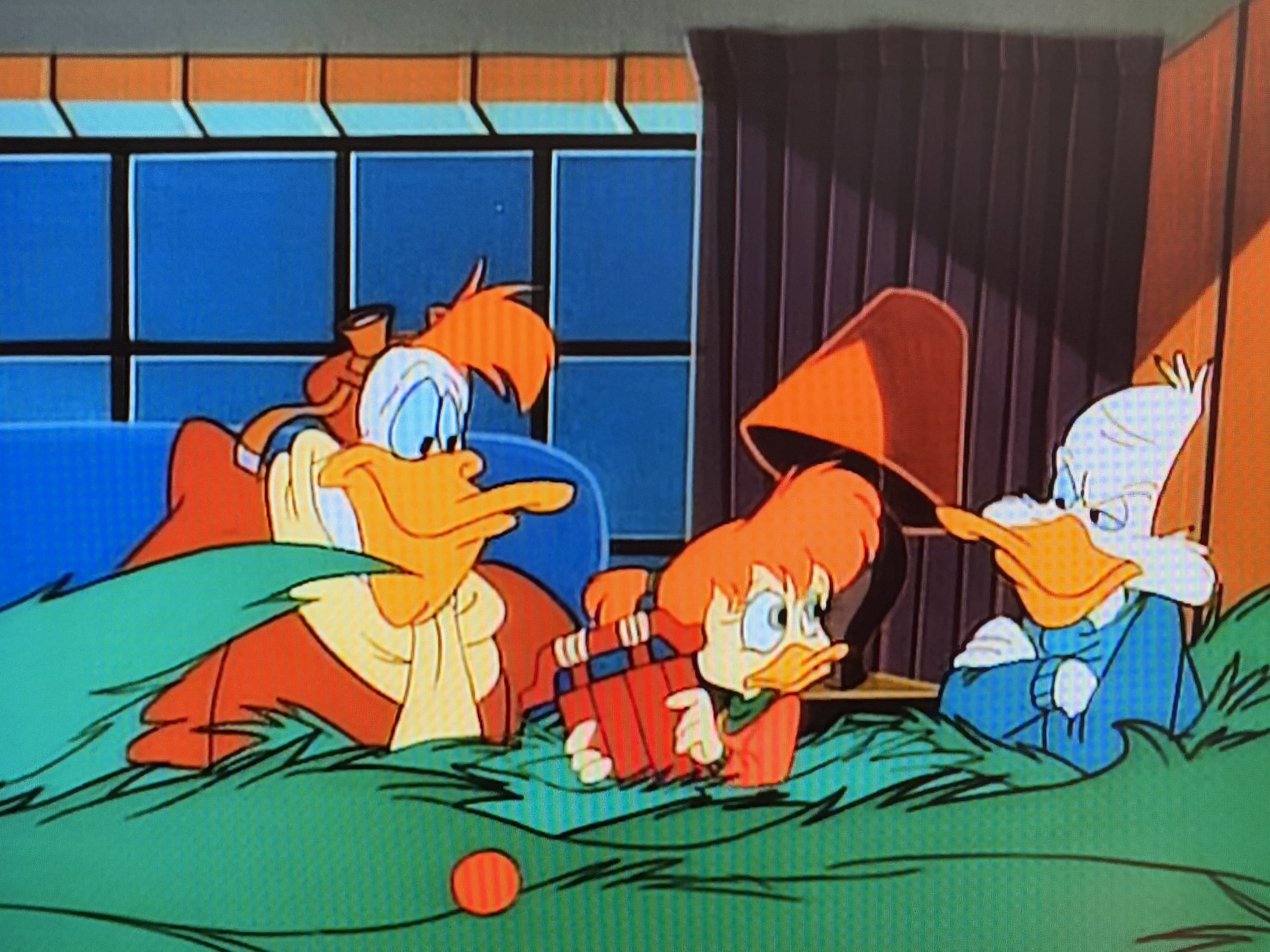
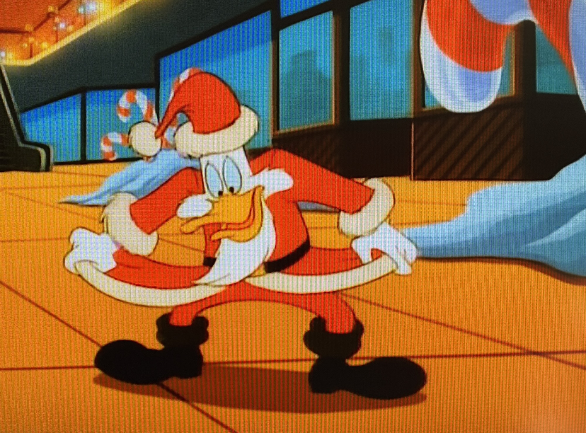
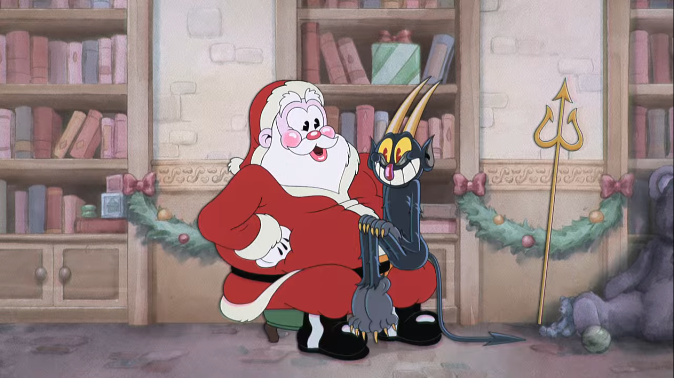
65 – American Dad! – Minstrel Krampus
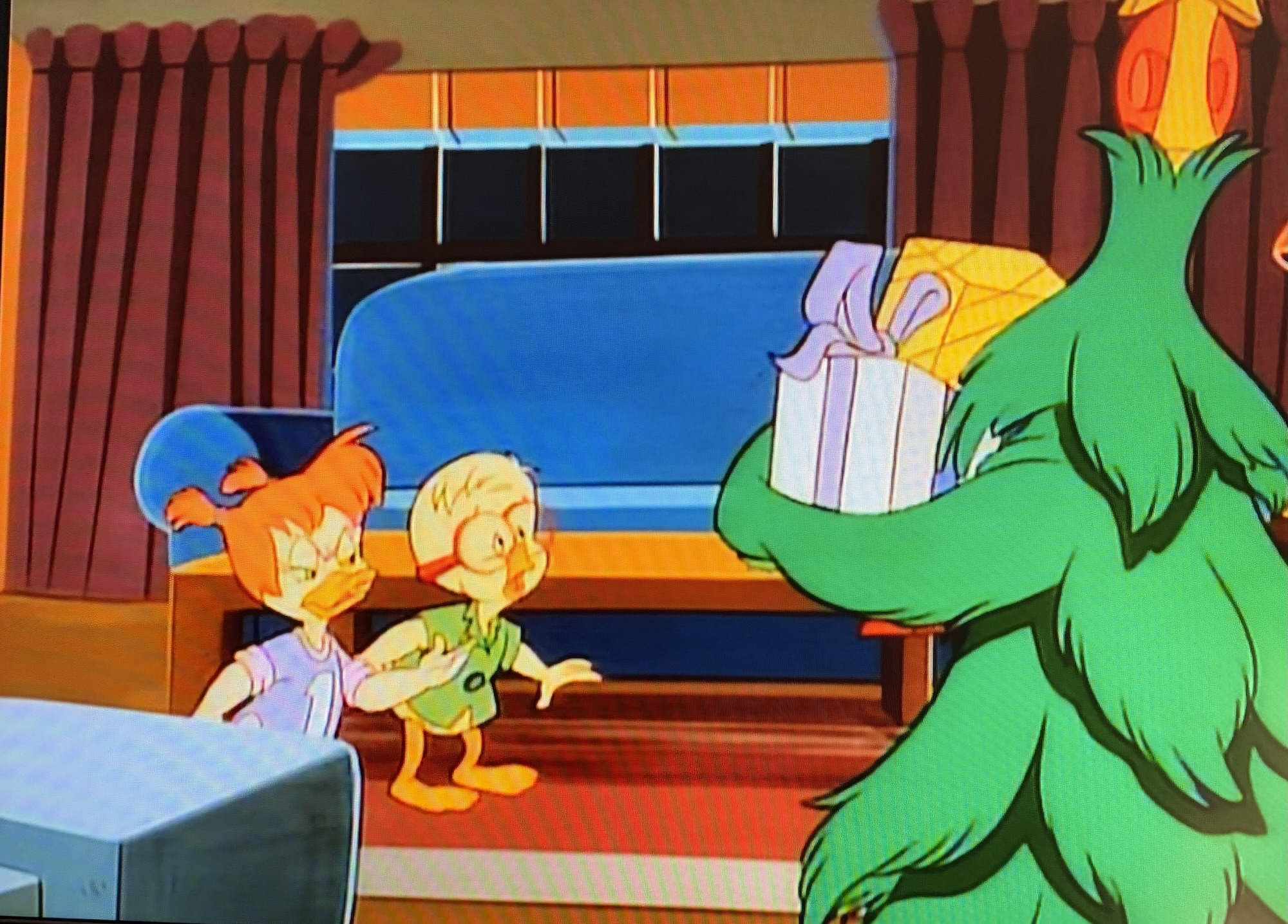
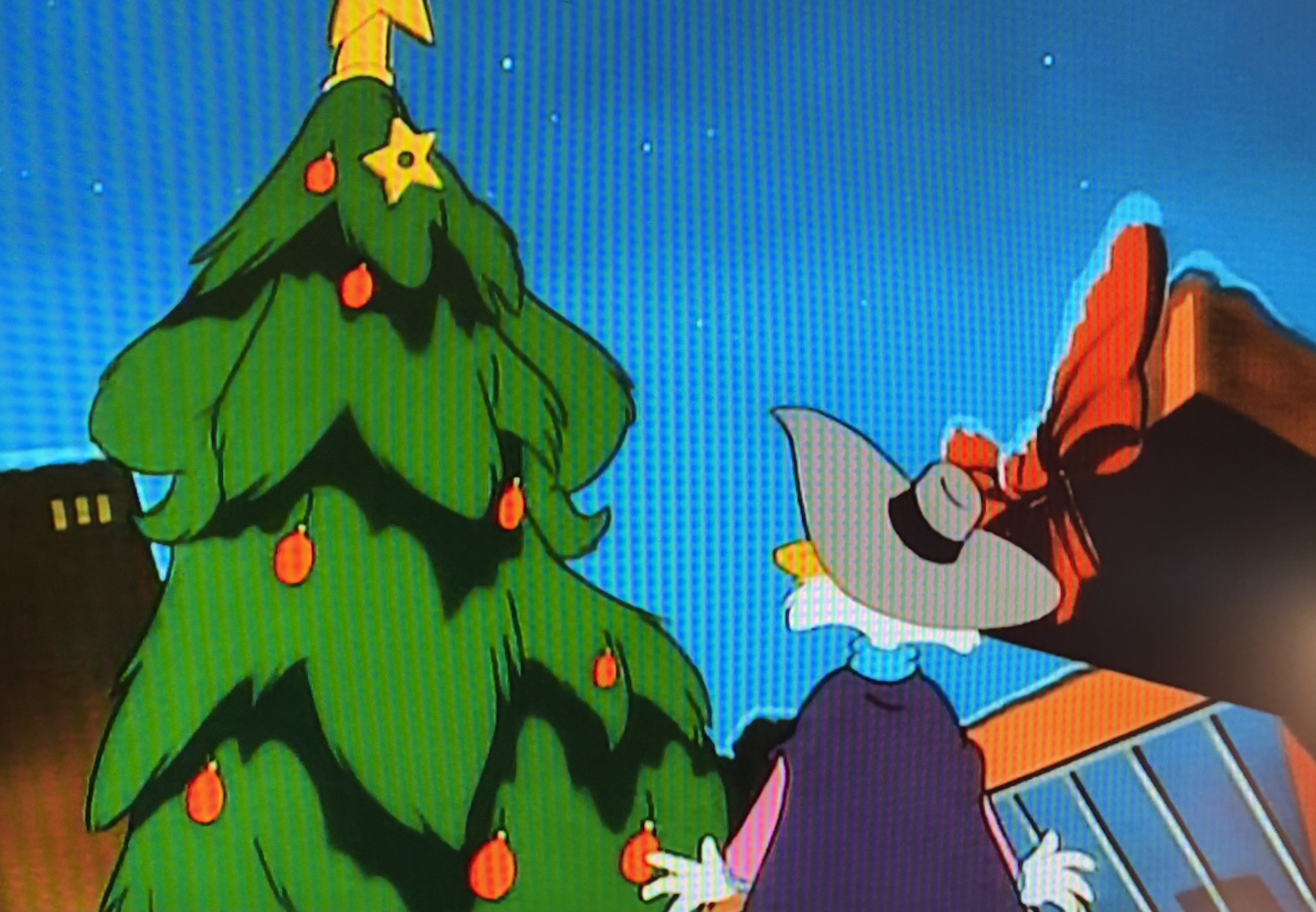
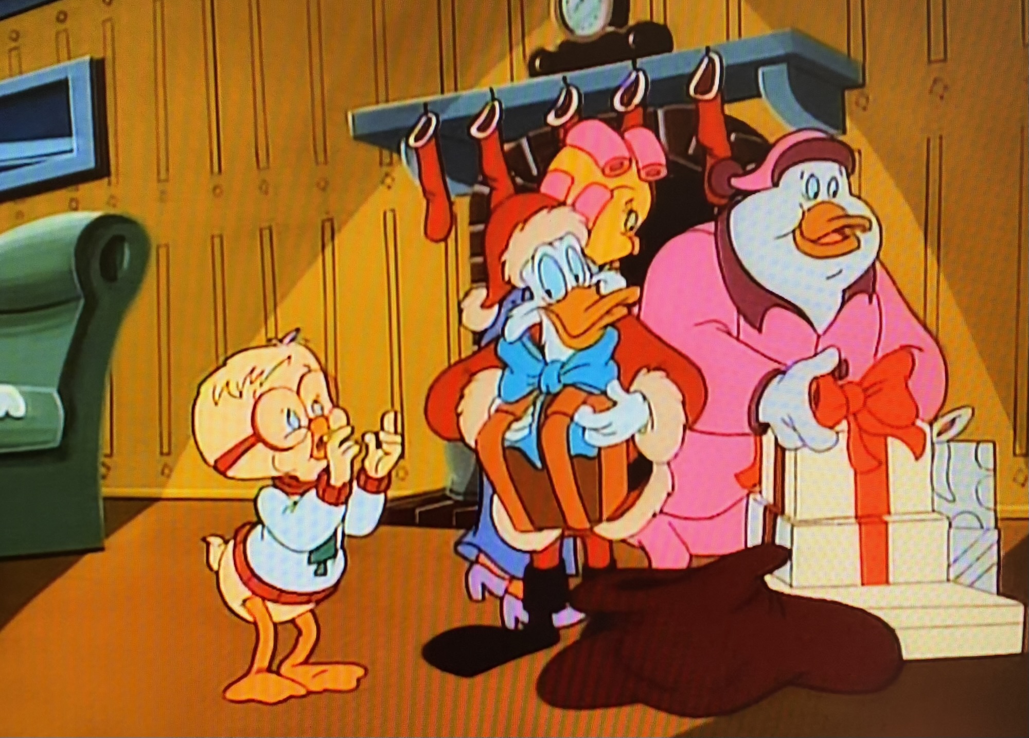
If you’re a show that likes to do an annual Christmas episode and you’re on for many seasons, chances are you’ll eventually wind up doing a musical. I wouldn’t call this episode of American Dad! a full blown musical, but it has multiple musical numbers most of which are pretty damn fun (Haley’s is not though, that one sucks). In this episode, we get to further the plot of Santa and the Smiths by having Stan accidentally free the demon of Christmas, Krampus, whom his father had trapped in a copper pot many years ago. Krampus immediately kidnaps Stan’s bratty son, Steve, and demands he send his father to save him. Stan’s dad is a jerk though and ditches him so Stan has to seek the aid of Santa himself. The two form an unlikely alliance and go after Steve who is basically in a parody of Disney’s Beauty and the Beast where he gradually warms up to Krampus and becomes a better kid. There’s a wild battle to end things and a new part of the lore is established in the process. It’s a rewarding episode in that respect for longtime viewers of American Dad!, but for anyone else it’s just an absurd Christmas story that will probably elicit some laughter.
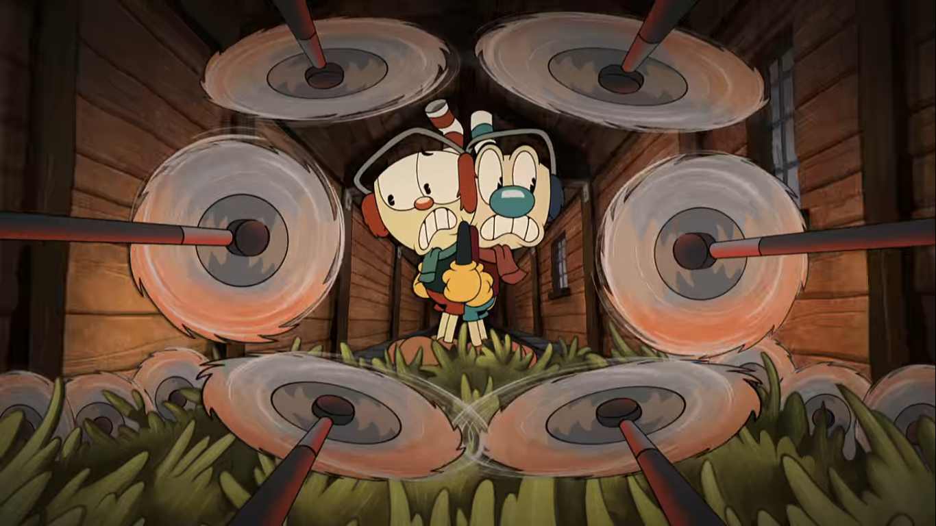
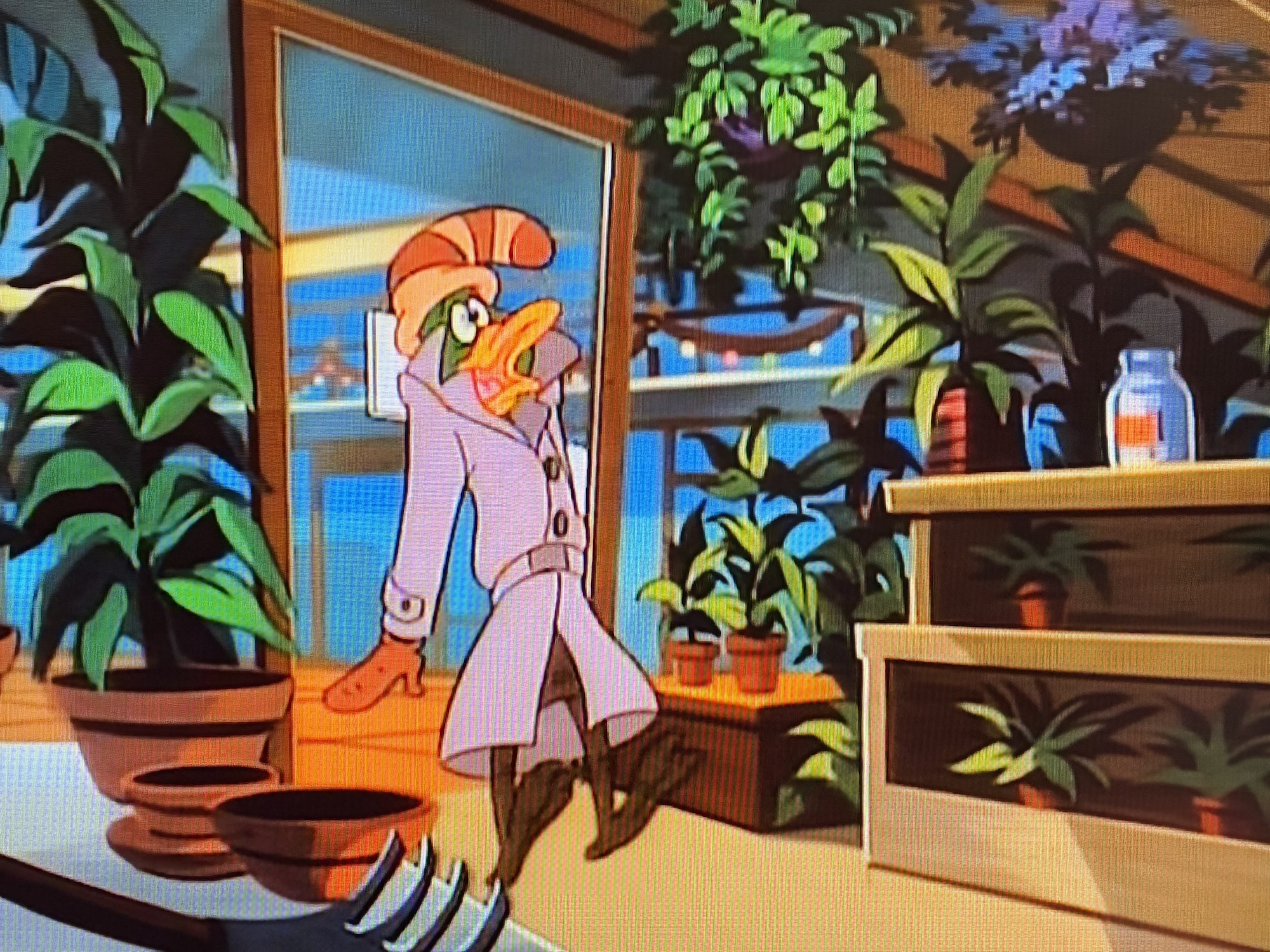
64 – The Cuphead Show! – A Very Devil Christmas
This second Christmas episode of The Cuphead Show! dares to ask the question “What does Satan want for Christmas?” Turns out it’s a choo choo as this show’s version of the Devil tries to get onto Santa’s Nice List in order to get what he wants, but the only way for him to do so is to make a deal with the big man and take his place! The Devil as Santa? That’s a worthwhile spin on what is essentially a take on The Santa Clause and the end result is pretty funny. It barely features the titular character of Cuphead, but that’s okay because the Devil is a great character on his own. It’s also really well animated and just looks fantastic for a modern piece of animation. It’s also much longer than a typical episode of The Cuphead Show!, but it doesn’t feel bloated. I was really entertained by it and it’s snuck onto my annual viewing list as a result.
If you can’t wait until tomorrow for more Christmas check out what we had to say on this day last year and beyond:

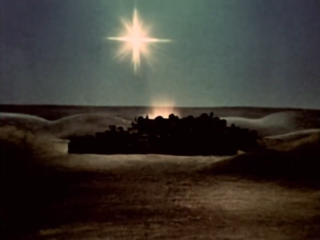
Dec. 17 – A Cosmic Christmas
If you watched a lot of cartoons in the 80s and 90s then you probably remember Nelvana. Their cartoons, like many others, would end with their own production logo which was a polar bear, I think. It was all one color and white and since Nelvana is Canadian it would certainly make a lot of…
Keep reading
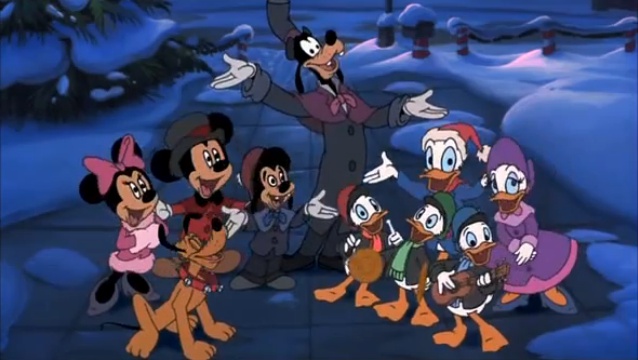
Dec. 17 – We Bare Bears – “Christmas Parties”
This year, I’ve taken some time out to watch Christmas episodes of shows I’m pretty unfamiliar with. This is yet another one of those posts, only with this show I did make an attempt to get into it. A mild one. We Bare Bears is a show created by Daniel Chong that aired on Cartoon…
Keep reading
Dec. 17 – Peace on Earth (1939)
Hugh Harman was one of the early stars in the field of animation. In fact, we talked about one of his shorts already this year, but perhaps his most famous and most celebrated is the 1939 anti-war film Peace on Earth. According to Harman, the short subject was nominated for The Nobel Peace Prize, but…
Keep reading