Well folks, we did it! We made it to another Christmas! These things come faster and faster each year which makes something like an online advent calendar helpful as it attempts to keep the season from going by even faster. It’s cliché, but the years go by even faster the older you get and if you have kids it seems worse. It’s great to stop, breathe, and just try to take it all in for I know if I’m fortunate enough to live to be an old man I’ll probably look back on my life and think it went by in a flash.
That’s the sort of melancholy vibes Christmas brings about for me, but it’s important to remember this is a day of fun. Of revelry! I try to save a good one for each December 25th, or at least a weird one (I did go with Samurai Pizza Cats one year), and this year I felt like turning the day over to America’s real first family: The Simpsons.

The Simpsons has been featured here before. Many times too. The show has staked its claim to Halloween via the Treehouse of Horror anthology series, but it was Christmas that marked the show’s debut. For years the show avoided the topic as how could anyone hope to top the show’s debut episode? Eventually, that fear subsided and the show started cranking them out. Not quite annually, but there’s certainly plenty at this point. And today’s episode comes from the show’s fifteenth season and is appropriately titled “‘Tis the Fifteenth Season.” At the time, it felt like quite the achievement to be on the air so long that it was celebrated, or at least marked, in the very title of the episode. Now, it almost seems quaint. Fifteen seasons isn’t even half the show’s current total. Will The Simpsons ever end? When I was a mopey teen angry the show wasn’t as funny as I remembered it being I would have said it needs to die, but now I’m just curious to see how long it can go. There’s a comfort in knowing that every fall a new season of The Simpsons debuts. It probably won’t go on forever, but that doesn’t mean it can’t try.

The first episode aired of The Simpsons, “Simpsons Roasting on an Open Fire,” was pretty much a Homer (Dan Castellaneta) story. He was denied a Christmas bonus and Marge (Julie Kavner) spent all of the family’s extra money on getting a tattoo removed off of Bart (Nancy Cartwright). Rather than come clean, Homer takes a part time job as a mall Santa to earn extra money in hopes of providing his family with the kind of gifts he felt they deserved. Or rather, the type of gifts that would make him feel like a successful provider. Following that episode, Homer would take a back seat in future holiday outings. We had episodes centered around Bart, Lisa, and even Marge while Homer was like a sidecar. The kids need his help in the waning moments of “Grift of the Magi” to steal some toys, he and Flanders have a B plot in “Skinner’s Sense of Snow,” and that’s kind of it. In today’s episode, Homer is very much the focal point as he must learn the spirit of giving, then learn to reject materialism, then…become the Grinch? This one ends in a place one wouldn’t have predicted at the start, so let’s jump into it and see how we get there.

This holiday episode of The Simpsons begins with the standard, abbreviated, opening where we just jump right to Marge almost running Homer over in the driveway. The couch gag isn’t even holiday themed, it’s anime, which is a surprise. We’re not off to a good start here. The episode proper then begins not with Christmas, but Thanksgiving. The family is watching a Channel 6 holiday broadcast featuring Krusty (Castellaneta), Sideshow Mel (Castellaneta), Mr. Teeny, and a large woman dressed as a ballerina. Am I supposed to know who she is? Kent Brockman is appearing via cardboard cutout which Krusty informs us he’s contractually allowed to do because he’s in rehab. Again. Oh, and Itchy and Scratchy are present too which is really confusing. Are they someone in costume? Are they animation and we can’t tell because the whole show is animated? Anyway, Krusty informs the viewers for every dollar spent on Krusty merchandise he’ll be nice to a sick kid. And that hookers with a cold count as sick kids. Never change, Krusty.

It’s now time for Christmas decorating, and set to “It’s the Most Wonderful Time of the Year,” we see Homer and the kids putting up the decorations. Bart and Lisa (Yeardley Smith) twirl some string lights like a lasso and fling them on the bushes outside. Homer tries to do the same with a tree and inadvertently kills two birds in the process which he slyly covers with snow and walks off. Inside, the stockings are being hung with care one by one until we get to Grandpa (Castellaneta) who hangs an IV bag instead. Marge is shown putting the family dog, Santa’s Little Helper, in a festive sweater which he predictably hates. We pan over to Snowball II who is already in a sweater and doing her best to get it off. The camera continues it’s pan to find Homer also in a sweater and also desperately trying to remove it with his teeth like an animal. Never change, Homer.

We now are taken to the Springfield Nuclear Power Plant where it’s apparently already time to exchange Secret Santa gifts. Carl (Hank Azaria) is Homer’s Secret Santa and he has quite the present for the big guy: a new DVD player and the first season of Magnum P.I. Homer is quite happy with this extravagant offering (come on Carl, there had to have been a limit you blew by), but there’s a problem. No one has a present for Lenny (No, not Lenny!) and that’s because Homer is his Secret Santa. Realizing he forgot, Homer runs offscreen and we get to hear him battle with a vending machine. Lenny (Harry Shearer) can tell what’s going on and a scowl crosses his face before Homer returns with his gift: a roll of Certs. Homer seems pleased with himself, but Lenny doesn’t hold back and tells him that his gift flat-out stinks. Carl piles on too telling Homer he’s the most selfish man he knows (then why did you go all out on Homer’s gift, Carl?). Homer appears offended and tries to defend himself by saying Mr. Burns is the most selfish man around. He starts to bad mouth him, and Skinner, only for Burns to sidle up behind him without him knowing.

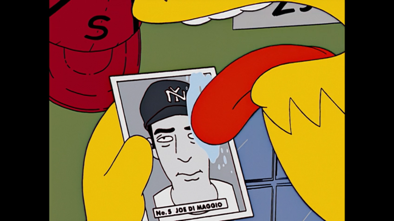
Burns (Shearer) hears the insults, but laughs startling Homer. He declares that Homer’s very obvious description of him describes “Cathy in personnel” to a tee. Who is this mystery woman? No time for that, for Burns is here to hand out Christmas bonuses. This feels familiar. The bonus this year? A five dollar voucher to the plant cafeteria which no one is happy with. I guess it’s better than the series premiere when they got nothing? Burns has something special for Bart though, I guess because he knows Homer has a son? They’ve obviously crossed paths many a time, but I don’t get the sense that he’s giving Bart a gift because of any of that. The gift is, as Burns puts it, a confectioner’s card of a current baseball player. The way he phrases it he clearly doesn’t place any value on this card, but it’s a Joe DiMaggio card and a pretty famous one in card collecting circles at that. Not that Homer is aware. Burns refers to DiMaggio as a rookie for the New York Nine and when Homer says the name in disbelief (likely because he knows that Joe DiMaggio has long since passed his rookie days) Burns confirms it’s him and adds, “It seems they’re now letting ethnics into the big leagues.” He then turns away from Homer and is surprised to see Cathy (Tress MacNeille), from personnel! She looks exactly like Burns and he asks her how things in personnel are she has a one word response for him: Excellent.
Homer may not know how valuable the card is, but he knows it’s worth something so he takes it to the only place in town he’d logically go: The Android’s Dungeon. Homer finds Comic Book Guy (Azaria) eating some nachos from his usual perch atop his stool and asks if he can get any money for the card? Comic Book Guy takes one look at it and nearly has a heart attack as he turns up his cash register and empties its contents onto the counter. He greedily snatches the card from Homer, but then immediately begins to fret because he got nacho cheese on it. He reasons the only solution is to deftly lick it off, which he does. Homer just grabs his armful of cash and walks off remarking “Freak,” under his breath. We don’t know how much Homer just got, but probably not a substantial amount? Most stores only keep so much money on-hand, though I suppose a business that buys and sells might have more than usual. Either way, he probably didn’t get full value since that’s a card worth tens of thousands of dollars, but at least he’s happy.
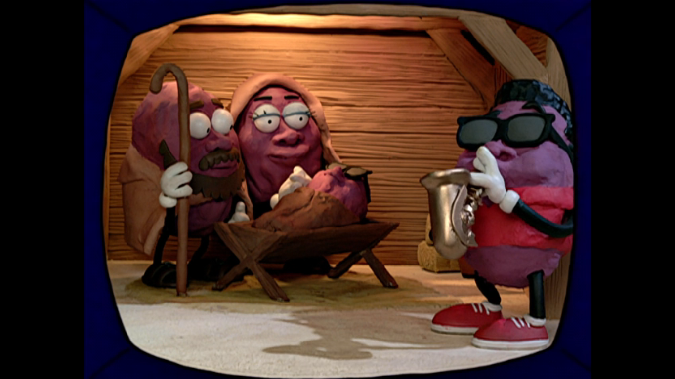
We return to 742 Evergreen Terrace to find the rest of the family seated in front of the TV. A common past time for the Simpson family. They’re watching the 1986 “classic” Christmas with the California Prunes. Obviously, this is a parody of the 1987 sorta classic A Claymation Christmas which featured the California Raisins, a special I probably should have covered by now, but just have not. This could almost barely be considered a parody as we get to see some of this special which features claymation characters that look almost exactly like the California Raisins. There’s a soulful rendition of “Oh Holy Night” being played (and possibly sung by Karl Wiedergott since he’s listed in the credits, but not assigned a role), but with words adjusted to better fit prunes like “We are the fruit that your grandmother eats.” It’s also a nativity scene so if you ever wanted to see what Jesus would look like as a prune, well now you have. I think this is actually really close to the actual segment it’s parodying so if this seems ridiculous, there’s a more sincere version out there. Lisa declares it offensive to Christians and prunes. You know what it’s not offensive to? Animation fans, because this segment looks way too good to just be a quick gag on an episode of The Simpsons.

Homer then comes bursting into the room with his hands and pockets overflowing with cash. He declares they’re going shopping at the Springfield Heights Promenade. Marge jumps up with excitement declaring “That’s the rich people’s mall! Let’s shop till we droop!” Lisa corrects her to say it’s drop, but Marge just scolds her with “That’s a very violent image, Lisa.” Burl Ives then whisks us into Springfield Heights with his version of “Silver and Gold.” The tagline for this place is “Our prices discriminate because we can’t.” It’s basically a fancy outdoor marketplace. I’m not sure if it’s based on anything specific, but it has a similar vibe to Boston’s Quincy Market and there’s a hint a little ways in that might give that away. For a sight gag, we get an Abercrombie and Rich store and there’s a cart that will put your image on a Rembrandt. Moe is clearly pictured on such a painting. Seems almost too tacky for this place, but if it is anything like Quincy Market then it’s also a tourist trap and tourists buy all kinds of stupid stuff.
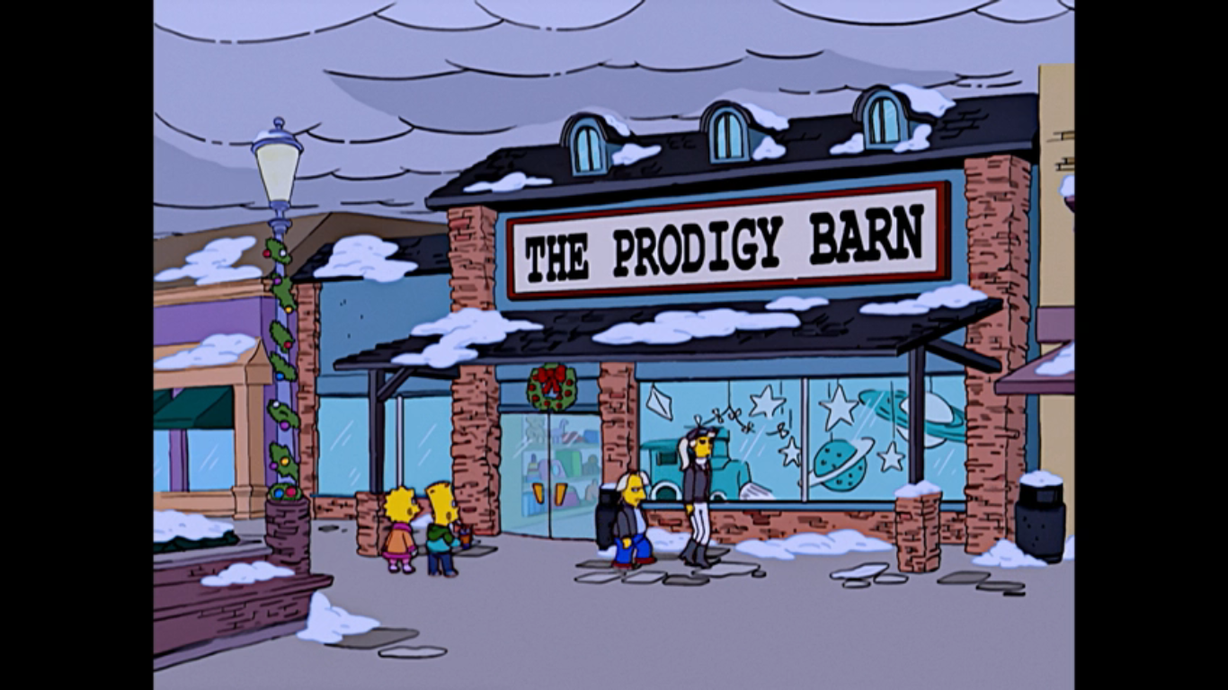
Homer is handing out wads of cash to everyone in the family to go buy Christmas presents with. And when they’re done, he also promises to get a glorious Christmas tree for the home. In fact, he declares it will be so large that its absence from the forest will cause mudslides and flooding. Everyone cheers this except Lisa. That’s some nice attention to detail. We cut to Bart and Lisa shopping together and Lisa has stumbled upon a toy store called The Prodigy Barn. Very quickly there’s a cameo of the rich happiest kid in the world and his mom from “Marge Be Not Proud,” though his hair is now blond instead of brown. Inside, Bart is playing a video game console clearly modeled after the original PlayStation as he’s blasting state capitols on a map of the United States. He soon realizes that this game is trying to teach him stuff and reacts angrily tossing the controller at the screen and declaring “That’ll teach you to teach me!”

We jump to Marge shopping at Victor’s Secret, an obvious pun on Victoria’s Secret, where she’s looking to buy a present for her beloved Homie. She’s picked out some very large underwear that’s sort of tiger striped, but she needs the clerk to help her figure out if it’s the right size for Homer. Make that two clerks as they both easily fit into the underwear and Marge is delighted that it’s the right size. They (Castellaneta) then offer to gift wrap it for her and in order to do so they have to fold it like a flag. They stuff it into a tiny box and hand it over to Marge warning her to stand back when she opens it.
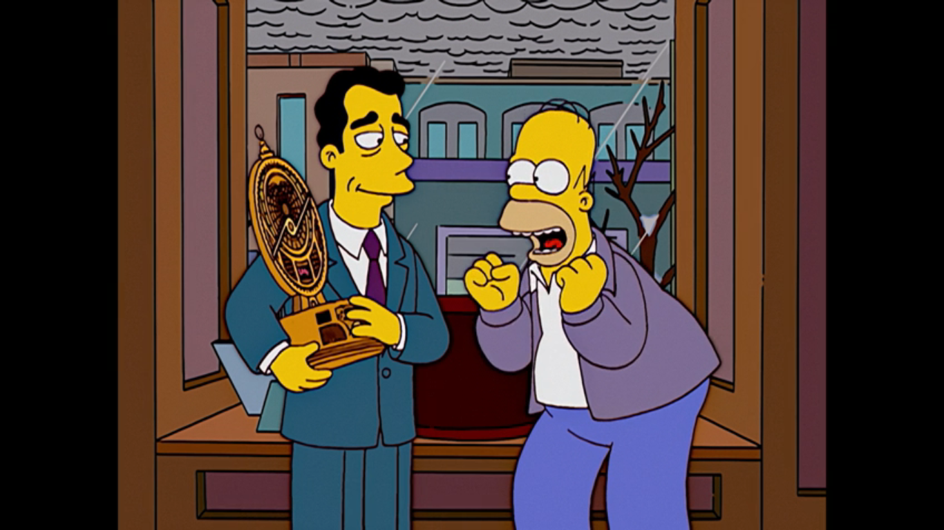
Outside of a store called Things Unnecessary, Homer is rummaging through his bag of goods with a contented look on his face. We then find out he’s bought the family all key rings. Cheap, stupid, key rings. He drops his gifts though when he catches a window display for a talking astrolabe. He immediately goes inside where a clerk with a British accent shows it to him. He wants to make it a gift for himself and notes how it is so unnecessary. The clerk (Shearer) laughs and remarks that he has excellent taste then lists the features which include a pad of paper and pen for writing upside down. Homer is pretty much sold, but then he looks at the price tag: 500 bucks. If he buys this he won’t have anything left for a tree. The astrolabe (I think it’s Azaria, but it’s not listed in the credits on IMDB) then announces that today is the birthday of comedian Margaret Cho, which makes this December 5th. We can also see the current coordinates for the location of this device which online sleuths discovered long ago point to Boston, hence my Quincy Market theory. “That’s the birthday I’m always forgetting, I must have it!” And with that, Homer has bought an extremely unnecessary and extremely expensive gift for himself.
We cut to the car and the family is on the road. Bart asks if they can get their big tree now and Homer laughs nervously and confirms that they can as he also inspects the cash he has left which totals 2 bucks. He still insists that they’ll get a tree from the finest lot in town as he proceeds to lead the family to a rather unsavory part of town. Lisa is the first one to remark that she doesn’t like this neighborhood, but Homer just tells her to lock her door and avoid eye contact while he turns on the radio. It’s a version of the song “Convoy,” which was part of the plot of “Radio Bart” way back when, only now it’s “Christmas Convoy.” It’s our soundtrack to the sights which includes Gil preparing to hang himself with Christmas lights, some hobos roasting pigeons over a flaming drum, and a bloody snowman with an axe in its head.

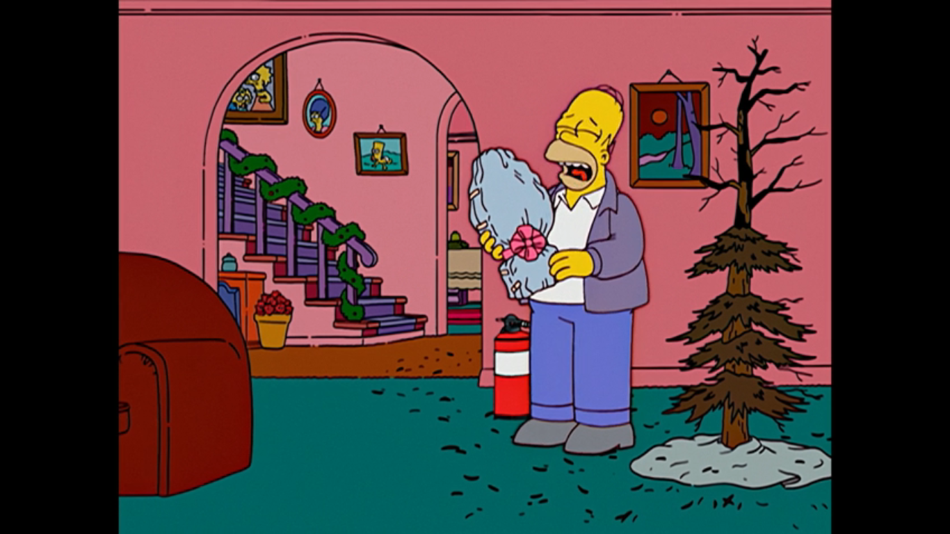
Homer pulls into a pretty sad looking tree lot and buys the best tree 2 bucks will get you, which is pretty brown and lacking in fullness. Homer presents it to the family as a great tree, but Marge points out that it looks a little dry. Homer tries to insist it just needs a little love, but when he rubs it the tree bursts into flames. I’m betting Homer thinks the tree will magically transform when decorated into a glorious one, like it did for Charlie Brown. We cut to the house and the partially burned tree is up. Homer remarks, “Isn’t it sufficient?” and pats it again once again causing the tree to go up in flames. He’s ready with a fire extinguisher and quickly puts it out, but Bart is left to wonder why they couldn’t afford a good tree? Marge asks Homer if there’s something he’s not telling them and right on cue we hear the astrolabe announce that it’s 6:31 PM in Montreal.
Marge rightly asks where that voice came from, but Homer tries to play it off as Maggie finally talking. She finds the astrolabe all wrapped up with a tag on it that says “To: Me, From: Santa.” Marge exchanges the gift for Maggie, who Homer was holding, and confronts him on the fact that he wasted their money on an extravagant gift for himself. Homer tries to reason with her that there’s a trickle down theory at play here: If he’s happy then he’s less abusive to the rest of the family. I should try that the next time I buy an expensive action figure. Lisa is the one to inform him that this time he was just plain selfish as sad music plays and the family leaves Homer with his toy. The astrolabe then announces “I am not returnable,” causing Homer to start sobbing. It then announces it will begin testing its smoke alarm for the next three hours which causes Homer to sob louder and announce, “This is sadder than Tuesdays with Morrie.”

Where do Homer and Marge often settle their disputes? In bed, of course, as we find Homer trying to defend his selfish act. He tries to suggest that she is in fact selfish too for choosing to get her haircut at Supercuts instead of Regular Cuts, the joke being Supercuts is a pretty cheap place to get a haircut. And whoever does Marge’s hair deserves a lot. Marge is obviously not taking the bait and just points out to Homer that Christmas is the time to think of others, but he only cares about himself. He denies this accusation pointing out that he cared what they thought when they found out. She informs him that he can sleep on the couch tonight, but Homer just wants her to yell at him now and get it over with. Marge refuses instead opting to parcel out her anger over the next few days and weeks so she can jab at him when he seems most content. Homer can only groan as he grabs his pillow and flees.

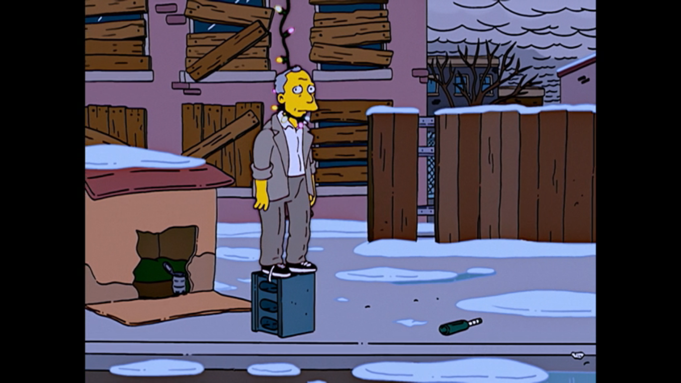
Homer has decided to stay up late watching Christmas specials with his selfish purchase. He’s also opted to unwrap it early as well and even declares that he doesn’t need Marge since he has the astrolabe. It responds to him by telling him that Columbia’s chief export is coffee. On television is The Year Santa Got Lost starring Jimmy Stewart (Castellaneta) as the voice of the mailman. It looks like another claymation piece and the characters all resemble toys from Rudolph the Red Nosed Reindeer, except for the mailman who just looks like a mailman. I guess he’s a nod to Special Delivery from Santa Claus is Comin’ to Town. It’s a very boring story that Jimmy is telling and Homer taps out insisting that Jimmy Stewart as a puppet is just wrong. On the next channel is Mr. Mcgrew’s Christmas Carol, a parody of Mr. Magoo. It’s sort of like the California Prunes from earlier in that this parody is so similar to the thing it’s parodying that it’s almost indistinguishable. Upon stumbling on this, Homer declares he loves that blind, senile, old man! He’s then interrupted by his father knocking on a window in his bathrobe claiming he can’t find his way back to the nursing home. Homer shouts at him, “I heard you the first five times!” then throws his shoe at the window. A bunch of snow falls off the roof and poor Grandpa is buried.

We get to see some of McGrew (Castellaneta) which looks a lot like the actual Mr. Magoo’s Christmas Carol, the very first animated Christmas special made for television. I’ve never covered it because it’s, well, terribly boring. We get to watch McGrew mistake a potbelly stove for a pregnant woman which somehow leads to him sticking his head into a roaring fire. Homer laughs for, once again, old McGrew has mistaken something for something. As the special moves along, Homer comes to realize that McGrew is just like him. Well, except for the rich part. When it gets to the climactic scene at the cemetary, Homer is on the floor in front of the TV begging the ghost to spare McGrew and to take Tiny Tim instead! The ghost gestures to the headstone which reads Ebenezer McGrew. Homer then sees it as reading” Homer Simpson – Unloved by All. He cries out “Unloved by Al? No!” then the ghost gestures again and he reads it correctly and yells even louder.
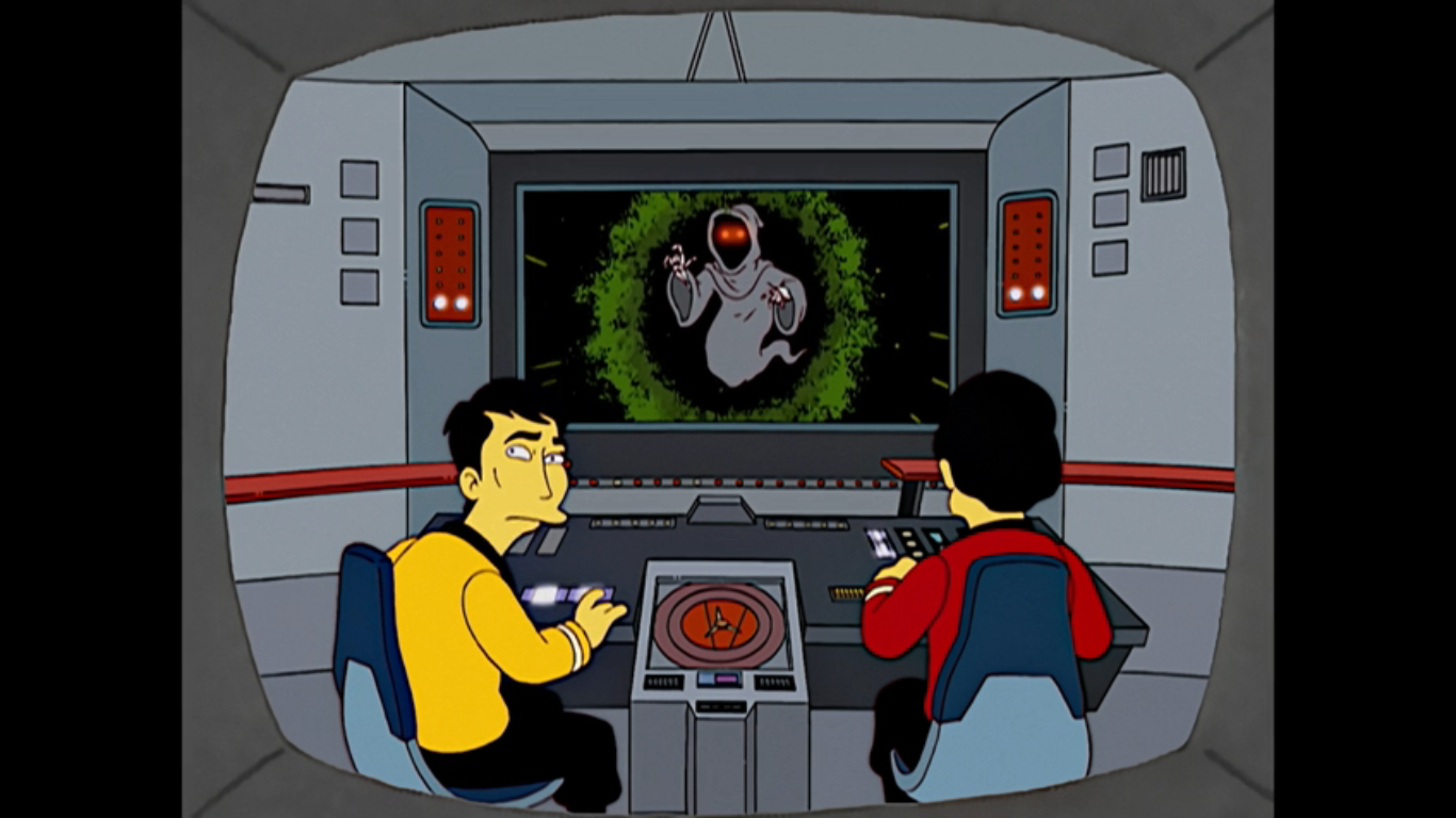
The next morning, Homer is still in the midst of a fretful sleep moaning on the couch “I’ll be good.” Lisa wakes him up with some concern in her voice and Homer just asks her what day is it? She tells him it’s Saturday, December 6h and Homer jumps up saying “Good! There’s still four more days till Christmas!” No one bothers to correct him. We next find the family at breakfast where Homer is talking about the amazing cartoon he watched the night before. He describes it and Lisa has to point out that what he watched was A Christmas Carol by Charles Dickens and that it’s been around for 160 years. Bart points out that television has been mining that thing for decades and he is certainly not wrong. What’s sort of implausible here is that someone who watches as much TV as Homer would be unfamiliar with it. Bart gets to prove his point by turning on the TV (there sure has been a lot of the family watching TV so far in this one) to reveal an Urkel parody and a Star Trek one. Marge thinks the Star Trek one looks pretty good. Homer then announces that TV and nightmares have joined forces to convince him to be a less selfish man. He vows to become the least selfish man in town and Marge reminds him that he’s made this promise before. Homer points out that this time he’s sober…ish. That’s a bit alarming since it’s only breakfast.

Time to see Homer put his words to action. We find Flanders (Shearer) and his two boys, Rod (Pamela Hayden) and Todd (Cartwright), taking some boxes of old clothes and lima beans to an area frequented by the homeless, only Homer beat them to the punch. He gave them his old clothes and we get to see a whole bunch of unhoused men dressed like Homer. One comes over to remark that these new pants smell worse than his old ones, but Homer just says “You’re welcome.” To the Nuclear Power Plant where Homer owes Lenny a present. A real present. Homer presents Lenny with a photo cube that’s full of pictures of them (and Carl) which Lenny seems to appreciate. And there’s another surprise, Homer filed down all of the corners so it won’t hurt if it comes into contact with Lenny’s frequently injured eye. He demonstrates by jabbing Lenny in the eye and he smiles uncomfortably and announces it only stings a little.

Back at the house, the family is finishing up dinner when Homer goes to eat the last porkchop, catches himself, and then walks the platter over to Marge. He offers her the last porkchop and Marge is so overcome with emotion she doesn’t know what to do. Homer has never offered her the last porkchop and she happily accepts. She is super emotional about it as she’s basically sobbing while she eats it remarking that his thoughtfulness tastes so good and that tears are the sweetest sauce. She’s not even bothering to use utensils, just her hands, and all the rest of the family can do is stare at her. Homer also adds that she’s starting to creep him out.

We then cut to the family at church where Ned and Homer are in charge of the collection plates, though they’re really more like baskets on poles. Homer gets to Burns who just deposits a coin into the basket so Homer jabs at him. He drops another coin in, but Homer is still not satisfied so he keeps jabbing him in the face. Burns finally relents by emptying his entire wallet into the basket, including his credit cards and eventually the wallet itself. He then angrily suggests that Homer take his blood too and pricks his finger, but only dust comes out which Burns acknowledges by saying “Yes, I’m old.” Ned happily empties his basket into a sack held by the Reverend Lovejoy (Shearer) who is only too happy to inform Ned that this week he came in a distant second to Homer who has a rather impressive haul. Homer announces he’s not looking for glory, he’s just trying to buy that stairway to Heaven Jesus sang about. When Ned corrects him that it was actually Led Zeppelin who sang that song, he just scoffs and tells him to get back to his bong, hippy! He and the reverend then smugly walk off leaving Ned to stew in anger. His kids come over and Todd asks him if he’s jealous of Homer with some shock in his voice. Ned confesses that he is a little jealous. To try and cheer him up, Rod confesses he’s jealous of girls because they get to wear dresses and Ned angrily responds with “One problem at a time, boy.” This was the era where Ned Flanders became a more bigoted Christian. I know some people don’t like this turn for Ned, but when a show is on for as long as The Simpsons characters are going to change with the times.
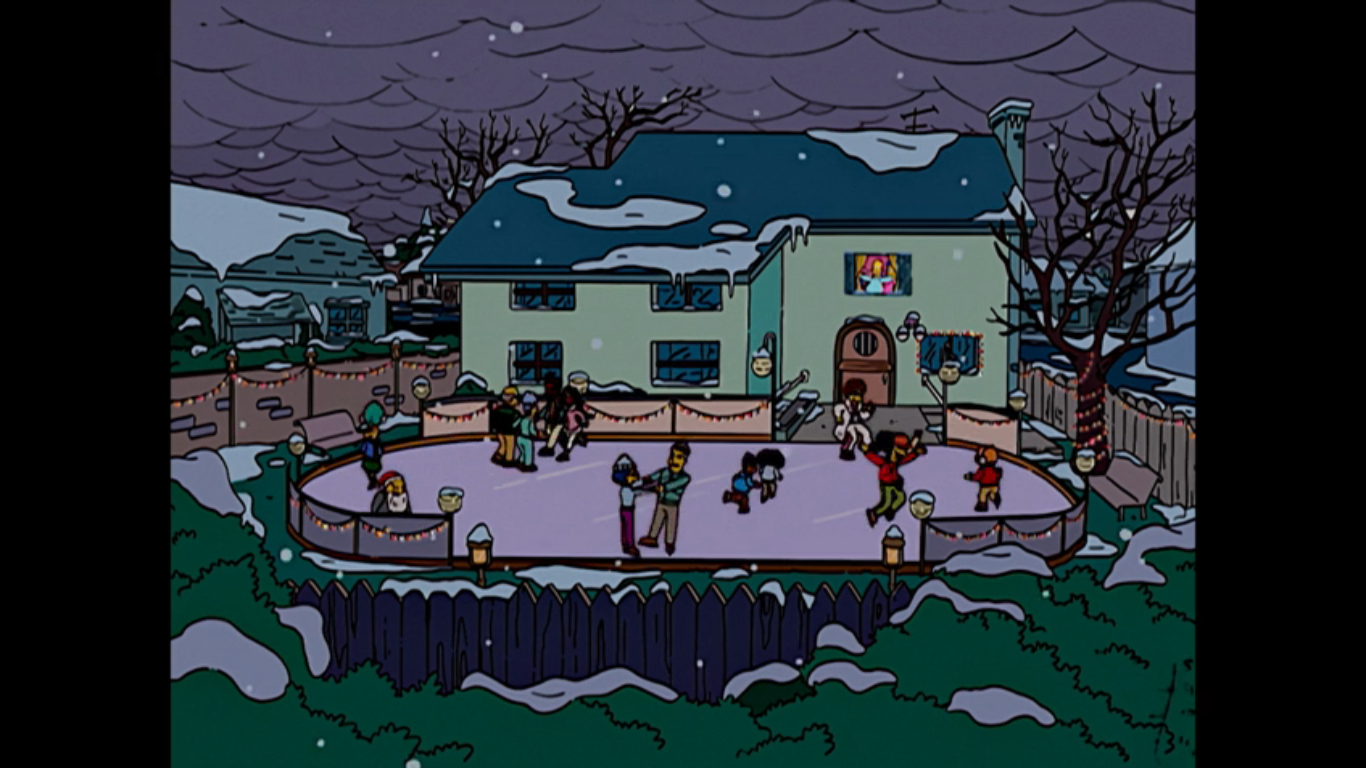
We return, yet again, to the Simpson master bedroom only now things are far less frosty. Marge is delighted in Homer’s transformation and he has come to view being unselfish as a natural high like hiking or paint thinner. And he’s not done! Homer then unveils to Marge his latest gift to the town: an ice skating rink in the Simpson backyard. How he built that without Marge’s knowledge is not specified. Similarly, how could he, the man who couldn’t afford a Christmas tree, manage to buy all of the materials needed for a rink? I should stop asking questions. It’s a hit though as numerous people are skating on it. Comic Book Guy demonstrates he’s pretty nimble for a man of his generous waist even though his leap results in a fall. A fall that splits his pants. With a declaration of “Activate cloaking device,” he ties his coat around his waist, only for that to rip too. Overcome with depression, he chooses to engage candy bar sadly.

Ned is shown making his way to the Springfield Men’s Mission singing “Here comes sandwiches,” to the tune of “Here Comes Santa Claus.” He has a plate of cheese on bread for the homeless who dwell here, but because this is Season 15 Ned we have to get a little peak in his head as he refers to this as Boozy Bum Lane. In other words, this is the Ned who partakes in charity not because it’s right or just a nice thing to do, but because he just wants to get into Heaven. He’s shocked to find the place empty, so shocked he even spells out the H word (no, not that one). And he soon realizes that everyone is at Homer’s where they can rent skates for free (how did he come into possession of all these skates? Shut up, Joe, just go with it) no matter how gross and black their feet may be. Ned is frustrated and dismayed to hear Gil (Castellaneta) refer to Homer as the nicest guy in town. Nelson (Cartwright) is also there to deliver his customary “Ha! Ha!” and add a dash of “Your position has been usurped!” He also makes a couple more passes to rub it in even laughing “You’re sad at Christmas!” While he does he demonstrates some really fine tandem skating with Sherri or Terri. Sometimes a guy surprises you.

After an act break, we return to the TV! Man, this episode has a lot of old Simpsons tropes between the bedroom scenes and the plot-advancing television spots. It’s the nightly news with Kent Brockman (Shearer) delivering a breaking news report on the nicest guy in town: Homer Simpson. He has to deliver it in his Brockman way though by first shocking and horrifying the viewer with the announcement that Santa Claus is dead! This gets a scream out of Bart and Lisa who are, strangely, the only ones watching the news in the house. Bart didn’t seem to believe in Santa way back in the first episode, but I guess he’s had a change of heart? Or maybe it’s just a part of him he can’t let go? This was all a clever setup by Brockman to declare that Santa might as well be dead, because Homer Simpson has stolen his spotlight. They then show a photo of Homer strangling Bart in front of Marge and Lisa, but it’s been digitally altered to replace Bart with an image of a bouquet of flowers.

Next door, Ned is practically steaming watching this report. He starts tugging on his moustache and assuring himself “Pain is the cleanser,” in an attempt to banish his jealous thoughts. Mel Gibson would approve. A ring of the doorbell gets him off the couch and it’s a pregnant woman (Hayden) who needs help with her car. An overzealous Ned offers to jump the car, rotate the tires, and even fold the map she’s holding. This just turns her off and, calling Ned a creep, the woman says she was looking for Homer Simpson. That is apparently the last straw as Ned vows to show the whole town that he’s nicer than Homer. That he can be the nicest man who ever lived! He then looks at a picture of Jesus on the wall and tells him he said nicest man, not man-god, and to keep his pants on. I don’t think Jesus wore pants, Ned. Hah!

To make good on his boast, Ned has decided to go door-to-door dressed as Santa Claus handing out presents to everyone in town. His first stop is the Skinner residence where Seymour (Shearer) is flabbergasted by Ned’s mission. Agnes (MacNeille) barks at him, “What’s your angle, pervert?” and Ned is actually honest by answering “Giving in this world, living in the next!” In other words, he just wants to get into Heaven. When Skinner asks how he can possibly afford this on a widower’s salary, Ned informs him he rented out his house to a fraternity. We cut back to Ned’s home and there are Greek letters (Sigma, Chi, Sigma? I’m not up on frat business) above the door and a keg goes flying through the front window. We hear an agitated Rod also shouting “Stay out of our medicine cabinet!”

Homer takes note of Flanders’ good deeds and scoffs at them. We see he’s already been to the Simpson house and gifted Bart a Krusty-branded version of Operation. We hear the toy groan when Bart “tweezes my wang.” I feel like they’re usually more subtle than that? Homer, apparently taking Ned’s bait, wants to outdo him and thinks the best way is to buy everyone a car. Lisa, ever the voice of reason, is there to tell her father that he doesn’t need to outdo Mr. Flanders and to remind him to remember the theme of the season. Homer seems to think it’s despair and Lisa goes on to share her feelings on the matter of gifts as a Buddhist. She thinks people would be better off without presents, which gets Homer thinking. We see a car, a Christmas sweater, and then an image of Budai (smiling fat dude often mistaken for Buddha), and they all combine into an image of Budai (Azaria) driving. He offers Homer some sage advice, “[…]attachment to material goods kills the soul.” Then, for some reason, Budai gets pulled over by the cops in Homer’s imagination and vows to never return to jail. Homer is satisfied now and decides he needs to take away everyone’s presents! He then thanks, Buddha which brings back his brain cloud to show Budai getting arrested and threatening the cops that they’re in trouble if he ever gets out.

And now it’s time for an extended Grinch parody! Homer, with assistance from Santa’s Little Helper, is going to go house to house stealing all the presents under the tree in town on Christmas Eve. And as he does so, he’s going to sing about to the tune of “You’re a Mean One, Mr. Grinch” which goes something like this: You’re a hero, Homer Jay. You’re as crafty as a skunk. They’ll thank you in the morning for stealing Flanders’ junk, Homer Jay! You’re a double-bacon genius burger, and just a little drunk!” As he does, we see clips of him walking like the Grinch, slithering like the Grinch, cutting down stockings like the drink, and chloroforming a toddler like the Grinch. Wait! That’s all Homer and not a good look for the big guy.

At dawn, Homer is seen driving the family station wagon into the center of town with a massive sack of stuff tied to the roof. He hops out of the car and douses the bag in gasoline before hopping onto the ground to put a hand to his ear. There he waits to listen to the thanks coming from the folks of Springfield. It’s a rather clever inverse of the Grinch. He wanted to hear sadness and anger over his stealing Christmas, but heard singing instead. Homer wants to hear the singing, but he just hears anger. First from Lenny, then Dolph (MacNeille), and then we start to jump around. Snake (Azaria) is shown shocked and saddened by the fact that he’s been robbed at Christmas and reflects, “Man, so this is how it feels.” In a season of Simpsons repeating Family Guy gags, I feel like I have to point out that Family Guy did a very similar joke where an inmate stabs himself to see how it feels. We then jump to a rather sad scene at Nelson’s house. He wonders if his dad came back in the night to steal their presents while his mom (MacNeille) just gruffly says “I wouldn’t put it past him.” She references the night he left and Nelson gets defensive insisting he just went to the store and when he gets back he’s going to wave those Pop Tarts right in her face! Poor, delusional, Nelson.

Homer then pulls back a little disappointment in hearing anger, but he points out happily that a mob is approaching shaking its fists in anger! The show decides to let Cookie Kwan (MacNeille) and Drederick Tatum (Azaria) get some lines in before the mob begins pummeling a confused Homer with snowballs. Even the Simpson family joins in on the beating. And who comes to Homer’s aid? Why, it’s Ned Flanders, of course. He stands protectively between Homer and the mob to tell them what Homer did was wrong, but that maybe he was also wrong to give everyone those gifts? Ned gets bombarded with snowballs for suggesting such and knocked to the ground.

Now, it’s Homer’s turn to rise to Ned’s defense. He shouts out for everyone to wait and look to the sky for there is the Christmas they need. And in the sky high above Springfield is a brilliant, shining, star. Everyone is transfixed with Selma (Kavner) even declaring it a miracle. We cut abruptly to find out that it isn’t a star, but a flare fired by Hans Moleman (Castellaneta) who appears to have gone off the road and is stuck chest-deep in the snow. It’s his last flare too, but don’t worry, for rescue dogs have come to his aid! Oh, actually those are wolves and the McGrew-like Moleman is blind and confused and sure to die.

Back in the center of town, Ned is finishing up reading from the Bible, the same passage old Linus referenced in A Charlie Brown Christmas. Before he can finish though, Mayor Quimby (Castellaneta) buts in to say that Ned can’t pray on city property. Homer takes it from there, “Let’s just say that on this day, a million years ago, a dude was born who most of us think was magic, but others don’t, and that’s cool. But we’re probably right. Amen.” The crowd returns with an “Amen” as well, and I just love that summation by Homer. It sums up that Christian smugness so prevalent in American society since that’s the majority opinion.

Homer then decides, with Ned’s help, to return all the gifts! As the two toss gifts to the mob, we get the expected animation of Santa’s Little Helper doing his Max impression as well. To sneak in an extra joke, we also get to see Professor Frink (Azaria) open his present and find it’s a brassiere (his choice of words), but in the spirit of Christmas, decides to make pretend that he has boobs. Bart is shown sharing his sentiments that this is a great Christmas and that not even Moe’s (Azaria) annual suicide attempt can bring him down. We then cut to Moe on top of City Hall threatening to jump and no one taking him seriously. Moe vows to jump and that they’ll all be sorry, but then laughs and confesses he’s not going to do it, but slips and falls anyway.

No one was paying attention to old Moe for they were busy launching into a rendition of “Hark! The Herald Angels Sing,” because we need to tie this back to Peanuts one more time. Moe actually gets to deliver the “Peace on Earth and mercy mild,” line so we see he’s not dead, just really, really, hurt. As the crowd sings, we cut back to the wrapped astrolabe on the roof of Homer’s car. We hear it say that today is the birth of Jesus, and also the birthday for singer Barbara Mandrell. Snake then steals it for good measure, a nice way to bring the whole story back around to the beginning. We fade out on the crowd singing. Merry Christmas!

As far as Simpsons Christmas episode go, that is one of the most joke-heavy ones they’ve done. There are tons of one-liners and just silly moments for the sake of comedy. Yeah, there are plenty of holes one can go poking through it, especially if past episodes are brought up. I’m always a little surprised when this turns into a “Homer Loves Flanders” redux in the second half thus leading into the Grinch parody. It’s quite a ride considering where we started. There’s really no B plot as the plot of the episode just moves from one stage to the next. I like that about it and it is reminiscent of “Grift of the Magi,” another Christmas episode that just moved from one situation to the next. The difference there is that one morphed into a Christmas episode where as this one was pretty much committed the whole way through.

As I mentioned during the write-up, there are a ton of moments where TV is used to advance the plot. I’m pretty much okay with it though as there was some great comedy to be found there. The Christmas special parodies were all well done, even if some played it mostly straight. The extra surprise of stop-motion utilized was pretty damn cool too and shout out to Chiodo Brothers Productions, Inc. for producing those segments. Some of the jokes could be described as easy or layups, but I found they worked. And try to keep in perspective that some of this stuff was still pretty novel back in 2003. Now, a Grinch parody feels a bit more played-out, though I’m struggling to think of many Magoo parodies so The Simpsons was and is still ahead of the curve there.
“‘Tis the Fifteenth Season” may honestly be the funniest Christmas episode of The Simpsons. That doesn’t mean it’s the best, but there’s a solid amount of laughs to be found. Some don’t like the portrayal of “Jerk Ass” Homer like we see in the first act and I also know folks who don’t like what Flanders morphed into in the 2000s. Such opinions are valid, but for me, it works. This is funny television. It’s not trying to make much of a statement, just lampoon Christmas specials. There isn’t really a cynical message either so if you don’t care for those types of Christmas specials then I don’t think this one qualifies. It’s just a bunch of stuff that happened at Christmas.

And that’s it for the 2024 edition of The Christmas Spot! If it’s the last time I do this 25 specials in 25 days thing then I feel like I went out with a pretty solid selection of Christmas episodes. There was some good, even some great, and some stinkers, but those are fun to read and write about. It was a lot though as I finish writing this one on December 23rd, possibly the latest I’ve taken to finish one of these. That’s partly why I feel like I need to take a step back because it’s become harder and harder to find the time (and material) to keep this up. Whether you read one or 25 of these things this year, thank you, and I hope you had some fun. Merry Christmas, Happy Hanukah, joyous Wednesday, and good luck in the new year!
That’s a wrap on Christmas 2024, but if you must have more here’s what we had to say on this day last Christmas and beyond:

Dec. 25 – Prep & Landing
We have reached another Christmas Day! It’s a great time to celebrate and enjoy the moment for tomorrow we mourn the passing of the season. It’s the great come-down every year. For this holiday, I am once again returning to my list of the best of the best when it comes to Christmas specials. This…
Keep reading
Dec. 25 – Rudolph the Red-Nosed Reindeer
Welcome to Christmas Day 2022! We made it another year and another long year is ahead of us until we make it back, but right now, it’s time to celebrate! And in keeping with the theme of this year’s countdown, we are once again looking at another much beloved Christmas special on this day. Before…
Keep reading
Dec. 25 – Mickey’s Christmas Carol
We made it! Another year in the books, and another Christmas has come. Indulge in it. Bask in it, for it only comes once a year, and not to get too dramatic, but you never know how many you’re going to get. And we’re ending this year’s edition of The Christmas Spot with another throwback…
Keep reading