When NECA started down the path of Teenage Mutant Ninja Turtles with the 2008 release of the four titular characters, it didn’t go very far. After the turtles came April, but as a convention exclusive, and then nothing else. It would be years before their Shredder, which was shown off at the very same convention April was released at, was released as a con exclusive himself along with three of his henchmen. And it seemed to take the success of the eventual cartoon and movie lines that pushed NECA to go back to the original comics. It’s been an interesting line as it started with perhaps less-requested characters with the Fugitoid and Renet, but now we’re getting to those heavy hitters fans were dreaming of fifteen years ago. And some of those heavy hitters come in pint-sized packages like the beloved Master Splinter.
He’s a little guy.
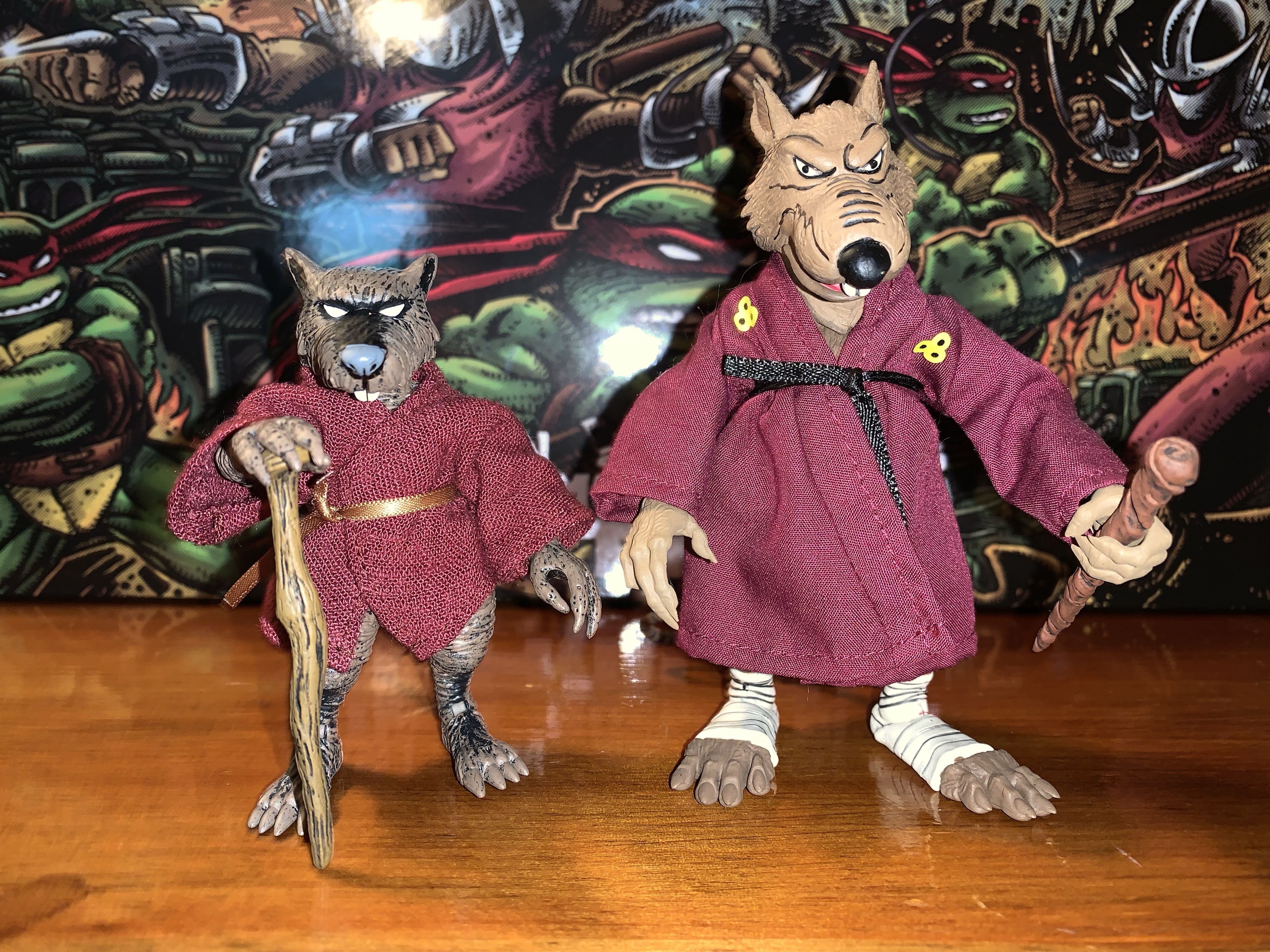
Splinter sets the bar as shortest figure in the line. Coming in at a tidy 3.5″, he’s very much a little guy. Especially when placed with the recently released turtle four-pack who are taller and bulkier than the 2008 figures. I said he comes in a pint-sized package, but that was an embelleshment on my part as the actual box he’s in is the same as most of the other single releases. It features new art by Kevin Eastman which matches the look of the figure pretty well. My memory is a bit fuzzy, but I do believe first appearance Splinter in the books was a bit more fuzzy and frayed looking than the figure here, but that would be very hard to pull-off in plastic.
If you prefer your Splinter with the 08 versions.
He apparently got a boost in size when making the leap to animation.“You have got to be kidding me.”
I noted Splinter is 3.5″ tall, but I should add that is in his neutral stance which features bent knees. It’s basically how he came out of the box and how he likely should be posed, but someone who wanted him to be taller for the sake of being taller could get a little more out of him. He’s sculpted all in brown plastic with a lot of black dry brushing over him. The black is heaviest on the top of his snout and extends to around his eyes which creates a striking portrait. It’s a solid approximation of the comic art and if there’s anything I think could have been done better with the sculpt and paint it’s the claws on Splinter’s hands and feet. They’re a bit soft in sculpt and all brown so they just blend into the fingers and toes. It matches the art on the box so I can’t knock the figure for its accuracy, it’s just one of those design choices that works better in print than sculpt.
This is probably a better foe for the sensei.
The shading on the figure covers the entire body, but it’s almost irrelevant since Splinter features a soft goods robe. Just like his cartoon and movie counterpart, the robe is wrapped around him and fastened with a brown ribbon. It’s a maroon color and it looks fine. It’s a lot of material and a little frumpy looking. It might have been neat to see it look a little more worn since this is a rat who lives in the sewer. I don’t like the ribbon used for the belt as it just doesn’t look like any belt one would expect a robe to fastened with. It’s a criticism I had for the movie and cartoon Splinter. A piece of stretchy material, like the additional belt on the Foot and Shredder movie figures, with a knot glued onto it would have been my preference, but it’s fine.
Since he doesn’t have much, Splinter gets all of the pre-mutated guys and some ooze too.
The figure, despite being small, has most of the same articulation one would expect of a NECA figure. The head feels like it’s on a double ball peg and it has great range in all directions. The shoulders are ball-hinged and can raise out to the side fine, but rotation is going to be limited by the robe. It’s something that can be worked around though as that’s the benefit of the robe being slightly oversized. The elbows are single-hinged with a swivel and will bend to 90 degrees. The wrists swivel and hinge horizontally as well. In the torso is a diaphragm joint that feels like a ball-joint, it could be a double, but you get rotation, a little forward “crunch,” and some tilt. The hips are ball-jointed and can go out to the side for splits. They kick back rather far, but not really forward a whole lot. There’s a little thigh pivot and the knees are single-hinged and swivel. You do get about a 90 degree bend at the knee, but again, he’s meant to stand with his knees bent to about 45 degrees so the practical range is limited. The ankles hinge and pivot with the ankle rocker being a bit flat, but functional. The tail is connected via a hinged ball peg so you get rotation and the hinge can direct it a bit. The tail itself is also bendy, though the wire only goes about halfway through it so it’s a bit limited.
And he also comes with this guy.
Splinter has decent articulation, though it’s hard to argue that he’s not meant to mostly just stand there on your shelf. He can hit a few battle ready poses and also stand on one foot if you want to place him in a side-kicking pose. I’m a little surprised that NECA did not include an articulated jaw as they did with the cartoon Splinter, but I don’t hate the exclusion. The profile looks good so if they felt they couldn’t get that joint in there without harming the presentation then that’s a decision I support. I only mention it as some may have expected it based on past versions of the character and may miss it.
The old and the new. The Utrom on the left came in the Foot four-pack and the turtle on the far right came with the 08 figures.
Since Splinter is such a small figure, he does come with a pretty robust assortment of accessories to justify his price tag. Big figures cost more money for both NECA and the consumer, but that rarely applies to small figures. To get more plastic into this, Splinter comes with three sets of hands: relaxed, gripping, and pointing. The gripping hands have the less desireable horizontal hinge. I’m surprised we didn’t get flat, chop, styled hands as well. Splinter also has his walking stick and that he can grasp with the gripping hands or the relaxed hands. The relaxed hands can also rest on top of the stick too so you have some options when posing him with it. There’s a small tea kettle with articulated handle and a little cup to go with it. The kettle has some nice black linework on it while the cup is blank. Splinter can hold the kettle by the handle and palm the cup well and it’s a nice little pair of accessories. I do wish NECA had ripped-off Super7 and included a steaming effect for the cup, but it’s fine as-is.
Cartoon Splinter is bigger than comic Splinter, but the opposite is true for the Mouser.
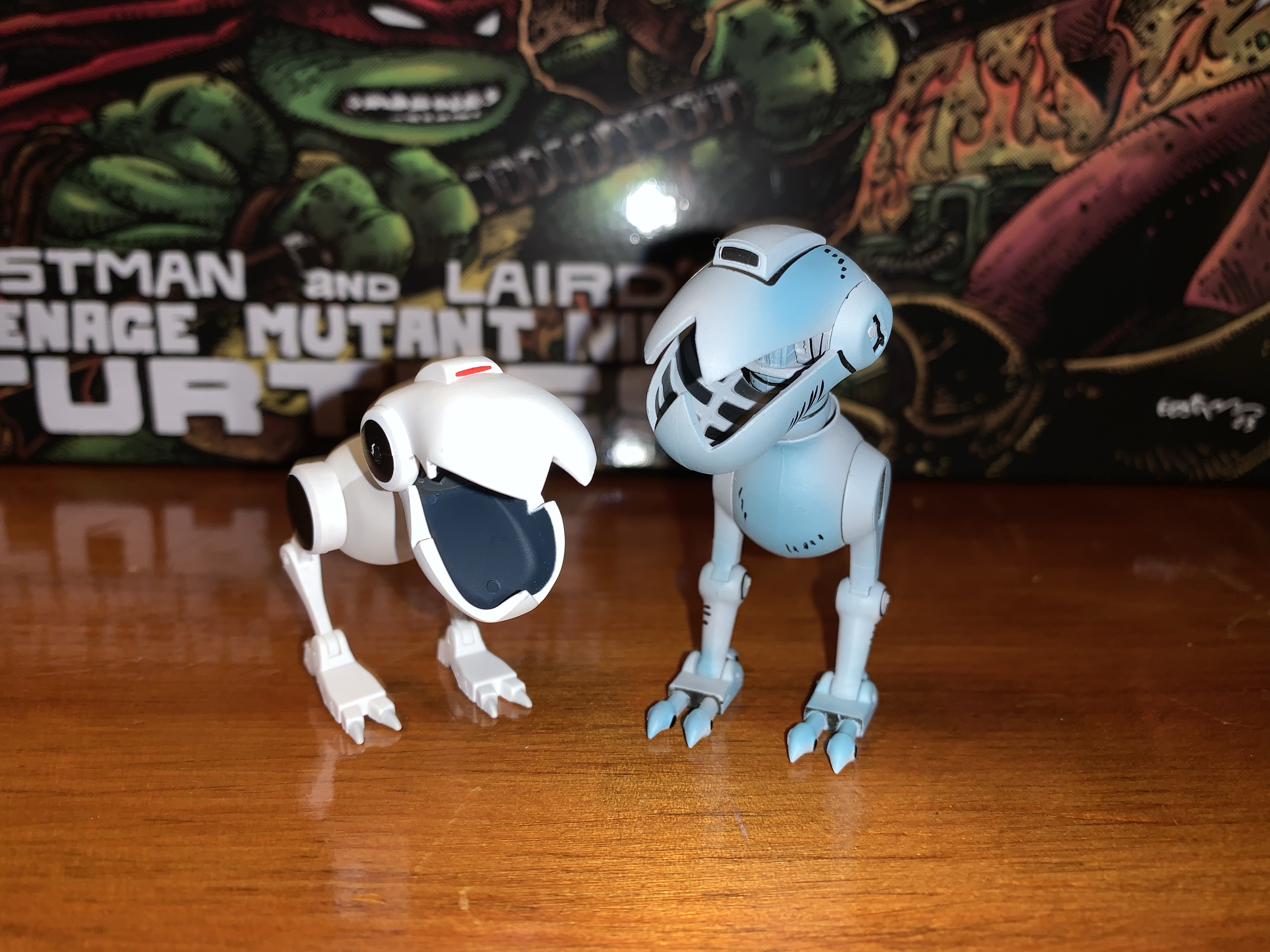
Those are the accessories for Splinter, the rest are basically extra characters. Up first is a brand new Mouser. It’s painted all in gray with some light blue shading on it to create a metallic effect that looks really nice. It’s also covered in the usual black linework and looks rather sharp. As far as I know, the entire sculpt is brand new as it doesn’t share any parts with the cartoon Mouser. If it shares any parts with the Mouser released back in 2008 I’m not sure as I don’t have any of those. It functions just like the toon one with an articulated jaw that features a fully-sculpted interior, hinge at the base of the head, ball-jointed neck which allows for a lot of rotation and tilt, leg swivel, hinged knee, and hinged ankle. The hinged joints in the legs are plenty tight so the figure has no trouble standing and overall it’s a nice addition that I’m sure collectors will want more of.
Who’s for tea?
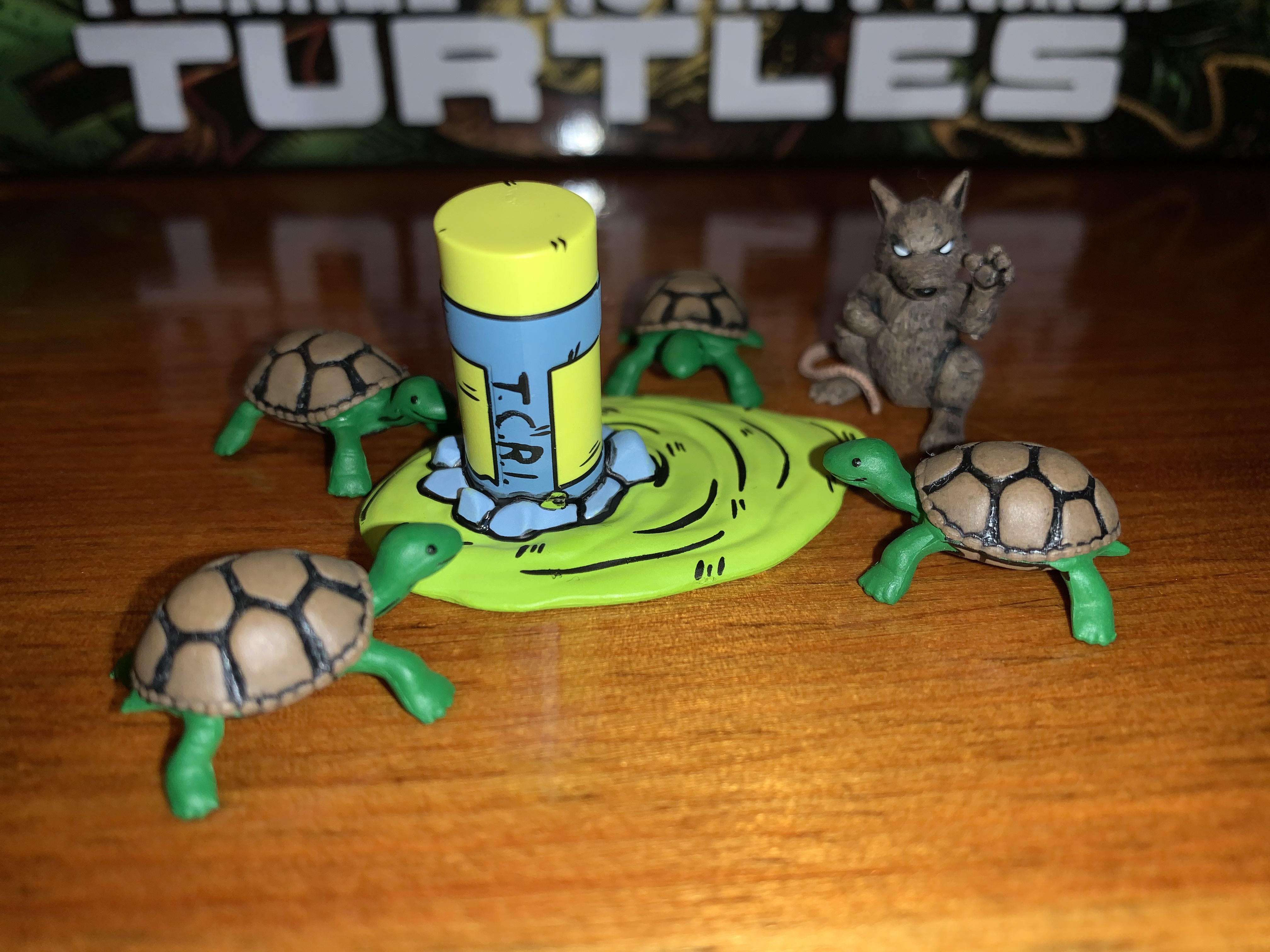
Splinter also comes with an assortment of slug figures for accessories. We get a new Utrom that has more of a surprised expression on its face. It’s very close in size to the previously released stand-alone Utrom that came in the Shredder convention set, it just drops the articulation entirely. It’s well-painted with a lot of dry-brushing that makes it look dirty and gross. We also get a pre-mutated Splinter that’s in sort of a martial arts pose. To go with him are four, baby, turtles. Stylistically, they’re very similar to the pre-mutated turtles the 2008 figures came with, but they’re all new sculpts and noticeably smaller. They’re nicely painted and they almost look like they’re smiling so they bring a cute factor to the package. The last item is the broken cannister of ooze. It’s a new sculpt and it’s basically upside down with a big puddle of the stuff spreading out from it. It serves to create a nice little display with the other slug characters and I prefer it to just a plain cannister.
“Michelangelo! You have neglected your training for too long!”
And that’s NECA’s take on Splinter. It’s a small figure with a bunch of stuff that NECA hopes will offset the price of the figure. I got my figure at Target where it retails for $37 which is about the same price as figures like Jagwar and Dreadmon, but less than Zog and the Shredder clones. Is $37 too much? It’s hard to blame folks who feel like it is. The added accessories are nice, but would I trade some of them to knock this release down to $30? Sure. As for the figure itself, I think it gets the job done. I think it could have more hands and a better belt, but this Splinter will look nice on your Mirage Studios shelf which is rapidly becoming shelves in many collections. It’s an essential release if you’re a TMNT Mirage collector, and if you can stomach the price I think you’ll be happy enough.
Fancy yourself a collector of NECA’s TMNT Mirage line? Here’s some more reviews to take a look at:
Haulathon 2023 has brought some pretty big releases to NECA’s line of Teenage Mutant Ninja Turtles action figures. And I mean big in a literal sense. REX-1 was tall and hefty and the multi-armed clone of Shredder was no slouch either. Those two seem to pale in comparison to Zog, the Triceraton warrior from NECA’s…
NECA and Target’s Haulathon event which has seen a vast assortment of product dumped onto shelves recently was not content to limit the products to just the cartoon Teenage Mutant Ninja Turtles. Far from it, as an assortment of comic book based characters were also released and today we’re going to look at the first…
Where there be turtles, there be Casey Jones – the bad ass vigilante of New York City! Casey was an early addition to the comics and he’s basically been included with every iteration of Teenage Mutant Ninja Turtles since. And in all of them he tends to wear a hockey mask and bludgeons bad guys…
When it comes to the popularity of Teenage Mutant Ninja Turtles a lot of the credit goes to Playmates Toys. Kevin Eastman and Peter Laird created the characters born out of a joke. Credit them for having the vision to think this joke had appeal beyond their small circle as they self-published Teenage Mutant Ninja Turtles in 1984. It was basically perfect timing from there as the product quickly got the attention of Mark Freedman and his Surge Licensing brand which, much like Mirage Studios, existed largely in name only. He saw the property’s potential as a kid’s product and was able to get Eastman and Laird to grant him permission to shop the IP to toy companies. Aside from a prototype created for Mattel, no major producer bit, except for Playmates. Known more as a doll company, Playmates wanted to get into the action figure business and took a chance on the franchise. They co-developed a television mini series with Fred Wolf to help sell the toys, and the rest is history.
New artwork from TMNT co-creator Kevin Eastman!
A nice window box to show you what’s inside.
Because of that early involvement and ridiculous level of success, Playmates has been intertwined with the TMNT franchise ever since. And for a long time, they were the only ones to make action figures based on the property. Then, in 2008, NECA Toys released it’s own version of the brothers. Marketed to collectors and sold outside the usual avenues occupied by Playmates, NECA sent to market a version of the turtles that had never really been done before in toy form. Based on their original appearance in Teenage Mutant Ninja Turtles #1, the turtles hit retail with hopes of more Mirage inspired characters to follow. Then, it stopped. Details are murky, but some have blamed Playmates for stepping in and essentially squashing the toy line by exercising its contractual rights as the master toy license holder. It also could have just been poor sales. NECA’s Randy Falk indicated years ago that the comic turtles weren’t big sellers. Anecdotal evidence suggests he may be correct as I personally can recall seeing both the standard issue and black and white variants hanging around comic shops for years and only finally vanishing after hitting clearance. It’s possible NECA was just a little too early and TMNT nostalgia just wasn’t ready to take off in 2008. Only a select few know for sure why the line was ultimately cancelled.
The biggest weakness of this set is the amount of stuff in the box.
Flash-forward 15 years later and NECA is back with a new iteration of the Mirage Studios Teenage Mutant Ninja Turtles. If fans weren’t ready for turtle nostalgia in 2008, they certainly are now. The property is now owned by Viacom who has wielded its mighty powers to loosen the toy license and we’re basically swimming in TMNT action figures from various companies. And since then, those 2008 figures have become far more sought after. Where once they could be had for clearance prices, they now command over 100 dollars a piece on the secondary market. This helped turn them into a magnet for bootleggers and some have even suggested that the physical molds were swiped from whatever factory NECA had been using. If NECA felt their dance with TMNT was over, it’s possible they let them go. Either way, because of a desire to do something different or because the figures have been bootlegged to hell and back, NECA decided to forego ever reissuing them. Instead, they opted to do new turtles based on later issues and for fans who have been dying to get ahold of some affordable Mirage turtles their wait is finally over.
If you’re wondering the answer is “No,” the arm, blaster, thing does not fit on the new turtles.
These old figures have some outdated engineering, but still look pretty damn cool.
The original 2008 figures have commonly been referred to as the Peter Laird turtles by fans. That’s likely due to Laird being the one who worked with NECA at the time when they were in development. They also seem to clearly be based on a singular image from the first issue which has been credited to Laird over the years. I have no idea how much of that is true as Eastman and Laird had a unique drawing style in which the two literally drew the same issue switching off in an unconventional manner as they passed papers back and forth. That’s why it’s just easier to consider them first appearance turtles. As the franchise took off, Eastman and Laird moved to the business side and away from doing the actual art which allowed for other artists to come into the fold. One such artist was Jim Lawson, who would go on to do pencils for a number of TMNT books. Initially, his take on the turtles was to emulate what Eastman and Laird had settled on when he stepped in while adding a little of his own influence. Eastman and Laird both loved Lawson’s work and have heaped praise upon it over the years. With their encouragement, he brought more of his own style into the books which can easily be seen during the City at War arc. His turtles were rather blocky, their heads almost resembling inverted mushrooms, and it’s that style that I think most comic book fans associate with the name Jim Lawson.
My attempt at recreating the TMNT #4 cover. Most know that as the cover to the first NES game.
For this release, NECA hired Paul Harding as the sculptor and directed him to design the turtles based on Lawson’s art, but not his later work as seen with City at War, but his earlier stuff when he first started on the book. Because of that, this set is being marketed as the Return to New York Turtles, though Harding clarified on Twitter that he didn’t expressly design them based on that story. It’s an appropriate shorthand though to place these figures into an era of the original comics. NECA’s approach to comic figures, unlike some companies, is to be very stylized and to try and emulate a certain artist’s approach rather than adapt a character from a generic model sheet or reference material. American comics have almost always allowed for an artist to imprint their own style onto established characters and such can be seen across basically all of the major comic books published by the likes of Marvel and DC. It’s both a cool approach for fans and a wise one for a toy producer since it opens up the possibility to re-release popular characters like the turtles over and over with slightly different looks.
I love how NECA handled the deco on Leo’s swords.
With all of that background out of the way, lets finally talk toys! This long-awaited NECA four-pack has recently started showing up at Target and was even sold online via Target’s website on June 25th. It seems like Target may have actually purchased stock from NECA for this release in contrast with the usual vendor-driven system they usually have in place for NECA. That’s likely due to this being timed with the drop of new toys by Playmates for the upcoming Mutant Mayhem film and because this release is the actual turtles, not some obscure side character that could possibly shelf-warm. This set will sell, even at the steep price of $150. The real question is – is this worth that steep price? If you’ve been waiting years to get a set of official Mirage turtles, that answer might be an easy “Yes” regardless of how this set turned out. If you are like me and have those 08 figures, or maybe even bootlegs you’re happy with, do you need to drop a bunch of money on yet another set of turtles? Read on.
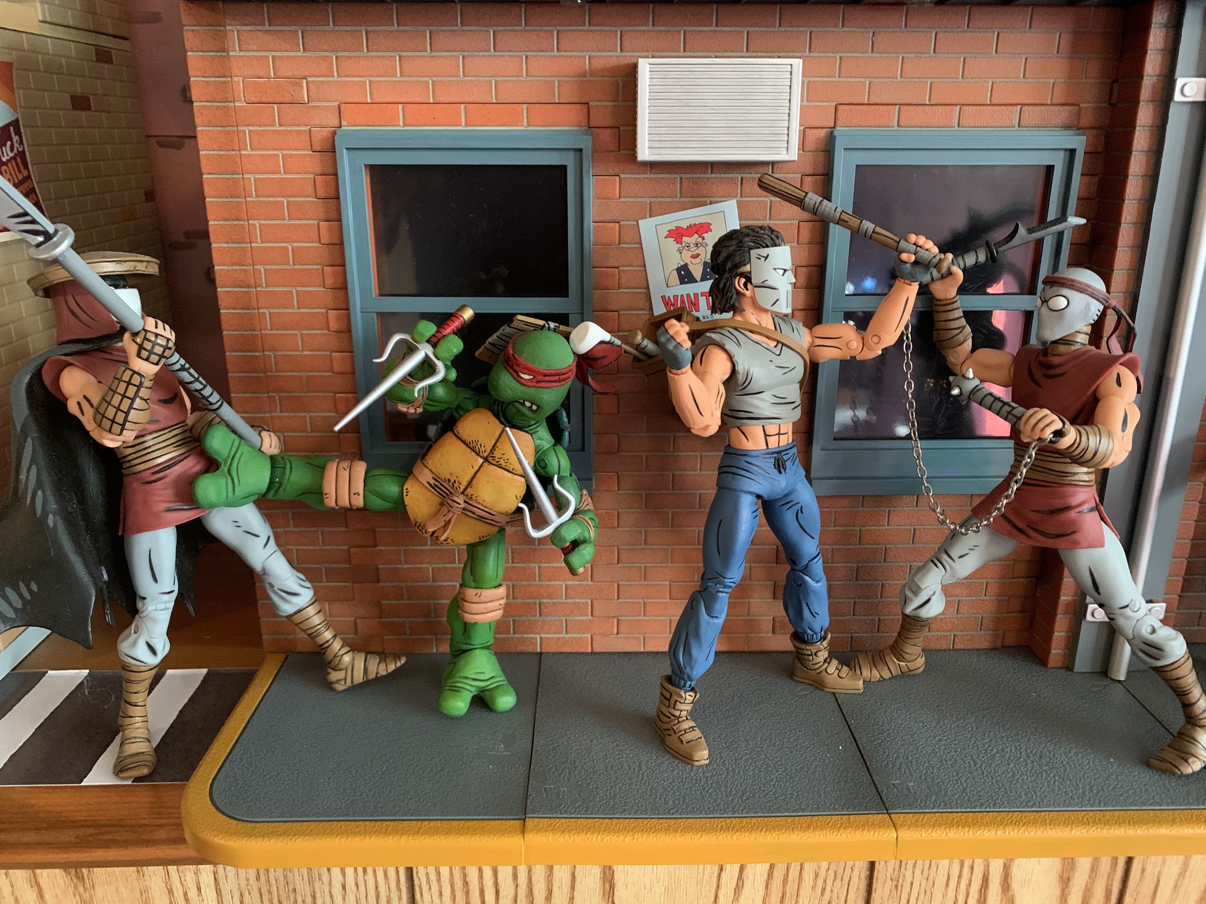
Don’t mess with this pair.
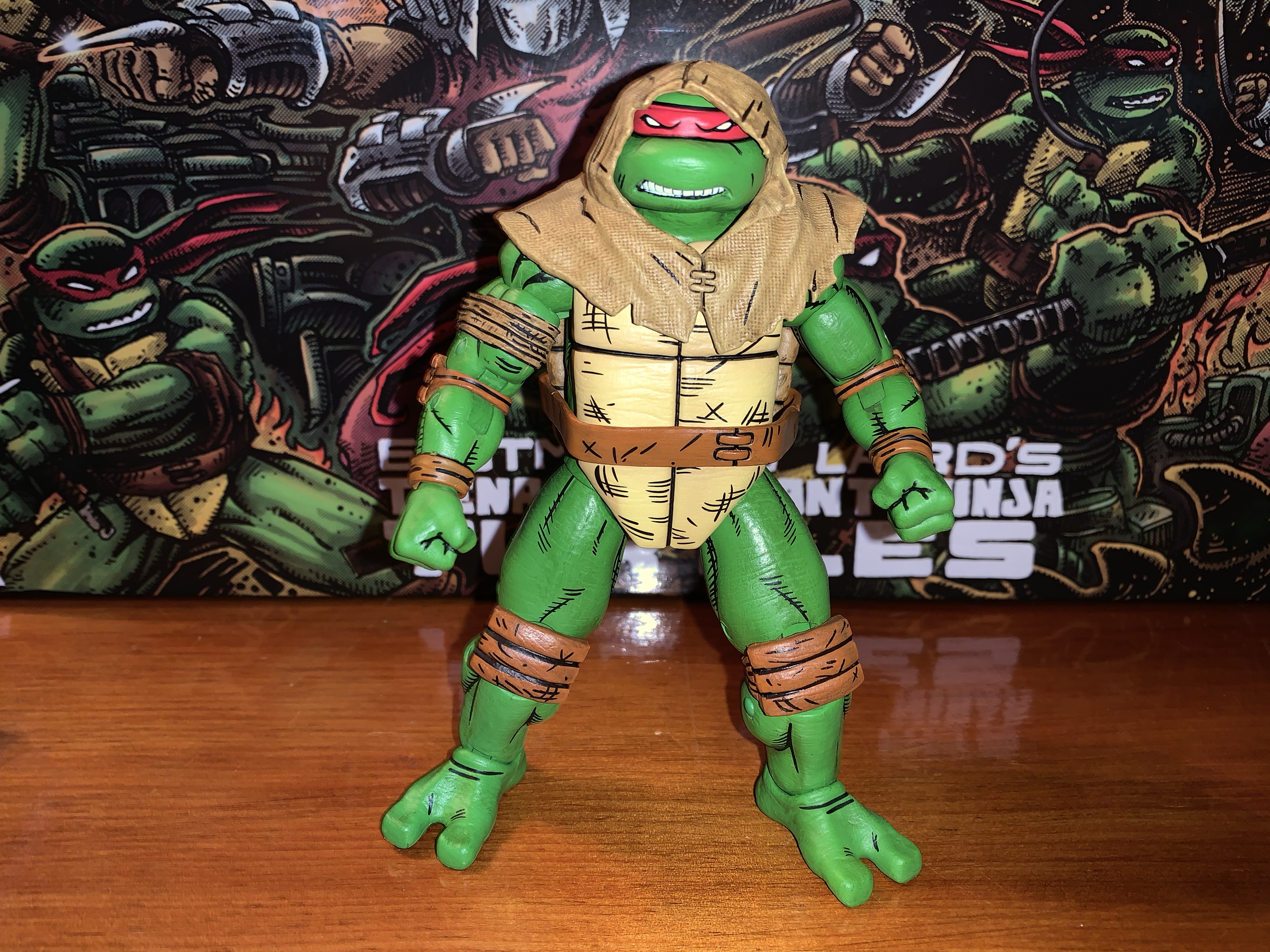
The turtles come packaged in what is essentially NECA’s standard four-pack box. It’s an oversized version of the Ultimates, or Deluxe, releases with a front flap and window on the package. It’s adorned with new artwork by Kevin Eastman which looks great. This is the type of box that will display well for you in-box collectors. For the rest of you, you probably only care about the contents. Each turtle is on the same buck so you basically have four nearly identical figures inside. The main difference between each is the headsculpt which just features a different expression for each turtle. Since this is a Mirage set, they’re all in red bandanas with brown straps and pads giving them a very uniform look. There’s also a different deco applied to the plastron of each figure with Raph’s featuring the most “scuffs” than the other three. They’re done with black lines as opposed to being sculpted in.
The Mirage line has been rapidly expanding over the past year.
The turtles stand at approximately 5.875″ in height. They’re quite chunky in appearance and fully-painted in a fairly neutral shade of green with lots of black linework to emulate the comic art. The linework is present on the pads, bandana, and belt and really sells the look well. It’s all relatively clean and consistent across the board. The only area I see as being a bit uneven is the linework around the bandanas. On a shelf, it’s fine, but up close there are some parts where there’s a smidge of green in-between the black line and the start of the red mask. My Michelangelo also has what looks like a scuff behind his right eye so there’s a little green showing. My Leonardo also has a speck of brown on his right bicep, but in general, I don’t see much in the way of color transfer throughout the four figures.
The paint is acceptable as is the level of quality control present throughout my set. Harding did a really good job of honing in on a design style for the turtles and capturing that with his sculpt. The only thing I personally would have changed are the legs which look really chunky. I think they could have been shrunk as the calf muscles basically extend outside the profile of the thigh muscles. That’s more of a subjective critique though than an objective one as these look quite close to the source material from what I can tell.
Shredder is looking a bit dated by comparison.
I think these figures are pretty much a homerun from a presentation point-of-view and that’s definitely where NECA’s strong suit lies. Where it often does not is with articulation, and these guys aren’t necessarily bad, but they’re not likely to wow anyone. Since the figures are essentially the same, they articulate the same as well. The heads are on a double ball peg (and in case you ever mix-up the heads, they’re stamped with the character’s initial inside) and the range is solid looking up, down, and all around. The shoulders are hinged-ball pegs and they can’t quite raise out to the side all the way. They rotate fine until they hit the shell, and past that is a biceps swivel. This joint was the only joint I had any issues with as 7 out of the 9 biceps joints in my set were stuck. I used the hot water to cold water method to get all of them working. The peg for the joint is pretty snug so I also pulled out a little before twisting and it required a pretty forceful twist. The peg is rather thick, so it should be pretty durable, but if you leave the joint in a hot water bath for too long and then try to twist it you could shear it off, so be careful. Once I essentially broke the seal on the joint it was fine.
Despite that, he still looks pretty good opposite these figures.
With that out of the way, the elbows are the next spot and NECA opted for double-joints this time. This is a welcomed addition as the cartoon turtles feature hinged pegs for the elbows and I wasn’t sure what to expect with these. The addition is worthwhile too as they can bend past 90 degrees at the joint. The wrists swivel and feature horizontal hinges. There are no vertical hinged hands in this set at all. That’s disappointing as the toon turtles had vertical hinges for the hands. The Turtles in Disguise set I believe came with two sets of vertical gripping hands, and this continues to be a problem with NECA. Where they once did a decent job of including the proper hinge, they seem to have essentially abandoned it for TMNT. Gargoyles characters get it, so I don’t understand the oversight. This is a set where essentially one set of tools creates four figures and it’s also something they’re likely to reissue many times so the fact that they couldn’t find it in the budget is absurd to me. It’s my biggest pet peeve with NECA of late.
For those who would like a more direct comparison.
At least at the waist we get an improvement over the 2008 turtles. NECA included a waist twist which they set fairly high behind the plastron to conceal it. It’s not going to provide the same amount of range a waist twist would with a non-shelled character, but it works all right. NECA added a “diaper” over the hips as well, but it doesn’t seem to get in the way. It does have the tendency to shift a bit though and my Leonardo has more of the part visible on his right leg than his left by quite a bit. The legs can kick forward past 90 degrees before the leg wants to go off to the side while the shell keeps them from kicking back. They also can hit a split. After that it’s pretty typical as we get a pivot point for the thighs where the ball connects with double-jointed knees past that which bend just a touch beyond 90 degrees. The ankles have the hinge and rocker setup, though the chunky nature of the ankles does restrict some of the range, but there should be enough to keep your figures flat-footed in most stances. These guys also have tails and there is a swivel point there if you want it. The bandana tassel also pegs in, and while it doesn’t really spin freely, you can reposition it if you want by removing it and re-inserting it even if you can’t get it to swivel.
Nothing is stopping you from swapping heads, but the default is (Clockwise from top left): Leonardo, Donatello, Michelangelo, Raphael.
The level of articulation is acceptable, aside from the lack of proper hinges for the gripping hands. Where this set surprises in the wrong way is with the accessories. If you have the Turtles in Disguise set or most of the other four-packs NECA has done over the past few years then you’re accustomed to getting a bunch of stuff in these boxes. With these turtles, despite the amount of tooling needed to produce these guys, we don’t really have much. Each turtle comes with a set of gripping hands out of the box, and then there is one set of fists, open hands, style pose hands, and gripping hands with more space between the fingers. Those hands are intended for use with Raphael when he grips his sai with the middle blade going through his fingers. Since it’s four sets the boys have to share, you can’t have all four turtles with their hands in a style pose or chop. There’s at least an entire set of four alternate bandana tassels that can be swapped in and out. The figures come with the bandana draped over their right shoulder and each one has a straight bandana piece to swap to.
There may not be a ton in the box, but at least they didn’t screw up the weapons.
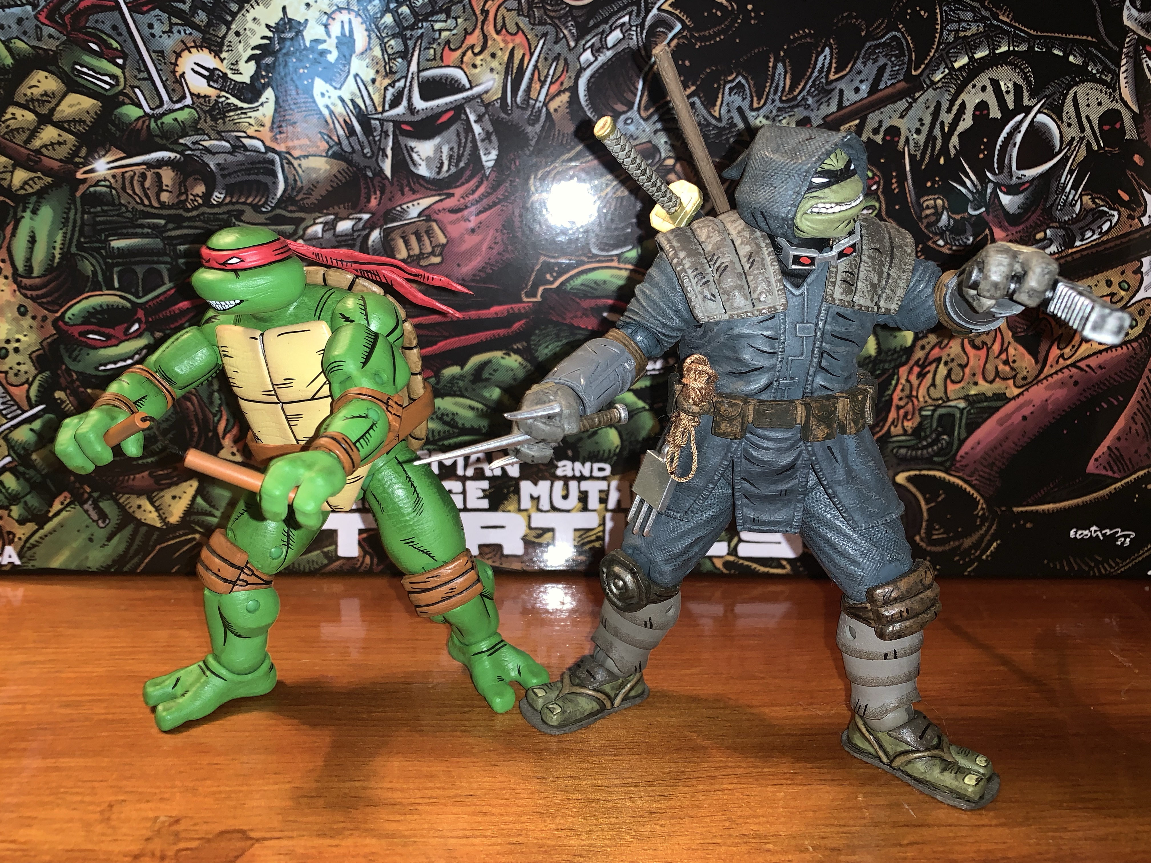
Of course, the main accessories are the weapons. Each turtle has his signature weapons and they all appear to be new sculpts. For Leo and Raph, the metal portions of their weapons are painted the way I’ve wanted metal to be done for a long time now: white with light blue shading. It looks so good and is much better than the flat gray so many companies use. Even the very expensive Mondo sixth scale Wolverine has flat gray claws. I attribute it to the idea of metal being white as “wrong” since we know it isn’t white in real life, but that’s how it often looks in print or in animation. With Leo, the effect is perfect, though with Raph the blue shading is basically all over. I think if they did it exactly how they did Leo’s katana it would have turned out better, but it’s minor. Mikey’s nunchaku are done similar to the movie figures with brown, plastic, handles connected via black thread. Donnie’s bo is done in an orange-brown with a slightly lighter brown wrap, which is an interesting choice. Perhaps an off-white would have contrasted more, but basically every Donatello figure does that with his signature weapon so I don’t mind the difference. There’s also three gear-like throwing weapons included painted in the same light blue as Raph’s sai and the shading on Leo’s katana. Why three instead of four? It’s an odd choice, but one I can’t get too worked up over since I’m not going to use these anyway.
You get three of these buzz saw things, if that’s something that interests you.
Lastly, we get a couple of accessories that are specific to Raph from the comics. His bandaged right arm is included as a swappable piece, but since all four turtles are the same mold, it can actually work with any turtle. The right arm pops off easily (the left does not) to facilitate swapping. The bicep was stuck on this arm as well, but I was able to free it up. Also included is Raph’s hood which is done in a soft plastic. It slides over his head easily after you remove the bandana piece and it’s a cool look for him. There’s a texture to the hood that helps sell the illusion it’s made from a rough fabric and it has some black linework as well. It looks good enough that I think I’m going to use this for my display since it does break things up a bit.
Raph’s sneaking outfit is the most substantial accessory. Since all four turtles are essentially the same, they can all wear this thing and the right arm on all four pops off with ease.
That’s it though. Four extra sets of hands for four figures, an extra set of bandana pieces, three throwing weapons, and Raph’s hood and arm. The melee weapons are a given because every set of turtles needs to include those, but why so skimpy on the hands? How about an extra head for each turtle? Especially since they’d function as an extra head for any turtle given they all look the same. With so many shared parts and the high price tag of $150, it feels light. It’s like we’re paying an undisclosed “Turtle Tax” since this is a set NECA knows will be in high demand and can make a larger profit on. Maybe I’m completely wrong and the profit margin is unchanged from past four-packs. And maybe I’m just still salty about the lack of vertically hinged hands.
“All right, Round Head, let’s go bust some skulls!”
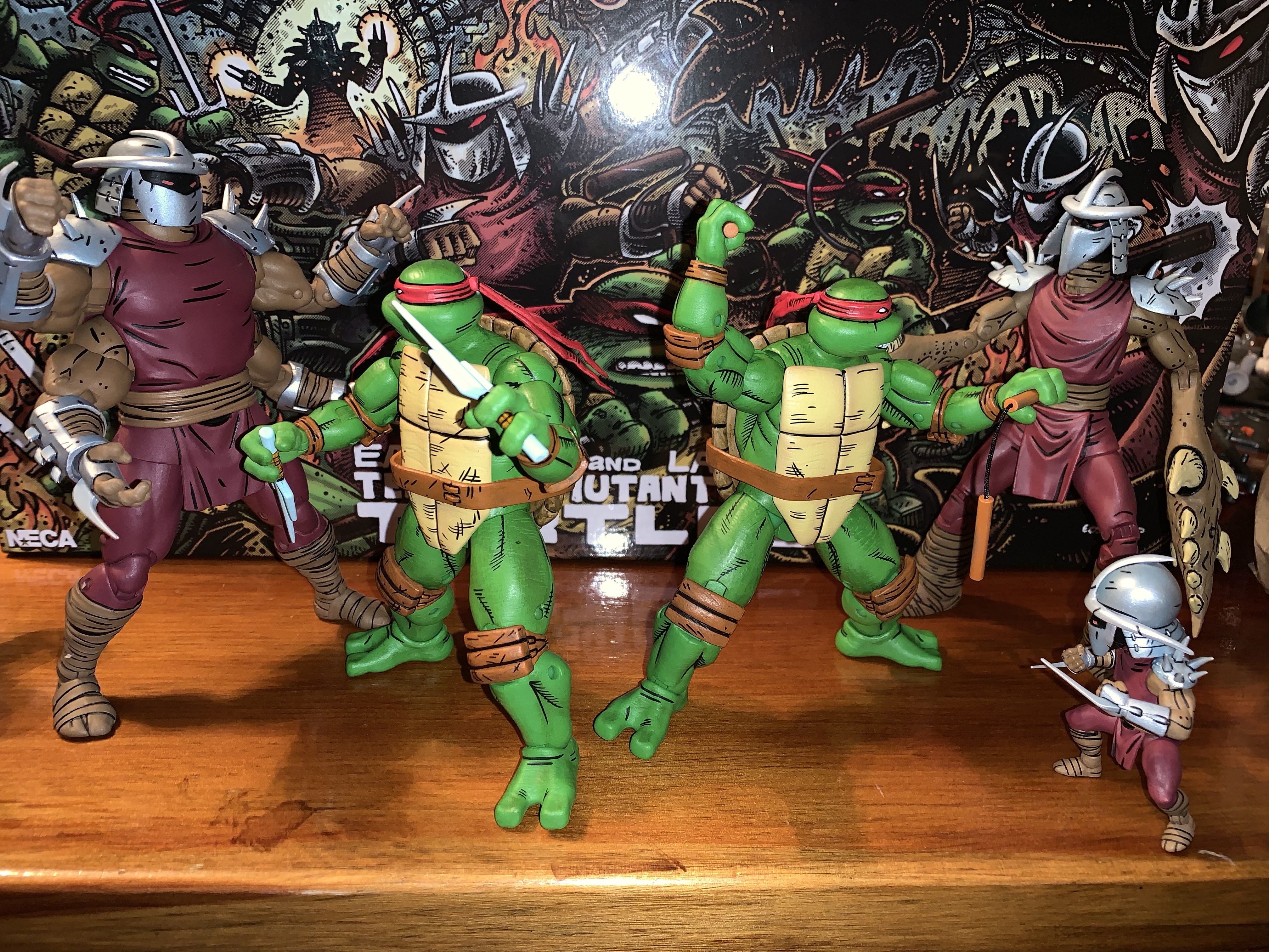
Basically, what I said several paragraphs ago is what applies most here: if you’ve been waiting years for a set of Mirage turtles then you’re going to get this set. And you’re probably going to be relatively happy with the outcome. The figures are fun to handle and pose and look great together. I think they pair well with most of the other Mirage releases, though placing them with Shredder does make me wish we had a beefier Shredder for them to fight. They’ll look great with Zog though or the Shredder clones or even just off on their own. In spite of the inflated price point, I do think they’re worth getting even for those who have the original Mirage turtles given the difference in style.
I figured I’d end on a pic of these two, for no particular reason…
If you’re on the hunt for these boys you can keep an eye on Target’s website. Set alerts for if they come back in stock as you never know. They also have shipped in waves to Target stores so keep checking there. If your store is like mine, they’re being stocked on an endcap in the toys section rather than in the usual NECA section. Since these are a Mirage release, it also stands to reason they’ll be sold in other places after this initial Target run is over. NECA hasn’t come out and said that, but it would be crazy for them not to make the actual turtles available to as many customers as possible.
A dozen years ago, toy company NECA dipped its toe into the world of Teenage Mutant Ninja Turtles for the first time, and shockingly it failed to stick around. That’s incredible to hear for collectors currently chasing down Bebop and Rocksteady at Target, but it’s the truth. There are a lot of folks at NECA…
Haulathon 2023 has brought some pretty big releases to NECA’s line of Teenage Mutant Ninja Turtles action figures. And I mean big in a literal sense. REX-1 was tall and hefty and the multi-armed clone of Shredder was no slouch either. Those two seem to pale in comparison to Zog, the Triceraton warrior from NECA’s…
NECA and Target’s Haulathon event which has seen a vast assortment of product dumped onto shelves recently was not content to limit the products to just the cartoon Teenage Mutant Ninja Turtles. Far from it, as an assortment of comic book based characters were also released and today we’re going to look at the first…
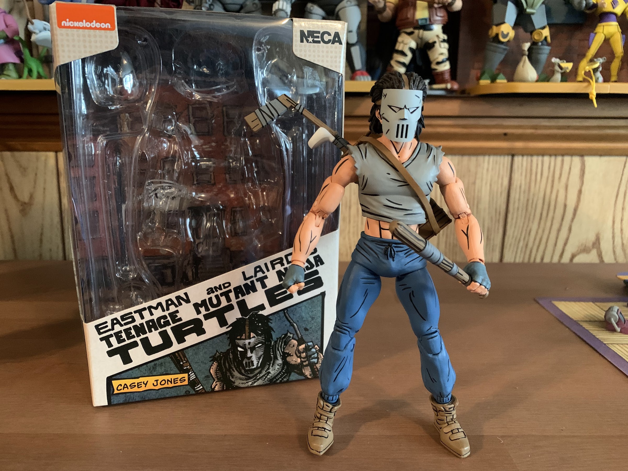
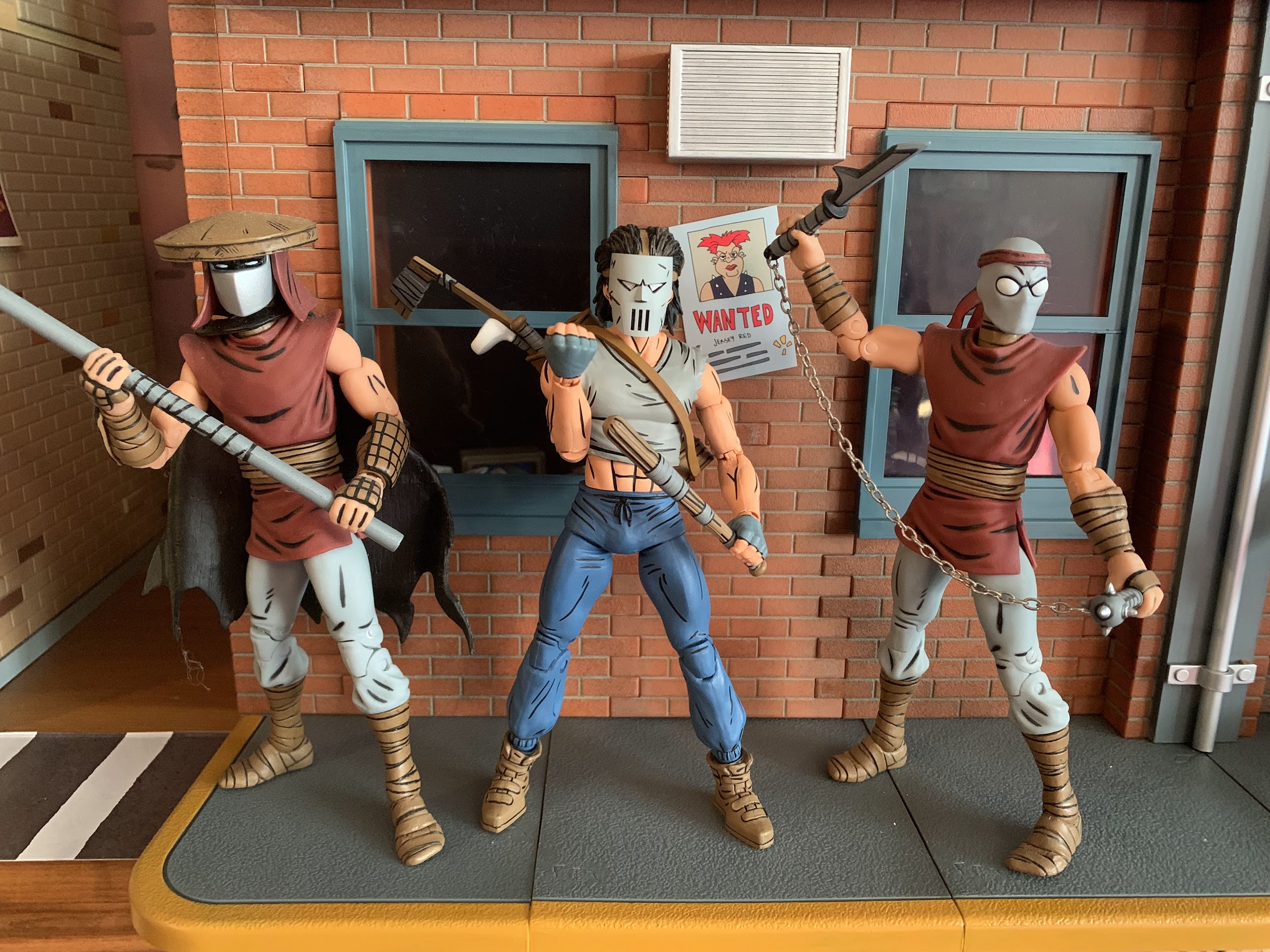
Where there be turtles, there be Casey Jones – the bad ass vigilante of New York City! Casey was an early addition to the comics and he’s basically been included with every iteration of Teenage Mutant Ninja Turtles since. And in all of them he tends to wear a hockey mask and bludgeons bad guys with sports equipment. It’s a pretty simple design, but it has stood the test of time. When NECA Toys started dipping its toe into TMNT back in 2008 it was probably assumed that Casey was on the short list of figures the company was likely to put out. Unfortunately, the line only extended one figure past the turtles (April) and fans never got their favorite vigilante in plastic. Things have changed since then and Casey Jones is no stranger to NECA or plastic. He’s been released as part of the toon line and received three separate releases in the movie line. And now, at long last, he finds himself released as part of NECA’s line of action figures based on the artwork of Mirage Studios.
How many Caseys is too many? And I even skipped one of the movie releases.
Casey Jones comes in the now standard single pack release. It’s a trapezoidal window box emblazoned with original artwork by TMNT co-creator Kevin Eastman. There’s product shots on the rear and a little cross-sell on the bottom. I’ll say upfront that this release from NECA is slightly controversial among some of the more hardcore members of the TMNT collector community. Like Renet before him, Casey comes in his reinterpreted IDW colors. That means a gray shirt instead of a red one and brown shoes in place of his black ones. I don’t know why NECA is doing things this way, but it looks like a red variant is coming too. Will it be stuck behind that Auto T bullshit the Mirage-accurate blue Renet was? Probably, but that hasn’t been confirmed. One would think the standard colors would be the standard release with the modern variant the slightly more expensive specialty option, but then that would make too much sense, now wouldn’t it? For all I know, this is the preferred look of the character by someone like Kevin Eastman. Personally, I don’t care that much because I’m used to seeing these books in black and white. Mirage Casey Jones is black and white in my head even though he had a red shirt on the cover of the Raphael one-shot. And unlike Renet, where I most definitely preferred the blue outfit to the red one, with Casey I’m less definitive. Red, gray, – it’s just a shirt. He at least stands out on my shelf a bit more considering the Foot all wear red and there’s Renet as well, but I certainly wouldn’t complain if he had a red shirt either. I guess if it’s that important to you then wait and find out how the red version is getting released. Or paint the damn thing yourself.
Casey seems to share some parts with the Foot.
He’s not exactly equipped to handle the Utrom, but then again, neither are the turtles.
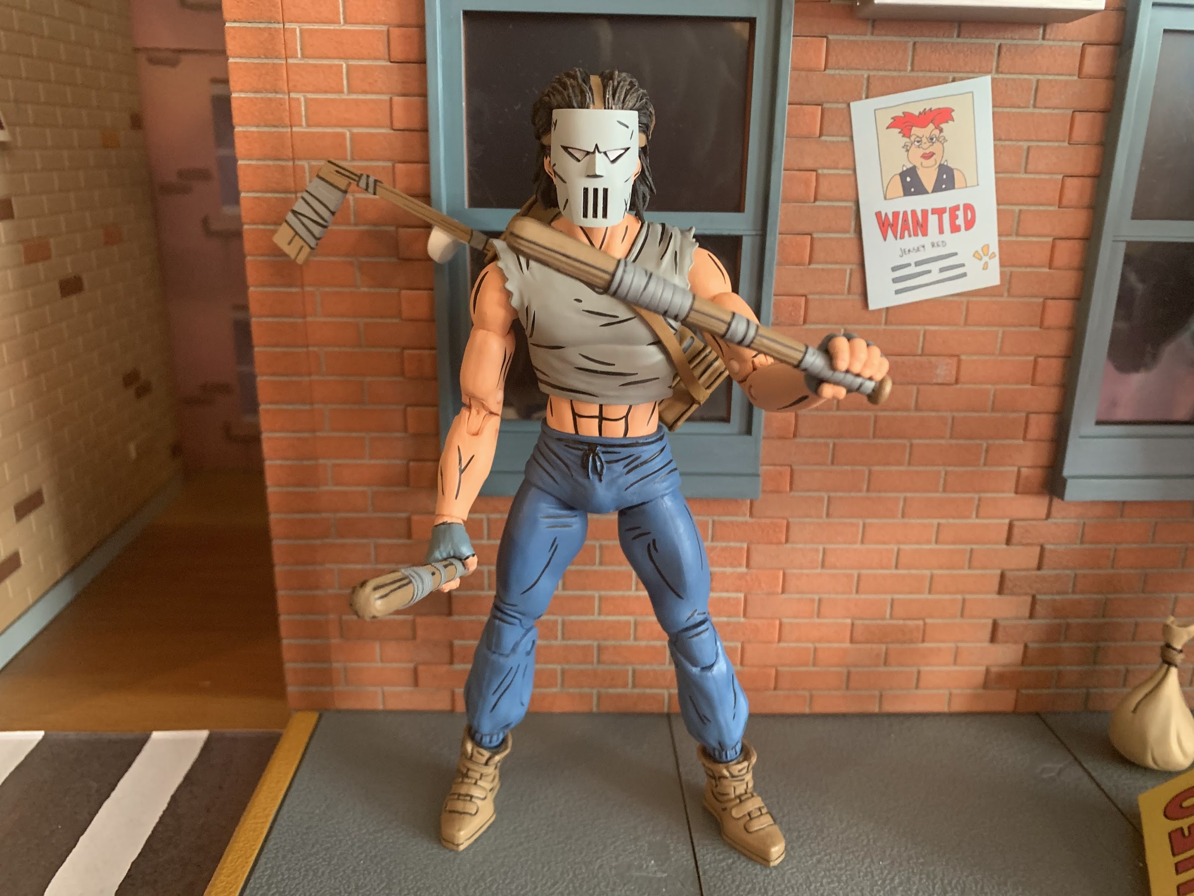
With that out of the way, lets look at the figure for what it is. Casey Jones stands approximately 6.5″ tall which feels right for the line. He’s comprised largely of parts reused from Shredder and the Foot as he has the same upper arms, thighs, and probably torso as those releases. What’s new is the shirt overlay for the torso, the hands, calves, shoes, forearms, and namely the head. His default portrait is masked and I like that the mask is a separate piece that’s glued down to the face. It gives it some nice depth, even though the eye slits are painted and we don’t need to see his eyes underneath it. It’s very similar to the cartoon figure’s mask, but it is different and looks just as cool as it always does. There’s paint basically everywhere on this guy with a lot of black linework throughout which really helps it to pop on a shelf. He’s depicted in sweat pants and they have some sculpted wrinkles in them and the lower leg is a bit baggy which looks nice. This is a very lean Casey, which does match-up with how he was drawn in the comics. He’s not as bulky as the toon version, but he’s menacing enough in appearance. Despite that, I do wish he had a little extra bulk in the midsection as there’s a lot of plastic for the hips, especially on the rear of the figure, which is a little unsightly. Overall, he looks good, it’s just a character design that’s not made to impress so he’s a bit less exciting than someone like Renet or the Utrom.
You gotta have the hockey stick!
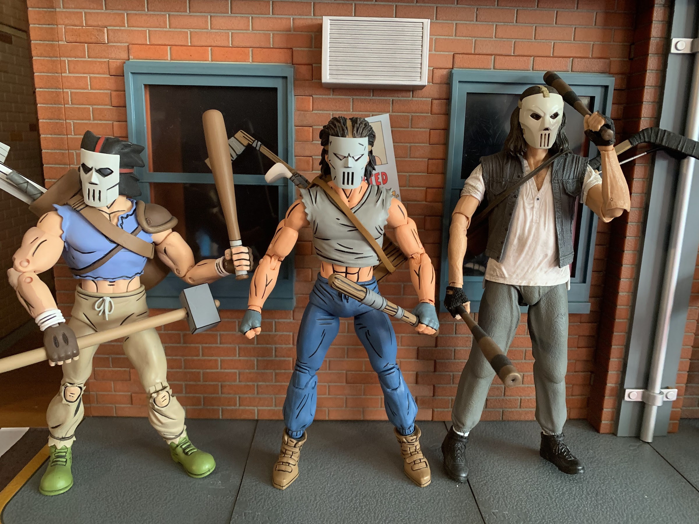
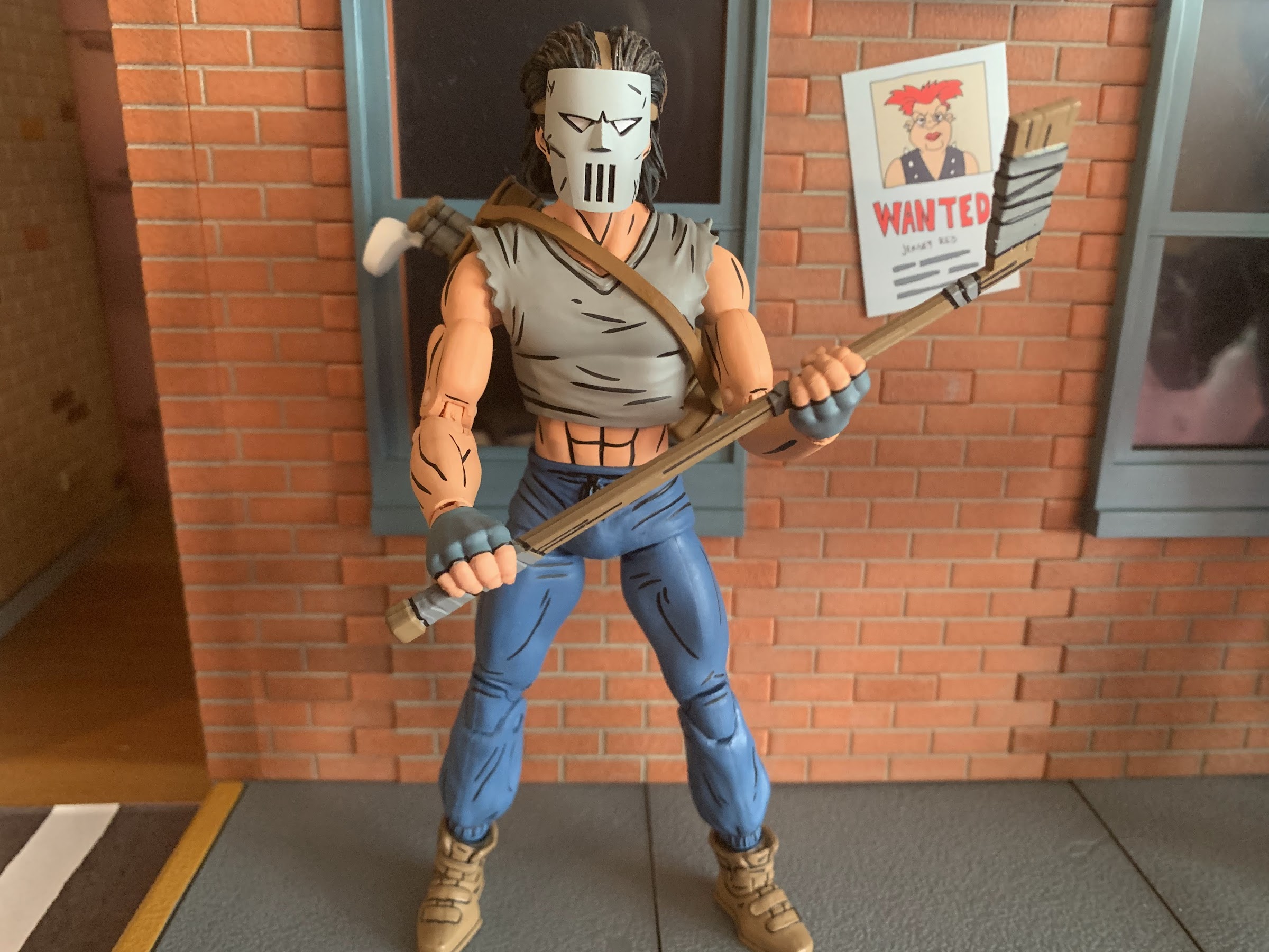
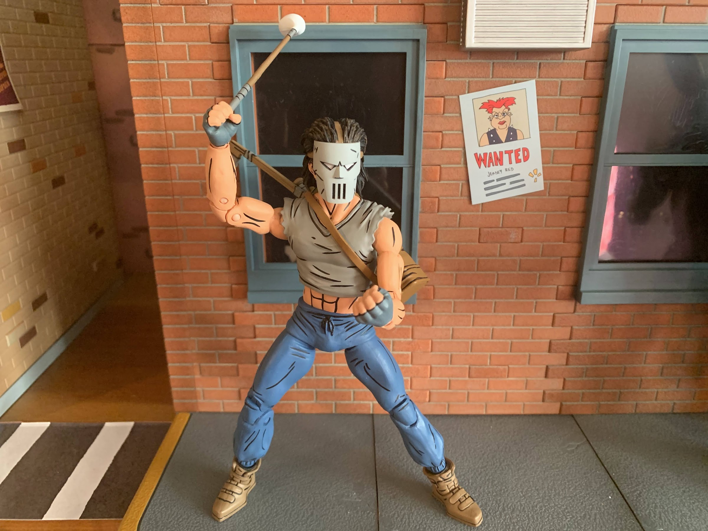
In terms of accessories, NECA outfitted Casey with a decent allotment. He’s basically known for having a bunch of weapons at his disposal, so NECA gave him his customary hockey stick, a pair of baseball bats, and a golf club. The stick and bats all feature sculpted tape around portions of them and are well-painted. The two bats are identical, which is a bit of a bummer, but I get why NECA wouldn’t want to sculpt two different ones for this release. At the same time, we’ve seen bats in other lines so it feels like they could have pulled from there. The club is a white wood style club and it looks fine, though it’s comically small. I’m not a big golfer or anything, but I have played the game and own a set of a clubs so I know how big they’re supposed to be. This club barely comes up past Casey’s knee so he must have found a youth model or something. It’s also very thin so he doesn’t grip it that well with two of his gripping hands. All of the weapons can be stored in his equipment bag. It has a square design to it so I’m not entirely sure what it’s supposed to be. It doesn’t look like a normal sports equipment bag or a golf bag, but it works. It’s easy to get onto the figure and looks fine. It’s brown and features the same black line work as the figure so it has a nice appearance.
I’m sure it wouldn’t feel too nice to get smashed over the head with this driver, but it sure is comically small.
Casey also has a few extra parts he can make use of. For one, he has a set of fists and a set of gripping hands. He wears fingerless gloves and those details are painted on. The gloves begin just past the hinge so that doesn’t get in the way and I can’t tell just which part of the hand is painted. Is it the gray glove portion or the fingers? Either way, the colors look fine and I’m not seeing any paint rub on the weapons so that’s a good thing. I do wish he had a different set of hands than the fists though. His gripping hands basically look like fists when he’s not holding anything so they feel redundant. Maybe some open hands, a finger pointing hand, or just different degrees of gripping hands would have been a better use of the budget. And this figure does commit the sin of not having the proper hinge on the gripping hands. Casey should have a vertical hinge, but instead he gets the mostly useless horizontal design. He has one extra, right, gripping hand as well and I think it’s meant for the golf club as it’s the only hand that gets a decent hold on that item. He does get an extra head and this one is unmasked. He’s a pretty ugly dude though so you might prefer to leave the mask on. He looks as he should, so that’s not a criticism of the figure, just the reality of the character design. Lastly, just like the movie version, he comes with a mask that can either be held or hung from the handle of one of his weapons stored in his bag. It looks quite nice and it’s a different mold from the mask on the default head as the eye slits are open. The straps are a soft plastic and, if you really want to, it can fit over the unmasked head, but you’re far better off just displaying him with the masked head than going this route unless you really like the look of the eyes from behind the mask.
A face only a mother could love.It fits!
That takes us to articulation and if you have Shredder or the Foot from this line then you know what you’re in for. The head is on a double-ball peg and he can look down okay and rotate, but looking up is blocked some by the hair. He can look up, it’s just only a little. He does have some nuance posing there, so overall I like it. The shoulders are your typical ball hinges. He has a hard time getting his arms up to a horizontal position, but the shirt is cut back enough that rotation isn’t a problem. I do wish NECA would improve these shoulders though as it’s a consistent issue. There’s a biceps swivel and double-jointed elbows that bend past 90 degrees with ease. He is fully painted so you may need to heat some of the joints, but for me, my figure was fine out of the box. We already mentioned the wrists and in the torso he has some kind of diaphragm joint that isn’t usable because of the shirt overlay. It feels like a ball joint and you get the tiniest amount of range there, so little that it’s not worth counting. The waist twist is fine, but not the prettiest due to how slender his abdomen is in relation to the pants. A ball joint probably would have looked nice and might have also functioned better. At the hips we have the standard ball and socket. Even with the “diaper” piece, Casey can damn near hit a full split so that’s good. They’re also not loose which is even better. There is a thigh twist there that works quite well and the knees are double-jointed and go past 90. There is a boot swivel at the top of the shoe and at the ankle we have a hinge and rocker. The range on the hinge is pretty poor as it only goes back a little and barely any forward. The ankle rocker also isn’t the best as it’s pretty steep and limited, plus it also feels a bit gummy so I’m worried that I’m stressing the peg more than spinning it on the joint.
“Enough standing around, let’s kick some ass!”
The articulation is rather basic. It’s par for the course for this mold and this line in general as NECA definitely does not prioritize making super-articulated figures. They want it to look like the comic first and foremost and then add a suitable amount of articulation where it makes the most sense. As a result, we have a figure that doesn’t really feature any eyesores brought on by the articulation, but it also isn’t very dynamic. The wrist hinges and the ankles are my biggest areas for critique, and to a lesser extent, the waist and shoulders. The limited ankle articulation makes him harder to stand than expected, and it’s not helped by the added weight on the figure’s back brought on by the bag. He’s not as tipsy as the movie Casey, but I do feel like NECA could have done better at the ankles. The wrists are what they are and it’s something NECA has lately been overlooking, unfortunately. I would like them to make it a point of emphasis going forward. I also do think they could have done the shirt overlay a little differently to give us some added range in the diaphragm. It shouldn’t be that hard to at least give us some twist there and I don’t think much sacrifice in the sculpt would have been needed, if any. I think it’s something just brought on by the desire to reuse parts for the torso from figures that had a full shirt and were never going to move there anyway so there was no reason to engineer it differently. Considering they’re planning on two releases, at least, for this figure, maybe a little extra tooling could have been done?
“When you’re the best of friends…”
At the end of the day, if you want a Casey Jones for your Mirage Studios TMNT display you’re going to get this figure. Or you’re going to get the red one. Or you’re going to get both! And I think, for the most part, those who do pick this figure up will be content with the end product. He looks pretty nice, there’s a decent amount of articulation, and he has the weapons most expected. I have some nitpicks with the figure and those nitpicks combined with the character having a less than impressive design result in me viewing this one as the weakest in the Mirage line, but that doesn’t him bad or anything. He’s pretty average for a NECA release, and at least for NECA, that’s still a good product. The paint is clean, I had no stuck joints, and perhaps most importantly, the price isn’t too bad. You should be able to find this figure at specialty shops and even Walmart where he’ll range from $35-$38 and that’s not bad in today’s climate. If the red version does end up being an Auto T release, expect to have to shell out $40 for that one. For some, the character has to have a red shirt and I get that, but for me, I’ll pocket the five bucks and go gray.
Welcome to the first Turtle Tuesday of 2023! 2022 is the year that NECA returned to the Mirage Studios subline of Teenage Mutant Ninja Turtles action figures it started way back in 2008. When the line was announced to return, it was essentially taking the place of the Turtles in Time figures that had been…
I swear this blog is not just a NECA Teenage Mutant Ninja Turtles blog, even though that’s what it has looked like lately. I’ve just been getting crushed with new releases lately, but it looks like a drought of some length will be incoming soon. Before that can happen though we need to talk about…
Something that is likely common to most of humanity is a desire to be successful. We all measure success differently, be it professional, financial, or something else, but we all strive for it. And sometimes success can feel like a burden. Take NECA’s line of action figures based on the Teenage Mutant Ninja Turtles property.…
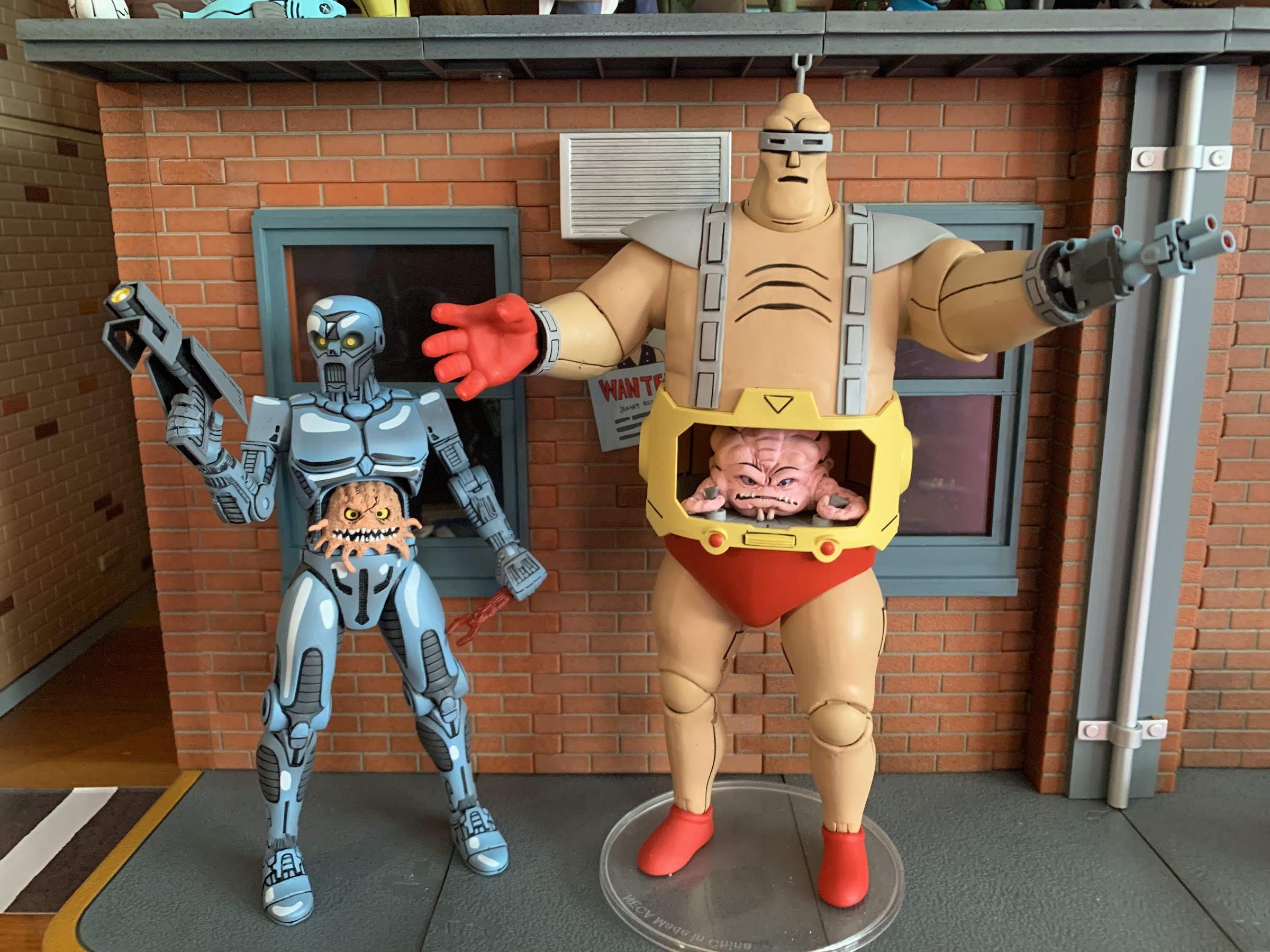
Raise your hand if you knew who this was. Be honest!
We’ve become so accustomed to having the Teenage Mutant Ninja Turtles in our lives that the name of the franchise has almost lost all meaning. Well, maybe not all, but I feel we mostly have lost sight of how ridiculous a concept this franchise is. And it extends to other characters in the franchise and I’m talking about Krang. Krang from the cartoon series is an oversized, talking, somewhat monstrous brain. In the context of the show, he’s perhaps not as outlandish a design as he would be in another show, but he’s still pretty out there. And then you add in his body. A large, bald, man in a red diaper and suspenders. Krang can’t go in his head like a normal brain would because then he’d no longer be visible so he has to go in the body’s stomach. I think it’s Vernon who draws attention to this factor in the fifth episode of the series when he sounds positively repulsed at the sight of a man with his brain in his stomach, and he’s right to be grossed out! Krang is one of the craziest designs from a popular franchise that I can think of.
These two make quite a couple.
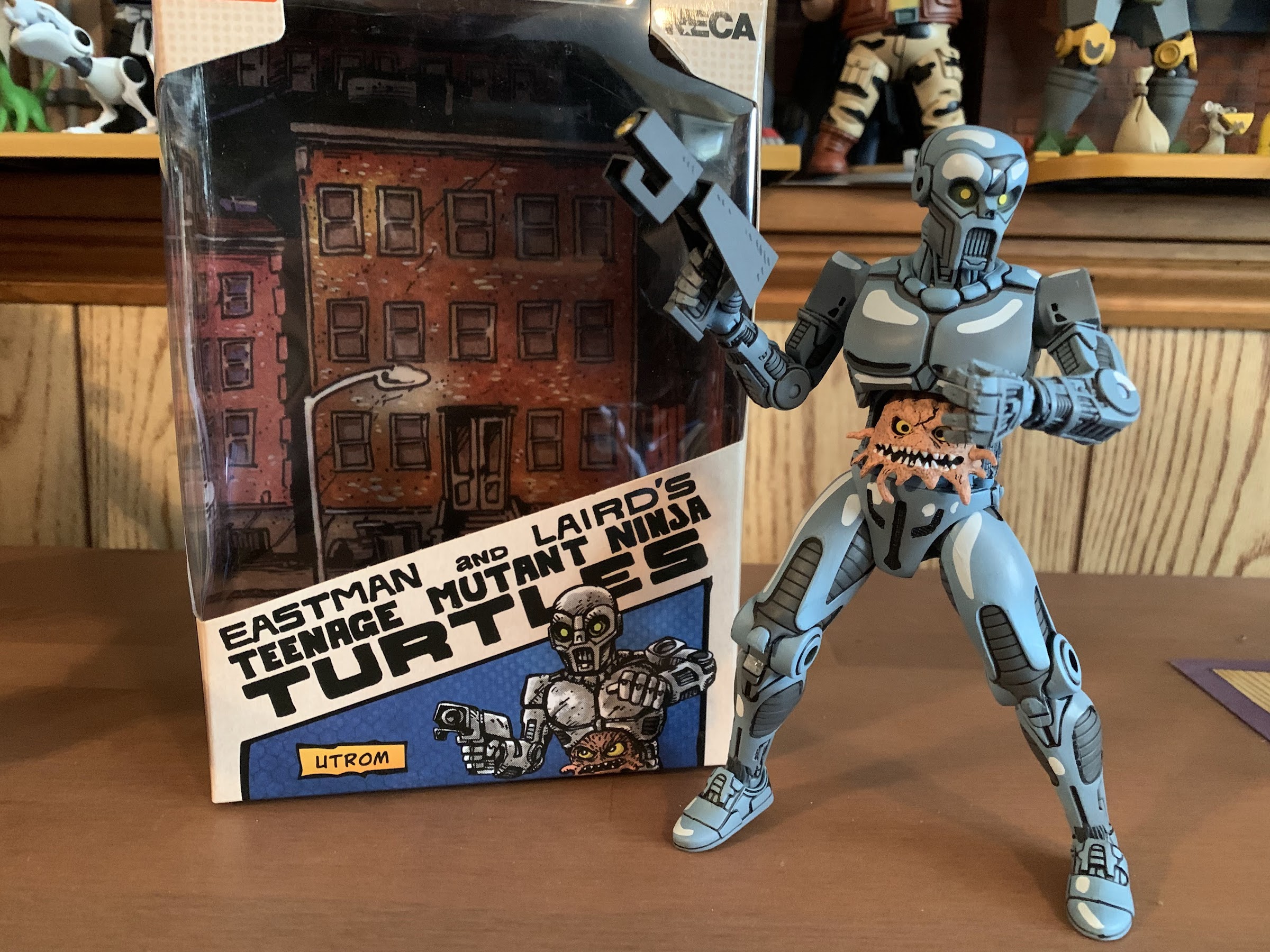
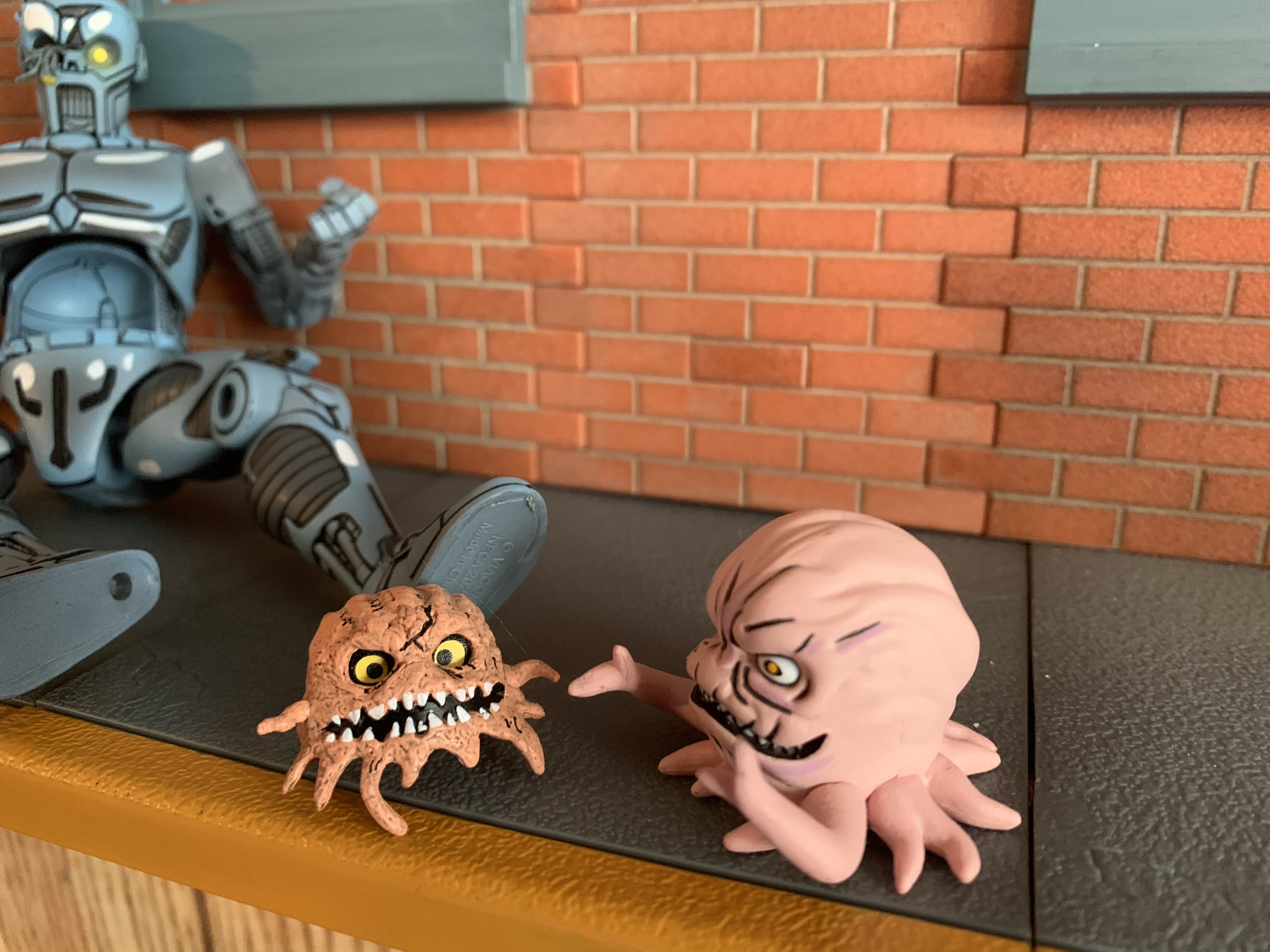
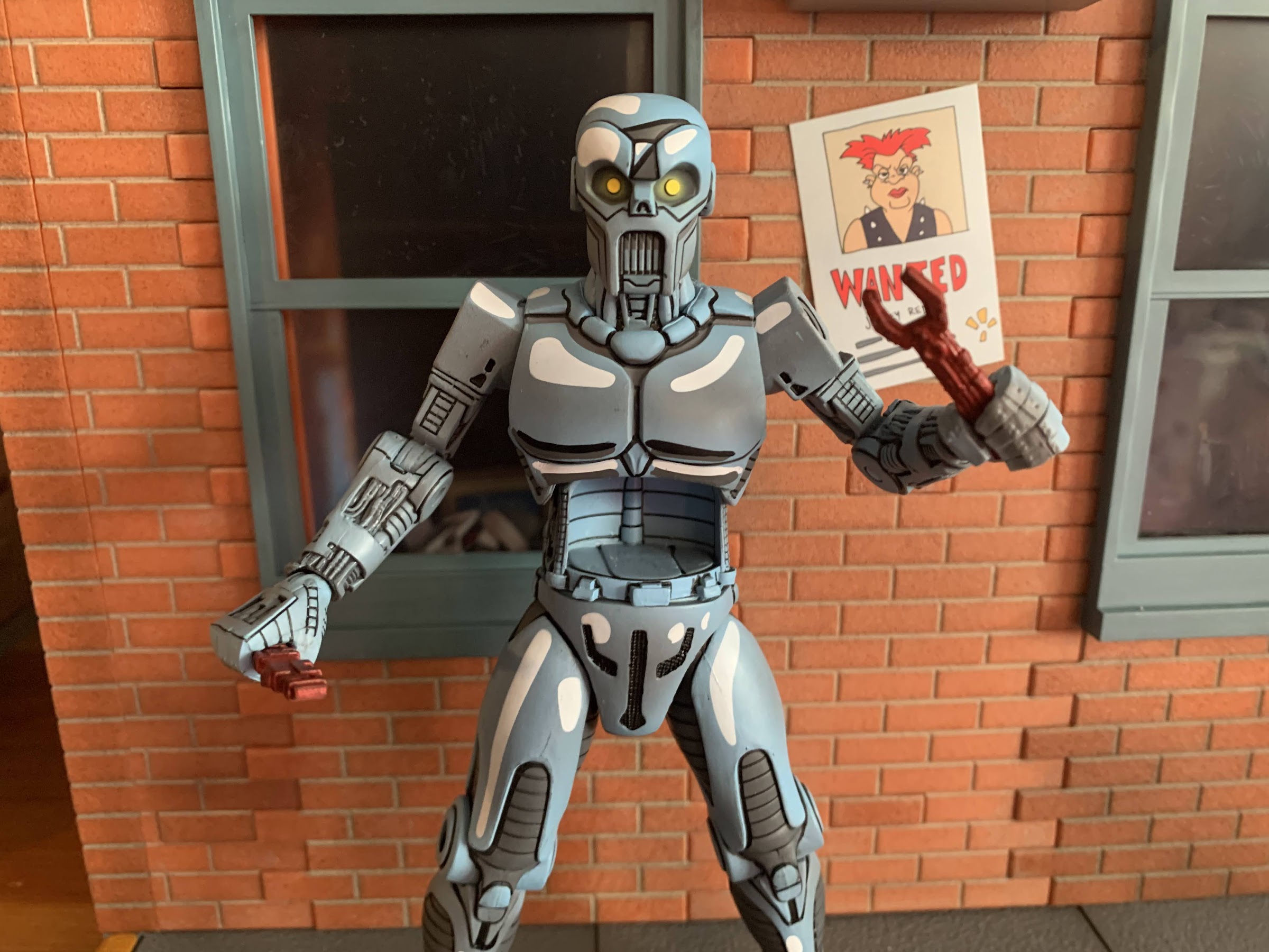
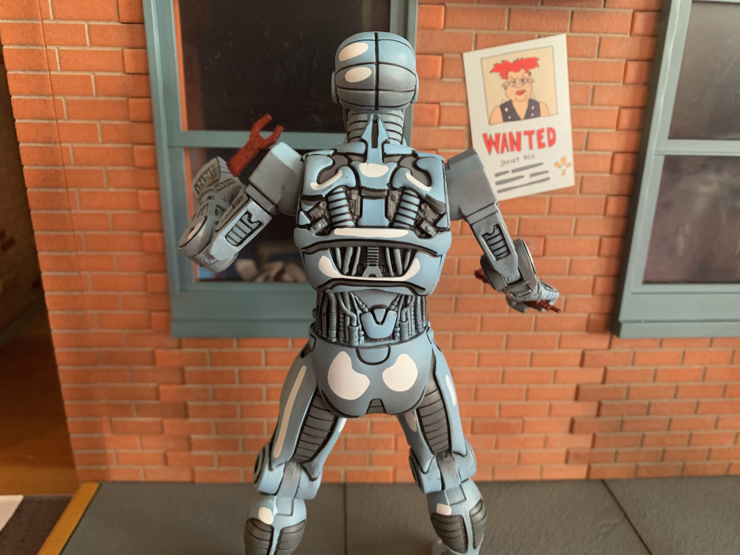
And if you have a deep familiarity with Teenage Mutant Ninja Turtles then you know Krang is taken from the original comics, only there his race of beings were called the Utrom. There weren’t many (any?) that were actually named, they were just alien brains that got around in robotic bodies. Like Krang, they controlled those bodies from the stomach area, but unlike Krang their bodies were far more mechanical looking. Think the endoskeletons from Terminator, as that’s more in-line for how they appeared. They were foes to the turtles, but also tied in with their origin, and I’d elaborate more, but ever since the 2012 show came along the Utrom and the Kraang from that series kind of run together in my head. Needless to say, they play a significant enough role in the original comics that an action figure from NECA made sense.
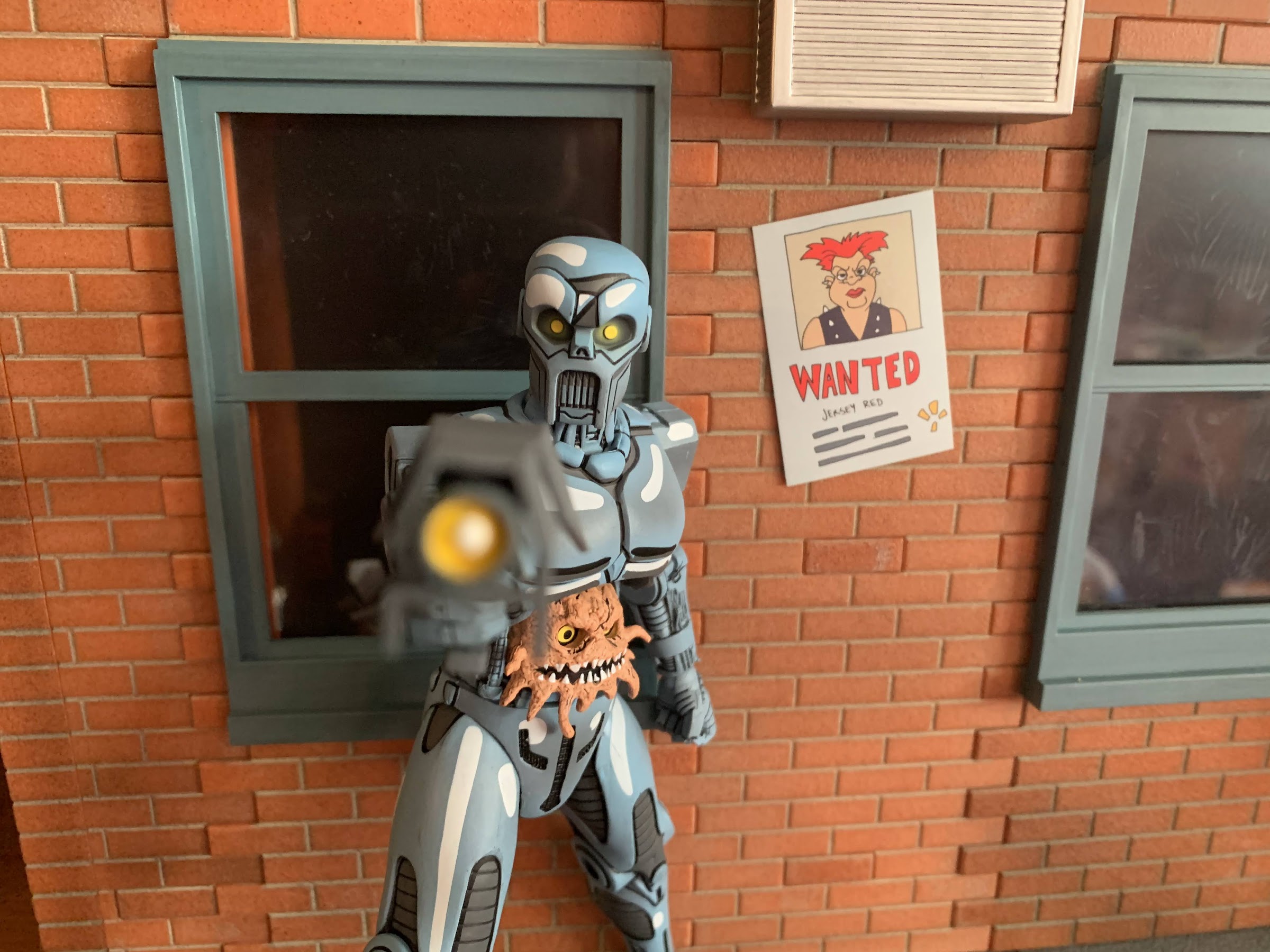
The Utrom from NECA stands at right around 6.625″ in height. It comes in the standard window box packaging with new artwork from Kevin Eastman on the box depicting the character. On the rear are product shots and a cross-sell for more figures in the line. Let’s just get right to the big talking point with this guy: the paint job. This figure is gorgeously painted. If you thought the Fugitoid figure looked terrific, wait until you see this. It is fantastic! I am in love with how this figure turned out. It’s sculpted in a light blue plastic, like a periwinkle, with white accents painted onto parts of it to go along with the usual black linework this line is known for. There’s also a hit from an airbrush that contains some gray paint and the effect is just wonderful. This looks like it jumped off of the the page, colored version, and I just love how stylized this looks. This is what I want from action figures based on comics. You can’t sculpt it in chrome, and just making shiny plastic isn’t going to achieve the same end result. The eyes are also painted yellow with a hit of yellow from the airbrush to create the illusion that they’re glowing. The Utrom in the figure’s stomach is also well-painted. The eyes and teeth are clean and there’s a wash applied to really bring out the nasty with this little guy. And with this amount of paint on the figure, there’s virtually no slop. No stuck joints. It’s about as perfect a paint job as one could get in this price range. If I have any nits to pick with it, it’s that a couple hits of the white look a little thin. Maybe the neck area and some of the details on the arms could have used another hit of the airbrush, but that’s all minor and just me trying to poke holes in this thing because, otherwise, it’s awesome.
The sculpt and paint on this guy are just incredible.
The wonderful thing about this figure too is it has a sculpt to match. There are tons of little details in the arms, especially, that look like wires and little machinations. I love the contrast of the smooth plates on the figure’s thighs and the ribbed portions underneath. The rear of the figure is really loaded with sculpted details which is commendable since that’s a spot NECA could have cheaped out on, but obviously did not. It all speaks really well to NECA as a company because they’re clearly committed to delivering the best, most accurate, representation of the character possible. Who knows if much or any of this figure can even be reused for other figures. I’m sure we’ll get a variant at some point, but we have numerous examples of other companies just half-assing their sculpts to present a compromised vision of a character in the interest of saving money on tooling and NECA is just putting them to shame. And something I should praise NECA for more often than I do is that they credit the folks who design their figures so a major shout out and hearty congratulations to sculptors Brodie Perkins and Josh Sutton with paint credited to Geoff Trapp and Mike Puzzo. We should also probably give a shout out to director Trevor Zammit as I assume he’s the one pushing to make these look like the source material and he just does a fantastic job with all of the TMNT lines he oversees at NECA.
And if you thought they would cheap out on the figure’s rear you’d have been wrong.
We’ve gushed over the look of this one, now let’s talk about the stuff it comes with. The Utrom has three sets of hands: fists, gripping, and trigger finger. All of the hands feature the horizontal hinge, our first disappointment of the release, but I do like that the fingers are soft plastic and getting the accessories into the trigger hands is relatively easy and free of paint rub. He also has a gun and it has a really fun design as it has these panels over it. It has some linework on it and the muzzle is painted rather simply, but well. There’s two red tools for the figure to wield. One resembles a wrench and the other is a bit more nondescript. I’m guessing it’s pulled right from the comic, but I don’t know exactly what it is. He also has a little canister with a straw in it. I think this is a drink for that actual Utrom in the belly, the only problem is he doesn’t hold it very well. The fingers on the trigger hands are flexible enough that you can wedge it in there with some effort, but a more relaxed hand would have worked better. Lastly, we have a second portrait for the robot that features battle damage. It’s right eye is hanging out and there’s a big gouge taken out of the top of the head that looks really cool. It’s nice enough that the temptation is there to get another figure, I just wish he had more battle damaged parts to swap to or even a second Utrom with a different expression to create a bit more variety. The Utrom that came in the comic con 4-pack years ago is much too big to fit in this guy.
Bang!
The accessories are solid leaving just the articulation for us to talk about. Like most of the figures in this line, the articulation isn’t going to be the strongest aspect of the release, but I think it’s going to be enough. There’s a ball joint in the head that provides rotation and some nuance posing. It looks down well, but not up. The shoulders are ball-hinged and you get all of the rotation you need, but the boxy shape of the shoulder means the figure can’t raise its arms out to the side. You get maybe 45 degrees there. There is a biceps swivel and it’s integrated very well into the sculpt. The elbow hinge is only a single hinge, but the design allows it to go past 90 degrees so that’s fine. The wrists swivel and hinge and I already mentioned the direction of the hinges is unfortunate. In the diaphragm, we do have a ball joint above the opening for the Utrom. It’s actually more functional than I expected as you get a little forward and back, some tilt, and a fair amount of rotation. At the waist is another twist and the hips are the standard ball and socket joint. There’s a thigh pivot there that provides just a little something for adjustment poses as opposed to a full thigh twist. The legs kick forward to a full horizontal position, though they do drift out from the body a little the higher you go. There’s no range going back, and the single-jointed hinge will get you a 90 degree bend. At the ankles we have a hinge that allows for plenty of range backwards, but nothing forward. The ankle rocker works fine. It’s decent and I think it’s enough for this character. He can do plenty of one-handed gun poses. I do think NECA could have sacrificed a little bit in the sculpt at the shoulders for more range, and the lack of vertical hinges for the hands is an ongoing problem. The actual Utrom in the body is not articulated, but I don’t think it needs to be.
Hydration is importnt!“I told you, Jerry, you can’t fit!”He’s a sharing kind of alien brain.
The Utrom may not be a character that gets a lot of TMNT collectors excited, but the finished product is one of the best releases from NECA in a long time. I think this is easily my favorite from the Mirage line and I would put it up there with the best from the toon line as well. I can’t say enough good things about the paint job. This comic deco is fantastic and I love that NECA has the guts to try something like this with its figures. So many collectors dump on “cel-shading” when it comes to figure releases without realizing that most of the companies attempting that effect with their figures do a piss poor job. It takes effort and money to get it right as well as artistic vision. I’ve said it numerous times, but natural lighting cannot shade an action figure based on a comic book character the way that character is drawn in the book. It’s impossible. Comic book artists do their own thing that doesn’t work in reality and no one complains because it looks awesome. It’s stylized, but some of it is so prevalent that we don’t really think about it. I always use Venom as an example. We know his costume is black, but if you showed a panel from “Lethal Protector” to a kid he’d tell you the costume is blue because that’s how comic book artists shade black. And that’s what I want out of my figures. Major props to NECA on this one, they hit a homerun. I can’t wait to see what they do next.
More from NECA and their expansive selection of Teenage Mutant Ninja Turtles action figures:
We’re back for 2021, and right now it looks like a lot like 2020 as we have a new Teenage Mutant Ninja Turtles action figure to talk about – Android Krang! Hopefully, this doesn’t mean 2021 is a lot like 2020 going forward, but if it’s going to copy anything from 2020 then let it…
I’m having a hard time coming up with an action figure line that has had retail releases separated by more than a decade. I don’t mean long-running lines of figures like G.I. Joe or Marvel Legends which have been around for decades, I mean a line that was started, ended, then re-started like NECA’s line…
The Shredder had a rough go at things for awhile when it came to plastic. He was featured rather prominently in the old Playmates line, though perhaps not as prominently as one would expect. Playmates never did do a movie version of him, aside from Super Shredder, and his figure was arguably the worst from…
Welcome to the first Turtle Tuesday of 2023! 2022 is the year that NECA returned to the Mirage Studios subline of Teenage Mutant Ninja Turtles action figures it started way back in 2008. When the line was announced to return, it was essentially taking the place of the Turtles in Time figures that had been sold through specialty shops over the past two years or so. These figures would be sold in a similar fashion as it was the small shops that would be able to place orders after being shutout of the more popular movie and cartoon sublines of TMNT. What NECA didn’t clarify at the time was that the Mirage figures (and Archie) would not be exclusive to those places, just available. When the company released Fugitoid earlier this year, it was via Target with the specialty shop places not getting the figure until months later. Since then, more has been revealed and for collectors it’s been a mixed bag as far as the experience goes. Specialty shops were given the figures Renet, Casey Jones, and the Utrom to solicit, but in the case of Renet and Jones, they were getting a variant based on the IDW re-colored issues. Renet is normally clothed in blue and Casey red, but the figures up for order featured a Renet in red and a Casey in gray. Is that a big deal? It depends on who you ask. A Blue Renet would eventually surface as a Walmart exclusive attached to some weird, NFT-like, distribution in which the consumer places an order either online (it has since sold out) or in-store that just gives them a code. They then go home and enter that code into a different website to take digital ownership of the figure at which point the collector can either “store” it or ship it. The turn-around on shipping was promised to be around two weeks, but turned into a month or more for those who participated. Oh, and the figures sold in this fashion (which also included black and white variants of the Mirage Foot Soldier and Shredder) retailed for 40 bucks, five more than the other versions.
Renet is no damsel in distress.
I personally wanted nothing to do with that arrangement. It sounds needlessly complicated, plus the toys are more expensive. Unfortunately, I did want the blue version of Renet, but I’m too stubborn to give in and jump through those hoops so when I eventually found the standard version at Target I just grabbed it. My experience with the character has mostly been in black and white anyway, so I’m not that attached to the blue color scheme, I just prefer it. It looks nicer. For others who grew up reading the colorized version of the old books they understandable have more attachment to the blue costume and I do not blame them one bit that the easy to order version of the character is essentially a variant with the true version locked behind an exclusive arrangement. That is, frankly speaking, bullshit and not the way I think NECA should be approaching this line. If part of the selling point of the Mirage line is to feature it at actual comic shops then it should be those places that get the standard version and send the IDW colors to Walmart. Instead it feels like NECA is admitting that variants of these characters aren’t going to be that popular so they’re making the more desirable version both exclusive and more expensive. It’s not a good look and given that NECA’s reputation has already taken a hit in 2022 thanks to the Loot Crate fiasco, it feels like another self-inflicted wound.
She can also go hoodless, if that’s your preference.
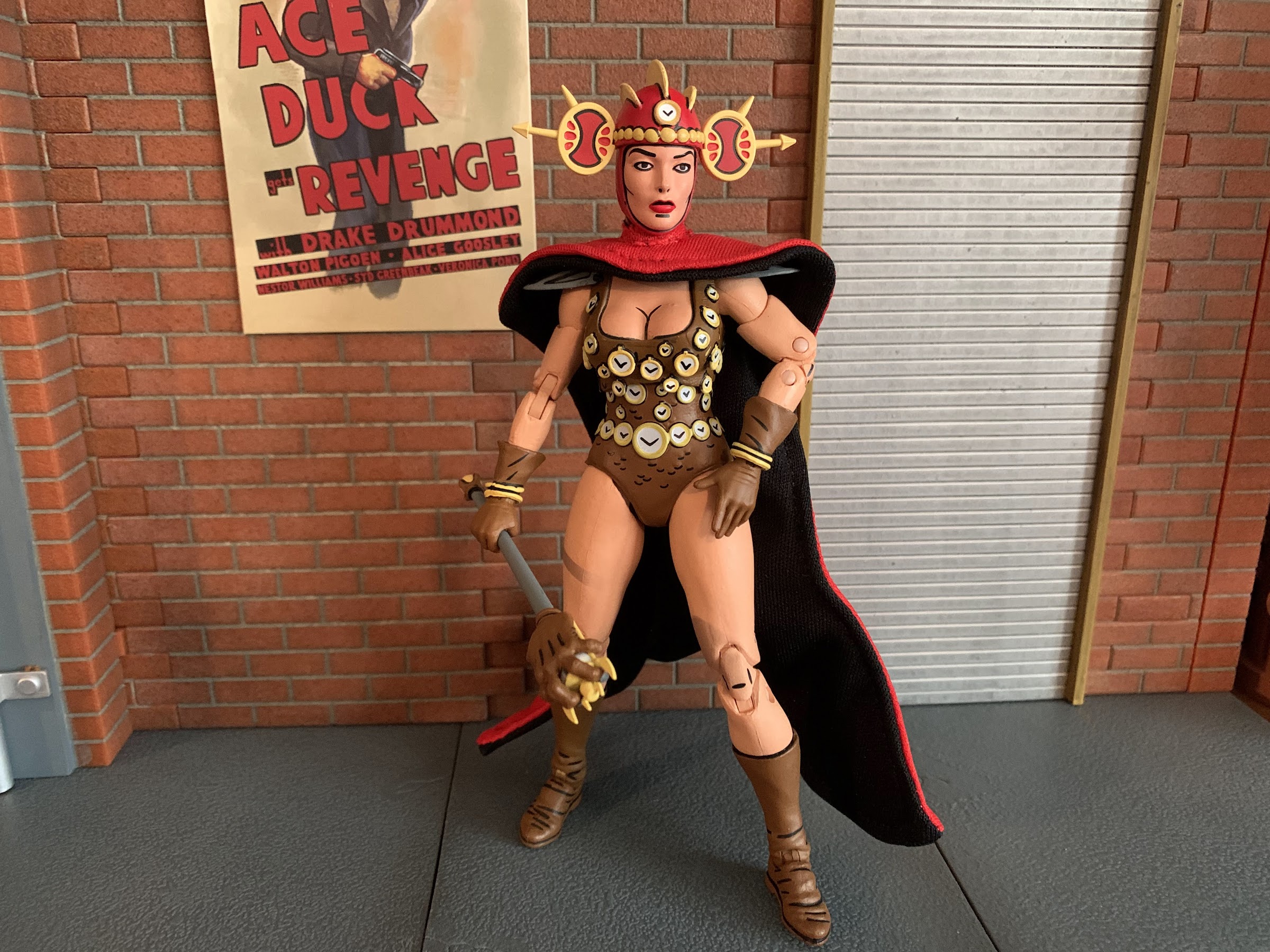
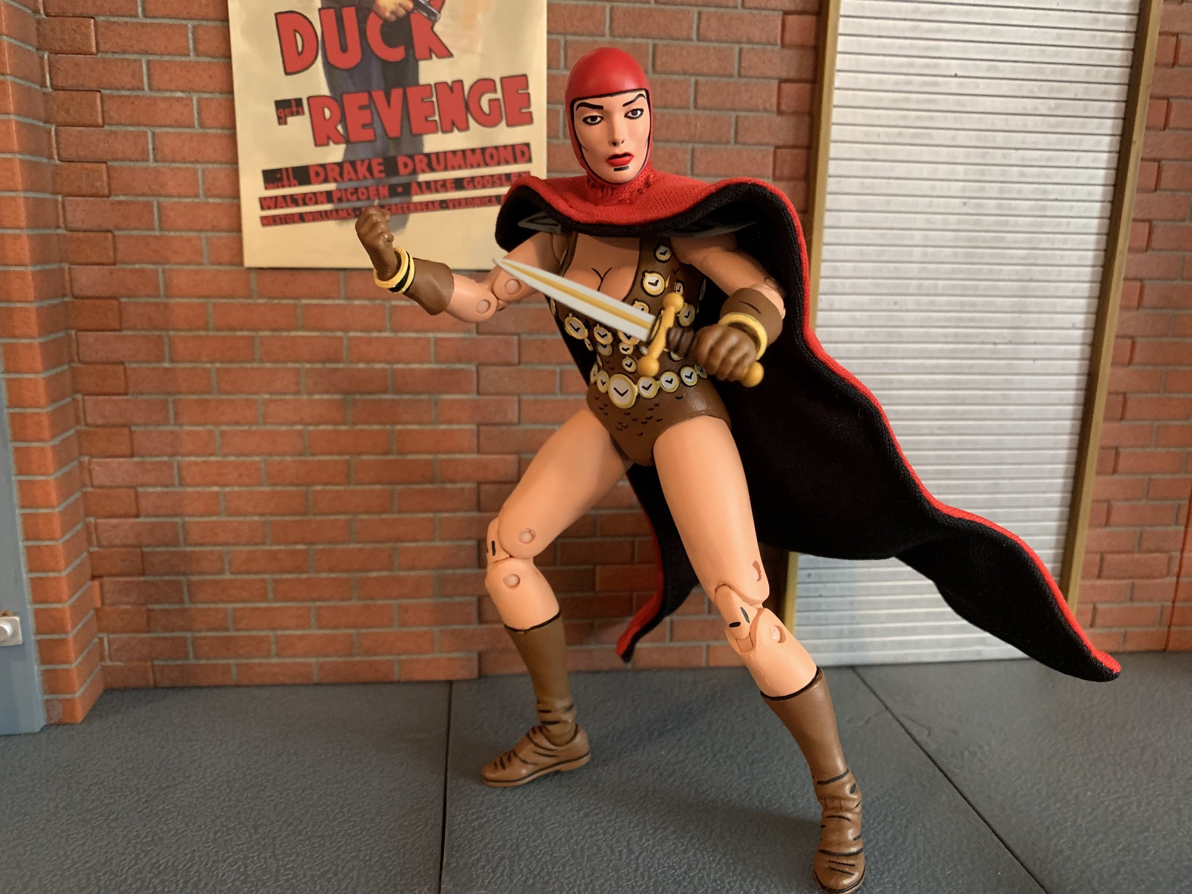
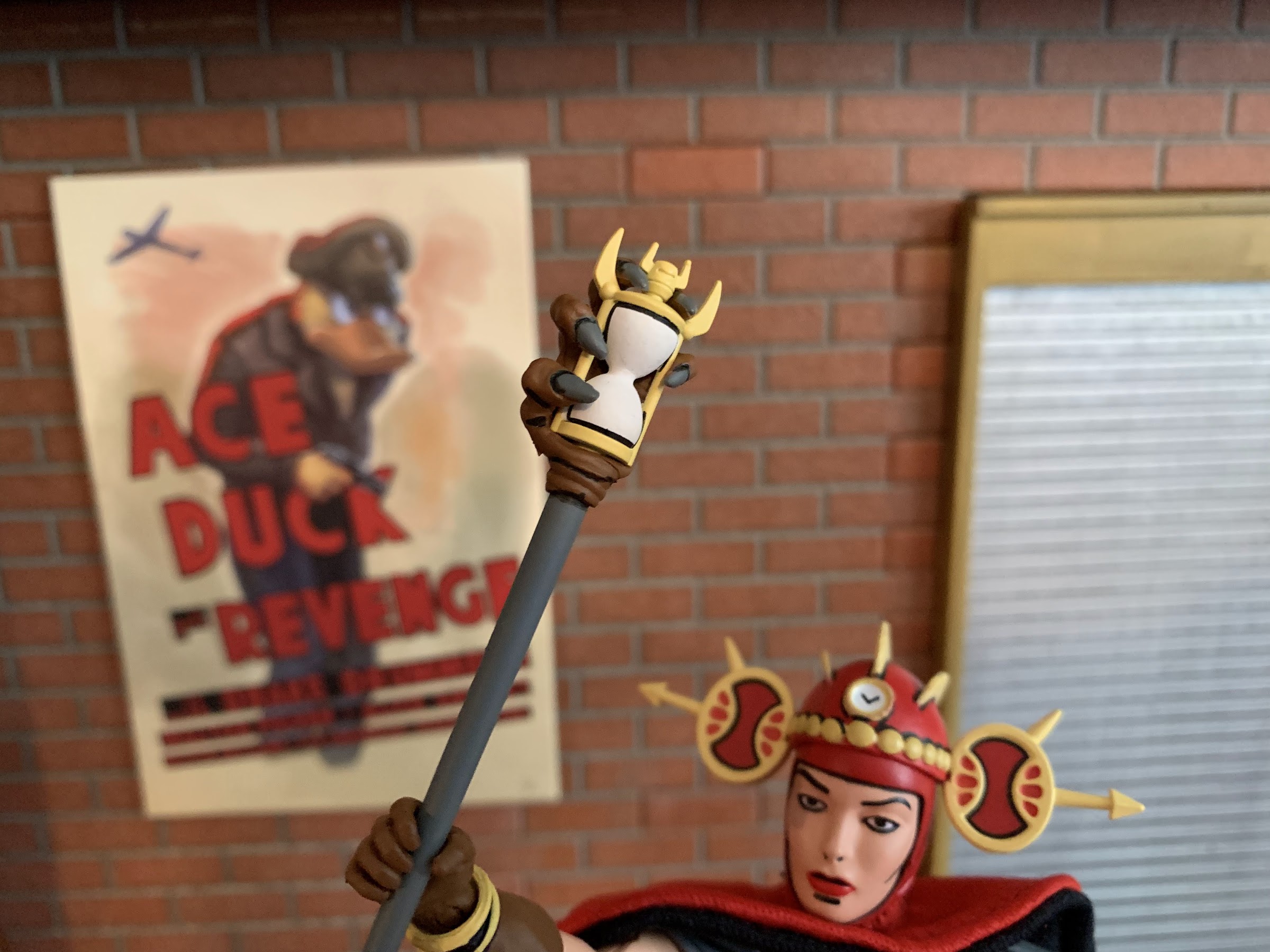
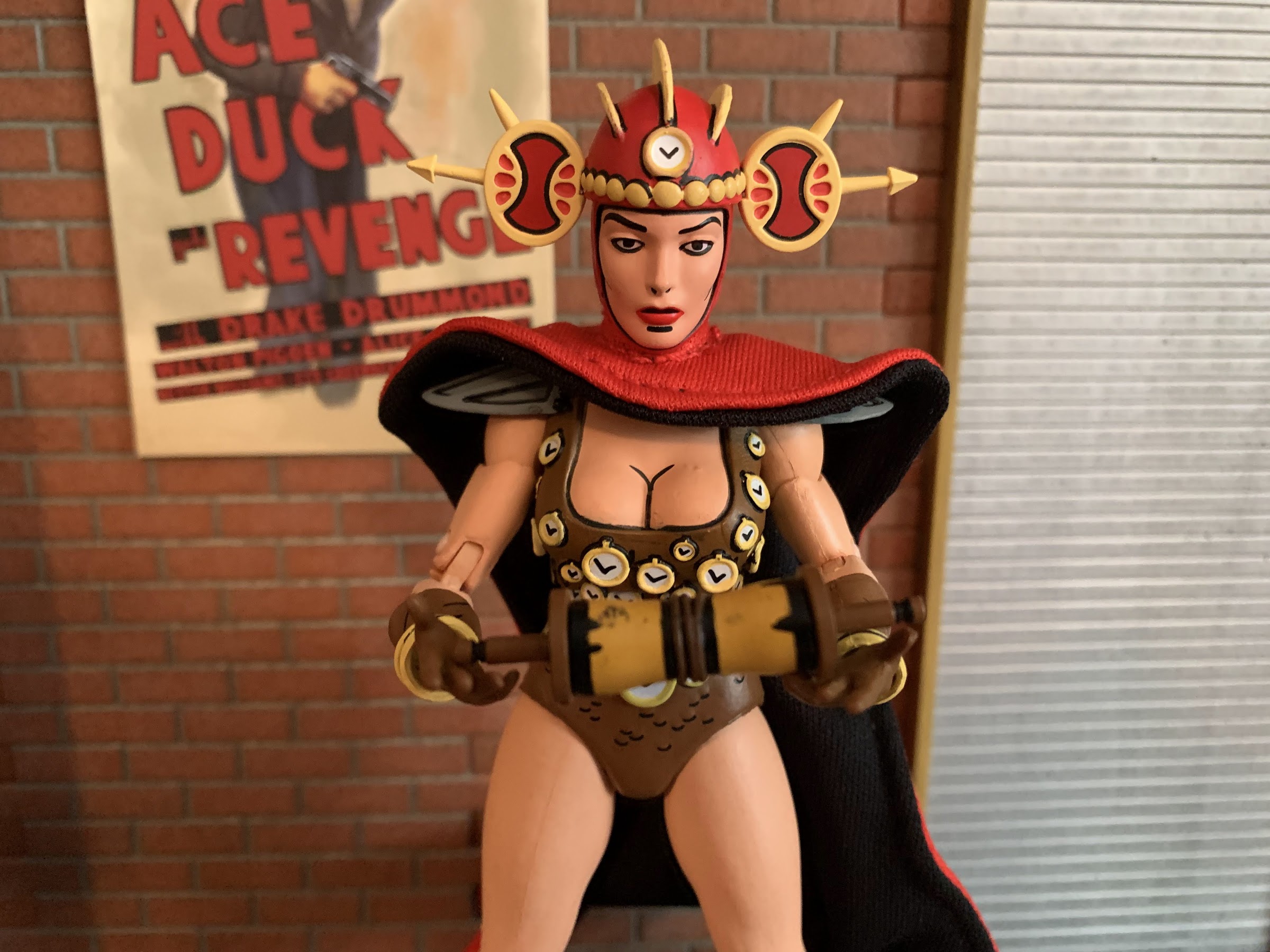
All that aside, Renet is pretty damn good figure. That’s the frustrating part as it would be nice to just voice with the wallet and skip the release all together, but the product is good and it’s not like sculptor Jon Matthews is responsible for how the thing is sold. Renet, if you’re unfamiliar with the character, debuted in issue number 8 or the Mirage Studios run. She is the Mistress of Time and carries the Sceptre of the Sands of Time which, as you probably could have guessed, affords her the ability to manipulate time. This leads to a time-hopping adventure with our heroes which would be adapted in both the 2003 cartoon series and the 2012 one (she kept her blue clothing in both, by the way). Given that there are so few female characters associated with the brand, it makes sense to turn to Renet fairly early in the relaunch to provide some variety out of the gate.
And if you want to go hoodless, she has this little piece to go over her neck that resembles the hood.
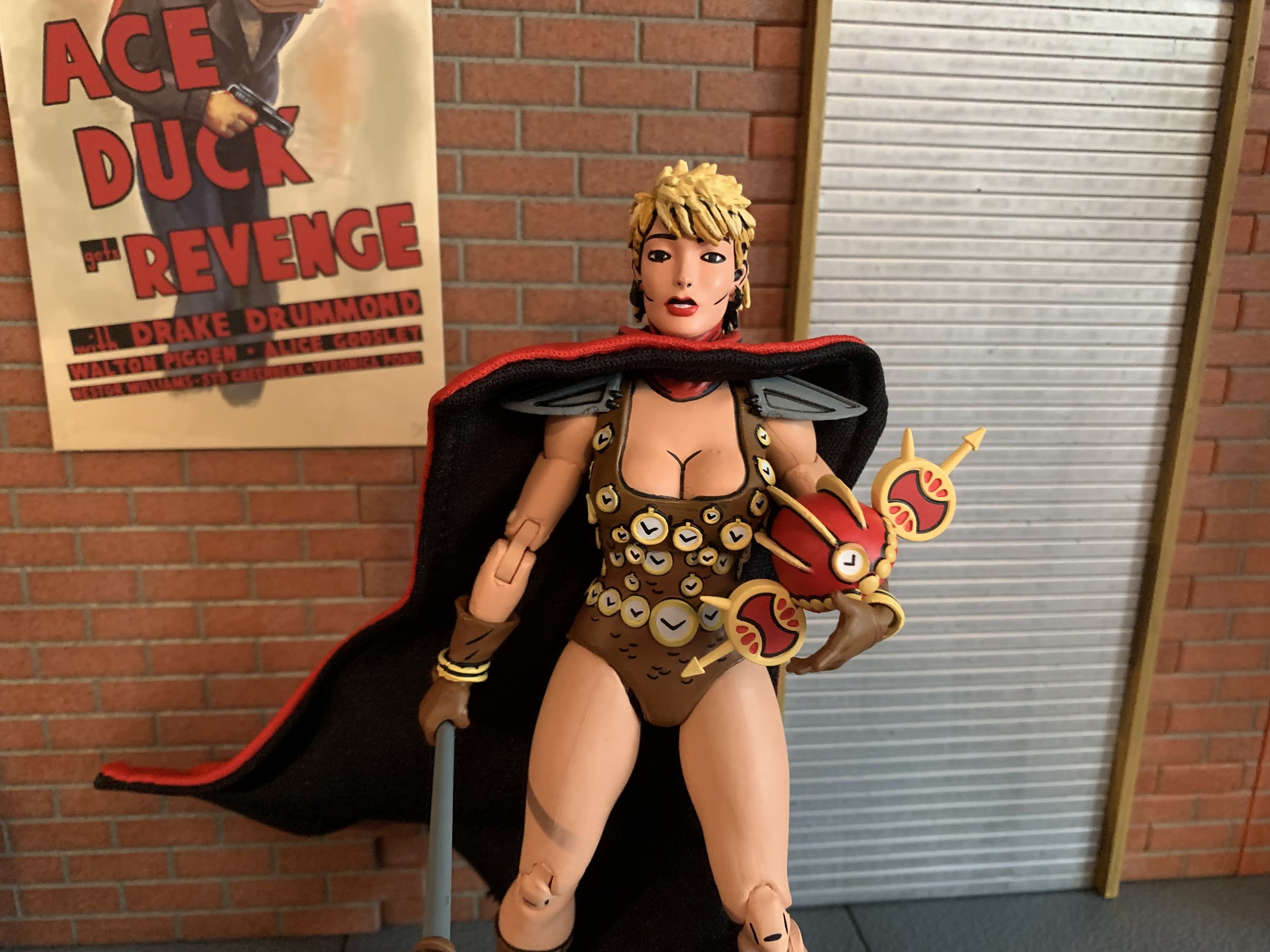
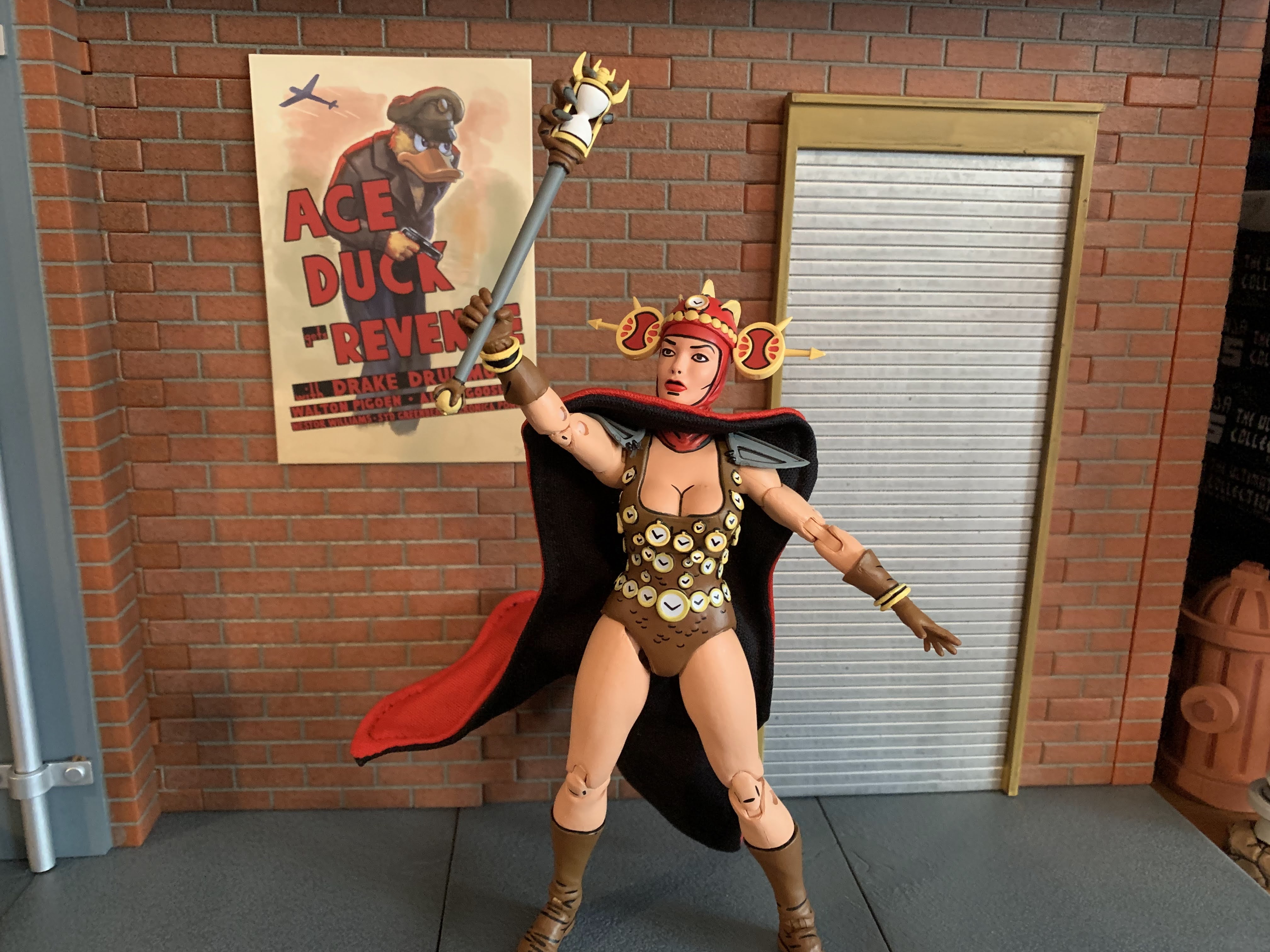
The figure arrives in the trapezoid styled box that Fugitoid came in complete with new artwork from Kevin Eastman. Renet stands approximately 6″ in height and feature the unfamiliar color combo or red and brown. Her default portrait features a red hood with a removable helmet that’s also red and accented with yellow. Her actual costume, which is essentially a one-pieced bathing suit, is brown and adorned with numerous clockfaces which are all sculpted details, and not decals. There’s some black linework to make the suit appear to be armored and she has gray shoulder pads, brown gloves, and brown boots. Every inch of this figure is painted and given the numerous clockfaces on the costume it’s really impressive that there’s little in the way of paint slop. If you go hunting for it you’ll probably find a clockface that isn’t perfect, but it’s rather remarkable how well the paint turned out. And I can say I saw three figures at Target and all three looked great. There’s the customary linework as well on the clothing and even some of the flesh portions like the knees and elbows. The only detail I don’t care for is the black line under her mouth which I just don’t think needs to be there. Otherwise, the paint is terrific.
The sculpt all around on this figure is exceptional for what is a mass produced item.
The sculpt for Renet is equally wonderful. The clocks I already mentioned and they’re a nice touch. The clock hands on each face are painted on so I guess if you have exceptionally high standards you can take NECA to task for not sculpting those, but I think they look good. Renet’s face and hair looks very true to the source material which was a bit rugged back in the day. Eastman will readily admit that he felt they had a hard time drawing females in the early days and it was something they worked hard to refine. I think she looks good though and her body certainly isn’t lacking for curves as she’s rather buxom. I like that her legs and arms have some shape to them though like she is strong and capable. This is in contrast to a lot of Marvel Legends where I feel their females tend to be too thin and lacking in muscle definition. Other sculpted details on the figure include wrinkles and creases in the gloves and boots which simulate the look of leather very well. The shoulder pads have sculpted indents in them too. Renet’s unusual helmet is also handled well with sculpted ridges and those weird ovals on the side.
And it’s not just the figure, the accessories are well-sculpted and well-painted too.
This scroll contains basically the only paint imperfections in the set. I can live with it.
Renet also comes packed with the standard assortment of articulation we’ve come to expect from NECA. The head is on a double-ball peg that allows her to look up, down, rotate, and tilt. Her shoulders are ball hinged and she can raise her arms out to the side to a horizontal position and rotate around. The shoulder pads flex so they don’t get in the way much, but I would recommend not rotating all the way around to not damage them. There is a biceps swivel plus double-jointed elbows which is great to see. NECA has, in the past, seemed resistance to double double-hinged elbows on characters without sleeves and I’m glad to see they’ve moved on from that fear. The wrists rotate and hinge horizontally. In the torso, there is a diaphragm joint, but it basically just affords some rotation with no forward and back. You will want to be mindful of doing much here too since the sculpted timepieces could get damaged. Because of that fear, I consider the joint functionally useless. At the hips are ball and socket joints that allow Renet to do splits. The crotch is a soft plastic so you do want to watch out for paint rub there, though mine seems okay. The thigh can rotate on that ball a bit and the knees are double-jointed. There is no boot swivel, and the ankles hinge and rock side-to-side. Lastly, we have the wired cape which is basically part of the articulation. It works very well and will allow you to position it as you see fit. My only issue with it is that it doesn’t always want to sit flush with her chest. The articulation here is serviceable. I wish she had some vertical hinges on her gripping hands and it would have been nice to get something out of the diaphragm joint. I like how the legs turned out though as they look terrific since the only visible joints are the knees. It’s a very clean looking figure so if the articulation isn’t going to amaze then at least it’s not contributing to some ugly cuts in the plastic.
This head looks awesome too, I just wish I had a place for it in my display.
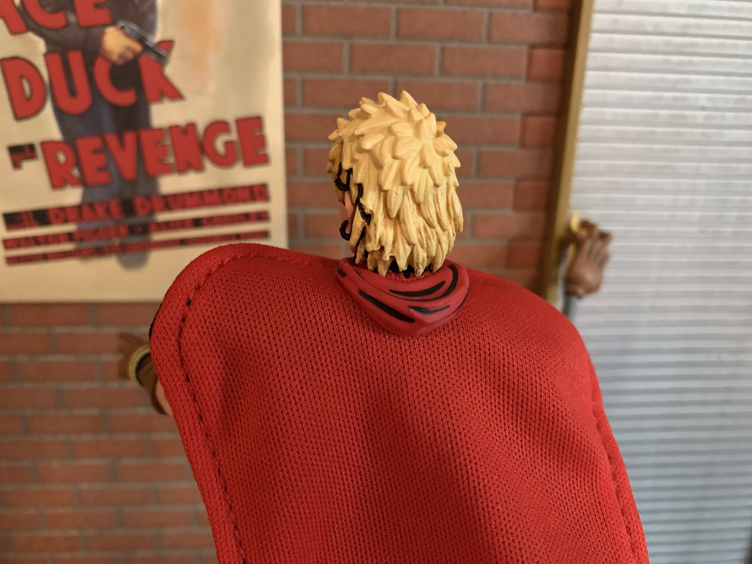
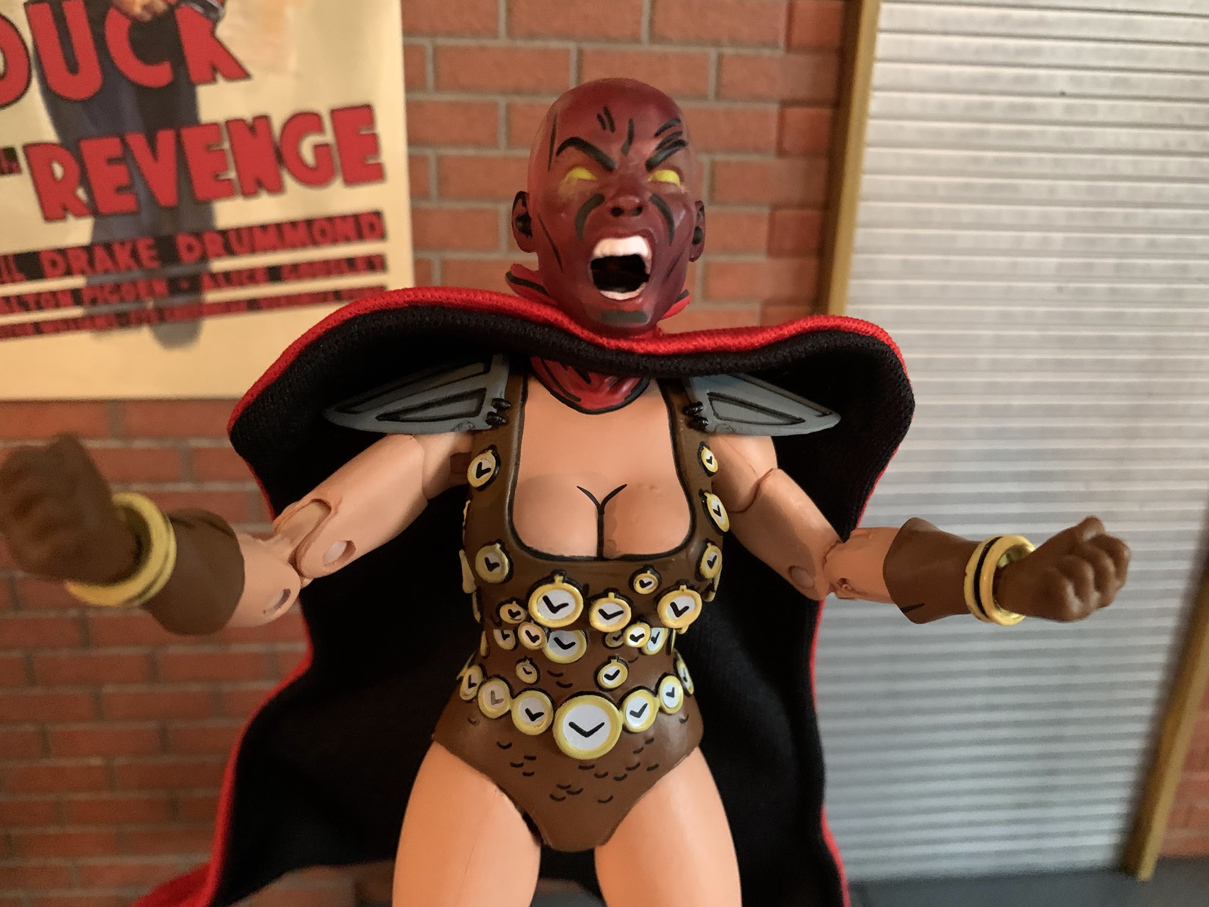
Renet also comes with a pretty solid assortment of accessories. For hands, she has a set of open hands, fists, and gripping hands. For those gripping hands she has a scroll she can hold loosely. It’s brown and a yellow-gold on the parchment and is really the only instance of paint slop on my set as there’s a black blob on the yellow. She also has a dagger which is painted rather well and easily slips into her gripping hands as the fingers are fairly flexible on both. She also has her sceptre which looks terrific. The top of it is a monstrous, clawed, hand gripping an hourglass and it’s incredibly well-painted. The only thing that would make it look even better would be if it had an actual hourglass in it. The bottom of the staff also features another claw gripping a gold ball. Just a really cool accessory. Renet also have an alternate portrait with her hood down. There’s a piece of red plastic that serves as the hood which can be placed between her head and cape and the illusion is well conveyed. Her expression on the alternate head is one of concern which is contrast to the strong, stoic, default portrait. She’s also sporting a mullet, which is amusing. I don’t know if I’ll ever use this other head, but it looks good. Lastly, she has a third head which is actually not of her, but Lord Simultaneous. It’s done in transparent red plastic and is accentuated with some black linework and yellow eyes. It looks really cool as the face is screaming, I just don’t know what to do with it. I wish NECA had included a transparent stand for it, just a tall post, for display purposes. The head can be placed on the figure, but I can’t imagine many using this head for their display in such a fashion.
Never would I have imagined Renet serving as the centerpiece of Mirage shelf. Also, I need another shelf.
Renet the character is not one I have ever been particularly attached to, and the wrong color presentation initially lead me to believe I could pass on this release. Then I saw it in-store and found myself giving in, and that’s because this is a really well done figure. The sculpt is terrific and the paint somehow even better. I love the inclusion of the wired cape and she comes packed with plenty of accessories. And if you find her at retail, she should only cost you around $35. Some places tack on a few bucks, but if you shop around you can probably find a good deal on this one. Ignoring the garbage that is the release model for the blue version, this is worth your while if you want to add Renet to your Mirage Studios TMNT collection. The relative obscurity of the character means that Renet will likely be the favorite release in this line of few, but she might be the best overall figure that NECA has done so far in the Mirage line and that’s some pretty high praise.
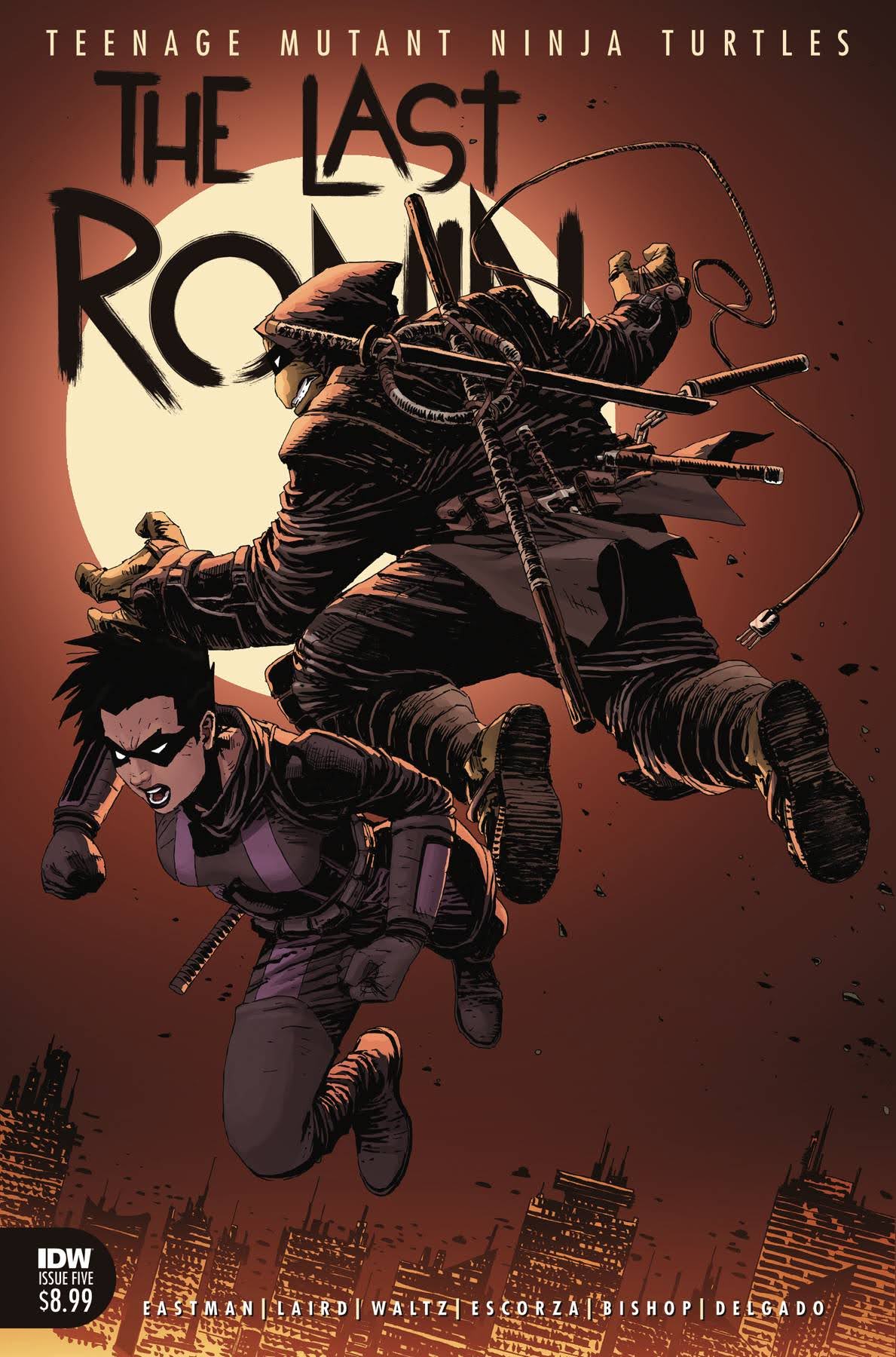
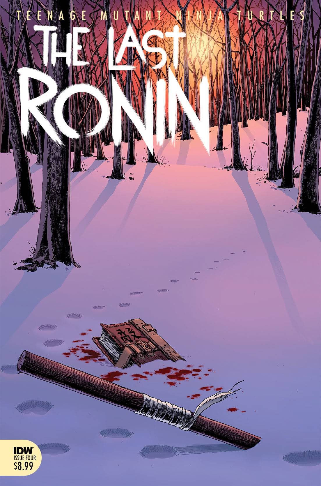
After lending Tuesday to the gargoyles for one week, the turtles are back on Turtle Tuesday and this time it’s for the latest (and final) issue in the The Last Ronin storyline. The Last Ronin is a concept for the final story of the Teenage Mutant Ninja Turtles dating back to the days of Eastman and Laird. It was decided in 2020, after issue #100 of the modern IDW series, that the time was right to tell this story. Despite being only five issues, it took awhile for the series to finish as multiple episodes were delayed with the final issue being the longest such delay. If it’s done to tell the best story though, then who cares? It’s here, and now I’m ready to talk about it.
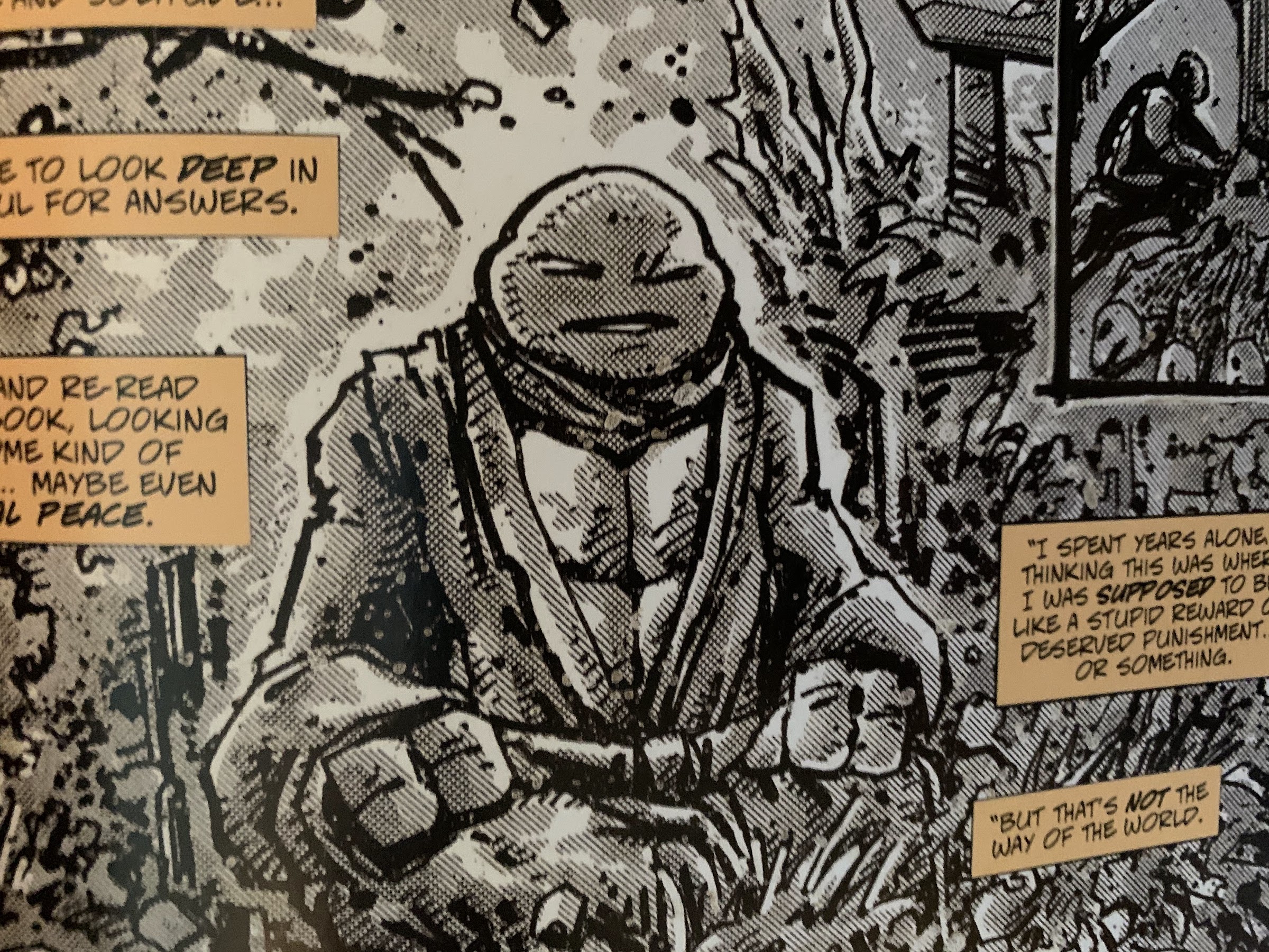
The Last Ronin tells the tale of the last of the Ninja Turtles. The first issue introduced this dreary future where New York is controlled by a descendent of Oroku Saki and times are bad. We get to see the last turtle on a suicide mission that’s basically a failure, since the villain isn’t toppled and the turtle isn’t dead! Over the next three issues, the plot advances quite slowly as Ronin (yes, I’m still committed to not spoiling anything) acquires some allies, but we also see lengthy flashbacks detailing how each of the brothers fell and the present came to be. The violence is not gratuitous, so while seeing our beloved childhood heroes actually dying is uncomfortable, it wasn’t exploitive in any way. The flashbacks are over though, and the stage is set for the final confrontation.
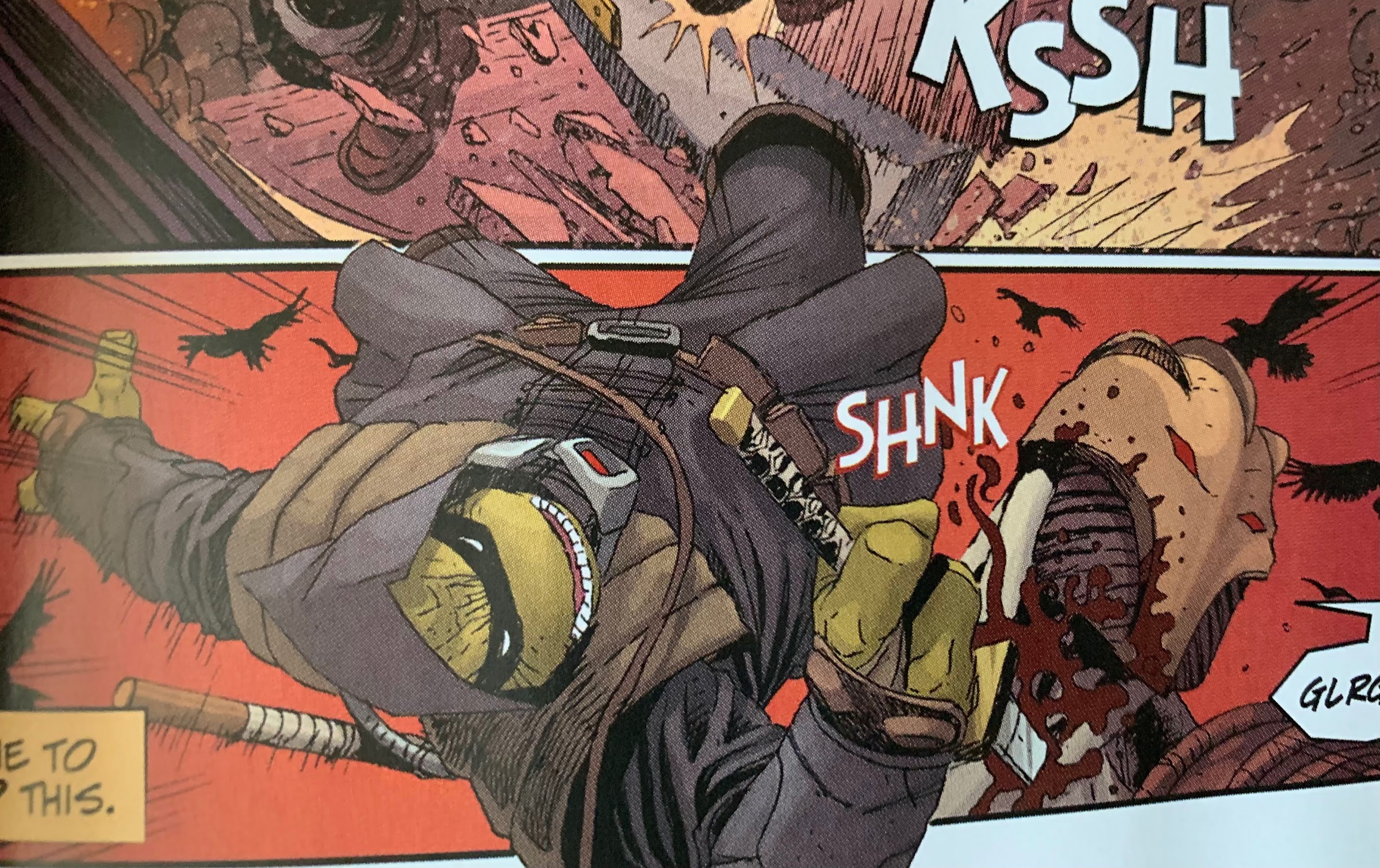
From that perspective, issue 5 delivers. We see Ronin go after the big, bad, guy of the series with the intent being to kill him or die trying. There is a B plot to the story as well, so it isn’t just straight action, but it’s not the most compelling of B plots. It’s merely a plot device to keep Ronin isolated from his allies. Otherwise, this is a brisk read as it reads almost like how a video game plays with Ronin dispatching of the fodder with minimal challenge before getting to the boss. Roughly half of the book is reserved for that battle and there is a wrinkle tossed in that Ronin needs to overcome in order to actually inflict damage upon his foe, but otherwise it’s pretty straight-forward.
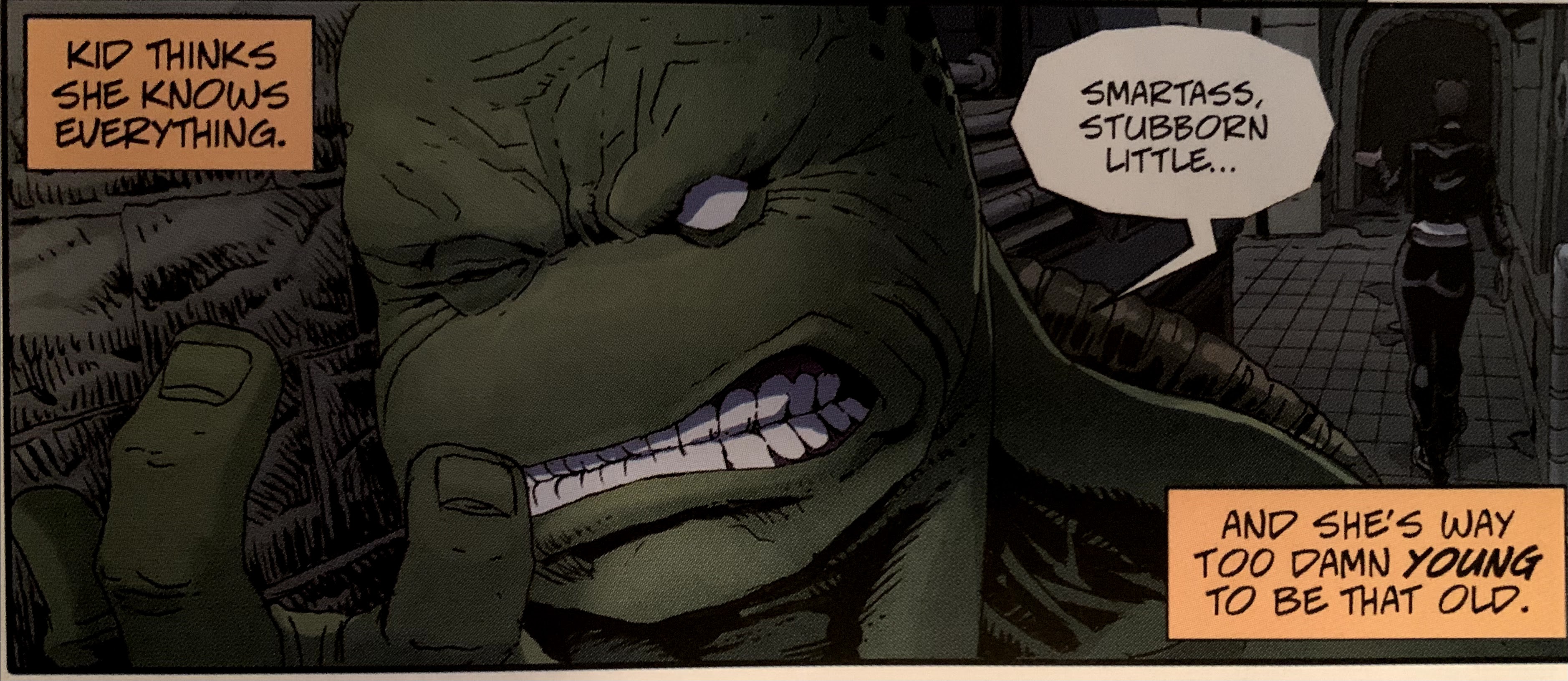
Ronin being so sick of the guilt and grief associated with his past trauma that he wants to banish his brothers forever is an interesting plot device that could have been expanded upon.
And if that’s all you wanted, you’re probably happy. For me, I found the first issue very intriguing, but every following issue was less interesting. The gravitas of this story demanded something a bit more epic, but we don’t get that. We don’t really get much character development either, only finally getting a glimpse of such at the start of this issue as Ronin tries to banish the “ghosts” of his brothers once and for all. It’s assumed they’re a figment of his imagination, but it was interesting to see how Ronin feels each brother views him. It might be something more interesting for me as someone who has not read the IDW series as I don’t know if it’s a lot of re-tread, but for me, it was the best part of the finale. The ending was very predictable. That’s not necessarily a weakness as many stories have obvious outcomes, but there wasn’t anything special tacked-on to that end to earn it.
What largely remained a strength of the book for all five issues was the artwork within. The Escorza brothers brought it, and not just in a technical sense. I really enjoyed the look of a lot of the characters in this series. The flashback turtles had a neat construction about them that was a bit more modern, but also implied a grizzled lifestyle of battling crime. I love the look of Ronin, and the action in this was easy to follow. The only thing I didn’t care for was the battle armor of the ultimate foe, who looked like the Shredder crossed with a costume from Tron. Eastman gets an art credit as well, though this time it’s not obvious to me which section. It’s possible that credit is just there because some of the variant issues feature a cover by Eastman.
If you were just looking for some action from a cool looking turtle then you are probably quite content with The Last Ronin.
Were my expectations unreasonable? Perhaps. It’s possible they always intended for this to be a very straight-forward tale for how the turtles could end up. There are certainly a lot of similar stories in cinema and television that are much celebrated, but I think all of those do a better job of developing the characters. I’m just left feeling like this could have been one issue, and considering the impact that first issue had, maybe that would have been the way to go? It’s possible I’m in the minority as well. I just wanted this story to elevate itself above other TMNT stories similar to how Logan elevated itself above other X-Men films. It’s certainly not a bad read or anything, it just doesn’t leave a mark on the franchise or the main character. Hopefully for IDW I’m in the minority as the issue ends with a “To be continued…” The story of The Last Ronin is complete after this issue, so I’m left to assume any future stories will center on his allies. Personally, I’m not interested, but others might be.
The Last Ronin #5 is currently on-sale at your local comic book stores. If supplies have already been depleted, rest assured there will likely be a trade paperback collecting all five issues. It also looks like there may be future director’s cut styled issues to come as well. Needless to say, you shouldn’t have to pay 20 bucks or something on the secondary market to experience this issue.
I’m having a hard time coming up with an action figure line that has had retail releases separated by more than a decade. I don’t mean long-running lines of figures like G.I. Joe or Marvel Legends which have been around for decades, I mean a line that was started, ended, then re-started like NECA’s line of Teenage Mutant Ninja Turtles action figures based on the work of Mirage Studios. That source is the original incarnation of the green machine made famous in the late 80s by a cartoon, video games, toys and movies. The Eastman and Laird turtles were of a different mold: more violent, less polished, and with less color. If you’ve ever been into TMNT then you likely know all of that already as it’s pretty well-covered at this point.
It’s pretty cool to see Kevin Eastman’s art on an action figure box in 2022.
When NECA first got permission to do figures based on Teenage Mutant Ninja Turtles, it was via a deal they struck with Peter Laird and Mirage Studios to bring the original turtles from issue #1 to comic book shops. It was in 2008 when those figures hit stores, and they would be followed-up with a black and white variant as well as an April O’Neil. After that, things came to a halt. NECA unveiled a Shredder, but it was cancelled. It’s unclear if the line was ended because the sales weren’t there (NECA’s Randy Falk has indicated in the past that consumers aren’t that interested in pre-toon TMNT) or if Playmates had something to do with it being that they held the master toy license and had really never been challenged on it. Playmates definitely wasn’t happy, and would remain a challenge to getting non-Playmates TMNT toys to retail for awhile longer, but I suppose it doesn’t matter as the line did indeed come to an end.
This paint job is amazing.
Since then, things have obviously become better for NECA where TMNT is concerned. The company has been able to branch out while turtle nostalgia has taken off. Once Laird sold the property to Viacom, it seemed to open the door for non-Playmates action figures, likely because Viacom is big enough to toss its weight around if Playmates starts threatening legal action or something. NECA was able to find a loophole that allowed it to produce TMNT action figures as convention exclusives, and in 2016 the company finally got that Shredder out they had unveiled nearly a decade earlier. And he came with a trio of henchmen too making the Mirage subline feel relatively complete. As things progressed and NECA brought TMNT to retail, there wasn’t room for more Mirage Studios figures, until now.
And unlike some companies, NECA doesn’t cheap out on the paint when it comes to the rear of the figure.
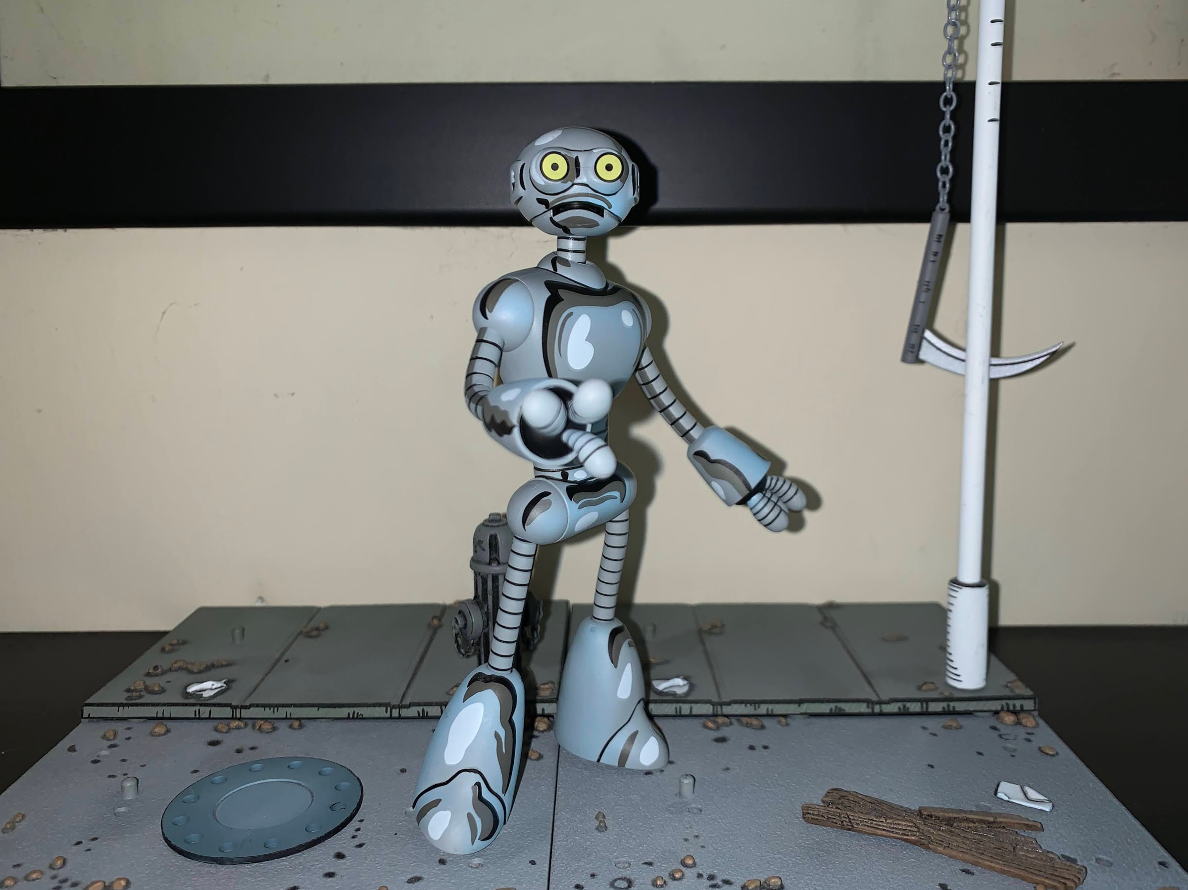
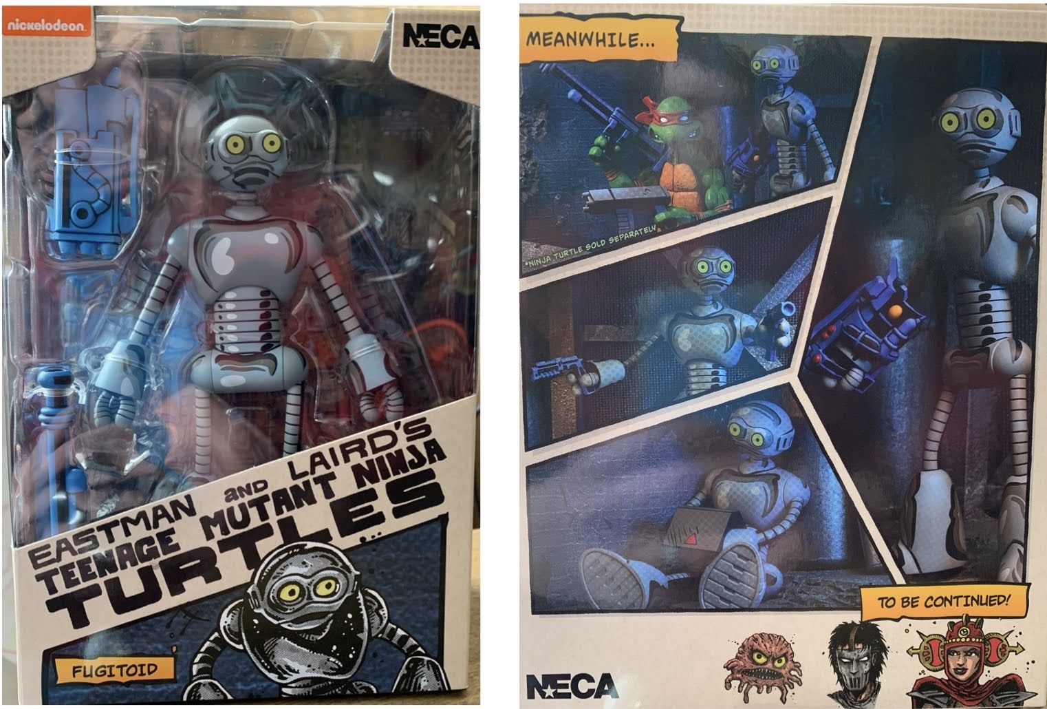
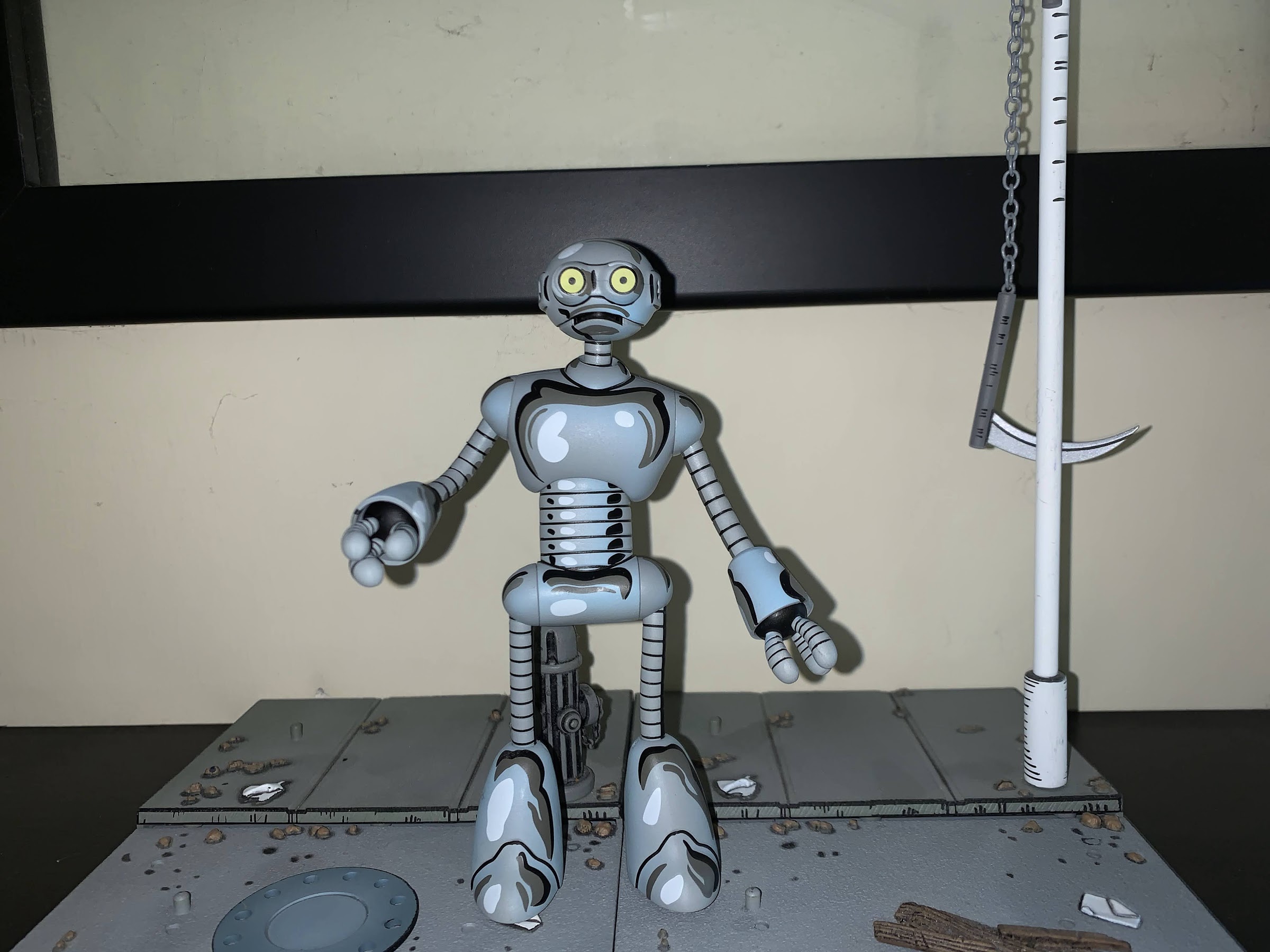
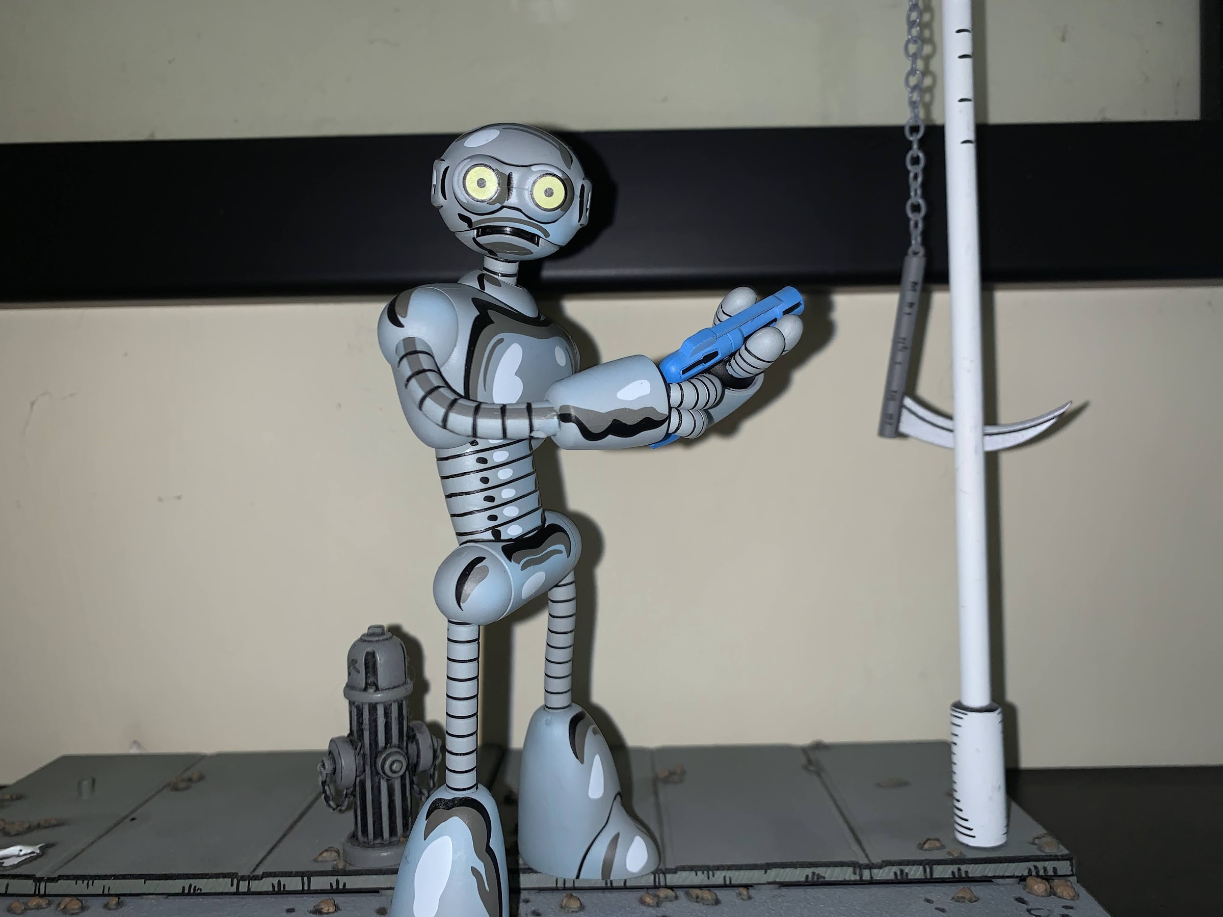
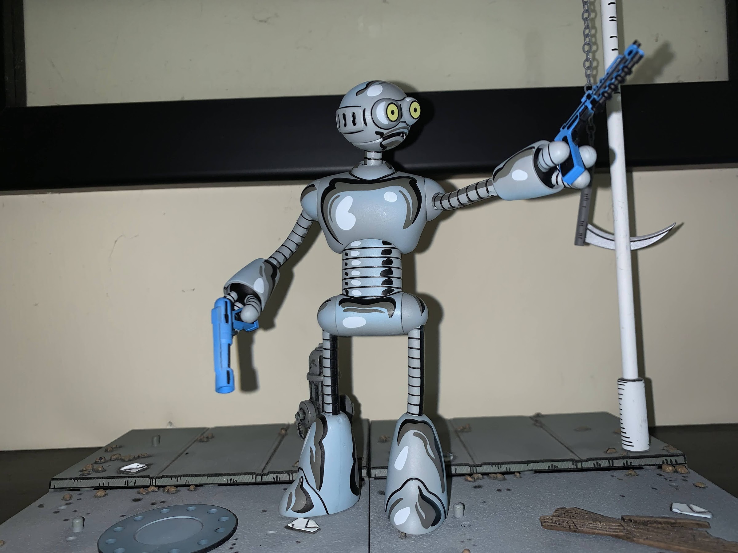
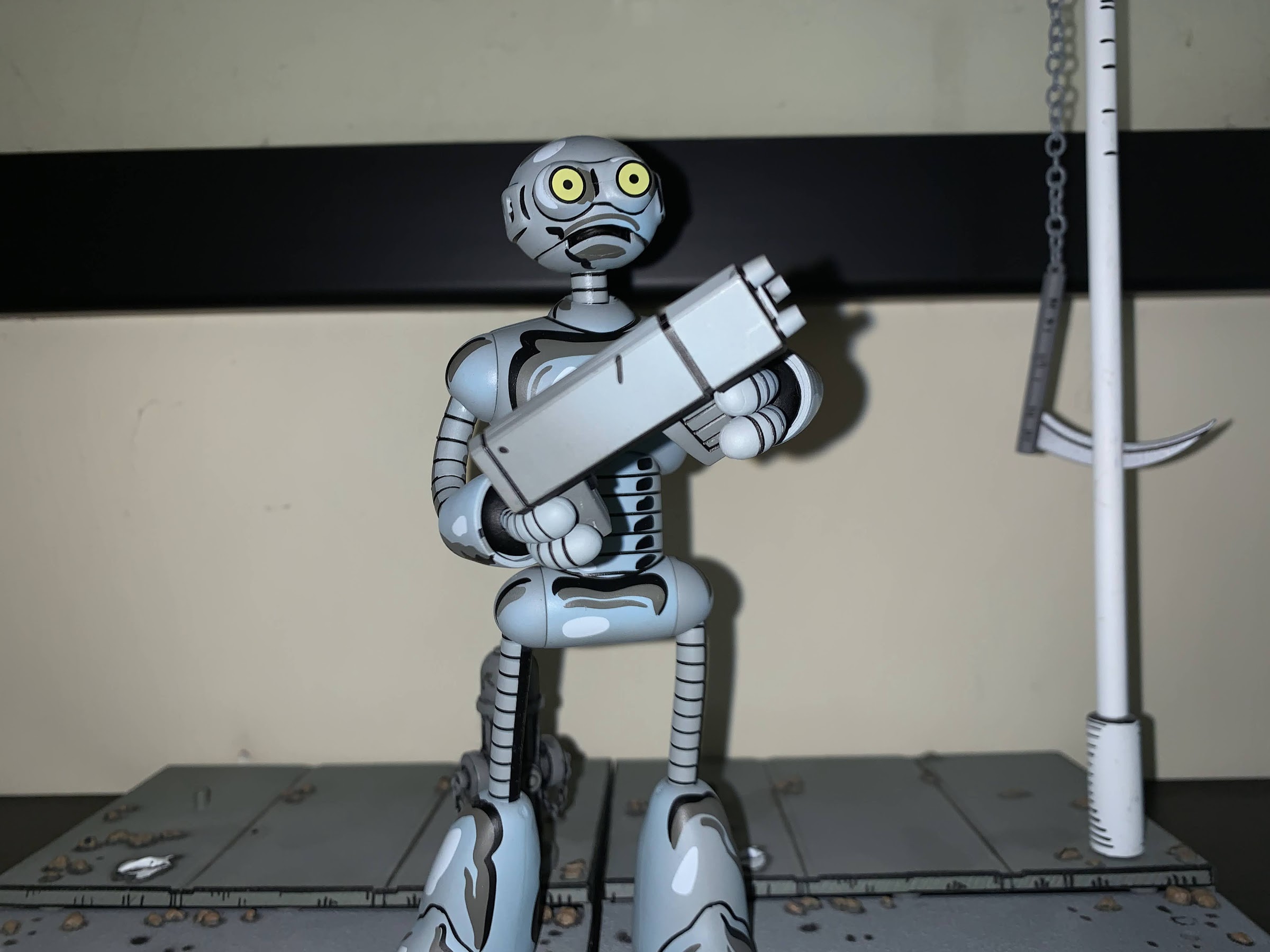
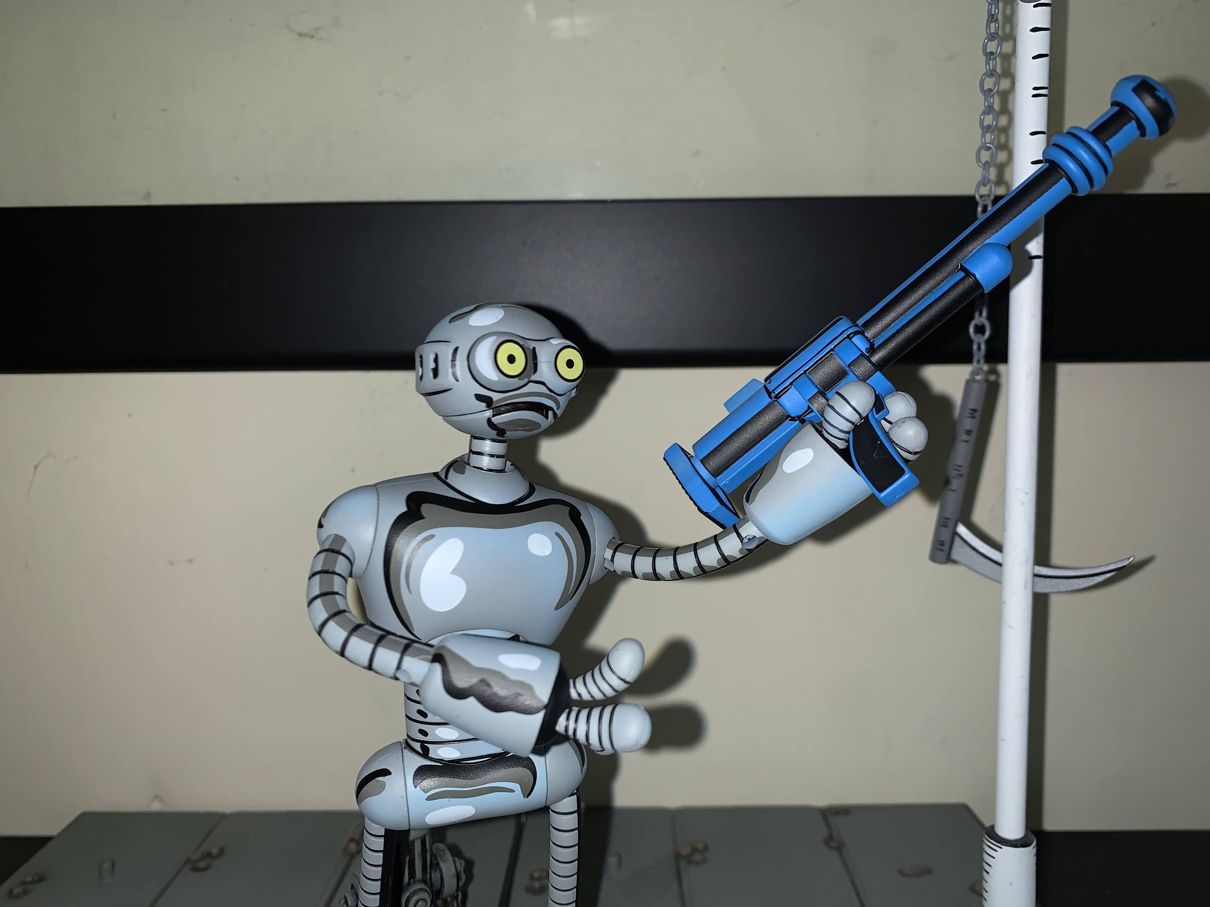
Relaunching the Mirage Studios line in 2022 is Fugitoid, a character arguably made famous by Teenage Mutant Ninja Turtles, but who actually came first. Fugitoid is an interesting character when you factor in that the Mirage version of the TMNT are often associated with violence as Fugitoid is a noted pacifist. Not that it stopped NECA from including a small arsenal with their figure. He’s the displaced Professor Honeycutt who after an accident found his mind transferred to the body of his loyal, robot, sidekick. He never made the jump to animation in the original cartoon series, but still received an action figure from Playmates. He would show up in later iterations, and in future toy-lines, but the Mirage original has been waiting on the sidelines (like just about every Mirage version of a classic character).
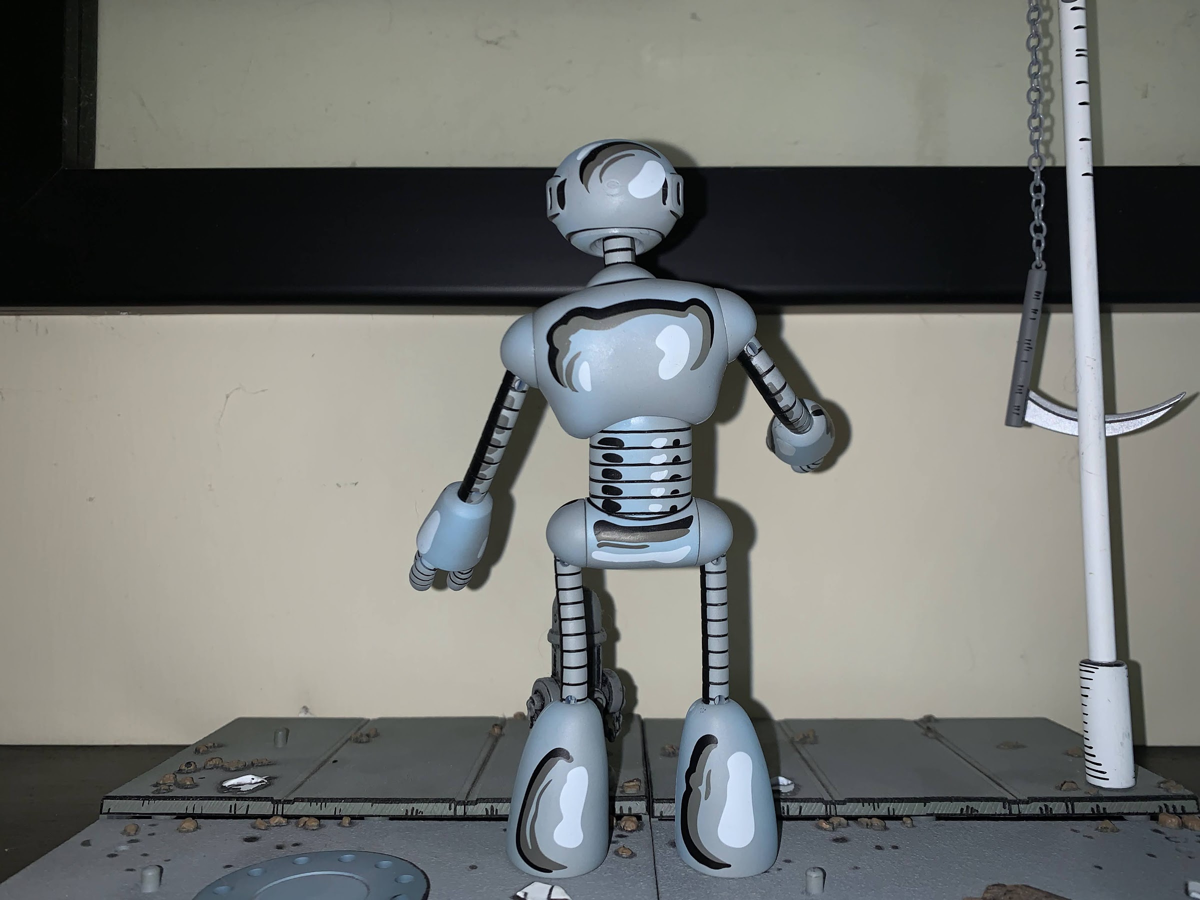
The articulation on this guy is a bit weird. That’s probably as steep an angle you’re going to get for an “elbow.”
Looks like he’s giving up on pacificism.
Despite all of my talk about Fugitoid being the next figure in a long dead line, he is numbered 1 for this relaunch. While there are likely more fan-favorite characters out there, and there’s certainly a lot of collectors out there that missed out on the previously released figures, I would say Fugitoid is a worthy figure to kick things off. He’s certainly an interesting one and I’m curious how much of a reflection this figure is of what’s to come. From a packaging standpoint, I’m guessing he’s very indicative as he comes in a window box adorned with artwork by co-creator Kevin Eastman. It’s an attractive box, but not so attractive that I am tempted to keep it (the best kind of packaging). There are three editions of the figure released to retail : standard with black font, signature edition with blue font, and signature edition with black font. The standard edition is self-explanatory, while both signature editions come with a little piece of card art signed by Eastman. The black font variant is either an error or was originally planned to be a surprise. Fugitoid is being released via NECA’s Haulathon event which was originally advertised as featuring surprise variants at retail. Perhaps that was nixed in favor of just charging extra as the standard version is $32 while the signature version is $100. Even though the black version of the signature variant looks like the standard version, the UPC is correct if you find it at Target which has probably caused some confusion at the register. I also saw more than one confused collector who received a black version via Target.com and thought they were sent the wrong one. You can see the art card behind Fugitoid in the box, in case you’re confused about which version you may be staring at.
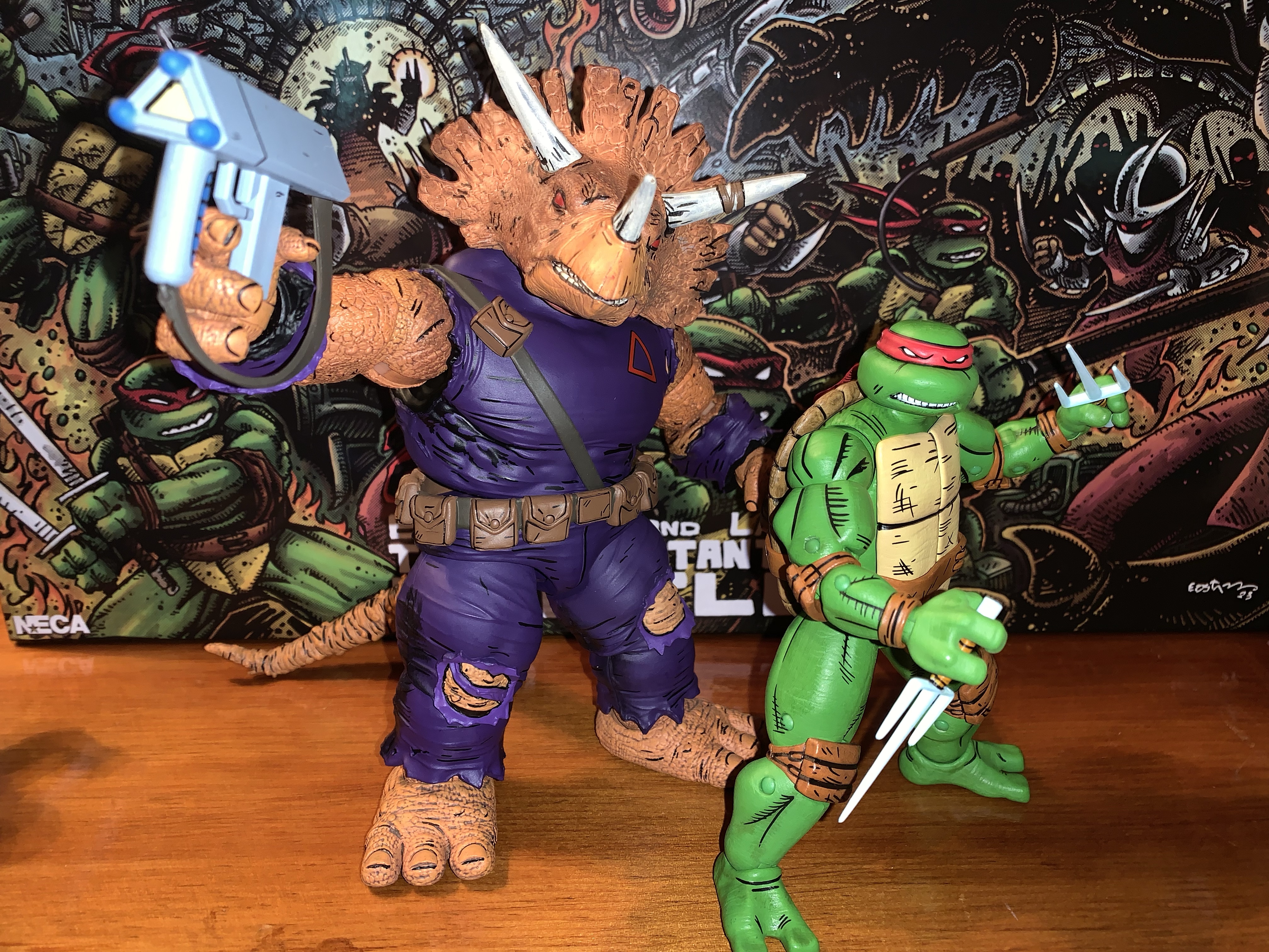
I do not have a specific memory for the pistols, but I know this one comes from the Triceratons.
I, being an opener and not really interested in Kevin Eastman’s signature (no offense, Kev), went with the standard version. Fugitoid is a very unique entry in this line, or any NECA TMNT line, because of his design and construction. First of all, he’s cast in gray plastic and stands around 5.5″, but the deco designed by Geoffrey Trapp and Mike Puzzo aims to recreate the character’s look in the comic. It’s a very aggressive approach, and I have seen some turn up their nose at it, but I for one love it. He looks like he stepped out of a comic book and the shading really matches the unique look of the Mirage books, something natural lighting just can’t reproduce. He looks perfect and while Fugitoid is not my favorite design from the world of TMNT, it wouldn’t be hard to make the argument that his likeness is the best yet from any TMNT line by NECA.
The little guy doesn’t even know what to do with this one.
Where things might change for people is how the figure is constructed and articulated. Fugitoid is basically a head, body, hands, and feet, joined by cables. He reminds me a lot of Blinky from Bucky O’Hare, and like the Blinky figure released by Hasbro in 1991, Fugitoid features bendy wires for his limbs. There’s no elbow or knee articulation, just bendy wire coated in plastic. It looks good, but you’re never going to get the same kind of posing out of this approach as you would plastic joints. Aesthetically though, it’s hard to imagine NECA finding a better solution. Where things are a bit more confusing is in the choice to go with just swivels at the shoulders and hips. NECA probably opted for that approach to preserve the aesthetic as much as possible, or perhaps there were issues with having the wired limb end at a ball hinge. Whatever the reason, it’s disappointing as I think a ball hinge in both spots would have been fine from a visual perspective, and it would have given the figure much better range. At the head you have what is likely a ball joint that works just fine to let the character look up, down, and all around. The feet feel like they have a joint in there as they turn just fine and the hands can rotate. The upper torso can tilt and move forward and back slightly as well. Fugitoid is not going to be very dynamic, but it’s obvious that NECA opted for aesthetics over articulation and it’s hard to disagree with their choices here (excepting the lack of ball joints at the hips and shoulders).
Always remember to secure your turtles.
Fugitoid does come with a lot of stuff, most of which isn’t really for him. He almost feels like an accessory pack as a result. He does have three sets of hands which just plug into the ends of his arms rather easily. He has just three fingers composed of coils that just sort of pop out of the ends of his arms. He has two sets of gripping hands, one tighter than the other, and a set of “open” hands. They’re more of a style pose hand, I guess, but quite suitable for the character. He also comes with four different guns all sourced from the comics: two blue pistols, one Triceraton pistol, and a blue, long, rifle. I don’t know exactly what issue each comes from, but they all look great as they have a similar deco to the figure. If guns aren’t your thing, he also has a set of Triceraton “handcuffs.” It’s a big lump of plastic that the hands are designed to go into. It can fit on Fugitoid, but is likely intended to be worn by a turtle. The other gun is definitely for the turtles as it’s from the Donatello one-shot. It’s a forearm canon that fits over the forearm and it’s really cool. I put it on my Donnie immediately and I don’t plan on taking it off. As for the other guns, I don’t know what I’ll do with them. It feels wrong to have Fugitoid posed with a weapon, but also equally wrong to put a gun in the hands of the turtles. I like the look of all of them, but I don’t know what to do with them.
Best accessory in the set? This one!
NECA’s return to Mirage Studios is a welcomed thing and Fugitoid is a character worthy of getting things restarted. I wish he wasn’t exclusive to Target as the line had been billed as something for comic shops and specialty retail, but I suspect that’s where he’s headed once this Haulathon nonsense is over. He doesn’t seem terribly hard to find as I was able to get mine online, but also came upon sets at physical locations too. I think he looks great and his price-point is on the low end (provided you’re not talking about the signature version) for stand-alone NECA releases these days. Especially considering the tooling for this guy is unlikely to bare fruit elsewhere. The articulation is not great, and while the accessories are plentiful, they’re not all particularly useful. At the same time, what else is there to include for a Fugitoid? He’s not missing anything, so I’m fine with the accessory loadout. And more importantly, I love how the figure is presented. That deco is fantastic and I’m excited to see the line move forward. We’ve seen two of the next three releases: an Utrom body and Renet. The third is probably the one people are most excited for, Casey Jones, who has yet to have a full reveal. And it’s a given that the turtles are coming back too and it sounds like in a new form. Those old figures are great, but would merit updates in 2022. Plus they’ve been bootlegged to hell and back and it’s been rumored that the tools were actually stolen so it’s unclear if NECA could re-release them if they wanted to. My guess is we’ll see the new ones around San Diego Comic Con time. For now, I’m going to enjoy what we have and wonder about what other exciting plans are in-store for this line. It’s great to be a TMNT fan!
The days of this shelf being able to hold all of my Mirage figures may be coming to an end.
The wait was a bit longer than originally anticipated, but the fourth issue of the Teenage Mutant Ninja Turtles flash-forward story The Last Ronin has arrived. If you are not familiar with this story, The Last Ronin was a concept first kicked around by TMNT co-creators Kevin Eastman and Peter Laird back in the late 80s/early 90s about a final story for the turtles. One, last, ronin, makes a final stand against the Foot with the memory of his family burning in his heart. It’s in some ways a parallel to the original story where the turtles set out to kill the Shredder to avenge their master, only their master was still alive. With the success of films like Logan and their comic counterparts, it made sense for the creative team to adapt this story now especially after Waltz and Eastman concluded their run on the main comic.
The first issue of The Last Ronin told the story of the last ninja turtle. The unnamed ronin infiltrated New York City, now under the control of the Foot Clan, on a suicide mission to avenge his family. The final panel reveals who the identity of this character is, and in my reviews of each so far I’ve not revealed that spoiler so I don’t plan to now. We’ll just call him Ronin. It almost doesn’t matter anyway as this turtle is like an amalgamation of all four as he wields all of their weapons (and then some) and has become consumed by his quest for vengeance. All trace of his normal personality is basically gone. Since that issue though, the following two took place in both the present (which is the future) and the past and showed how one of the turtles met his end. As a result, not a whole lot of plot has moved forward in the present timeline.
Issue #4, subtitled titled “Blood in Snow,” has what feels like a shorter flashback to reveal the fate of the final turtle and moves things forward in the present timeline far more than the others. When I read issue #2, I actually found it a bit challenging because it basically bothered me to see one of my childhood heroes fall. Issue #3 surprised me in that I didn’t get the same feeling, and as a result, it disappointed me a bit. Issue #4 is more of the same. It’s not that I expect these to be gratuitous in their depiction of death and violence, it just doesn’t do much to tug on the heart strings. There was a lot of room especially in this issue for some tragic drama, but the writers and artists chose not to lean into it giving the flashback more of a procedural feeling than an emotional arc.
Let’s not do this.
The plot that takes place in the present is, unfortunately, no better. It’s very cliché with its plotting. One moment had me rolling my eyes as our Ronin has taken on a protégé. In this issue, the characters are assaulting a fortress that is a key to breaking into the main Foot headquarters and Ronin goes ahead telling his pupil not to follow. Of course, he gets into some trouble and his protégé does indeed make the save leading to this exchange:
Ronin: I thought I told you to stay put!
Protégé: You did. I didn’t.
Ronin: Terrible discipline, excellent initiative. DON’T do it again!
How many times has such an exchange taken place in movies and comics? The characters also just march along with not much of a climax. There’s a villain from the past at the end, but the villain receives no development and is entirely dependent on the reader just being familiar with them. And the showdown really doesn’t land. I get the sense that more energy has been put into telling the story of how the turtles were defeated with little regard for this current timeline. We don’t even know how New York ended up in such a state, you would think the US government would have some issues with it, but I can at least understand the creative team not wanting to tell that story. What is unfortunate is that their main story just lacks drama and excitement. I fully expect the next issue will just feature Ronin leading a last ditch attack on the tower where the leader of the Foot waits. All or most of his allies will fall, but it will end with the two facing off at the top of the tower with likely both falling. And I’m not saying that can’t work as an outline, but they really need to land on some of the bigger moments to make it work.
The future stuff looks good, but I found myself really enjoying the setting of the flashback portion.
What hasn’t been a letdown though is the artwork. The Escorza brothers handle the majority of the work and they continue to do a good job. There’s plenty of good action panels and they really do a terrific job with the flashback sequence which features some characters in rather resplendent armor. Eastman does contribute 4 pages as well and continues to handle the portions where the Ronin character narrates his own flashback. His pages are done in black and white and feature his own, unique, artwork. For fans of the original Mirage line, these panels are a delightful throwback. A novelty, but a fun one. Newer readers might see them as weaker since Eastman’s art is not and has never been as polished as many of his professional peers, but that was part of the TMNT charm back in the day. And it was good enough to make him quite wealthy.
I’m guessing we’re not quite done with flashbacks as we need some Eastman art in Issue #5.
The trajectory for The Last Ronin appears clear with issue #4 concluded. With only one issue left in the mini series, and the flashbacks seemingly complete, we’re ready to see this revenge story come to its conclusion. I do feel like The Last Ronin began with tremendous momentum and spark, but each issue to follow has been weaker than the one preceding it. I’m hopeful they’ll rebound and stick the landing. It’s possible the story just wasn’t necessarily big enough for five issues and maybe that’s the problem, but we’ll see. I don’t expect Alan Moore writing or anything from Teenage Mutant Ninja Turtles, but it could definitely be better. As such, I began this series giving it a strong recommend, but at this point I might suggest to newcomers to wait for the trade paperback edition at this point. We’re also in for a bit of a wait, it would seem. Issue #4 was delayed about a month and the fifth and final issue has yet to be solicited by the publisher. That means it’s probably slipped to 2022 at this point. This year has been one of delays so I’m not surprised by any at this point. Hopefully the extra time allows the team to do something special. I want this story to succeed, and I am eager to see how it concludes.
IDW recently dropped the third issue in the Teenage Mutant Ninja Turtles mini series The Last Ronin; the flash-forward, what if, story about the last of the turtles and his quest for revenge. I have so far enjoyed this series and have shared my thoughts here. The first issue was like a big introduction as it was largely about the hero infiltrating a future New York controlled by the Foot on a suicide mission that wasn’t successful, in more ways than one. In that issue, we saw that our hero is haunted by the ghosts of his brothers, possibly literally, but likely not as he interacts with them like they’re still alive. Issue number 2 was the first issue where the story is only partially in the present, and largely took place in the past as the writers and artists on the book started to peel back the layers of what happened to get us to this point.
In that second issue, we saw the death of one of the ninja turtles, as well as the death of a major villain. When that happened, I hypothesized that this would be the format for the next few issues. Plot developments in the present would be kept to a minimum, while much of the books would be devoted to showing us the death of a turtle. Sure enough, issue three is more of the same as we see a little bit more of what happened following the death of the first turtle and how we ended up where we are.
Seeing one of my childhood favorites killed off was actually a lot harder than expected. Even though the story begins with three of the four turtles deceased (and other allies unaccounted for), I didn’t really consider how I felt about these characters being dead. Nor did I really think about what it would be like to see their last moments, and it turns out, it’s hard! As such, I had a slight feeling of dread walking into this one as I pretty much knew what was coming. In some ways, I guess I’m happy to say it wasn’t that tough a read after all, but that’s also disappointing as well.
Our hero has a new problem he needs to deal with: teenagers.
The confrontation we see this time around concerns a character’s rise to power in the Foot and how that individual orchestrated this whole thing. Much of the book is spent in the past showing what happened, but when it gets to the “hard” part, the story takes an easy way out. I was left holding the book and saying to myself, “That’s it?!” as I flipped back and forth to see if I missed something. Everything leading up to the moment was fine and compelling, but the payoff just wasn’t really there. I don’t expect to see any of the turtles brutally murdered on the page, but this death was a bit confounding and the presentation almost Saturday morning cartoon-like. Some additional mileage is spent on the present time, and the story there moves a bit further than it did in issue #2. Things are moving, but the end game isn’t in sight yet, which is fine as I like the pace this story is setting.
As was the case with the first two issues, the artwork here is great. Esau and Isaac Escorza do a fantastic job bringing this world to life. The colors are muted and dingy befitting the subterranean setting throughout. I like the look of the turtles as they’re uniquely designed for this story. The human characters are a bit ho-hum by comparison, but it all looks fine so I’m not complaining. As was the case with the previous issue, there is a layout done by Kevin Eastman. It’s another flashback presented in black and white which is just a fun throwback to the original Mirage issues. I suspect that will continue at least into the next issue when we should see how the third turtle was dispatched.
We get to check-in with another villain from the past in this issue.
The Last Ronin #3 is a minor stumble for the series. I am enjoying the overall story, I was just less satisfied with this entry and less moved by what transpired within the pages. I still have high hopes and great expectations for the fourth issue, and I’m genuinely curious to see how this is all wrapped up. That conclusion is still many months away as I’m not even sure if the goal is to finish it before 2021 ends. The fourth issue is scheduled to ship in August, and I’ve got it on my pull list at the local comic book store. With the world coming back to life, I heartily recommend you not only check this series out, but support your local comic book stores in the process!
As covered here about a month ago, The Last Ronin is a lost Teenage Mutant Ninja Turtles story from the late 80s/early 90s that has just now been finally realized in the pages of IDW’s ongoing Teenage Mutant Ninja Turtles comic. Conceived originally by TMNT co-creators Kevin Eastman and Peter Laird, The Last Ronin tells the story of the last ninja turtle and, as a bit of a callback to the Teenage Mutant Ninja Turtles #1, his quest for revenge. The fully realized story is not shaping up to be some sort of Kill Bill clone, but as a referendum on vengeance and its fleeting nature. The story is one I compared with the classic X-Men plot Days of Future Past as it does contain a dystopian future where hope is either lost or nearly gone and most of the characters we know and love are either dead or in a position to envy the dead.
It should go without saying, but I’m going to say it anyway, that if you have any interest in the The Last Ronin then you should definitely read the first issue before even sniffing the second. I will not spoil anything in this mini review, but it would be easy to be spoiled even with just glancing at this book or by reading other reviews as I’m sure many are only concerned with spoiling the contents of this book, and not the preceding one.
And the main thing that can be spoiled is what was revealed on the final page of issue #1: the identity of the last turtle. In that first issue, we saw our hero infiltrate New York and have a tough go of it. Along the way we realized he’s possibly just clinging to sanity as he constantly talks with the spirits of his dead brothers. In this issue, he’ll even argue with them and debate strategy going forward. He is aware that this behavior may be off-putting to others, as he tries to hide it from his allies. And who might those allies be? Well, that’s kind of a spoiler too, but let’s just say some are familiar, and some are not.
Much of this book is devoted to showing how we got to where we are.
The main purpose for this book is to advance the story of our hero ahead just a little, while also fleshing out what brought him here. In what is likely to be a theme going forward, this issue primarily tells the story of the death of one of the ninja turtles via flashback. In doing so, we learn the catalyst for what created this current reality while also seeing what the hero has been doing ever since. As someone who grew up watching the cartoon and movies, seeing the death of one of my childhood heroes is definitely upsetting. It’s not gratuitous, but it is visceral. When I was a kid, I so much as never even saw the turtles bleed and thus I never could comprehend them befalling a gruesome injury or death. I’ve been exposed to the more violent side of the Mirage books since, but it’s still quite a thing to bare witness to.
Pictured: not Elektra.
As I said before, the main plot for the last turtle does not advance much in this book. The time spent with him is more quiet. It’s a time to reflect, recuperate, and ultimately regroup. I’m curious how the next book balances the flashbacks with the current period arc. The flashback is so full that nothing feels like padding. Even though the story doesn’t advance much, I don’t get a sense that the writers and artists are stalling because they want this to hit a specific amount of issues. It’s just a story that has taken 30 years to tell so it’s not going to rush anything.
A familiar art style for those who read the early stuff.
As was the case with issue #1, the artwork in this book is fantastic. The Escorza brothers are on top of their game and the fight scenes are drawn really well. They don’t hold back, but they also do not do a disservice to the quiet scenes or the more distressing scenes. Kevin Eastman breaks out his pencil to illustrate the flashback sequence of the last ronin character and his original escape from New York. It’s a fun touch to see Eastman’s rougher art juxtaposed with the super slick work of the Escorzas and it’s an appropriate part of the story for Eastman to add a personal touch. I’m curious if we’ll see more from him in issue #3.
Something about them seems familiar…
The third issue should be arriving around the end of the month, and based on the cover, it looks like we’re going to learn the fates of a few more important characters. I think that is going to be the formula for at leas the next pair of issues before we get a big blow-off in issue #5. It’s been an interesting, if a bit uncomfortable, ride through these first two issues so I am looking forward to the next, and yet dreading it at the same time. I also appreciate though that I’ve been made to care about these characters enough over the decades that a story like this both entertains and upsets me. If you’ve ever loved Teenage Mutant Ninja Turtles, you owe it to yourself to hop aboard this runaway train.