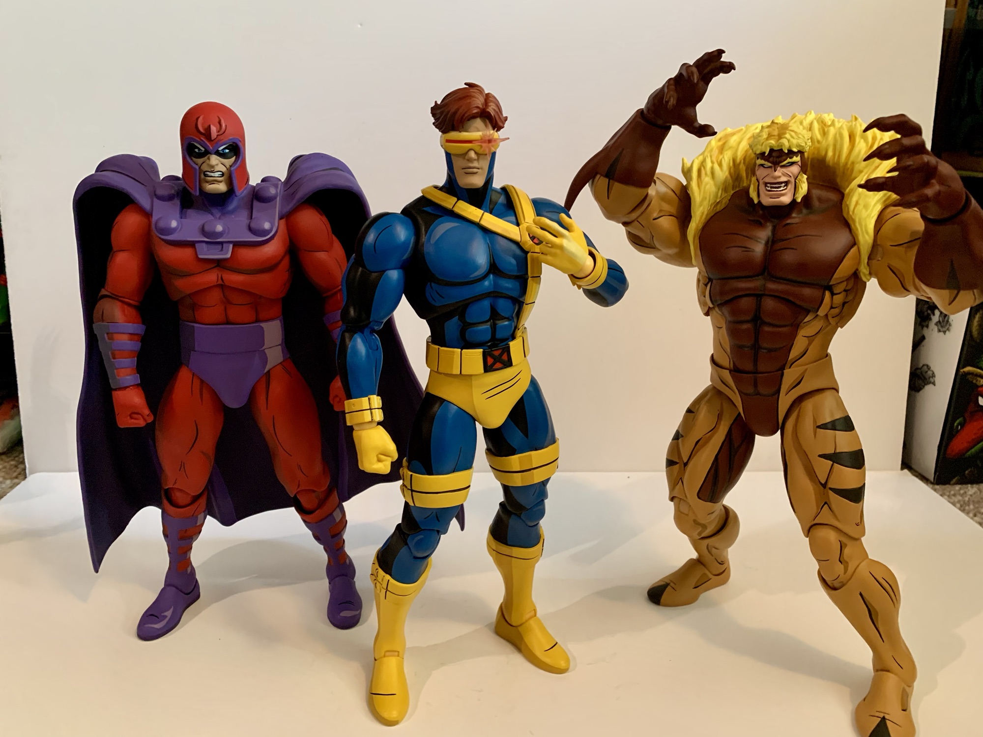
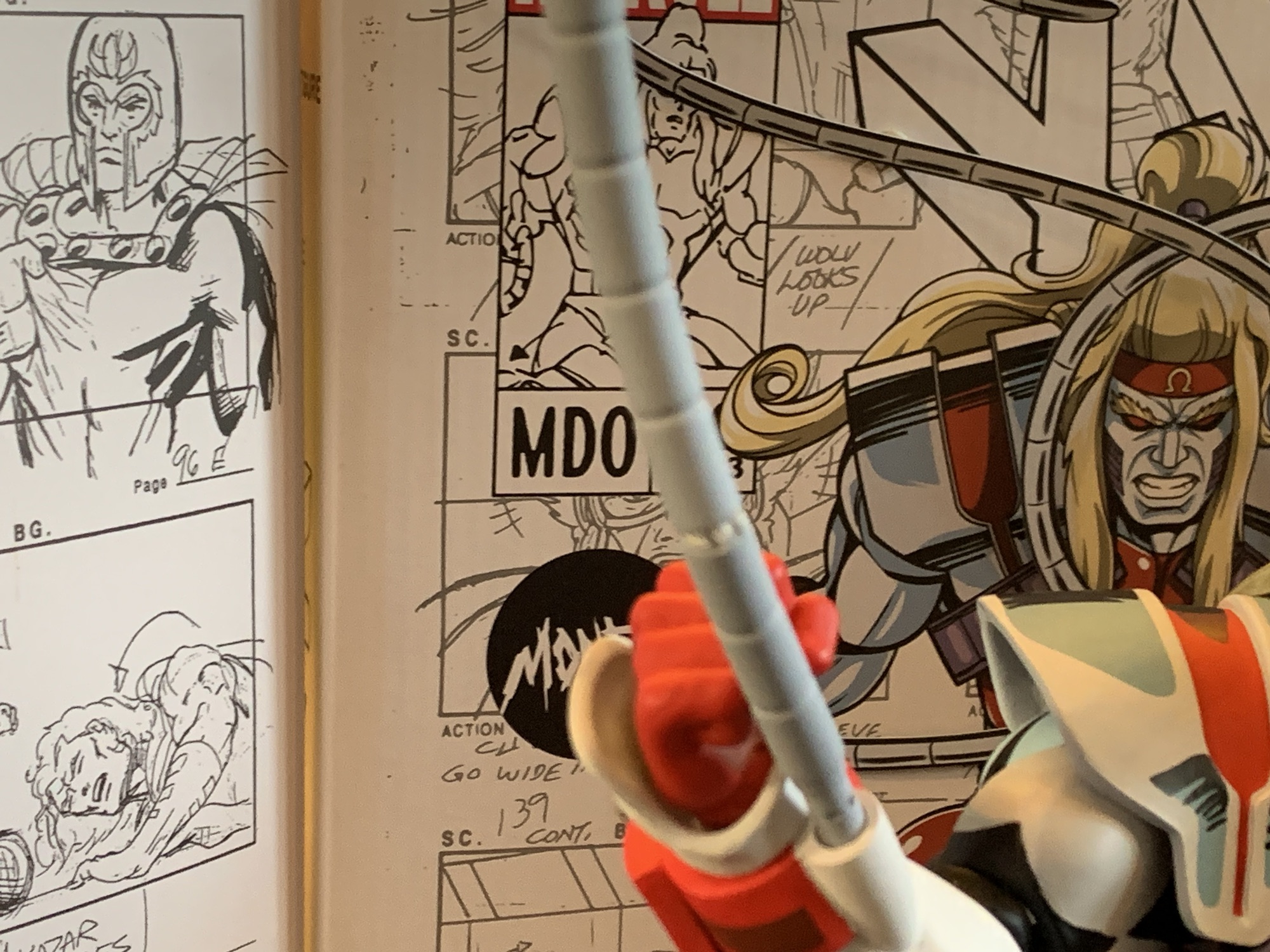
Back in 2021, Mondo unveiled for San Diego Comic Con a sixth scale Wolverine action figure based on the X-Men animated series from the 90s. It was a presale to coincide with the 30th anniversary of the show’s premiere and product went out in 2022 closer to that actual anniversary. At the time, Mondo wasn’t planning on doing more, but the response was so enthusiastic that their one-off turned into a whole line. To sculpt the next figure, Magneto, Mondo enlisted the work of Alex Brewer – a fast rising sculptor in the toy world. Alex would go on to knock it out of the park with Magneto which naturally lead to more work for Brewer. It’s basically been his style and vision that has come to define the line, and as it’s pivoted to include X-Men ’97 as well, the need for a Wolverine to fit in with the style of the rest of the line became more apparent.


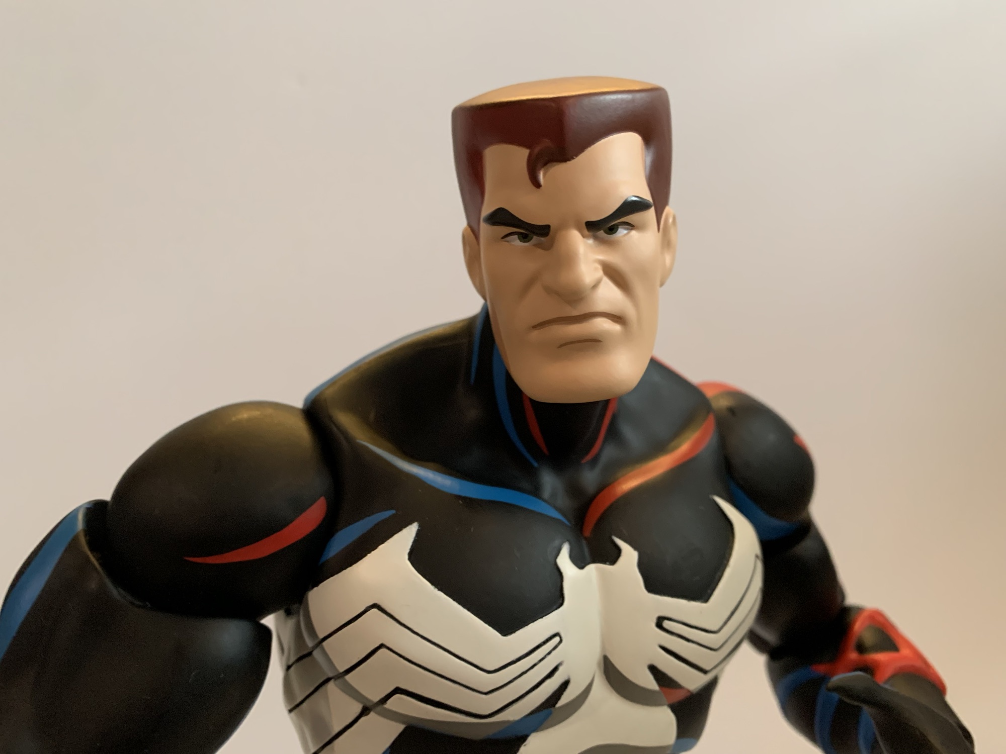
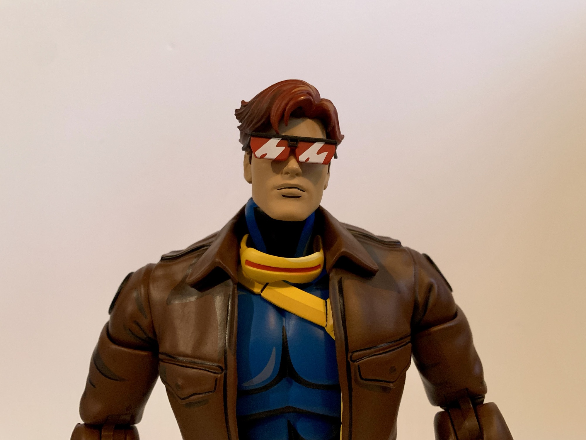
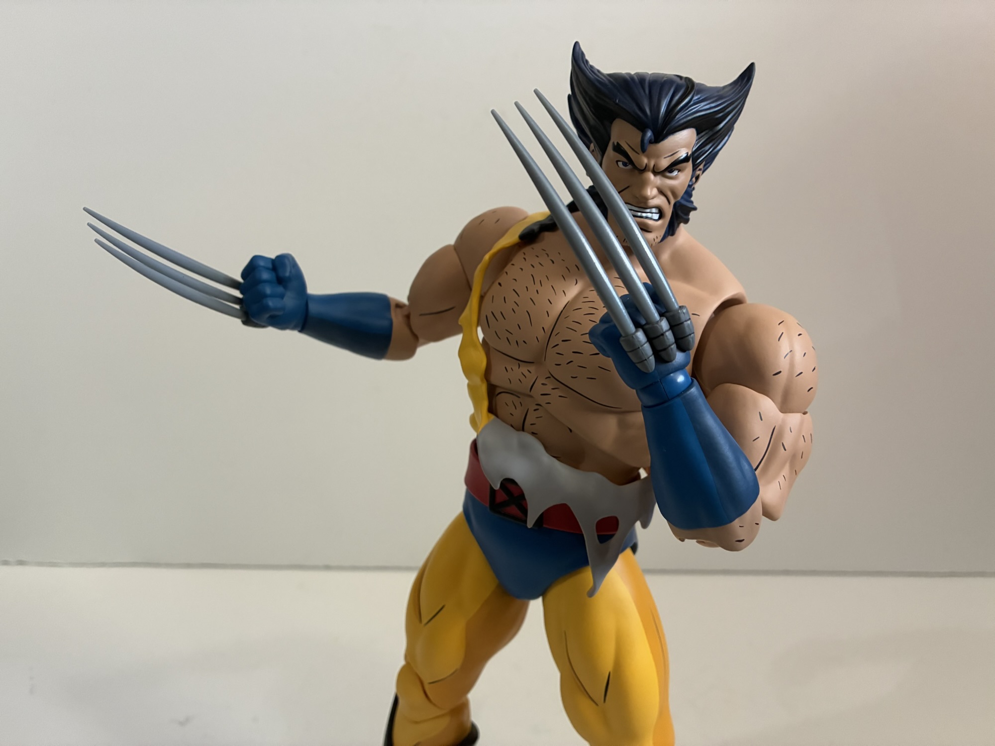
Wolverine has the unique standing of being the first in the line and now the 9th. Well, technically this is the third attempt at the character as we did get Wolverine in his civilian attire, but that’s pretty different from his business look. When Mondo had that initial Wolverine sculpted, they weren’t planning on more which meant not much consideration was taken for scale. That Wolverine was nearly 11″ tall, and as the line went on it became pretty apparent that he was too tall. This new Wolverine not only allows for a chance for Brewer to do the character, but also to correct that scale issue. And Mondo has for this new one which stands at about 10.33″ to the top of his head putting him in that 5’3″ – 5’4″ range which feels fitting for Wolverine. Even though the box says X-Men ’97 on it, it’s still adorned with production art from the original series with new artwork by Dan Veesenmeyer that portrays the updated look. Tom Rozejowski, a name we see a lot with NECA products, handled the paint for Wolverine and Tommy Hodges also gets a sculptor credit. I’m thinking he may have done the base, but I don’t know for certain.
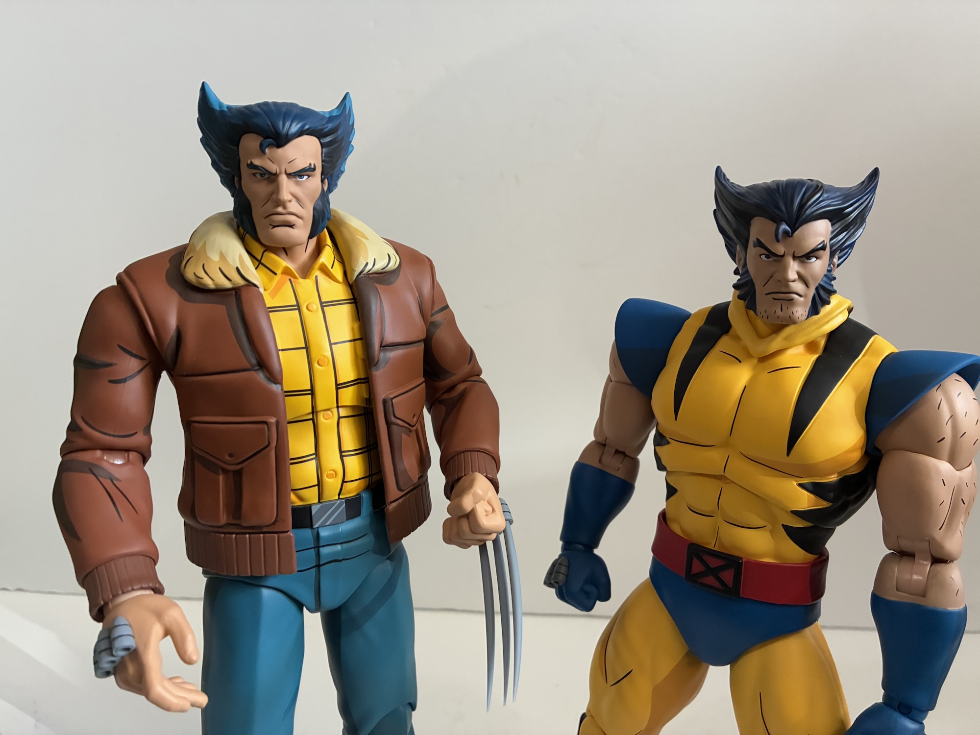
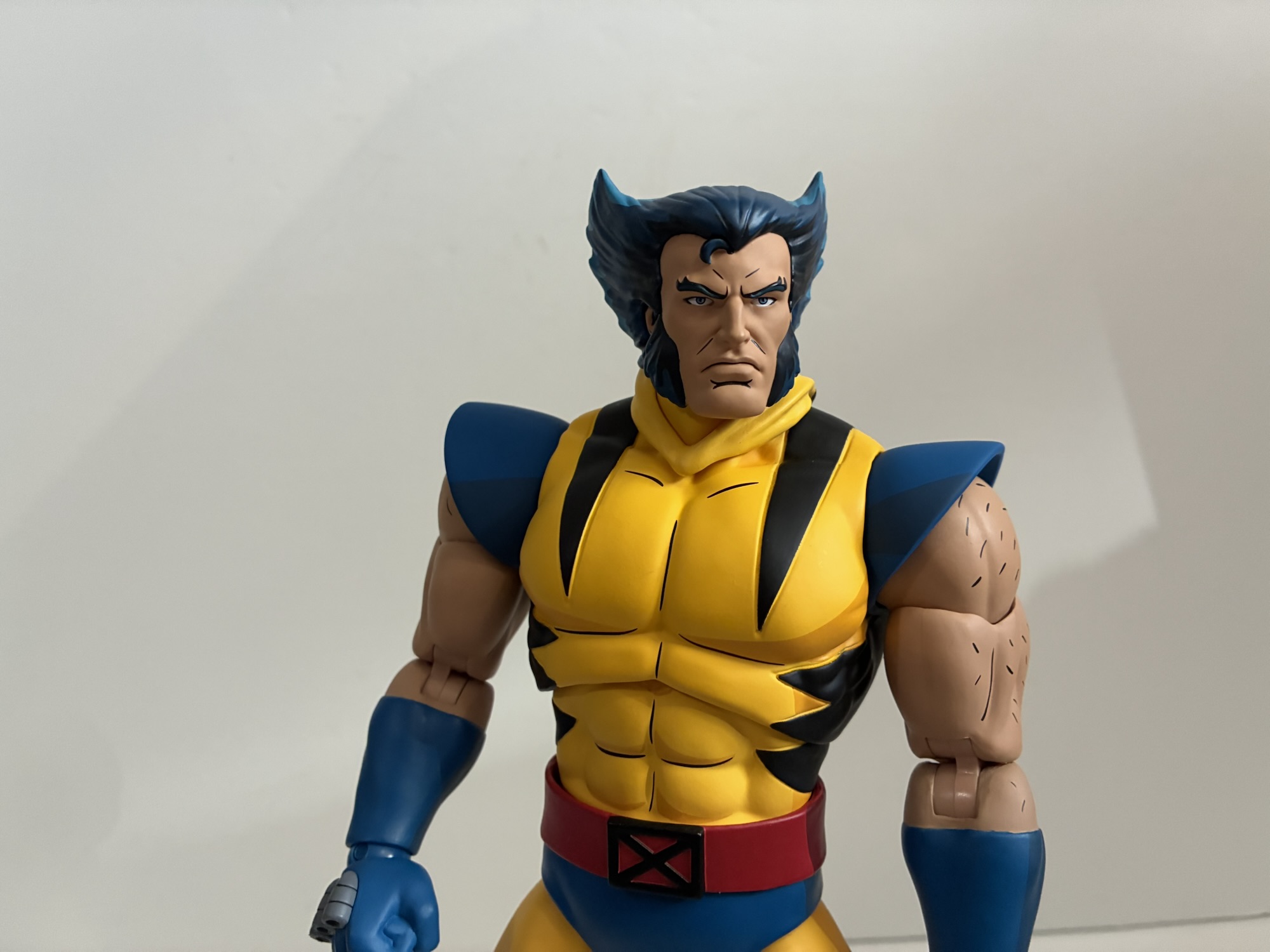
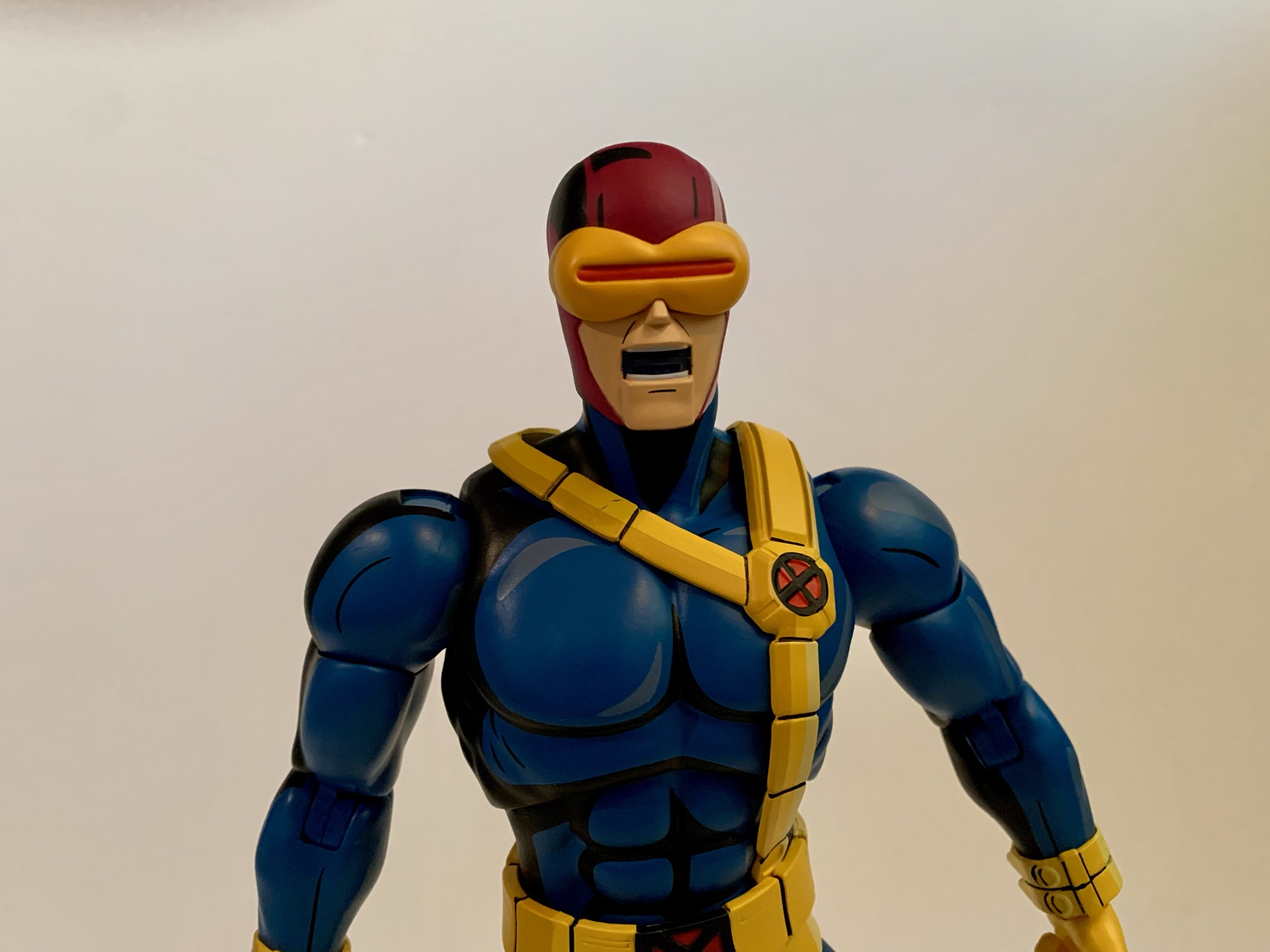
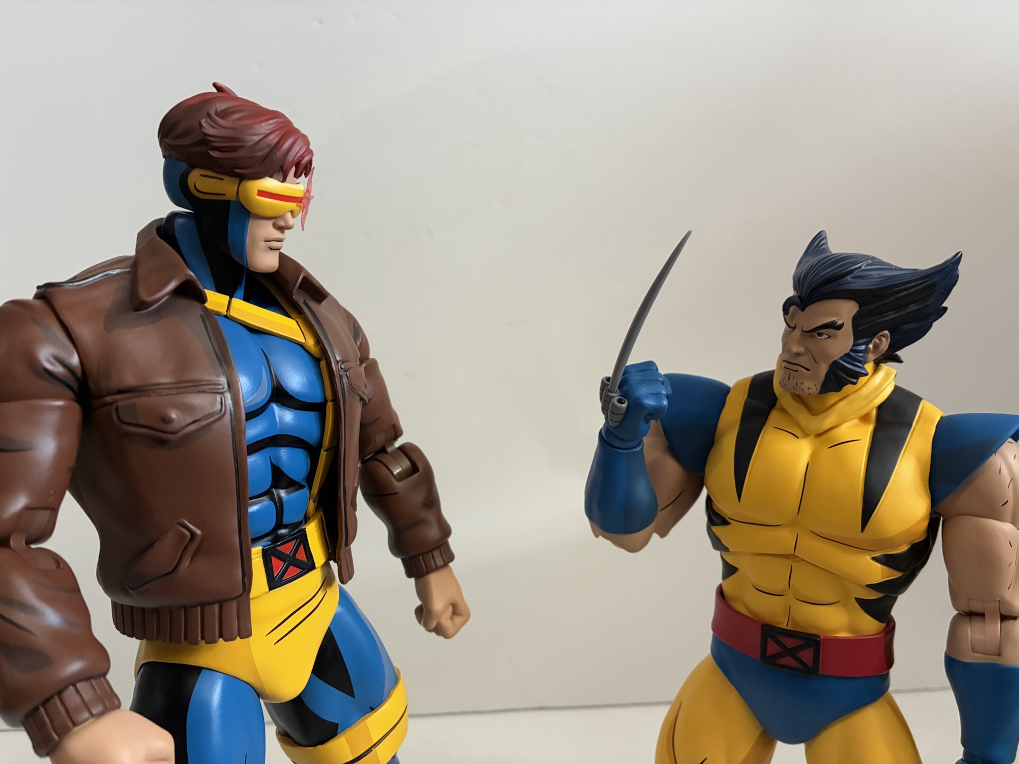
Mondo has been trying to straddle the line between X-Men ’92 and X-Men ’97 with these more recent releases. This figure definitely has a more ’97 look to it. While the costume is the same, there are some telltale differences and it’s mostly in the body hair. The original series left Wolverine’s chin free of hair for the most part, save for perhaps some close-ups. The hair on his arms was usually done with lines across the shoulders and biceps. For ’97, he has some chin stubble and the hair on his arms is done with several short lines In addition, the angle of the mask fins is slightly steeper and they don’t stretch quite as high. Of course, that aspect of the ’92 series was hardly consistent, but it’s in comparison to the model sheets. The yellow of the costume is also just a little bit darker, a touch more gold, and the same is true of the blue parts. In comparing this figure with the original release, the cel-shading is also less prominent. We have primarily two shades of blue on the new figure compared with three on the original. The same is true of the belt, though the yellow on the old figure only utilized two shades, but there’s more of it. The black portions of the shirt are also sculpted in now. There’s no paint slop, but it doesn’t quite fill the entirety of the sculpted-out area. There is no shading on the flesh, and like the rest of the color palette, it’s a touch darker as well compared with the old figure.

I have mixed feelings on the updates and changes. I find the overall sculpt more suitable for Wolverine. Not only is he shorter, he’s stockier. The original is very leggy and the torso slightly slender. I think the portraits are an improvement as well even if they have a very ’97 style. There is an included ’92 masked portrait, but the only aspect of it that reads ’92 is the shape of the fins. The stubble is still present. I definitely prefer the more vibrant paint job of the original and the approach to the arm hair. The arm hair with the new release is missing something. The show tended to show his arm hair as always breaking his silhouette, regardless of how much of the arm is visible. That makes it hard to translate to 3D so Mondo just went with these dashes that almost look like a dot pattern. I think they would have been better served keeping the same approach as the first figure. The flesh tone also feels a touch too dark. It’s certainly not bad, I just wish he better fit the ’92 style since that’s how the line began. I’m still going to have this one replace the original on my shelf and that one will be returned to his bed box, but I’m definitely always going to see X-Men ’97 when I look at him as opposed to the original series.
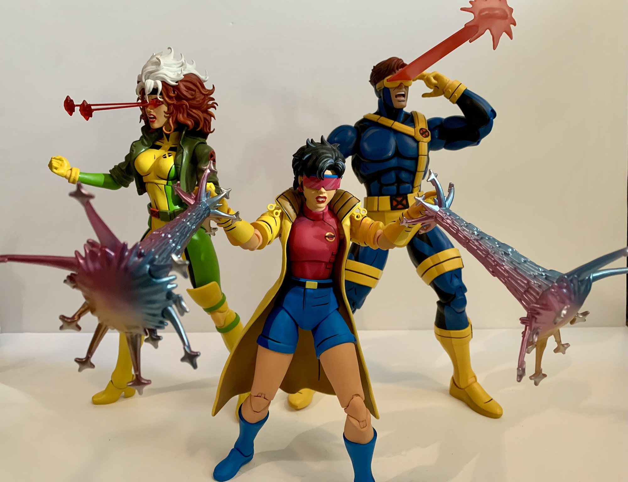
Am I being unfair? After all, the box does indeed say X-Men ’97 so it’s not hiding what it’s trying to be, but the line is trying to placate both and is not shy about its intentions so I don’t think so, but I’ve said my piece. Not only is the sculpt redone to conform to Brewer’s style, but the articulation scheme Mondo utilizes has also changed since that first Wolverine release three years ago. This figure embodies those changes, some for the better, and some not so much. This is an aesthetics forward line, but Mondo has room for improvement and this Wolverine is proof of that. The joints are all the the same as Cyclops, the most recent release in the line: head, shoulders, double-jointed elbows, biceps, wrists, diaphragm, waist, hips, double-jointed knees, ankles. The original figure used a different style of double-jointed knees similar to what NECA used to make use of with a hinge above and below the knee. This allowed for some swivel at those joints, but it is a little odd looking, though perhaps only odd because we’re so used to the other style. It also used a swivel joint above the elbow in place of a bicep swivel that was ugly and persisted for quite a few releases. The range at all of the joints present is pretty typical, except for a few places that have become an issue recently.

If you saw my Egon Spengler review, you will note I had issues with that figure at the neck and hips. Mondo textures the ball joints for a more snug fit, but they may have went overboard. The ball joint inside the neck was stuck on that figure and the hips were pretty stuck too. Wolverine has the same issues. I had to use a lot of force to move the double ball peg in the neck, though the hips required a hot water bath. Out of the box, they just wouldn’t budge and I put more force into it than I probably should have. After the hot water bath they moved better. I applied some lubricating oil to the hips and neck and it didn’t appear that any had been applied by the factory, but once the figure cooled down it mostly went back to the way it was out of the box. In addition to that, the diaphragm joint remains useless. With a lot of effort, I can get the torso to rotate there a click to each side, which is hardly much to speak of. There’s no forward or back. Also of a nuisance, the red belt rubs off onto the abdomen very easily and the blue of the trunks will transfer to the thighs as well. I’ve been able to rub these instances off, but I worry if I let it sit that way then it would become more stubborn.

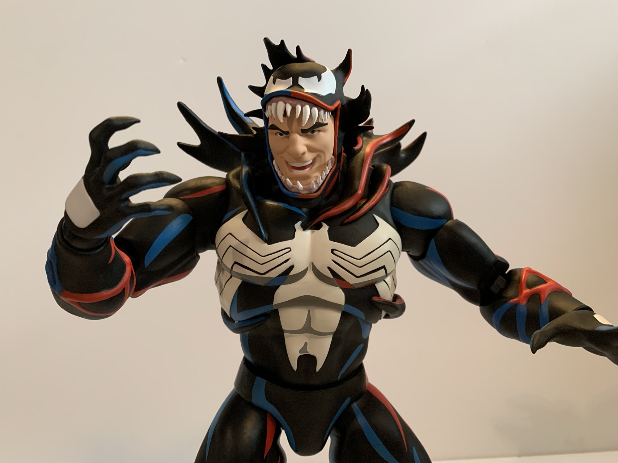
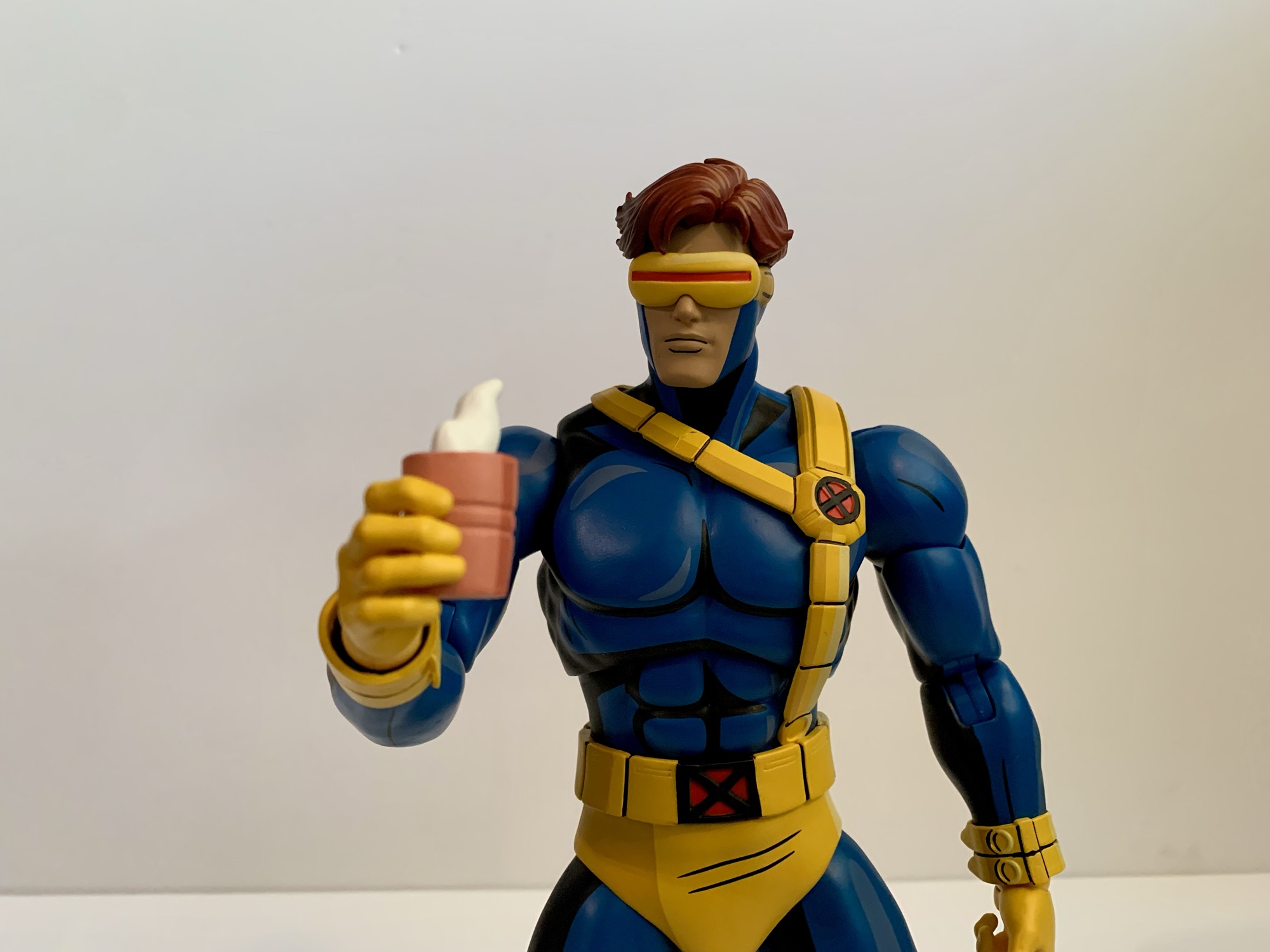
Wolverine is a bit tough to pose as a result, and it’s especially a bummer because he has a lot of stuff to be posed with. For heads, we get that ’92 inspired portrait I mentioned before as well as ’97 masked portraits featuring a neutral, growling, and yelling expression. If that’s not enough, he also has two unmasked portraits: neutral and a teeth gritting/growl. They’re both really similar to the portraits that came with the Logan figure which is kind of disappointing as it would have been nice to get different expressions to share between the two. That figure though was all the ’92 series while this one is updated for ’97. It’s not much of a difference, just stubble and a different approach to the shading. He also has a more pronounced single bang of hair and his ears are fully visible. With how subtle the difference is, it’s kind of shocking they bothered to sculpt new portraits, but they do look good.
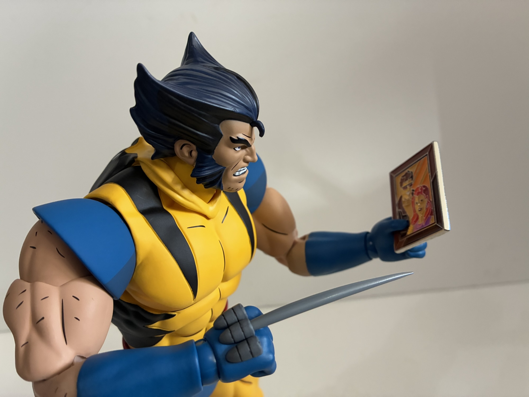
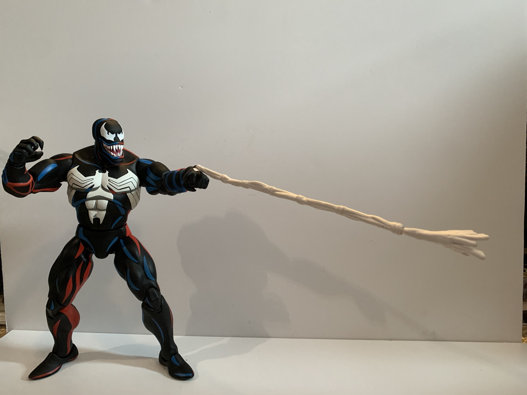
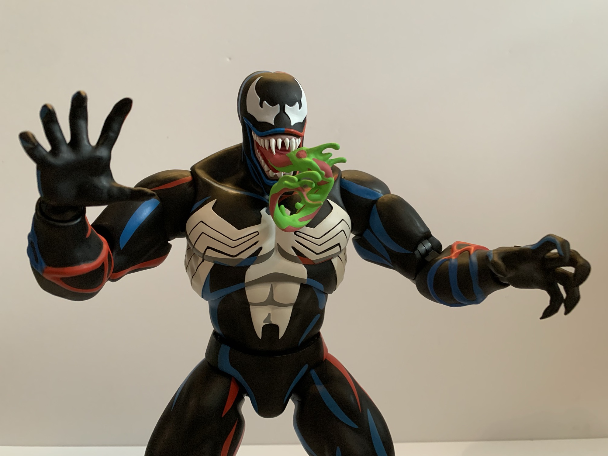
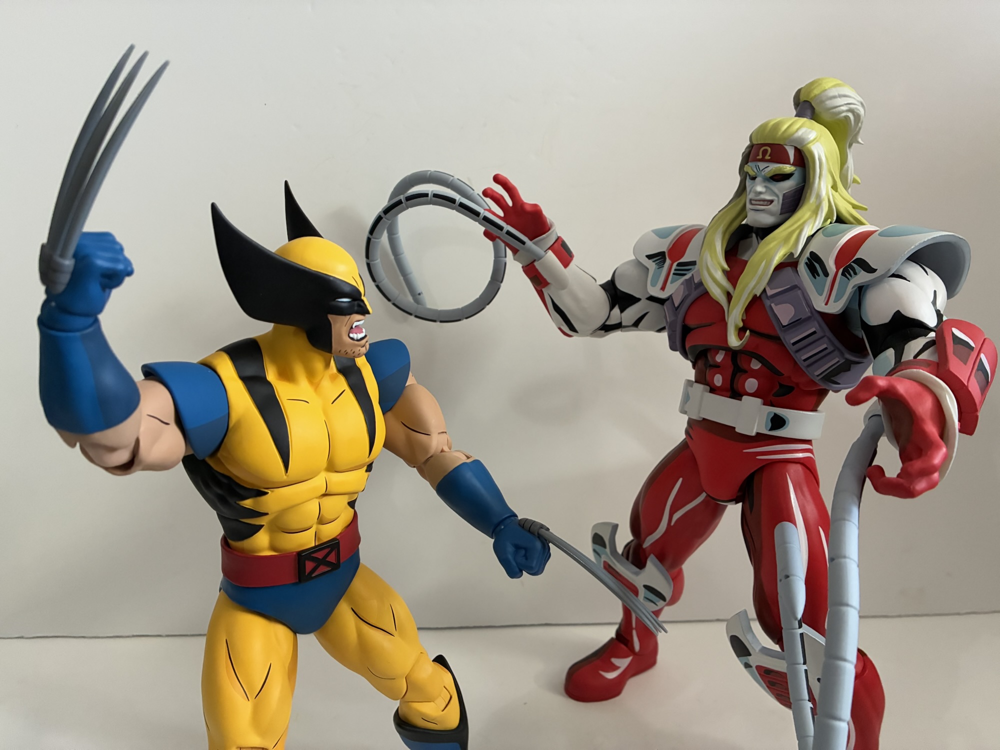
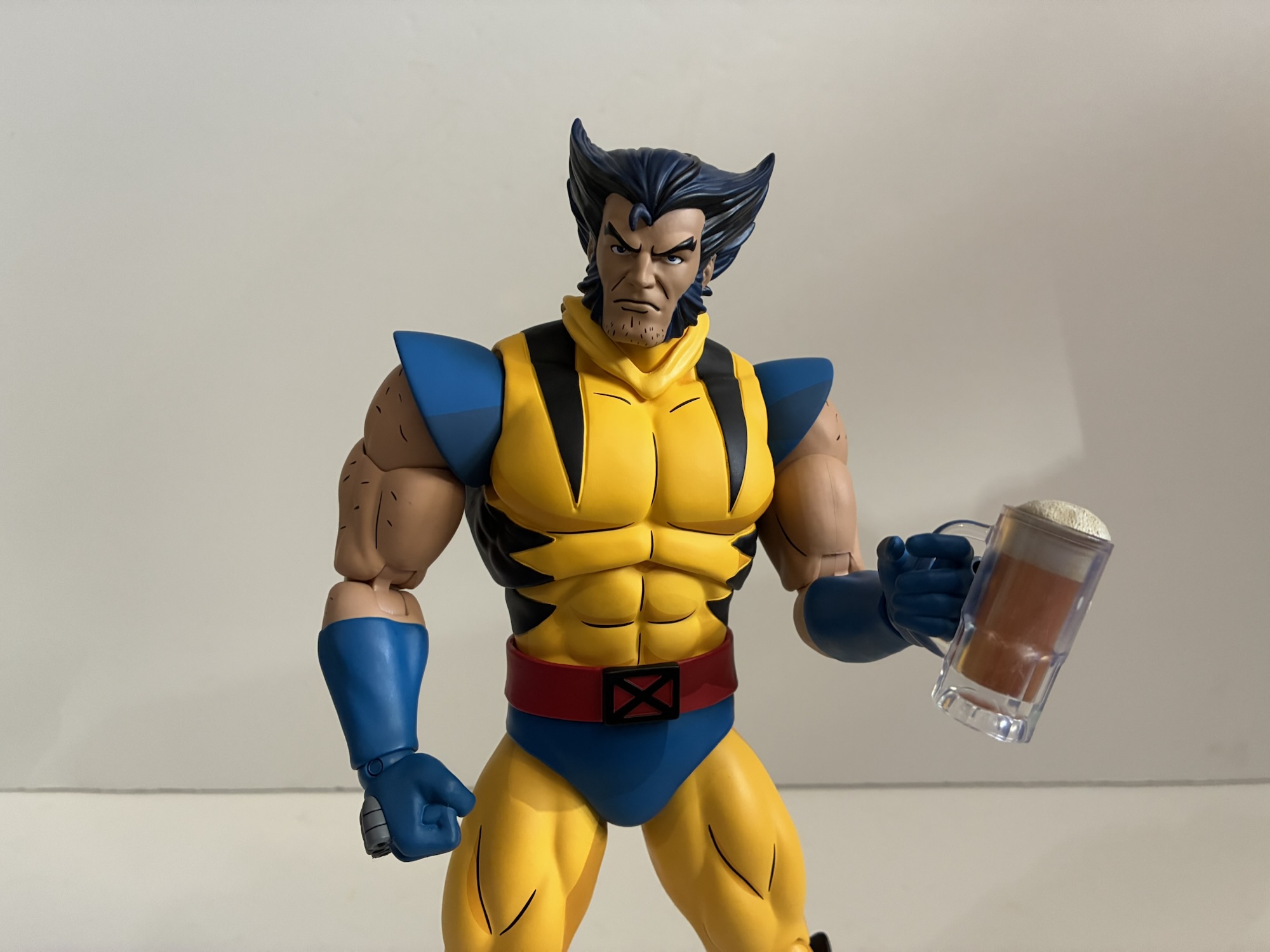
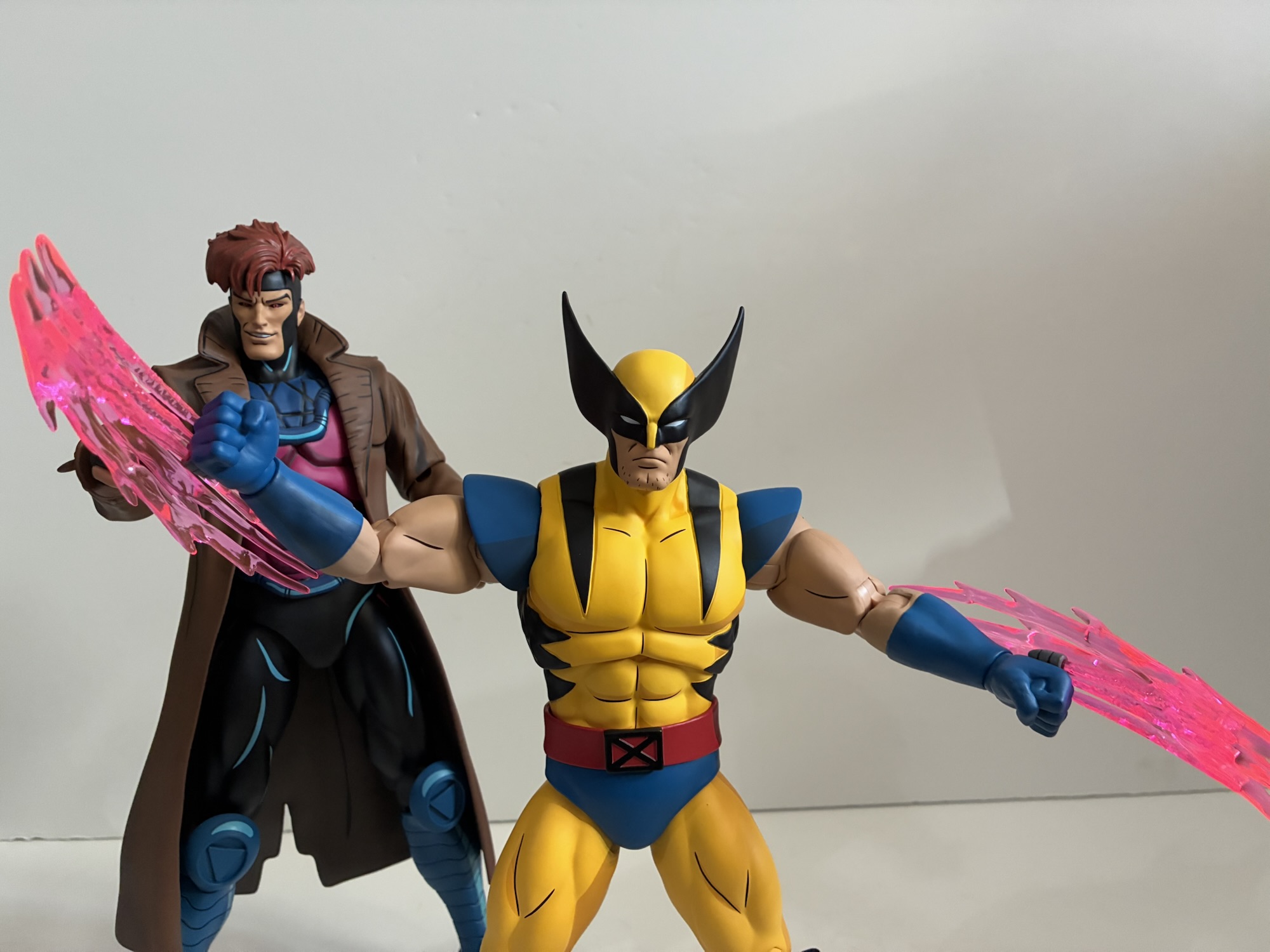
For hands, Wolverine is actually a touch light. We have fists, gripping, and his “Come here,” gesture from the cover of Wolverine #1. I’m surprised there are no relaxed hands or pointing hands, but I guess most are likely to keep the fists in place any way. Packaged behind the figure is the traditional Mondo figure stand though this one has the X logo painted on it. I only call this out because I sometimes leave these stands in the box since they’re not really needed, but if you want to find Wolverine’s claws you’ll need to remove it as they’re hidden behind it. Mondo provided 8 claws so you essentially get two extras. They’re just gray plastic and they’re the same as the ones that came with Logan. I wish they were white to better match the show, maybe with a touch of light blue, but this plastic may not take well to paint. They clip in easy enough though and they’re compatible with all of the hands in the box. You also get a set of charged claws as seen in the first episode of X-Men ’97. They’re done with translucent pink plastic and they clip into the backs of his hands in place of the claws. There’s also an included mask for draping over his neck when using an unmasked portrait, a similar accessory to what we saw with the Marvel Legends version of the same. Mondo also through in another picture of Scott and Jean from the episode “Captive Hearts,” only this time it’s an enamel pin instead of a picture frame accessory.
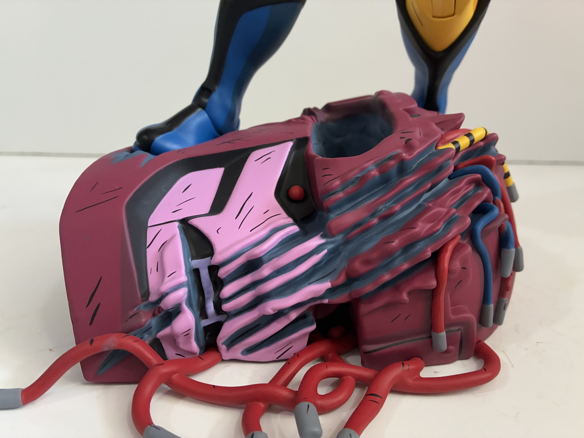
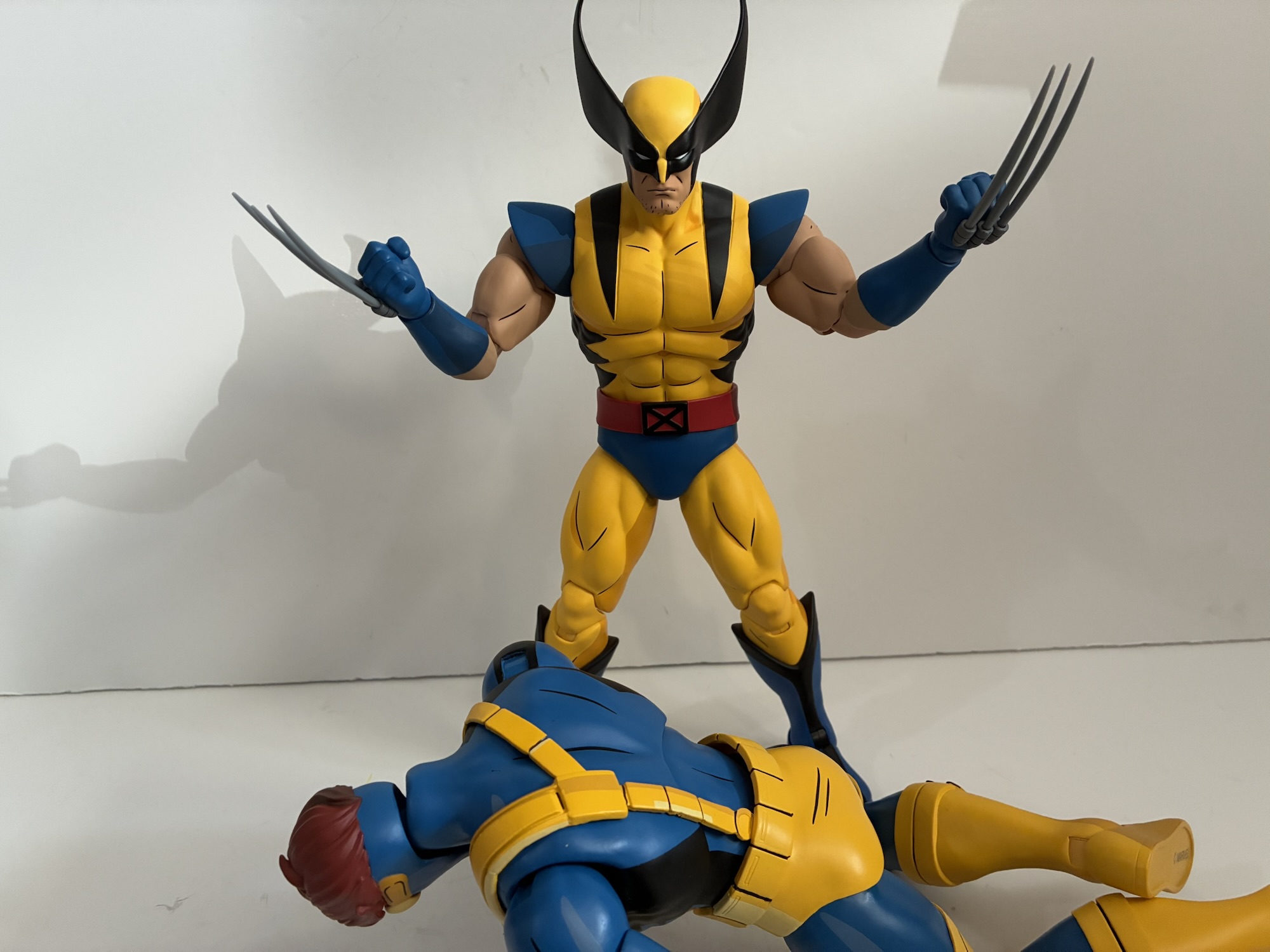
The limited edition Wolverine also comes with even more stuff like an entire second torso. Yeah, this is the first figure I’ve ever bought with a swappable torso as there’s a bare one since Wolverine always seems to get his shirt blown off in a big fight. To help sell the damage there’s a strip of the tattered remains of his shirt included made out of a soft plastic. You just place it over a shoulder to complete the look, or you can have him go completely shirtless which is a look from the show. To accommodate this change, the arms need to pop out easily and they do, which you will want to take advantage of when unwrapping the figure anyway as there are plastic bags over the arm pegs. The shoulder pads slot over the shoulder pegs and are conveniently stamped for left and right, should you get them confused. The torso separates easy as well. Unfortunately, the diaphragm joint on this torso works no better than the regular one. Lastly, Wolverine has some Sentinel parts as well including the remnants of a head that serves as a base and a chunk of a fallen robot with wires dangling from it. It has three claws holes to go over one of Wolverine’s hands to complete the look. The base has two, deep, indentations for Wolverine’s feet which gives him a secure base, though does limit things since his stance is left kind of boring. He can kind of crouch on it, but I can’t decide if that looks more dynamic or if it just makes Wolverine look like he needs to poop. The foot holes are designed for Wolverine, but I did find Gambit can fit in them as well. Cyclops and the original Wolverine have feet that are too big.

For the most part, this Wolverine redo is much like past releases in this line. It captures the likeness well and certainly comes with enough stuff to help justify the hefty price tag of $245. This one was also solicited before all of this tariff nonsense with has really jacked up the price on subsequent releases, but I’ll complain about that in reviews of figures actually impacted. This Wolverine does capture the look of X-Men ’97 very well, just at the cost of not capturing the original series as well. I like the extra torso and stuff, but I personally would have traded it for more ’92 accurate arms and heads. Mostly, I’d rather the figures seek to emulate the look of the original series and make the ’97 heads the one-off for those that want it that way. The articulation issues with the neck and hips are unfortunate and really something Mondo needs to correct. If they want to charge this kind of money for their products then the quality needs to be there. They’re pretty receptive to feedback, and I do plan on dropping them a line regarding it. If you don’t have the previous Wolverine then this one is worth getting if you’re collecting this line. And even if you do have it, I think it’s enough of an upgrade to consider. It does fit the style of the other figures better, but if you’re happy with that one then maybe you don’t feel this is necessary. The limited edition is sold out, but the standard version is still available. It’s slightly cheaper, but may come with tariff surcharges depending on where you buy it from.

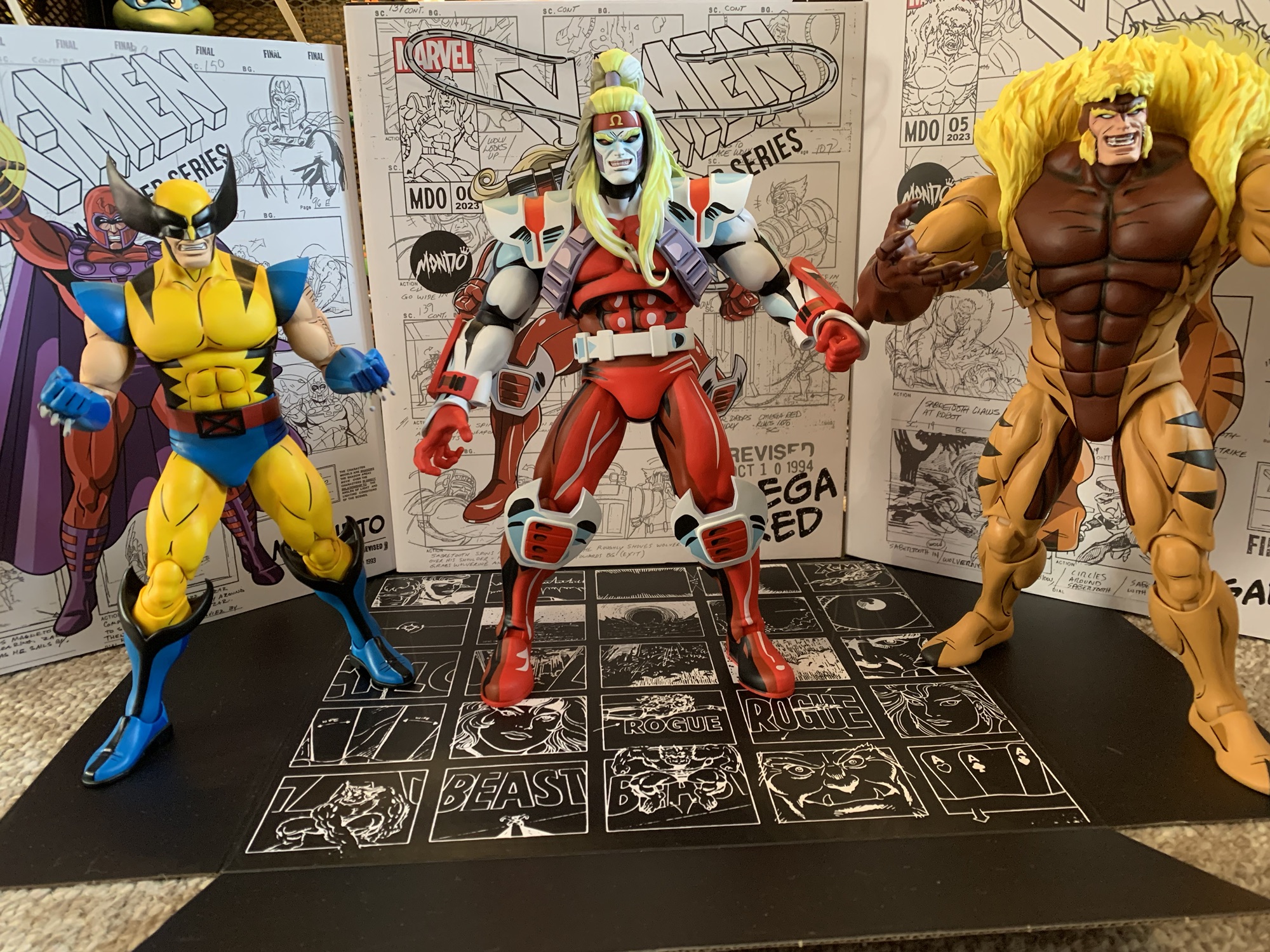
We have plenty more from Mondo’s line of X-Men, including a couple of Wolverines at that:

Mondo X-Men TAS 1/6 Scale SDCC Exclusive Logan
Mondo has been absolutely killing it with its sixth scale line of action figures based on the now classic animated series X-Men. The company also really ramped up production in 2023 on the line by soliciting five new figures during the year. At over 200 bucks a pop, it was quite the hit to the…
Keep reading
Mondo X-Men TAS Wolverine 1/6 Scale SDCC Exclusive Action Figure
When San Diego Comic Con was cancelled for 2021, many of the entities that would have sold exclusive merchandise at the event pivoted to web sales. And since the 2020 iteration of the famed event was also canceled due to the COVID-19 pandemic, many seemed to expect the same for 2021, or the massive delays…
Keep reading
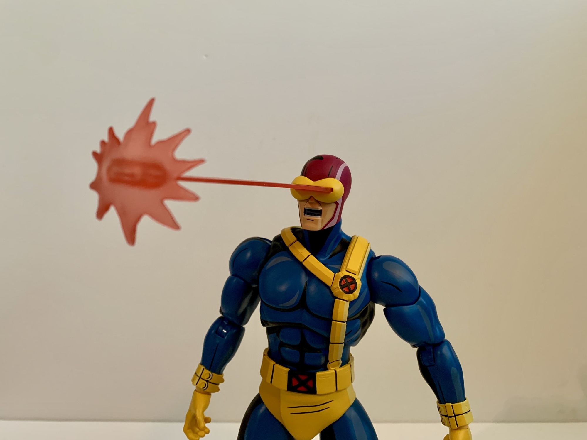
Mondo X-Men ’97 1/6 Scale Cyclops – Limited Edition
After putting a real hurting on my wallet in 2023, Mondo decided to take it easy in 2024 with its line of sixth scale action figures based on the animated series X-Men which ran from 1992-1997 on Fox Kids. Two figures ended up getting released this year, Rogue and now the leader of the X-Men…
Keep reading