When I first came across the Kickstarter drive for a series of action figures called Plunderlings I was almost instantly smitten. The little impish creatures reminded me of some characters I used to doodle as a kid. In my mind, they look a lot like what I used to draw, but given I was much younger and definitely an amateur artist they probably looked far more crude. A similar aesthetic was in place though: short, big ears, big smiles, a bit devilish in disposition. I definitely never envisioned my goblin-like creatures as pirates though, and I was tempted to back the project.
I did not. I basically convinced myself I didn’t need anything like that. I also let my kid see them and I was curious if he would have a reaction to them, thinking it might be fun for the two of us to collect something together, but if it isn’t a Pokémon he doesn’t care much. The Plunderlings were funded, and eventually released early this year to quite a bit of praise in the toy community. The little devils were a tad pricey though, and I used that as justification for passing. Only when they sold out and became expensive on the secondary market did I change my mind, because I’m an idiot. Well, it was that and I found out a particular figure named Fwush was inspired by the toy community over at http://www.thefwoosh.com which I thought was really neat. I’ve been a member there since 2006 and was probably a lurker for a good while beforehand and it was just kind of cool to see a shout out like that. I wanted to at least grab that character, and I came close on a few occasions via Big Bad Toy Store, but it always sold out too quickly. Eventually, I gave in to eBay to erase my FOMO, but hopefully I didn’t just replace it with buyer’s remorse over paying above MSRP.
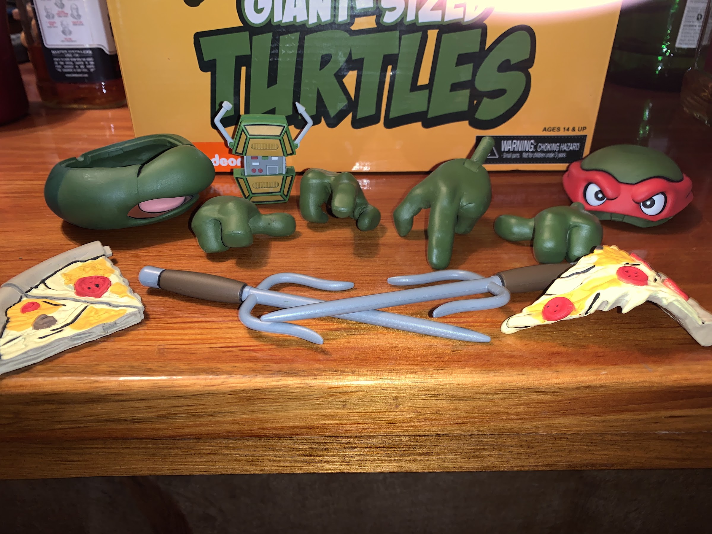
The top of the “crate” provides for a look at the alternate heads and hands, but doesn’t provide much of a look at the accessories.
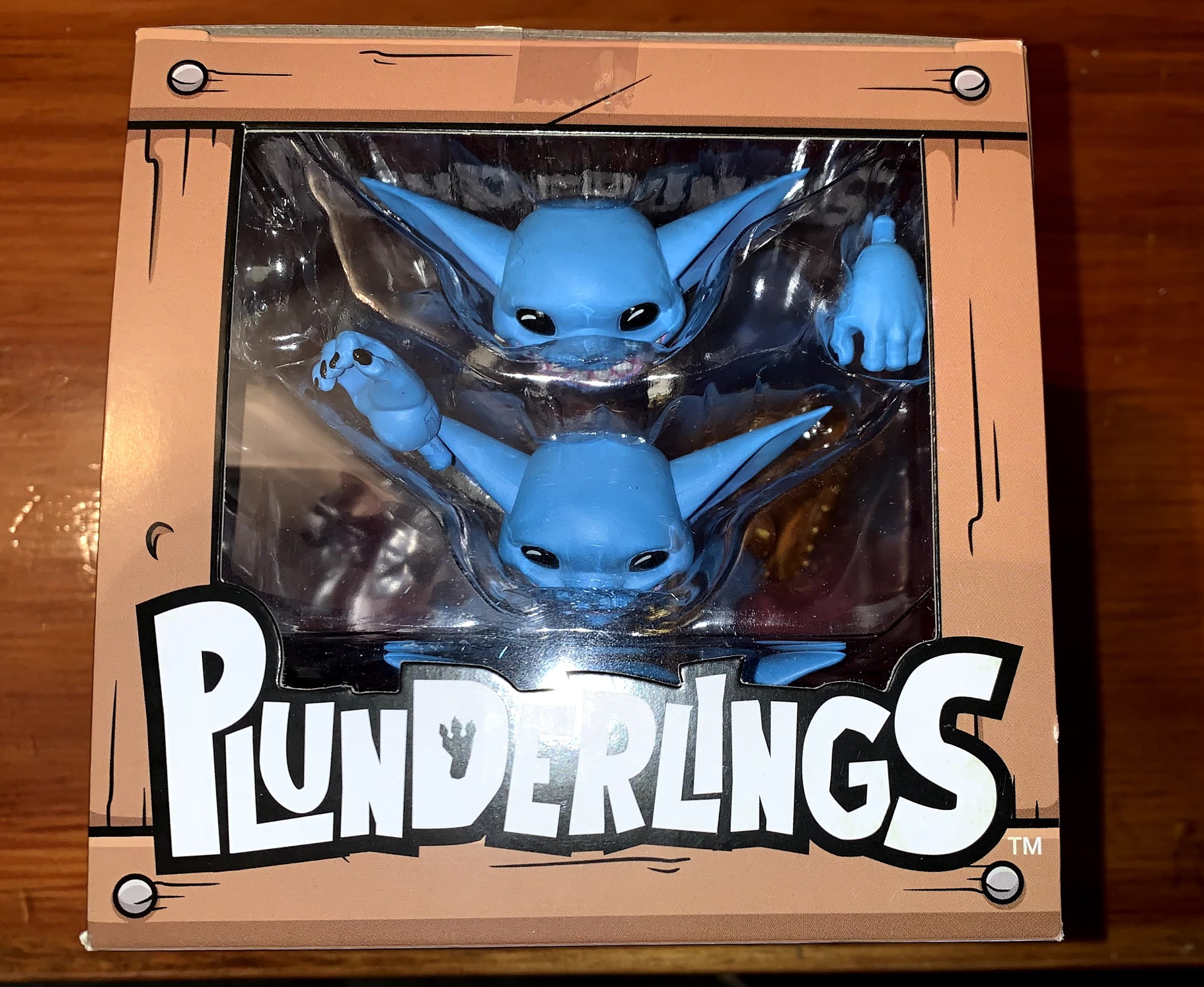
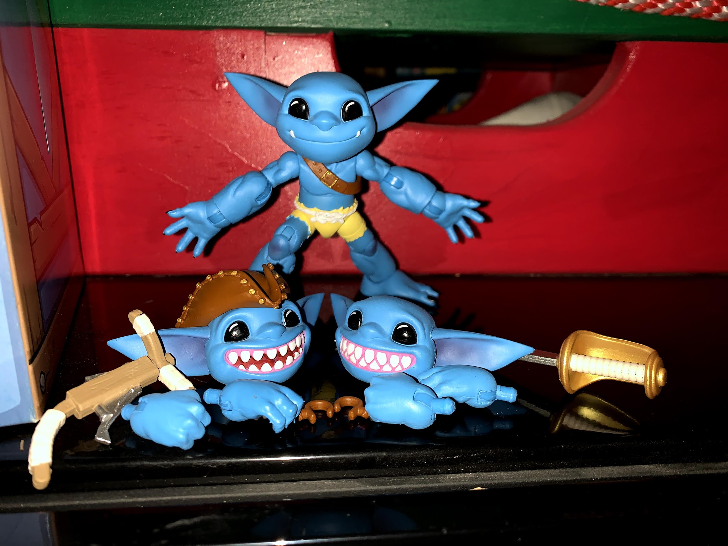
Lone Coconut is new to the toy making community and Plunderlings is apparently the brand they’re going to sink or swim with. The little creatures are smartly designed from a manufacturer’s perspective as the company is basically selling the same figure over and over. Each Plunderling shares almost an identical body with one another. About the only different appears to be in the shorts or pants each features and some minor differences with the ears. Otherwise, the heads, hands, arms, etc. are largely the same. How the company distinguishes each character from one another is with accessories and paint. They come in a variety of colors that basically span the entire color spectrum and they have a bunch of optional parts to enhance their look. Some are dressed like pirates, others are more feral, and some are just plain different like the golden idol. A lot of the parts, like belts and shirts, fit over the main body and are theoretically interchangeable if you’re not afraid to pop some limbs off while the masks and hats are held in place by magnets on each figure’s head. It gives the line a customizable quality, though based on what I’ve seen it looks like most collectors largely leave them as-is as opposed to mixing and matching. They’re packaged in cute little crates with the figure positioned inside its own mouth. The package is a perfect cube, 5x5x5″, with a second window on top showing off the extra heads and hands. Once the product is removed, there are paper ears inside the box that can be slipped into the sides of the crate to really make an interesting statement on your shelf. Great, another box I can’t bring myself to toss!
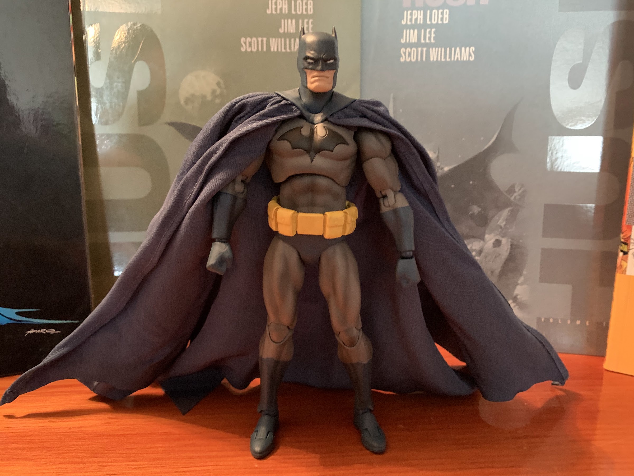
I love that brilliant shade of blue.
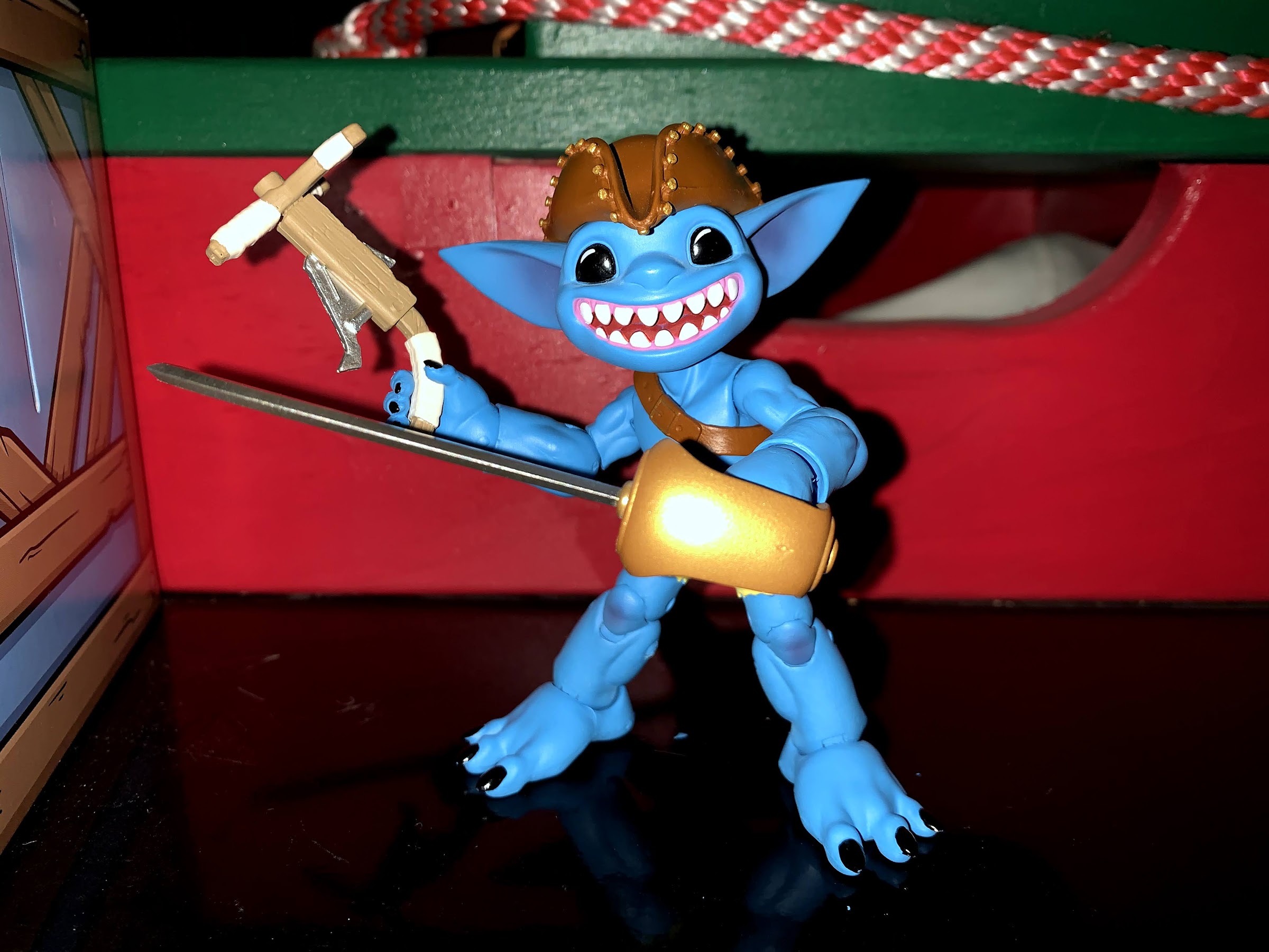
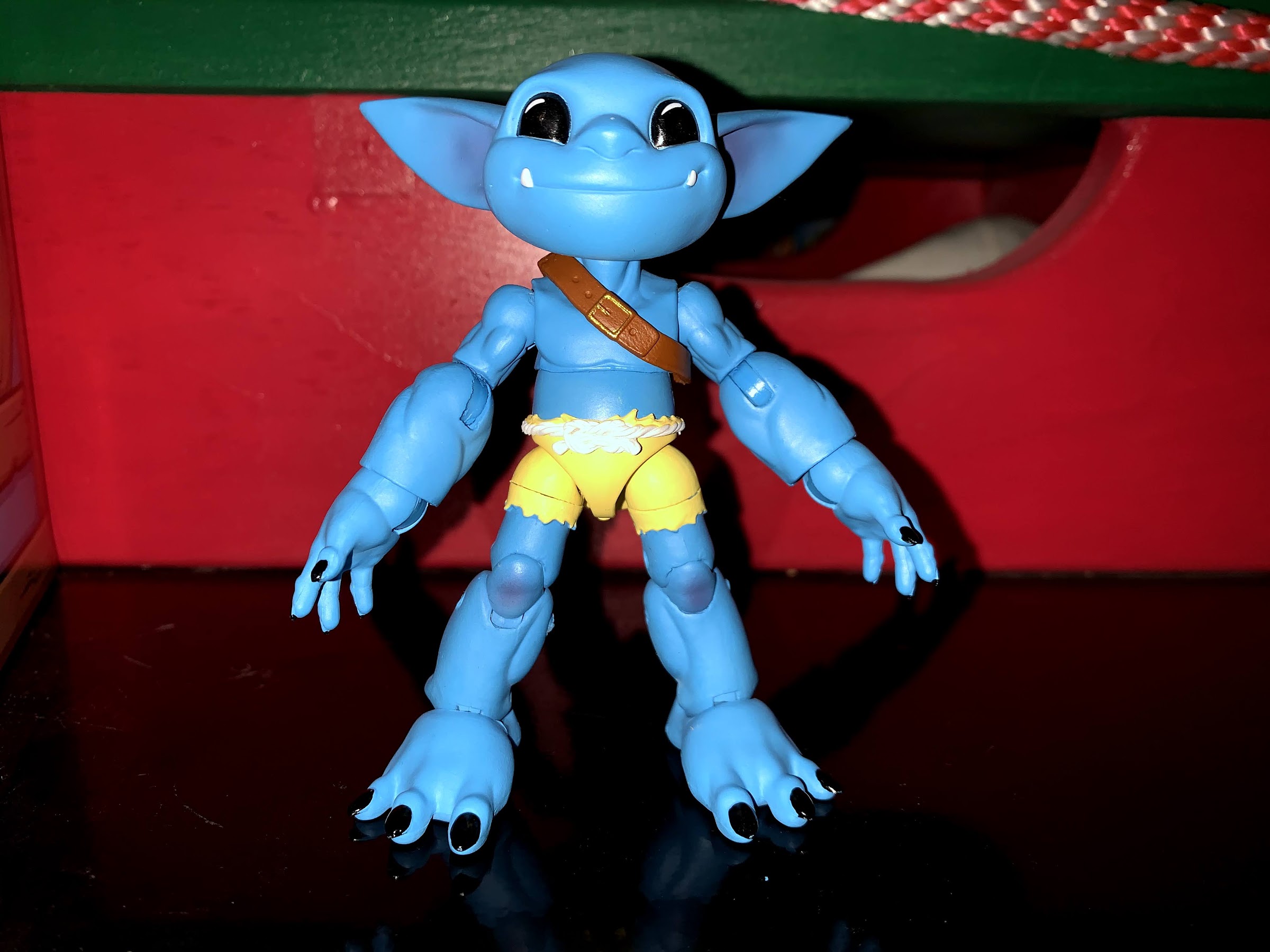
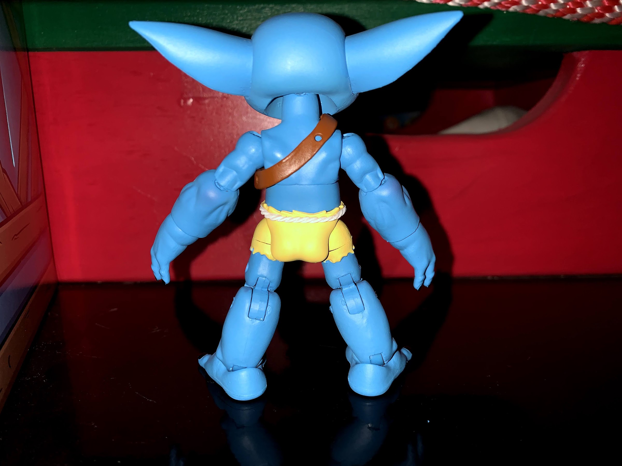
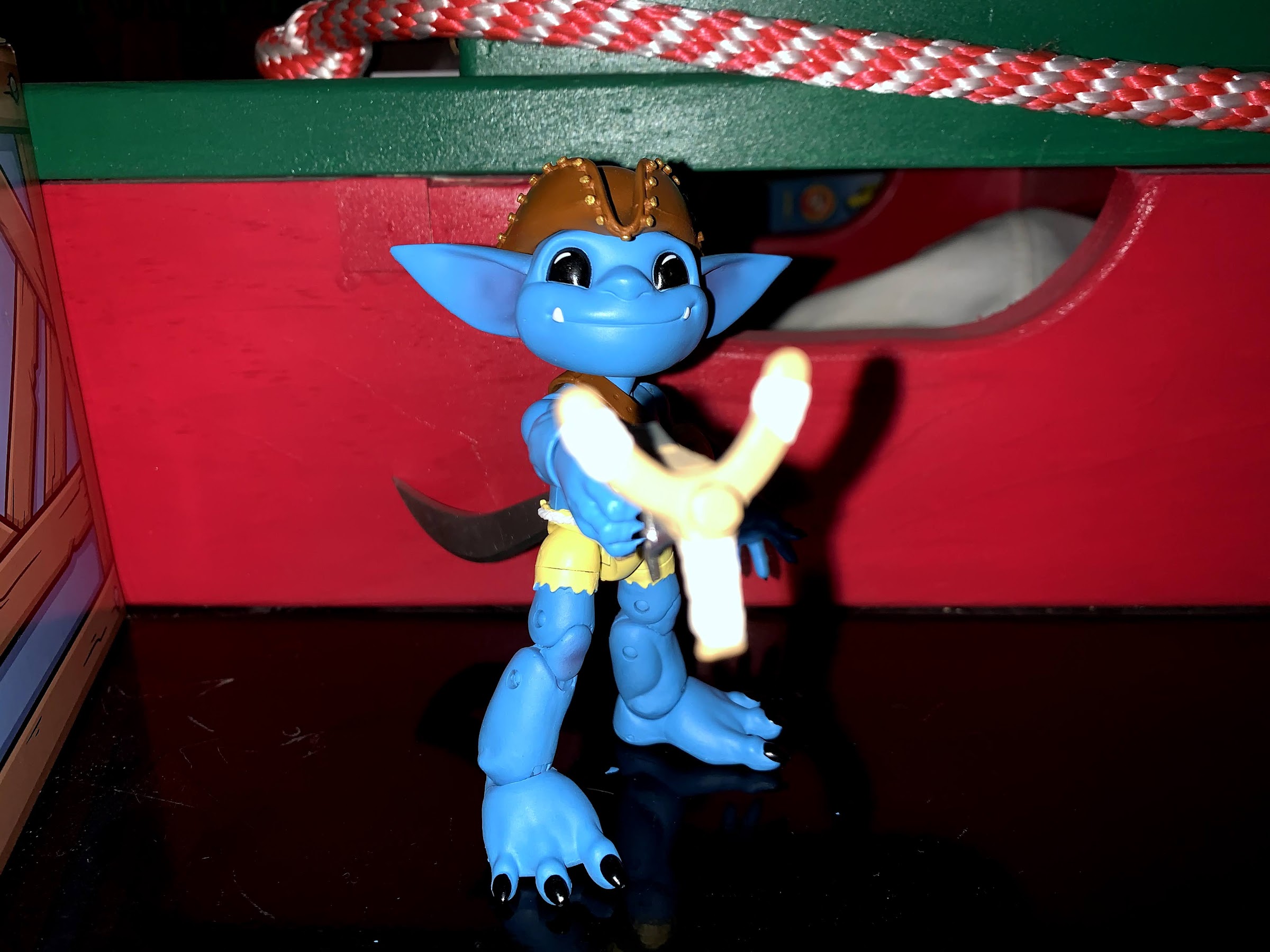
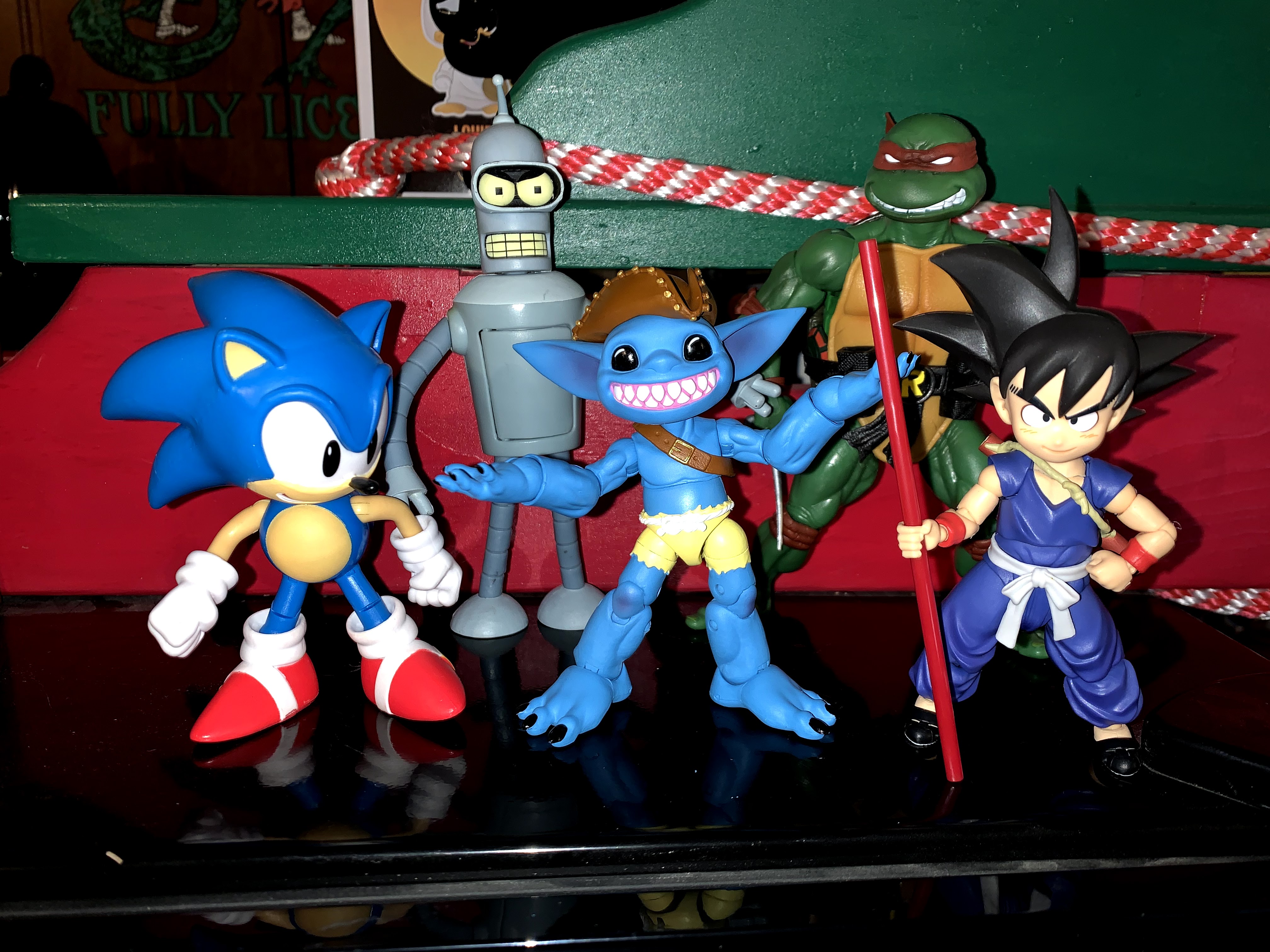
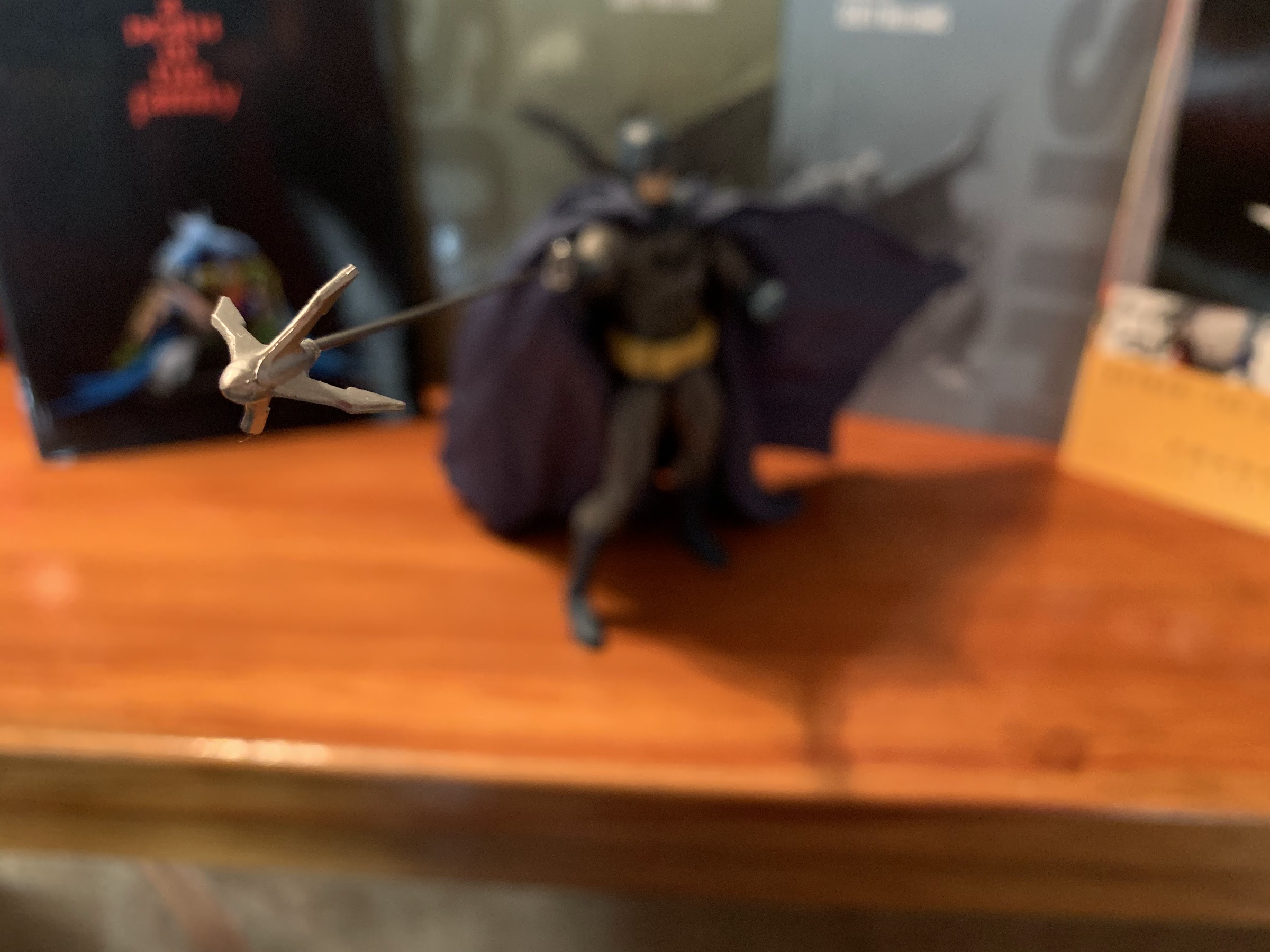
Fwush, being inspired by The Fwoosh, is a bright blue. He’s one of the raider Plunderlings and has some tattered, canary yellow shorts with a rope belt tied around his waist. First off, if you don’t immediately fall in love with the Plunderling design then this line probably isn’t for you. I, as explained in the first paragraph, very much like the aesthetic of these guys and the blue tone only enhances that. Without the hat, he’s about 3 and 3/4 inches tall with ears that stretch out to next week. The head on these guys is pretty large relative to the torso, while the legs and arms are a bit long too. The forearms on these guys are chunky as they basically lack wrists and they have some serious cankles going on. The paint is pretty clean and there’s some darker blue, or purple, used to shade the inside of the ears and some of the musculature. These guys are little, but they’re pretty shredded everywhere except the abs because a little belly just adds to the cuteness. They also seem to have a really droopy butt, which is kind of funny. The figure does have peg holes on its feet, though it really doesn’t need them as he stands very easily given the size of those feet. I may have bought this off of eBay, but it was a brand new and sealed figure that even came with some bonus, Kickstarter, stretch goals. Out of the box, I did have some paint flaking as I worked him out, but nothing that left behind an ugly white spot or anything. There is a message printed inside the box from Lone Coconut recommending these be heated gently to break them in so they obviously expected some stuck joints.
Mr. Saggy Buns.
Lone Coconut was able to pack a fair amount of articulation into each Plunderling, even with them being small in stature. Fwush features a ball-hinge at the head that sits well and provides terrific range. It’s definitely the most expressive part of the figure as he can look up, down, rotate, and tilt like mad. The shoulders are ball-hinged and the elbows are just single-hinged. They swivel, but I can’t get them to bend as far as 90 degrees. The hands peg in and are on hinges with the open hands being horizontally hinged and the gripping hands vertically hinged, a nice little attention to detail I actually wasn’t expecting. There is a diaphragm joint that feels like a ball joint. The figure can bend back pretty far, but doesn’t come forward much. There is a little tilt and swivel there, but he doesn’t seem to want to twist very far and I’m not going to push it since I don’t have a major retailer backing this purchase. The legs connect on simple ball joints and they’re pretty limited. The figure can kick forward fine, but the legs don’t lift out very far to side or kick back far because of the butt mold. The knees are double-jointed, though I can only get one hinge on each leg to work. On the left leg the bottom hinge will move and on the right it’s the top hinge. Both are pretty tight, but he can achieve a 90 degree bend and I suspect if I applied some heat and got both hinges to work in tandem he’d bend even further. As it is, it’s fine. The feet are on hinges, but they’re shape doesn’t afford much movement there. They do have ankle rockers though, and they work just fine.
Presenting: the stuff.
For a figure that’s less than 4″, I think the amount of articulation is fine. The only area I wish there was more range rests with the hips as I wish I could get him into a really, low, crouch. I’m still pretty satisfied with the poses I can achieve though, and it’s definitely helped by the fact that I only have one figure and not a whole army so I don’t have to seek out variety. I will say a lot of the joints were pretty stuck out of the box, but this does feel like a pretty sturdy figure. I wasn’t too concerned about any breaks as I worked him out, and I didn’t have to resort to heat for anything (though if I want those knees to work properly I’ll definitely have to do something there) to get him going so I’d say it wasn’t too bad. It’s certainly something to be mindful of so don’t go snapping your little imp right out of the box.
Bang?
You’re in over your head, Turtle Troll Leo.
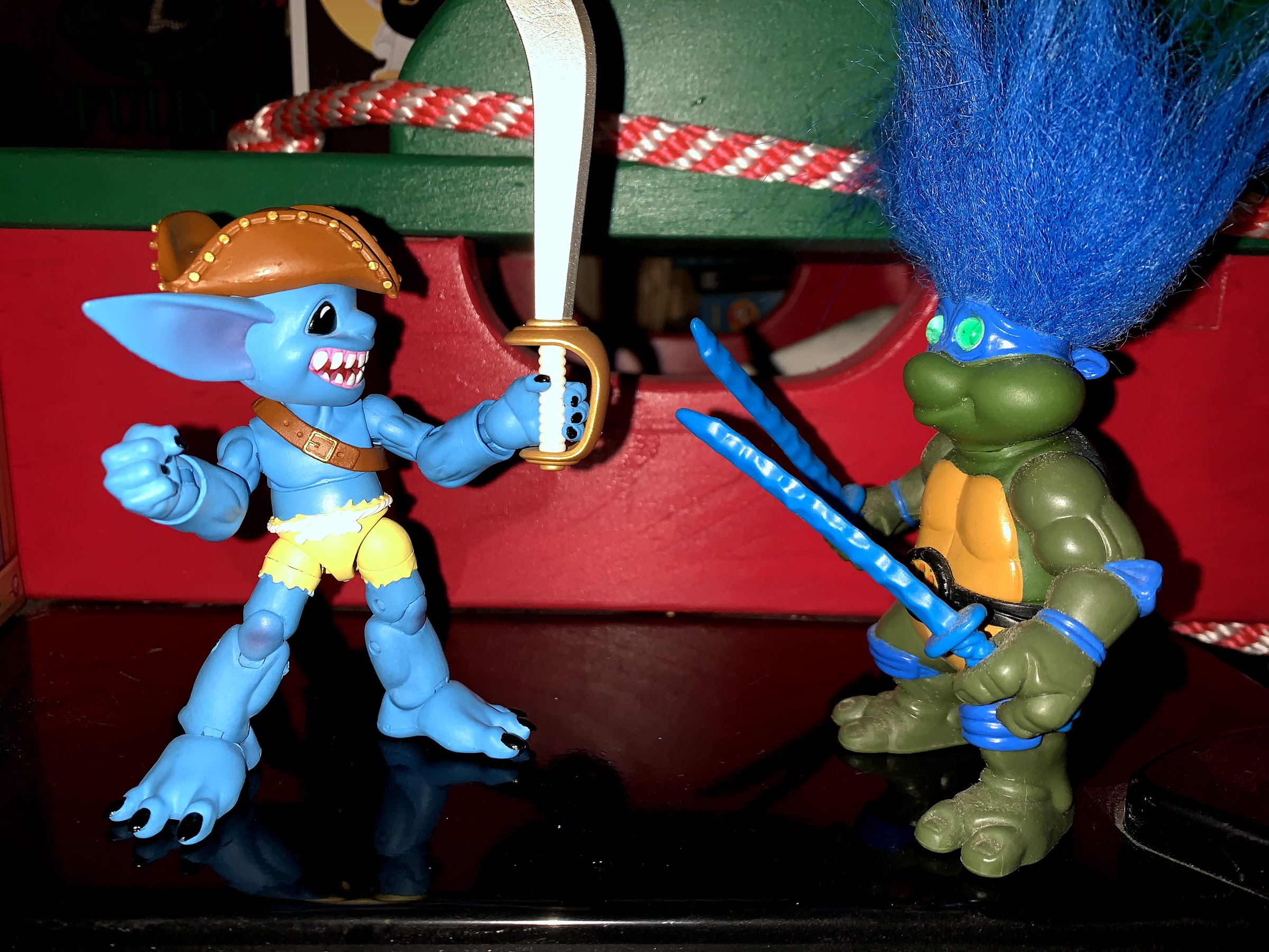
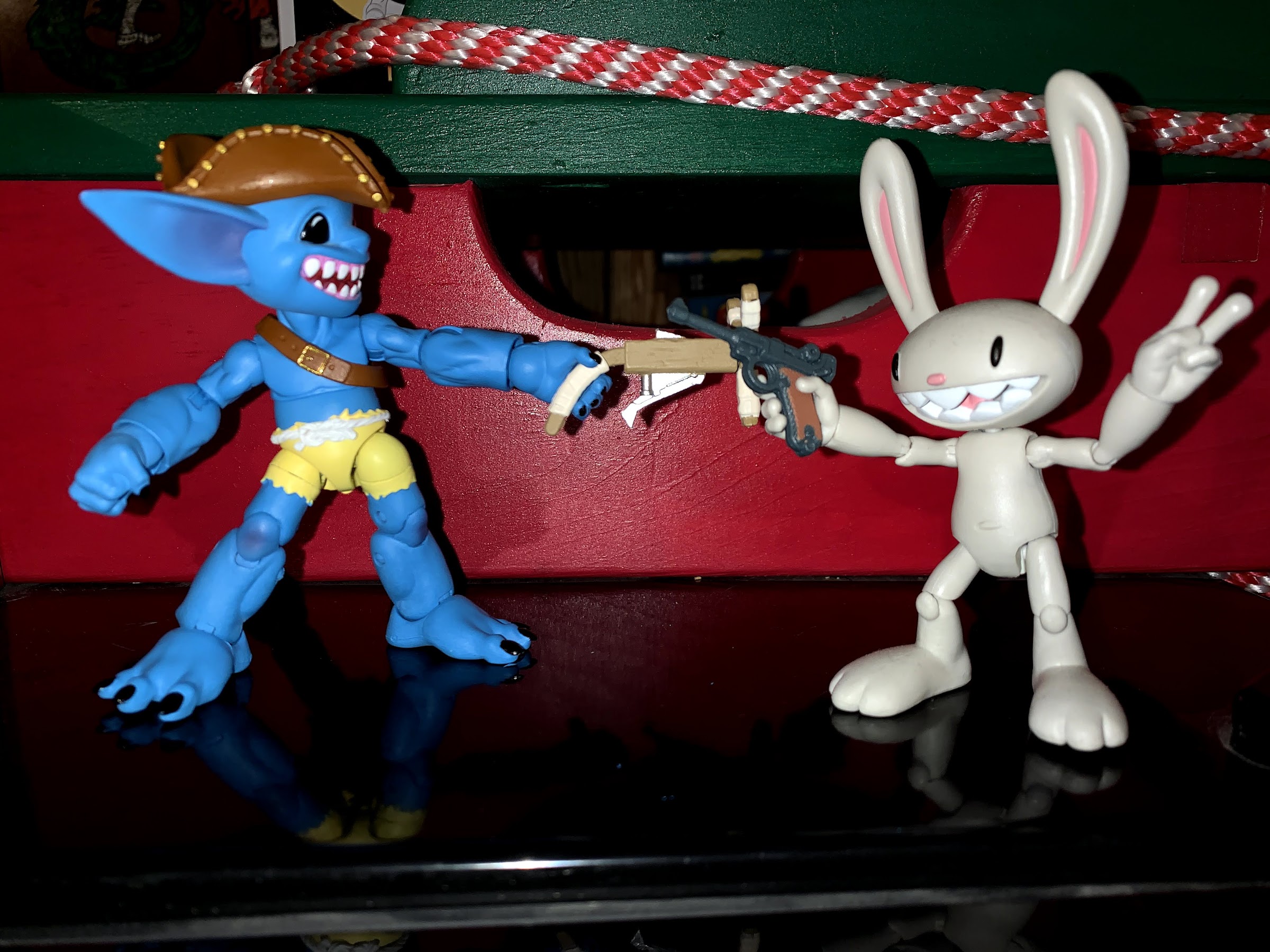
Little Fwush comes with a decent assortment of extra parts and accessories. Every Plunderling seems to come with three heads: smiling, grinning, and open mouth grin. They pop off and back on rather easily, and the same can be said for the hands. The retail version of Fwush comes with a pair of open hands and a pair of gripping hands. This one also came with the Kickstarter bonus pair of fists. It’s always nice to have fists, but I don’t know if I’ll ever display him with them on. As far as accessories go, Fwush has a bandolier around his chest that could probably be removed if you popped an arm off. In addition to that, he has a tri-corner hat that’s nicely painted and affixes to his dome via a magnet and stays in place well. Fwush also has a pair of weapons to make use of, a stylish scimitar and some sort of slingshot/gun hybrid. It’s basically a crossbow, only with a slingshot instead of a bow. He doesn’t have trigger fingers though, but even if he did the trigger mechanism is too far forward for him to reach, but it looks fine. Both weapons are painted well and I really like the distressed markings on the sword. They’re also easy to get in and out of his hands, though he can’t holster either weapon by default. Included in the box is a little plastic bag with two hooks in it. I initially thought they were earrings, but they actually can peg into one of the two holes on the bandolier to serve as a holster. The problem is, the bandolier is so tight to the figure’s body that it’s tough to get the leverage needed to fit the peg through the hole. And when I did finally get one of the hooks in place, it popped out the second I tried to holster the sword. In the end, they make for better earrings.
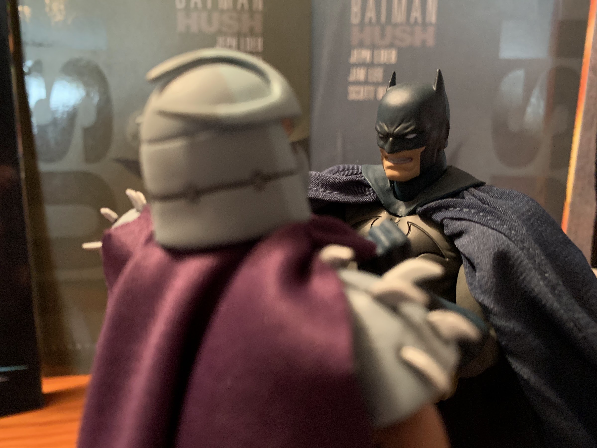
Now this seems like a fair fight.
Fwush, and the Plunderlings in general, are cute little action figures that pack just enough articulation and accessories to make them a worthwhile purchase. How much you enjoy a Plunderling is dependent on what you think of the base aesthetic the line provides which actually makes these an easy purchasing decision: you either like what you see, or you do not. In hand, the figure has a nice feel and it checks all of the boxes. It doesn’t necessarily “wow” in any one area, but there’s also few shortcomings. I definitely wanted this particular one because of his look (I love blue) and its connection to The Fwoosh and I wouldn’t mind a few more eventually, but this is definitely not the sort of line I’d be all in on. Of course, if you want this figure you’re kind of out of luck at this point as he’s only available on the secondary market. Lone Coconut, realizing it has a hit on its hand, has opened pre-orders to both Big Bad Toy Store and Entertainment Earth on six designs, but Fwush is not among them. They’re still available though if you’re interested. The only other downside to these figures is they are expensive for what you’re getting. The retailers charge $40 a Plunderling after they initially launched for $30 so the price is not a strong point. You are supporting a new, and small, company by purchasing them though and it’s a company that probably can’t get factory rates like Hasbro or NECA can. The pricing is similar to other small shops though like Boss Fight Studio which charges the same price for its Max figure that’s even smaller in stature than a Plunderling. It is what it is and if you don’t like the price then don’t buy it. I think these guys are pretty fun and Lone Coconut has a hit on its hands. Hopefully they continue to have success and maybe they can get the prices down with larger orders eventually which would really open this line up to kids as well as adults.
He’s certainly a unique addition to the collection
If you’re a repeat visitor here at The Nostalgia Spot, then you’ve probably noticed that around here there is a high opinion of the television show Batman – The Animated Series. I did a re-watch of the series that spanned more than two years and also checked out the various films based on the property. What I have never touched upon are the toys. Back in the 90s, there was a toyline from Kenner that was sold wherever toys were sold. It was fine, from what I remember, though I was too into X-Men to spare many resources when it came to that one. Of more interest to people my age now, is the line of action figures released by DC Collectibles. Over the past several years, I’ve seen this line sold at various comic shops and at online retailers, but I’ve never been able to pull the trigger. The figures do an okay job of matching the television show’s aesthetics, but at the cost of articulation. The figures never looked particularly imaginative, and since they usually featured a rather high price point I was never able to convince myself this was a line worth investing in.
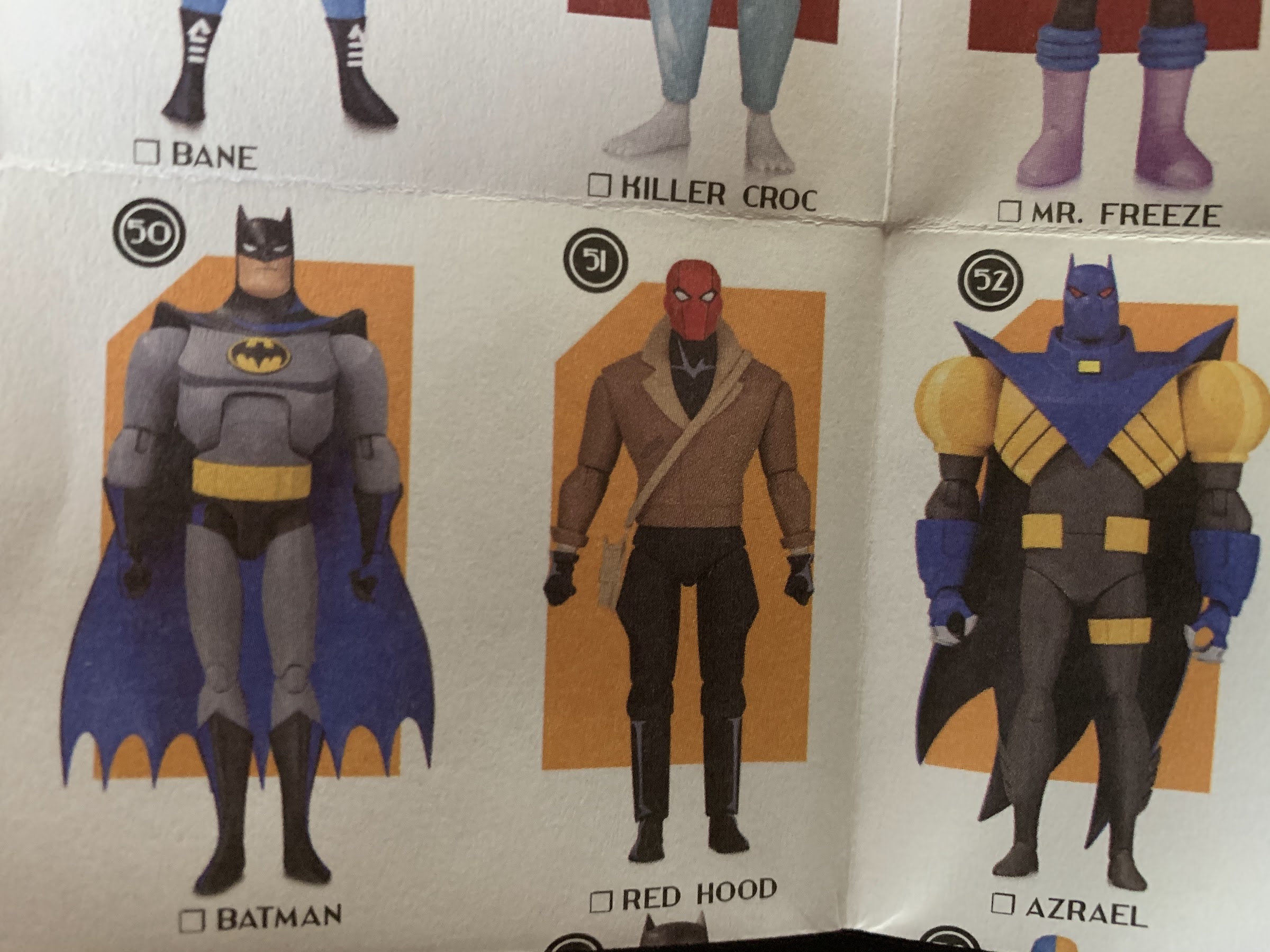
2020 marked the end of DC Collectibles. As that part of DC’s business was winding down, a final line of figures based mostly on BTAS was making its way to retail. Dubbed Batman – The Adventures Continue, many of these figures were re-releases of past figures that may have been limited releases, or were changed-up in some way. Some also never made it out and were cancelled, like the new Catwoman featuring an unmasked head. And some were also separate from BTAS, but appeared to emulate the show’s style like the Knightfall Azrael as Batman figure. I don’t know what the numbers ended up being like for this apparently final wave of figures, but I had a hard time tracking any down. Though I also was not frequenting any comic shops and was mostly limited to online shopping. They appeared to sell out rather quickly though, which was unfortunate as I held off on pre-ordering any because the promotional shots left a lot of unanswered questions for me. They were basically limited to just the figure, and it wasn’t clear if any accessories were even being included. It had me thinking these were just leftovers that DC was trying to make a quick buck off of, which was really driven home by the fact that the images for the actual Batman figure matched the aesthetics of a previously released figure that came with the Batcycle. That Batman had a rather ugly ab crunch so he could fit properly on the bike. It’s a necessary evil for a figure with that kind of need, but as a stand-alone figure it made little sense.
Pictured: not the figure that was released. In this case, that’s probably for the best, but I can understand if some felt misled.
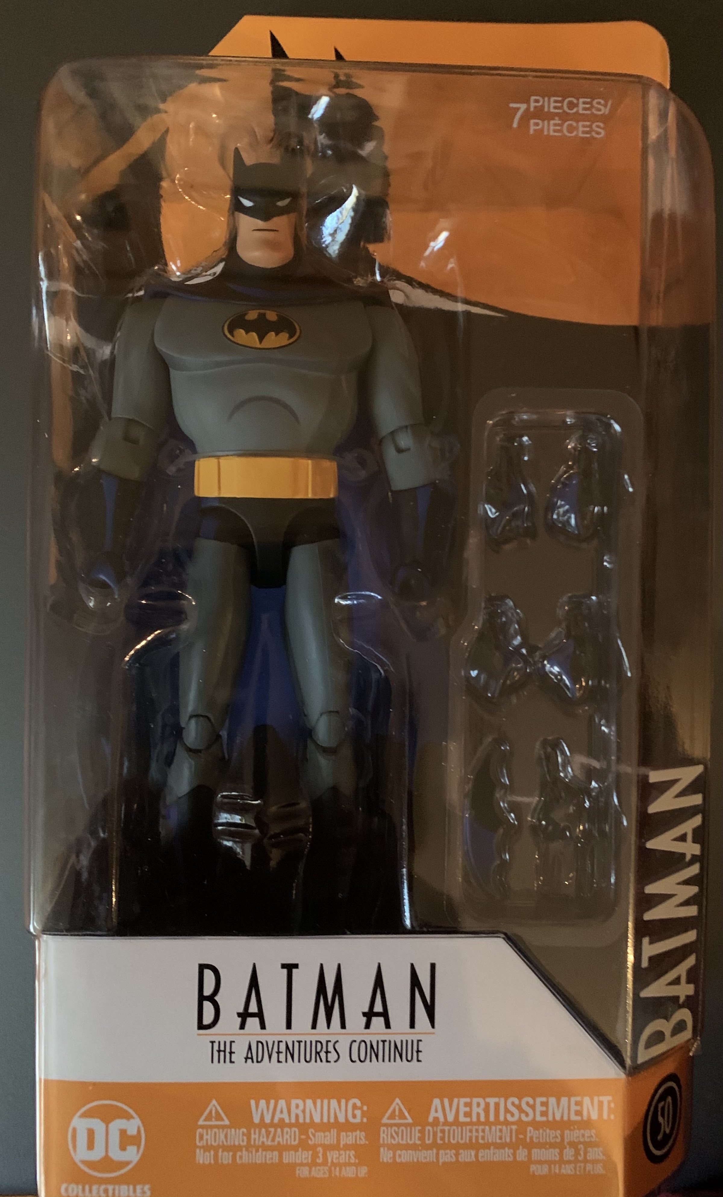
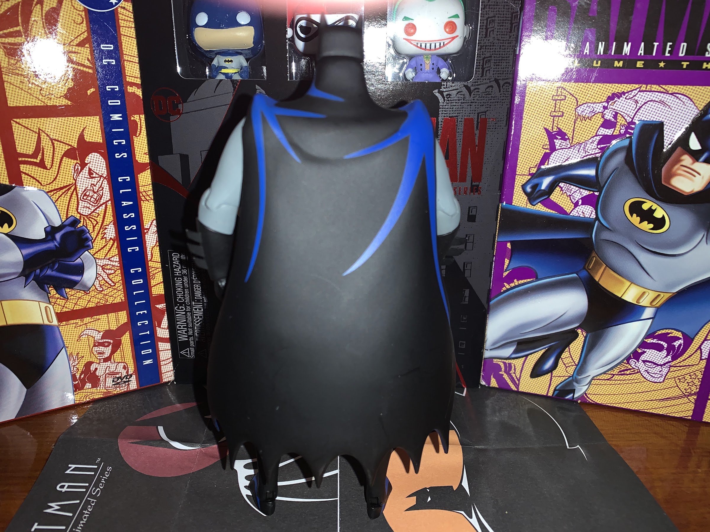
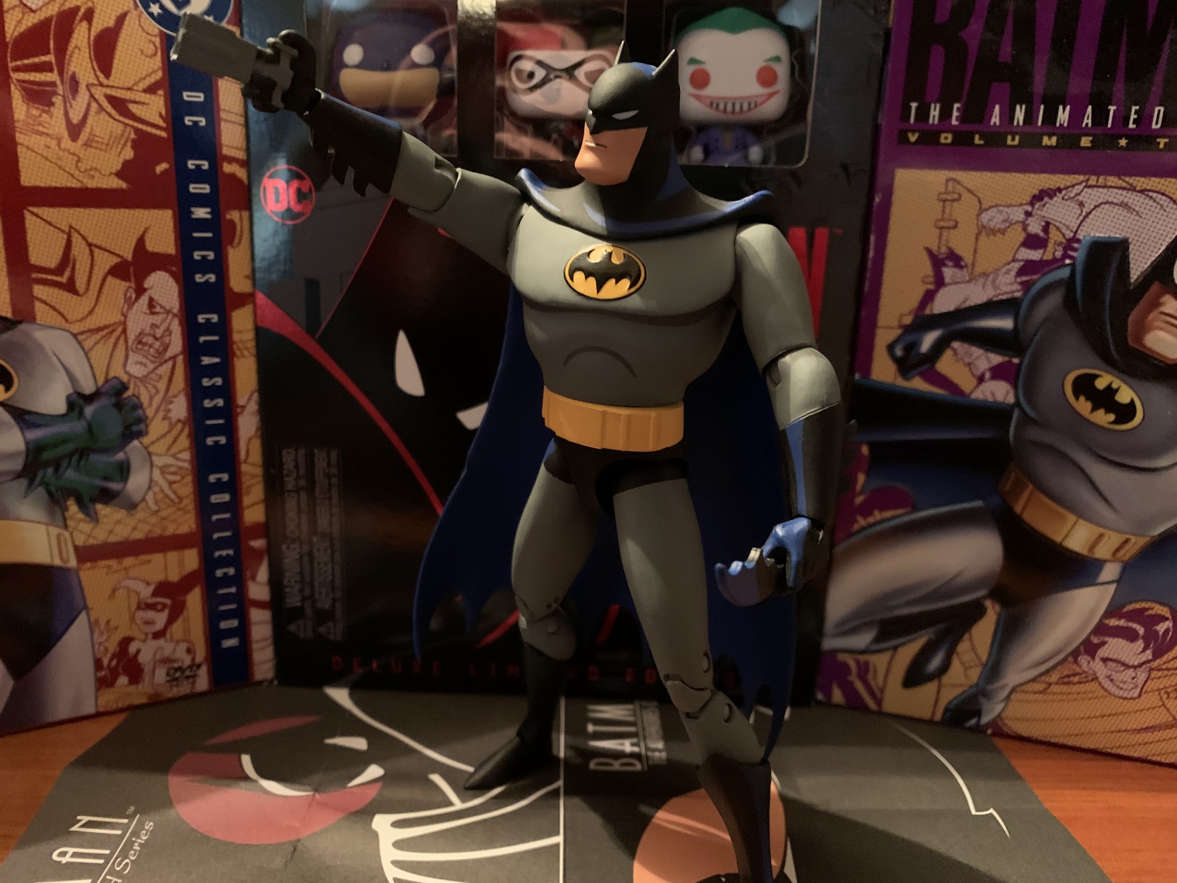
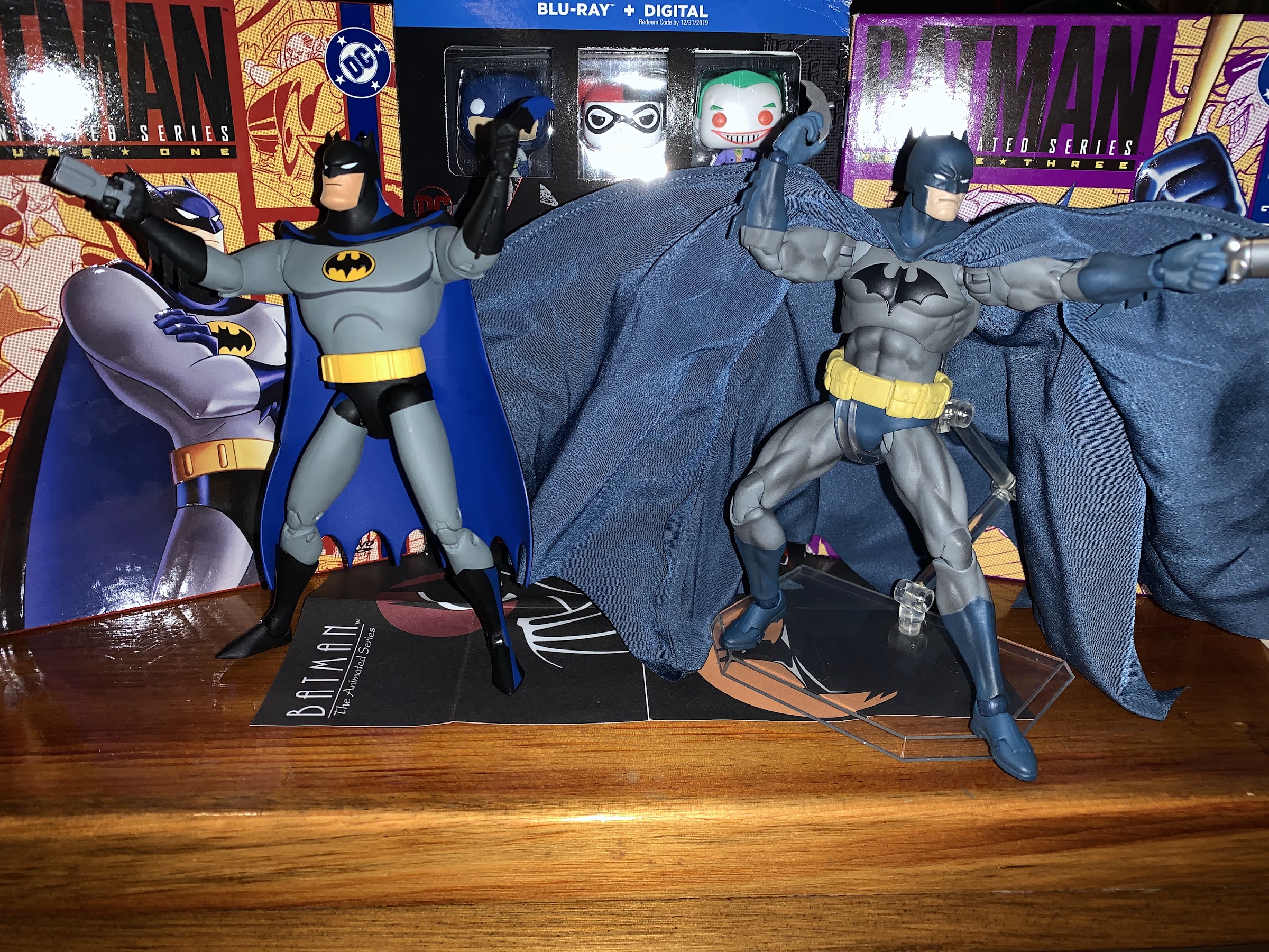
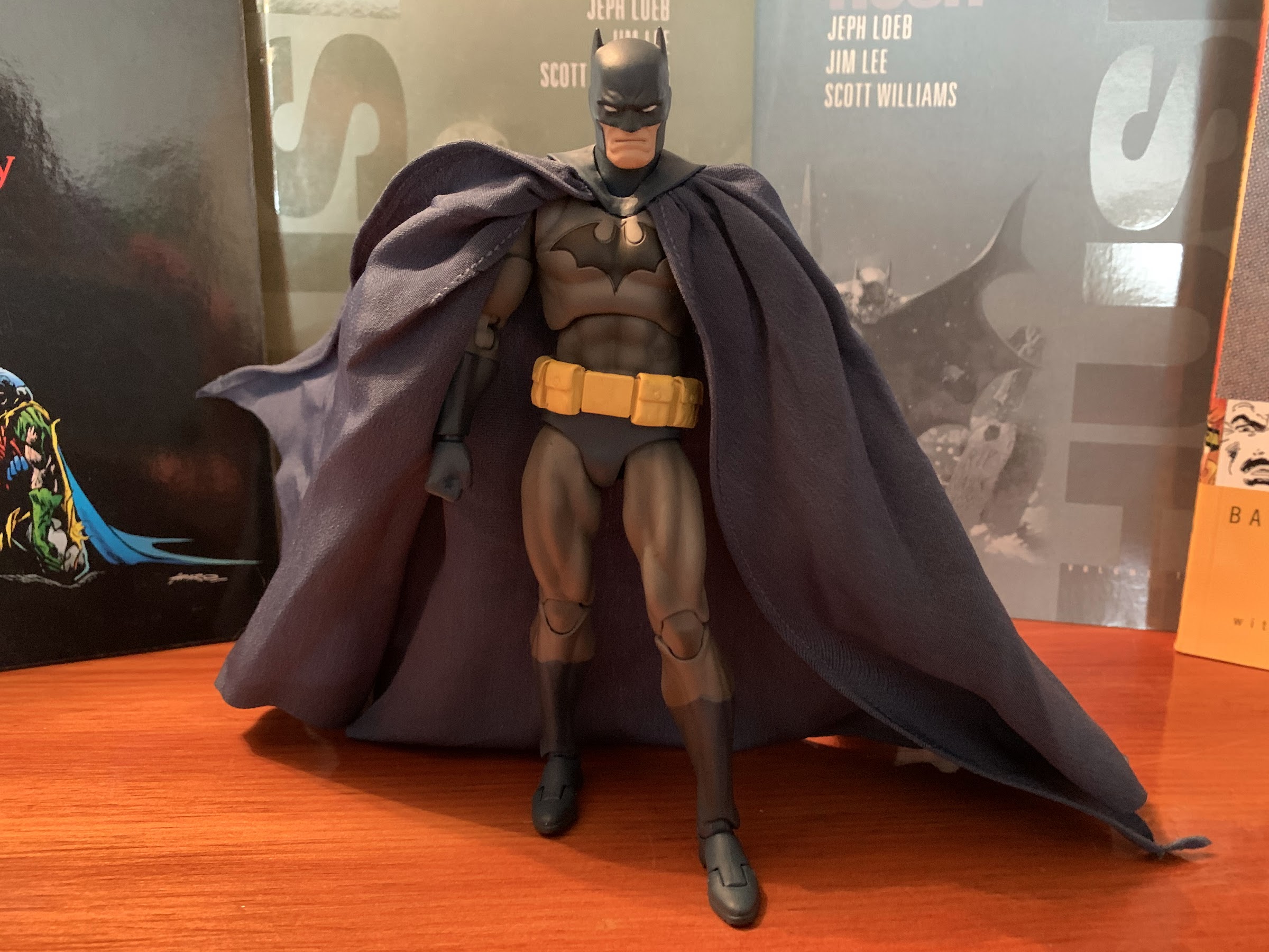
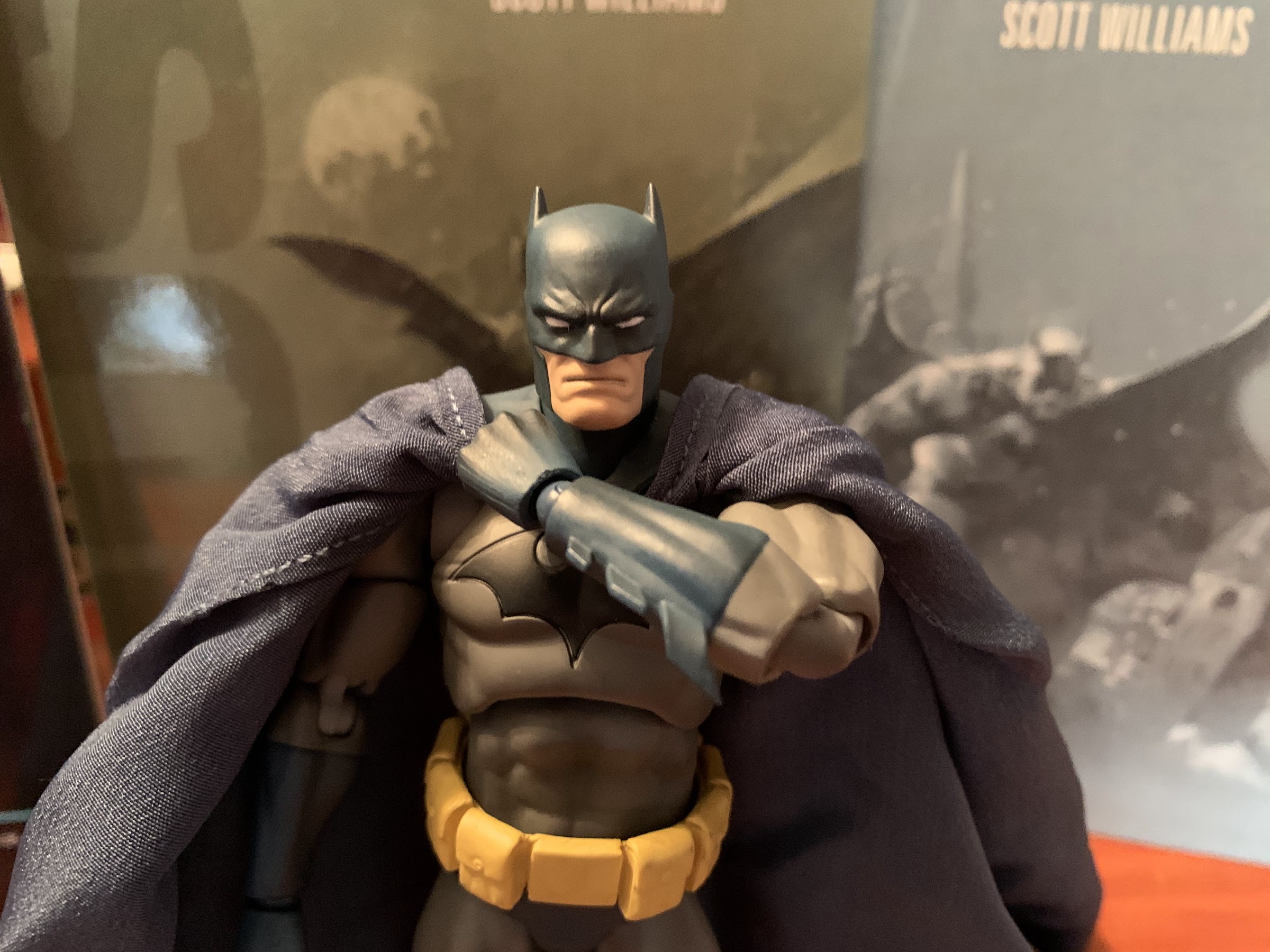
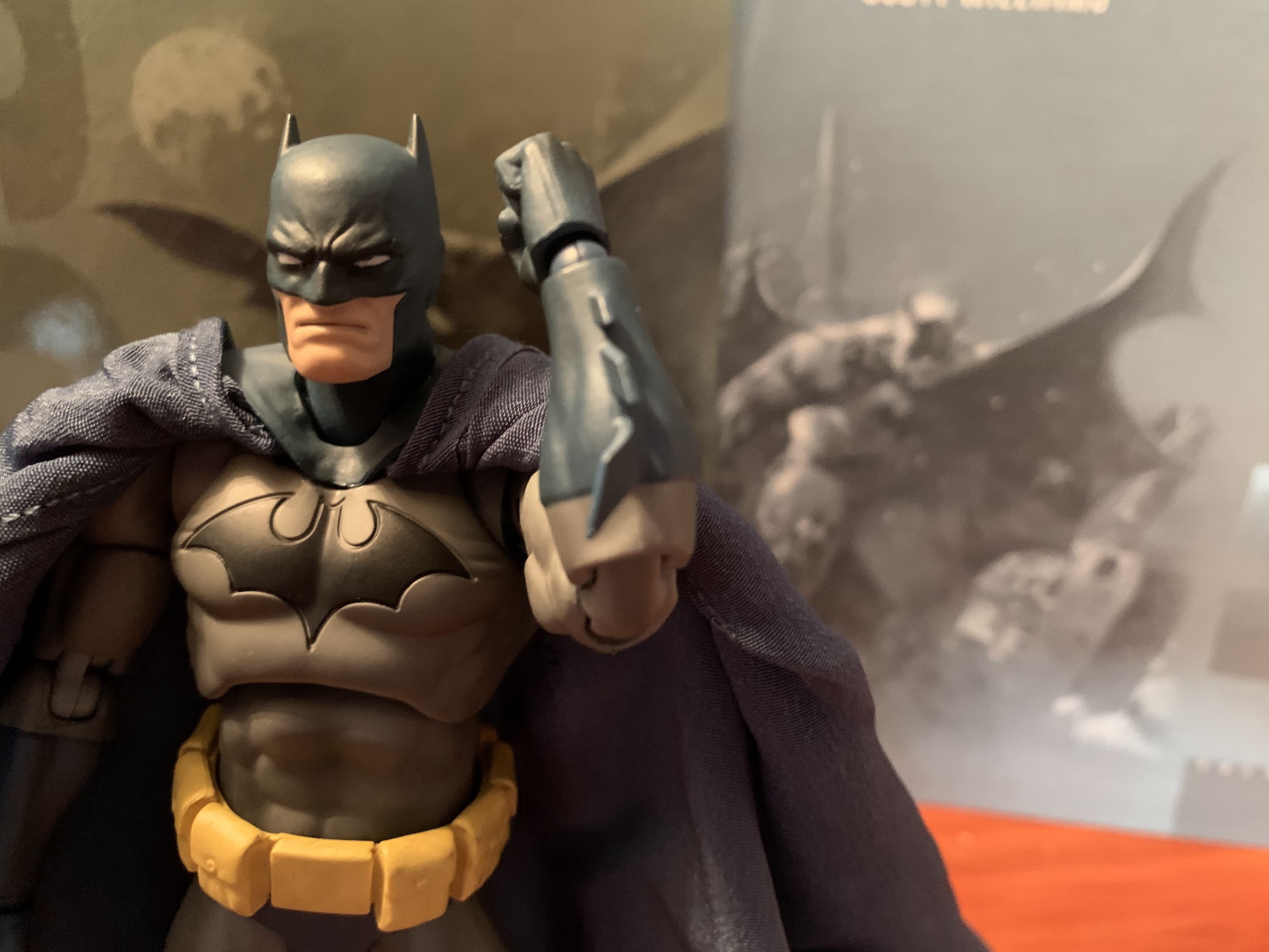
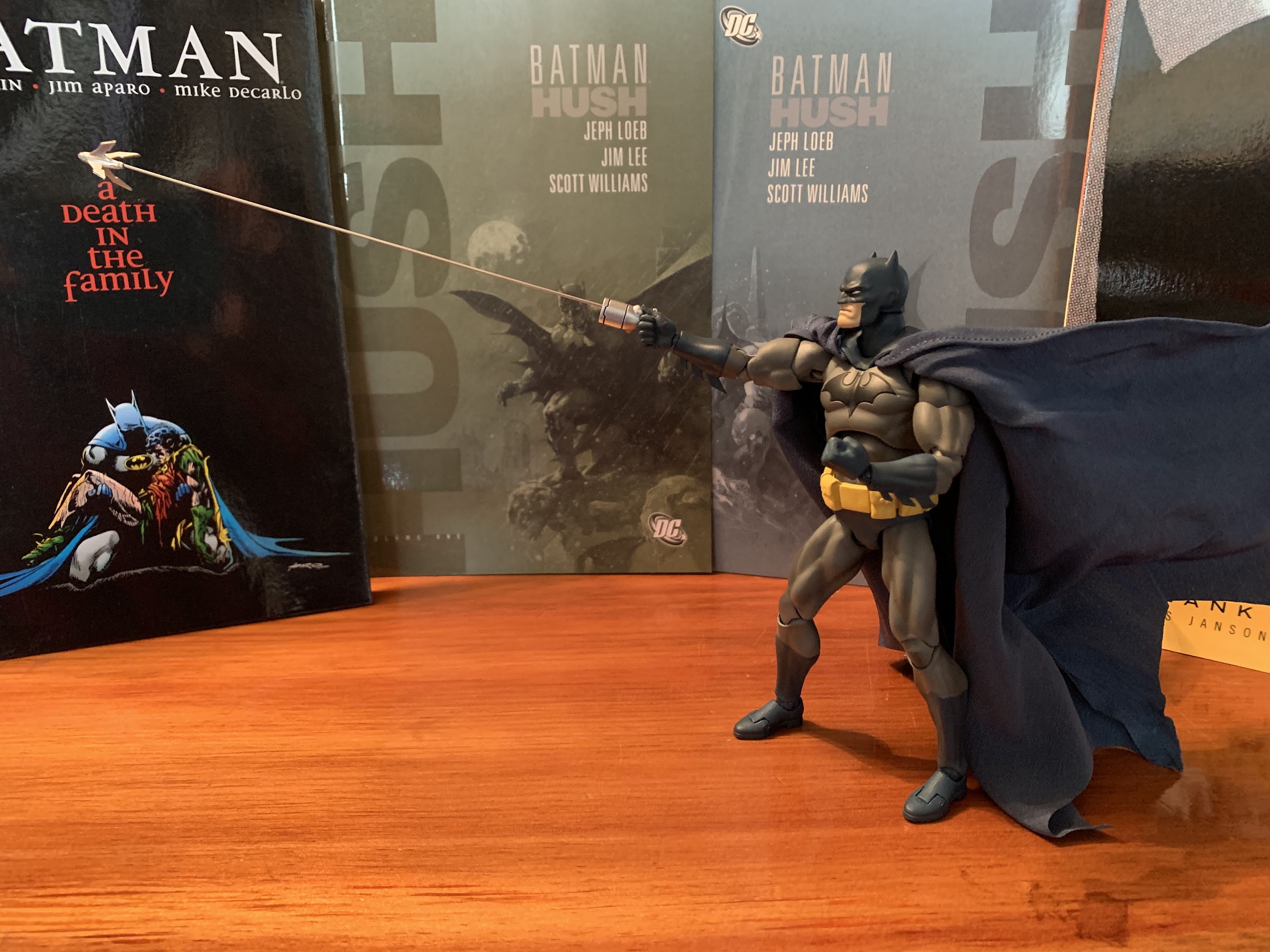
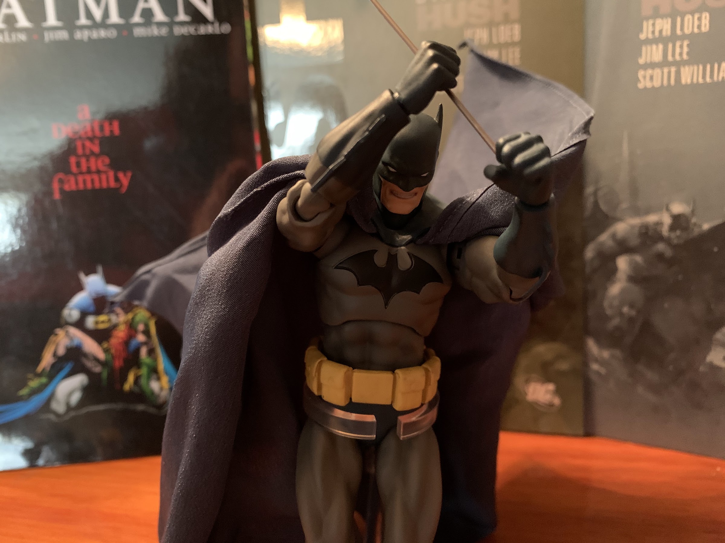
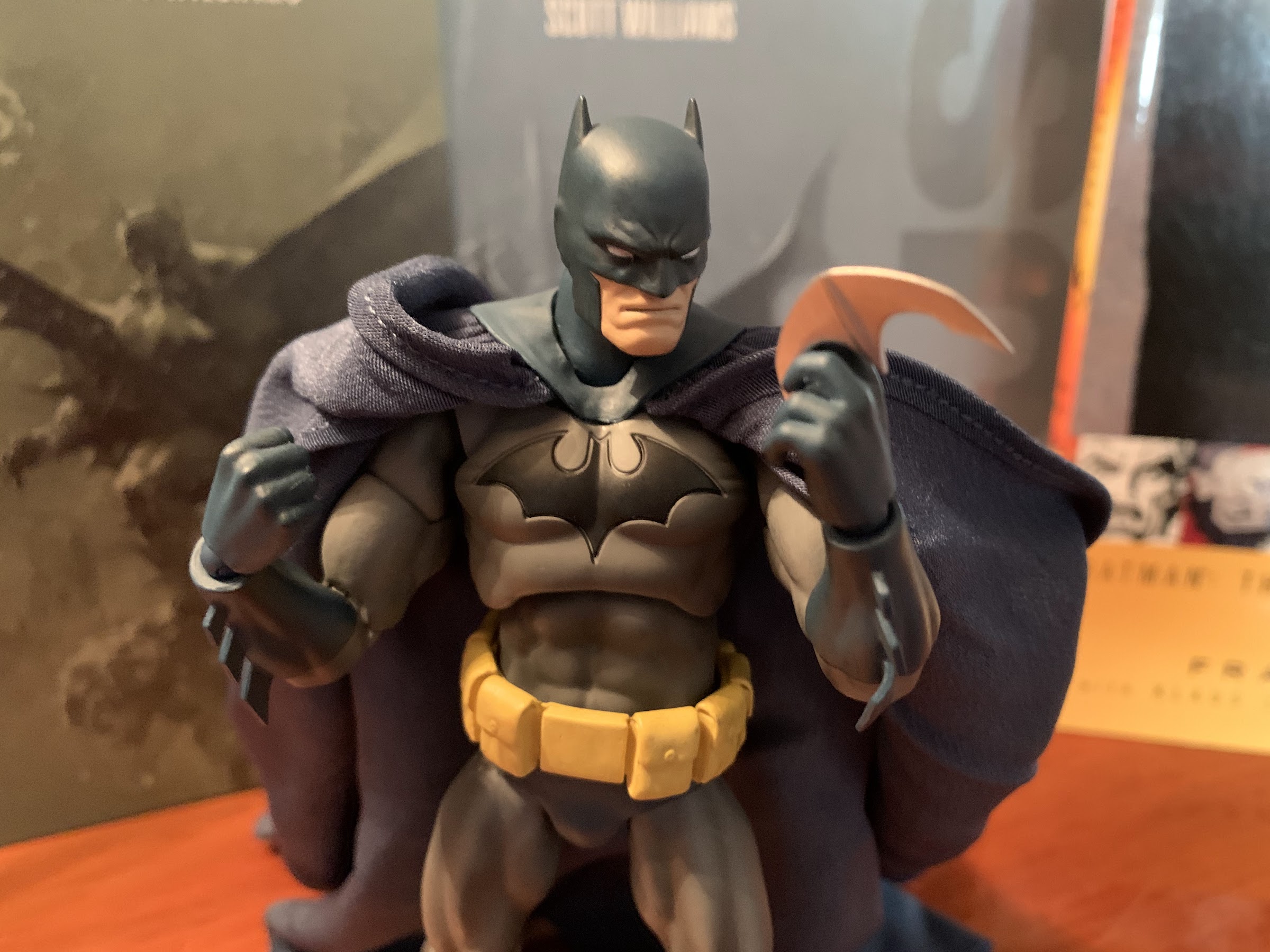
When the Batman figure was finally released though, it ended up being in the style of the original Batman figure from the BTAS line. Only this figure had re-tooled and improved articulation and a new paint job. When it came to BTAS, many figures cheated and just gave Batman a black cape and cowl even though it’s clearly blue in the show. They just go with black because Batman is often only shown at night so much of his cape and cowl are painted black with blue highlights. For the DC Collectibles figure, they did him all in black, but made the underside of the cape blue which looked okay. For this new one, someone finally had the bright idea to just paint the damn figure like the animators painted the character – what a concept! That means he’s still mostly black, but with blue accents and shading. It looked terrific in promotional images, and even though I was still unsold on the actual figure, this Batman at least looked enough like the character from the show that I wanted it, even if it would be my lone figure based on the classic series.
Batman may like to dwell in the dark, but we’re gonna need that flash to bring out those sweet blue accents.
Of course, by the time all of that was determined the figure was sold out. There is one retailer still, to this day, taking pre-orders on the figure at MSRP, but every month they push the release out another month leaving me to believe it will eventually just get cancelled. As far as I know, DC Collectibles is all done and product is out the door, but I could be wrong. At any rate, being unable to track this figure down at brick and mortar or finding it sold out everywhere online, I was left to turn to the dreaded secondary market. A lot of the figures form this final wave have been marked up by a few sellers considerably, as they know numbers were low. How much did I want this figure? Enough to pay essentially double the MSRP on it? As the weeks and months dragged on it became evident to me that I was just too curious about this figure to not give in. And the longer I waited, the higher the price would likely climb, so give-in I did.
Hopefully the artwork in the background is making it obvious that this is the proper way to paint a Batman from this show.
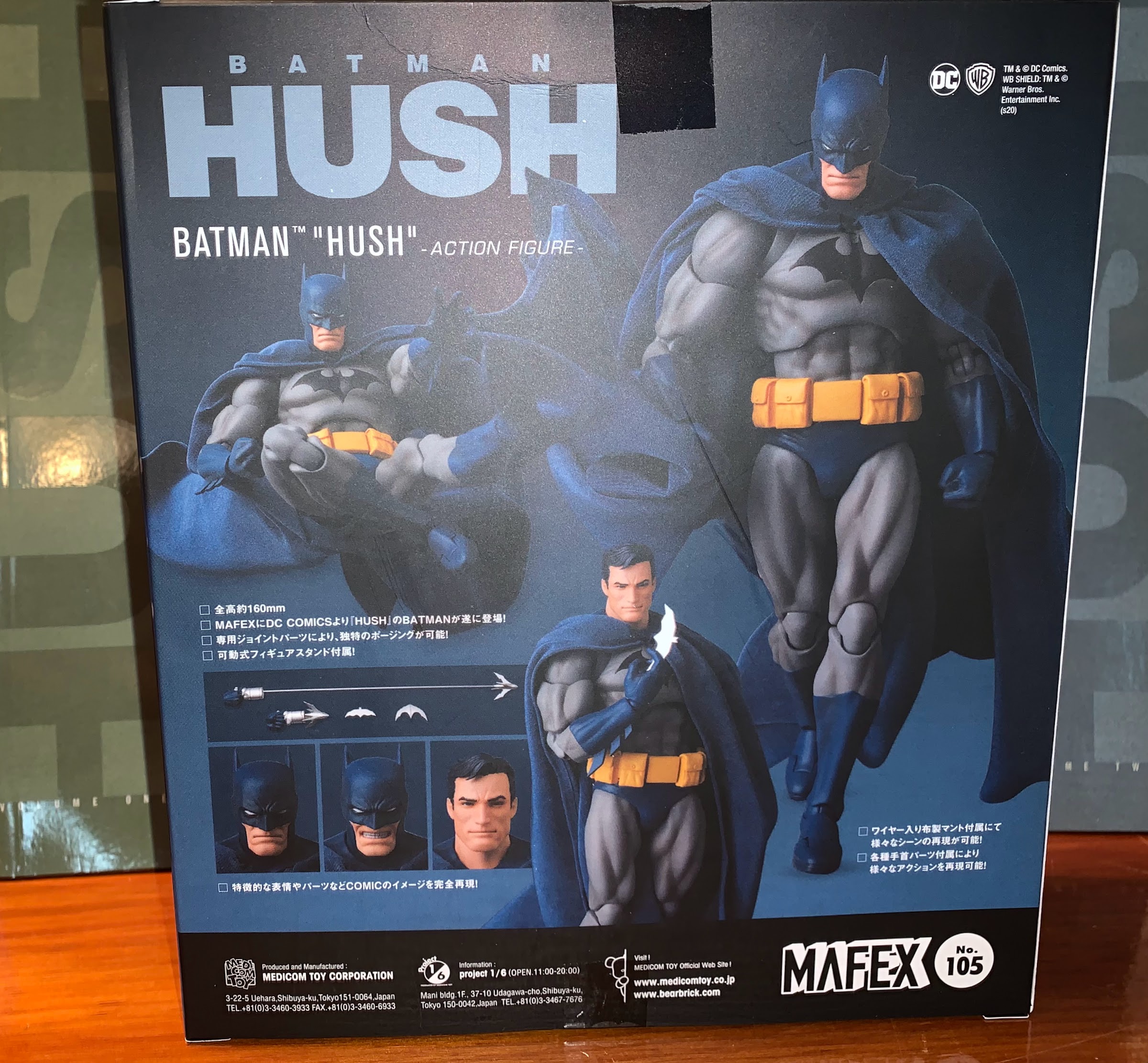
The Adventures Continue line all come packaged on a standard, non-resealable, blister. There’s a shadowy Batman on the back of the card with a yellow (interesting choice) backdrop. There are no product shots or cross-sells on the package, but there is a little booklet inside the box showcasing the other figures in the line. The figure is easy to get a look at and the accessories are in plain view as well. The actual Batman figure is held in place by one plastic tie at the waist and the cape is fed through the back of the blister, which is quite tight. When removing him, definitely be careful with that cape as you don’t want to scratch it.
That emblem is just perfection.
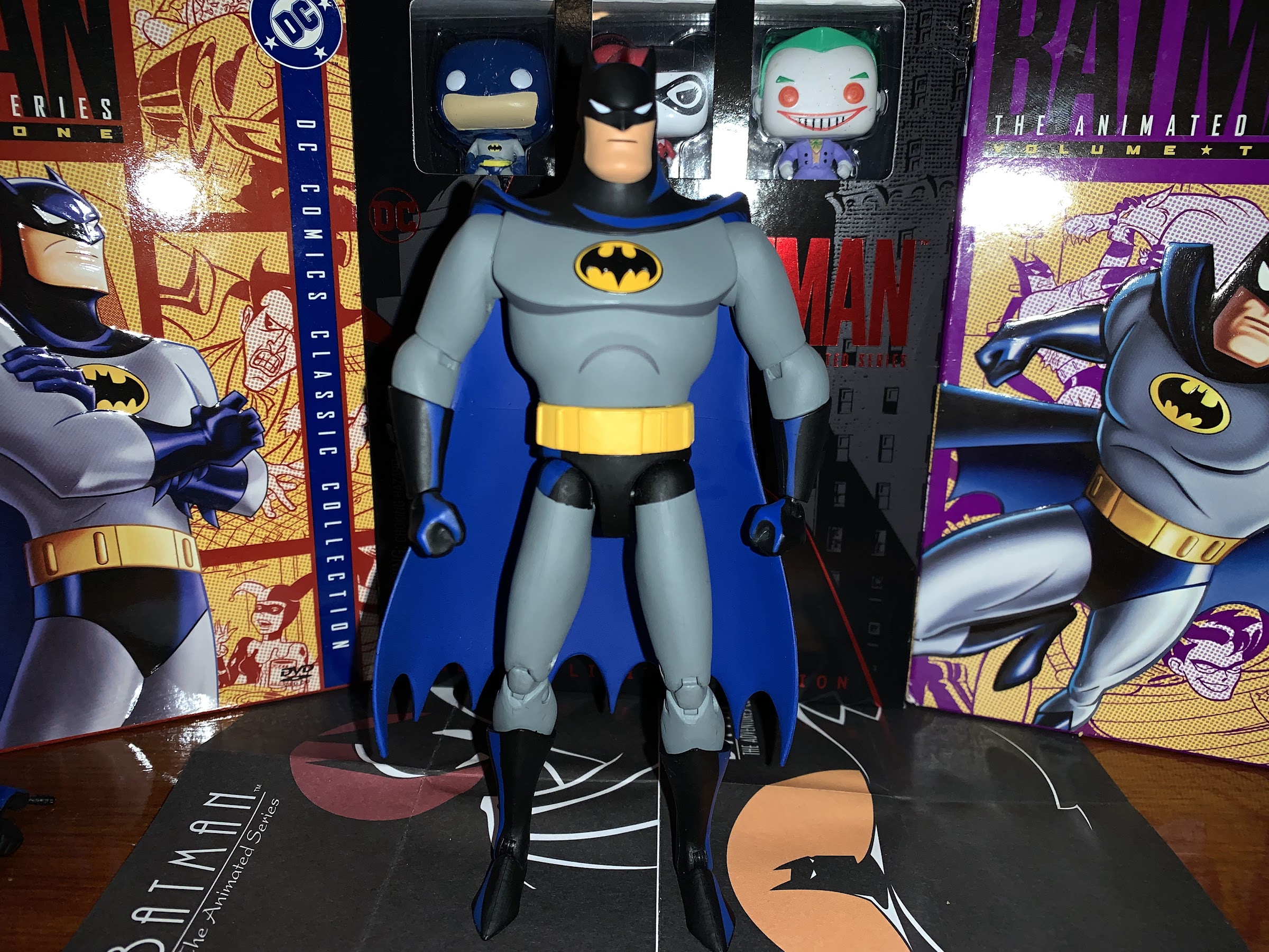
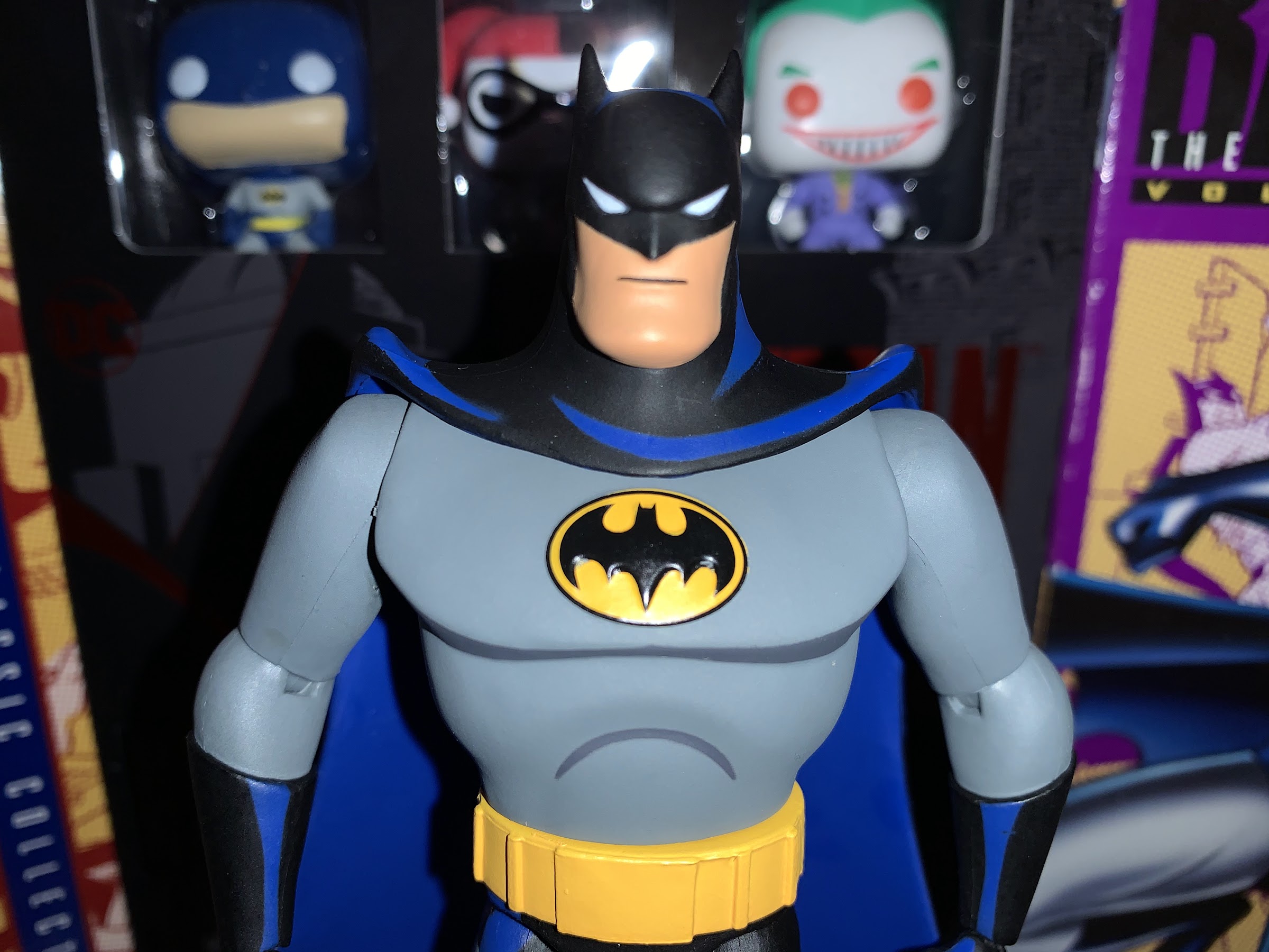
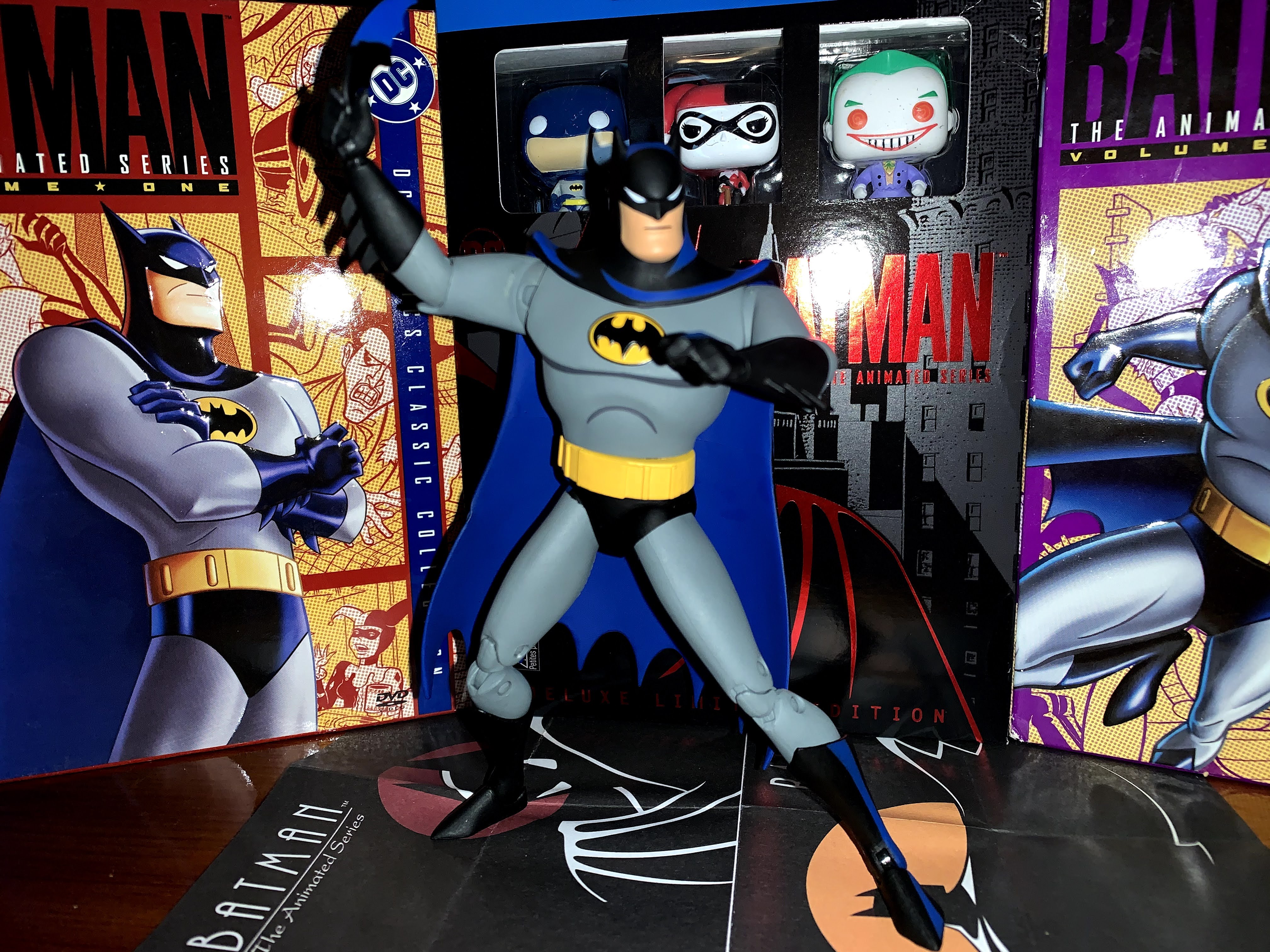
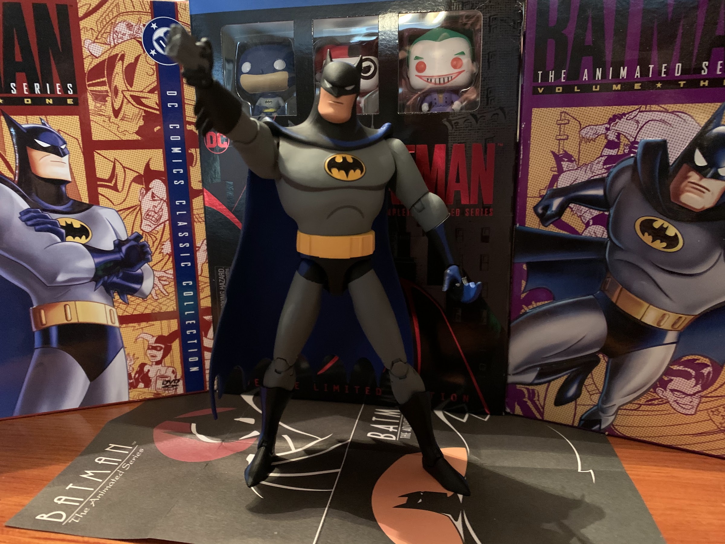
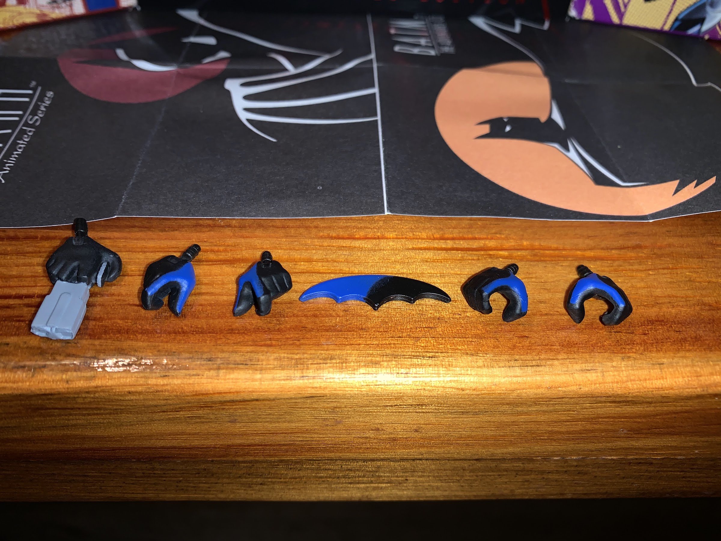
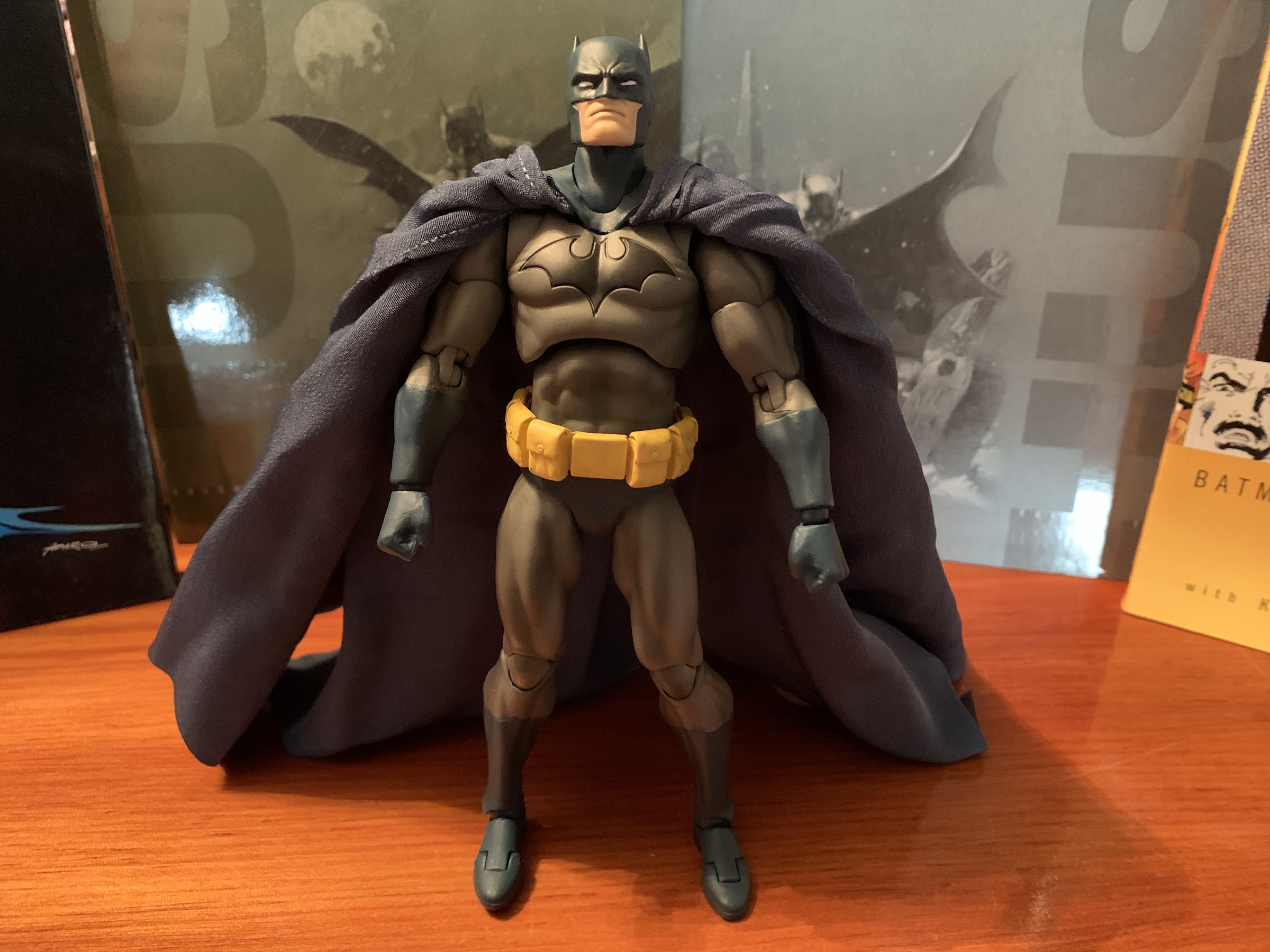
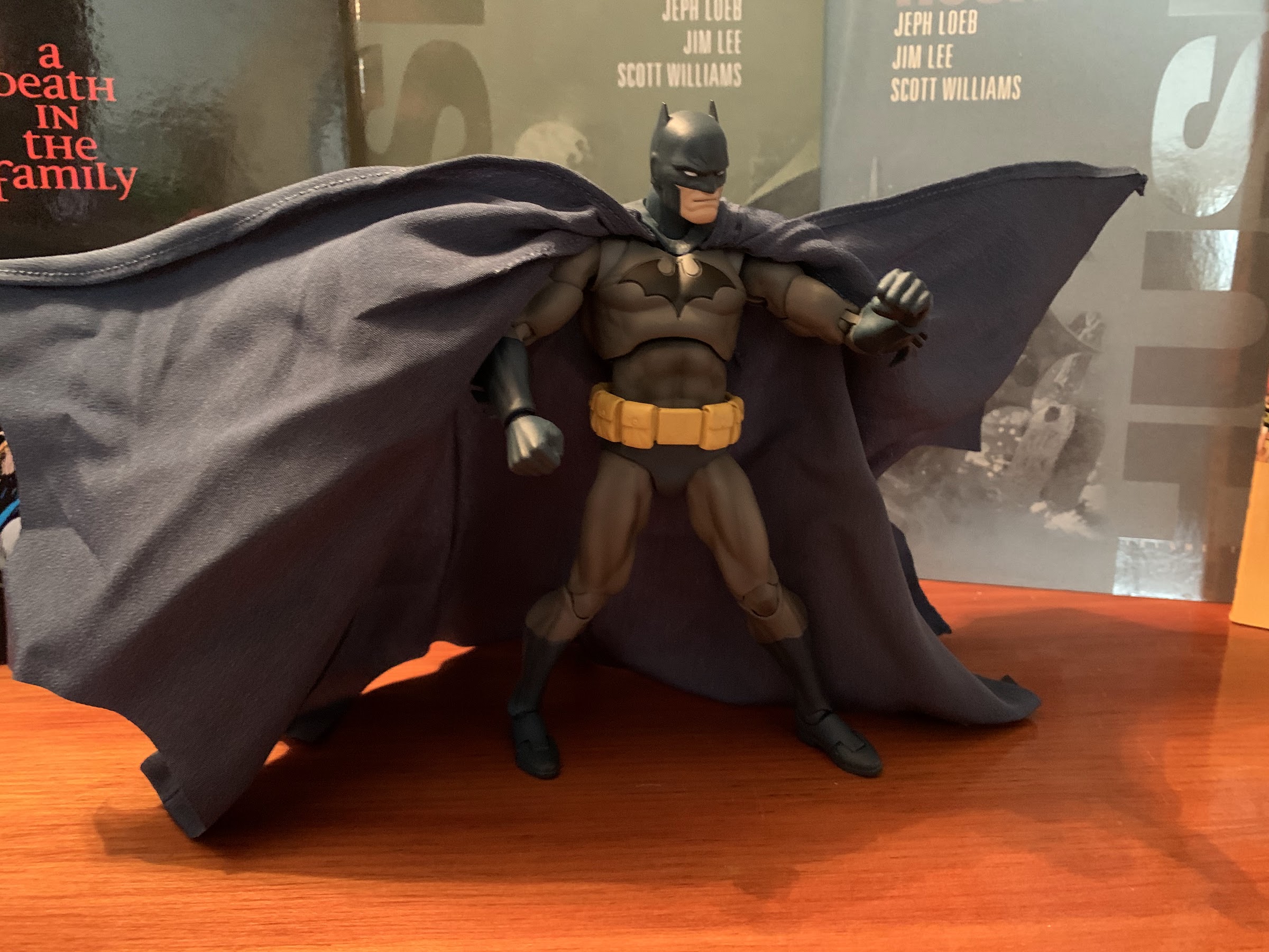
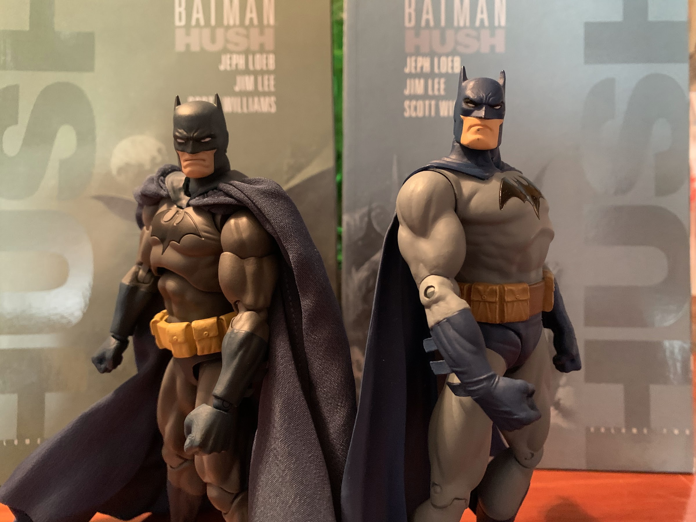
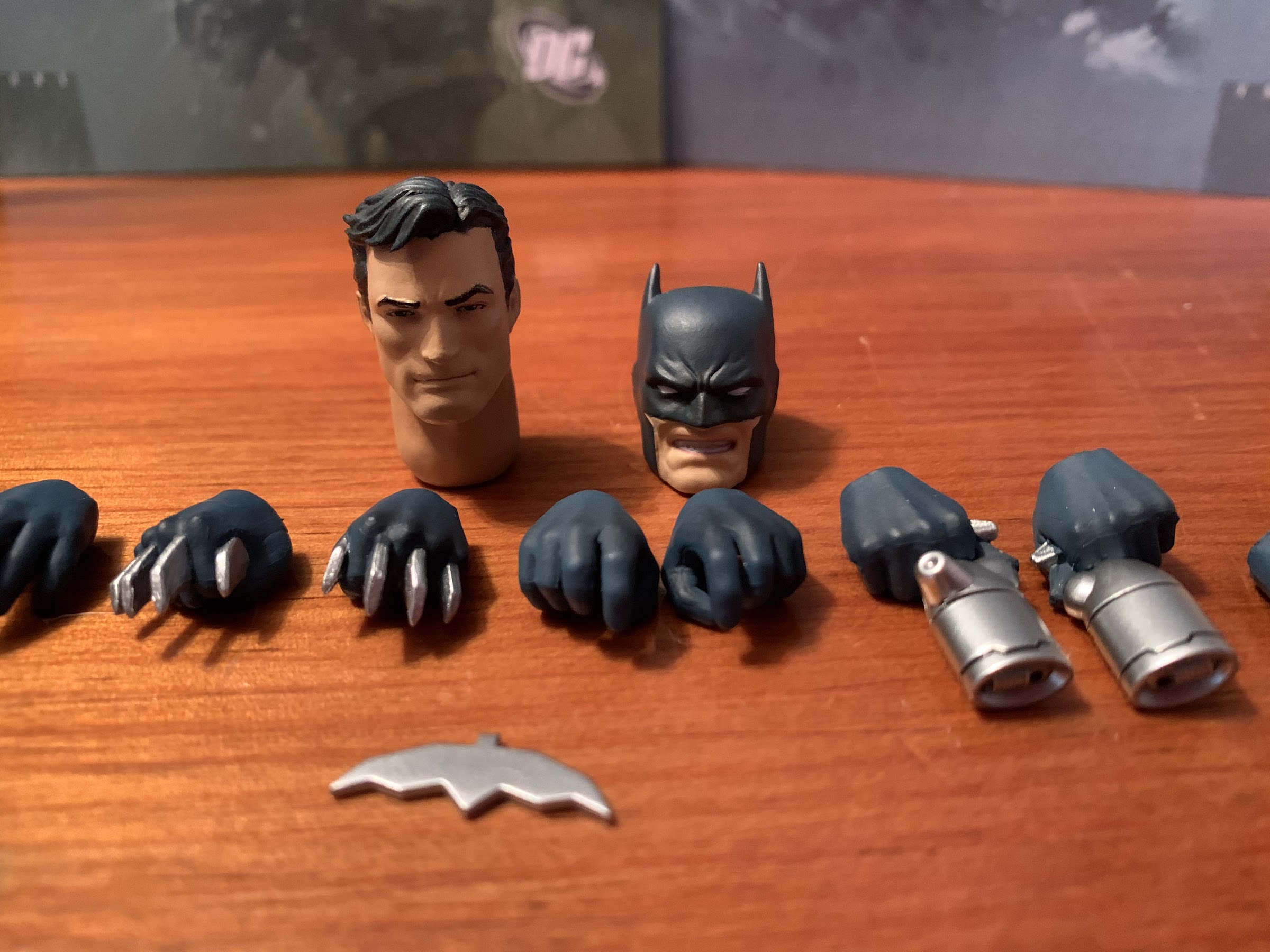
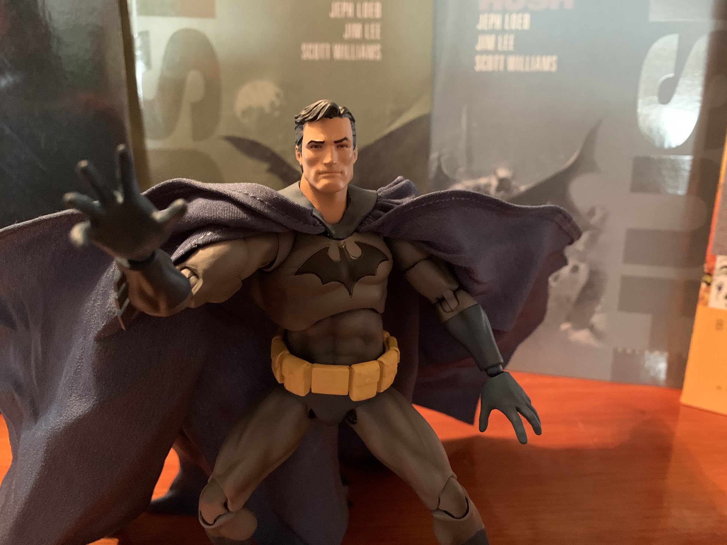
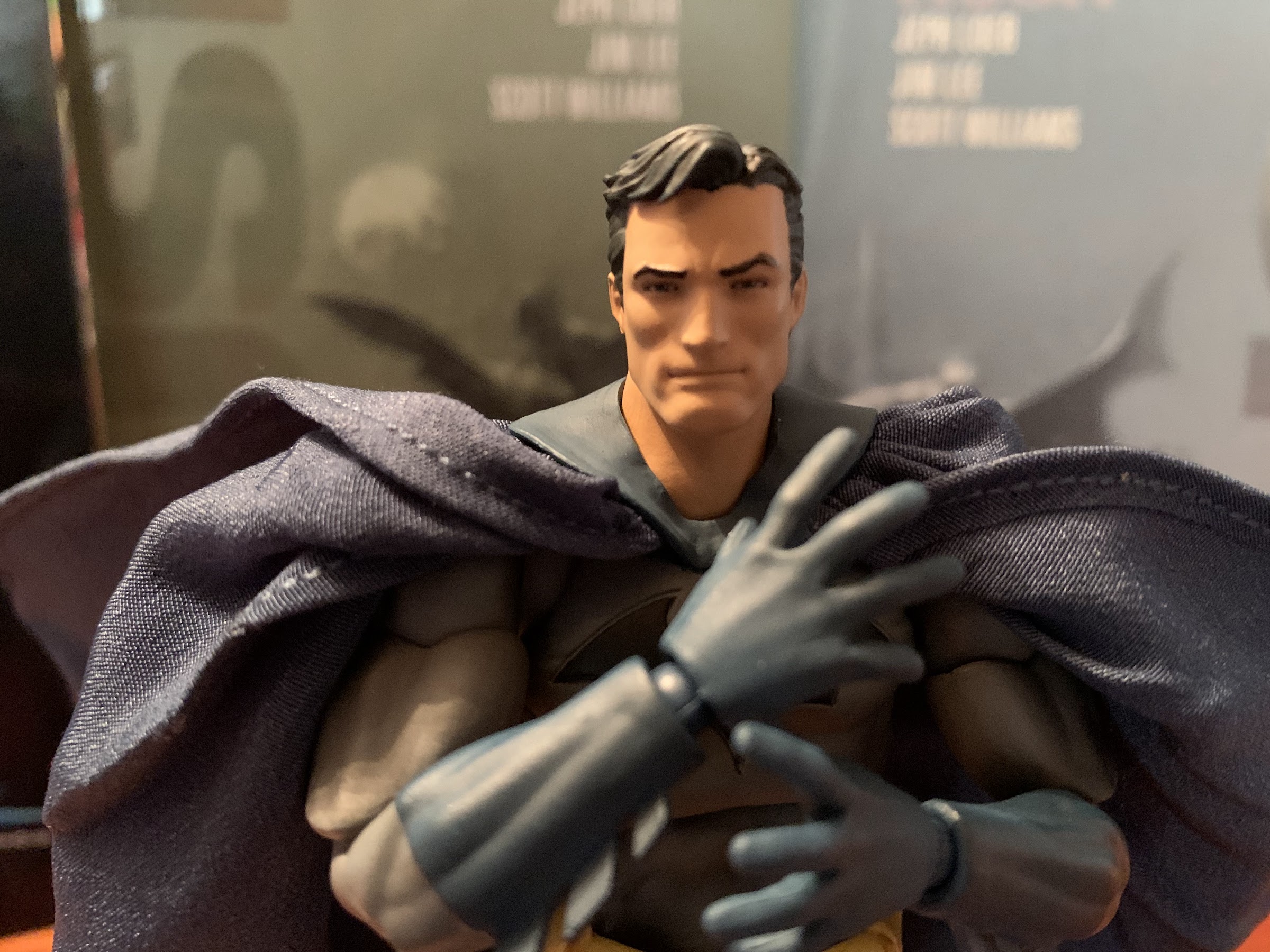
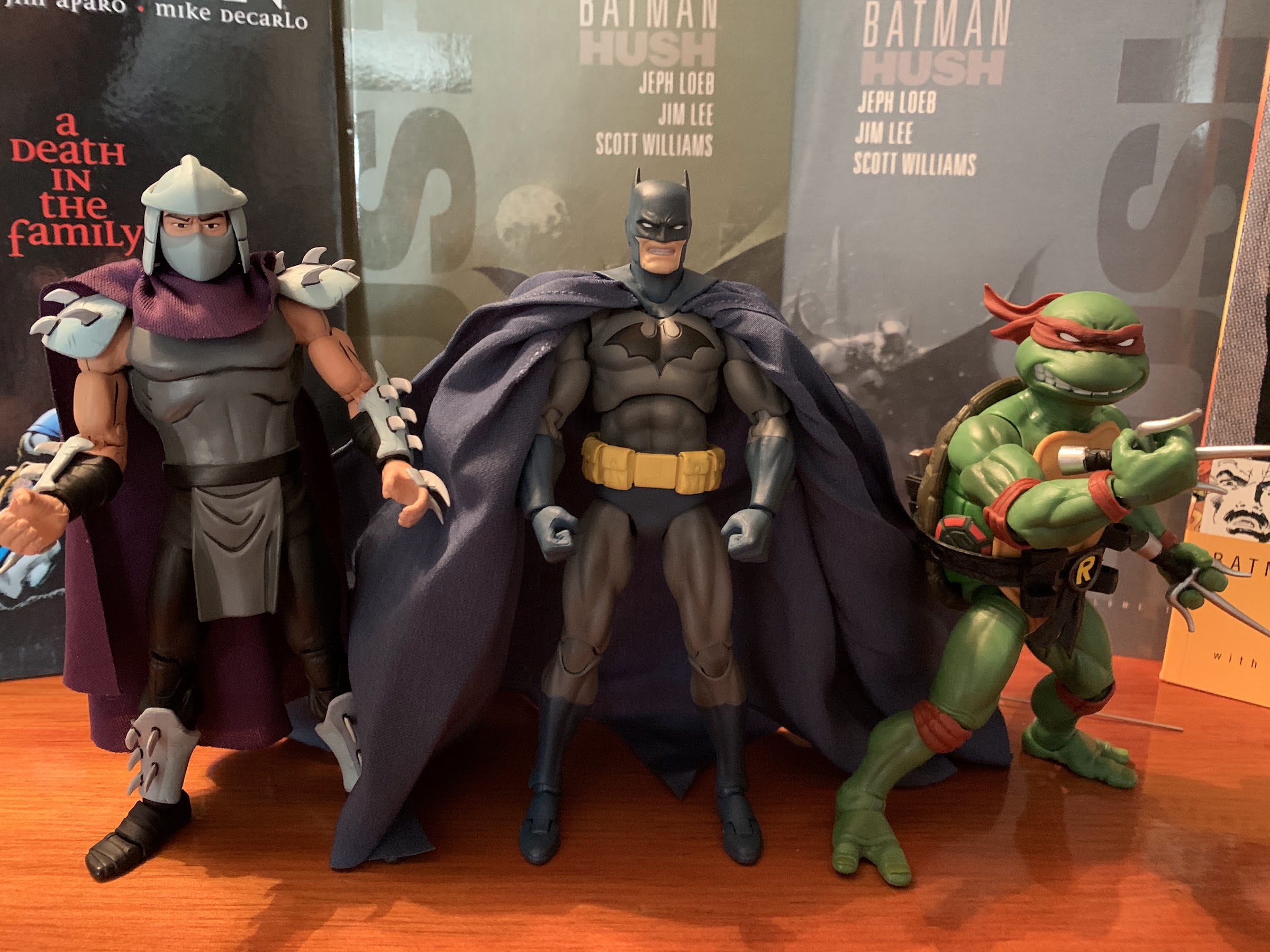
Once removed, Batman stands about 6.5″ tall and I believe that’s roughly the same height as the prior BTAS figures. The paint job on him is pretty damn flawless. I am very impressed with what is before me. The gray of his costume is a matte finish with some shading on his muscles. The black and blue is also nice and saturated and the added blue on the cape just makes this guy pop. From what I can tell, the entire cape is cast in blue plastic and it’s the black that’s been added. All of the other pieces are likely the reverse including the hands and head. He’s got a nice, square, jaw and his eyes are narrowed as some hoodlum must have just pissed him off. The proportions look great and if I have any issues there it’s with the hands, which seem a bit small. The bat logo on his chest is all molded and painted and I am in awe of how clean it turned out. I really wasn’t expecting that considering even Medicom had some issues with a much simpler logo on their figure. The only area where the paint could have been improved is around the trunks, where the line work on the thighs isn’t as sharp. The belt is also just a bright yellow and I feel like it would have benefitted from a little shading, at least around the center buckle. Overall though, I’m quite pleased with how this figure looks and this is definitely the best representation of this version of Batman that I’ve seen.
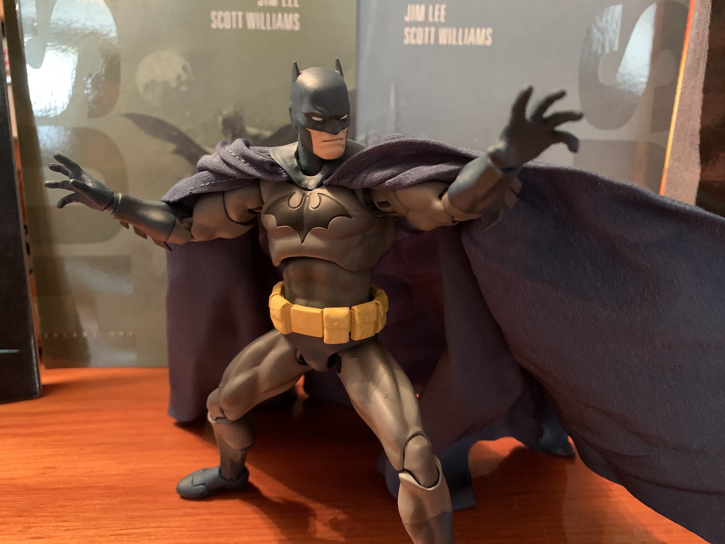
I have a feeling this is going to be the default look for most collectors with this figure because it’s basically his only interesting pose.
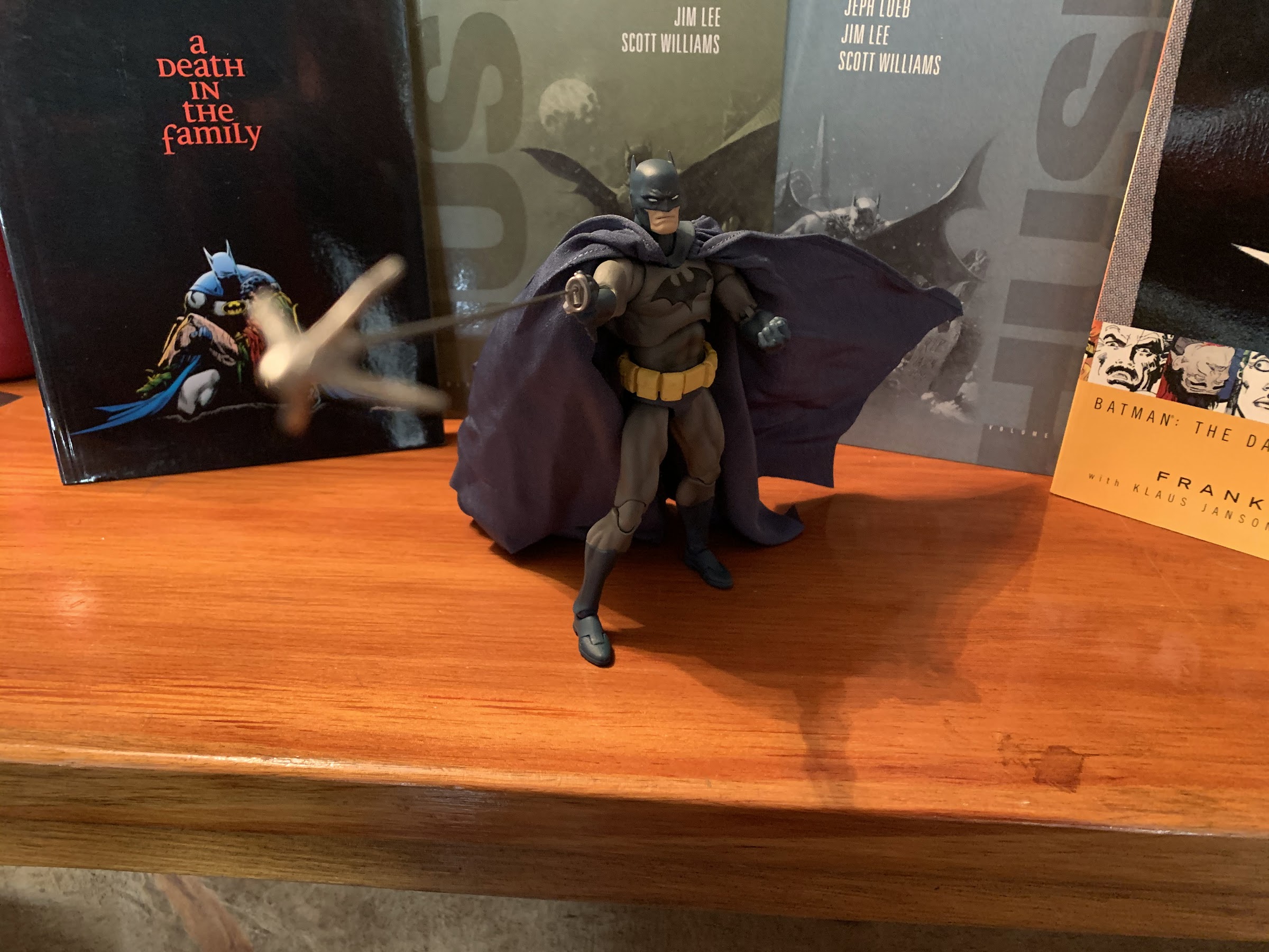
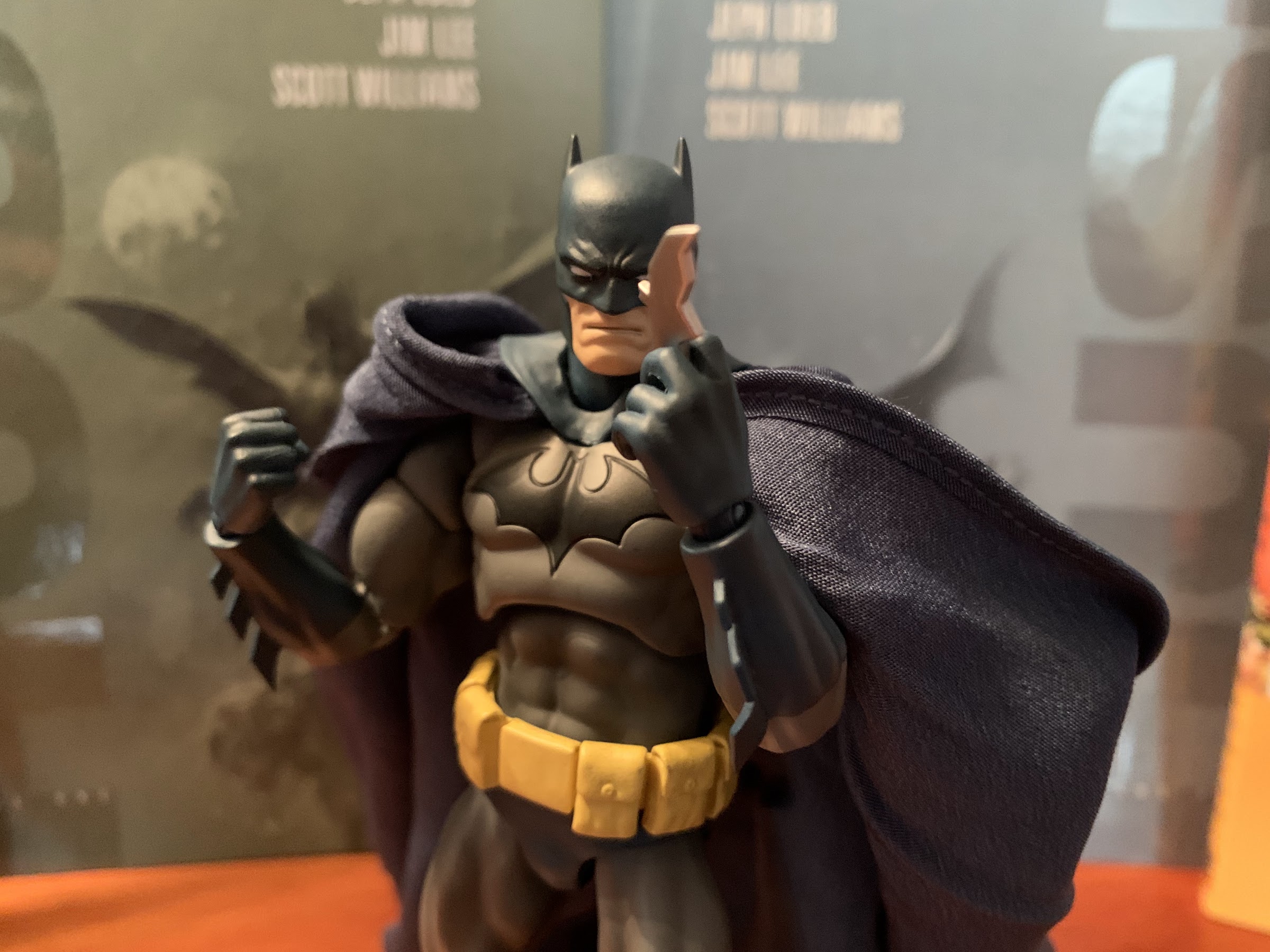
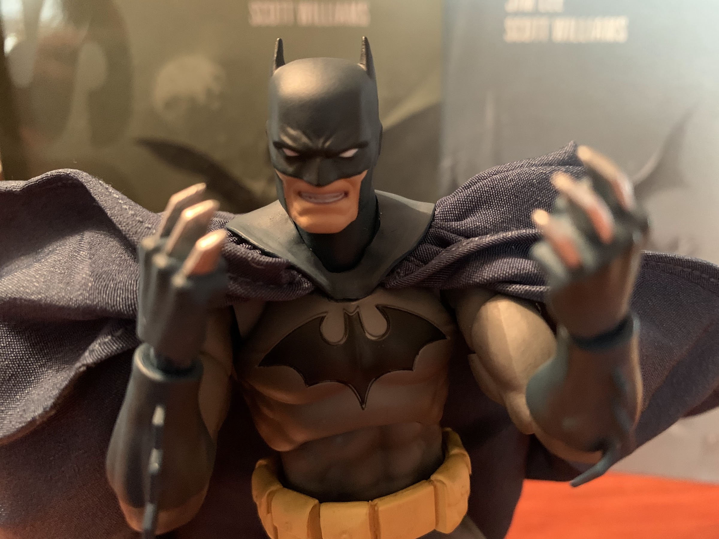
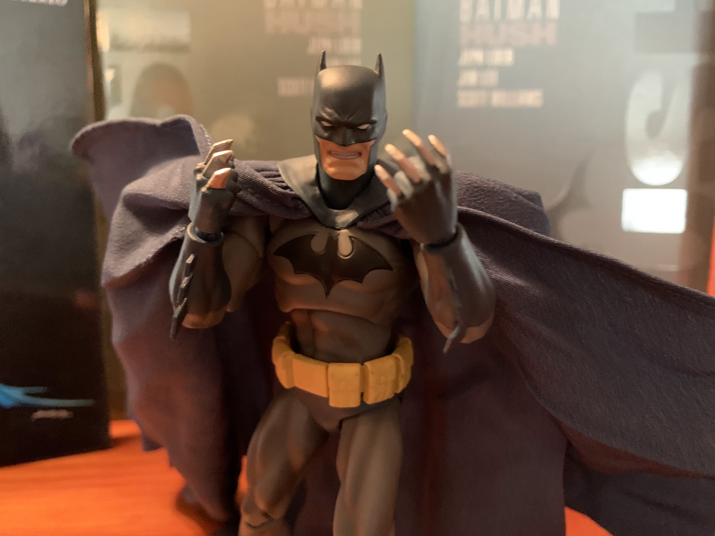
The aesthetics of this guy weren’t a tremendous concern for me going in, what gave me pause was the engineering and articulation. Even keeping my expectations low, I can’t say this figure is well articulated. I’m not sure he’s even fair in that regard. If you add up all of the points of articulation, he sounds fine, but it’s just not particularly functional. For starters, the cape is just soft plastic that hangs off of his back. It looks fine and I wasn’t expecting anything extravagant, but no posing is present there. At the head, we have just a single ball joint. He can turn his head to the side a bit, but his massive chin will prevent him from looking too far off to the side. If set looking straight ahead, he can look up and down a little, but once you turn it you basically loose any up-down articulation which sucks for grapple gun poses. At the shoulders we have ball-hinges and they’re pretty tight. I handled this guy with kid gloves since he was a secondary market purchase and should he break I am screwed. His arms will raise out to the side, and rotate forward and back until they hit the cape. When rotating forward, watch his pecs as you don’t want the arms to rub on the edges. At the elbow, we have single joints and a swivel with no biceps swivel. He can’t achieve a 90 degree angle at the elbow, and once bent he ends up with this weird elbow point that sticks out. It’s not a great setup. At the wrist, we have rotation and in-out hinges with no vertical hinges. There’s a waist twist, but he can only go so far before it looks weird. At the thigh, this is the area most improved over past releases as he has a more standard ball-joint where the leg meets the torso. He can do splits and kick forward and back. There is no thigh swivel, which stinks, but now he does have double-jointed knees which work just fine. He does swivel at the boot, and at the ankle we have hinges and rockers. The ankles are easily the best part of the figure, which is a good thing because he has small feet and you really need good rockers to get him to stand well.
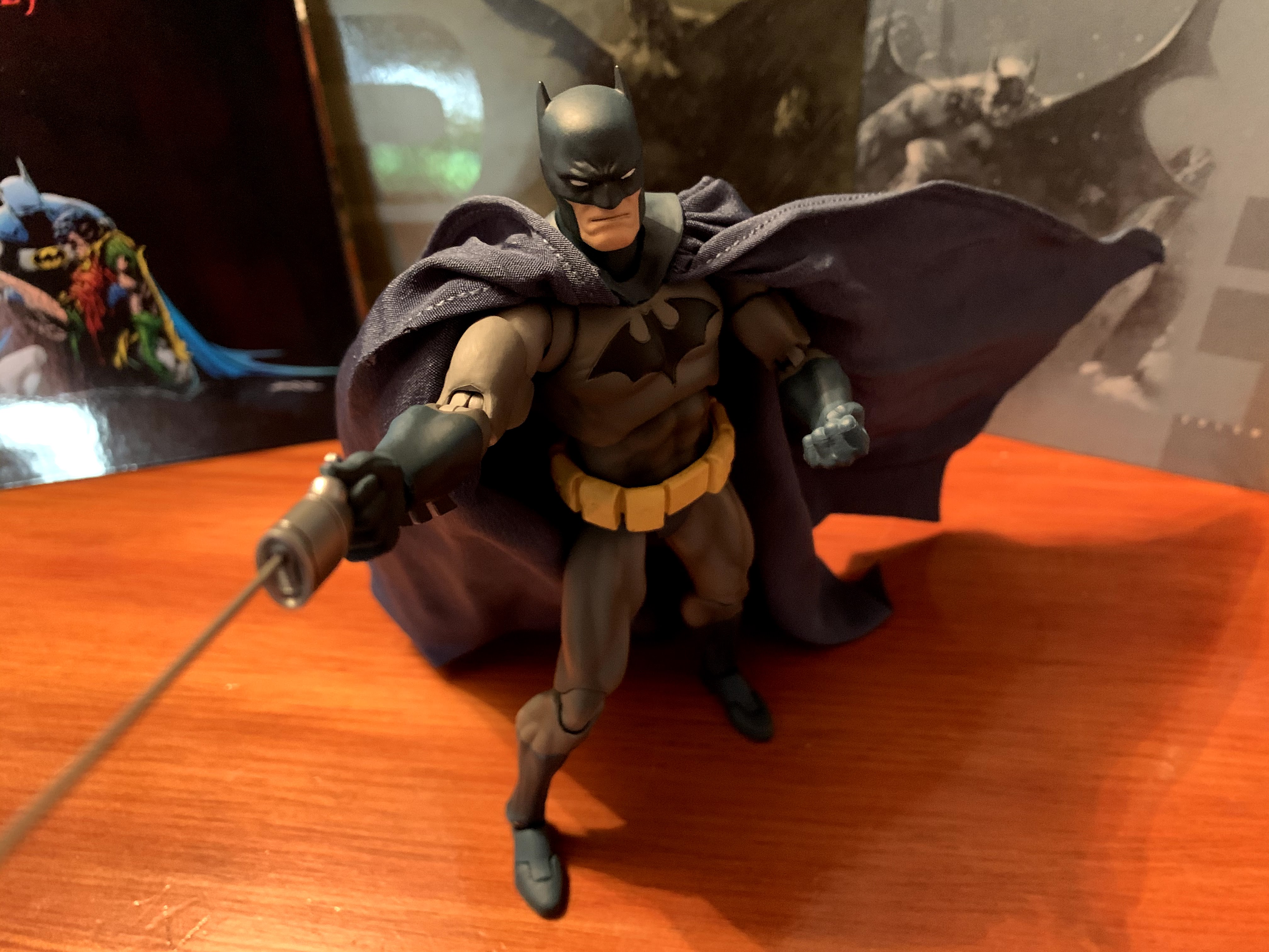
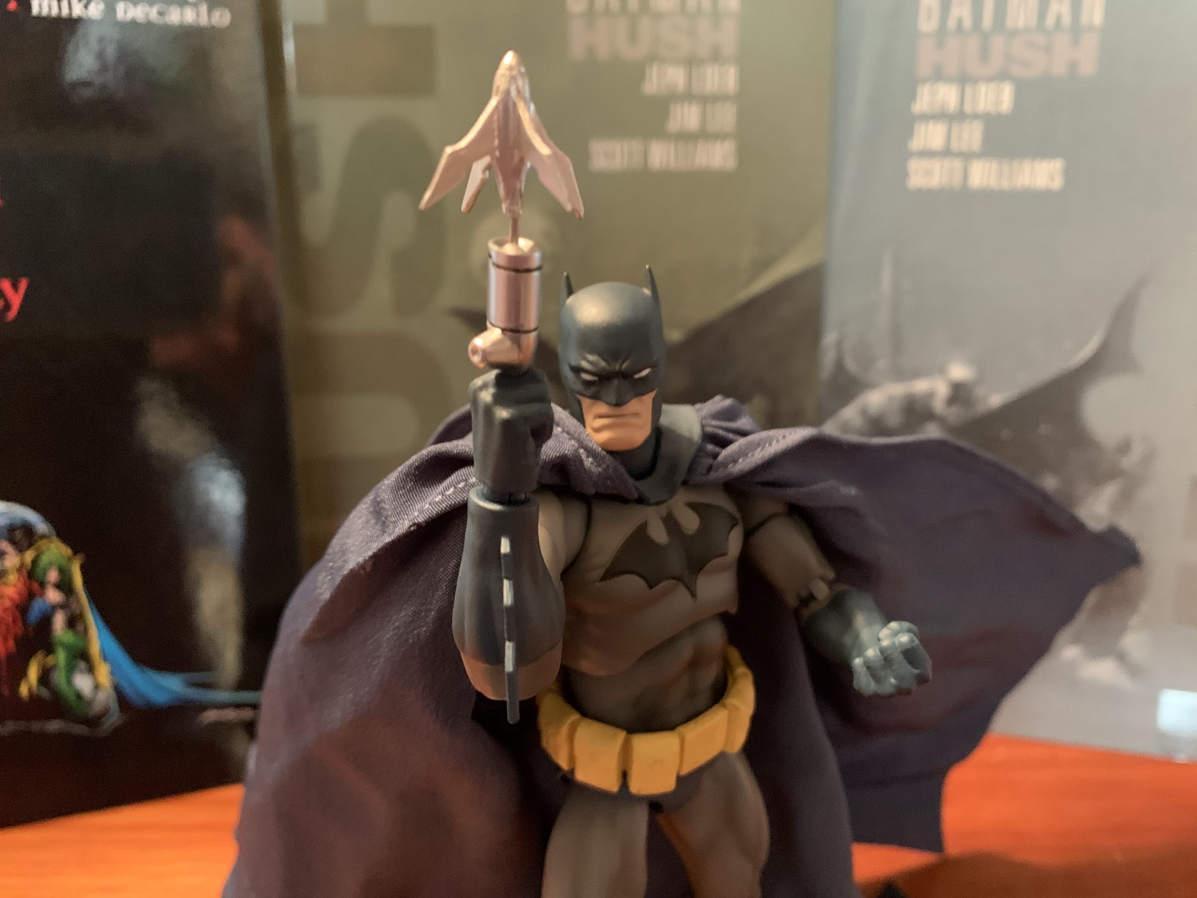
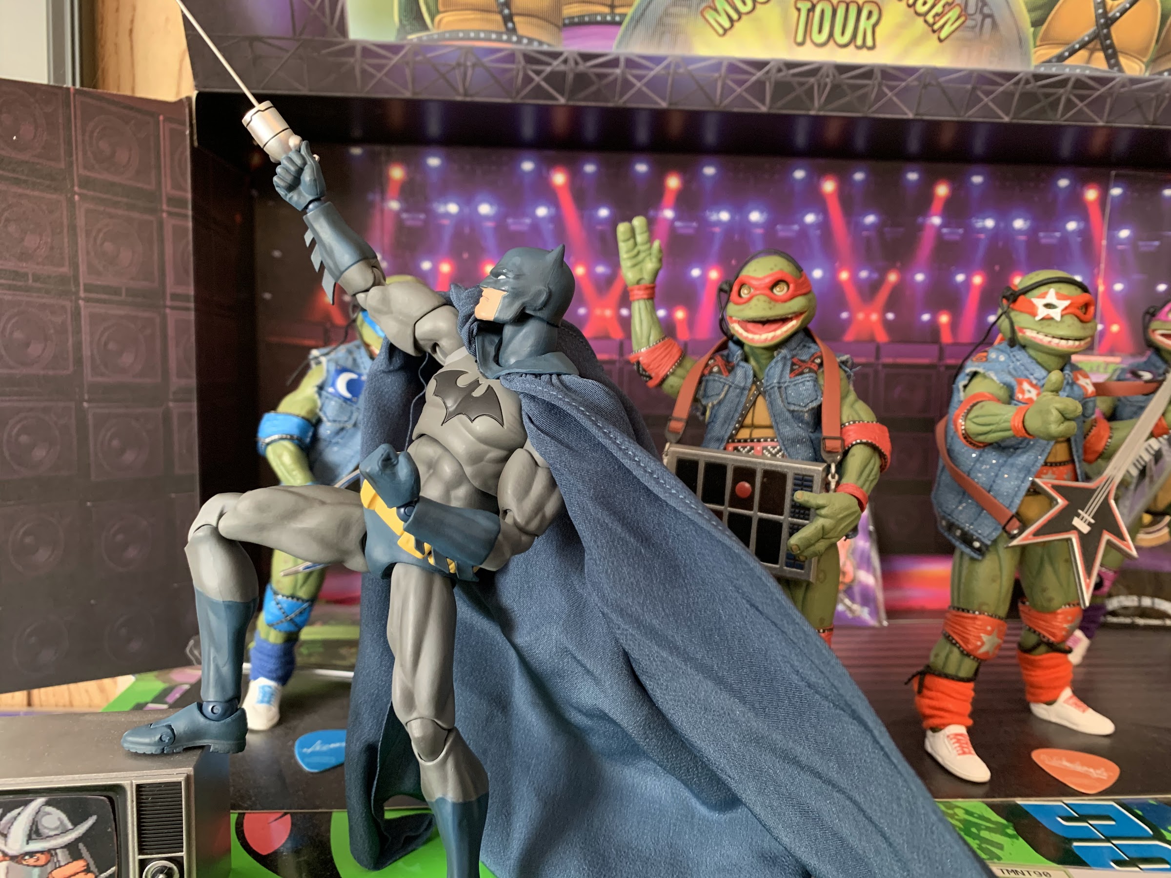
The grapple gun pose is less convincing.
What holds this figure back is the lack of any thigh twist and the subpar arm articulation. You really don’t know how much you’ll miss something as simple as a thigh cut or twist until it’s gone, but it’s the legs that really add that dynamic quality to any pose. Some probably miss that ab crunch he was advertised as having, but I find that whole chest area too important to the sculpt of this particular version of Batman to want it broken up. I normally am not a fan of ab crunches, but I do like diaphragm joints, but the square-ness of Batman’s chest doesn’t lend itself well to such a joint so I’m not sad it isn’t present. I’ll make that sacrifice, but the arms and thighs could have easily been better. On the plus side, nothing is loose so this guy will hold a pose on your shelf. I am a little concerned about shelf dives out of him though since his feet are so small and he has a lot of added weight on his back due to the cape. He does have a peg hole on his right foot, but the feet are so small and thin resulting in a rather shallow peg hole that doesn’t fit any stands I have.
I suppose they did all right covering Batman’s essentials, but this is still an unimpressive array of accessories.
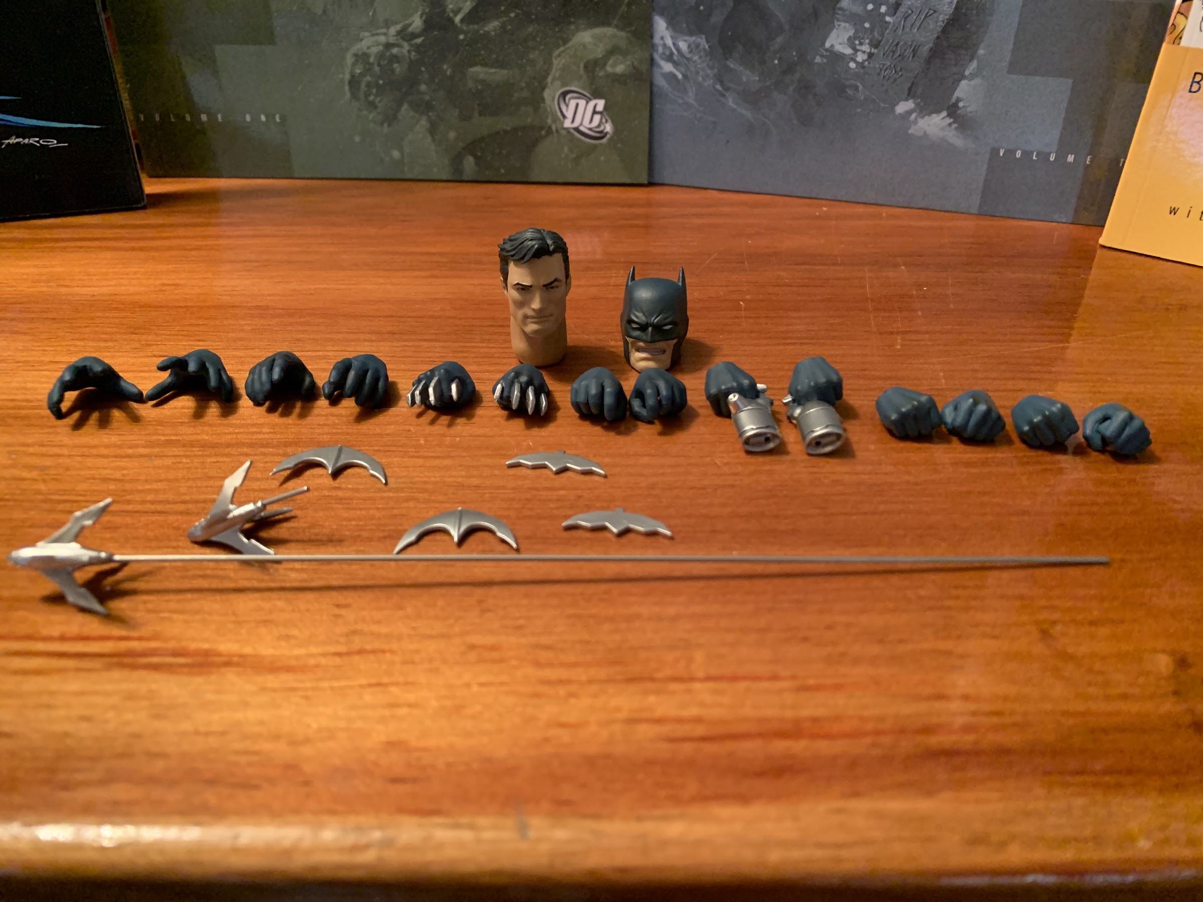
As far as accessories go, this Batman is pretty limited. He comes with fists out of the package and five additional hands: a set of gripping hands, a set of “batarang hands,” and a right hand with a grapple gun molded into it. He also has a batarang which also features the two-tone black/blue shading which looks pretty cool. It basically just rests in the included batarang hands so that you can position the figure as if he’s about to wind-up and throw it. If you want a tighter grip, it will fit in the gripping hands as well, but looks less elegant. Otherwise, those gripping hands serve no purpose on their own with this release. I don’t know if other figures come with something that would make sense for Batman to hold or not. I would have preferred something more dynamic like open hands or an alternate head in their place. The hands at least look fine and all have that blue shading on them. The paint on the grapple gun hand isn’t as clean. It will look fine from the shelf, but close inspection reveals they didn’t fill the space between his index and middle fingers where the grapple gun is exposed with gray paint. They also painted the area his thumb rests on the gun all black when it should probably be gray. The hands are easily removed from the figure and swapped, so that’s a plus.
Maybe with a good stand something more dynamic could be done with his lower half to sell this pose.
When all is said and done, this figure either met my expectations in some areas or exceeded them. I expected limited articulation, and I definitely found that. I expected the accessories to be a lon the slim side with nothing truly exciting, and that’s true as well. Where the figure exceeded expectations is with the paint-job. This is a very clean figure with some nice shading and little touches that really help it make a statement. I wish the articulation allowed him to show off a little more, but he looks sharp. It does feel like a missed opportunity that DC Collectibles couldn’t give us a second cape that draped around the arms for Batman’s more casual stance. The figure is so static that such an accessory would have made a lot of sense. And those gripping hands stand out as another missed opportunity since we could have had something else, like an effects piece for the grapple gun, which would have really been cool.
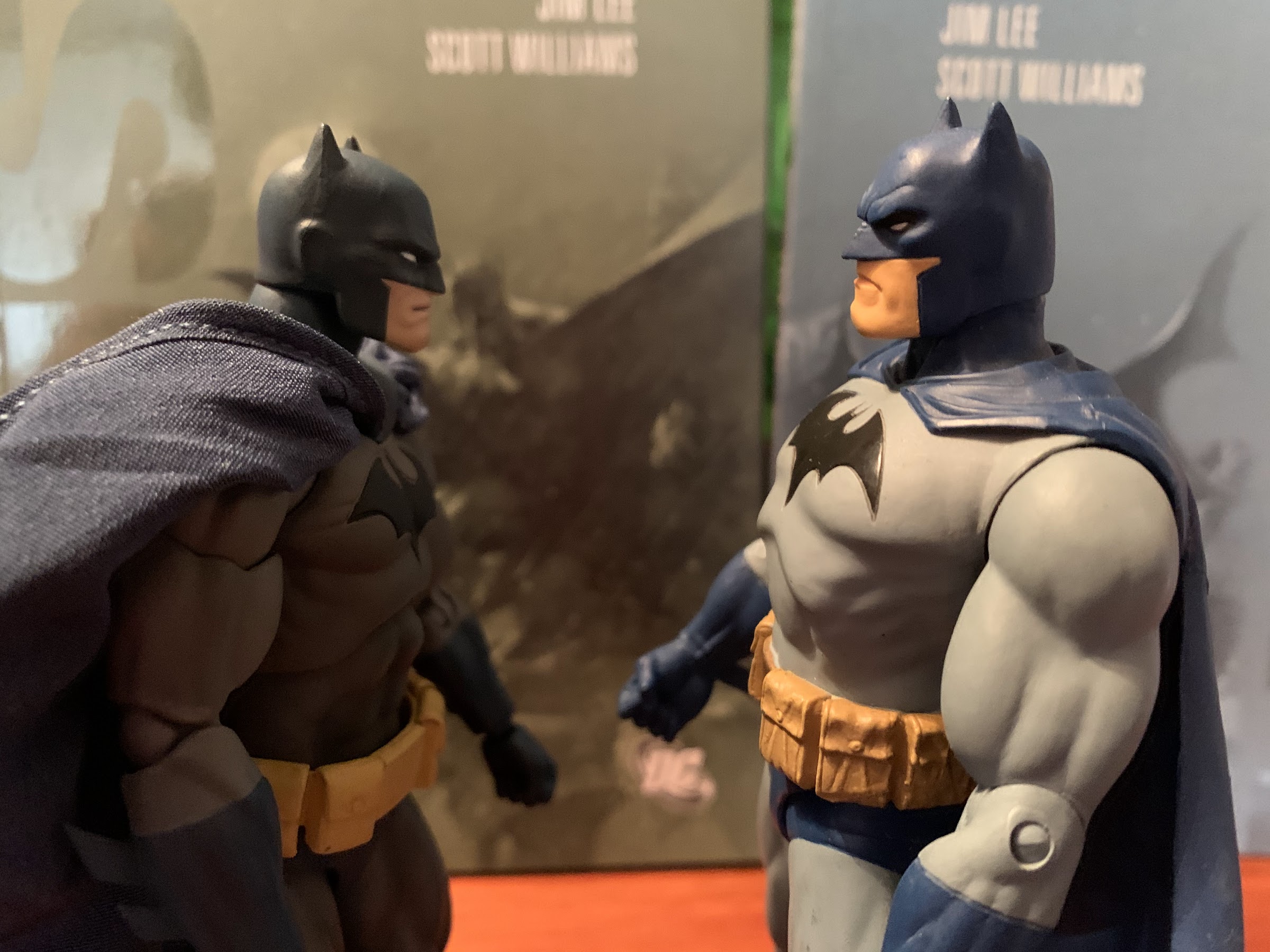
To close this one out, I guess we’ll compare the $25 figure to the $95 one. An unfair comparison to be sure, but it does drive home how static the BTAS Batman is. And yet, I do quite like him just for that toon aesthetic.
I had to pay over retail for this guy, but I’m not really bothered by that now that I have him. He really does get the job done and better than any of the other DC Collectibles versions of this character. I had considered going all out and springing for the expressions edition of the figure, but I’m glad I didn’t. That one has worse articulation and doesn’t have the paint touches this one has. Sure, extra heads are cool and all, but if the figure doesn’t really look the way I want it to then they won’t help much. Now I’m just left wondering if I want to add any other characters. Some are still easy to come by, most are not. The Joker from this line looks bad so he’s not something I want, but what about Mr. Freeze? He’s an awesome villain, though his figure looks even more static than Batman. I do wish I had grabbed Gray Ghost, and the H.A.R.D.A.C. Batman looks to have a really neat sculpt. We’ll see. If this ends up being the only figure I get from this line, at least I picked a good one and the most essential one, at that.
I don’t read a lot of comics these days. Actually, I suppose I never truly read a lot of comics even when I was very much into X-Men and Spider-Man. Back in the 90s, I received most of my comic lore from trading cards. They were cheaper and fun to collect. When it came to actual books, I was rarely allowed to get one though I certainly would try to get my mom or dad to buy me one when at the grocery store. The most comics I read probably came when I was in college and I had the money to buy trades of all of the famous stories I had heard about growing up: The Dark Phoenix Saga, Watchmen, Death in the Family, etc. I also got into modern stories and for awhile I kept up with Marvel’s Ultimate Universe until I either ran out of money or grew bored with the hobby.
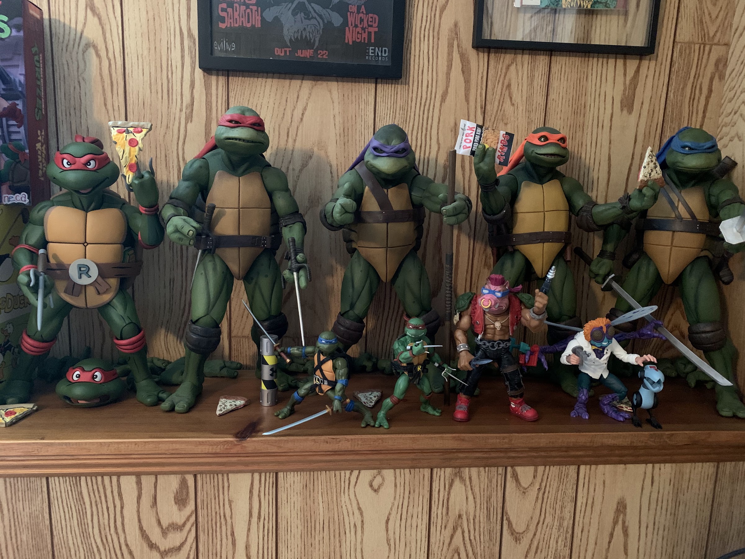
One of the last comic storylines I really dove into was the inaugural Mirage Studios Teenage Mutant Ninja Turtles. IDW Publishing started handling the property following the sale of the franchise to Viacom and the company put out these massive, hardcover, collections of the original Eastman and Laird run on Teenage Mutant Ninja Turtles. I blogged about all five volumes here, if you want to search for them, and I mostly jumped into them because I grew up a big TMNT fan and I had never really checked out the original books. I certainly knew of them, and I think I had read the inaugural issue on more than one occasion, but I had never gone deep. It was pretty fun, though when I was finished checking those out I found I had little curiosity in the other TMNT stories, be they more older ones like the Archie comics or the new ones published by IDW.
Late last year though, a lot of TMNT fans started singing the praises of a new TMNT story titled The Last Ronin. It’s basically a future “what-if?” styled story that could best be described as the TMNT version of the classic X-Men story “Days of Future Past.” I really didn’t know much about it, only that there was some really cool artwork based on the story being circulated online. I decided it was something worth checking out, though by the time I had done so the first issue had sold out. Thankfully, it was still attainable via online shops with only minimal markup. I eventually ordered a copy, and I also subscribed to the rest and even grabbed the Director’s Cut reprint of the first issue recently and I’m glad I did.
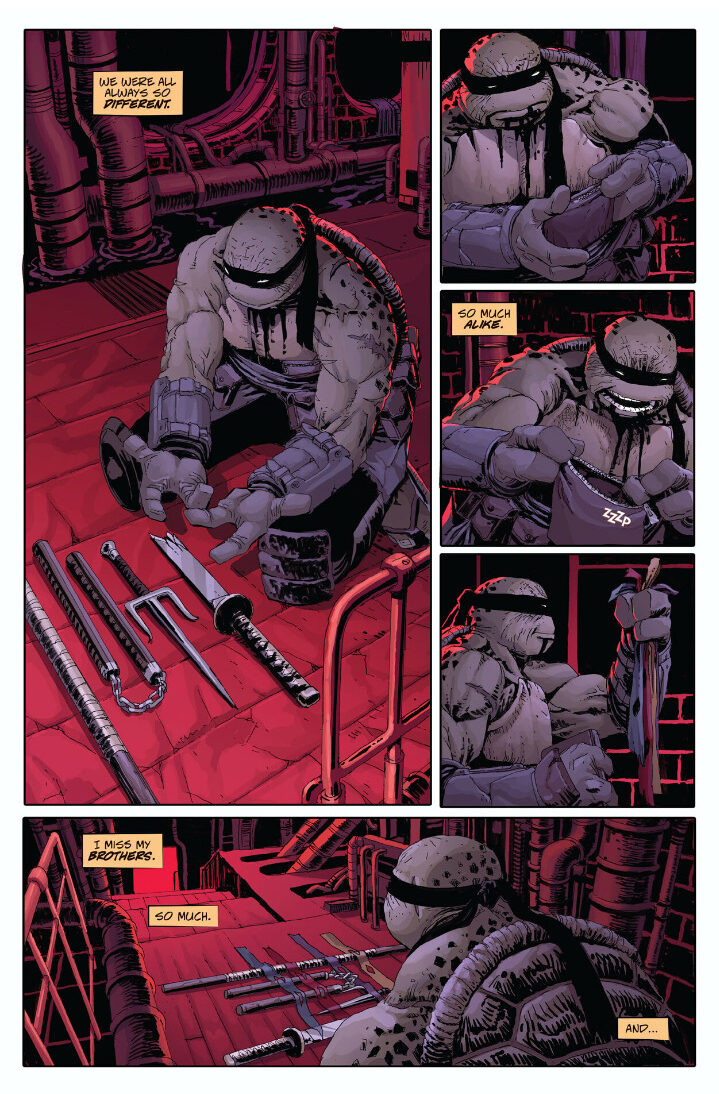
The Last Ronin tells the tale of a lone turtle in the future. He’s bundled from head to toe in robes and armor and is outfitted with the weapons longtime turtle fans know and love: katana, sai, nunchaku, bo. He sports a black mask and he’s a bit paunchy compared with other versions of the TMNT I’m used to, but that wasn’t something I read much into beforehand. Once I had the first issue in hand though, it was obvious this was an older turtle and when we meet him he’s sneaking into New York City which is now a Hell hole because this is a dystopian future story. High walls surround the city and massive skyscrapers have created a dual class system where the wealthy live above the city and the poor are left to fend for themselves at ground level, and below. The Foot run the show, though we don’t know who leads them, while our protagonist narrates to himself (and the reader) what’s about to go down.
Things get pretty heavy for our nameless friend.
It would seem this is a turtle on a suicide mission. He wants to sneak in and cause trouble in hopes of taking down whoever leads the Foot now. And as he talks to himself, he talks to the dead. It becomes obvious that this turtle is one of the four Teenage Mutant Ninja Turtles and the rest are dead. We don’t know which one (that’s saved for the end of the first issue), but it almost doesn’t matter as whoever this is he’s undergone a lot of trauma and has changed considerably.
And things get bloody too.
I really don’t want to say anything more about the first issue as I don’t want to spoil anything. It’s a very action-packed issue as our turtle friend encounters trouble pretty much from the onset. It’s in-line too with the Mirage comics of old as there’s a considerable amount of violence and this turtle clearly plays for keeps. He also gives as good as he receives as this isn’t a superhero type of character capable of being a true one-man army. He’s plenty capable, for sure, of causing a ruckus and fending off multiple enemies, but he’s no Superman. It’s a bit of an uncomfortable read for someone who grew up adoring TMNT as it’s really not fun to think of them as dead, but here we are.
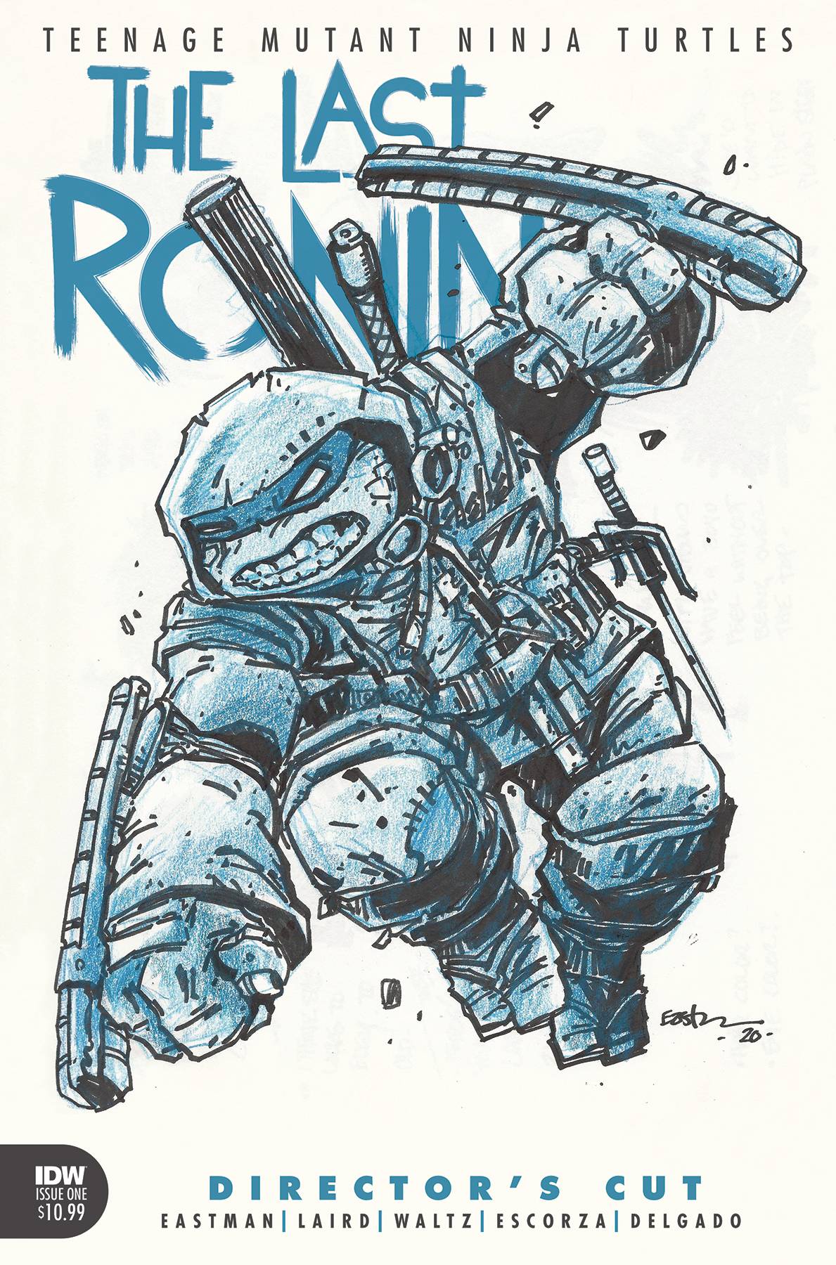
The Director’s Cut of issue #1 shows off a lot of the original treatment for this story. This plot originates from the 1980s when TMNT co-creators Kevin Eastman and Peter Laird dreamt up a finale of sorts to what they started. It never got made until now, and a lot was changed in the interim, but it’s pretty cool to see the original vision. Some of the writing can be hard to read, as it’s just scanned notes from 30 years ago, but it’s definitely worth a look. There’s also a look at the concept art for the series with annotations from Eastman that are pretty informative. I wouldn’t call the Director’s Cut essential for those who want to experience The Last Ronin, but if you’re interested in getting a copy of issue #1 I’d recommend it over the standard release.
The story for this one is shared amongst Eastman, Laird, and Tom Waltz with Eastman and Waltz handling the actual script (Laird’s credit appears to stem from the original story and I didn’t get the impression he had much involvement with it beyond that). Layouts were done by Eastman and pencils and inks were done by Esau and Isaac Escorza and the art in general looks terrific with colors by Luis Antonio Delgado. The team does a great job of evoking some of that rough Mirage art from the 80s but with a more refined touch. The colors are mostly muted which suits the grim atmosphere of the story with some of the flashbacks featuring a soft, glow, to them. There are several variant editions out there if that’s your fancy all with different covers. The main cover is by the book artists and the Director’s Cut cover features art by Eastman. The book is printed on thick paper as this is a special release. The cover is also thick and durable and it comes with a slightly higher retail cost of $8.99 per issue with the Director’s Cut coming in at $10.99.
The Last Ronin is off to a great start. It definitely seems to hit the tone it’s going for as this is a downer of a story. There’s a lot to uncover as this five part series moves along and issue #2 is already out with #3 expected in May. If this sounds like something you’d be interested in reading, I definitely recommend checking it out as I think it’s going to be an interesting ride. Of course, you could always wait for the inevitable TPB edition but that may not come until 2022 so why wait? And if there are any action figure makers reading, we need a Last Ronin figure!
Written by: Paul Dini, Stan Berkowitz, Alan Burnett, Rich Fogel, Steve Gerber
Animation: TMS – Kyuokoichi Corporation
Running Time: 61 minutes
Also Known As: Superman: The Animated Series episodes 39, 40, 41 “World’s Finest: Parts 1, 2, and 3”
When Warner Bros. launched its own network, The WB, in 1995 it had a bit of a conundrum on its hands. Warner had been in the business of producing hours upon hours of content, but it was all aired somewhere else and would be tied down by licensing agreements for yet a while longer. And in the 90s, most of those properties were airing as part of the Fox Kids Network and included the likes of Tiny Toon Adventures, Animaniacs, and Batman: The Animated Series. Warner needed to focus on parts of its portfolio that hadn’t already been licensed to Fox and it sure is nice to have a character like Superman to utilize as a fallback. While Fox held the broadcast rights to Batman, Warner essentially ceased taking episode orders for that show and instead tasked the team of Bruce Timm and Paul Dini that had done so well with Batman to do the same for Superman. Superman: The Animated Series was born, and unlike Batman, it was a brightly lit, modern styled, depiction of the classic hero. It was not quite as successful as Batman, but for a generation of comic book fans, this depiction of the man of steel is about as definitive as it gets replacing for many the character we saw on the big screen played by Christopher Reeve.
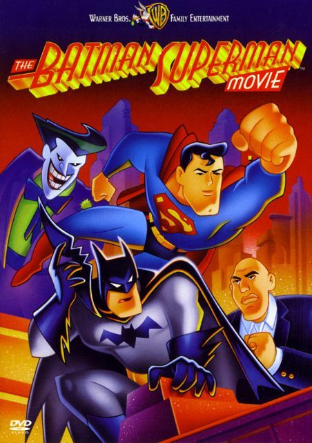
Following the successful first season of Superman, Warner once again had the broadcast rights to Batman and commissioned a new season. Re-titled, The New Batman Adventures, the caped crusader and his comrades would receive a makeover to bring it in-line with Superman while also accomplishing the goal of simplifying the models for overseas animation. The WB, which had launched its own children’s programming block called Kids’ WB, would air these new episodes of Batman alongside Superman creating The New Batman/Superman Adventures, an hour and a half block typically consisting of one Superman, one classic BTAS, and one New Adventures of Batman. To commemorate the union of these two titans of comics, a three-part episode was created for Superman called “World’s Finest” that would take-up the whole Batman/Superman block on October 4, 1997. These episodes would then be collected and released on VHS and DVD as The Batman/Superman Movie.
Fans had to wait a long time to see these two pair-up, it would seem Batman was not looking forward to it though.
Given how long these two heroes have been around and in Warner’s portfolio, it’s actually rather incredible the two weren’t paired-up for a movie until 1997. This one is a bit of a cheat since it’s three episodes of an animated series, and Batman and Superman have shared space on the small screen for decades. They have since shared time on the big screen as well in one of the most love it or hate it film universes imaginable. In 1997, and even today, there is still a neat “geek” factor to the two teaming up, though I personally wish it could have happened sooner as come 97 I wasn’t watching much network television. I can recall catching bits and pieces of this story, but I don’t think I ever sat down and actually digested it. Since concluding the years long look-back at Batman: The Animated Series, the cross-overs with Superman were basically the few remaining missing links I had yet to look at, so I figured I would rectify that with a look at this pseudo movie.
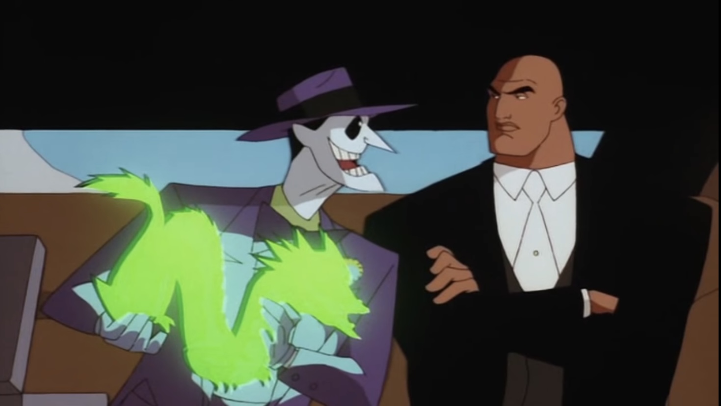
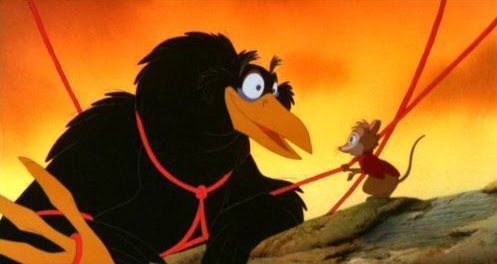
“World’s Finest” is anchored by a pretty simple premise: How would Batman and Superman work together when their arch enemies team-up? It’s the type of thing any young, comic book, fan probably would have dreamed up as a starting point for a team-up as we have Joker (Mark Hamill) offering his services to Lex Luthor (Clancy Brown) to kill Superman (Tim Daly) for the not unreasonable sum of one billion dollars and it’s Batman (Kevin Conroy) who first sniffs out the scheme. It’s an interesting premise to see Joker turn himself into a hitman-for-hire, and especially interesting that he would be so arrogant that he would think he can take out Superman when he’s failed to do the same with Batman for years. Perhaps it owes to him not viewing Superman as his great rival as many have wondered if Joker really ever aimed to kill Batman, instead preferring to play with him like a cat and a ball of yarn, only in this case the ball of yarn always comes out definitively on top. There’s also a bit of shock factor to see Joker so nakedly offering to kill someone for money, but it is a nice callback, intentional or not, to Joker’s roots in this universe as a mob hitman as seen in Mask of the Phantasm.
Joker has a very big reason for his overconfidence.
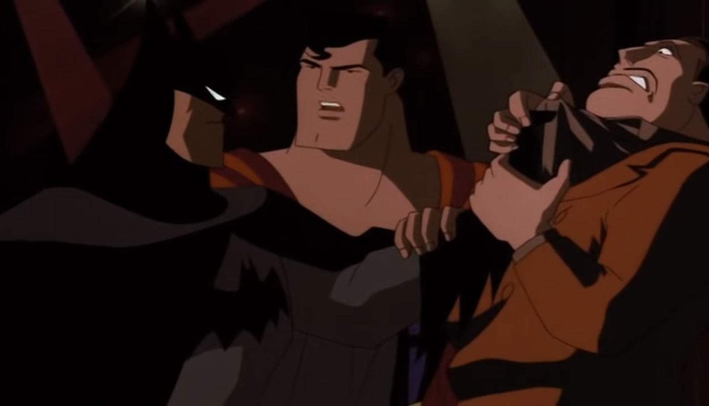
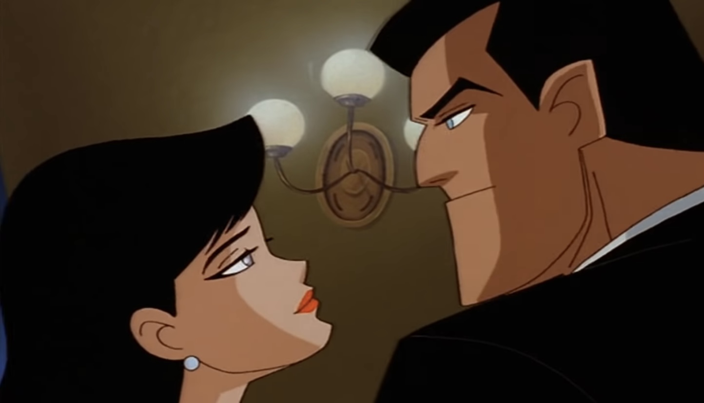
Why is Joker offering to kill Superman for Luthor? For the simple fact that he needs money on account of Batman always foiling his plans and because he’s come across a rather large sum of kryptonite. Early in the film, Joker pulls off a heist in which he and Harley (Arleen Sorkin) snatch a dragon idol thought to be made of jade, but Batman knows otherwise and makes the move to Metropolis. It’s there he masquarades as Bruce Wayne, who has a business venture underway with Luthor, and makes acquaintances with both Lois Lane (Dana Delany) and Clark Kent. Lane is quite smitten with Wayne right out of the gate and the two start seeing quite a lot of each other, much to Clark’s disappointment.
The film wastes little time in establishing that Batman and Superman are going to be uneasy allies. Batman is setup to be Superman’s opposite. When we first see Batman inspecting the crime scene following Joker’s theft, Detective Bullock (Robert Costanzo) puts up a minor protest when Batman takes a piece of kryptonite left behind as tampering with a crime scene, but Commissioner Gordon (Bob Hastings) somewhat jokingly laughs it off suggesting to Bullock he be the one to stop Batman from doing what he wants. It’s played for laughs, but it’s kind of scary that Gordon essentially revealed he feels helpless when it comes to telling Batman what to do. Of course, we know he welcomes Batman’s aid in an unofficial capacity, but this scene seems to exist to remind the viewer that Batman operates outside the law. When he eventually crosses paths with Superman for the first time, Superman refers to him as a vigilante and that there’s no place for such in his town. Superman is our goody-two-shoes, the one who operates within the confines of the law, while Batman happily exists outside it. He’s also played as a jerk, as Batman introduces himself to Superman by arm-tossing him over his shoulder. It’s definitely beyond what we’re used to seeing out of the character previously in BTAS, that very patient detective working alongside Ra’s al Ghul and tolerating his subordinates slights is long gone. It’s somewhat in-line with the character we’ll see more of in The New Batman Adventures, but it’s definitely a change.
Batman is such a dick to Superman that I half-expected him to torture the guy for fun here.
The Batman/Superman dynamic is the main anchor of the feature, but also entering the fray is the Lois Lane situation in which it’s clearly spelled out she’s attracted to Superman and Bruce Wayne, but turned off by Clark Kent and Batman. There’s also multiple scenes in which Joker and Luthor are pitted against each other, mostly via tense negotiations or dealing with the fallout of a Batman or Superman encounter. They’re actually quite entertaining and this is the best Joker we’ve seen in awhile. It would seem the time off between the end of the second season of BTAS and this feature did Dini and his crew well as this Joker feels fresh and exciting. As does his main squeeze Harley and the two actually work quite well together in this one with less signs of abuse on the part of Mr. J. It does mean the story basically ignores how we left off with the pair and we’re just left to assume that Harley eventually came crawling back. It’s a pretty entertaining story, albeit one that only runs a mere 61 minutes. It does follow a predictable arc, and I dislike that the ending basically has zero consequences long-term, but I definitely had a good time following along. There were some segments that were a bit too liberal with the notion that every bad guy in these shows is a terrible shot. Batman should have probably died ten times in this thing, but it’s just accepted that our hero is never going to get shot no matter how improbable the situation.
Being that this movie exists within the Superman show, it follows the same visual style as that show and The New Batman Adventures. There are no additional effects applied like we saw with a true feature in Mask of the Phantasm, but that doesn’t mean this one doesn’t look nice. Warner at least opened up its wallet for TMS to handle the animation. TMS was once upon a time a semi-regular in Warner animation, but come the mid-90s the studio’s reputation was beyond reproach and their services were essentially beyond Warner’s television budget. The studio wasn’t even called upon to handle the second BTAS feature, SubZero, so it was a bit surprising to see them utilized here. It certainly pays off as “World’s Finest” looks terrific. The animation is so smooth and so consistent frame by frame and it pays off as there’s plenty of action. There’s even a classic “Superman saves an airplane” segment probably just so they could have TMS animate such a sequence, because it’s otherwise a scene that’s completely unneeded for the plot. It’s certainly fun though, so I’m not complaining! The only drawback the film possesses from a visual perspective rests with the character designs. I really don’t like the redesign on Joker, and it’s so apparent in the scenes he shares with Luthor. Luthor looks like a person, while Joker looks like he belongs in a different series, something far more toony. That’s a problem I have with The New Batman Adventures as a whole though, not one unique or born from this arc.
I think the writers want us to think Bruce has legitimate feelings for Lois, but it’s not convincing and you may exit this movie with a new opinion on the guy.
The Batman/Superman Movie is probably not the spectacle the pairing deserves, but if I’m being honest, I’d rather watch this than the live-action one that would follow years later. Despite the short duration, it doesn’t cry out for additional material. If it had been a true feature we probably would have just been treated to more of Wayne and Lane’s romance which does move quite fast in this one (she appears poised to move to Gotham at one point) so that’s probably not realistic, but billionaires certainly have a knack for getting their own way despite logic and reason. I suspect some might not like the portrayal of Batman in this one as he really is just an asshole towards Superman. One has to wonder if he’s only interested in Lois to stick it to Superman. And given that their relationship progressed far enough for Lois to talk about moving, I’m going to make the assumption that she and Bruce slept together and if Bruce slept with her just to make Superman jealous or angry then that’s some pretty lowlife behavior on his part. Even without that piece of head-canon on my part, I felt pretty bad for Lane at times in this one as she’s just being used left and right. Bruce uses her to get info on Superman, Joker uses her as Superman bait, and all the while she thinks she’s met someone she’s ready to run away with. It’s quite a ride for Lois, and I wonder if Dini contemplated tossing Barbara Gordon into this whole mess, but thought better of it.
“World’s Finest” was just the first cross-over event between Superman and The New Batman Adventures, and not the last. There were two more in Superman, “Knight Time” and “The Demon Reborn.” There was only one in Batman, “Girl’s Night Out,” which I covered some time ago. Since I’ve covered so much of Batman: The Animated Series here, I would like to some day talk about those additional crossovers, but I also have no plans to at this time since I don’t own Superman: The Animated Series. Perhaps that will change one day, but the availability of this movie is what made this possible. If you want to check it out for yourself, you can do so either via Superman which is available on DVD and streaming on HBO Max, or you could buy the stand-alone movie which is quite affordable. I picked up a copy at a secondhand media store for a mere $2.97. For less than 3 bucks, this is a rather nice piece of entertainment.
He lives….again! Check out NECA’s Twitter page for more images!
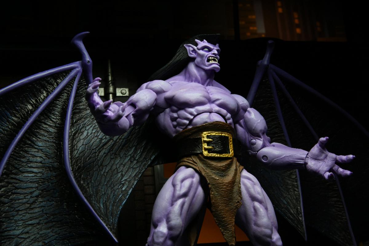
It was announced one week ago in a post timed for midnight on the east coat that toy maker NECA had acquired the licensing rights to produce action figures based on the Disney Afternoon classic Gargoyles! NECA had begun teasing a new intellectual property had been acquired back in January and the only clues provided were that it was a 90s property enjoyed by kids that had yet to experience a revival of any kind. This had heads spinning, including my own, and I nearly made a blog post on the subject itself. The reason I did not is because it started to become apparent that it was indeed Gargoyles. That wasn’t due to anything NECA said, but what it didn’t say as fans tossed ideas at the company’s official Twitter account and the Gargoyles suggestions were left untouched. Gargoyles just also made sense for NECA, who originally made a name for itself in the collector space with its horror themed releases. While not horror, Gargoyles is certainly horror adjacent with its gothic imagery and fright-inducing main cast. It also fit the description provided by NECA perfectly as no one has attempted a modern toyline, even though there’s an obvious fanbase hungry for more, and because there just weren’t a lot of other options. The best non-Gargoyles thing I could come up with was Captain Planet, a certainly remembered franchise, but one I’m not sure has a rabid fanbase. Though with NECA’s recent Defenders of the Earth toyline selling out I suppose it’s hard to figure out just what doesn’t have a fanbase eager for modern toys these days?
The Twitter announcement came with some delightful images of the line’s first figure: Goliath. For Goliath, and likely the line as a whole, NECA took the basic cartoon aesthetic and applied some artistic licensing in bringing the figure to life. He is far more detailed than the character model from the show with realistic (though exaggerated) musculature and textures to his skin and claws. He looks really cool, but it’s understandable that some fans were left wishing he better matched-up with the animated version, since that’s the look most remember. NECA’s approach does remind me of classic toy lines which were often more detailed than the cartoon source for the simple reason that cartoons have to dial down the details in order to keep costs down. This figure, which I’m judging based off pre-release images, looks like Goliath to me so I’m fine with the approach. Should the line find success it wouldn’t shock me to see NECA double-dip and add a toony line, especially as it pumps out Teenage Mutant Ninja Turtles figures at a tremendous pace potentially hastening the end of that line.
Meant to be modernized w more detail and anatomy not a direct copy of the cartoon. Toys have come along way since 1994. Stylized realism if you will like Defenders of the Earth & our DC vs Dark Horse line https://t.co/O9iNSiEwVd— NECA (@NECA_TOYS) March 31, 2021
And the early returns suggest the line is off to a fantastic start. Preorders opened up the day of the announcement at all of the usual online spaces. They sold well enough that NECA sent out a press release to its retail partners saying it needed to cut-off preorders earlier than expected and set a date for that to take place of April 2nd. It’s possible fans will be able to order Goliath figures past that date as that is the date for retailers to get their orders in. If a retailer like Big Bad Toy Store sees Goliath selling well, it might submit a higher order on that day than what it’s sold, especially since large retailers rarely submit an exact order. It does mean that once places start closing orders following April 2nd, Goliath will be unobtainable until the figure’s official release expected sometime in July. NECA has stated the figure will be sold, and I quote, everywhere so there should be no shortages of places to go toy hunting, but I for one definitely prefer to secure an order early rather than later.
And Goliath will not be the only figure from Gargoyles the company releases. NECA has yet to show off any other figures, but has stated there are five finished and more in development. The company hopes to reveal a new one each month and stagger the release in the same fashion. That means if Goliath is coming our way in July, then figure number two should follow in August, and so on until all five are out. And that certainly has fans speculating who will be among the five to follow in Goliath’s footsteps. The Manhattan Clan from the show included fellow gargoyles Brooklyn, Hudson, Lexington, Broadway, and Bronx. That’s five right there, but I’d be quite shocked if rogue Demona is not part of the initial launch. I’ll even go so far as to say I’ll be surprised if she isn’t number two behind Goliath. There are certainly plenty of other characters for NECA to turn to such as ally Elisa Maza and villains like Xanatos, MacBeth, and The Pack. It’s possible NECA will try to offset the development costs of the tooling intensive gargoyles with humanoid characters that might lend themselves well to parts reuse, either with each other or from other NECA lines.
We can probably expect the original Manhattan Clan to come to plastic, and more!
All that is to say this line could have serious legs. There are a lot of characters from Gargoyles to mine and I suspect NECA will be eager to do some of the clone characters, like Thailog, since they’re just redecos. The tooling in this line looks like it could be costly, but Goliath is being solicited for the extremely reasonable price of $33 in most places. That price gets you an 8″ tall gargoyle with a 16″ wingspan. He has multiple face portraits and extra hands to go along with a book accessory and the ever important jalapeno. The part where NECA will save some money does rest with the accessories as most of these characters require little to none. Hudson brandished a sword while Demona often had some heavy artillery, but the rest were just gargoyles armed with tooth and claw. I am supremely excited for this line though and I just wanted to share that with the world before the preorders close. Fans of Gargoyles have been waiting for something like this for a long time and hopefully it’s the start of a revival of sorts. If it only leads to an extensive toyline though, I’ll be plenty satisfied.
If you want a Goliath figure of your very own, here is a non-exhaustive list of some places where you can do just that (I receive no compensation from these websites if you do choose to order from one of them):
There he goes, thinking he’s the best turtle once again.
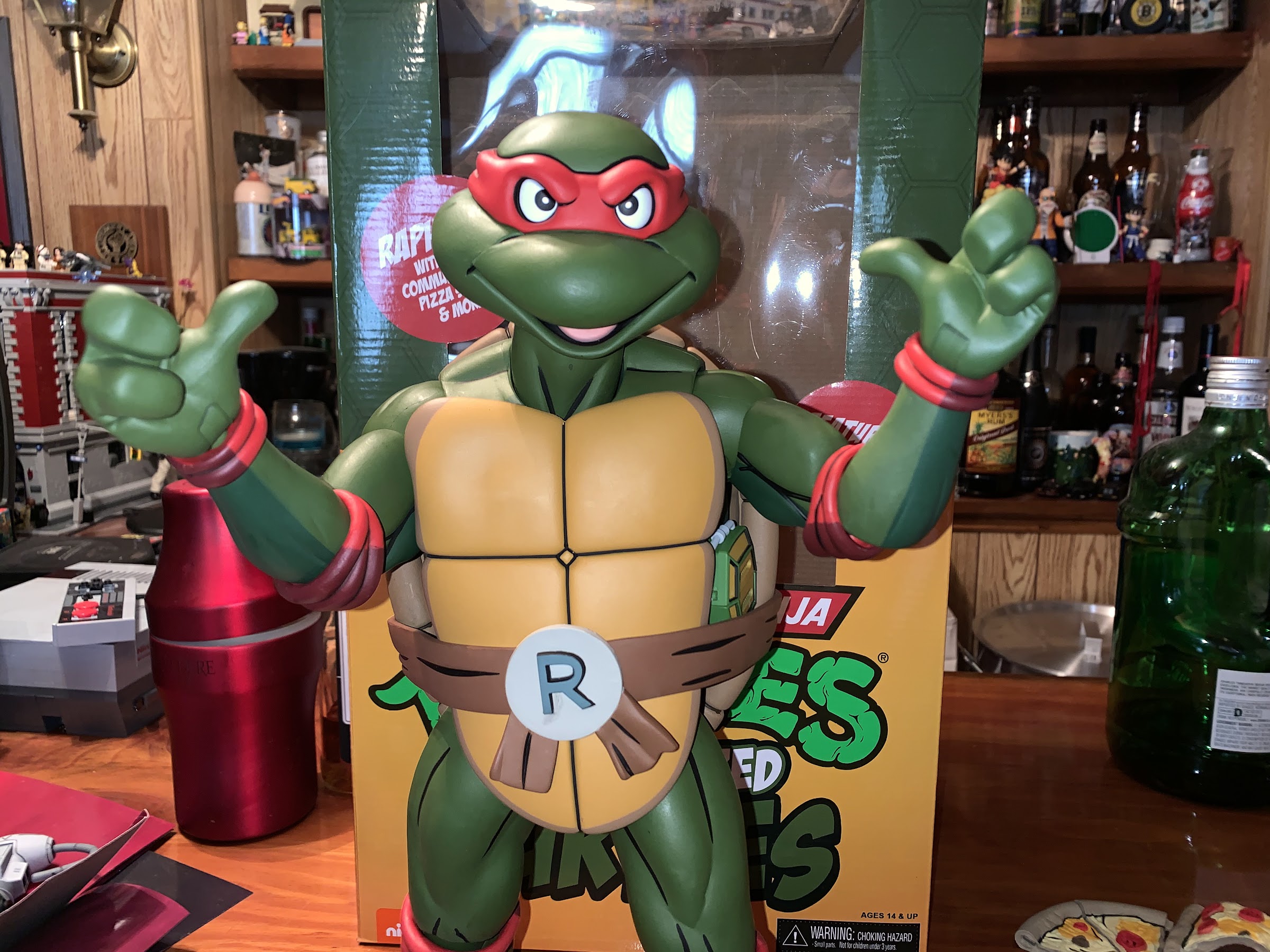
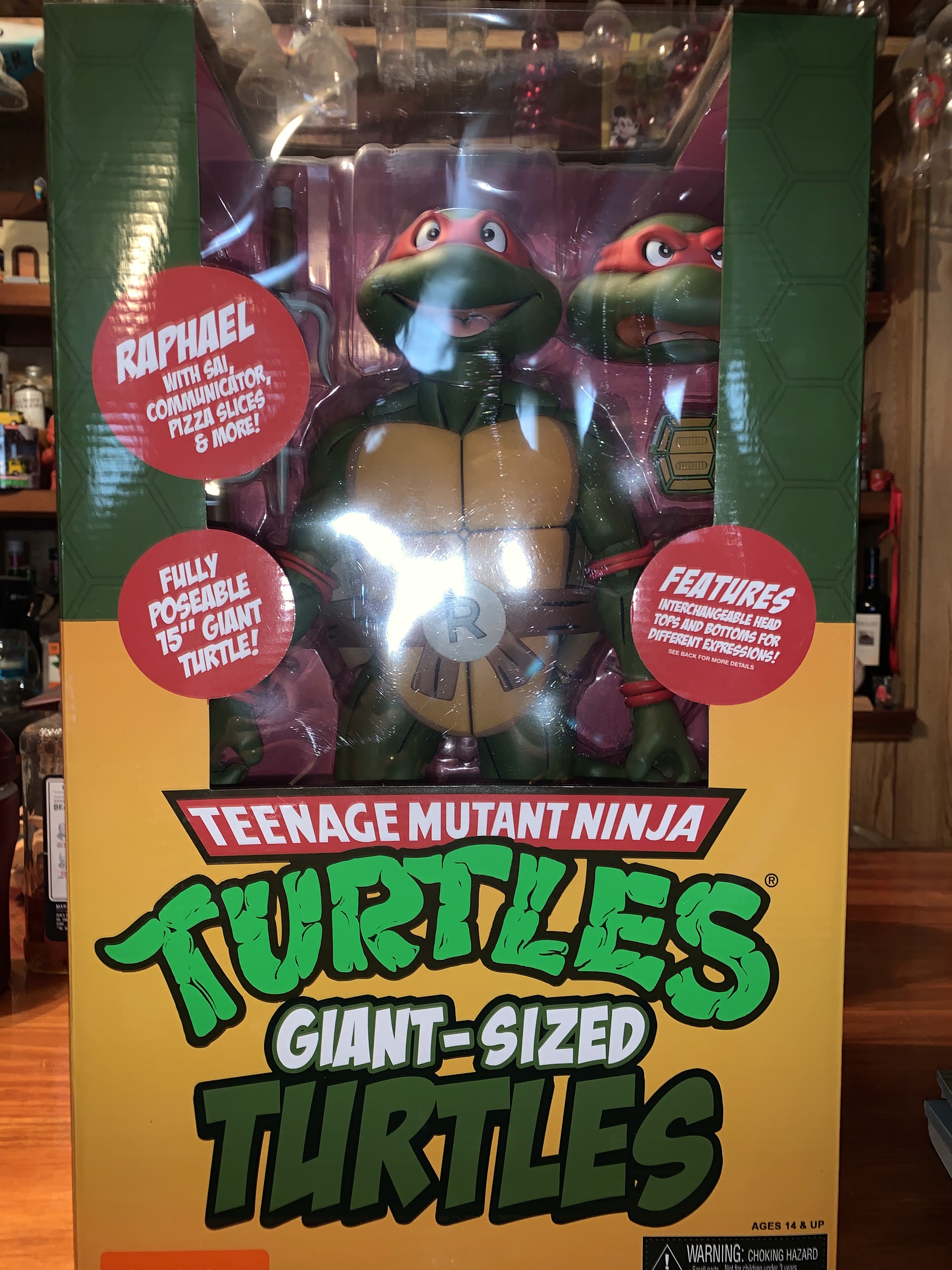
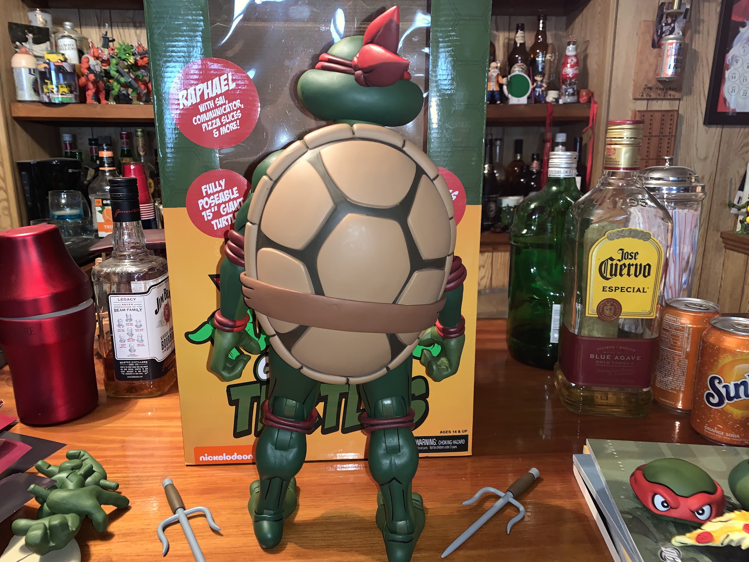
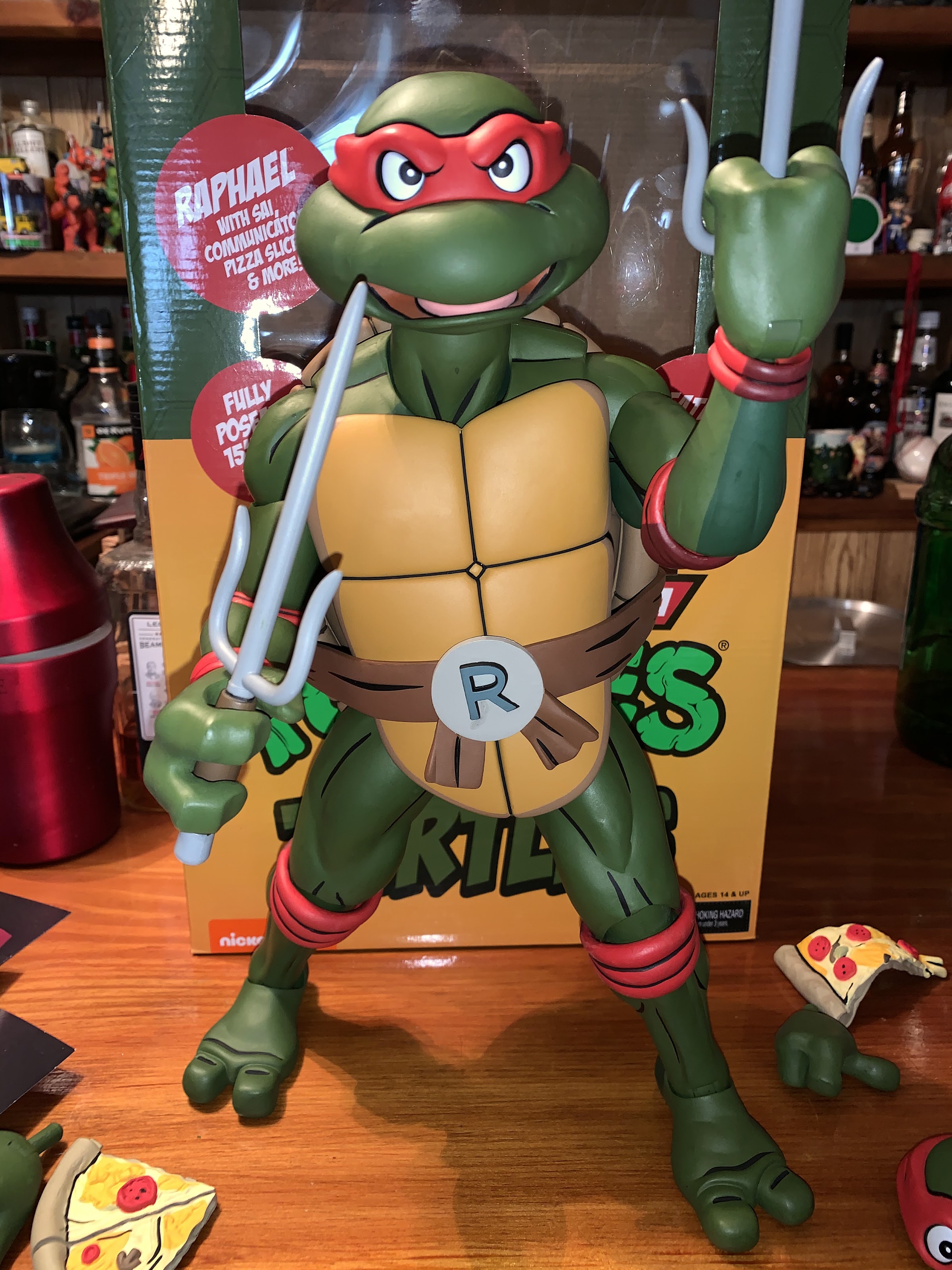
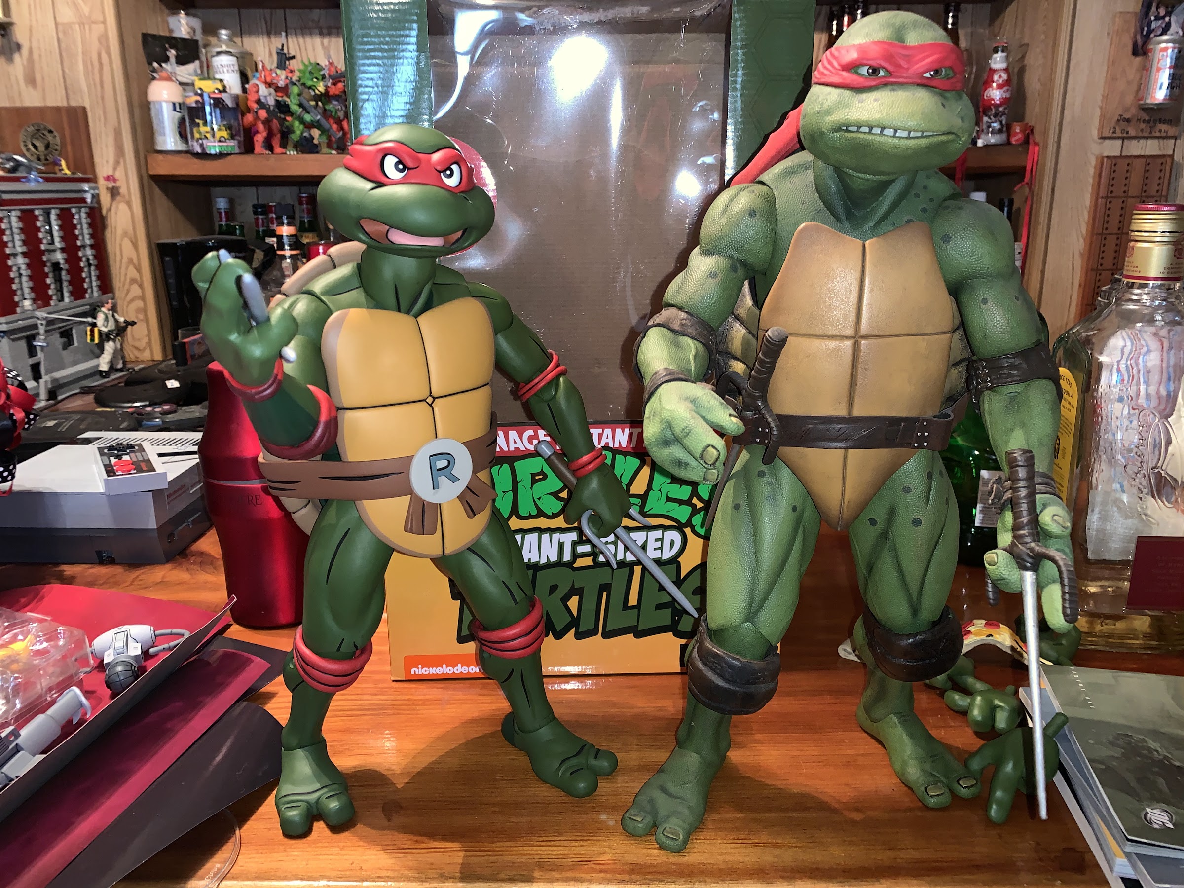
My first NECA Teenage Mutant Ninja Turtles product was the original release of the Mirage Studios quartet released in 2008. Nearly a decade went by before I bought another TMNT product from NECA, and that item ended up being the quarter scale movie Donatello. It was love at first sight for me and Donnie, and I eagerly awaited the following three turtles to complete my display. Following those, I’ve stayed away from the quarter scale largely because it’s expensive and takes up a lot of space. Those figures are over a foot tall and are quite beefy and it’s just more convenient to collect at a smaller scale. When NECA first announced it was going to bring the cartoon turtles to the quarter scale, I initially wasn’t interested. What would I would do with more giant turtles? The first one on the release schedule was Raphael, and I kept my eye on it, but wasn’t really feeling the pull to go for it. Then the figure was delayed from the jam-packed Fall 2020 to Q1 2021 finally arriving when there’s little action in the toy world. Maybe that was the reason for my renewed interest as once I go several weeks to a month without a new toy I get anxious. Seeing reviews online was enough to do me in, and here I am with a quarter scale Raph.
Raph and all of his bigness.
When I say I had little interest in the figure when announced initially, I am mostly referring to Raphael. I did plan to get at least one quarter scale turtle because one of my favorite Christmas presents ever was the Playmates Giant Sized Leonardo. I loved that big-ass turtle and I marveled at the changes made in going from 4″ to 14″. The “pleather” belt, pupils in the eyes, ankle articulation – it all seemed awesome to me at the time, even if by today’s standards that’s still a pretty basic figure. The only negative with that toy was Playmates was too cheap to include two swords. I no longer have that guy, but he was immortalized in a clock my grandfather made for me that he based on that toy and I still have that to this very day. It’s in my son’s room now and if he ever breaks it he’s in some major trouble.
This is an action figure that comes with instructions!
I caved though, and now I have a big, beefy, toon, Raphael on my shelf. I was able to order him from Big Bad Toy Store, which has since sold out, so apparently there are a lot of folks out there who slept on this thing for awhile, only to change their mind once released. I did try to find him locally first, but no comic shops around me seemed to carry him which was a bummer. Even though this is a big figure, I was still taken aback by the sheer size of the box he arrived in. This figure is actually smaller than the movie figures, so I kind of had it in my head to expect small, but there’s just no making a quarter scale figure small.
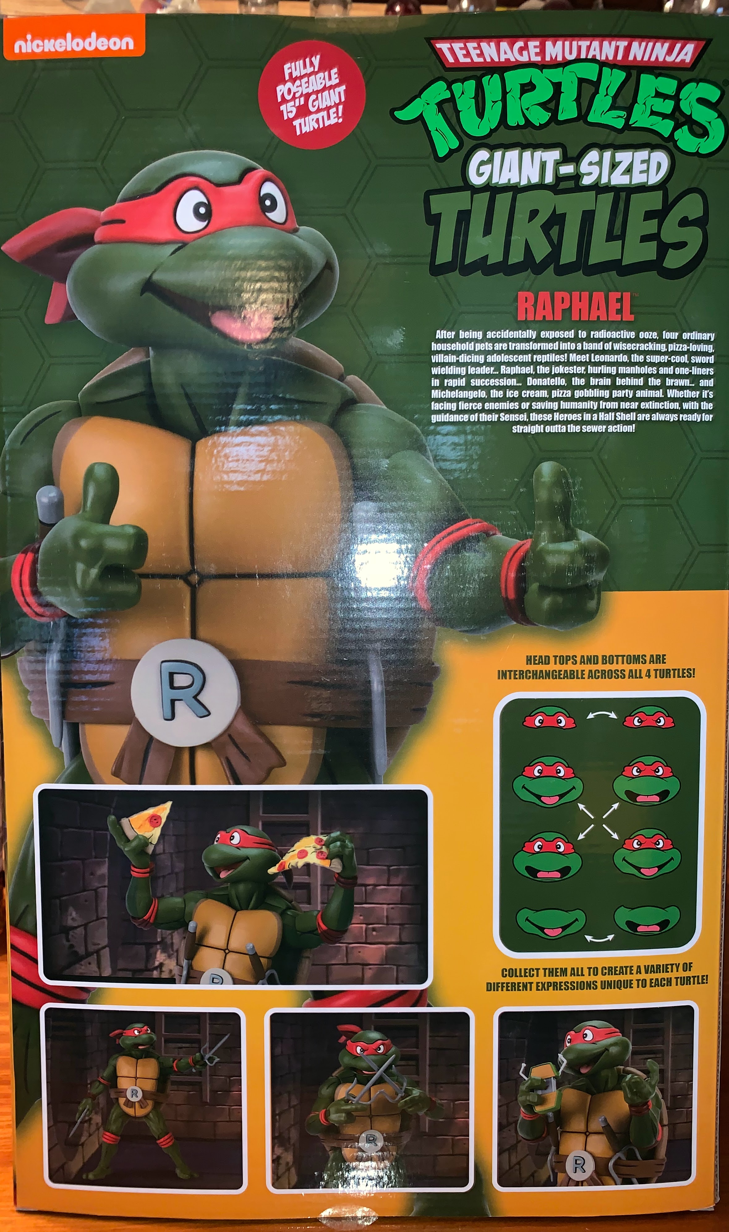
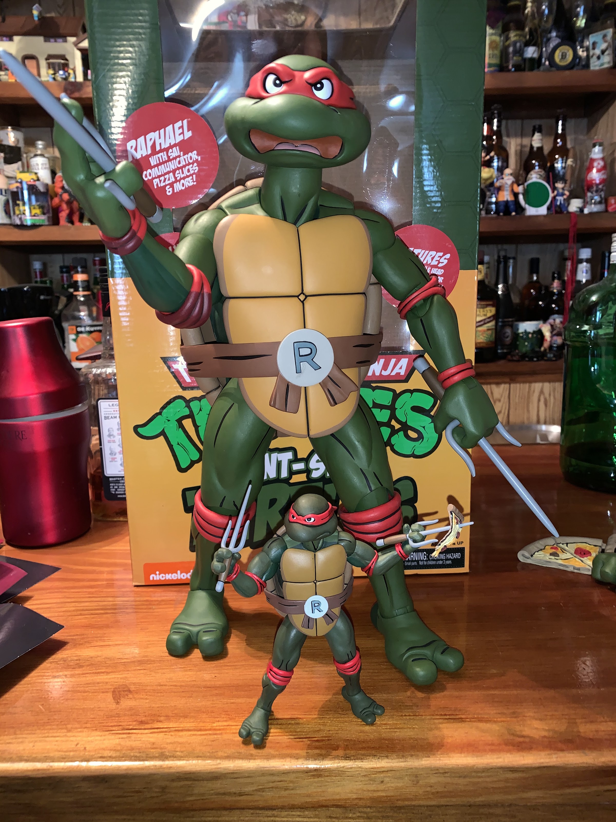
You have to look at the underside of the box to find the other brothers.
Raphael comes in a window box done up in the same style as the Target releases. NECA originally wanted to do retro packaging, but couldn’t get permission from Playmates to make that happen (which possibly accounted for the delay). There’s some nice photography on the box though demonstrating the product. Hidden on the bottom of the box is the cross-sell with the other three turtles set for release (Donnie is next and should arrive over the summer) and a demonstration of the features of the figure. The main selling point, aside from the aesthetics of a giant turtle, resides in the head. These figures come with two heads, but each head can separate at the bandana to create up to four, distinct, expressions. Not all of the turtles will come with the same pair of mouths, so once all four are collected you should have quite a bit of variety for mixing and matching. It’s a great idea, and it’s one that is also being brought to the 6″ line next month with a deluxe four pack being sold exclusively at Target.
The bigness of this figure means you’re going to see all of my bar stuff in every shot.
Because I know you want to check out what he’s got going on out back.
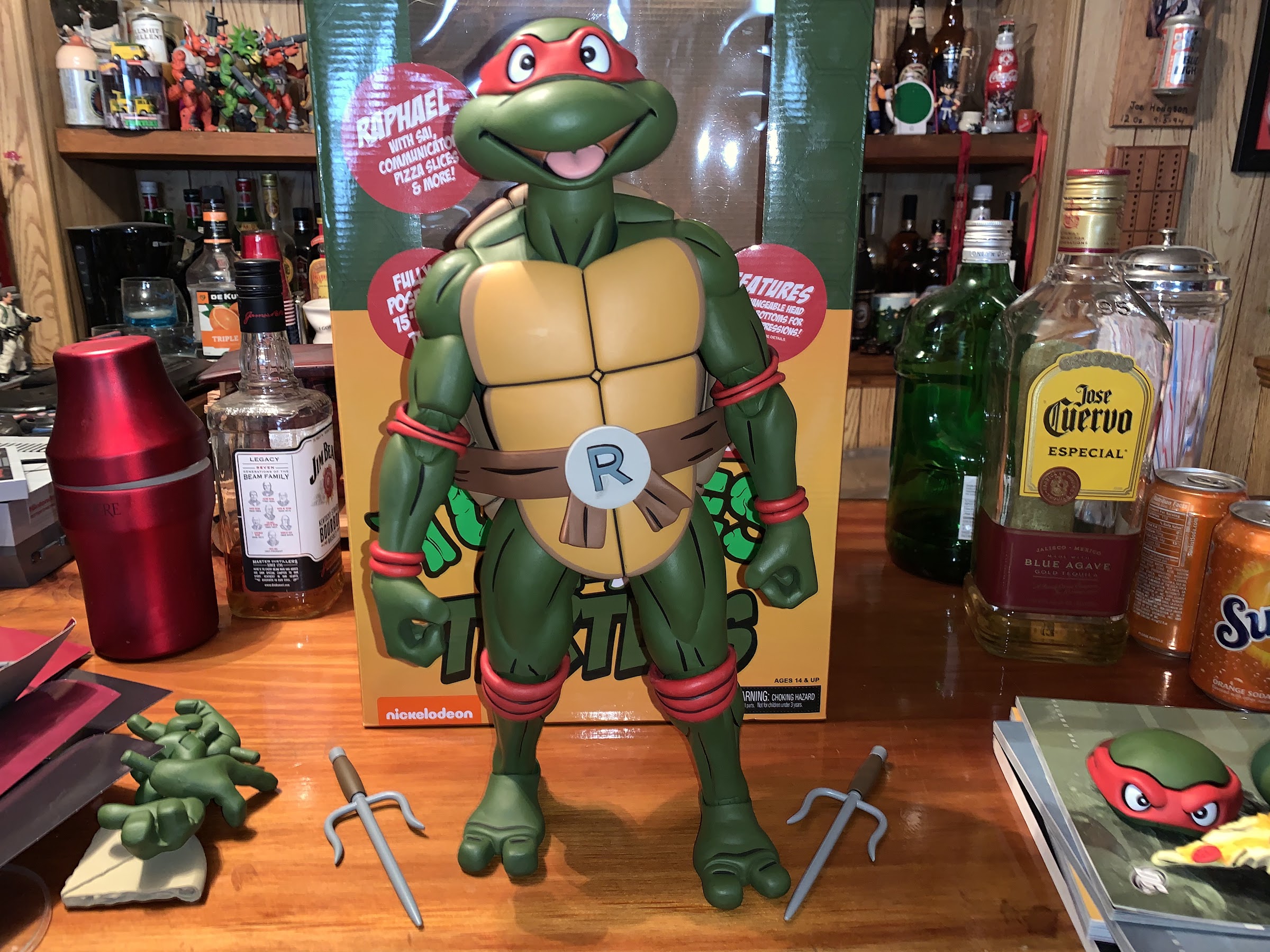
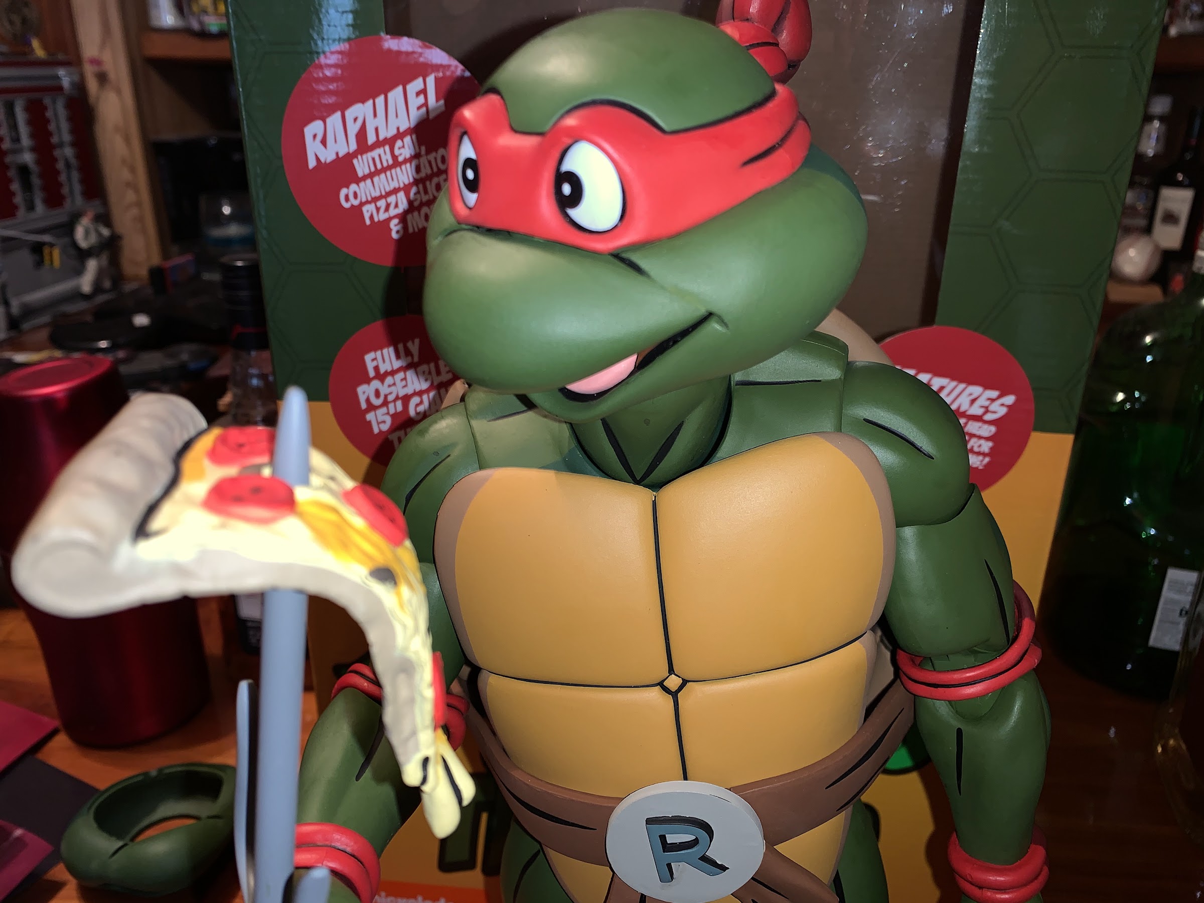
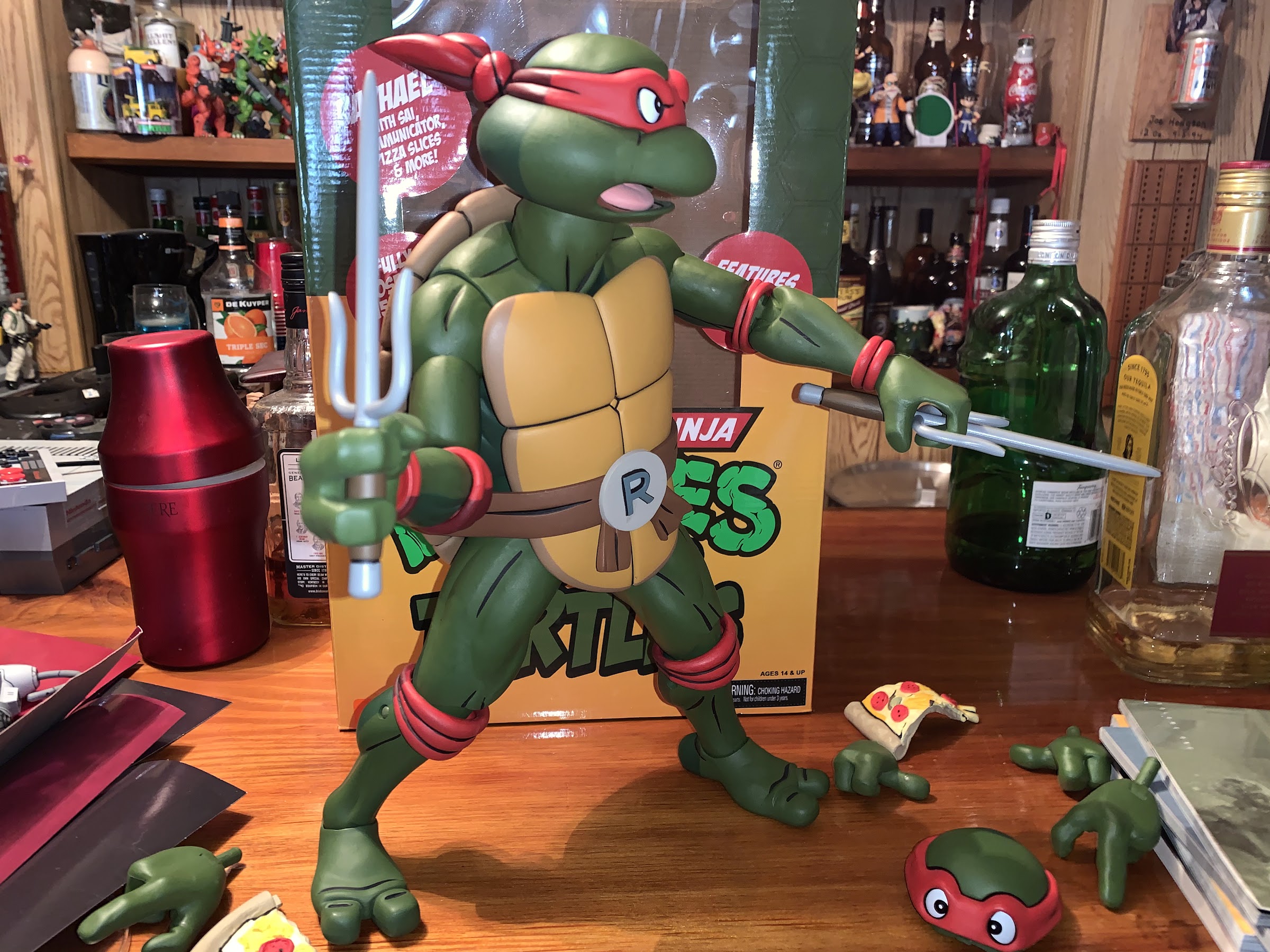
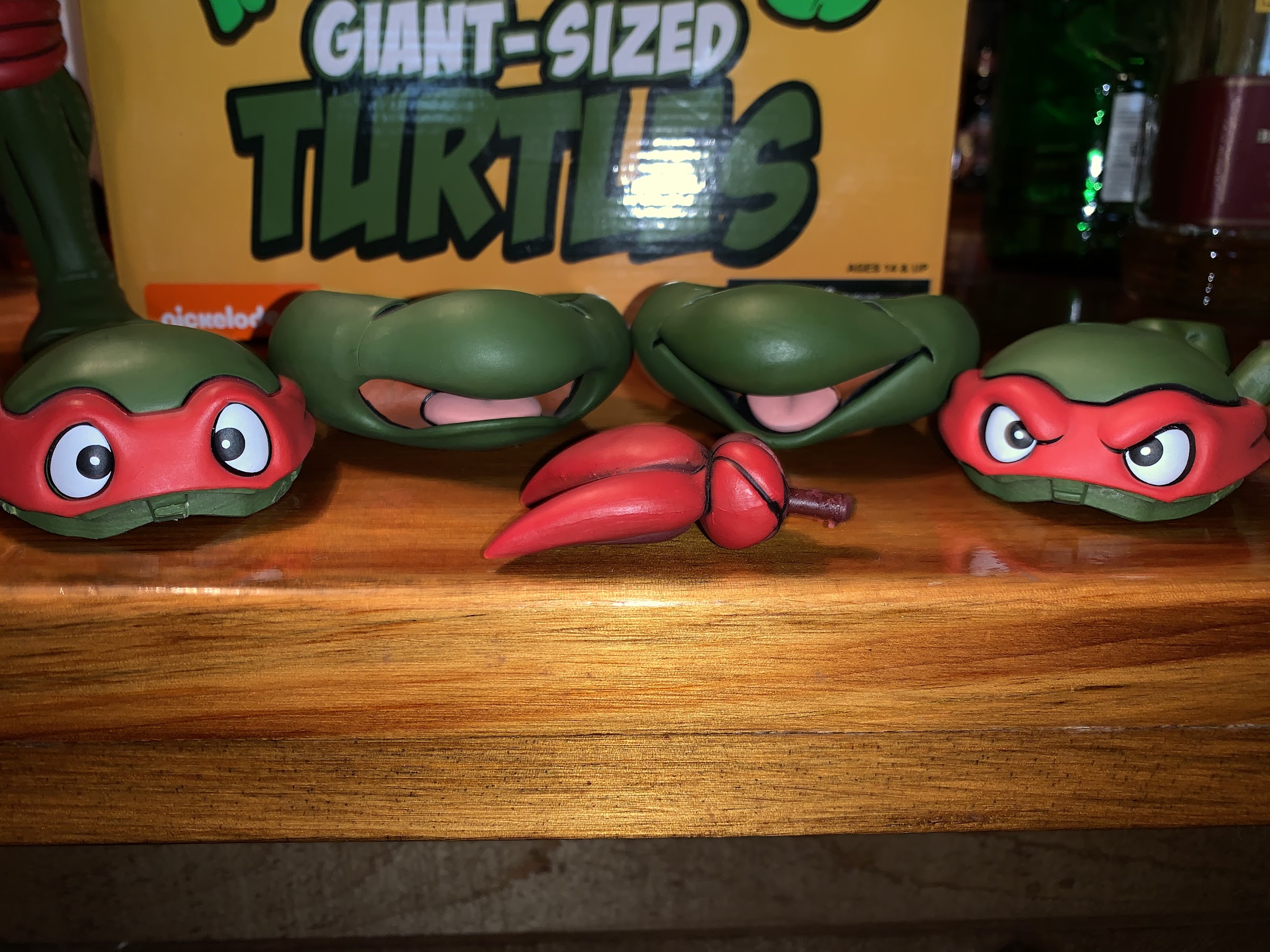
Extricating Raph from his box requires some work. This is not collector friendly packaging, which is actually liberating to a degree as I didn’t mind destroying it and trashing it when done. Once removed, Raph stands roughly 14″ tall. If you have the series one Raph from the toon line sold at Target, then he should look fairly familiar. The color scheme is basically the same with that olive green skin-tone. NECA uses an even darker green on the backside of the figure and the same is done with the red of the bandana and various pads as you have a bright red on the front and a dark red on the back. There’s some black line work at play to really bring out that cell-shaded look and the shell is a soft brown, as it was in the show, and not deep green like some of the licensing art. The obvious major change is just in the expression on the head. Raph’s default look is that big, happy, open-mouthed, grin. The other head features angry eyes and a yelling mouth while the smaller version of the character has a more neutral expression with gritting teeth. I’ve always felt the headsculpts on the standard turtles from NECA were the weakest aspect of the figures as they’re just not very representative of the cartoon and this is a major improvement.
Gotta go with the angry head when the sais are out.
Unless there’s pizza involved, then happy is the way to go.
This big boy can move around a bit.
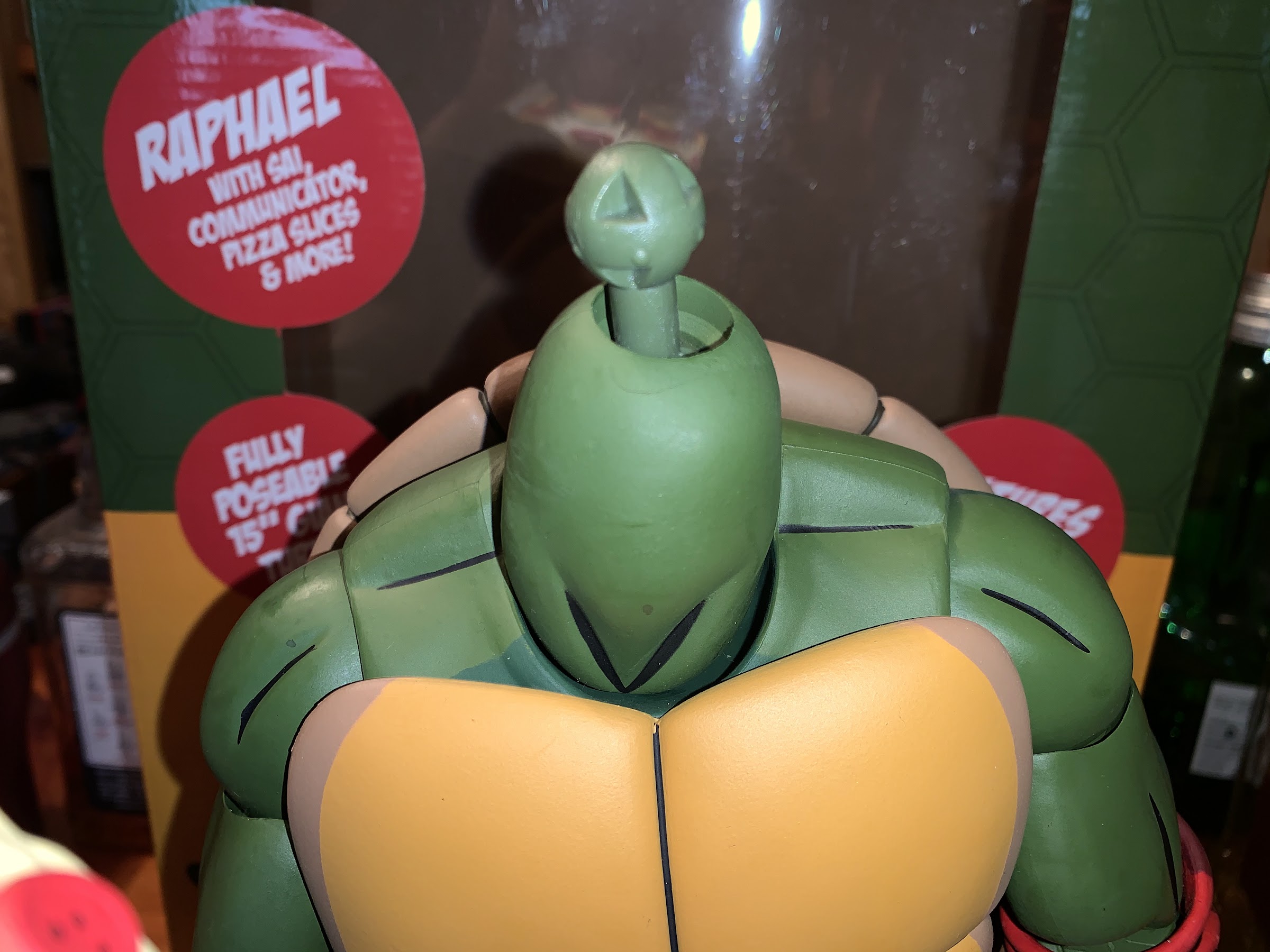
The figure may look like a larger version of the standard release, but it’s actually a little different. This turtle is actually packing more articulation than the old one, which was a bit of a surprise. The head is on a double barbell styled joint so it moves inside the head and inside the neck. The neck is also articulated so you get a pretty good range of motion out of the old noggin. The shoulders are still standard ball-hinges and there’s a biceps swivel past that. The elbows though are now double-jointed like his movie counterpart. Also like the movie figures though, the elbow pads limit just how useful those elbow joints are and you’re basically only going to get 90 degrees out of the joints, but it looks better than the smaller one which placed the elbow pad above the joint. And that pad doesn’t just float in the joint either, there’s actually a little ball-peg that it clips onto. I don’t think it’s something you have to necessarily worry about breaking, but maybe just be mindful of it. The wrists still swivel and possess horizontal hinges and the inner shell has some articulation points, but they don’t really function at all because of the shell. At the legs, we have ratchets to help this figure hold his pose since he is quite heavy. The legs can go out to a full split and kick forward pretty far. The front part of the shell is pretty soft so it doesn’t hinder the kick too much, but the rear shell will keep him from kicking back. The knees are double-jointed, but like the elbows, the kneepads will get in the way a bit. I could get past 90 though, so all in all it’s pretty good. There’s a slight swivel at the knee and the ankles have been redone. The smaller figures just had their feet on ball pegs, but now we have true hinges and rockers which is really needed for posing because this guy actually doesn’t have a thigh swivel. I’m pretty surprised by this omission, but I’m guessing it’s for stability reasons. He moves better than he has any right to, and best of all no stuck joints! The only tough ones were the knee joints, but I assume they’re tight for a reason as loose legs would kill this figure. His bandana knot is also now articulated with a hinge, which is cool.
All the stuff. Note I do not have the Turtlecom all the way opened.
Now that Turtlecom is fully opened!
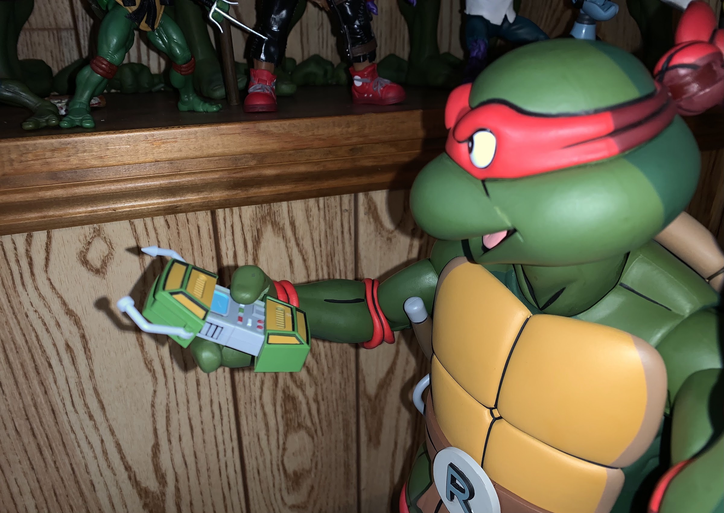
This guy comes with quite a slew of accessories for mixing and matching. Some of these accessories are definitely going to be repeated with the other turtles, like the pair of pizza slices which actually snap together. I suspect once all four are out we’ll have a full pie. The hands are familiar to anyone with the smaller figure: two gripping hands, two pointing hands, and two thumb’s up hands. The gripping hands feature the wider gap between the fingers so Raph can hold his sai with the center blade between them. The pointing hands also function as stylized sai-holding hands, though they don’t fit as neatly as the movie sai and hands. Best of all, the hands are actually quite soft so it’s easy to put accessories in his hands and there’s little risk of paint rub. To go along with these hands, are Raph’s trusty sai which don’t look quite so huge in this scale as they do with the smaller figure. Raph still can’t holster them in a toon-accurate manner, but they fit under his arms when not in use. He also has a Turtlecom that actually opens and closes now. Getting it all the way opened requires a little tug that may seem scary the first time you do it. Once opened, the shell ends are very loose and floppy making it hard for it to hold its shape when actually placed in the figure’s hand. I still think the added gimmick of it actually opening and closing is worth having over the previous method of one static closed Turtlecom and one static open Turtlecom. Lastly, there’s the dripping slice of pizza with the hole through it for placing on Raph’s sai as he does in the original cartoon intro.
The pieces we have to work with.
And the peg they sit on. It’s pretty easy to get his head off, but at the cost of them not staying on very well. It’s definitely one of the hardest things to get right about an action figure with swapping parts.
Of course, we need to talk about that big selling point: the face swapping. Raph’s head comes off very easily, possibly too easily, which is needed to change-up those portraits. The bandana knot just pegs into the back of the head. It’s quite snug, so go easy with it. Separating the top of the head from the bottom isn’t too bad as you can hold it in one hand and push from the bottom inside the head to pop it apart. Once you do that with both heads, you can swap to create expressions. He basically has four: happy, angry, scared, and a sort of wicked expression that is easily my favorite (angry eyes plus the smile). Unfortunately, mixing and matching doesn’t work as well as I had hoped. The two default heads snap together fine, but trying to combine happy eyes and yell or angry eyes and smile does not work as well. The happy and yell combination, which creates a scared Raph, is super tight. It took a lot of effort and repeated attempts to finally get it to snap together. I probably should have got out the head gun, but I did eventually get the thing in place with pure muscle without damaging it. It might seem like an odd choice, but in some respects, this scared face feels the most authentic to me since the turtles do react in a surprised, concerned, and even frightened manner to all kinds of dangers in the show. I might have to go with this look for at least one turtle when all is said and done. The look I was most interested in for Raph, that wicked smile, has a worse issue. It’s too loose! The two pieces will click together, but just the slightest breeze will cause them to come apart. I’d get them together okay, but then once I put the head back on they’d fall apart. It’s frustrating, because the only remedy I can think of is to just glue the pieces together, but that defeats the purpose of the gimmick. Very carefully, I did manage to get the head on and even posed Raph on my shelf with this expression. It’s held, for now, but this doesn’t seem like the type of thing that’s going to get better with time, only worse. Right now, my hope is that one of the other brothers comes with a smiling mouth that works better with Raph’s eyes. It looks like I’ll have to wait awhile though as Donnie appears to come with the yell and a closed mouth, but Leo and Mikey are both shown with big smiles. And maybe once I have a bunch of these guys I’ll be more open to gluing one head together. I’ve seen other reviews that did not have the same complaint, so this could be unique to my set, but I really hope the other figures work better than this one as this is the main selling point of the line, as far as I’m concerned.
Well, that’s no good.
And that’s no better. He’s right to look scared!
The issues I ran into with the expressions definitely put a damper on my enthusiasm for this figure. I do enjoy that he has this big, nice, weighty feel to him and the quality seems to be there as well. As it should be since this figure retails for around $125. He’s shorter than the movie version, but actually feels more substantial. And this is an eye-catching piece with enough posing options that it should be pretty fun to assemble a squad of four. NECA is aiming to release one per quarter and get them all out in 2021. Donnie is next, and we don’t know who will follow him, but eventually I will have my Leonardo! I am also very much looking forward to that four pack and I hope it won’t be a huge chore to acquire it when it’s finally released because these new portraits just work so much better for the source material than the grim ones we got a few years ago.
I’m guessing folks want some comparisons.
Quarter scale Raph and puny, insignificant, Raph.
This bad boy appears to be selling quite well, so if you think this is something you’re going to want then you probably won’t want to wait too long. There will be no restocks, according to NECA, until all four brothers are released and I’m pretty sure they’re looking to do more movie quarter scale figures in 2022 so it could be awhile before Raph is readily available once again. And if you’ve been collecting NECA TMNT, you know how hot it is right now and how crazy the after market can get. The good news is that hot after market means if you buy this guy and decide you don’t have the room or just plain don’t like him you can probably get your money back without too much trouble by flipping him. I do like the look of Raph, and I think I’ll appreciate him even more when I get my toon setup all situated once NECA releases the cartoon diorama it solicited last year. There’s going to be a lot of turtle power added to my house this year.
He’s going to have to chill with the movie figures for now. Hopefully no slight breezes enter my basement to knock his head off.
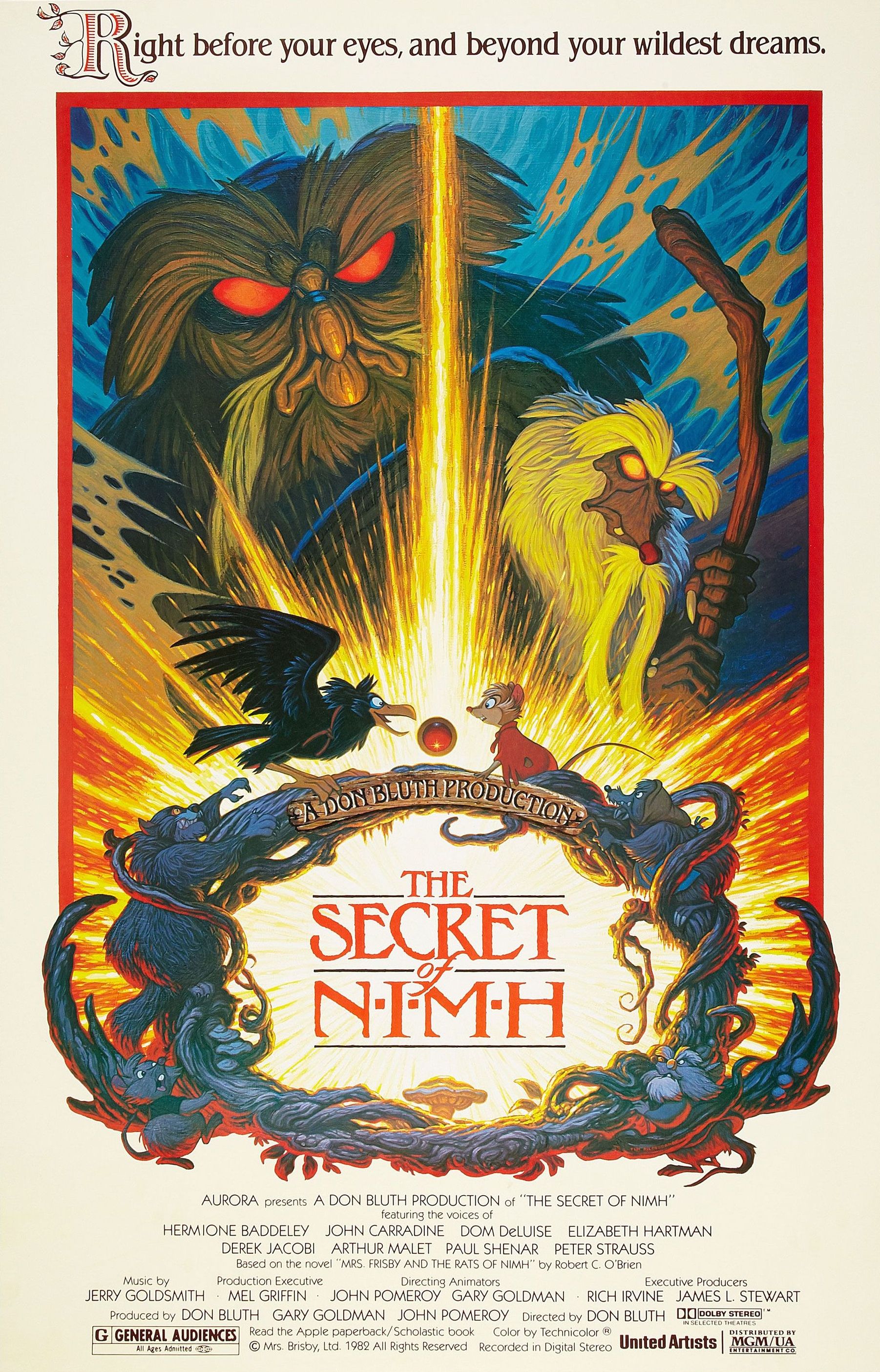
The 1970s was a transition period for the world of feature length animation. Walt Disney’s death had left a leadership void at Disney which was exacerbated by the passing of Roy Disney in 1971. With the Disney brothers no longer at the head of operations, the company turned to Donn Tatum, the first non-Disney family member to head the company. It was during this era that the animators on staff started to feel like the company no longer prioritized the art of animation the way it had under the Disney brothers. It probably didn’t help that the decade began with the release of The Aristocats, one of the least celebrated Disney animated features to date. Because of a sense of stifled creativity, a group of animators staged a walk out lead by Don Bluth. He along with animators Gary Goldman, John Pomeroy, and several others left the company during production on The Fox and the Hound and Don Bluth Productions was born. Seeking to emulate the classic style of early Disney works, Bluth and his associates set out to making features as quickly as possible. They found a partner in Metro-Goldwyn-Mayer and a story in Mrs. Frisby and the Rats of NIMH by Robert C. O’Brien. They knew what they wanted to do, but the hard part would be making it all happen.
The tale of Mrs. Frisby had been brought to Bluth’s attention by fellow animator Ken Anderson while working at Disney. Try as he might though, he just couldn’t get Disney to bite on it. And there was some solid reasoning behind that as animation director Wolfgang Reitherman cited the recent release of The Rescuers as being too similar to the tale of Mrs. Frisby and her fantastic rat friends. When Bluth left Disney, the story went with him and it was the book he turned to first when it came time to prove that feature length animation could flourish outside the House of Mouse. Working outside of Disney though meant a lower budget and a shorter schedule which necessitated Bluth and staff to work ungodly hours on the feature. And a certain company that popularized a flying disc necessitated a name change of the titular character of Mrs. Frisby to Mrs. Brisby.
Bluth wanted to prove to Disney that others were capable of outperforming them and The Secret of NIMH certainly packs the visuals.
I was in the fifth grade when the story of Mrs. Frisby and the Rats of NIMH was introduced to me. I was a kid who liked to take shortcuts when it came to academics. I was fortunate that most subjects came easily to me, but it did stifle my intellectual curiosity as a result. When it came to independent reading, I just recycled junk I had been reading for years that my new teachers wouldn’t necessarily be aware of. Eventually, my teacher, Mrs. Roy (who remains my favorite teacher ever), wrote a note in my report card that I needed to read more challenging books. I really had no desire to honor the request, but also had little choice in the matter so I simply asked one of my friends if he got the same edict. When he confirmed he did not, I asked what he had been reading that she seemed to approve of and he directed me to the book Mrs. Frisby and the Rats of NIMH. I read it and thought it was good enough to read the sequel when I was finished. Better yet, my teacher left me alone when it came to my independent reading assignments. At the time I read it, it was the early 90s and I had no idea a film had been made out of the story a decade earlier. I think I just happened upon it one night at the local video rental store and asked my mom if we could rent it, so we did!
Ever since seeing The Secret of NIMH I have thought of it very little. I think I liked it, but it clearly didn’t leave a mark. The book really didn’t leave a lasting impression either, though I can say it did stick in my head far better than the sequel of which I remember nothing but the title. In my house though, Saturday is movie night and we alternate who picks the movie each week among the members of my family and when the choice falls to me I like to find things that my kids haven’t seen and will hopefully enjoy. That’s how this film popped up on my radar recently, so out I went (safely) to a nearby media store and found a used DVD release of the film for a mere five dollars. It’s certainly not a great DVD release as it only has a full screen option, but it was an opportunity to see this film again and show it to my kids for the first time and I’m still not willing to digitally rent things. I’m just weird like that.
Mrs. Brisby is out to save little Timmy. I feel like it’s always a “little Timmy.”
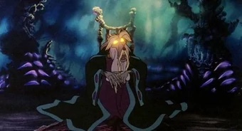
The Secret of NIMH tells the tale of the widow Mrs. Brisby (Elizabeth Hartman), a field mouse, and her quest to save her ailing son Timothy (Ian Fried) from a bout of pneumonia. The illness itself isn’t necessarily the threat, it’s the fact that the harvest season has arrived and Mrs. Brisby and her family need to vacate their current home for the farmer’s tractor will soon level it. Unfortunately, Timothy is too sick to be moved so Mrs. Brisby is forced to turn to the Rats of NIMH for help. The rats are a colony that lives in a nearby rose bush and they possess intelligence seemingly beyond that of man. It’s all the result of once being lab rats. Throughout the film viewers are introduced to a small portion of their various members and their wonderous home while also learning about their past and their relationship with Brisby’s deceased husband. Internal strife also exists within the ranks of the rats which will pose a problem for Mrs. Brisby and her family.
The story is quite brisk and uncomplex as it moves along during its 82 minute runtime. Mrs. Brisby basically has a problem and receives advice from one source to go to another, who then sends her to another, and so on. It’s easy for a child to follow and Brisby is a likeable and empathetic lead. She is joined, at times, by the crow Jeremy (Dom Deluise) who provides comic relief, while the seemingly ancient leader of the rats, Nicodemus (Derek Jacobi), adds a little wonder to her supporting cast. The danger of the situation is illustrated clearly, and other dangers arise throughout the film. Since we’re largely dealing with a cast of mice and rats, expect a cat to play a role.
Jeremy is the character we’re supposed to laugh at, but I didn’t hear much laughing in my home.
The story is cohesive, but what isn’t is the world created by O’Brien and added to by Bluth. The rats are said to possess human level intelligence, and perhaps more as their home is quite elaborate for something that exists in a bush. However, seemingly all of the animals (except the cat) possess incredible intelligence anyway making the rats seem less remarkable. Mrs. Brisby and her children all wear clothes and live in a home full of human comforts. They even use utensils and boil water for tea and such. A Bluth addition is the inclusion of magic. Bluth seems to think animated tales should contain elements of the fantastic like magic, so Nicodemus is now a wizard of some kind. He’s the first character we meet as he views Brisby through a magic looking glass and remarks how he has a talisman for her. No explanation is provided by the film for this magic or how Nicodemus and the Rats of NIMH came to possess it, but the talisman does at least serve a practical purpose of putting the power to save her family in Mrs. Brisby’s hands, quite literally. Movies don’t have to explain everything, of course. People seem willing to happily accept that Cinderella can communicate with animals and such in her Disney film, but this is also the type of film that does try to provide explanations for everything else, and hand-waving the concept of magic feels off as a result. It also forces a lot into the final five to ten minutes of the film. Animation is expensive and hard, so it’s no surprise to see this one clock in under 90 minutes, but it’s a film that would have benefited from more time. We barely get to know the rats and their inner conflict so the climax that conflict leads to doesn’t land like it should. Everything just sort of happens and as a viewer I was left feeling, “That was it? Huh.” My kids, on the other hand, fell asleep.
The film’s decision to shoehorn some magical elements into it doesn’t really satisfy from a plot perspective, but it’s at least visually interesting.
The Secret of NIMH isn’t as captivating or as enchanting as it probably would like to be, but what can’t be denied is the visual fidelity. The Secret of NIMH looked terrific in 1982, and by any standard it still does. I wish I had tracked down a Blu Ray version, but beggars can’t be choosers. Bluth and his fellow animators set out to emulate the early Disney style and they absolutely nailed it. Show this to someone who is just a casual animation viewer and they’ll probably mistake it as a forgotten Disney feature. The designs of the mice and rats are very reminiscent of The Rescuers and Cinderella, but absent those tell-tale Xerox lines from the Disney films of the 1970s. It’s gorgeous, and the more fantastic elements are captured with simple, effective, animation techniques. I may not have been fully engaged with the film’s plot, but the visuals definitely held my attention for the duration of the film.
Less celebrated is the soundtrack of Jerry Goldsmith. It is certainly capable, but not quite memorable. The same can be said for most of the Disney features from that era, so in that respect this one feels quite similar to what Bluth’s old place of work was outputting. The voice cast is plenty capable though and I very much enjoyed the late Elizabeth Hartman in her role as Mrs. Brisby. She brings a gentle confidence to the character and I imagine it’s quite similar to the voice I heard in my head when reading the book back in fifth grade. Dom DeLuise is good in his role as Jeremy, though I think the film thinks he’s funnier than he really is making him more of a distraction than true comic foil. The Rats of NIMH are all given rather regal and distinguished voices while Nicodemus is treated as an elderly wizard, a departure from the source material. It’s a cast that doesn’t contain many big names from the era, but it’s a professional cast more than capable of bringing these characters to life.
The Secret of NIMH is a triumph of animation with a somewhat forgettable story. That adds up to a solid viewing experience that provided movie-goers in 1982 with a glimpse of where Don Bluth was heading. He and his team of animators would go on to make better films, and worse ones, leaving The Secret of NIMH to serve as the appetizer of the Don Bluth feast. The film did eventually receive a sequel, but without any contribution from Bluth, which makes it similar to the book sequel which was not written by Robert O’Brien. I have never seen it, but it received a near universal negative reception upon release in 1998 as a direct-to-video feature. Which is fine, as this isn’t a film that cries out for a sequel. It’s quick, fairly tidy, and mostly beautiful and a perfect way to kill an hour and a half on a Saturday night.
Few games have taken me longer to complete than The Legend of Zelda: Majora’s Mask. When it was originally released on the Nintendo 64 in 2000, I did not own a Nintendo 64. I experienced the game in fits and starts at the homes of friends, but never really was I able to sit down and play it by myself. When the game was released on the Nintendo Virtual console in 2009, I bought it and installed it on my Wii, but never finished it. When the Nintendo 3DS came out one of the big titles announced for it was a remake of The Legend of Zelda: Ocarina of Time, which I bought on the day of release. It was all but assumed a remake of Majora’s Mask would follow, but it took Nintendo a few years to make that a reality saving the title until 2015. And at the time of release, I was not in need of a new game so I passed o it initially and I ended up waiting a few years to purchase Majora’s Mask 3D when it was discounted in the summer of 2017 or ’18. And it has taken me since then to finally beat it. I never beat it on the Wii, and I played it irregularly on the 3DS. Sure, I’ve physically spent more hours with games than I have Majora’s Mask, but in terms of the passage of time from the first time I played it to my finishing it I’m not sure anything compares.
Majora’s Mask is in many ways the first true sequel for a game in The Legend of Zelda series. Canonically, the second game in the series is a sequel to the original as Zelda II: The Adventure of Link takes place after the events of the original The Legend of Zelda. However, it’s an entirely different game as Nintendo opted to switch to a side-scrolling perspective and add RPG mechanics to the character progression. About the only thing linking the two was the catchy soundtrack. On the Game Boy, The Legend of Zelda: Link’s Awakening was a sequel to the Super Nintendo title A Link to the Past, but obviously going from the Super Nintendo to the Game Boy necessitated quite a drastic change in playing style. Link’s Awakening ended up being one of the most offbeat Zelda titles, and it also introduced a jump mechanic to the top-down Zelda gameplay popularized by the very first game in the series.
Majora’s Mask though, being a 2000 release, is very much the sequel to Ocarina of Time. The Link character present in both games is the same, and the gameplay engine was recycled. Previously, every Zelda game was constructed from the ground up, but likely lengthy development cycles arising from the technological advances in gaming and simply the cost in crafting a gameplay engine meant Nintendo had a lot of reasons to do a more traditional sequel. It’s something Nintendo really has resisted with Zelda as since Majora’s Mask the only games that qualify as traditional sequels are the DS titles. Because of that reality, some questioned whether or not Majora’s Mask should even be considered a full-fledged Zelda title upon release, which was a bit absurd. It’s an entirely stand-alone game with as much content as basically any other Zelda title up to that point. And since it was built on the back of one of the most popular and critically acclaimed games of all-time it seemed doubly crazy to criticize Nintendo for essentially fast-tracking a Zelda game. If anything, content-starved owners of the Nintendo 64 should have been doing backflips to receive another Zelda game a mere 2 years after the previous one.
Top: N64 original, Bottom: 3D remake.
Majora’s Mask would not be as well received as Ocarina of Time, but you would be hard pressed to find a negative review of the game from 2000. And the same is true of the remake for the 3DS, so why did it take me so damn long to actually finish it? Well, Majora’s Mask is constructed around a time travel gimmick. Ocarina of Time was as well, but Majora’s Mask takes it in a different direction. This game is basically the equivalent of Groundhog Day for video games, only the events of the game unfold over the course of 3 days instead of 1. In it, you once again play as a child version of Link, the Hero of Time. He has ventured away from the kingdom of Hyrule and arrived in the region of Termina when the game begins. Unfortunately, he quickly loses his horse and comes to find out that the town is doomed. The Skull Kid, whom players should remember from Ocarina of Time, has stolen the cursed Majora’s Mask and has used its power to summon the moon to crush Termina. It’s a slow moving moon though, with a creepy visage upon it, that won’t actually strike for 3 days. Link is expected to unseal the power of four lost deities which should stop the moon from crashing into the planet. Unfortunately, there just isn’t enough time to accomplish that goal so Link will need to turn to his trusty ocarina to constantly rewind time to the start of the first day in order to acquire all of the items needed to foil the Skull Kid.
The Skull Kid from Ocarina of Time is back and he’s kind of a dick now.
What this means from a gameplay standpoint is that you’re constantly managing an in-game clock. If left to its own devices, the three days unfold at an equivalent of one gameplay hour equaling one real world minute. If you let the clock run down, you lose and everyone gets destroyed. This means you’re always running around and trying to accomplish as many tasks as possible as going back to the dawn of the first day means the entire world gets reset. Any consumable items you may have acquired like bombs and arrows are lost, as are the contents of any bottles and such. If you had to undertake certain tasks in order to gain access to a dungeon or similar area, you may have to redo them in order to pick up where you left off. The only things you’re allowed to keep when traveling back in time are key items like the bow and hookshot as well as heart containers and masks. This all results in a gameplay experience that is best described as tedious. Just like any other media centered on time travel, there’s always going to be repetition in the plot and it’s a pretty subjective take on how much is too much. Some people consider Back to the Future Part Two the worst film in the trilogy because so much of it is a rehash of the first film, even though it’s by design. And others love it for that very reason.
Link’s first mask will be the Deku mask, but it won’t be the last.
Because of its gameplay style, Majora’s Mask may be one of the most controversial Zelda titles ever released. I know people who can barely tolerate it, and I also know others who think its the best Zelda title ever released. Because the game is a constant loop of three days, every non-player character in the game has a schedule. You know where they will be on any given day at any given time. For some people, I think such a concept is very rewarding. It’s certainly a tad gimmicky, but it’s a gimmick that definitely wasn’t common on consoles in the year 2000. I personally don’t recall encountering such patterns in NPCs until I played an Elder Scrolls game, though in those games it wasn’t a loop of three days, but still characters could be trusted to be in certain places, on certain days, at certain times. And the ability to play with and manipulate time certainly has some charm. Not only can Link rewind time when needed, he can also slow down the passage of time essentially doubling the amount of time available, or he can move forward in time. Being able to do so plays a role in many side quests as they’re dependent on encountering characters at certain times of day, and rather than waiting around, you can simply move forward in time to wherever, and whenever, you need to be.
Every time Link transforms he screams and I can’t decide if it’s a scream born of terror or pain. Maybe both?
All that said, I am not one of those people. While I found a certain thrill in playing with time each time I started up a game of Majora’s Mask, it was something that wore off. Around the time I got to the second, main, dungeon of the game in the mountains I hit a wall. That’s where I left off for years on my Wii version, and it was the first time I put the 3DS version down for an extended length of time. I came and went over the years though and at long last I can finally say I have beaten Majora’s Mask, the 3D version anyway. Which is fine for me as we’ll get into it soon, but this is the superior version of the game. And while I did beat it, I did not accomplish every little thing in this title which is unusual for me when it comes to a Zelda game. Typically I get every item and find every heart piece, but I was content with this one to just get all of the masks. It’s not a hard game so the heart containers really just start to feel like filler at some point, the last few are also incredibly annoying, but that’s another thing we’ll get to in time.
You will gain access to a lot of masks in this game, some of which only have one application, but in the case of the Stone Mask it’s rather memorable.
Being that Majora’s Mask is built on the same engine as Ocarina of Time it should come as no surprise that the two games look pretty similar. That’s true of the original build, as well as the 3D remake. I played this on an original model 3DS and rarely touched the 3D setting. When it occurred to me to do so, I would, but only for cinematics. The remake is largely a cosmetic improvement over the original as all of the polygons have been smoothed over and rounded off better while the muddy textures of the N64 have largely been removed. The original looked okay in 2000, but the remake is pleasant to look at now and likely will remain that way for a lot longer than the 2000 release did. The upgrades are not just cosmetic though as Nintendo implemented a number of quality of life improvements, as it did with the Ocarina of Time remake. The bottom screen serves as your inventory and the ocarina itself is easily accessible now. Better, you can also see all of your songs displayed as you play so you don’t need to memorize anything. Link can equip four items at a time making it less cumbersome to swap things in and out and the Song of Double Time now allows you to select an hour in the future rather than just move time forward in preset intervals. All of the transformation masks have also received tweaks, some more severe than others. The most notable is Zora Link now swims a lot slower, but he can speed-up by consuming magic which feels like more of a downgrade than an improvement, but it is helpful when swimming in tight confines. There are also far more save points now, which is something that’s appreciated for any game.
When transformed, Link can’t use any of his items except for a transformed version of his ocarina. He does, however, gain access to new abilities and items like the Goron powder keg.
The main game asks the player to explore the world of Termina and acquire masks, which serve as the main feature of the gameplay gimmick. The masks largely replace the specialized items we’re used to finding in past Zelda games. The Goron mask, for example, basically gives Link the same “powers” as the hammer from Ocarina of Time while the Zora form has a boomerang attack and gives Link the ability to swim. The other mask, and the first one you get, is the Deku Scrub mask which gives Link the ability to hop across water and utilize the Deku flowers to basically hover a short distance in the air. There are still items to be found in dungeons, but far fewer than the typical Zelda experience. The masks themselves though are visually interesting and thematically as well as each mask is actually inhabited by the spirit of a deceased individual. It’s a bit sad that when Link is wearing one friends of the dead fellow mistake him for their dead friend or relative, which adds a tragic element to the story.
Swimming as Zora Link has been altered so that he swims much slower. This make navigating some tight spaces more manageable, but it’s less fun. Plus it’s still swimming and swimming is always annoying in games.
There are four main dungeons in the game that have to be completed in a specific order. If that makes the game sound short, it’s a bit longer than you think as each dungeon has basically another dungeon that has to be completed first. The first dungeon usually contains an item needed to progress the story or is necessary in opening the location of the dungeon you need to access most. Those four main dungeons each contain the mask of a deity, and assembling all four is needed to stop the moon. Those four masks are unwearable, but that doesn’t mean there is any shortage of masks in the game. There are 20 total masks, the majority of which do very little and are relegated to a specific purpose that once taken advantage of is no longer needed again. Some are neat though, like the one that turns Link’s head into a bomb and allows him to self-destruct thereby giving you infinite bombs. My favorite is probably still the Bunny Hood, a holdover from Ocarina of Time, which just makes Link run much faster. It’s annoying to get, but definitely worth it once acquired. The last mask you can get is basically a bonus item. Dubbed the Fierce Deity mask, it turns Link into an adult version of himself that’s over-powered that turns all boss battles into a mere formality. It’s the type of mask you should probably go after once you’ve beaten the game once, unless you prefer the final boss be a pushover.
Goron Racing is one of those annoying things you have to do and it pretty much sucks.
Which is something that isn’t needed anyway as the game is pretty easy. Even the puzzle elements aren’t particularly tricky and the ones that stumped me the most were usually the ones that required the least amount of thought. I got stuck for a bit in the last dungeon because I simply didn’t kill every enemy in a specific room, but the enemy was a statue that only comes to life if you touch it, which is the type of enemy where the purpose seems to be to avoid touching them! And these two were even situated in lava, so go figure. Combat is by far the most dated aspect of this game as it’s very simplistic and really not a whole lot of fun. Only one enemy will attack Link at a time if you’re locked onto them and the vast majority can be defeated just by smacking them. Others require the player to either deflect or parry a strike, then counter. Most of the bosses have been tweaked from the original release as well to add a weak point that you need to strike in a fairly obvious manner, then smack them around with your sword. Only the underwater boss gave me any trouble, and the final boss was a bit disappointing in how easy it was to fell. I suppose it was better than a boss fight that required a bunch of switching of masks or something, but lackluster combat isn’t a new problem for Zelda and it was even my biggest criticism of Breath of the Wild.
You’ll memorize this friggen song during the last dungeon, whether you like it or not.
I can live with the simple nature of the battle system in this game, but what drove me nuts was just the little things. The camera isn’t great, even when playing with the Circle Pad Pro which allows for manual manipulation of the camera, and it’s something I found myself fighting with more than expected. The targeting system can be finicky, but at least there’s no shortage of health available so that didn’t bother me too much. What would bother me the most are the alternate forms of Link, specifically Goron and Zora Link, as controlling them was such a chore. Goron Link has a rolling ability and there are moments in the game where you have to roll on a track while Zora Link has to swim and swimming is just never any fun in video games. The end of the game features some optional dungeons that drove me insane as it puts the lackluster camera and controls for those two forms in the spotlight and if you want every heart container you just have to soldier through it. The penultimate dungeon also introduced a mechanic where you flip the dungeon upside down which proved incredibly tedious. The last song you learn for Link’s ocarina, The Elegy of Emptiness, also allows Link to make a duplicate of himself for the purpose of standing on a switch. And you can duplicate Link as many times as transformations you have! The problem is you’ll end up doing this over and over as you leave and re-enter the dungeon, which is required to flip it and complete it, and watching those mask transformations and songs over and over is maddening. Nintendo apparently either loves its cinematics too much to make them skippable, or it hates its fans. I don’t know if it rises to the level of the infamous Water Temple, but the overwhelming tedium of this game just wore me down by the time the end arrived.
There are at least a few rewarding side quests in this one, and not just in terms of the item you get at the end.
I have a lot of complaints and mixed feelings when it comes to Majora’s Mask 3D, but in the end I do think it’s a good game and worth playing, I just think reactions to it will be volatile from person to person. It’s a game you can’t be in a hurry to play or else it will frustrate you, but sometimes you’re staring at a red battery light on a handheld and time becomes precious. When I ranked the Zelda games almost five years ago, I called this the seventh best game in the series. When ranking them then, even though I had never finished the game, I was reminded of how a lot of games in this series feature some degree of tedium and gimmicks that overstay their welcome. What distinguishes this game above some of the others is that the gimmick at least feels clever, and that’s a feeling that doesn’t really ware off. Sure, the combat doesn’t impress and the end game starts to feel a bit “samey” when most enemies just require the bow and sword, but there is a charm to the game’s structure and some of the characters are actually memorable, when Zelda plots are often just “meh.” And if you are going to play just one version, the 3D remake is definitely the superior one. While the changes to Zora Link make that last, optional, dungeon super annoying, that’s not enough to outweigh the other quality of life improvements and increased visuals. The only thing that stinks about playing the 3DS version is that you’re confined to a portable. You can certainly do better than the old model 3DS I have, but Nintendo has yet to make 3DS games available on Switch or introduced a 3DS player (there are third party hacks that can accomplish this, but nothing official) so that’s unfortunate, especially because the game contains a fantastic soundtrack. It’s a shame it’s trapped on those tiny speakers, but I suppose you could hook up some nice headphones. It was nice to get a Zelda fix though, especially with Breath of the Wild 2 still without a release date, and at least I can finally say I have beaten Majora’s Mask.
You may have been wondering why I decided to devote an entry earlier this week to a nearly twenty year old action figure of mediocre quality, and if so, now you know why. I wanted to take a look at the DC Direct Batman based on his appearance in the Jeph Loeb written, Jim Lee illustrated, story Hush in anticipation of a look at what should be a much better figure based on the same Batman. The MAFEX Batman should be everything the DC Direct one was not as MAFEX action figures pride themselves on being highly detailed as well as super articulated. They’re also super expensive so they should be awesome.
My only experience with Medicom prior to this was nearly 15 years ago. Back then, Medicom was known to me for vinyl toys which were often stylized and often pretty expensive. Medicom did a deal with musician Glenn Danzig back then, and if you have not noticed that’s a favorite subject at The Nostalgia Spot, and I grabbed one. Medicom issued three figures, one based on each of Danzig’s bands, and I grabbed the one based on the band Danzig. The figure is basically a vinyl doll, it swivels at the arms and fists, but nowhere else. It might have swiveled at the head if not for the hair-sculpt. It was stylized though with its own unique look featuring an oversized head and fists with a somewhat round nose and underbite. It was cool, but also around $75 in 2006 money so it was hardly cheap and the reason why I only grabbed one.
I am very excited to open this guy up.
My experience with Medicom is not at all applicable to its MAFEX line of figures. The only comparison is that both are expensive. I have seen plenty of MAFEX offerings over the years that looked pretty good and were thankfully not attractive to me since they do a lot of superhero stuff. I’ve also had some reservations as I’ve seen and heard many complaints about the MAFEX quality control over the years. Joints breaking, paint applications iffy, and so on. Often times reputations are earned, but it’s also important to remember not everyone’s experiences, or expectations, are the same. I’ve certainly seen a lot of complaints about NECA’s quality control online recently and yet I own somewhere in the neighborhood of 75 NECA figures and have yet to have one break. The worst I encountered was my toon Slash which arrived with a detached backpack strap which was easily fixed with a dab of glue.
I feel like his thighs look bigger here than they do on the figure, but it could just be perspective messing with me.
Even with that reputation starting to build for MAFEX, it wasn’t the thing still giving me the greatest pause, it was the price. And it’s not necessarily the idea of spending around $100 on a figure. When I saw this Batman unveiled I was very interested as I felt this was THE Batman for me and I’d never need another and that has a pretty high price for me. It’s more what you get for the price. Each MAFEX figure is 1:12 scale which is fancy for six inch scale, for the most part. They’re not identical, but most people won’t notice the difference. You’re getting a figure with a good sculpt and a lot of articulation to go along with numerous extra parts like hands and heads, as well as character appropriate accessories and often (always?) a stand. It’s a good assortment of stuff, but the fact remains that quality figures in this scale just don’t carry this high a price. Bandai’s SH Figuarts are very comparable in terms of scale and quality and they usually retail for $60, at their high end (up until recently, of course, as we’re currently seeing a rise across the industry in prices). What is MAFEX doing to justify the added cost? It’s possible the licenses they go for just plain cost more, but Bandai has done Marvel and kept the price down, so that leaves me largely with one conclusion.
Here he is!
And here’s that cape!
And that conclusion is “because they can.” We’ve been seeing a lot of boutique style collectibles start to crop up that really push what is expected in terms of price. And I think some manufacturers have realized that collectors are willing to pay a lot, and some are now willing to charge a lot as a result. Action figures are not known for having fantastic profit margins, but they do exist and most companies figure out a price that works for them. And then we have other companies that want more. It’s basically just capitalism at work, and if collectors buy it then producers are going to charge it. Did I want to contribute to making it acceptable to buy a 1:12 figure at $100? The short answer is, “No,” but I am both making an exception here and I felt I should have some personal experience with such a product before forming a final opinion, so here we are. And maybe I’m just ill-formed and Medicom pays its employees way better than the competition and thus, has to charge more. I doubt that’s the case, but since it’s a possibility I figured I would mention it.
Sculpted bat logo – good. Paint not quite lining up with the sculpt – bad.
I am going to keep this review objective, because that’s what I always do, and because subjectively I’m almost guaranteed to enjoy this action figure. The version of Batman depicted in Hush is fantastic, as far as I’m concerned, and this figure need only capture that. Price is a factor though, so I have to keep that in mind. This figure by itself might be great, but it needs to justify its cost. I can overlook some lazy sculpting or iffy paint in a Marvel Legends and still declare it’s pretty awesome because that figure costs around $25, but such things are not so easily overlooked when the price is quadrupled.
Good elbow clearance.
Well, for starters, MAFEX presents a good figure. The figure comes packaged in a collector friendly window box with appropriate colors and artwork. The rear features numerous product shots to demonstrate how the figure can be posed, and unlike a Lightning Collection release, I suspect all of these potential poses are actually achievable. I do wonder if these are actual product shots though as the colors are a bit different and the figure looks a bit beefier, especially the legs. It’s likely they’re just edited post photo, or the figure depicted is a final test sample that turned out a little differently. The figure comes in a blister tray with some actual Jim Lee artwork serving as the backsplash. The tray has a plastic overlay to keep everything in place and the included stand is taped to the back. I recommend removing that stand before removing the tray cover because that cover is the only thing securing all of the accessories and figure. Don’t do what I did and remove the cover and decide now is a good time to take off the stand and accidentally dump all of your parts on the floor. It’s not a fun time searching for batarangs on a carpeted floor.
I have real mixed feelings about this cape.
There is no tape or tie-downs inside the box, so once that tray cover is removed you are free to pull your Batman out. He is pretty light to the touch and your first reaction is likely going to be, “Wow, that’s a big cape!” It’s massive and made of some kind of cotton, I assume. It’s well put together, but it will arrive wrinkled. Had Mafex used spandex or something more rubbery it likely would not wrinkle so easily. The stitching is clean though and I don’t see any fraying, so that’s a plus. It’s glued under the cowl and it’s a little messy and I worry about that piece eventually lifting off of the torso. Holding and moving Batman feels a lot like handling a SH Figuarts release. The joint system is pretty familiar and just the overall build quality feels pretty much the same, and that’s a good thing. The only negative for me right out of the box is that one of the blades on his left forearm came out bent and curled over, which you’ll see in virtually all of the images in this post. Since taking all of the pictures I was able to apply some heat to that curled blade and straighten it out a little. It’s not where it needs to be and it’s something I’ll have to keep at if I want to straighten out completely, or just learn to live with.
I’m actually a little surprised at how well the old figure looks next to the luxury model. If only he didn’t have the paint blemishes on his face.
Here the Mafex figure shows off its superior head-sculpt, but the DC Direct one still gets to brag about its massive chest.
Once placed on a surface, Batman stands right around 6.5″ to the top of his ears, probably a little less. He’s shorter than the DC Direct figure I looked at who was around the same height to the crown of his noggin. The Mafex version is also less substantial. He’s a leaner Batman in comparison, which is not really page-accurate if we’re being technical. His chest could use a bit of beefing up as well as his thighs, though his biceps and shoulders look pretty good. The head shape is much better on this version and more reflective of the art, as is the color palette utilized which is a pale blue, almost a gray-blue, for the cape, cowl, gloves, boots, and trunks. The yellow belt is also pale and a little dingy. I think a touch of brown might have better achieved the effect they were going for, but in checking the source material this looks pretty close. The paint on this figure isn’t terrific. The head-sculpt must have been cast in blue because it shows through the flesh-colored paint around his mouth. There’s even a blue line under his lip, which isn’t great. It also shows through the teeth of the alternate head. On a shelf, it’s probably not a big deal, but this is a pricey figure so this shouldn’t be an issue. The paint around the bat emblem on his chest doesn’t fill the sculpted-out symbol giving it a gray outline, which is irritating. There’s a gray speck on one of the belt pouches and the paint around the boot cuffs is bad. It’s frustrating because there’s not a lot of paint that needed to be done, and what little there is wasn’t done particularly well. At least, the eyes came out well and there does appear to be a wash on the gray parts that looks good and brings out the musculature of the figure, though there is some paint slop on the left thigh of my figure.
Sad bat blade 😦
Lets see what this guy can do!
The overall presentation of the figure is a mixed bag. The sculpt is good enough, even factoring in the price, but the paint is not while the cape size is going to be more subjective. I think the cape could have been smaller, but it could also work at this size with some improvements. I think the bulk of the cape, in particular how it bunches up at the shoulders, contributes to my feeling like this Batman seems undersized. If I flip the cape over a shoulder and just look at how it compares to the head and width of the upper body it looks pretty good. The cape in the books is certainly large, but it’s illustrated rather thin and heavy, almost leathery in behavior like a, you know, bat! There’s not a lot of material around the neck area as there is with this figure so that’s what’s throwing things off for me. If it wasn’t glued under the cowl way up inside the shoulders and on the pectorals, it would look so much better. They just brought it forward way too far.
Lets see the 03 model pull this off!
I definitely have some nits to pick when it comes to the presentation of the figure, but I also haven’t talked about the articulation, so lets get to it. His head is on a ball peg which sits inside a neck piece that also connects via a ball peg in the torso. He can turn his head and look down pretty well, but the range going up isn’t great. What also isn’t great is that neck wants to turn with the head most of the time, and sometimes it doesn’t, and you may end up with Batman’s adam’s apple on the side of his neck or something. Something inside it also kind of chewed up the edge of the neck on mine as it rotated. It’s not a big deal because it sits far enough down in the torso that it can’t be seen unless you’re looking for it, but it’s something to watch out for. The shoulders are on ball-hinges with a butterfly joint that allows Batman to reach all the way across his chest. There’s a swivel at the biceps and double-jointed elbows that go well past 90 degrees and don’t look terrible. The hands are connected via ball pegs so they have pretty good range of motion, but they do pop off a little easily, which is better than the alternative. In the torso we have a ball-peg in the diaphragm so he can rotate and tilt pretty well. There is a waist swivel, but it’s a little tight. The belt is a separate piece that has a little give, but it’s either glued down or pegged in somewhere. The trunks are also a separate piece, but they’re pretty small and stay out of the way. The legs are on ball hinges so they can kick forward and back and raise out to the side far enough, but not a full split. They also can drop down for a little extra mobility and swivel at the thigh. The knees are double-jointed and molded at a slight angle so they look a little funky, but the joint is pretty clean. At the ankle we have a ball-hinge so they can raise up a little, go back a good amount, and rock side-to-side, though it takes a little finagling. There’s also a toe hinge.
Time to fly!
Is that your grappling hook or are you just happy to see me?!
The articulation is quite good. I like that Mafex avoided creating any real ugly joints on this guy. The clumsiest area is probably the shoulders where that giant cape works to the figure’s advantage. And speaking of the cape, it too is articulated. There are four, metal, wires running through it that connect at the cowl. Two wires run along the outer edge and then two more are inside. The wires on the outer part work very well to help pose this massive thing, while the two inner wires do very little. They basically help the cape to hold its shape, but what is missing is a center wire which would have aided this figure a whole lot. It certainly adds a fun dynamic to the figure since you can do a lot with that cape. And if you find it looks too bunched up at the shoulder, I recommend taking that outer wire and just sort of folding it back as opposed to trying to tuck the whole thing behind a shoulder.
We’ve got a lot to talk about.
Extreme close-up!
We’ve talked about the sculpt, and we’ve now discussed the articulation, so really the last place for this figure to justify its cost rests with the accessories. And it’s a good thing that this figure has a boatload of accessories. For starters, he comes with a fairly neutral head and can swap to a teeth-gritting one. Both are pretty effective at evoking the Batman persona and which you display may come down to which has the better paint application. There’s also a Bruce Wayne head which has its own neck piece. The paint on that head looks much better since it’s probably not molded in blue and it’s fine, though who is going to display this figure as Wayne? Swapping heads is not terrible, but that neck joint is guaranteed to give away before the head so don’t be surprised when that neck releases the first time. Joining the three heads are seven sets of hands! Ready for them all: fists, fists with tiny tracks sculpted in them, fists with batarangs poking through from between the fingers, open hands, slightly open hands, curled hands (batarang hands), and grapple gun hands. That is a lot of hands, and they all actually seem viable. The fists with the tiny channels in them might stump some initially, but the opening is just wide enough to slide the cape edges into them and I think that’s their main function.
Do you prefer the figure be in focus…
…or the hook?!
Those channel hands can also handle the grappling hook wire, which is another accessory. There are two hooks: one with a short cable and one with a long cable. Both peg into either grappling gun hand rather easily and look pretty cool. The wire on the longer one is metal and it does not appear to be bendy, so don’t snap it! It pegs in fairly gently too, so don’t force it, but it’s in snug enough for posing. I love that they used metal since it’s unlikely to sag or loose its shape. It’s also light enough that it doesn’t cause the arm to slowly drop. The grapple gun hands also look nice and are page-accurate as far as the placement of the trigger goes. I half-expected the paint job to be lacking with these hands, but they turned out well. Swapping hands is a bit of an exercise in patience. The hands pop off easy enough, but every hand except for the fists he comes packaged with are rather snug. You can even see that the diameter of the peg hole is smaller on the extra hands versus the fists. Nevertheless, they will go on, just be patient and don’t try to jam them on there. The ball joint that the pegs are on will fight you, but it’s manageable. I did not feel discouraged from swapping hands, which I sometimes do with other figures.
Swing!
Locked and loaded.
What would Batman be without some batarangs? Not much of a Batman, I’d argue. This figures comes with four: two bat-shaped ones and two more rounded ones. Both work well with the curled, style-posed, hands that I referred to as “batarang” hands before. They can slide in between the middle and index finger, or even wedge between the thumb and index finger. The channel fist hands can also work with them, though I don’t know how natural it looks. It’s hard for me to decide how to eventually pose this figure on a shelf as I like the batarangs, but the grapple gun attachments are also really cool and unique to this figure. Decisions, decisions…
Old reliable.
For those who prefer a more moon shaped batarang.
Lastly, Batman comes with an included stand. I think all Mafex figures come with this particular stand and it’s pretty straight-forward. It comes in three pieces: the base, the articulating arm, and the claw. Snap it together and you’re good to go – or are you? If your stand is anything like mine, it will be way too loose to support the figure. He stands fine with out it, but if you want a swinging pose or something a bit more dramatic then you’ll need to grab a small, phillips head screwdriver and tighten each joint. Once you do then you should be fine as I had no problems getting the stand to support the figure’s weight, so long as I didn’t throw off the center of gravity too much. I wish there was a pre-drilled hole or something on the base to support a wall mount, but oh well. I suppose nothing is stopping me from adding one myself.
And then of course we’ve got these hands with a rather nasty application of the batarang.
I’m guessing he doesn’t use these on your garden variety hoodlum.
In terms of accessories, this figure came out quite well. There isn’t really anything missing. The only thing I would have liked to have seen included was yet another fist that had his Kryptonite ring sculpted onto it for battles with Superman. Apparently, that’s been included though with the Mafex Superman so that’s cool since you wouldn’t pose Batman with it on unless you have Superman, which I obviously do not and do not plan to get. That’s pretty much it though, these accessories are great, they’re easy to work with, and the only throw-away one really is the Bruce Wayne head. It looks fine, I’m just never going to choose to display a Batman figure without his mask.
I should probably show you the Bruce Wayne head since it did come with the figure.
He is rather handsome.
As expected, I do like this figure. I have some quibbles about the overall aesthetics, but I think it looks like Batman and it’s easy to tell this is the version of the character from the Hush books. The articulation is great and I very much enjoy the accessories, but I’m still not sold on that price tag. This guy came out last summer and can still be purchased at various online shops and probably in some local comic book stores. No matter where you buy him, he’s going to end up costing right around $100 which is a lot for a figure in this scale. Some places will have him for around $80-$85, but they’ll likely have steep shipping charges while a place like Big Bad Toy Store has cheap shipping, but prices this guy at just under $95. Comparing him to my SH Figuarts Vegeta, which I paid $50 for not on clearance, and there’s just no comparison when it comes to value. That figure is physically shorter than this one so there’s less plastic involved, but the articulation is there, the sculpt is there, he has a ton of extra hands and faces, and is also an import figure of a popular licensed character. I can accept this Batman costing more than that figure, but nearly twice as much? No way.
“WHERE’S THE MUTAGEN?!”
“Help! Krang!”
That’s what it comes down to with the Mafex Batman figure from the pages of the Hush story. He’s a nice figure and if you like that version of the character you will like this action figure. What you are unlikely to enjoy about it is the sticker price. There are plenty of collectors out there who will convince themselves they’re getting an item that is definitely worth a hundred bucks and be fine with it – whatever floats your boat. I just, objectively speaking as someone who likes this figure, don’t see a justification for that kind of price here. And I especially don’t considering the iffy paint and slight inaccuracies when it comes to the source material and the sculpt. At this price and at this scale this figure should be objectively flawless in those areas, and it’s not. However, I still enjoy it and I’m happy to have it. It’s possible for an action figure to be both good and overpriced. I’m just not going to make a habit out of buying Mafex action figures.
“Nice costume, dude! Who’s your tailor?”
I bet you would like some comparisons, so here’s a couple: NECA Shredder and Super7 Raphael.
Lastly, if you like this figure and feel like it’s worth adding to your collection, then by all means do so. However, I do want to point out there is a new version coming out any day now. It changes the color scheme of the figure swapping out the blue parts for black ones, but it also looks like Mafex did some adjustments with the cape. I think it’s still the same material and still features four wires, but the promotional images make it look like they adjusted how it’s glued to the figure and basically did it in the same manner I suggested in my review (this isn’t me taking credit for that since that figure was obviously designed way before I posted this, just in case anyone were to think I was trying to do so) which looks a lot better. They’re just promo images though in which the figure is supposed to look awesome, so maybe seek out some reviews or something. It does look like some people already have it. Mafex also swapped out the Bruce Wayne head, and maybe some hands, in favor of a gargoyle base for the figure which looks fantastic. I’m actually kind of mad at myself that I can’t be happy with a black and gray Batman as that edition honestly looks better than this one. I’m a blue boy though, so here we are. Whichever version you decide to get, or don’t, will result in you having a pretty nice Batman figure. Your wallet may just disagree on how valuable that is.
And a final comparison with the Hasbro White Ranger and SHF Vegeta.
The return of DuckTales came at a really good time in my life. When it was announced, I had just become a dad not that long ago and even had another kid on the way (a bit earlier than planned) and it seemed like the kind of show that would lineup well with my family when it premiered in 2017. I had grown up with The Disney Afternoon and the pre-Disney Afternoon shows, like DuckTales, and they were a formative experience for me. While DuckTales was never my favorite show, it was still appointment viewing and my sister and I watched it daily and stayed with it into the Disney Afternoon days through the release of the movie in 1990. Leading up to the premiere, I purchased the original series on DVD and would most often turn to it to amuse my kids on long car rides. We had a DVD player for the car, and for awhile it was the only show my son thought was available to him in the car. I can still remember his little voice saying “Go in the car, watch DuckTales!” The first thing he watched on YouTube, was the DuckTales intro and when the new intro was unveiled on YouTube it became a nightly ritual for him to sit at the table, eat his dessert (usually M&Ms), and sing along to the video.
Grab some tissues and get ready to say “good bye.”
When the show finally premiered in August of 2017 I had it in my head that this would be a show I could watch with my children and we would all enjoy it. Things didn’t quite work out the way I had planned. My son was only 2 and my daughter was still a month shy of her first birthday. They loved the song, but the episodes themselves were a bit hard to reach. The premiere, “Woo-oo!,” was a brief hit in my household with my son requesting to watch it quite often for a period of a few weeks. As he often did, he would latch onto a piece of media, consume it over and over for a period of time, and then move on. And move on he did. Eventually, they got older and to the point where they could sit and watch it with me and sort of enjoy it. My son seemed to like it more than my daughter, who remained way more into the opening song than the rest of the show, but at least it provided for a bit of quiet time on a Monday evening.
Webby gets to be the star in this one, which is only fair since they use her birthday party as a cover for their FOWL trap.
Even though they didn’t grab onto DuckTales like I had hoped, I’m still going to miss those Monday evening viewings for DuckTales just aired its grand finale last night. Appropriately titled “The Last Adventure!,” the finale truly was a grand undertaking as it spanned 90 minutes of broadcast space. It is my understanding that it will be broken up into three separate episodes with three distinct titles in the future, but as a finale it was pretty special. We knew DuckTales was not coming back for a fourth season as the news broke before the end of 2020. The creators of the show, Frank Angones and Matt Youngblood, were at least informed by the network that the show was ending after three seasons with enough advance notice that they could plan for a true ending. This is in stark contrast to the Disney Afternoon shows of old which were almost cynically constructed to air over and over in syndication with no apparent end. Viewers like finales though. We may hate to see a treasured program end, but if it’s got to, we want some closure. And DuckTales has always approached story telling in a big way. This is not the Disney Afternoon of old where the vast majority of episodes are just one-off, self-contained, stories that anyone can just drop in and out of. This show has arcs, it has continuity. It’s not to the point where it’s unapproachable for a newcomer, but it’s very rewarding for those who take it all in. Had it been denied a true finale, that would have been a television tragedy. Instead, viewers of DuckTales were treated to one of the best television finales in recent memory, and maybe even history!
Donald and the boys have one last adventure in them!
“The Last Adventure!” is centered around the nefarious organization, FOWL, and Scrooge McDuck (David Tennant) and his family have laid a trap for the organization to finally put a stop to it. It’s been somewhat simmering in the background for a few episodes, so it’s great to get back into this plot for the finale especially knowing that we’re going to spend 90 minutes on it. Naturally, the trap laid out by Scrooge and the gang isn’t much of a success, because we need this thing to carry on for awhile. The show introduces two new characters in the process, May (Riki Lindhome) and June (Noël Wells), who should be familiar to longtime duck fans or viewers of The Legend of the Three Caballeros. They’re really the only new characters as the rest of the show is going to be devoted to essentially bringing everyone back. Most just show up for a cameo or to hang out in the background of a shot, but it’s pretty cool to see everyone back. And chances are, if you think someone was missing they were probably there and you just missed them.
Della gets to play the audience surrogate this time as she declares she doesn’t want their adventures to end! There’s a lot of meta stuff in this one.
The theme of the episode is going to be that family is the greatest adventure of all. Della (Paget Brewster) is going to find out early in the episode that her brother Donald (Tony Anselmo) is planning on running off with his new love Daisy (Tress MacNeille) after their business is concluded and she is not happy about it. That’s our first little taste of family, while the rest is largely reserved for the character Webby Vanderquack (Kate Micucci) and how she fits into this eclectic clan.
Webby giving one of many lessons on family in this one.
Centering the finale partially on Webby is a brilliant choice. In the original series, Webby was basically everyone’s least favorite character. She was there because someone felt there needed to be a girl equivalent to Huey, Dewey, and Louie, which is fine. Unfortunately, she was made this annoying, baby-like, character and it was borderline offensive that someone thought this was the right choice for a character that young girls were supposed to relate to and enjoy. It felt like she was put upon the viewers, and viewers generally don’t like that. For the reboot, Webby was turned into the audience surrogate. She’s the outsider within the McDuck family and is constantly in awe of Scrooge and his exploits. When Della Duck has her emotional return, the camera pans to Webby to show her overcome with emotion and sobbing uncontrollably because the show knew that’s what we were doing! This Webby is fully embraced by the other characters in the show and she’s a ball of energy and insight and this show quickly became one that was largely about Scrooge and his nephews as well as his surrogate niece.
Despite being the finale, this one does make time for some new faces.
That is how I will remember DuckTales. It’s a show about Scrooge McDuck, but it’s mostly told through the children of the show. It was able to take time for other things as well, and the Della Duck plot was definitely one of the most rewarding the show touched upon. It was rewarding almost to a fault as once she was brought into the fold, Della kind of just slipped into the background. The show probably could have done more with her and Donald, as it felt like that was held back initially, but then never truly paid off. This finale rectifies that to a degree, but if the show had one missed opportunity it was in not doing more with the duck siblings.
The only thing missing is a, “DuckTales! Assemble!”
That may be a criticism of DuckTales on the whole, but it’s not applicable for the finale. FOWL’s plan will be revealed and it’s appropriately silly, but not to the point where the cast can’t take it seriously. There’s also quite a bit of fan service and pretty much every classic Disney Afternoon show gets a call-out of some kind. Favorite characters get their moment to shine, all the while the show practically beats us over the head with its theme of family being the greatest adventure. And when it’s starting to get too corny, the show basically calls itself out via one of the characters which is a good laugh-out-loud moment. A show centered around a family of adventuring ducks should get ample opportunity to get a little Full House at times. And it is truly impressive how such a massive cast of secondary characters were brought back into the fold so well. The episode doesn’t lag at all, even with it being triple the runtime of a normal episode. It makes me wonder what this team could do with an actual feature-length project set in this world.
So long and thanks for the memories, McDuck family!
Ultimately, DuckTales may not have been exactly the show I had hoped it would be for me and my family. My kids did sit and watch this one with me, but once 8 o’clock hit they checked out. In our house, 8 o’clock means tablet time and the kids get 30 minutes to do whatever they want on their tablets before we read a book and go to bed. And right when the clock struck 8, my son asked for his tablet (sigh). It wasn’t a total loss though for we got a late start to the show because it takes my kids forever to eat dinner, so at 8:30 their tablets went off and I gave them a choice of book then bed, or DuckTales then bed, and they chose DuckTales. We watched the last 20 minutes or so as a family and they were pretty into it, for what it’s worth. As for me, while the show didn’t become appointment viewing for my kids like I had hoped, it very much was everything I could have hoped a new version of DuckTales would be. The finale was fantastic, and I am not the sort who is prone to hyperbole in the moment, but this really was one of the best television finales I’ve had the pleasure of viewing. It was funny, exciting, full of action, and packed with plenty of emotional moments as well. The show set out to solve some mysteries and rewrite history, and boy did it ever deliver!