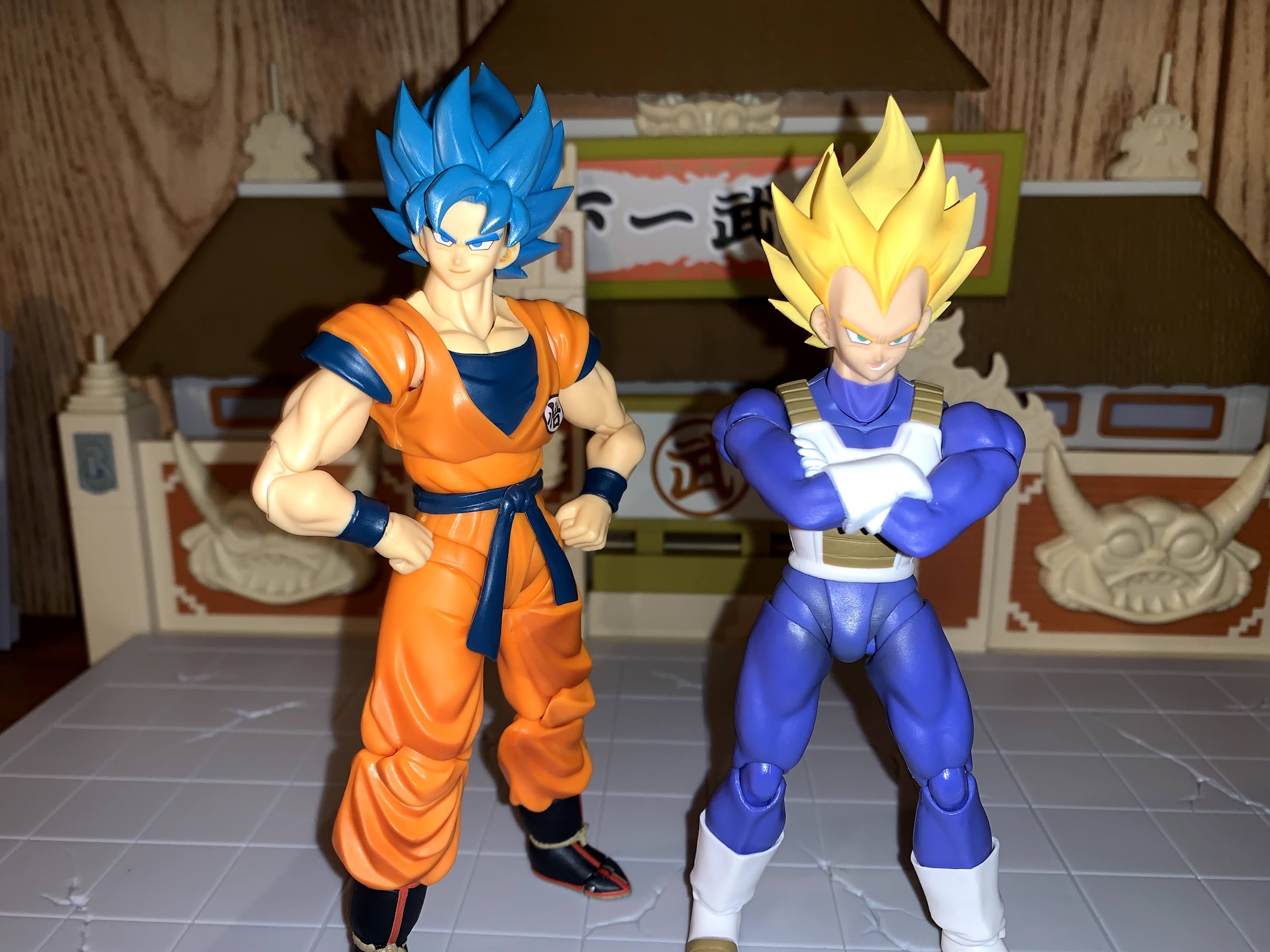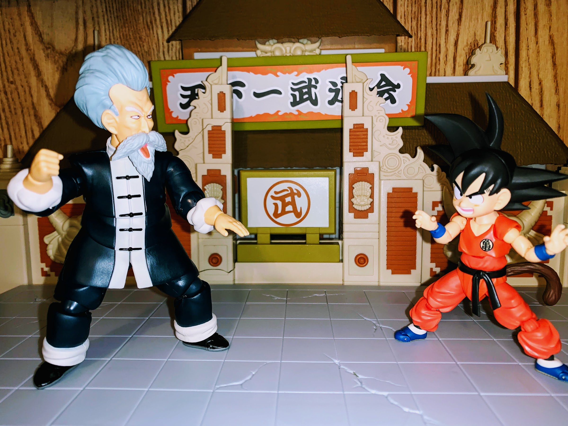
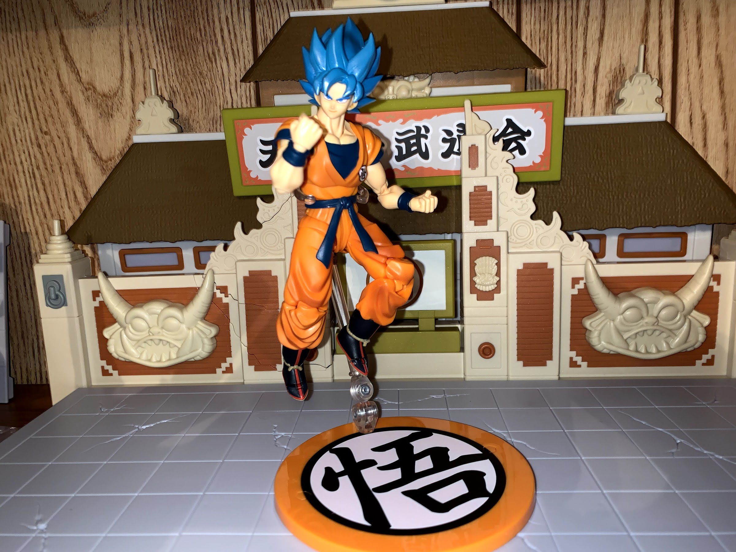
When it comes to my S.H.Figuarts collection, I’ve been able to largely keep to just Dragon Ball. And by Dragon Ball, I mean the original anime and manga that centered on a young boy named Goku. Even though that’s my favorite edition of the venerable series, it doesn’t mean my favorite is the one shared by millions across the globe. Most fans prefer Dragon Ball Z to any other iteration of the anime (the manga just kept the name Dragon Ball until Dragon Ball Super became a thing) so there is ton more merchandise for those fans than there is for me.
Now, just because I have a preference, does not mean I dislike Dragon Ball Z. Like many American viewers, I saw DBZ way before I ever saw Dragon Ball. I saw it briefly when it was on a broadcast network in my area really early in the morning, but I became a fan when Cartoon Network started airing it. The popularity of the show led the network to center a whole block of action cartoons, most of which were anime, around it and Toonami was born. During those early days, only the first 56 episodes or so were dubbed in English (it’s confusing because there was enough material cut that the English dub had a smaller episode count for awhile), and since the show had failed to catch on initially, there were no plans to dub more. Those same episodes then aired over and over so we American fans came to know those characters and arcs rather well. And one of the early villains of the show was the Saiyan warrior: Nappa.
Nappa arrived with Vegeta following Raditz’s defeat with the idea being to get vengeance for his fallen comrade. Even though he viewed Raditz as weak and pathetic, there was enough Saiyan pride in the grunt to want to seek revenge. His comrade and superior, Vegeta, had other ideas though. He cared nothing for Raditz and only wished to find the Dragon Balls so he could wish for eternal life. Unfortunately for Nappa, Vegeta’s lack of affection for Raditz extended to him as well, and when Goku delivered a devastating blow to the warrior that left his back snapped in two, Vegeta decided to put the beast down rather than help him rehabilitate.
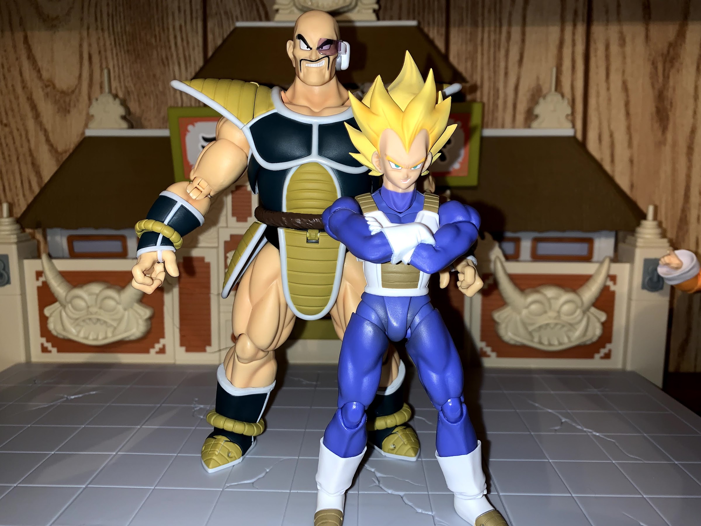
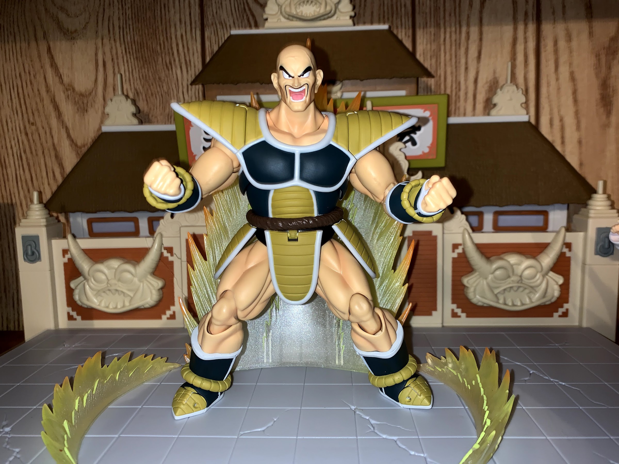
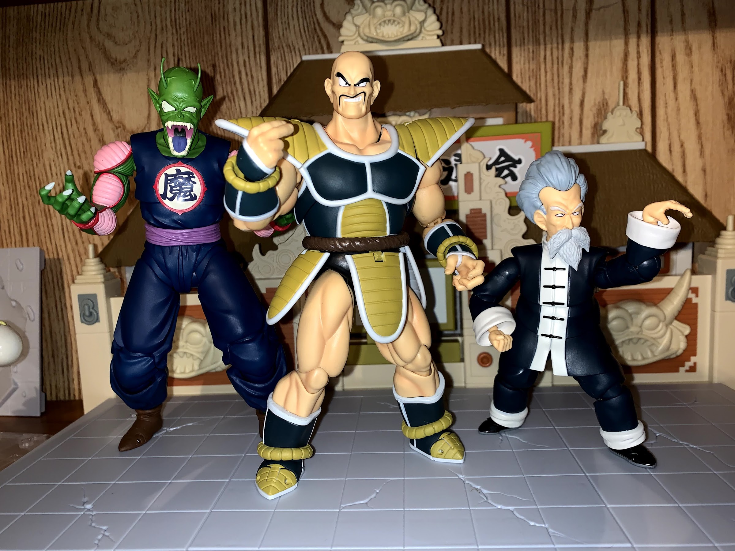
As a result, Nappa’s presence on the show was fairly brief. He shows up, beats up the lesser fighters, and then gets to be the sacrificial lamb to Goku in a bid to demonstrate how far the warrior has progressed in his training. Still, I always thought he was a really effective bad guy. A remorseless killing machine who just loves to fight. His design is simple in that he’s just a massive piece of man-beef with a bald head and moustache. He wears the giant Saiyan armor that was still rather new to viewers at the time, but has shown up in a myriad of places since, and just really looks the part of a guy you wouldn’t want to mess with. So many villains in the show are intentionally drawn small and unimposing as series creator Akira Toriyama seemed to enjoy toying with expectations. Nappa was different, though also kind of the same since the much smaller Vegeta was considerably stronger than him.
A few years ago, a version of Nappa was released in the Bandai/Tamashii Nations S.H.Figuarts lineup that was really tempting. A comic book store near me had one on display in a glass cabinet, but I never could bring myself to bite on it. He even got marked down eventually, a paltry 10%, but a discount nonetheless, and I still passed. That version of the character had more of a manga appearance. His armor was basically black and brown, but he still looked cool. In the anime, his coloring was slightly different which happened from time to time. His shoulder pads were more of a yellow and the black portions had a blue hue to them. That was my Nappa, and when Bandai unveiled a version of the character that matched that appearance I finally gave in.
During the virtual San Diego Comic Con in July, Bandai put what would have been its exclusives on its Premium Bandai webstore. The whole thing was a shit show, and getting from one screen to the next was incredibly tiring as the website was just overrun by collectors looking to buy one of the five Dragon Ball exclusives. It took me over an hour, but I did get an order in for Nappa. I had to wait over a month for delivery though, which funny enough, makes Nappa the first SDCC exclusive I have received in 2021. Either because the global shipping crisis delayed release, or because manufacturers expected they wouldn’t need to have product on hand for a physical con, most of the exclusives ended up being pre-orders. My NECA purchase might arrive in October, or it might arrive in December and my Mondo purchase is dated January. My guess is the reason for the delay is actually a combination of both reasons spelled out, but ultimately, it’s a case of “it is what it is.” You want this stuff? Cool, you got it, but you’re going to have to wait.
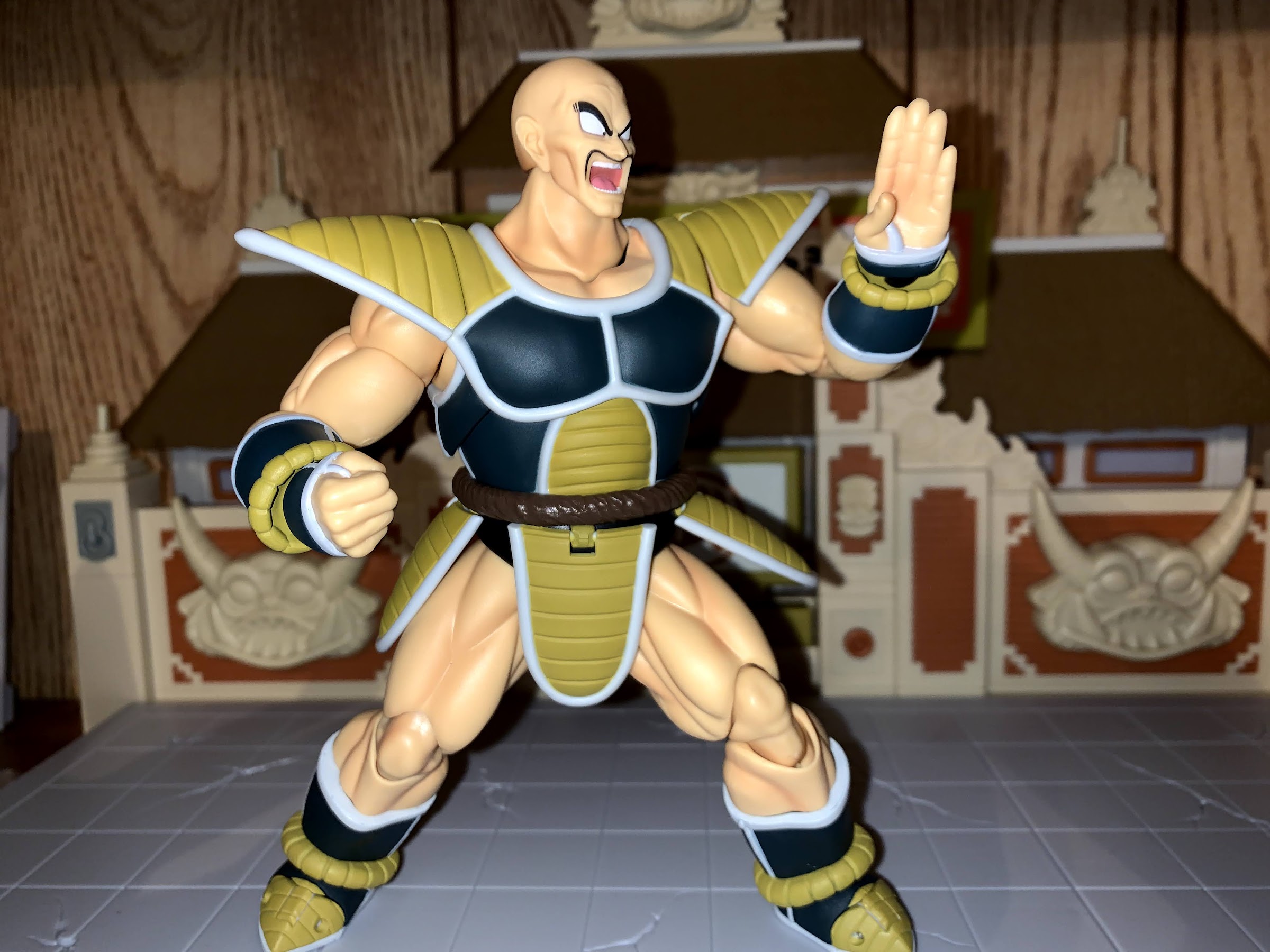
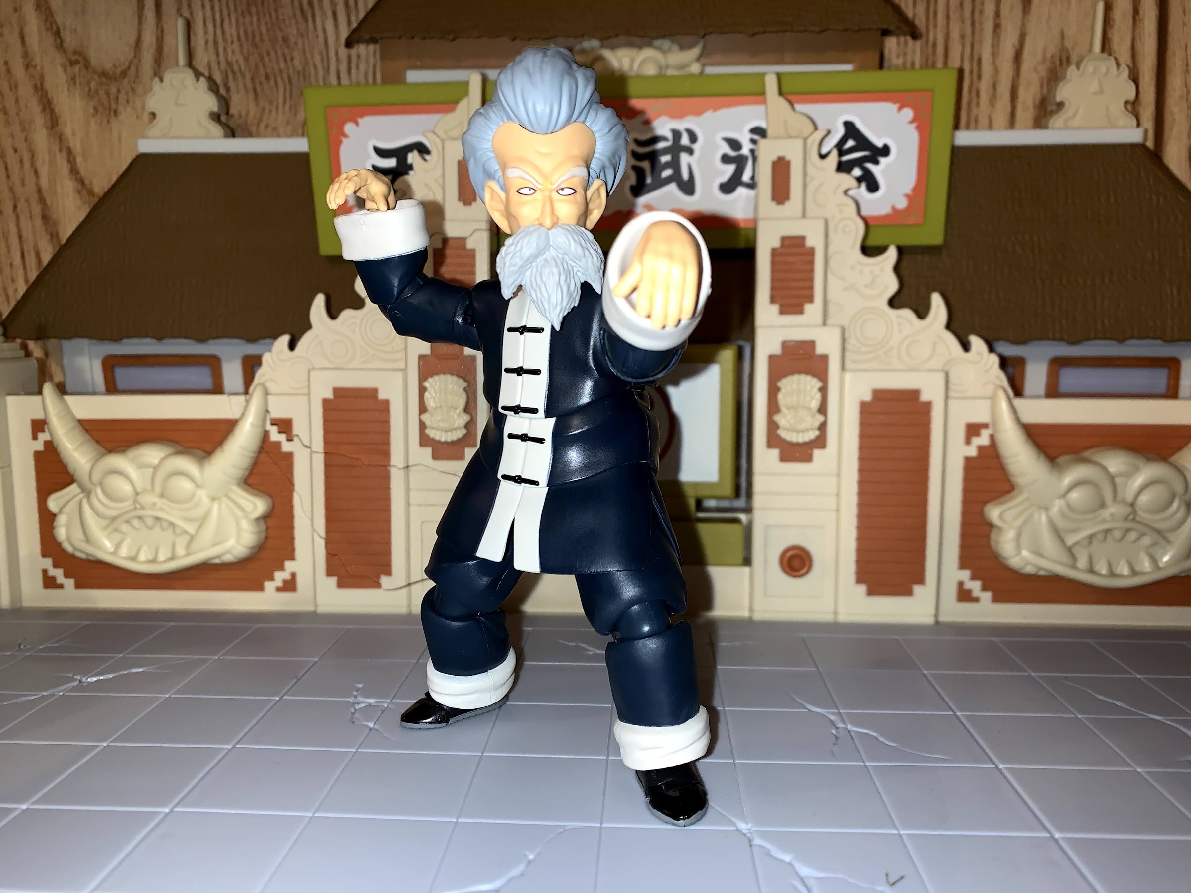
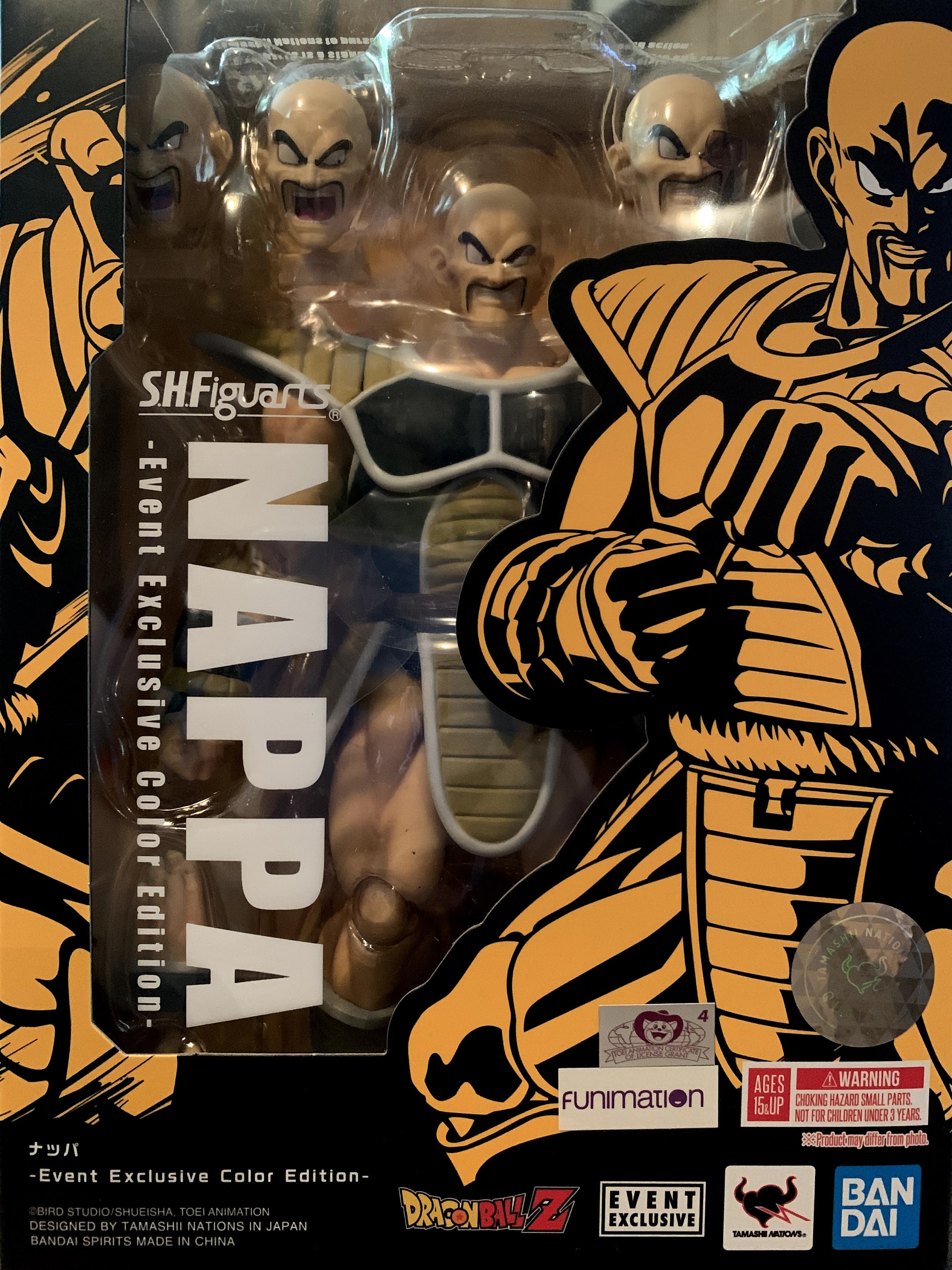
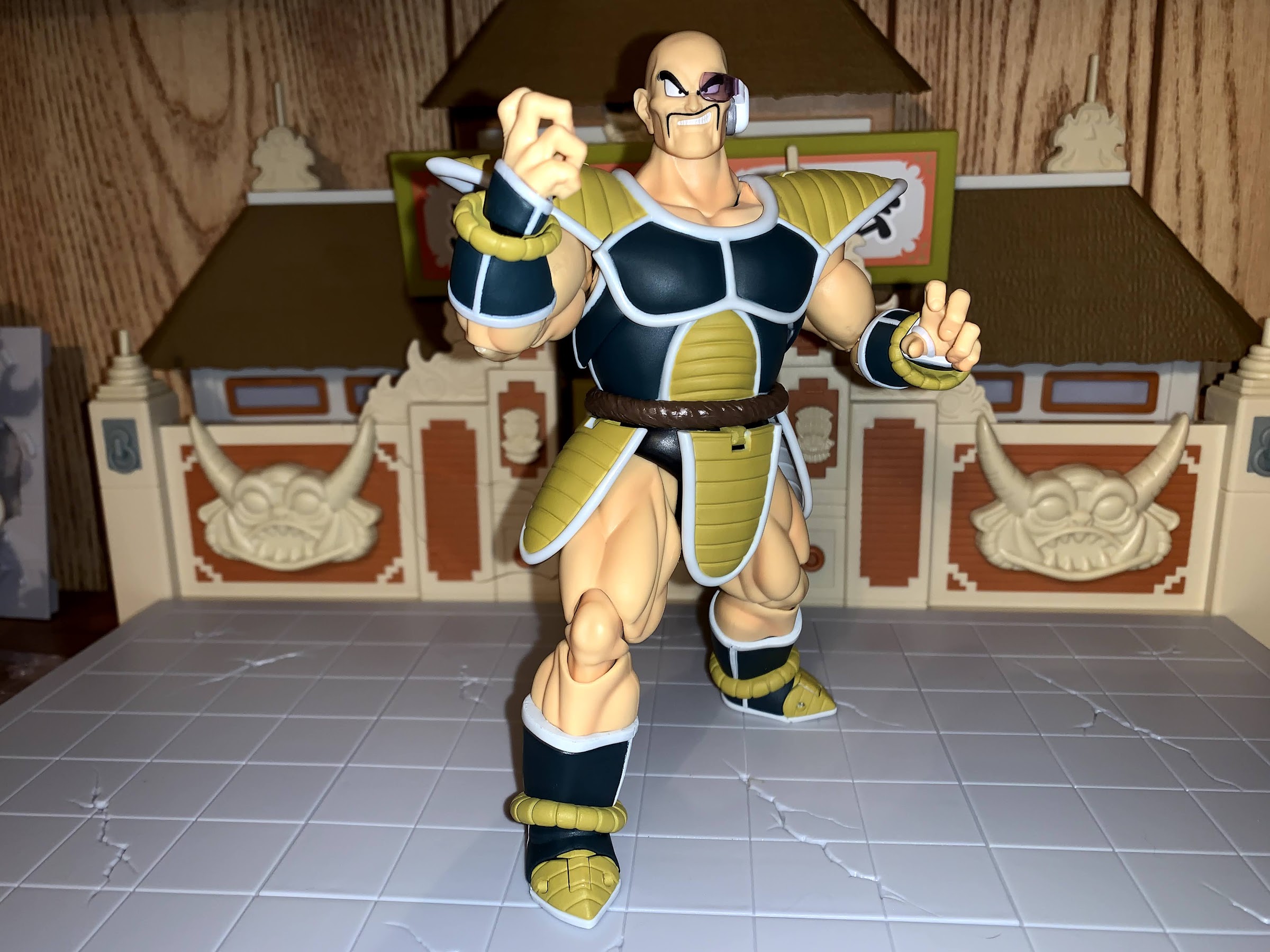
Nappa arrived in the usual SHF window box only this one features a black and yellow motif to accentuate that it’s an event exclusive. My event exclusive Kid Goku was packaged similarly, though I never did post a review of that figure since he’s the same as the other Kid Goku, just with a blue gi instead of orange. Nappa is a chunky boy. He’s not the tallest SHF figure I own, but he’s probably the heaviest. He stands just a tad shy of 7″ and really fills out the package he comes bundled in. He’s a great figure to hold as he looks and feels like a collector grade action figure. The plastic is firm and each, individual, piece has a lightness to it, but the sum of its parts results in a nice heft for this guy. All of the musculature is well sculpted and the anatomy and design of such really echoes the source material well. As is the case for most of the figures in this line, there’s not a ton of paint, but what’s there is clean. Nappa actually commands more paint than usual as his gloves and boots feature some gray piping with mustard braids around the wrists and ankles. The mustard yellow of the abdomen, shoulder pads, and skirt pieces are all painted and there’s even a slight wash on his muscles. The painted portion of his upper chest area matches the sculpted flesh color of the neck well. The only paint application that looks a little odd to me is the moustache on his smirking head because it doesn’t follow the crease of his smile on the right side. I don’t think it’s supposed to though, it’s just one of those things that looks odd. I’d have to closely inspect the source material to see if I’m wrong, but it only looks odd when the figure is placed right in front of your face. Otherwise, I have no complaints about the aesthetics of this guy.

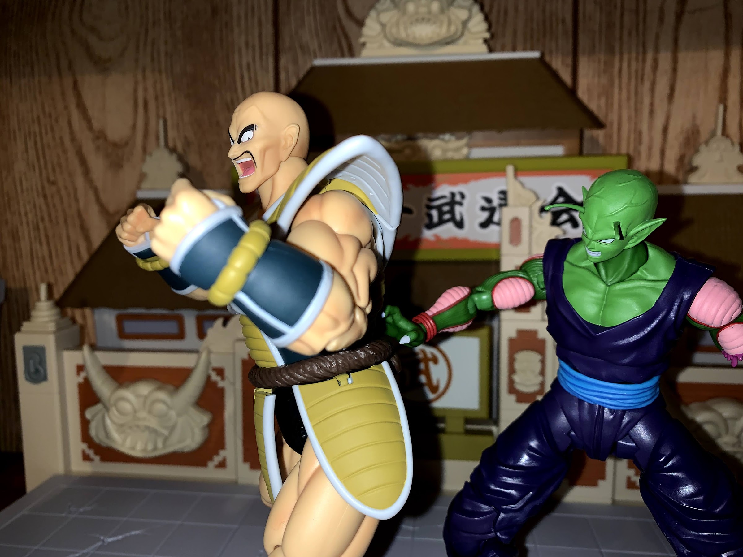
Where the SHF line rises above most is in its ability to wed these impressive sculpts with a ton of articulation. Nappa has a whole bunch at his disposal and it’s all of the stuff you would expect. He has a ball joint at the head plus another at the base of the neck so he can look all over the place including up and down. At the shoulders, he has a ball joint plus a butterfly joint. Because of the bulky armor, he can’t bring his arms out and across his chest as well as some figures. The shoulder pads are on hinges so they can be moved out of the way, but the bicep hits the edge of his pec. There’s a biceps swivel and double elbows, but his arms are so thick that he can’t bend past 90 degrees. On the plus side, none of the plastic joiner pieces are over-exposed to accommodate a truly wide range of motion so his arms look pretty nice in whatever position you place them in. His hands are attached via ball pegs, and even though they’re recessed in those gauntlets he’s wearing, he can still move them around pretty well. In the abdomen, he has a ball-joint that I don’t think is hinged. At least, mine won’t go up. He can bend back okay, but not forward very well and you definitely have to be mindful of the upper chest area rubbing on his abs and ruining the paint. At the waist, he has a very small ball-peg that basically just affords swivel rotation. There’s a little tilt there, but nothing game-changing. At the hips, he can kick forward and back about as far as you would ever need him to. There’s a thigh twist and double-jointed knees that go just a tiny bit past 90. At the ankle I believe we have a ball-joint. It’s nice and tight, which is what a big figure like this needs, but doesn’t provide a huge range of motion. There’s also a toe hinge, but it’s not very good and is kind of ugly because the joint is too far forward.
Nappa moves reasonably well. Obviously, there’s no getting around that armor he wears. It’s big and bulky. The hinges on the various flaps help to some degree, but there’s only so much they can do. While I wish he could reach out in front of himself better than he can, I wouldn’t want to put any cuts in the armor to facilitate that so I’m happy with the choices Bandai made. It helps that Nappa doesn’t really have a signature energy blast like a Kamehameha or Special Beam Canon that he needs to mimic. He’s more of a brawler, and if Bandai ever did want to do a more articulated version of him they could also do a battle damaged one that doesn’t have the armor. As I mentioned in the prior paragraph, the lesser articulation means his joints mostly look really good. His elbows and knees look pretty great whether bent or out straight and there’s not a lot of gapping issues on him. The only area, besides the useless toe hinge, that I think looks a little unsightly is the neck. He’s always going to have a small gap there and since his neck is bare there’s no way to hide anything. The trade-off for the neck articulation is one I’d make though. He is an action figure, after all, not a statue.
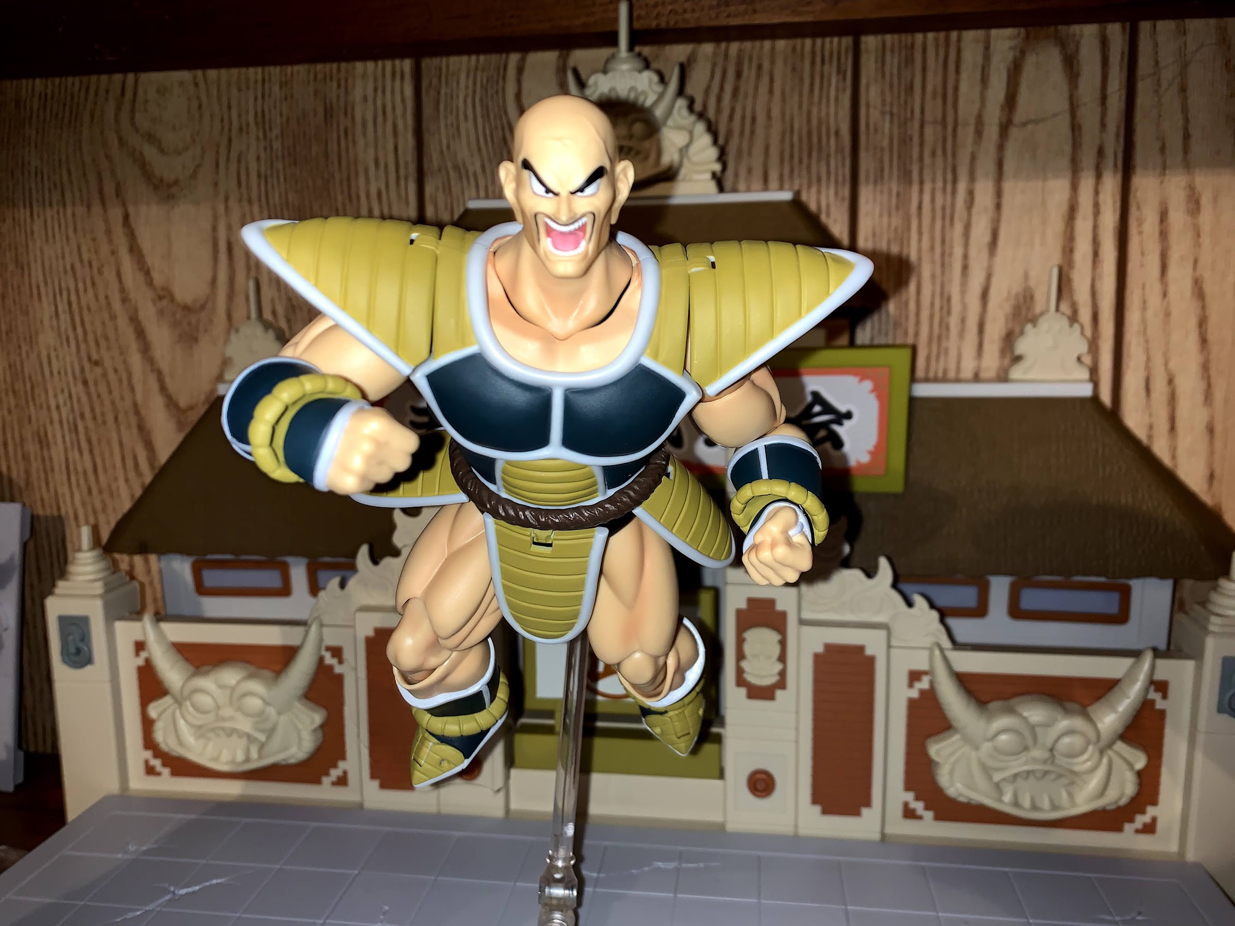
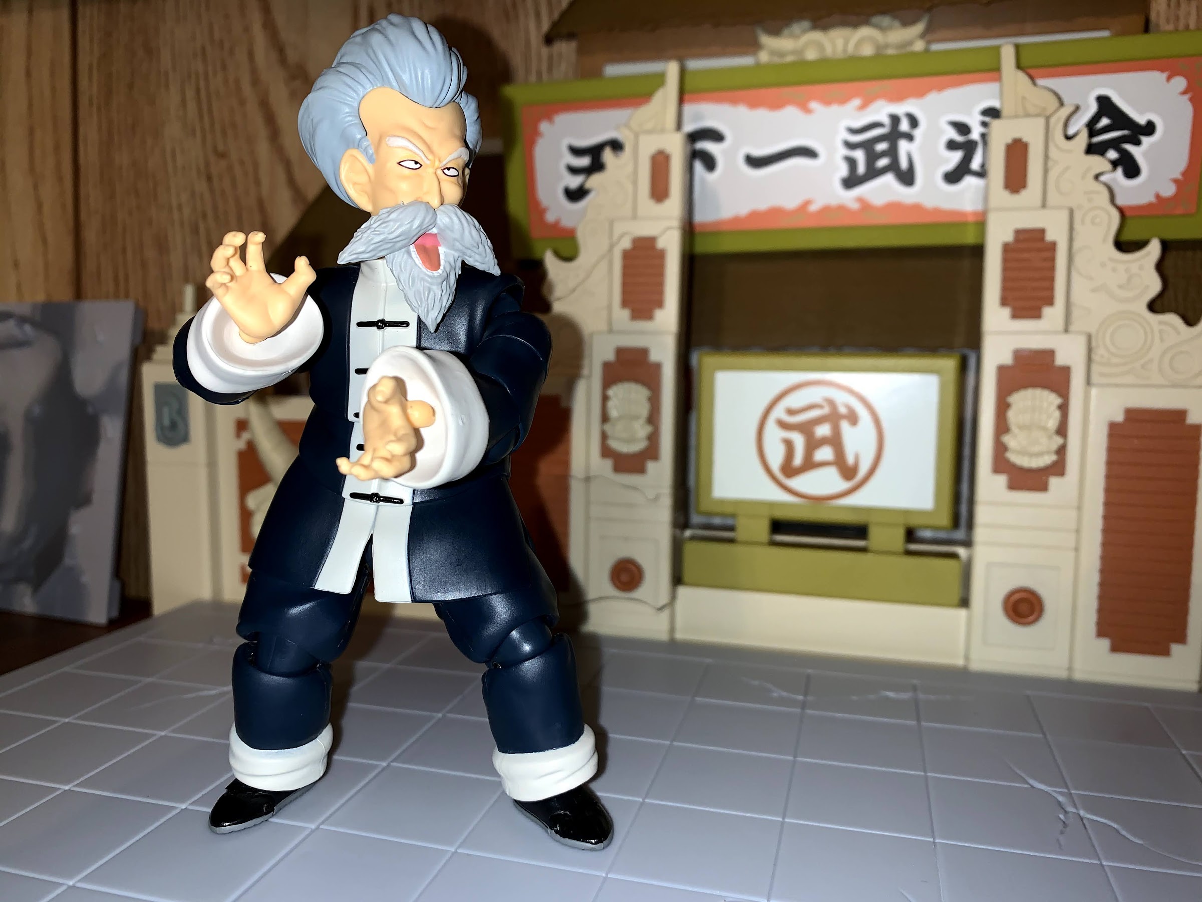
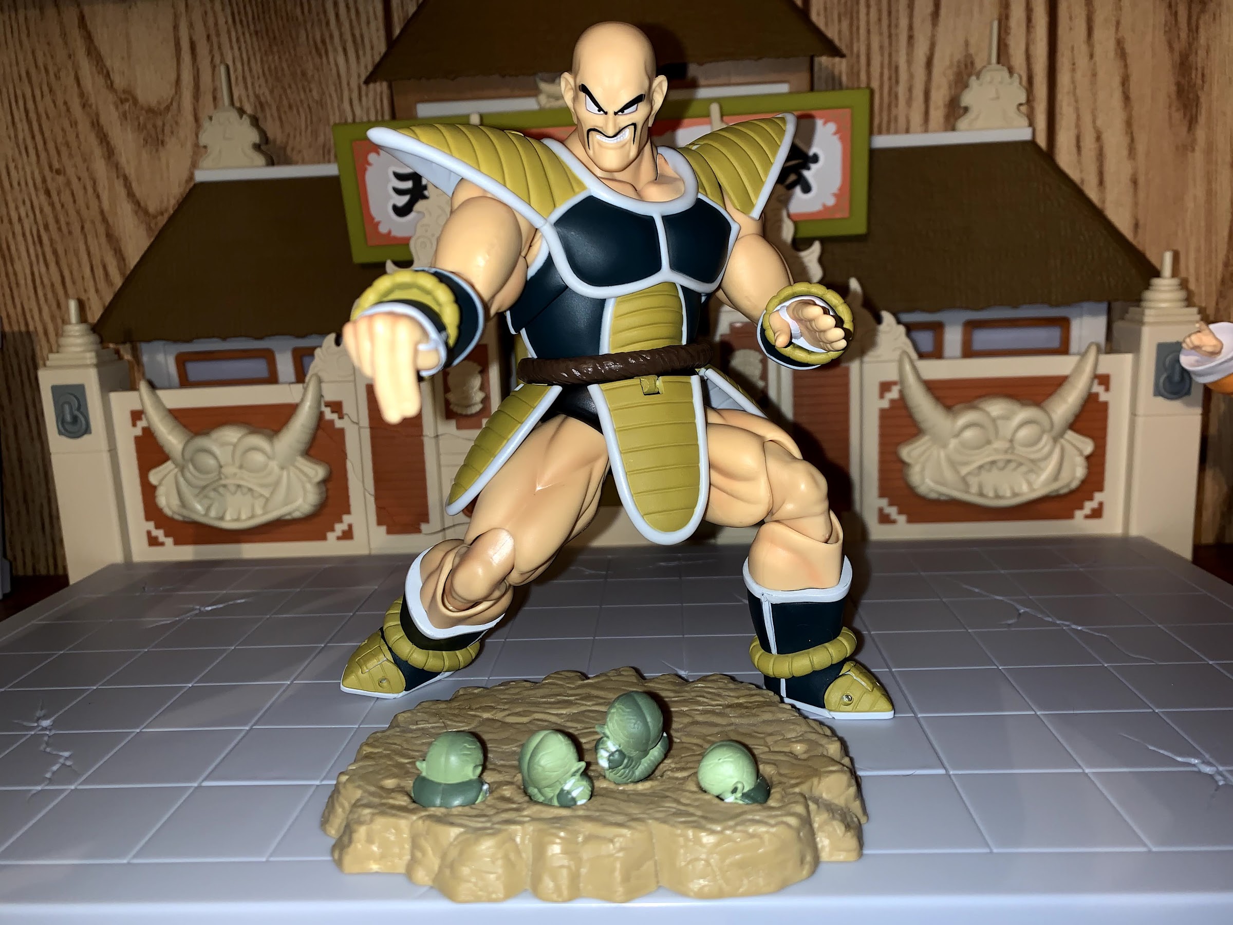
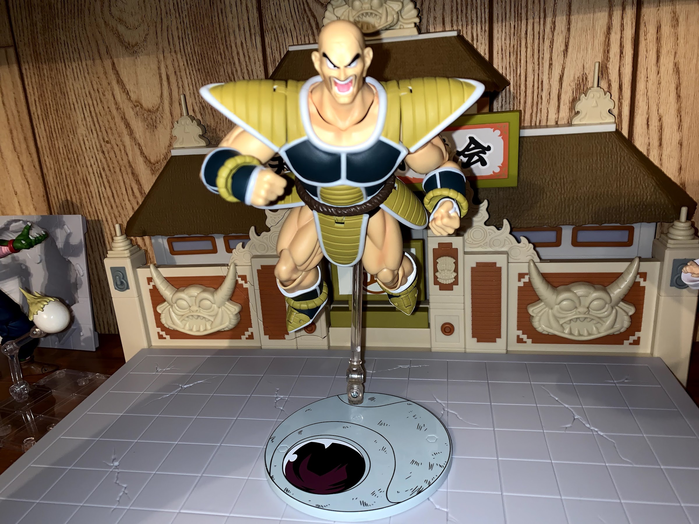
There’s a lot of plastic in Nappa, so it’s probably not surprising to see his accessory count is on the smaller end. Nappa comes with four, distinct, facial portraits. He comes with a smirking face, a yelling face where he’s looking straight-ahead, a yelling face where he’s looking down and to the left (or like he’s trying to look behind himself because there’s a guy grabbing onto him) and a smirking face with scouter. The scouter is non-removable so you only get one display option if you wish to use it. I always think of him as having the scouter on so that’s my preferred look, but I like the others as well. The head where he’s trying to look off to the side is definitely present so you can recreate the scene where Chaoz blows himself up why clinging to Nappa’s back. It’s even illustrated on the back of the box. I don’t have that figure though.
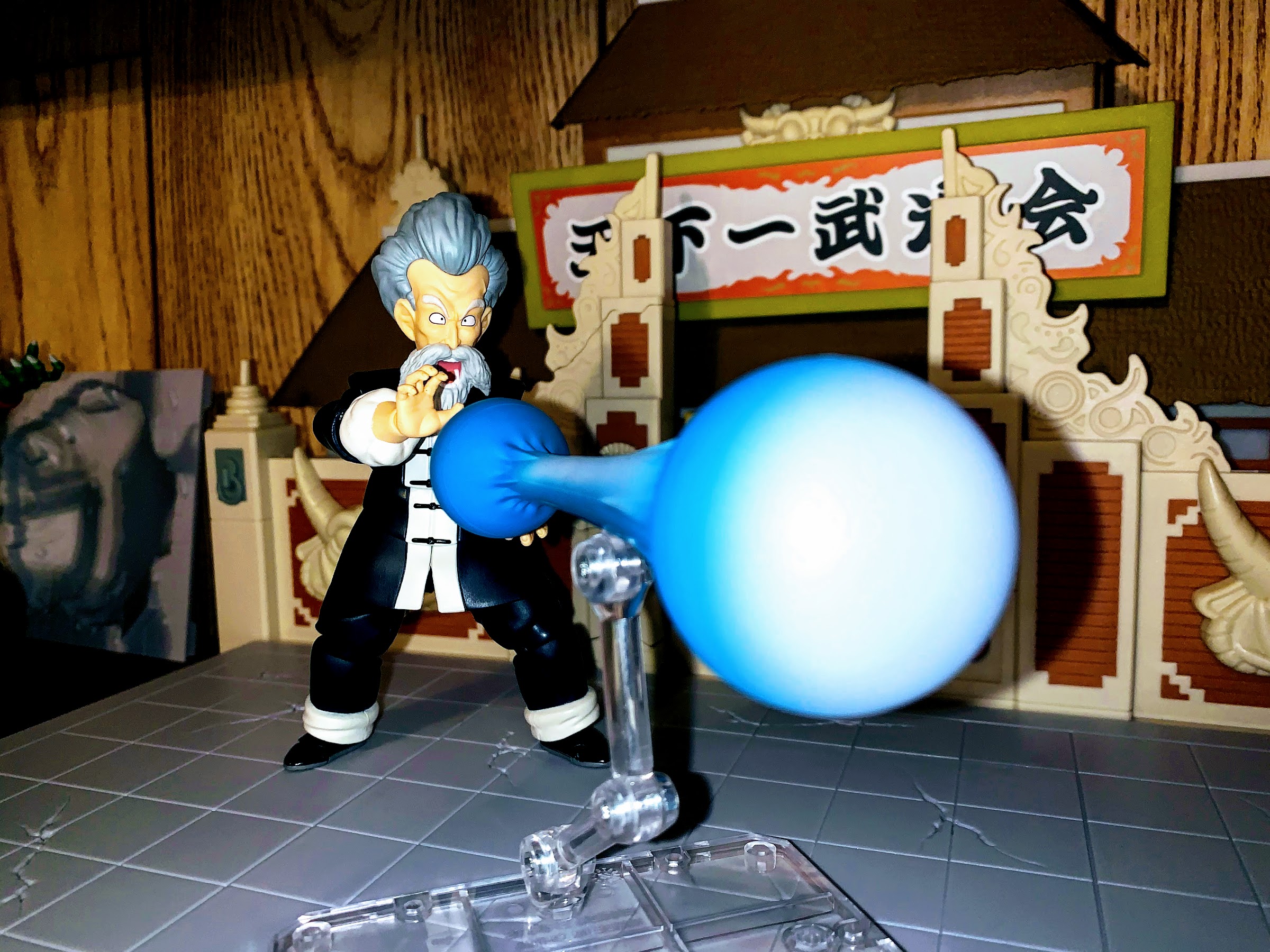
In addition to the alternate heads, Nappa also comes with 3 sets of hands. He has fists in the box, but also has grabbing hands and a set of hands that are in a “chop” position. I’m assuming he does some chops in the anime, though I really can’t recall specifics (maybe when he’s smashing up the jets) and the product shots on the box are of no help as none feature them. He also has a seventh hand which has two fingers extended. It functions like a cool, style, pose sort of thing and he may have done an attack that utilized such a gesture, or I could be mistaken. I think it’s present because that’s how he makes holes in the ground to plant the Saibamen. Of the sets, I definitely prefer the grabby hands, but all of them feel like they have use and I’ll likely switch them up, though I don’t know that I’ll ever display him sans scouter. That’s it though for accessories. As usual, there’s no blast effect which would have been nice. A big, mouth, blast would have been pretty fun and unique. I think the standard version might have come with a small one? Or the shop I used to see him at just happened to display him with such. That blast effect wasn’t the best, but I’d still take it over nothing.
That’s not all I have to talk about though. For SDCC, Bandai had four figures available plus a fifth set which was a box of action stands. They’re personalized to coincide with the figures they did and I grabbed a set. I think it was 40 bucks, but it got you 6 stands, 2 each of the following design: Goku, Whis, and a Saiyan Space Pod. I grabbed it because I really did need more stands and I thought they looked pretty slick. Unfortunately, when it comes to Nappa it doesn’t work too well because he is just so thick. The stand is designed to grab the figure around the waist and has some added crotch support, because even action figures need crotch support. The clasp really can’t get around Nappa’s waist, but he can at least be position on the crotch piece. You will likely need to tighten the screws in the stand as far as they’ll go to accommodate his bulk or else it will just topple. I like that the pack came with two of each style though since anyone who has the previously release Saiyan Saga Vegeta will likely want to use one with him. I do not have that figure, though if he ever gets a re-release I’ll probably grab one now. I was able to finagle a flying pose for Nappa with the stand, though I don’t think I’d trust it on a shelf. That means it’s more like a base for Nappa, and having the space pod as a base is kind of cool in its own way, but it would have been nice if it had been specially engineered to work better with the bulky Nappa.
This figure has some shortcomings, but ultimately it nails what it needed to the most and that’s the look. This looks like Nappa from Dragon Ball Z and he looks fantastic. It would have been awesome if they had found a way to make him move a little better, (and at least one of the product shots on the back of the box must be a render because he can’t wipe his mouth with the back of his hand) or stuck in a cool effects part, but he can definitely can hit all of the important poses for the character. Really, the biggest negative about him is now I want more figures that display well with him. A Saiyan Saga Vegeta is the most appropriate, but it did cause me to look at the recently released Kid Gohan, but I don’t think I need him. I considered Kaioken Goku, but he squared off with the unarmored Nappa so that doesn’t feel necessary. I did grab one figure, and I’ll tell you about him soon enough, and I also pre-ordered the new Krillin so Nappa should have a few guys to play with in due time. This is a guy that enjoys being violent, so I definitely need to feed him.
This action figure is an event exclusive from Premium Bandai. Other retailers did buy some stock, but they tack on a sizable surcharge. Even with that surcharge, it looks like most have sold out so if you want him you may have to go to the secondary market. Some people are probably looking to flip him, and Bandai did open a pre-order window since their website was so terrible so some people (and possibly retailers) will get him in Q1 2022 so if you don’t like the prices right now you can wait and see if they improve next year. Bluefin Brands has also been hosting a pop-up shop that will be selling the con exclusives. They’ll probably only hit major cities like LA and New York, but maybe you have a buddy who can get to one for you or something. If you prefer the older version, maybe the release of the more anime-accurate Nappa has knocked the price down on that guy a bit. I’m pretty happy with him, even if my Saiyan Saga collection is rather light, and I don’t think any DBZ collection of S.H.Figuarts should be without a Nappa.