There’s some mild debate about the “Golden Era” of The Simpsons, but most seem to narrow it down to seasons three through eight. A lot of that period saw the show do well and get mined for talent on the writing staff. It also coincided with the show becoming eligible for syndication and the daily episodes that followed certainly had an impact on the minds of viewers now able to consume many hours of the show per week. I also just think it’s objectively the best the show has ever been. That doesn’t mean there aren’t good episodes that fall outside of that range. In fact, some of the show’s most referred to and memed moments come from later seasons of the show and one I see pop up a whole lot is Stupid, Sexy, Flanders.
Ohh, that’s what you’re smiling about.
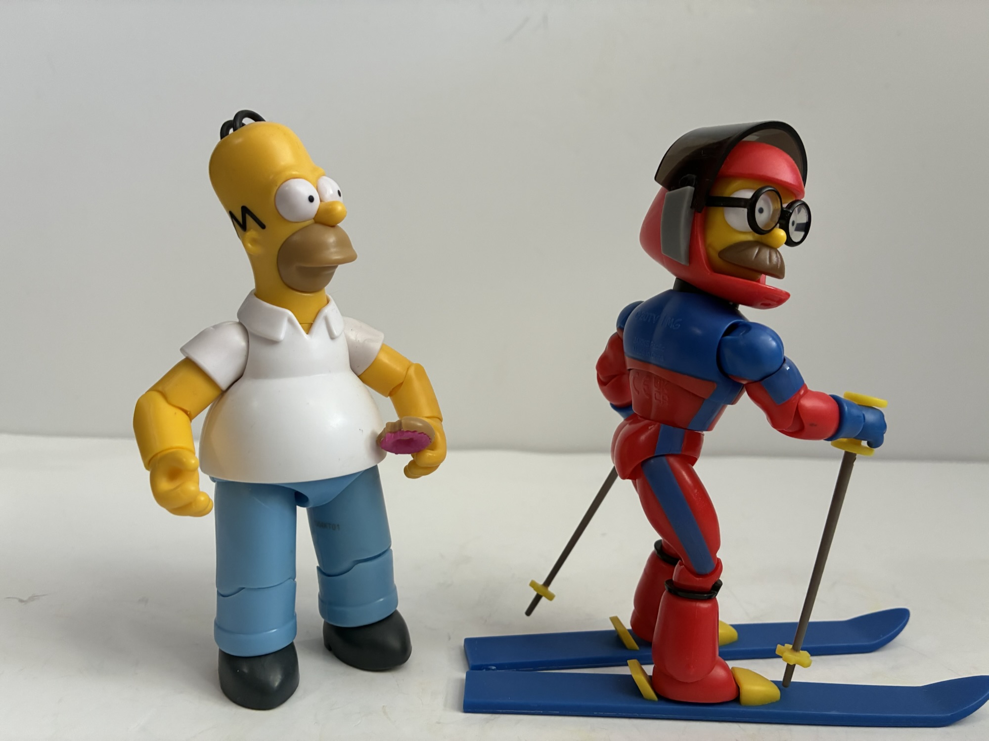
Season 11 gave us the episode “Little Big Mom” where Lisa takes on the role of homemaker when Marge suffers an accident at a ski lodge that requires hospitalization. The episode is fine, but what most remember comes from the opening moments. Homer, getting ready to attempt to ski, has a skier slide up alongside and kind of piss him off with his dusting of snow. The incredibly well built individual is sporting a skin-tight suit and a helmet that obscures his face. When Homer reacts negatively to this individual, he flips the visor of his helmet up to reveal he is none other than Ned Flanders. Homer is surprised, even though he’s seen Ned in more revealing situations before, but then calls out how revealing the ski suit is. Ned just gives a good-natured laugh then says it feels like he’s wearing “nothing at all!” Later, when Homer is spiraling out of control going down the slopes, he tries to recall what he was taught about skiing, but all he can think about is Flanders in his tight, revealing, ski suit (do you think this look could have been inspired by the NES game Slalom?) and cries out in frustration, “Stupid, sexy, Flanders!”
Scale is pretty much what you would expect.
Jakks Pacific, despite being the brand that sells to kids in the toy aisle of Target and Walmart, wisely decided that this often referenced moment was deserving of plastic. Honestly, I can’t believe Super7 didn’t get here in the short time they had the license, but they botched a whole lot more than that so I guess I shouldn’t be surprised. The figure is labeled as Ned Flanders on the box, but shows up in inventory systems as Stupid, Sexy, Flanders which is pretty damn funny. I had to get this one, even though tracking down this line has been a massive chore. Luckily, this wave Ned is a part of received some distribution to online retailers, which is good because all of the stores I’ve been to in the last month have completely removed their Simpsons stuff from the toy aisles.
He can do more traditional ski poses if that’s your preference, but I doubt it is.
If you have a Jakks Simpson toy then there is little here to surprise you. This should also be rather quick since there’s not a lot to talk about which is why I usually review these as waves. Ned stands at 5″ and is depicted in his ski suit with the visor of the helm up. It’s not articulated and I guess because it would be impossible to fit his head inside the helmet without compromising the look. He has a smile on his face, but his mustache obscures most of it while his glasses are a separate piece with transparent, plastic, lenses. The body is a mix of red and blue plastic with paint details where needed. The main torso is blue, with the red painted on, while the limbs are red plastic with the blue painted on. The zipper down the center is also painted and Jakks did a good job of making sure the colors match each other. He comes with a pair of skis and his ski poles which are done up in all colored plastic. The handles of the poles remind me of push pins, but in checking the episode they’re pretty faithful to the look. The sculpt is pretty nice for what it is. The torso tapers in nicely, the buttocks are defined (though perhaps could have been exaggerated further to really sell the meme), the arms are muscled, and the legs are proportioned well.
“Go ahead, Homer, have a good long look!”
The only thing this guy needs to do is hit his signature pose and he can – kind of. Jakks loaded Ned up with articulation: head, shoulders, biceps, elbows, wrists, diaphragm, waist, hips, knees, ankles. The range at the hips, knees, and elbows won’t quite reach 90 degrees, but he can approximate his pose from the show. The real limitation is with the torso. To really hit the pose, he almost needs to bend up his torso in a J shape, but he doesn’t get enough rock forward at the waist nor can he really arch back on the diaphragm joint. He needed a ball joint at the waist rather than peg and swivel to really get it. He can mostly fake it on your shelf though and honestly what’s really missing is a companion Homer to react to it. The standard Homer doesn’t seem to mind the view.
And that’s probably good enough. For 12-15 bucks, I can’t really complain. He makes me smile when I see it on my shelf and I have elevated this Ned to winter time decoration in the main area of my house. I have no idea if I’ll be getting much more from the line. I don’t think it’s doing well if Target and Walmart are giving it the boot and I have yet to track down the elusive Carl figure. This Ned was stocked by Big Bad Toy Store and hopefully is still up if you’re reading this and wanting to get your own. It’s fine, and it’s the type of release I enjoy from a Simpsons line because there are just so many fun moments from the show worth immortalizing in plastic.
If you’re curious about the other Jakks releases I’ve covered then check these out:
These days, The Simpsons is as synonymous with Halloween as candy and costumes. Via its annual Treehouse of Horror installment, which returns October 19th this year, The Simpsons has contributed more to Halloween pop culture than any other entity in my lifetime. Other shows have had memorable Halloween offerings, but none have taken over the…
One thing I wasn’t expecting for 2025 was that the hardest line to collect would be The Simpsons by Jakks Pacific. It’s a mass retail release so, if anything, I thought it would be pretty easy. My assumption has been proven wrong and I think it’s because this is a line that is trying to…
Back in October, we took a look at the very first wave of action figures from Jakks Pacific based on The Simpsons. At the time, I only had two figures from that inaugural wave: Homer and Bart. It was a series of great interest to myself and other Simpsons fans since it’s existence basically meant…
It’s the end of the year so that means it’s time for year-end awards and accolades. It’s easy content and who doesn’t enjoy reflecting on another year gone by? Unless, of course, that year was a bad one. I don’t think 2025 is going to go down in history as a particularly good year, but that doesn’t mean there weren’t some great toys released or announced. I don’t always do posts like this, but I felt like I did a lot of toy reviews this year so it felt warranted. It was also interesting because some staples, like NECA’s Teenage Mutant Ninja Turtles cartoon line, didn’t put out a ton of figures. And yet I still managed to have reviews up almost weekly this year. I have a bunch coming in early 2026 as we play catch-up, but that’s probably true most years. It did feel like this year in particular had a heavy dose of releases at the end of the year and I think I know why – which I’ll get to momentarily. My rules for this list are pretty simple though: if it came out in 2025 and I got it then it’s eligible. Even if I haven’t technically posted the review yet. And since I’m based in the US, it’s all US release windows so if Asia was enjoying something at the end of 2024 that didn’t arrive at my house until 2025 then it’s fair game for me. Now, let’s get started with an atypical category:
The Storyline of the Year – Tariffs
Yes, those wonderful tariffs are being brought up again, but hopefully it’s the last I need to say about it until they’re gone. The “brilliant” strategy of the new administration in the US was to tax the hell out of imports because someone convinced the president that a trade deficit is akin to being robbed. It’s not. And even though tariffs are paid by those who are doing the importing, it’s a regressive tax that is passed onto the general public either in whole or in part. It varies from company to company, but it also created a bottleneck in shipping and some packages have been tossed or seized for “reasons.” I had one seized, but was fortunate the shipper re-sent without any additional charge to me, but it has meant I’m on week 6 for a package that still isn’t here as of this writing. I’ll tell that story when I get to the figure review. Anyway, tariffs have had a huge negative impact on a lot of industries this year and I’m not going to pretend that my hobby is the worst affected, but it still sucks and continues to suck as we head into 2026.
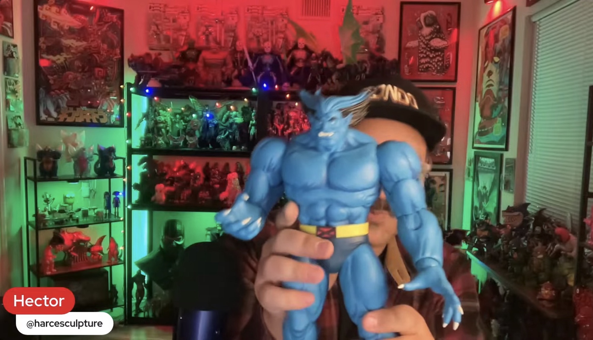
Reveal of the Year – Mondo X-Men ’97 Beast
He looks so good!
I don’t know why, but it feels like we’re always waiting on a toy company to deliver some version of Beast. Back in the early days of Toy Biz, Beast was one of the last characters featured in the cartoon series to make it to plastic (poor Jean had to wait even longer for a non Phoenix version) and current Marvel Legends collectors are waiting on him to finish up the X-Factor squad (they may technically be waiting on a properly costumed Angel too). With Mondo’s X-Men and X-Men ’97 line of sixth scale figures, we’re still waiting on Storm, Jean, Morph, and Beast, but in 2025 all but Morph were shown. Storm already went up for preorder too and I think Beast is expected next. Mondo showed him off in their end of year stream (they had previously announced and displayed him at a convention) and he looks fabulous. We’ve never had a proper animated Beast. The last one Hasbro did is good, but the portrait isn’t right for that version of the character. Animated Beast never had those whited-out eyes which I have always felt was inappropriate for the character as the pupils show the human within the beast. I’m a little afraid of how much a chunky boy like Beast is going to cost, but I can’t wait to add him to my collection in 2026!
Honorable Mentions: Mondo Squad Rocko’s Modern Life, Big Bad Workshop The Tick, Marvel Legends X-Men ’97 Apocalypse
Worst Toy Line of the Year – Jakks Pacific The Simpsons
Jakks got to take over The Simpsons from Super7 which meant more releases at a much cheaper price. Their output has been fine. I have nits to pick with them as I do most things, but for the price it’s hard to complain. What lands Jakks on this list though is just how damn frustrating the line is to collect. My local stores never got anything past Wave 2 until very recently when they got Wave 4. I was able to snag a Barney off of Target’s website, but nothing else from his wave has shown up in store for me or online and it’s very annoying. I’ve basically “quiet quit” the line as I’m not paying scalper prices for them or blowing a ton of gas riding around hoping to find them because the on-line inventory tracking is so poor.
Honorable Mentions: None
Figure I wish Arrived in 2025 – S.H.Figuarts Gamerverse Cyclops
A weird thing happened in 2025. Two companies, Hasbro and Bandai, decided to unleash upon us a “Gamerverse” line of figures. Hasbro has been doing that for years, but mostly for the Spider-Man games on PlayStation. In 2025, both companies are dipping their toes into Marvel vs Capcom and, oddly enough, both are focusing on the Marvel side of that equation. For Hasbro, it’s not a surprise as they don’t have a license for anything Capcom, but Bandai has been doing Street Fighter figures for years. Maybe they’ll get to more from them, but thus far we’ve only seen Marvel and sneaking out in Asia just before the end of the year is the first figure in the line – Cyclops. There are some things about the figure I’d change based on what I’ve seen so far, but overall I think he looks like the best Cyke that’s ever been. I like the Legends Cyclops I have from the VHS styled line of X-Men figures, but that one came with almost nothing. The X-Men ’97 one comes with some effect parts, but it looks horrible. This one may be the last Cyclops I’ll ever need so I’m really eager to see how he looks and moves in person.
Honorable Mentions: S.H.Figuarts Across the Spider-Verse Scarlet Spider, Storm Arena Street Fighter Alpha 3 Sagat
Debuting Toy Line of the Year – Storm Arena Street Fighter Alpha 3
Storm Collectibles has been releasing figures based on Capcom properties for years, but always in a weird scale and for a large sum of money. Perhaps feeling pressure from Jada Toys, Storm decided to launch a new line in 2025 based on designs from Street Fighter Alpha 3 and this time they were finally listening to fans. The Storm Arena line is a true 1:12 scale action figure line where each figure comes with alternate hands, portraits, a stand, and effect parts and for the low price of $26! I honestly didn’t see this one coming. Larger characters, like Sagat who is due any day now, will retail for more, but still at a hell of a price in today’s market. And the figures do not sacrifice anything as far as I can tell. The sculpts are terrific, the articulation is excellent, and they even retained that soft plastic torso Storm loves to use. They only managed to release two figures in 2025 and they’re basically the same figure with different heads – Ken and Ryu, and yet I was tempted to make them Line of the Year anyway. They are that good and I can’t wait to see how Sagat turned out. 2026 could really be the year this line takes off.
Honorable Mention: NECA Teenage Mutant Ninja Turtles (2012), Marvel Legends “Not Marvel vs Capcom” Gamerverse, InArt The Dark Knight Rises, Mondo The Real Ghostbusters
Most Disappointing Cancellation of the Year – Super7 Teenage Mutant Ninja Turtles (Vintage)
Super7 did not have a good 2025, but it did manage to finally make it’s long-planned pivot to action figures based on the 2003 version of Teenage Mutant Ninja Turtles, though how long-planned that was we don’t know. When Super7 first announced they were doing figures based on that show it was supposed to be in conjunction with their line of vintage-inspired TMNT. The release pattern would go Vintage, 2003, Vintage, 2003, etc. Well, plans apparently changed as Super7 clarified things to say the vintage-inspired line is “on pause.” I don’t know about you, but anytime I’ve seen a toy line described as being on pause the phrase has been synonymous with cancelled. Other than Marvel Legends, which saw Hasbro pivot to a 1:18 scale line when oil prices were incredibly high, I can’t think of another line that came back. Maybe Super7 will buck the trend, but it’s disappointing because there are some Technodrome-sized holes in the collection headlined (for me) by Heavy Metal Raph. We know Super7 was running into issues with Playmates who did not like them recreating their figures, but this is a case where the company needs to take a stand and go to bat for its collectors. Paramount wanted them to do 2003 which is fine, but they should have negotiated at least one final wave to give their fans what they have been waiting for. They managed to do it for Rat King, surely they could have for the rest.
Dishonorable Mention: NECA Gargoyles
Toy Line of the Year – JoyToy Teenage Mutant Ninja Turtles
This is a line I never saw coming. When JoyToy first showed off their 1:18 scale Teenage Mutant Ninja Turtles I was very much intrigued, but thought they would mostly be a one-off in my collection. Then came Shredder, Bebop, Rocksteady, April, Krang, and on and on it went. JoyToy pumped out a ton in this line in 2025 and there’s still more on the way including a 1:18 scale Turtle Van! And it’s not just the volume of releases, but the quality. These figures have a ton of unique sculpt, accessories, and paint and the roster is basically complete even if the line came to a sudden end today. We got freakin’ Zork already – that’s insane! Trying to pick a favorite is almost a pointless exercise and it’s the line I’m basically most excited for when a new reveal is announced because I never know what to expect. If you dismissed this line because of the scale or because it’s a little bit of a chore to collect due to the restrictions then I suggest giving it another look. It’s really been phenomenal.
Honorable Mentions: Storm Arena, Mondo The Real Ghostbusters
Worst Company of 2025 – Super7
All of that stuff I said about Super7’s vintage-inspired Teenage Mutant Ninja Turtles line can basically be copied and pasted here, but that doesn’t really tell the whole story. Not only did Super7 bungle some of their lines, they also laid off a huge chunk of their workforce and closed their retail locations. I get it, things must not be going well there and tariffs certainly didn’t help, but they dumped some of the people responsible for what little success they’ve had in recent years which didn’t make a whole lot of sense. And they’re still just doing stupid stuff with their line. They are expected to deliver wave 2 of the 2003 TMNT line in the coming weeks, but wave 3 consists of Hun, April, and a Raph with a motorcycle – who asked for that?! And their prices continue to climb where now it seems like $65 is the new norm for them and the figures hardly live up to the term “Ultimate” anymore. They are in a price point all on their own that is grossly out of touch with the wider market. I have no idea how they survive 2026 at this point. I’m not rooting for them to fail, just expecting it.
Honorable Mention: None
Worst Figure I Reviewed in 2025: Super7 Ultimates! Ghost Papa Emeritus IV
I call him Mr. Frumpy.
Probably no surprise that my pick for worst company of the year is also responsible for the worst toy I reviewed in 2025. This Papa Emeritus isn’t terrible on its own. It’s the same body we’ve seen before with a few tweaks, but the blatant false advertising really stuck in my craw. The base figure is merely okay. It looks a little cheap especially considering the price, but is a decent likeness. With the soft goods though it just looks frumpy and awful. The solicitations they sent out for the figure with the soft goods look nothing like the final version. I don’t expect any release to precisely match a promotional shot, especially one using digital renders of a figure and not a prototype, but there’s a limit and Super7 betrayed its fanbase with this one. And yet, I still ordered Papa V Perpetua with the hope it will actually resemble the figure I purchased so clearly I’m part of the problem.
Action Figure of the Year – The Runners Up
Marvel Legends Gamerverse Wolverine – this figure is a blueprint for what I want to see from Marvel Legends going forward. The sculpt is unique and appropriate for this version of Wolverine, but mostly it’s the articulation. They finally went with the double-ball peg joint in the diaphragm and combined it with a ball joint at the waist. No more ugly ab crunch. The only thing that sucked about this release is you had to also pay for a crappy Silver Samurai since it was sold in a two-pack.
Mondo X-Men ’97 Nightcrawler – a sixth scale figure would have to be really special to take the top spot, but Nightcrawler came close. Maybe if I had been able to get the limited version, or if the economic conditions didn’t push the price to over $300 for the same, I’d have given it to Nightcrawler, but runner-up isn’t bad. This figure looks impressive, as all Mondo figures do, but it does something most don’t which is they made it fun to pose. Even their Spider-Man couldn’t manage that. Look for the full review in the coming weeks.
JoyToy Groundchuck – I said it was hard to select just one figure from JoyToy’s excellent line of TMNT figures, but if I had to pick one it would be Groundchuck. Not only does he look impressive, he comes with so many tremendously fun accessories. I love it when an action figure creates a dilemma for me when it comes to displaying it on my shelf and this one qualifies. I currently have him with three effect parts attached which is kind of ludicrous, but oh so much fun!
Action Figure of 2025 – InArt The Dark Knight Rises Batman
Queen Studios really came out of no where for me. I wasn’t asking for a Batman based on The Dark Knight Rises, but this figure looked so damn good that I couldn’t say “No.” This is, quite simply, one of the best 1:12 scale figures I’ve ever had the pleasure of handling. The sculpt is incredible, the likeness is spot-on, and the articulation is great. If you got the deluxe version then you also got a ton of accessories as well. In a way, it has the opposite problem for me when compared with the JoyToy Groundchuck in that he just looks so cool standing in a vanilla pose that I am not tempted to pose him with anything else. The shortcomings with this release are few – the alternate portraits are too similar, no wired cape, and it’s not sold in the US. It was still relatively easy to import for under $100, which while not cheap, actually feels worth it compared with other figures in that price range (it’s cheaper and likely better than what Mezco is prepping). While it’s not exactly fair to compare such a figure to one that costs $25, this one is so exceptional that it just had to be it. It’s so good that they got me to preorder their next Batman based on Arkham Origins even though that’s another figure I wasn’t asking for and they damn near got me with their Dark Knight Rises Catwoman. I expect it to be every bit as good as this one too. Keep your eyes on Queen Studios and their InArt line because they are making some terrific stuff.
If you want to read more about the best figures of 2025 then check these out:
Is this a review I really need to do? Probably not, but I’m doing it anyway. Queen Studios wasn’t a shop that was on my radar going into 2025. I’m guessing that’s true for a lot of folks and that’s probably why they had a media blitz when it came time to promote their brand…
Video game inspired action figures are quite the hot ticket right now. I’m not entirely sure why that is, but maybe some of that is owed to Jada Toys and how well received their line of Ultra Street Fighter 2 action figures have been received. Hasbro, for their part, has had a “Gamerverse” subline of…
Last week we had ourselves a look at Dirtbag from JoyToy’s line of 1:18 scale Teenage Mutant Ninja Turtles action figures. As most probably expected, we’re back this week with a look at his buddy Groundchuck, the mutant bull that could have very easily been named Bull’s Eye, but maybe Playmates felt that was too…
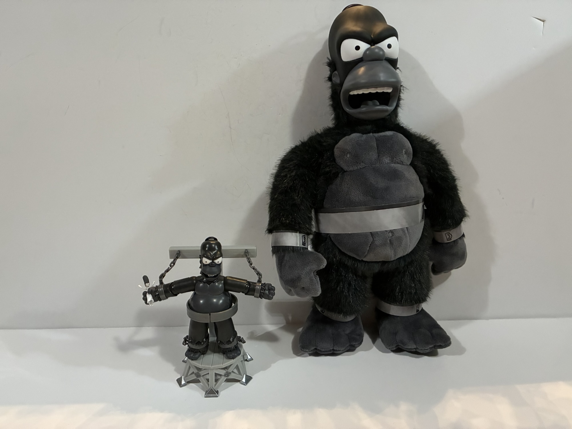
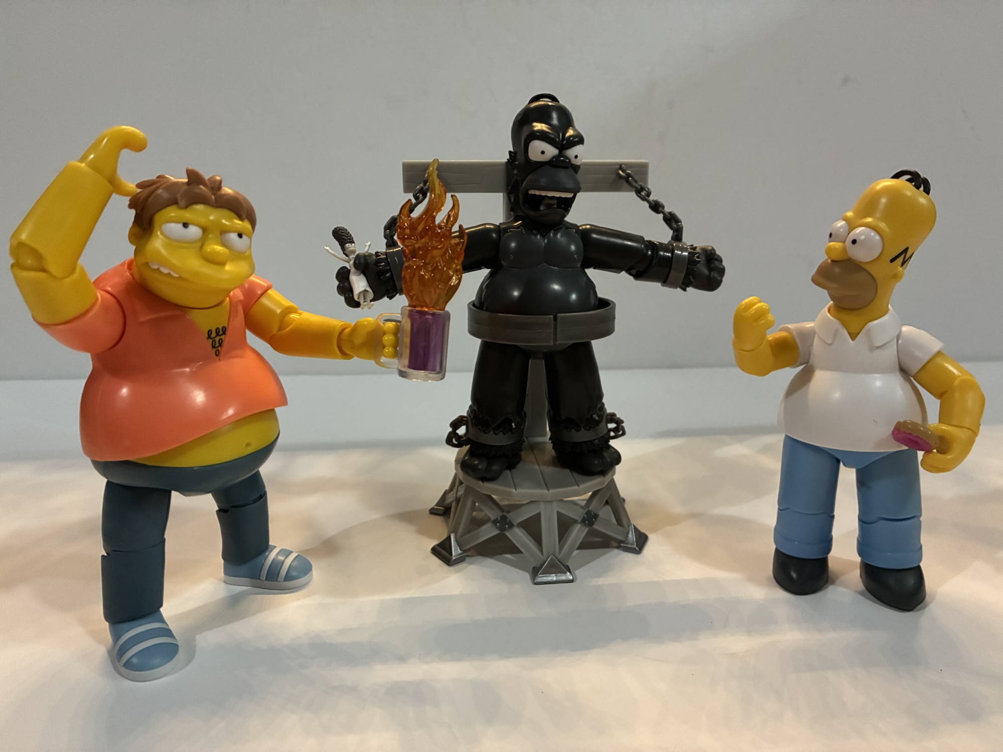
These days, The Simpsons is as synonymous with Halloween as candy and costumes. Via its annual Treehouse of Horror installment, which returns October 19th this year, The Simpsons has contributed more to Halloween pop culture than any other entity in my lifetime. Other shows have had memorable Halloween offerings, but none have taken over the holiday like The Simpsons. It’s a big part of the brand and Treehouse of Horror is a frequent go-to for license holders of The Simpsons. Jakks Pacific, who currently has the license to produce action figures, went to the Treehouse well last year with a Count Burns figure. It wasn’t very good so I didn’t bother getting it, but this year they’re back with a far better offering in the form of King Homer.
If you like King Homer then you’re eating well this year.
King Homer hails from the segment of the same name as part of Treehouse of Horror III. This is actually the second version of the character from Jakks who earlier this year released a plush doll of King Homer. Last year, they did the evil Krusty doll featured in the first segment of Treehouse III so that installment is apparently a favorite within the walls of Jakks Pacific. King Homer is part of the deluxe line of 5″ figures meaning it features more paint and an action feature. I don’t know how the action feature became associated with “deluxe” as that’s something more associated with children’s toys, but that’s the approach Jakks has taken.
Jakks uses the word “deluxe” fairly loosely.
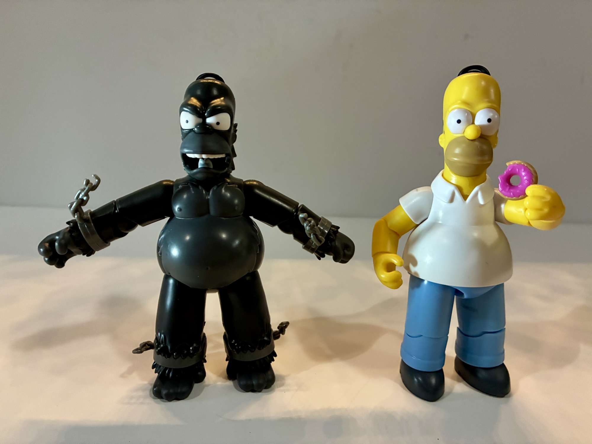
King Homer comes in a rather attractive all black box with some nice graphics on it. This would look fine for in-box collectors, but for those who take it out you will find one figure, one accessory, and one impressive platform. King Homer may be deluxe in pricing, but he’s conventional in size at about 5″. The platform will take him up to 6″. The sculpt looks to be very on-model and the paint is nice where needed. The segment was in black and white so Jakks only had to account for that sort of gradient and it looks fine. His restraints are gray and permanently part of the sculpt and his face bares an angry roar.
He’s pretty much just meant for this.
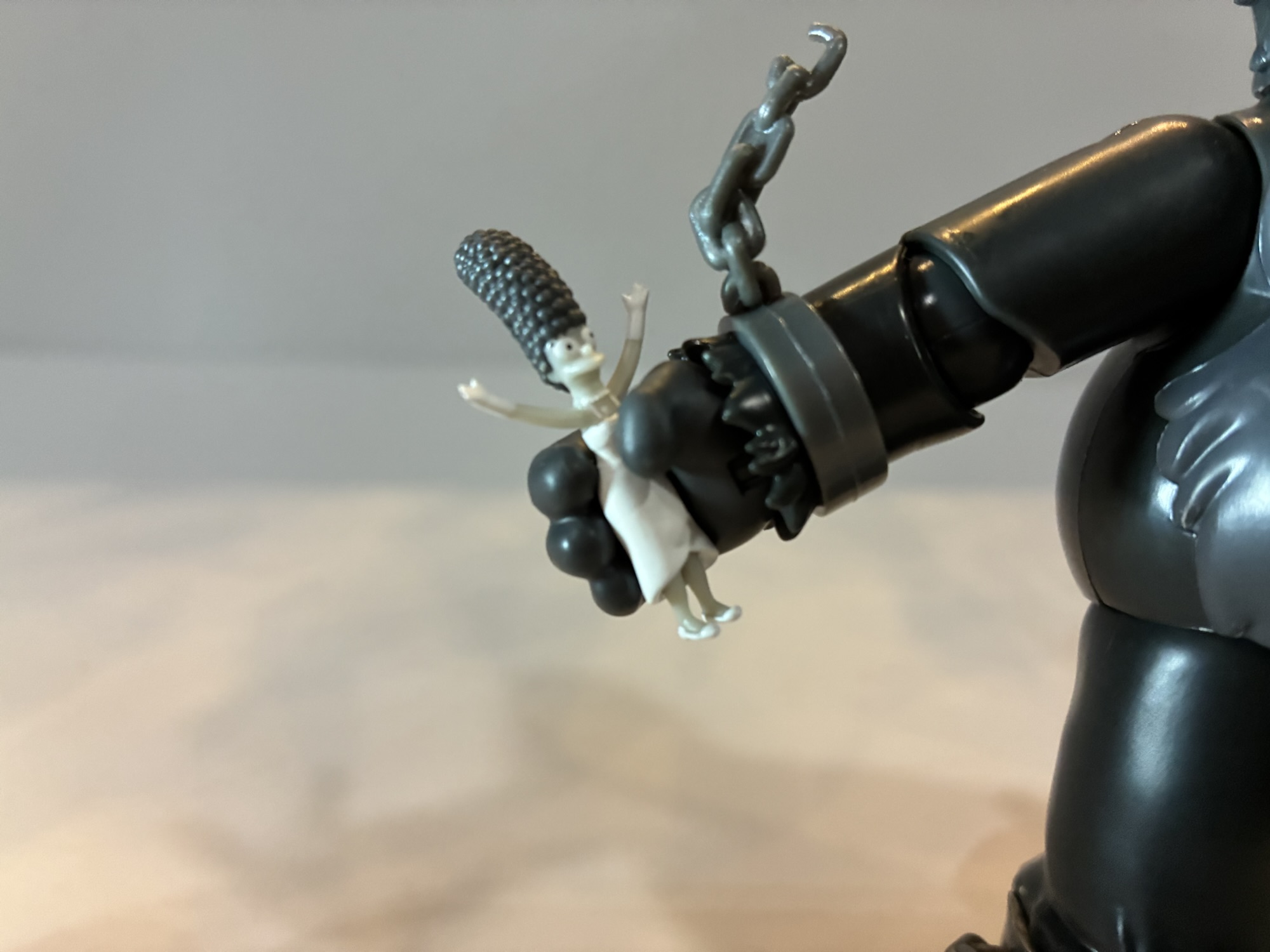
As you could probably surmise just by looking at him, this is essentially King Kong, but Homer. The sculpt is tailored for that look with tufted fur around the ankles, wrists, and the back of the neck. He has ape-like feet with four digits, in keeping things consistent with other Simpsons features, and he even has some sculpted nipples. The figure is molded in the dark gray plastic and the lighter gray as well as the whites are painted features. The only accessories are the platform and tiny Marge. The platform is molded in a very light gray with some painted silver parts that add a little splash to the set. Marge is in her white dress and not in any apparent distress. She’s painted rather well given how small she is and appears to be more or less in scale with Homer.
“Oh, Homie…”
The articulation for Homer is exactly the same as standard Homer. The only different is this one has an action feature. Basically, you are supposed to put him on his platform and then press the button on his back which makes his arms wiggle at the shoulders like he’s breaking free. There isn’t a pass-through button on the platform to activate it so you kind of just push Homer into it. The springy feature means Homer’s arms can never be at his sides and it honestly adds nothing to the experience for me personally. I’d have preferred he not have an action feature. Are kids really buying these more expensive offerings? Hell, are they even buying the cheaper ones?
“Come on, Barney, say the line!” “Ugh…I am so Krunchy the Clown…?”
As a Simpsons fan, having this King Homer to throw on a shelf during Halloween is fun. It displays well, but you’re forgiven if you think it shouldn’t be any more expensive than the standard offerings. The action feature stinks, but it doesn’t ruin the sculpt so I can excuse it (or rather ignore it). The figure is $20, but most of the deluxe offerings last year wound up on sale so if you don’t care about getting this guy in time for Halloween this year you may be able to save yourself some money by waiting.
For more Simpsons and Treehouse of Horror check these out:
One thing I wasn’t expecting for 2025 was that the hardest line to collect would be The Simpsons by Jakks Pacific. It’s a mass retail release so, if anything, I thought it would be pretty easy. My assumption has been proven wrong and I think it’s because this is a line that is trying to…
Happy Halloween fellow toy enthusiasts and fans of The Simpsons! Every year since 1990, there has been a Halloween edition of The Simpsons. The annual anthology style episode called Treehouse of Horror is basically appointment viewing each and every year. Sometimes it arrives before Halloween, sometimes on Halloween, and often times after Halloween (as it’s…
We are onto the third wave of Ultimates! from Super7 based on The Simpsons. Like past waves, plenty of questions abound when it comes to Super7’s character selection and they’re not unfounded. Perhaps the two most questionable inclusions in this third wave are the subject of today’s post: Kang and Kodos. These are two separate…
Another company is taking a whack at The Simpsons.
I think it was early this year that we found out Super7’s line of ReAction and Ultimates! action figures based on The Simpsons was ending after just a couple of years. That meant Super7 was done after four waves of Ultimates! and four waves of ReAction figures. We had seen figures for a possible fifth wave and listings for another wave of ReAction figures, but they will never see the light of day. If you’re curious about my thoughts on that whole mess, check out my review of King Size Homer linked at the bottom of this entry. Safe to say, I was let down and really not surprised that Disney pulled the plug. Super7 took too long to bring figures to market and frustrated the fanbase with its character selection. And once the backlog was unleashed earlier this year, the quality took a nosedive as well which would have only further irritated Disney.
It is entirely my assumption that Disney ended the deal with Super7 largely over money in that they probably wanted more. They also apparently had another partner ready and willing to dive into The Simpsons in Jakks Pacific. Unlike Super7, Jakks is a company that specializes in low cost action figures and toys released at mass market retail. You have probably seen their figures based on various Super Mario Bros. licenses and Sonic the Hedgehog. The Simpsons is apparently their next mountain to climb and it’s possible that Jakks either wouldn’t do the deal with Disney or wasn’t willing to pay as much as Disney wanted without some kind of exclusivity over the license. For fans of the property, it basically just means we’ve swapped out one company for another. The approach of the two is very different and it remains to be seen what the finished product will look like for Jakks when it comes to selection, but for now we have a few figures we can look at and assess.
I don’t have any of the figures from Playmates, but I can show you how they scale with Super7 Ultimates!
The Jakks approach for The Simpsons is a lot like their video game figures in that there are basically two lines: a 2.5″ line and a 5″ line. I don’t actually know what the measurements of the smaller line are because I have yet to buy any. They are small though and minimally articulated. It looks like this line will be how Jakks gets play sets into market as there’s already a Homer and living room set. The 5″ line is the one I’m more interested in as it’s a more fully articulated line of figures. The 5″ scale also has the added benefit of fitting in with the old World of Springfield toy line from Playmates that existed in the early part of the century. There’s also a third tier, a deluxe line, that’s starting to come out. These figures will feature more paint and come with dioramas and special features. I’m not sure about that line at this time as the price is around $25 for those and I’m not seeing the value, but maybe I’ll change my mind. There’s also a talking Krusty doll (I have it, it’s great for what it is) and a roleplay item in the form of Moe’s telephone. I might have to get that too, but it’s very much a “toy” and something I don’t need (not like that ever stopped me).
And I can also show you how they scale with the Super7 ReAction line.
Wave One of the 5″ line contains four figures: Homer, Bart, Willie, and Otto. I have so far only managed to find the two Simpson boys, but I do hope to run into Willie and Otto at some point. The figures are sold in window boxes with the same licensing art across all of them. It’s fine and sturdy and if you’re an in-box collector the window is generous and provides for a good look at the figure inside. Each figure will retail for about $13 and it looks like the aim is to do a figure with at least one accessory. As a first wave, this seems like a solid approach to get two family members and two fairly prominent side characters. Otto was definitely more of a factor early in the show’s life, which I do kind of appreciate since it’s those long-time fans that are mostly likely to buy these. After Super7 failed to release any women in their main line though, I’m a little remiss that Jakks did the same. It looks like we won’t have to wait long though for such characters to arrive as Wave Two is set to include Lisa along with Krusty, Moe, and another Homer. I guess Marge will have to wait until the third wave.
The scale here is not great.
Homer and Bart follow a pretty similar approach. Homer is around 5″ tall while Bart is a tick under 4″. You will likely notice right away that the scale is pretty far off for the pair. Bart is way too big, but it’s basically the same scale as what Playmates did. Toy companies have a tendency to make the smallest characters in a property bigger than they should be while the largest characters tend to be smaller than they should be. In the case of Homer, I think his size is perfect. His proportions look pretty good and I really have no complaints there. Bart, in addition to being too big, also doesn’t look proportional to me. His head is huge relative to his body and his arms and legs are too long. The arms and legs I can excuse since it’s probably to help facilitate articulation, but he’s not a great looking figure. I pretty much bought him because he’s, well, Bart!
Homer actually scales pretty well with little Hugo here. I think I prefer the kids be just a little too small than too big.
Both figures feature minimal paint applications. There’s really almost none to speak of. On Homer, it’s possible the only paint is the black hair that zig zags around his head and the pupils of his eyes. His mouth and the white part of his eyes look like they may be separate pieces of colored plastic glued into place. It’s certainly the case with the eyes, while I’m less certain about the mouth. For Bart, his pupils are painted along with some of the parts of his shoes. And with the shoes, the only paint might actually be the white circles on the inside of his sneakers (something Super7 failed to paint) as the soles of his shoes are all white and there’s a little excess plastic around his socks which makes me think that too is a molded piece. It’s possible the blue is painted on and then the white circles over that.
Similarly, this new Bart doesn’t look too bad beside an Ultimates! Homer.
The lack of paint basically means these figures have a very glossy appearance. From a collector’s standpoint, it’s the thing that bothers me the most. Yes, I know, we’re talking about a very low price point here, but if just the heads were at least painted it would give these figures a much nicer aesthetic. The other issue that stands out for me are the portraits. Both characters have a hint of a smile that’s really only visible from the side or a 3/4 angle. From the front, there isn’t much personality to convey. The Simpsons are a pretty animated bunch and I would have liked some more personality. Something else that kind of bums me out is that the heads don’t feel like they’ll be easy to remove. If Jakks had planned it better, perhaps we could swap portraits with future Bart and Homer variants to create more expressive poses.
My favorite detail about Homer’s behavior at work is how he always just takes the box of donuts from the break room and heads into the bathroom.
This line is a fully articulated one and Homer and Bart probably have as much articulation as one would expect of a Simpsons line. It’s also the same setup for both. There’s a swivel head, ball-hinged shoulders, biceps swivel, single-jointed elbow, wrist swivel and hinge, ball-jointed waist, ball-socket hips, single-hinged knees, and ankle swivels. Bart’s thighs can also swivel where they meet his shorts, though it’s tight enough that I wonder if it’s intentional. I was also able to get his lower leg to rotate at the knee which I only did because his lower leg was inserted backwards out of the box. Again, I’m not sure if it’s supposed to do that, but it did. Homer’s elbow range is a little less than 90 degrees, while Bart’s is a little more. The waist joint is mostly a rotation point, but there’s a tiny bit of tilt all around on the ball joint there. It’s decent and probably enough for this brand. The arms are a little ugly since both characters are bare armed, but what are you going to do? I suppose a more collector focused line would do swappable arm parts instead of joints, but that clearly isn’t what Jakks is going for. The only joint that’s really worth criticizing is the lack of an ankle rocker. I suppose a simple ball joint for the head would also be superior to what we have.
Eating and skateboarding, that’s pretty much what both characters like to do most. Aside from maybe watch TV.
Both figures do feature a primary accessory. I suppose for Homer we technically have two. For Bart, it’s his skateboard which features a single peg at the rear of the board and purple wheels that really spin. The board itself is red plastic with stickers applied for the other colors. I always thought of Bart’s board as more orange than red, but it’s fine. Even though Bart’s right hand is a gripping hand, he doesn’t come with a slingshot or anything. For Homer, he has a pink box of donuts with an articulated lid. Inside the box, are eleven donuts which are non removable. There’s one missing because it’s separate and Homer can hold it. It has a big bite missing and it’s Homer’s favorite donut with the raspberry glaze. It too appears to be two pieces of different colored plastic glued together. That approach must be way cheaper than paint for Jakks to go through all of this trouble assembling tiny donuts.
Homer’s box of donuts turned out pretty well.
Overall, I would say these figures of Homer and Bart are pretty much as expected. They look cheap and they feel cheap because they are cheap. Now, they don’t feel fragile or anything and they have a nice weight to them, but they definitely don’t feel like a true “collectible.” I’m far more pleased with Homer than I am Bart and it has everything to do with the scale and proportions on Bart. I’m tempted to buy the 2.5″ Bart to see if I like how he fits with Homer and maybe making that my way of collecting the Springfield kids. I like how Homer looks with the ReAction Hugo so it gives me optimism that He’ll look good with the smaller Bart.
They might not be the figures we want, but maybe they’re what we deserve?
If you’re looking to start another collection of The Simpsons action figures, these are currently showing up at both Target and Walmart and have been for quite a few weeks now. It actually took me awhile to find a Bart that didn’t have misaligned pupils which is what took me so long to get to them. Amazon is also selling the first wave and they can be found at other online retailers. The figures should retail for about $13 so it’s definitely an affordable line, but you also get what you pay for. I’m largely interested in this line and I do plan to buy more, but I’m not excited about it. It’s mostly a feeling of acceptance that is driving me to buy these as more than anything they just remind me of what I want from the brand. And that’s 5″ scale figures with more paint and more accessories. Not so much accessories in the form of “stuff,” but just in extra expressions via portraits and hands. I can pose Homer with his donuts, but his mouth isn’t open to bite into one nor can he just drool over them. These figures are very sterile, but The Simpsons should be anything but.
If these figures from Jakks Pacific aren’t really doing it for you, maybe you’ll like the stuff Super7 did:
Well, we’ve done it. We’ve reached the last figure in Super7’s line of Ultimates! action figures based on The Simpsons. Did we save the best for last? No, not really, but I am happy to say today’s figure is definitely not the worst. And this fourth and final wave has featured multiple contenders for worst…
We are onto the third wave of Ultimates! from Super7 based on The Simpsons. Like past waves, plenty of questions abound when it comes to Super7’s character selection and they’re not unfounded. Perhaps the two most questionable inclusions in this third wave are the subject of today’s post: Kang and Kodos. These are two separate…
When I concluded my review of wave 1 of The Simpsons Ultimates! from Super7 I was thinking that I’d be back with more reviews later in the year. That was in February of 2023. We are now in April of 2024 and finally wave two has arrived (my original order was place January 5th, 2022).…
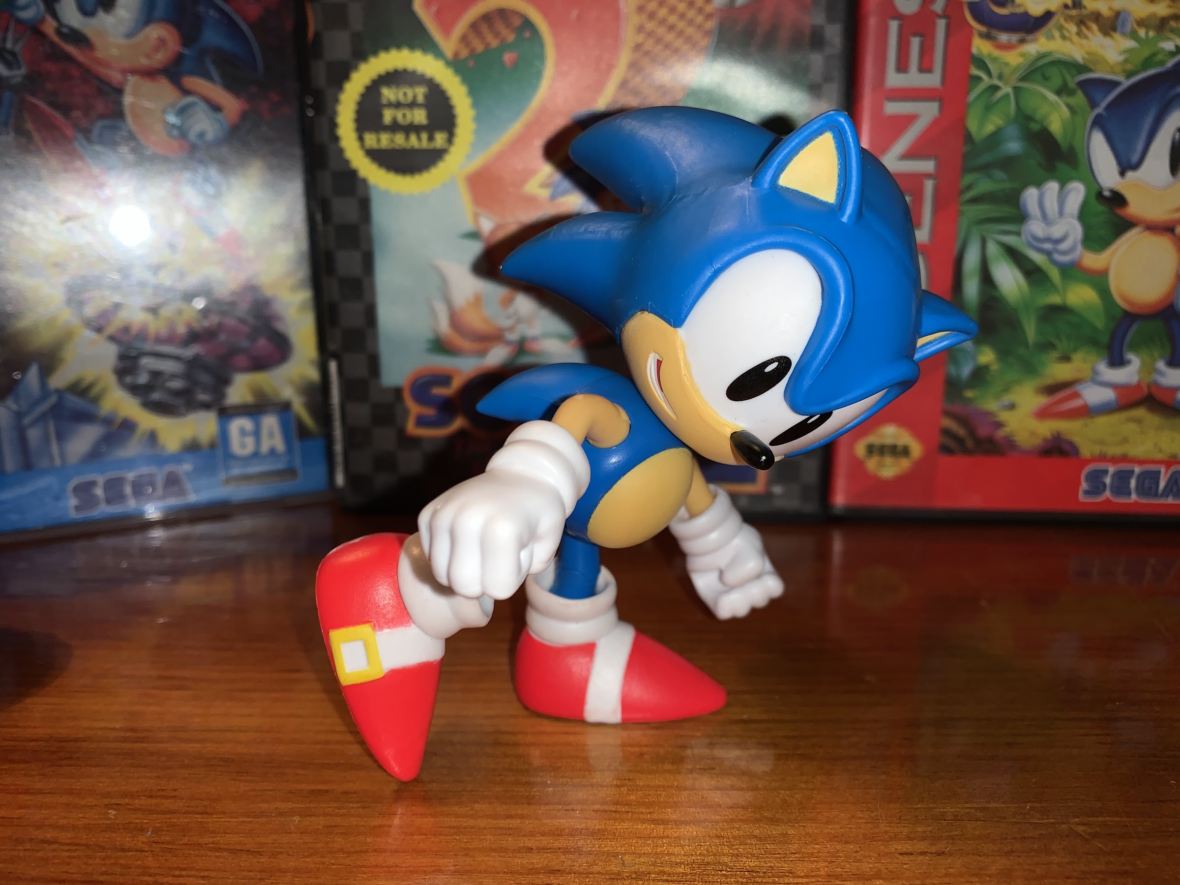
Ever since I was introduced to the character Sonic the Hedgehog via the Genesis game of the same name I’ve found the character just very aesthetically pleasing. And that’s apparently intentional as Sega relied upon tried and true designs like Felix the Cat and Mickey Mouse when it instructed artist Naoto Ohshima to come up with a new mascot that could rival Nintendo’s Mario. Now of course, it’s not necessarily Mario’s design that made him a star, but it certainly can’t hurt. Sega needed to pull gamers away from their Nintendo system with something flashy, and Sonic apparently fit the bill. And like Mario, it turned out his game was pretty good too and a rivalry was born!
Back in the early 90s, there was no shortage of toys at retail. Action figures, which really took off in the 80s, were still going strong and brands like Teenage Mutant Ninja Turtles and Mighty Morphin Power Rangers were raking in revenue. Strangely, the mascot characters from the world of video games largely sat things out. While fighting games like Street Fighter and Mortal Kombat were able to force their way into toy stores, Sonic and Mario instead found themselves relegated to the Happy Meal. Maybe because neither character was really associated with action figure tropes like guns and other weapons their respective parent companies didn’t see a reason to seek out a toy deal that included action figures or maybe producers weren’t interested. There were some non-articulated PVC figurines and even plush options, but no true action figures that I can recall.
Not the usual collector grade packaging I look at.
Today, things have changed and both Sonic and Mario can be found occupying space at retail alongside the likes of Star Wars and He-Man. Interestingly, it’s Jakks Pacific that has the licensing rights for both Mario and Sonic when thirty years ago that might have seemed somehow wrong, though DiC did produce cartoons for both. Nevertheless, Sonic has had a toyline for awhile now and most of those have been focused on bringing the modern Sonic to toy form. When Sega launched the Dreamcast in 1999, it was released alongside a brand new Sonic game titled Sonic Adventure. For that title, Sonic received a slight redesign. He dropped the spherical torso he borrowed from Felix and replaced it with something longer and trimmer. His legs were also lengthened, his shoes were redone, and his eyes made green. It wasn’t particularly radical, but it was noticeable.
The cross-sell seems to contain two additional classic interpretations of characters and one that is definitely not classic.
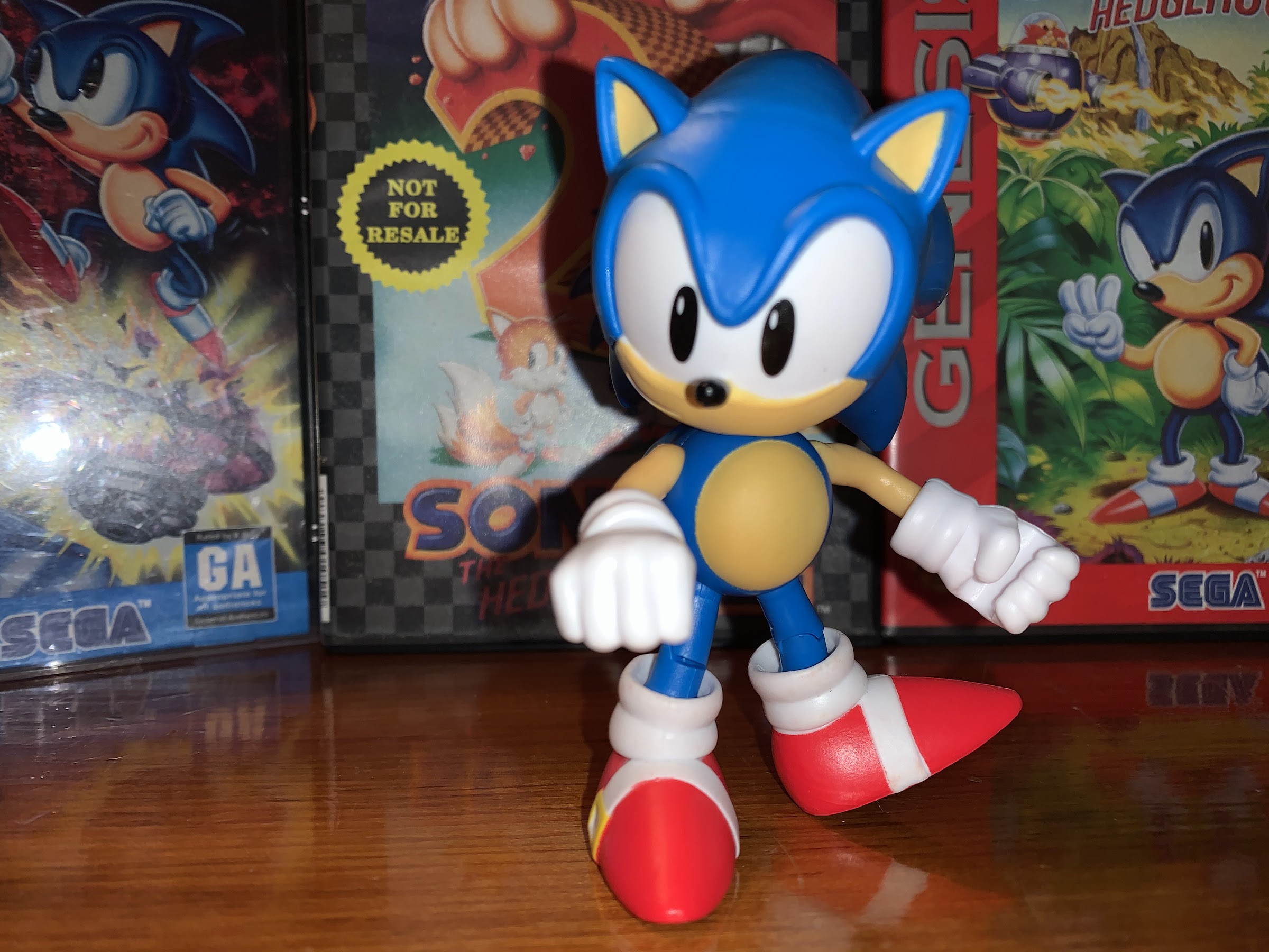
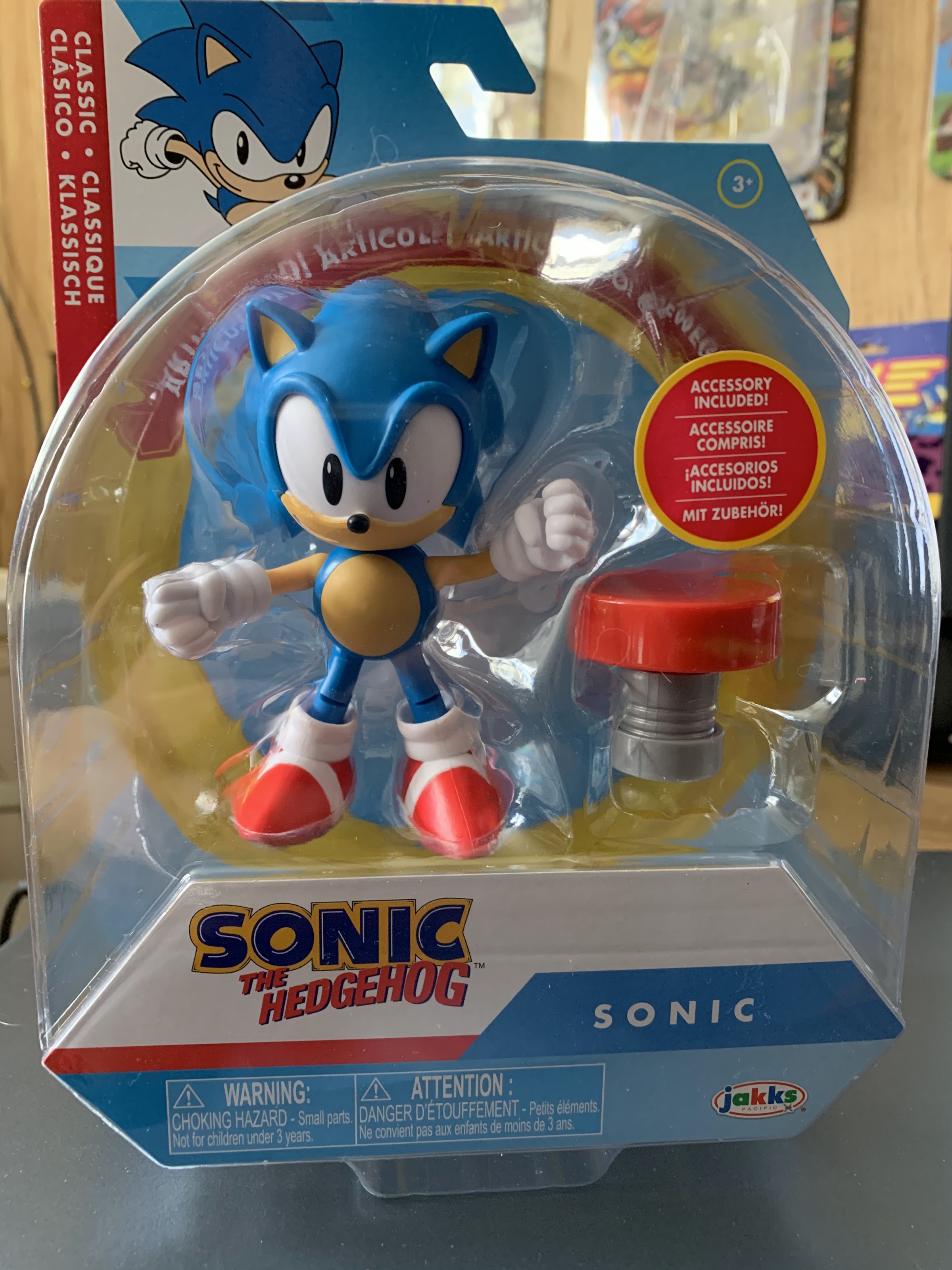
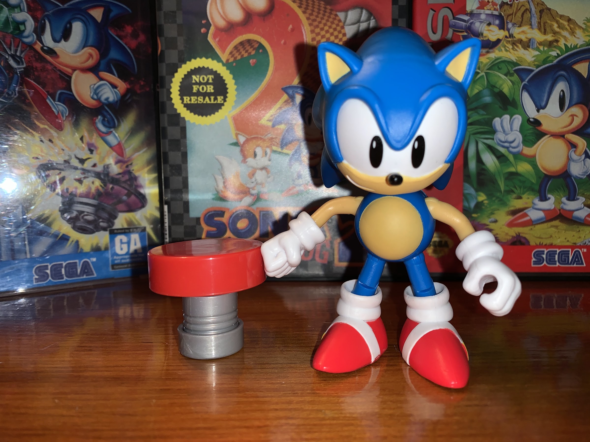
Sonic’s new look was fine, as far as I was concerned, but I did miss the slightly more chunky iteration of the hedgehog I knew and loved from his days on the Genesis. And even though I’m supposed to have aged out of toys (hah!), my desire for a classic interpretation of Sonic has never fully gone away. Recently, when browsing the toy aisles at my local Target, I came upon the latest from Jakks Pacific: a classic Sonic complete with a bouncing spring. It’s a figure that adheres to my chosen aesthetic for the character, and considering it runs a mere 10 dollars, I decided to purchase it and take a look. Is this the Sonic I was desperate for as a child, but never had the opportunity to purchase? Or, is this just a cheap, piece of crap designed to sucker kids and their parents into making a foolish purchase?
Sonic and his trusty spring! That’s a thing, right?
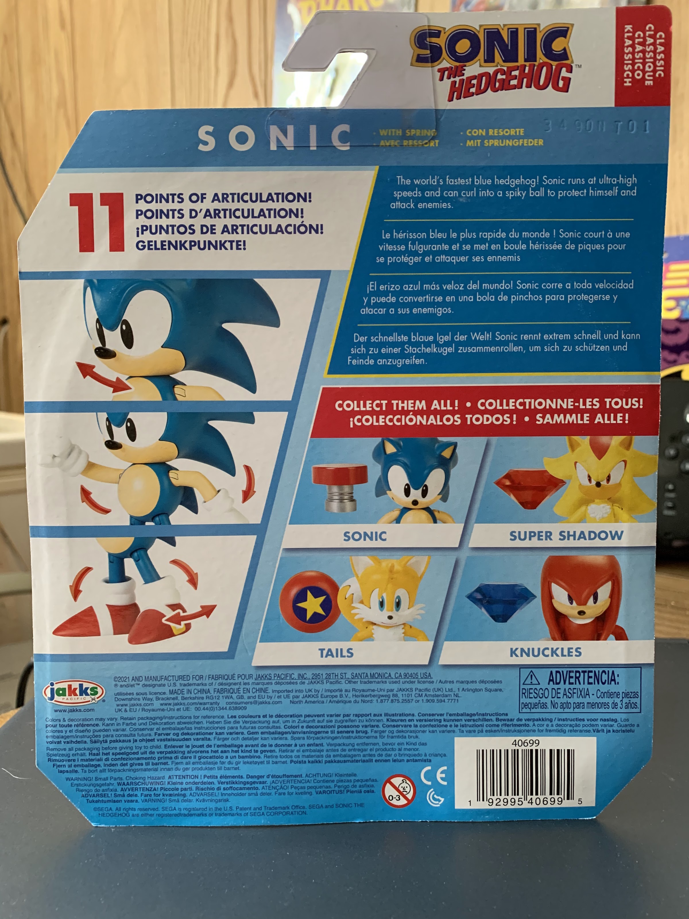
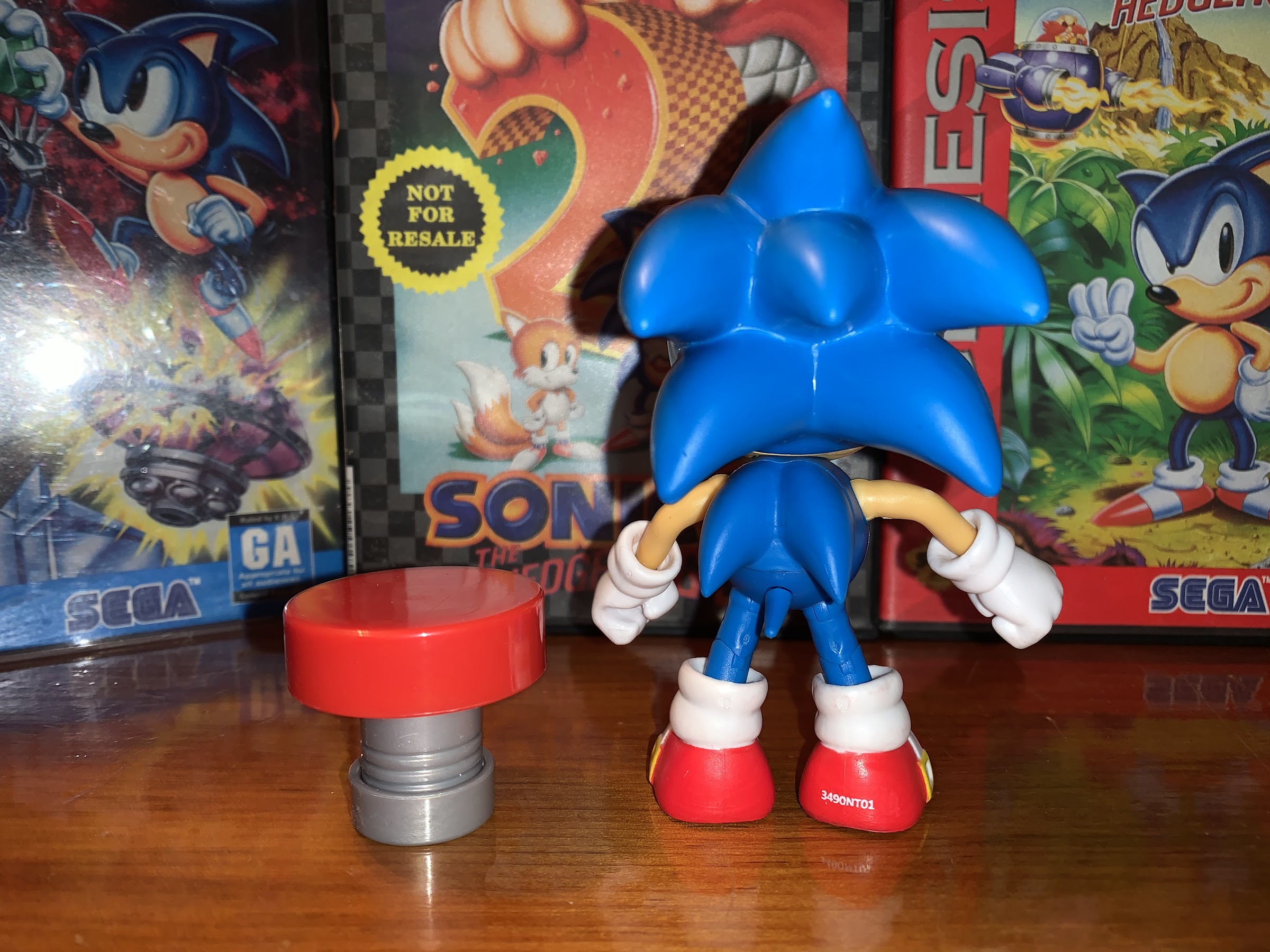
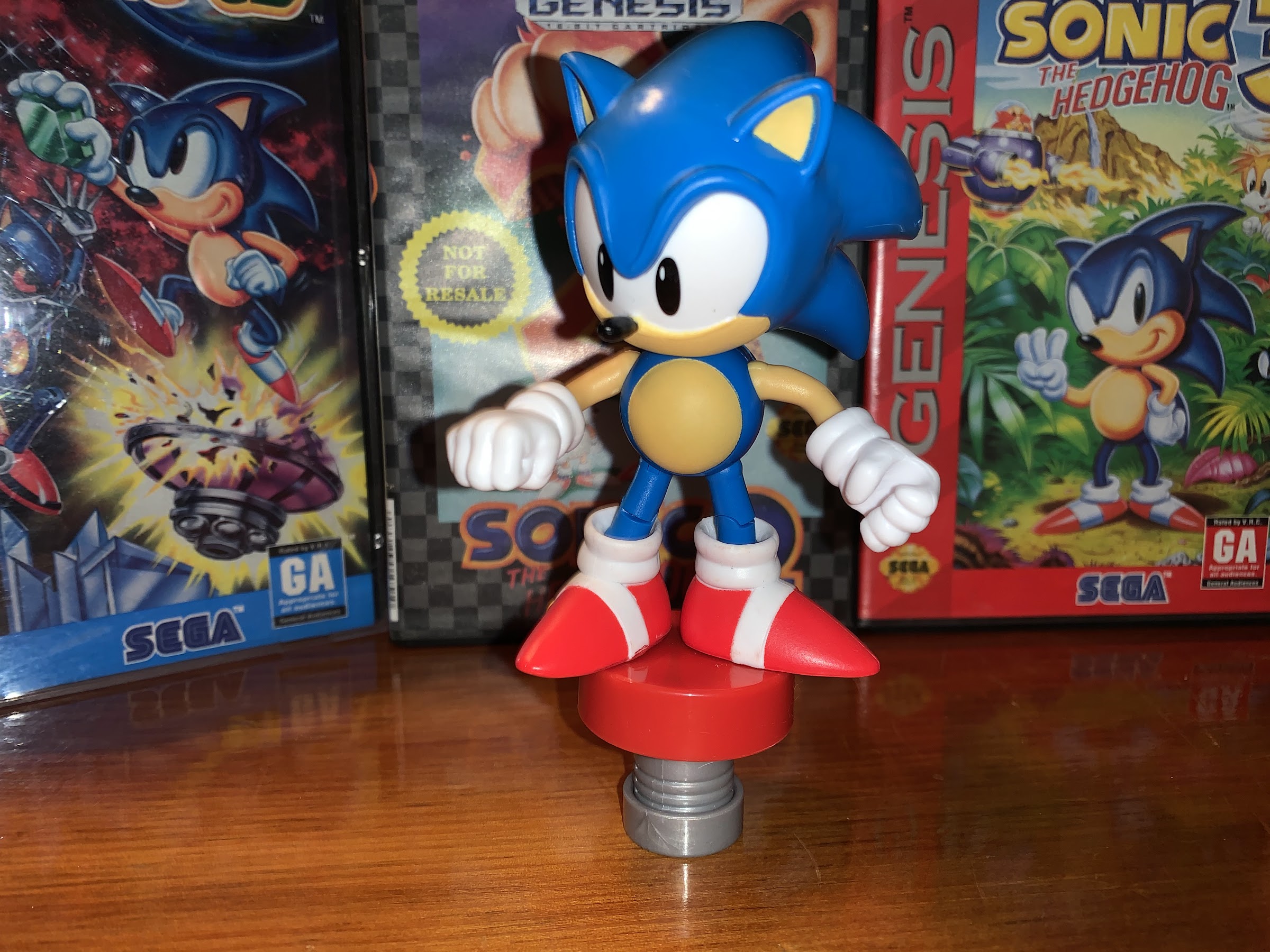
Sonic comes packaged on a standard blister card. There’s a picture of the character in the top corner and he’s surrounded by a printed, gold, ring. The package affords a good look at the figure within, which is appreciated since it allows for some inspection before purchase. Freeing the hedgehog from his plastic confines is actually a bit tricky since he’s wedged in there pretty tight, but considering this isn’t meant to be resealable packaging one can muscle him out. Once placed on a surface, Sonic stands roughly 4″ tall, probably a tick under, and is mostly head. He’s a fairly light shade of blue, almost teal, and his eyes dominate his visage. He has his long, rounded, nose and trademarked red shoes. He has six spikes on the rear of his head and two more on the back of his spherical mid-section. His little tail pokes out like an extra spike, though curled in the opposite direction of his spikes. He seems to adhere to the design of classic Sonic as presented in the game Sonic Generations. That Sonic was meant to resemble the Genesis era Sonic, but he’s a lighter blue and has yellow buckles on his shoes. I think I would have preferred a slightly darker shade of blue and no buckles, but it’s not a big deal. It’s near enough though that I think the sculpt is fine.
Spikes! I’m going to give them the benefit of the doubt that they counted the amount of spikes present on the model in Sonic 2.
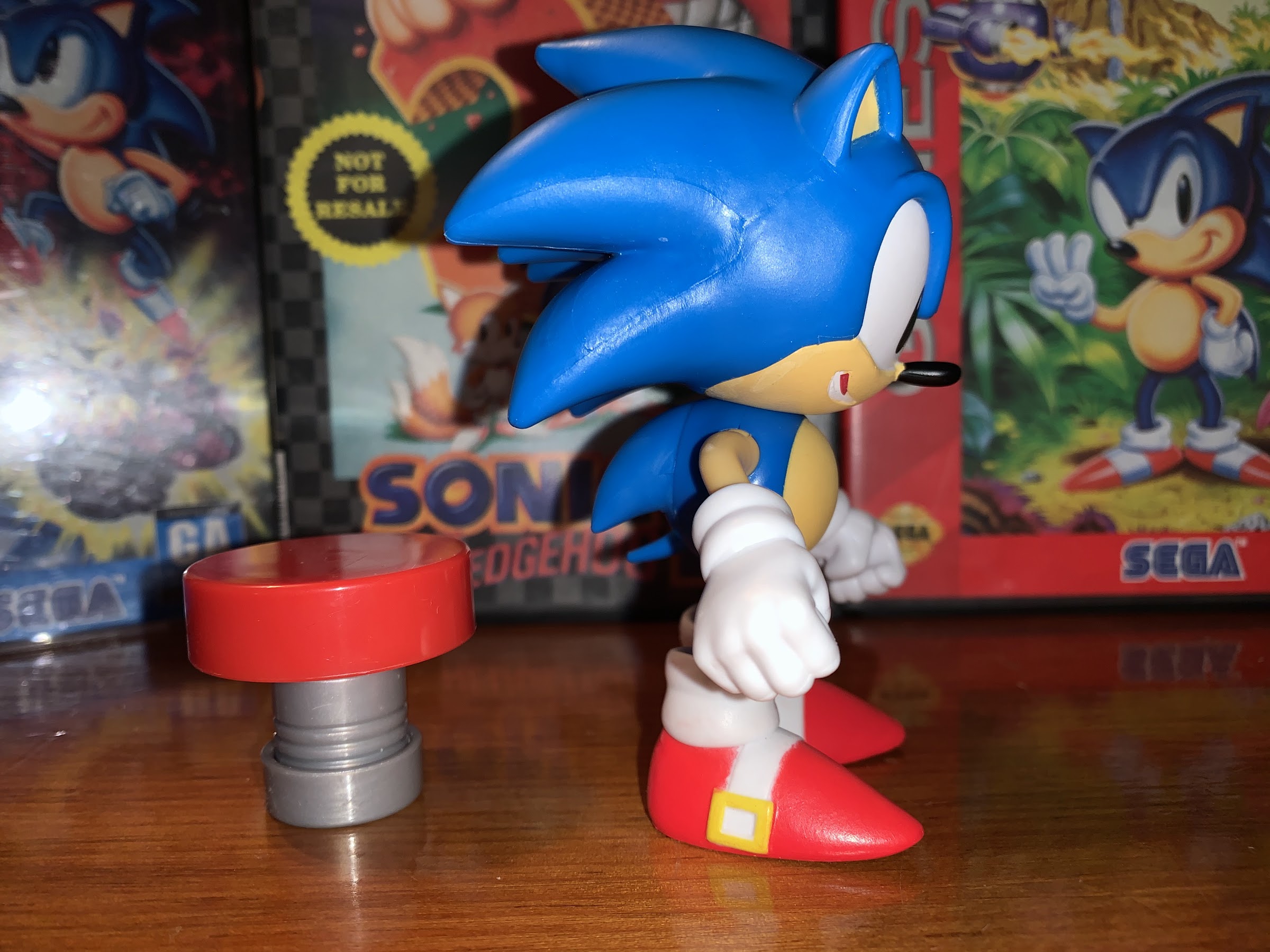
The side view gives you a good look at the iffy paint on the shoes.
Since he’s basically two colors, there isn’t a lot of paint to speak of with Sonic. All of the blue is molded plastic as are the arms in that peach color. The white of the eyes is quite sharp as is the belly, but the rest of the painted areas all feature some fuzzy linework. It bleeds a bit, especially on the mouth, which I don’t know if that’s been painted properly on this figure. It looks like there’s a sculpted line of teeth that I presume should be white, and is, with the rest of the mouth intended to be red? Instead, the white continues past the teeth and there’s just a line of red above it. Perhaps knowing this area would be the most problematic, Jakks declined to include any promo images on the rear of the box that feature the mouth prominently so it’s hard to say what should be going on here. It’s unfortunate since I don’t think an open mouth was even necessary. I always associate classic Sonic with a simple smirk. The white stripes and buckles on the shoes also aren’t terribly clean, but there’s at least no random splotches of paint. For a 10 dollar figure, the paint is fair and is better than some of the Hasbro Power Rangers I’ve purchased recently, so that’s a plus.
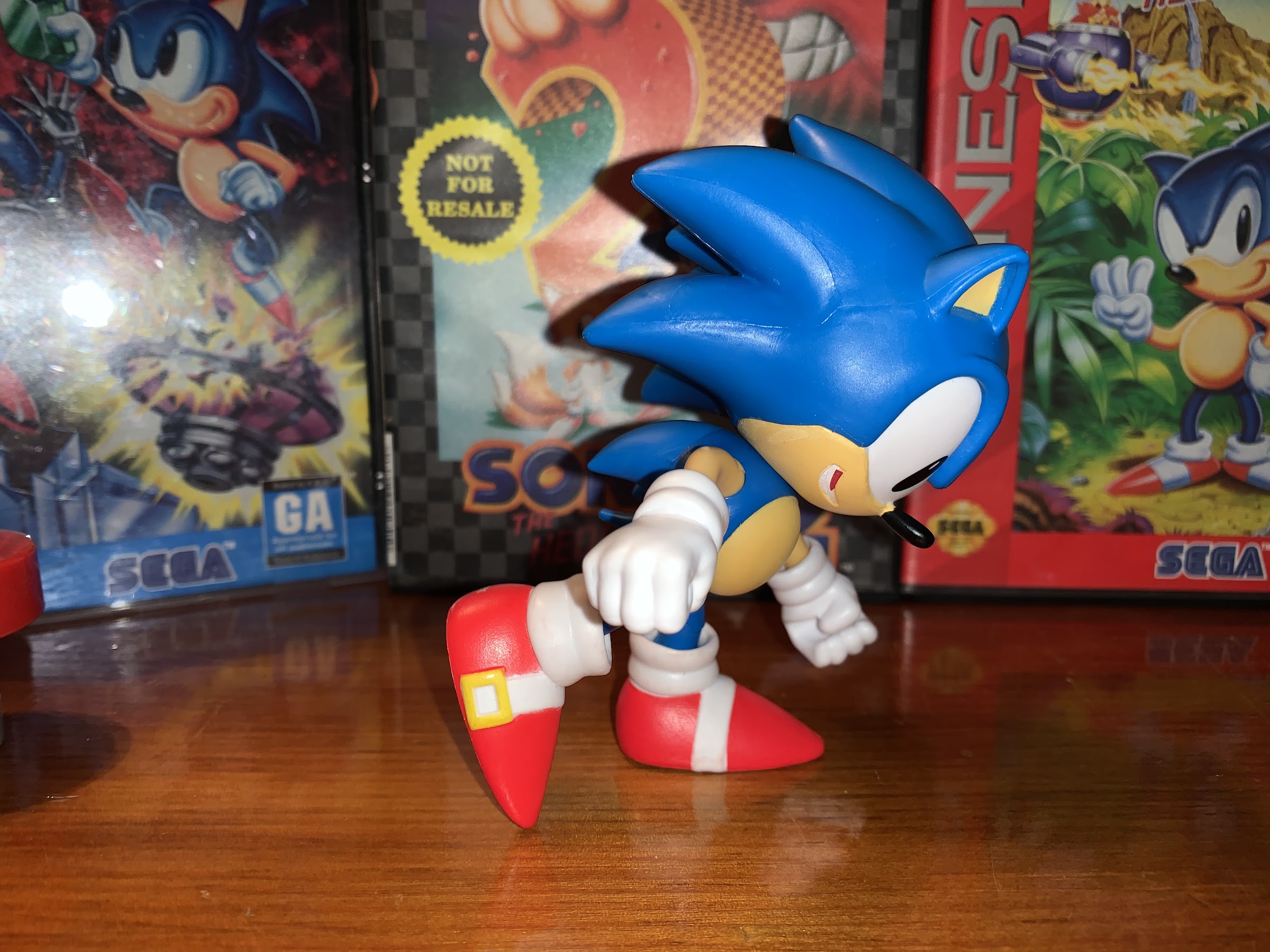
He can kind of run. It’s the lack of a head tilt that really hinders the posing.
It looks a little better when you turn the head, but what he really needs is just a plastic base that simulates his legs in motion.
Given the size and design of this figure, there isn’t a ton of opportunities for articulation. Jakks has largely kept things fairly basic in that area. Sonic’s head is on a swivel and can rotate. Since he doesn’t possess a neck, he can’t really do anything else. There’s a tiny bit of play that allows for him to ever so slightly look down, but I think that’s just the head moving on the ball peg that’s likely in there. Sonic’s arms are traditional ball-hinges that can rotate and raise out to the side just fine. His arms are permanently curved as he lacks elbows. The gloved hands can rotate and have some in-out as well as up-down play, though without the aid of hinges. His right hand is a fist, while the left is a gripping hand even though he has nothing to grip. There’s no articulation in the torso at all, which is expected of a character with Sonic’s anatomy, while his legs are on ball-hinges. They can swivel where they meet the torso and can kick forward and back pretty well. Since they’re ball-hinges, you can also rotate them to put Sonic into a split, if that’s your desire. Sonic does have knee hinges while his feet appear to be on ball pegs, like the hands, so they can rotate and have some play in all directions. It’s honestly better articulation than I expected and the only area I wish had more is the head. If he could look up that would have been terrific, but would have probably required a bit of clever engineering considering the lack of a neck. Even though he’s considerably top-heavy, he’s not too difficult to pose. I was able to get him to stand in a slight running pose and I suspect that’s what a lot of people want him to be able to do.
There’s a surprising amount of tension in the spring as the weight of the figure isn’t enough to push it down.
As far as accessories go, there isn’t much to talk about. Sonic comes with one spring platform that does at least have a spring action to it. It’s pretty boring looking though as it’s just a piece of red plastic for the top and gray for the base. A little black paint on the sculpted spring would have made this look a lot nicer, but wouldn’t really change a whole lot either. What’s missing is a power ring, which is made all the more obvious by the fact that he comes with a gripping hand perfectly suited to grasp such a ring. None of the figures in this wave appear to come with one which is bizarre, and it makes that gripping hand feel out of place. I’d much rather he have two fists for a true running pose. The gripping hand isn’t far removed from a fist so it’s not that big of a deal, but how much cost would a plastic, yellow, ring really add to this thing, Jakks? Even better would just be an extra hand with a ring molded into it, but swappable parts isn’t something I expect out of a 10 dollar figure. I also would have preferred a base to the spring. Just a piece of molded plastic for Sonic to stand in that resembles his running animation from the game would have solved some of the posing issues. Jakks could have even put it on wheels if they felt a play element was needed with the figure that would be lost by dropping the spring.
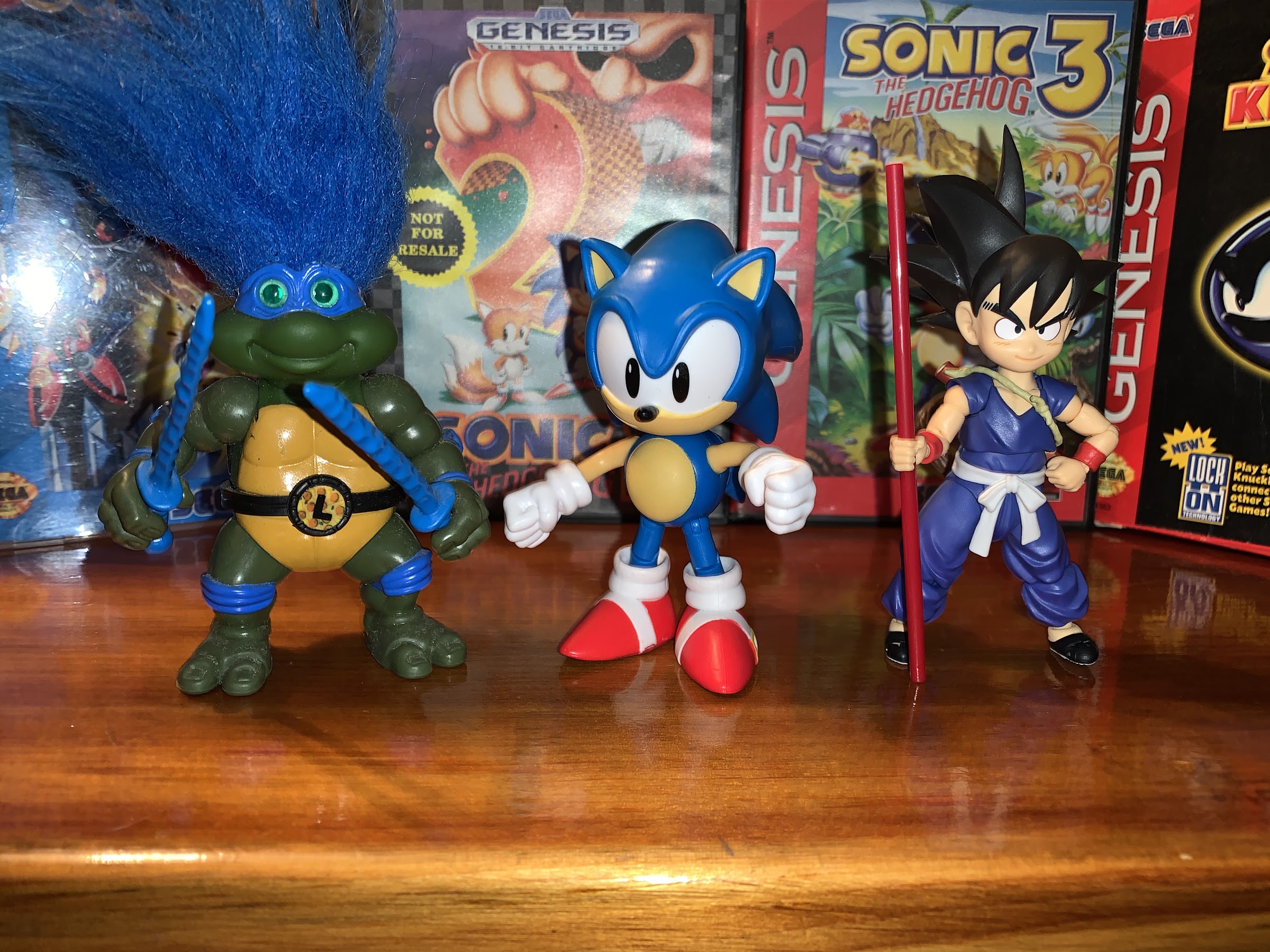
I think you’ll find he doesn’t really scale with much. He’d probably look fine beside one of the Mario figures though if you want to stage your own Mario vs Sonic at the Olympic games.
The Jakks Pacific Classic Sonic the Hedgehog is perfectly fine for what it is. It’s an inexpensive, simply painted, representation of the character’s classic look that does a good enough job with the sculpt to justify its existence. My complaints and criticisms with the figure are, at best, nitpicks and it’s important to remember what this figure is meant to be. It’s a kid’s toy first, collector item second, and that’s probably a distant second. And considering it does a good enough job with the aesthetic, I’d say I’m happy. Prior to getting this, I had been tempted by the Nendoroid Sonic release. That’s a figure modeled more on Sonic’s modern look, but the Nendoroid aesthetic means it works pretty well as a classic interpretation too. It’s also more than four times the price of this figure, so while I’m sure it’s superior, it’s probably not four times superior to this figure. This guy will look fine amongst my classic gaming artifacts and should one of my kids want to play with him, I can at least hand him off with no worries. Now lets see if I can suppress the urge to grab Tails and Knuckles as well.
Jumping back into the world of Dragon Ball, and especially the SH Figuarts Vegeta figure, has made me especially nostalgic for all things Dragon Ball Z. Back in the early 2000s, I was an avid collector of Irwin Toys’ Dragon Ball Z line of action figures. When Dragon Ball Z first showed up in America, Irwin licensed the old Bandai Super Battle Collection line of toys for distribution in North America. This proved a smart move because the show didn’t catch on so Irwin wasn’t out a ton of capital. The Bandai toys, and also a series also licensed by Irwin from a company called AB, were pretty dated in the late 90s. They contained minimal articulation, almost no accessories (something DBZ didn’t really lend itself well to, in fairness), and were just an adequate representation of the characters from the anime. Arguably their best feature was the nice box-styled packaging, something that was probably expensive relative to other toys so the Irwin ones came in standard blisters with “loud” 90s styling.
These toys, as released by Irwin, were largely peg warmers. They paled in quality to the stuff being put out by Toy Biz and McFarlane and since the show didn’t catch on kids really didn’t want them. They eventually made it into the discount bins, which was when I got my Super Saiyan Vegeta figure for a mere four dollars. Eventually, Cartoon Network picked up Dragon Ball Z and began airing it during the afternoon timeslot. It soon caught on, and suddenly America was in love with this series from Japan that had long since ended. Funimation, the company distributing the show in North America, eventually went back to the series to dub it in its entirety which also gave Irwin the confidence to go all-in on the license and start creating its own toys. DBZ was mostly a show that appealed to an older audience, so Irwin made it a point to appeal to collectors and longtime fans, which was pretty cool from a collector’s standpoint, but maybe not the best marketing decision. They first concentrated on characters that Bandai never tackled such as Nappa, Krillen, and the non-final forms of Frieza, to name a few. They didn’t even release a Goku until Series 4, which is pretty damn crazy since almost every series of modern figures includes one Goku.
In light of my enjoyment of the Figuarts Vegeta, I decided to dig out all of my Vegeta toys from storage and take a look at them. They’re all Irwin releases, except one. Irwin eventually went bankrupt as DBZ was basically its only successful property. They were able to sell the license to Jakks Pacific who would continue the line for a few years. The Jakks toys initially were fine because they were mostly unreleased Irwin designed figures, but the Jakks originals were rather poor which is when I stopped collecting. Jakks seemed to use a lower quality plastic and a much simpler paint application giving their toys almost a rubbery look, even though they were hard plastic. Their only good releases really were the re-releases of older Irwin toys that they were able to make paint corrections to, most notoriously Perfect Cell who had a very blue skin and no purple sideburns as released by Irwin. Lets take a trip through the toys I did get though. I did not get every Vegeta released by Irwin, but I did get all of the main ones (I mostly skipped the gimmick lines, with one exception) and one of the Jakks releases. Let’s start with the first one, the re-release of the Bandai Super Battle Collection Super Saiyan Vegeta.
This figure is pretty damn basic for a toy. He’s mostly comprised of colored plastic with minimal paint applications and almost no articulation, which was par for the course for this line. His only articulation is in the shoulders, wrists, and calves. His hair is glued on and doesn’t look particularly great, but in a way it accentuates his receding hairline. The battle armor is removable and it’s just two pieces of plastic that snap together. This was the standard approach for this line as most characters had a removable shirt. His boots are missing the yellow/gold tips. Still, for the time, the likeness was fine and he mostly looks like Vegeta, especially from the side. Not a fun toy by any means, but at least his bum looks nice in blue spandex.
Our next figure was Irwin’s first attempt at a proper Vegeta. Based on his look in the Androids Saga, this was a Series 4 figure and a much anticipated one. He’s a solid representation of what Irwin’s approach was. They utilized ball joints for the shoulders to go with legs, knees, and head articulation. It was pretty standard for the time, but obviously not on pair with what we’re accustomed to today. After all, he basically can’t be posed in any of his signature stances and what you see is kind of what you get since he has no elbow or wrist articulation. Like the Bandai toys, he is mostly done with colored plastic as well, but the white and yellow of his armor is painted on. The blue of his suit is a deep royal blue and the tips of his boots are molded on, but not painted. This was an artistic approach for the figures as we’ll see with the Super Saiyan version, Irwin would go lighter on the suit and paint in the boot tips. The likeness is solid, though something is off a bit in the face and I think it’s the thickness of the eyebrows. Part of the likeness issues is probably due to the relatively small scale Irwin is working with. Vegetal stands just under 5″ at about 4 7/8″ to the tip of his hair. This line is basically in-scale with the Bandai line, though most of the figures were about the same height with only the obviously taller ones coming in greater than 5″. This figure does accentuate what I love about this look for Vegeta which is the contrasting bright white of the armor with the rich blue of the bodysuit. It pops, and making the armor molded onto the figure is a much better choice than making it removable.
A comparison of the different shades used on the super version.
The next figure is Irwin’s first go at Super Saiyan Vegeta. Coming in the very next series following the non-super version, this figure had an entirely new sculpt which was a positive as I feared they’d just put a new head on him and call it a day. There’s evidence of minor enhancements too in Irwin’s sculpting process. This figure is more rounded in the torso, possibly to accentuate the bulkiness of Super Vegeta. He also has molded kneecaps and a slightly open hand showing that Irwin wasn’t going to shy away from doing fingers. The hair is much spikier, and there’s a pearl finish to the white of the armor. As I mentioned with the previous figure, this one is a lighter blue and the yellow pieces are slightly lighter as well to give off the impression of that Super Saiyan glow. The yellow tips of the boots are also painted in as well. For some reason, Irwin associated that feature with the Super Saiyan form as they would repeat this with Trunks. The face sculpting was more ambitious as well as he has sunken in eyes, a furrowed brow, and more detail in his ears. He looks pretty solid, though the shape of the hair feels off and I wish he had a sneer instead of a scowl. The pupils of his eyes aren’t lined up either and he looks kind of goofy upon closer inspection. I was pretty satisfied with him though at the time, and he is an improvement on the previous Vegeta in many respects, though at the expense of looking a little less like Vegeta.
Maybe it’s due to how his legs are positioned, but this Vegeta is a little shorter than the others which is actually a good thing.
Our next figure is from the non-mainline series and from the Striking Z Fighters line of figures. These ones all featured some action they could perform. In the case of this Super Saiyan Vegeta, clad in his Buu Saga attire, he’s supposed to do a flip. It’s an exceedingly lame action feature as you basically just hold one arm between your fingers and literally flick at him to make him spin around. Basically any figure can do this, this one just features a ratchet joint in the shoulder so he’ll move more freely and easily without getting so loose that the figure can’t hold its arm up when posing. The good thing is this lame feature doesn’t harm the look of the figure, but it does mean he lost knee articulation and can only stand with his right foot slightly in front of his left. This stance makes him shorter than our other Vegeta figures, which actually makes him more in scale with the likes of Goku and Trunks. He’s a quieter looking figure too when compared with the prior Super Saiyan version as his hair is less spiky and his facial features are more simple. He has a sort-of angry, smug look on his face that’s almost the much-wanted Vegeta smirk but not quite. He looks fine, though I wish he posed better. He came with a plastic board originally that he could flip through that I didn’t drag out as it was pretty lame. And it was nice that Irwin made the effort to put him in different attire, even though the Buu Saga was still a little ways off at the time of release.
“Goodbye, son. Take care of your mother, or don’t, I really don’t care.”
The next figure is the first Vegeta from the Buu era of the show in the main series and it’s Majin Vegeta. He had an interesting existence as the first version released to retail incorrectly colored his hair black. If you’re thinking this makes that version rare and valuable you would be wrong. While perhaps it could become that eventually, the figure was mass released and I honestly don’t know which is more rare – the error version or the running change yellow seen here. Since it was so obviously an error, I’m sure many people bought multiples and kept them carded in hopes of re-selling them later. Unfortunately for them, this line doesn’t command much money probably due to the abundance of better DBZ toys out there. Anyway, this figure was a bit of a disappointment. Series 6 for Irwin marked a new era of paint experimentation that included applying a paint wash to give the toys more definition and personality. They also tried to give them a bit of a dirty look as well. This Vegeta came well after that and Irwin toned it down some, but they still had’t quite figured things out. His clothing is very muted while his skin has a lot of red to it, including around the eyes which should have been heightened with black for this version of Vegeta. The M on his forehead is nice and sharp, though his hair should probably be spikier given this is also our first Super Saiyan 2 Vegeta. His arms are posed oddly, making it look like he’s riding an imaginary motorcycle. Maybe this was done to recreate the scene where he gives young Trunks a hug before sacrificing himself in a bid to kill Majin Buu. This figure disappointed me at the time, but at least they did finally give Vegeta a cocky grin.
Next up is I guess what you would call dead Vegeta. This is after he’s been brought back by the Kais to help Goku defeat Buu, marked with a halo above is head. He’s in his super form and it looks like the head of the first Super Saiyan Vegeta may have been re-tooled for this figure. At least the hair looks to be about the same. The only real different is he’s sporting an open mouth instead of a closed one. The outfit is less drab compared with Majin Vegeta as Irwin dialed back the dark blue wash they used on that figure. There’s also way less red in the flesh, though the center piece of plastic on the shoulders remains unpainted. His gloves feature a lot of grime on them, as do his boots. Interestingly enough though, Irwin finally adopted elbow articulation so this Vegeta can be posed a little better than others. For the first time he can kind of look like he’s getting ready to power-up his Final Flash attack, so at least that’s pretty cool. The halo is a little warped from storage, though I recall most had a little bend in them, and is supported by a very sturdy peg. It’s not removable, and the tallness of his hair does a solid job of hiding the peg when viewed from the front. This was the last official Irwin Vegeta in the 5″ line and you could argue it was their best take on the character which isn’t a bad way to go out.
Our last 5″ figure is a Jakks Pacific release, but I’m pretty sure this was an Irwin design. This Vegeta was a bit of a surprise, but also a sign of where Jakks would take the line. This is Vegeta as he was on Planet Namek during his fight with Frieza. It features the Namek armor vest which lacked the yellow straps and it’s also battle damaged. The paint is a bit off though as the bodysuit is a very light blue, almost as light as the Super Saiyan Vegeta, when it should be a very dark blue that’s almost black. He also has the yellow tips on his boots when this particular version of Vegeta should have all white boots. The paint is a little sloppy in places, mostly where the vest ends and the bodysuit begins just before the neck, though overall I’d say it’s pretty good. The battle damage on the vest looks awesome and really adds depth to the armor pieces. He has a great looking cocky grin recalling the time just after Dende healed him and Vegeta challenged Frieza thinking he was a Super Saiyan. Best of all, he has more articulation than the other figures including ball-jointed elbows and twisting wrists. He even has ankle articulation, though the shape of the boots makes it very limited. Aside from the incorrect paint choice, the only drawback to this figure is his almost total absence of a nose. The nose is always one of the hardest parts to get right on these characters since they’re so small. It’s not awful, but his face looks a little weird as a result. After so many Super Saiyan versions of the character, it was nice to get another black-haired Vegeta. Jakks would release one more Vegeta that I believe originated as an Irwin sculpt, a version with a black jacket from the very end of DBZ. They would never top this one though.
Oh, but wait! We’re not done yet! In addition to the 5″ line of figures, Irwin also dabbled in the collector market. They first released a trio of figures in a 9″ scale – Goku, Super Saiyan 2 Gohan, and Super Saiyan Vegeta. These figures were more like statues and featured extensive battle damage. Goku looked pretty awful, but Gohan and Vegeta were pretty cool and both were depicted as they were during the Cell Games. This Vegeta is in sort of an odd pose as he almost looks like he’s surfing. As a result of the pose, he comes in at about 8 1/2″ tall. I’m not sure what the source material was, maybe the death of Trunks? What you see here is largely what you get. He does have a thin, black display stand I neglected to remove from storage that helps him stand, but he doesn’t need it. His attire is pretty well beat-up and there’s a real brightness to the blue of his suit. There’s some color blending on it as well that looks pretty sharp. The same trick is used for his skin tone and the color of his hair. It’s similar to what they did with their 5″ version of the character in an attempt to try and make it look like he’s glowing, only with this larger format the results are more convincing. He has a concerned look on his face which i suppose is appropriate. I would have preferred something else though. I really like the shape of his hair, and I wish they could have pulled this off with the smaller figures. He does have articulation in his shoulders and waist as well as his neck. No ball joints though. The rear of his vest has yellowed too, possibly due to when I had him on display which may have been in sunlight – I’m not sure. Oh well. At the time, this was one of my favorite pieces in my DBZ collection, but he’s kind of just so-so now.
Lastly, but not least, we have the IF Labs take on battle damaged Super Saiyan Vegeta from the film Cooler’s Revenge. After just the three figures in their special 9″ line, Irwin created the brand IF Labs (later re-named Giant Ape after the Jakks sale) for large scale collector figures. Most of the figures released in this line were based on the many DBZ films getting dubbed and released by Funimation, but they would eventually tackle DBZ characters like Vegito and Super Buu. This Vegeta is about 8″ tall, making him much shorter than most of the characters released in this line which actually put him in scale for once. His articulation is expansive when compared with the 5″ line – ball shoulders, neck, elbow, hips, knees, shins, and waist. He’s not capable of much in the way of dynamic poses, but his standard look is pretty nice on its own. The sculpting is the real stand-out with this Vegeta as his armor is cracked and broken in places, the bodysuit torn with fragments hanging, his skin is scratched and bleeding and is very evocative of the source artwork. He has an angry, but determined, look to his face and the hair is in two distinct pieces giving the spikes nice definition. There’s finer details as well like stitching on the boots and gloves really giving this figure a jolt of realism, even above what is present in the film. Some of that realism, like his teeth, actually take away from the figure slightly because he looks too real and unlike the actual cartoon. Otherwise, the attention to detail is rather impressive including the all-white boots which is film accurate, even though he always had gold-tipped ones when wearing this attire in the anime. The only thing that stinks about my particular figure is the tiny paint chip on the end of his nose, a terrible place for a spot of missing paint. This was probably my favorite Vegeta figure, until I got the Figuarts one, though I do have another non-Irwin/Jakks Vegeta I’m quite fond of. I suppose I would have preferred a really awesome, non-battle damaged version of the character in this line, but at least the battle damage looks good. They also did eventually do a normal Vegeta and he looked pretty terrible. A lot of the figures in this line suffered with scale as often the heads would be too small, but for at least this figure IF Labs nailed it.
Hopefully you had fun on this trip down memory lane with me and Vegeta. I plan on doing more Dragon Ball related posts in the not too distant future so if you like that franchise you might want to hit that subscribe button!


 Jumping back into the world of Dragon Ball, and especially the


