Author Archives: Joe

Dec. 2 – Tennessee Tuxedo and his Tales – “The Tree Trimmers”

Original air date November 27, 1965

In the early 1960s, content producers were still trying to navigate the lay of the land when it came to television. Animation had been popular for decades in movie theaters and the big studios knew they appealed to kids, but it was just so expensive to produce that few were willing to try it on television. Where there’s a will, there’s a way, and one of the earliest Saturday morning cartoons was a production from Total Television titled Tennessee Tuxedo and his Tales.

Tennessee Tuxedo was essentially the heir apparent to the series King Leonardo which concluded the same day Tennessee Tuxedo premiered. The show was conceived of by W. Watts Biggers and Chet Stover and originally existed to sell cereal, as sponsorship was the name of the game back then (and for awhile) when it came to children’s programming. Education was also a component as well and the show was setup in a fashion that allowed the main characters to learn a thing or two and serve as an audience surrogate in the hopes that the kids watching at home wouldn’t figure out it was really they who were learning a lesson.

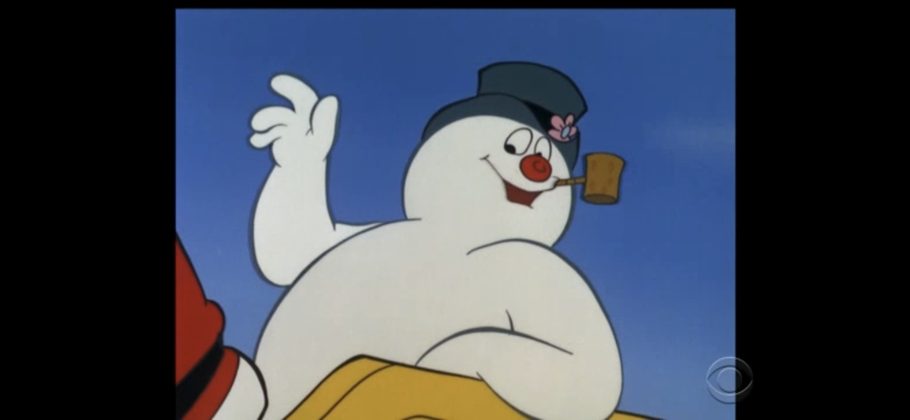
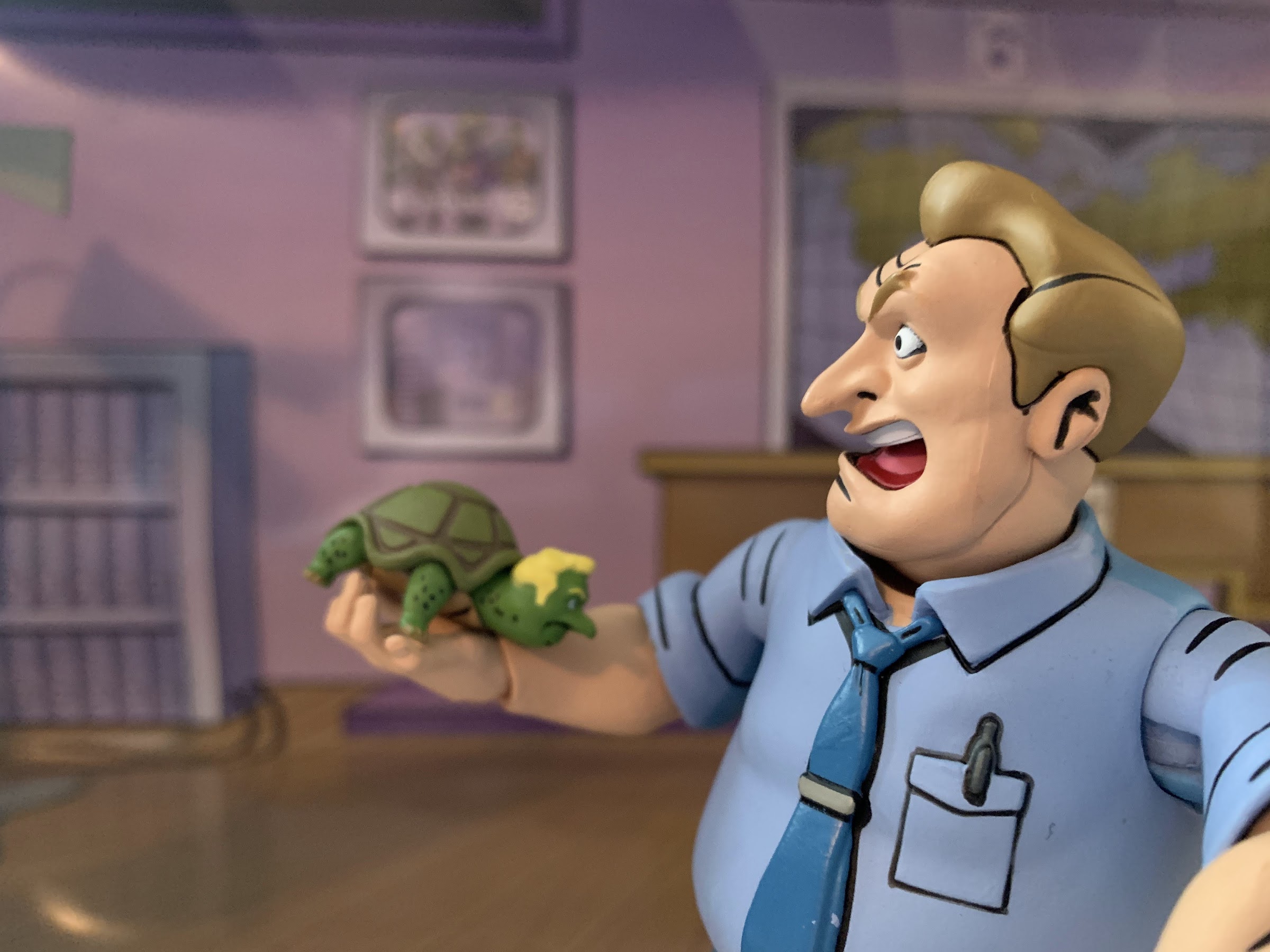
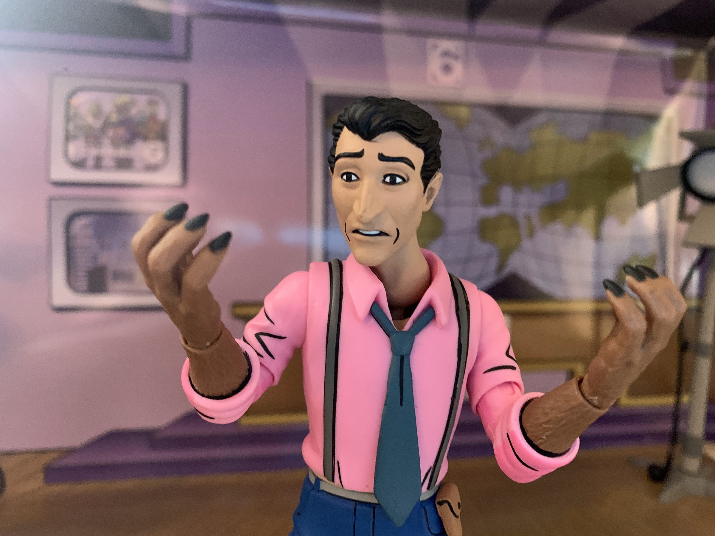
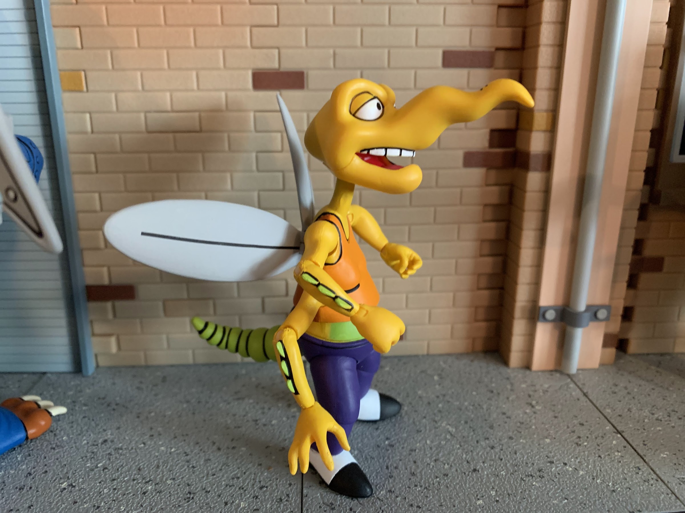
The show starred Don Adams in the role of Tennessee Tuxedo, a penguin in a hat and bowtie who lives at the Megapolis Zoo. Adams uses the “clippy” voice he would later perfect on the series Get Smart! and even later as the voice of Inspector Gadget to voice Tennessee. The penguin’s best friend is a walrus by the name of Chumley (Bradley Bolke) and together the two are usually up to something that takes them out of the confines of the zoo and presents a problem for the pair. Tennessee’s catch phrase is “Tennessee Tuxedo shall not fail,” even though he usually does. When the problem gets too big for the pair to manage, they turn to the all-knowing Phineas J. Whoopee (Larry Storch), who is literally the man with all the answers and the way for every episode to write its characters out of trouble. The main antagonist of the show is the zoo director Stanley Livingstone (Mort Marshall) who often threatens to skin the pair. Nice guy!

What a way to close out your opening theme song.

In the early 1990s, few cable networks dedicated significant time to children’s programming. Basically, the only game in town was Nickelodeon, but back then the Viacom-owned network did not produce much in the way of cartoons. Instead, the network was forced to license material to air on its network, but couldn’t pay the big money of the major broadcast networks to attract the best shows. That left Nick with a lot of older material, which is how I was exposed to Tennessee Tuxedo. Not long after the show’s original debut came Underdog, which proved to be the more popular show. In licensing Underdog for syndication, his show would often be packaged with other cartoons, many of which debuted as part of Tennessee Tuxedo and his Tales. These packaged shows would air often on Nickelodeon and I watched quite a bit of them, even though I don’t recall actually enjoying them. It was a cartoon and it was on – those were essentially my standards at the time.

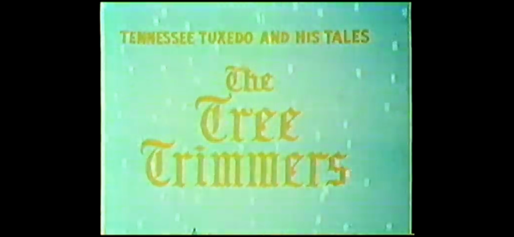
As part of the show’s third season we have a Christmas episode. Tennessee is going to take it upon himself to trim the zoo’s tree, even though Stanley would prefer he not do so. I don’t recall seeing this one as a kid and it’s possible the holiday themed episodes were not included in the syndicated package. After all, networks just want to be able to throw these things on at any time and seasonal episodes can mess that up (if the network cares, and often times, they don’t). When this one first originally aired, it was at the end of November and likely the Saturday after Thanksgiving, a plenty appropriate time to unveil a Christmas episode.

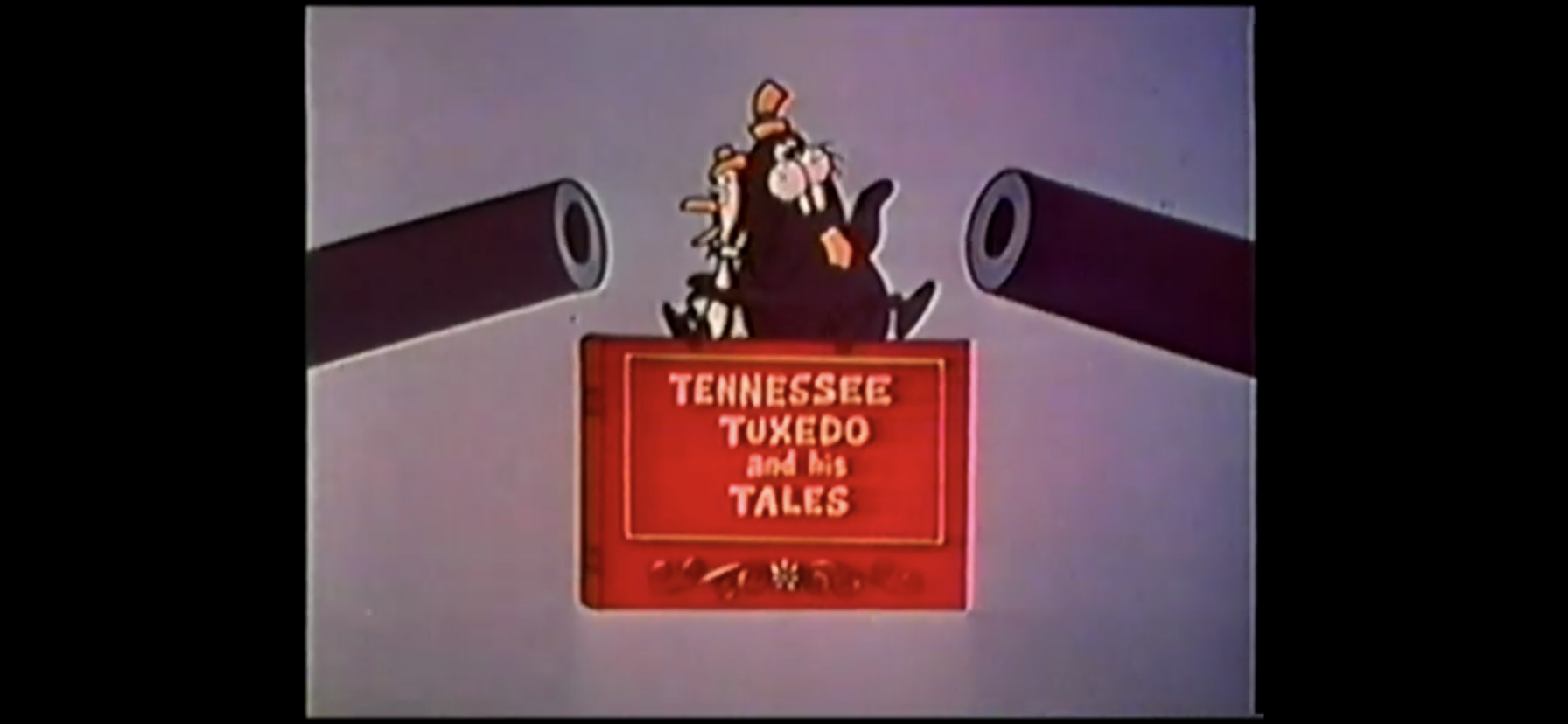
The opening title for this one has a very Mickey Mouse Club feel to it, only it looks a lot worse. The scenes in the opening title also seem to suggest kids are getting a show full of high adventure, which is not how I remember the actual show being. It also ends with Tennessee and Chumley dropping onto the title of the show and then two, giant, gun barrels are pointed at them. There’s an explosion, but no animation of the guns actually firing, before the pair is blasted up and out of the shot. It’s a pretty intense close for a Saturday morning cartoon.

I bet you can’t guess what the eagle’s name is.

The cartoon begins with Tennessee and the gang singing a bad Christmas carol. They’re just singing “Merry Christmas to you,” over and over for the most part before they’re interrupted. Flunky (Kenny Delmar), the zoo keeper, comes running over to tell Tennessee that Stanley needs to see him in his office and Tennessee seems particularly annoyed at being taken away from caroling. When Flunky mentions it concerns the zoo’s Christmas tree, Tennessee gets excited as he assumes Stanley wants their help in setting up the tree.

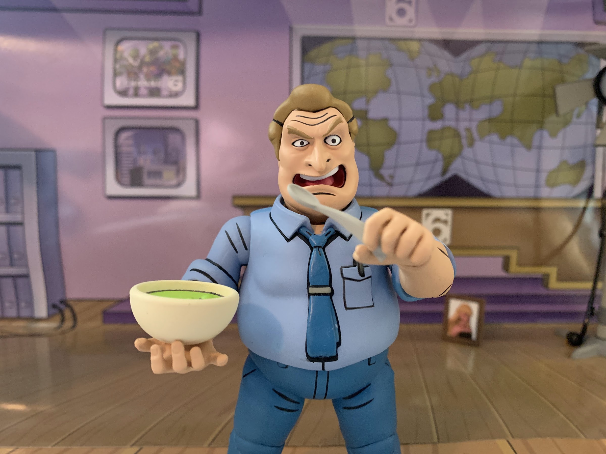
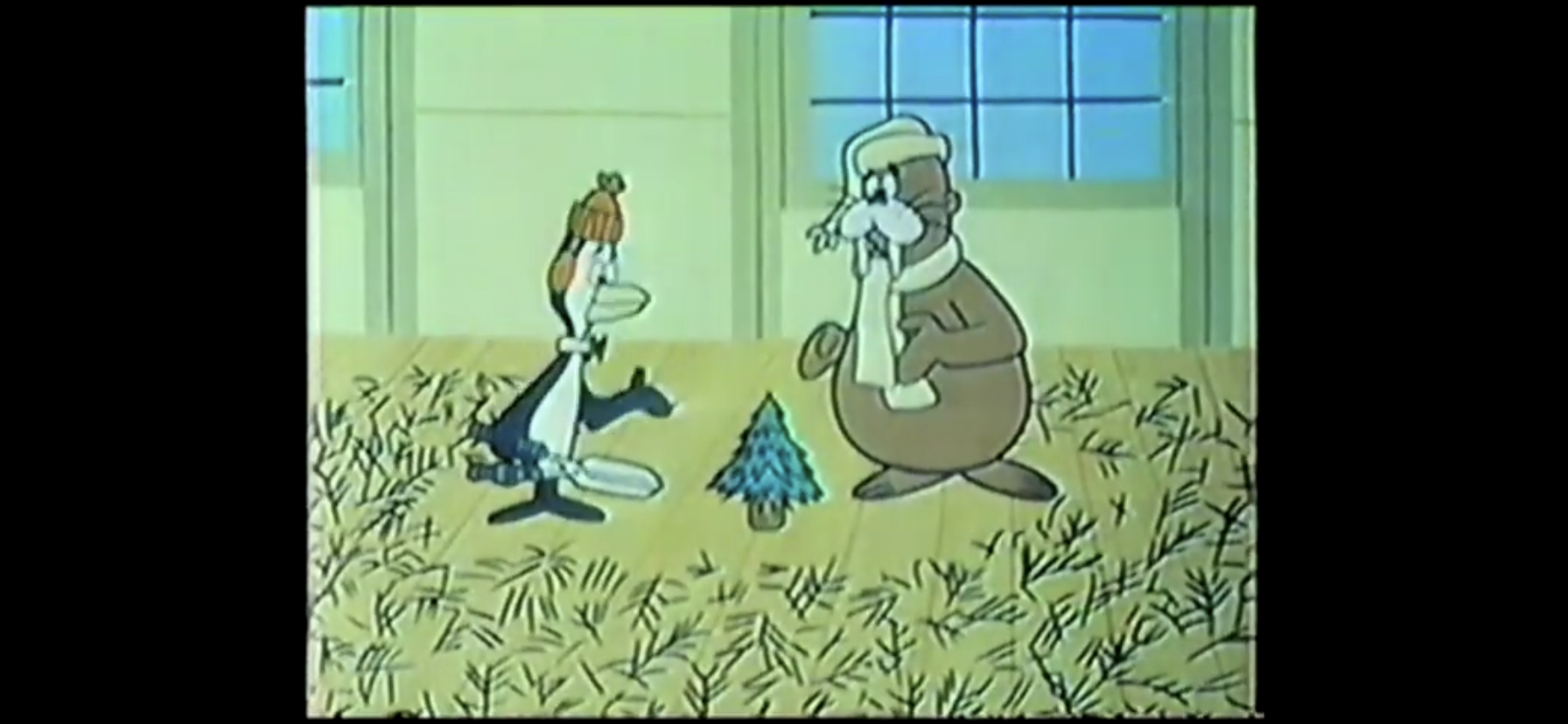
Tennessee and Chumley head over to Stanley’s office ready to help trim the tree. Stanley, who always seems irritated, informs Tennessee he’s to do no such thing! Stanley tells the pair that the mayor has set up a tree contest and that he intends for the zoo to win. He’s hired professional tree trimmers to handle the decorating and wants Tennessee and Chumley to show the decorators where everything is while he’s out fetching the mayor. Tennessee protests a bit and insists he and Chumley can handle it, but Stanley refuses to entertain the thought. Once gone though, Tennessee tells Chumley they’re decorating that tree. Chumley, who speaks in a classic dimwitted voice where every line begins with a “duh,” reminds Tennessee that Stanley forbade them from doing so, but Tennessee insists that they should because it’s the season of giving and decorating the tree will be their gift to Stanley.

This is going well.

Outside of the zoo’s auditorium the pair find a massive tree that Stanley wants setup inside. Tennessee and Chumley each grab one end of the tree which knocks Tennessee flat on his back prompting him to instruct Chumley to, “cut the comedy!” They then try to bring it inside with Tennessee dragging the tree from the top and Chumley from the bottom, only the tree gets stuck about 3/4 of the way through the door. Tennessee tells Chumley to trim off some of the bigger branches so they can fit it in. He does as he’s told and the tree fits, but now the first 8 feet or so of the tree’s base is bare.

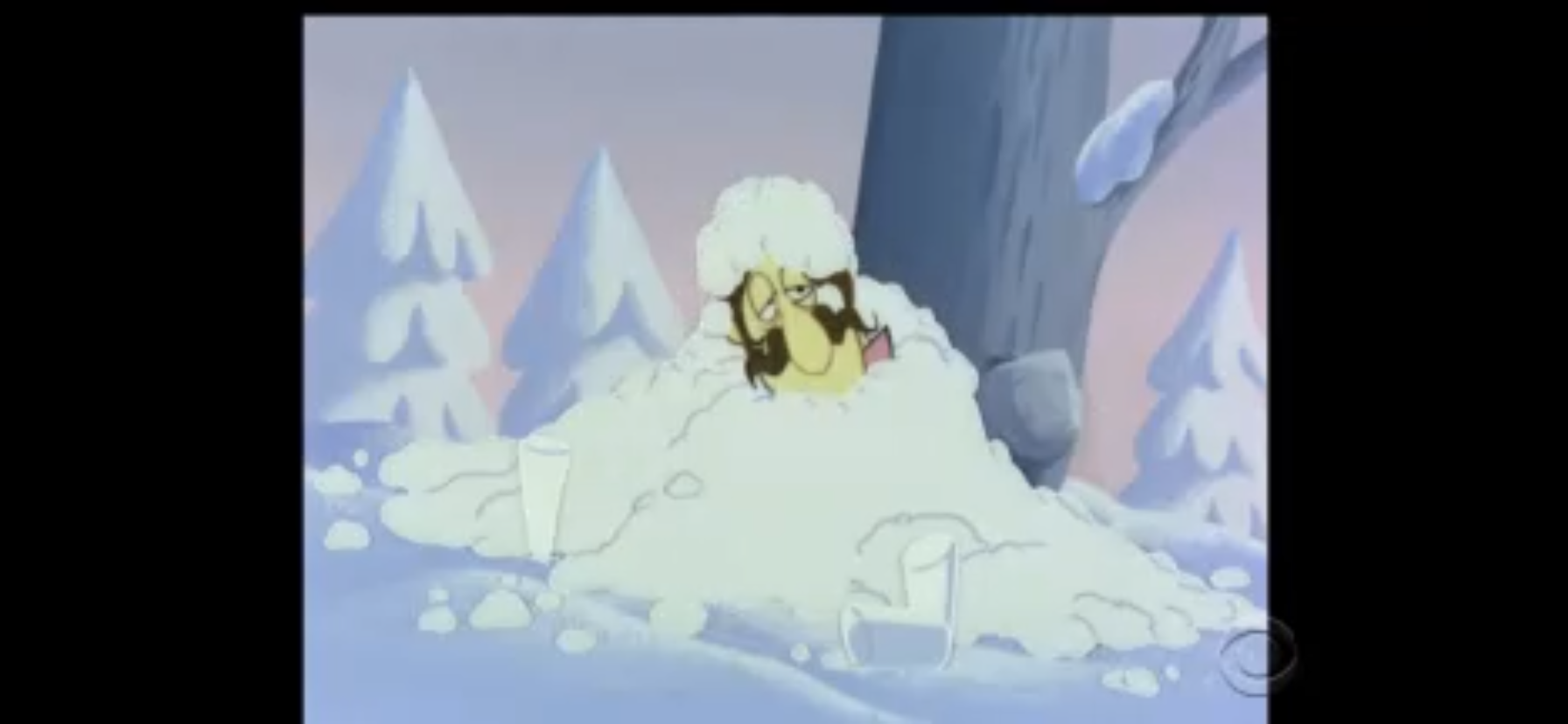
The two then go to set the tree up, only the top scrapes the ceiling. Chumley tells Tennessee the tree is too tall, and Tennessee indicates it’s not a problem as they can chop some off. Considering that the bare portion of the tree extends beyond the pair’s head, the viewer is likely supposed to assume Tennessee will cut from the bottom, but he does not, and cuts from the middle. When he’s done, the tree is much smaller, and Chumley remarks that it now looks like a dust broom. Tennessee, once again, assures him it’s fixable as he trims off the “handle.” Chumley then tells him it looks too wide and points out that a Christmas tree should be pointy at the top. Tennessee then takes some clippers and re-shapes it. When he asks Chumley if it’s not the ideal shape for a Christmas tree Chumley agrees, but notes it’s not the biggest tree he’s ever seen as it’s now about a foot tall.

Still less pathetic than Charlie Brown’s tree (which premiered less than two weeks after this episode).

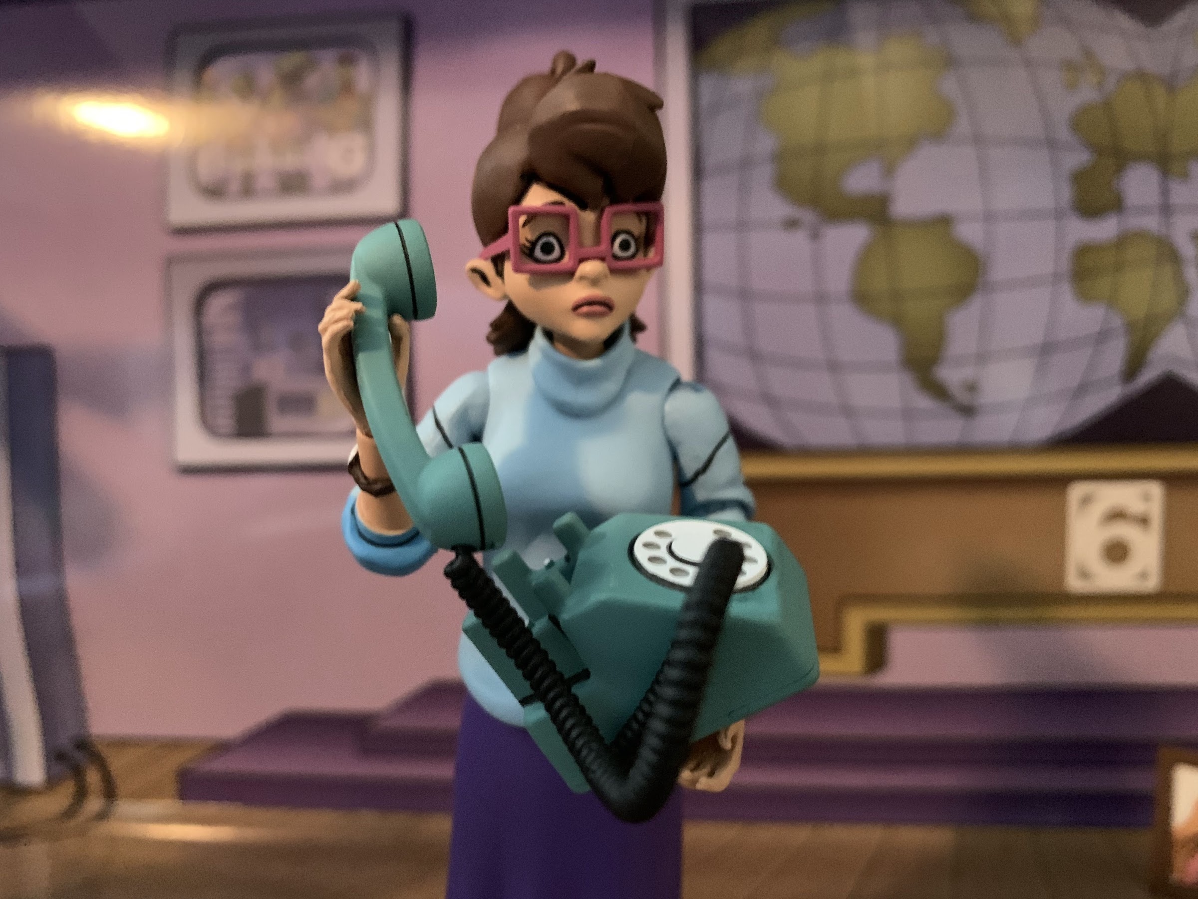
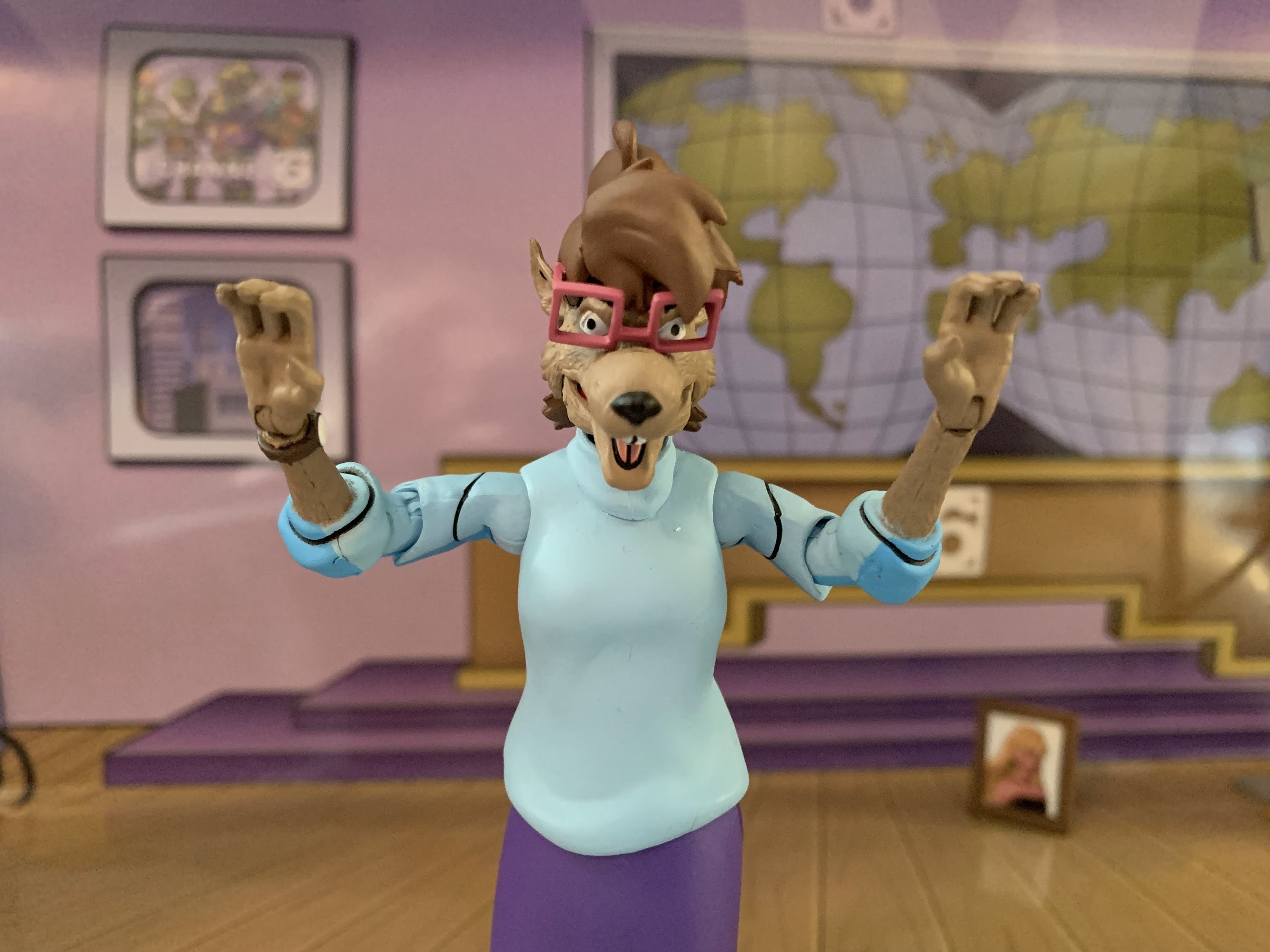
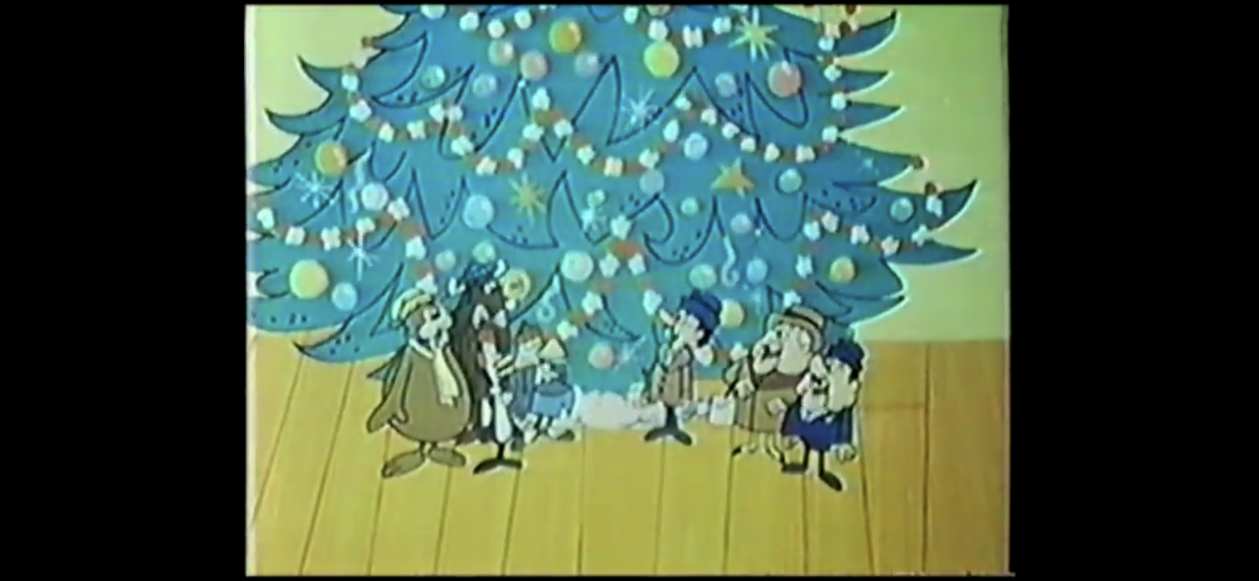
Baldy, an eagle, and Yakkity Yak (both voiced by Kenny Delmar) enter the auditorium to ask what’s going on. Tennessee shows them the tree, and the two immediately start to panic as they know Stanley is going to be pissed when he sees what Tennessee did to his tree. Tennessee Tuxedo, turning to his catchphrase about never failing, tells them not to worry as he’ll just chop down another tree. We then jump to the new tree being setup and it’s actually quite lovely. Now, they need to trim it. Tennessee heads up a ladder and instructs Yak to start tossing him ornaments, only Yak’s aim is terrible and they just smash on the floor. Yak then decides it would be better to simply hand him the ornament and Tennessee places it at the top of the tree. He’s so enamored with the ornament’s beauty that he descends the ladder to admire it and promptly falls onto the other ornaments, breaking half of their allotment.

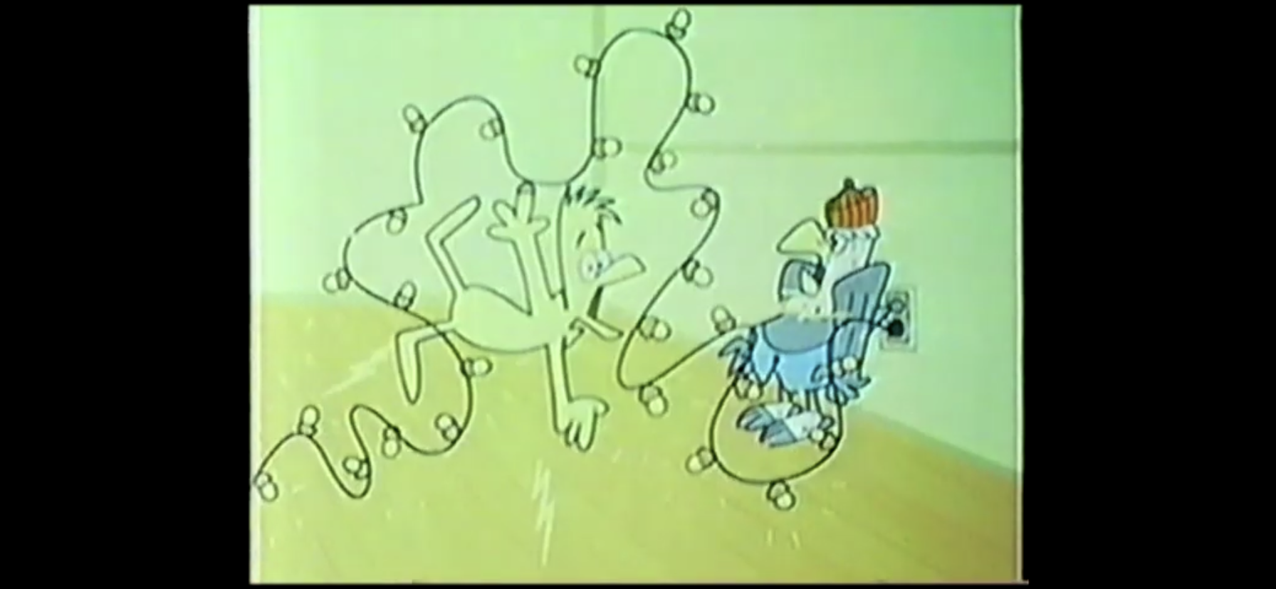
Tennessee places the rest on the tree and searches for compliments, but Yak is honest in his assessment that it’s pretty bare. He assures him it will look better with lights on it and turns to Baldy, who is about to plug in a string of lights to test them. As he does so, Tennessee examines the string and notes there’s a missing bulb. He sticks his finger in the socket right as Baldy plugs them in and is soon electrocuted. The effect is super basic as Tennessee just slowly flashes different colors before a cloud of smoke explodes.

Electrocution gags will get a lot better over the years.

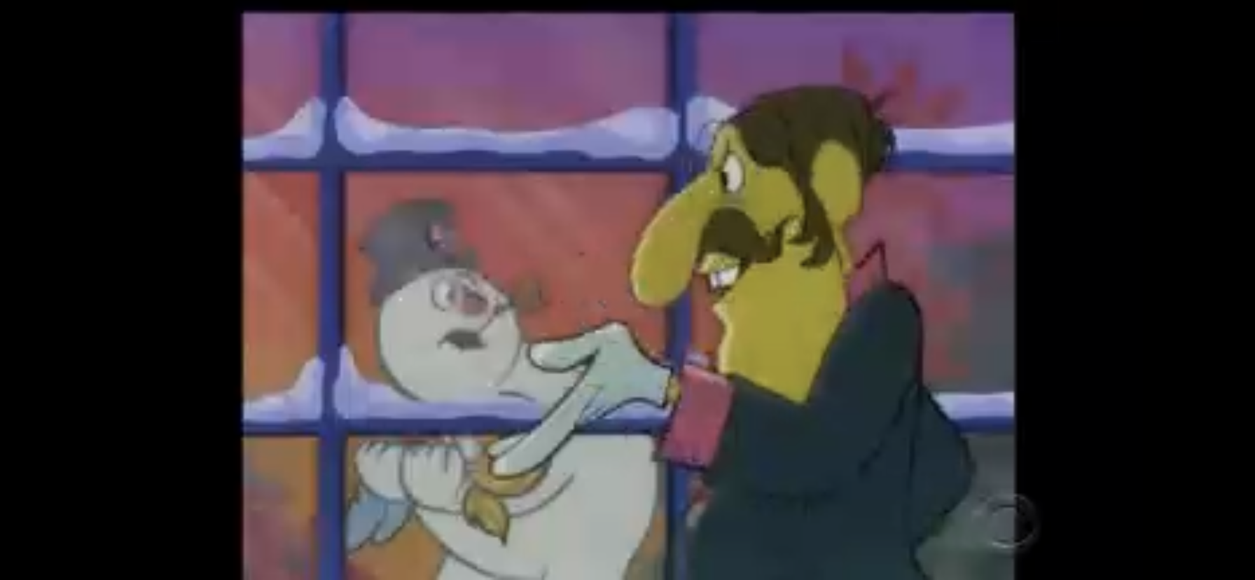
With the tree bare and lacking lights, the only thing that can save it now is the star. Tennessee heads up the ladder once again to place the star at the top, only the ladder starts to shake right as he reaches to place the star in its rightful place. Despite Chumley telling him to be careful, Tennessee predictably takes a tumble right into the tree. The whole thing comes down and Yak quickly notes that now all of the ornaments are broken. Tennessee, with the star stuck on top of his head, rises from the shattered tree and tells Chumley it’s probably time they go seek the aid of Mr. Whoopey.

Your ornament sucks, Whoopey.

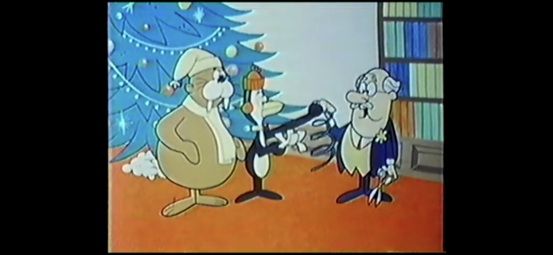
We find Mr. Whoopey casually seated on his desk as Tennessee tells him about their dilemma. Before he can finish, he remarks that Mr. Whoopey has a really fine tree in his office. This sets Mr. Whoopey on his instruction for the day as he tells them how to make shitty ornaments out of paper. The guy loves paper as most of the ornaments and garland he recommends begins life as a piece of paper, which seems really dangerous considering the lights utilized in the 60s were those giant, colored, bulbss that got super hot after about five seconds. He also tells them they can put cookies and candy on the tree as ornaments and shows them how to string popcorn and cranberries using a needle and thread. These guys can’t even work a ladder without destroying a tree, I don’t think they should be allowed to string anything with a needle. The advice all seems terrible, but Tennessee disagrees as the pair enthusiastically head back to the zoo.

Oh Stanley, you’re in for a treat!

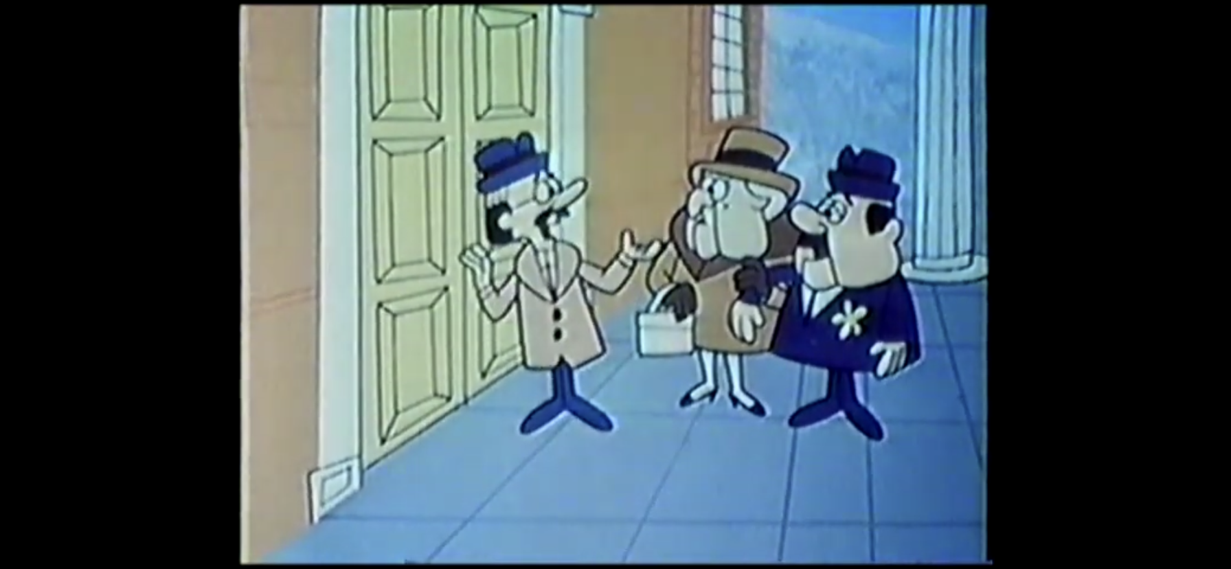
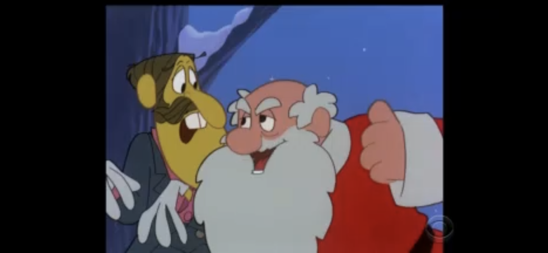
We then see Stanley leading the mayor and his wife to the auditorium. As Stanley opens the door, he boasts about hiring professional decorators to trim the tree, but then looks at his tree in horror. He runs in wanting to know what happened to all his ornaments, but soon realizes the tree looks pretty good. And it does, and it magically has non homemade ornaments on it as well as the popcorn garland. They also apparently found more lights. The mayor’s wife really likes it and declares it the prettiest tree she’s ever seen prompting the mayor to inform Stanley they’ve won the contest. Tennessee then doffs his cap (which has switched back to his normal, yellow, hat) to wish everyone a merry Christmas and the whole gang assembles in front of the tree (and Tennessee’s hat has switched back to his red stocking cap) to resume the awful carol the episode began with.

Looks like it’s time to start singing again.

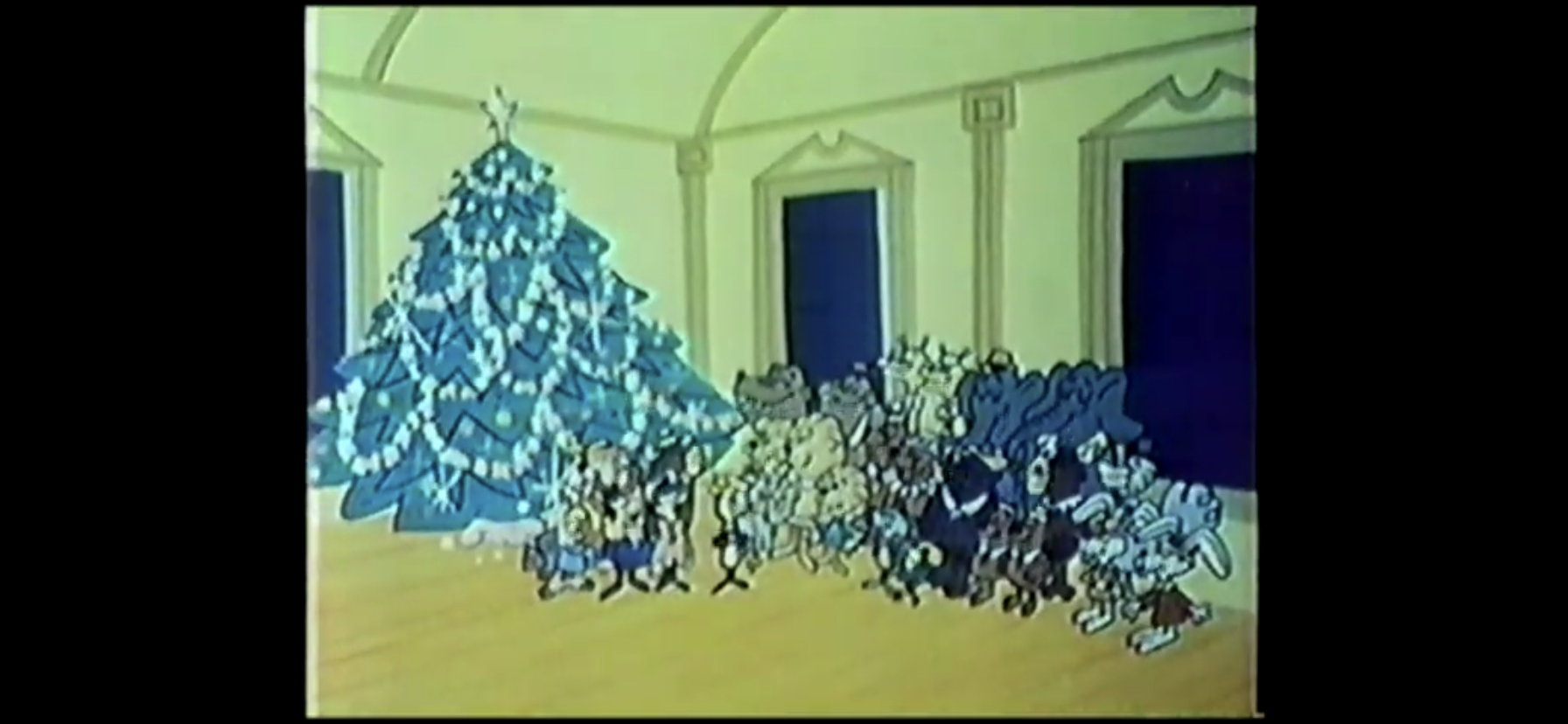
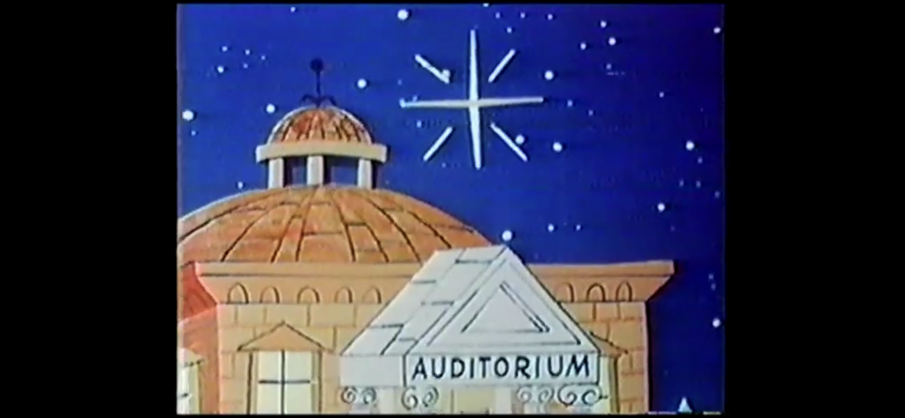
As they all sing, the other zoo animals start popping their heads out of their homes. They all react favorably to hearing the carol as they all start to leave and descend upon the auditorium. They enter and the carolers inside appear happy at their arrival and soon we have a large group shot of everyone singing the song. Tennessee, who now has his yellow hat again (this is insane!), acts like he’s conducting their choir or something. The cartoon closes on an external shot of the auditorium at night and then zooms in on the Christmas Star which sparkles in the night.

And now everyone gets involved!

“The Tree Trimmers” feels like an episode that was written in all of five minutes. Someone must have got the mandate to do a Christmas episode, and the writers quickly came up with Tennessee and Chumley struggling to properly decorate a tree. Even the educational segment was rather weak as Mr. Whoopey gives lazy advice on how to cut paper into half-assed ornaments. Seriously, if your kid came home from school with one of those you’d probably feel cheated. Everything turns out fine in the end because it’s Christmas and it has to. At least the song, even if it’s mediocre, appears to be an original rather than some public domain Christmas carol.

Being a cartoon from the 60s intended for television, it’s probably no surprise to hear that this one is pretty rough looking. The animation is very basic as the characters only move when necessary and they just sort of slide across the screen with no bounce in their step. There’s no wasted movement or embellishment anywhere. I can at least appreciate that they made the effort to put everyone in mildly festive attire with Tennessee and Chumley ditching their usual hats for winter ones. The vocal cast is okay and I do like how Adams plays Tennessee and Stanley is a well-acted antagonist, even if he’s barely in this cartoon. The show wisely lets Adams dominate every scene as the other actors really aren’t asked to do much more than just set Tennessee up for whatever comes next.

The final shot rests on a star. I would have preferred Santa.

It probably comes as no surprise to anyone reading this in 2021 (and beyond) that Tennessee Tuxedo and his Tales is not airing on any network these days. I don’t think it’s even streaming anywhere. The show was made available on DVD by Shout Factory in 2012 so if you want to own this episode, and every other episode, you can. It’s out of print though so it’s not exactly cheap, but also it’s not the sort of thing that has become insanely expensive. It can basically be had for around 30 bucks brand new, which is probably right around the original MSRP. If you were to find it used, maybe you could get it for 20. I don’t think it’s worth it, but at least the option is available for those who do like this show or just like to amass a large collection of animation. This episode can also be found on the internet for free, if that’s your preference. It’s not likely to bring about those lovely Christmas feels, but it’s certainly a Christmas themed episode and since it’s only about 10 minutes you probably won’t feel like you wasted your time. At least not much of your time.

Can’t wait until tomorrow for more Christmas? Check out what we had to say on this day last year and beyond:

Dec. 2 – Toy Story That Time Forgot

When the credits started to roll in 2010 signaling the end of Toy Story 3 I think most who were watching it assumed this was “good bye.” The toys which had captured the hearts of movie-goers going on two decades were saying good bye to their former owner and playmate, Andy, and so too were…

Keep reading

Dec. 2 – Robot Chicken’s ATM Christmas Special

This is going to be a bit of an experiment. These recaps the last few years have basically focused on cartoons or live-action shows in which a story is told over some duration. I have so far avoided sketch shows, not purposely, but it’s definitely been in the back of my mind that doing a…

Keep reading

Dec. 2 – The Simpsons – “Grift of the Magi”

Talk to any fans of The Simpsons and they’ll likely have an opinion on when the show ceased to be great. For most, that occurs sometime after Season 8 of the now 30 season show. Some will argue that, while it may have been past its prime, it was still watchable, reliable, programming for a…

Keep reading

Dec. 1 – Frosty the Snowman

Original air date December 7, 1969

Welcome back, lovers of Christmas, to the 7th edition of The Christmas Spot! If you missed the introduction a few days ago, we’re doing things a little differently this year. Yes, you’re still getting a dedicated write-up each day through Christmas about a beloved or not-so-beloved holiday special, but this year we’re also going retro by this blog’s standards. In order to shine a brighter light on the best of the best in the field of televised Christmas specials, we’re revisiting some of the 25 best as laid out in 2015 and reaffirmed just a year ago on this blog. When the subject was first discussed, the format for The Christmas Spot was to do a mini review of each special as opposed to the full-on walkthrough it has turned into. It didn’t make sense that so few words were reserved for the best the holiday had to offer, so we’re going to start rectifying that this year. Not every one of those inaugural 25 are being rehashed this year, just a select few of my choosing. Maybe next year we’ll look at some more, maybe we won’t, it’s all rather fluid.

Today, we’re kicking things off with a lookback to one of those 25: Frosty the Snowman. The Rankin/Bass classic was originally ranked at number 15, but was dropped down to 19 last year. Being in the top 20 is still nothing to sneeze at as Frosty is here to stay.

The 1969 classic is now one of the longest running Christmas specials on television today. For the past several years it has been the unofficial start of the holiday special season as CBS has chosen to air it the day after Thanksgiving for quite awhile now. As streaming services continue to take over, the days of the event special may be coming to an end. Last year saw Charlie Brown and the gang get axed from a network timeslot all because Amazon scooped the property up and intended to put an end to the tradition. What happened was people were so pissed about missing out on annual viewings of the Peanuts holiday specials that Amazon rethought its position and made the Thanksgiving and Christmas special available for one night only each on PBS. They aired at 7 EST and were barely in prime time, but I suppose it’s better than nothing. ABC also seemed to reduce their holiday output since it now has Disney+ to stash its specials on. It’s likely we’ll continue to see massive corporations hoard these valuable pieces of television history and what was once a shared, viewing, experience each year is just another thing to binge at your leisure.

For now, we still have Frosty. The special, which is obviously adapted from the song written by Walter Rollins and Steve Nelson, was written by Romeo Muller and directed by the tandem of Arthur Rankin and Jules Bass. It’s narrated by comedian Jimmy Durante and features voice work from Jackie Vernon, Paul Frees, Billy De Wolfe, and June Foray. It’s a special that always stood out to me as a kid because, unlike Rudolph the Red-Nosed Reindeer, it was a cel-animated production from Rankin/Bass instead of stop-motion. I feel like everyone associates Rankin/Bass with stop-motion, but their more traditional animated works are pretty noteworthy as well. When it came time to animate the special, Rankin/Bass turned to Mushi Productions, the animation studio based in Japan founded by the legendary Osamu Tezuka. Yes, Frosty the Snowman is basically anime. It would be more obvious if Rankin/Bass had not hired Paul Coker Jr. to first design the characters for the special, but you can certainly see the Japanese influence in several places.

Jimmy Durante will be our guide through the story, and song, of Frosty the Snowman.

Frosty the Snowman opens in idyllic fashion. Snow is falling and the people of this small community are busying themselves getting ready for Christmas. Our narrator, Jimmy Durante who is animated to resemble himself, explains that this is the first snow of the season and that it’s actually a Christmas snow. Why is that important? Apparently, when the first snow of the season happens to fall on Christmas Eve, something wonderful is bound to happen!

Our attention then shifts to a small school house. The kids are restless as they want to go play in the snow and their teacher (voiced by June Foray) has organized a Christmas party. Yeah, those days were always long even if they weren’t filled with education as no one wants to be in school so close to the holiday (and basically no one goes to school on Christmas Eve these days). The teacher informs the students that she’s hired a magician to entertain them. Considering the teacher had to pay out of pocket to bring this guy in, you can probably guess just what kind of magician a teacher’s salary can afford.

Behold! The worst magician in the world!

Professor Hinkle (Billy De Wolfe) is introduced by the narrator as probably the worst magician in the world. He begins his routine by tossing some eggs into his “magic” hat, says some traditional magic words, and then turns the hat upside down only for the eggs to fall out and smash on the floor. The kids are disappointed, which is perhaps the most unrealistic aspect of this special about a snowman coming to life as any group of kids I know would have laughed at a trick going so poorly. Hinkle then tries to retrieve a rabbit out of the same hat, which is going about as well as the egg trick. Declaring the hat is only fit for the trash can, he chucks it towards the waste basket only for the rabbit to finally pop out. Before the kids can react to the reveal of Hocus Pocus, the bell rings and they storm out of there basically trampling the magician in the process.

Once outside, the kids race through the snow. Most apparently did not consult a weather report earlier in the day as several are wearing shorts. One girl is sporting short sleeves and a pink skirt with suspenders which really can’t be comfortable. Some of the boys immediately start building a snowman, and it’s during this process we really get to meet Karen (who was voiced by Foray in the original, now lost, airing and re-dubbed by Suzanne Davidson) as she volunteers to build the head for the snowman. She declares it’s the most difficult part of snowman construction, and even challenges the boys to ask anyone on the subject for confirmation. Well Karen, I’ve built a few snowmen in my day and I have to strongly disagree. The head is quite possibly the easiest part, especially if you’re building a snowman like Frosty who has actual legs! Seriously, that’s damn near impossible.

Never in my life have I been able to make a snowman half as good as what’s present in cartoons.

Once the snowman is assembled, the kids gather around to choose a name. After some truly wretched suggestions, including an unintelligible suggestion from one kid who apparently just speaks in sound effects, Karen proposes Frosty and the kids all seem to agree this is a fine name. They then clasp hands and spontaneously break-out into song. Either they’re all amazing at improv, or they’re just as unoriginal as most kids and they named their snowman after a song that already exists in their world. While they’re singing, the rabbit Hocus Pocus comes bounding out of the school house in the discarded hat which Karen tosses on Frosty’s head to complete his ensemble. Much to everyone’s shock, the hat brings Frosty to life as his lifeless, coal, eyes become whole and he greets everyone with a “Happy birthday!” Considering it is essentially his birth day, it’s an appropriate greeting, if a bit unexpected.

Professor Hinkle is there to witness the whole thing as he had been chasing Hocus. When Karen declares the hat must be magic, Hinkle decides he wants it back as a fortuitous wind blows it off Frosty’s head and into his waiting arms. When the children protest, Hinkle plays dumb and claims he didn’t witness any such nonsense. He admonishes the children informing them that when they’re grown up they’ll understand snowmen can’t come to life. As he takes off with his hat and rabbit, the kids turn forlornly towards Frosty and reassure the snowman that they did see him come to life. Durante then comes back in to sing a jolly rendition of “Frosty the Snowman” as we’re finally shown the opening credits for the special and the major network gets to toss some commercials our way.

Get a load of this asshole.

When we return from the festivities, our informative narrator makes it clear that Professor Hinkle was wrong to take Frosty’s hat. He doesn’t elaborate, but I guess we’re to hold him to his momentary anger at the hat when he tossed it at the garbage. That seems a bit extreme, but it’s important the viewer hates this guy (and denying life to a snowman is a pretty shitty thing to do) as Hocus Pocus is about to take action. As the magician walks past people on the street greeting them happily, Hocus quickly swaps the hat with a wreath and bounds off.

When Hocus returns to the site of Frosty’s awakening, the kids are still just standing around accepting defeat. Karen notes the hat is back, seemingly oblivious that it was the rabbit who returned it, and she places it back on Frosty’s head. He once again greets the children with a “Happy Birthday!” and then begins to question his existence. Rather than be burdened by some truly out of this world thoughts on who he is and why he’s here, he just humbly accepts that life has been granted to him and then begins to test out his bodily functions. No, nothing weird or gross, mainly just juggling and checking if he’s ticklish. Okay, that does sound a little odd. His right hand also sprouts an extra finger so he can count to five (like most cartoon characters, Frosty only has four digits normally), but that’s just one of many odd animation quirks we’ll endure.

Frosty admiring his own rump.

Once Frosty is satisfied that he’s alive, the dancing can commence! We get a little more of the song as sung by Jimmy Durante as we’re basically just going to hear a verse here and there until the special is over and the song concluded. Once they seem to get over the thrill of life, Frosty wipes some “sweat” off of his head and takes note of a nearby thermometer. I question its accuracy, as it appears to be pushing past 90 degrees Fahrenheit, but the point is made and that’s snow is destined to melt, which means Frosty is destined to melt. This is where the special takes a hard pivot from the song. The lyrics make it sound like Frosty accepts his fate as all snowmen must melt and resigns himself to have a good time until the moist, dripping, splash of death consumes him. In the special, he immediately decides death is quite a bummer and a thing to be avoided. Where can a snowman cheat death? Why, the North Pole of course! When Frosty shares this bit of info the children decide they have to help him get to the North Pole, so they have a parade! All right, that part is a little weird, but I guess if you need to head to a train depot you might as well make a parade of it.

We deserve a sequel that explains if this guy ever got his whistle back.

As Durante sings more of the song, we see Frosty lead the children through town (with Hocus in tow) which contains some visual gags of people reacting with shock at the sight of a walking, talking, snowman. The parade comes to a halt when they encounter the traffic cop the song makes mention of. He’s directing pedestrian and automobile traffic and has to scream at Frosty in order to get him to stop. This begins a 1920s-esque bit of shtick as the cop questions Frosty on the various signs and signals all around him, never once seeming to realize he’s speaking with a snowman. Frosty is ignorant of basically all things, and Karen has to explain he just came to life and the cop then backs off. After instructing the gang to move along, he remarks to himself that snowmen are so stupid when they first come to life. Only then does he realize how absurd the whole situation was as he exclaims to himself “Come to life?!” and swallows his own whistle.

The parade finally reaches its destination, a train depot. The clerk (Paul Frees) working the ticket counter is fast asleep when the kids approach requesting a ticket to the North Pole. He then springs into action as he stamps a whole sleeve of tickets remarking how their journey will take them through the Klondike and for some reason mentions aurora borealis. He’s clearly lost in his work. He returns with a stack of tickets, as this journey is going to require quite a few trains, and then requests payment: three-thousand dollars and four cents (including tax). When Karen sheepishly responds that they don’t have any money, the enraged clerk slams his fist on the table causing the whole pile of tickets to spring up and wrap around him. He then utters perhaps the most quotable line in the entire special, “No money, no ticket!”

He’s so angry that he just closes up shop and quits the business right here and now.

Well, if you can’t buy a ticket to the North Pole, just do like the old hobos do – stow away! One of the kids takes note of a refrigerated box car on a train apparently heading north. That’s good enough for Frosty as they inspect the car. It’s full of ice cream and frozen Christmas cakes, which we’ll find out is a splendid way to travel for a snowman. Frosty climbs aboard, and so does Karen. All of the other kids have sense enough not to attempt to travel to the North Pole on Christmas Eve, and Frosty is too dumb himself to point out that Karen climbing aboard is a bad idea. She seems to think she can get there and back before supper which begs the question how old is Karen supposed to be? Hocus Pocus also climbs into the car as I guess he would prefer the North Pole to whatever town they’re currently in. As the train speeds off, we see there’s another stow away on board – Hinkle!

After the break, we take a look inside the box car to find a contented snowman and relaxed rabbit, but a freezing girl. It takes Frosty a few seconds to realize that this is a bad situation for a little girl. Proving he’s not some selfish jerk, he elects to scoop Karen up in his arms and leave the frozen confines when the train has to stop at a crossing (the animation makes no sense as the train goes past the junction, then stops, and an express train goes past behind it). Hinkle, still clinging to the caboose, sees the trio hop off as the train starts to leave and thinks they’re trying to ditch him. As he shouts at them “No fair!” it’s hard to tell if Frosty actually takes note of him or not. Hinkle is then forced to jump from a moving train if he has any hope of getting his hat back. He hits the ground and stats flopping down a snow-covered embankment before finally crashing into a tree. As he falls, the person doing the sound effects just goes nuts as there appears to be no rhyme or reason to the sounds we’re hearing, but it certainly sounds painful for Hinkle!

He deserved that.

Frosty, Karen, and Hocus wander through the cold, darkening, woods as Frosty frets about finding warmth for Karen. Hocus, through pantomime, suggests he build her a fire, but that’s not something a snowman can do. They press on and eventually come across a bunch of animals. They’re slightly personified, sort of like Hocus, and they’re decorating the forest for Santa’s arrival that night. It’s a bit preposterous, but I suppose not out of character for a Christmas special. Frosty asks Hocus to communicate with the animals about building Karen a fire. He does as he’s told, and soon the deer, squirrels, and such get a roaring fire going for Karen to get warm by. It’s pretty damn goofy to behold.

As Karen warms herself by the fire, Frosty stays far away. With Hocus by his side, he contemplates how he can get Karen home and himself to the North Pole. Hocus acts out some suggestions including the marines and President of the United States. Hocus then covers his face in snow like a beard and struts suggesting Frosty seek the aide of Santa Claus. Frosty thinks that’s a great idea and smiles at the camera apparently happy with himself. Hocus is ordered to be a Santa look-out, and once the guy flies overhead, he’s expected to somehow get his attention even though he’s a fluffy white rabbit standing amongst a bunch of snow.

It’s belly-whopping time!

Unfortunately though, a roaring fire in a dark forest is quite visible and Hinkle soon stumbles upon Karen. He taunts her before laughing then demonstrates he has some amazing lungs as he literally blows the fire out. Frosty comes running over and Hinkle demands he hand over the hat. He makes an empty threat, which Frosty calls him on, and Hinkle just stamps his feet like a toddler screaming to get his hat back! When he makes a lunge for it, Frosty deftly sidesteps him and drops down onto all fours. Frosty tells Karen to jump on his shoulders and our narrator interjects that Frosty, being made of snow, is the fastest belly-whopper in the world! He basically shoots off like a rocket across the snow, down a small hill, up another, and down again leaving Hinkle far off in the distance.

This is where Hinkle goes from annoying to evil.

The ride comes to an end at a random green house in the middle of no where filled with poinsettia. Karen is pretty cold from the ride, and also likely because she’s currently being cradled in the arms of living snow, so Frosty decides to bring her inside. She reminds him he’ll melt in there, but he suggests he’ll only stay in to melt a little and makes a joke about losing weight. Hinkle then arrives, suggesting he not only has tremendous lung capacity, but he’s also really damn fast. Honestly, I feel a little betrayed by the narrator who said he was left far off in the distance just seconds ago. Anyway, Hinkle sees the snowman in the green house and promptly slams the door shot. It must lock from the outside, or Frosty just isn’t very confrontational, because they’re trapped. Hinkle laughs devilishly proclaiming the hat will soon be his as Frosty looks on with horror.

Up in the sky, Santa passes by! Maybe he’s just out for a quick preflight check or something, because he only has four reindeer and no sack of presents. He comes across the woodland critter celebration where he is informed by Hocus what’s going on with Frosty, Karen, and the magician. Hocus leads the big guy to the green house, but when they arrive they’re met with a terrible sight. Karen, on her knees sobbing, is beside a puddle and Frosty’s “parts” are floating in it. I feel like there’s a darker cut of Frosty the Snowman where we watch the poor snowman melt and Karen is forced to look-on helplessly. That girl has seen some shit and Hinkle, who presumably watched it all unfold too, is quite an evil soul.

She’s going to need some therapy.

The narrator tells us that Santa is too late, but he breaks the fourth wall to correct him. With a big, booming, voice, Santa (Paul Frees) shouts “Nonsense,” at the suggestion of being too late and then sets to comforting Karen. He tells her that Frosty, being made of Christmas snow, can never disappear completely. This does little to cheer up Karen since her friend is still a puddle, but Santa just chuckles and opens the green house door. He commands Frosty to basically pull himself together as a cold wind enters the green house, scoops up Frosty’s parts, and recreates the snowman outside the green house. The only thing left to do is return the hat to Frosty, but now Hinkle makes his presence known demanding the hat be returned to him.

Santa, who almost looks ready to throw-down, instructs Hinkle not to lay a finger on the hat. Rather than threaten him with the violence he so richly deserves, Santa just tells him he’ll never bring him another Christmas present so long as he lives. Earlier, Hinkle seemed to think a magic hat would make him a millionaire magician so I don’t know why he places any value on future Christmas presents, but he’s not the sharpest guy. He immediately begins to pout and kicks a can that mysteriously appeared in the snow before remarking, “We evil magicians deserve to make a living too.” Santa then tells him that if he goes home right now and writes one-hundred-zillion times that he’s sorry for what he did to Frosty, then maybe he’ll get a new hat for Christmas. Despite being handed an impossible task, Hinkle seems pretty happy with this arrangement as he starts hopping up and down with excitement. In probably my other favorite quote from this special, he hollers “Sorry to lose and run, but I’ve got to get busy writing! Busy! Busy! Busy!”

Santa will make everything right!

Santa slips in a little chuckle as Hinkle disappears into the night, then turns his attention back to Frosty. He returns the hat, and once again Frosty greets everyone with a “Happy birthday!” I guess it still is his birthday, after all. We then slip into a bit of a montage as the song returns. The group celebrates a bit before getting back to business. Santa, after all, has a long night ahead of him, but he still finds time to return Karen home. Maybe he’s a little ticked off though about the extra work on Christmas Eve since he leaves her stranded on her roof before taking off with Frosty. The narrator then pops in to let us know that Frosty would return every year after that and the whole town would have a big celebration in his honor. The song gets into full swing now and we basically see everyone from the special in Frosty’s parade, including Professor Hinkle in a new hat. Jimmy breaks from the song again to wish us all a very, merry, Christmas as Santa swoops down in his sleigh (again, only four reindeer) to retrieve Frosty as the song ends. Frosty gets the last word in as he alters the closing line of the song, “I’ll be back on Christmas Day!”

Santa finds time to fly past the moon, now how the hell is Karen getting off of that roof?

Frosty the Snowman is sort of like the Christmas special baseline. It’s cheerful, charming, magical and it has some memorable characters. It helps that it’s anchored by the classic song, which is catchy enough and isn’t as overplayed (or annoying) as other Christmas songs. It might not be anyone’s favorite Christmas special, but I don’t think I’ve ever met anyone who hated it. There’s definitely some goofy logic at times, and the animation is merely adequate. This is from the 60s so I think most of the animation warts are only really apparent with modern eyes. I don’t think it’s as good looking as How the Grinch Stole Christmas, but it’s definitely better looking than A Charlie Brown Christmas. And it has character with the design of Frosty being simple, but pleasant, and Hinkle looking quite memorable. About the only thing I don’t like when it comes to the visuals are the deer. They just look stupid, but not offensively so.

Rankin/Bass seemed intent on transforming Frosty from a character that was just a wintertime creation to a Christmas icon. As much as the old song is associated with the holidays, it doesn’t make mention of Christmas at all. Maybe that’s why when Rankin/Bass did return to the character with Frosty’s Winter Wonderland they left Christmas out. They did produce Rudolph and Frosty’s Christmas in July, one of the lesser stop-motion efforts from the studio, but otherwise Frosty has mostly left Christmas behind. Today this special is almost always joined by the non-Rankin/Bass production Frosty Returns every year, even though that special has nothing to do with Christmas. In 2005, Classic Media produced another pseudo-sequel titled The Legend of Frosty the Snowman. That one features a Frosty that looks identical to the one presented here (and that’s because Classic Media bought up the Rankin/Bass library), but otherwise tells a new story and also has nothing to do with Christmas.

He says he’ll be back on Christmas Day, but it’s an empty promise.

This Frosty the Snowman is truly the only worthwhile one. I don’t particularly care for the other animated specials, and the feature with Rudolph is a tremendous slog that shouldn’t be viewed by anyone. This one though is an annual tradition and no Christmas season goes by without at least a viewing of Frosty the Snowman in my house. It’s become a favorite of my kids, so I actually am subjected to it a lot each year and I’m totally fine with that. If you’re hoping to catch it on television this year, check cable and keep an eye on CBS. They already did the first airing, but often will re-air it later in the month. It’s one of the harder ones to miss.

Can’t wait until tomorrow for more Christmas? Check out what we had to say on this day last year and beyond:

Dec. 1 – DuckTales – “Last Christmas!”

It’s that time of year once again! Every day goods are a little pricier, egg nog is invading the dairy case at every grocery store, and red and green versions of every candy in existence flourish in the seasonal section of department stores. Yes, it is Christmas time and it would be obnoxious if it…

Keep reading

Lego 21330 – Home Alone

Just in time for the holidays!

I love building Lego sets. It’s something I didn’t completely realize until I was an adult. It just puts me in a very serene sort of mood when I’m constructing some massive Lego set. And I liked doing it as a kid, I just never got the big sets when I was young. Only as an adult have I been able to grab things like the Ghostbusters Fire House and The Simpsons home. The only drawback is what to do with these things once they’re complete? These things aren’t like jigsaw puzzles where you put them together then toss them back in a box. They’re like sculptures, and also function as toys. I’m not going to just build them up to tare them down, but finding the space to display them is quite the chore.

Because of that, I try to limit my Lego purchases. If they ever went back to The Simpsons I’d definitely take a look, but mostly I try to stick to Disney. And by Disney, I mean theme park inspired sets. And that’s because my wife and I are really into that sort of thing. And I’ve been doing fine in that regard, but then Lego had to go and do something like create the house from Home Alone in Lego form.

If these product shots don’t make you want this set then nothing will.

Since the sale of 20th Century Fox to Disney, Home Alone is now technically a Disney movie and this is technically a Disney set. More importantly though, it’s Home Alone! I loved that movie as a kid, I still enjoy it as an adult, and now my own kids love it. We’ve already watched it a few times this fall because it’s really become a favorite of my daughter’s. She’ll want to watch it in June, she doesn’t care that it’s a Christmas movie. When I saw Lego was making this thing a reality, I had to get it: for myself, for my wife, and definitely for my kids. When it went up for sale, I pounced, and then I waited. I wasn’t sure when to spring it on my kids, and eventually I settled on the day after Thanksgiving. That’s the day I devote to decorating for Christmas and this year it was rainy, so it ended up being a good thing I had a Lego set to work on since setting up lights outside was a no-go.

It’s a big house in the film and pretty big as a Lego set measuring 12″ wide, 10 1/2″ high, and 8 1/2″ deep.

The Home Alone house is based on the home of the McCallisters as seen in the films Home Alone and Home Alone 2: Lost in New York. It’s definitely more evocative of the first film since that film takes place almost entirely within the house as young Kevin has to defend himself against two robbers, the notorious Wet Bandits! Bringing the house into Lego form requires nearly 4,000 plastic bricks leading to a rather large set. The build process is spread out over 24 steps, ingenious as this basically doubles as an advent calendar, and it’s part of the Ideas series and was designed by Alex Storozhuk so it includes a large instruction manual with background info on the design. It also includes five mini figures: Kevin, Kate, Old Man Marley, Harry, and Marv. And it’s not just the house, as it also includes the tree house and the plumber’s van that the Wet Bandits use as a cover for their illegal activities.

Opening it up only makes it bigger.

Building the set was fairly painless. All of the instructions are clear and the build order was pretty logical. It starts with the van and then moves to the house building from the ground up. I worked on it at a leisurely pace over the long weekend, sometimes by myself and sometimes with my kids, and by Sunday night I was finished. The steps are organized in such a manner that there’s no tedious parts. The outer walls and roof are spread out by working on interior objects and the like to keep things fresh and fun. And if you’re a fan of the film (and I assume you are if you’re interested in this) you’ll have a ball as you uncover things pulled directly from the film.

The placement of the rear door is not screen accurate, but at least you can still shoot robbers in the dick.

Now, because we’re taking a large house and trying to cram it into a not-to-scale replica, some sacrifices have to be made. Lego houses routinely omit the basements, and that’s because they would look pretty weird if every house sat on top of a foundation. Unfortunately, the basement plays a large enough role in the film that it can’t be ignored, so Lego figured out a compromise. The house looks the part from the outside and even includes a section that breaks the rectangular shape by sticking off the back. Lego elevated that part, which is the kitchen in the film and in the set, so they could put a small piece of the basement underneath. This means you lose the steps that Marv slips down leading to the back door and the kitchen is actually elevated above the dining room inside. There are also no stairs going up from the basement into the house proper, so in order to do laundry the McCallister’s have to walk outside and around the back of the house to access their basement. It’s not perfect, but Lego made it work well enough and doing it this way means they were able to put the laundry chute in the kitchen so an iron can fall and smash Marv in the face.

And you can still make sure Marv’s face gets smashed with an iron.
Kevin’s dining room where it’s always 9 o’clock.

The house is constructed for display and for play so there are four hinged pieces on the front. This allows the house to open wide for a view of the inside. On the right, is the dining room complete with grandfather clock and an uneaten macaroni and cheese dinner on the table. Behind that is the previously mentioned kitchen containing a refrigerator (with more mac and cheese dinners), island counter, television, microwave, rear door with doggy door (despite the family apparently not owning a dog or cat) and sink. It’s cramped compared to the massive kitchen in the film, but it looks the part. There’s also two boxes of pizza from Little Nero’s, one closed and one that’s opened, though the pizza inside appears to be topped with pepperoni, olives, etc. Big mistake, Lego, as Kevin only eats plain cheese!

Totally not Michael Jordon.
Oh, Kevin.

In the center of the house is the staircase and Kevin can ride his toboggan down it and out the front door, though his figure throws off the weight of the sled and it rarely works properly. To the left of the stairs is the living room. There’s a fireplace, Christmas tree, lounge chair, and a model train set. A not Michael Jordon cutout is affixed to the train and it, along with a mannequin on a record player in the dining room, can rotate by working a handle on the outside of the house. This is probably the favorite feature of my kids. The mannequin is more of a bust though, which is a bit of a bummer, but at least the gag is represented.

Hey Buzz, we’re going through all of your private stuff…

On the second floor are the bedrooms we saw in the film. Now, Kevin has four siblings to go along with two parents, but we only see a bedroom for his brother Buzz and one for his parents. Naturally, Lego saw fit to only do those bedrooms so where everyone else sleeps is a mystery. Buzz’s room is on the left (when looking at the house from the front) and there’s a desk in there with a Christmas catalog on it (sorry, no Playboy) and shelves that can be made to “fall down” by pulling on a tab. There’s money, firecrackers, and a motorcycle helmet plus an old fashioned rifle mounted on the wall to represent the BB gun (there’s a second gun included so you can arm Kevin without needing to steal from Buzz). There’s also a chest to represent Buzz’s private stuff, but inside is just a heart. His girlfriend’s photo is mounted to the wall for Kevin to “admire.”

This is where I point out that this house lacks a shower or bath tub. Kevin must stink.
The master bedroom definitely got the short end of the stick.

At the other end of the floor is a bathroom with stolen toothbrush. I like that Lego used a mirrored sticker for the mirror so your mini figure can actually see himself and scream accordingly. On the other side of that wall is the master bedroom, which is definitely a little cramped. It can’t really be accessed without taking the third floor off of the house, but inside is a neat looking wood stove and a large beg with popcorn and an alarm clock that will forever read 12:00. In the center of the floor are more stairs leading up to the attic. The paint can trap is here and it works reasonably well. It can only fit one can though, but it’s sufficient for taking out two Lego figures.

Kevin’s attic lair.
Kevin’s tree house, equipped with clippers.

The attic is rather cramped, but that’s to be expected. The one in the film was impossibly large, but Lego was still able to fit the hide-a-bed along with a desk for Kevin’s battle plans. There’s also a gumball machine that’s a clever build and the top of the house is on a hinge so the attic can be accessed easily. The rear also features a window with opening shutters so Kevin can zipline to his tree house. The tree house is a simple, but effective, build and serves its purpose as Kevin’s evacuation plan. I’m tempted to try and assemble a second set of bricks to build another tree house to put with my Simpsons house.

Kevin’s escape route is intact.
The other room seemingly most compromised for this form is the kitchen, which had to be downsized significantly from its film presentation, but Lego still managed to fit in most, if not all, of the important details.

The house is really quite impressive. I’m surprised that Lego was able to work basically every room we see in the film into this. Sure, it’s not 1:1 as the living room lacks a TV and the bathroom isn’t connected to the master bedroom as it is in the film. I know in the second film we see a hallway bathroom, but I don’t really care about the second film. I mostly just have nitpicks with the presentation of the house. I’m pretty sure Buzz should have a red or green comforter on his bed since everything in that house is red, green, or white. If you’ve never noticed pay attention next time, it’s kind of crazy. I think Lego just got sick of that color palette as there’s more teal and such in use here and there. I also don’t like the dining room chairs. Lego used these tusks or spikes for the legs and they just don’t support the weight of a mini figure as they just topple over. I would have much preferred something more stable. That’s really it though. The little functions work fine, aside from the toboggan, and there’s even an illuminated brick for the basement furnace that’s pretty cool. The only other Lego “house” that I have is The Simpsons one and for that Lego had to make huge compromises to bring it to life by eliminating multiple rooms. I was expecting similar with this one, but the Home Alone house is far more impressive as far as screen accuracy goes. I will say, there are 34 stickers that need to be applied which feels excessive for an expensive set. It is what it is though and I can understand Lego not wanting to do screen printing for a Little Nero’s design it will never use again.

The basement was also shrunk significantly, but we still get a cool light-up furnace!
Obviously, we need the Wet Bandits to make this set feel complete.

And it’s not the only thing! We do get the mini figures and the van. The van is just okay. It’s more or less in scale with the house, but it is on the small side. The rear opens with a swing-out shutter and the Wet Bandits can store their loot in the back. There are no doors though on the cab so the only way to get Harry and Marv inside is to pop off the roof. It works, it’s just a fairly compromised add-on that could have been done better.

Marley has what he needs: shovel, garbage bin, and beard.
We also have Kevin’s mom, who can smile or scream. I choose scream.

The five mini figures are also serviceable. Kid Lego characters are always hard to get right, and Kevin is really no exception. He’s in his maroon sweater so that at least makes him identifiable. His head also features two expressions: a smile and a scream. The hair piece, which is very blond, seems a little off to me. He does have a scarf and a hat, though the hat is a simple knit beanie and doesn’t resemble the pom-pom one from the movie. I wish he had a second torso for his jacket, but oh well. Kate also doesn’t really do much for me. She just looks like a generic character, but also gets to smile and scream. The Wet Bandits fair better as there’s enough personality to their design to make them apparent to anyone who these characters are. Harry uses the kid legs since he’s so short and he has his gold tooth printed onto his smile. Since he doesn’t have hair, he only gets one expression, but he makes up for it by having a police hat he can swap his black, knit, beanie for. Marv just plain looks like Marv. He gets to feature a smile and a face that’s been burned by an iron, a fun and necessary touch. Lastly, we have old man Marley. He’s got his beard and shovel and looks okay, though they were very generous with the hair. It’s a solid assortment of figures. I don’t think a Home Alone set needed anymore to feel complete (and really, it probably only need Kevin and the bandits), though I would have loved the pizza delivery boy or Johnny and Snakes. Johnny does make an appearance via a decal for the TV.

This set is just a lot of fun, so if you have the means and a love for Home Alone, I say go for it!

Lego’s take on the iconic house from Home Alone is quite impressive and a lot of fun. I suspect my kids will play with this one throughout the holiday season this year and maybe even beyond. I don’t intend to put it away with the Christmas decorations, so this sucker is here to stay. Customizers will likely also find a lot of fun to be had with this by making lights to pair with it, or even that pizza boy I’m missing. He wouldn’t be a hard figure to come up with, and we already have the Little Nero’s stickers. If you’re looking to add this one to your own collection this Christmas, it’s currently available now for $250 through both the Lego Store and the Disney Store. Both show it as out of stock for now, but I would expect more to be on the way. Will they be in time for Christmas? Maybe not, but I bet this thing is just as fun to build in March as it is in December. Merry Christmas, ya filthy animals!


NECA TMNT Cartoon Channel 6 Newsroom SDCC Exclusive Set

BREAKING NEWS: San Diego Comic Con exclusives are now shipping! Full story at 10.

Remember San Diego Comic Con? You would be forgiven if you did not since, like last year’s edition, the event was a virtual one once again. Only unlike the 2020 version, this one came with the expectation it would be virtual. It also coincided with a global shipping crisis, so combine that with the expectation that no one would be in attendance, the various companies who were on-hand for the virtual event had little reason to have actual product ready for distribution. Because as many know, SDCC isn’t about just unveiling new things, it’s about selling exclusive merchandise and for toy producers this is usually a pretty big deal.

When it comes to NECA, the company has had a Teenage Mutant Ninja Turtles themed item for several years now. With the lines expanding to retail just a couple of years ago, NECA is now in a position where it can make its SDCC sets a little more off-beat. Last year, we saw the company release The Musical Mutagen Tour 4-pack of turtles based on their appearance in the so bad it’s good Coming Out of Their Shells tour from the early 90s. That set definitely fit the bill of one that likely would appeal to a small portion of the TMNT fanbase and not create the sort of intense demand we had seen in the past. As a result, some were disappointed to see NECA devote this year’s set to the Channel 6 news crew from the cartoon.

It’s a NECA four-pack, so expect fancy packaging!

Even though the members of Channel 6 were not mutants, or fighters, they were an integral part of the classic cartoon series simply by virtue of being there. April and her co-workers Irma, Burne, and Vernon were in more episodes than they weren’t so the now adults who watched the show have a pretty strong attachment to them. So far, we’ve seen April and Vernon receive a retail release in the toon line, but Irma and Burne have been shut out. Now, they find themselves in an exclusive set and some were a little irritated about it since they’re definitely characters deserving of a wider release. Those concerns seem to be a bit of a stretch though, as the set went up for sale in July and remained in stock for most of the day. And that was just the initial sale as more are headed to Target in the coming weeks minus some additional swag that was part of the online sale (and had to be paid for).

Even though San Diego Comic Con was in July, and this set was sold in July, it’s just now arriving at the homes of those who purchased it likely due to the shipping issues faced by everyone. When the set went up for sale, it wasn’t clear when it would be released or that it was even a pre-sale thing. It was then speculated by NECA that it might show up in October, but apparently even that was wishful thinking. It is what it is, but after the extended wait I’m here to tell you if this one was worth it, or not.

There’s some familiar faces.

The Channel 6 Newsroom set is a four-pack of action figures based on the cartoon Teenage Mutant Ninja Turtles: April (as a mutated cat), Irma, Burne, and Vernon. Two of those figures will be familiar to collectors of this line as April is essentially a repaint with a new head and forearms while Vernon is a re-release of the same figure from the two-pack released back in January. He does have two new portraits, frightened and blindfolded, and the coloring on his clothing is slightly different, but otherwise he’s old news. The new figures are the long requested Irma and the less requested Burne. Irma is the secretary at Channel 6 and someone seemingly always in the orbit of April. She has several starring moments on the show, but despite that this is only the character’s second figure. And the first was this weird yellow and green thing put out by Playmates. Burne is the resident blowhard of Channel 6, a J. Jonah Jameson type who hates the turtles with little reason why. He’s an unlikable sort and not featured as prominently as the other members of the crew, but he’s a pretty essential character too. And like Irma, he only had the one release in the Playmates line, though his was actually pretty good for that line aside from the sculpted hamburger permanently in his hand. And like most of NECA’s four-packs, this one includes a bevy of accessories which, at the end of the day, are likely to be the only exclusive items in here when all is said and done. Well, that and maybe Cat April.

They’re free and ready to…report?

As has been standard with past NECA four-packs, this one comes in a highly decorative package. There’s a slipcase with artwork depicting The Catwoman of Channel 6 that has April in her cat form superimposed over a more scenic pic of the Channel 6 building. Slide that off and you get a five-panel window box that has April on the front as-if she’s broadcasting through a television. The flap is secured via Velcro and once opened the figures are present via the window along with all of their stuff. Mine arrived slightly damaged, which is a bit of a bummer since this is a box I actually intend to keep. The inner box has a puncture in it, though the slipcover is fine. Inside is a backdrop featuring the Channel 6 studio which should actually make for a decent display for the figures when removed. It’s pretty standard packaging at this point, though this one is a bit deeper than the other four-packs and will thus occupy more real estate on your shelf.

April looks fine, though for once I think NECA went too far with the added linework, particularly around her muzzle.
She can strike a good pouncing pose.

Before we get to the new figures, we should probably talk about the familiar figures and we’ll start with Cat April. This is from the episode “The Catwoman of Channel 6” where April is accidentally mutated and then put under Shredder’s control via a collar. It’s a fairly memorable episode, and a worthwhile variant to explore. The figure’s body is the same as the much maligned April we got before. That April is probably the worst figure in the line so far owing to the fact that it’s not in scale with the turtles and the head-sculpt is just not particularly good. This figure repeats the scale issue since it uses the same body, but it at least is able to rectify the head issue by giving April an all new cat sculpt. It looks quite nice and the collar is also present and removable if you pop her head off. The chest and forearms had to be altered as well by painting them to match the fur of her face and to give her claws. Because of that, it wouldn’t be a simple thing to include a standard April head to switch to as NECA would have needed to basically swap out the whole upper torso. And there’s also the matter of the tail which removing such would leave a hole in the figure’s rear. I’m not going to run down the articulation on this one again, but know that it’s fine and you now have a bendy tail to add to it.

Vernon’s back and he has lots of stuff this time.
Old Vernon left, new Vernon right.

Just like April, Vernon is essentially the same figure as before so I don’t feel the need to go over everything again. The only difference with this Vernon is his tie is a different color and his facial portraits are new. The tie thing is cartoon accurate as he had multiple looks. The other colors of his clothing have also been lightened a bit so his shirt is a paler pink and his jeans a lighter blue. That’s not likely to excite anyone, but what I think will please most is the new frightened expression he comes with. Vernon is a character with barely more than two emotions, smug and scared, and this captures that second one very well. It’s the expression I think of first with the character as it seemed to become his dominant trait as the show went along. The first release gave us smug, so it was nice to get this one. The second portrait is a blindfolded one, which looks fine, but has limited uses. Honestly, after taking a few pictures here I probably won’t use it again. I would have much preferred an agitated Vernon giving us a good trifecta of expressions of smug, scared, and angry to go along with the mutant rat parts released previously. I was tempted to grab a second Rat King/Vernon set just so I could have mutant Vernon on my shelf at all times, and now I can!

Irma! Nice of you to join us!
She can’t do much, but at least she can answer a phone.

All right, lets talk about the new characters and first up is Irma. I don’t think it’s a hot take to call Irma a fan favorite. Maybe kids watching the show didn’t think much of her, but I definitely find her as a source of entertainment in the show when I go back to it. Not much about this show holds up on adult viewings, but Irma might hold up the best. She’s depicted in her standard attire: blue sweater, red glasses, long skirt, yellow shoes. For her facial expression, NECA went with a concerned, or worried, look. I think they were aiming for neutral, but it comes off a little awkward. It’s not a bad look for the character as her eyebrows had a tendency to always be in that concerned position, but I wish we got a second portrait for a little variety.

This isn’t going to help her get a date.
She picks up an extra point of articulation with the jaw on the rat head.

Her unique attire makes her articulation a bit lacking. Her head is on a ball peg and she has sufficient range there though her hair keeps her from looking up. Her shoulders are ball-hinges and she has the same style of double elbows as April. Her forearms rotate where they meet her sleeve and her wrists are swivel/hinges. The torso doesn’t feature any articulation, but her waist is joined to the hip with a ball-peg so she can pivot and rotate. Unfortunately, the long skirt kills most of her leg articulation. I think she has ball joints at the hips and double knees below, but you won’t be getting much out of them. At the ankles are hinges and rocker joints.

Shredder always used turtle soup as a threat, but only Burne followed through.

Burne is our other new figure this time around and he’s quite different from his box-mates. Short and squat, Burne is definitely the heaviest figure in the box and the chunkyness of the sculpt makes me think of the vintage toy line. He’s depicted in his standard, very blue, attire of light blue work shirt, dark blue tie, and blue slacks. His default look out of the box is this angry expression where he’s almost twisting his head in rage. The other is a smug look. I’m not sure which I prefer. I think angry when I think of the character, but the smug one looks more on-model to me, though both have their charms. He’s painted cleanly and really looks the part so if you’ve been waiting 30 years for a toon accurate Burne this should do the trick.

“Is this some kind of sick joke?!”

Even though Burne is rather chunky, he’s still expected to be able to move well since he is, after all, an action figure. He’s got a ball-peg at the head with solid range, shoulder hinges, and single-jointed elbows. I thought they might use the same double elbows the other characters possess, but NECA opted for something that’s definitely cleaner. It’s just not super functional as I can’t get his arms to go straight, nor can he really bend past 90 degrees.. He’s got swivels and hinges at the wrist and a ball-joint in the waist that lets him move around pretty well, though he lacks torso articulation. The ball joints at the hips work well considering the roundness of this area of the figure, and NECA did include double-jointed knees that let Burne kick all the way back to his own ass. I can’t seem to engage both joints though no matter how much heat I apply, which is a bit frustrating. The ankles are hinged and pivot, but they’re very stiff and the hinges were painted a dark brown over blue plastic which looks bad once the paint flakes.

“Yeah, that’s MY girl.”

On the quality control front, this set is a bit of a step back from more recent releases. I had a lot of stuck and fused joints out of the box, in particular with Burne and April. Burne’s left knee just didn’t want to do anything, and after heating only the top hinge works. With April, her knees are also a pain point as the top hinge won’t go into a default pose. As you can see in my pictures, her knees are always slightly bent. She arrived that way, and heating them and then plunging them into cold water hasn’t done the trick. Just straight heat makes them rather gummy and are more likely to warp or damage them further if I persist. I’ll just keep her in a pouncing position, I guess. April also has paint-flaking issues on her arms with white or clear plastic beneath. Irma runs into the same thing as do the flesh portions on Vernon. It can lead to an eyesore which just makes me want to leave these figures alone once I find a pose I like and call it a day.

Check out all of the stuff!
These giant cameras are arguably the real stars here.

NECA included a fair amount of accessories with this set, and the big ones are the two studio cameras and lights. They look terrific and the paint on these is excellent. The lights can pivot and rotate and the cameras do the same. They all have plugs too which makes me want outlets that can accommodate them. There’s also a cat with a toy mouse and the cat’s head is on a ball peg so it can move a bit, but nothing special. There’s also a pair of turtle versions of Burne and Vernon that are pretty fun to look at and can be hidden in a display as the cowardly pair try to avoid getting squashed. There’s also a boom mic which is affixed via a non-removable cord to a messenger bag. The bag is similar to Dirtbag’s backpack in that it’s a soft plastic that can actually open.

Now we have a duo of rat people!
I guess the toy mouse is an April accessory?

As for more character specific accessories, we have a few. Irma has a pair of open hands and a wider gripping hand to go with the more relaxed gripping hands attached to her by default. And like the first release of Vernon, she has swappable rat parts to duplicate her mutant rat form. The only nitpick with her though is she should have visible non-mutated flesh by her ankles, but NECA “cheated” and instead made her leggings extend to her shoes rather than make her shins swap. There’s also a rotary phone that’s either for her or Burne, but either one can use it. It’s fun and in the same fashion as the Sam and Max phone from Boss Fight Studio pair I looked at earlier this year. For Burne, he comes with fists, but also has a pair of gripping hands and open hands that look like they should be typing. It makes me wish I had a desk to pair with him to set him up with the phone and Chrome Dome’s PC. He also has a bowl of turtle soup and a spoon to consume it with. There’s also a framed photo of his girlfriend, Tiffany, and the image is a rendered one that makes her kind of look like an action figure. Maybe an actual figure will be crafted in the future, though she definitely feels like a Loot Crate release. There’s also a framed photo of a “hunky reporter,” as the box refers to it, that I think was someone Irma lusted over. Vernon also has gripping hands and a pointing hand plus one more wider gripping hand. April has no extra parts.

In case you prefer your Vernon blindfolded.
Swag!

If you bought this set from NECA direct, then you also got some extra swag. If you’ve purchased a Loot Crate since NECA took over, then this basically feel like that. You get a t-shirt, pin, patch, badge, and poster. The shirt contains original, toon-inspired art, of the figures present in this set plus a few other characters from the show. It’s printed on blue and it’s okay, but the art is way off model when compared to the toon and some of the designs (like Burne) I do not care for. The patch is a Channel patch while the badge is a replica of April’s press badge. Unlike the badge we just saw with the movie April, this one is a nice, thick, plastic and feels like a badge should, I just really dislike the picture of April used for it. It’s the same one from the box of the April and Foot two-pack from last year. The pin is an enamel one of the news van and its fine if you’re into pins. The poster is an 11″ by 7″ print of the Channel 6 building. It comes rolled up so it’s a bit of a pain to flatten out. It might make for a decent backdrop though for your figures. The retail version of this box set released at Target won’t include any of these items, but it will also be cheaper as a result and the trade-off is probably better for those who find this in stores.

That new April can’t come soon enough.
“APRIL! WHY AM I ALWAYS SHOUTING?!”

The Channel 6 set from NECA is a solid release, it’s just not as fun or as exciting as some of the other four packs NECA has done. Irma is a great character, but her figure is so limited due to her design which really saps a lot of the fun out of her. I’m left wishing that NECA went the Super7 route and gave collectors the option of a sculpted skirt or a soft goods one. It’s really needed for her rat mutation as she just looks so static posed with Vernon in his mutated form. On the plus side, I don’t feel a desire to get a second Irma as a result to display both versions, I’ll probably just keep her unmutated. Burne is a solid representation of the character, he’s just also limited by his design. And he’s Burne, the least entertaining character from this assortment. As for Vernon and April, well, I don’t mind having a second Vernon so I can display the rat one too and he’s fine. April is still a bit off as far as scale goes, but I’d like this figure a lot if the joints weren’t so stuck and flaky. It’s a memorable version of the character at least and one I’m happy to have. NECA is allegedly prepping a deluxe April for the toon line to release in 2022, and I hope it’s just an all new figure to properly correct the scale issues.

“Oh no! April’s turned into a cat!” “Hey Leo, you remember your laser point?!”
The new characters scale pretty well. April is still off.

If you missed out on the NECA sale and want to add this set to your collection it should show up in Target sometime in December. I’m not sure what it’s going to retail for once there though as I believe it’s going to be more expensive than the Turtles in Disguise set, which was $125. It’s not cheap, but for now, this is the only way to add Irma and Burne to your collection. I suspect Irma will get a two-pack release eventually, but I’m less confident when it comes to Burne. We’ll see. Even though this set didn’t “wow” me, I’m still happy to have it as these are characters I want in my display. Hopefully, everyone that wants one has a chance to buy one and happy hunting to all who are braving the stores this holiday season!

“What is happening to me?!”
Had to make a new shelf for this one.

The Christmas Spot Returns for 2021!

It’s that time of year again! Every year since 2015 when the calendar hits December 1 this blog turns into The Christmas Spot; a place to countdown the days until Christmas while basking in a festive, holiday, special of some kind. It will be 25 days of 25 posts, most of which will feature a Christmas special or the occasional special adjacent topic. It’s never a guarantee to be a great special, but at least it’s festive.

The first year this blog underwent such a transformation I dedicated each day to ranking the best Christmas television specials of all time. Last year, I decided to revisit that list and rearrange some things. In doing so I was reminded of how this concept had expanded over the years. In 2015, I was rather busy and my planning wasn’t the greatest. I was also intimidated by the concept of doing so many posts in such a small window of time so each entry that year was basically a mini review of the post’s subject. Since then, the format for this has changed to be more of a synopsis of the special as we go on a little journey together through the special making it almost like a written commentary track. And that’s the format I like best for The Christmas Spot and it’s the format I intend to continue.

The issue with that is, I’ve already talked about some of the greatest Christmas specials ever. Once I cover a subject, that’s it. It’s done. On the other hand, how can I allow this blog which celebrates Christmas on an annual basis to allow some of the greatest Christmas specials of all time to have such brief write-ups? In short: I can’t. This year, The Christmas Spot shall set out to write some of those wrongs. As part of the 2021 countdown, I’ll be revisiting some of those favorites I first blogged about in 2015. I’m not going to rehash all of them this year, because that would be a little too much redundancy, but in time perhaps I will revisit each and every one on that inaugural list. For this year, I have selected six specials to revisit and they’re spaced out to appear on every fifth day starting with the first post on December 1st. That means the other Christmas Spot Classics will appear on the fifth, tenth, fifteenth, twentieth, and conclude on the twenty-fifth. Revisiting these also accomplishes two goals: it gives each of these specials their proper due, and it allows me to preserve more specials for future years. There are a finite amount of Christmas specials out there, so anything that helps keep me from running out is a good thing.

With the “classics” appearing every fifth day, you can expect something brand new to The Christmas Spot on all of the other days. And we’ve got some good ones to talk about this year, including one that I placed in my top 25 last year that has never been discussed in full on here! So keep your eggnog handy, your chestnuts roasted, and your Christmas tree free of chipmunks as we count down the days until Christmas!


DC Collectibles BTAS #42 – Gray Ghost

Beware! The Gray Ghost!

I have long maintained that the best episode of the now classic Batman: The Animated Series is the Mr. Freeze story, “Heart of Ice.” It is not, however, my favorite episode of the show as that honor belongs to “Beware the Gray Ghost.” That episode introduced the character Gray Ghost, a superhero from television who was the in-universe inspiration for nearly every aspect of the Batman character. There’s a terrific sequence at the start of the episode where shots of young Bruce Wayne watching his favorite program are cut with acts of Batman in the present virtually mirroring his childhood idol. We’ll find out during the episode that not only are many of Batman’s mannerisms based on the character, but even the very layout of the Batcave. Turns out, Batman is just a nerd in a cape and shares more similarities with his audience than previously thought.

Peeling back some of the untold origins of the Batman character can certainly make an episode memorable, but what really makes “Beware the Gray Ghost” work is the casting of the Gray Ghost himself. In the show, the Gray Ghost was played by actor Simon Trent, who following his show’s cancellation found himself typecast and unable to find consistent work. He’s a Gotham resident and nearing the end of his rope as he’s forced to sell nearly every piece of memorabilia he saved from the show just to make rent. And playing Trent is none other than Adam West. Come 1992, when the episode first aired, West was quite similar to Trent in that he struggled to land big roles following his turn as the caped crusader in the 1960s television series Batman. His campy character had also been usurped by a more brooding Batman as seen in 1989’s Batman. West was viewed more as a punchline as a result, his Batman being a dork while Keaton’s was a brutal enforcer.

Gray Ghost unboxed. I’ll spare MOC collectors from having to look at him in-box since I went ahead and removed a valuable figure from its packaging. That would be torture for some, and I’m very much against torture.

For those who worked on BTAS, that wasn’t the West they grew up with. For them, and even kids in 1992 like myself, West’s Batman was the first Batman we really knew. He wasn’t campy, he was smart, capable, and could kick the butt of any hoodlum thrown his way. It was only as we grew older that we realized what that show, and character, were aiming for. And it’s a great show! I recommend it to anyone. No, you’re not getting the same Batman Frank Miller wrote, but this is a character that’s been around for nearly 100 years and has had lots of contributing writers. There is no one Batman, no “best” Batman, just many Batmen. And this episode felt like the show trying to take that back, to shine a light on actor Adam West and provide almost a final say on that era of the character. We loved him as children, and we love him as adults. It’s a beautiful episode of the show and it’s only more poignant with West’s passing.

Simple, effective, paint apps on the face get the job done.

Because of my love for that episode, and that character, I was immediately drawn to the DC Collectibles Gray Ghost action figure from its line of figures based on Batman: The Animated Series. Even though it wasn’t a line I actively collected, I wanted to make an exception for this figure. I assumed I’d run into it eventually at a comic or collectibles store as one of my routines was to walk to a local one near my office in Boston, but I never did run into this figure. And once COVID arrived, I found myself working remotely and those casual strolls are long over. I sort of lost track of this one, but when I got the new Batman over the summer from the sequel line The Adventure Continues I was reminded that I really wanted a Gray Ghost to pair with it. Unfortunately, so did many others as after-market prices were ridiculous as DC Collectibles was folded and production ceased. A lot of the figures, especially the ones released late in the line, are now prohibitively expensive save for a select few. I kept my eye out for a deal, but honestly never really expected one to happen.

Fast-forward several months later, and a deal was found! Prices have been falling on Gray Ghost, maybe in anticipation of more re-releases, or maybe the COVID bubble is starting to burst on collectibles. Whatever the reason, I started seeing lots of “Buy It Now” listings on eBay just sit and finally a true auction came along and I was able to snag it! No, I didn’t pay retail for the figure, but I also didn’t pay triple retail. I paid enough though as this is a line that isn’t great. There are a lot of bad designs, many characters that look fine, but can’t move or function very well. Even that Batman I got over the summer is just “okay.” Aesthetically, it’s pretty great and in some respects I like it more than the far more expensive MAFEX Batman I bought around the same time, but he’s not very posable and feels a bit fragile. I certainly had concerns about Gray Ghost as a result, but the construction of the figure looked okay from a distance, and now I know for sure since I have it in-hand.

Who needs Robin when you have Gray Ghost?

The Gray Ghost is depicted in his costume from “Beware the Gray Ghost” when Trent puts it on and helps Batman in solving the mystery of the mad bomber. Even though Trent was an older guy, he’s still in pretty great shape so his body shape is pretty much the same as Batman’s. Broad shoulders, long limbs, he looks like a guy who could handle himself in a fight. He also stands nearly as tall as Batman coming in at 6 1/8″ roughly, which is about an eighth of an inch shorter than the caped crusader.

Tagline for the poorly conceived Gray Ghost reboot: He’s no friendly ghost.

As the name implies, the Gray Ghost is clad almost entirely in gray. His hat and cape are more of a slate gray, while the uniform is a paler gray and quite close in color to Batman’s uniform. He has black shoes and a black ribbon around the hat to go along with gray goggles that blend into his gray hair. It’s odd to see the hair and goggles painted in the same shade of gray, but the show looks to have done the same. The only other color on the figure is the flesh of his face and the blue on the lenses of the goggles. And that’s fine as it’s in keeping with the character’s look in the show which seemed to have a philosophy of “keep it simple, stupid” for animation reasons. The coat of the Gray Ghost is like a double-breasted coat without a collar. The buttoned portion is sculpted on the figure while the cape is laid over it and likely affixed with glue. The only other sculpted detail on the figure really are the folds in the bottom of the pants and the cuffs of the gloves. The face is done well as the designers captured his sunken cheeks and the lines around the mouth are sculpted in as well. He has a serious, almost grim, expression and it’s suitable for when he was stalking the night alongside Batman.

As Gray Ghost inspects the subpar painting on his car, you can also see, just barely, the flesh-colored paint by his right armpit.

Because Gray Ghost is so lacking in color, DC Collectibles also could save money on paint. Basically, all of the paint is reserved for the head, which makes it hard to explain why my figure has some flesh colored paint near his right armpit. It’s on the front of the figure and kind of a bummer, but I’ve been able to scratch most of it away. I just don’t want to damage to figure underneath. Aside from that, what little paint is present is applied well enough. The painter just barely missed the sculpted outline of the goggles on the left side of the figure, but it’s only noticeable to someone really looking carefully. It wouldn’t surprise me if the cape is painted, but I don’t know for certain. You just may want to exercise caution when flexing it as it’s a soft, rubbery, cape.

Imagine if this could have been done like a Micro Machines car? As is, it’s still pretty cool.

Overall, I think this figure looks very good. Especially for this line and he fits in well with the Batman figure I already have. What usually concerns me about this line is durability and articulation. And when it comes to articulation, I am mostly concerned with the aesthetics of it and how it relates to the durability concerns. Thankfully, most of these concerns are for naught with this figure. Gray Ghost is fairly chunky and thus doesn’t feel particularly fragile. The only thing I don’t like is swapping hands as the pegs are small and have a snug fit. I worry about them breaking at the hinge more so than snapping. Otherwise, all of the other joints feel okay. They’re stiff and it was a little concerning out of the box as should I have broken anything it wasn’t like I could easily replace it, but no such breaks occurred.

This little VHS accessory is my favorite in this one. The rear of which is blurry with the naked eye, and worse through an iPhone camera.

In terms of points of articulation, Gray Ghost is fairly vanilla. He has a ball hinge at the head. It works fine, but considering that area is about the only paint on the figure you will want to make sure it’s not rubbing any part of the collar below. The shoulders are just ball-hinges and he can raise his arm out to the side just fine, but the cape will prevent him from being able to do Pete Townsend impressions. The elbows are single-hinges with swivels. They can get to about 90 degrees on a bend and look fine as he doesn’t have the weird elbow overhangs that Batman has. In the torso is nothing, as far as I know. The coat is rigid so I don’t think it’s an overlay and if there’s a waist twist or ball joint I can’t tell as the coat comes over the crotch. And at that crotch is one of those soft, plastic, “diaper” pieces that offers some flexibility, though you’re not likely to do much with the legs. They’re affixed via ball joints ditching those awful hinged things this line was known for. There’s a twist there as a result, but not a true thigh cut. He can’t kick that far forward without hitting that diaper. If you wanted to force it you probably could, but I don’t want to risk warping the plastic there. The knees are double-jointed and look great when his legs are straight and just a little messy when bent as they wanted to keep the uniform shape of the pants. The joints can be a little stubborn, but it’s functional if you want to do something like a running pose. At the ankles, there’s a hinge and a rocker. They’re tight, and the feet sit fairly deep in the cuffs of the pants. If they can twist, I haven’t been able to get them to go. It was a little dicey even figuring out the ankle pivot, but it’s there, and it works.

Gray Ghost ready to meet his adoring fans.

Gray Ghost is okay when it comes to the action portion. He’s best served to mostly stand there, and his accessories at least aid in that. He comes with gripping hands in the box and they’re fairly wide. They look a little silly for default hands as a result, and I wish he had either fists or relaxed hands for a more neutral pose. He also has a right, trigger finger hand and a handgun to pair with it. The handgun is all gray and has a boxy design to it with some sculpted details. It’s not something Trent handled during his evening with Batman, but he was seen with a gun on a poster in the episode. The episode specific accessories are an RC car and VHS set. The car is what the mad bomber used to deliver his payloads. It’s the #3 car and the sculpt looks pretty good. The tires do not rotate so it’s just a brick of painted plastic. The paint job is not great. The base color must be black or gray because some parts of the orange appear thin with the darker plastic seeping through. There’s also some slop as there’s a lot of paint on a small object. It fits in his hands okay, but definitely be careful as I’d hate to see orange paint transferring to the gray hands of the figure. The other accessory is the VHS set Gray Ghost can be seen autographing at the end of the episode. It’s a chunky piece of blue plastic with a front and back printed onto it. It looks great, though it’s a bit weird that one of the images on the back of the set is young Bruce watching the show. I suppose it’s just a nod to the episode, but it doesn’t make sense for Bruce to be there. Gray Ghost comes with another right hand that’s holding a writing instrument so he can be posed autographing it for Batman. The end of the pen is curled on mine and I don’t know if that’s supposed to be like that or not. It works well enough though to achieve the look the designers were going for.

“Can you please make it out to, umm, Bruce…your number one fan…”

All in all, a light assortment of accessories for the Gray Ghost, but an appropriate assortment. The only thing I miss are just more hands because the car and VHS are so bulky that his gripping hands needed to be wide enough to accommodate them, which means they look kind of silly when not holding anything. I suspect, as a result, most have no use for that right, gripping, hand as he’ll either be holding his gun or signing the VHS. I suppose you could position him looking for a handshake from Batman, but he doesn’t really have a hand shaking hand to go with it. There’s also no stand included, which many of the older figures came with, but was also universally maligned, it would seem. It’s no loss, though I wish he had peg holes on the bottom of his feet. He stands fine without any help. There’s a little weight on the back of the figure due to the cape, but I don’t have to tilt his upper body forward to get him to stand. It’s more of a case of me being fearful of breaking or having this guy take a shelf dive since he’s so hard to get and wanting a little extra security.

DC Collectibles’ take on the Gray Ghost was able to meet my expectations. I suppose in some respects the figure exceeded them as I don’t really have any issues with the figure’s construction. I wish he had more hands and maybe a waist twist, but he looks good and that’s the most important piece to me. This is the Gray Ghost I want and I didn’t trust McFarlane to deliver as that company’s animated characters do their own thing, design wise. This looks like the character I fell in love with almost 30 years ago and that’s exactly what I want. I can position him with my Batman and be reminded of that viewing experience every time I look their way. There are a few other figures from this line I would like to have, but Gray Ghost was the only one I felt I needed following Batman and I’m glad I have him.


NECA TMNT Cartoon Wingnut & Screwloose

Don’t call ’em mutants.

For most fans of the Teenage Mutant Ninja Turtles from the 1980s, you reside in two camps when it comes to how certain characters are remembered: either from the cartoon/comics, or from the Playmates toy line. For Wingnut and Screwloose, I suspect most associate them with the action figure, but there are those who think of them first as members of the Mighty Mutanimals, the Archie Comics sister book to their version of Teenage Mutant Ninja Turtles. When it came to the toy line, many of those characters would be brought over and usually as villains. What many consider to be classic villains Slash and Leatherhead, actually started off as heroic allies of the TMNT. And when it came time to bring them into the animated universe, it was usually as characters based on the toys so to the rogue’s gallery they went. Even some of the few that were made heroes by Playmates would get the villain treatment, like Mondo Gecko, though he would come around by episode’s end.

For Wingnut and Screwloose, they too got the villain treatment despite being counted amongst the allies by Playmates. Their Playmates design also differed wildly from the comic as the toy maker preferred to envision Wingnut as a Batman parody. The mutant bat is clad in blue and gray evoking memories of Batman’s past. He’s also a little on the paunchy side, which might have been Playmates poking a little fun at actor Adam West. By the early 90s, the Batman most associated with the brand was the one featured in Tim Burton’s film. He was a brooding character sporting all black, muscled, features, even though actor Michael Keaton wasn’t exactly the brawny type. It was quite fashionable in those days to poke fun at the campy show from the 1960s and West’s “pure West” physique, while certainly not overweight or anything, was definitely not the muscled look the character had undertaken. Nevertheless, the design was quite interesting and Wingnut was a favorite of many of my friends. Screwloose, on the other hand, was just a sculpted lump of plastic, one of the earliest “buddy” accessories to be featured in the line. I’m actually not sure which buddy was my first, but I think it was either Screwloose or Joe Eyeball.

Such a lovely couple.

Why the cartoon Teenage Mutant Ninja Turtles decided to take a clear Batman parody, or homage, and make it a bad guy is beyond me. Sure, Wingnut is a bit fearsome looking, but I never confused him for a villain. The show decided to make him and Screwloose a pair of invading aliens, with Screwloose actually serving as the brains of the duo. Making them aliens actually kept them inline with their comic counterparts, who did start off a bit villainous before switching to the side of good, but otherwise they’re kind of their own thing here. The design for both is clearly taken from the toys, something the cartoon seemed more willing to do in later seasons, probably because it was hard to come up with a bunch of new designs with those larger episode orders. And now, NECA Toys has made it so we can have toon accurate versions of these characters for the very first time.

Wingnut is definitely one of the heaviest figures to grace this line.

Wingnut and Screwloose come in an oversized two-pack box. The actual design is standard, it’s just massive. The height and width are essentially universal for the line, it’s the depth where this one gets beefy. I have it at 5 1/4″ which is about an inch deeper than the recent Groundchuck and Dirtbag box. The box depth obviously varies, but for comparison’s sake the Casey Jones and Foot two-pack was a miniscule 2 1/2″. The end result is you know when you’re handling this one as to grip it across the top with one hand results in me being able to feel the skin between my thumb and index finger stretching.

These wings are something to behold.
He’s not much taller than a turtle, but he’s a whole lot chunkier.

The box has to be this big because Wingnut is an especially large figure. As far as height goes, he’s a rather ordinary 6 1/8″ to the top of his head and a full 7″ to the top of his ears. It’s his bulk though that makes him quite large as this is a big boy. The Playmates figure was a little on the soft side, but cartoon Wingnut is a bat that’s clearly let himself go. He’s got a huge backside and then when you add in the wings the figure gets even deeper. And because he’s so chunky, he’s got quite the heft to him. Screwloose, by comparison, is far more diminutive and is in-line with figures like Baxter and Splinter. He’s around 4 1/2″ tall and not particularly bulky or anything. Though it certainly makes him a lot bigger than the vintage toy. I don’t have my old toy for comparison, but I think most of the sculpted details of the figure were carried over to the show so he’s got a tank top, four arms, pants, and shoes to go along with his bug features like wings and a tail. I remember the figure having a little belly on him, and the cartoon retained that. It was interesting getting a better look at Screwloose as a kid when he showed up in the toon, and it’s nice to see him finally have a proper figure.

The Little Brigade.
Everything about this figure is big, including the gun.

Back to Wingnut. As I said, his design mimics the toy, but in bringing him to the show some details were either scrapped or simplified. He no longer has a logo on his chest and his uniform doesn’t feature any rips or holes. His face also just features less detail and his tongue is no longer permanently sticking out. The dominant color of his suit is a gray that appears to have a touch of purple mixed in. It complements the blue mask, gauntlets, and boots and the pale yellow of the belt and pouches is certainly evocative of classic Batman. In true NECA fashion, there’s lot of black line work painted on and the rear of the figure is cast in darker shades to evoke the cel-shading present in the show. In this case, the rear of Wingnut is very much a shade of purple while the blue is just a richer shade of blue. He has a somewhat menacing, teeth-gritting, expression on his face that was, more or less, his default look on the show. What really stands out though are those wings. Wingnut has these tiny, little, bat wings that probably weren’t suitable to handling his massive bulk, so either he or someone else outfitted him with metal wings that fit over them. They’re riveted and feature what look to be thrusters on the bottom and guns at the top. What’s really neat though is NECA was able to sculpt and paint the biological wings inside of them and the result is so impressive that I can’t tell if it’s one sculpt or two.

This is unfortunate.

What’s less impressive though, is some of the paint applications. The paint on the wings is phenomenal, but on the figure itself there are some problems and chief among them are the teeth. Wingnut is supposed to have pretty normal looking toon teeth, but with two fangs in the front that were illustrated to fit over the teeth, rather than apparently exist as teeth on their own. This apparently caused problems for the painting as it looks like those fangs are sculpted, but the factory just did normal, grid-like, line work for the teeth. It’s messy, and it seems to be a consistent problem with this figure based on the others I’ve seen. Beyond that, the other paint imperfections are largely minor. There’s some black lines that aren’t quite lined up with where they should be and some bleeding over the edges, such as with the blue on the fingers, in other places. It’s the type of variance one would expect. I will add, that after a mostly paint-flaking free experience with Dirtbag and Groundchuck, this figure is definitely a messy one to handle at first. Lots of painted joints, which means lots of paint flakes winding up on whatever surface you’re handling him over.

That’s quite the profile.

With Screwloose, the expectation is that he’d be a lot less interesting in comparison with his box-mate based solely on size. And that’s true, but he’s also less interesting just because his sculpt requires far less detail. He’s dressed like a bum, though his shoes are a bit fancier than a bum would dress, so there’s not a lot of texture work with him. Possibly because he’s mostly yellow, NECA didn’t really do much with the paint as far as the usual light on the front, dark on the rear goes. They mainly just did it with his shirt, while his purple pants appear to be uniform in color. His stomach is painted green, which I always felt was an odd choice on the part of the toon and he does have some green spikes on his arms. He’s painted well enough though, but he does have some of the older problems from this line. Namely, the paint on the joints will flake off leaving a clear plastic beneath. It’s definitely not the eyesore some of the other figures experienced, but it’s unfortunate. There was also some paint rub from his arms or back to the wings so mine have a little yellow on them.

Paint rub and flaking is more of an issue with this guy as you can see the white, or clear, plastic in some of the hinges has been exposed after just light manipulation.

In terms of articulation, these guys basically do what you’d expect of them. Wingnut’s head appears to be on a double-ball peg so he gets movement at the head and the neck, which is concealed in the body. He can look down, and if you have a flight stand capable of supporting his bulk, he can even look ahead in a horizontal flying pose. The arms are ball-hinged at the shoulders with those bulky, NECA, double-elbows. They twist above the joint, and below, and genuinely look fine because there’s so much going on with the costume. He can bend his elbow a little past 90, but if anything I have a problem getting his arm perfectly straight. He’s tight, and I can’t tell if he’s only supposed to go so far or not. At the wrist though we have the usual swivel and hinge system. In the upper torso, there’s a diaphragm joint right below his “bust” that allows him to tilt, rotate, and even crunch forward and back a bit. There’s no true waist twist, and the legs on the new ball pegs. They’re plenty secure, which is good for such a big figure. The knees are just single joints and they’re either really tight, or slightly ratcheted, as mine kind of click when I move them. They don’t offer much range as this is a character meant to always be hunched slightly, but they work fine as far as allowing the figure to stand effortlessly. His ankles are hinged, and they don’t have much range there, but they do have rocker-tilt which works just fine. Wingnut’s tail, tiny as it may be, is on a ball hinge so there’s some play there. The wings are also on ball hinges so they can rotate and “flap” as well as they probably need to.

These guys aren’t super poseable, but they’re still capable of looking cool on a shelf.

As for Screwloose, he’s basically the same. His head is just on a ball peg, but there’s enough range to let him look in basically any direction, he’s just going to have a bobble head from certain angles. All four shoulders are standard ball hinges and are quite tight. I think it’s due to them sitting fairly deep in the sculpt, but moving them around gets messy due to all of the paint flaking. The elbows are just single joints and they rotate as well. The knees are single hinges too and there’s a ball peg, I think, between the shirt and belly that lets him rotate and tilt ever so slightly in all directions. The wings are ball-hinged like Wingnut’s, though the tail appears to just swivel. It was also so tight initially that I wasn’t sure if it moved at all, but it just needed to have its seal “cracked.” I also think his ankles can pivot, but they sure don’t want to. He’s quite light though so he doesn’t need his ankles to do much in order to stand.

This gun is chunky and long.
Raph, you’re probably going to want more than your sai here.

This set is definitely not the most dynamic as far as posing possibilities go. Screwloose just doesn’t have a ton of options, while Wingnut is mostly limited by his bulk. That doesn’t mean they can’t look interesting on your shelf, and NECA did include some accessories to help there. With Wingnut, we get three sets of hands: fists, open, and gripping. The gripping hands are meant to wield his massive bazooka. Initially I thought it was the Triceraton gun with some parts swapped, but this is all new and much bigger. It’s a gun he handled for all of 2 seconds in his lone cartoon appearance, but it is toon accurate. The grip is a touch loose, but that’s probably a good thing in order to avoid lots of paint rub when inserting it into his hands. And even so, you’re likely to experience some anyway. Screwloose, on the other hand, gets nothing. He has two open hands and two gripping hands and you can easily move them from one arm to another, but that’s all. He does come with a flight stand, and it’s the improved one we saw with the video game Baxter that has an extra joint in it. It’s still annoying in that you can’t have the claw at a true horizontal angle, but it works all right. Lastly, NECA included some paper goods. There’s a wanted sticker for Smash, leader of the Crooked Ninja Turtle gang, as well as Wingnut’s W logo from the toy and a sticker for a map. The map is from an episode where it’s discovered Splinter’s kimono hides a secret and you can stick it on your Splinter if you want. I probably won’t There are also four, mini, comic books for your turtles to read taken from the episode. A fun, little, touch, for sure.

Screwloose just gets a flight stand, but hey, at least he can fly!
Novelty toss-ins, or hints of what’s to come?!

Wingnut and Screwloose are a fairly iconic pair in the Turtle-verse owing mostly to their appearance in the vintage toyline. Their animated appearance was far more forgettable (especially since it was a Zach-centric episode and he sucks) and downright bizarre in some respects, but the designs were still fun since they basically mirrored the toys. As an action figure pair, there’s definitely some warts present, but nothing that comes close to ruining the experience. The accessories are a bit on the light side, but there really wasn’t much to source from the episode they were a part of and NECA even tossed in the deep cut that is the map sticker and included a flight stand for Screwloose. And possibly because they didn’t have to go too nutty on the accessories, this one comes in at a price point of $55, cheaper than Dirtbag and Groundchuck even though, like that pair, these guys appear to feature all new tooling. The only real issue I have are Wingnut’s teeth as they look rather bad and since they’re right on front of the figure’s face there’s no avoiding the issue. Again, it’s not enough of an issue for me to not recommend this set. These guys succeed like almost every other figure in the line in achieving that “pulled right from the cartoon” aesthetic, and a giant Batman parody and four-armed mosquito are inherently fun designs. I would definitely suggest adding this set to your toon display as it’s one of the better two-packs NECA has put out so far.

Chrome Dome still towers over all!

Wingnut and Screwloose are currently showing up at Target stores across the US. They appear to be arriving in solid quantities, and being that they’re cartoon appearance isn’t particularly memorable, the sets appear to be hanging around longer than a few minutes. Good luck!


NECA TMNT Cartoon Dirtbag and Groundchuck

Some new mutants have joined the party!

NECA’s line of action figures based on the cartoon Teenage Mutant Ninja Turtles has been a wonderful source of nostalgia for 80s/90s kids even as the line heads into more obscure territories. In socializing with individuals of my age, it feels like a lot of those 5 and 6 year-olds who were watching the first few seasons of the show outgrew it come the early 90s. By then we were in the midst of a cartoon boom and the quality of shows was increasing with seemingly every new show. Practically overnight, the cartoon that was really just a not so cleverly disguised toy commercial started to fall out of favor. You still had your Street Sharks and Biker Mice From Mars, but there were also a ton of one and done type shows that came and went. With TMNT, the show seemed to get more mileage out of the fact that it started to take from the toyline, rather than dictate it. It used to be that a character would appear in the show, then eventually make its way to store shelves, but giant episode orders probably made it easier to just grab a toy and integrate it into the show practically 1:1. And so we have Dirtbag and Groundchuck.

I remember this pair showing up in stores roughly at the same time. I never had the Playmates Dirtbag, but I did have Groundchuck and he was one of my favorite designs from the line. I liked his armor-plated leg and the harsh shade of red that was his fur seemed cool to me. He had a crossbow weapon and a Foot logo tattoo on his arm and he became one of my chosen enemies. I even played with him so much he eventually fell apart, something that never happened to any of my other TMNT toys. He and Dirtbag eventually made their animated debut in the episode “Planet of the Turtleoids,” the same episode as Chrome Dome and Kerma. They were supposed to be the new Bebop and Rocksteady, but they had little interest in taking orders so that’s how the writers were able to move on from them. They were actually competent villains for the turtles, so that right there makes them fairly unique amongst the rogues from that show.

“By any chance, would you two be interested in helping a poor, defenseless, turtle?”

Since Dirtbag and Groundchuck arrived in the show as a pair, it made sense for NECA to release them as a pair. This year, we’ve seen toy companies do their best to adapt to the shipping crisis and uptick in factory rates and NECA has made some changes to this year’s releases as a result. We saw the figures Mondo Gecko and Muckman split into deluxe releases and we’ve also seen an uptick in price. With Dirtbag and Groundchuck, there was just no getting around the issue of costs. These two are, as far as I can tell, entirely unique as far as tooling goes. We’ve seen NECA get a lot of mileage out of the Bebop and Rocksteady base here and there, but that won’t work for this pair. As a result, we have the priciest two-pack in the line as this set retails for $65. Some may balk at the increase, at this time last year a NECA two-pack was $52, but I for one would rather receive an uncompromised product than a cheap one. No, I don’t particularly like paying more money for something, but I understand the economics in play.

Who would have thought a mutant mole would be so cool? The bull is kind of a given though.

Dirtbag and Groundchuck are an impressive pair. And that’s what you want if a set is going to set you back a few more bucks than the usual. Dirtbag is around 5.5″ and Groundchuck is closer to 6″, maybe a tick above when he’s standing up as straight as he can. This is veteran sculpter Paul Harding’s first contribution to the line and he really set a high bar for himself going forward. These two guys should remind anyone who owned them as kids of those vintage Playmates toys, but mostly they look just like they stepped out of the television. Dirtbag has all of the little things I remember from his brief appearance on the show and stuff that I don’t. He’s rocking the one boot, one bare foot, look and his limbs feature sculpted fur. He’s got these two-toned overalls with an olive green on top and black on the bottom to go along with a hot pink backpack. It’s a pretty gnarly getup, but it almost looks ordinary for a character from this show since it’s not as outlandish as some of the other stuff. Like his box-mate, for instance. Groundchuck sports this tattered, blue, tunic with shaggy fur underpants. He’s got a lavender belt that evokes images of Batman and a pair of bull’s eyes, one over his heart and one on his left knee, to add a dash of yellow. He has a bright green tuft of hair on his head which is poking out from under this futuristic half-helmet thing that even covers his right horn. His right leg almost looks robotic, but I think it’s just armor. Why he chose to armor one leg and little else I don’t know. He does feature some plating over his left thigh and he has this big shoulder contraption over his right shoulder. His left shoulder has a more conventional shoulder pad while both of his fingerless gloves have spiked or studded knuckles. He’s a totally 90s design and I am here for it!

Just a mole trying to earn a living.

Let’s talk a bit about Dirtbag first. I’ve already mentioned that his sculpt is awesome, but so is the paint work. His design doesn’t call for anything outlandish, but what is here works. He’s mostly a soft gray with a darker gray used to shade his backside. The same is done for his shirt, light green on the front, dark on the back, and his mining helmet as well. There’s a lot of black linework on this guy which adds so much depth to him. And it’s just remarkable how clean everything is. I would expect some of the lines to be a little out of whack here and there, but there’s literally none of that with this guy. The eyes, the inner ear, the inside of his mouth – it all looks fantastic. Also worth noting, all of his hinges appear to be cast in the most appropriate color of plastic. The one consistent eyesore with this line that keeps coming back are painted hinges with a poor choice in base color beneath. Those stand out too readily, but with Dirtbag it all looks good. You will only run into that issue with the back of the ankles because the hinges are done to match the shade of gray from the front of the figure, not the rear, and that’s fine. It would be stupid to do it the other way around. Even the left boot was cast in brown plastic and the fingerless gloves were done in red. I suppose there’s a risk that paint might come off of the fingers on the gripping hands, but there’s not much that can be done to prevent that. For now, I haven’t had any issues there.

I applaud Dirtbag for his willingness to rock a pink backpack.
The backpack is functional too. You can either put small items in it or wedge his shovel in there like so.

Dirtbag (and Grounchuck for that matter) is also on the chunky side. His torso his wide and his legs a bit squat. Because of that, articulation isn’t going to be his strong suit, but it’s not a huge minus either. His head can really only swivel, if there’s any up and down I haven’t been able to figure it out. He does have an articulated jaw, a commonplace for this line that’s welcomed, so he’s not lacking in personality there. The shoulders are ball-hinged and lift out to the side all the way into a T position and can spin around. There’s a biceps swivel past that and double-jointed elbows. He’s a pretty jacked mole, so the size his of his biceps don’t really allow the elbows to bend past 90 degrees, but it’s not something I miss. The hands rotate at the wrist and all feature horizontal hinges. At the waist we have a big ball peg so he can rotate and tilt a little, but he can’t crunch forward or bend back. At the hips are the newer NECA ball and socket which I am happy to report are not loose. He doesn’t kick out very far forward, but he’s not really a martial arts kind of rodent. There is a thigh twist and the knees are double-jointed. At the ankle, we have hinges and rockers which work very well. On the rear of the figure we find a tail and a backpack. The tail is on a ball peg, but it doesn’t do a whole lot, though it can come in handy for adding a little stability to the figure. At the backpack, which is constructed of a rubbery plastic, is a flap that actually can open and close. I haven’t tried sticking a small accessory in it out of fear that it will be hard to get out, but it’s a cool little detail. What I have enjoyed doing with it is wedging the pole of his shovel underneath the flap so it goes straight across his back. The hold is plenty tight and it’s something that can be done to add weapon storage, which I always like.

There isn’t a matador alive who would mess with this bull.

With Groundchuck, we have a similar story. For one, the paint is so eye-catching with this bovine. There’s fur, metal, cloth, and just a lot going on. And it’s fairly clean, though not as clean as it is with Dirtbag. There are paint blemishes present on Groundchuck that I wish weren’t there. There’s a spot of missing white on the armor of his left thigh and the cow skull belt buckle has some scratching too. Those are the only ones that stand out, but there are a few nicks here and there which is customary with mass market figures and especially those with as much paint as this guy. The black line work though, is once again, pretty damn stellar. The line on the right legs are sculpted in and painted while the armor on the left thigh is scalloped and a really fun texture. I love how NECA painted both portions with a lot of white in the middle and gray on the edges. I find the shading on Groundchuck’s body to be a little more subdued than some other figures in this line as the red of the fur and blue of the tunic is just a little darker on the rear of the figure in comparison with the front. That’s not a critique, but an observation, as the metallic bits are shaded aggressively and look terrific as a result. The only spots where I feel a little more paint might of helped make the figure look even better are just small details like the fingernails and the row of teeth on his upper jaw. The bottom row has the black line work all throughout, but the upper row is just white. That’s likely because it’s really only noticeable if you’re looking at the figure from below the head, but when you’re reviewing a figure it’s something you’re going to see as you approach the figure from many angles, including ones that likely won’t factor into a display.

Look mom, no flaking!

The articulation for Groundchuck is more or less the same as Dirtbag with only minor differences. He has all of the same points of articulation, minus the tail and backpack. I’m not sure why a mutant bull was designed without a tail, but that’s how it was. His head does feature a bit more play than Dirtbag’s, but it’s not drastic. He mostly looks straight ahead and down a little, with some room for tilt. His jaw doesn’t seem to open as far, but there’s enough there to change up his disposition. His shoulders are going to be somewhat impacted by his shoulder pads, but it doesn’t stop his arms from lifting out to the side all the way. He’s also traded a waist cut for a ball peg in upper abdomen. It mostly just affords rotation there, but he can tilt a little bit to the side as well as forward and back. The legs and arms are entirely the same, except with Groundchuck comes the added fun of having a character with hooves for feet instead of something more traditional. Even though they’re hooves, they still have the usual amount of ankle articulation and he’s really not a challenge to stand. Since he has kneepads like the turtles, his knees can’t quite achieve a 90 degree bend, but I don’t think that’s something that will be a problem for this figure. Also worth noting, that the hinges in the legs are painted on the rear, but the paint isn’t flaking! I don’t know what NECA did or if they did anything different, but it’s pretty cool.

The Cowboys of Moo Mesa wish their sidearms were this cool.

One way companies have been able to keep costs manageable this year is by cutting back on accessories. NECA said “Screw that,” with this set as this pair is pretty well loaded. Both characters come with fisted hands in the box, but also have a set of gripping hands and open hands. All of the hands feature horizontal hinges and the same lovely paintjob. They’re easy to swap too as NECA seems to be using softer plastic with shorter pegs lately. The only downside is the hands might pop out when you don’t want them too, especially as you break in the hinges, but that’s certainly better than the alternative. Groundchuck has his own stylized pistol that ends in a bull skull complete with nose ring. It’s ridiculous, but appropriate for the show and character given the era. His gripping hands aren’t classic “trigger finger” hands, but they’re also soft enough that getting his index finger onto the trigger shouldn’t be a problem. As far as I know, that’s the only Groundchuck specific accessory in this box with the rest belonging to either Dirtbag or another character all together.

They attack from above and below!

Dirtbag, being a miner and a fighter, needs tools and weapons. He’s got a pistol like Groundchuck, but unlike Groundchuck his pistol doesn’t really contain any Dirtbag theming. It does look like a nail or rail gun, which feels appropriate for his workman-like appearance. There’s a small, handheld, device that looks like a cross between a TV remote and an electric razor. I think this is a tracking device used by Donatello, if it fell into the hands of Dirtbag or Groundchuck I don’t remember, but rest assured it is absolutely pulled from the show. Dirtbag also has his shovel, which can be used for digging or cracking skulls, and he has an oversized drill that I guess helps him tunnel through the earth. He can easily hold it with two hands in front of his body, though the drill bit doesn’t rotate.

“Hey! Don’t worry, I’m supposed to do this!”

Lastly, Dirtbag has a rather unique accessory that just looks like a ring of rocks. This is to simulate him coming up from the ground, similar to what we saw with the Roadkill Rodney figures, but on a bigger scale. To achieve the desired result, you have to pull the figure apart at the waist and then just sit his torso in it. Getting him apart the first time can be a little scary since the factory likely really shoves these things together tight. It’s a double ball peg that’s in there, so it should be hard to break. Even so, I used some hot, running, tap water to soften it up (I did not need to heat any other joints on these figures) and was able to pull him apart. Putting him back together was also a snap. It’s pretty cool and provides for another display option. I’m torn on how Dirtbag will ultimately end up on my shelf. I think this is an accessory that may come and go as I change things up here and there. All of these accessories though are lovingly painted and detailed. The gripping hands are also pretty soft so there shouldn’t be too much of a problem preventing paint scuffing as they’re swapped in and out, but as always, take care when doing so. These are, after all, “adult collectibles.”

They look appropriately intimidating when paired with turtles.
“Back off, dirt bag!” “Hey, how did you know my name?!”

NECA’s latest two-pack from the Teenage Mutant Ninja Turtles cartoon line is one of its best. This one is right up there with Bebop and Rocksteady for me, and I’m hard pressed to think of a better one. Dirtbag and Groundchuck aren’t the most well known characters from the show, but their presence in the classic toy line (which basically mirrored their later cartoon appearance) makes them more familiar than than someone like Kerma, even though he appeared in the same episodes. These sculpts are phenomenal and I really hope Paul Harding will be making many more contributions to this line and basically any line I collect. This pair is certainly helping NECA end 2021 with a bang, and what’s really awesome for collectors, is there’s more coming since these guys were released alongside another all new two-pack and the other sets solicited earlier this year should be on a boat somewhere. NECA made this two-pack available on its website earlier this month, but they should be hitting Target right now. Take advantage of the fact that some people won’t remember this duo and snatch a set if you see one. You will not be disappointed.

“Now, I can rid myself of those imbeciles: Bebop and Rocksteady!”
Because every figure needs to be compared to Chrome Dome.

NECA TMNT Movie Ultimate April O’Neil – Signature Edition

The coat you’ve all been waiting for!

NECA’s Teenage Mutant Ninja Turtles line has so been so successful that it’s allowed the company to branch out. It wasn’t that long ago that Playmates was the only game in town when it came to TMNT action figures and the company showed little to no interest in releasing anything other than the turtles themselves. If it was a toyline tied into a current cartoon, sure, there were secondary characters to get ahold of. The Playmates Classics line? Shredder and Krang were sculpted and shown off, then quietly cancelled. They did do Bebop and Rocksteady, but when it came to the movie line it was just the four turtles and fans were left wanting.

When NECA first started making figures based on the 1990 movie Teenage Mutant Ninja Turtles, they too focused on the usual subjects. The line was so popular though, that they soon found the courage to branch out. And that decision was made even easier when actress Judith Hoag, who played the turtles’ ally April O’Neil in that film, was enthusiastic about seeing herself molded in plastic. She was so eager to make it happen that she even talked Elias Koteas, who played Casey Jones in the same film, to give his consent to do a proper Casey Jones figure which I reviewed just last month. Judith is pretty active on social media and was very active during the pandemic of 2020 so she was well-aware of the NECA experience and how frustrating it could be to acquire these figures. Her only conditions then for giving permission to use her likeness was that the figure had to be put up for preorder and she wanted to document the process through her social media channels. NECA was more than amenable to those requests and Judith, with coordination via NECA, was able to reveal the figure over a series of video installments earlier this year culminating in a preorder when all was said and done.

The figure comes in a box most should be familiar with (though now with a cool lenticular cover) and an ID badge in a padded envelope.

As NECA promised, the April O’Neil figure was put up on their webstore for preorder in April (obviously). Anyone who wanted one had a couple of weeks to log in and secure a copy. And, like clockwork, people were pissed. The online toy collecting community does not have a great track record when it comes to reacting in a calm, rational, manner when faced with disappointment. In this case though, there was some reason for the anger. During the reveal process, and even back to the announcement a figure was coming, a common request on Twitter and other outlets was for April to come with her yellow raincoat. The raincoat was worn by the character in her first scene when she stumbles upon a robbery and has to be saved by the turtles. It’s a scene that lasts maybe 3 minutes and then the coat is never seen again. A small detail, especially considering most expected NECA to depict April in a different outfit from later in the film when she’s properly introduced to the turtles, but one fans had a connection to. I don’t know if it was on purpose, though I suspect it was, that yellow coat was put on the character as an homage to the April kids were used to seeing in the cartoon when she almost always wore a yellow jumpsuit. They weren’t going to put Hoag in that outfit, an outfit no reporter has ever worn, but the yellow raincoat was plausible enough. It practically screamed to the kids in the audience, “Hey! It’s April!” and it felt right to see her in that color. I know it worked on me when I saw it in theaters as a wee lad, and yeah, I’d prefer a figure of April come with the coat than not.

I have to hand it to NECA, they did a solid job of finding stuff to pack-in with a news reporter figure.

When the figure was put up for order, the coat was included. However, it was included in the special “Signature” edition of the April action figure. What was the “Signature” edition? Well, as you could have probably guessed based on the name, it’s a version of the figure that comes signed by Judith Hoag. Or rather, it comes with a replica press badge signed by Hoag. The figure and packaging is the same, except NECA added the raincoat behind the blister in the box. It’s also limited, and fans were irritated that what was being billed as an easy purchasing process was being mucked-up with a special edition containing an accessory most fans wanted. The real kicker, though, was the price. The standard edition of the figure retailed for the usual $30. The signature edition was $100. Sixty bucks for an autograph and a tiny raincoat seemed excessive at the time, and still does. And yet, this edition sold out relatively quickly so if you didn’t make up your mind right away you missed out. I, being a sucker and completist, grabbed the signature version. We actually didn’t know the price until it went up for sale, so it felt like a hostage situation. The adrenaline got the best of me, but I was also holding out hope that we’d get a nicer product. Maybe something with the packaging, just anything. Instead, we got delays.

With the signature edition you get an autographed ID badge and a rain coat for your figure.

2021 has really been marked by issues with the supply chain, and toys have been hit especially hard. That’s not surprising as they’re nonessential goods and thus aren’t going to take priority over essential ones. It’s still frustrating to deal with. The April figure actually, remarkably, stayed on track. Most who ordered it in April with an expected release of July/August got their figure in that window. Unfortunately, those who paid for the more expensive option did not. NECA did not elaborate, but that version was delayed and one has to assume it was a production issue with the coat. The coat is a soft goods addition as opposed to a plastic one so it was probably manufactured in a different factory. The delay was described as a several months delay, and that came true as the figure started shipping in late October and I suspect most will get them in November. Mine arrived the first week of November putting an end to the lengthy wait, but the delay ended up bringing about another issue we’ll get to.

Some would say if you spend extra money on a special edition you should keep it mint-in-box. I am not one of those people.

If you stuck with me this long, well now I can actually tell you about the figure. April O’Neil comes in the standard five-panel Ultimates box NECA is known for. The front flap features the Shredder’s wall of TVs he famously tosses a knife at when April comes on the screen and the rest of the box is reserved for product shots of the figure. The front is a lenticular image and the TV screens transition from static to April’s visage and it’s pretty cool. April O’Neil is depicted in her outfit she wears when she’s rescued by Raphael in the subway and is brought to the turtles’ lair. It’s a skirt, vest, and blouse combo that is definitely of its era. As is April’s full perm hairdo. This is a seven inch scale line and April comes in right around that 7″ mark. She’s wearing high heals which help push her past the turtles in terms of height and basically puts her on equal footing with Casey. Where scale was a large issue with the Danny Pennington figure, it’s basically spot on here with April.

Portrait one: serious April.
Portrait two: fun-loving April!

The overall sculpt and looks of the figure definitely reflect April from the first film. The likeness is quite good, maybe not on par with NECA’s Doc Brown figures, but definitely good enough. She comes with two portraits: neutral and smile. Both have a slight wide-eyed quality to them, but they also both work pretty well. The difference between the two is a bit subtle and thus hard to pick a favorite, but they’re both appropriate for the character. The hair piece is the same on both, and I do wish one featured her hair pulled back slightly as it was when she was interviewing the police chief and assaulted by the Foot. The clothing, especially the blouse, is well-sculpted and the detail looks terrific. She’s sporting the somewhat infamous NECA double-elbows, but with bunched up sleeves the joints look fine. The knees are a different story. NECA opted for double-jointed knees and while the overall shape looks good, the joints above and below the knee are a bit awkward. Some may designate them an eyesore, but I wouldn’t go that far. Normally, I think the trade-off in articulation is worth the added cuts. This is an action figure, after all, not a statue. Here though it’s probably not the right joint as this is a character that doesn’t need tremendous range in her knees. A single joint would probably look better and would be similar to the change NECA made with the Casey figure and his elbows. And NECA apparently agrees as a running change has already been made to April that does just that. It eliminates the double-jointed knees for single hinges and this is presumably what collectors will see when the figure hits Walmart at some point (right now, she’s only out in Asia). And that’s the other issue I was referring to had this come out on time we’d have already had the figure before this change was revealed. Collectors probably still would be irritated, but it’s a little added salt in the wound to see a better version of the figure in the hands of collectors before you’re extra expensive version ships.

The knees I’ve heard far too much about at this point.
The rear of the knees are definitely unpleasant.

Knees aside, the sculpt is good enough. There will be variations though when it comes to the paint, as is the case with all mass produced figures. NECA painted on nylons onto April’s legs, a curious decision since casting them in the color they’re painted would have achieved the same end result. They still could have painted them, as NECA often does, but by not casting them in a similar color you get ugly chunks of flesh tone in the joints. The paint flakes off easily, or was never there to begin with as it is with the back of the knees and was on my figure’s left ankle. It’s an error NECA continues to make and is a frustrating one. It’s obviously a cost saving measure, but it’s also one of the lesser costs associated with figure production and an expense most collectors would rather shoulder than not. There are other small paint imperfections with my figure. The default portrait has a blueish mark on her forehead (and I don’t think it’s supposed to be a bruise) while her right shoe has a black blob near the toe. Beyond the paint, the shin on my figure’s left leg appears to be warped slightly and I can’t get her toe aligned with her knee on that side. I could try to heat and reform it, but considering her whole leg is painted I’d rather not risk it.

There’s a lot of articulation on this figure, but for the most part, she’s only suitable for fairly neutral poses like this.
You can certainly try though.

I suppose we should talk about the articulation though, since it bled into the talk about the sculpt. April is fairly conventional, though limited by her attire. The head is on a normal ball peg and the range is okay, but her hair is obviously going to present some posing challenges. The shoulders are simple ball-hinges and the double-jointed elbows provide bend slightly better than 90 degrees with swivels as well. At the wrist are horizontal hinges and swivels. There are no vertical hinged hands for April, which may not seem like a big deal since she’s not a fighter, but vertical hinges would work better with a microphone than horizontal. I wish NECA would just make that hand direction the default rather than horizontal. There’s likely a diaphragm joint in the figure, but the overlay for her clothing renders it useless. She does twist with a slight ability to pivot at the waist, and the hips feature the older style of joint, like every figure in this line so far. Her skirt is going to really limit what she can do there, so the range is almost inconsequential. The knees do give her bend past 90 and rotation above and below the knee, and the feet are hinged. There are ankle rockers on this figure, but again, be careful with the painted hinges. Because she has heals, she’s going to be a challenge to stand. NECA foresaw this and included a simple, black, disc stand that pegs into her foot. It’s all right, but she really would have benefitted from a more robust stand that grabs around the waist. Even if it was like a Barbie stand that didn’t pose, that would have been far more functional. She obviously doesn’t need a dynamic action stand, but she does need to stand.

Frozen pizza!
The bag is unfortunate.

In addition to the stand and alternate portrait, April comes with a few expected accessories. She’s got her microphone for conducting interviews and it has a long, bendy, cord on it. In the box, she has open hands, but she also has a set of gripping hands. The open hands can grip the mic, while the tighter hands get a more sturdy grip. NECA also included a pointing left hand and a right fist, because sometimes she needs to get her hands dirty. She also has a stack of frozen pizza for when the boys are hanging out at her apartment. In true NECA fashion, they’re parody brands and in this case we have Smellio’s, an homage to Elio’s (which I loved as a kid, but I bet it was awful), and Josh Pizzas. She also has her handbag and the sai she snatched from the crime scene. The sai is the same as what we’ve seen packed with Raphael, only the paint job seems lesser. Mine even has a silver blob on one of the tines. If you want to stash it in the handbag you’re in for a challenge. I couldn’t get it all the way in and I’m not sure if it’s even possible. You will want to be careful if you try though because the printing on the bag, which looks great, is also prone to peeling. I don’t know what the failure here is, if it needed an acrylic coating or if the printing isn’t suitable for softer plastic, but it’s a bummer. I’ve seen a few bad ones online so I at least had the gift of foresight as stressing the plastic obviously makes the problem worse. And even so, mine had cracking right out of the box anyway. If you want it to look as nice as it can, definitely go easy with it. No word yet on if the running change with the legs improved upon this aspect as well.

Not the fit I was hoping for.
Don’t you dare bad mouth my yellow coat!

Since this is the signature edition, we have the additions to speak of. First up is the press badge. It’s signed by Judith and looks fine, though it’s also paper. I was expecting an actual badge like what every office gives out to its employees, so this was a bit disappointing. This might be accurate to the film though, so that would certainly be one reason to do it this way. It’s in a plastic sleeve with a clip like a functiong badge would have and if you’re into cosplay then I guess this is just what you needed. The much talked about coat is also here and it’s certainly yellow. It fits on the figure, and if you really dislike those knees then here is a way to conceal them a bit. The fit is a bit bulky, but I suppose it’s better to be on the larger end than small as that would just make it hard to put on and take off. And I would argue it’s less bulky than the actual coat in the film. It’s stitched in several places and made of a shiny, vinyl, material so it certainly looks the part. The sleeves are permanently rolled up and there is a sash, but it’s mostly for decoration and not really functional. Honestly, the figure looks better without it, but I basically paid 70 bucks for the stupid thing so you’re damn right I’m displaying the figure with it on.

She can be a challenge to stand, but she does fit-in just fine with the rest of the line.

NECA’s movie April O’Neil figure from Teenage Mutant Ninja Turtles is a bit of a tough one to properly rate. If this were just a figure I picked up at Walmart for 30 bucks then I’d probably be more enthusiastic about it. I think the peeling on the bag though is inexcusable and disappointing. That’s the type of thing a company can really affect its reputation with. It’s one thing for it to be poor, but to not address it is almost a worse sin. Had NECA come out and said it was replacing all of the handbags then it would possibly raise people’s opinion of the company and do more good than the harm of the faulty product. Similarly, NECA had an opportunity to do better with this signature release. Suppose they just tossed in the new legs as a way to make-up for the delay and to add a little more value to the set. I think fans would have been singing the company’s praises had it pulled such a move. The reality is, I don’t know how easy a fix that would be for the average collector, but presumably anyone paying 100 bucks for April is either a mint-in-box collector or an experienced one capable of switching out some legs. Doing so also isn’t unprecedented. Yeah, it would cut into NECA’s bottom-line on the release, but that’s exactly what Super7 did when it shipped out some Thundercats parts when the final release of those figures didn’t live up to their expectations. It’s the type of move that really helps foster good customer relations, but it’s also unnecessary since this stuff sells and likely will continue to sell well regardless.

It’s a shame they didn’t last.

Setting aside some of my disappointments with this release, I do want to say I think the figure is fine. A figure of April was never going to set the world on fire since she’s not a ninja turtle or a hideous monster. The likeness is well done and this April should fit in with the rest of your display. She poses well with Casey, and she also looks great beside the turtles so you have options. Most of the errors with the figures are of the unforced kind. NECA was way too ambitious with those knees and should have learned from the first Casey release that less is more. And the paint issues are also something the company repeats too often. If you’re just looking for this figure to hang out in a display though and look good, then I think most will be happy.

This shelf is pretty much full and there’s more on the way. What’s a guy to do?!

Hasbro Pulse Con Exclusive Marvel Legends Series Venom

“We are Venom!”

When I was a kid, my dad took me to some local convention or trade show. I have no idea why because my dad wasn’t the type who would go to such an event. He liked car shows, but from what I can remember this was more of a hobby show. It was early in 1993 and that was a moment in time when I lived in Virginia. My family only lived there for about 9 months so even trying to remember where this place was located is basically impossible. Anyway, I mostly just remember seeing lots of individuals selling old toys, comics, and baseball cards. That sort of thing. It’s possible my dad was trying to nurture my just emerging interest in model car building, or maybe my mother and sister were doing something together that day and he was just looking for a way to kill some time. It was while there though that he offered to buy me a comic book. I was newly interested in X-Men and always had a fondness for Batman, plus a comic book was probably the cheapest way to send me home with something. When we started looking at books, my eyes were immediately drawn to one comic: a red, foil, cover of the newly released Venom Lethal Protector #1. To a kid, anytime you see the number 1 on an issue it immediately screams “value,” and the red foil spider-webs behind this giant image of Venom just looked awesome. I wanted that one and my dad bought it for me. It was the start of my love affair with the character Venom.

Who wouldn’t fall in love with a face like that?

Prior to that fateful day, I knew who Venom was. I mostly knew him as a Spider-Man foe and what little I knew of the character’s lore came from the back of the Toy Biz action figure card. Lethal Protector would be like my first, proper, introduction and I was smitten. Mark Bagley’s interpretation of the character would forever become my preferred one. He was drawn to be this massive dude, but not as chunky as the McFarlane original. He had this huge mouth with an insane amount of pointy teeth and that tongue was always flailing about with green slime dripping off. He was cool! And I loved that book though strangely I never bought another issue from that story.

When Toy Biz launched a Spider-Man line of toys to coincide with the 1994 release of the cartoon, Spider-Man, Venom followed. I actually didn’t like the inaugural jaw-chomping Venom released with the first wave, but I made it a point to collect every iteration of the character to follow. And I was pumped to see Venom make an appearance in the show. The wait for that felt excruciating at the time, but it was only the 10th episode when Venom appeared. Still, a weekly show for a kid is bad enough between episodes, 10 weeks (not including the weeks the show took off for reruns) probably felt like an eternity. And when he finally did show up it was for just one episode, and then old Eddie Brock found himself powerless and in jail. What a tease.

The outer box is quite lovely, and I feel bad opening the blister inside, but it must be done!

I mentioned it in my recent post about the upcoming X-Men animated line of figures, but the Spider-Man line from back in the day was similar in that it wasn’t exactly a reproduction of the show. It was however much closer than Toy Biz’s X-Men line and basically every major villain from the cartoon would make the jump to toy. The card backs also utilized the show logo and artwork from the show of each character so there was an obvious synergy with the cartoon. As the line went on it would move away from the cartoon a bit, especially with the Venom subline, but for the most part fans of the cartoon had the toys they wanted. Now though, we’re in an age where those who grew up with that cartoon are adults and have a certain fondness for it. And while the toys were close to the toon, they weren’t exact which just leaves enough room for a company like Hasbro to step in.

The rear of both is supremely nostalgic as well. I think I would have burst with joy if they had recreated the cross-sell from the 94 Venom with modern action figures.

This year, Hasbro celebrated itself with its own virtual convention. Pulse Con took place on October 22nd and 23rd and it was an event with some reveals of Hasbro’s upcoming product and also a time to sell some exclusives. One of those exclusives was a special edition of Venom. And not just any Venom, but a Venom from the Spider-Man animated series. That version of the character is pretty unique as far as Venoms go. He had to be simplified in order to properly animate him, so the artists couldn’t give him rows of teeth or go too nutty on the tongue. Instead, he has just some obvious sharp teeth and they even gave him some thick, blue, lips. Venom’s eyes, always something that seems to change with the artist, were also simplified to a more definite shape. A little jagged on the edge, but also now with a more pronounced middle portion that included a large point cut-out of the white of the eye giving off the appearance of pupils. He has almost a reptilian quality to his face as a result, a little bit crocodile, but his mouth also sometimes took on a duckbill quality too in some of the less flattering stills. And foe whatever reason (and you can see it on the card art) sometimes he had a “butt head” where it curved into the center slightly before rounding out again like the top of a heart.

The blister has been cut. What is done cannot be undone.

The feature of this Venom most likely remember though is the odd approach to shading the show took. When you have a show that takes place mostly at night, a big, black, monster of a character is tough to do. He needs to pop when on screen, so he basically needs to be outlined. Often times in comics or in cartoons blue is used to shade black. It makes no sense in the real world, but in the comic one it’s basically a rule of law. The show did use blue when it came to Spider-Man as he had to wear the black costume first. And when Eddie Brock took control of it they used blue again, but only for about half the body. The other half used red which didn’t make any sense in the real world or in the world of comics and cartoons. Why did they do that? I have no idea. Maybe it was just to differentiate him from Spider-Man? Red has a bit of a malevolent reputation, so I guess it makes him look more sinister. Then again, the giant mouth of sharp teeth accomplished that fine on its own. Maybe it was foreshadowing the Carnage symbiote? His dominant color is red, so it’s possible. For what it’s worth, when Carnage did show up the red on Venom had become even more saturated and bold, but that was probably just a variation in production. Maybe someone on staff felt the blue and red combo illustrated Venom’s anti-hero persona. He’s not a villain in the classic mold, he’s more like a guy who just hates Spider-Man and wants to make his life miserable. That’s probably a pretty far-fetched assumption though. Instead, it’s just an odd peculiarity with this version of the character, and it’s not the last! For his second appearance in the show, the artists added these web-like veins to his forearms which just seemed to draw even more attention to the red and blue thing. Of all the villains in the show, Venom definitely feels like the one who was the most unique as far as comparisons to his comic counterpart go. Similar to how Apocalypse had a completely different color scheme in X-Men versus the comics.

I paid 10 dollars for the Toy Biz Venom on the left back when it was released, a princely sum at the time because a local comic shop got it before I ever saw it at a big box retailer, but I had to have it!
More retro goodness! The Venom on the right is from the Toy Biz Marvel Super Heroes line which preceded the Spider-Man one.

Because of that reality, and because Venom has remained a very popular character, is likely why Hasbro saw fit to do a cartoon version of the character. Hasbro has been releasing Spider-Man figures on retro card backs for a little while now with more planned. All of them feel more like an homage to the old toyline or just a fun way to release new Spider-Man figures. Venom is the only one that seems to be deliberately based on the cartoon. And the action figure does a pretty good job of capturing that likeness. First of all, he gets his own special box with his beautiful mug plastered on the front. The eyes are the dead give-away that this is animated Venom as opposed to one based on comic art. Inside that box is just a standard, retro, blister card with the figure inside. The card art matches the original jaw-chomping Venom from 1994 while the back has been updated for the new wave. If you have not bought one of these retro card releases, they’re a little different from what was sold in stores 30 years ago. The card itself is thicker and oversized. The blister also isn’t glued down over the artwork, but the artwork is actually laid over that. I wish Hasbro had invested in something resealable (especially since this release is about 10 bucks more expensive than a standard retail one), but as best I can tell the only way to remove the figure is to cut through the blister. Or you could just tare it apart.

I basically only bought Web-Man to have a modern Spider-Man to pair with this Venom.

Once freed from his confines, Venom stands a tick over 7″. He’s pretty beefy, especially compared to the Web-Man figure I looked at recently. The main body of this figure is apparently repurposed from Hasbro’s Omega Red release which was part of a Wolverine five-pack. It works well as a Venom body, though one could argue the shoulders could stand to be beefed up a bit. They sit low, which is a thing Hasbro has been doing for awhile, so in certain poses it looks a little off. The Venom from the toon had a really large upper body with a comparably small head. This Venom has more standard proportions and might actually be closer to the show’s model sheets than the character was on screen. The animation definitely wasn’t great and there are some pretty funky pictures of Venom out there. This figure most looks like Venom as he appears at the end of the opening credits. The other big drawback to this sculpt though comes from Omega Red having oversized shoulder pads. They apparently peg into the shoulders because Venom has a pair of holes in his traps. They’re basically right in the top of the figure, which also stinks because if they were more towards the figure’s back they’d be less visible. Or better yet, Hasbro could have spent a few cents more to inject some plastic into those holes or even fashion plugs. Either way, it sucks that this figure has random holes in its upper body.

Well, that’s a shame.
The spider on the back had to be squished to fit it inside the articulation, but it’s for the best.

Complaints about the holes aside, the rest of the figure looks quite lovely. The face looks dead-on for this version of Venom with light blue accents on the right side of his face and red on the left. In the show, the shading was usually of a bisected nature, though one color wasn’t specifically reserved for one side. It just depended on which way the character was facing. They would also do both colors on the limbs with one on the outside and one inside. As funky a design choice as it was, it’s pretty fun to see it replicated so well here. He also has the big, white, spider on his chest which properly wraps around to the back of the figure. To fit it inside the joints though, the spider on the rear of the figure is a bit squished, but it’s not as noticeable as it would be if they did that on the front. And they did to a point as the spider’s legs purposefully avoid the butterfly joint, but I don’t think it really harm’s the figure’s aesthetics. He does have his unique, forked, tongue which I’m not certain was ever supposed to be a true forked tongue in the show or if the animators just failed to paint the slime most of the time. Either way, this looks the part. The forearms of the figure also have the web-veins as seen in the character’s second appearance on the show, though Hasbro declined to paint them which is disappointing. What’s more disappointing is the absence of the white portions on the back of Venom’s hands. He had those in the show, so it’s bizarre to see them excluded here and it truly does bug me. Those are all design flaws though, the actual execution on this guy is pretty good though. The paint looks clean and it’s even well done around the teeth, where things could have certainly gone off the rails. The spider logo is sharp and neat and they definitely nailed those eyes. The sculpt, outside of the head, doesn’t have to do much since this is just a muscle dude in a skin-tight suit, but what’s there is well done.

Two heads are indeed better than one, though it would have been cool if the second head was different from the first in more ways than just the tongue.
The fists are a nice option, though they look a little undersized to me, but I think it has more to do with how deep in his wrists they sit.

Despite the premium price, Venom doesn’t come with a whole lot. We’re likely paying for a head-sculpt that will never be utilized again and for the special paint job, because Venom comes with just three accessories: a pair of fists and second head. Out of the box, Venom has open, style-posed hands. His right hand is more open than the left, but if you don’t like that look for your figure then Hasbro included some fists. They’re just fists, but they have the blue and red shading on them. They seem undersized to me, and that might be the way the forearms are sculpted on Venom which just causes them to sink into the arm. I don’t really care for the look as a result, but maybe that’s just me. The second head is the same as the the one that comes on the figure, only this one has a smaller tongue. The eyes, teeth, and expression are entirely the same, Hasbro was just able to glue a different tongue piece that’s contained inside the figure’s mouth rather than one that’s flailing about. It’s cool for anyone who dislikes the tongue, but I feel like that’s probably not many people. I would have preferred a closed mouth with a big grin, but again, this is a head-sculpt that probably won’t be repeated so I understand why we’re essentially just getting one.

Time to play!
“I keep trying to tell you, I’m not Spider-Man!” “And we keep telling you, you web-heads crack us up!”

Hasbro may have gone light on the accessories, but at least they didn’t when it comes to the figure’s articulation. The base body is pretty well loaded with a lot of functional articulation. Perhaps the only shortcoming is right at the top. The head is on a ball and hinge, but sits pretty low on that ball so the range isn’t very good. He can look up and down just a bit and rotate. Some neck articulation would have helped him look down further, and since he towers over Spider-Man that would be beneficial, but it’s passable. The shoulders are ball-hinged and the way the sculpt of the shoulder area slopes down does prevent Venom from raising his arms out to the side, but he gets close. The rotation is fine and there is also a butterfly joint in each one that lets him reach across his body. It moves well and only gets a little chunky looking when Venom rears back, but on the whole it looks fine and works better. After the shoulders we have biceps swivels, double-jointed elbows that achieve about 90 degree bends, and wrists that swivel and hinge horizontally. It all works fine, but the red/blue shading might drive you nuts if you’re intent on making sure the various swaths of color line up. In the torso, there’s an ab crunch that’s done quite well. Only when bending him all the way back does a hint of a gap start to show. There’s also a waist twist and ball joints at the legs. He can’t come close to pulling off a split, which is a little disappointing as Venom is quite limber despite his bulk, but I don’t consider it a deal-breaker. There’s a thigh cut and double-jointed knees that allow Venom to bend past 90 and he has hinge and ankle rockers down below that work great. Nothing really is missing. A lower neck joint would have been cool to see, but at least there’s nothing breaking up the sculpt. Everything is at a nice tolerance and no joints were stuck on my figure. Nothing is floppy and there are no joints that breakup the sculpt in a way that isn’t worthwhile.

Web-Man was enjoying his time on the shelf before Venom showed up.
“Ahh, we’re just messing with you, web-head!”

Hasbro’s attempt at a cartoon accurate Venom is pretty damn close to a homerun. Any issues I have with the sculpt are what I consider nitpicking on my part. The only real issues I have with the figure is the missing paint on the back of his hands and those two holes in his traps. The hands might be an oversight or a design choice since they did put blue and red shading on the back of the hands, but the holes are just Hasbro getting cheap on us. Considering this guy was priced at $34, I feel like they could have fixed those and still made a tidy profit. Oh well, that’s Hasbro for you. Beyond those two issues though, this is a really attractive and fun piece to have on your shelf. The red and blue shading, as odd as it was back in 1994, is an attention grabber and makes this Venom design and figure feel truly unique. I didn’t even particularly like the character’s look in the show when I was a kid, but as an adult this does get my nostalgia juices flowing.

My new Venom with what I once considered my favorite Venom (and most recently purchased Venom?) along with a parachute Spider-Man from the early 2000s Toy Biz Spider-Man line.

If you’re looking to get a Venom animated figure of your own, I’m afraid you’ve already missed the boat. Hasbro sold this one exclusively via its Pulse website following Pulse Con. It was up for about a day, but is now sold out. I would bet on a retro card Venom to follow at some point for a regular retail release, but it probably won’t have this head nor will it have the red and blue shading. That means if you’re really into this look for the character you’ll probably have to turn to the secondary market where it’s presently selling for 70-80 bucks. It’s hard to predict where the prices will go from here as it could climb, or maybe when Hasbro does a comic accurate Venom on this card-back it depresses the value of this one. It’s also hard to say if more characters in this style will follow. Venom is one of the more unique designs from the show, but there are a few others like Morbius and Punisher. And with Hasbro launching the X-Men line based on the cartoon it certainly could be a door-opening moment for Spider-Man as well. Whether or not this potential line is one and done, I’m quite happy with my purchase and I don’t know what I’d pay had I missed out. Best of luck to any who are trying to get him.

Venom rules.