Let’s try this one more time for 2023 – can we find a good Looney Tunes Christmas special? And more importantly, a good Bugs Bunny one? We’ve looked at two already that were merely okay. Nothing terrible, but hardly holiday classics. For our final go at this, I’m feeling a little more optimistic and that’s because we’re jumping to the world of Looney Tunes Cartoons. Looney Tunes Cartoons resulted from a meeting between Uncle Grandpa creator Pete Browngardt and Warner Bros. for an unrelated project. That meeting with Warner Bros. apparently didn’t go all that well as Browngardt wasn’t interested in whatever project Warner was selling. Audrey Diehl, the executive leading the meeting, apparently wanted to try to salvage something from it and asked Browngardt if there was a project that might interest him and I bet you can guess what his response was. Looney Tunes Cartoons was born out of that meeting in 2017 and Browngardt was put in charge of basically bringing back the classic characters in a format befitting them. He would team-up with artist Jim Soper and many other talented writers, artists and voice actors to create the show which finally premiered in 2020 on HBO Max.
The timing of the premiere kind of sucked some of the wind from the sails of Looney Tunes Cartoons. Not because the show was poorly received, but because it came during the great lockdown that was brought on by COVID-19. Locking the cartoons behind the HBO paywall also didn’t help matters and despite myself being pretty plugged into the world of animation, I didn’t see much of these new shorts until the next year. At that point, Cartoon Network had begun airing the first season as a means of promoting Space Jam: A New Legacy. If you want kids to go see a new movie based on the Looney Tunes characters it pays to make them accessible to today’s kids. When those episodes did land, I watched them with my kids and we all pretty much enjoyed them. Eric Bauza is probably the best Bugs Bunny since Mel Blanc and the characters both look and feel like Looney Tunes. They’re certainly different from the golden age and no one would look at one of these and mistake it for a classic short, but they can exist alongside it. My kids have also been raised on this stuff so that helped, and there was a period of time in my house where the new cartoons were preferred to the originals (that has since passed).
Part of that first season, but exclusive to HBO Max, is the show’s lone Christmas special titled Bugs Bunny’s 24-Carrot Holiday Special. It uses the star power of Bugs in its title, but it’s an ensemble piece like most television episodes of Looney Tunes with Bugs leading a segment alongside Porky, Daffy, Elmer, and others. A holiday special formatted for a half hour based on Looney Tunes is a bit concerning going in. These characters and shorts work best in quick hits, but as I said before, I’m cautiously optimistic going in as the shorts I’ve seen have been pretty good, but I’ve been burned before so I’m still going to keep my guard up.
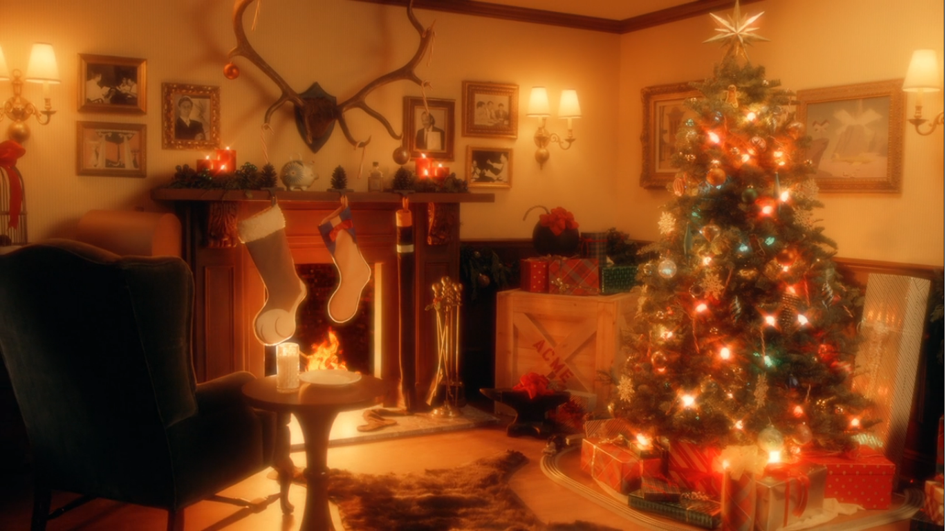
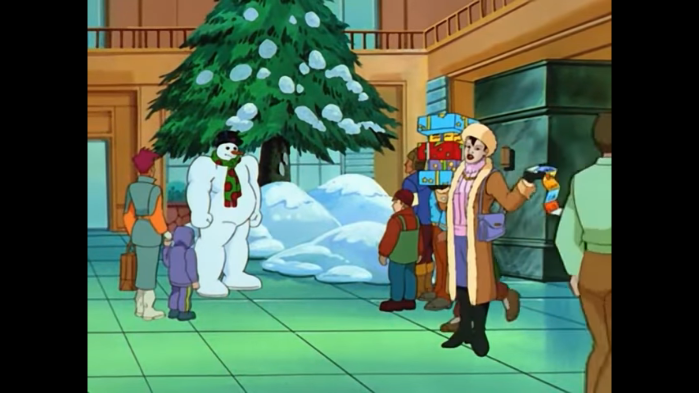
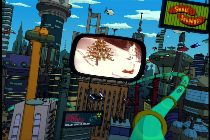
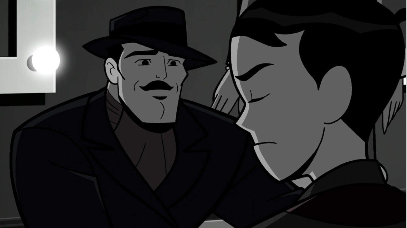
The cartoon begins with a shot of the show’s logo covered in snow. The orchestra sounds like it’s warming up, and we smash to the classic WB shield, also covered with snow, and the familiar sting of “The Merry-Go-Round Broke Down.” An image of Bugs Bunny’s visage is shown like this is the start of a Bugs Bunny short, but it fades to be replaced by the title of the special over a warmly lit house like a classic holiday special of old. And orchestral version of “We Wish You a Merry Christmas” has replaced the usual Looney Tunes fair and as the logo fades the camera starts to zoom in until we find ourselves inside this cozy home. It appears to be an actual set, though with modern CG I suppose it’s possible I’m being fooled. I’m thinking it’s probably a combination as there’s a lit fireplace that looks a little off so maybe that’s being CG generated while the set is real. There’s a picture of Bob Clampett on the far wall and opposite him is Mel Blanc. There’s a very full and well decorated Christmas tree and a narrator chimes in to set the mood. He muses on the tradition of decorating the Christmas tree as the camera finds a wooden ornament of Daffy and Porky dressed as elves. The ornament is titled “Santa’s Little Helpers” and it’s a hint at the short to come.

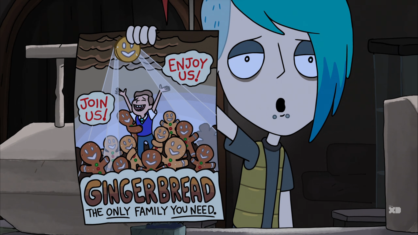
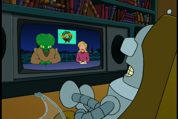
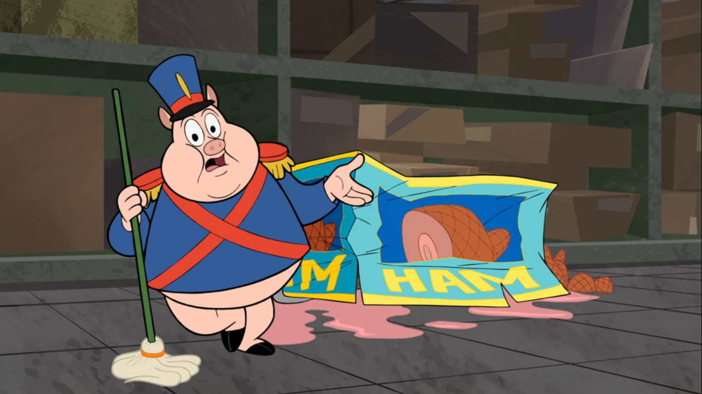
That short begins without a title card, but according to Wikipedia it’s called Elf Help. We’re at the North Pole, and an announcer informs us that not all is well up here. The elves are on strike, and Santa can’t make Christmas happen without them as we see him attempt to wrap a gift and it bursts into flames. This is a news broadcast we’re watching and we’re transported to the home of Porky Pig (Bob Bergen) and Daffy Duck (Bauza) as they react to this news. Daffy is horrified at the thought that Christmas might be cancelled this year since he won’t be receiving any presents! His design is a noodlelike bowling pin and he’s more in-line with the Clampett Daffy personality wise, though his selfishness is a bit more from the Chuck Jones mold. Daffy is worried that he and Porky won’t be getting their usual delivery of Christmas coal, as he opens a closet to reveal a whole bunch of the stuff. He loves it though as it keeps their house warm and Porky seems to be of the same mind. Daffy then proposes that he and Porky head up there and help Santa turn things around. Porky wants nothing to do with crossing a picket line, but Daffy has no shame. And it also doesn’t take much convincing on his part to get Porky to agree to go and save Christmas.

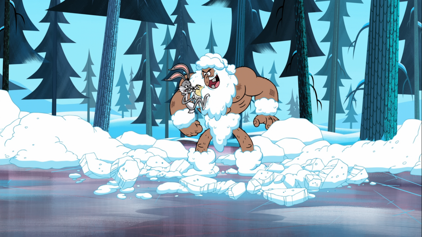
We return to the North Pole and find a family of penguins just hanging around. The little penguin is basically the same character model as the penguin from the Bugs Bunny short Frigid Hare (he’s apparently named Playboy Penguin). An elevator comes shooting up out of the ice and dispatches the penguin family – just what are penguins doing at the North Pole anyway? Daffy and Porky emerge to “Jingle Bells” from the elevator. Daffy is full of enthusiasm while Porky is freezing. He probably should have put something on since he’s just wearing his blazer and bowtie. Daffy soon spies the striking elves and decides to show them a strike of his own. Gathering up his friend into a bowl, he hurls Porky towards the elves who get knocked out of the way with relative ease. Porky smashes through a window and gets lodged in something gray and squishy.

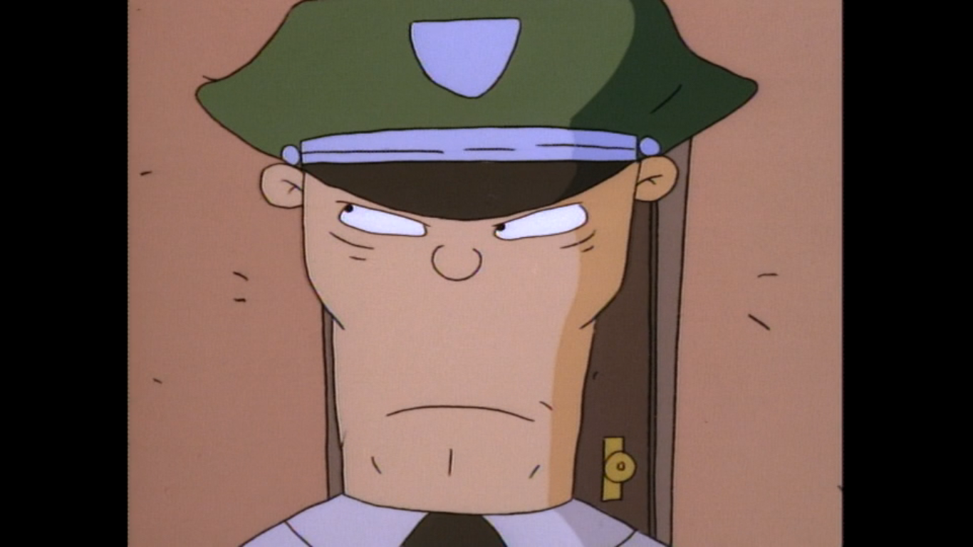
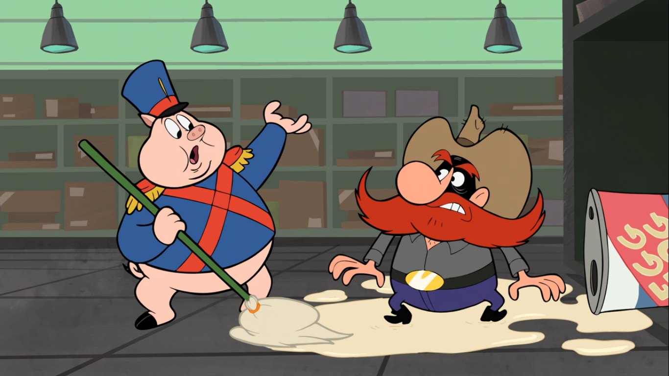
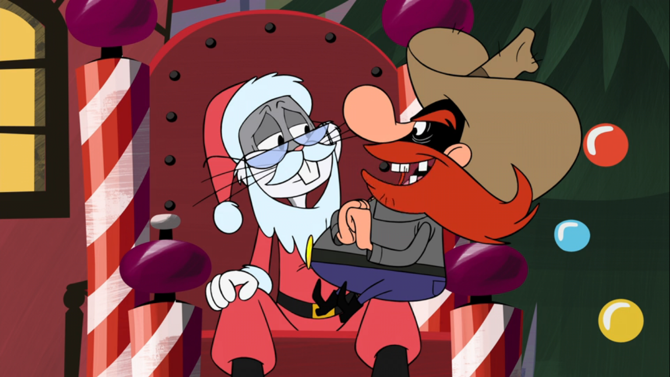
It’s Santa! Daffy comes running in to find the big man miserable and his face covered in cookie crumbs. He’s in his long underwear and seems to be pretty deflated over this whole strike thing. When Daffy asks him where his usual jolly-ness went, Santa (Fred Tatasciore) confirms it died when his elves went on strike. Daffy tells him not to worry as he and Porky are here to help him get ready for Christmas. Santa somewhat sarcastically asks if they’re going to make all of the presents for Christmas and Daffy confirms that’s the intent. Santa then surprisingly jumps up and seems okay with this! He decides they’re the Christmas miracle he was waiting for, and he belly bumps them across the room to smash into the wall and slide down through some elf outfits hanging on said wall.

We cut to the two dressed in their elf attire almost giddily building toys. It’s set to a very cheery rendition of “Deck the Halls” and as the boys work on their toys Santa comes into view. He starts laughing almost hysterically until they ask what’s so funny? Santa then gestures to the toys they’re building, which include a wooden duck and other traditional trinkets, and tells them kids don’t want that crap anymore. What they want is high-tech video games! He slams a console down in front of the two that’s like a hodgepodge of an X-Box and a Super Nintendo which makes some futuristic type noises. He then ushers them along into the room where those are to be assembled: it’s a dark, windowless, cold room with posters on the wall of “Santa is Always Watching” that portray the jolly fat man more like the dreaded overlord the elves are protesting against. He encourages Porky and Daffy to have fun with it as he urges them in, but adds in a threatening voice, “Or else!”
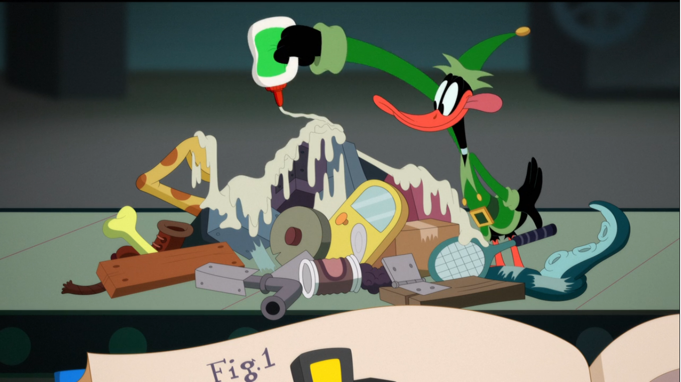
With the door slammed shut behind them, Porky and Daffy are left to figure out how to construct a game console. Porky is basically freaking out as he views this task as an impossible one. Because he is a good-natured ham, he’s actually worried about letting Santa down when I’m starting to think he isn’t deserving of any sympathy. He walks into a bookcase and a bunch of books fall out on top of him. Daffy tells him to cheer up as he picks up just the book they need: A Total Nincompoop’s Guide to Building a Video Game System. Daffy hands the book to Porky and instructs him to read while he makes adding the obviously fateful line of “This video game stuff can’t be that complex!” Porky starts reading off instructions while Daffy sets himself up at a conveyor belt. The camera focuses on a classic cat clock, only this one is dressed like Santa with a candy cane tail. I kind of love it and want one. Also of note, the calendar in the background suggests that the present date is December 3, which just so happens to be the day this went live on HBO Max. We hear Porky read out the instruction number as he stammers along finally reaching step one-thousand two-hundred seventy-six, which is basically final assembly. When he looks up from the book, he just sees Daffy with a pile of unrelated junk that he’s covering in glue.

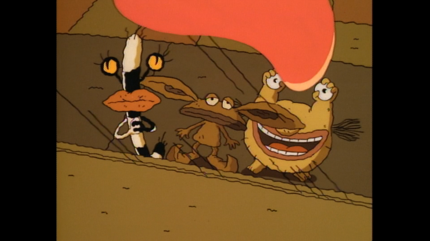
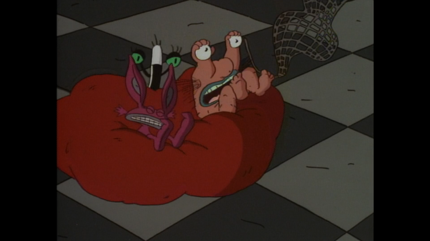
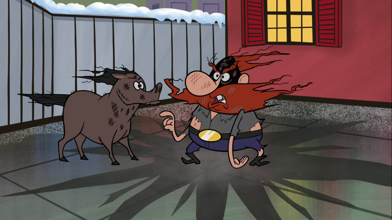
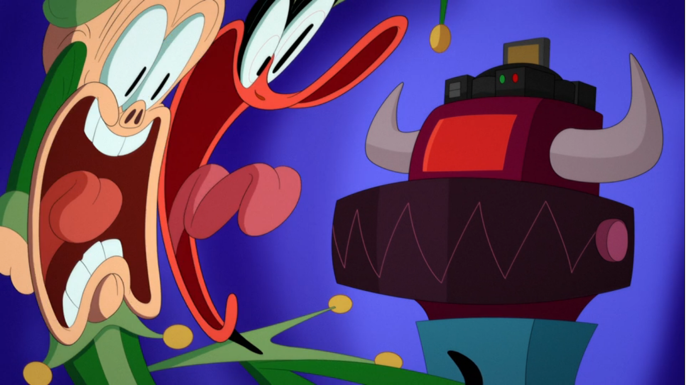
Porky is ready to freak out as this monstrosity does not resemble a game system in the slightest. It even features tentacles and what appears to be a giraffe’s knee. Daffy tells him to calm down and yanks on a pull chain which triggers a hydraulic press that smashes the two into each other with the…game console…in between them. The resulting collision reduces Porky and Daffy to a paper like consistency as they float to the floor, but it surprisingly turns Daffy’s stuff into something! Daffy declares they’ve done it, and at first we get a shot of an actual game console. Porky then adds it looks more like a killer robot to him and as the camera zooms out it’s hard to find fault with the pig’s assessment. The game console is on top of what is otherwise an intimidating machine. It’s boxy, purple, and on tank treads with spikes sticking out of it. It is indeed a killer robot as it reaches out an arm to grab Daffy while uttering “Destroy! Destroy!” Porky winds up getting smacked by the robot (wielding Daffy like a club) onto a conveyor belt and when he realizes he’s not moving as he runs he lets out this hilarious scream that sounds so convincing. It’s clear the pig thinks he’s about to bite the big one. The robot lifts Daffy and aims the duck’s rear at Porky. Cocking the duck like a shotgun, it then makes Daffy start firing eggs at Porky from Daffy’s…well, you can probably figure that part out for yourself.

The robot tosses the spent duck after assaulting Porky and closes in for the would-be kill. Porky begs the robot to spare them, which triggers an idea in Daffy’s brain. It’s either a callback to how he dealt with the elves, or just a repetitive gag, but Daffy declares “Why settle for a spare when you can have a strike?” and scoops up Porky once again and rolls him like a bowling ball at the robot. The robot was readying a bunch of missiles to kill the pair, but once struck by the Porky bowling ball they get deflected into the air above the robot. As they crest and begin their descent, the robot meekly pulls out a cocktail umbrella to shield itself which obviously results in a rather large explosion.
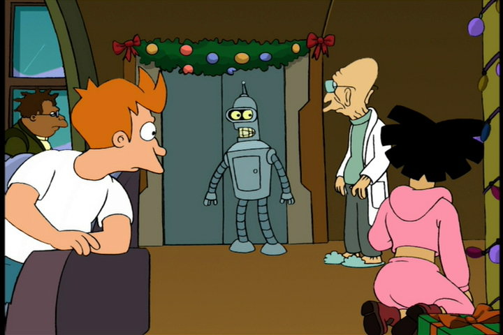
The rumble wakes up a napping Santa who heads to the factory to investigate. When he gets there, we find the robot has been destroyed, but the actual game console that was a part of its head has been left intact! Daffy presents it to Santa who seems rather impressed. He suggests they test it out and when he presses the power button on the device it, well, explodes. The explosion does nothing to Daffy and Porky, but Santa looks rather worse for ware. His face was nearly blown off and he’s covered in soot and as he fumes over the explosion he just keeps repeating “Why I oughta…” as he inches in ever closer to Daffy and Porky. Only after the third one, he returns to his usual demeanor and finishes his thought with “I oughta hire those elves back!” It’s very reminiscent of the gag where Ren of The Ren & Stimpy Show threatens Stimpy and Sven (“I gotta take a whiz!”), which was almost certainly referencing something from Looney Tunes that I’m not recalling off the top of my head.
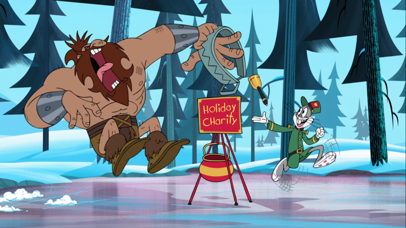
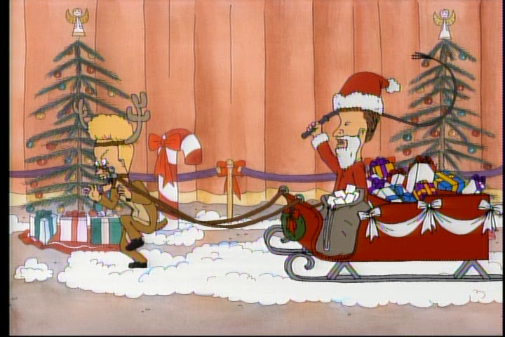
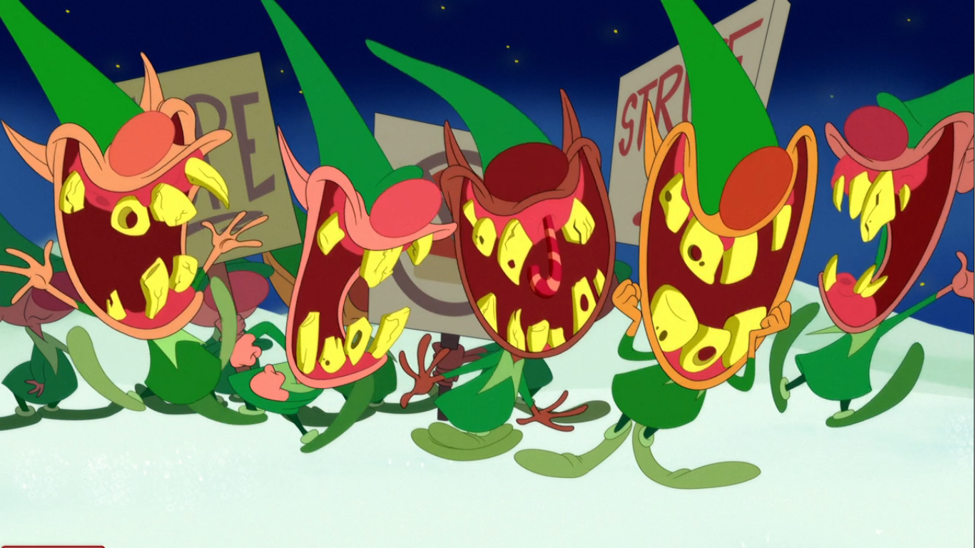
Santa heads outside, and rather coyly, restarts the bargaining process with his striking elves. He ends it by offering a 20% raise if they return to work, but the apparent union leader just gestures for him to come up higher. Santa them grumbles and adds, “Plus dental,” and the elves all cry out with glee revealing mouths full of horrendous teeth. With the elves back to work, it would seem Christmas is saved which prompts Daffy to mosey on over to Santa and suggest that he and Porky deserve a present for kind of, sort of, saving Christmas. Santa agrees and hands the duck a gift. Daffy removes the top to find a game console and Porky seems delighted with the gift. The console then lifts up to reveal the killer robot the pair had crafted and both characters utter some terrific screams in horror. They run right through the wall and the robot chases after them and the cartoon ends with the pair racing over the snow-covered hills of the North Pole with the killer robot hot on their heels.
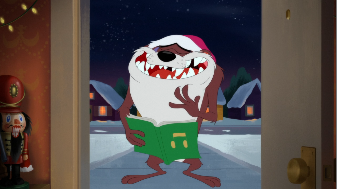
Our next segment stars Taz (Fred Tatasciore), everyone’s favorite ever hungry creature from down under. It’s a bit where Taz is out caroling, but something keeps interrupting him or otherwise causes him to flub what he’s doing. We start with an interior shot of a front door and the sound of someone knocking. The door opens and we see Taz with his book of carols in hand and a Santa hat on his head. He informs us that he’s going to sing a carol, but when he opens his mouth to sing we hear the cry of a cat. A surprised look crosses his face and he reaches down his throat to pull out a soaking wet orange kitty. Taz chuckles and remarks, “Cat got tongue,” and the owner of this dwelling slams the door in his face. The bit continues at different homes, but they all start the same way. At the next house, he tries to sing “Angels Heard on High” but the sound of police sirens keeps interrupting him until he eventually gets so mad that he destroys the police car. At the next house, he never even gets to his song as he’s enraptured with ringing the doorbell. The following house sees him disappointed in the handheld bell he brought with him for “Jingle Bells,” so he blows a raspberry at it and takes off only to return with a giant church bell which the occupant of the home apparently wants nothing to do with. The next door opens to reveal a trio of kids singing “It Came Upon a Midnight Clear” and they sound lovely. Then Taz sees them, and viewing them as threats, chases them off. He returns with a scarf hanging out of his mouth that he sucks up like a string of spaghetti. I’m guessing he ate those kids. The door slams shut and the occupant locks all of the locks on it. Taz then peers through the mail slot and says “Taz know you’re still in there,” so the guy nails a 2×4 over the slot. The next house finds Taz looking grumpy, but he whips out his book and goes into a warm-up routine. When he finally starts singing, it’s the closing part of “Silent Night” and he has the voice of a woman who is an accomplished singer. The position of the camera then finally changes to an angled shot and we see the occupant of the house is Granny (Candi Milo). She just says “What?” and asks him to speak up as she pulls out one of those old-fashioned horns for hearing. Poor Taz looks utterly defeated.

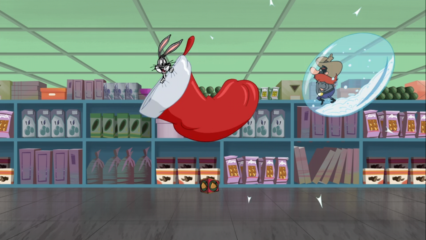
We return to the Christmas tree and the narrator which started this whole thing. There’s an egg-shaped Taz ornament on the tree and we pan to one featuring Sylvester and Tweety in a shopping cart. The image dissolves onto a department store being ravaged by shoppers. Granny and Tweety (Bauza) come strolling up to take part in the big holiday sale and the pair have no trouble simply walking through the mob clogging the entrance. Emerging from a garbage can nearby is Sylvester (Jeff Bergman)who shares what he wants for Christmas – a delicious, yellow, bird. He has a much harder time getting through the mob as he first tries to push his way in, only for his arm to get sucked into it. He tries to run, but eventually his whole body gets sucked into the mob and flung through the store where he crashes into the hardware section and a circular saw splits him in two for a “Half Off” gag.

Granny and Tweety are off shopping and Tweety pulls out a sock from a bin of clearance, left, socks. He wears it like a stocking hat and prompts Granny to check him out, who ignores him. Sylvester emerges from the bin of socks, but before he can grab Tweety a clerk puts a 90% off sign on the bin and a mob of people descend upon it. They clear out the entire bin leaving behind just Sylvester’s nose and eyes. Tweety then tosses his “hat” back, declaring it too big, and one last person snatches it up along with the remains of the cat. Tweety and Granny then head to the nutcracker section and Granny instructs Tweety to pick out a good one. Tweety hops onto the shelf and draws Granny’s attention to a big, ugly, one. It’s Sylvester in disguise, and Granny scoops him up and declares they need to put it to the test. Sylvester is sweating profusely as Granny shoves a handful of walnuts into his mouth. She then uses his tail like a lever and Sylvester tries to crack the nuts, but all he does is crack his teeth. Granny keeps tugging to no effect prompting Tweety to smash Sylvester in the head with a novelty candy cane. The nuts fall out of his mouth, along with the remains of his teeth. Granny then nervously tries to put the defective merchandise back without anyone noticing and urges Tweety to come look at the Christmas trees. Sylvester emerges from the shelf, and with a pan and dust broom, sweeps up his shattered teeth and dumps them back into his mouth. The clinking foley on his teeth is most unpleasant.

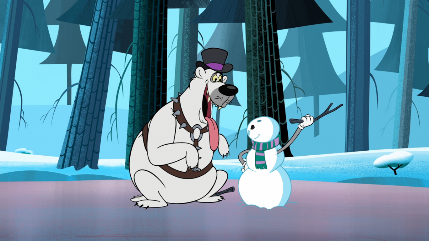
In the Christmas tree section, Granny and Tweety survey their options. Tweety notes the trees are rather skinny, but Granny demonstrates they work like umbrellas as she opens one. Tweety then poses on top of another pretending he’s a star, but above him Sylvester is waiting to strike. He sings the opening verse to “The Twelve Days of Christmas” substituting the partridge for a yellow canary. He dives at Tweety, but the little bird flutters away leaving Sylvester to land mouth first on the tree. It goes all the way to his tail and Tweety, seemingly totally aware that Sylvester is trying to get him, tells Granny he likes this tree declaring it funky. Granny regards the cat tree curiously and then opens it up. Sylvester becomes a full blown Christmas tree, but Granny thinks he looks a bit scraggly. Tweety just thinks they need to plug it in, so he does, and Sylvester gets a good jolt as his eyes and nose turn into Christmas lights which promptly explode to an instrumental rendition of “The Twelve Days of Christmas.” Sylvester with his face missing a nose is giving me my second The Ren & Stimpy Show impression of this special as his face has a very Stimpy-like appearance.
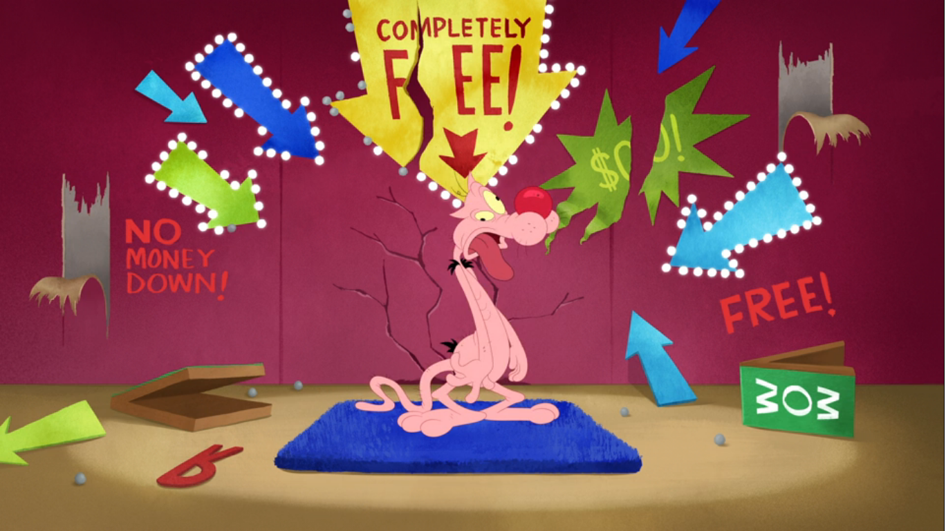
We next find Granny and Tweety in the electronics section. Granny is occupied looking at the sales while Tweety is playing with a remote-controlled car. Sylvester, lurking behind a display television, tries to grab Tweety, but he moves out of the way just in the nick of time. Sylvester then picks up the TV and tiptoes after the bird using the television to keep himself hidden, only for the bit to repeat. After the third attempt, Sylvester turns the TV on to reveal himself looking quite angry before he turns it off. When he next places the TV down he has the misfortune of finding himself in a sale section with arrows and signs declaring the item is free. A mob descends upon Sylvester once more leaving him battered and furless. He remarks “It’s black and blue Friday,” before collapsing. We now cut to Sylvester in a wig tying some mistletoe to the end of a fishing rod. It would seem he’s going to give the old mistletoe routine a try as he casts the rod over a display where Tweety resides on the other side. The little bird looks up to see the flowers over his head and then Sylvester emerges in drag to point out the obvious. He declares that, by the laws of Christmas, they must kiss and as the cat puckers up Tweety concedes he doesn’t want to break the law. He also does not look at all thrilled about kissing Sylvester, but he closes his eyes and prepares to do just that, only for Sylvester to snap his jaw shut over him. Contented, Sylvester relaxes a little, until smoke starts escpaping from his mouth. He sticks out his tongue to find a lit menorah, and a cheerful canary wishing him a happy Hannukah.

Tweety hops down, but Sylvester is done playing around. He simply scoops the bird up in his hands apparently done with the little game they’re playing. As he tells Tweety what he’s about to do, Tweety informs the “puddy tat” that if he eats him then he won’t be able to give him his Christmas present. Sylvester is taken off-guard as Tweety produces the wrapped box. He takes the gift as tears well up in his eyes declaring that no one has ever given him a Christmas gift. He’s bathed in an angelic light and Tweety urges him to open it. Sylvester at first refuses for what would Santy Claus think of him? Tweety flirtatiously says “I won’t tell,” and that’s all the convincing Sylvester needs. He rips into the gift and pulls out a little catnip mouse. He says it’s what he’s always wanted and looks genuinely touched. As he gives it a squeak, the fur falls off revealing a stick of dynamite. Sylvester is then blown up and comes to rest on a pile of fruitcake in a fruitcake-like shape himself. Tweety sticks a sign designating the fruit cake as costing a mere fifty cents and the mob returns. Only this time they stop short, turn up their nose at the sight of fruitcake, and leave. This allows Tweety to do his customary mugging for the camera routine which has closed many a Tweety short previously. He declares that no one likes fruitcake, or puddy tats, and leaves us with a big, exaggerated, smile.

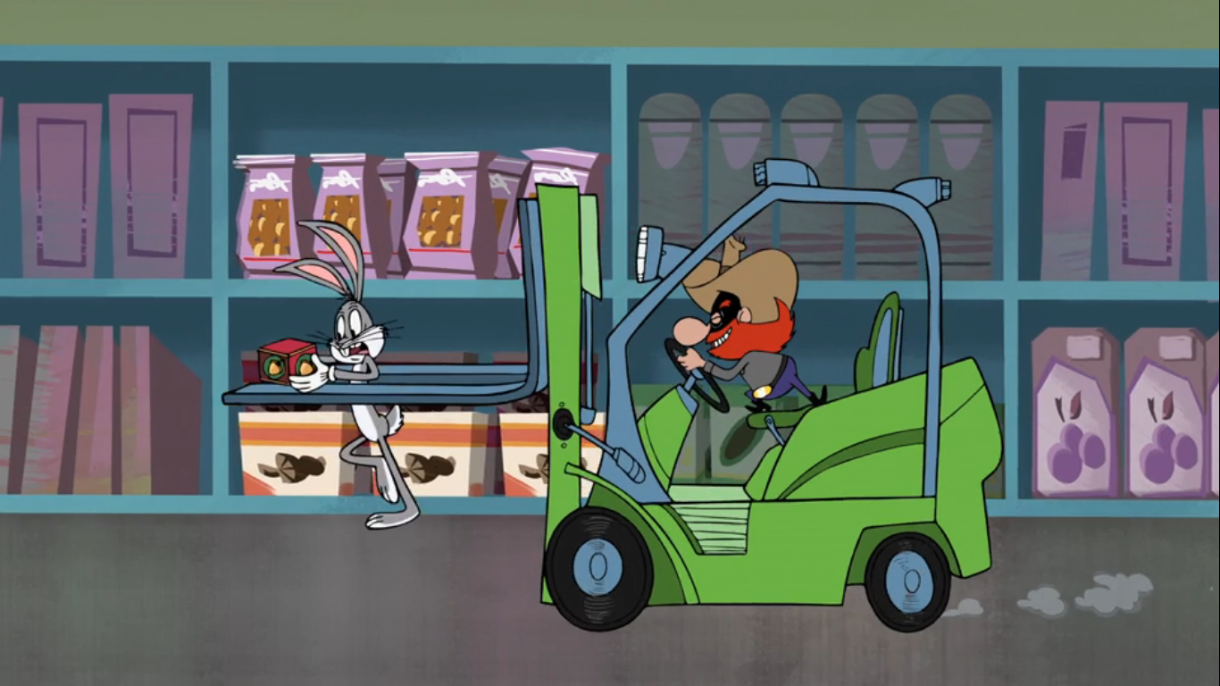
You may have expected this one to return to the Christmas tree, but we’re not ready to do that just yet. Instead, the iris shot which closes the preceding cartoon opens on a fairly familiar looking desert landscape. Only this time, it’s dotted with patchy snow. A trail of smoke ends with the familiar sight of a speeding road runner. He looks pretty much like the road runner of old, only with a more saturated blue tone. Nearby is the ever hungry Wile E. Coyote scoping out the road runner through a pair of binoculars. He also looks like the coyote of old, but with a floppy snout that adds a touch of ugliness to his design. He has a festive trap planned for his would-be dinner: a gift addressed to the road runner from Santa Claus. The gift is placed in the center of the road, and above it lurks a large boulder being supported by a small stick. It’s tied off with a red ribbon secured to a rock at ground level and when the road runner snatches his gift it should pull the stick free and cause the boulder to come crashing down upon him. How the coyote will consume the squashed remains is a problem for later. When the road runner comes upon the gift, the coyote braces for impact, which never comes. Instead, he looks to the road and sees another gift, this one addressed to him! He’s quite touched by the gesture and it’s hard not to feel like we just saw this exact same scenario play out with Sylvester a moment ago. It makes me think these were all produced independently. He cheerfully opens the present and inside is a stick. Not just any stick, mind you, but the stick that had been keeping the boulder at bay. It lurches forth and comes plummeting down to crush the coyote. It splits in half like an egg, and when the battered coyote emerges he too splits in half.
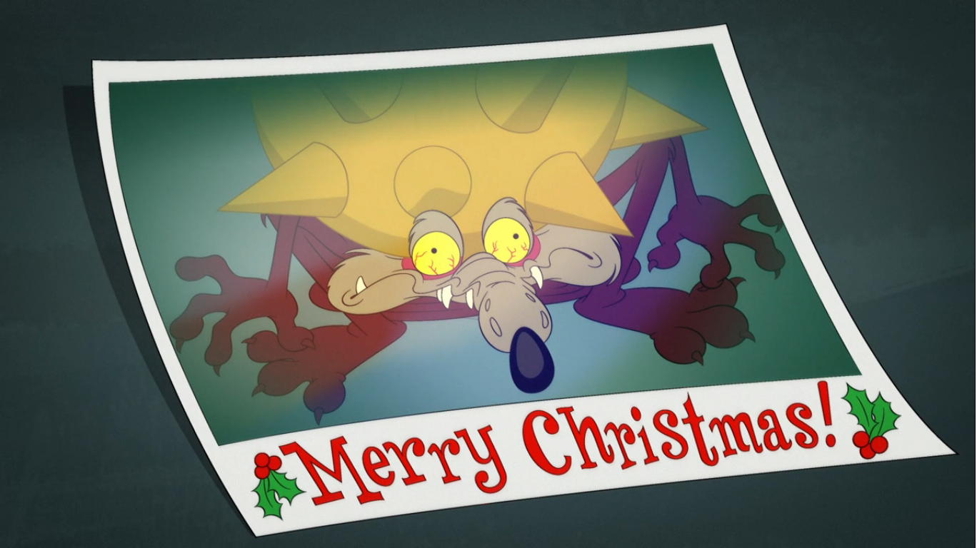
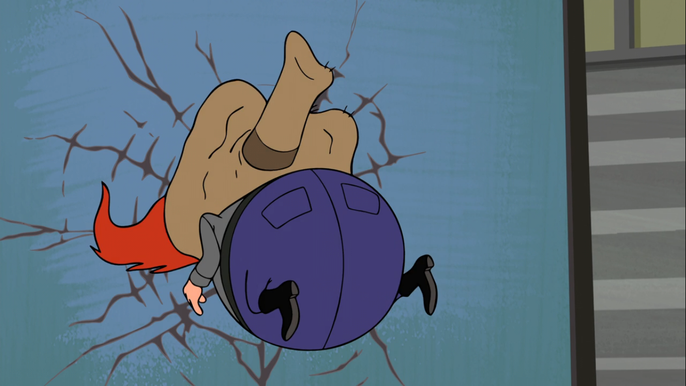
The next plot involves a phony Christmas picture photo booth. A sign beckons those who come upon it to come get their picture taken with a Christmas tree. We then see how this plan is supposed to unfold as the coyote opens a box for an ACME extra large mace. He puts the heavy, spiked, object on top of the tree and hits it with some yellow spray paint. He then consults his blueprints which shows that the road runner is supposed to stand on the “X” in the road and look at the camera while the coyote chops down the tree sending the mace onto him. The “meep meep” sound of the bird alerts the coyote to hide and as the road runner comes upon the trap, he falls for it! The coyote springs out from behind the tree with his axe and chops at the base. He does a pretty good job, but the tree does not fall. He kicks at it, pushes it, but to no avail as the road runner waits for the camera to go off. A few shoulder tackles finally gets the job done, but as the tree falls, the mace stays in place. It floats in the air a moment, and then falls on the coyote as the camera goes off and we’re treated to a Polaroid of the mangled mutt.

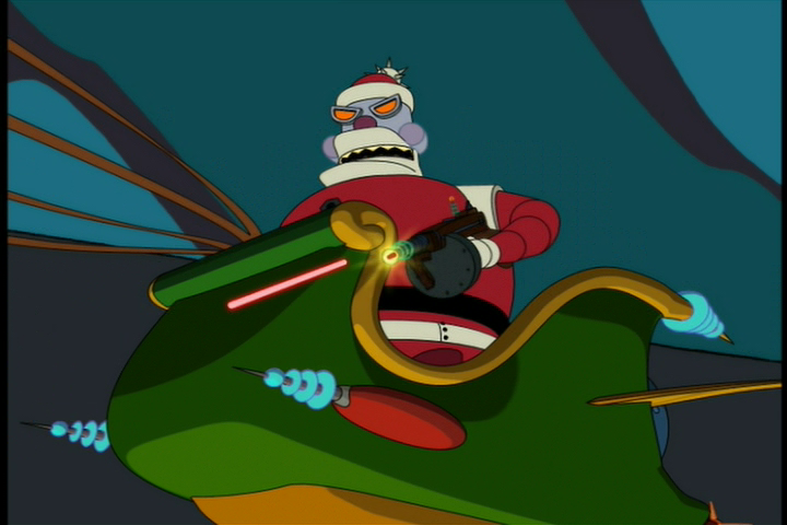
The next bit involves an ACME Santa’s Workshop kit. It’s basically a façade with a working door and behind it the coyote places a whole bunch of explosives. He then takes shelter behind a boulder where he keeps the detonator, a plunger styled device, and waits for his prey. The road runner comes upon the trap, looks it over a moment, then runs right through the door! The coyote pushes down on the detonator, and nothing happens. He does it a few times before he decides to investigate, but as he nears the door it swings open and out comes Santa Claus in his sleigh (pulled by only four reindeer – boo)! He leaves the coyote flattened, and the road runner is riding alongside him in the sleigh. As the coyote gets up and watches the two head out of sight, he regards the phony workshop curiously. He approaches with some trepidation, like he knows what’s likely to happen, and just before his hand touches the door it all explodes. The charred and angry coyote just looks at the camera and whips out a “Bah Humbug!” sign in defeat.

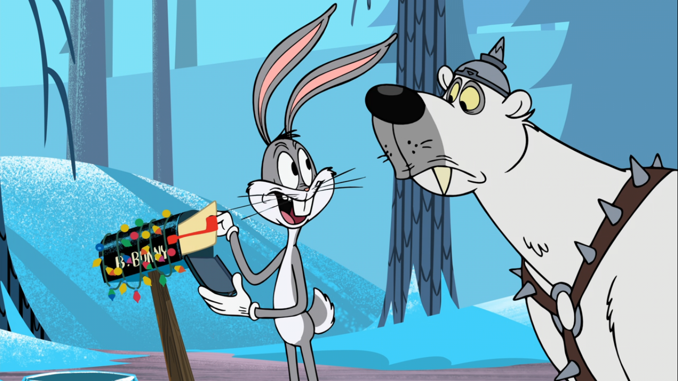
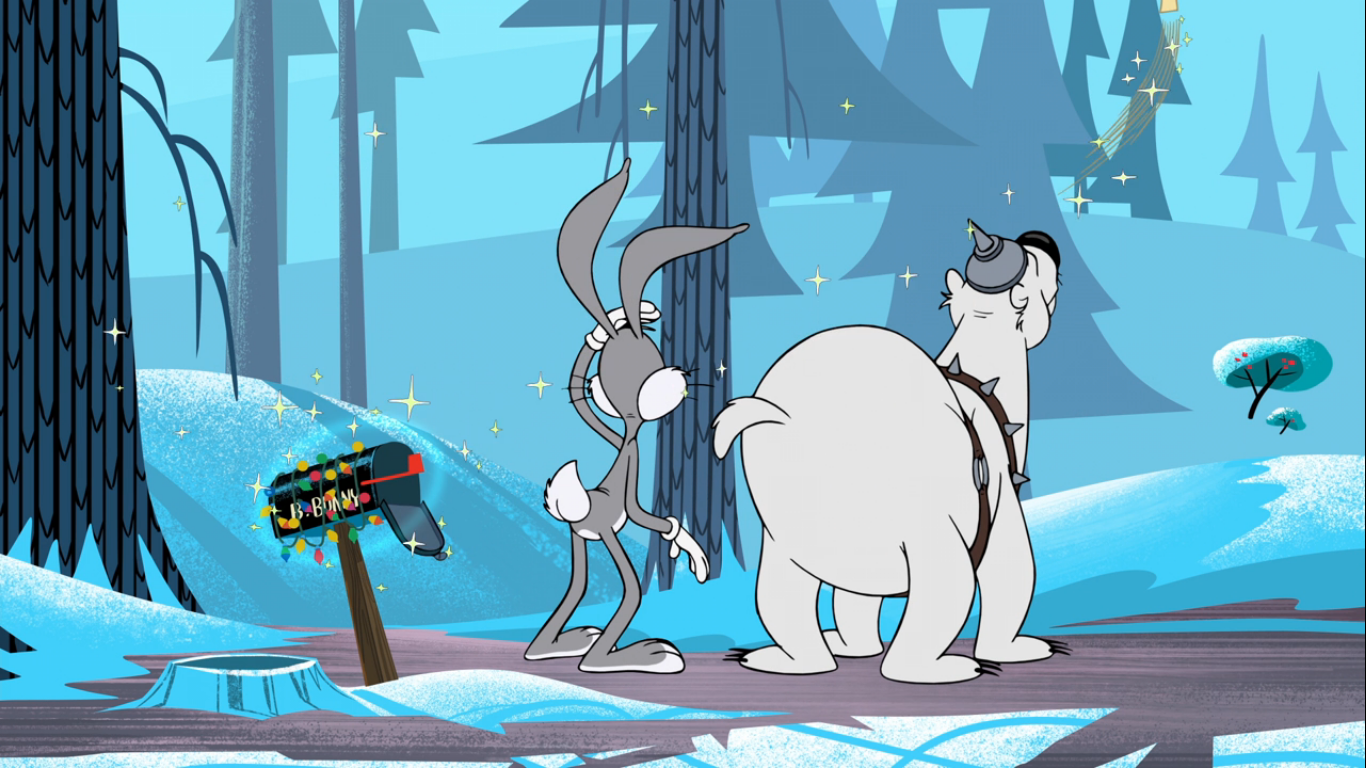
Now, we return to the Christmas tree setting as we move away from a cactus ornament the narrator remarks the holidays are a time for sharing. The camera comes to rest on an ornament that reads “Love thy Neighbor” and the image dissolves to come upon the site of a mailbox beside a hole. This can only belong to one Bugs Bunny (Bauza), and we find the wabbit sitting by a roaring fireplace enjoying a nice cup of hot, carrot, tea. A large amount of snow comes down his chimney to blunt that fire, and when Bugs cries out another clump falls on him. He needs to investigate what’s going on and pops out of his hole as-if it were equipped with an elevator. This Bugs is the more streamlined Bugs as he appeared in his earliest cartoons. He also has yellow gloves, as the prototype Bugs featured, and I’m still torn on if I like the gloves or not. They’re a very pale yellow, but they still clash with the gray of his fur, but at least it’s different.
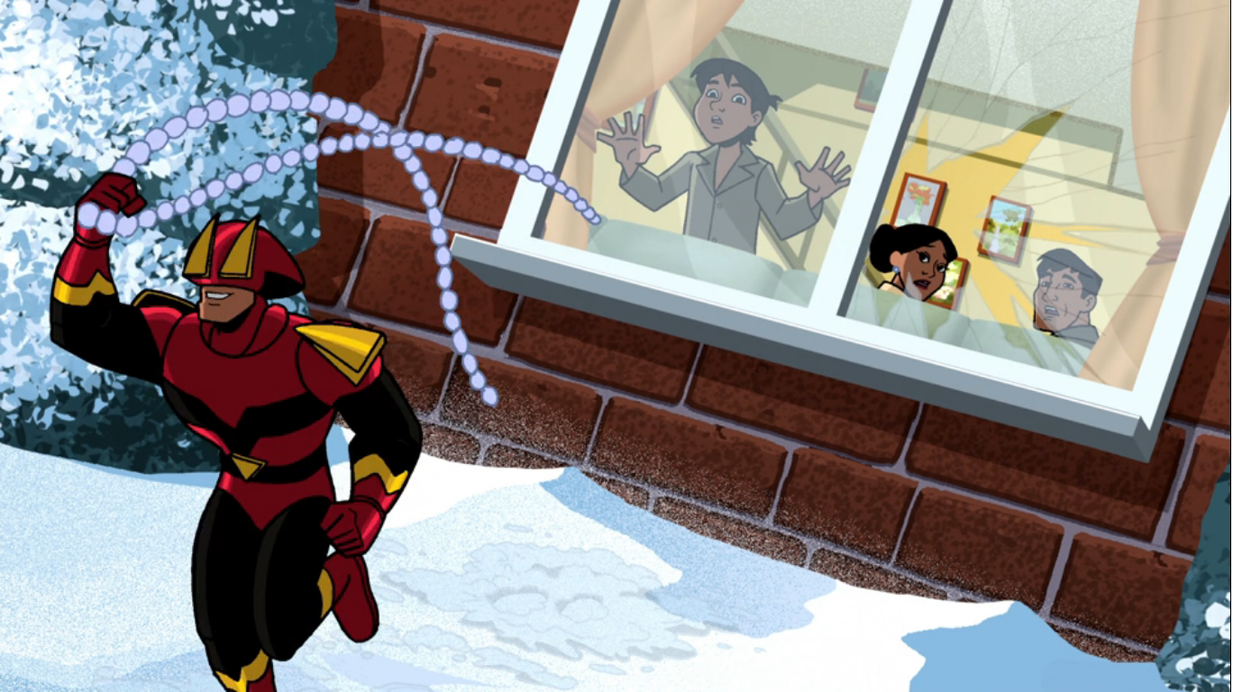
The culprit for this snow storm is Bugs’ neighbor – Elmer Fudd (Bergman). Elmer has a pretty traditional design as well, but with perhaps a bit more exaggeration to his jowls. He’s shoveling his walk and tossing the snow wherever he pleases. Bugs approaches him and, rather politely, requests that he not do that. Elmer just declares it’s his home and he can do whatever he wants demonstrating that he is completely absent of reason. When Bugs, rather flirtatiously, reminds him that he should love thy neighbor he punctuates it with an “And I love you!” followed by a hug. Elmer tells him he hates him, and he hates his house too! He swats a lump of snow with his shovel like a baseball bat that takes out Bugs’ chimney. He then fires up a snowblower and blows the wabbit away. He follows that up by pounding the snow that is now over the rabbit hole, and while dusting himself off, declares that no one tells him what to do. This could quite literally be the hill that he dies on. Elmer then starts thinking about how he’s going to treat himself when he’s done clearing the snow. As he does, he’s oblivious to the snow rising beneath him as Bugs pushes it out of his hole. He tosses it, and Elmer, like a log and Elmer is still thinking about pie as he crashes into his own property. His head bursts out of the snow looking beat up and with some stylish snow hair!

We then find Bugs trying to rebuild his shattered chimney, but he keeps getting hammered with more snow! It’s Elmer, who after getting dusted by the bunny needs to re-shovel his walkway and is tossing the snow back in Bugs’ direction. Bugs pops up behind him and casually asks him what he’s doing. He explains the situation, unaware that he’s talking to the wabbit that caused this mess. Bugs sympathizes with him, but then tosses in a casual reminder to mind those walkways this time of year as they can be mighty slippery. He then dumps a bucket of water on the surface Elmer is standing on which freezes instantly. He does a faceplant, and when he lifts his head up we see his face crack and shatter into pieces on the ground. Bugs then smashes him with a refrigerator for good measure.
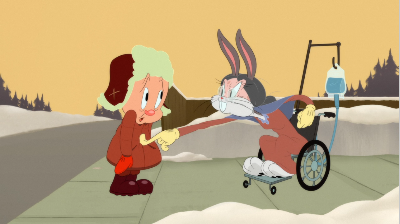
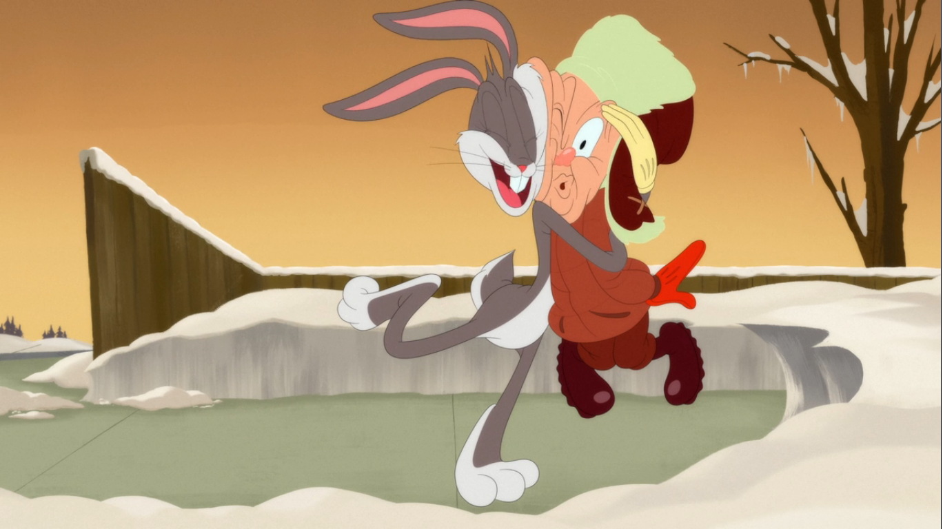
Bugs then walks off thinking that problem is solved, but we still have several minutes left in this short which suggests it most certainly is not. He sings his own version of “I’ve Been Working on the Railroad” to substitute in shoveling the walkway, until a snowball hits him in the back of the head knocking him over. It’s an enraged Elmer, and Bugs confronts him and warns him not to do something he’ll regret. Elmer responds in kind with more snowballs and Bugs just…takes it? He gets repeatedly pelted with snowballs as he cries out in pain before falling face first in the snow. Elmer gets a few more shots in apparently targeting the ass of Bugs. When the camera switches to focus on him, we see an old lady come rolling up in a wheelchair behind him. It’s obviously Bugs, but he lifts off his disguise momentarily to wink at the camera in case there was any doubt. He then shouts “Junior!” and it’s clear he’s playing Elmer’s mother. Convincingly, apparently, as Elmer is fooled. She reprimands him for not dressing in layers before slamming a ton of clothes on him. She then tells him to finish the job and bash that rabbit and hands him what looks like a skinny Christmas tree from the Tweety short. Only it’s the top of an actual tree that Bugs just bent over and when Elmer takes hold of it he lets go sending the man on a trip through the air. He crashes into a funeral home, which explodes on impact, leaving behind a somber looking grave complete with tombstone.

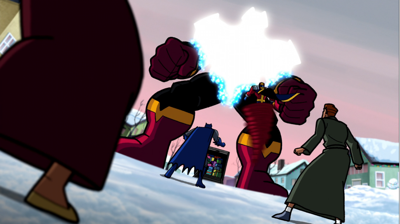
We get a nice close-up on the headstone which reads “Here Lies Elmer Fudd, Loved by neighbors (not really)” and his date of birth is just 1940 and date of death 2020. The headstone then splits and an enraged Elmer emerges from behind it. He’s going to bash that wabbit, and his weapon of choice is a lead pipe (I guess found in the rubble of the funeral home?). He goes rushing off to seek his revenge, but is taken aback when he gets to his house and finds all of the snow is gone. There’s a nice wreath on his door and that along with the stocking on Bugs’ fireplace is about the only Christmas this short has. When Elmer approaches the house, Bugs shows up to say he’s responsible. He felt bad about how things had gone down, so he cleared all of the snow. Elmer is overjoyed and invites the rabbit in for tea, but in doing so also declares that he was in the right this whole time and is glad that Bugs came to see that. This might have been a wrong move, though it also seems like the trap was already laid, for when Elmer inquires what Bugs did with all of the snow he’s told it was put in a place that will make them both happy. Bugs opens the front door and a wall of snow is visible which basically explodes from the house, including the chimney! Bugs then walks away content with his work, but the mountain of snow that was Elmer’s house shudders and explodes leaving behind a monstrous snow plow and an angry, little, bald man behind the wheel.

Bugs then remarks “Too far?” as he runs for his life while Elmer drives after him, his face purple and red with rage. He chases Bugs to the edge of a cliff and as Bugs finds his back up against nothing but thin air, he uses cartoon magic to get out of the predicament by simply crawling along the underside of the cliff like a gecko or something. He emerges from behind the snow plow as Elmer waits to hear the scream of Bugs as he falls. And since he’s doing so, he’s not actually watching what he’s doing as Bugs encourages him to keep moving “a little further” until he finds himself suspended in midair. Once he realizes what he’s done, the plow falls and explodes upon impact on the ground below.

There Bugs finds the unconscious, but still rather put together, Fudd. He resorts to the old painted glasses trick and paints a beach setting onto the lenses and puts them on Elmer’s face before he regains consciousness. Once he does, he’s soon convinced by Bugs that summer is here! He puts on his best green Speedo and sets himself up with a nice beach chair. As he settles in to enjoy some rays and reflects on his apparent victory over the wabbit, we smash cut to Elmer completely frozen like the end of Stanley Kubrick’s The Shining. Bugs emerges from behind him to declare that Elmer’s victory has been frozen in time. He then has a laugh at Elmer’s expense, who can only blink his eyes, and we return to the living room setting.

The narrator then attempts to wrap this thing up. And as he does, we see the arm of Bugs reach out from in front of a lounge chair to grab a carrot and milk. The camera changes to then show Bugs outright revealing that he is, in fact, our narrator. Before he can wish us a merry Christmas, he’s overtaken by a fit of coughing, which once over returns his voice to its natural sound. He waves at the camera and apologizes for his allergies, then ends with a “Thanks for stopping by and Happy Holidays!” Cue the “That’s all folks!” screen, sans Porky, and put a bow on it!
This edition of Looney Tunes Cartoons is, without question, the best half hour of holiday themed Looney Tunes content we’ve ever been graced with. It’s better than the other toons we’ve looked at this year, and probably better than Bugs Bunny’s Looney Christmas Tales. It’s helped by having character designs that are pretty much classic interpretations of the characters with just a touch of added stylizing. The voice acting and sound design are both terrific, and the quality of the animation, while obviously digital, is pretty damn good for what it is. One could perhaps quibble with the length of this one as it’s three standard-length shorts with a pair of smaller segments used to break them up. And yet, I quite liked the bit with Taz trying to carol and the Road Runner segment was rather short and sweet. Of the meatier segments, I think the Daffy and Porky one was probably my favorite of the three. It had a conventional plot of two dim-witted characters chipping in on Christmas, but with the added subtext that this version of Santa is kind of a monster and the helpers are scabs. He’s more like an evil overlord, and while it made him rather unlikable, he at least did the right thing in the end. The Sylvester and Tweety short was fairly typical of the duo with the cat trying to capture the bird, but getting outwitted by him at every turn. It had some solid gags and I rather enjoyed seeing Sylvester as a Christmas tree, but man, I hate fruit cake jokes so it had a bit of a sour ending.

The weak spot for me was the Bugs Bunny cartoon. Not because it was bad, it was actually quite entertaining, but because IT WASN’T A CHRISTMAS SHORT! This whole month I’ve been trying to find not just a good Looney Tunes Christmas special, but a good Bugs Bunny one too and in a way I’m still left wanting. The Bugs Bunny cartoon is basically a snow fight between him and Elmer and the only Christmas I noticed was the wreath on Elmer’s door and some decorations on Bugs’ fireplace. What a bummer. They could have just tossed Santa into the end or something and had him play a role in settling things, but maybe they didn’t want to since that’s how the Road Runner segment ended? Again, not a bad cartoon, just not really a Christmas one.
The wrap-around segments with the uncredited narrator added a little holiday charm, but it also felt a tad derivative. There was no gag, unless you count the Bugs reveal at the end which was hardly a shock, so it felt surprisingly earnest. It very much reminded me of the Mickey Mouse special Once Upon A Christmas and its sequel. It’s an easy way to make a Christmas special feel like a Christmas special so I don’t fault them for doing it, but just wish they did it better.
Even though I admittedly have one rather big problem with this Christmas special, I still think it’s deserving of a recommend. I could recommend the other Looney Tunes specials as a curiosity piece, but this one works as just good entertainment. Which is how I view the whole of Looney Tunes Cartoons. It’s a solid B+ show that’s keeping these characters alive outside of Space Jam, and for that I’m thankful. For now, this one appears to only be available on HBO/Warner’s Max platform, which is unfortunate. Maybe it will get a showing on Cartoon Network, but don’t count on it. It looks like it’s available for purchase digitally, and you may even be able to find it elsewhere. I think it’s worth checking out and there’s a bunch of other Christmas stuff on Max so a one-month subscription might be just the ticket for your holiday entertainment, though maybe not at this point since we’re nearing the end of the season. Hey, there’s always next year!
Can’t wait until tomorrow for more Christmas? Check out what we had to say on this day last year and beyond:

Dec. 23 – Bluey – “Verandah Santa”
When it comes to The Christmas Spot, I have very few rules. I definitely favor animated Christmas specials, but that’s not some rule I’ve created for myself. The programs don’t have to be all ages, they don’t have to be “nice,” and they certainly don’t have to be any good as I’ve looked at an…

Dec. 23 – DuckTales – “How Santa Stole Christmas”
One of my favorite modern Christmas specials is the DuckTales episode “Last Christmas.” I feel like anytime I talk DuckTales I have to specify which era, though in this case I really shouldn’t since the original DuckTales never did a Christmas episode. To make up for that, the 2017 edition of the show did two…

Dec. 23 – The Super Mario Bros. Super Show! – “Koopa Klaus”
During the late 80s Nintendo was on fire in the US. The Nintendo Entertainment System came storming into living rooms, basements, and dens across the country making Mario and Luigi household names. In addition to video games, there were tons of licensing deals for clothing, school supplies, bedding, you name it. If it could be…