Tag Archives: utrom

Super7 TMNT Ultimates! Shredder (2003)

Here comes the bad guy.

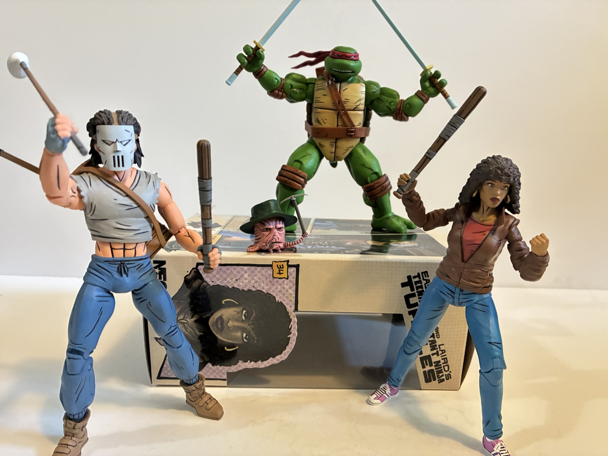
They say that breaking up is hard to do. I feel like I’ve been slowly breaking up with Super7 for a couple of years now. The relationship began with a “will they, won’t they,” feel when Super7 announced its line of Teenage Mutant Ninja Turtles Ultimates! at the then high price of $45 each. Did I need recreations of the toys I had as a kid in a new scale and better articulation? No, then yes! Super7 and I kept it casual over the next year or so. I was never all-in, but I was always buying something. Then came wave five when Super7 raised the price to $55 and subsequently dropped the quality. One of my favorite designs from the vintage line, Sewer Samurai Leonardo, was done dirty. Sure, he looked fine, but the figure was a mess and damn near impossible to handle as a modern action figure. Things were pretty rocky from then on. Some figures, like Classic Rocker Leo, were great and reminded me of how good things could be between us while others left a lot to be desired. Super7 dropping the line in favor of the 2003 version of the franchise is probably where things need to end between us. The inaugural wave released last year was okay. The turtles looked the part, but the skimpy accessories and some terrible design choices made the wave more bust than boom. I was never going to be all-in on the line anyway, these turtles aren’t my turtles, but I wanted some representation for that era in my collection. And while I can pass on the likes of April and Splinter, I feel like no set of turtles is complete without the Shredder.

He’s got some size on the turtles.

Even with my belief that all turtles need a Shredder, I still wasn’t sure about this one. While I love the look of this version of the character, I was hesitant about the quality after handling those 2003 turtles. Super7 made the artistic choice to reference the actual show heavily in their design over prioritizing things like the key art. That’s fine and defensible, though personally I don’t know why you would settle for the worst version of the characters when it’s possible to match the better ones. That didn’t bother me as much as the engineering choices. Much was made of Super7 finally embracing 21st century technology and adding double joints to the knees and elbows, but one change they made is truly puzzling. They started using soft plastic for parts like the biceps, thighs, and pretty much all over the limbs like the figures are endoskeletons with soft plastic parts layered on top. Softer plastics are great for things that need to be pliable like the belts, bandanas, and even the hands since it makes gripping weapons much easier. For things like the thighs where the parts are going to rub against the harder plastic parts when doing just basic articulation it leads to gouging and damage. Is this how Super7 plans on doing all of its figures going forward? I wasn’t sure. I’ve even done the rare thing (for me) of watching a video review of this figure before I got it. You pretty much have to with Super7 as you never know what you’re going to get. I considered canceling my preorder, but decided to hang onto it more out of obligation than anything. I hate canceling on retailers that I like (I’ll cancel on Amazon anytime) and my desire for a Shredder outweighed my apprehension over the quality of the figure. And despite seeing that review, I still don’t really know how I’ll react to this one. I’m writing this (as I do pretty much all of my intros) before handling the figure and remain hopeful that it will be “good enough.”

Technically, this is the Shredder. What a little stinker.

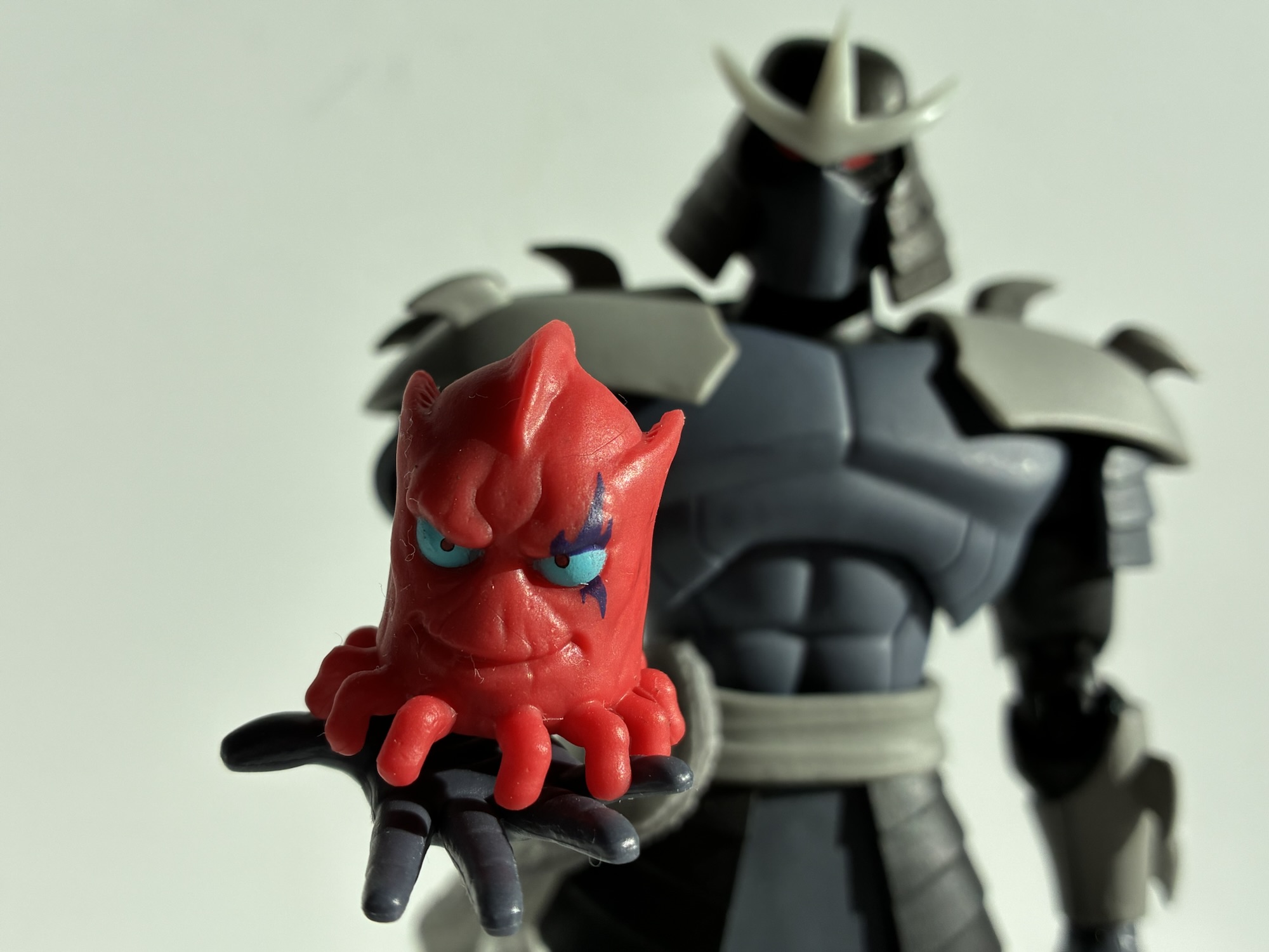
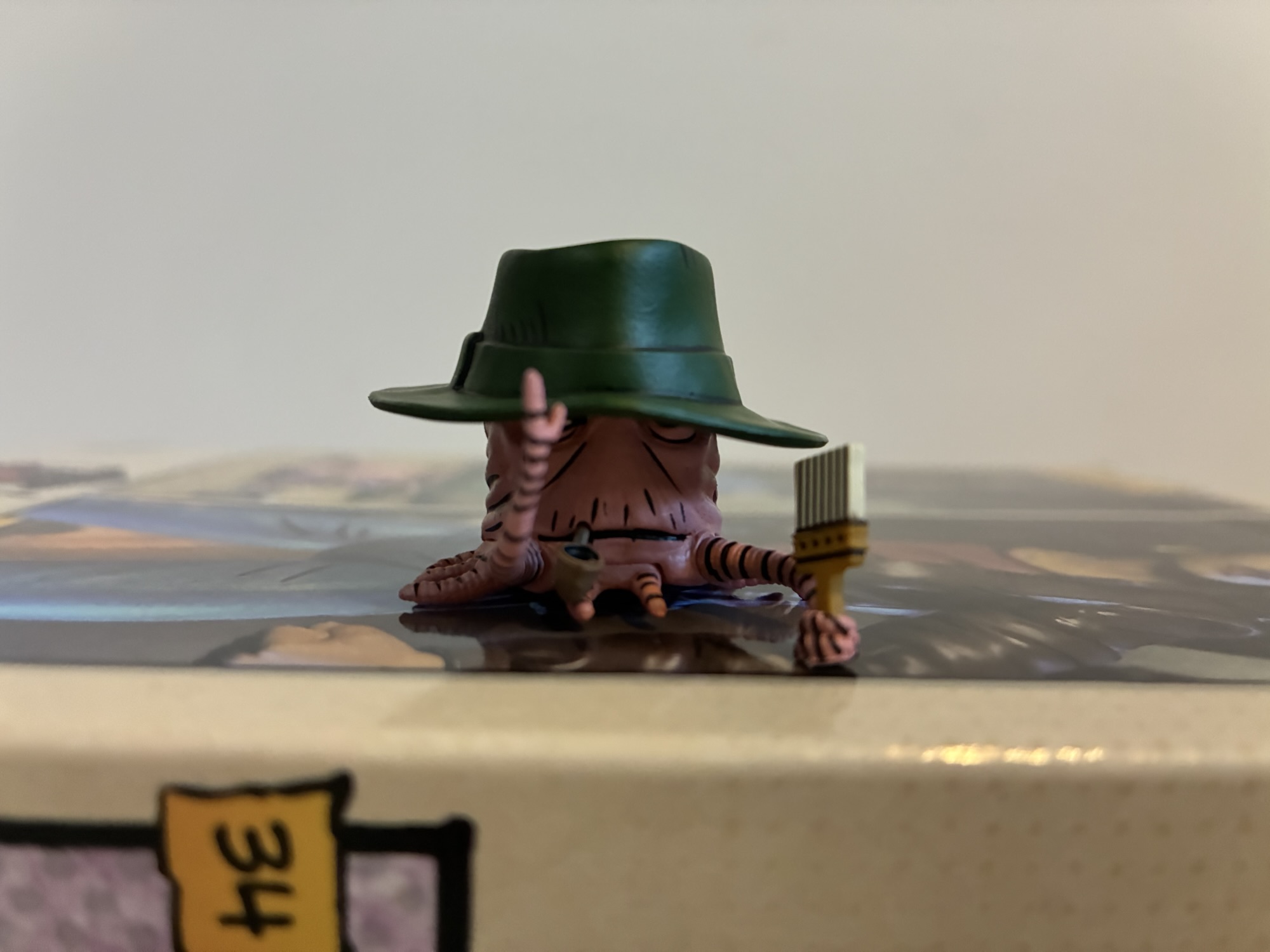
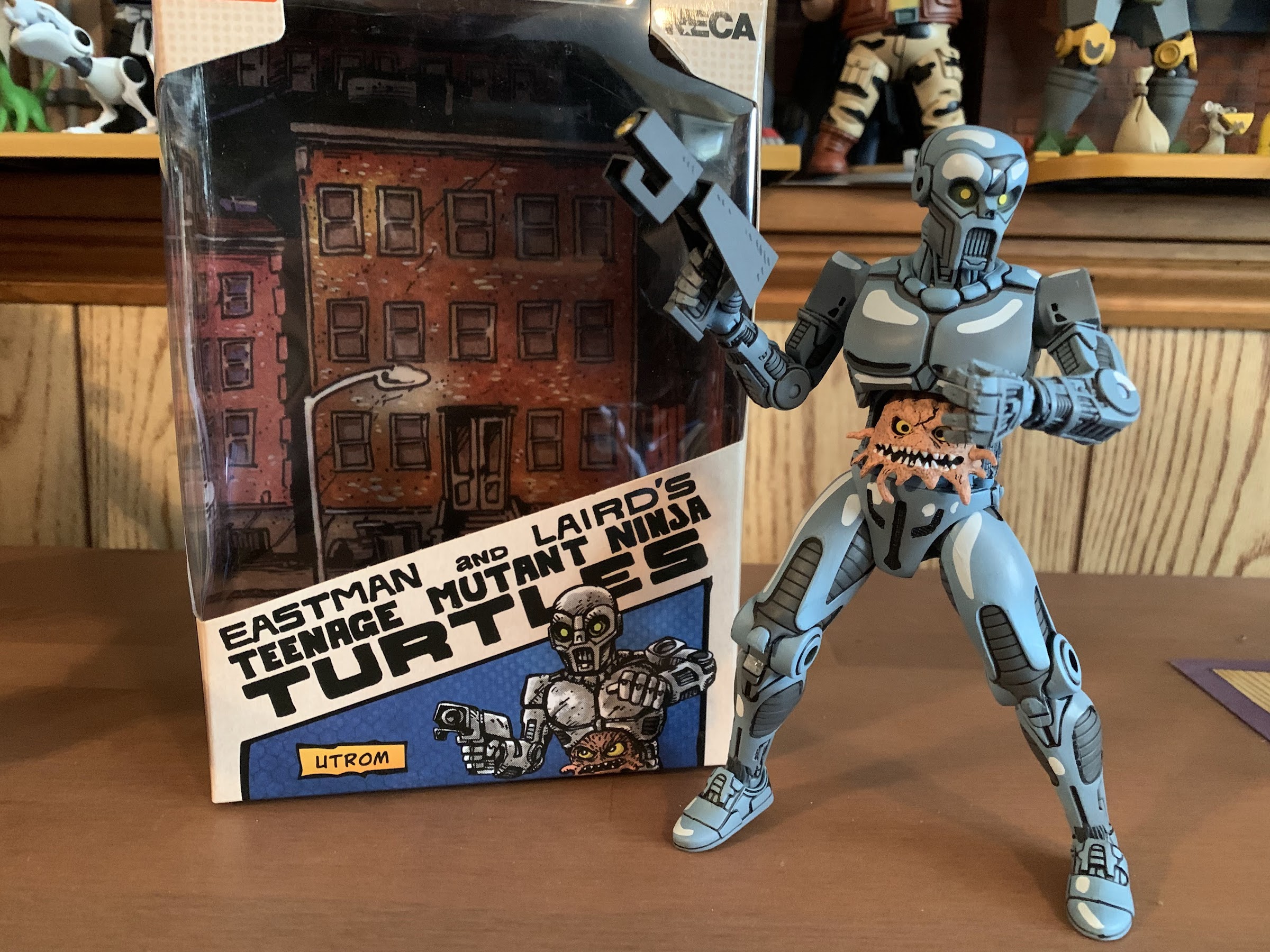
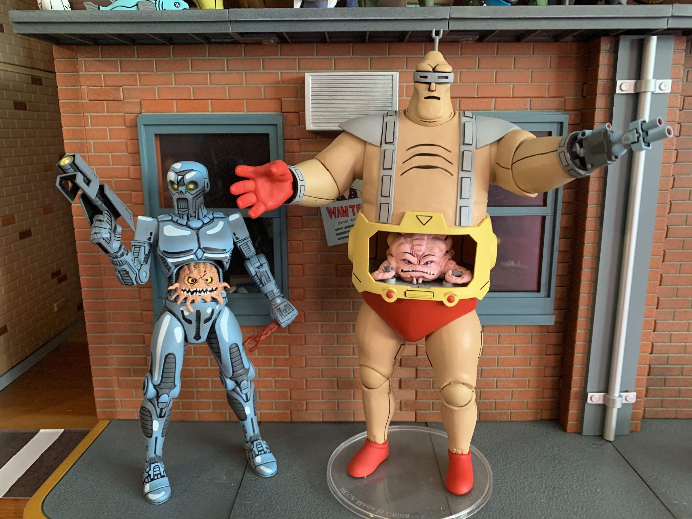
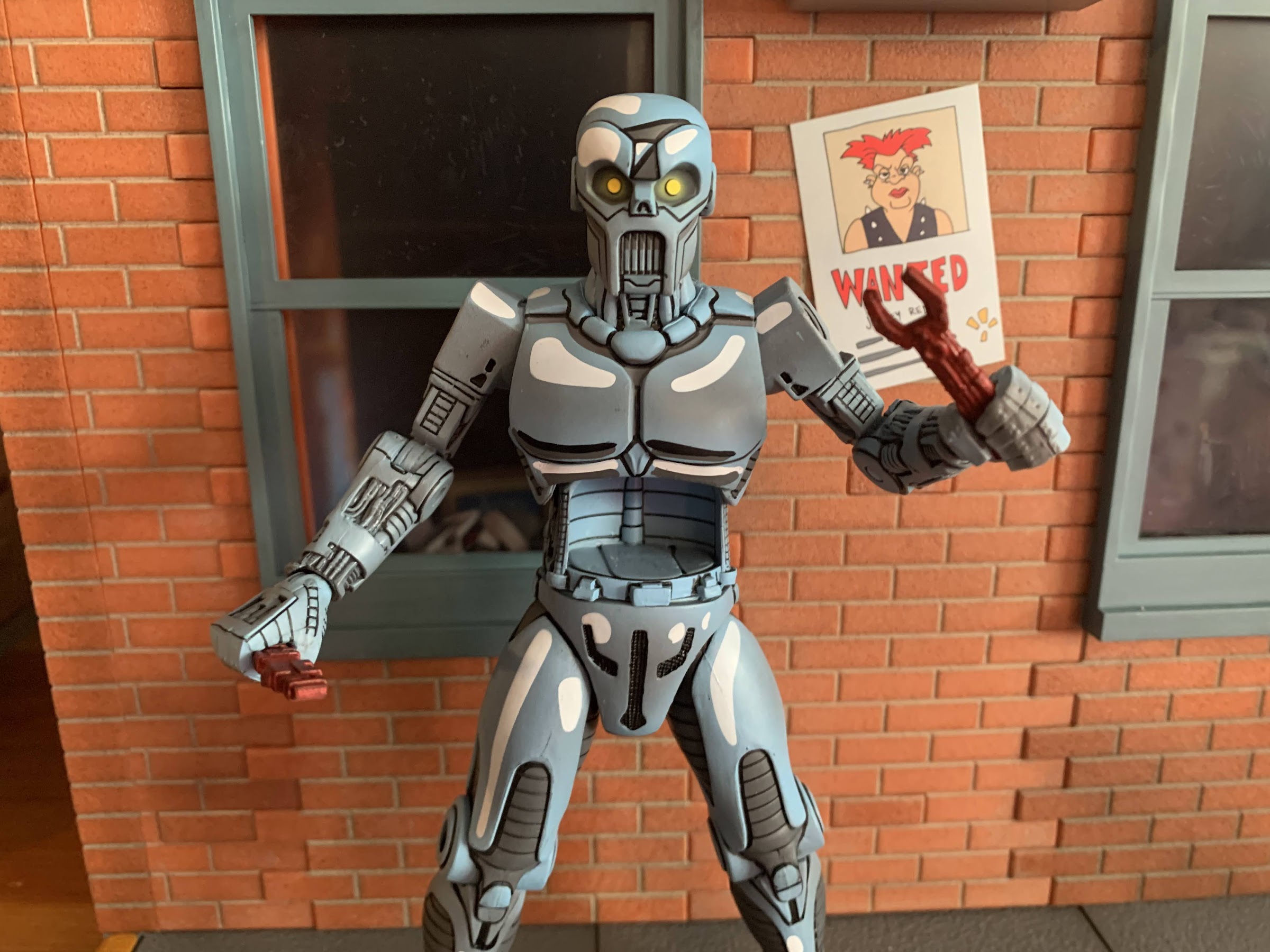
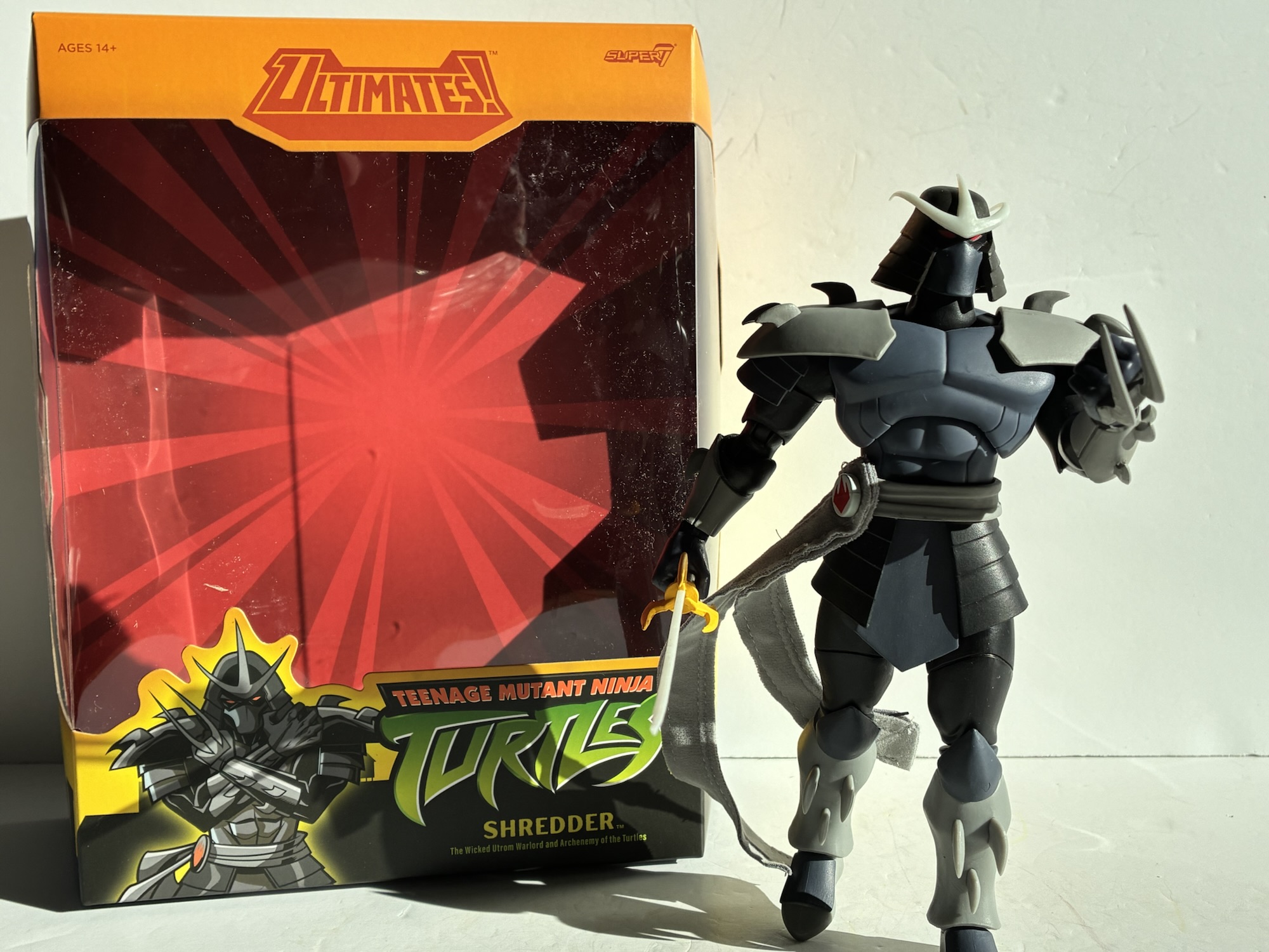
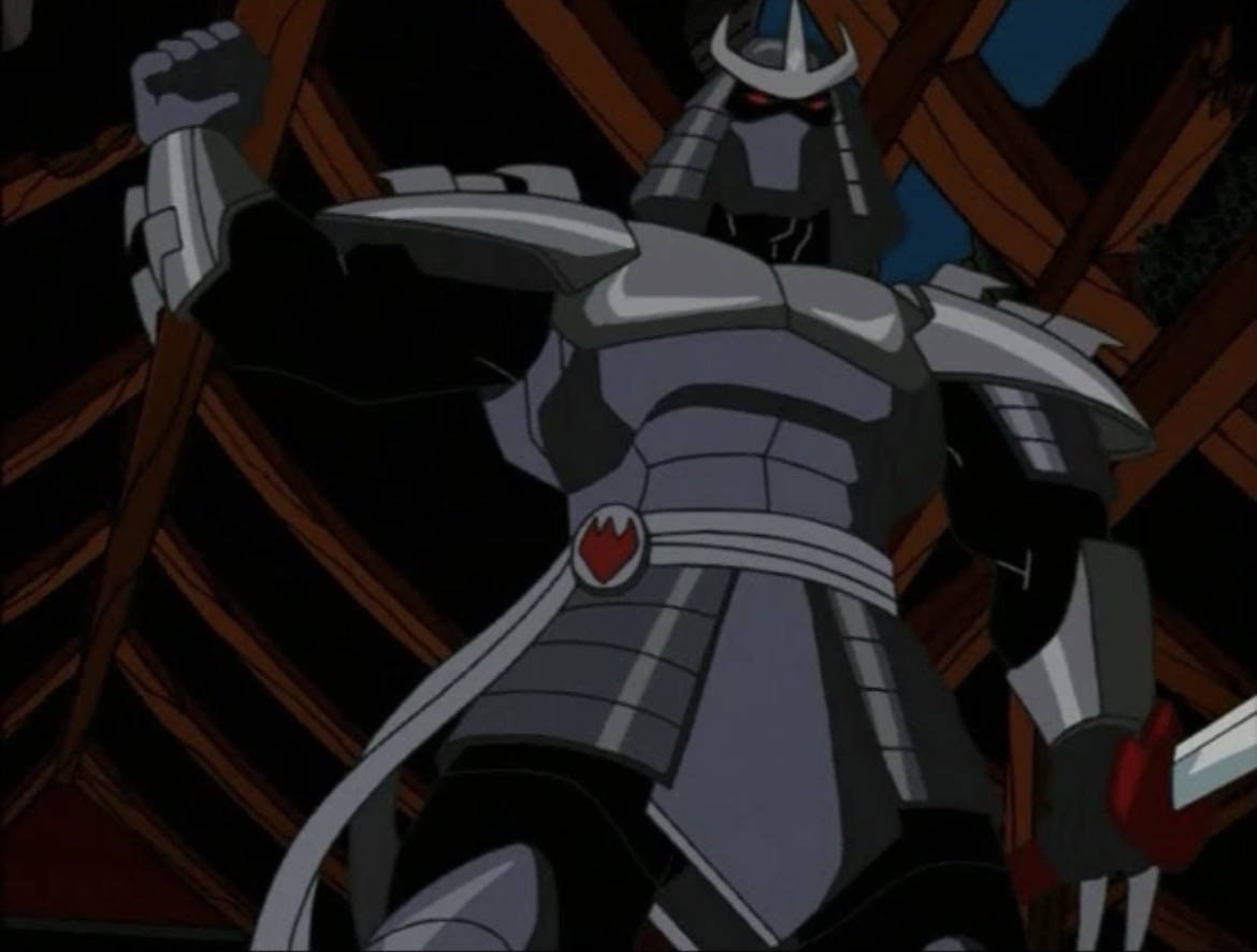
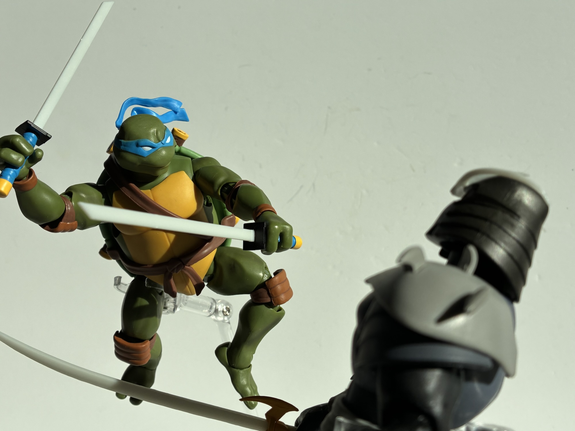
Shredder arrives in the normal box we’re used to. There are no credits on it and the artwork appears to be stock art from Paramount. It takes up too much space, but there is a nice, big, window so if you like to keep these in-box (a very defensible position with Super7) it will look fine. This Shredder is big and imposing coming in at around 8″. It’s what I liked about him from the moment I saw the artwork for the 2003 show as this was no longer the bumbling doofus entrusting all of his lame schemes to the likes of Bebop and Rocksteady. This was a Shredder out to win and in order to win it meant he had to kill. This dude is a literal murderer and also not a dude at all. He’s an Utrom (spoiler?) named Ch’Rell who ended up on Earth a thousand years before the start of the show and managed to turn himself into a legend. The figure you see before you is just a suit of armor being controlled by Ch’Rell in the abdomen. If that sounds kind of like Krang to you know that it is. These are the guys Krang was based around when the original show was adapted from the comic books, though in the comic Shredder was never among the Utrom. Not that it was needed for the character, but having Shredder essentially be a robot works in the character’s favor as it explains how he can be so massive and how those eerie, glowing, red eyes can shine out from under his helm. It was a step in the right direction for the character and this Shredder begets the one we’d receive in the 2012 series who was also a vicious murderer, though that one was a human.

He’s a master of intimidation.

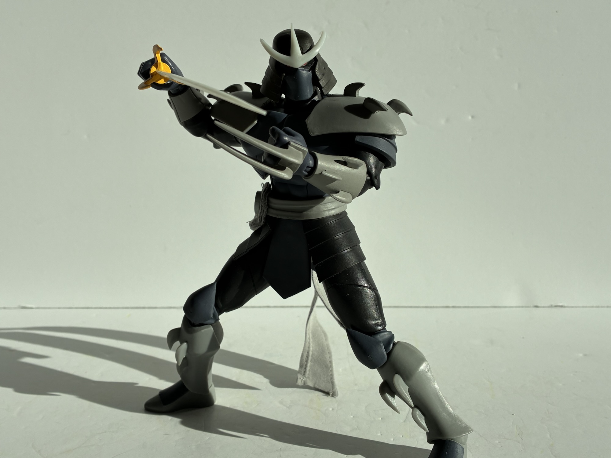
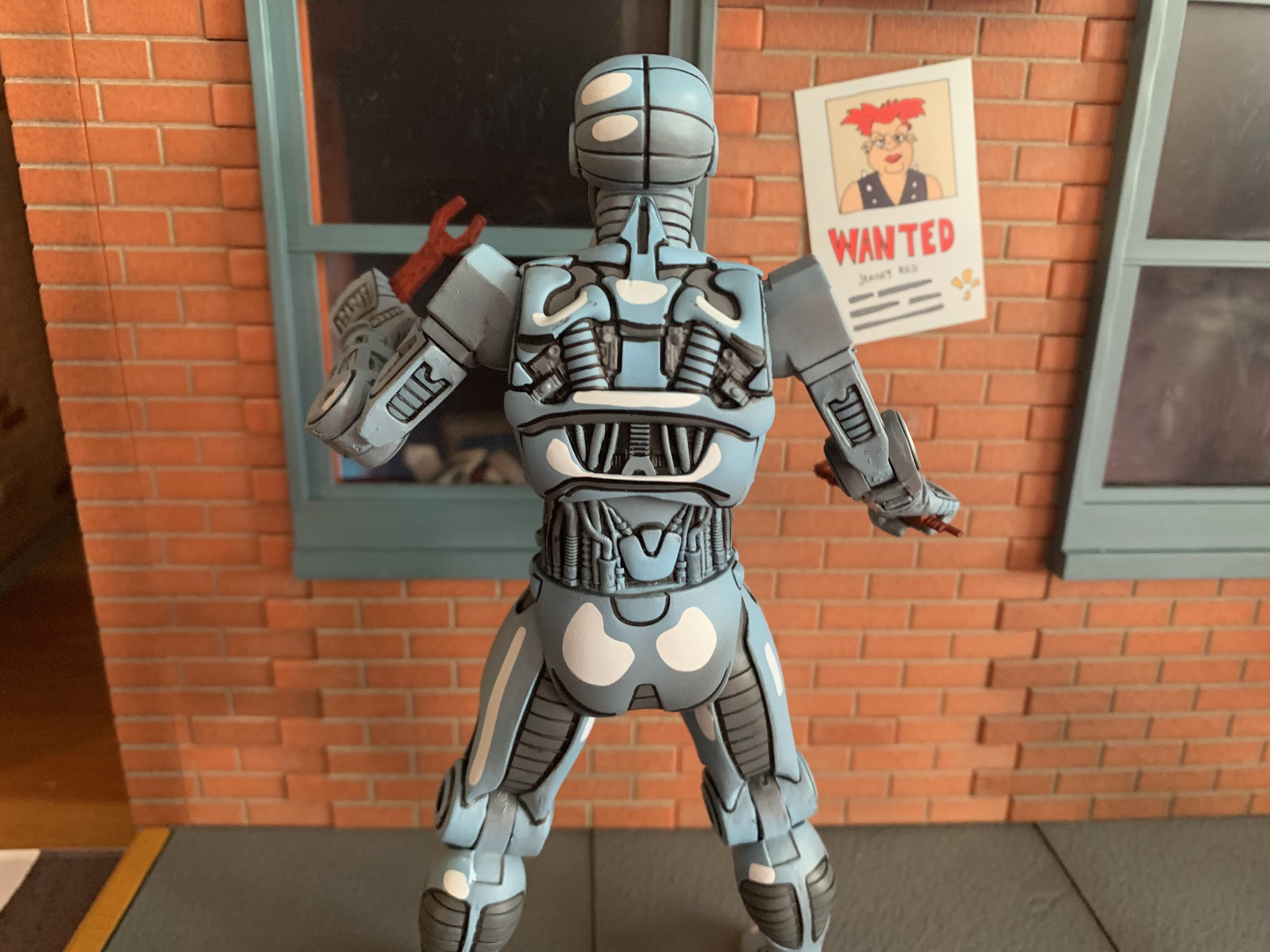
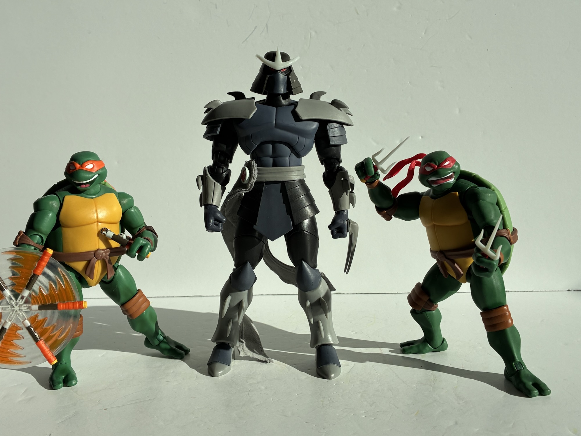
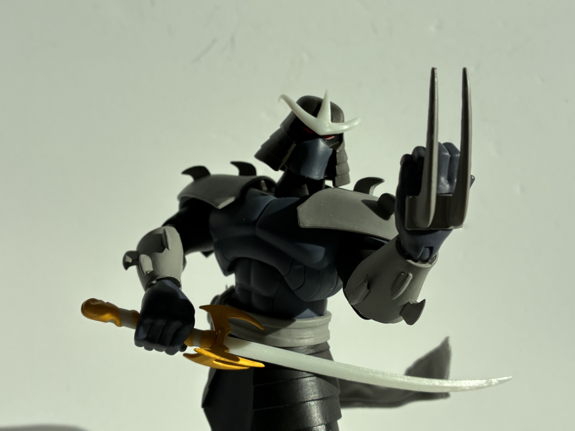
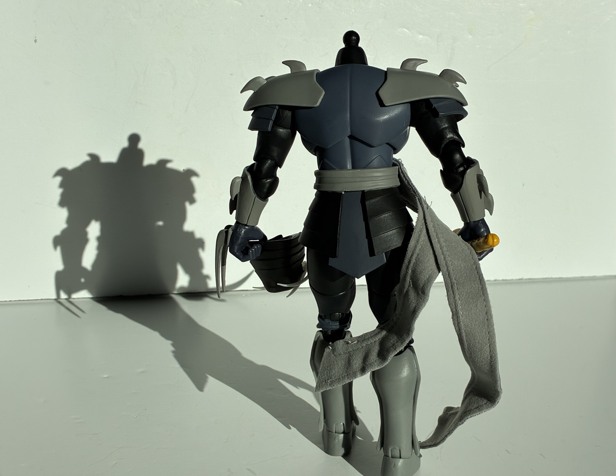
Super7 has always been good with size when it comes to their villains so it’s no surprise that Shredder comes out looking menacing. The body is largely black with some differing shades of gray. The main armor of the torso almost has a purple hue to it which, if intentional, is a nice, subtle, homage to his look from the original cartoon. There’s no cape on this Shredder, but he does have a sash, which Super7 elected to handle with soft goods. This comes as a surprise because this aspect of the figure was not apparent in the solicitation. The head-on shot made the sash look plastic, while the action shots look like they have a subtle texture to them implying that they could be soft goods. I’m not a huge fan of mixed media apart from capes when it comes to figures and this one won’t change my mind. The sash is clunky. Super7 wanted it to be wired, but whoever they contracted to make the sash used a thick material and the stitching around it is very apparent and amateurish. If you absolutely hate it you can pull it off, but I wish they included a plastic one like the old days of the line when Shredder came with a plastic cape and a soft goods one. The proportions on the sculpting is good and probably the figure’s strength. He does look like a Shredder that could kick your ass.

Where things are less great rests with the paint and materials used. Super7 is going all-in on these soft plastics as the shoulder pauldrons are like a very pliable rubber. It feels like the kind of material you might find in a hardware store used on cheap, plastic, products or in a gasket or something similar. It does what it’s supposed to in that it lets the arm move freely, but it looks really cheap as there’s no paint on it. I’m not sure if one can paint this material without the paint cracking. Super7’s approach to a toon aesthetic is basically solid, muted, colors. In other words, the opposite of what a company like NECA has done with its own toon line which uses a lot of paint, some line work, and shading. Paint just helps the figure to “pop” like the character would on an old animation cel (I have no idea if the actual show was done on celluloid or if it was all digital) and on your television screen. Super7 seems to think colored plastics get the job done and it just looks really bad in places. The pauldrons are one area and the crest on the helm is another which is that same, milky, plastic the company used for Raph’s sai. I know some would prefer a metallic silver, but I’m actually fine with white since animated metal often ends up being painted white in this case, but it needs to be actually painted. It at least isn’t shiny and the joints aren’t ugly, but a $55 collectible should look better than this.

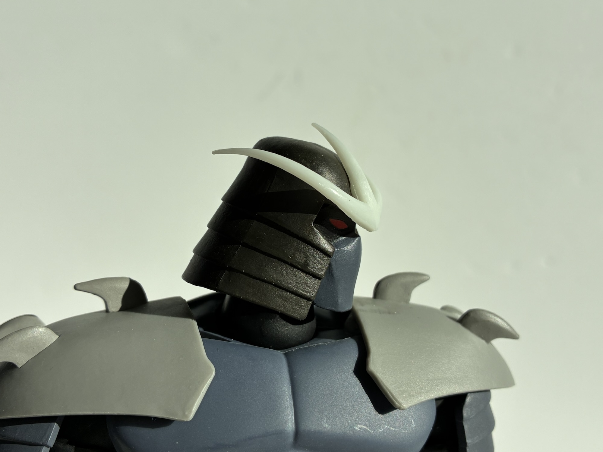
Things get a little more off the rails when comparing this figure to the source. Super7 stated they were trying to match the look of the character in the show and that’s fine. However, this really isn’t it. I was trying to figure out what looked off about this guy right from the start and I think I’ve mostly figured it out. For one, his helm is a little narrow compared with the show. A lot of the time it’s flared to the side which exposes more of the jaw line. This one is a bit blocky by comparison. Not a big deal, but the kind of thing that does mess with your mind’s eye. The crest on the helm is also curved and I cannot understand why. At first I thought maybe it was a case where the character was drawn differently depending on the angle which wouldn’t be the first time that happened. I can find no evidence of that though. It looks like it should always be straight so having the ends curve was apparently a design choice and I don’t like it. And then the other issue I have are the colors used. They made the helm and the outer pieces of his skirt black. They were never black in the show. They should be gray. The only area of the figure that should be black are the arms, legs, and the face behind the mask. The character is basically just a bunch of gray, and some of these parts should be metallic gray. A good company would paint the embellishments the animation went with to create the illusion of a metallic surface, but instead we get flat colors or bare plastic. Maybe they ended up with this black, or almost black, in these spots because the gray for the main part of the torso is just a bit too dark. I mentioned that it almost has a touch of purple to it, but I do think it should be a little lighter. Am I being nitpicky? I don’t know – I’ll let you decide. I think the main issue is the lack of shading and painted details. With those, I think the colors would blend together better and these issues would be easier to overlook. This isn’t some $15 Playmates special though – this is a $55 figure in a line that’s getting bumped up to $65 after this wave. We should expect better.

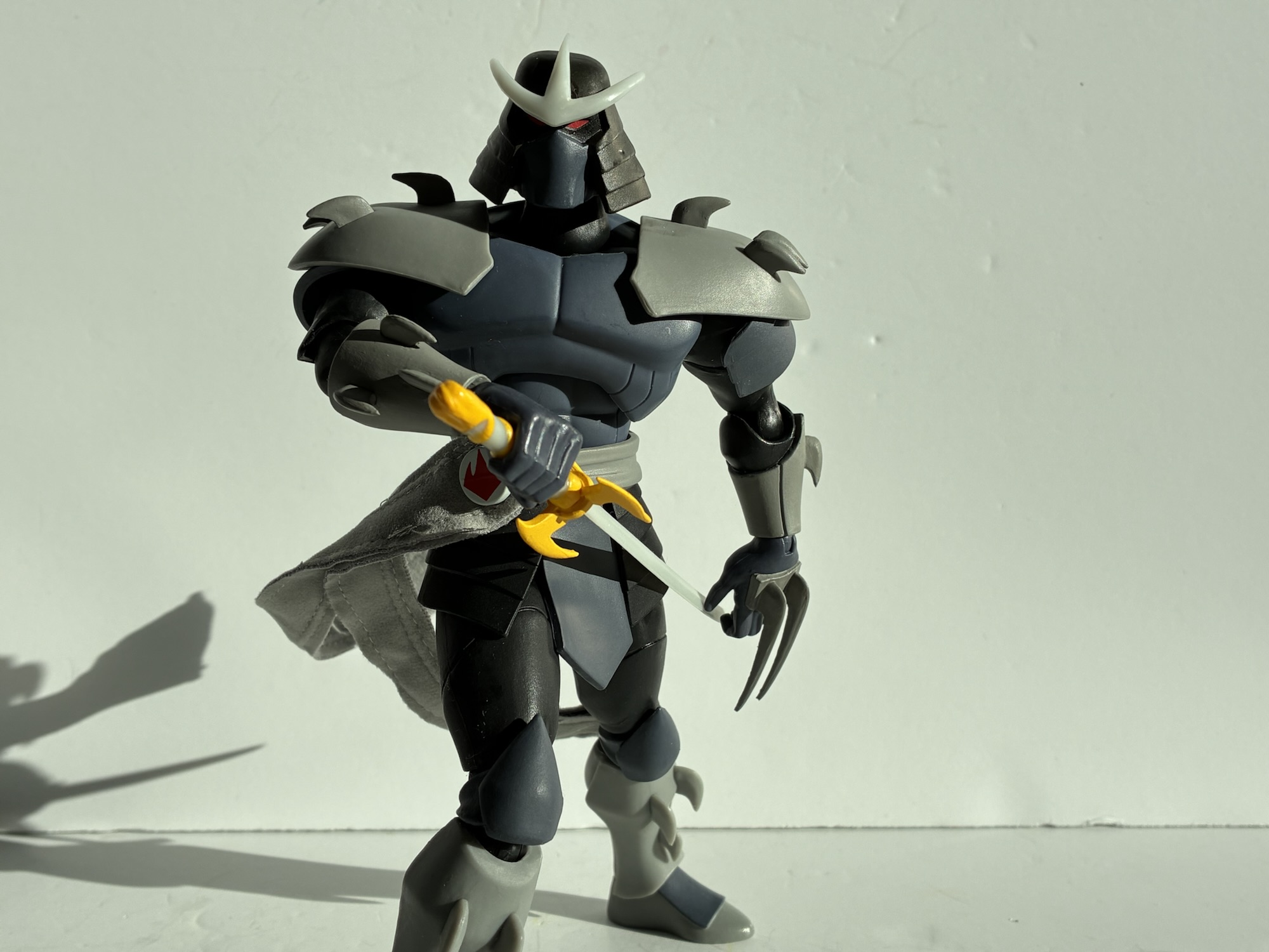
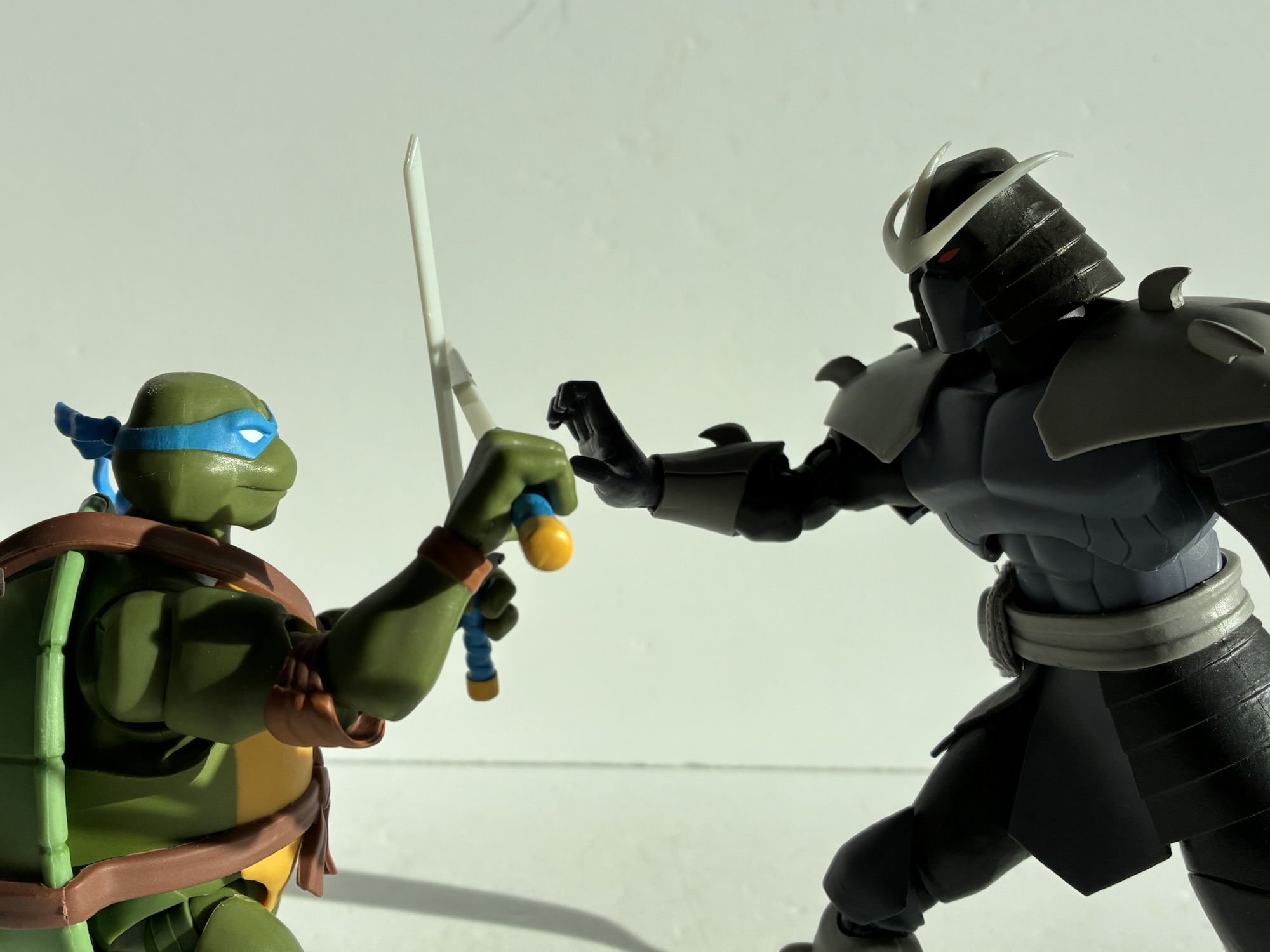
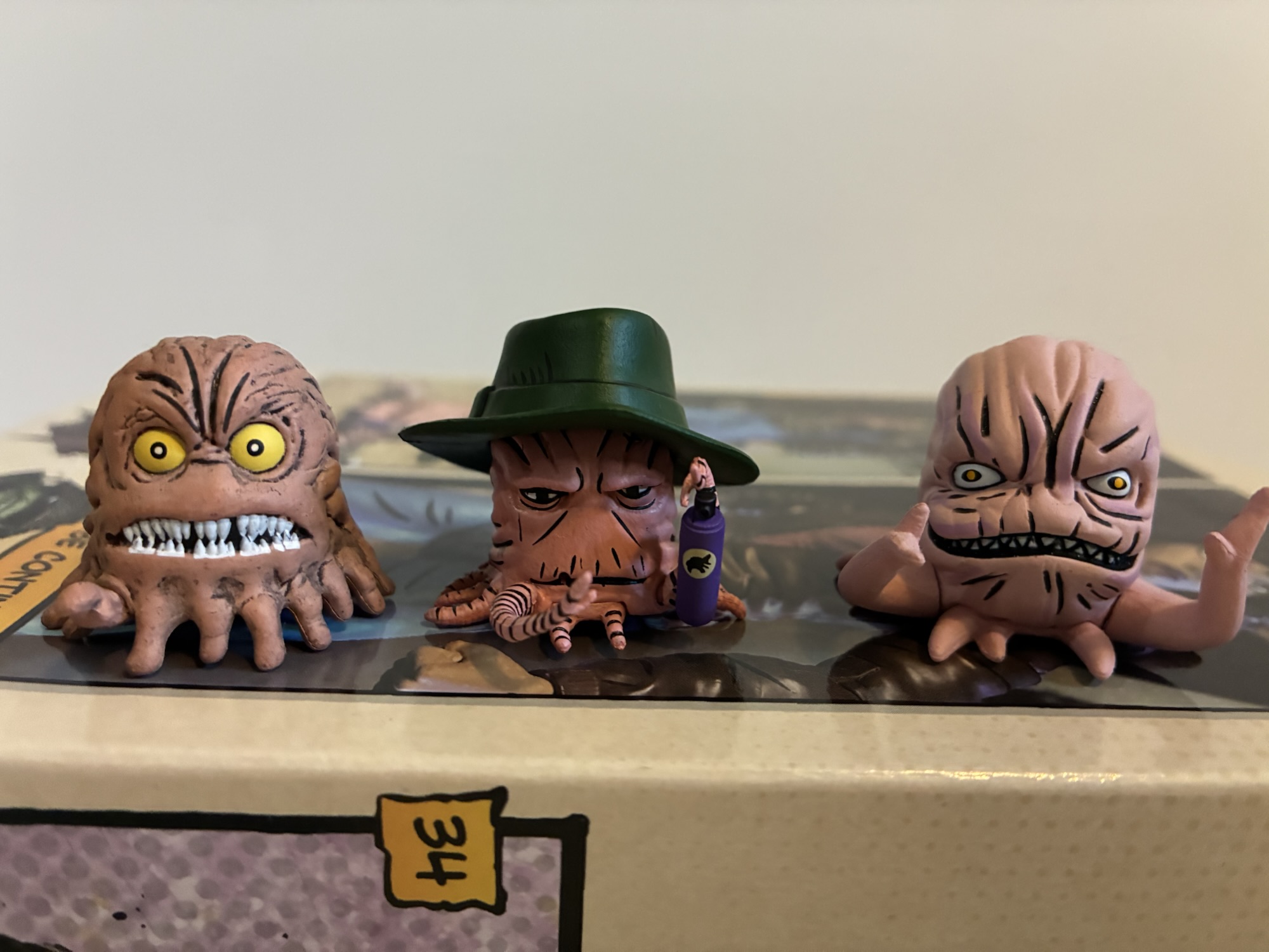
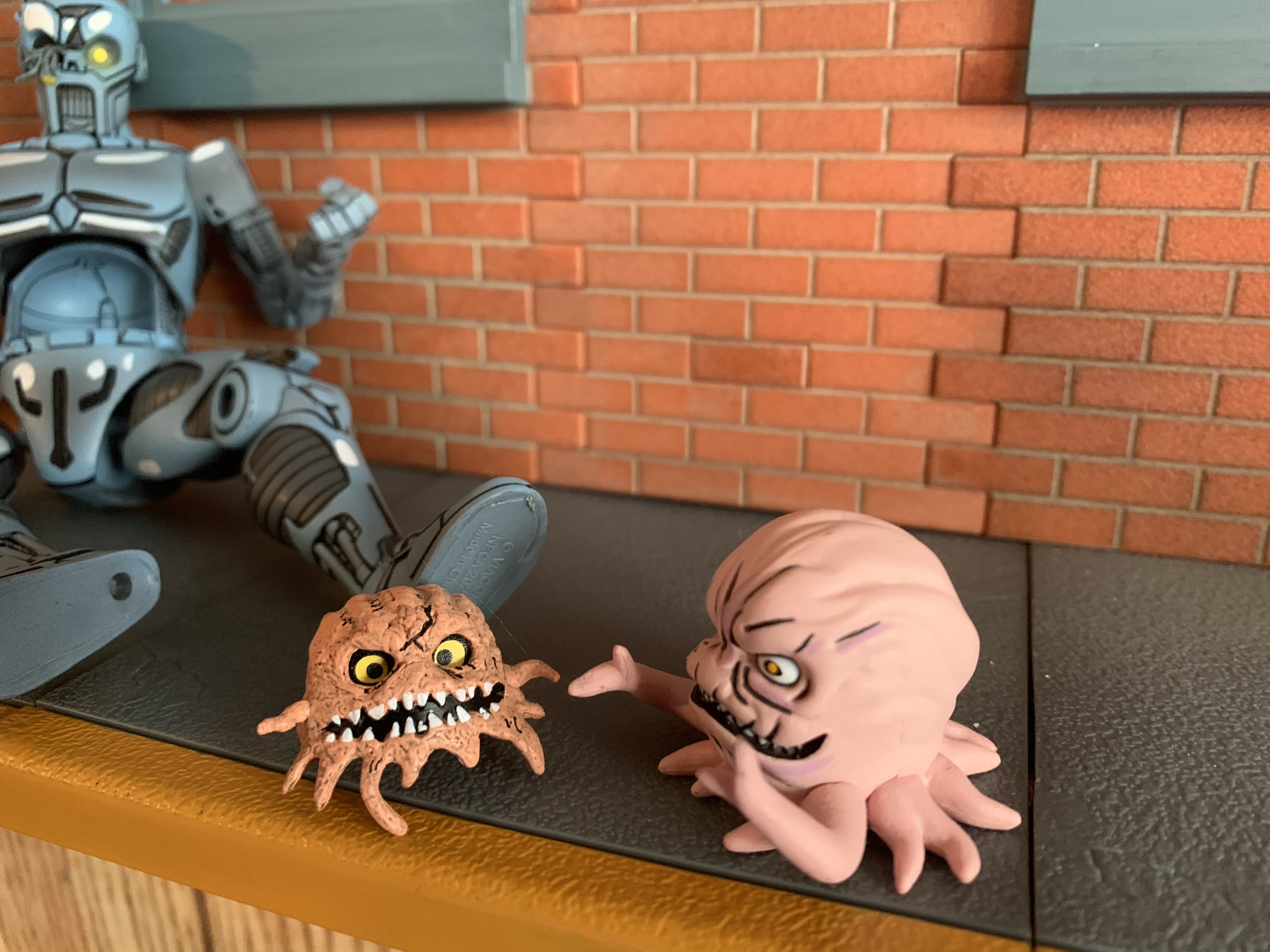
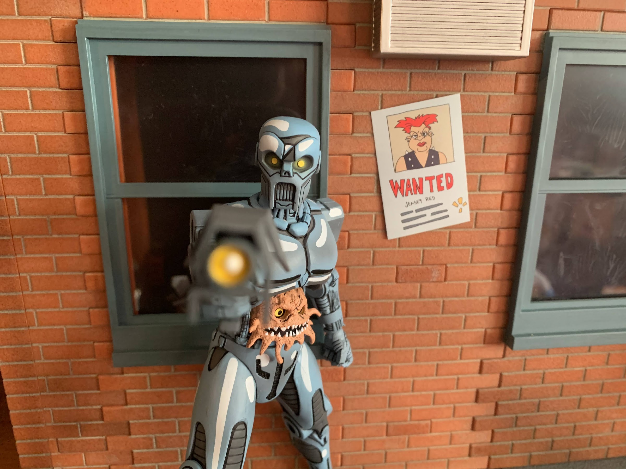
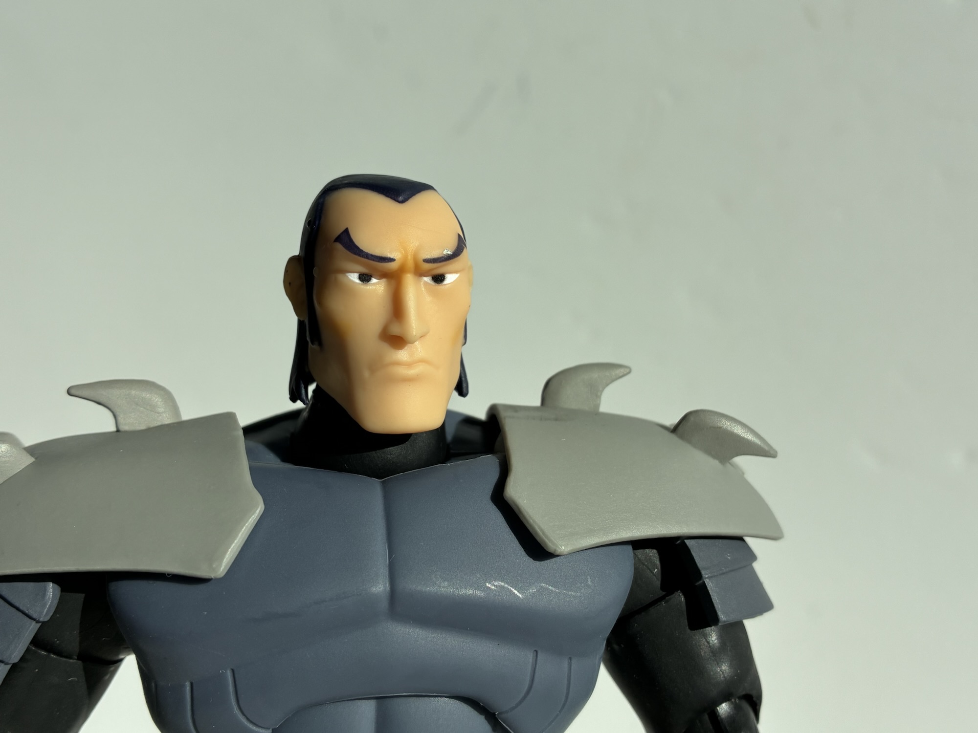
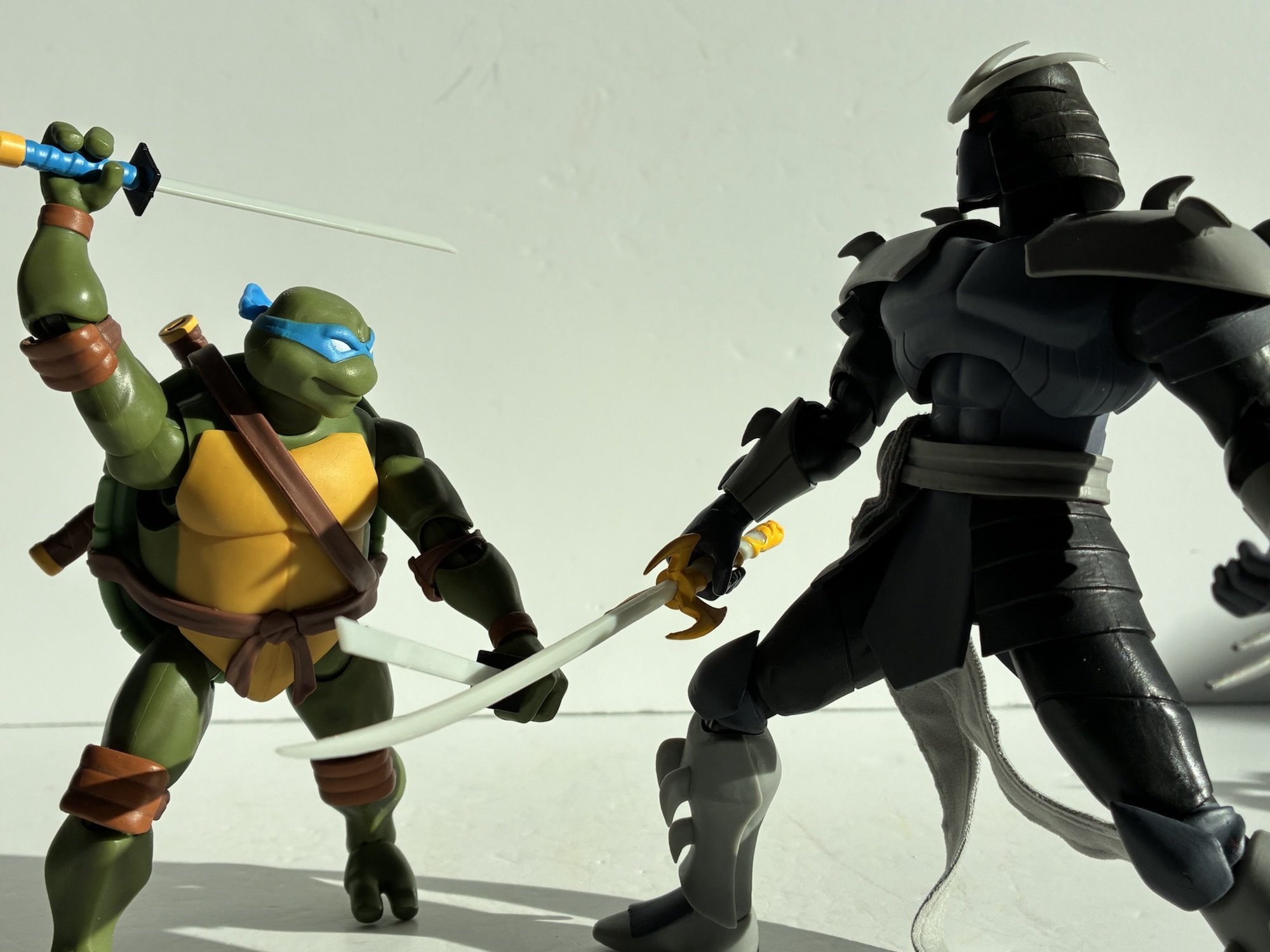
Shredder is like a B or a B- looking figure, but unfortunately it’s the strong part of the package. The accessory load-out is merely okay. We get a pretty decent assortment of hands including sets of fists, gripping, and what look to be palm strike hands. The palm strike hands may be intended to function as an alternative gripping hand, but to grip what I don’t know. He also has a right, open, hand for gesturing to the Foot, I guess. It’s a solid spread – no complaints. He also comes with the Sword of Tengu. The sculpt is fine and there’s some painted yellow parts on the hilt, but the blade and the plastic between the painted parts are bare, gray, plastic. It’s that same milky, slightly translucent, plastic that they’ve been using for the weapons and the crest on Shredder’s helm. It almost looks like it’s supposed to be glow-in-the-dark (coincidentally, there is such a version for those who preordered the whole wave through Super7) and just another example of Super7 going cheap and letting down their sculptors. Shredder also has an unmasked head that’s a bitch to get on. That crest is kind of fragile so pulling off the head isn’t easy. The likeness is good though, but they left most of the flesh unpainted so it has a waxy appearance. There is, to my surprise, some shading on the cheekbones and inbetween the eyes, but they used an orange color that looks like someone smeared an orange rind against it. Maybe this is why they don’t often use shading since they’re bad at it? The last accessory is little Ch’Rell out of his suit and looking like he’s up to no good. It’s a slug figure that looks good, but again the lack of paint just keeps it from being as good as it could be. They painted the eyes and the scar over the left eye, but there’s no shading anywhere else. A dark wash would have really brought out the detail here, but instead it looks like the cheap throw-in that it probably is.

He kicks high.

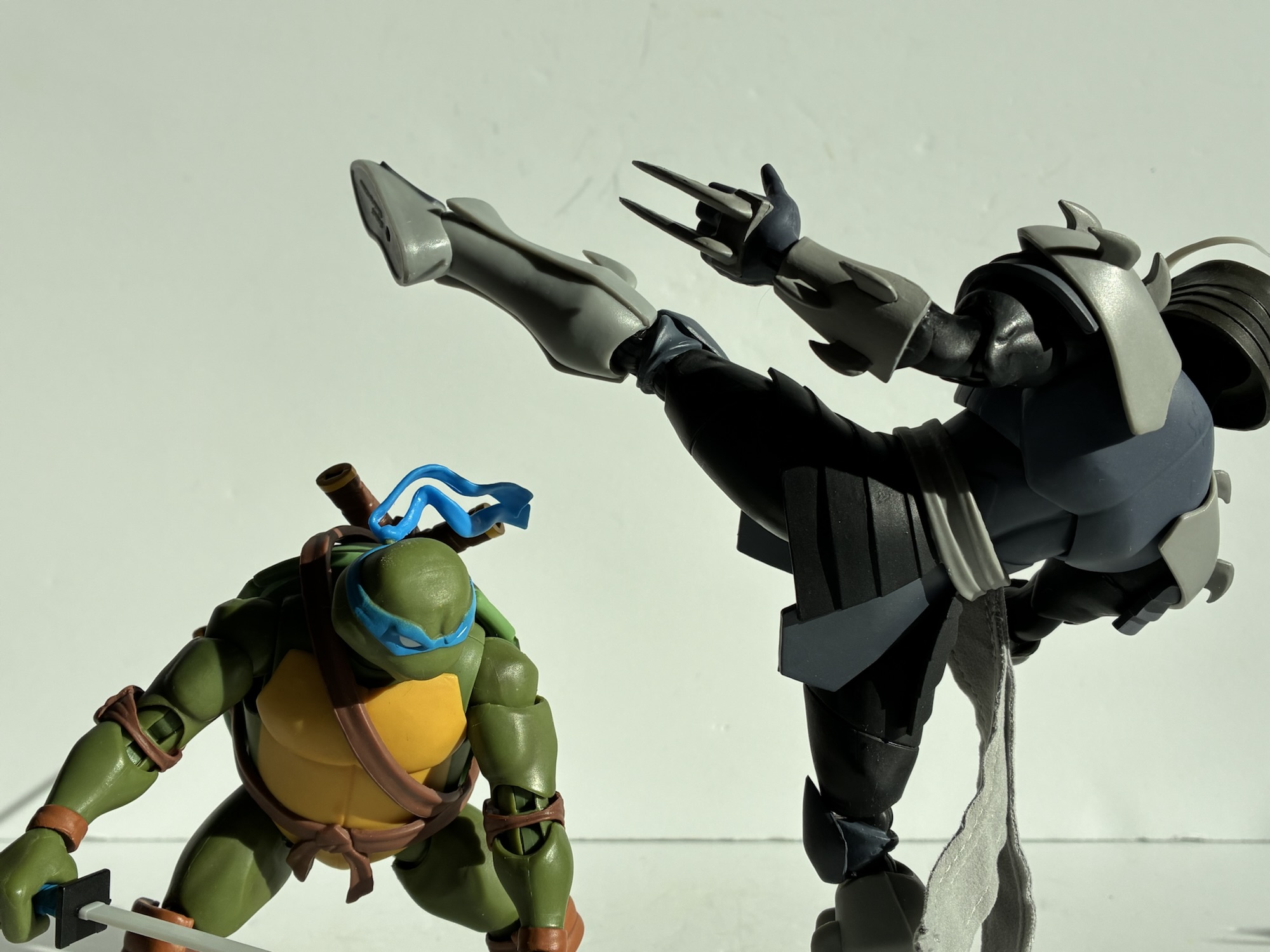
Perhaps Shredder can impress with his articulation. After all, there’s more here than we’re used to with Super7 and unlike the turtles before him there’s no cumbersome shell to work around. The head is a double ball setup with another joint at the base of the neck, but it mostly just rotates and offers some tilt out of the box. I did find that removing the head and then reseating it helped to sit the head just a touch higher which opened up some more forward and back range. The higher sitting head also looks a little better to me (all of my pictures are after adjusting this so if you think his head looks too high know you could force it down further on the ball peg). Standard shoulder hinges are in place and he can raise his arms out to the side 90 degrees and rotate without issue. The elbow joint is like that old style NECA double-joint with a peg and hinge above and below the elbow. It doesn’t look as bad as some of those NECA elbows because they did sculpt a point onto the elbow so you don’t get that weird U shape when utilizing both hinges. There’s also less range to prevent that oddity as Shredder can only bend his elbows a little past 90 degrees. You do get a swivel point above and below the joint effectively giving you a bicep swivel and a forearm swivel as the bicep and forearm are basically plastic sleeves over the joint inside. This is actually quite useful for Shredder because of those forearm gauntlets so you can always make sure they’re aligned with the hand in a manner you like best. The wrists swivel and hinge with the gripping hands having a vertical hinge. Unlike the head, it’s quite easy to swap hands which I appreciate.

In the torso, we get what is probably a double-ball peg in the diaphragm. This mostly allows for rotation with minimal forward, nothing back, and only a little tilt. The waist twist is just a peg so it only swivels, but at least it’s there. The hips are standard Super7 hips with a hinged ball peg that also has a built-in swivel at the joint which works fine as a substitute for a thigh cut. The knees follow the same engineering as the elbows so you get a joint that will bend past 90 degrees, though perhaps not as far as you would have expected. In this case, I believe the knee pads play a bit of a role. There is also a swivel point both above and below the knee so you essentially have a double boot cut. It’s useful as if you always want the knee cap to align with the toes of the figure then you should be able to do so. The ankles are typical hinge and rockers and the range going back is very good and going forward is fine as there’s enough of the shin cut away to let the foot go forward. The ankle rocker is acceptable. Lastly, there’s that wired sash I mentioned back in the aesthetics portion of the review and even though it’s ugly, the wires at least function well.

Leonardo wins – always.

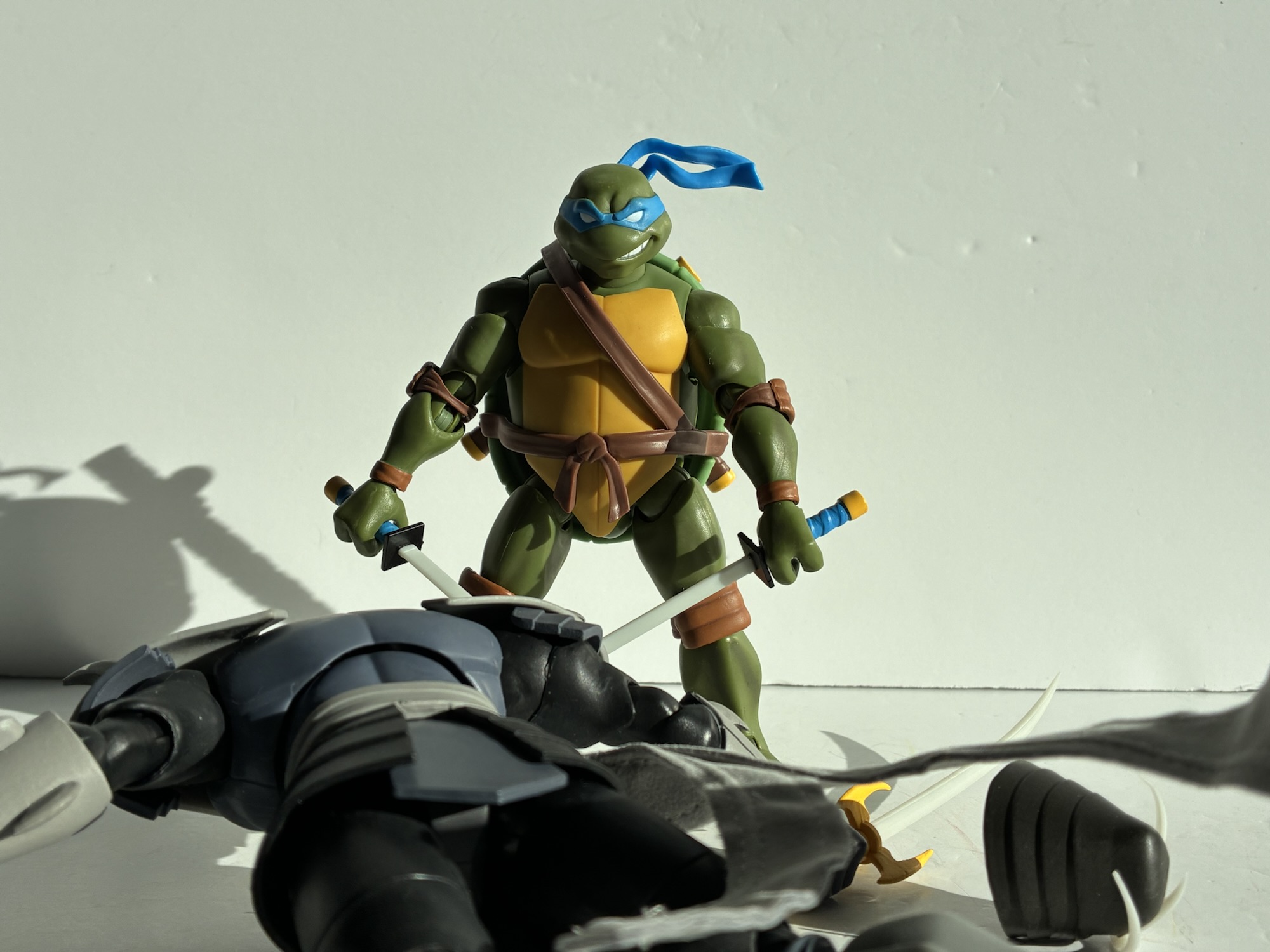
To my surprise, the articulation for Shredder is pretty good. It’s not perfect. I think the diaphragm could be a little better and a ball joint at the waist would have allowed for at least some forward and back, but he articulates better than most Super7 figures. And his leaner proportions mean his softer parts don’t grind against the hard plastic ones like the turtles. Out of all the Shredder figures I have from various companies he may even articulate the best. I definitely wasn’t expecting that. Is it enough to save the figure? Yes and no. Save is a strong word. I have criticisms of the presentation here, but I still think he looks good on a shelf and in the 2003 collection. It’s an appropriately menacing looking Shredder so Super7 at least accomplished that much. It still probably doesn’t earn the $55 asking price. In addition to my presentation criticisms, the figure still feels like a Super7 offering. It poses reasonably well, but not in a fun way. Everything feels stiff and kind of clunky. It’s a bad in-hand feel like a lot of Super7 figures. There’s no smoothness to any of the joints as most are clicky, almost ratcheted, but also with loose spots. Nothing is floppy, but nothing is smooth. It’s a Super7 figure and you’ll have to decide for yourself if it’s worth it to add to your collection. I wanted this guy to pair with the turtles and I at least don’t regret my purchase. Will I six months from now when Amazon has him listed for $35? Maybe. It’s not a given that will happen, but it is likely. I do think this is where I get off the Super7 train though. The other figures in this wave either don’t interest me or don’t look worth the asking price and I am definitely not going up to $65 for this company. If they return to the Playmates looks and finally put up that Heavy Metal Raph then they may get me for the full $65, but from here on out I’m only considering these things on clearance as they’re just not worth what the company is asking for.

“I’ll be back!”

Despite my criticism of Super7 I do have quite a bit of stuff from them:

Super7 TMNT Ultimates! Teenage Mutant Ninja Turtles (2003)

Who isn’t making Teenage Mutant Ninja Turtles action figures these days? It’s becoming a far easier thing to keep track of than just who is making them. For years, it was the domain of Playmates Toys and only Playmates Toys. NECA tried to get in on that TMNT action in 2008 and it ended prematurely…

Keep reading

Super7 TMNT Ultimates! Guerrilla Gorilla

It feels like the last few times I’ve made a Super7 Teenage Mutant Ninja Turtles post I’ve wondered if it’s my last one so I’m going to stop trying to predict that. This one comes courtesy of Big Bad Toy Store and their generous summer of deals. I wasn’t going to pick up this particular…

Keep reading

Super7 TMNT Ultimates! Triceraton

My summer of discounts continues today with yet another Super7 Ultimates! release. Back when wave 7 of Super7’s line of Teenage Mutant Ninja Turtles was unveiled I quickly locked in a preorder for three figures: Punker Don, Robotic Bebop, and Triceraton. By the time the line released way, way, late, I only ended up with…

Keep reading

NECA TMNT Mirage Studios April (Version 2) with Professor Obligado

Say “Hello” to her little friend.

Back in 2008, when NECA was planning out a line of Teenage Mutant Ninja Turtles action figures that they hoped would run for a long time, they turned to the turtles’ most trusted ally when it came time to do a fifth figure. The line wasn’t long for this world, and that figure of April O’Neil from issue two of the Mirage Studios run of comics ended up as a convention exclusive. She had a couple of variants, and came packaged with Mousers as well, but she was also the end of the line. Be it poor sales or issues with the master license holder, NECA’s Mirage run of turtles was brief, but has since been resurrected. We’re almost nearing a point where it feels like NECA, not Playmates, is releasing more unique sculpts per year when it comes to this franchise and it’s no surprise that in 2025, in the month of April no less, NECA has decided to return to the character once looked to as the most logical release after the turtles themselves.

An updated April for your updated turtles and newish Casey.

Version 2 of April is presently shipping as part of the Target Haulathon, that oh so expensive time of year for those who collect NECA TMNT. The old figure is one I never bought. April was a little rough in her debut appearance and creators Kevin Eastman and Peter Laird were not too proud to admit that it took them awhile to really learn how to draw April. That figure fits in well with those early TMNT figures NECA produced as they’re based on the first issue, but for those looking for an April that vibes with the more recent output from NECA a new figure was needed. For inspiration, NECA turned to issue #11 which has become somewhat infamous online over the years. Namely, for those who want to champion that April was originally conceived as being black or at least mixed race. While it was true that her name came from April Fisher, a woman who is of a mixed race, Eastman and Laird have always been pretty clear over the years they envisioned her as a white woman. In issue 4, she received a new hair style – a perm. Combine that with the name thing and the fact that Eastman and Laird often used people in their orbit to base April’s looks on and you can see why this became such a big thing.

Apparently, Eastman has at least embraced this retcon of sorts as this new April from NECA depicts her as a black woman. And why not? NECA already did a white April (well, many if you count the cartoon and movie lines) and people seem to like this idea. Some don’t, which is often the case when you start talking about race because there are racist assholes out there, but this is Kevin and Peter’s baby and if they like this depiction of April then that’s good enough for me. We know Kevin at least does since he did the artwork for the box. I guess Peter could hate it, or he could be fine, or indifferent, it doesn’t matter. It’s an April action figure and all that really matters to most would be is it any good?

“You know, I’m something of an artist myself.”

April is a figure sculpted by Richard Force and Tim Miller. Or I should say, April and her boxmate are sculpted by the duo. I’m not sure if one sculpted April and one sculpted her pack-in, but at least we know they both contributed where as most toy companies don’t give us that much info. Paint is credited to Geoff Trapp, Mike Puzzo, and Holly Knevelbaard. April stands at around 6″ to the top of her hair. She’s depicted in her outfit from issue 4 of a pink shirt, blue jeans, sneakers, and a brown jacket. At least those were the colors in the earliest color versions I have seen, though for me I’m most accustomed to seeing April and everyone else in black and white.

Not a figure made for the classic (and probably sexist) female pose.

The presentation for April is fairly basic. That’s not necessarily a negative, it’s just the reality of an action figure based on a normal woman. There’s no crazy super powers to capture or outlandish costume, it’s just a woman in casual attire. She has her poofy hair which is done in brown with some light brown brushed over it. Her expression is serious, but fairly neutral. There’s some linework on her cheekbones and her lips are red and outlined in black. She has a simple gold necklace sculpted around her neck and some big hoop earrings which appear to be part of the sculpt for the hair. The jacket and shirt feel like they’re an overlay, but the material is more firm than usual. There’s a lot of black linework on the clothing and the paint job on the sneakers is pretty complex and mostly clean. The paint is sharp and the appearance of the figure is too. My only critiques would be it looks like they missed a paint app on the zipper of her coat as it’s just left brown. They also gave April a serious case of “flat butt,” why did you do her dirty like that NECA?

This little guy gets all the stuff.

April comes with three sets of hands: open, fists, and gripping. That’s it. I wish we got a second portrait from the panel where she shows off her new haircut as she just looks really happy in that shot and it would be nice to give her the option of being happy on the shelf. Her articulation is pretty basic for the line as well. If you have Kirby or Baxter then you should have a pretty good idea of how April moves. Her hair really limits the range at the head to basically a swivel. The shoulders, elbows, wrists, and knees all work well and as expected. The range at the hips is good, but she can’t quite hit a split. Ankles are a bit limited and for some reason the left ankle on mine doesn’t want to pivot (it’s gummy and just snaps back into a neutral position). The waist is a ball joint, but it just swivels for the most part because of the size of the overlay. The torso isn’t going to do anything and the gripping hands have the wrong hinge, not that she has anything to hold. Her feet being relatively small, she can be a deceptively difficult figure to stand. I’ve had her topple over numerous times already in the short while I’ve had her.

That’s April, but she’s technically not alone. Joining her is Professor Obligado, an Utrom ally with a series of short stories by Stephen Murphy. He’s very similar to other Utrom characters we’ve received in that he’s a little more than a slug figure as he has two articulated tentacles. He also gets the bulk of the accessories as he has a fedora, pipe, pick axe, paint brush, can of ink, and two extra tentacles one of which has a can of some spray molded to it. He looks fine and the swapping features are fun, but I would have liked something for April. It’s almost like NECA saw doing another April as an obligation, but rather than make her as much fun as they could, they threw in another character after doing the bare minimum.

At least Casey has weapons to spare.

This review has taken on a negative tone, but I should stress that this figure of April isn’t a bad one. It’s just fine. There’s nothing special about it, it does what you would expect, and the execution when it comes to the sculpt and paint is up to NECA’s standards. The articulation isn’t great, but still what one would expect of the line. It just lacks imagination. Obligado is fine, and those who really dig the Utrom characters will enjoy adding him to the mix. That doesn’t shake the feeling that I only bought this figure because I want an April and I would have bought anything. At least she turned out far better than the cartoon one. If you’re feeling inclined to pick this one up, April sold out online, but can be found at Target. If you don’t want to shop there for any reason, know that she’ll eventually show up elsewhere, but with the current state of things who knows what she’ll cost? Right now, the MSRP is $35 and hopefully it stays that way.

There are plenty more heroes and villains from NECA’s TMNT line of figures based on the original comics:

NECA TMNT Mirage Studios Karai as The Shredder

Where do you take your heroic comic book franchise when you kill your main villain in the first issue? Well, you first undo that rash decision by bringing him back! Teenage Mutant Ninja Turtles co-creators Kevin Eastman and Peter Laird famously killed The Shredder in the first issue of their comic. They never intended to…

NECA TMNT Mirage Studios Rat King

Rats! Is what Charlie Brown would say at the sight of today’s subject, the almighty king of the rats himself, the Rat King. Rat King has always been a favorite of mine when it comes to Teenage Mutant Ninja Turtles villains. Like a great many, I was introduced to the character via the cartoon series…

NECA TMNT Mirage Studios Kirby

Say the name “The King” to a comic book fan and they will immediately know of whom you speak. Jack Kirby is a titan in the world of comics. Creator or co-creator of a great many characters known throughout the world today, it’s hard to imagine what a comic book would look like without his…


NECA TMNT Mirage Studios Utrom

Raise your hand if you knew who this was. Be honest!

We’ve become so accustomed to having the Teenage Mutant Ninja Turtles in our lives that the name of the franchise has almost lost all meaning. Well, maybe not all, but I feel we mostly have lost sight of how ridiculous a concept this franchise is. And it extends to other characters in the franchise and I’m talking about Krang. Krang from the cartoon series is an oversized, talking, somewhat monstrous brain. In the context of the show, he’s perhaps not as outlandish a design as he would be in another show, but he’s still pretty out there. And then you add in his body. A large, bald, man in a red diaper and suspenders. Krang can’t go in his head like a normal brain would because then he’d no longer be visible so he has to go in the body’s stomach. I think it’s Vernon who draws attention to this factor in the fifth episode of the series when he sounds positively repulsed at the sight of a man with his brain in his stomach, and he’s right to be grossed out! Krang is one of the craziest designs from a popular franchise that I can think of.

These two make quite a couple.

And if you have a deep familiarity with Teenage Mutant Ninja Turtles then you know Krang is taken from the original comics, only there his race of beings were called the Utrom. There weren’t many (any?) that were actually named, they were just alien brains that got around in robotic bodies. Like Krang, they controlled those bodies from the stomach area, but unlike Krang their bodies were far more mechanical looking. Think the endoskeletons from Terminator, as that’s more in-line for how they appeared. They were foes to the turtles, but also tied in with their origin, and I’d elaborate more, but ever since the 2012 show came along the Utrom and the Kraang from that series kind of run together in my head. Needless to say, they play a significant enough role in the original comics that an action figure from NECA made sense.

The Utrom from NECA stands at right around 6.625″ in height. It comes in the standard window box packaging with new artwork from Kevin Eastman on the box depicting the character. On the rear are product shots and a cross-sell for more figures in the line. Let’s just get right to the big talking point with this guy: the paint job. This figure is gorgeously painted. If you thought the Fugitoid figure looked terrific, wait until you see this. It is fantastic! I am in love with how this figure turned out. It’s sculpted in a light blue plastic, like a periwinkle, with white accents painted onto parts of it to go along with the usual black linework this line is known for. There’s also a hit from an airbrush that contains some gray paint and the effect is just wonderful. This looks like it jumped off of the the page, colored version, and I just love how stylized this looks. This is what I want from action figures based on comics. You can’t sculpt it in chrome, and just making shiny plastic isn’t going to achieve the same end result. The eyes are also painted yellow with a hit of yellow from the airbrush to create the illusion that they’re glowing. The Utrom in the figure’s stomach is also well-painted. The eyes and teeth are clean and there’s a wash applied to really bring out the nasty with this little guy. And with this amount of paint on the figure, there’s virtually no slop. No stuck joints. It’s about as perfect a paint job as one could get in this price range. If I have any nits to pick with it, it’s that a couple hits of the white look a little thin. Maybe the neck area and some of the details on the arms could have used another hit of the airbrush, but that’s all minor and just me trying to poke holes in this thing because, otherwise, it’s awesome.

The sculpt and paint on this guy are just incredible.

The wonderful thing about this figure too is it has a sculpt to match. There are tons of little details in the arms, especially, that look like wires and little machinations. I love the contrast of the smooth plates on the figure’s thighs and the ribbed portions underneath. The rear of the figure is really loaded with sculpted details which is commendable since that’s a spot NECA could have cheaped out on, but obviously did not. It all speaks really well to NECA as a company because they’re clearly committed to delivering the best, most accurate, representation of the character possible. Who knows if much or any of this figure can even be reused for other figures. I’m sure we’ll get a variant at some point, but we have numerous examples of other companies just half-assing their sculpts to present a compromised vision of a character in the interest of saving money on tooling and NECA is just putting them to shame. And something I should praise NECA for more often than I do is that they credit the folks who design their figures so a major shout out and hearty congratulations to sculptors Brodie Perkins and Josh Sutton with paint credited to Geoff Trapp and Mike Puzzo. We should also probably give a shout out to director Trevor Zammit as I assume he’s the one pushing to make these look like the source material and he just does a fantastic job with all of the TMNT lines he oversees at NECA.

And if you thought they would cheap out on the figure’s rear you’d have been wrong.

We’ve gushed over the look of this one, now let’s talk about the stuff it comes with. The Utrom has three sets of hands: fists, gripping, and trigger finger. All of the hands feature the horizontal hinge, our first disappointment of the release, but I do like that the fingers are soft plastic and getting the accessories into the trigger hands is relatively easy and free of paint rub. He also has a gun and it has a really fun design as it has these panels over it. It has some linework on it and the muzzle is painted rather simply, but well. There’s two red tools for the figure to wield. One resembles a wrench and the other is a bit more nondescript. I’m guessing it’s pulled right from the comic, but I don’t know exactly what it is. He also has a little canister with a straw in it. I think this is a drink for that actual Utrom in the belly, the only problem is he doesn’t hold it very well. The fingers on the trigger hands are flexible enough that you can wedge it in there with some effort, but a more relaxed hand would have worked better. Lastly, we have a second portrait for the robot that features battle damage. It’s right eye is hanging out and there’s a big gouge taken out of the top of the head that looks really cool. It’s nice enough that the temptation is there to get another figure, I just wish he had more battle damaged parts to swap to or even a second Utrom with a different expression to create a bit more variety. The Utrom that came in the comic con 4-pack years ago is much too big to fit in this guy.

Bang!

The accessories are solid leaving just the articulation for us to talk about. Like most of the figures in this line, the articulation isn’t going to be the strongest aspect of the release, but I think it’s going to be enough. There’s a ball joint in the head that provides rotation and some nuance posing. It looks down well, but not up. The shoulders are ball-hinged and you get all of the rotation you need, but the boxy shape of the shoulder means the figure can’t raise its arms out to the side. You get maybe 45 degrees there. There is a biceps swivel and it’s integrated very well into the sculpt. The elbow hinge is only a single hinge, but the design allows it to go past 90 degrees so that’s fine. The wrists swivel and hinge and I already mentioned the direction of the hinges is unfortunate. In the diaphragm, we do have a ball joint above the opening for the Utrom. It’s actually more functional than I expected as you get a little forward and back, some tilt, and a fair amount of rotation. At the waist is another twist and the hips are the standard ball and socket joint. There’s a thigh pivot there that provides just a little something for adjustment poses as opposed to a full thigh twist. The legs kick forward to a full horizontal position, though they do drift out from the body a little the higher you go. There’s no range going back, and the single-jointed hinge will get you a 90 degree bend. At the ankles we have a hinge that allows for plenty of range backwards, but nothing forward. The ankle rocker works fine. It’s decent and I think it’s enough for this character. He can do plenty of one-handed gun poses. I do think NECA could have sacrificed a little bit in the sculpt at the shoulders for more range, and the lack of vertical hinges for the hands is an ongoing problem. The actual Utrom in the body is not articulated, but I don’t think it needs to be.

The Utrom may not be a character that gets a lot of TMNT collectors excited, but the finished product is one of the best releases from NECA in a long time. I think this is easily my favorite from the Mirage line and I would put it up there with the best from the toon line as well. I can’t say enough good things about the paint job. This comic deco is fantastic and I love that NECA has the guts to try something like this with its figures. So many collectors dump on “cel-shading” when it comes to figure releases without realizing that most of the companies attempting that effect with their figures do a piss poor job. It takes effort and money to get it right as well as artistic vision. I’ve said it numerous times, but natural lighting cannot shade an action figure based on a comic book character the way that character is drawn in the book. It’s impossible. Comic book artists do their own thing that doesn’t work in reality and no one complains because it looks awesome. It’s stylized, but some of it is so prevalent that we don’t really think about it. I always use Venom as an example. We know his costume is black, but if you showed a panel from “Lethal Protector” to a kid he’d tell you the costume is blue because that’s how comic book artists shade black. And that’s what I want out of my figures. Major props to NECA on this one, they hit a homerun. I can’t wait to see what they do next.

More from NECA and their expansive selection of Teenage Mutant Ninja Turtles action figures:

NECA TMNT Cartoon The Wrath of Krang!

We’re back for 2021, and right now it looks like a lot like 2020 as we have a new Teenage Mutant Ninja Turtles action figure to talk about – Android Krang! Hopefully, this doesn’t mean 2021 is a lot like 2020 going forward, but if it’s going to copy anything from 2020 then let it…

Keep reading

NECA TMNT Mirage Studios Fugitoid

I’m having a hard time coming up with an action figure line that has had retail releases separated by more than a decade. I don’t mean long-running lines of figures like G.I. Joe or Marvel Legends which have been around for decades, I mean a line that was started, ended, then re-started like NECA’s line…

Keep reading

NECA Mirage Shredder and Foot Clan NYCC Exclusive Set

The Shredder had a rough go at things for awhile when it came to plastic. He was featured rather prominently in the old Playmates line, though perhaps not as prominently as one would expect. Playmates never did do a movie version of him, aside from Super Shredder, and his figure was arguably the worst from…

Keep reading