Merry Boxing Day every one! I hope you enjoyed the Christmas content this year, but it’s time to go back to our usual programming. Which in 2020 means toys. And I just could not wait any longer to talk about what was probably my most anticipated release of 2020: NECA’s Tokka and Rahzar based on their appearance in Teenage Mutant Ninja Turtles II: The Secret of the Ooze.
One of the last, big, events of 2020 was New York Toy Fair. The show, occurring annually in February, is ostensibly a trade show, but over the years it has become much more. Like E3, coverage of the event has basically turned it into a full blown consumer event, only the general public is still largely kept away in the case of Toy Fair. The event was originally a time for producers to show their wares and solicit orders from retail partners and other vendors. Now, most of that stuff is handled throughout the year since communication is so much easier these days than it was 30 years ago and for the big toy producers the event is almost more like a chance to show off and get the consumer excited for what’s to come later in the year.
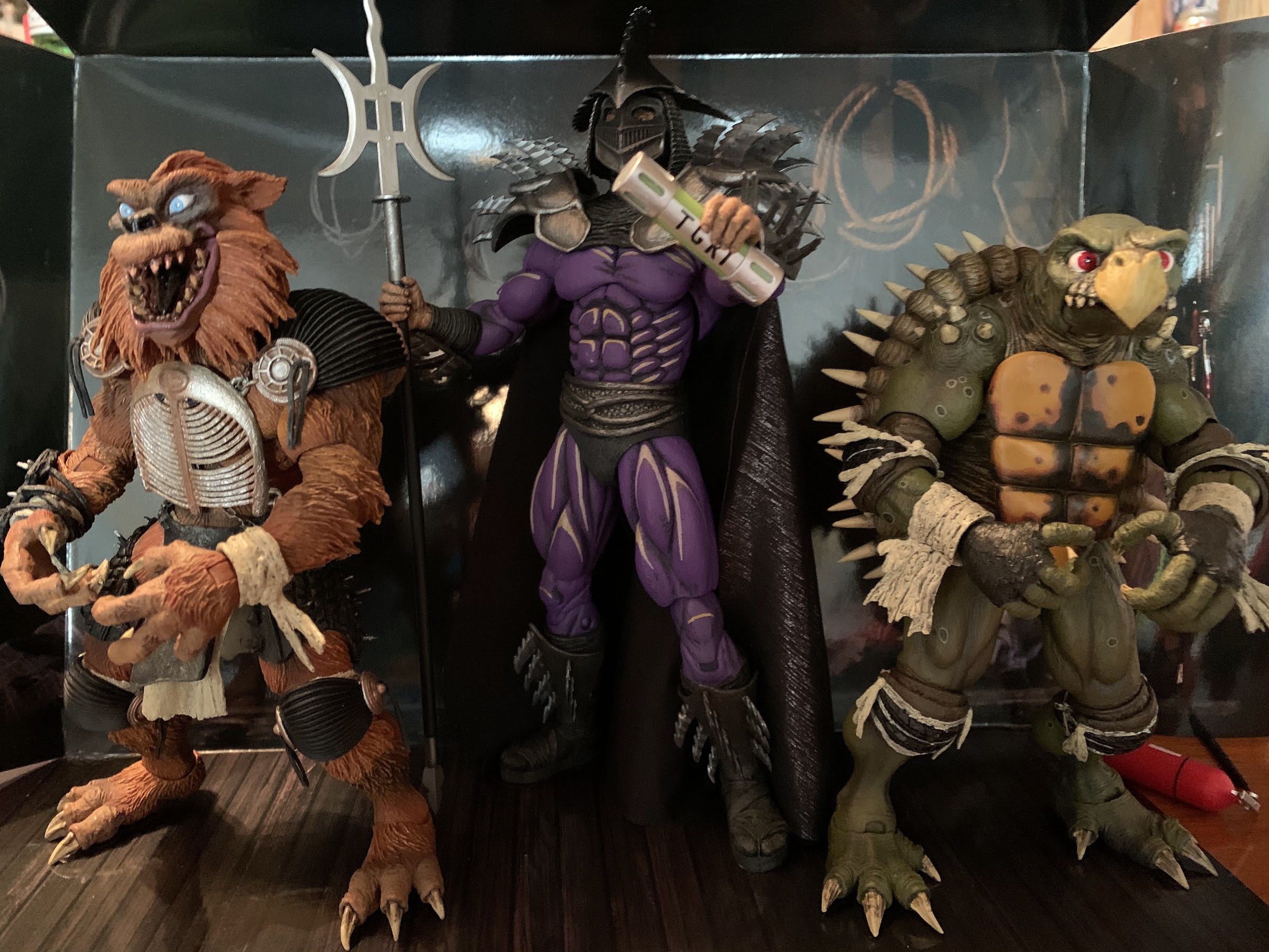
For last year’s event, I was pretty excited to see what NECA had cooking in the oven when it came to its Teenage Mutant Ninja Turtles license. I’ve definitely been more interested in the cartoon line, and I certainly was heading into Toy Fair 2020, but what ended up stealing the show for me was a two-pack from a movie I don’t even really care for. Tokka and Rahzar were the new mutants introduced for the sequel film The Secret of the Ooze in 1991. The movie is pretty hokey and kind of dumb, but the creature designs for Tokka and Rahzar (handled by the talented folks at Jim Henson’s Creature Shop) were off the charts. They’re imposing, and while NECA originally said it wasn’t that interested in producing toys based on the sequel, it basically had to give in to fan demands where these guys were concerned.
This year, NECA started distributing all movie-related product for TMNT at Walmart. It has not gone well. NECA had to endure a lot of fan backslash, some of it justified, some of it not, throughout the summer when product was scarce. Sort of as a mea culpa, the company decided to do something different with the planned Tokka and Rahzar two-pack. Rather than send it to Walmart like it did with the other figures, the company decided to do a manufacture-on-demand run via its website. For one week in July, anyone who wanted a set (or multiples) could place an order on NECA’s website and expect delivery later in the year. The only catch was you had to pay upfront, but you were guaranteed a set of figures in the fall. I don’t know if Walmart showed little interest in the set (it was more expensive than a standard two-pack, retailing for around $70) or if NECA just never offered it to the retailer, but either way, this method of delivery was a god-send. Sure, the wait was a long one given how much excitement I personally had invested in the set, but all-in-all, going from an ordering window to delivery in less than 4 months is a pretty short wait and it looks like the company pulled it off.
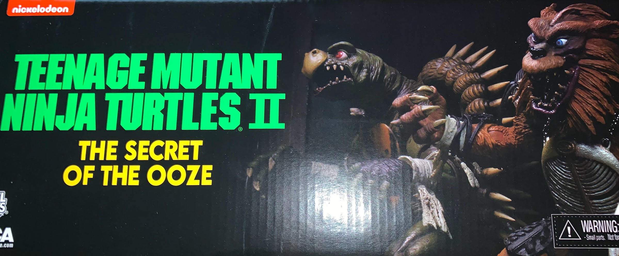
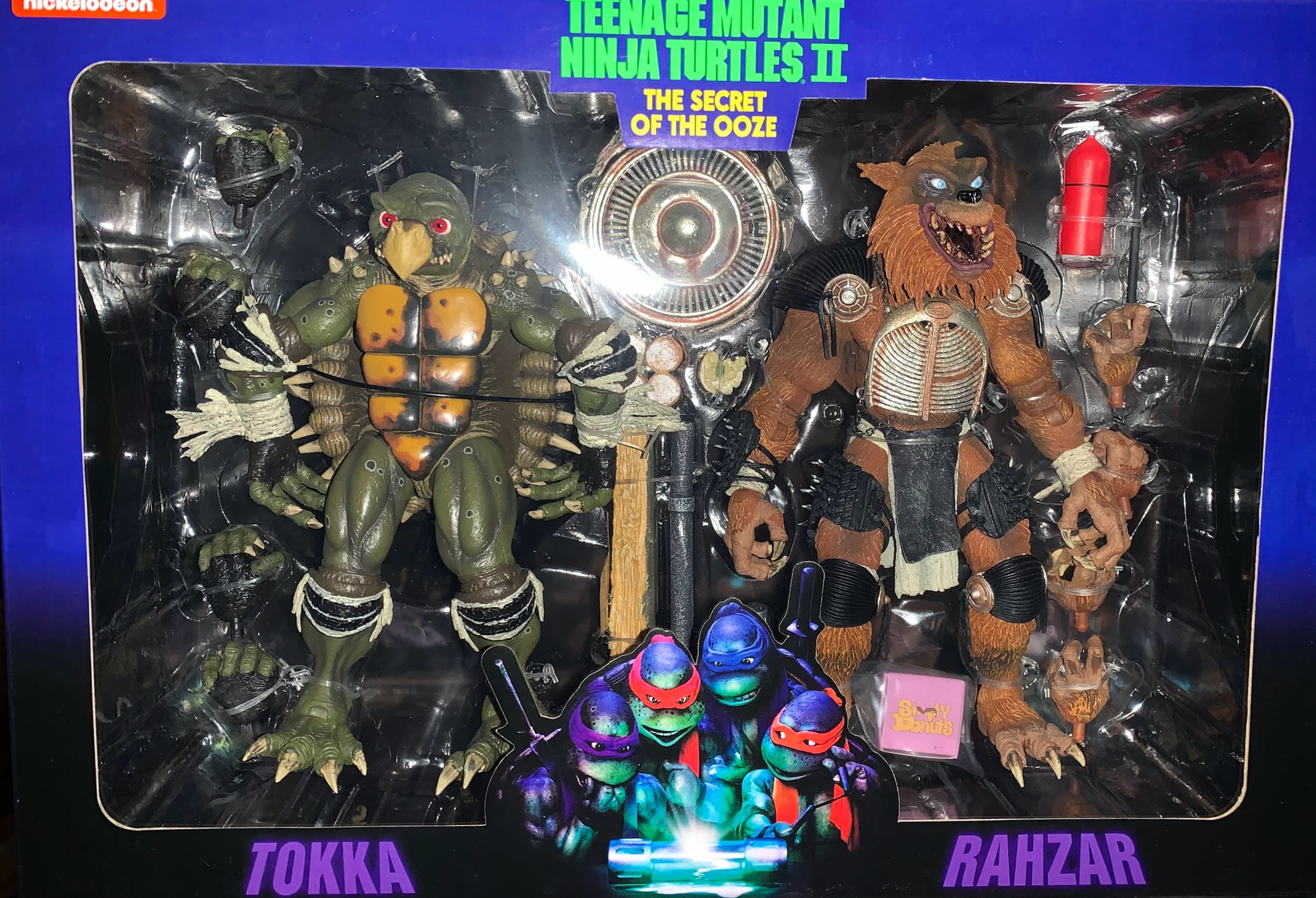
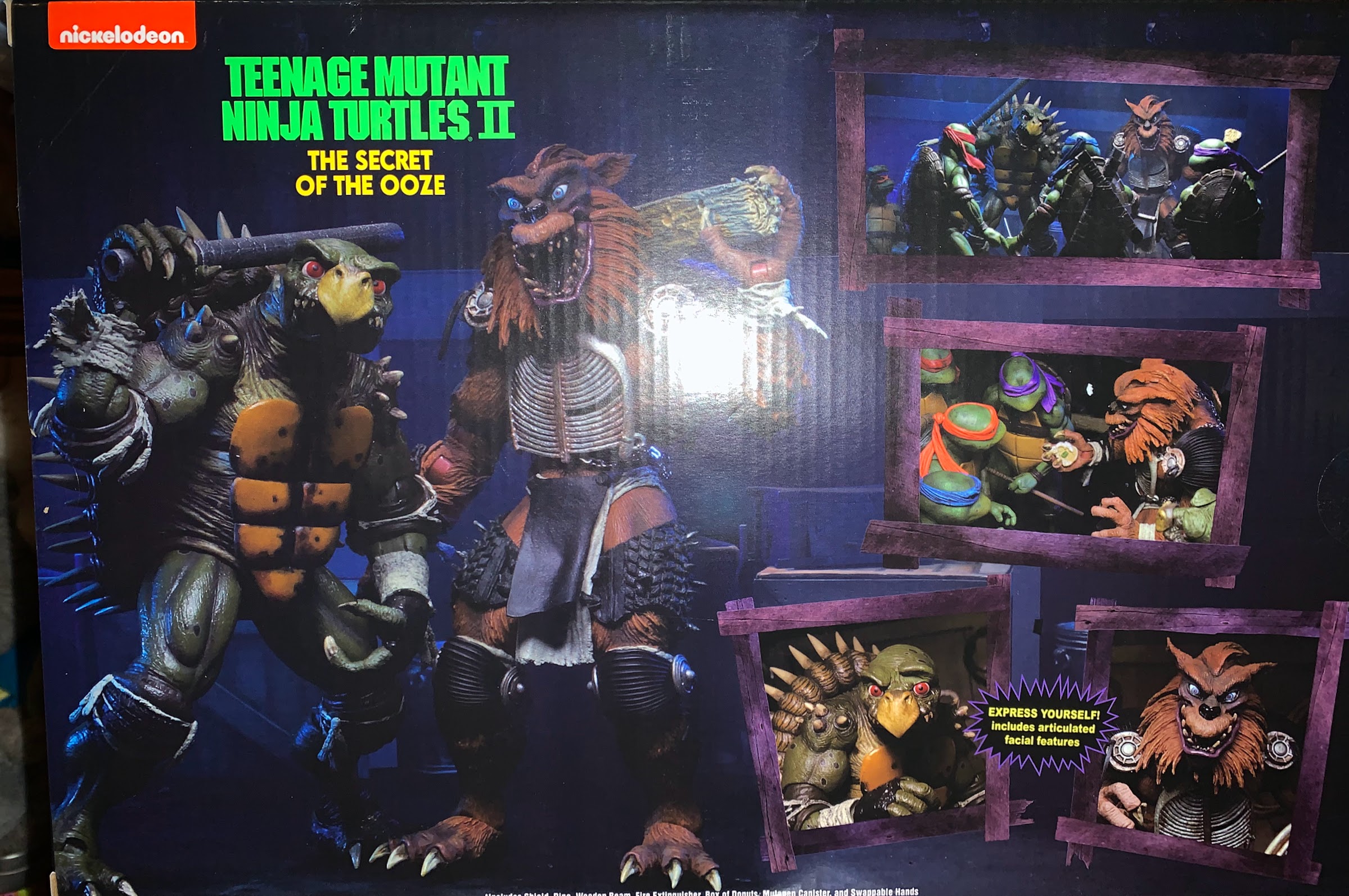
My set arrived in mid-December, so I’ve had some time to enjoy these “babies” before making this post. First of all, the box for these guys is huge! It’s the standard window box we’re used to, only it had to be increased in size to accommodate these guys. This sucker is 5 1/2″ deep, 9 3/4″ tall, and nearly 14 1/4″ long. The box is decorated with numerous product shots and the image of the turtles huddling over a broken canister of ooze from the theatrical poster. If you’re a mint-in-box collector then you’ll have to clear some space to display this thing. It’s appreciated since NECA could have skimped on the presentation considering this isn’t going to appear on store shelves, but then again, this sort of distribution is fairly common these days and NECA knows that a lot of collectors were going to buy two sets: one to open and one to preserve.
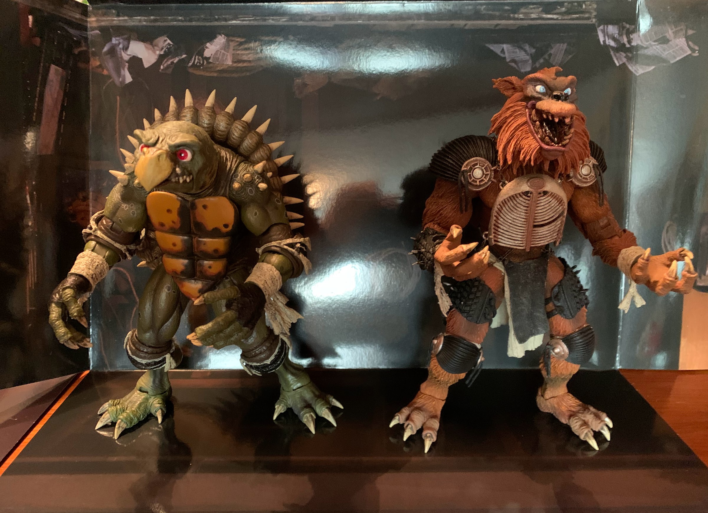
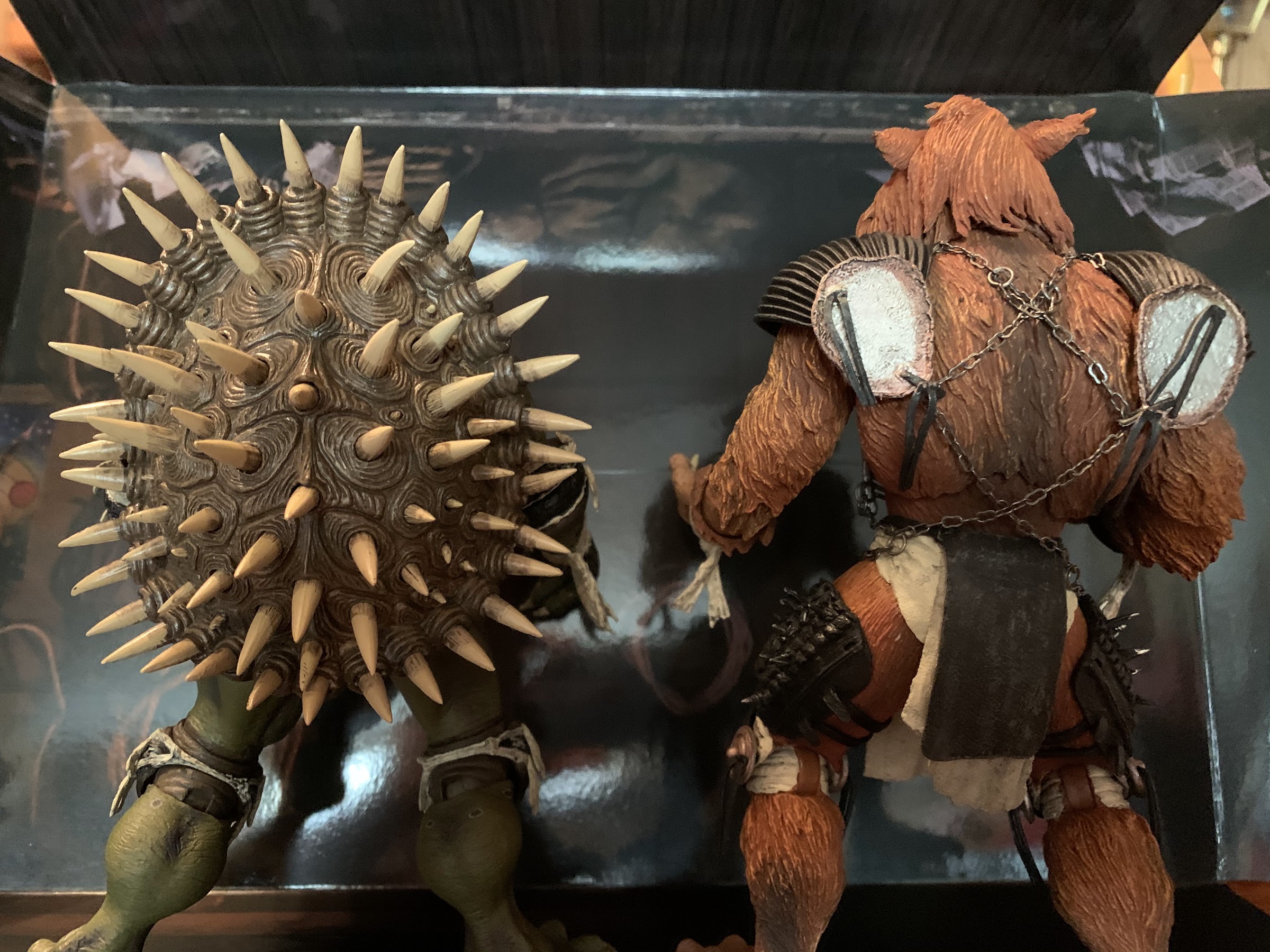
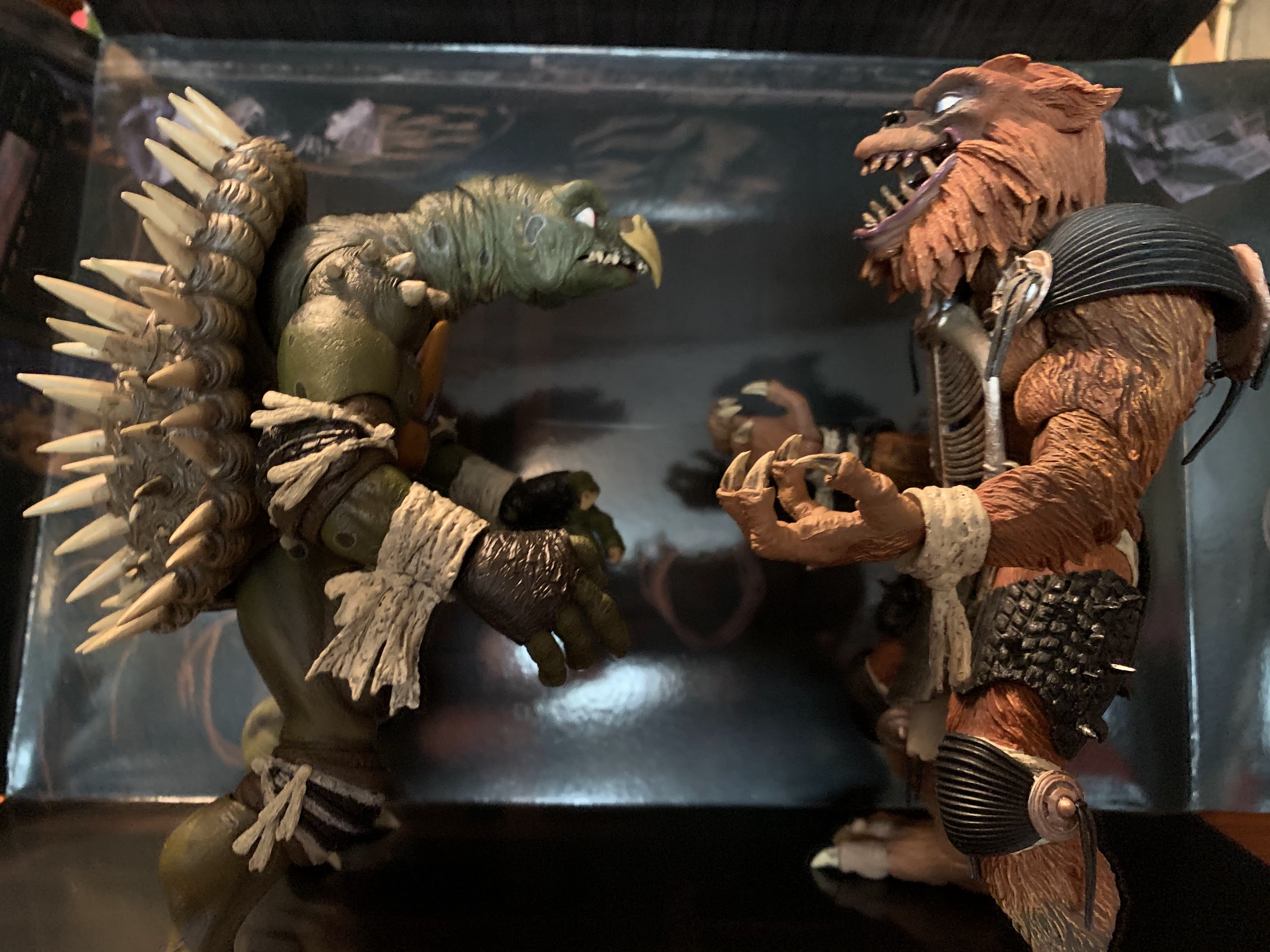
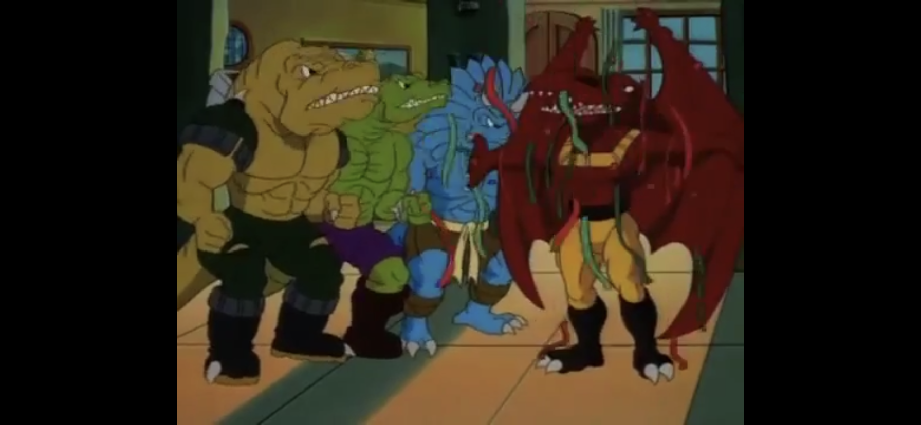
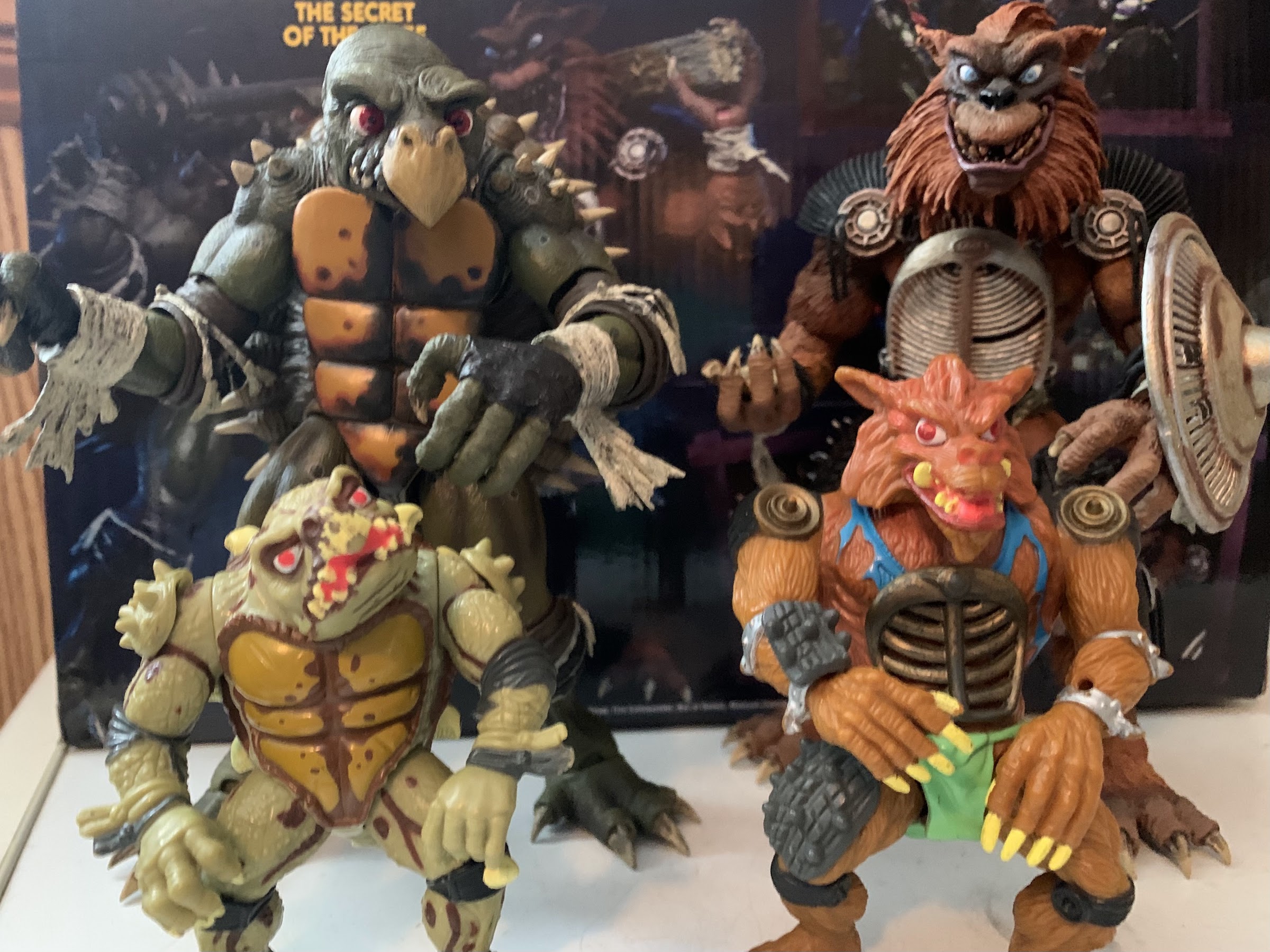
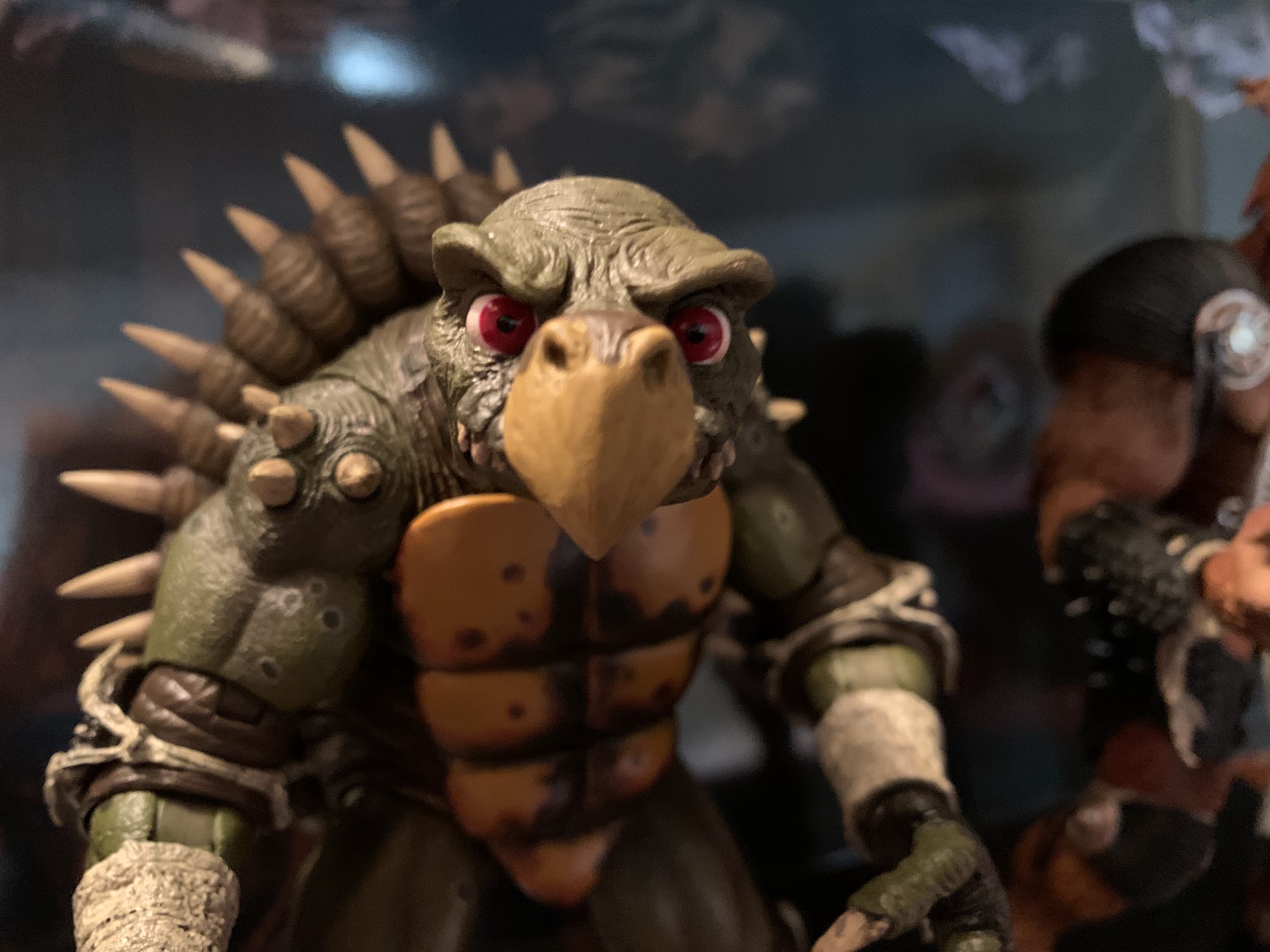
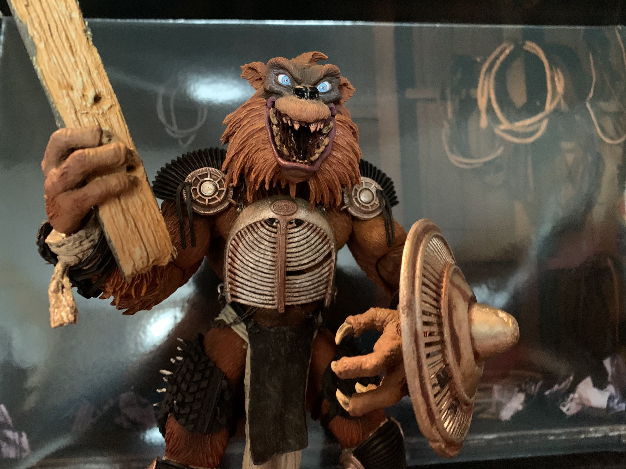
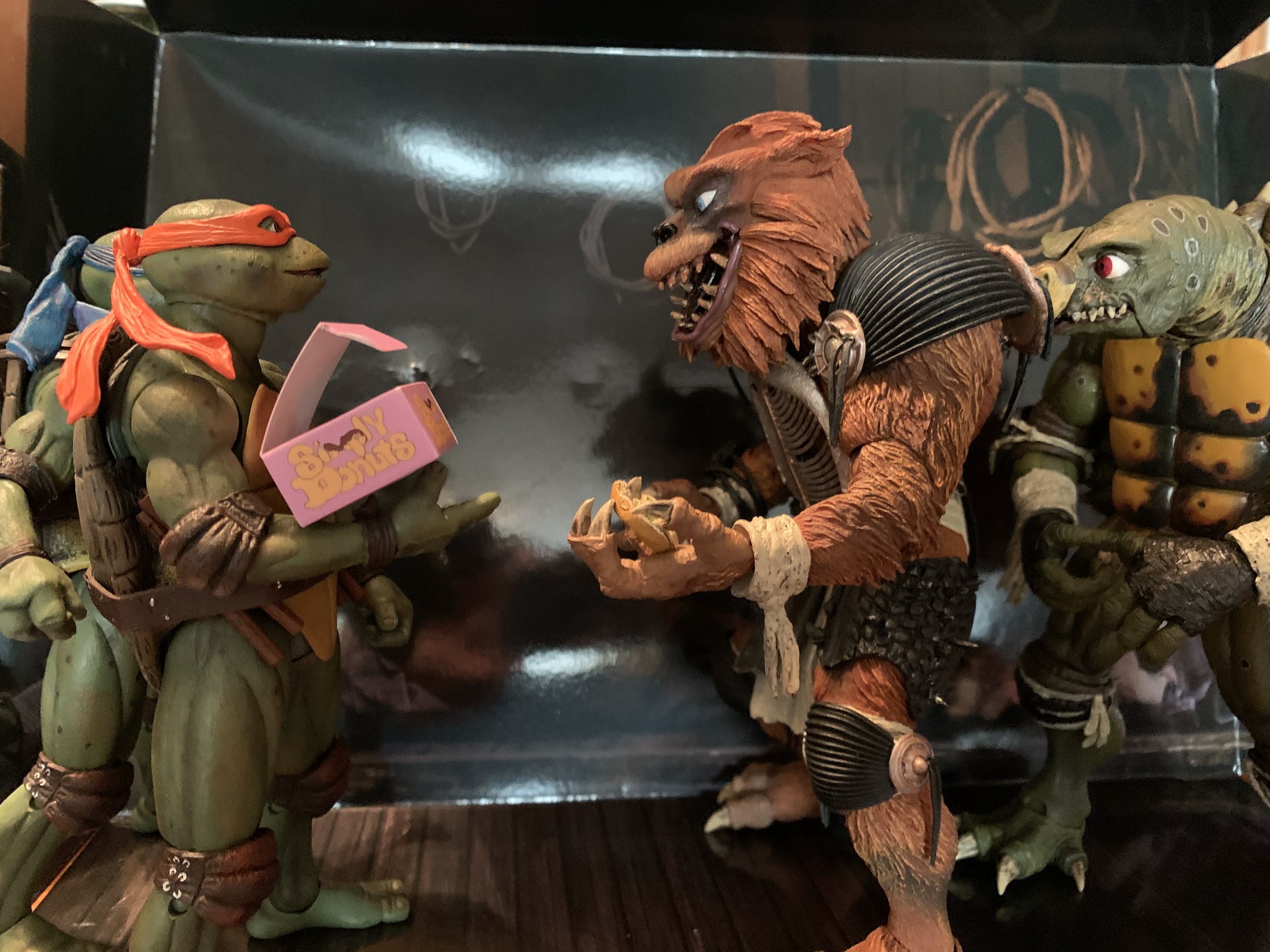
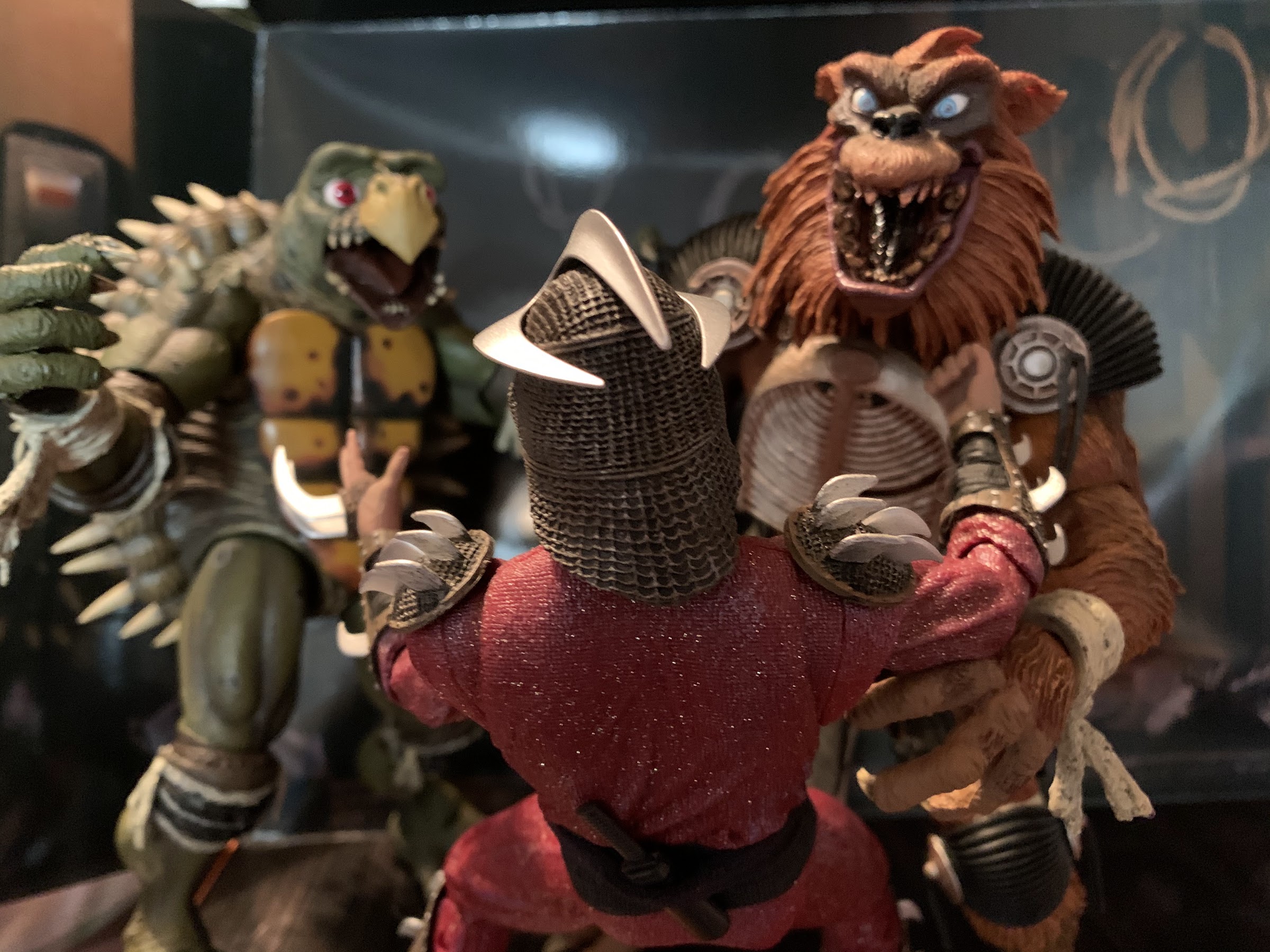
The figures themselves are a sight to behold. They’re depicted as they were later in the film when they do battle with the turtles at the junkyard. Tokka has little on his body aside from elbow and knee pads, while Rahzar is decked out in all kinds of stuff. As in the film, Tokka is the smaller of the two coming in at right around 7″ at the top of his head, with his shell protruding a bit higher. Rahzar stands a tick under 8″ and both figures have tremendous presence on a shelf. They’re very much in scale with each other, though some collectors may be a little disappointed that the scale isn’t perfect when it comes to the turtles. They are shorter, as you’ll see in pictures, but it’s not as drastic as it looked in the film. Granted, the film usually utilized a low angle when filming the two together. I think it’s good enough, but considering the scale on Super Shredder was basically perfect it might surprise people slightly that these two aren’t bigger.
The scale may very well be the last of any criticisms I have for these two. I certainly have little or no quibbles when it comes to the sculpt and overall look of these boys. Tokka is done in a slightly more olive skintone when compared with the turtles and it looks fantastic. He has a real dingy look to him, and it’s enhanced by the wash on his wrist tape which is quite dirty looking. His eyes are really expressive and I’m just waiting for him to bark at me that he wants a donut. What’s really going to impress though, are the various spikes on his shell. They have a springy quality to them, but don’t confuse that for me saying they aren’t sharp. You know when you’re holding this guy. Rahzar looks every bit as good as his box-mate. Well, I should say he doesn’t look quite as perfect as Tokka, but that’s only because he had fur in the film, but here it’s sculpted plastic. That said, it looks pretty damn good and I’m not suggesting NECA should have gone with faux fur as that might not have come out well. His eyes are super expressive as well and his mouth has that permanent grin he possessed in the film. The claws on his hands and feet look amazing with the amount of yellow and a dark, brown, wash to really bring them out. The texture on the black, rubber, armor pieces is also perfect and it’s great to get a good look at the detail on them since it’s hard to see in the actual film. I never even noticed before now that the pieces on his thigh appear to be torn from rubber tires with nails jutting through them. The grill on his abdomen is secured with actual chain links and swings around freely, not distractingly so. There’s a lot of soft plastic utilized for things like his loincloth or the little tassels on his shoulder and knee pads that not only look great, but seem to be durable enough. It’s hard to imagine someone else better nailing the aesthetics of these guys, even if done at a quarter scale, that’s how impressive they are.
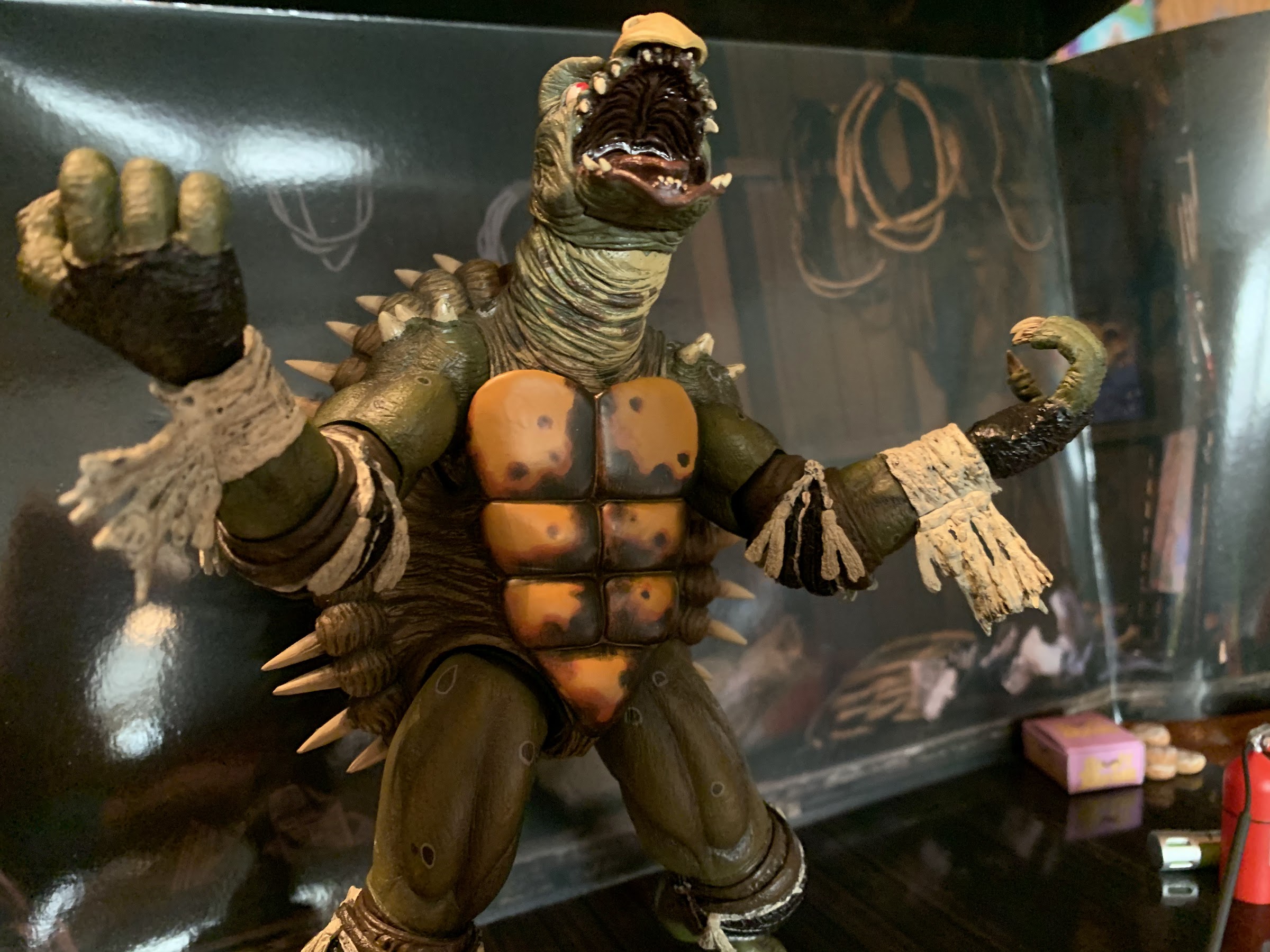
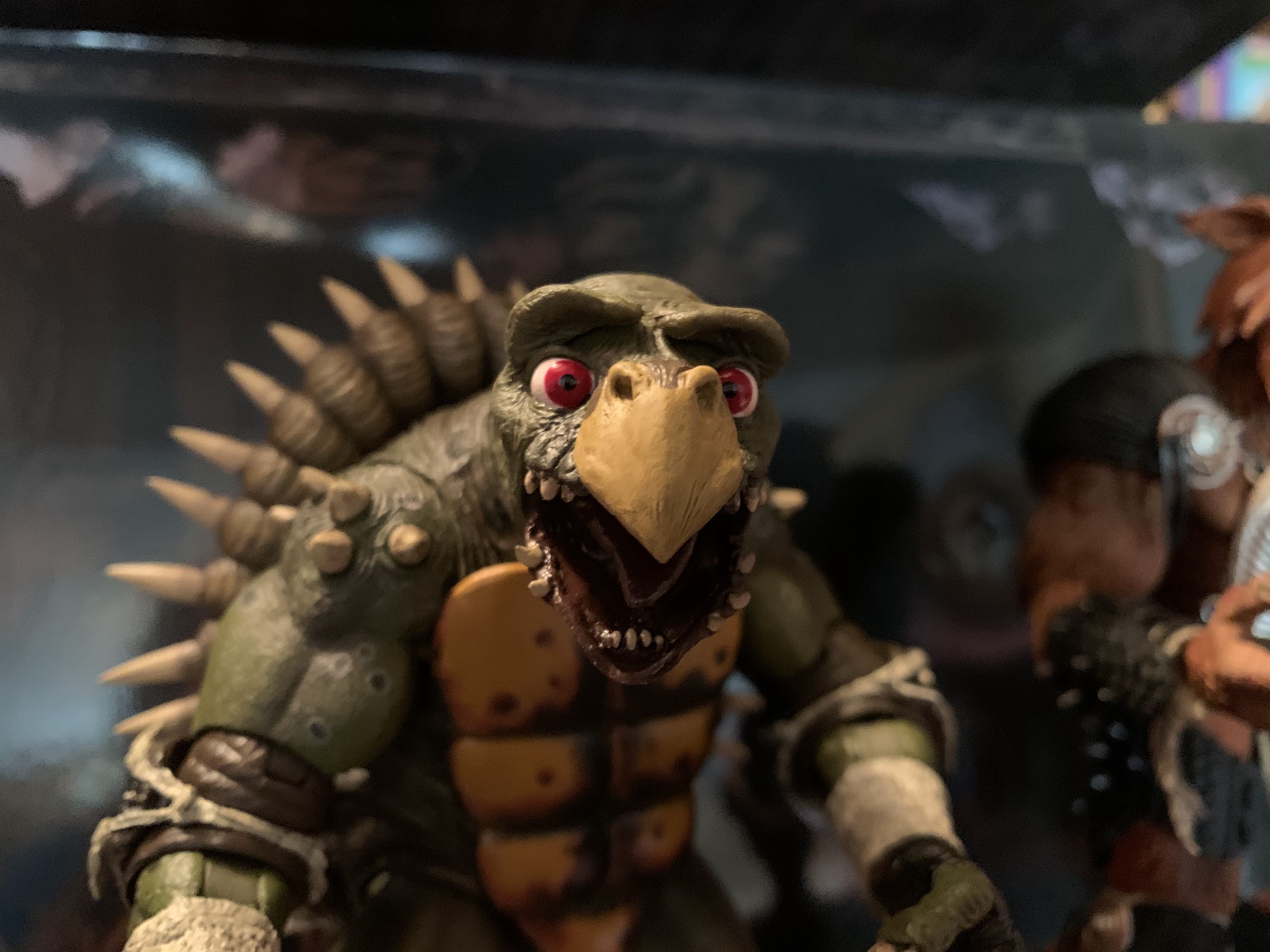
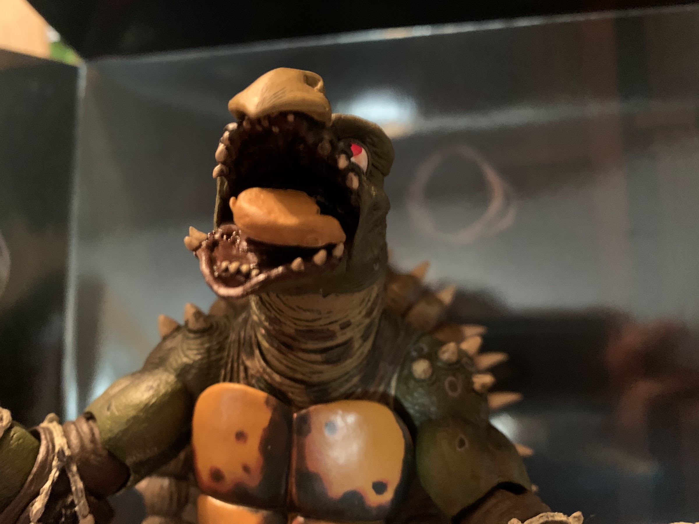
Let’s talk articulation. These figures look good enough to be statues, but they aren’t and I’m glad for that. It’s also fun to talk about them because unlike a lot of NECA two-packs, these are two very different figures. And as far as I can tell, they don’t share parts with any other figures that NECA has done. Let’s talk about Tokka first. Unlike the good guy turtles, this guy has quite the neck on him. He can look up, down, and all around. The neck is jointed at the base which enhances his range of motion and it’s all quite impressive. On his head itself, the end of his beak can tilt in and out and his jaw can open very wide. He’s got some ugly teeth and a big, purple, tongue in there as well. Better yet, his eyebrows articulate! This is quite possibly the coolest feature of the set as it allows you to recreate basically any expression Tokka wore in the film. Want him to be angry? No problem. Confused? Check! It’s tremendous! At the shoulder we have the typicall ball and hinge that’s hindered a bit by the spikes on his shoulders. He can still raise and lower his arms and do what is largely expected of him. At the elbow he has a double joint plus a swivel above and below the elbow. The pad really hides everything too. His wrist rotates and he’s got a hinge as well. Inside the shell, there’s a ball-joint that allows for some pivot, but not much. At the legs he’s got ball-joints and hinges with an upper thigh swivel, pretty standard for NECA figure. He can kick back probably farther than you think given the giant shell on his back, and his legs can come out to the side. His knees are double-jointed and swivel above and below the knee, and like the elbows, the pad hides everything. His feet possess a hinge, though the hinge is either super tight or limited by the sculpt as it doesn’t move a whole lot. His feet can rock side-to-side and given how large they are you should have little issue getting him to stand safely on a shelf, even on one foot!
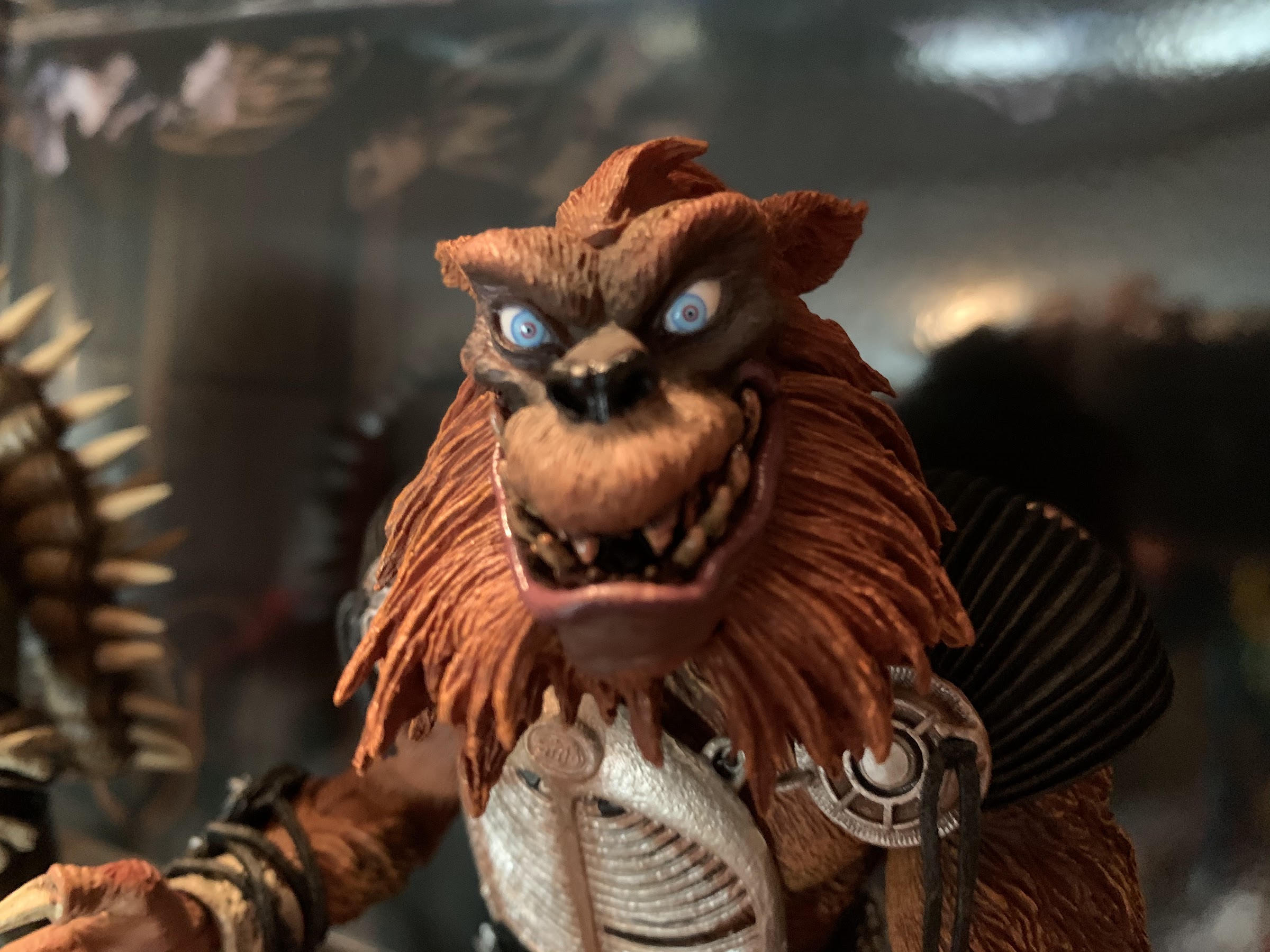
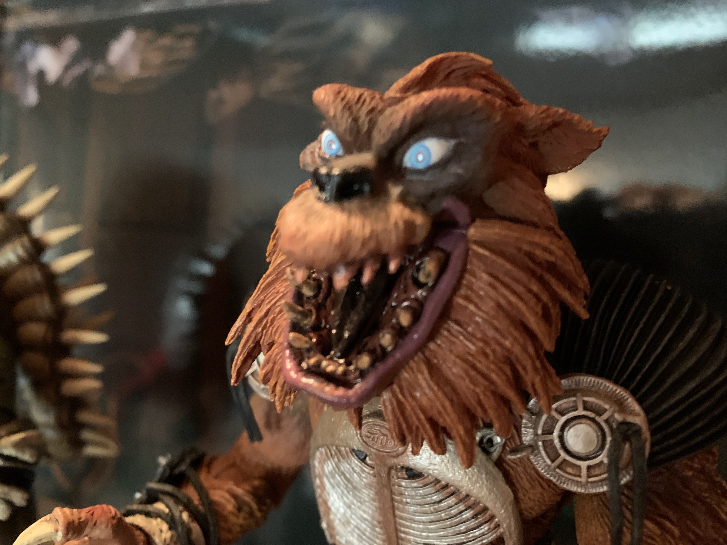
Rahzar, being that he is not a turtle, is articulated quite differently though I’d say the range of motion is pretty similar. His head sits on a ball-joint, and even though he has no articulation in his neck, he’s able to look up and down pretty well and tilt his head side to side. There’s no facial articulation beyond the jaw, which works great. He can open real wide and close his mouth up pretty tight, possibly even better than the actual costume could considering all of the teeth and his extreme underbite. The shoulders are ball-jointed and hinged and the big shoulder pads definitely prevent some movement. He can still raise his arms up to the side, he just can’t raise them over his head real well. He has the same double-jointed elbows that swivel above and below the joint, and even though he doesn’t have elbow pads to hide the articulation, the sculpt is impeccable and does a great job even without such an aid. The wrists rotate and have hinges like basically all NECA figures. The abdomen features a ball-joint in the diaphragm that allows for full rotation (careful with the chains) as well as some tilt, though there’s no ab crunch. The legs are on ball pegs and sit a bit higher than Tokka’s. They can twist a bit above the thigh, but not all the way. The knees are single-jointed and the only other swivel is below the knee. The feet are hinged and can rock side-to-side. I’m a little surprised at the lack of double joints in the knees, but like Tokka, Rahzar can move around pretty well. He’s not a ninja, so he doesn’t really need a ton of articulation and what he has is probably more than enough for whatever pose you want to go for. He stands well, and I was even able to get him to stand on one foot as well even though his feet aren’t nearly as wide as Tokka’s.
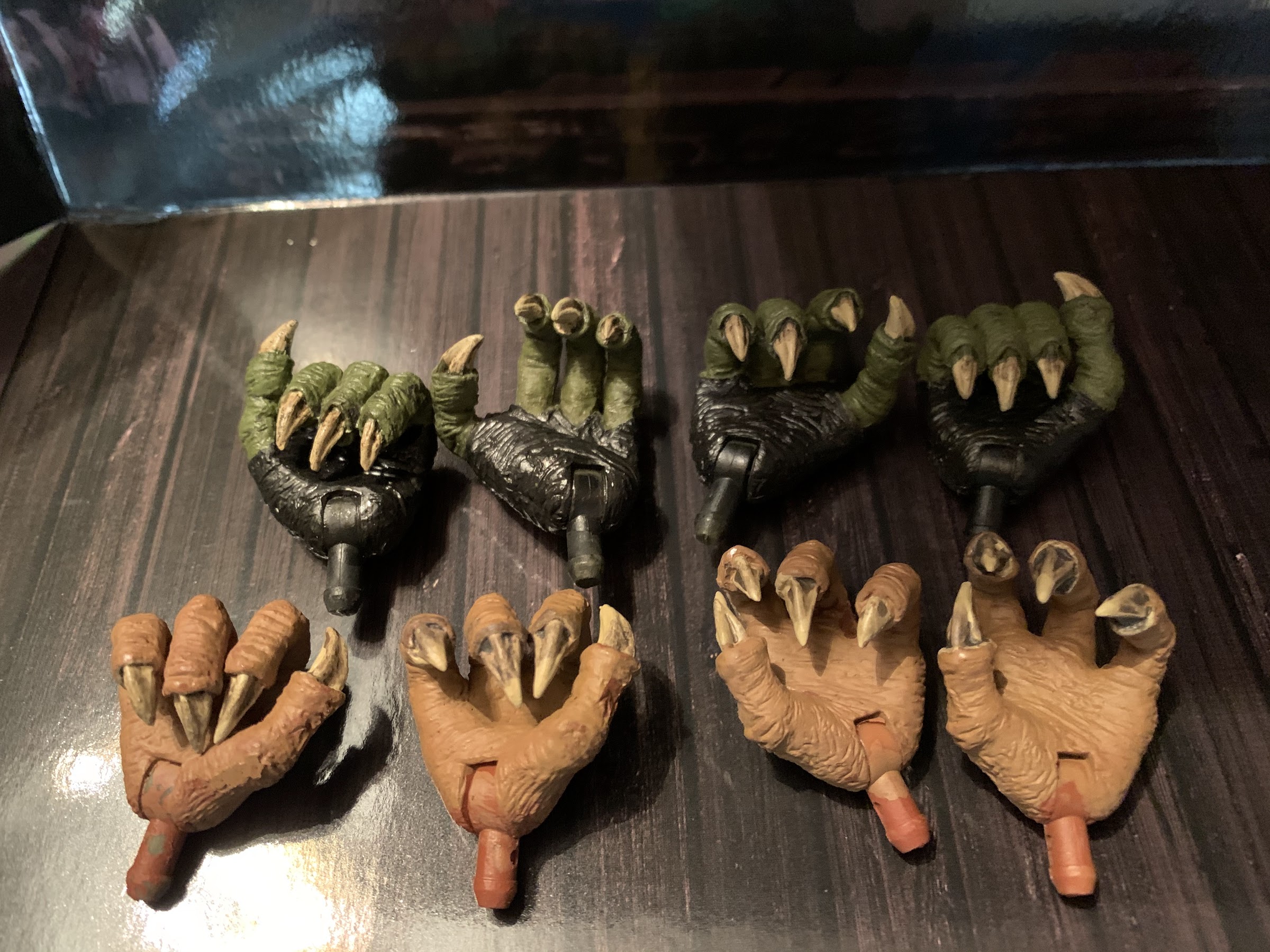

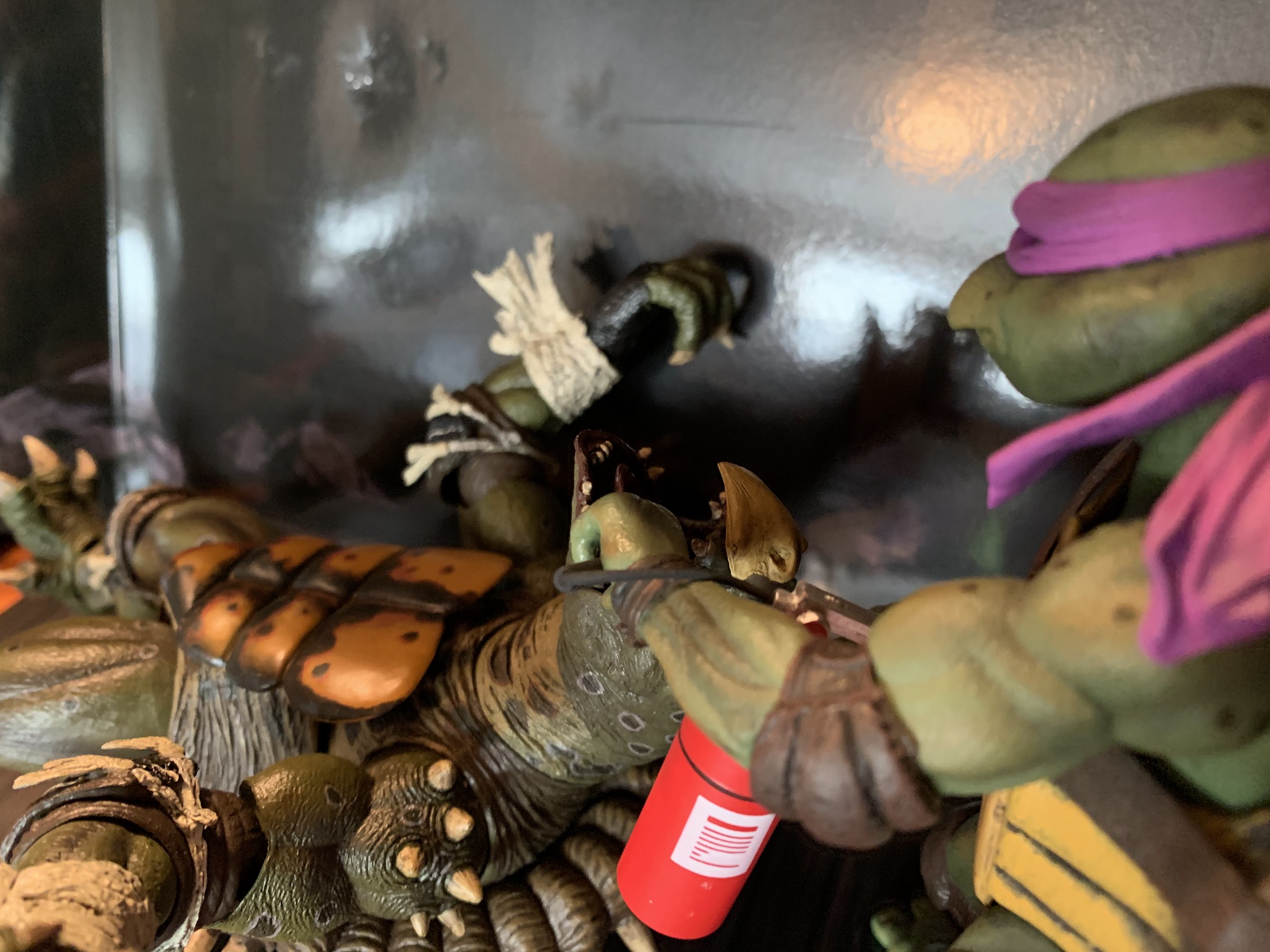
NECA gave us two figures sculpted to perfection with a great deal of articulation, but you know they also had to throw in some accessories too. These two guys weren’t known for wielding weapons or anything, but there are certainly some items they’re associated with. First off, we have extra hands. Both figures come packaged with what I consider relaxed, open, hands. Both have two extra sets. Tokka has two fists, though the fingers aren’t fused together so they’re kind of like really, tight, gripping hands, but they’re not needed for any gripping. He also has a pair of dedicated gripping hands with his left hand being more relaxed. Rahzar has a really tight gripping, right hand that’s more of a fist. He also has a looser gripping, right hand. He also has two gripping left hands that are very similar, but one is definitely more open than the other. Rahzar’s claws, being what they are, basically makes his stock hands function as gripping hands as well so you’re choice of hands will likely depend more on aesthetics than use. Swapping them is rather painless, assuming you don’t accidentally grip Tokka’s shell, though I should point out the only paint issues with these figures reside with Tokka’s hands. It’s a problem that has plagued NECA’s other figures, but the hinge is painted black to match the tape around his palms and it will flake off almost immediately leaving behind the olive plastic. NECA really needs to cast the hinge in the dominant color of the hand to prevent this. At least with Tokka, the wraps on his wrist can hide the hinge better than most, but it’s the lone eyesore with this set.
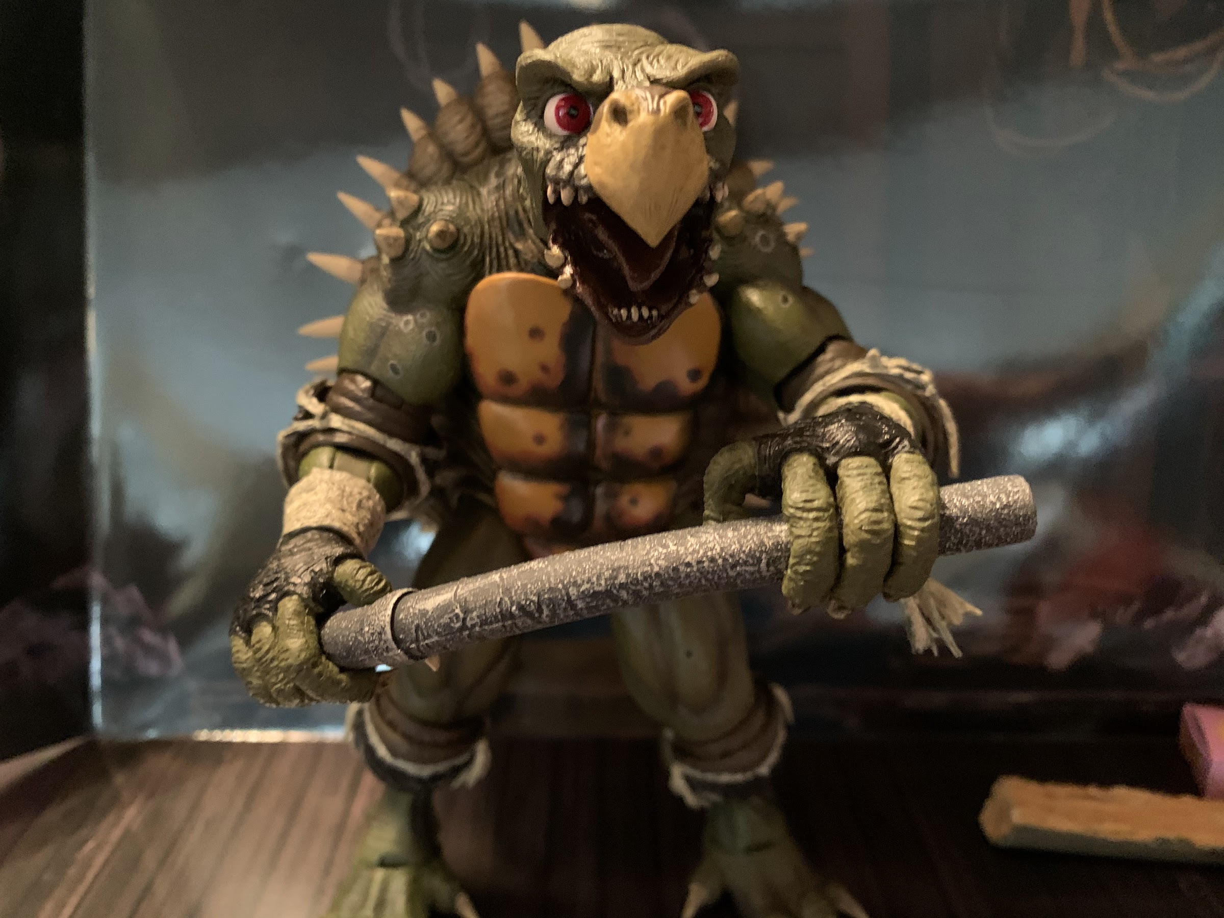
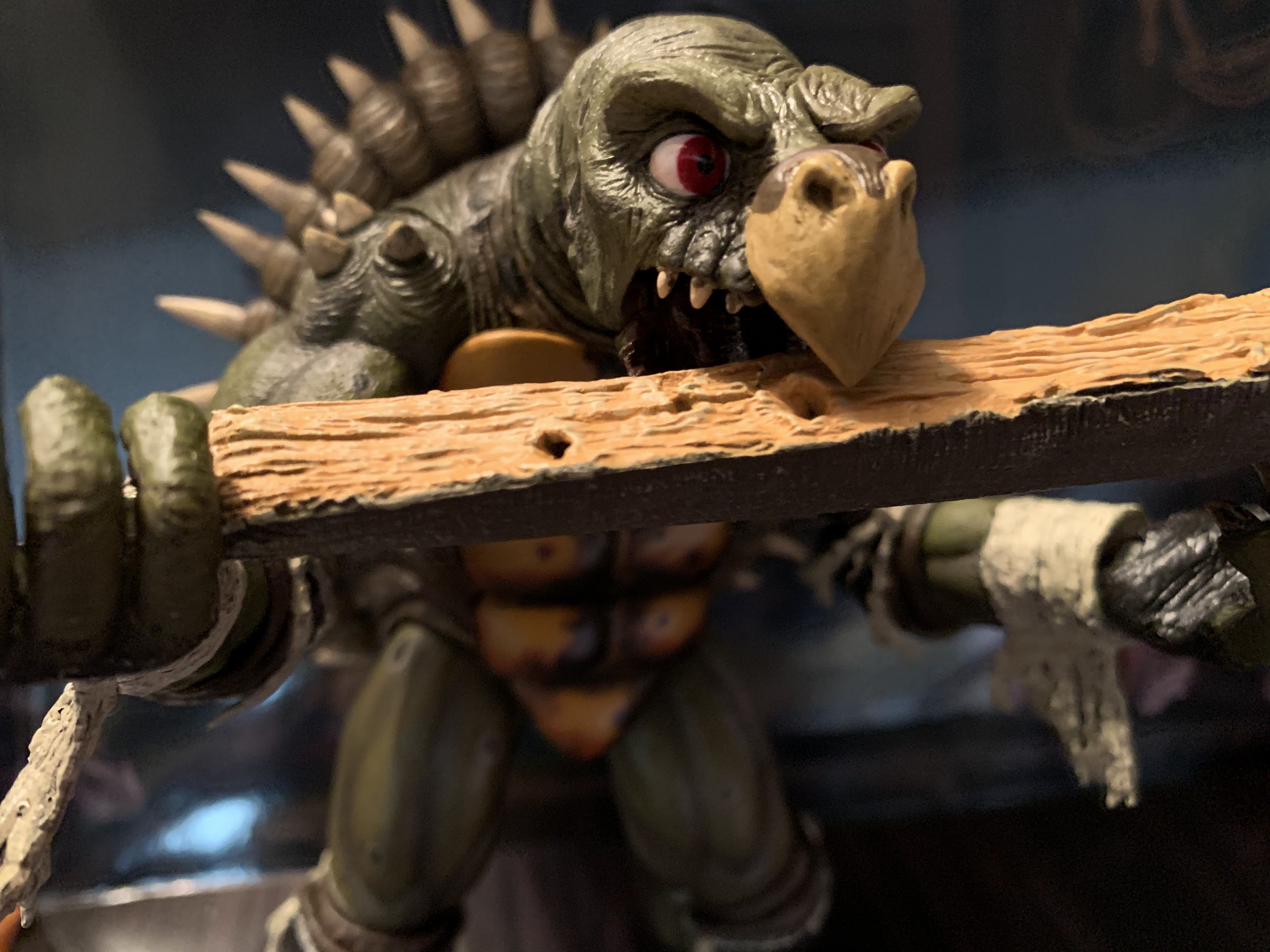
In addition to hands, they’ve got some stuff to either hold or admire. Tokka comes with his big, lead, pipe which is bendy so he can demonstrate his strength, should you please. Rahzar can also hold it just fine, so it’s not just Tokka’s. There’s also a big chunk of a utility pole from when they wreak havoc on New York’s streets that can be wielded like a club. It’s textured really well and it can also fit in Tokka’s mouth. Rahzar also has his shield he wore on his forearm briefly in the film. The paintjob on it is terrific, and the straps just slide loosely over his forearm so there’s no fuss with it. There’s also a can of ooze, the same one that came with Super Shredder. There’s a fire extinguisher for when the turtles need to speed up the reverse mutation process. And speaking of which, in order to reverse their mutation you need a box of traditional, pre-fight, donuts! And we have one! By far, the best accessory is a little pink, cardboard, box that has the Simply Donuts graphic on it. There’s a stack of seven donuts molded together to fit into it, plus an eighth donut that has been smooshed exposing the mutagen cube inside. Your turtles can hold the box, and one of the baddies can hold the squished donut to recreate one of the better scenes from the film. You can also shove that donut in one of their mouths too, if you prefer your mutant babies be ignorant.
The accessories are appreciated, but honestly, these guys would be awesome if they arrived with nothing. NECA has positioned itself in “toy of the year” talk with these babies, as these are two incredible action figures. The only negative to add is that these guys are basically unattainable now at retail pricing. NECA set them up as made-to-order and it sounds like if you didn’t order a set you’re out of luck. NECA apparently didn’t even order extra for quality control as the only other downside is that I’ve talked to a few people who had issues, either a misassembled figure or missing accessory, and NECA couldn’t help them. NECA is also sensitive to the fact that they are a collector brand so they do not want to devalue their products, but they’re also a company out to make money so if there is tremendous demand for these figures after this release then maybe something will happen in the future. Never say never. They could do a limited box set release, a single card release, or maybe re-release them re-tooled with pixel art to mimic their appearance in Turtles in Time. That probably won’t satisfy people who want the screen accurate version, but I suppose it would be better than nothing. All I’m saying, is NECA has said stuff is one and done before only to re-release it later. If you missed out, you’re going to have to go to eBay for the time being or hope someone ordered two that was forward thinking and assumed a collector would have missed out. These guys are awesome and if I had missed the pre-order window I honestly don’t know how high I’d go in terms of price to get a set, but I know I would not want this set missing from my collection so I think I’d do whatever it took to fill that void.
Tokka and Rahzar all but complete my Teenage Mutant Ninja Turtles film collection. NECA is prepping an April from the first film that will be released in the same fashion as this set, made-to-order, and there’s a good chance I’ll grab that. Otherwise, I think I’m good. I don’t need Secret of the Ooze Shredder or turtles and I definitely don’t need a Keno. If they can ever get the likeness rights for Tatsu then maybe I’ll give that a whirl, but NECA has been unable to get ahold of him and even put out a plea to anyone who knows him to speak with him on their behalf. The only other announced products are a Secret of the Ooze Shredder (I should say teased, never shown) and a two-pack featuring Oroku Saki and Hamato Yoshi, and as tempting as a little Splinter in his cage is, I don’t feel like I need that set. If this is the final movie set for me though, then what a way to go out!