If you watched a lot of cartoons in the 80s and 90s then you probably remember Nelvana. Their cartoons, like many others, would end with their own production logo which was a polar bear, I think. It was all one color and white and since Nelvana is Canadian it would certainly make a lot of sense for that bear to indeed be a polar bear. That polar bear logo was conceived sometime in 1978 first appearing alongside the television special The Devil and Daniel Mouse. What most probably don’t know, or really even thought about, is that the polar bear logo wasn’t around for Nelvana’s very first animated television special which is the subject of today’s post.
A Cosmic Christmas is an animated television special first released in 1977. It was Nelvana’s first and was a production headed by co-founder Patrick Loubert and directed by fellow founder Clive A. Smith. It’s from the subgenre of Christmas specials where aliens come to Earth to experience the holiday, a subgenre that is often not utilized. It’s an original tale, and for this blog it’s a slightly more secular take on the holiday. Being that I did my growing up in the United States, A Cosmic Christmas isn’t something I ever encountered before. It’s animation is a bit crude and clearly dated with just a cursory look. That coupled with its original story and lack of recognizable characters probably gave this one a pretty short shelf life on television. Sometimes a company can strike gold with an original Christmas special (like Disney’s Prep & Landing), but most of the time the ones that hang around feature popular characters or adapt familiar stories.

That doesn’t mean that a production like A Cosmic Christmas is destined for failure or need to settle for mediocrity. Plenty of animated stories lack polish and are still well received, and an original tale is certainly better than yet another version of A Christmas Carol. This one begins with a very alien looking image. It’s apparently the navigation system for a spaceship and a wacky (for lack of a better word) sounding voice alerts us that this ship is nearing the planet Earth and that it’s December 24th.

We then cut to a crowded town setting. A young boy, Peter (Joey Davidson), is roaming the streets in search of someone named Lucy. There are quick cuts to very angry looking people, a woman ordering some clerk to wrap a gift faster while her poodle barks, and more abstract crowd images. The style is very flat, but colorful. The more abstract people are a solid color such as blue or purple while Peter is always drawn in detail. Though what detail there is to him is a bit limited to mostly just solid colors without shading. Sometimes there’s some cross-hatching added to the edges of models, but that’s it. The people are also moving in a squirmy sort of way. It’s not to the same degree as squiggle vision popularized by shows like Dr. Katz or early episodes of Home Movies, but it’s similar. I’m not sure if this is a stylistic choice or if the animation team just lacks experience and wasn’t able to properly time the animation. The audio is a bit loud, but not distorted. It’s certainly dated and lacking in polish, but the presentation isn’t altogether off-putting. I don’t know that I’d call it charming, but there is at least a unique element at play.
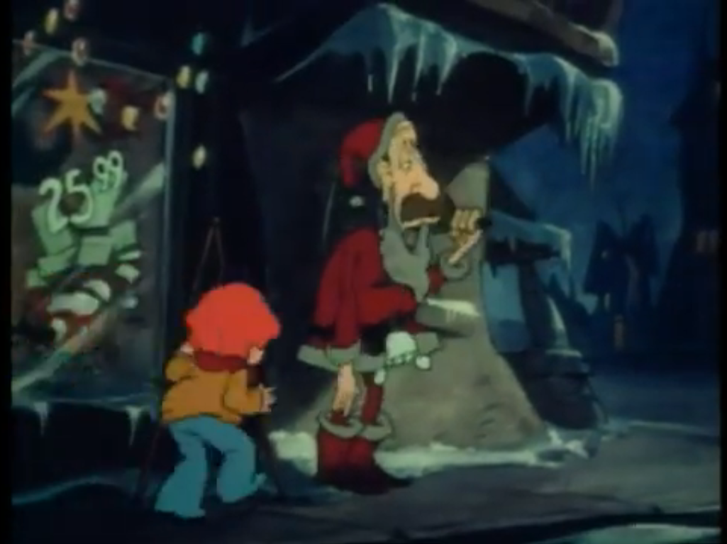
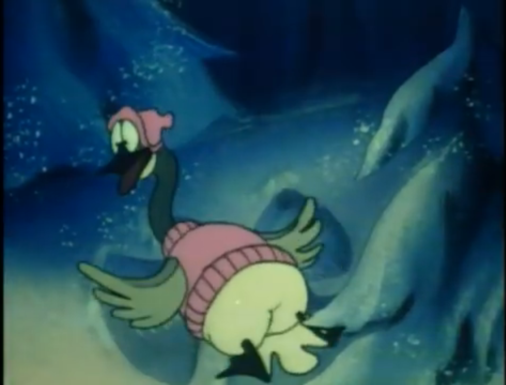
We soon find out that Lucy is not a person, but a goose. And it’s a goose that is wearing what looks like pink pajamas. Why? I don’t know, but don’t expect to find out. We then cut to a very tired looking individual dressed as Santa Claus (Martin Lavut). He’s ringing a bell and trying to raise money for the less fortunate. Peter comes running up to him and refers to him as Santa Joe. He asks him how’s it going and Joe replies not so well. Peter doesn’t have much to say in return, but wishes him a merry Christmas and takes off with his goose at his side. Some kids then show up to claim they’re the less fortunate he’s looking to help. They appear to be something akin to the local riff raff. They mock him, while the apparent leader of this troupe, Marvin (Greg Rogers), gets a little more face time. He’s an oddly designed character. He has shaggy bangs which his eyes are drawn over and these pants that sort of resemble bell bottoms (it was the 70s, after all) that are purple and covered in stars. The pants don’t really end in shoes though, a trait also shared by Peter. Compare him to Santa Joe who looks like a more conventional and real person, albeit stylized for a cartoon, and you would think they’re from two different productions.

Peter stops at a store window which has a nativity display in it. He just stares at it until a light catches his eye. It looks like a star and it’s reflected in the window back at him right where the Star of Bethlehem is in the display. Peter turns around and sees that the star is moving – it’s a spaceship! Nearby, the local chief of Police, Snerk (Marvin Goldhar), is writing a ticket and Peter races over to point out the weird object in the sky. The guy is apparently one of those very jaded cops who doesn’t believe much. He takes one look and finds nothing remarkable about a star in the sky. Other people in the street ignore the boy as well because who has time to turn their head?
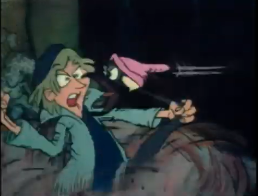
Someone else then calls out to Peter that they see it too, but when he turns his head he gets hit in the face with a snowball. It’s blue in color and more resembles the consistency of mud, but we’re dealing with limited animation here. The culprit was Marvin and he and his gang take to mocking Peter. They’re not very original as they all claim to be something they’re not (“Look Peter I’m a green martian and I’m gonna eat you!”) in a mocking, playful, way. None of them have any real zingers, and when the female taps the head of one of the other goons acting out her role as a fairy the kid throws himself back and lands on Lucy. This sets off a classic cartoon dust cloud brawl! The other guys jump into this entity as they apparently have some bone to pick with the goose. Peter cautiously approaches the cloud and yanks his goose out. The two run off leaving Marvin to glare at the pair because the goose bit his nose during the melee. They are now enemies.
Peter and Lucy run off into the woods and while the animation isn’t doing much for me, I will say the setting looks appropriately cold. Cold enough that I catch myself telling Peter to just go home assuming he has a home. He clearly is short on friends since he hangs around with a goose in pajamas. It’s time for a musical montage where we see Peter and Lucy doing winter things like making snow angels and looking at the stars, which is appropriate as the song would seem to be called something like “Why Don’t They Look to the Sky?” At least, the vocalist punctuates every verse with that question. I suppose now is a good time to mention that the music is credited to Sylvia Tyson and since the vocalist is feminine sounding, it may even be her that’s singing.

The song ends with Peter and Lucy coming upon that light again, only now it’s descending closer and closer to the Earth. There’s an actual attempt at lighting as this thing turns into a sphere. It’s probably the closest thing to special effects as we’re going to get as this circular object lands. It has an almost realistic texture as if this were a model, but it’s still very flat so if it is then it’s just paper. It turns all black and then the outline of a pentagon with rounded corners appears. It then falls like it’s made out of paper before forming into stairs. A pretty horrid sounding bit of synthesized music accompanies this dramatic reveal as the silhouettes of three tall individuals materialize in the glowing light.

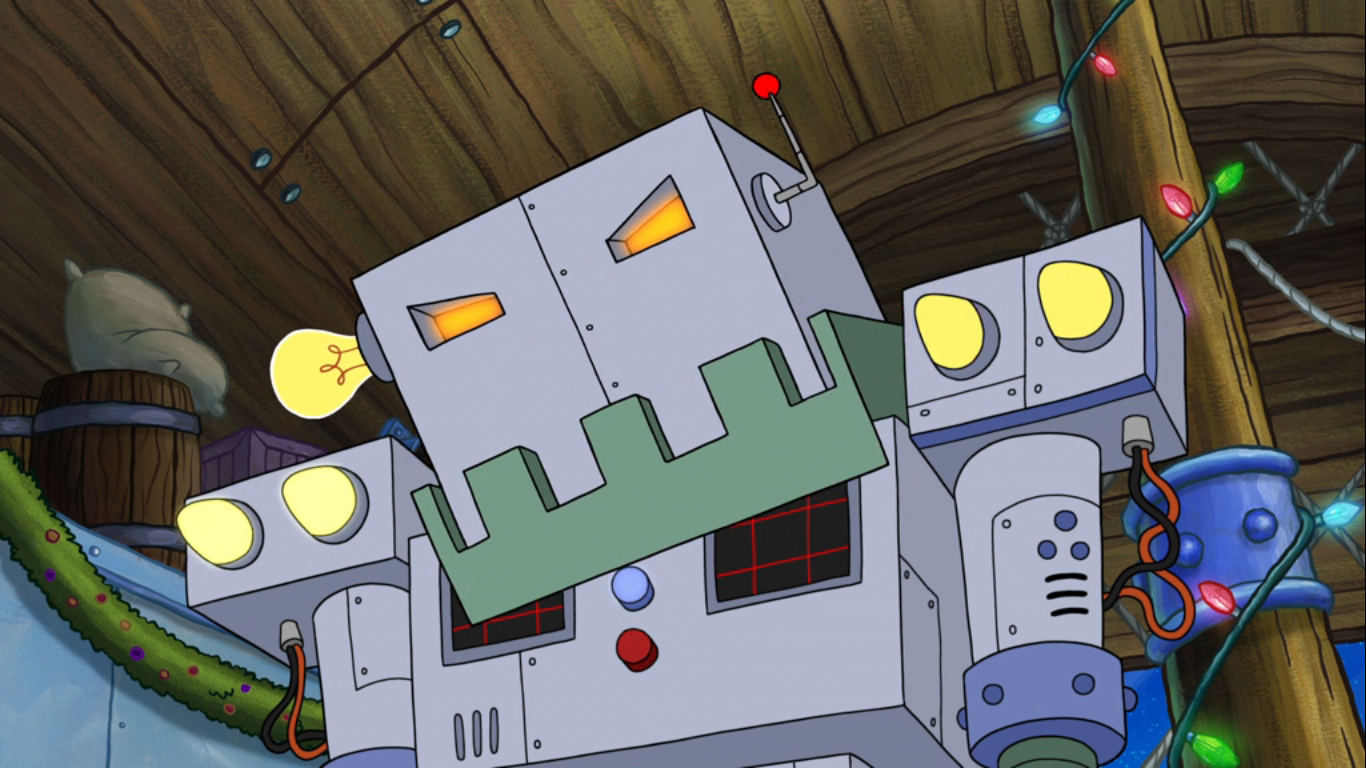
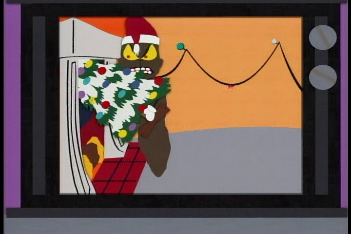
Peter and Lucy are shown to be pretty alarmed by this as they cower behind a stump. The three individuals emerge and they’re animated in this very jittery fashion. They’re tall with two possessing long faces with the third featuring a rounded one and the colors in use for them are mostly of the cool variety – whites and blues. This weird little yellow android buzzes around them. He kind of looks like a robotic, yellow, sperm. Sperm-bot is apparently quite curious as it flutters around and soon finds Peter and Lucy. He make some noises and it’s clear that this thing was what we heard at the very beginning of the show. Peter and Lucy sort of awkwardly jump with fright and roll over the stump they had been hiding behind.
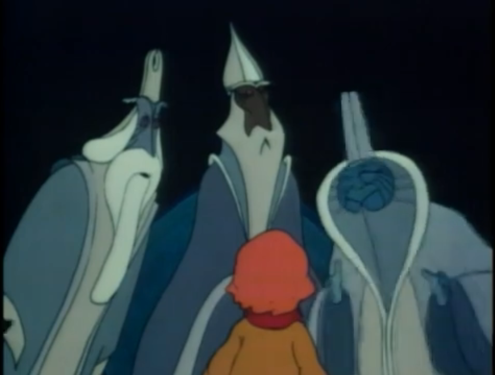
Now that they’re no longer hidden, the three alien beings approach. The credits seem to list these individuals as Plutox (Lavut), Lexicon (Richard Davidson), and Amalthor (Duncan Regehr). I have no idea which is which and the sperm thing doesn’t appear to be credited anywhere as anything. Peter is understandably alarmed to be face-to-face with bonafide aliens, and he’s even more surprised to find out they both understand him and can speak English. One of them basically brushes this aside by saying they essentially know every language which is remarkably convenient. He then asks Peter “How do you do? I am fine,” which is something he’ll repeat a lot. They’re not here for any sort of nefarious reason (though that’s exactly what an alien out to destroy the planet probably would at first claim), but rather to observe. They’re sort of like the Galactic Inquisitor from The Venture Brothers and even kind of resemble that character. Perhaps these were an inspiration?

Anyway, they noticed something unusual appeared in the sky 2,000 years ago on this night. The one with the round face uses a whole bunch of nonsense words to describe the event while one of the others offers a more plain explanation for Peter’s benefit. In the process, he refers to the round-faced one as Plutox so we’ve at least figured out the name for one of these guys. Peter is only too cheerful to reveal they must be referring to the Star of Bethlehem. They have no idea what Peter is talking about so for as intelligent as these guys are, they apparently do not study otherworldly religions. They want to understand the meaning of this star, which Peter explains appeared when Jesus Christ was born and basically just says that he was a real important guy and leaves it at that. He name-drops Christmas and that’s what the focus of everyone shifts to: the meaning of Christmas.

Peter, being a rather helpful and enthusiastic kid, decides to take these three wise aliens to the same local store display we saw him staring at earlier. As the four look at the display once again, the store’s owner, George, emerges from the door. A bunch of stuff is apparently being held back by said door and as he exits a wreath gets stuck on his head. Another fellow approaches (I can’t find a credit for George or this unnamed guy that sounds like Droopy, but Nick Nichols is credited as a townie so maybe he’s one, both, or neither guy) with a “Gee George, did you see the alien spaceship?” George is really wrestling with this wreath that ended up over his head and is having an unusually hard time removing it. He’s pretty irritated and dismisses that so-called spaceship as some marketing blitz by a new store trying to run him out of business. The wreath then practically explodes giving him the appearance of a green, shaggy, beard with pinecones for a mouth. He storms off into the darkness presumably heading home for Christmas.

One of the aliens ask Peter if this is “love” and he has no response. We pan to a clock that shows it’s 8:30 as Peter leads the trio to the local town hall reasoning the people there know something about Christmas. There we meet the mayor (Chris Wiggins), a large man dressed like an ear of corn with hair that resembles sea kelp. We’ve already met the chief and he’s seen taking calls about the alien spaceship which he still seems doubtful of. The mayor is a bit more excitable and wants the chief’s entire force on the case, but he gave them the night off for Christmas. One of the aliens asks if this is Christmas as the mayor instructs the chief to go check it out. The chief agrees to do so, but casually remarks that they may come around here which causes the mayor to get startled. He decides to go with the chief instead as one of the aliens asks Peter if this is peace? The camera zooms in on his face and he looks worried, but really, what’s to be worried about? Wouldn’t you expect the local police to go check out an alien spaceship?

Peter then takes the group to a rundown looking house. He was drawn in by the sound of laughter, but when he looks through the window he sees Marvin and the other bullies inside. They’re basically mocking the wealthy by pretending to eat fancy dishes, even though they have nothing. The female of the group (Marian Waldman is credited as a townie, so maybe her?) mentions roast goose which gets Marvin’s attention. He sits up and pulls out what appears to be a switchblade, but it’s one of those novelty switchblade combs. What’s a poor kid doing with one of those stupid things? Anyway, he runs it through his hair and remarks how he’d love some roast goose. We cut to Lucy and sperm-bot looking horrified and disgusted at the thought, but it does leave me to wonder what Peter’s family has planned for Lucy. My own great-grandmother would raise pigs as if they were her pet, only for them to be slaughtered once fattened. It was a much harsher world back then.

As Lucy turns up her beak and walks away, little tears run down her face. One of the aliens asks if this is “caring” while Peter tries to convince Lucy that those kids were only kidding (nice try). The sperm bot then follows Lucy close behind and appears to really be sizing up her caboose as if it may be pondering what roast goose tastes like (in my experience, bad). Does this thing eat? Or is this just a fake-out? Or could it be a lustful gaze? Maybe that as we go into another musical bit. It’s a piano medley and as it goes along the robot demonstrates its ability to shapeshift. It even sprouts arms and legs and does a Michigan J. Frog type of dance. The robot looks almost longingly at Lucy and now I’m thinking it’s not looking to eat Lucy. Or, well, maybe it is in a different kind of manner. Lucy plays hard to get, but relents and the two dance together. They end by slamming butts together and having a hearty laugh. I am now rooting for this pair to become an item by the time this is over just for the sheer absurdity of it. Also, I’m left thinking it’s weird that this shape-shifting robot can apparently be anything, but it chooses to resemble a floating sperm.

We next find the gang standing on a snowy hill which overlooks a small house. One of the aliens asks if they have finally come to find Christmas yet, and Peter explains they have one more place to check. We zoom in on the house and find it belongs to Peter’s family. His mother (Patricia Moffett) is setting up the tree which is this tiny, little, thing that hardly seems worth it. A voice from offscreen asks if she’s done yet which belongs to Peter’s father (Lavut) who dumps a bunch of wrapped gifts at the base of the tree. He then asks Granny (Jane Mallett) if she’s done making something. We pan to her and see she’s making an angel. It looks like a doll of some sort and I guess she’s making the clothes for it. She also demonstrates that its wings open and it would appear to be a gift for Peter. She refers to the pair as Walter and Martha, very boring parental names. Martha tells Granny she doesn’t need to make things for Christmas anymore – you buy them! Granny retorts that you can’t buy Christmas as she goes to place this angel on the mantle. I thought it was a tree topper. Walter wonders where Peter is and the two hope he hasn’t gotten involved with the space man rumors while Granny dismisses the whole thing as nonsense.

Peter then enters the home. He tells them he brought visitors and describes them as strangers in town. His parents are alarmed and his dad even angry that Peter would talk to strangers, but they’re soon taken aback when the three wise aliens enter. The tallest introduces himself in the same manner as he did with Peter while the others explain their mission. The parents are speechless, but Granny is wide-eyed with an “Oh my, men from Mars!” I think Granny is getting some ideas here. Sexy ideas. She then tells Peter to go get some firewood and he does as he’s told. Lucy tags along and when Peter removes some logs from the pile some evil looking eyes are shown to be lurking behind. Lucy is shown just standing there and looking around, then the weird, little, robot comes up behind her and blows a raspberry at her ass scaring her. What is up with this thing? First it wants to eat her, then it wants to mate with her, and now it wants to torment the poor goose? This thing sucks!

Back inside, Peter adds the logs to the poorly animated fire and asks his grandmother to explain what Christmas was like in the old days. She chuckles and takes a seat with her knitting and explains how her dad used to get a big tree and they’d decorate it with homemade ornaments. One of the alien men then remarks, “You mean, like this?” Round faced guy’s face then glows and a bunch of stars emerge. They form a large light as another song begins, this one a somber tune about the passage of time. The light comes together and forms the shape of a tree. A bunch of ornaments and decorations come into being carried by turtle doves and ribbon as the tree is magically decorated. There are angels and gingerbread men dancing and one even emerges from the dad’s pipe. As they flitter about the tree, Granny also remarks how they always had a big, silver, star for the top of the tree, so naturally one appears. She goes on to add that branches of fir would be placed on the mantle, so they too appear along with a skinny looking rabbit. He’s pretty alarmed to find himself here and jumps off giving everyone a laugh. Granny then talks about the food her mother would prepare, so that appears as well. These alien dudes are pretty convenient to have around. The creations are all animated in a wavy manner so perhaps these are just apparitions.
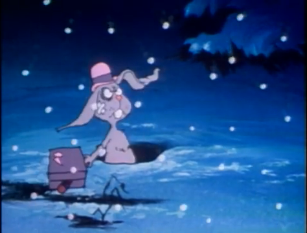
The sound of Lucy honking outside ends the sequence. All of that stuff disappears so I guess these guys are just big teases. Peter runs outside to check on Lucy, but the goose is gone and hopefully not cooked. Peter gets there just in time to see Marvin taking off on his bike with the goose. Everyone in the house gives chase, except for the aliens. Well, the little robot chases after Marvin, but perhaps is not permitted to interfere because it seems like it would be easy for the robot to stop the bike, but it chooses not to. Marvin rides over a rabbit hole and the bunny we saw on the mantle earlier pops his head out. When the robot goes by it knocks him over. He dizzily lifts his head up and just manages to duck under Peter. He then pops up, now bruised for some reason, sporting a top hat and suitcase apparently done with living in this particular hole.
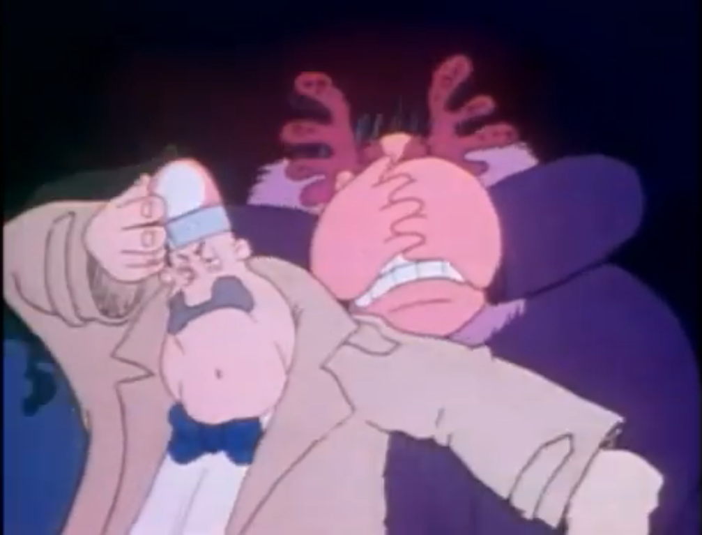
At the spaceship, the mayor, chief, and other townsfolk have gathered around. The chief has a megaphone and is ordering the aliens to come out. When nothing happens, a rather dimwitted townie remarks that maybe they don’t have ears? The mayor gets angry at this suggestion and gets all in this guy’s face for making a perfectly valid suggestion. The chief announces that he’s going to count to ten, and the mayor gets all giddy and decides that he’ll do the same. I don’t like this guy. As the chief counts, the mayor looks absolutely terrified. Marvin them goes zooming through the crowd and few seem to take notice. Then Peter runs by shouting for everyone to stop him and the chief kind of cocks his head. When Peter’s dad runs by shouting “Thief!” then the chief springs into action! He quickly abandons the alien spaceship thing, puts a siren on his head like he’s Inspector Gadget, and takes off. The rest of the townies follow leaving the mayor all alone. When he realizes that everyone left he too runs off, but once he’s a safe distance away from the ship finishes counting to ten.
Everyone is now chasing after Marvin, including Granny who at some point acquired a snowboard. Marvin’s run from Peter’s family ends on a frozen lake where, wouldn’t you know, the kid crashes through the ice. Lucy is able to fly to safety, but poor Marvin is stuck in the water. Peter, always the good kid, doesn’t hesitate to run to Marvin’s aid. He unfortunately can’t get the boy out and soon he too falls through the ice. We’ve also added thunder and lightning to heighten the drama. Sperm robot decides to get involved and blows itself up like a balloon. Peter tries to grab on, but then the robot lets all the air out and does exactly as a balloon would when the same happens to it. This thing can shapeshift into anything, was a balloon really the most helpful?

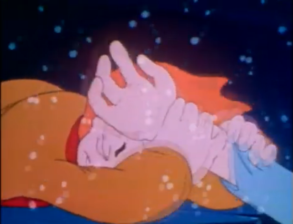
By now, the rest of the townies are at the edge of the pond. The ice is cracking under their weight so the chief announces that they need to form a chain. Everyone grabs hands, with the mayor being safely the furthest away from danger because he sucks, but the problem is there isn’t enough of them to reach the kids. Now we have a dilemma. The aliens, who are sworn to only observe and report, must ponder if they should get involved. As the humans call out for help, they ponder the meaning of help, and arrive at the proper definition. The brown-faced one decides that perhaps by helping they can understand the meaning of Christmas. The other one reminds him that they aren’t supposed to get involved and in doing so calls him Amalthor, so we have finally figured out who is who. Not that I’ll remember.

The other two seem to follow Amalthor’s lead and join the chain. When the chief called on them to help, he had no idea who they were, but now everyone can see that they are the aliens. No one recoils or tries to run and the three wise aliens grasp hands with the humans which allows Amalthor to reach Peter and Marvin. Once the boys are safe, the mayor tries to basically take credit for the rescue, but once he comes face to face with Amalthor (who, once again, asks “How do you do?”) he faints.

Now, the mob turns its gaze to Marvin. While people are asking Peter if he’s all right and draping coats over his shoulders, Marvin is left shivering in the cold. They call him no good and want him thrown in jail for stealing the goose. Lexicon interrupts to ask why the boy wanted the goose? He is answered by shouts of the kid being no good, but granny sticks up for him and offers the most logical explanation: because he was hungry. Now it’s Plutox’s turn to be confused for he doesn’t understand why a child would be left to go hungry at Christmas. Granny explains it’s because they lost sight of what’s important, and in doing so, lost the meaning of Christmas. Peter then does the only logical thing and extends an invite to Marvin to join his family for Christmas. Marvin is skeptical, but Peter’s mom reassures him that they’d love to have him. The other townsfolk start offering up food and decorations and someone has even placed a blanket on Marvin. The chief then asks if there are any more questions (surprisingly, he’s not insisting on locking up the delinquent) and Amalthor confirms there are none. They now understand Christmas.

Back at Peter’s house, everyone has gathered for a big Christmas party. Marvin’s friends are there, and even the rabbit who nearly got squished shows up. The other riff raff kids are shown fixing a giant sandwich, while that flying robot still seems intent on tormenting Lucy. Or sleeping with her. I don’t know, but they share food with each other and it’s almost a Lady and the Tramp spaghetti moment. Peter’s grandma hands him the angel she made which he in turn gifts to Amalthor. I knew he wouldn’t like that thing. The girl from Marvin’s gang rather seductively asks to see the chief’s badge. I don’t know why she needed to ask in such a manner since he has no reaction to basically anything or anyone, he just hands it over and Peter places it atop a massive tree. Where it came from, who knows, but it certainly isn’t the tree his mother setup. Santa Joe then arrives to wish the kids who were constructing the massive sandwich a merry Christmas and to remind them to help the less fortunate. He being the less fortunate as he makes off with their sandwich.

Peter’s mom then asks where the boys went? Well Martha, I think we’re about to find out. Peter’s dad pokes his head out the door to find Peter, Marvin, and Lucy standing in the yard. An instrumental version of “The Twelve Days of Christmas” is our soundtrack and man is that song way better without words. The boys are watching the spaceship take off and they’re soon joined by Peter’s parents and Granny. As they watch it rise into the night sky, it takes on the form of the angel granny made. Then the wings sprout out from it and we can hear Peter calling “Thank you” to the alien lifeforms onboard. The mayor and chief are out there as well and as the mayor nudges the chief we see he’s actually crying at the beautiful sight. The mayor waves and calls out “Merry Christmas, whoever you are!” The camera pulls back to show all of the gathered folks outside, as the spaceship contracts and takes on the form of a star once again and that’s how it ends.

A Cosmic Christmas is certainly a unique experience. The animation is so rough and oddly timed that it definitely has its own feel. A lot of the characters feel like archetypes and simple ones at that so it’s hard to really feel much for them. I wasn’t invested in the quest of the three aliens, clearly stand-ins for the three wise men, nor did I feel any worry for Lucy. This is the kind of story that has some rather predictable beats to it, but so are a lot of Christmas stories.
There was an attempt by Nelvana to make this a more secular holiday special. It doesn’t really dive too deep there as it basically just name drops Jesus and makes a few Bible references and leaves it at that. The message just becomes one of focusing on what truly matters. It’s not the gifts, parties, decorations, or anything like that. Christmas is a time to reflect and appreciate each other. To take care of one another. In an era where we have priests overseeing mega churches that flaunt their incredible wealth I suppose it doesn’t hurt to be reminded that we should be looking out for the less fortunate and not ignoring them. Or worse, condemning them.

The attempts at humor in this one weren’t particularly successful. Almost all of them revolved around the robot character which I grew to dislike. The thing is just pointless. It’s not funny or interesting and feels forced. As does the goose. Marvin could have stolen anything, though I suppose it adds to the drama if the thing is something living. Peter is even shown to have a cat, but I guess he prefers hanging out with the goose. The mayor character also felt forced upon us and is another I could do without. He had an arche, but not one that really had time to feel meaningful.
I’m left with lukewarm feelings on A Cosmic Christmas. I have no nostalgia for it, but I’m guessing for people that do it’s something they return to annually. It’s not bad or anything, it just fits into that mid tier Christmas special ranking. I grew up on ‘Twas the Night Before Christmas from Rankin Bass and I can appreciate it on that level, but I probably wouldn’t think much of it if I saw it for the first time in my 40’s. Though I will go to bat for the songs in that one always. The songs in this particular special are just okay. No bangers, but nothing that’s offensive to the ears.
If you want to view A Cosmic Christmas for yourself, then it probably comes as no surprise that it can be found very easily online. According to Wikipedia, the last physical release of this thing came on VHS so you can imagine how protective of this thing Nelvana is today. I can’t really recommend it for those looking for a hidden gem, but if you feel like you just need something different this holiday season then you could certainly do worse than A Cosmic Christmas.
Can’t wait until tomorrow for more Christmas? Check out what we had to say on this day last year and beyond:

Dec. 17 – We Bare Bears – “Christmas Parties”
This year, I’ve taken some time out to watch Christmas episodes of shows I’m pretty unfamiliar with. This is yet another one of those posts, only with this show I did make an attempt to get into it. A mild one. We Bare Bears is a show created by Daniel Chong that aired on Cartoon…
Keep reading
Dec. 17 – Peace on Earth (1939)
Hugh Harman was one of the early stars in the field of animation. In fact, we talked about one of his shorts already this year, but perhaps his most famous and most celebrated is the 1939 anti-war film Peace on Earth. According to Harman, the short subject was nominated for The Nobel Peace Prize, but…
Keep reading
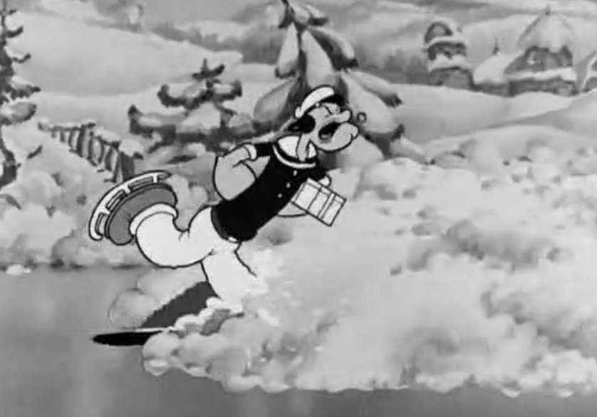
Dec. 17 – Popeye the Sailor – “Spinach Greetings”
One of the big, early, cartoon stars was Popeye the Sailor. Popeye starred in newspaper strips, radio plays, and theatrical shorts with contemporaries like Mickey Mouse and Bugs Bunny. His star has faded over the years, but few would deny Popeye’s place among the greatest cartoon stars of all-time. Come the 1960s though, Popeye and…
Keep reading