

We have looked at 15 figures from Super7’s line of Ultimates! action figures based on The Simpsons and we’re about to look at the 16th. What I’m wondering at this stage is do I need to keep talking about the baffling character selection? Yes, yes I do. Drederick Tatum is today’s figure, the show’s Mike Tyson parody, and he’s about as warranted as last week’s figure, Radioactive Man. I don’t know that any, named, character on The Simpsons who has spoken lines could be called a deep cut or anything, but there’s tons of minor characters in the show who show up for a joke here and there and then fade away. Sometimes for years at a time. Tatum isn’t unique in that sense, and yeah, those minor characters are certainly part of the charm of The Simpsons, but I don’t think I’m alone in saying that fans would prefer dozens of characters ahead of Drederick Tatum. Characters like Principal Skinner, Edna Krabapple, or how about freakin’ Marge Simpson?!

We all know the case against Drederick Tatum, but what’s the argument for the character getting immortalized in plastic? I don’t think he had a figure in the Playmates line back in the day so that’s one. That line actually was super expansive and probably should have done a Tatum, but maybe they were afraid of a lawsuit? He is a minority character in a line that’s been all yellow dudes and the occasional alien, dog, or robot. And he has a pretty unique build in the show relative to the existing characters so it’s a different sort of figure.
The existence of this figure is probably pleasing to some. I know at least one person who is a Mike Tyson fan that is getting just this figure from the line. And that’s good for him since this figure won’t pair with anything else in the line. I don’t think it changes the fact that it’s still a bizarre choice in a line rife with them. Perhaps more concerning though would be is the figure any good? I have not had a very good time with the fourth wave of this line. It’s featured sloppy paint, a low accessory count, and limbs that just fall off. The bad news is those were the “cheap” figures of the wave at $55. The last two figures come with an inflated MSRP of $65 and that includes Mr. Tatum. What about this figure warranted the extra ten bucks? I have no idea. Maybe Super7 expected lower orders for this character and thus decided to tack on an extra Hamilton. Sure, he’s bigger than Flanders and Radioactive Man, but not to the degree one would think warranted more money. There’s not a ton of paint here and the accessory count is just okay. Basically every figure in this line has been all unique tooling and most have featured soft goods. What separates him from Krusty or Duffman? Again, I have no idea.

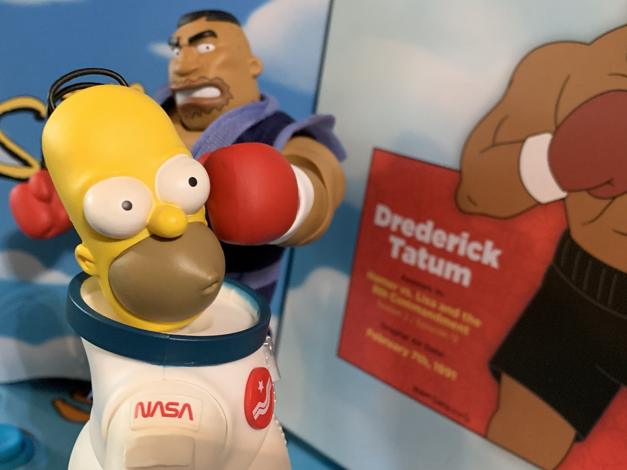
This figure has to impress a bit more as a result of that price, and at least at first glance, it’s off to a solid start. Tatum stands around 7.5″ to the top of his head. This sets him a little taller than he probably should be if we’re going off of his appearance in “The Homer They Fall” as he was really no taller than Homer there. He’s a chunky figure with a good feel in-hand as there’s some heft to him, not the overly hollow, plastic, feel some of the other figures possess. He has a very neutral expression, but that’s suitable for the character. The paint on the face is okay. The top of the eyebrows aren’t painted and if you get in close the black lines around his stubble aren’t perfect. The eyes look nice and it’s amusing how this character has such small eyes compared with the usual Simpsons design.

The body of the figure requires far less detail. He’s a boxer so he’s just a guy in trunks and boots. The body is molded in brown plastic and has a nice, matte, finish. The forearms appear to be molded in white plastic and painted brown, but they match the rest of the arms perfectly. Why? Because Super7 painted brown over brown! They had started to do that with the second wave in places, but abandoned the practice with the third wave. It looks so much better and it’s basically what NECA does with all of its toon figures. The trunks are just plastic though, as are the boots. They’re a really dark, almost black, navy and the exposed portions of the legs are painted brown and look fine.

The paint is not perfect, but few figures can claim to have a perfect paint app. The brown paint doesn’t quite reach the white cuffs where the boxing gloves begin and there is some chipping around the elbow of the right arm of my figure which leaves behind white marks. What is more the fault of the figure and Super7 is how tight the shoulders are. Clearly, they’re not used to painting this much of their figures because the shoulders were close to stuck out of the box. The left arm was easier to free than the right and it’s fine, but the right arm is all chewed up on the underside of the shoulder joint. That sucks, and the elbows are also very hard to work with and I think it’s a combination of paint and how far recessed the hinge is in the arm. I basically have to take the hands off to work the elbows otherwise they’ll just pop off. They, and the heads, come off easily. Maybe too easily for the hands, but they’re not falling out so I’m not bothered by that. I am, once again, bothered by the hips though. Just like Radioactive Man, the right leg loves to come off when posing the figure. The left is a little better, but I even had that pop off on me when I was setting up for pictures.

The rest of the articulation is pretty mediocre. The shoulders suck and so do the elbows. He has a diaphragm joint that pivots and can go back a bit, but not much forward. The waist twist doesn’t want to work on mine. It moves, but snaps right back into a neutral position so I think plastic is bending as opposed to rotating. The hips have good range, but the knees do not. Ankles are fine, but this is a design with stubby legs and small feet relative to the body so posing options are going to be pretty limited. He can’t really get into a “ready” position for a boxing match, but he can sort of deliver a punch at least. He, like most of the figures in this line, is best equipped to just stand on your shelf in a fairly neutral pose. And as a blunt, understated, sort of tough guy in the show, that’s at least a look that works better with Tatum than others.

Tatum does have some accessories to speak of, most notably the soft goods “Mr. Armageddon” robe. It’s very well done and looks nice. There’s no wire this time, but this isn’t the sort of garment calling for one. It looks so good though that I doubt many will display the figure with it off. For alternate heads we have a teeth gritting expression which is meaner than the normal one and an eyes closed one with a smile. They’re painted well enough, though I can’t see myself ever using the smiling portrait. Since Tatum wears boxing gloves, there isn’t much need for alternate hands, but we do get one extra set. They’re open hands with peg holes in them and they’re to be used with his championship belt. The belt is really thick and done on a rubbery plastic. It has pegs on the reverse side so he can hold the belt over his head. It does not fit around his waist nor does it look good draped over a shoulder because it’s just too thick to hang naturally. Completing the look is a white, preposed, towel to be draped over Tatum’s shoulders and it looks good whether he’s robed or not. The last accessory is his “butt-ugly shoe” which is from the episode “Large Marge.” Tatum was paid to endorse them, but wasn’t up to the task. Or just too honest for his own good.

Drederick Tatum is another somewhat subpar release for this line. He looks better than some of the other figures in the line, but the quality control isn’t up to par. Especially for the money Super7 is charging. It’s still hard to shake the feeling that the company blew off a lot of the review process in order to get these out faster (it was rumored that Super7’s slow release pace was a problem for Disney) because it’s very basic, tolerance, checks that these figures are failing at. The hips are still an issue and so are the shoulders. They both required more fine-tuning, which is indicative of a rush job since that fine-tuning may have been scrapped. Super7’s Brian Flynn acknowledged the issues with Devil Flanders, but said nothing of the rest of the wave other than to sell it as “So good,” like it’s a tragedy the line is ending. And to be clear, Devil Flanders is the lone figure I think was absolutely not fit for release in its present state. The rest are more flawed than outright disasters.

Even with its problems, the Drederick Tatum figure is the best of The Simpsons Ultimates! Wave Four. That’s an admittedly low bar since one figure wasn’t fit for release while the other had plenty of issues on its own. The real question is does this figure do anything to warrant the price tag? No, not really. I mean, if you want a figure of Drederick Tatum this at least looks good. It’s going to satisfy that need, it’s just overpriced at $65. It’s possible not a ton of these figures were produced so waiting for a discount might come back to haunt the person who needs this figure to complete their collection, but I still have a hard time seeing this guy sell out at the current price. If you’re asking me it’s probably worth the gamble, but perhaps be ready to pounce if it drops below 40 bucks. Next week, we’ll see if this line’s final figure can redeem this awful wave or if the line is fated to end like Homer’s attempt at jumping the gorge.
Want to see more from Super7’s take on The Simpsons (you masochist):

Super7 The Simpsons Ultimates! Radioactive Man
Last week, we started on our journey through the fourth and final wave of Ultimates! from Super7 based on The Simpsons. It did not start well. Devil Flanders represented a new low point for the line and maybe for Super7 as a whole. I know I certainly do not own a worse Super7 figure than…
Keep reading
Super7 The Simpsons Ultimates! Devil Flanders
Last week, we concluded our look at the third wave of Super7’s line of figures based on The Simpsons and now we embark on the fourth and final wave. That’s right, Disney pulled the rug out from under Super7 and handed The Simpsons license over to Jakks. Their products will start rolling out this fall.…
Keep reading
Super7 The Simpsons Ultimates! C. Montgomery Burns
We wrap-up our look at Wave 3 of Super7’s Ultimates! line of action figures based on The Simpsons today with the main villain of the series: Charles Montgomery Burns. Mr. Burns has been around since the beginning and, like Ralph, is a worthy inclusion in the line at this stage and it’s only odd that…
Keep reading
Leave a comment