For a guy as tied into comic books and the properties associated with them, Glenn Danzig has had a lot of disinterest when it comes to toys based on his own likeness. It was about 20 years ago that musician and publisher of his own books partnered with Medicom to produce a trio of vinyl figures of his own likeness from his time with The Misfits, Samhain, and the band that bares his namesake. Those figures were very stylized and not exactly what one would call an action figure. It was mostly in-line with the snippets of Glenn’s own collection of toys that are floating around on the internet which seems to focus on Japanese properties and soft vinyl. This approach is in contrast with what his former and now current bandmate Jerry Only has done who had a doll of himself (and then Misfits guitarist Doyle) sold in the early 2000s and has partnered with Super7 to produce a ReAction figure of himself. He also went the Medicom route as well with a figure stylistically the same as what the company did with Glenn.
Previously, the only Danzig toy of any kind I’ve had is this big fella on the left from Medicom. There was a Samhain and a Misfits version of that guy as well.
I don’t know if Glenn Danzig has ever said specifically why there aren’t more toys of him out there. I’m sure he doesn’t mind the income that comes with such deals, but I know he did throw some shade at Jerry for those dolls that wound up in Hot Topic’s clearance section eventually. It was awhile ago, but NECA’s Randy Falk, in response to a question from another user on social media, mentioned he had been trying to get Glenn onboard with the company to do a figure of him, but the singer always brushed him off. NECA tends to do realistic portrayals of music personalities which leads me to think that Glenn just isn’t interested in such a thing. We saw similar sentiment out of actor Elias Koteas when NECA was trying to secure his likeness to do a Casey Jones figure and, for him, he indicated it just seemed weird that people would want a tiny version of himself to mess around with. Maybe Glenn feels similarly about the whole thing, or maybe he knows the internet or a show like Robot Chicken would have too much fun at his expense if such a thing existed?
The style of these Danzig figures is clearly based off of the old Masters of the Universe line. Since I don’t have any of those, here’s an Origins He-Man for comparison.
That hypothesis seems to track with what Super7 has recently released. Brian Flynn of Super7 teased a deal with Danzig years ago in a conversation with The Fwoosh. I didn’t try and look it up again, but I want to say it was in either 2020 or 2021 and may have been part of the San Diego Comic Con at home thing. That deal was apparently not an easy one and Super7 never elaborated on what they were doing, but it turns out they had Danzig in mind for a new line they wanted to launch. It’s possible Glenn said “No,” to ReAction and Ultimates and this came about as a compromise – who knows? Super7 calls the line it’s Vintage line and it’s heavily inspired by the original Masters of the Universe toyline from Mattel. And by inspired by, I mean it’s basically the same thing. They’re 5.5″ figures with super basic articulation in a preposed stance. Glenn was obviously onboard with this depiction of him in plastic, though it still came with more controversy. It was sometime last year that retailers abruptly cancelled the line indicating that word came down from Super7 that they weren’t happening. Super7 blamed it on retailers auto-cancelling items that have been outstanding for too long, which makes no sense since I’ve had stuff on preorder from the same retailers for Super7 product that literally took years to deliver. Danzig, for his part, seemed to be confused by the whole thing so he wasn’t expecting it. The Jerry and Misfits Fiend figures in the same style were not cancelled, so it was definitely an issue with Glenn and Super7. Was the company having an issue with approvals and playing hardball or something? I don’t know, but something fishy was going on. Either way, the figures went back up for preorder eventually and started rolling out at the end of 2024.
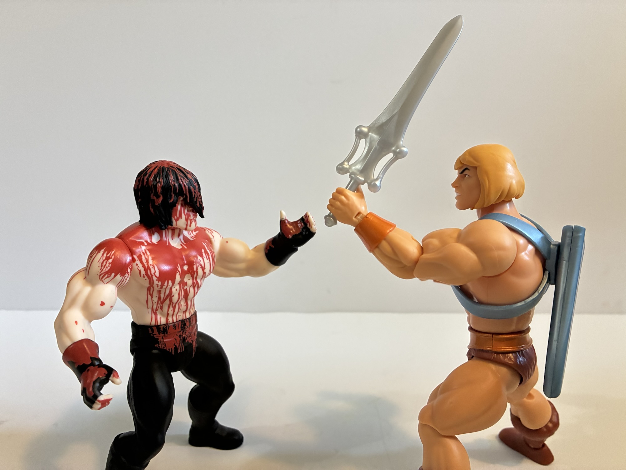
Gimme that sword!Danzig triumphant!
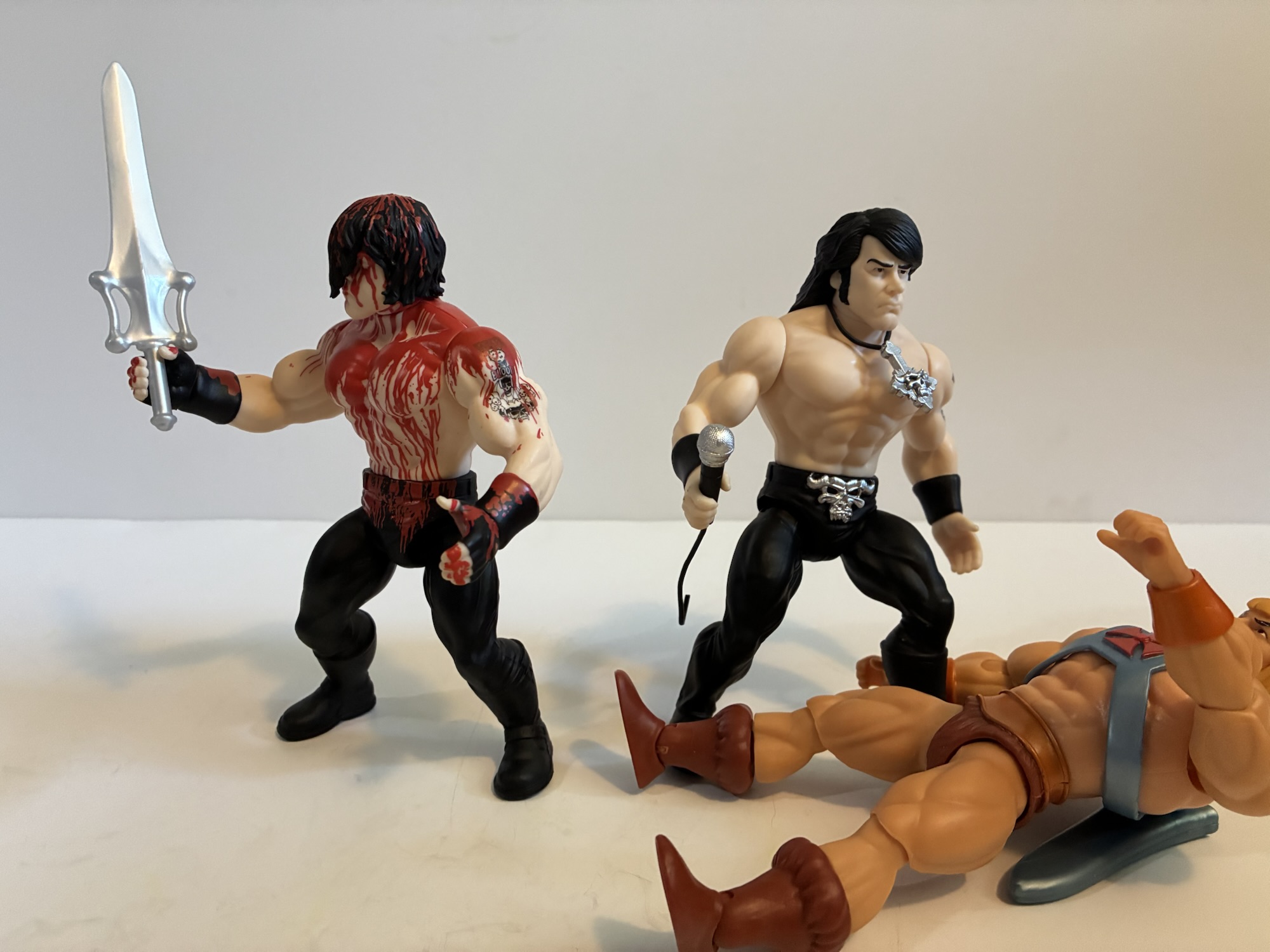
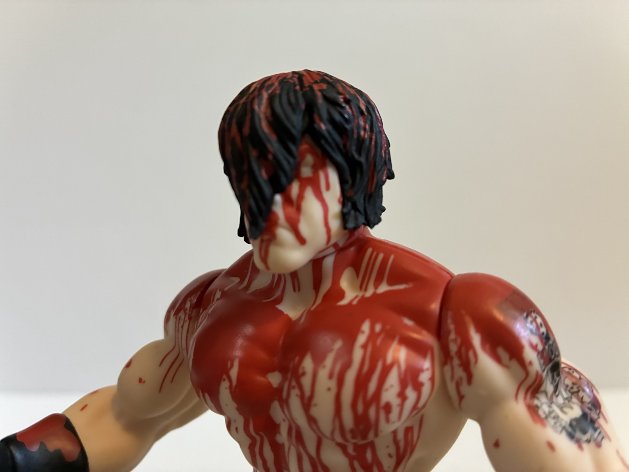
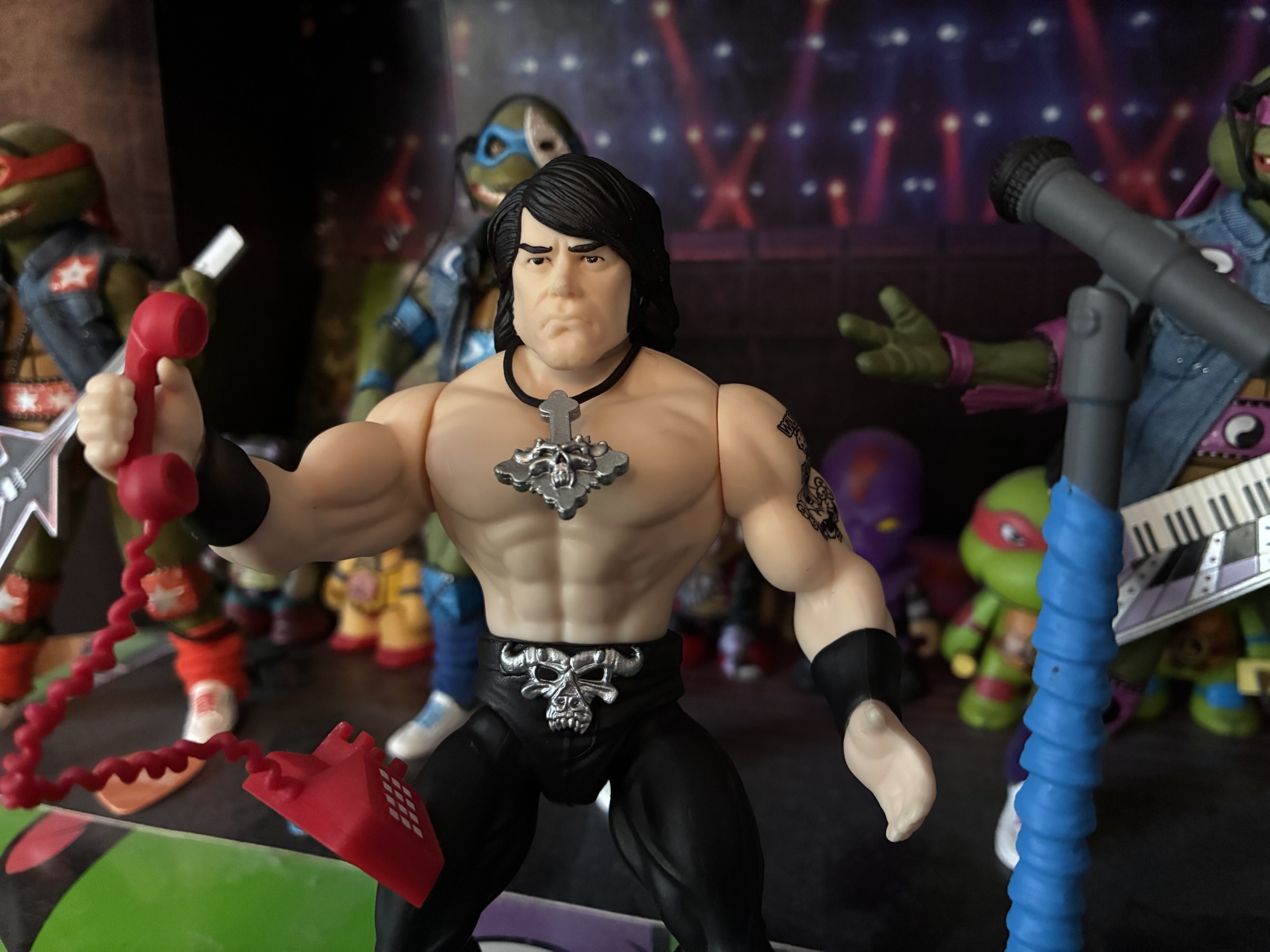
The first two figures in this line to arrive are figures of Glenn based on his appearance with Samhain and one based on his early 90s Danzig look. They’re packaged on a cardback the exact same dimensions as a MOTU figure. There’s even a castle, but instead of it being Castle Grayskull it’s a castle sporting the Samhain/Danzig/Golden demon skull. The Samhain figure, based on the album cover for Initium, has a blister bubble with the shape of a skull blown in while the Danzig one has an inverted cross. The castle on the Initium card is also bloodied. It’s a thin card so it’s not the most sturdy, but I suspect the packaging is nice enough that many will just leave this on card.
On second thought, maybe don’t fuck with He-Man?
And that’s because the figures themselves are not the most interesting to handle. These are faithful interpretations of the MOTU style which is a mold that is over 40 years old at this point. Those figures were designed during a time when action figures were almost exclusively the domain of children. They were engineered to be durable and functional first and foremost. The form was also still really new so there hadn’t been much in the way of innovation beyond some swivel joints. They were also designed for maximum profit so the molds were just used over and over recolored and joined with new accessories and new heads to flesh out the cast of characters.
The form factor you know and love?The blood continues on the back so that’s cool.
And that brings me to the subject of vintage inspired releases. Super7 very clearly wants to be as faithful as it can to the old toys in this style at the expense of perhaps even saving a few bucks. There is really nothing modern about these Danzig figures, but the molds are not exactly the same. The torso is the only intended shared part between these two. Samhain Danzig has fingerless gloves on while Danzig era Glenn has just wristbands. Since the arms are one piece, that’s an entire new mold. Samhain Glenn also has boots with buckles on them while Danzig era Glenn has long pants that go over his boots. Or he’s supposed to, but my figure has the correct right leg, but the wrong left leg which is the Initium figure’s leg.
Hey, Glenn! You ain’t got no eyes!“You call those sideburns.”
I find Super7’s approach here kind of interesting, and a bit frustrating. The company could have saved itself some money if its molds for the legs and arms ended at the boot and wrist. This would have also given us another point of articulation if the hands and feet were separate pieces, but then that would break with the original line’s articulation which is just a swivel at the head, shoulders, and waist and a ball-hinge at the hips. How much does the consumer value this slavish adherence to a format from the early 80s? I don’t think many care and would happily trade the inaccuracy for a couple of swivel points. You may be thinking that a wrist swivel or a boot swivel won’t do much, but these guys are packaged with microphones that they can only hold in their right hand and not turn towards their face. It’s kind of dumb looking.
A comparison of tats.“You need a shower.”
Those are my thoughts on the approach here, as for the figures themselves they look about as good as you could get out of this form factor. These are exaggerated, hulked-up, takes on Glenn Danzig from two different points in his life. The Initium head has the old devilock hairstyle which obscures the face while the Danzig era figure has the side part long hair and sideburns. The face on the Danzig era figure does look like Glenn, albeit it looks more like an older Glen to me than an early 90s one. He’s got some of that modern grump to him. The Samhain Glenn has no facial features to really take in. Even his eyes are unpainted. His selling point is the blood paint job which does look pretty damn cool. Both also feature Glenn’s tattoo on his left bicep. I’m honestly not sure if it was finished when the Initium album cover was shot, but I don’t really care. The batwings on the Fiend in the middle is a little smooshed looking, but it’s fine considering the size we’re dealing with. I think he also had some other skulls added to it for Unholy Passion and November Coming Fire. I don’t know when they were added, but they’re featured on the Medicom figure.
“Did he just say he wants to kill a baby?!”“Sorry, bud, it’s not adjustable.” “This is bullshit!”“I’m calling my lawyer!”
The only accessory each figure comes with is a microphone that has a bit of wire trailing off of it. The Danzig era figure does have the skull-cross pendant which is affixed via a plastic wire. It’s not a bendy wire and has a tendency to want to float. I’m curious if I heat it up if I can get it to lay flat on his chest, but I think it’s just not heavy enough. That figure also has the skull belt buckle which is painted silver and looks decent enough. The presentation across both figures is pretty clean and the paint kept to a minimum. I wish the Samhain figure had a little paint on the buckles of his boots or something, but I’m definitely not surprised by the omission.
“Hey man, what’s up with the bear?” “I vibe with this bear.”
Are these stylized takes on Glenn Danzig worth adding to your collection? I guess it all depends on what your initial reaction to them is. If your first thought is “These look pretty cool,” then you’ll probably like them. If you’re buying them to keep on card then you’ll be even more pleased since they don’t really do much out of the box. I personally wish they were engineered like a MOTU Origins figure, but that’s just me. These will set you back about $30 so they’re not exactly cheap. A MOTU Origins figure is about half that and a much better figure, but none of them are Glenn Danzig. For the price, I do wish they had more stuff. Maybe a dagger for Danzig era Glenn and that weird mask he sometimes wore for Samhain performances? The mic makes sense, but is kind of lame. That said, I have a rather extensive Danzig collection so I had to add these and I’ll be adding the Misfits ones soon as well. If I have anything to say about them you know I’ll say it here, but I could have saved myself a lot of words by just saying what you see is what you get. If you like it then cool, and if you don’t you probably won’t regret passing on them.
Here’s a look at some related figures you may find interesting:
When Glenn Danzig and Jerry Only reached a settlement over who owned the rights to The Misfits in the mid 90s (resolution: they both did), it set off a wave of new merchandise plus a new version of the band. What had once been a logo found mostly at punk and metal shows, the visage…
If you’re reading this the day it went up then you should know April 25, 2025 as Skeleta day! This is the day that Ghost unleashed its latest album upon the masses and there’s a lot of hype surrounding this one. It’s arguably the band’s first release since it saw its popularity explode in recent…
When it’s come to the Turtles of Grayskull line by Mattel, I have mostly stayed in the Teenage Mutant Ninja Turtles side of the pool. I have all four turtle boys plus Sla’ker, who is more Slash than Faker if you ask me. The one exception has been Mouse-Jaw, but the classic Masters of the…
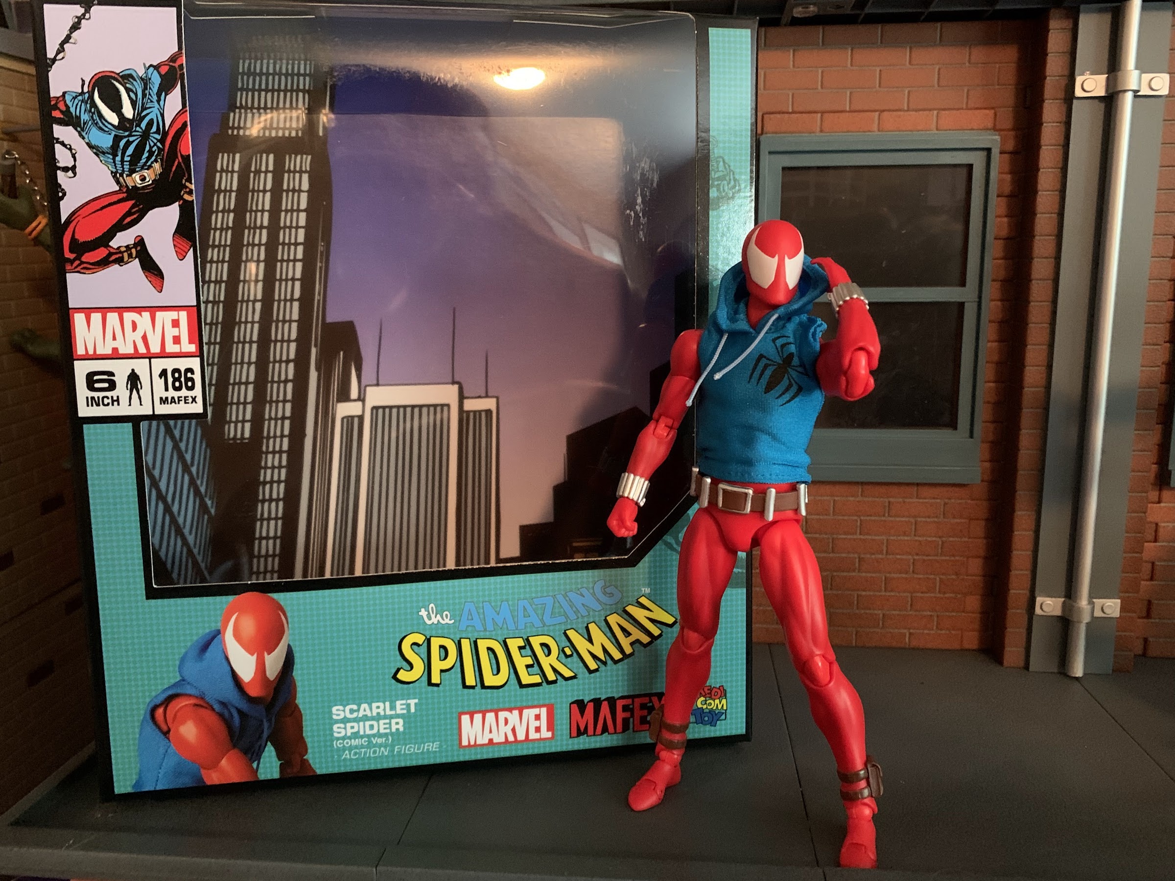
Wait! Why is Spider-Man wearing a hoodie? Answer: it was the 90s, baby!
When I was a kid, one of my favorite past times was drawing. Like most, I started really young with a box of crayons and coloring books. I’d eventually start keeping markers, colored pencils, and other instruments in a plastic McDonald’s case that came from a Happy Meal. It was blue and had a map of the United States on it, if you’re the curious type. As I got older I got into comic books and those characters became my inspiration for my drawing. I’d draw Marvel characters as well as my own, which usually looked an awful lot like an existing character because, hey, I was a kid!
One of my favorite subjects was Spider-Man. He’s a pretty popular guy and he certainly was with me. The problem with drawing Spider-Man is he has all of those web lines on his costume. Now, I’m not criticizing the man’s threads. That costume is iconic and one of, if not the, best superhero costumes of all-time. I just didn’t like to draw it because it was time consuming and definitely a little tedious. Enter the Scarlet Spider! Scarlet Spider debuted during the infamous Clone Saga in issue 52 of Spider-Man. I still remember seeing the cover to Web of Spider-Man #118 with Scarlet Spider on the cover. I took one look at that costume and said “Yeah, now that I can handle!” It was basically the same general idea as Spider-Man, only all red and no web lines. Easy! The clone of Peter Parker, Ben Reilly, had created his own persona and it had a bit of a D.I.Y. vibe to it with the exposed web shooters and blue hoodie, and it worked for me. The Clone Saga itself was a bit of a mess and probably ran too long. It also ended with the reveal that it was Reilly, and not Peter Parker, who was the REAL Peter Parker leading to Ben Reilly’s turn as Spider-Man that brought back the web lines and I personally didn’t know how to feel about it. Like Wolverine losing his adamantium, I wasn’t crazy about the guy I knew as Peter Parker being revealed to not be Peter Parker.
The figure comes with three different portraits, two of which I will never use.
Like most things in comics, eventually the status quo was restored. Ben Reilly was a clone after all, and then he died. Then he came back, because no one ever dies in comics. I honestly haven’t read much Spider-Man since the 90s so you’re better off heading to a wiki at this point if you want to know more, I’m just here for that costume. Scarlet Spider became a favorite of mine to draw and as a result I have a nostalgic attachment to the costume. The character was never done justice by Toy Biz back in day as his figures were always lame repaints. I had a 12″ version of the character with the hoodie painted on and some rubber overlays added to the wrists and ankles of what had previously been a Spider-Man figure. The inaugural line of Spider-Man Classics, the precursor line to Marvel Legends, also featured a Scarlet Spider repaint that I believe was exclusive to a retailer, possibly KB Toys. I never got it, or any other Scarlet Spider that followed. When I started getting Spider-Man figures here and there again starting with the Pulsecon exclusive Venom, my appetite for a Scarlet Spider came with it. Unfortunately, the Marvel Legends version (which actually looks pretty good from what I’ve seen) is a little old at this point and prohibitively expensive on the aftermarket. I’m not paying an inflated price for a Hasbro figure, but a Medicom one? Now that was intriguing.
I think the figure in the middle is unquestionably superior to the other two, but is it $70 better?
When Medicom unveiled their version of Scarlet Spider under their MAFEX branding, I decided to give it a go. The price is awful, as it was for the only other MAFEX figure I own, the Hush Batman, but I’d rather overpay for a boutique figure than something previously sold at Target. I had some nits to pick with that Batman figure and my overall attitude towards MAFEX is that it’s too expensive. The Marvel license probably doesn’t come cheap, but in general, I think Bandai makes better figures than Medicom and they’re usually at least in the $65 range. This figure will basically set you back about 100 bucks if you reside in the US, and I’ll tell you upfront it’s not a figure that justifies its price tag. That doesn’t mean it can’t be good as one could pay 50 bucks for a perfectly cooked steak and find it delicious, but overpriced compared with a chain restaurant’s $25 prime rib. It’s more a question of “Do you want to pay $75-$90 for a loose Marvel Legends figure, or $100 for a brand new MAFEX version of the character?”
Yeah, I wish the spider logo was bigger, but damn does he look cool or what?
Obviously, you know which option I chose and now I’m going to tell you how happy (or not) I am with that decision. Scarlet Spider comes in the MAFEX window box with artwork from the comic on the front and product shots of the figure on the sides and rear. This one is branded with The Amazing Spider-Man in the traditional font with the actual name of the character off to the side in a rather unglamorous and understated fashion. This isn’t the type of figure mothers at Toys R Us are going to be confused by, but it was somewhat amusing to me. Right off the bat though, Medicom is doing Medicom things which is namely using character art that doesn’t match the figure inside. The picture of Scarlet Spider on the top left looks to be from his early days. The red, or scarlet, of his costume is dark with lots of black shading and the hoodie has the big, spider, logo across the chest. The figure inside is a bright red, no shading, and has a small spider logo over the heart. It’s my understanding that this version is a later version of the character as he’s come and gone over the years. Why the person designing the packaging wouldn’t choose a better representation of the figure inside is beyond my understanding. And if Marvel dictated that this version of the character be featured on the box, why not make the figure match? It’s puzzling.
The hoodie is fine, certainly fine enough to not want to spend more money on a different one.
Right off the bat, we’re kind of off to a bad start. Not because the picture is wrong, but because the figure seems to be based on a version of Scarlet Spider that isn’t my favorite. And I don’t get the sense that I’m alone in that regard. Is it a deal breaker? Obviously not since I bought it anyway, but I wish he had the character’s original hoodie. The belt is also different with this one having a more traditional buckle instead of the red-buttoned belt. I’m honestly less irritated by that change, but felt it was worth pointing out. The shape of the eyes on the mask are also more of a traditional Spider-Man eye shape, but this is rendered moot by the inclusion of a head with more of a 1995 look to the eyes so I won’t count that as a knock. Still, I have encountered multiple collectors in the market for custom hoodies for their $100 figure to get the right logo on it. I can’t bring myself to drop another $30 on an already expensive figure in an attempt to improve it, but if it really bothers you there do appear to be some nice customs out there.
Is Scarlet Spider a little big or Venom a little small? Both things can be true. This looks okay to me though.
With that out of the way, let’s talk about the actual figure. Scarlet Spider stands at approximately 6.25″ tall making him a little oversized. The MAFEX line is a 1:12 scale line so that would make the character about 6’3″ which is on the tall side for a Spider-Man clone. At the same time, if you’re looking to fudge him into a Marvel Legends display this should work pretty well as most of those Spider-Man figures are around the same height, with a few exceptions. The figure is basically cast in all red plastic with very little paint. The paint is limited to the eyes, belt, and little pouches on his ankles. And at the ankles, it’s not as fine as it could be as the top of the straps wasn’t painted over leaving them red. A nitpick, perhaps, but this is a $100 figure, after all. I can’t tell if the web shooters are painted or not, but they’re a nice, lustrous, silver. They’re definitely separate pieces from the arms, but they may be painted over for added effect. On the body itself I’m not detecting any shading which is a bummer. I think some dark red over the bare plastic would have helped spruce this one up. Personally, I would have loved an ambitious paint job with a lot of black shading, but I’m not surprised we didn’t get that. Medicom did do a comic paint Spider-Man years ago so maybe we’ll get such a variant in the future (do I really want to be tempted by such), but for this release Medicom is definitely playing it safe. I also would have liked some outlining around the eyes, be it dark red or even black to add a little pop to the presentation. They are at least raised as part of the sculpt, which is better than nothing.
He’s got you now, Ben!
The overall sculpt is definitely going for a lean, but muscular, build suitable of Scarlet Spider. The soft goods hoodie is done well and I rather enjoy the almost metallic sheen it posseses. The logo is printed on, and despite being too small at least looks fine. There’s no logo on the back. The drawstrings are connected to the hood and don’t actually function, but respond a bit to posing despite lacking a wire. The hood itself is wired and the figure looks good with it on or off. I will say, the hoodie helps add a little extra bulk to the torso which is a good thing as without it I think he’d look too lean and shapeless. The torso doesn’t taper much from the chest to the abdomen so he would probably look stupid without the hoodie. Maybe that’s by design as we wouldn’t want him to look frumpy either, but if you’re someone with a lot of money looking to utilize this body for custom action figures you may be letdown. I do like that the hoodie fits tight enough that we can see some of the muscle definition showing through. If you did want to get a custom hoodie I’m not sure how difficult it would be to get this one off given its tightness, but the head is easily removed and he can raise his arms up to the heavens to it’s probably more than manageable.
The paint may be basic, but at least the figure makes up for it with a whole bunch of stuff.
The costume is a rather simple one, which is basically what drew me to it. Simple can be nice, and Medicom did a fine enough job capturing this particular version. I think his chest could be bulked out more and maybe even the abs to a degree. He looks fine from the front or back, but viewing the figure from the side makes him look rather thin. Aside from that, the proportioning looks good and while the paint doesn’t impress, what’s there at least isn’t sloppy. How much you enjoy the look of this figure will be determined by how much you like this particular version vs the original Scarlet Spider costume. Even if you’re someone who doesn’t like the over-articulated aesthetic of a MAFEX release, the hoodie, web shooters, and belt hide some of the seams on this guy and the only minor eyesore resulting from the articulation is that the knees and elbow pieces are an ever so slightly different shade of red from the rest of the figure. Under a white light, you’ll notice it more, but in natural lighting it blends fine.
This figure comes with too many web effects to make use of at once, which means your Hasbro offerings can finally get some decent webs!
For accessories, Medicom did what Hasbro don’t and loaded this guy up with plenty of hands and web effects. We do get three heads: standard eyes, wide eyes, and what I’ll call “classic” eyes. The classic eyes look more like the box art (even the image of the figure on the front of the box is using these ones) and those early first appearances of the character. The default eyes look like standard Spider-Man eyes to me and the third set are even larger and a bit more expressive without getting as stylized as some Spider-Man eyes tend to get. For hands, we get a set of fists, thwip, gripping, open, and relaxed hands. There’s also another set of open hands with magnets in the palms and a set of feet with magnets in the soles so he can scale a metal wall or refrigerator. All of the extra hands and feet come on little acrylic stands to I guess make sure the openings on them don’t warp in the package. The fists are what come on by default, and as such they slide off and on the easiest and actually won’t really fit on any of the little acrylic pieces when not in use. The extra hands, for their part, go on easily enough and at no point was I afraid of breaking anything. The heads require a bit more effort, but aren’t too bad either. I was a little apprehensive about the feet, but they too go on and off with little effort. Overall, a much better experience than the one I had with Batman.
He has magnetic hands and feet if you want him in a wall-crawling kind of pose provided you have some metal on your wall. It stayed in place for me, but I personally wouldn’t trust it longterm.
To go along with the extra bits are a whole bunch of web effects. We get two short “thwip” effects and two longer ones. These have a little loop on them and are meant to be slotted over the wrist peg and then the hand can be placed over them. It’s a simple, and effective effect made easier by the exposed web shooters this costume features. We also get two “L” shaped webs which basically feature handles for the gripping hands. I wish there was a little nuance to the handled part, but it works fine. We also get two additional “L” shaped webs where the handle portion is actually a spiral of web. There’s a loop where the long portion ends and the spiral begins that a hand can go through with the rest of the spiral portion riding up the forearm.
I really like these web lines that coil around the forearms, but I wish he could grip this figure 8 one better.
Lastly, we get another swinging web that basically ends in a figure eight. It has a lovely look, but the issue with this figure is that the gripping hands are lumps of plastic with a hole through them. The fingers are connected to the palms, so the only way for the figure to grip the webs is to start at one end and slide them through. I would like to have the figure grab an inner portion of the figure eight, but it’s essentially impossible without some modification to the figure or the accessory. You can try to use the relaxed hand instead like he’s in the process of letting go, but making the fingers flex on the gripping hands would have been the way to go. As for the effects themself, the web lines look the part. They’re just white plastic with some knots and such sculpted into them. I’m happy to have so many, as Hasbro is terrible about giving us web effects with its figures so the extra will be put to good use. Of course, Hasbro also doesn’t give us gripping hands so they’ll only go so far. Medicom also packs in a display stand so you can actually display your figure in mid-swing. It’s just a plain, acrylic, stand, but it gets the job done. It articulates at the base, the midway point, and at the “claw” where the figure slots in. There’s also a straight peg included and a second, narrower, claw that I believe is more for grabbing a thigh instead of a waist. There’s also yet another piece that’s basically a “J” shape with a peg above it. I don’t see how that peg plays a role in posing this figure, but the J piece acts like a seat if you want to try and balance the figure on it as opposed to having a claw piece grab it.
Some of these leg poses were tricky out of the box. I had to hit this one with some silicon spray to get them moving well enough that I wasn’t afraid of snapping anything.
Medicom’s major boast with its MAFEX line concerns articulation. This is a “super” articulated line that should blow away anything you’re likely to find at a brick and mortar retailer. With this guy, we get a double-ball peg setup at the head. Medicom likes to use this angled peg that I don’t think adds much, but combined with the ball-peg at the base of the neck means you get a figure that can look up, down, and packs some nuance as well. The shoulders are ball-hinges which peg into a socket inside the chest. You get some up and down play, and the arms raise out past a horizontal position. There’s a butterfly joint here as well which allows for some back and some forward range, but not a ton. At least with this figure, we’re not dealing with any aesthetic trade-off with the joint as the soft goods hide it. There’s a biceps swivel, double-jointed elbows that bend well past 90 degrees, and ball-hinged wrists. Either the hinges at the wrist are really tight, or the web shooter interfere with their range as I can’t get much out of them which is unfortunate.
Do I want to put this figure on a shelf or on the fridge? Shelf? Or fridge?
In the torso, we get ball joints in the diaphragm and the waist. This allows the figure to bend back rather far as well as crunch forward. There’s tilt and rotation at both joints and overall I would say this is a very well done torso. It also helps that we once again have the soft goods to hide any ugliness these joints might create. I’ve never been a big soft goods guy, but maybe this figure is winning me over? The hips are where I lose a little bit of my enthusiasm as Medicom loves the drop-down hinged joint with ball and sockets. They’re finicky, and they’re the only joints that scare me as sometimes I feel like they’re fighting me, especially the left hip which might actually be stuck. Kicking forward is a chore and he gets to about horizontal when you get everything in proper alignment. Drop the hip and you get just a little bit more range which is why I don’t really like the design. He can at least do splits and the thigh swivel at the socket works great. The double-jointed knees are fine and at the ankles we get more hinged ball pegs. They can bend forward and back plenty fine while the ankle rocker is a little more cumbersome, but functional. They’re also tight enough that the figure has no issues standing on its own.
Shelf, it is!
Aside from the hips, I mostly like what this figure does as far as articulation goes. I can’t quite get him into some of the deep crouches Spider-Man is known for, but part of that is the stuck left hip. I may try to hit it with oil to see if lubrication helps alleviate the issue. If it didn’t have the more delicate drop-down setup, I’d just pop the leg off and try to diagnose the issue that way. Or if it was 70 dollars cheaper, I’d be more aggressive with it. I can still basically get the figure into the poses I want, especially since I’m mostly interested in using the stand, but it’s never much fun to fear moving a part of an action figure like I do with the hips on this guy.
Is the MAFEX version of Scarlet Spider worth the $105 asking price some retailers have it listed for? Probably not, but what 1:12 figure could be? None really, this is an expensive commodity, but given the lack of alternatives I can’t say I blame anyone for just going for it. That’s what I did as I’m not a regular MAFEX buyer nor am I amassing a giant collection of Spider-Man stuff. I just get things here and there so for me I was able to rationalize the occasional splurge with this one. I certainly don’t blame those who can’t, and given the frequency of higher budget releases this year, one could easily argue that I should have passed on this one all-together since I don’t make any money off of this blog, so I’m collecting just for fun as opposed to content. At the same time, if you do grab this figure and can look past the price and the fact that it’s not based on first appearance Scarlet Spider, I think you’ll be plenty happy. There are things that could be better, but at the end of the day it has enough stuff to make sure it looks good on your shelf and it probably will get the attention of anyone who comes looking. And that’s definitely what you want from an expensive collectible.
Interested in more Spider-Man figures or maybe you’re curious about another MAFEX release?
When I was a kid, my dad took me to some local convention or trade show. I have no idea why because my dad wasn’t the type who would go to such an event. He liked car shows, but from what I can remember this was more of a hobby show. It was early in…
It was in 2021 that Hasbro released a PulseCon exclusive Venom figure on a Spider-Man retro card. The retro card series is meant to stir-up nostalgia for all of the adults who were buying toys and watching cartoons in the 90s as the retro card is a facsimile of the old cards Toy Biz used…
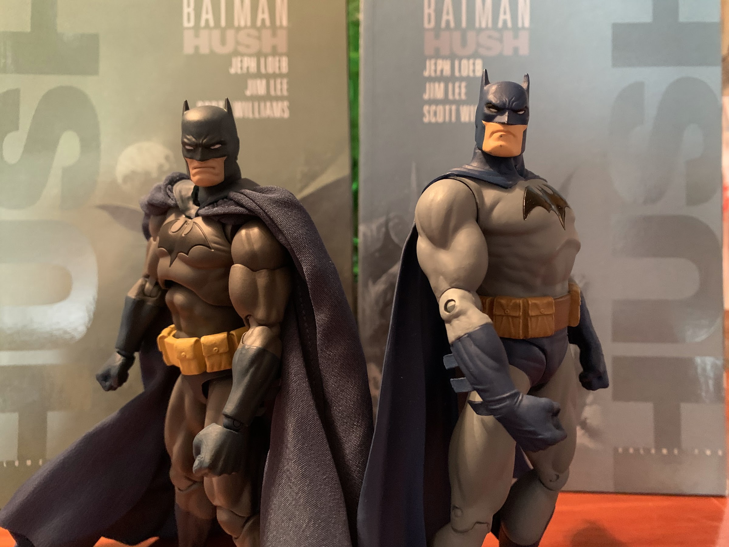
You may have been wondering why I decided to devote an entry earlier this week to a nearly twenty year old action figure of mediocre quality, and if so, now you know why. I wanted to take a look at the DC Direct Batman based on his appearance in the Jeph Loeb written, Jim Lee…
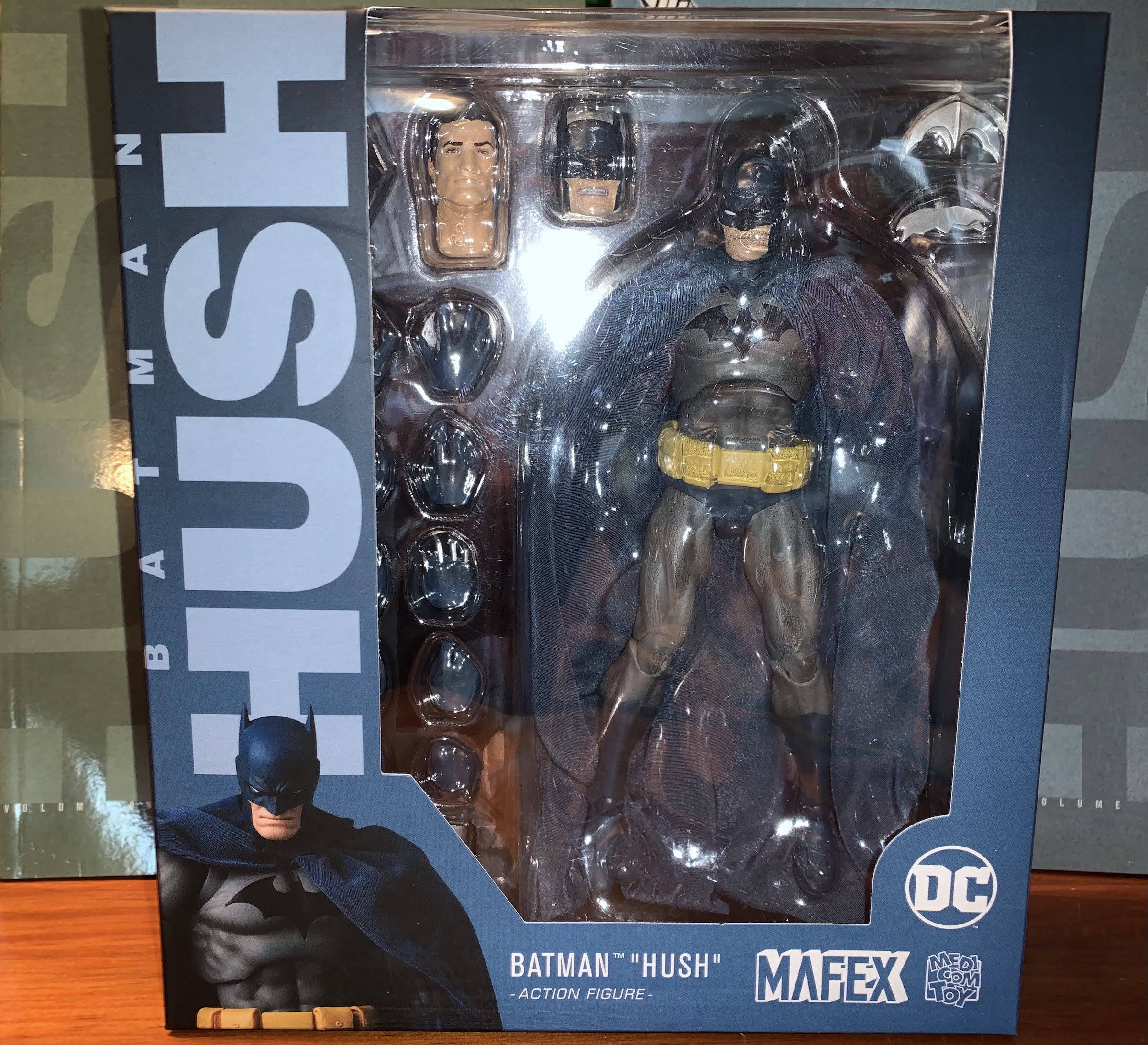
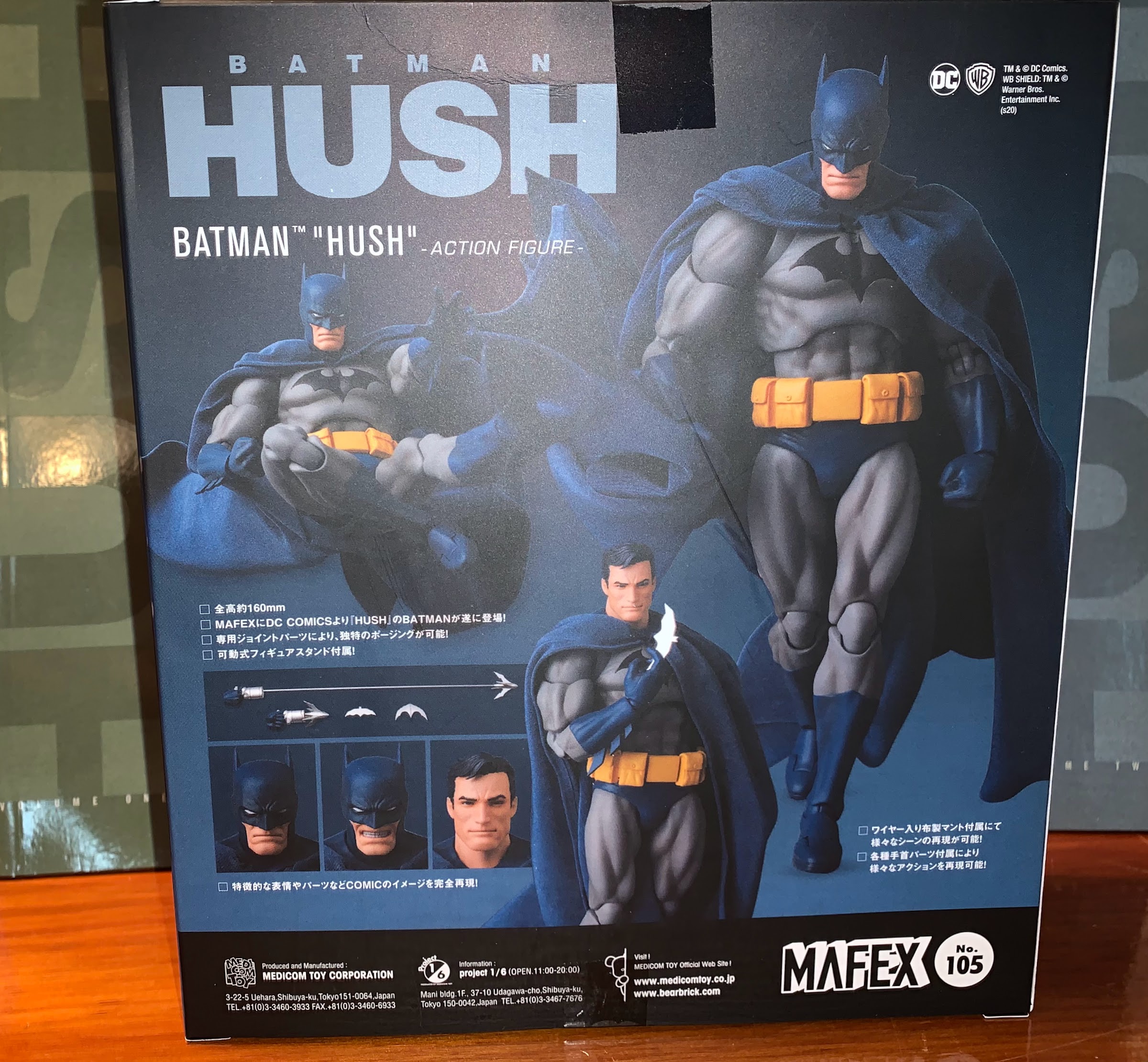
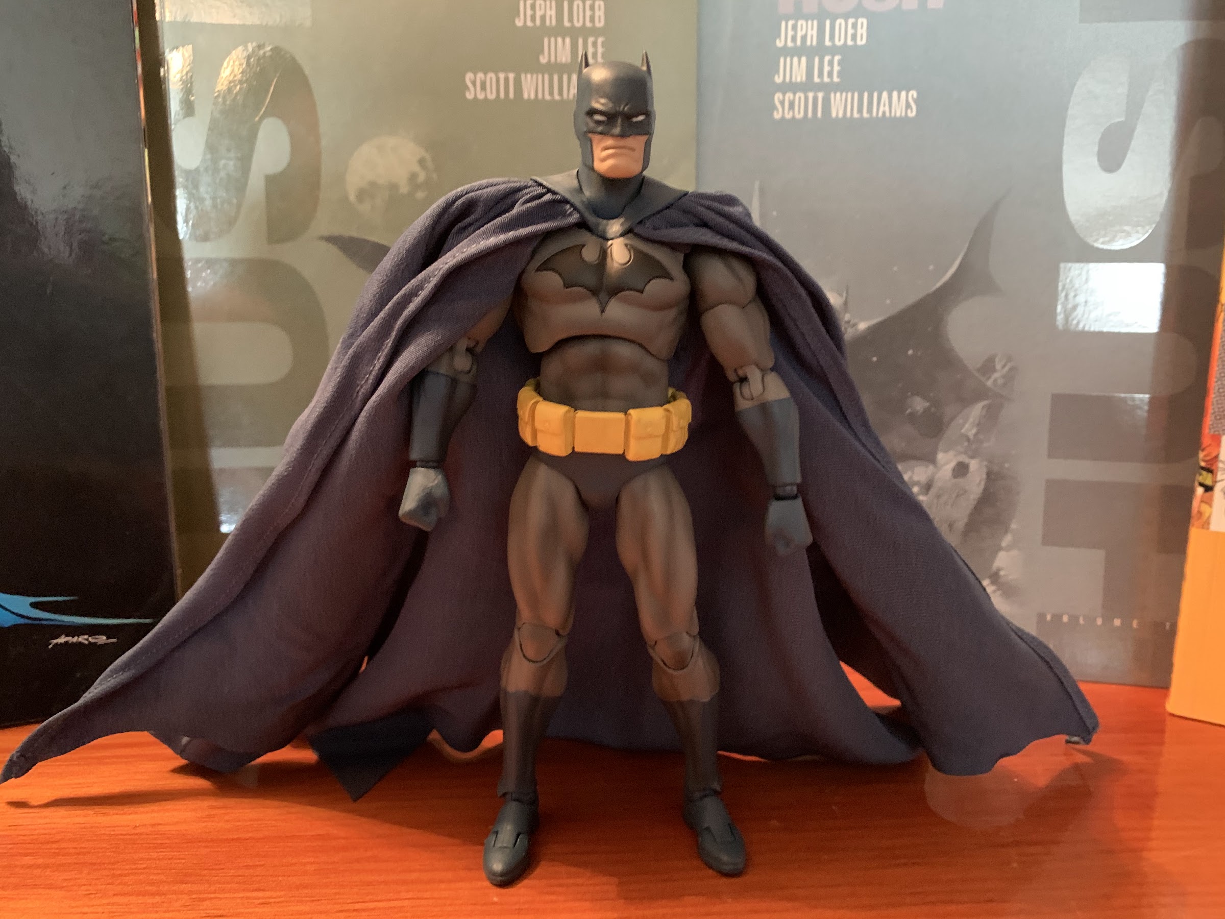
You may have been wondering why I decided to devote an entry earlier this week to a nearly twenty year old action figure of mediocre quality, and if so, now you know why. I wanted to take a look at the DC Direct Batman based on his appearance in the Jeph Loeb written, Jim Lee illustrated, story Hush in anticipation of a look at what should be a much better figure based on the same Batman. The MAFEX Batman should be everything the DC Direct one was not as MAFEX action figures pride themselves on being highly detailed as well as super articulated. They’re also super expensive so they should be awesome.
My only experience with Medicom prior to this was nearly 15 years ago. Back then, Medicom was known to me for vinyl toys which were often stylized and often pretty expensive. Medicom did a deal with musician Glenn Danzig back then, and if you have not noticed that’s a favorite subject at The Nostalgia Spot, and I grabbed one. Medicom issued three figures, one based on each of Danzig’s bands, and I grabbed the one based on the band Danzig. The figure is basically a vinyl doll, it swivels at the arms and fists, but nowhere else. It might have swiveled at the head if not for the hair-sculpt. It was stylized though with its own unique look featuring an oversized head and fists with a somewhat round nose and underbite. It was cool, but also around $75 in 2006 money so it was hardly cheap and the reason why I only grabbed one.
I am very excited to open this guy up.
My experience with Medicom is not at all applicable to its MAFEX line of figures. The only comparison is that both are expensive. I have seen plenty of MAFEX offerings over the years that looked pretty good and were thankfully not attractive to me since they do a lot of superhero stuff. I’ve also had some reservations as I’ve seen and heard many complaints about the MAFEX quality control over the years. Joints breaking, paint applications iffy, and so on. Often times reputations are earned, but it’s also important to remember not everyone’s experiences, or expectations, are the same. I’ve certainly seen a lot of complaints about NECA’s quality control online recently and yet I own somewhere in the neighborhood of 75 NECA figures and have yet to have one break. The worst I encountered was my toon Slash which arrived with a detached backpack strap which was easily fixed with a dab of glue.
I feel like his thighs look bigger here than they do on the figure, but it could just be perspective messing with me.
Even with that reputation starting to build for MAFEX, it wasn’t the thing still giving me the greatest pause, it was the price. And it’s not necessarily the idea of spending around $100 on a figure. When I saw this Batman unveiled I was very interested as I felt this was THE Batman for me and I’d never need another and that has a pretty high price for me. It’s more what you get for the price. Each MAFEX figure is 1:12 scale which is fancy for six inch scale, for the most part. They’re not identical, but most people won’t notice the difference. You’re getting a figure with a good sculpt and a lot of articulation to go along with numerous extra parts like hands and heads, as well as character appropriate accessories and often (always?) a stand. It’s a good assortment of stuff, but the fact remains that quality figures in this scale just don’t carry this high a price. Bandai’s SH Figuarts are very comparable in terms of scale and quality and they usually retail for $60, at their high end (up until recently, of course, as we’re currently seeing a rise across the industry in prices). What is MAFEX doing to justify the added cost? It’s possible the licenses they go for just plain cost more, but Bandai has done Marvel and kept the price down, so that leaves me largely with one conclusion.
Here he is!
And here’s that cape!
And that conclusion is “because they can.” We’ve been seeing a lot of boutique style collectibles start to crop up that really push what is expected in terms of price. And I think some manufacturers have realized that collectors are willing to pay a lot, and some are now willing to charge a lot as a result. Action figures are not known for having fantastic profit margins, but they do exist and most companies figure out a price that works for them. And then we have other companies that want more. It’s basically just capitalism at work, and if collectors buy it then producers are going to charge it. Did I want to contribute to making it acceptable to buy a 1:12 figure at $100? The short answer is, “No,” but I am both making an exception here and I felt I should have some personal experience with such a product before forming a final opinion, so here we are. And maybe I’m just ill-formed and Medicom pays its employees way better than the competition and thus, has to charge more. I doubt that’s the case, but since it’s a possibility I figured I would mention it.
Sculpted bat logo – good. Paint not quite lining up with the sculpt – bad.
I am going to keep this review objective, because that’s what I always do, and because subjectively I’m almost guaranteed to enjoy this action figure. The version of Batman depicted in Hush is fantastic, as far as I’m concerned, and this figure need only capture that. Price is a factor though, so I have to keep that in mind. This figure by itself might be great, but it needs to justify its cost. I can overlook some lazy sculpting or iffy paint in a Marvel Legends and still declare it’s pretty awesome because that figure costs around $25, but such things are not so easily overlooked when the price is quadrupled.
Good elbow clearance.
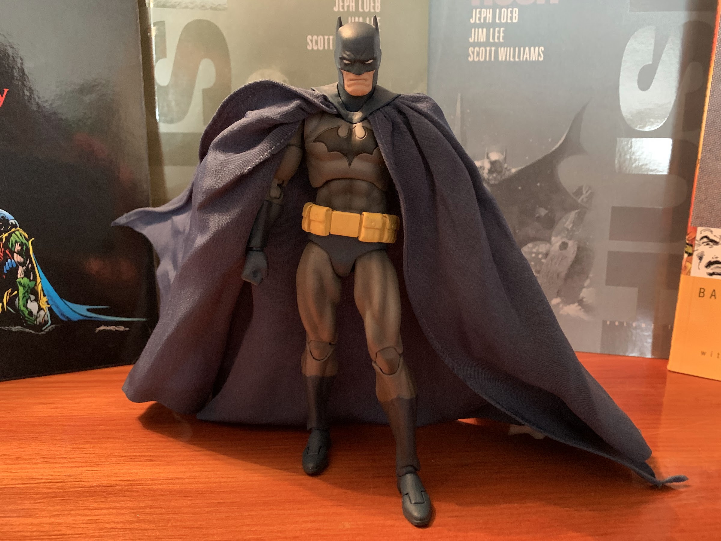
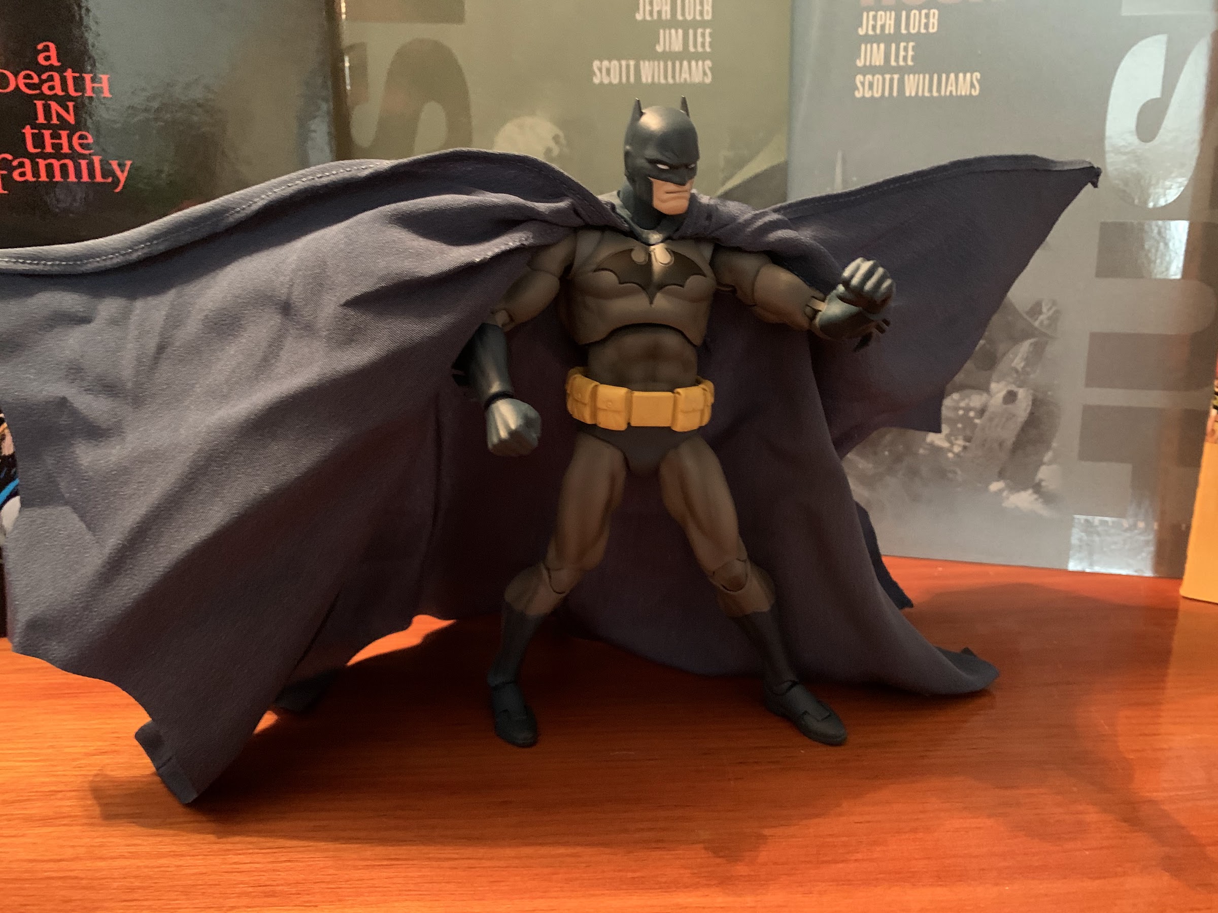
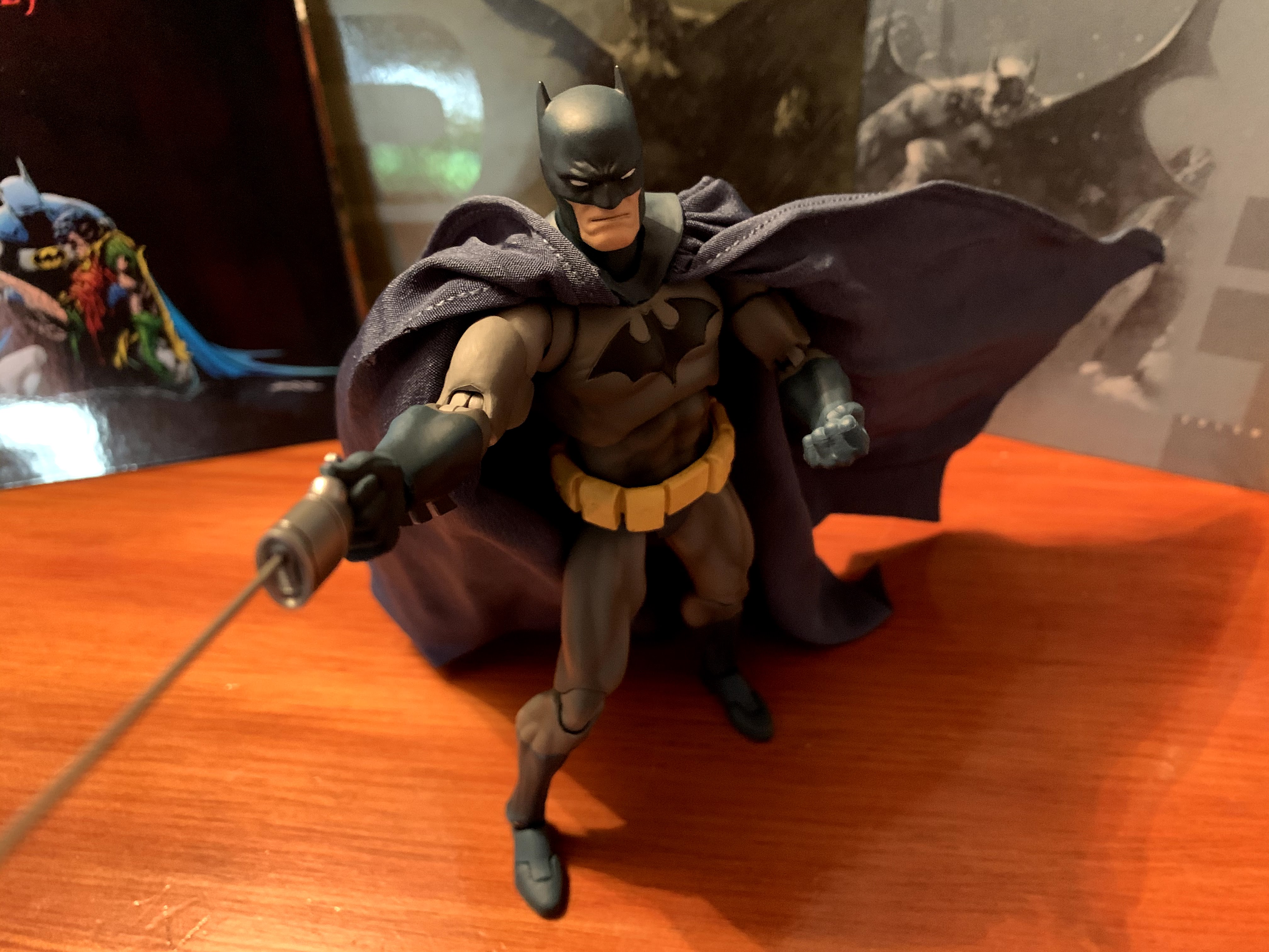
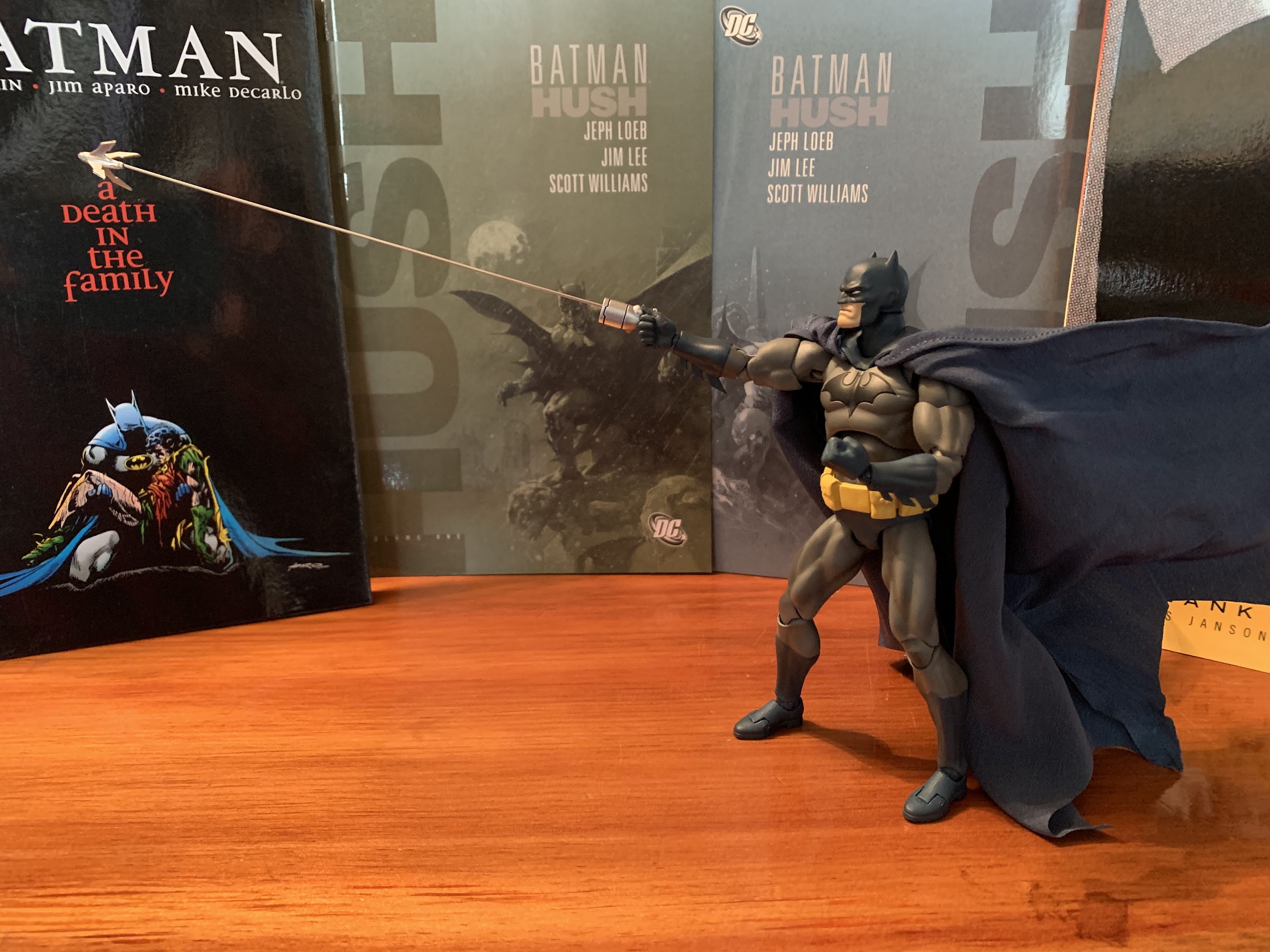
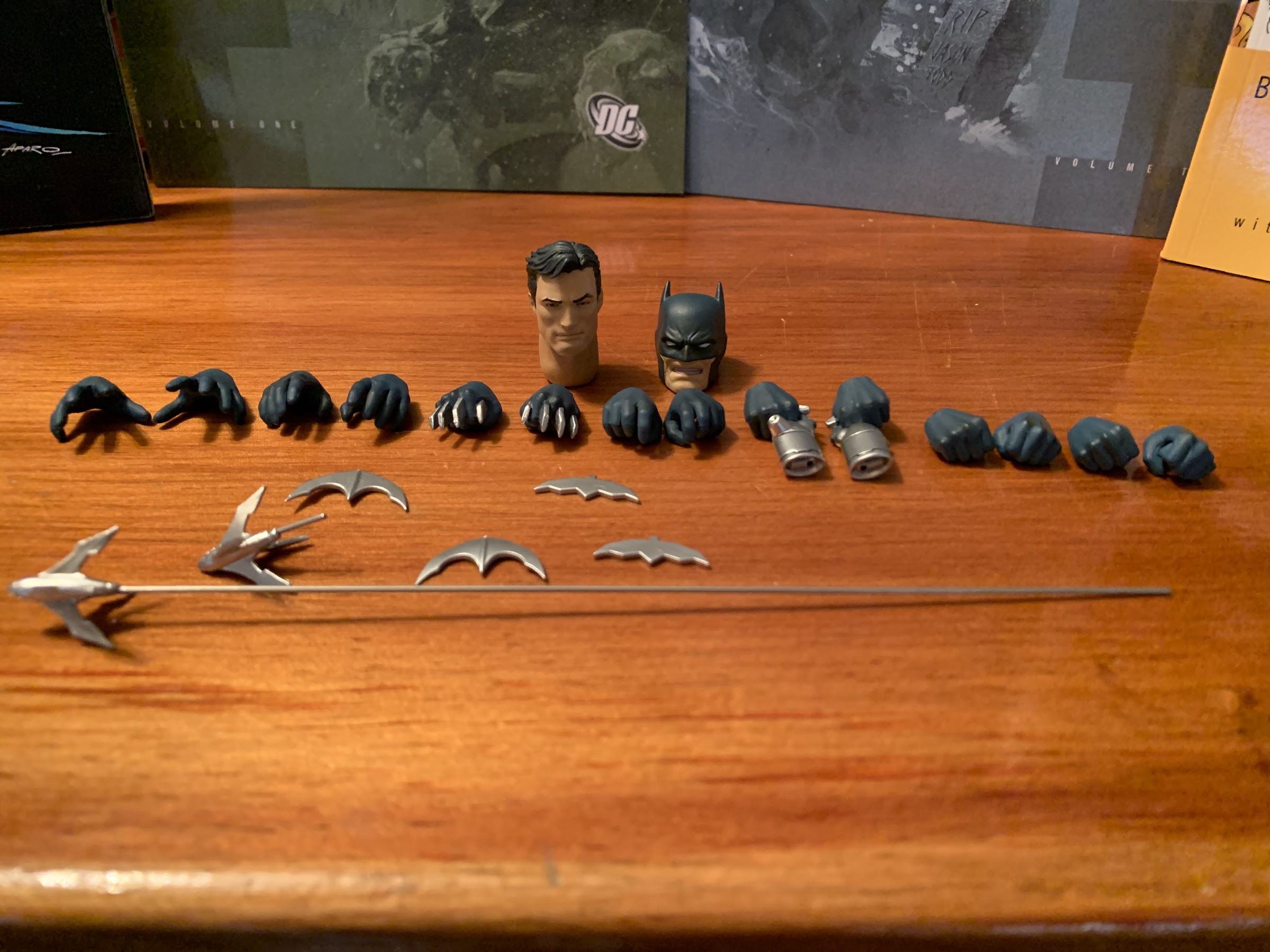
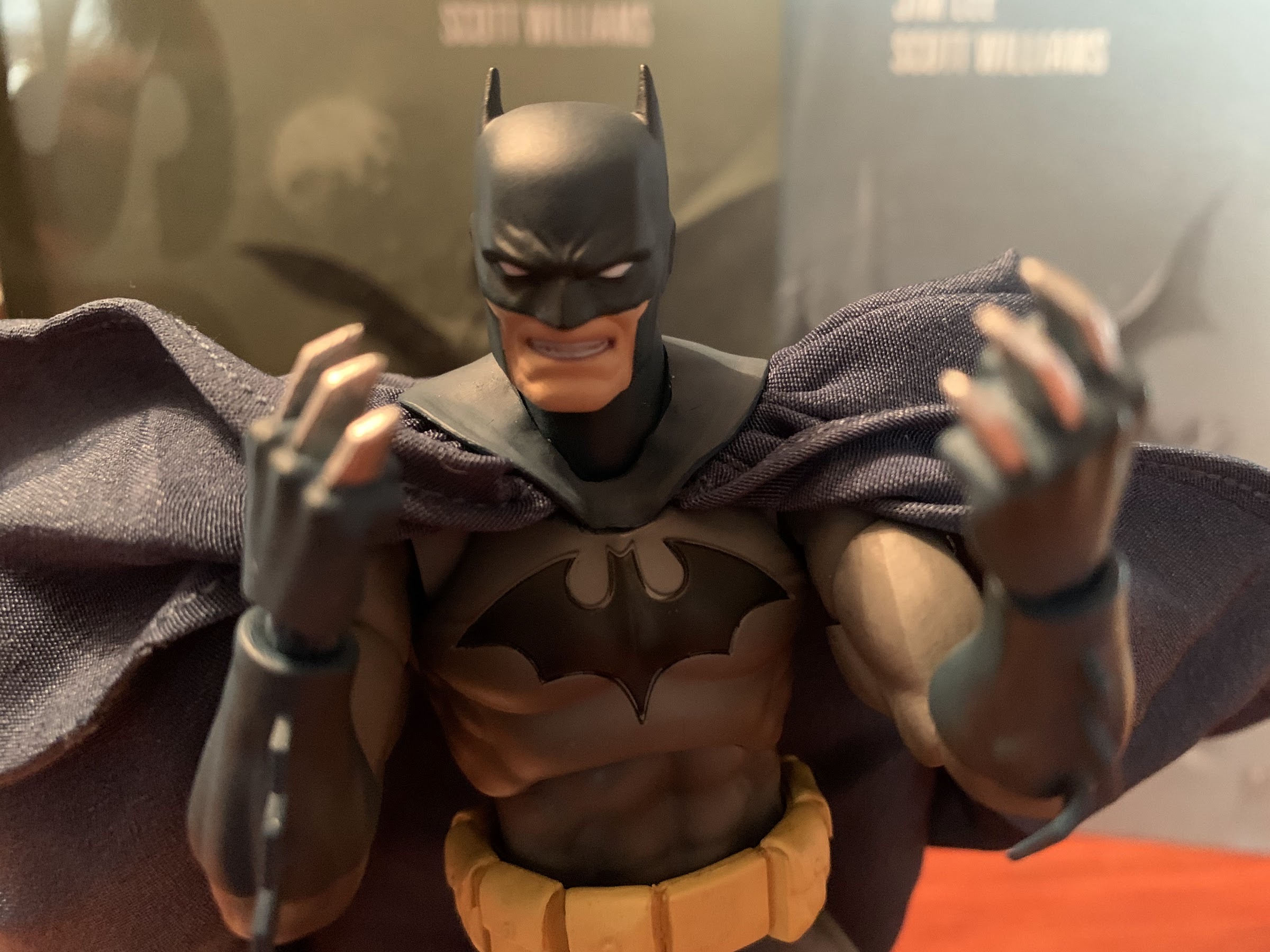
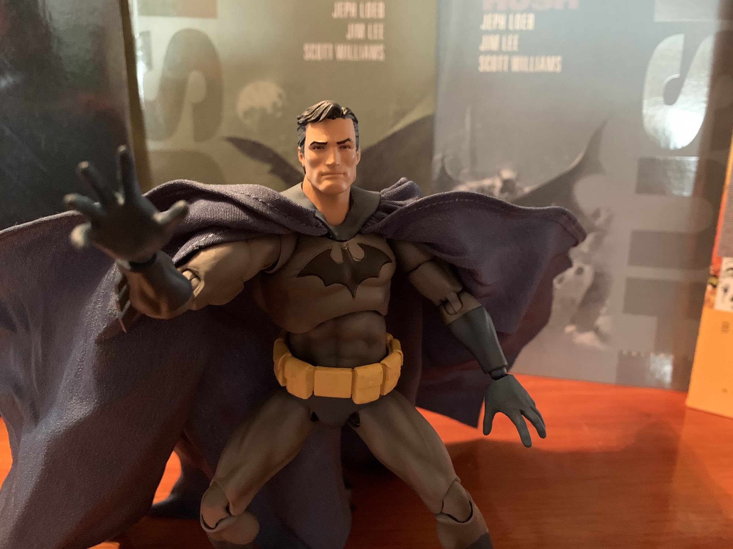
Well, for starters, MAFEX presents a good figure. The figure comes packaged in a collector friendly window box with appropriate colors and artwork. The rear features numerous product shots to demonstrate how the figure can be posed, and unlike a Lightning Collection release, I suspect all of these potential poses are actually achievable. I do wonder if these are actual product shots though as the colors are a bit different and the figure looks a bit beefier, especially the legs. It’s likely they’re just edited post photo, or the figure depicted is a final test sample that turned out a little differently. The figure comes in a blister tray with some actual Jim Lee artwork serving as the backsplash. The tray has a plastic overlay to keep everything in place and the included stand is taped to the back. I recommend removing that stand before removing the tray cover because that cover is the only thing securing all of the accessories and figure. Don’t do what I did and remove the cover and decide now is a good time to take off the stand and accidentally dump all of your parts on the floor. It’s not a fun time searching for batarangs on a carpeted floor.
I have real mixed feelings about this cape.
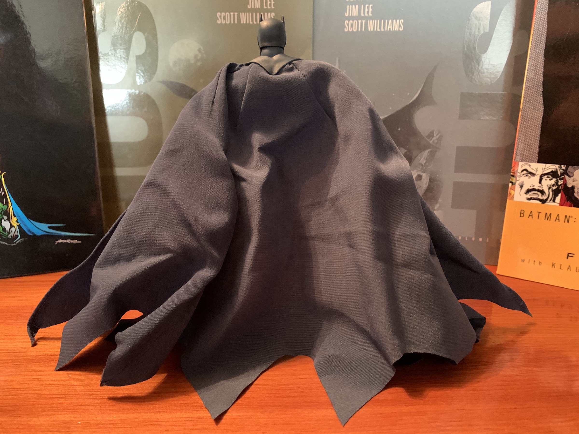
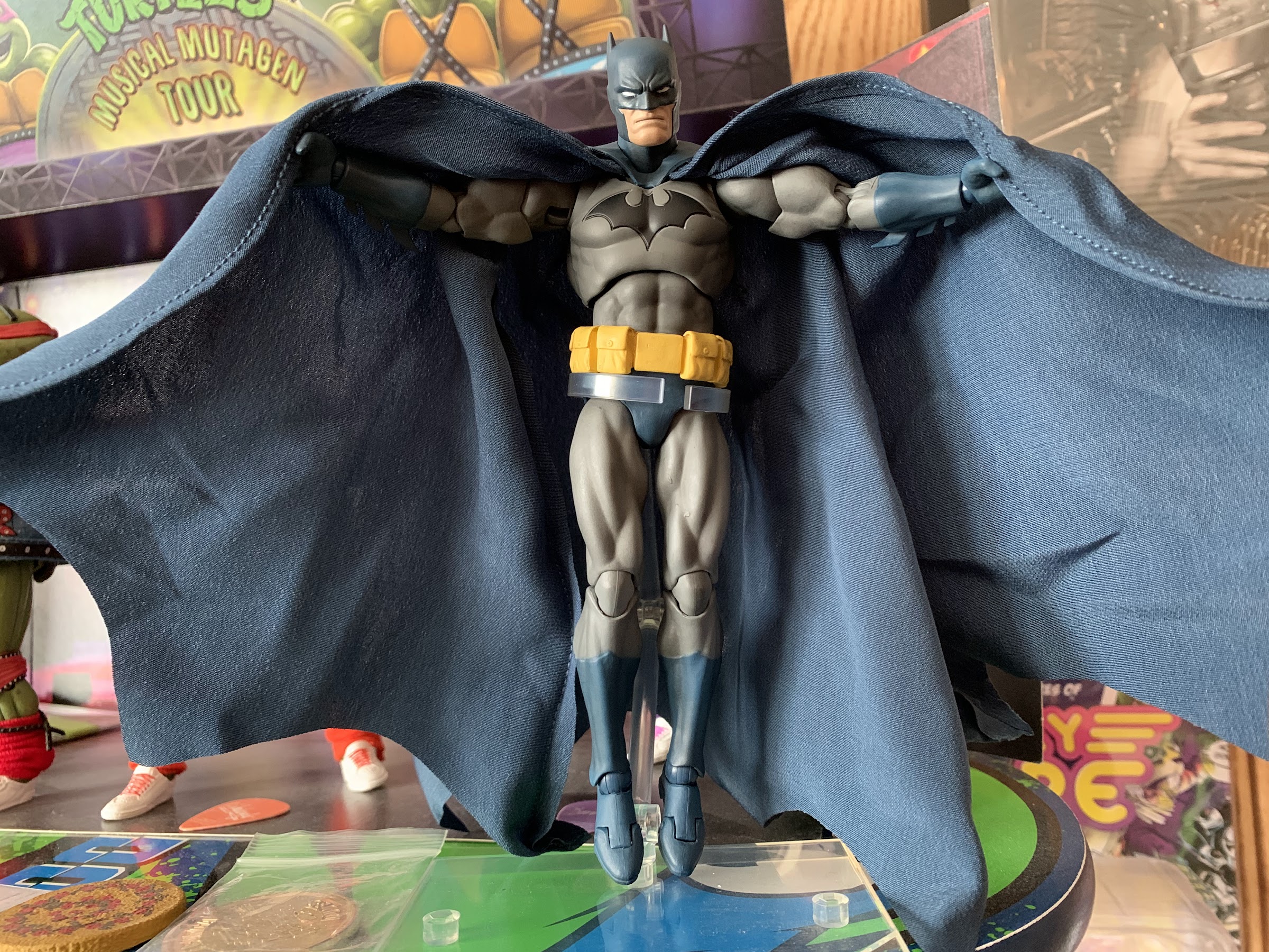
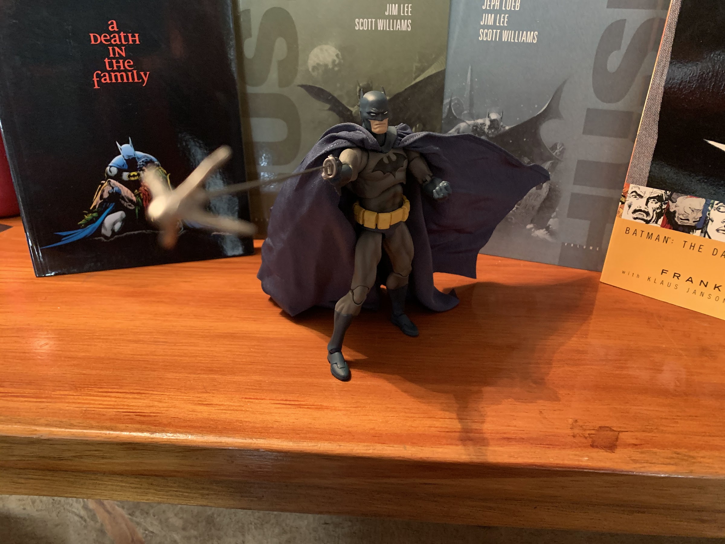
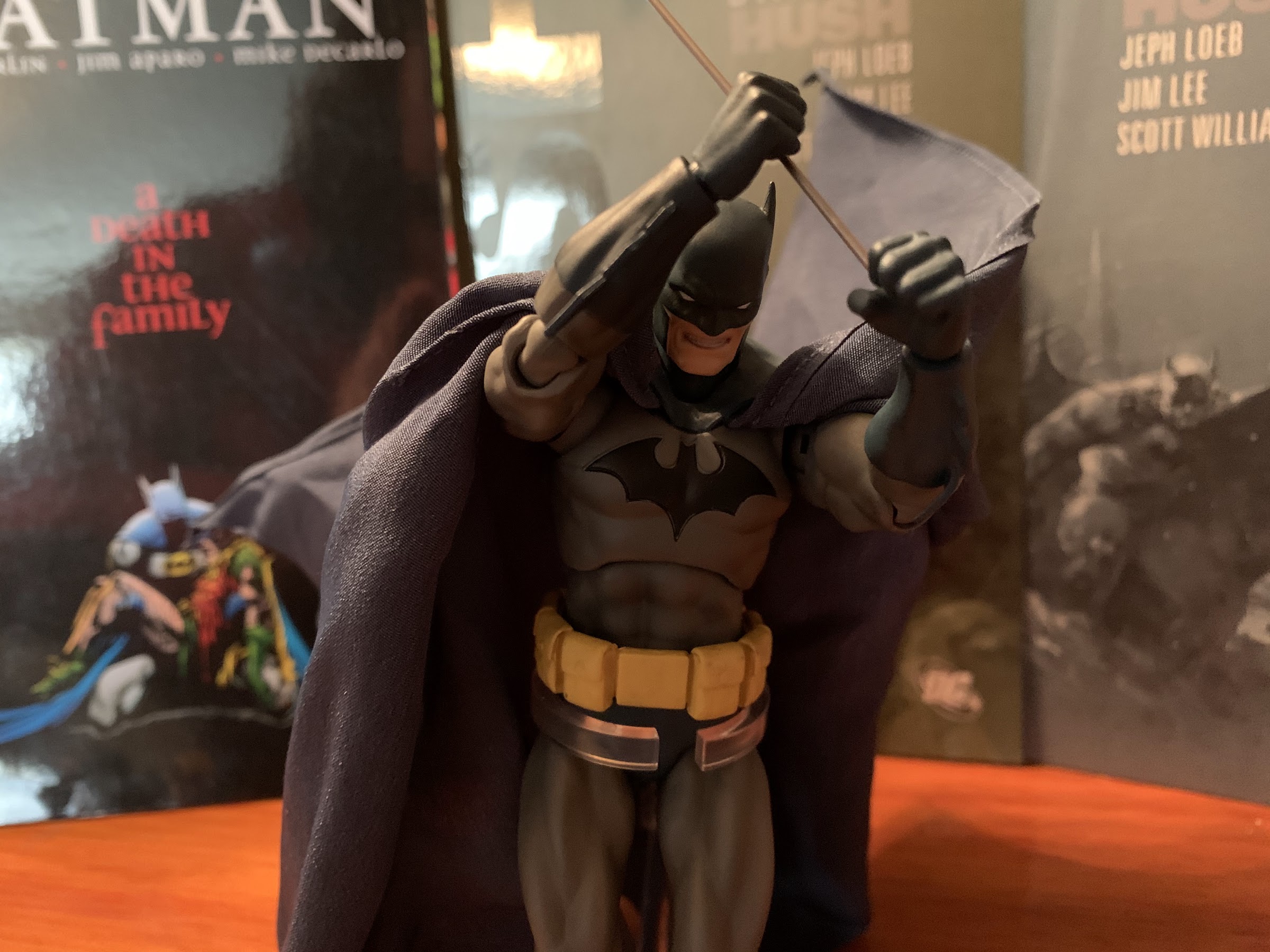
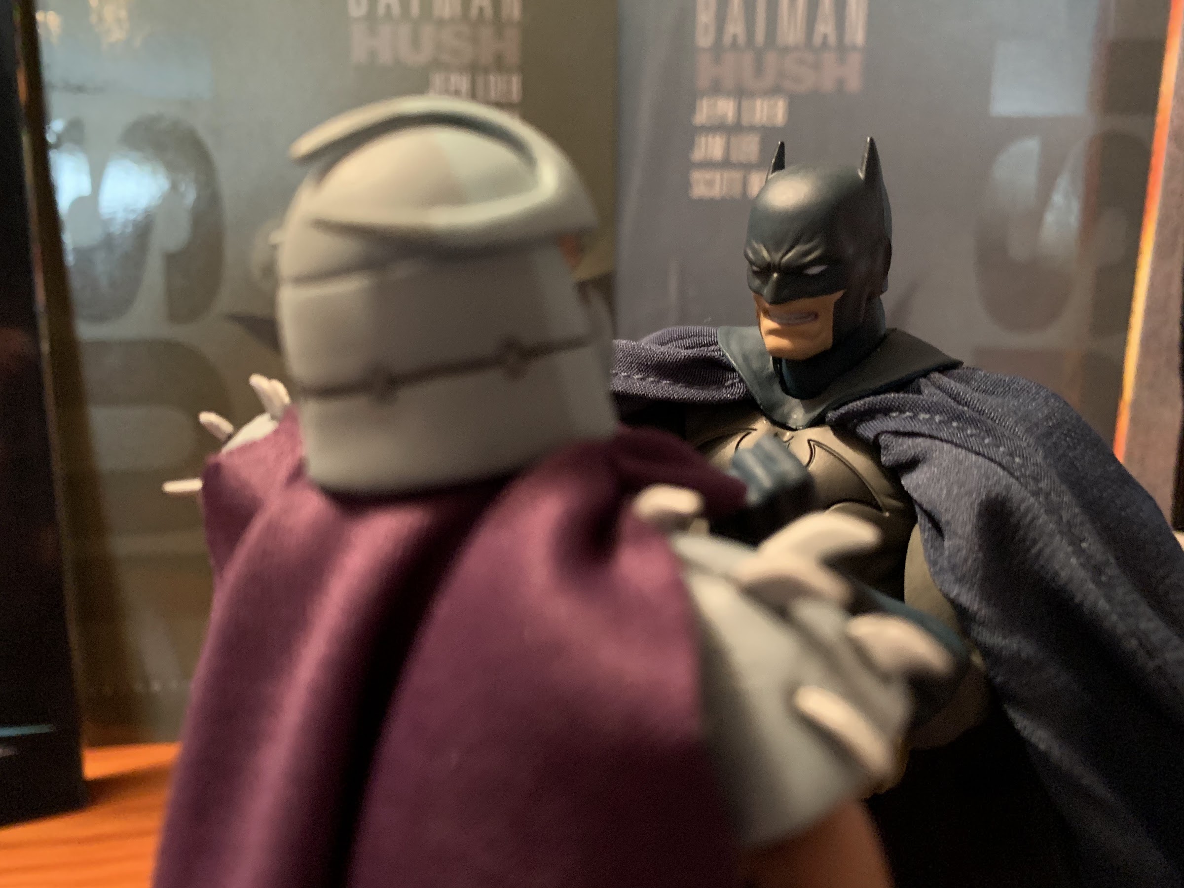
There is no tape or tie-downs inside the box, so once that tray cover is removed you are free to pull your Batman out. He is pretty light to the touch and your first reaction is likely going to be, “Wow, that’s a big cape!” It’s massive and made of some kind of cotton, I assume. It’s well put together, but it will arrive wrinkled. Had Mafex used spandex or something more rubbery it likely would not wrinkle so easily. The stitching is clean though and I don’t see any fraying, so that’s a plus. It’s glued under the cowl and it’s a little messy and I worry about that piece eventually lifting off of the torso. Holding and moving Batman feels a lot like handling a SH Figuarts release. The joint system is pretty familiar and just the overall build quality feels pretty much the same, and that’s a good thing. The only negative for me right out of the box is that one of the blades on his left forearm came out bent and curled over, which you’ll see in virtually all of the images in this post. Since taking all of the pictures I was able to apply some heat to that curled blade and straighten it out a little. It’s not where it needs to be and it’s something I’ll have to keep at if I want to straighten out completely, or just learn to live with.
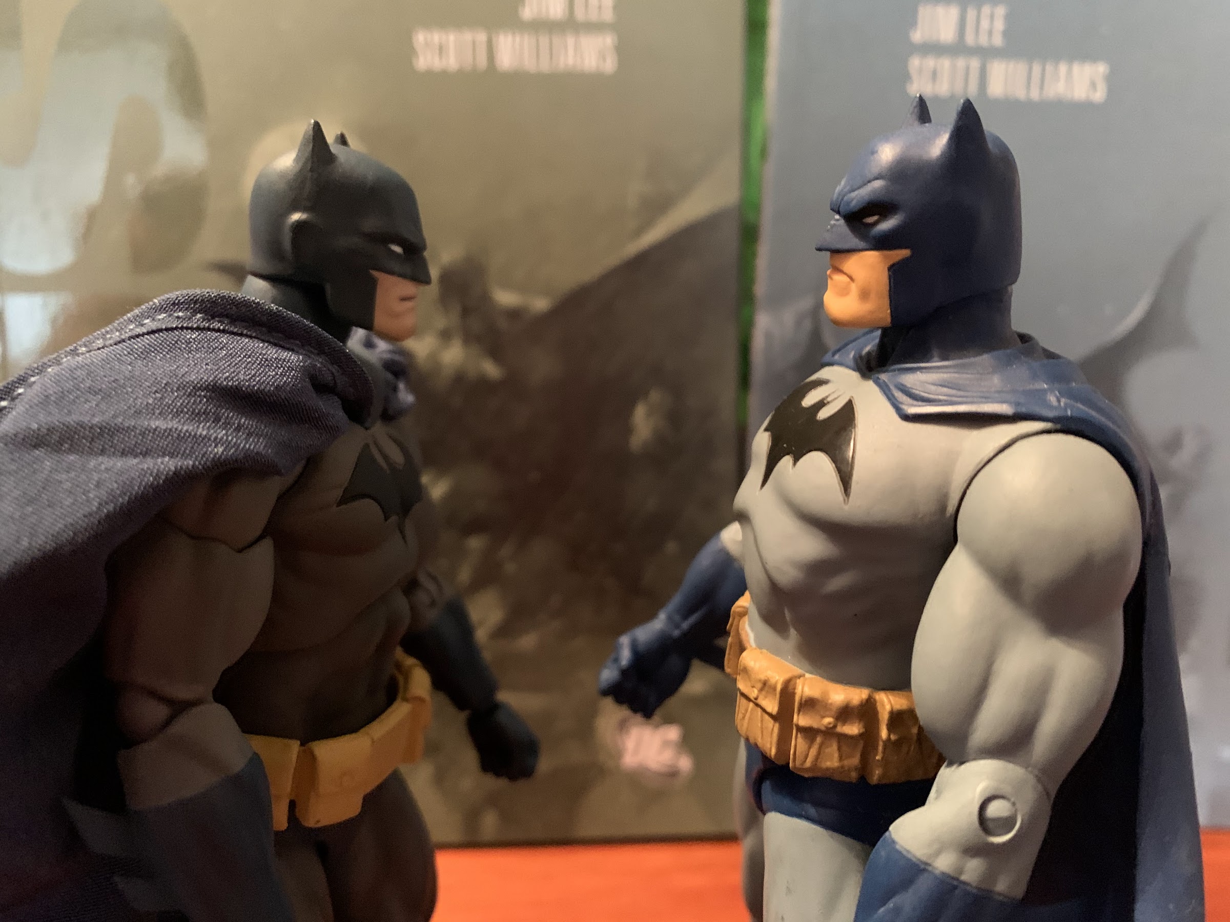
I’m actually a little surprised at how well the old figure looks next to the luxury model. If only he didn’t have the paint blemishes on his face.
Here the Mafex figure shows off its superior head-sculpt, but the DC Direct one still gets to brag about its massive chest.
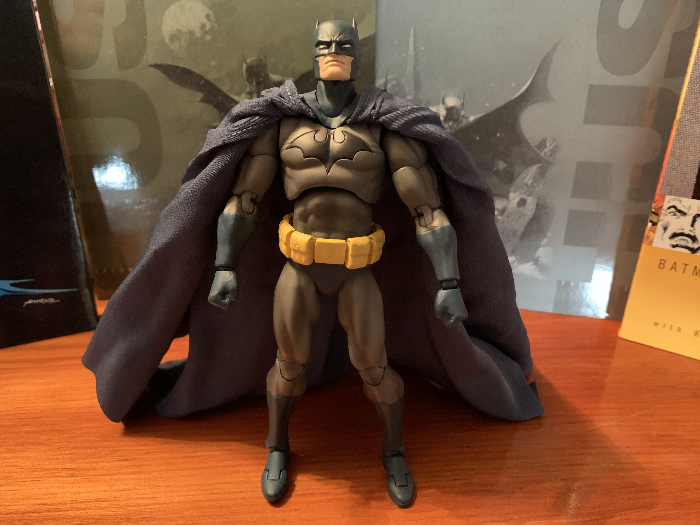
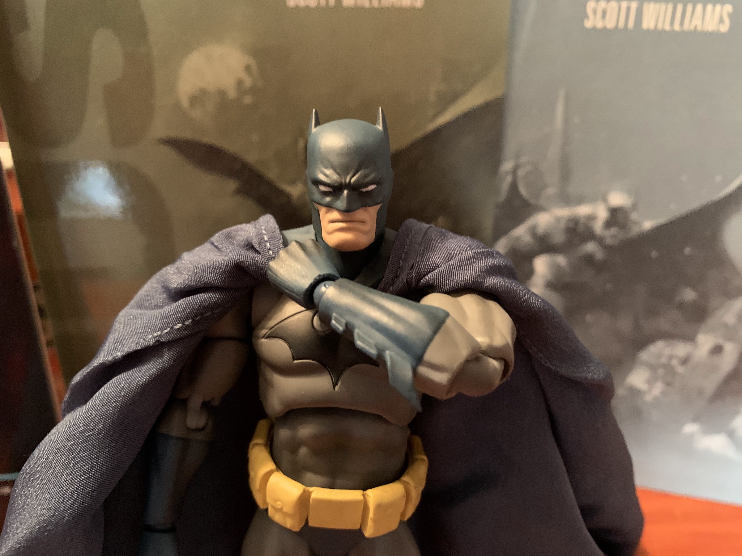
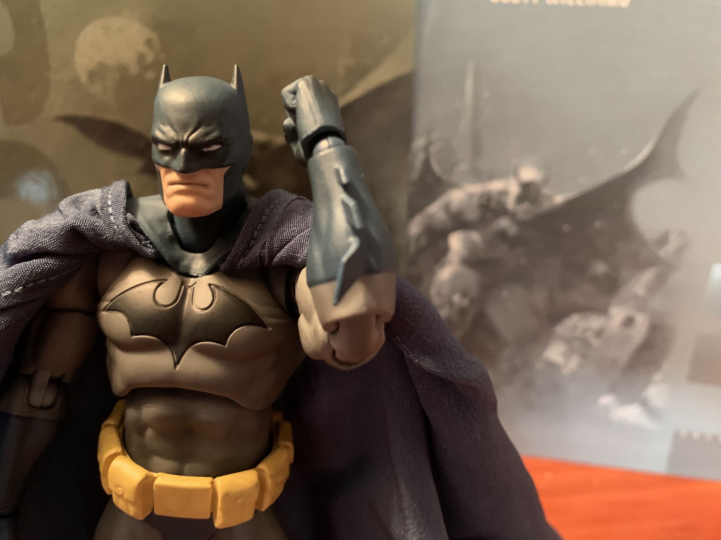
Once placed on a surface, Batman stands right around 6.5″ to the top of his ears, probably a little less. He’s shorter than the DC Direct figure I looked at who was around the same height to the crown of his noggin. The Mafex version is also less substantial. He’s a leaner Batman in comparison, which is not really page-accurate if we’re being technical. His chest could use a bit of beefing up as well as his thighs, though his biceps and shoulders look pretty good. The head shape is much better on this version and more reflective of the art, as is the color palette utilized which is a pale blue, almost a gray-blue, for the cape, cowl, gloves, boots, and trunks. The yellow belt is also pale and a little dingy. I think a touch of brown might have better achieved the effect they were going for, but in checking the source material this looks pretty close. The paint on this figure isn’t terrific. The head-sculpt must have been cast in blue because it shows through the flesh-colored paint around his mouth. There’s even a blue line under his lip, which isn’t great. It also shows through the teeth of the alternate head. On a shelf, it’s probably not a big deal, but this is a pricey figure so this shouldn’t be an issue. The paint around the bat emblem on his chest doesn’t fill the sculpted-out symbol giving it a gray outline, which is irritating. There’s a gray speck on one of the belt pouches and the paint around the boot cuffs is bad. It’s frustrating because there’s not a lot of paint that needed to be done, and what little there is wasn’t done particularly well. At least, the eyes came out well and there does appear to be a wash on the gray parts that looks good and brings out the musculature of the figure, though there is some paint slop on the left thigh of my figure.
Sad bat blade 😦
Lets see what this guy can do!
The overall presentation of the figure is a mixed bag. The sculpt is good enough, even factoring in the price, but the paint is not while the cape size is going to be more subjective. I think the cape could have been smaller, but it could also work at this size with some improvements. I think the bulk of the cape, in particular how it bunches up at the shoulders, contributes to my feeling like this Batman seems undersized. If I flip the cape over a shoulder and just look at how it compares to the head and width of the upper body it looks pretty good. The cape in the books is certainly large, but it’s illustrated rather thin and heavy, almost leathery in behavior like a, you know, bat! There’s not a lot of material around the neck area as there is with this figure so that’s what’s throwing things off for me. If it wasn’t glued under the cowl way up inside the shoulders and on the pectorals, it would look so much better. They just brought it forward way too far.
Lets see the 03 model pull this off!
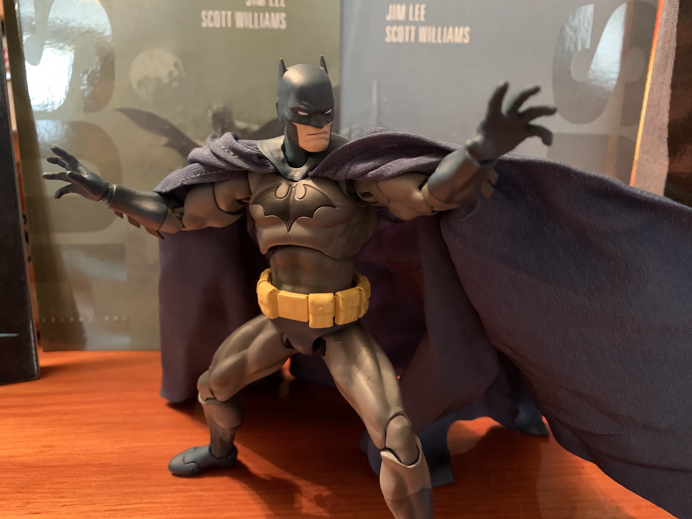
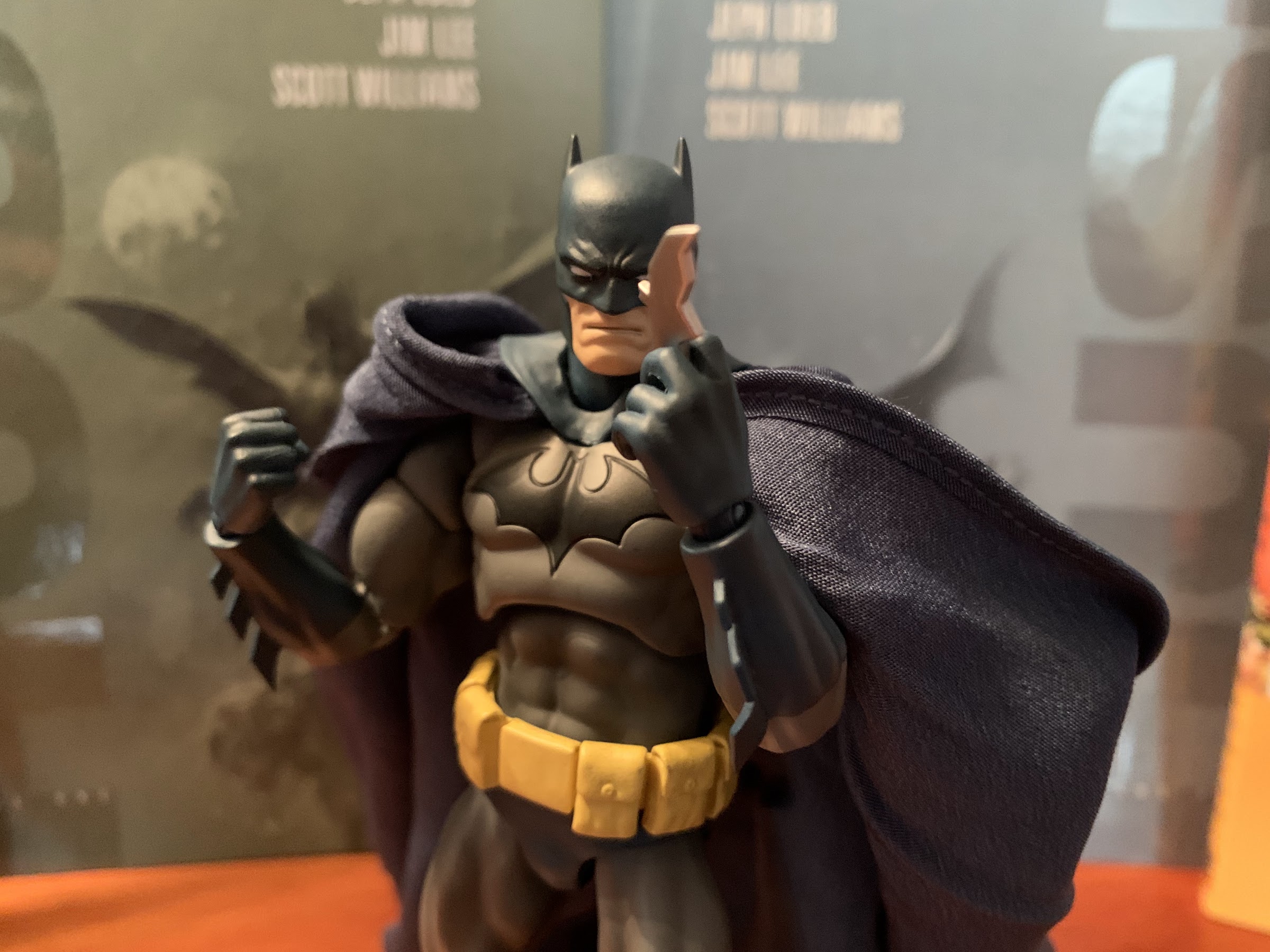
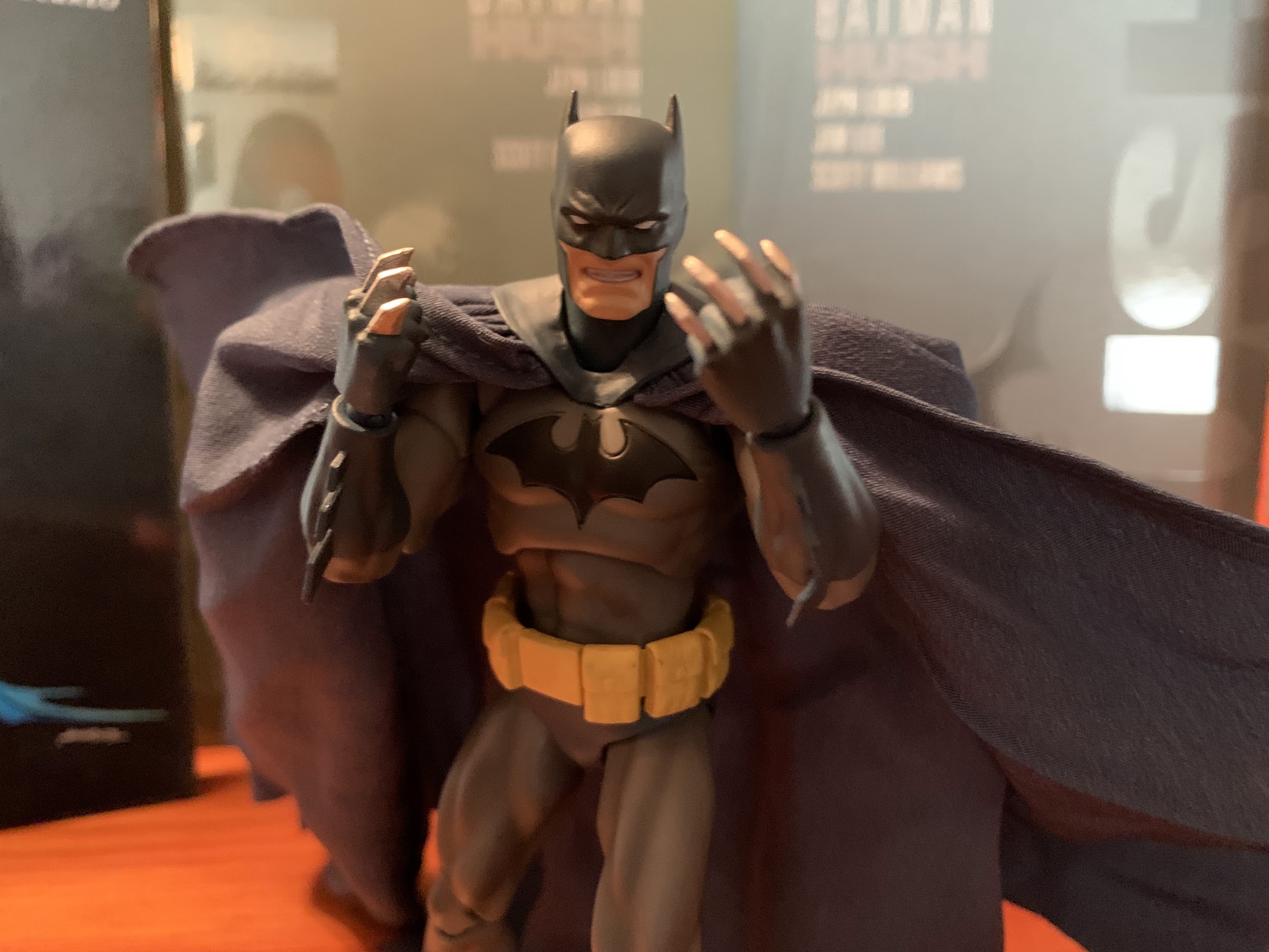
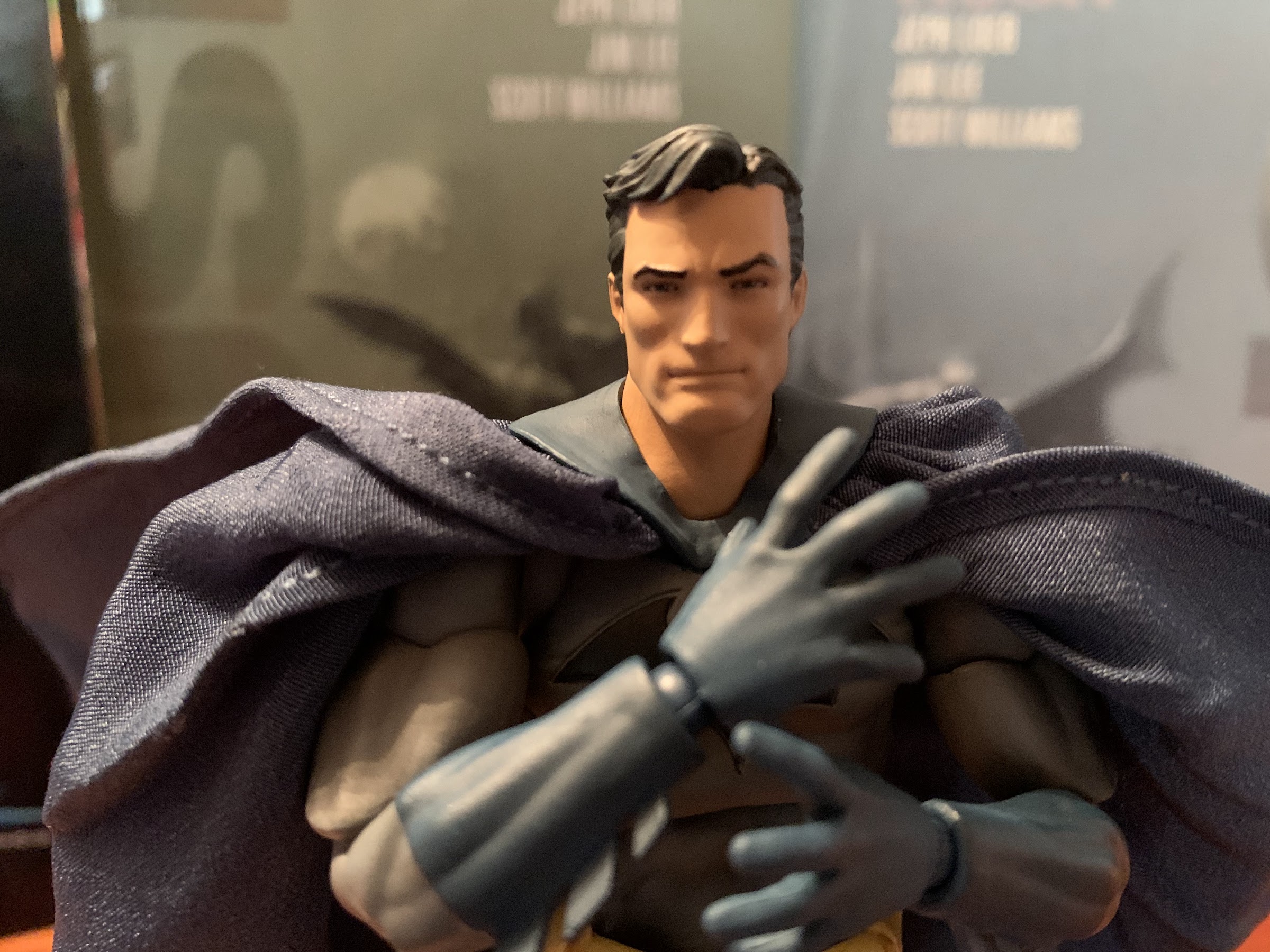
I definitely have some nits to pick when it comes to the presentation of the figure, but I also haven’t talked about the articulation, so lets get to it. His head is on a ball peg which sits inside a neck piece that also connects via a ball peg in the torso. He can turn his head and look down pretty well, but the range going up isn’t great. What also isn’t great is that neck wants to turn with the head most of the time, and sometimes it doesn’t, and you may end up with Batman’s adam’s apple on the side of his neck or something. Something inside it also kind of chewed up the edge of the neck on mine as it rotated. It’s not a big deal because it sits far enough down in the torso that it can’t be seen unless you’re looking for it, but it’s something to watch out for. The shoulders are on ball-hinges with a butterfly joint that allows Batman to reach all the way across his chest. There’s a swivel at the biceps and double-jointed elbows that go well past 90 degrees and don’t look terrible. The hands are connected via ball pegs so they have pretty good range of motion, but they do pop off a little easily, which is better than the alternative. In the torso we have a ball-peg in the diaphragm so he can rotate and tilt pretty well. There is a waist swivel, but it’s a little tight. The belt is a separate piece that has a little give, but it’s either glued down or pegged in somewhere. The trunks are also a separate piece, but they’re pretty small and stay out of the way. The legs are on ball hinges so they can kick forward and back and raise out to the side far enough, but not a full split. They also can drop down for a little extra mobility and swivel at the thigh. The knees are double-jointed and molded at a slight angle so they look a little funky, but the joint is pretty clean. At the ankle we have a ball-hinge so they can raise up a little, go back a good amount, and rock side-to-side, though it takes a little finagling. There’s also a toe hinge.
Time to fly!
Is that your grappling hook or are you just happy to see me?!
The articulation is quite good. I like that Mafex avoided creating any real ugly joints on this guy. The clumsiest area is probably the shoulders where that giant cape works to the figure’s advantage. And speaking of the cape, it too is articulated. There are four, metal, wires running through it that connect at the cowl. Two wires run along the outer edge and then two more are inside. The wires on the outer part work very well to help pose this massive thing, while the two inner wires do very little. They basically help the cape to hold its shape, but what is missing is a center wire which would have aided this figure a whole lot. It certainly adds a fun dynamic to the figure since you can do a lot with that cape. And if you find it looks too bunched up at the shoulder, I recommend taking that outer wire and just sort of folding it back as opposed to trying to tuck the whole thing behind a shoulder.
We’ve got a lot to talk about.
Extreme close-up!
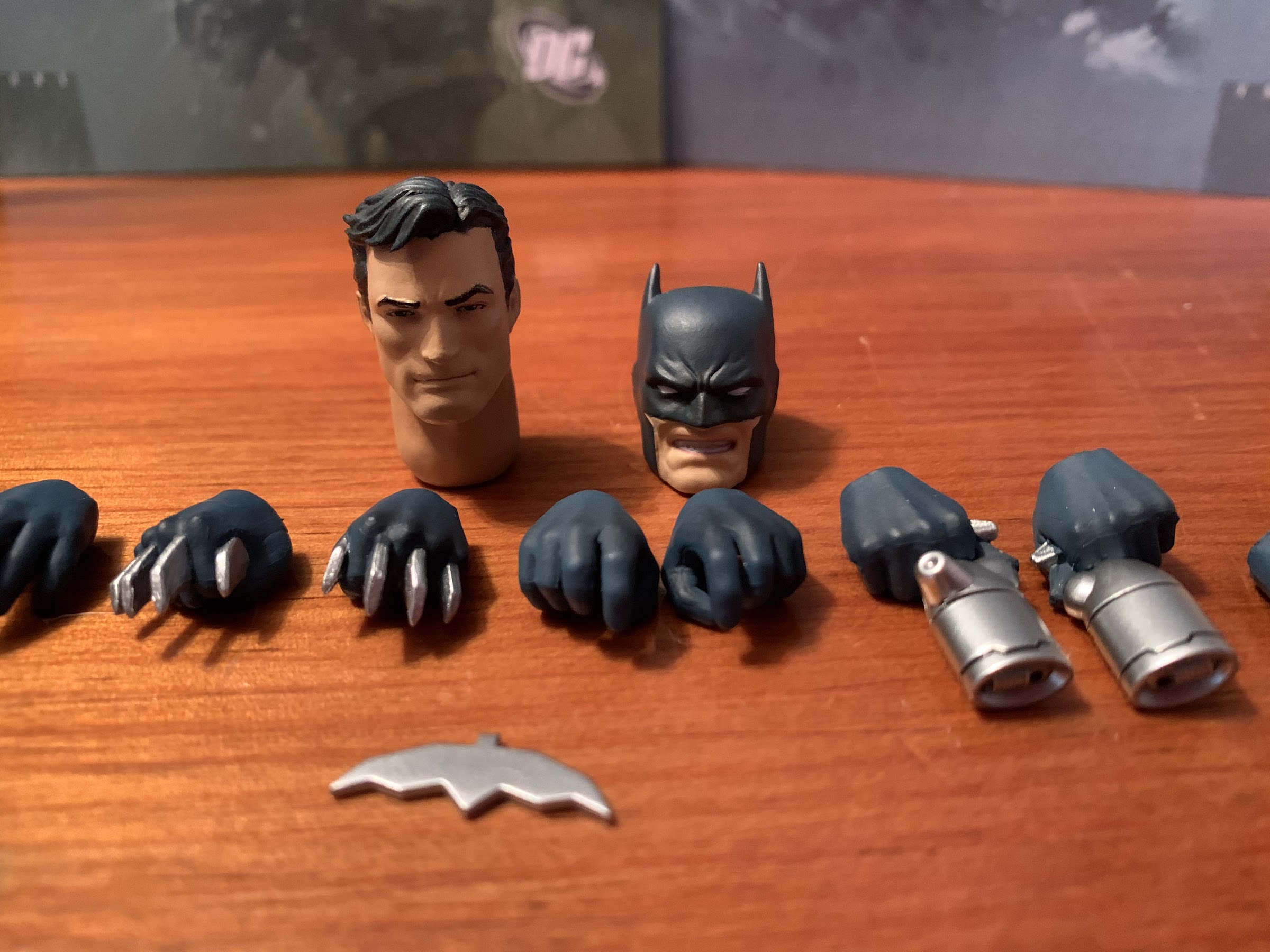
We’ve talked about the sculpt, and we’ve now discussed the articulation, so really the last place for this figure to justify its cost rests with the accessories. And it’s a good thing that this figure has a boatload of accessories. For starters, he comes with a fairly neutral head and can swap to a teeth-gritting one. Both are pretty effective at evoking the Batman persona and which you display may come down to which has the better paint application. There’s also a Bruce Wayne head which has its own neck piece. The paint on that head looks much better since it’s probably not molded in blue and it’s fine, though who is going to display this figure as Wayne? Swapping heads is not terrible, but that neck joint is guaranteed to give away before the head so don’t be surprised when that neck releases the first time. Joining the three heads are seven sets of hands! Ready for them all: fists, fists with tiny tracks sculpted in them, fists with batarangs poking through from between the fingers, open hands, slightly open hands, curled hands (batarang hands), and grapple gun hands. That is a lot of hands, and they all actually seem viable. The fists with the tiny channels in them might stump some initially, but the opening is just wide enough to slide the cape edges into them and I think that’s their main function.
Do you prefer the figure be in focus…
…or the hook?!
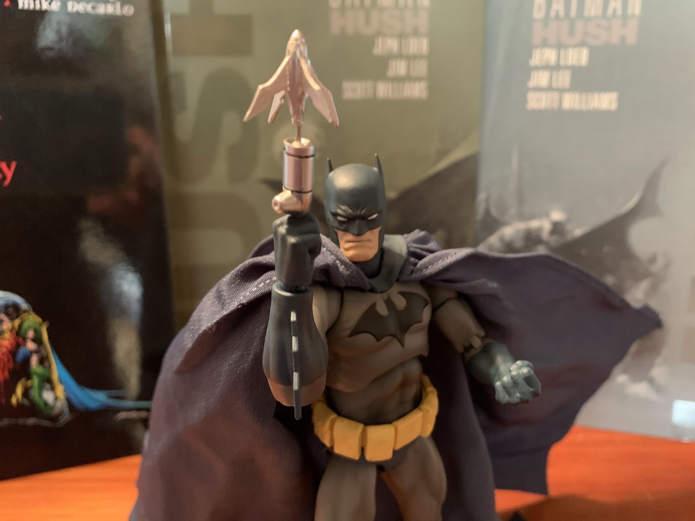
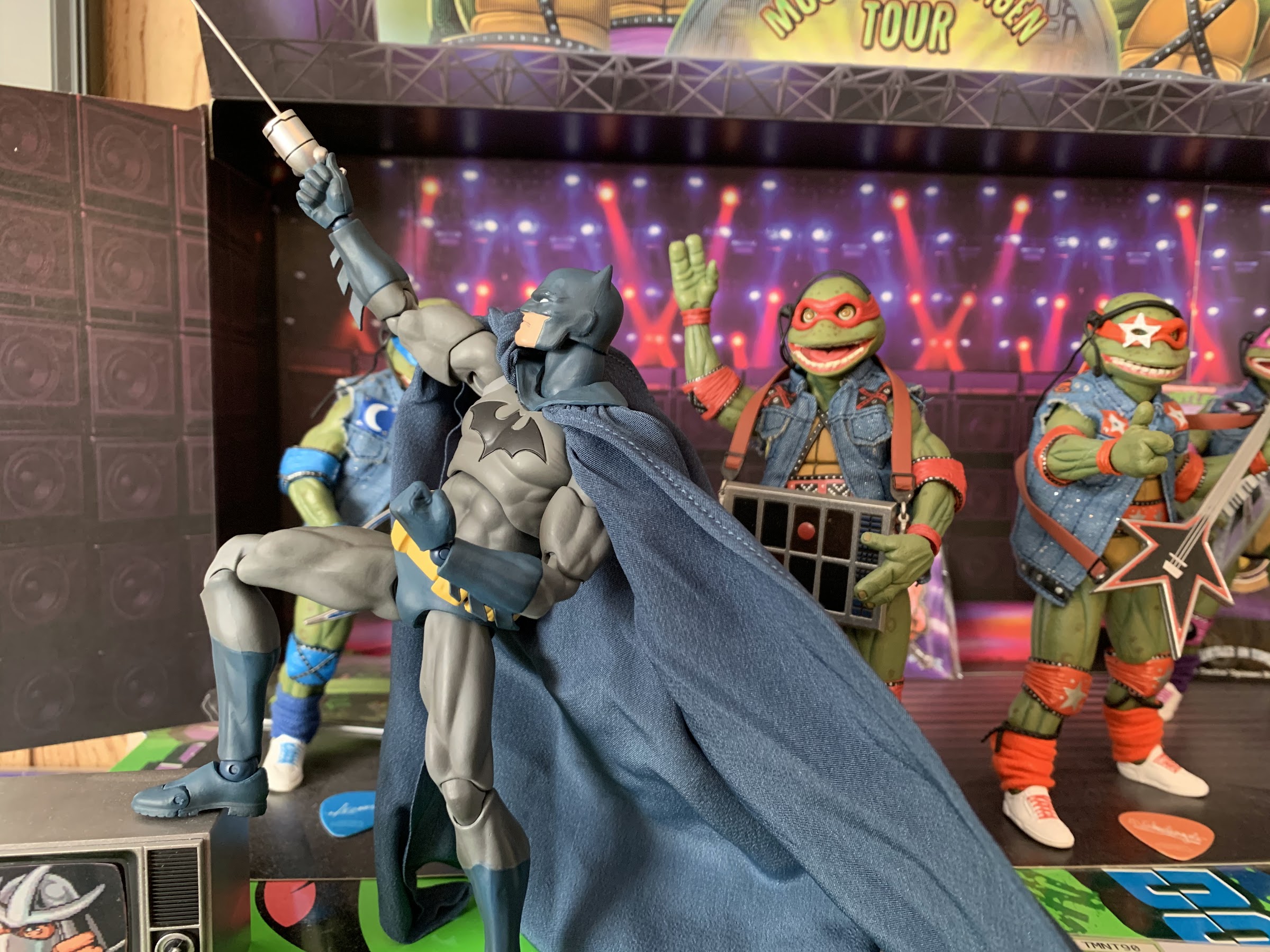
Those channel hands can also handle the grappling hook wire, which is another accessory. There are two hooks: one with a short cable and one with a long cable. Both peg into either grappling gun hand rather easily and look pretty cool. The wire on the longer one is metal and it does not appear to be bendy, so don’t snap it! It pegs in fairly gently too, so don’t force it, but it’s in snug enough for posing. I love that they used metal since it’s unlikely to sag or loose its shape. It’s also light enough that it doesn’t cause the arm to slowly drop. The grapple gun hands also look nice and are page-accurate as far as the placement of the trigger goes. I half-expected the paint job to be lacking with these hands, but they turned out well. Swapping hands is a bit of an exercise in patience. The hands pop off easy enough, but every hand except for the fists he comes packaged with are rather snug. You can even see that the diameter of the peg hole is smaller on the extra hands versus the fists. Nevertheless, they will go on, just be patient and don’t try to jam them on there. The ball joint that the pegs are on will fight you, but it’s manageable. I did not feel discouraged from swapping hands, which I sometimes do with other figures.
Swing!
Locked and loaded.
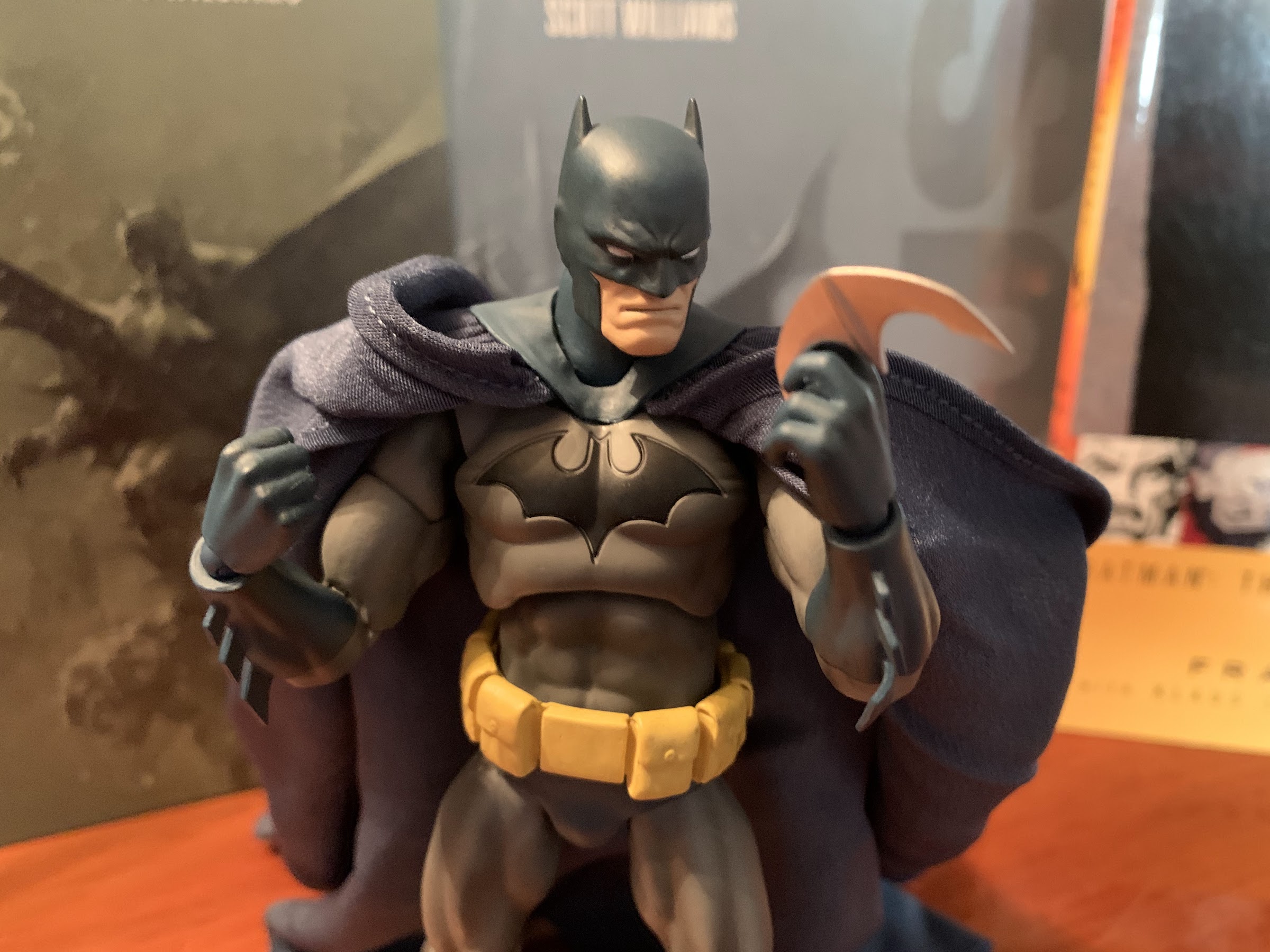
What would Batman be without some batarangs? Not much of a Batman, I’d argue. This figures comes with four: two bat-shaped ones and two more rounded ones. Both work well with the curled, style-posed, hands that I referred to as “batarang” hands before. They can slide in between the middle and index finger, or even wedge between the thumb and index finger. The channel fist hands can also work with them, though I don’t know how natural it looks. It’s hard for me to decide how to eventually pose this figure on a shelf as I like the batarangs, but the grapple gun attachments are also really cool and unique to this figure. Decisions, decisions…
Old reliable.
For those who prefer a more moon shaped batarang.
Lastly, Batman comes with an included stand. I think all Mafex figures come with this particular stand and it’s pretty straight-forward. It comes in three pieces: the base, the articulating arm, and the claw. Snap it together and you’re good to go – or are you? If your stand is anything like mine, it will be way too loose to support the figure. He stands fine with out it, but if you want a swinging pose or something a bit more dramatic then you’ll need to grab a small, phillips head screwdriver and tighten each joint. Once you do then you should be fine as I had no problems getting the stand to support the figure’s weight, so long as I didn’t throw off the center of gravity too much. I wish there was a pre-drilled hole or something on the base to support a wall mount, but oh well. I suppose nothing is stopping me from adding one myself.
And then of course we’ve got these hands with a rather nasty application of the batarang.
I’m guessing he doesn’t use these on your garden variety hoodlum.
In terms of accessories, this figure came out quite well. There isn’t really anything missing. The only thing I would have liked to have seen included was yet another fist that had his Kryptonite ring sculpted onto it for battles with Superman. Apparently, that’s been included though with the Mafex Superman so that’s cool since you wouldn’t pose Batman with it on unless you have Superman, which I obviously do not and do not plan to get. That’s pretty much it though, these accessories are great, they’re easy to work with, and the only throw-away one really is the Bruce Wayne head. It looks fine, I’m just never going to choose to display a Batman figure without his mask.
I should probably show you the Bruce Wayne head since it did come with the figure.
He is rather handsome.
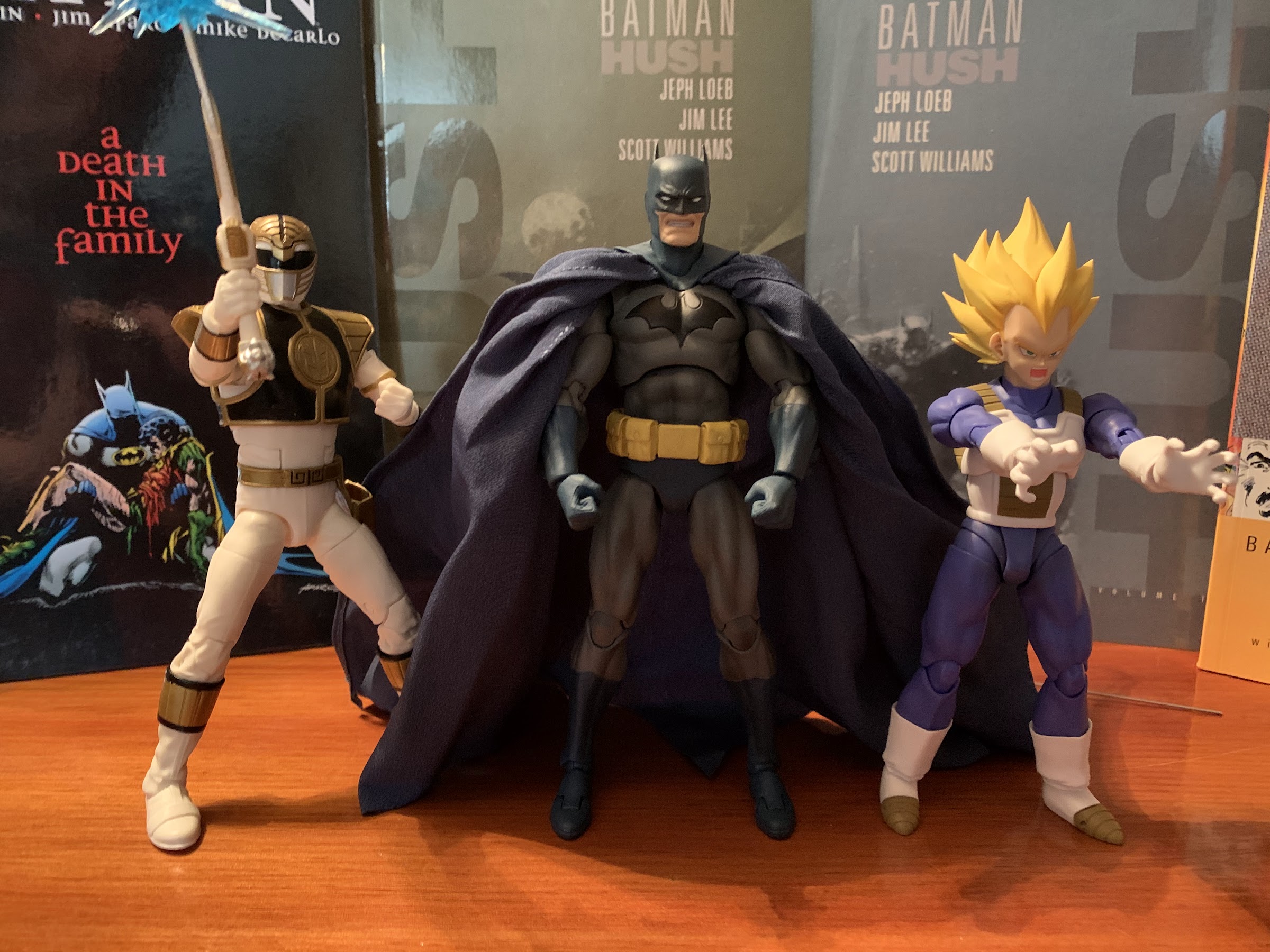
As expected, I do like this figure. I have some quibbles about the overall aesthetics, but I think it looks like Batman and it’s easy to tell this is the version of the character from the Hush books. The articulation is great and I very much enjoy the accessories, but I’m still not sold on that price tag. This guy came out last summer and can still be purchased at various online shops and probably in some local comic book stores. No matter where you buy him, he’s going to end up costing right around $100 which is a lot for a figure in this scale. Some places will have him for around $80-$85, but they’ll likely have steep shipping charges while a place like Big Bad Toy Store has cheap shipping, but prices this guy at just under $95. Comparing him to my SH Figuarts Vegeta, which I paid $50 for not on clearance, and there’s just no comparison when it comes to value. That figure is physically shorter than this one so there’s less plastic involved, but the articulation is there, the sculpt is there, he has a ton of extra hands and faces, and is also an import figure of a popular licensed character. I can accept this Batman costing more than that figure, but nearly twice as much? No way.
“WHERE’S THE MUTAGEN?!”
“Help! Krang!”
That’s what it comes down to with the Mafex Batman figure from the pages of the Hush story. He’s a nice figure and if you like that version of the character you will like this action figure. What you are unlikely to enjoy about it is the sticker price. There are plenty of collectors out there who will convince themselves they’re getting an item that is definitely worth a hundred bucks and be fine with it – whatever floats your boat. I just, objectively speaking as someone who likes this figure, don’t see a justification for that kind of price here. And I especially don’t considering the iffy paint and slight inaccuracies when it comes to the source material and the sculpt. At this price and at this scale this figure should be objectively flawless in those areas, and it’s not. However, I still enjoy it and I’m happy to have it. It’s possible for an action figure to be both good and overpriced. I’m just not going to make a habit out of buying Mafex action figures.
“Nice costume, dude! Who’s your tailor?”
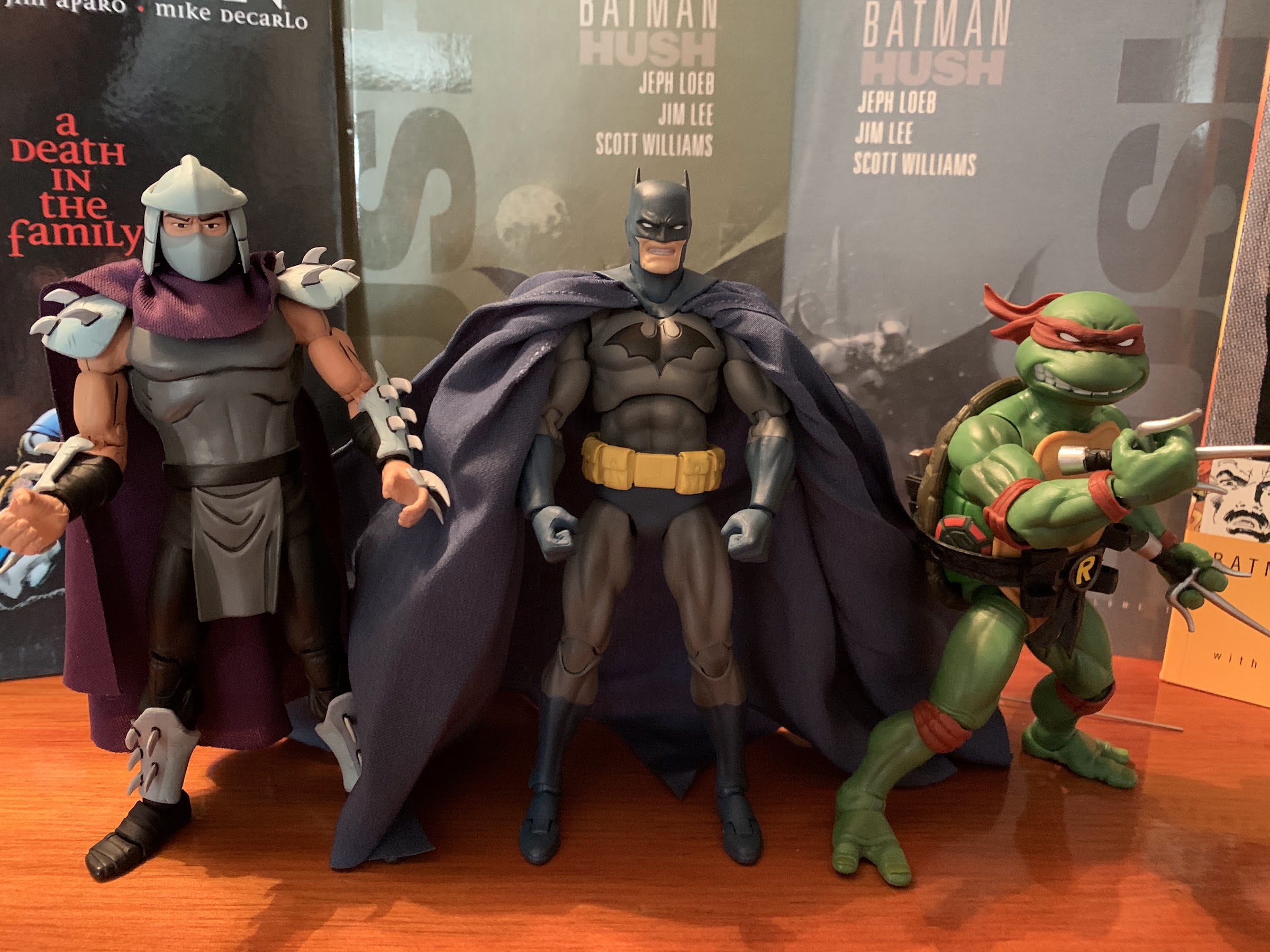
I bet you would like some comparisons, so here’s a couple: NECA Shredder and Super7 Raphael.
Lastly, if you like this figure and feel like it’s worth adding to your collection, then by all means do so. However, I do want to point out there is a new version coming out any day now. It changes the color scheme of the figure swapping out the blue parts for black ones, but it also looks like Mafex did some adjustments with the cape. I think it’s still the same material and still features four wires, but the promotional images make it look like they adjusted how it’s glued to the figure and basically did it in the same manner I suggested in my review (this isn’t me taking credit for that since that figure was obviously designed way before I posted this, just in case anyone were to think I was trying to do so) which looks a lot better. They’re just promo images though in which the figure is supposed to look awesome, so maybe seek out some reviews or something. It does look like some people already have it. Mafex also swapped out the Bruce Wayne head, and maybe some hands, in favor of a gargoyle base for the figure which looks fantastic. I’m actually kind of mad at myself that I can’t be happy with a black and gray Batman as that edition honestly looks better than this one. I’m a blue boy though, so here we are. Whichever version you decide to get, or don’t, will result in you having a pretty nice Batman figure. Your wallet may just disagree on how valuable that is.
And a final comparison with the Hasbro White Ranger and SHF Vegeta.