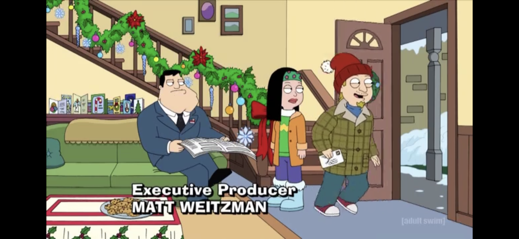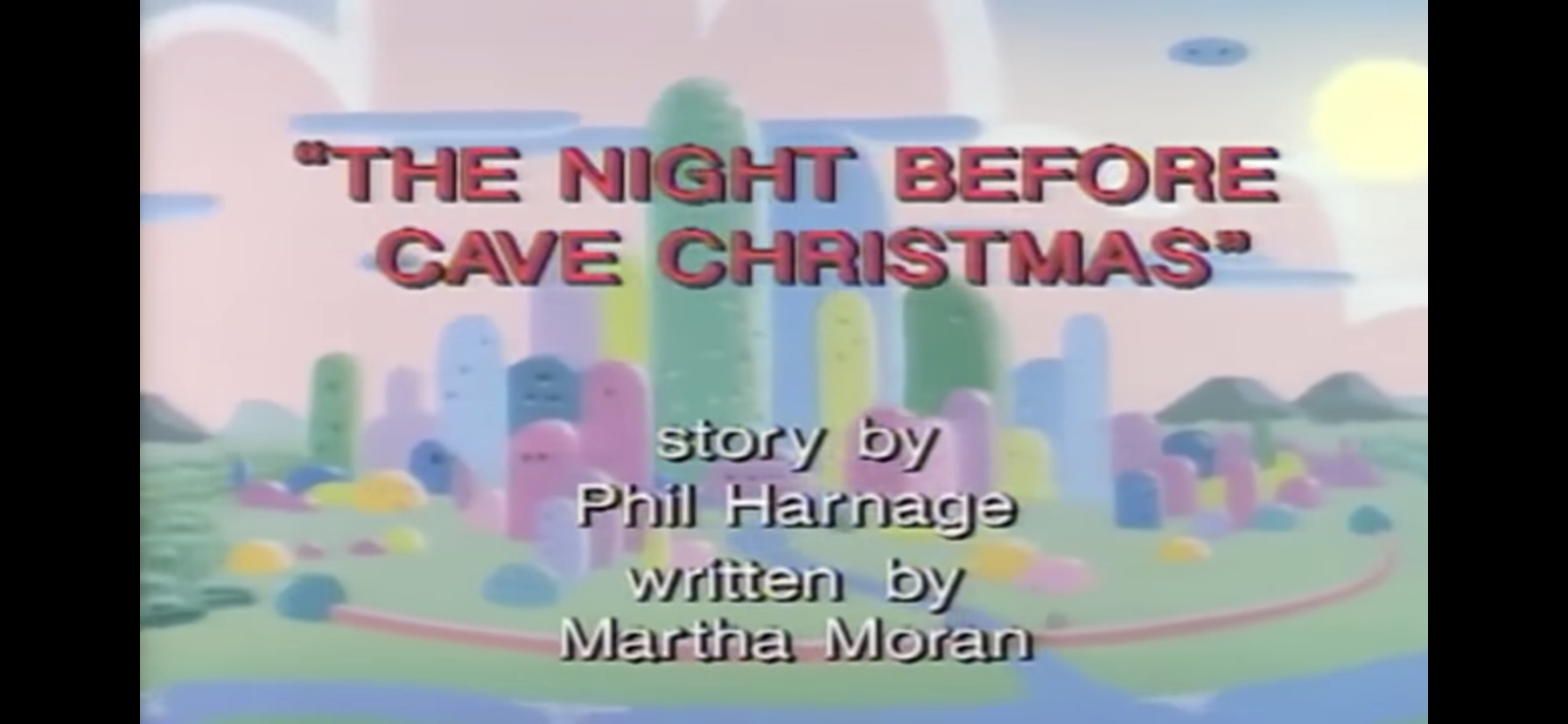
Yesterday, I sung the praises of American Dad! for its ability to give me fresh, Christmas, content seemingly on an annual basis. I should also apply the same to Robot Chicken, for even though it goes about making people laugh in a completely different manner from a more traditional animated show, it does have a solid track record of getting festive each and every December. I didn’t tally them up, but I would assume the number of Robot Chicken Christmas episodes actually compares quite favorably to American Dad!. The main difference though is that while American Dad! is essentially a sitcom, Robot Chicken is basically sketch comedy and sketch comedy doesn’t always lend itself well to such exercises.
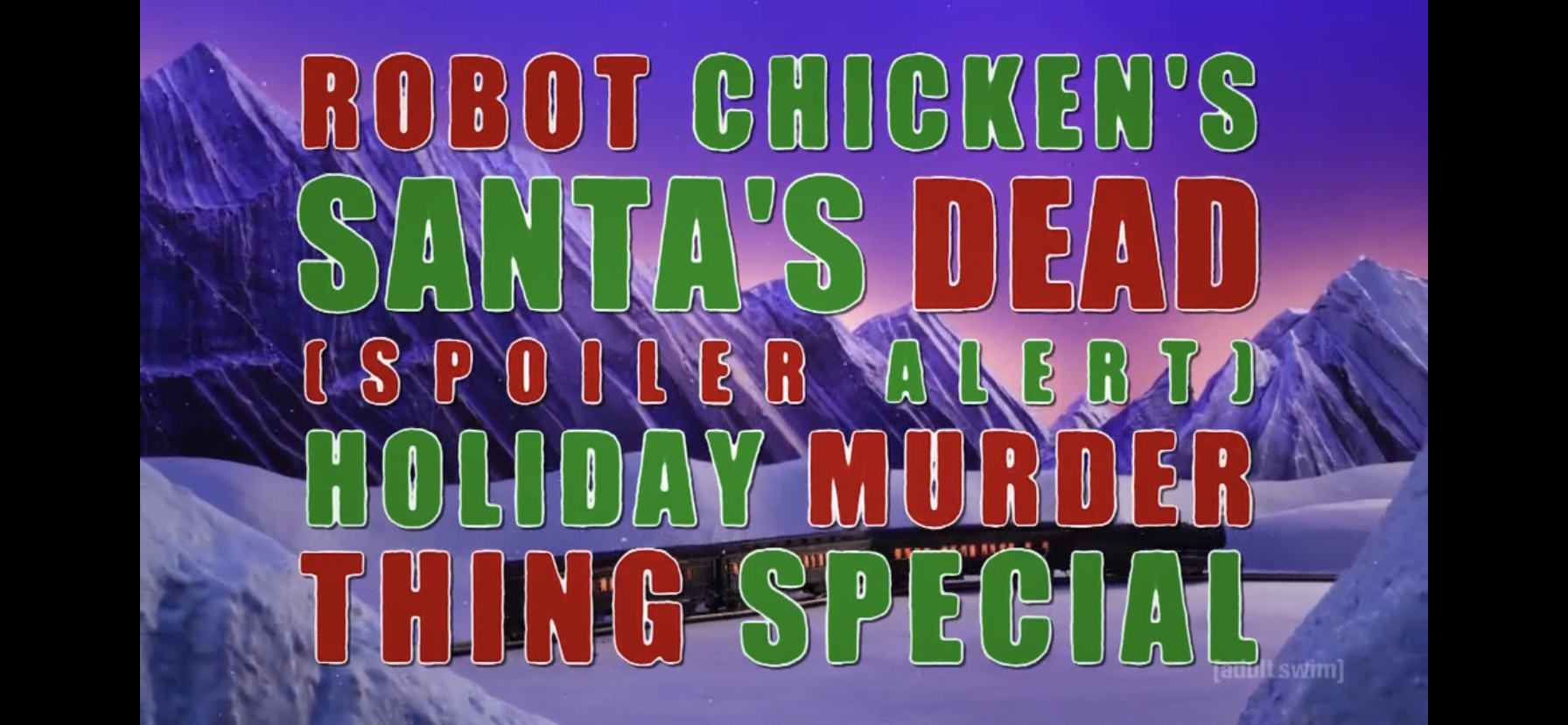
The writers of Robot Chicken must have had me on the brain then when it unveiled its latest Christmas special, the insanely long-winded Robot Chicken’s Santa’s Dead (Spoiler Alert) Holiday Murder Thing Special. I’ve now typed it twice and I have no desire to type it again! This episode though is not a typical episode of Robot Chicken. While it’s still largely animated using stop-motion techniques, it actually possesses a narrative instead of just a theme. It’s going to introduce a plot in the early moments and just stick with that until it’s over. This makes doing a write-up a lot more rewarding than the typical episode. I’ve done those in the past, I’m just not convinced they make for good reading material. Feel free to correct me in the comments if you so wish.

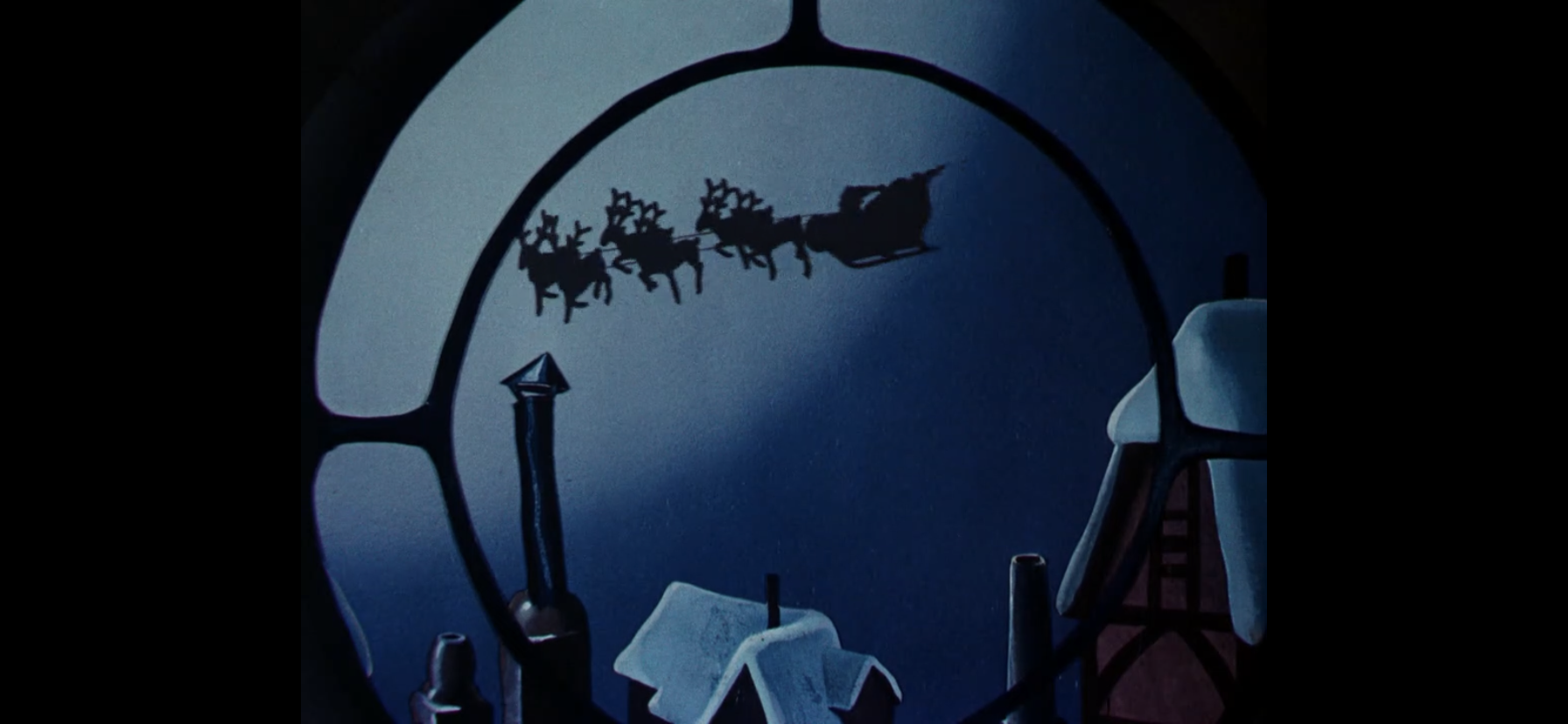
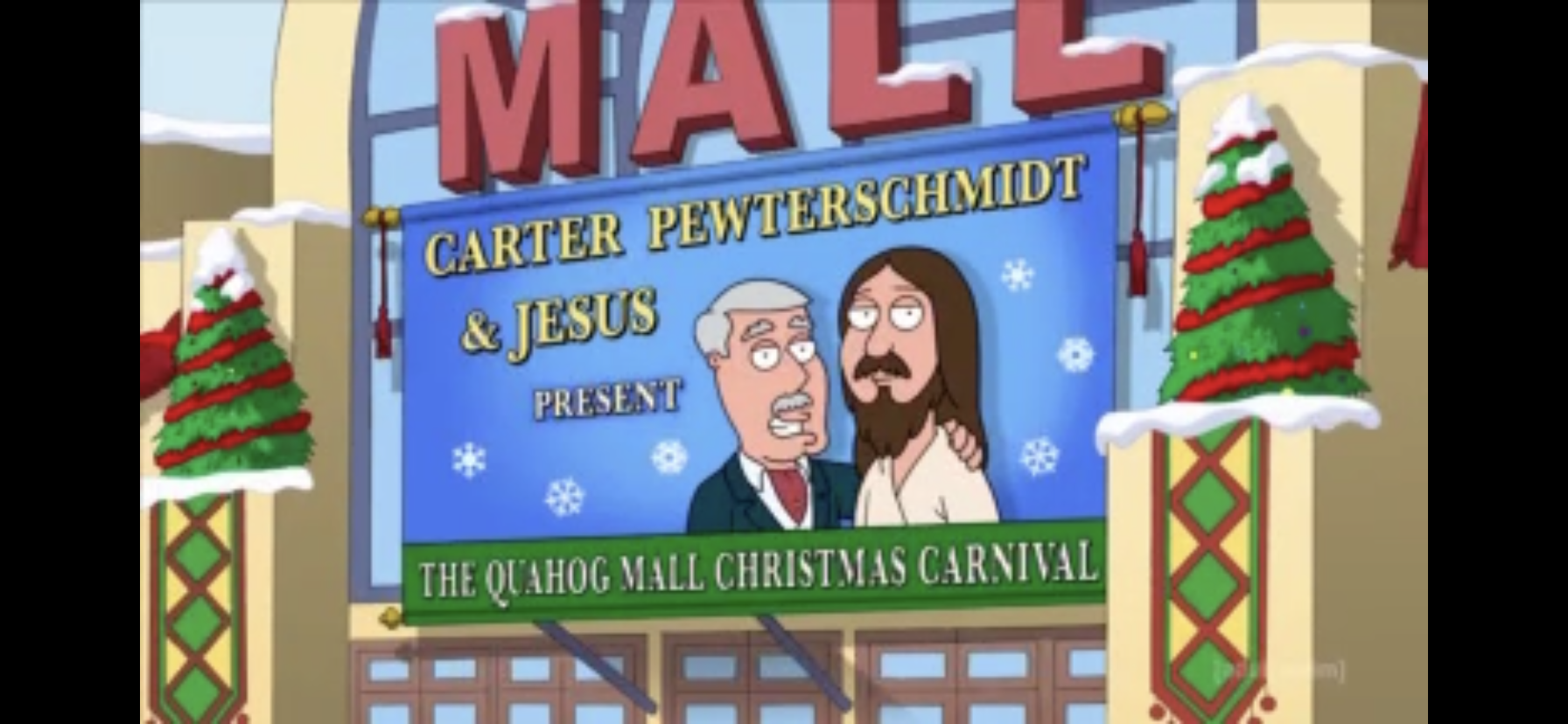
This episode premiered in 2019 and is the most recent Robot Chicken holiday episode as-of this writing. The whole episode takes place on a train and unfolds like a typical murder mystery, only with some Robot Chicken humor tossed in. Tonight, our victim happens to be the big man himself: Santa Claus. Someone has put an end to the jolly, fat, man and answers need to be found so the culprit is brought to justice! Who would kill Santa? A jealous Jesus? Spoiled coal recipient? Overworked elves? The list of suspects may be longer than you think, and we’ve only got 11 minutes to solve the case!
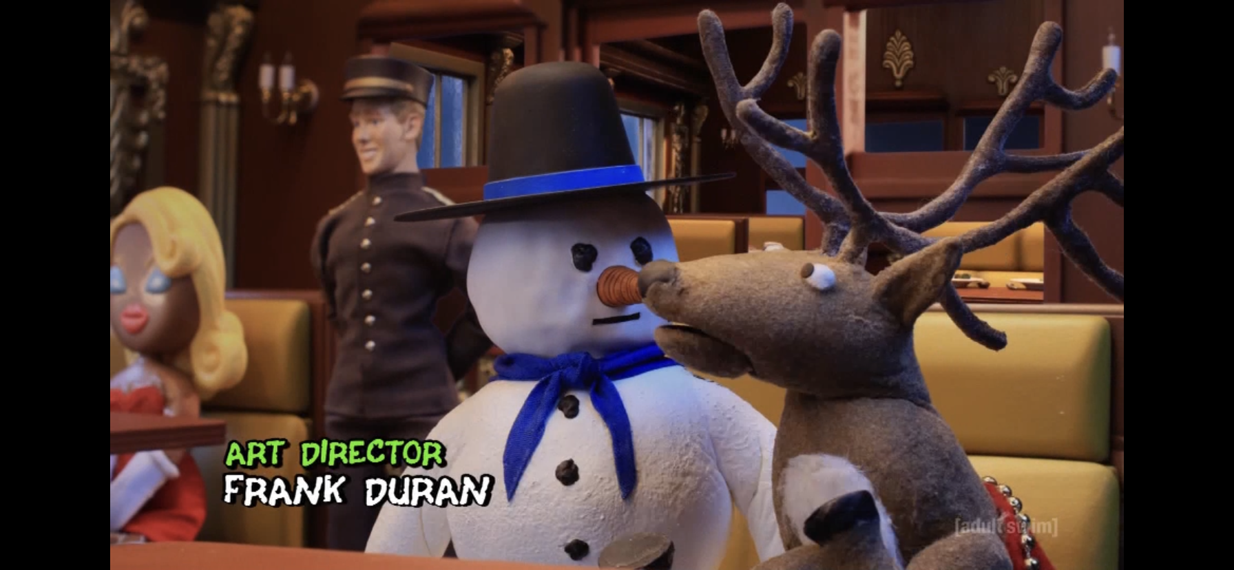
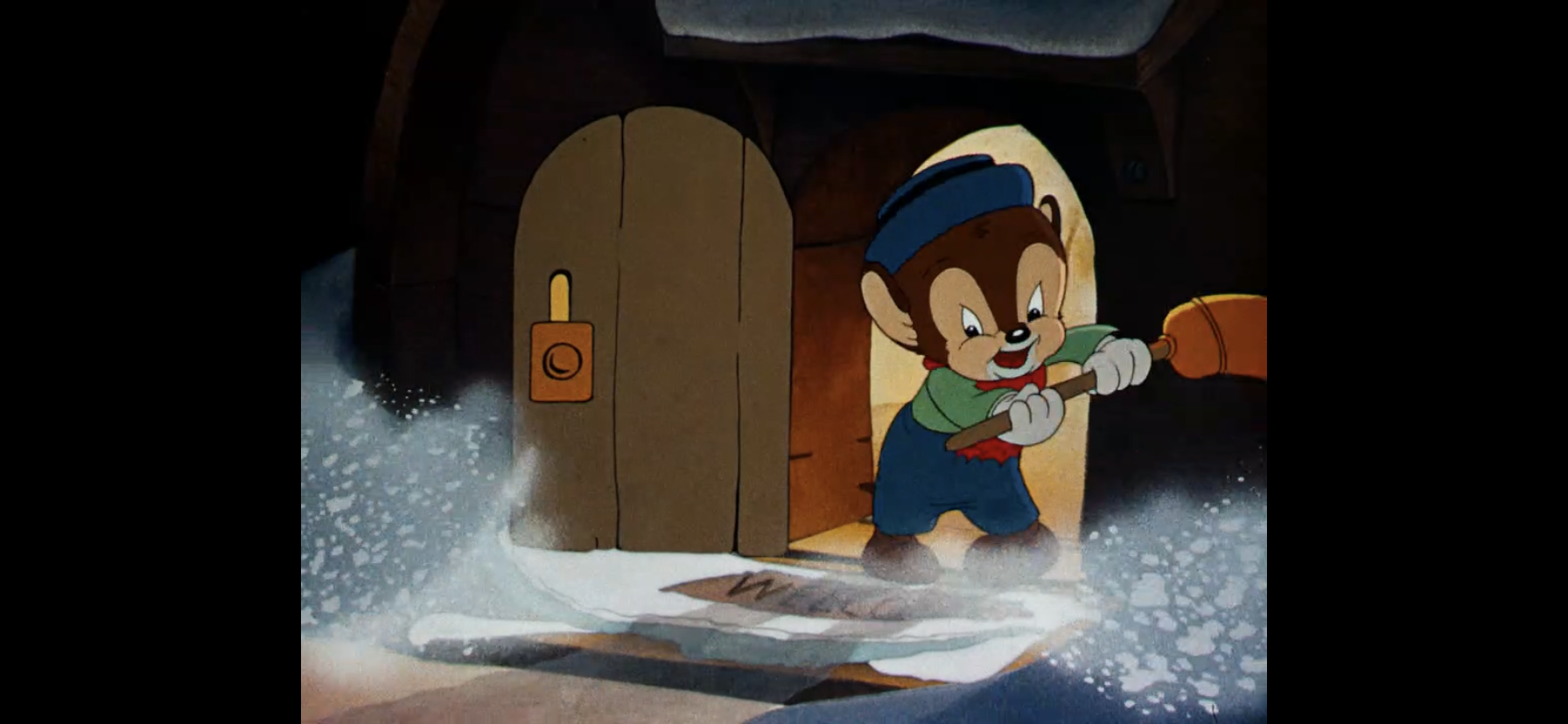
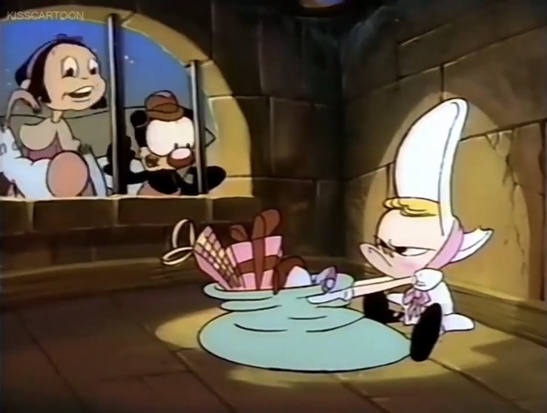
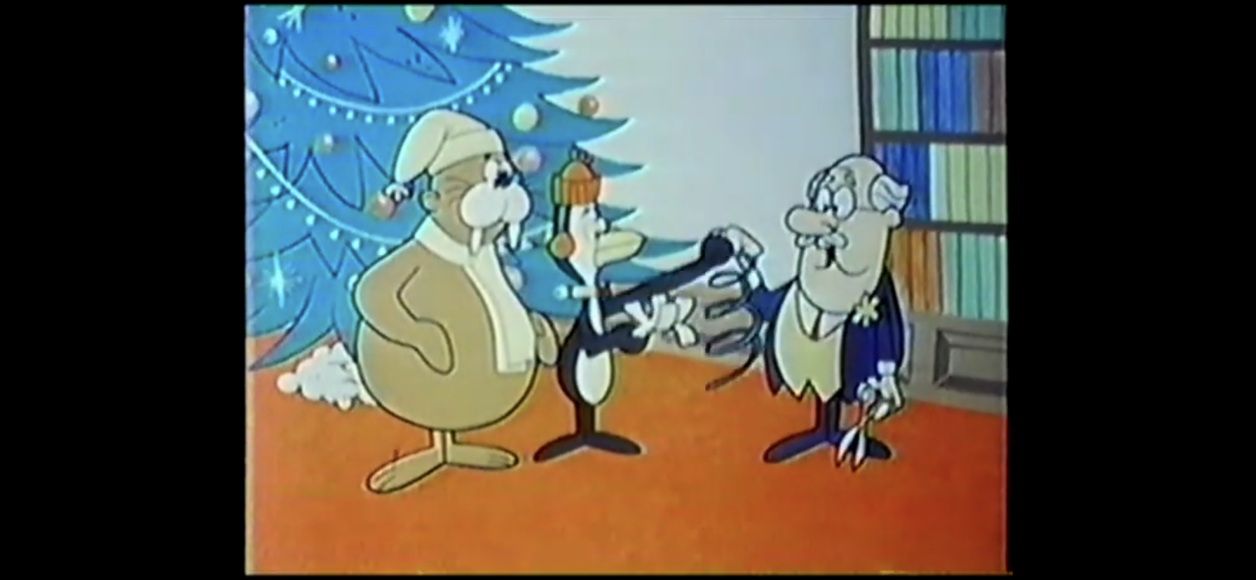
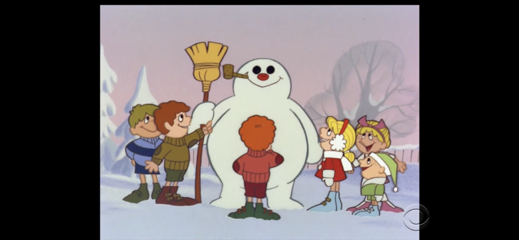
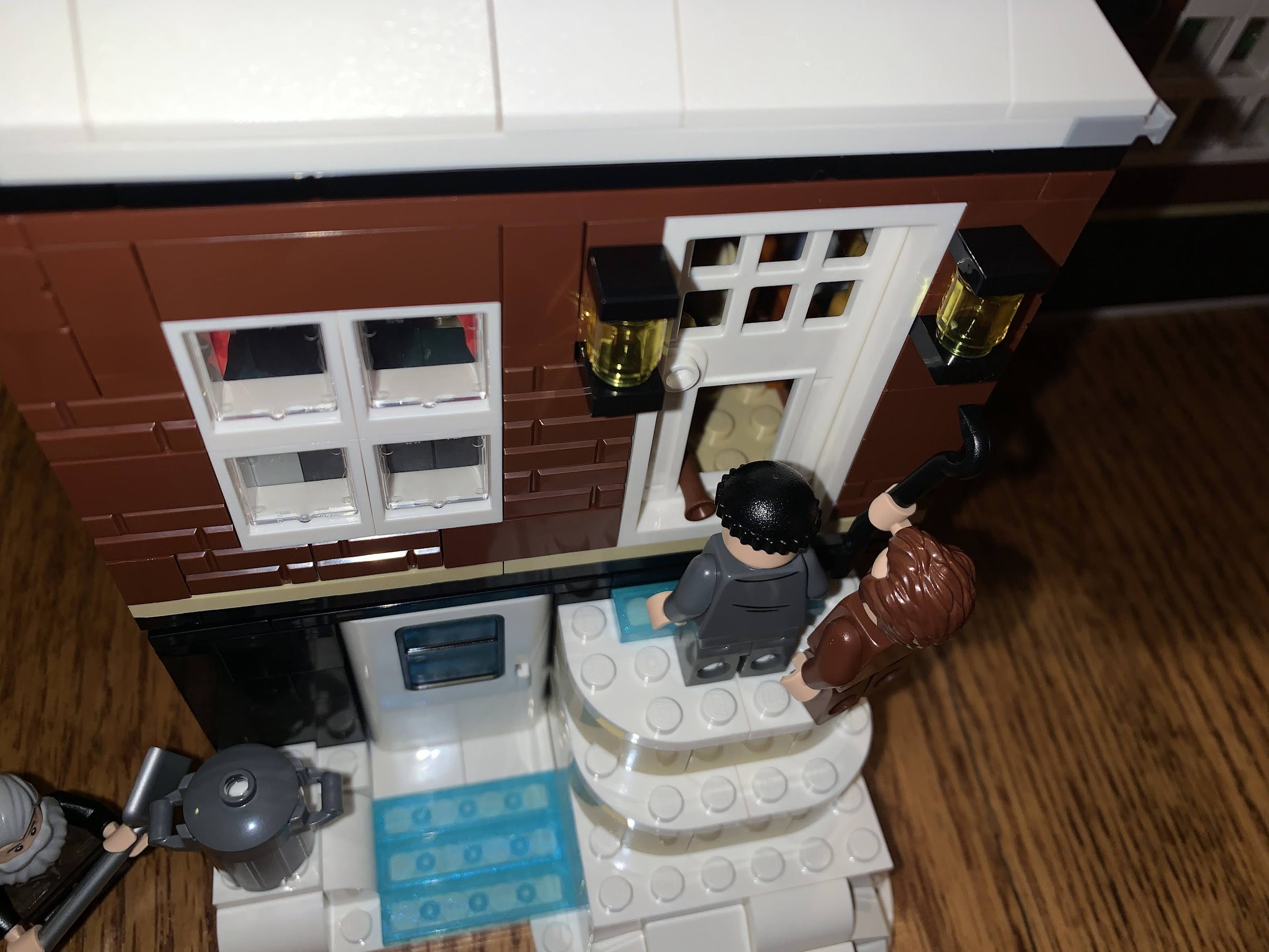
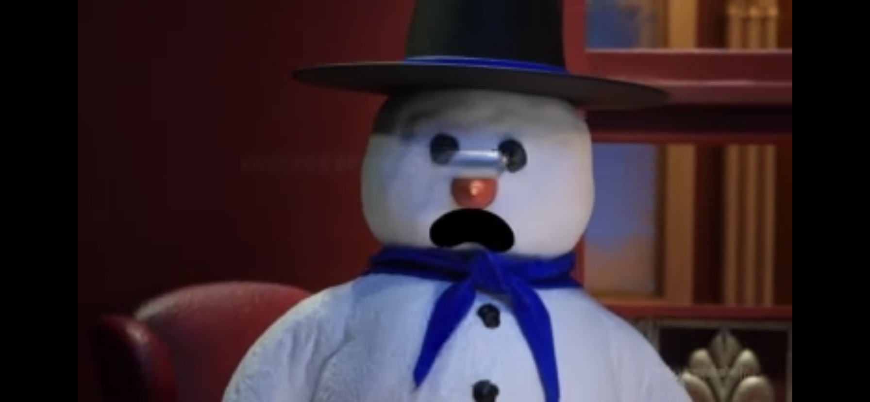
Our story begins on The North Pole Express, not to be confused with The Polar Express, as we’ll soon learn. Our conductor is the cheerful Porter (Timothy Simons) who is happy to boast about the train’s zero murder rate. Onboard, a snowman named Snowball (Zahn McClarnon) is seated beside the famed reindeer Comet (Breckin Meyer) who won’t shut up about this train being different from the other famous one. The snowman then moves to sit beside Krampus (Jason Alexander) who openly wonders what happens to their crap when they take a dump on the train causing the snowman to move once again.
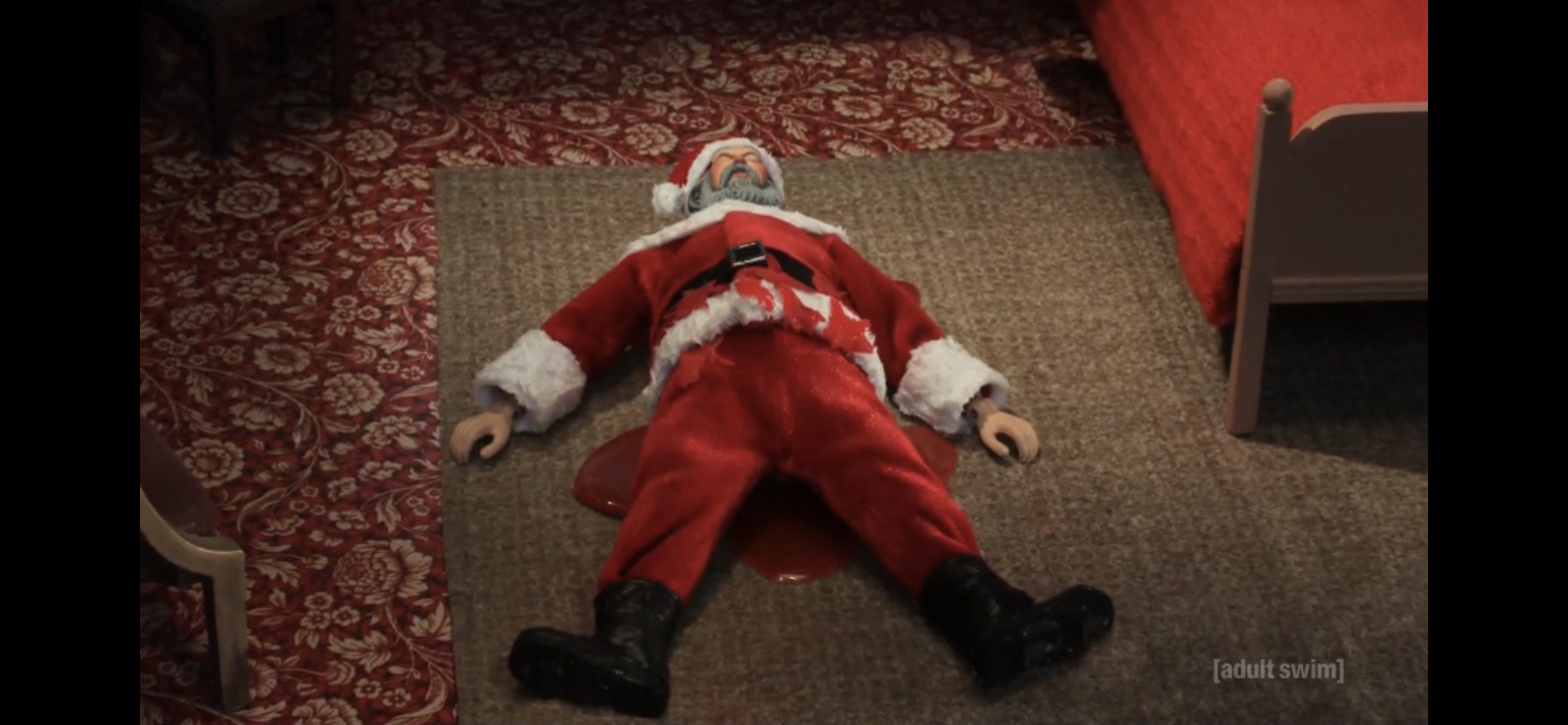
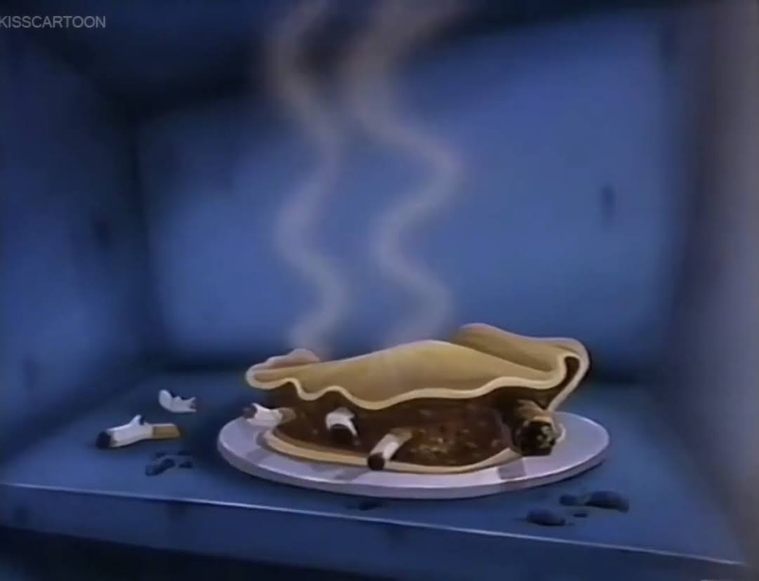
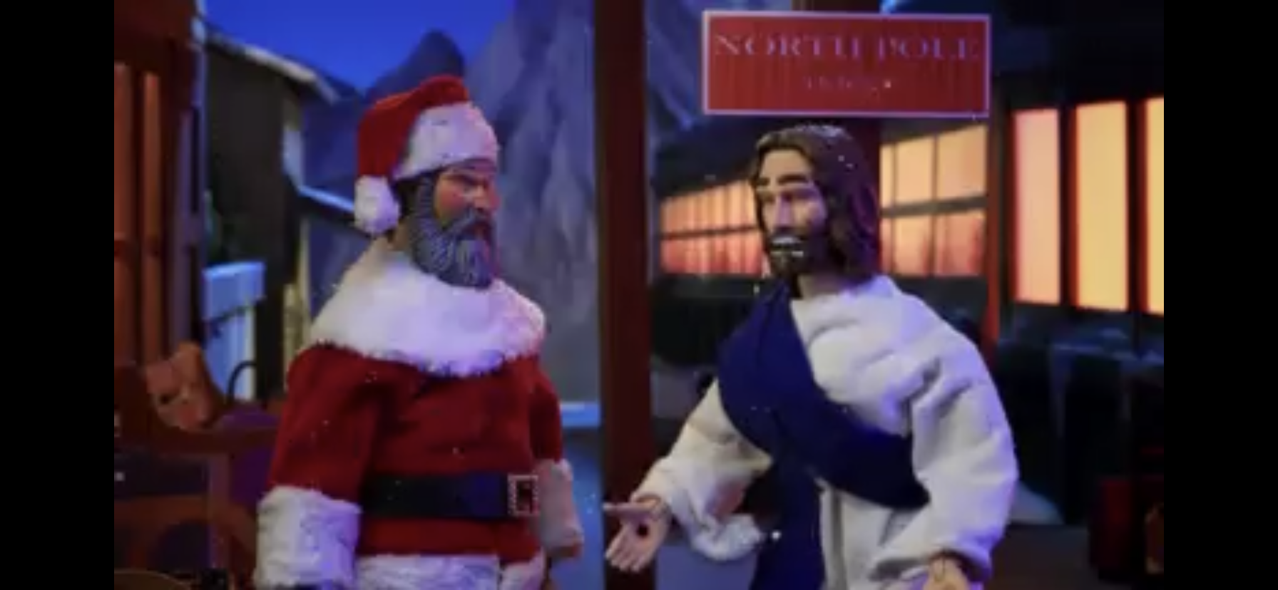
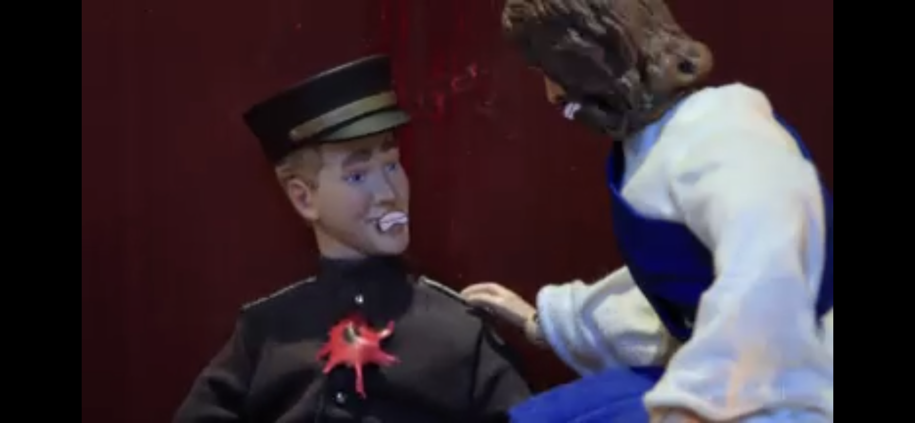
The scream of Porter interrupts Comet and Krampus, who were now seated together, and all rush over to see that he has discovered the corpse of Santa Claus (Seth Green) in another passenger car. He’s clearly been stabbed, many times, but that doesn’t stop Comet from assuming suicide. The passengers insist they need to de-board the train immediately, but Porter says no one is leaving until this mystery is solved. He then turns to the only man who could possibly solve this case: Jesus. Jesus (Meyer) immediately dubs himself Inspector Jesus and boasts that not only will he solve this case, he’ll do it without his powers! Despite Porter insisting to him that’s not necessary and he would actually prefer he use his powers, God takes them away with a blast of light. Jesus smooths his moustache into more of a handlebar variety and begins his investigation by ordering everyone away from the crime scene.
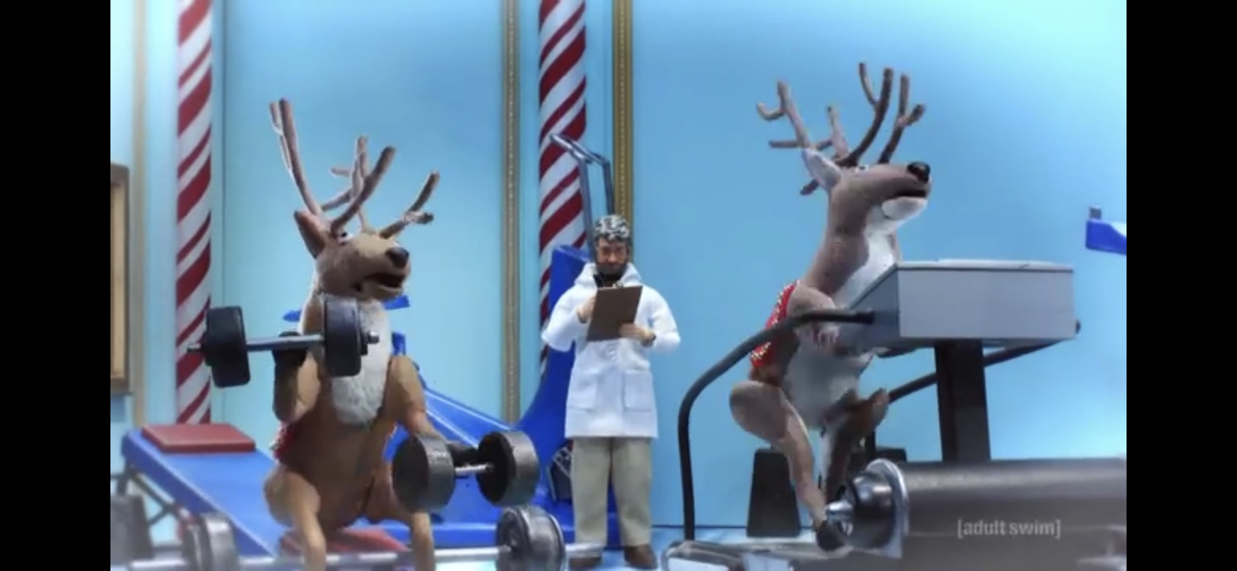
Everyone is assembled in a passenger car. Jesus paces the room initially and then sets his eyes on Comet. In searching for a motive for the reindeer, Jesus zeroes in on whipping scars present on Comet’s rump. Comet comes clean about the whipping, insisting they all enjoy it, then casually asks Jesus if he’d also like to hear about the drugs. He obviously does and Comet then details how Santa has been shooting up the reindeer with performance-enhancing drugs for years. Apparently, poor Prancer lost his life to an equipment mishap when his legs were torn off accidentally. Santa is shown shoving needles in the ass of reindeer and it would seem that Jesus has stumbled onto a reason for the reindeer to want the big man dead.

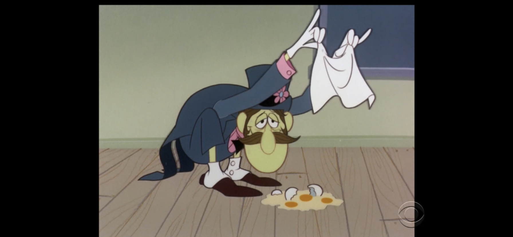
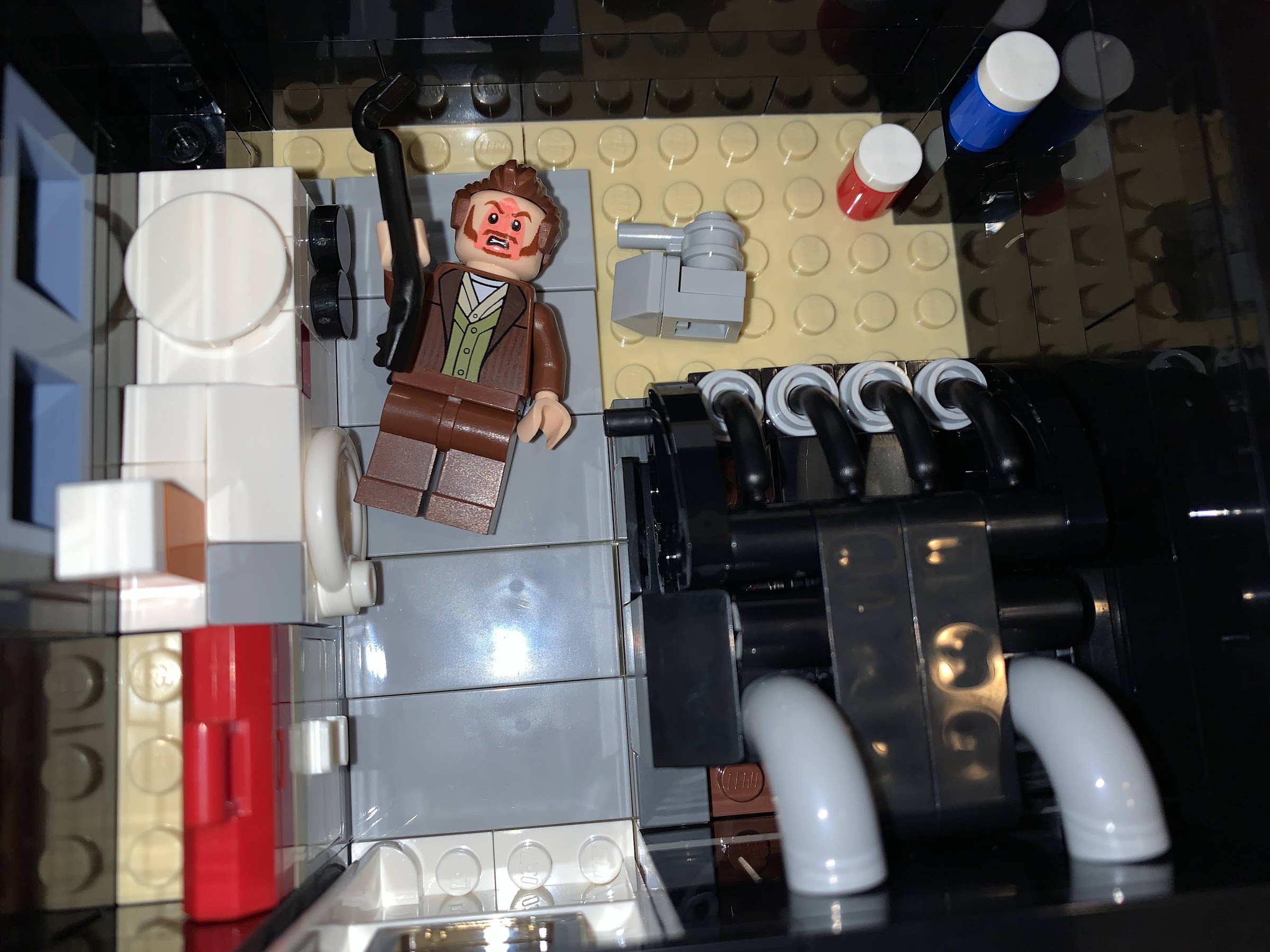
Reasoning that steroids cost a lot of money, Jesus then turns his attention to a nutcracker by the name of Nutsy Goldberg (Wayne Knight), a Jew, as he “follows the money.” Nutsy takes exception to Jesus calling him out for being a Jew and adds he owes Santa his life. It seems nutcrackers were once a popular Christmas present, until Cabbage Patch came along. We see a kid (Matthew Senreich) removing a nutcracker from his stocking and his mom (Emmy Raver-Lampman) calling out from the other room asking him what Santa brought him and he casually chucks the nutcracker into an open fire and responds, “Fire wood!” It seems Santa was looking out for old Nutsy when it became apparent that no kid would want him and hooked him up as an accountant at the North Pole. Jesus then points out that Nutsy has a mink hat and Nutsy casually comes clean to embezzling here and there, like it was expected of him. Jesus accuses Nutsy of killing Santa when Santa found out, but Nutsy brushes him off and insists he’d never kill off his cash cow. Jesus then shouts back that it would be just like a Jew to kill Santa since they killed him, and Nutsy gets offended and calls him racist. Jesus apologizes and the two have a stare-down.
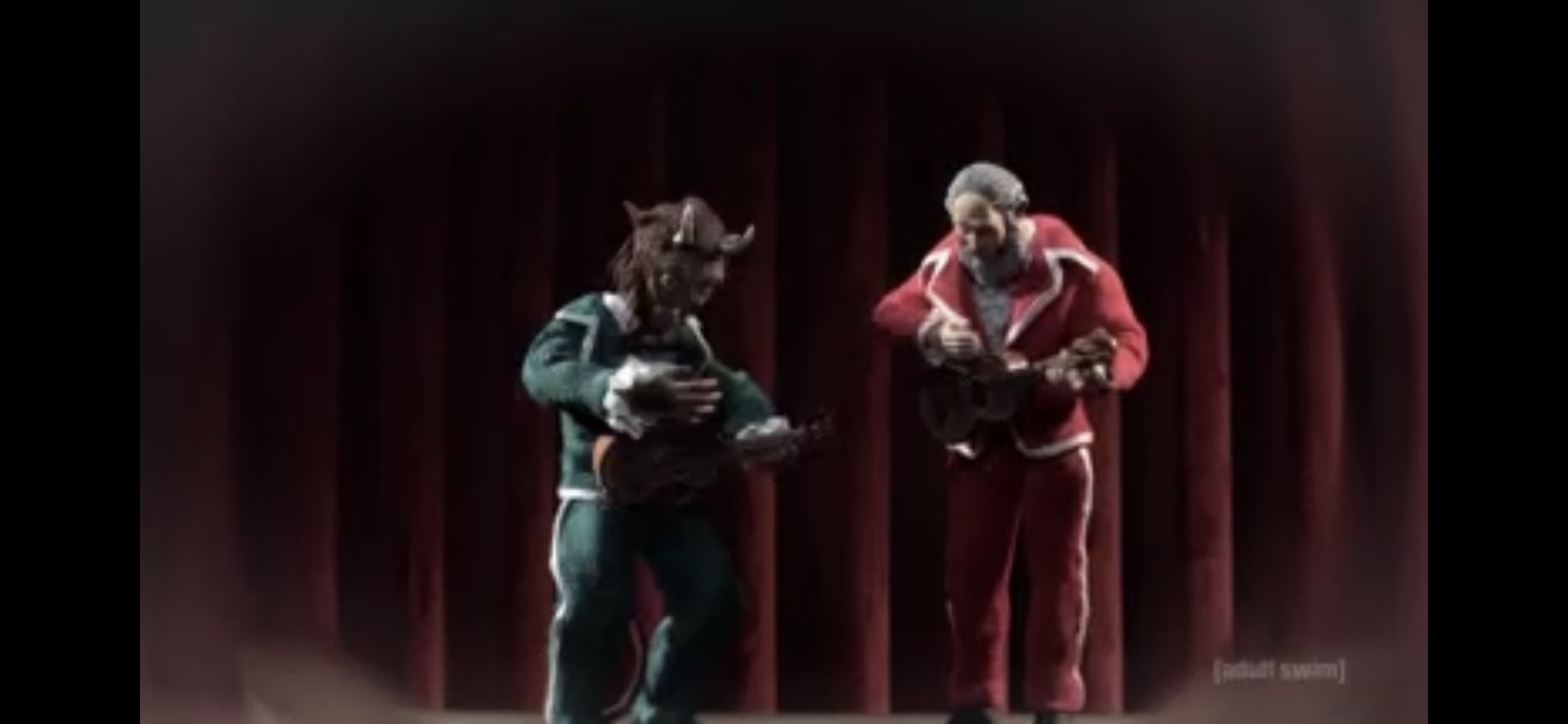
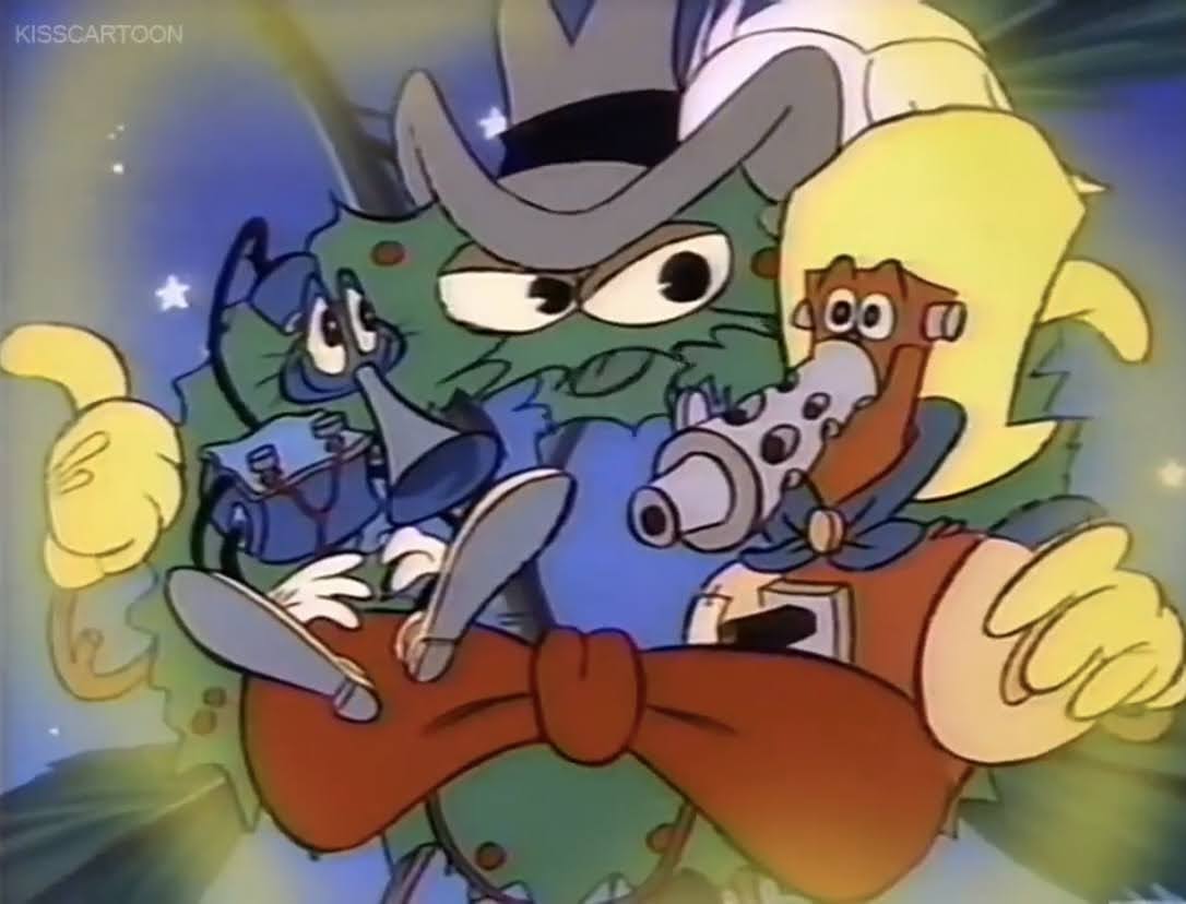
Krampus declares the case unsolvable and references the murder of Nicole Brown Simpson and Ronald Goldberg which causes Jesus to narrow his focus on him. Jesus refers to Krampus as Santa’s mortal enemy, and Krampus calls that an absurd characterization. He doesn’t hate Santa, just kids. He then says how they used to work together as a comedy duo and we see a little flashback to that. When Krampus uses Santa’s setup for a joke to make one about beating children, he storms off the stage in disgust and that’s apparently how that act came to an end.

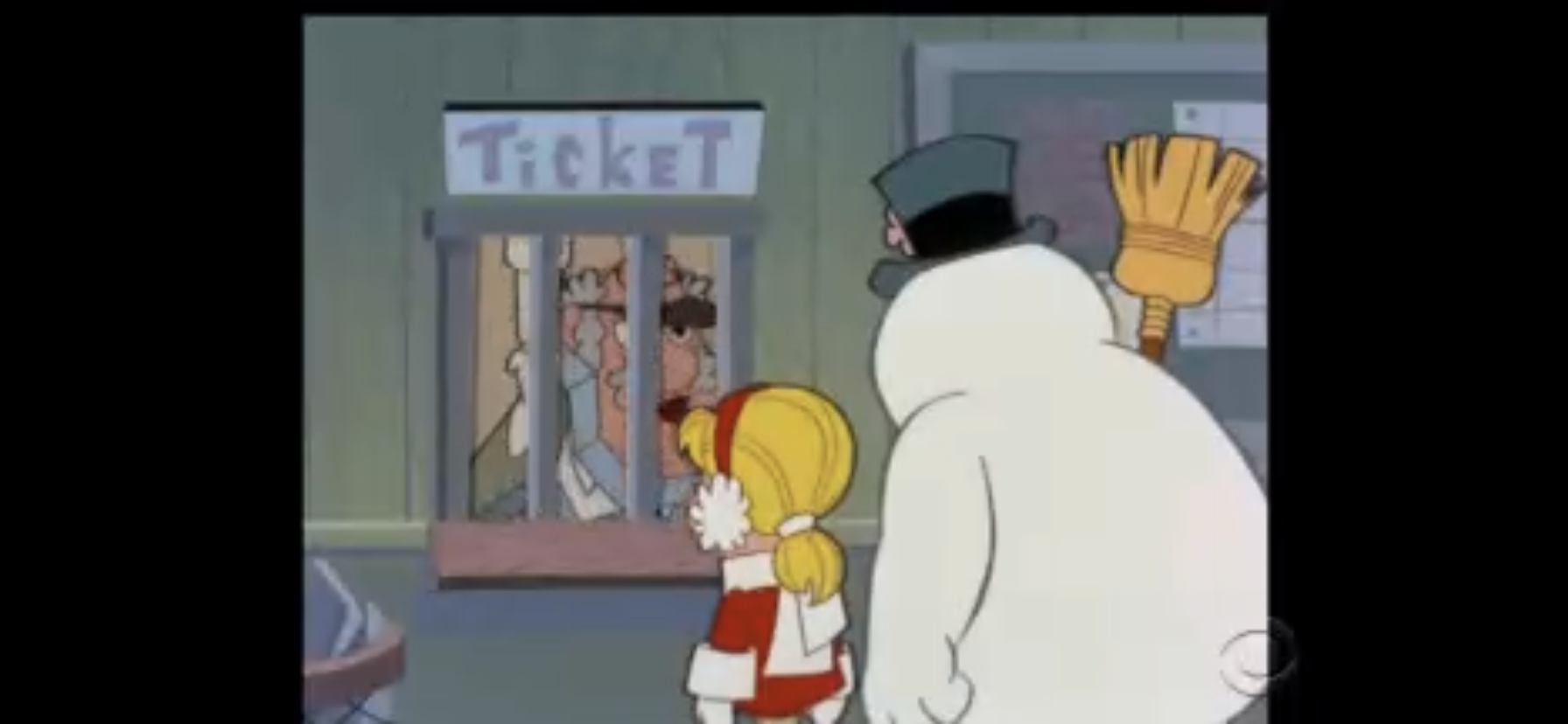
Krampus starts strumming his ukulele and singing a song about Santa when he’s interrupted by the train coming to a sudden stop. Jesus heads outside to see a small avalanche has blocked the tracks and it’s there he encounters Snowball. Snowball mentions how this stop is good for the murderer as it will allow the wolves to descend upon the train and desecrate Santa’s corpse thus destroying any physical evidence. Jesus then points his finger at the snowman, who has no problem admitting his disdain for Santa. We then see how the North Pole used to be a paradise for snow people, until Santa showed up and took over. He forced the naturally nose-less snow people to sport carrots and cover their heads all the while polluting the land with his toy factories contributing to global warming. We see a family of snow people being forced off land via a chunk of floating ice as Santa waves mockingly. Jesus accuses Snowball of doing the deed, but he responds with, “Does it matter?” and references the North Pole being lost to global warming. Krampus is there to make a “Global warming bullshit,” remark as we’re definitely supposed to view him as just the worst.
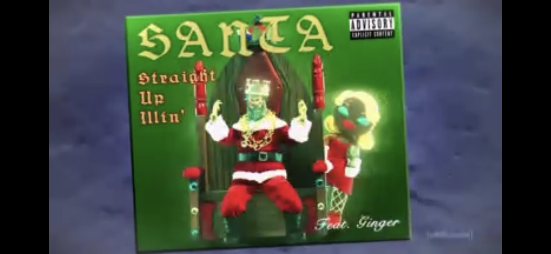
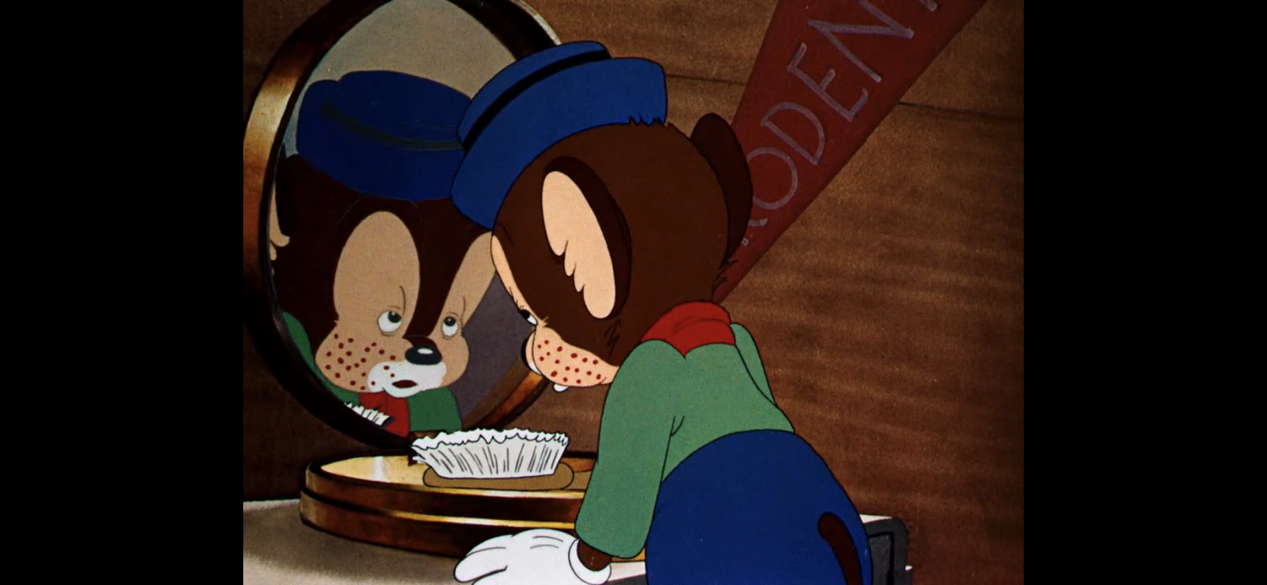
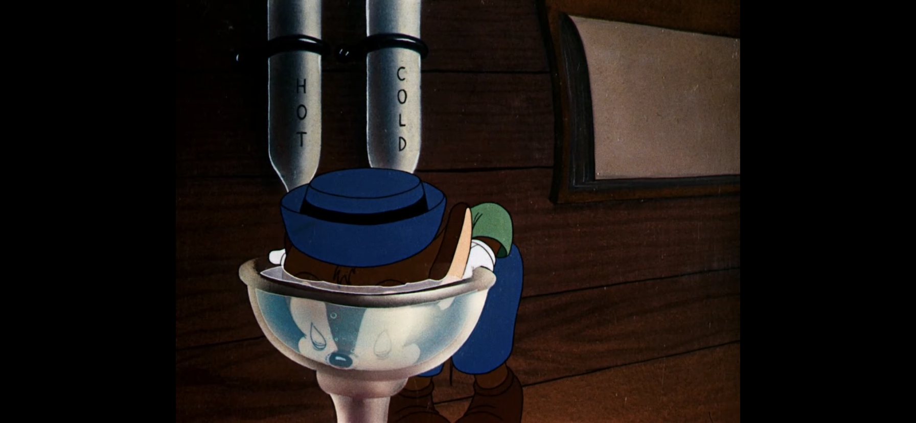
Porter then calls out to inform everyone who the real hero of the story is, him, as he shovels the snow off the tracks. Everyone returns to the train and Jesus takes note of the crumbs falling from the gingerbread woman, Ginger (Gina Rodriguez). He confronts her on the train for he spotted crumbs just like that on Santa’s corpse. He accuses her of killing Santa in a jealous rage since he wouldn’t leave Mrs. Claus for her. She confesses to being with him last night, but denies killing him, but does explain how she knows Santa. He discovered her in a night club one night and encouraged her to take her career to the next level. We see Ginger in a recording booth, and Santa shoves the engineer aside and starts rapping at the control deck. She explains creative differences drove them apart. Jesus presses further and she snaps, admitting she hated the guy and indicates she slept with him by complaining about his balls and small penis.
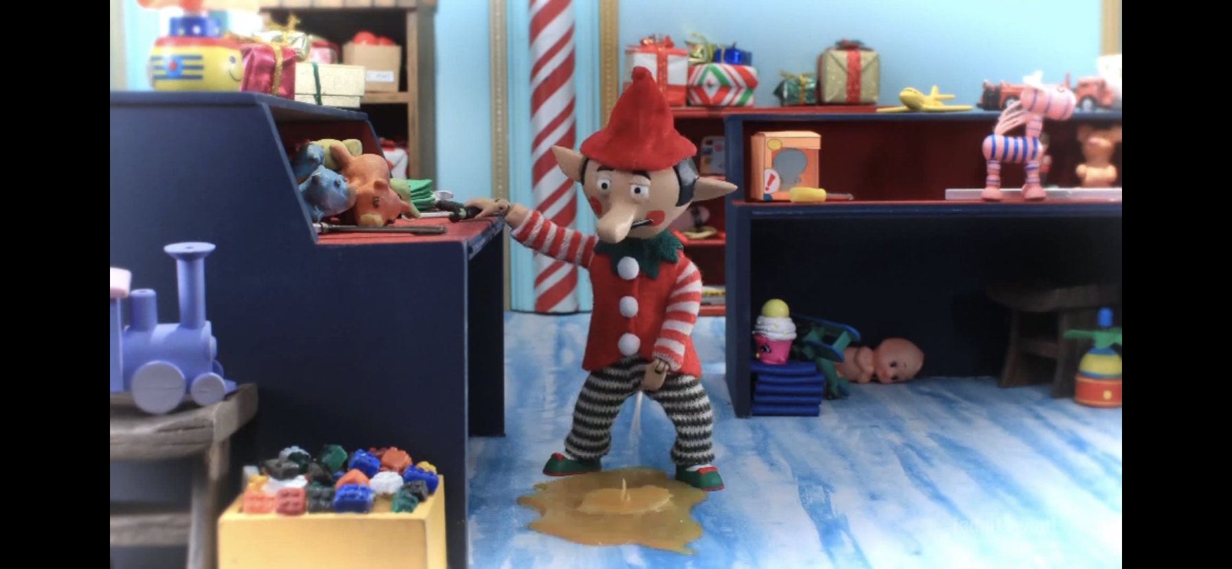
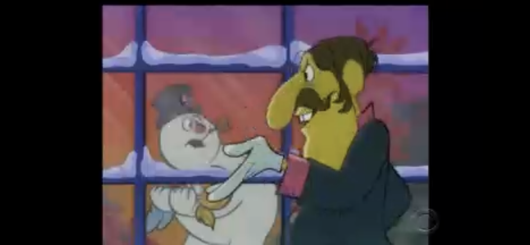
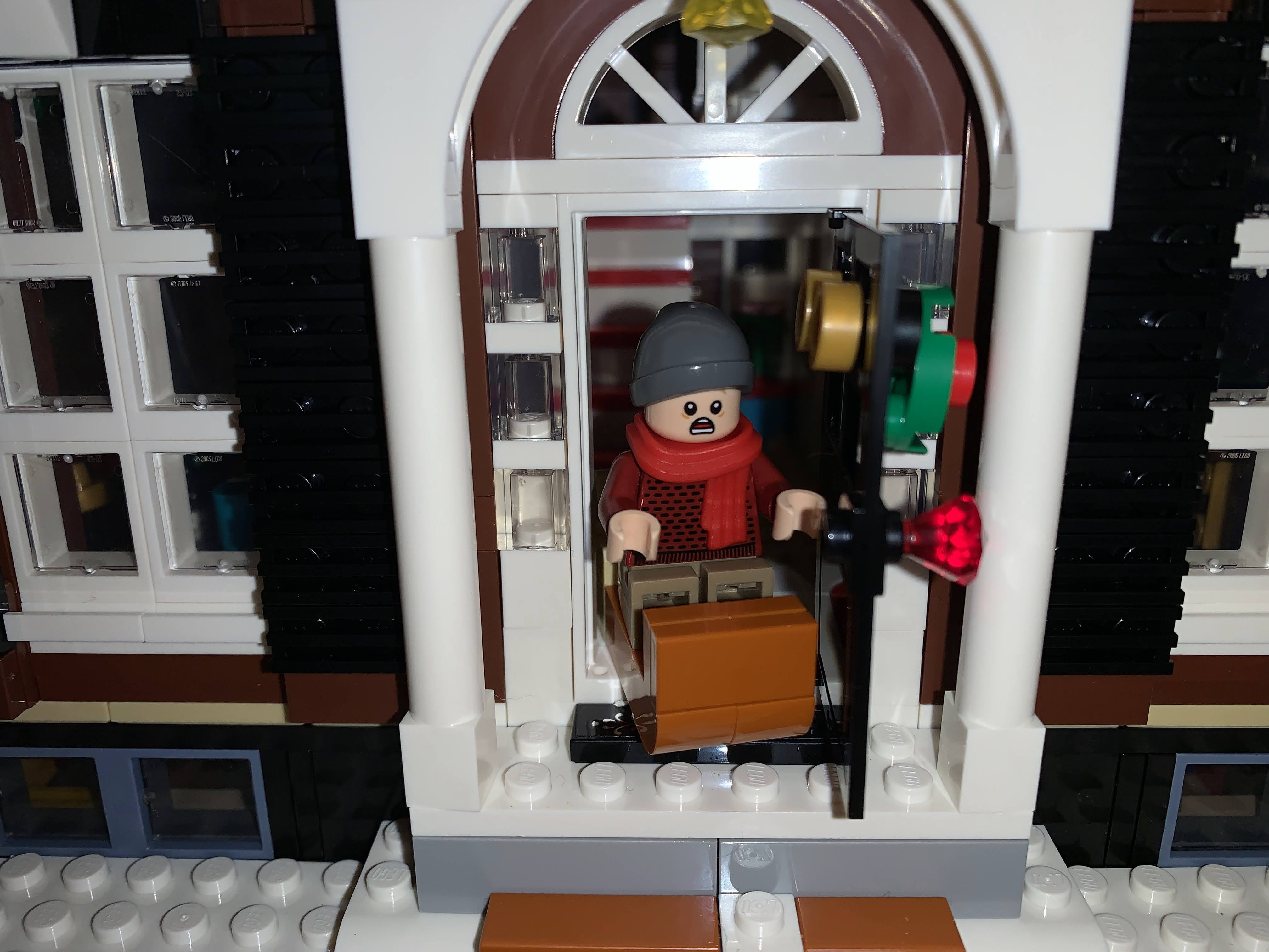
As the suspects start feeling the heat, they turn things around on Inspector Jesus. They point out his many reasons to want to kill Santa, while also mistaking his heritage (“Santa was his father?”) which just frustrates him. Jesus then retreats to go examine the body once again, alone. The lights cut out though and when they come back on Jesus finds himself nailed to a cross! Worse, someone has written “BOOB” across his forehead! Removing himself, Jesus races out of the car and sees two candy cane-striped legs disappearing through an opening in the roof. He follows and encounters the elf, Peppermint (Emmy Raver-Lampman), on the roof of the train. The others gather around Jesus as he interrogates the scared elf and we see a permanent marker fall from her hand as she tries to deny any involvement in the murder of Santa or the recent attack on Jesus. It’s at this point Krampus informs us of the poor working conditions experienced by the elves. We see elves being mutilated by the equipment, urinating on the floor, and attempting suicide by jumping out of windows only to land in nets Santa strung up. Peppermint had tried to form a union, but Nutsy adds that Santa hired the Bumble from Rudolph the Red-Nosed Reindeer to put an end to that nonsense. We are “treated” to a visual of the Bumble curb-stomping a poor elf as an intimidation tactic for the rest of them.

Peppermint is fed up at this point and announces she’s ready to blow the whole thing open. Only she would have, if not for a sniper taking her out! Jesus demands to know who did that, but the other individuals all deflect attention They head back inside and Jesus orders Porter to alert the authorities at the next stop to be prepared to receive a prisoner for he, Inspector Jesus, has solved the case! Utilizing what Jesus refers to as the most exciting flashback yet, Santa is shown in his train car when he went to open the door for some “friends” he thought were paying him a visit. Only their intentions were vile! One by one, each suspect is shown stabbing Santa “For the Watch” style punctuating with Ginger snapping her hand off in Santa’s mouth.
The suspects still aren’t entirely willing to come clean, but Jesus details the evidence even further which includes entrails on Comets antlers and Ginger’s hand still lodged in Santa’s throat. Porter makes the announcement that they now know why they wanted to kill Santa, only for Krampus to interject that he’s wrong. They actually wanted Santa dead because he cheated at fantasy football by using his naughty and nice list to guess which players would get suspended. Jesus then makes the announcement that Santa was killed for the greatest sin of all: giving a shit about fake football! Krampus, angry at Jesus for exposing them, whips out a gun and fires away! The bullet travels in slow-motion passed the shocked faces of the other culprits until it passes right through the nail hole on Jesus’ hand and strikes poor Porter. Jesus retaliates with his magic, some sort of icy blast or something that decapitates Krampus, and then kneels beside the dying Porter. He thanks Jesus for solving the train’s only murder, then asks him if he was happy with his service? Jesus indicates his experience was satisfactory, 3 1/2 stars, and Porter dies.
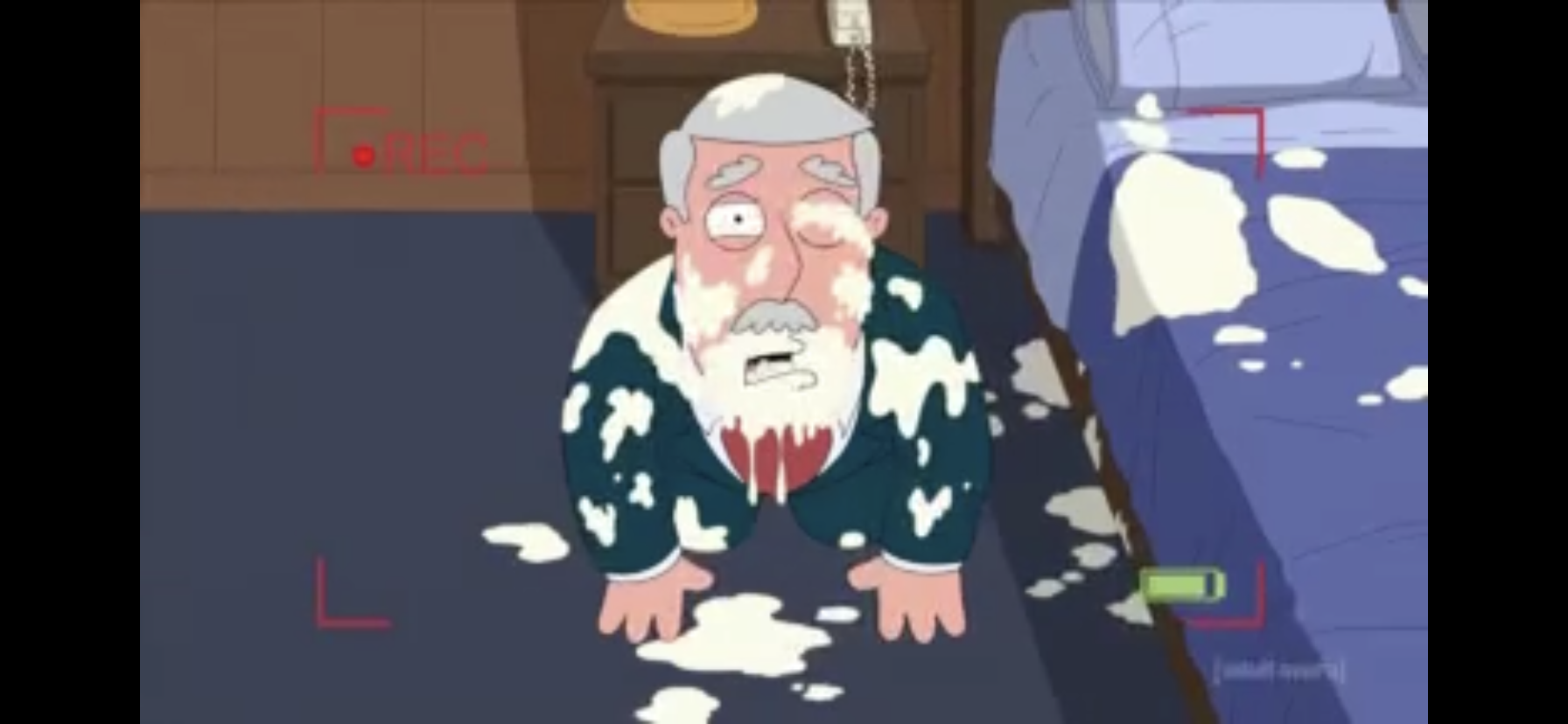
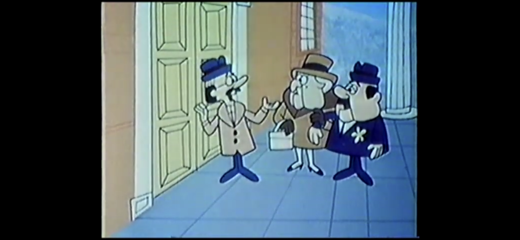
The North Pole Express stops at the next station and all of the murderers are taken away. Jesus is quite pleased with himself and does a celebratory dance, only to be shocked when Santa comes out and thanks him! Jesus, confused, asks how Santa could possibly be alive? He explains he was in the locomotive the whole time running a different sort of train (Comet’s voice can be heard calling out “There’s two trains!”), and then informs Jesus the corpse he found was none other than Tim Allen (Tom Root). They share a hearty laugh as we head to the credits which includes a flashback of Santa calling Allen to invite him on the train. He only speaks in those grunts he used to do all of the time on Home Improvement. We also see him in costume as Santa basically assures him he’ll be fine as he walks him into a death trap. A Stoopid Monkey card appears on the screen at the end of the credits wishing us a “Merry Christmas” while the monkey mascot lights a menorah, which is genuinely cute.

The Robot Chicken special with the absurdly long title is a solid way to spend 11 minutes this holiday season. Turning the classic murder mystery into a holiday special where Santa is the victim is a solid setup and the Clue-like resolution is also appropriate. The Game of Thrones reference for the murder means this sucker is already super-dated, but it’s not a reference viewers need to get in order to find the situation funny as Christmas mascots all shout, “For the Pole!” as they stab Santa. Snowball, who apparently hates Santa the most, stabs him in the crotch. The animation and character designs are fun to take in and there’s plenty of blood and guts, if that’s your thing.
Where the special does stumble a bit is where most Robot Chicken jokes have a tendency to fall flat, and that’s just in how obvious the jokes are. Robot Chicken always goes for the easiest joke. When your show is basically the Wario Ware of television and the joke needs to be communicated in about 10 seconds, that sort of thing makes sense. Here they actually have some semblance of time on their side, but they still go for the easy setup and knock down. I did enjoy the “dad jokes” Jesus leaned on which were all just Jesus puns like saying he does Crossfit and pointing out how he’s been double-crossed. They were able to create a fun lead with the character which initially surprised me as I thought Porter was being setup to lead the investigation. I also enjoyed the dig at Tim Allen during the credits.

If you like the comedy stylings of Robot Chicken then you’ll probably be entertained by this episode. I can see some fans being disappointed in the format as it’s not what’s expected, but the jokes are fairly similar and the staff probably welcomed the chance to just deal with a few puppets and staging areas rather than the usual amount needed to shoot an entire episode. And if you’re unsure, well, it’s only 11 minutes of your life so it’s hardly much of a risk. Cartoon Network is assured to show this one during the month of December, likely multiple times, and Robot Chicken is also available on HBO Max. For the Pole!
Can’t wait until tomorrow for more Christmas? Check out what we had to say on this day last year and beyond:

Dec. 9 – Space Goofs – “Holiday Heave Ho”
Come the late 90s I was definitely losing track of what was airing on Fox Kids. X-Men came to an end, as did Spider-Man and The Tick. They were replaced with Silver Surfer and a new Spider-Man cartoon that was pretty awful. There was also that live-action Teenage Mutant Ninja Turtles show called The Next…
Keep reading
Dec. 9 – The Real Ghostbusters – “Xmas Marks the Spot”
The 1980s sometimes feel like they belonged to the Ghostbusters. That’s because, for me, the Ghostbusters were always around. The film came out when I was but a wee baby, but by the time I had a real interest in television The Real Ghostbusters (not to be confused with the Filmation series) was airing…
Keep reading
Dec. 9 – Spectacular Spider-Man – “Reinforcement”
It’s not my favorite, but if you wanted to argue that Spectacular Spider-Man is the best animated series based on a Marvel property then I wouldn’t fight you on it. The show ran from March 2008 to November 2009 and produced a tidy 26 episodes. It was a re-telling of Spider-Man with an obvious emphasis…
Keep reading