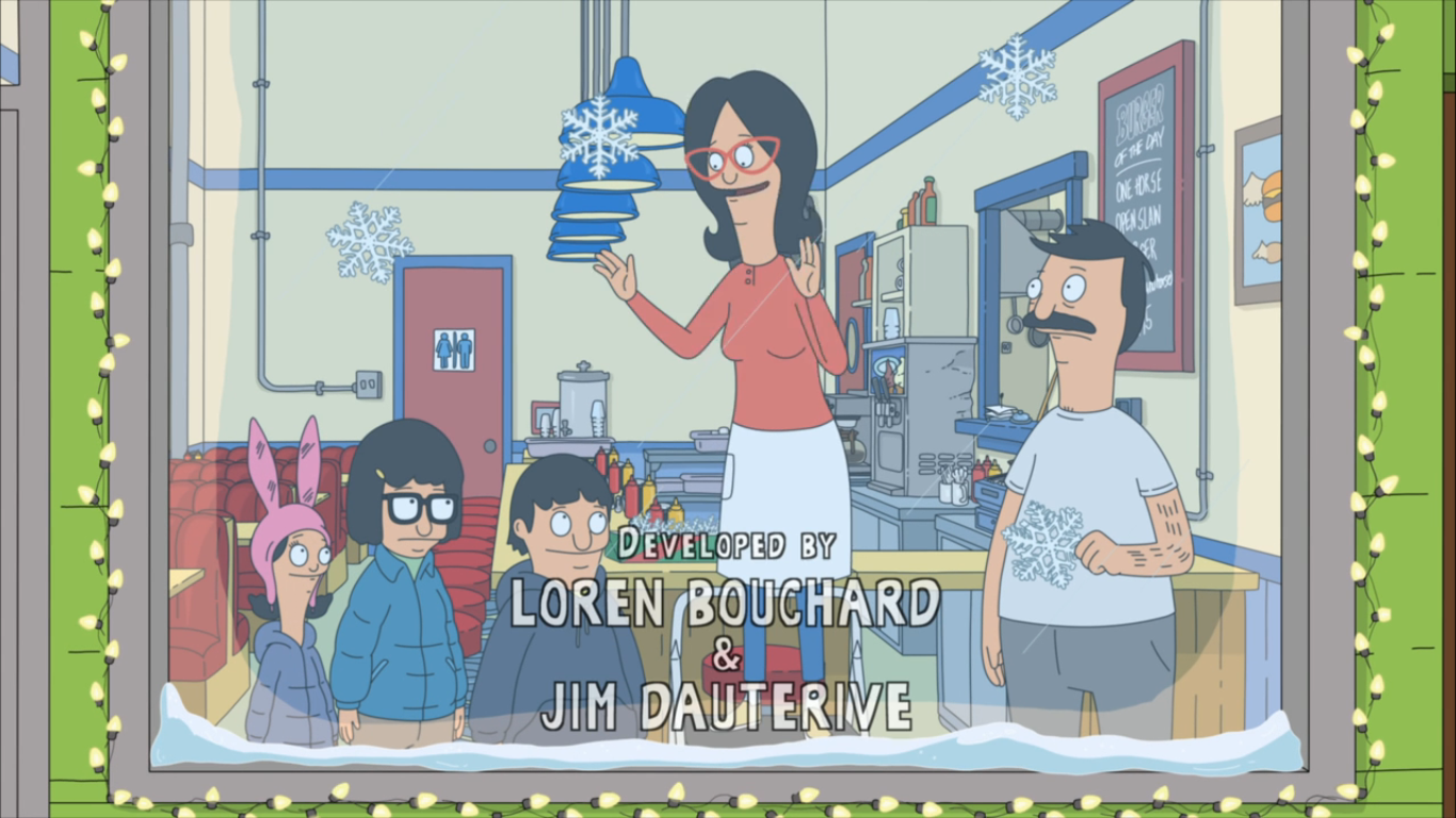
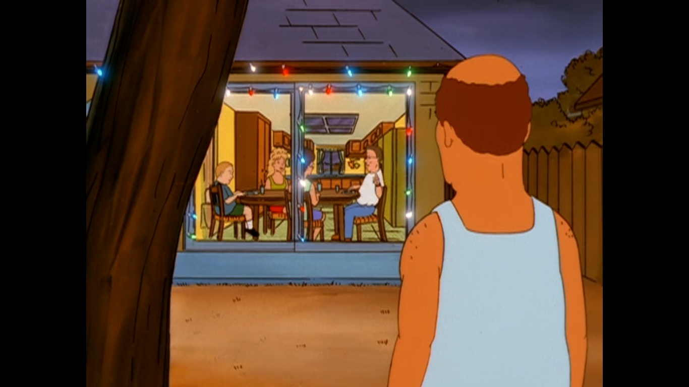
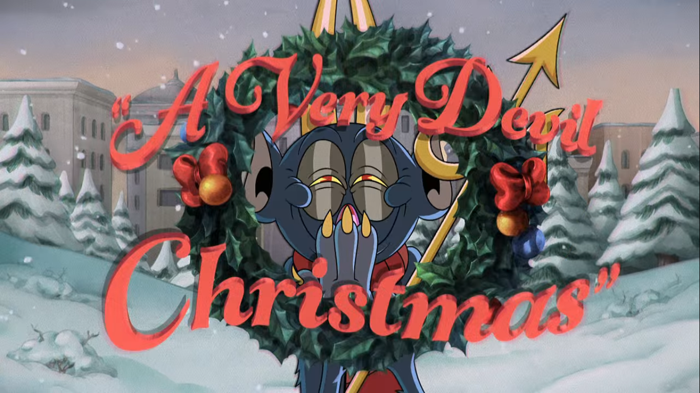
I did not grow up with SpongeBob Squarepants. He is very much a post-Nick show for me as I wasn’t paying much attention to the cable channel when he premiered. Over the years, little has changed for me when it comes to SpongeBob Squarepants save for the fact that I’ve come to appreciate the show’s take on Christmas. SpongeBob Squarepants has two all-timers for Christmas specials on its resume. There may be more than just the two, but as far as I know the little sponge is batting 1.000 when it comes to Christmas. When I found out a new Christmas episode was due to air in 2021 I immediately took notice. I obviously didn’t write about it then, or the year after, or the year after that, but today I am going to remedy that. Can “SpongeBob’s Road to Christmas” possibly live up to the show’s other Christmas specials? Let’s find out.
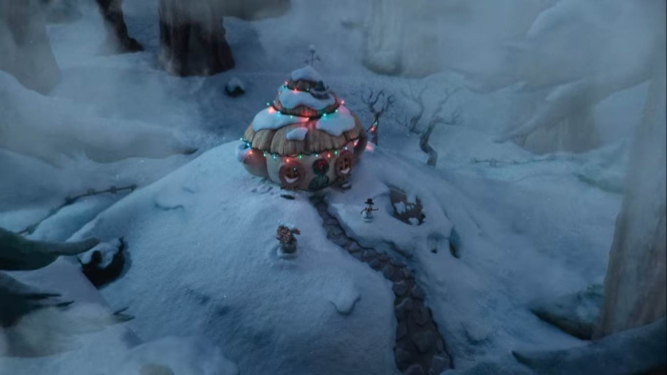
The episode begins as any other without any extra holiday fanfare. The title card is at least set to an instrumental version of “Deck the Halls.” When the episode begins, we’re shown a traditionally animated (for this era of the show) shot of Bikini Bottom decked out for the holidays. It’s somehow covered in snow or a snow-like substance, but this show has very few rules when it comes to its setting. SpongeBob (Tom Kenny) is in his aforementioned pineapple under the sea preparing for Santa’s arrival. Unlike most people, or sponges, SpongeBob actually has a present for Santa. Either he’s really generous or he’s angling for a little something extra. Either way, it’s a nice gesture that goes beyond the typical cookies and milk.
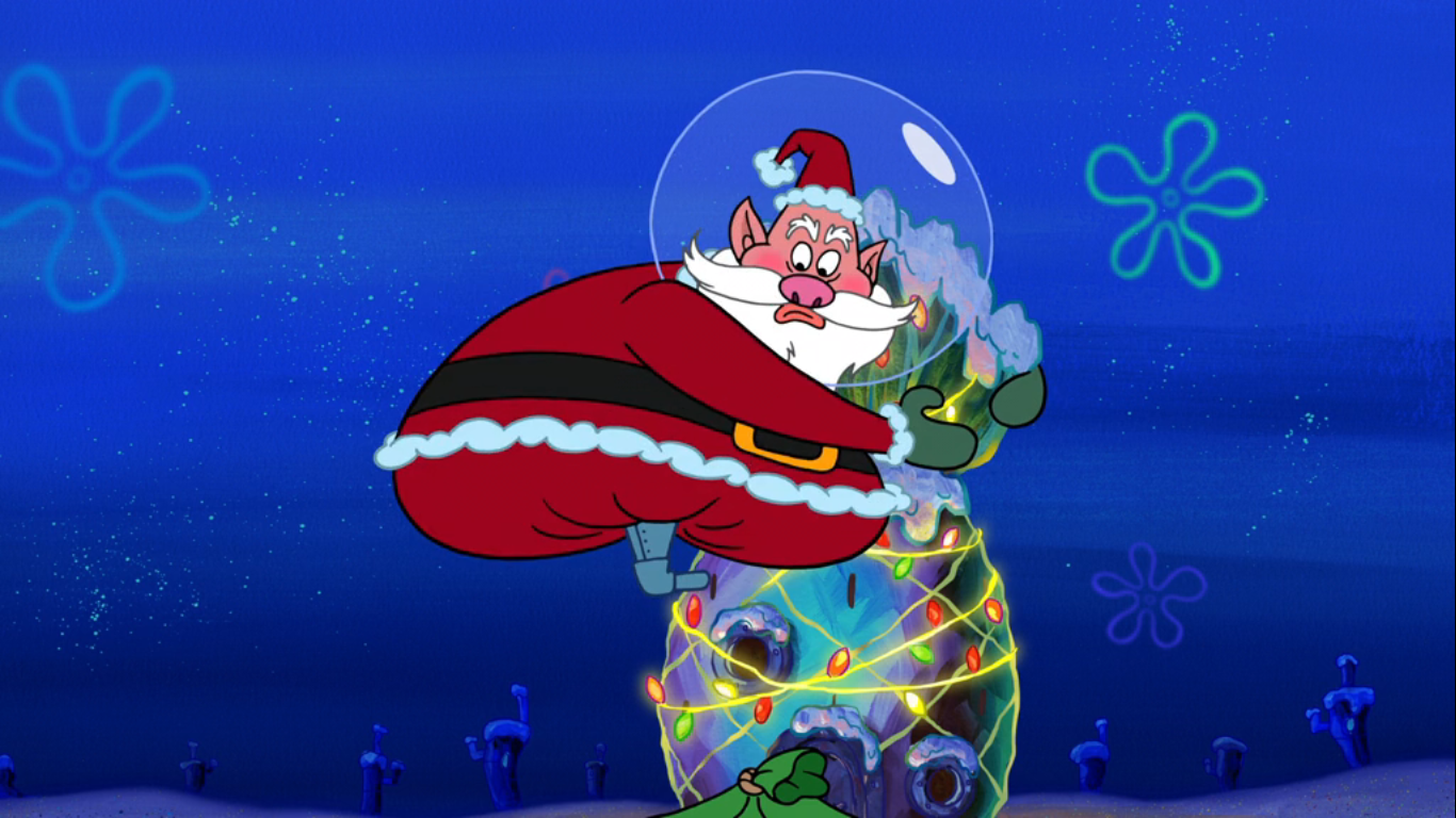
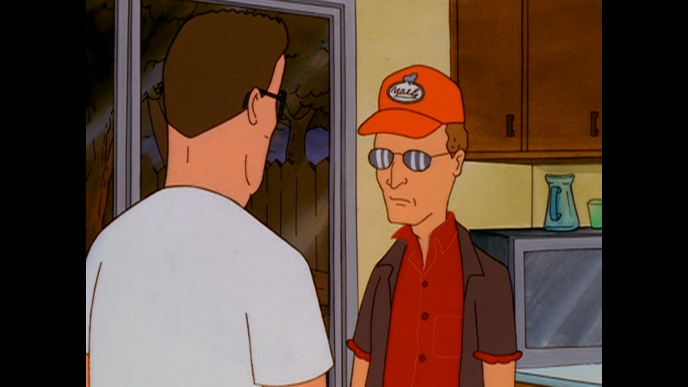
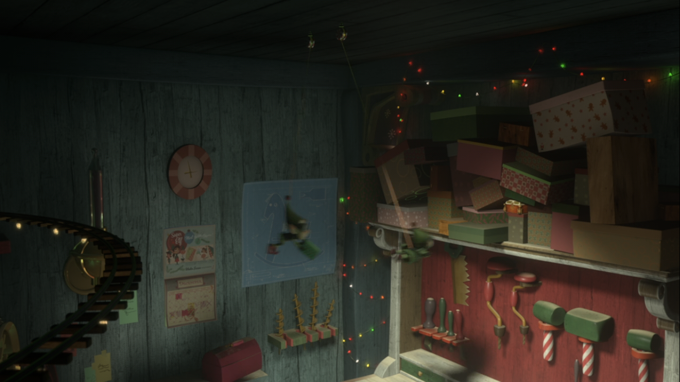
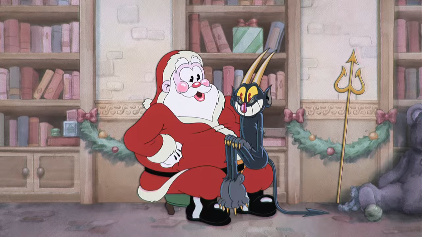
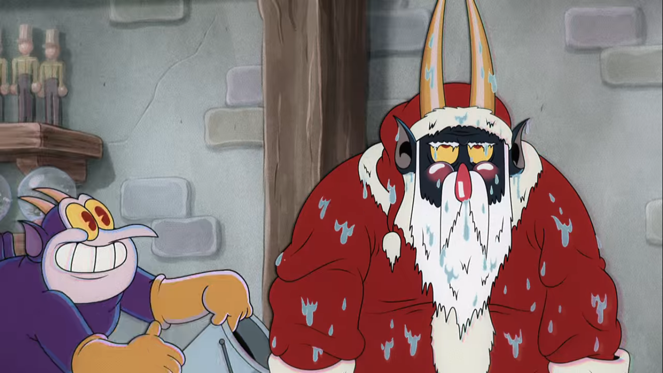
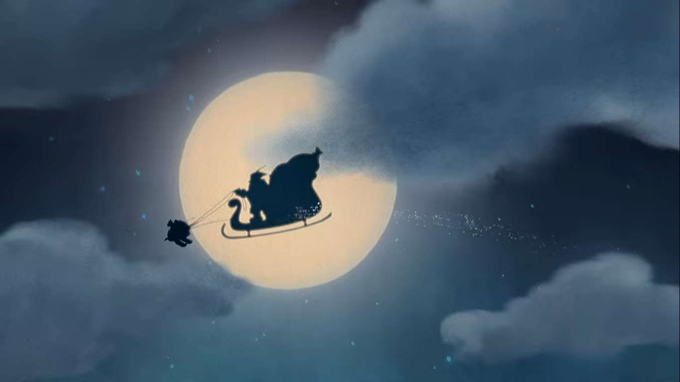
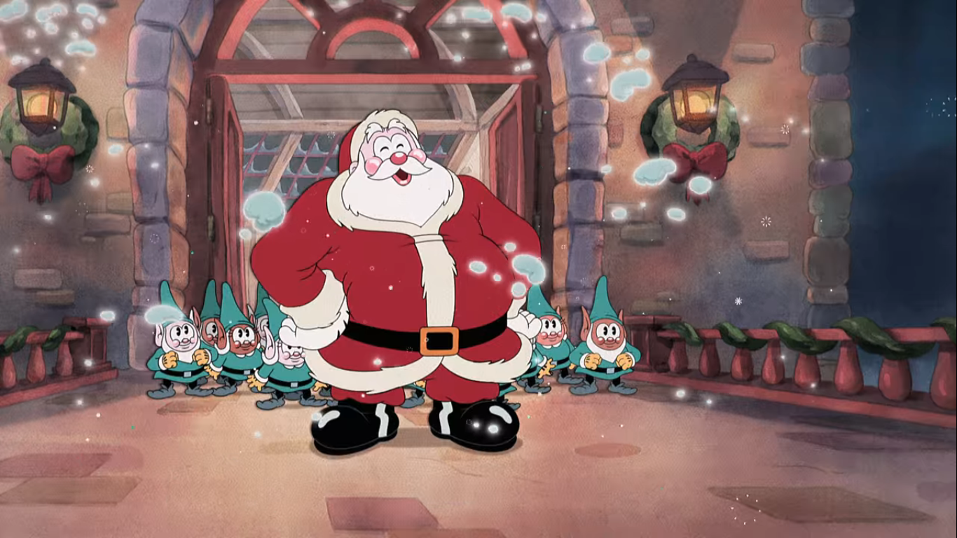
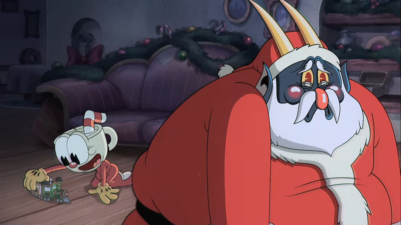
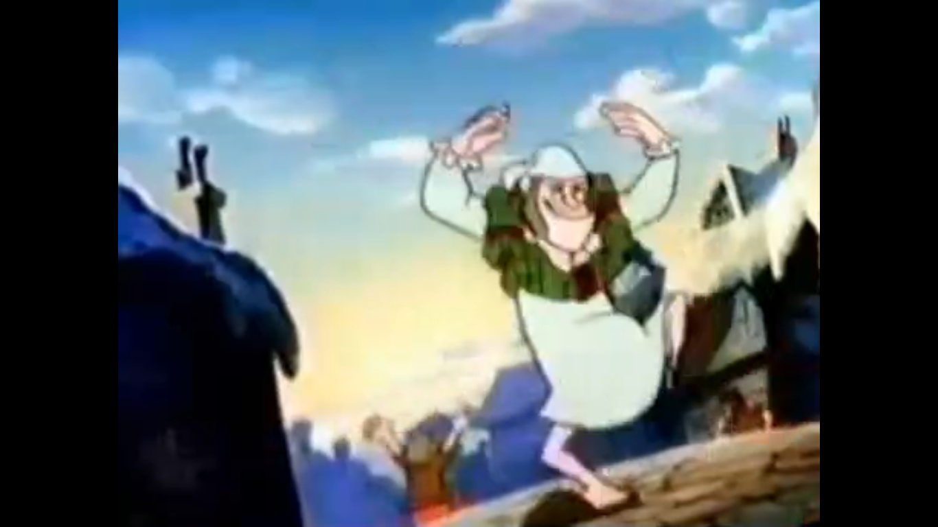
SpongeBob, along with his pet snail Gary, retire for the evening since Santa doesn’t visit homes with active residents. And soon enough, Santa (Lewis Black in what is a pretty atypical role for him) arrives! It’s a bit weird seeing him animated in a more traditional sense after only seeing him depicted in the stop-motion A SpongeBob Christmas, but his design seems to be more or less the same. He has a rather elven appearance to some of his facial features, but he also has the big, round, belly one would expect of Santa. Initially, he has a little trouble navigating SpongeBob’s home on account of the fact that he’s way too big. I guess we didn’t see this aspect of Santa back in that other special, but he actually needs to shrink himself with magic dust in order to enter the home. Once inside, he’s positively giddy as he dances and prances about SpongeBob’s living room. His jiggling, bulbous, ass knocks the present SpongeBob left out for him behind the couch without him ever noticing it. He places a gift for SpongeBob under the tree and then departs.

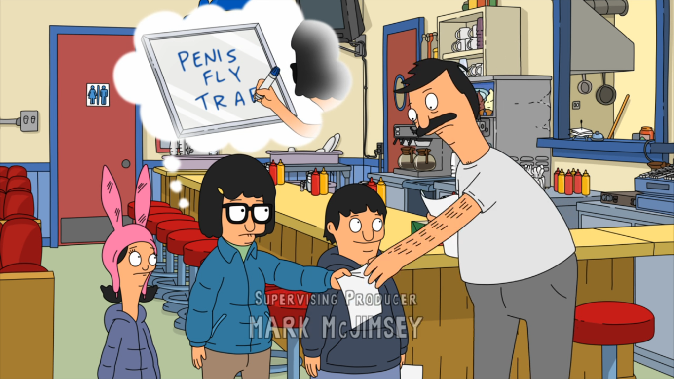
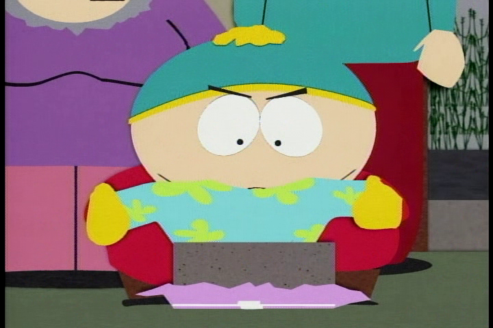
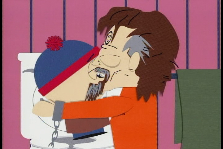
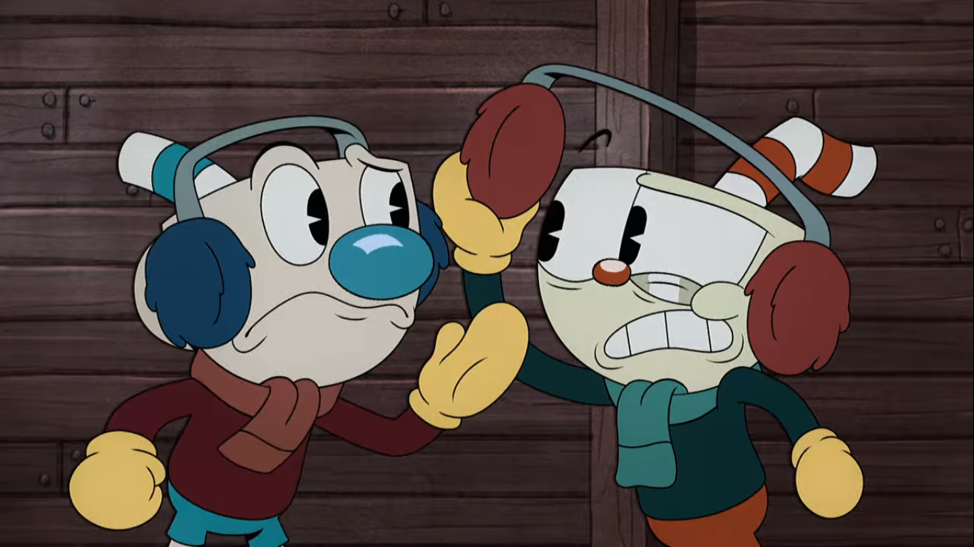
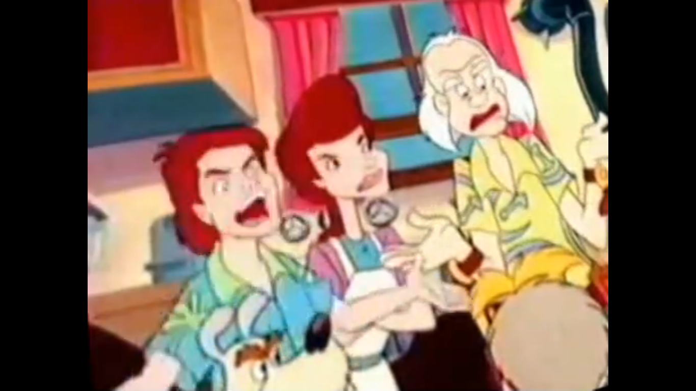
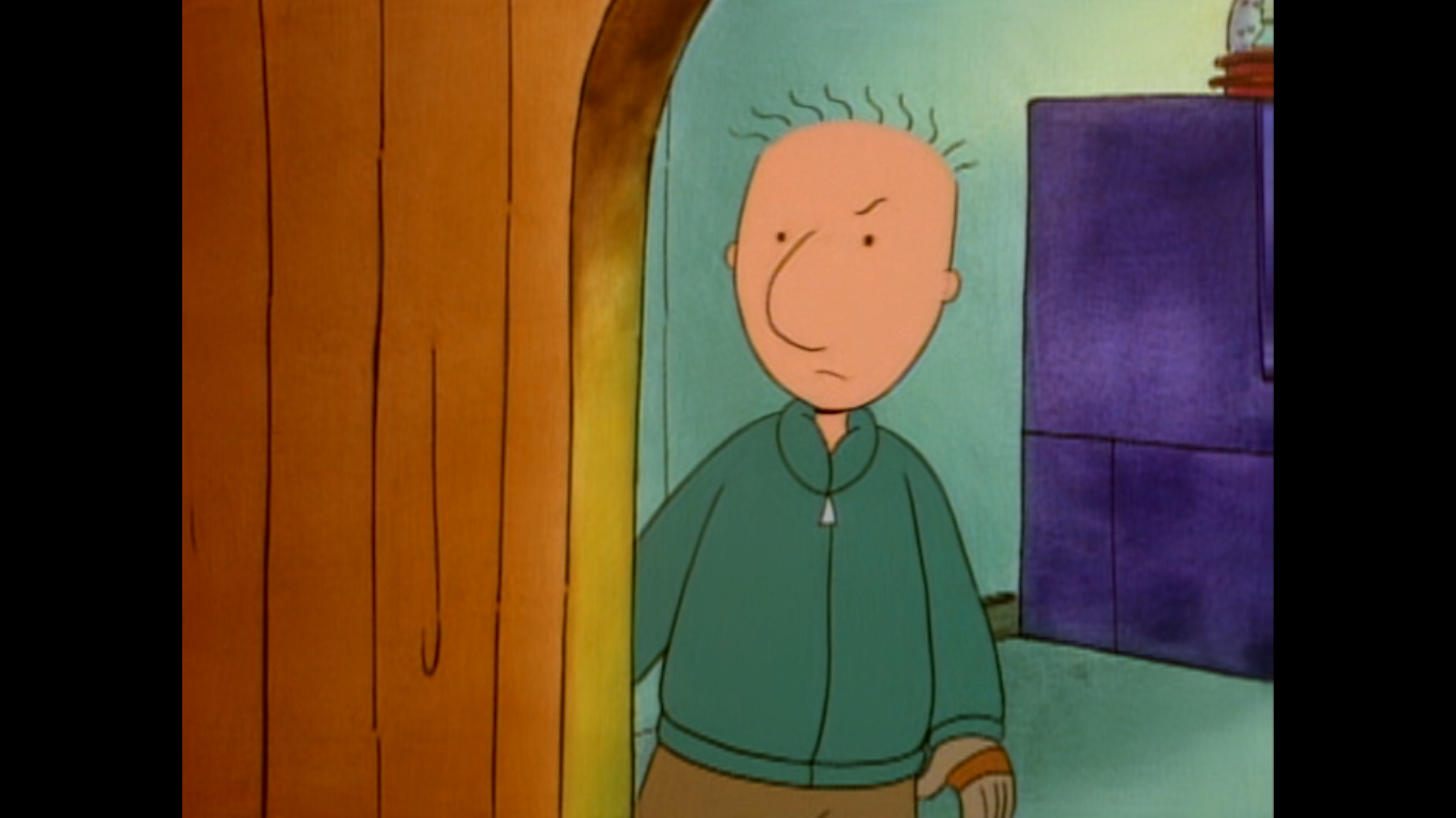
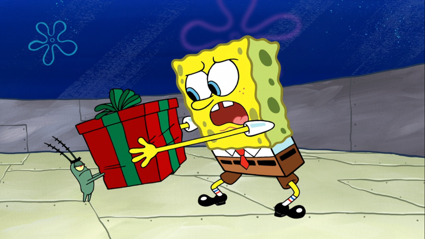
Seven months later, we find SpongeBob doing some vacuuming in his home. He moves the couch to vacuum behind it and there he finds the present he left out for Santa all covered in dust and cobwebs. At first, he has almost no reaction to it, but then the realization sets in. Santa didn’t get his present! It’s two-hundred and twelve days late (making this exactly seven months later on July 25th, assuming no leap year) and all SpongeBob can do is clutch the present to his bosom and roll around on the floor sobbing. Roses rain down upon him as he does and they’re from Patrick (Bill Fagerbakke) who thinks SpongeBob is performing or something. SpongeBob rises to his feet and informs Patrick of the situation. He doesn’t see the big deal here and rather matter-of-factly just suggests to SpongeBob that he deliver the present to Santa himself. Sleigh bells ring in SpongeBob’s head at the suggestion which he absolutely loves! Patrick volunteers to go too, but the only issue remaining is how to get there? Patrick suggests they push and shove their way to the North Pole and, wouldn’t you know, SpongeBob loves that idea too. He opens his face like a locker and stores the gift for Santa inside himself for safe-keeping, then Patrick shoves him out the door.

The two idiots, I mean friends, take turns pushing each other down the street laughing all the way. Nearby, Plankton (Mr. Lawrence) emerges from the confines of The Chum Bucket looking rather smug. I don’t know why, or if that’s just his natural disposition, but he soon gets squished by a rolling SpongeBob. SpongeBob pops up from the ground and Patrick mistakes the glob of Plankton on his nose for a booger. He offers SpongeBob his handkerchief who accepts it and delivers a hearty blow leaving behind what Patrick refers to as the ugliest booger he’s ever seen. The booger soon reveals itself to be Plankton who seems to be taking this all in stride. SpongeBob tells him what’s going on and Plankton gets an idea. Ever since he got the phrase “Born to be Naughty” tattooed on his right arm Santa has had him on the Naughty List. If he were to sneak into Santa’s workshop and change his designation on said list then he could finally receive the Krabby Patty secret formula for Christmas! Again!

Plankton informs the two that he’s coming with which they don’t seem to mind at all. When they ask how he’d like to be shoved, Plankton smugly whips out a remote. Informing the two they’ll travel via other means, he presses a button and out from the Chum Bucket emerges a sort of fishbowl on snowmobile treads and skis. Plankton informs the pair he built it to fly and run over bodies in preparation for the zombie apocalypse. I’m guessing they needed to include the zombie apocalypse bit to please the network censors since they likely couldn’t simply depict Plankton as murderous.
The three strap in with Plankton insisting on fastening their seatbelts. SpongeBob does as he’s told while Patrick just pulls his shorts over his head. Plankton is clearly showing some signs of regret in bringing these two along, but the decision has been made. He fires up the vehicle and it rockets off nearly taking out Mr. Krabs as they zoom past the Krabby Patty. SpongeBob and Patrick almost immediately jump out of their seats to look out the window and at all the fish they’re passing over including one farmer fish who mistakes their vehicle for a UFO. Plankton barks at them to return to their seats, but Patrick points out that the seatbelt light has been turned off. Plankton has no retort and the flying machine soars off into the sky. Or undersea. Whatever.
Night falls and Plankton is looking beat. Lucky for him, the ship is equipped with autopilot so he’s able to go to bed, but first he needs to pick on SpongeBob. SpongeBob has been polishing his gift (it’s wrapped in a conventional box so he’s just polishing paper) and Plankton decides that he’s entitled to a peek. He snatches it out of SpongeBob’s hands and starts shaking it around wondering what’s inside. SpongeBob isn’t telling, and he turns his own eyeball like the dial of a safe to open his face and stash the gift back inside. Plankton expresses hope that the contents are a stink bomb since he has a hatred of Mr. Claus, which SpongeBob takes offense to when Plankton refers to him as potbellied (“Santa is not potbellied, he just suffers from seasonal bloating”). Plankton doesn’t care enough to argue and heads to bed, which for him is a cot onboard the ship. For SpongeBob and Patrick, it’s the floor.

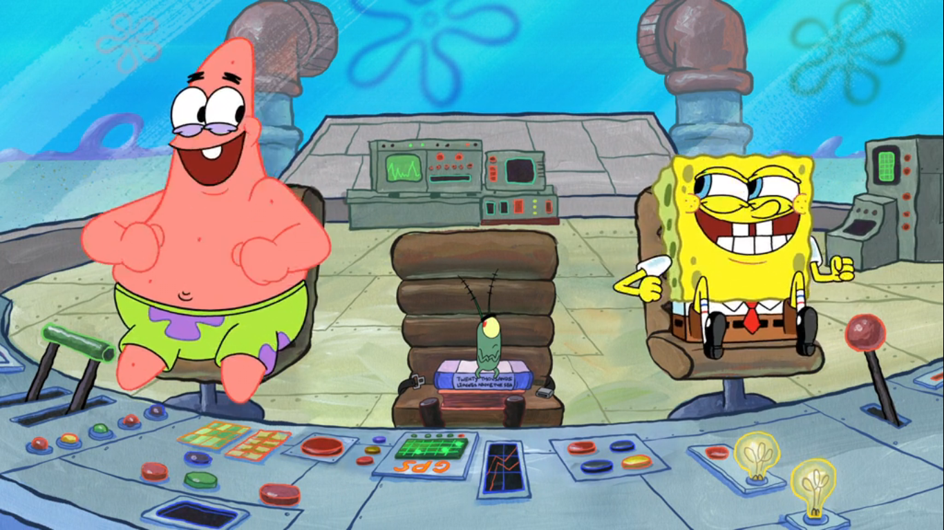
When Plankton wakes up in the morning he’s irritated to see SpongeBob and Patrick at the controls of the ship. He demands to know what they’re doing, but they’re happy to inform him that they’ve found the North Pole and way sooner than he said they would. Plankton is skeptical and asks how long he’s been asleep, but there’s no time for that as the ground is rapidly approaching. The ship smacks into the sign for Christmas Land Theme Park and it would appear to be on actual, dry, land. Plankton jumps onto the console to claim his rightful spot as pilot, but the seatbelt light is on so Patrick just slams him into the co-pilot chair and straps him in. Patrick is apparently the one in charge, and when Plankton asks if he even knows how to land this thing he responds with, “I know how to crash land!” The ship, almost gently, crashes into the snow-covered ground and skids to a halt at the actual North Pole. It just barely touches the pole as it comes to a complete stop and naturally this results in an explosion.
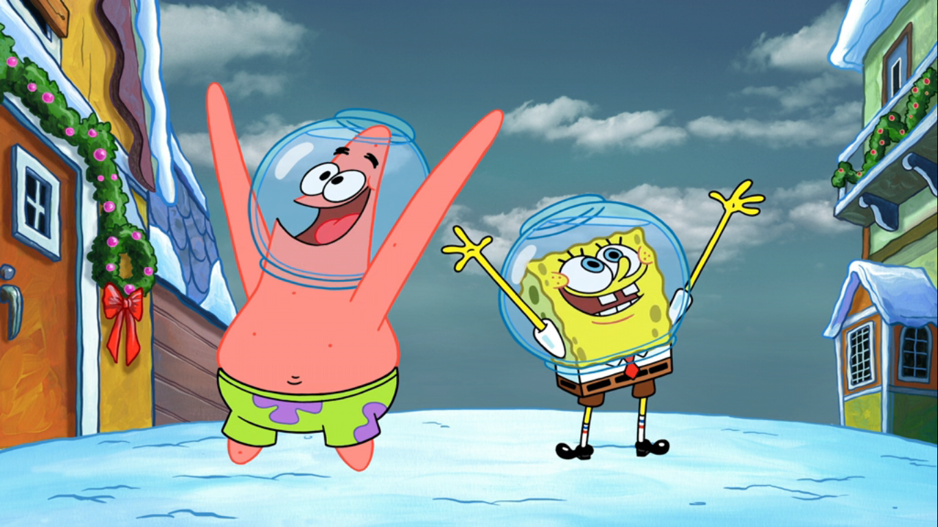
Despite the explosion, the ship seems to be fine. Well, everything except the navigation system. The boys emerge from the ship (with fishbowls full of water on their heads) to bask in the glory of the North Pole. Plankton is rightly irritated with the damage done to the ship, while Patrick and SpongeBob don’t appear to be phased one bit. As they start walking through the park, Patrick and SpongeBob are captivated by their surroundings. They’re also unable to discern a fake elf or fake reindeer from a real one. Plankton, on the other hand, has taken note of the lack of coldness and the presence of smog in the air, but SpongeBob and Patrick just declare it’s some special “snog” and continue prancing along delighted by their own ignorance while Plankton just looks defeated.
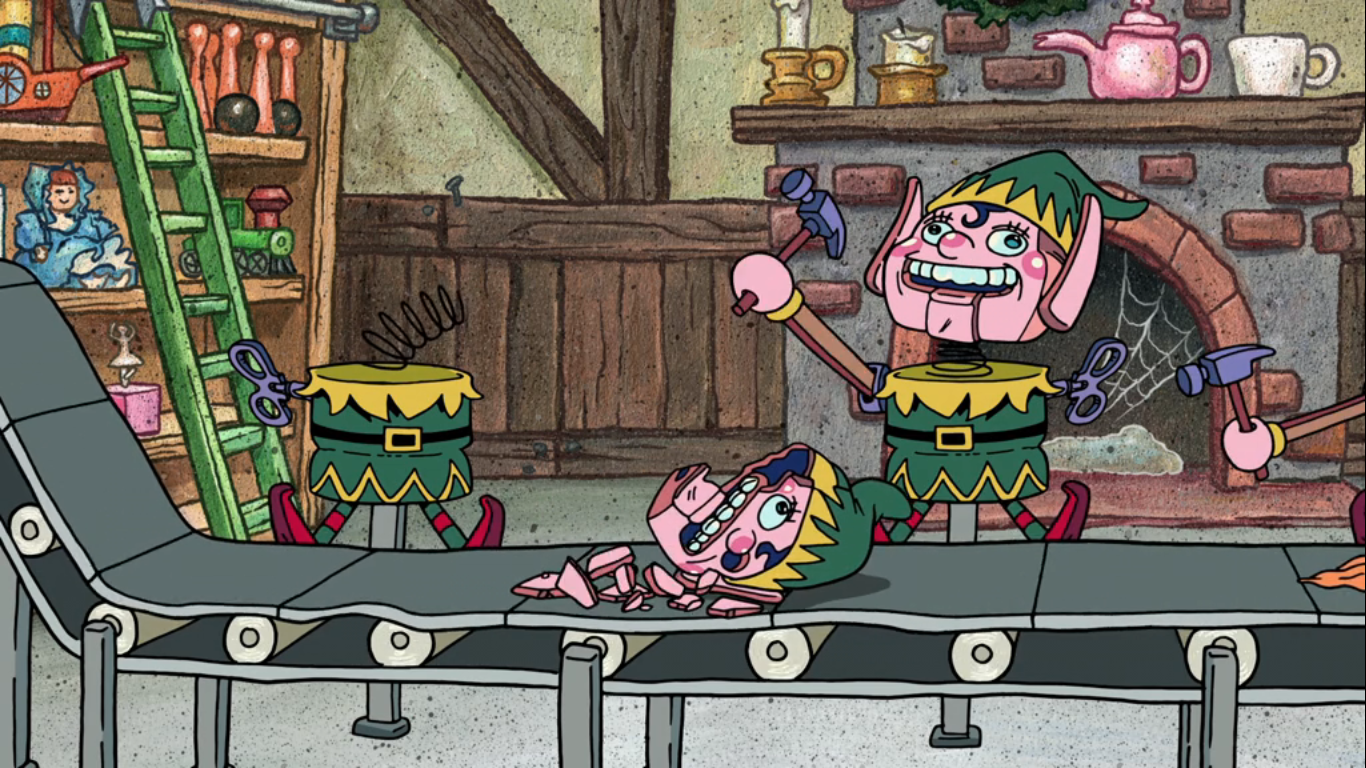
SpongeBob and Patrick then come to the heart of the apparent North Pole: Santa’s workshop. Inside, some barely functioning animatronic elves are working a toy assembly line and, once again, the two knuckleheads think they’re real. SpongeBob finally shows a tiny bit of concern on his face when one of the robot heads falls off the body of the elf and onto the assembly line where the next elf smashes it with a hammer. His concern quickly evaporates though when he takes note of a sign that says “Meet Santa Claus.” The building where this meet n’ greet is to take place is actually one the nicer pieces of scenery so far. SpongeBob and Patrick head in enthusiastically while Plankton is still piecing things together. He hasn’t quite figured out where they are, but he knows it’s a sham. SpongeBob tells him that Christmas is about believing while Patrick either has a different philosophy or mishears him as he chimes in with “Yeah, Christmas is about bleeding.”
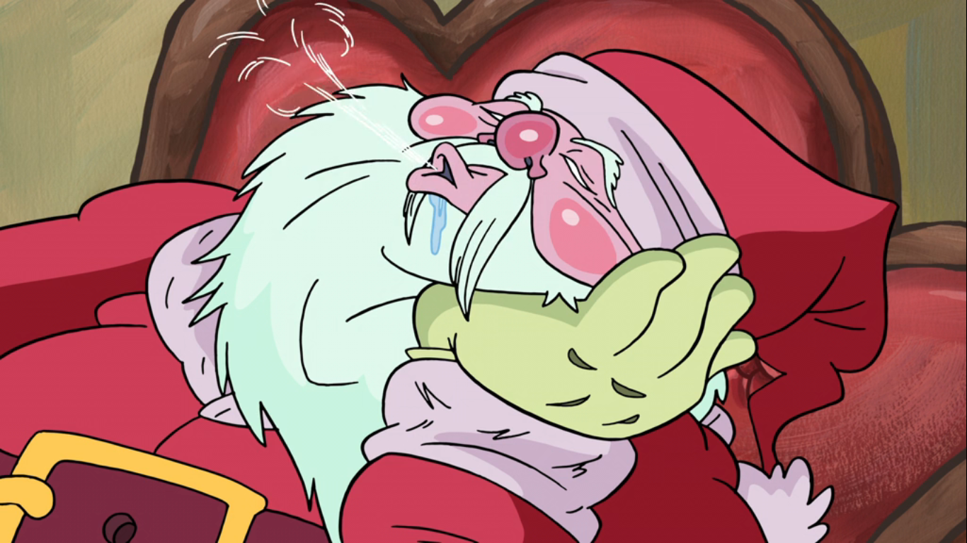
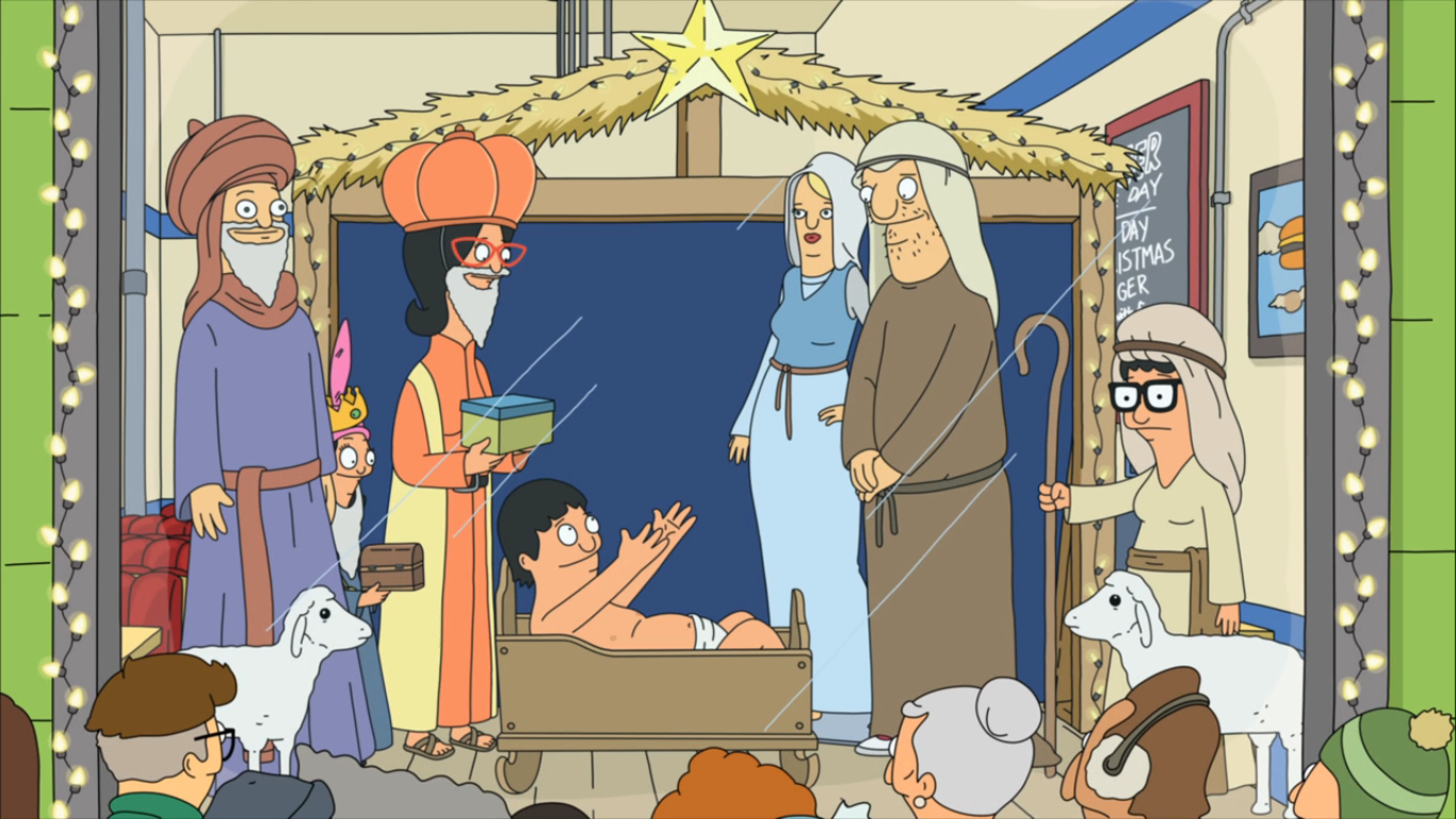
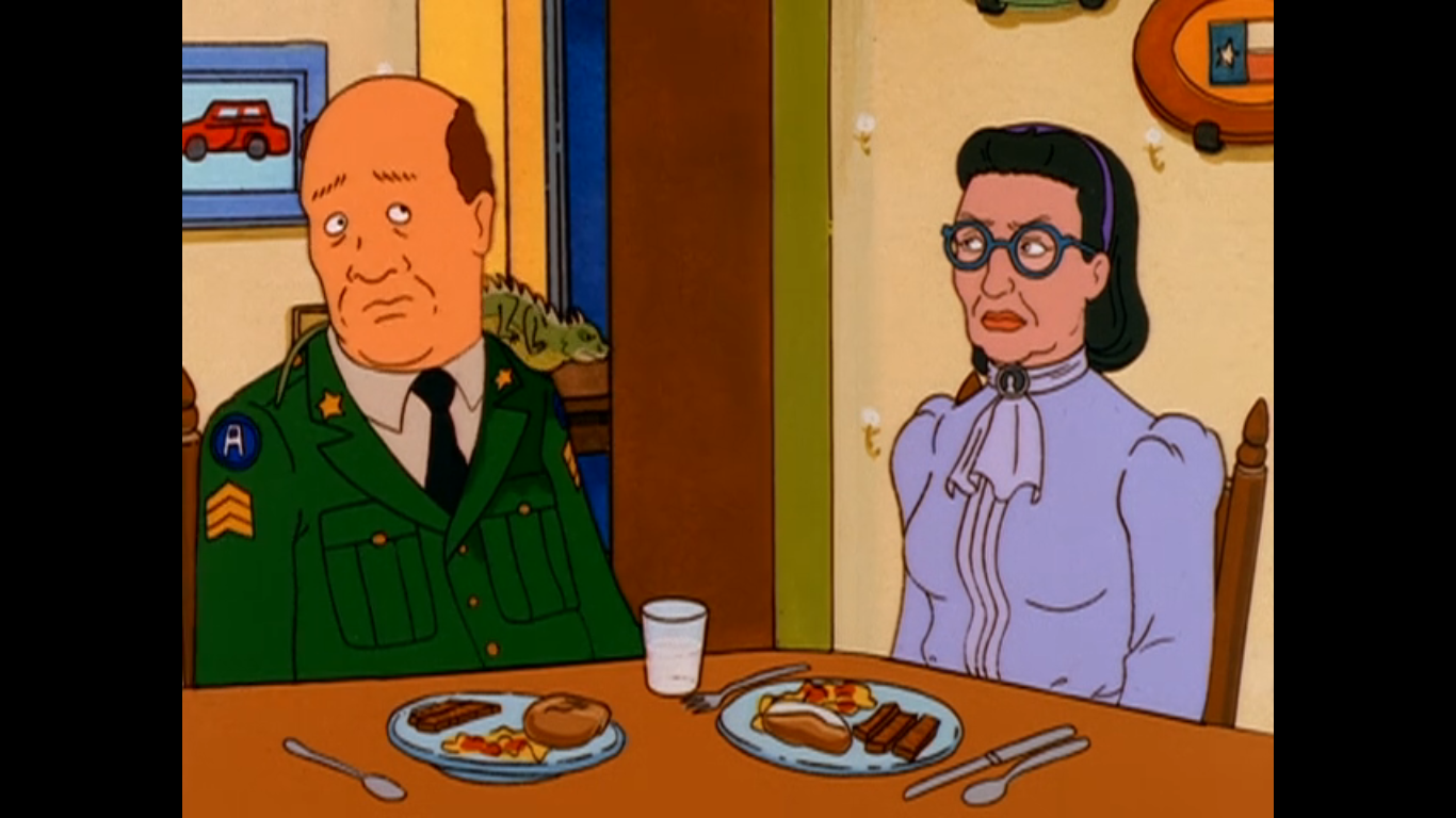
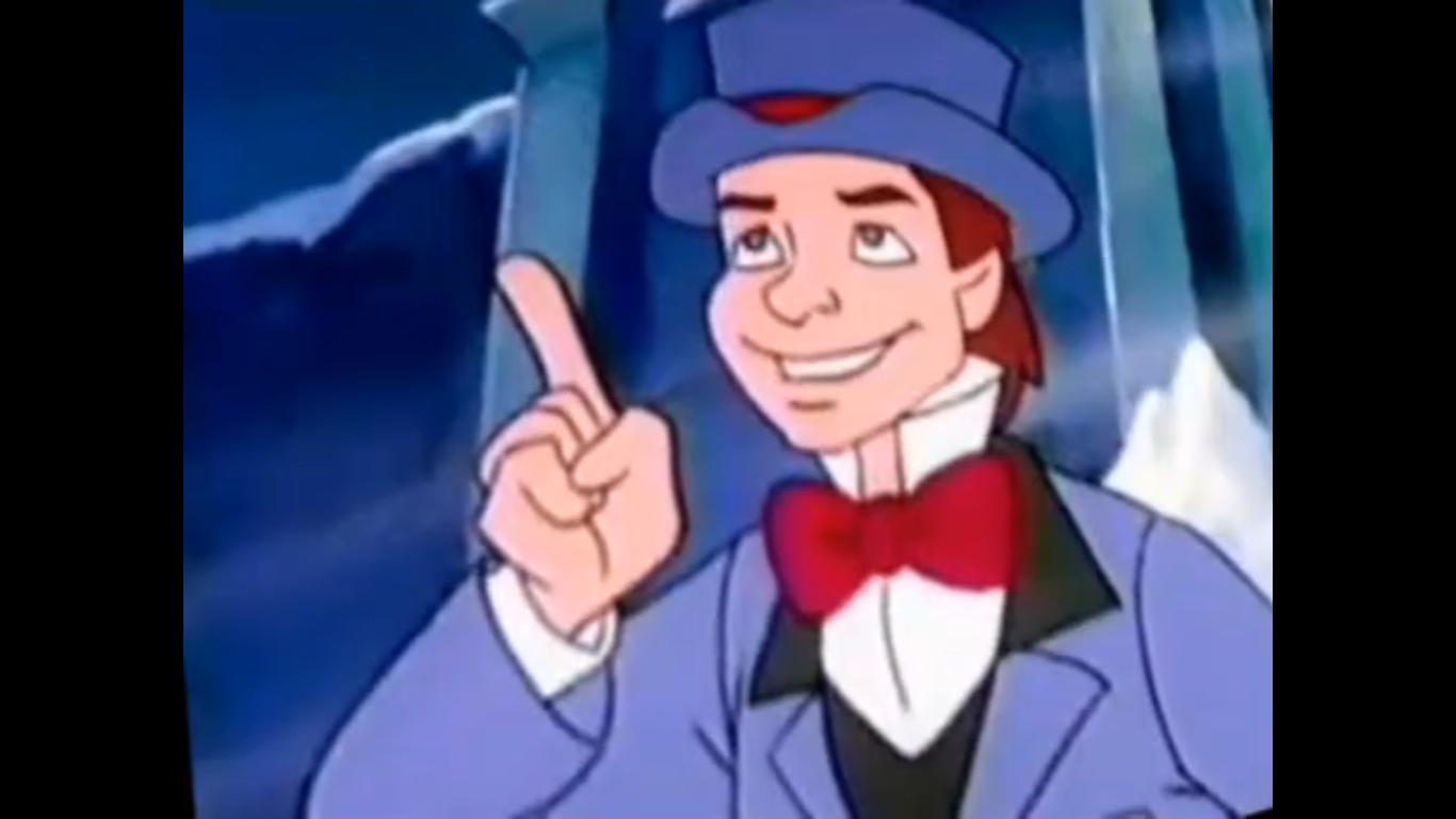
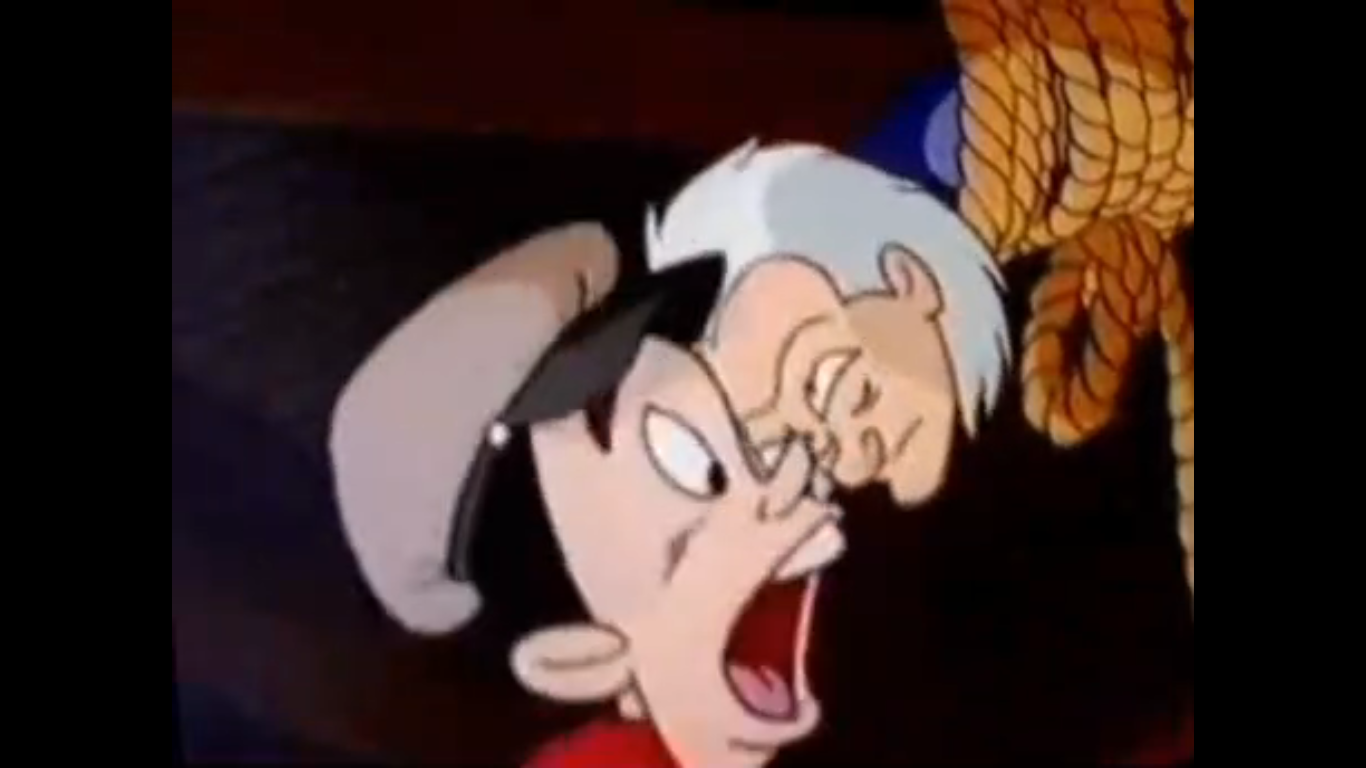
The three walk down a dilapidated red carpet (the interior of this place is not the equal of the exterior) until they finally come to him – the big man! Or, well, he is indeed a big man, but he’s also asleep and snoring loudly in a big chair. SpongeBob and Patrick run at him while Plankton can scarcely believe it. The two nitwits each jump onto one of Santa’s knees and sit with giddy anticipation for Santa to wake up. His eyes crack open a tiny bit and he asks them what they want for Christmas. SpongeBob and Patrick immediately start shouting over each other a whole bunch of unintelligible stuff as they must be among the few thinking of Christmas lists in July. Santa’s eyes then finally flutter open to see who is actually on his knee. To my surprise, he knows them by name! Is this guy the real deal after all? He also tells SpongeBob that he’s his biggest fan and SpongeBob is forced to correct him that Patchy the Pirate is actually his biggest fan. Which makes sense, because this ain’t Santa.
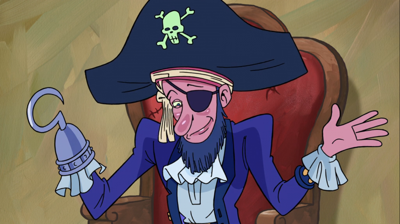
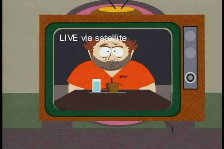
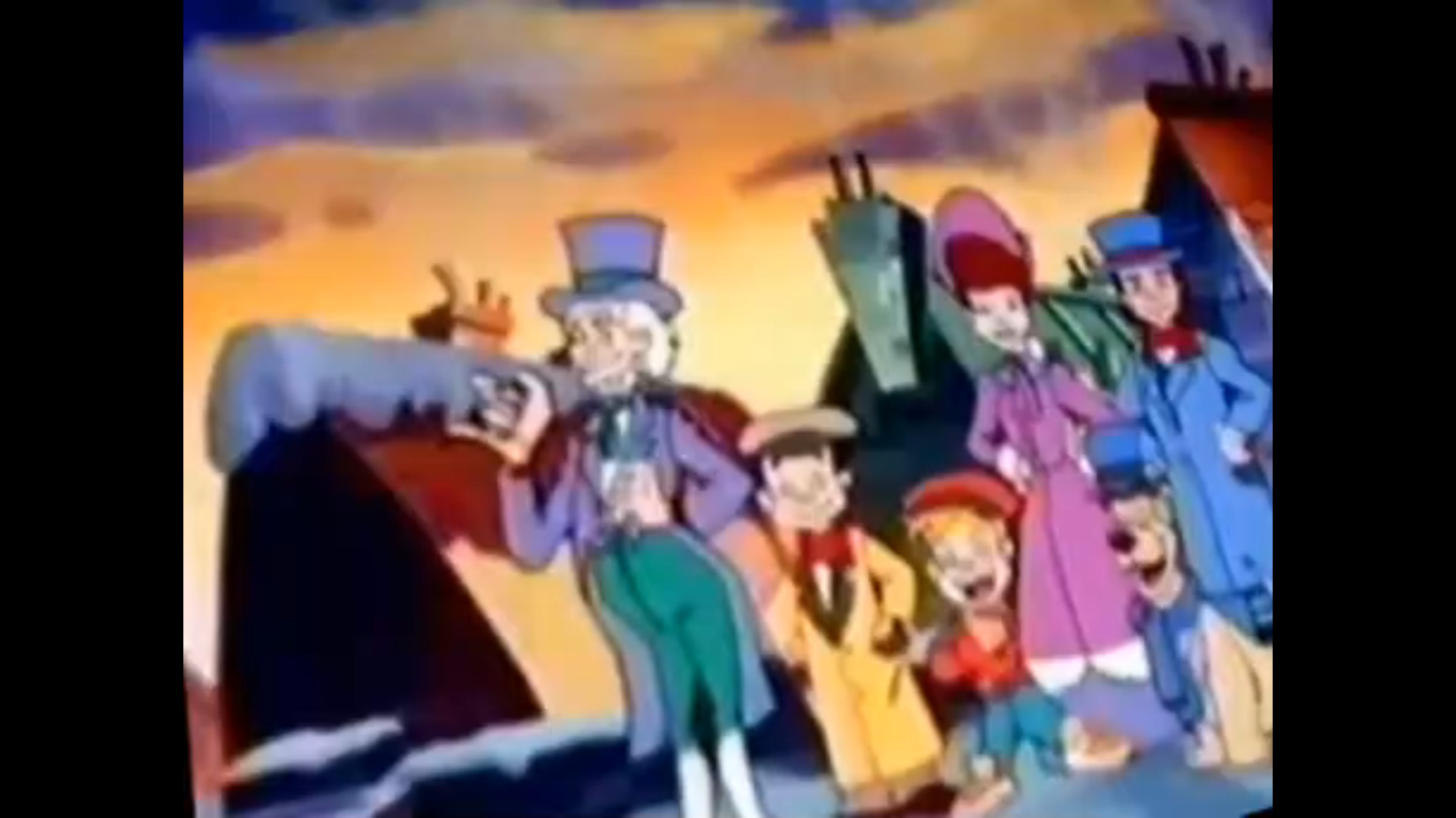
It’s Patchy (Tom Kenny)! He pulls off his Santa costume and presents himself to SpongeBob and Patrick. Upon seeing this, SpongeBob and Patrick’s head literally explode. Once reassembled though, they’re pretty happy to see old Patchy, but what they’re not happy about is finding out they’re at an amusement park in Encino and approximately 4,000 miles away from the North Pole. Plankton is pretty pissed they went so far off course while SpongeBob is just bummed that their GPS is busted. Patchy cheerfully offers an alternative to GPS – a map! And don’t forget about Potty (Lawrence), the broken down toy parrot thing, who drops in with a compass which just so happens to land on and subsequently crush Plankton. He shakes his fist at the parrot while asking “Polly want a smacker?!” SpongeBob and Patrick cheerfully hop down off of Patchy’s knees with their map and compass and bid their old fan goodbye. As they depart, Patchy requests they tell Santa “Hi” for him and to let him know that he wants a new parrot for Christmas. Potty smacks him over the head and tells him he’d like a new pirate for Christmas.
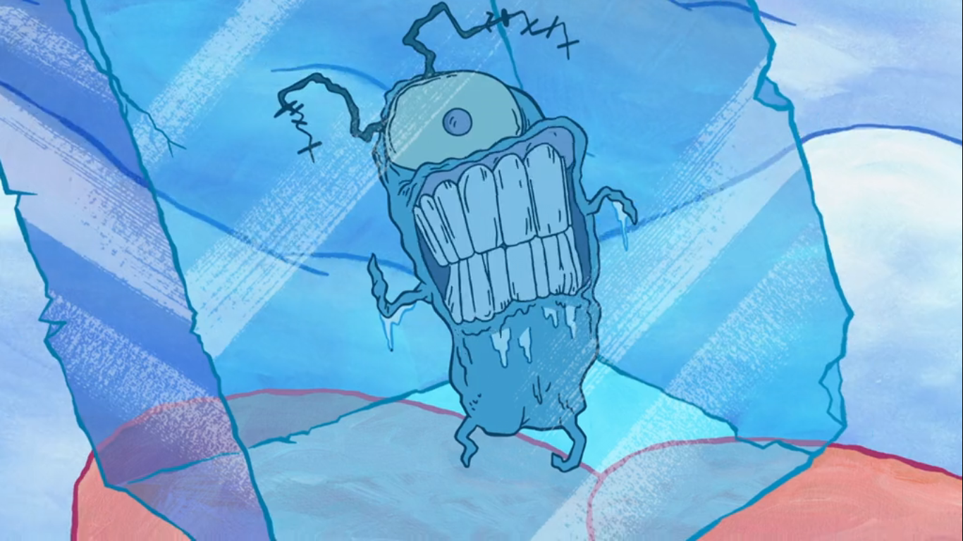
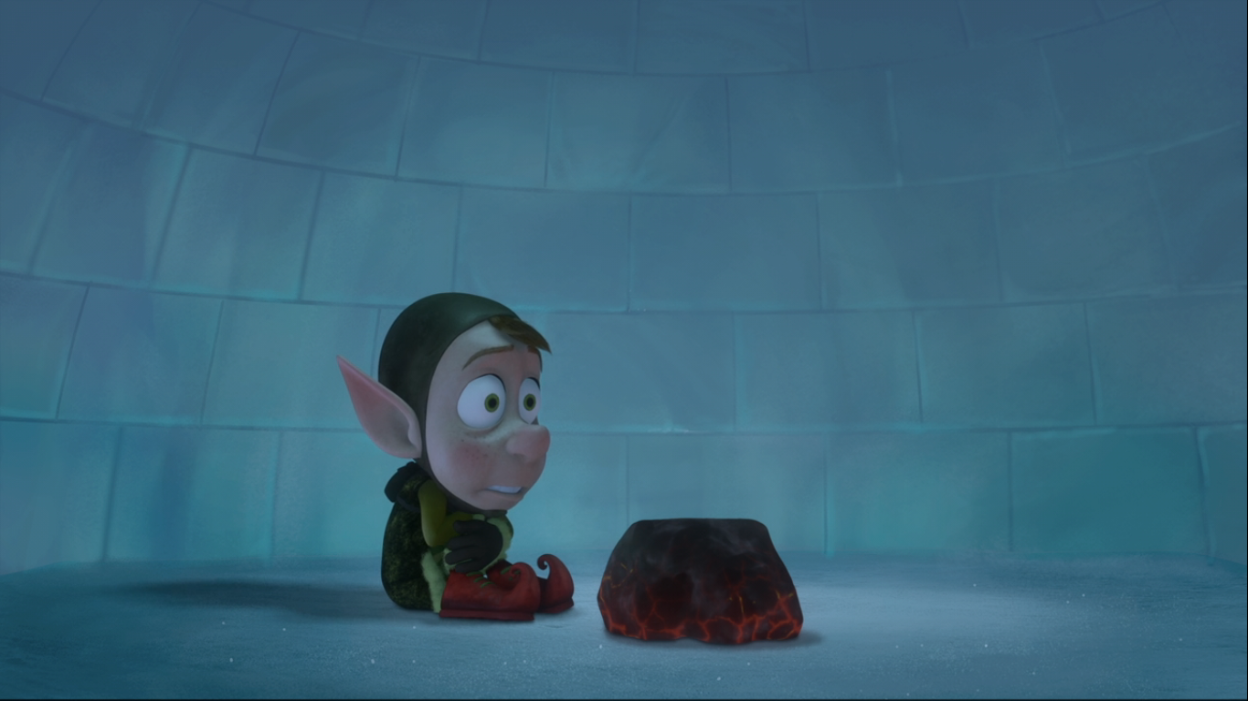
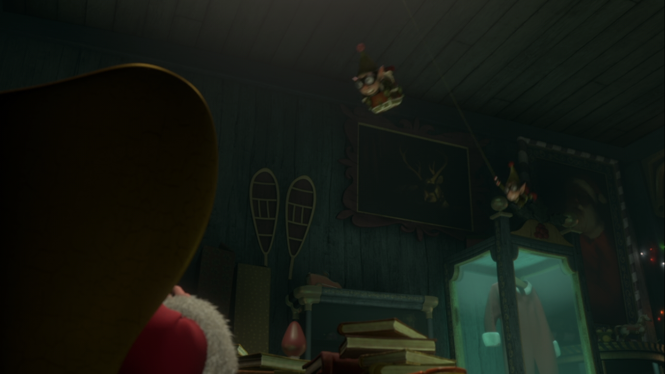
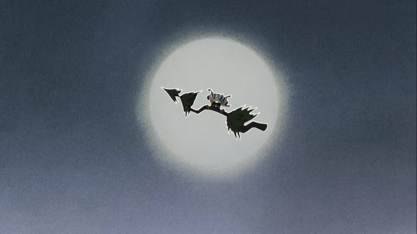
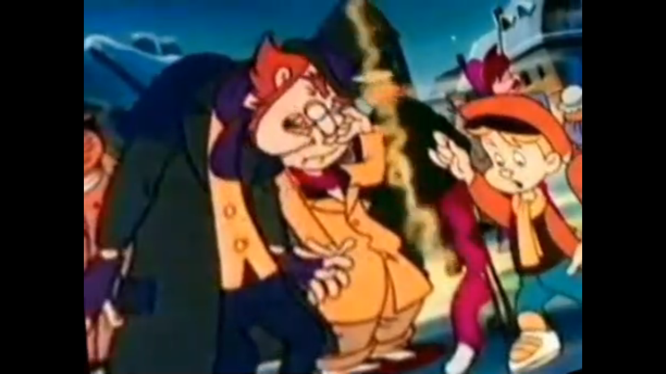
The boys set off once again and we see their adventure unfold over the map. They get off to a bad start first traveling across the U.S. all the way to Florida where they’re eaten by an alligator. They escape to Idaho, before getting diverted to Nova Scotia where an angry moose donkey-kicks them up to the North Pole. When they arrive, we see the effects of the cold as Plankton is encased in a block of ice while SpongeBob has turned blue and is shivering beside him. Patrick, who has been asleep, is also blue and wakes up to ask if they’ve arrived yet, only for his eyes to shatter. Patrick and SpongeBob then disembark from the ship to approach the real Santa’s work shop. Plankton is conspicuously absent, or not. He’s actually still in ice and SpongeBob asks Patrick if he’s enjoying his “Plankton Pop.” Patrick, who has Plankton pinned between his face and the glass of the bowl over his head, declares he can’t wait to get to the chewy center. We get a close-up of Plankton which looks rather horrifying.
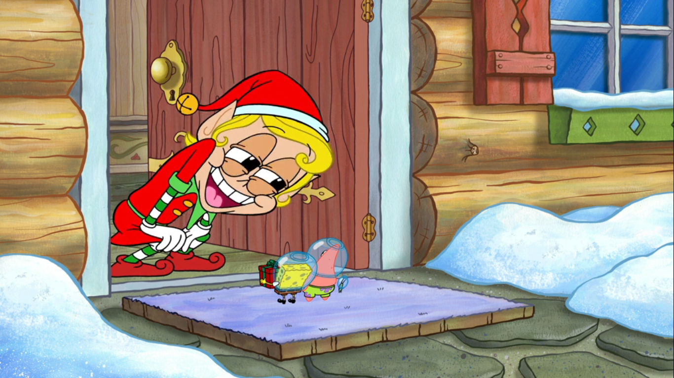
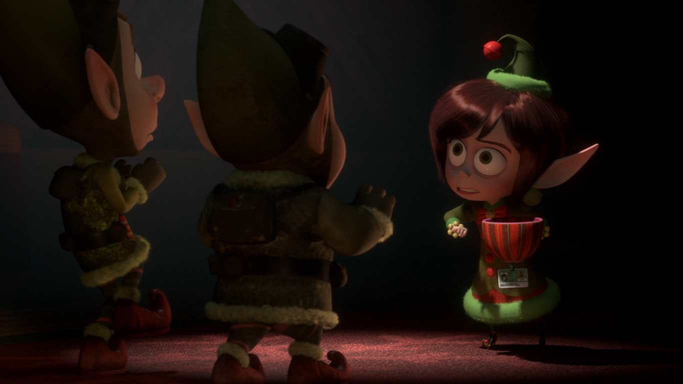
SpongeBob and Patrick approach the door with giddy expressions on their faces. SpongeBob then realizes that Plankton has gone missing and asks Patrick where he went. The starfish looks momentarily perplexed, then his jaws are forced open by a very haggard looking Plankton. He’s able to get out of Patrick’s bowl-helmet and tells the guy he needs to do something about his terrible breath. The door to Santa’s work shop is then opened and a female elf (Jill Talley) pokes her head out. She immediately mistakes the pair for trick-or-treaters even though they would be three months early. Plankton, now seeing an open door, vacates the area as he doesn’t care what’s going on with Patrick and SpongeBob. He slaps a pair of elf ears onto his own bowl and heads inside.

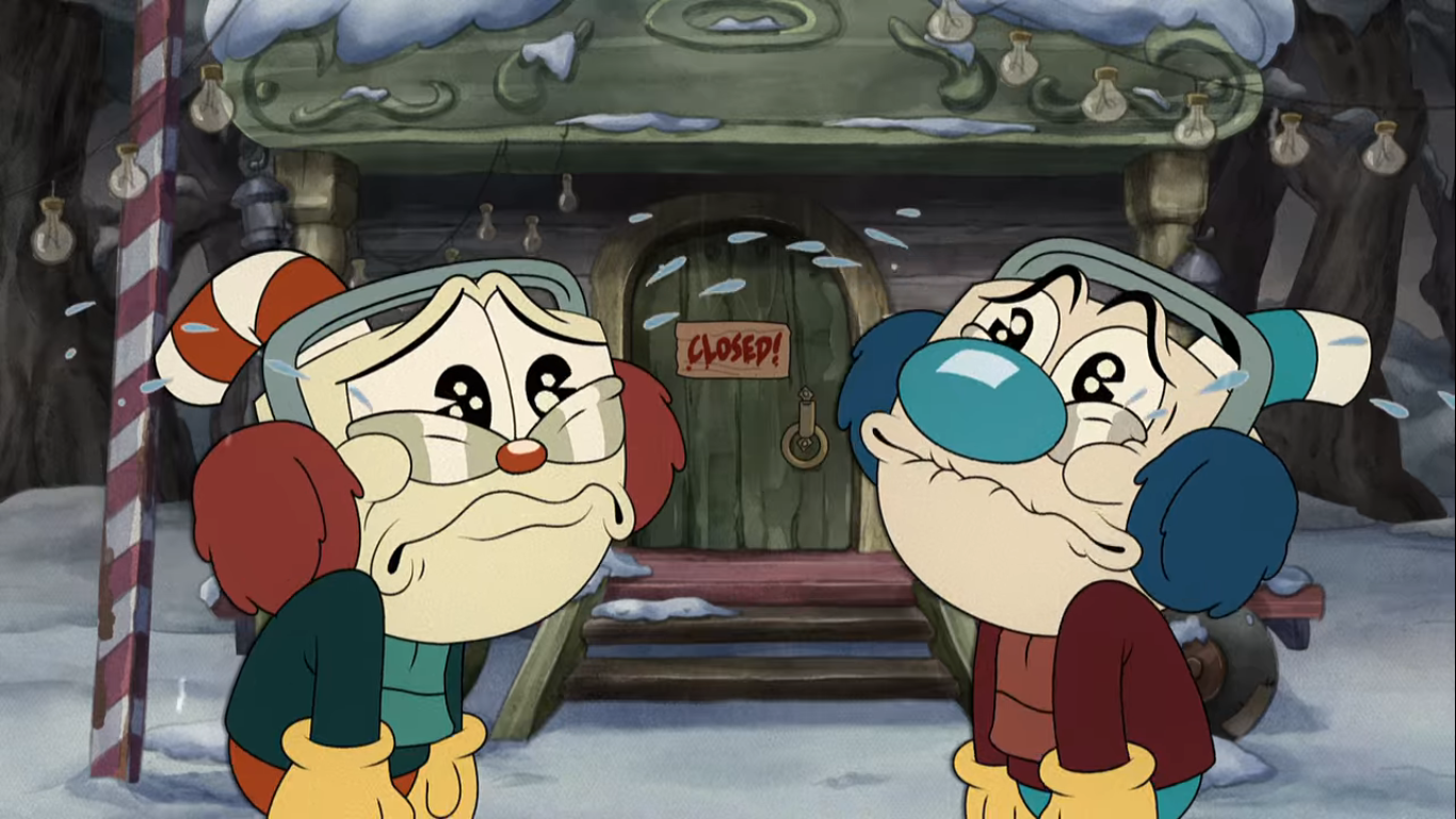
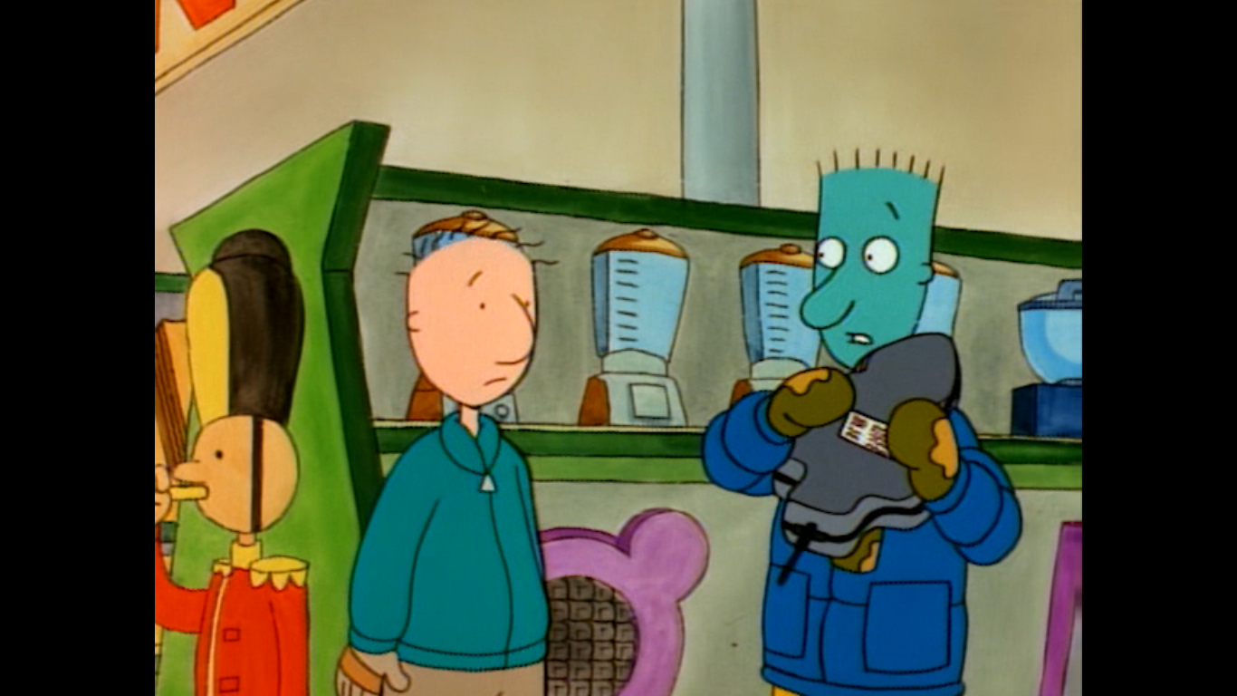
SpongeBob tells the elf they’re not trick-or-treaters, but are actually here to see Santa. It would probably have been helpful if he explained why, but he doesn’t. The elf has some bad news though: Santa has gone on vacation with his wife in Aruba and isn’t currently here (so that’s what he does during the offseason). She speaks to them in a cheerful, but supremely condescending manner which makes her kind of terrible. She tosses the pair a candy cane each and then bids them farewell with a “Happy Halloween.” SpongeBob is pretty downhearted about the rejection, but Patrick is happy to have some free candy. Really happy. He reacts to eating the candy cane like it’s crack or something. That’s probably not a good thing. The two peer through the window and see the total elf rager going on inside. They’re behaving like drunks, but they’re clearly just drinking milk and eating cookies. Plankton is also in there trying his best not to get stepped on. SpongeBob reasons they need to get inside to leave Santa his present. Patrick has an idea for how to get in, but SpongeBob decides they should do it Santa style. Patrick, who can be seen at the controls of a wrecking ball, is disappointed in SpongeBob’s choice.

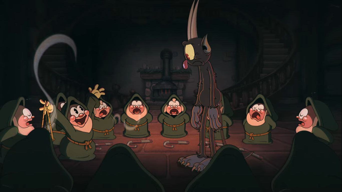
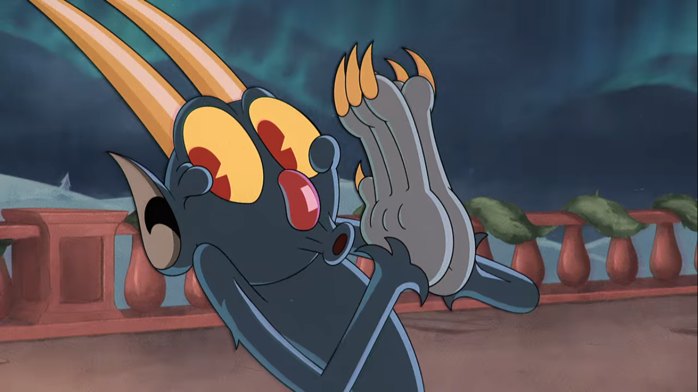
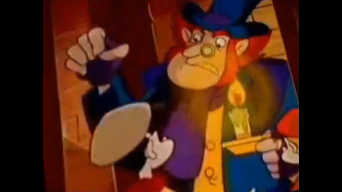
Meanwhile, Plankton is strolling about the area in search of Santa’s mainframe. He intends to hack it so that he can put himself on the Nice List. Or take himself off the Naughty List. I guess he has to do both. As he walks through the compound, he sees a group of reindeer working out. These reindeer are pretty serious as they pump iron. Their overall shape reminds me of the shaven yak from The Ren & Stimpy Show. Plankton avoids them, but apparently not well enough for he’s soon approached by a rather nasty looking reindeer. He has a round, blue, nose which is probably why he’s called Bludolph (Clancy Brown). I don’t know if the name is ever said in the episode, but it’s how he’s credited. Anyway, he thinks Plankton is up to no good and Plankton certainly doesn’t look like any elf he’s ever seen. Plankton tries to play it cool, but when Bludolph is clearly not fooled he kicks snow in his face and calls him a moose. Bad move, Plankton, as Bludolph summons the other reindeer for some reindeer games. And the game is hacky sack with Plankton serving as the sack. As he’s sent through the air we get a poop joke as he shouts “That better be mud on your hooves,” after getting kicked.
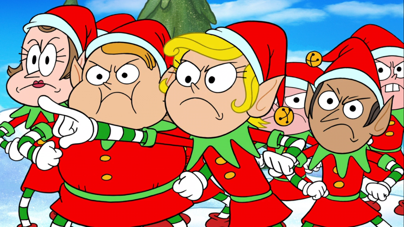
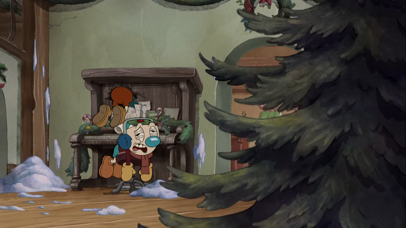
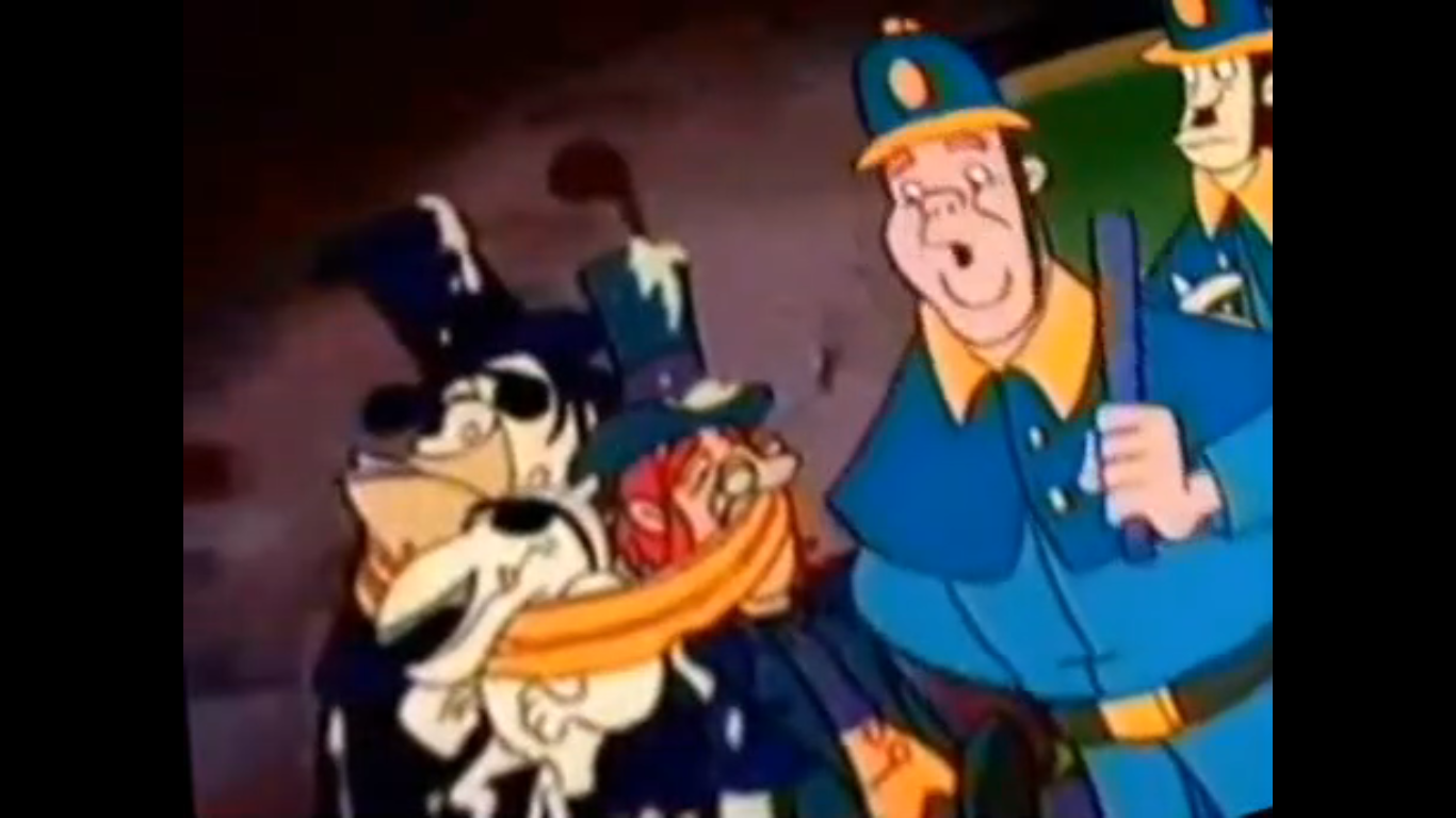
We cut to a fireplace and out from it emerges SpongeBob and Patrick. They’re in a rather cozy looking room and before them stands Santa’s Christmas tree. The two are in awe, but despite their reaction I have to say it’s a pretty conventional looking Christmas tree. All that’s left is for SpongeBob to do what he set out to and leave Santa his present, but as they approach the tree with their arms linked an alarm is triggered. The elves burst in and the girl elf from early recognizes the pair of “trick or treaters.” They think they’re hear to steal toys. They’re also too angry to listen to any sort of reason as they burst in forcing SpongeBob and Patrick to escape by climbing up the tree.

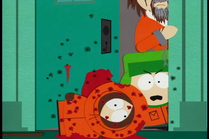
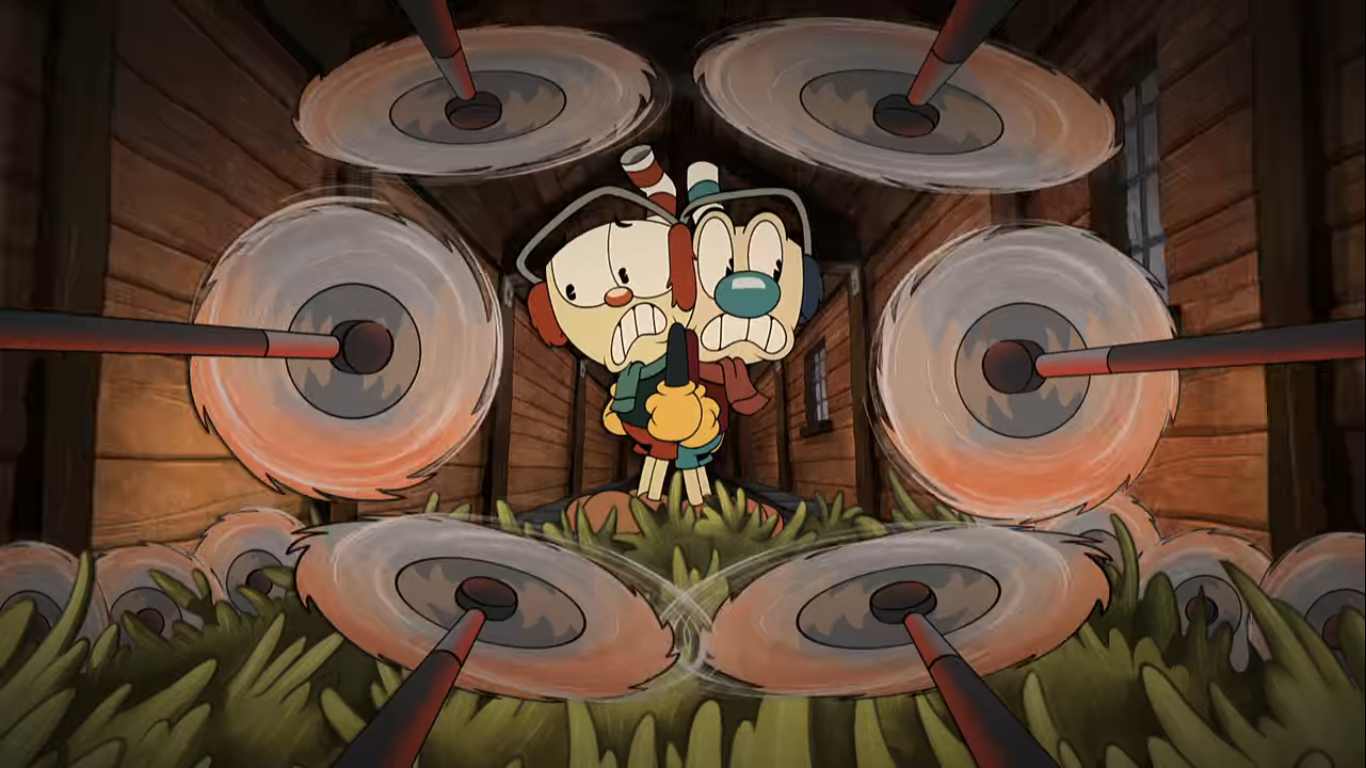
It’s at this point that Bludolph and the other reindeer storm in as they were alerted to the break-in as well. This means Plankton’s beating is over, but he gets stepped on by a reindeer for good measure. He pops up wondering if they’ve had enough and calls them a bunch of cariboobs. It’s a good insult since reindeer are indeed caribou. I guess Bludolph and company are kind of like the security up here, but they also seem to have some conflict with the elves. They feel like the reindeer are out of line for coming to their aid and there’s quite a bit of hostility between the two. When a reindeer gets mistakenly hit by a toy the elves were throwing at SpongeBob and Patrick, a brawl breaks out between elves and reindeer. Despite the reindeer being the far larger species, the elves certainly came to play and both sides take on some casualties. Though some of it is self-inflicted on the part of the reindeer. One of them, I think it’s Prancer, manages to get his antlers stuck in a ceiling fan causing him to fall on some elves. Then his snout gets run over by a train.
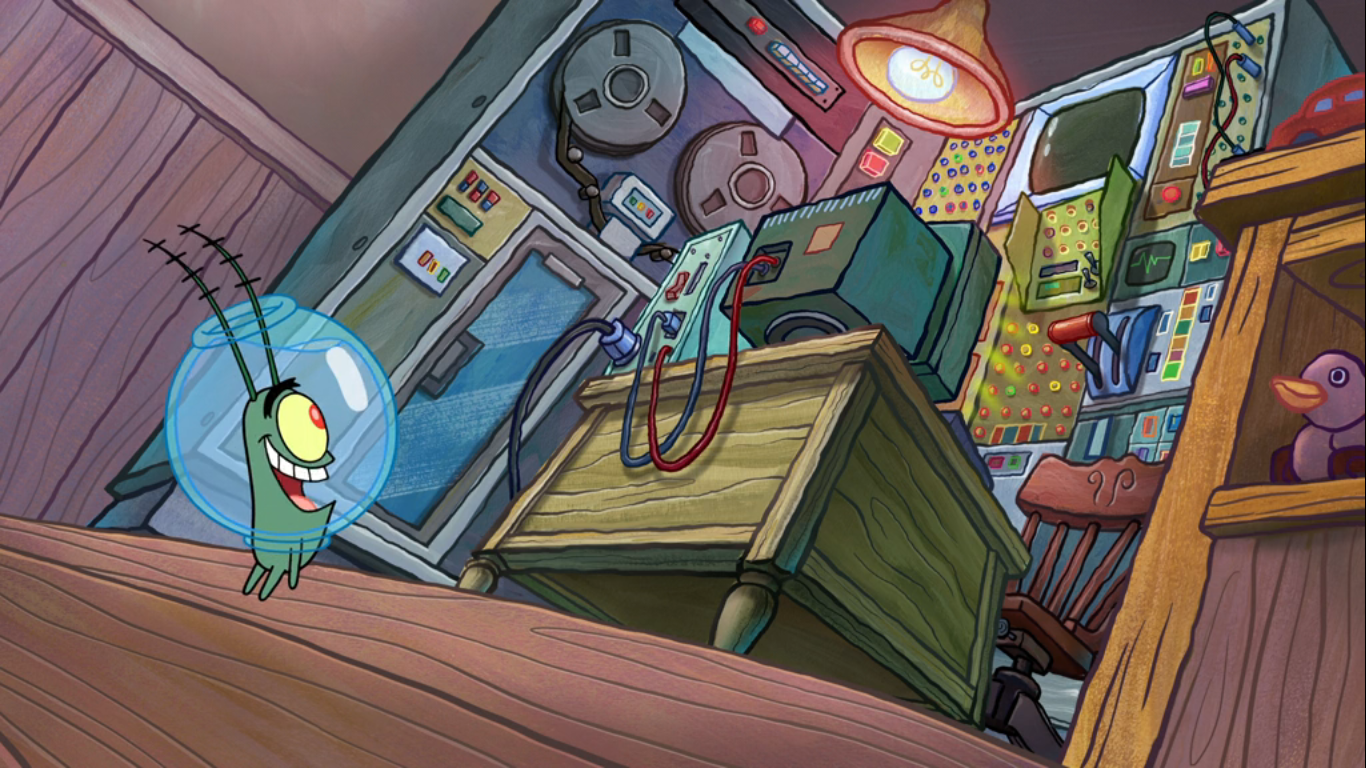
SpongeBob is forced to observe the horror from high in the Christmas tree. He blames himself for this since he was the catalyst for the confrontation. He looks to Patrick for support, but he’s enraptured by the aroma of candy canes and of no use to SpongeBob now. A vicious looking elf is also climbing the tree. What he intends to do to SpongeBob should he reach him is anyone’s guess. SpongeBob tries bombarding him with Christmas ornaments, but that only seems to fuel him. Meanwhile, Plankton, having recovered from his own beating, strolls in deftly avoiding the many feet around him. He’s overjoyed when he comes upon the thing that which he seeks: Santa’s mainframe. It’s not issue for him to access it and add himself to the nice list. As he strolls out the door though, he’s once again stepped on.
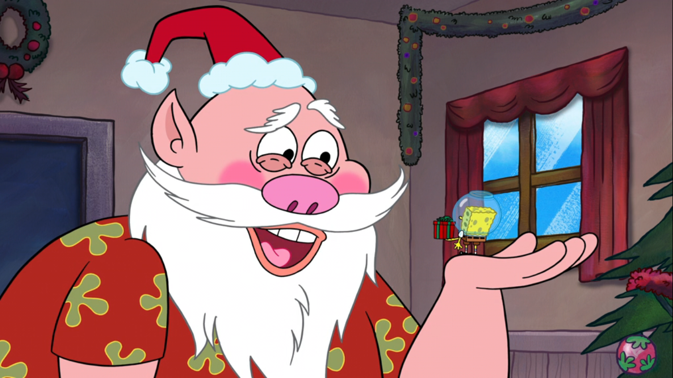
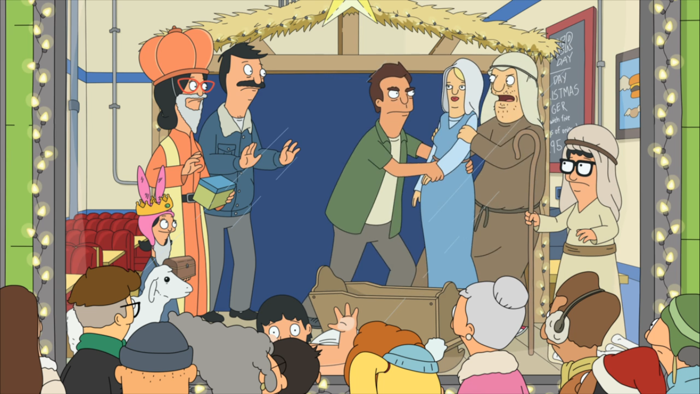
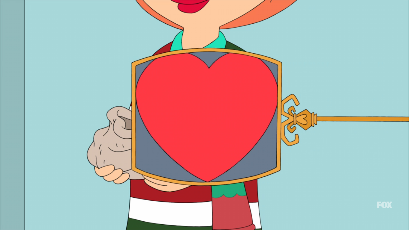
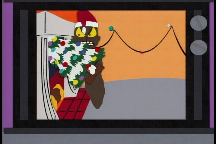
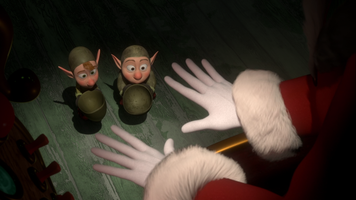
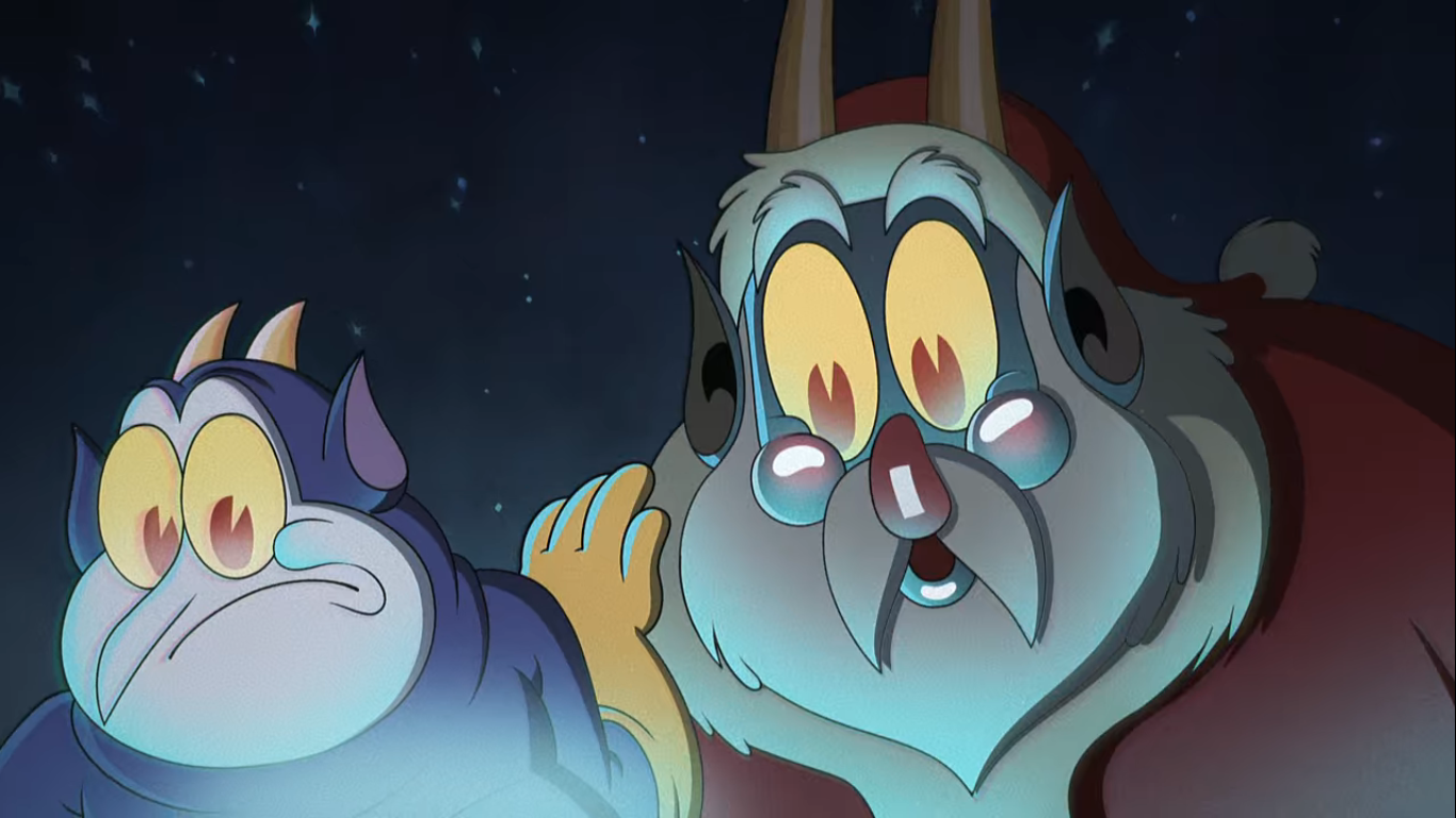
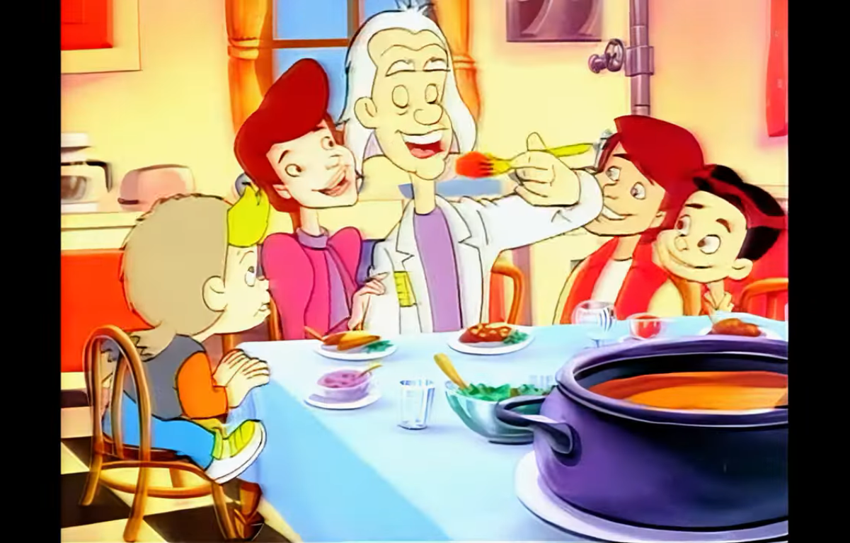
The foot that stepped on Plankton belongs to none other than Santa! He’s none too pleased to have to come back from his vacation early due to the alarm going off in his quarters. He’s less happy to find the elves and reindeer seemingly at war with each other, but he brightens up when he takes notice of SpongeBob who was about to be attacked by the elf from earlier. He even playfully refers to SpongeBob as a menace which the little guy laughs off. He hops down and it’s at this point I’m reminded that Santa had to shrink himself to fit into SpongeBob’s house at the beginning of the episode because now SpongeBob sits in the palm of the big elf’s hand. He explains what’s going on and pulls out the gift he has for Santa. Santa seems touched and he carefully opens the tiny present to find a gloss bottle inside with a piece of parchment within it.

Plankton, upon seeing the gift, assumes it’s the thing he covets most: the Krabby Patty secret formula! Seeing what he wants before him, he abandons his plan to remain nice until Christmas and instead opts for thievery. He swipes the bottle and taunts Santa for good measure with his tattoo before opening the bottle and taking a look at the message inside. Of course, it’s not the secret formula (why would SpongeBob even have it?) and he sheepishly offers to return the gift to Santa. Seeing an opportunity to punish Plankton a bit, Santa instead demands he read it and Plankton reluctantly does. It’s just a simple message from SpongeBob that notes there’s no present that would be commensurate to what Santa has gifted the world over the years, so instead it’s just a simple message of thanks. Santa gets all teary eyed for no one has ever given him a Christmas present before. No one until SpongeBob Squarepants.
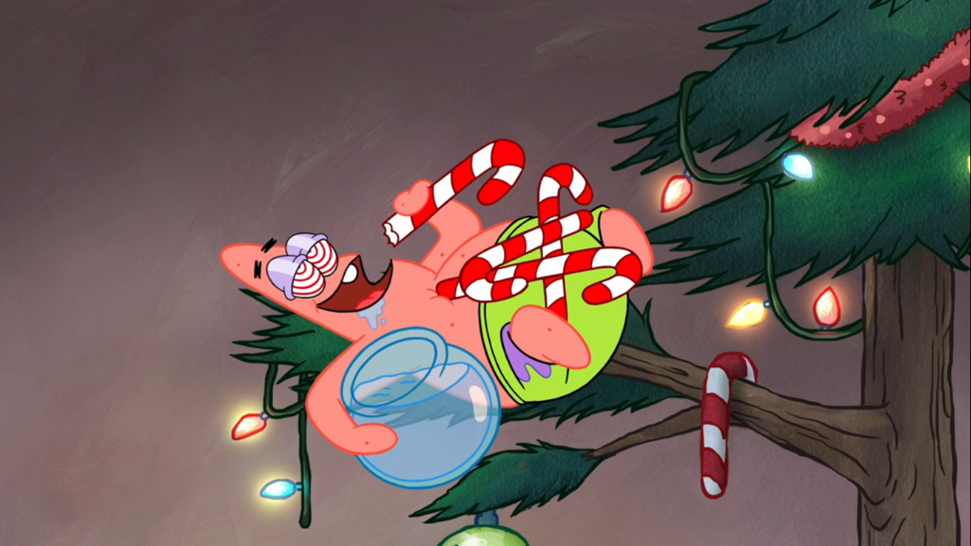
Santa thanks SpongeBob, but the little guy is always looking out for others. He makes sure to point out to Santa that he would never have made it to the North Pole without Plankton’s help. He even tosses in a “he’s not such a bad guy,” to try to sweeten the sentiment. He also credits Patrick to getting him there, which causes him to remember that Patrick is still in the tree! We pan to Patrick in the tree who has managed to get his hands (flippers?) on several candy canes. His eyes are all striped again and he just offers up a “Happy holidays to me!” I think it would have been funnier if he said happy Halloween.

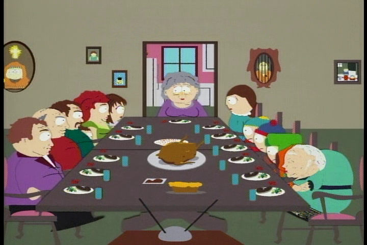
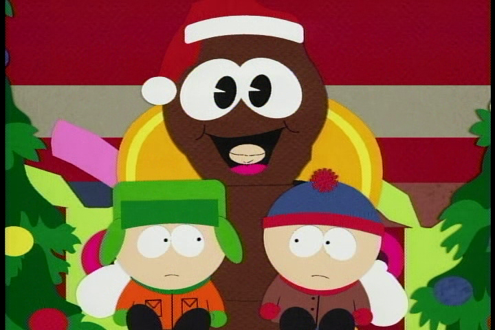
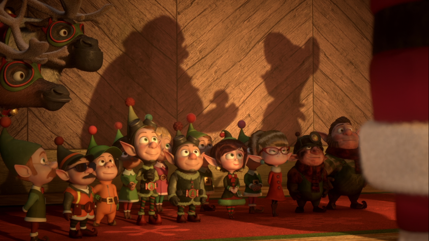
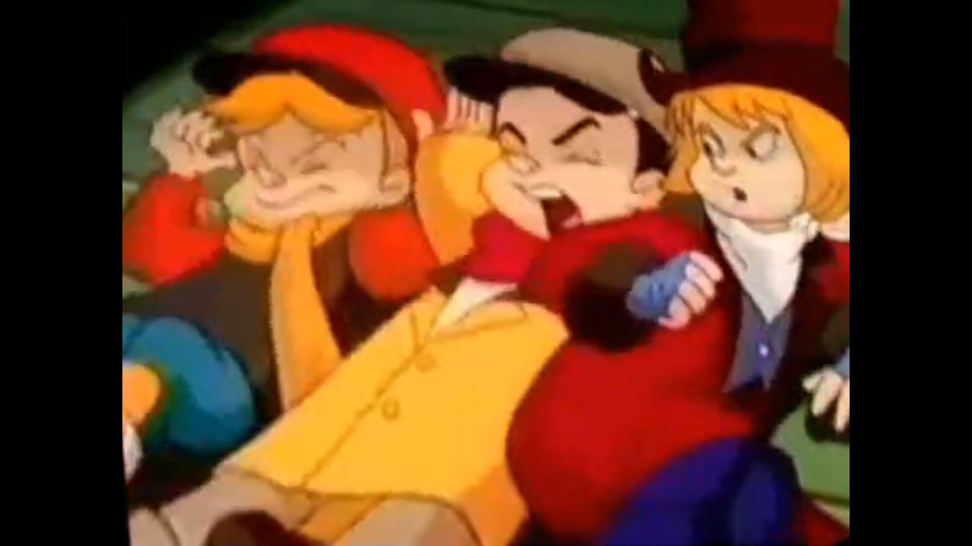
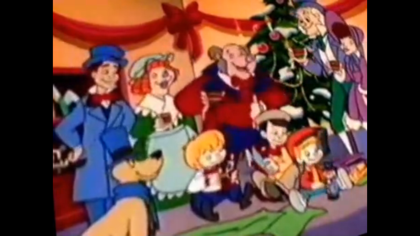
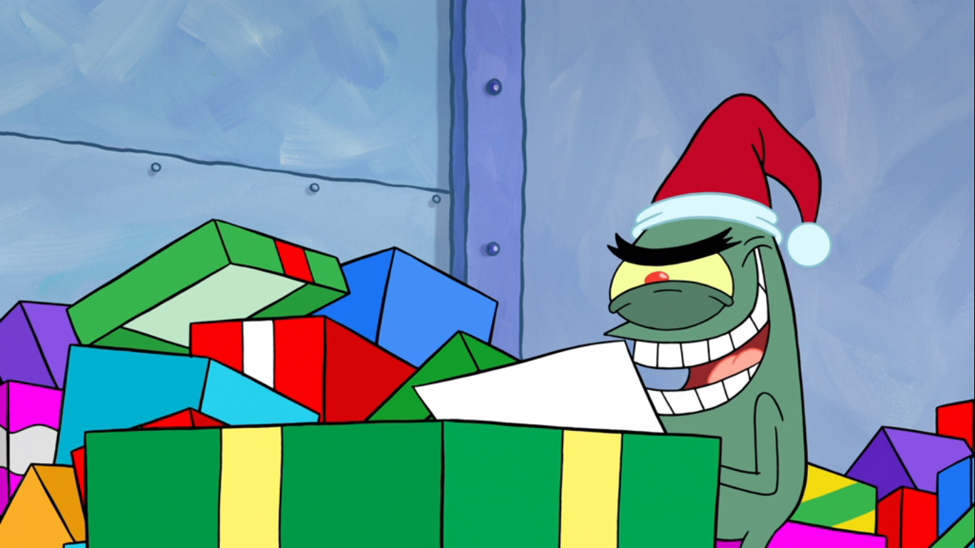
Fast forward five months and it’s a Christmas party at the famed The Krusty Krab. SpongeBob and all of his friends are enjoying the festivities as presents are being handed out. Plankton is there as well and we see him cheerlessly open another present which contains a lump of coal. He tosses it aside where it lands amongst a pile of other coal. SpongeBob then sidles on up and gives Plankton a gift as well. It’s a picture of him, Patrick, and Plankton with Patchy the Pirate from their adventure to the North Pole. It also contains a message of encouragement from SpongeBob for Plankton as it says “One day you will destroy us all!”
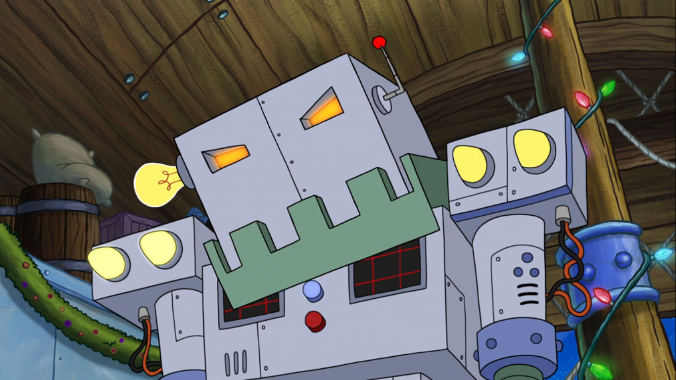
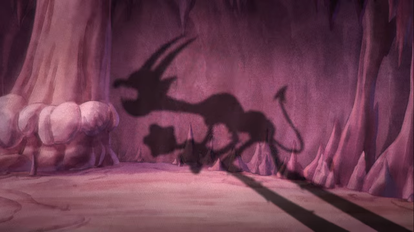
Upon reading such words of encouragement Plankton appears touched. Then his soft expression is replaced with a hardened one. One of determination and malevolence! He shovels all of that coal immediately into a giant robot which has just been standing there. The coal-powered monster belches fire and we cut to an exterior shot of the restaurant now glowing from the fire within as the sounds of screams (and Plankton’s laugher) coming from inside take us to credits.
SpongeBob’s journey to the North Pole did not surprise me in that it doesn’t quite live up to what’s come before it. That’s not a slight against this Christmas episode, but more an acknowledgement of how good the previous two were. I do like the premise as it’s very much a SpongeBob plot to want to make sure Santa Claus himself gets a present on Christmas. The show does a fine enough job of coming up with something for SpongeBob to hand over to Kris Kringle and it’s not really important, anyway. This episode is about the journey. It’s a road trip for SpongeBob and his best friend plus the odd pairing of Plankton. All good road trip movies include an oil and water dynamic and that’s what inserting Plankton into the plot does here. It also provides the plot a mode of transportation and giving Plankton the goal of getting himself onto the Nice List works well enough.
Where things stumble a bit for me is in the actual journey. Every road trip story needs a part where the journey clearly has gone wrong and a wrong destination or a wrong turn is often the device utilized. Here, it’s a dilapidated amusement park which I guess was fine? It’s a way to work in Patchy the Pirate who played a role in past SpongeBob Christmas episodes so I guess it’s kind of his thing. My issue with it is I think we’re denied more time at the North Pole. There are some unusual dynamics going on up there between the elves and reindeer and I’d have appreciated some more context there. Maybe we could have even had time for Mrs. Claus? It all leads to a sensible resolution though and I like the somewhat violent ending with Plankton. It caught me by surprise and that’s a pretty hard trick for a Christmas episode to pull off.
“SpongeBob’s Road to Christmas” is a perfectly charming and entertaining little Christmas episode. It’s unlikely to blow anyone away, but it’s entertaining and not too derivative of other Christmas travel specials. It’s only real failing is not being as good as A SpongeBob Christmas. If you’d like to spend time with the sponge and his friends then you can find this episode streaming on Paramount+. It’s also likely to be shown on Nickelodeon a few times this month and I bet you still have time to find it if you still have a cable subscription.
Can’t wait until tomorrow for more Christmas? Check out what we had to say on this day last year and beyond:

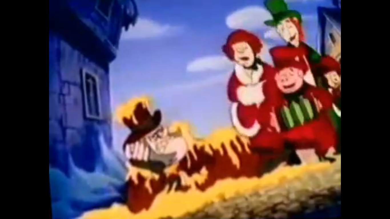
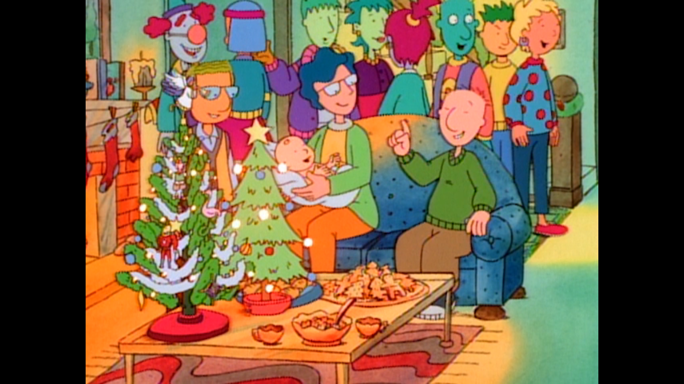
Dec. 14 – All Grown Up! – The Finster Who Stole Christmas
In 2001, Rugrats had the honor of being the first Nicktoon to make it 10 years. The path to that honor was not a smooth one as the show had effectively been cancelled in 1993 with the third season. That appeared to not be performance related, but more strategic on the part of Nickelodeon as…
Keep reading
Dec. 14 – Rugrats – “The Santa Experience”
Yesterday, we took a look at the 1992 Christmas special from the third Nickelodeon Nicktoon The Ren & Stimpy Show. Today, we’re basically working backwards and talking about the second Nicktoon to premiere: Rugrats. The Ren & Stimpy Show is probably the most celebrated of the original Nicktoons when it comes to animation circles, but…
Keep reading
Dec. 14 – Gifts from the Air
For today’s subject, we’re going all the way back to 1937 to talk about the Columbia Pictures Gifts from the Air. This particular cartoon comes from an era dominated by Disney, Warner Bros, and MGM with a tip of the cap to Noveltoons. The Color Rhapsody Theatrical Cartoon Series is not particularly well-remembered outside of…
Keep reading